32

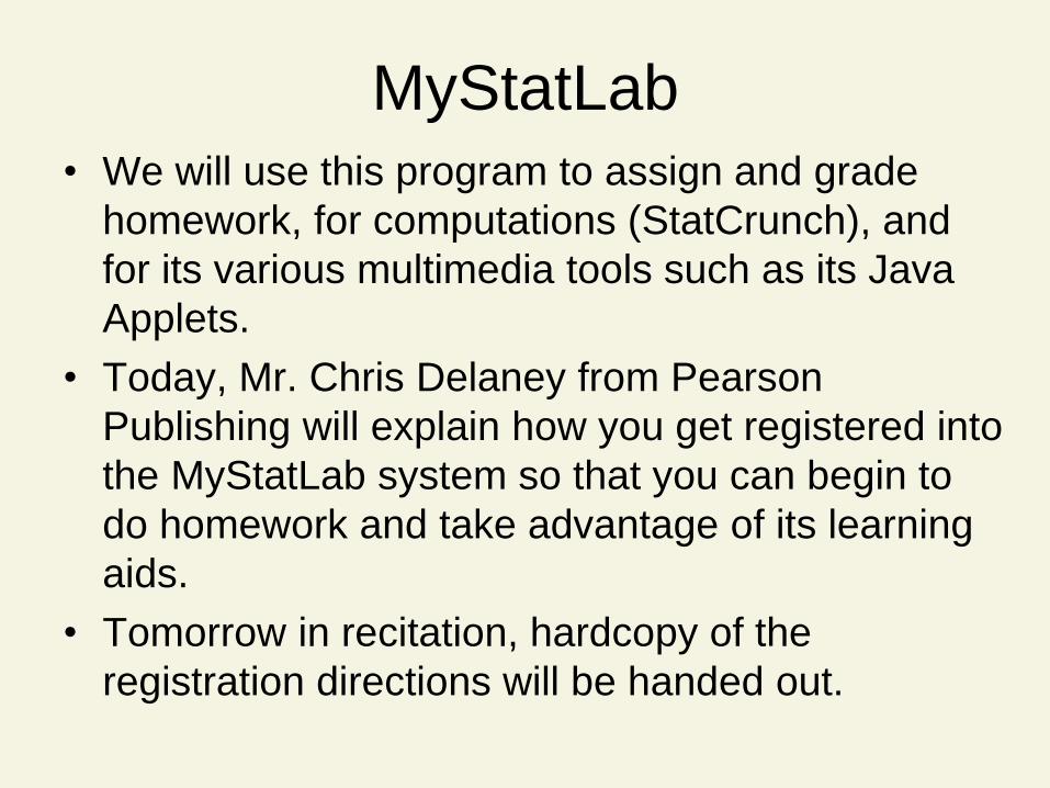
MyStatLab • We will use this program to assign and grade
homework, for computations (StatCrunch), and
for its various multimedia tools such as its Java
Applets.
• Today, Mr. Chris Delaney from Pearson
Publishing will explain how you get registered into
the MyStatLab system so that you can begin to
do homework and take advantage of its learning
aids.
• Tomorrow in recitation, hardcopy of the
registration directions will be handed out.

Statistics for Business and
Economics
Chapter 2: Secs 1, 2
Methods for Describing
Sets of Data

Contents
Sec 2.1 Describing Qualitative Data (minimal
read: pp. 40-42.)
Sec 2.2 Graphical Methods for Describing
Quantitative Data (minimal read:
pp. 51-57.)

2.1
Describing Qualitative Data
MyStatLab Exercises 1, 2
(Due 9/11/13, 11:59 pm)

Key Terms A class is one of the categories into which qualitative data can be classified.
The class frequency is the number of observations in the data set falling into a particular class.
The class relative frequency is the class frequency divided by the total numbers of observations in the data set.
The class percentage is the class relative frequency multiplied by 100.

Data Presentation
Data
Presentation
Qualitative
Data
Quantitative
Data
Summary
Table
Stem-&-Leaf
Display
Frequency
Distribution
Histogram Bar
Graph
Pie
Chart
Pareto
Diagram
Dot
Plot

Data Presentation
Data
Presentation
Qualitative
Data
Quantitative
Data
Summary
Table
Stem-&-Leaf
Display
Frequency
Distribution
Histogram Bar
Graph
Pie
Chart
Pareto
Diagram
Dot
Plot

Summary Table
1. Lists categories & number of elements in category
2. Obtained by tallying responses in category
3. May show frequencies (counts), % or both
Row Is
Category Tally:
|||| ||||
|||| ||||
Major Count
Accounting 130
Economics 20
Management 50
Total 200

Data Presentation
Data
Presentation
Qualitative
Data
Quantitative
Data
Summary
Table
Stem-&-Leaf
Display
Frequency
Distribution
Histogram Bar
Graph
Pie
Chart
Pareto
Diagram
Dot
Plot

0
50
100
150
Acct. Econ. Mgmt.
Major
Bar Graph
Vertical Bars
for Qualitative
Variables
Bar Height
Shows
Frequency or %
Zero Point
Percent
Used
Also
Equal Bar
Widths
Fre
qu
en
cy

Data Presentation
Data
Presentation
Qualitative
Data
Quantitative
Data
Summary
Table
Stem-&-Leaf
Display
Frequency
Distribution
Histogram Bar
Graph
Pie
Chart
Pareto
Diagram
Dot
Plot

Econ.
10%
Mgmt.
25%
Acct.
65%
Pie Chart
1. Shows breakdown of
total quantity into
categories
2. Useful for showing
relative differences
3. Angle size
• (360°)(percent)
Majors
(360°) (10%) = 36°
36°

Data Presentation
Data
Presentation
Qualitative
Data
Quantitative
Data
Summary
Table
Stem-&-Leaf
Display
Frequency
Distribution
Histogram Bar
Graph
Pie
Chart
Pareto
Diagram
Dot
Plot

Pareto Diagram Like a bar graph, but with the categories arranged by
height in descending order from left to right.
0
50
100
150
Acct. Mgmt. Econ.
Major Vertical Bars
for Qualitative
Variables
Bar Height
Shows
Frequency or %
Zero Point
Percent
Used
Also
Equal Bar
Widths
Fre
qu
en
cy

Summary Bar graph: The categories (classes) of the qualitative variable are represented by bars, where the height of each bar is either the class frequency, class relative frequency, or class percentage.
Pie chart: The categories (classes) of the qualitative variable are represented by slices of a pie (circle). The size of each slice is proportional to the class relative frequency.
Pareto diagram: A bar graph with the categories (classes) of the qualitative variable (i.e., the bars) arranged by height in descending order from left to right.

Thinking Challenge
You’re an analyst for IRI. You want to show the
market shares held by Web browsers in 2006.
Construct a bar graph, pie chart, & Pareto diagram
to describe the data.
Browser Mkt. Share (%)
Firefox 14
Internet Explorer 81
Safari 4
Others 1

0%
20%
40%
60%
80%
100%
Firefox Internet
Explorer
Safari Others
Bar Graph Solution* M
ark
et S
ha
re (
%)
Browser

Pie Chart Solution*
Market Share
Safari, 4%
Firefox,
14%
Internet
Explorer,
81%
Others,
1%

Pareto Diagram Solution*
0%
20%
40%
60%
80%
100%
Internet
Explorer
Firefox Safari Others
Ma
rket
Sh
are
(%
)
Browser

2.2
Graphical Methods for Describing
Quantitative Data
MyStatLab Exercises 18, 19, 20, 21
(Due 9/11/13, 11:59 pm)

Data Presentation
Data
Presentation
Qualitative
Data
Quantitative
Data
Summary
Table
Stem-&-Leaf
Display
Frequency
Distribution
Histogram Bar
Graph
Pie
Chart
Pareto
Diagram
Dot
Plot

Dot Plot
1. Horizontal axis is a scale for the quantitative variable,
e.g., percent.
2. The numerical value of each measurement is located
on the horizontal scale by a dot.

Data Presentation
Data
Presentation
Qualitative
Data
Quantitative
Data
Summary
Table
Stem-&-Leaf
Display
Frequency
Distribution
Histogram Bar
Graph
Pie
Chart
Pareto
Diagram
Dot
Plot

Stem-and-Leaf Display
1. Separate each observation
into stem value and leaf
value
• Stems are listed in
order in a column
• Leaf value is placed in
corresponding stem
row to right of bar
2. Ordered Data: 21, 24, 24, 26, 27, 27, 30, 32, 38, 41
26
2 144677
3 028
4 1

Stem-and-Leaf Display (Double Stems)
1. Separate each observation
into stem value and leaf
value. Here we use each
stem digit twice to capture
greater detail in the
distribution of the data.
For example, use one stem
of value 2 to hold leaves
from {0,1,2,3,4} and the
other to hold leaves from
{5, 6, 7, 8, 9}.
2. Ordered Data: 21, 24, 24, 26, 27, 27, 30, 32, 38, 41
2 677
3 02
4 1
4
3
2
8
144

Data Presentation
Data
Presentation
Qualitative
Data
Quantitative
Data
Summary
Table
Stem-&-Leaf
Display
Frequency
Distribution
Histogram Bar
Graph
Pie
Chart
Pareto
Diagram
Dot
Plot
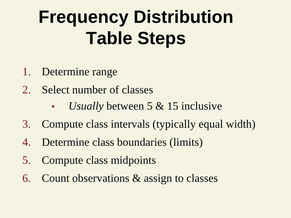
Frequency Distribution
Table Steps
1. Determine range
2. Select number of classes
• Usually between 5 & 15 inclusive
3. Compute class intervals (typically equal width)
4. Determine class boundaries (limits)
5. Compute class midpoints
6. Count observations & assign to classes

Frequency Distribution Table
Example
Raw Data: 24, 26, 24, 21, 27 27 30, 41, 32, 38
Boundaries (Lower + Upper Boundaries) / 2
Width
Class Midpoint Frequency
15.5 – 25.5 20.5 3
25.5 – 35.5 30.5 5
35.5 – 45.5 40.5 2

Relative Frequency &
% Distribution Tables
Percentage
Distribution
Relative Frequency
Distribution
Class Prop.
15.5 – 25.5 .3
25.5 – 35.5 .5
35.5 – 45.5 .2
Class %
15.5 – 25.5 30.0
25.5 – 35.5 50.0
35.5 – 45.5 20.0

Data Presentation
Data
Presentation
Qualitative
Data
Quantitative
Data
Summary
Table
Stem-&-Leaf
Display
Frequency
Distribution
Histogram Bar
Graph
Pie
Chart
Pareto
Diagram
Dot
Plot

0
1
2
3
4
5
Histogram
Frequency
Relative
Frequency
Percent
0 15.5 25.5 35.5 45.5 55.5
Bars
Touch
Class Freq.
15.5 – 25.5 3
25.5 – 35.5 5
35.5 – 45.5 2
Count


