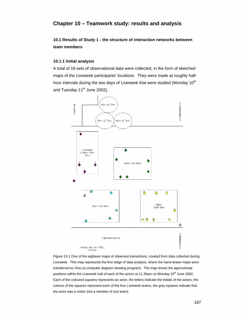
187 Chapter 10 – Teamwork study: results and analysis 10.1 Results of Study 1 - the structure of interaction networks between team members 10.1.1 Initial analysis A total of 18 sets of observational data were collected, in the form of sketched maps of the Liveweek participants’ locations. They were made at roughly half- hour intervals during the two days of Liveweek that were studied (Monday 10 th and Tuesday 11 th June 2002). Figure 10.1 One of the eighteen maps of observed interactions, created from data collected during Liveweek. This map represents the first stage of data analysis, where the hand-drawn maps were transferred to Visio (a computer diagram drawing program). The map shows the approximate positions within the Liveweek hall of each of the actors at 11.30am on Monday 10 th June 2002. Each of the coloured squares represents an actor, the letters indicate the initials of the actors; the colours of the squares represent each of the four Liveweek teams, the grey squares indicate that the actor was a visitor (not a member of any team).
Transcript
187
Chapter 10 – Teamwork study: results and analysis 10.1 Results of Study 1 - the structure of interaction networks between team members 10.1.1 Initial analysis A total of 18 sets of observational data were collected, in the form of sketched
maps of the Liveweek participants’ locations. They were made at roughly half-
hour intervals during the two days of Liveweek that were studied (Monday 10th
and Tuesday 11th June 2002).
Figure 10.1 One of the eighteen maps of observed interactions, created from data collected during
Liveweek. This map represents the first stage of data analysis, where the hand-drawn maps were
transferred to Visio (a computer diagram drawing program). The map shows the approximate
positions within the Liveweek hall of each of the actors at 11.30am on Monday 10th June 2002.
Each of the coloured squares represents an actor, the letters indicate the initials of the actors; the
colours of the squares represent each of the four Liveweek teams, the grey squares indicate that
the actor was a visitor (not a member of any team).
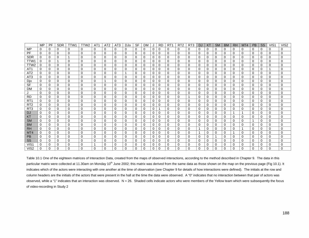
Table 10.1 One of the eighteen matrices of Interaction Data, created from the maps of observed interactions, according to the method described in Chapter 9. The data in this
particular matrix were collected at 11.30am on Monday 10th June 2002; this matrix was derived from the same data as those shown on the map on the previous page (Fig 10.1). It
indicates which of the actors were interacting with one another at the time of observation (see Chapter 9 for details of how interactions were defined). The initials at the row and
column headers are the initials of the actors that were present in the hall at the time the data were observed. A “0” indicates that no interaction between that pair of actors was
observed, while a “1” indicates that an interaction was observed. N = 26. Shaded cells indicate actors who were members of the Yellow team which were subsequently the focus
of video-recording in Study 2
189
The number of actors present on each of the observation maps varied between 23 and 36.
The mean number of actors in each map on the Monday was 29.6, while on Tuesday the
mean number of actors was slightly higher at 31.5.
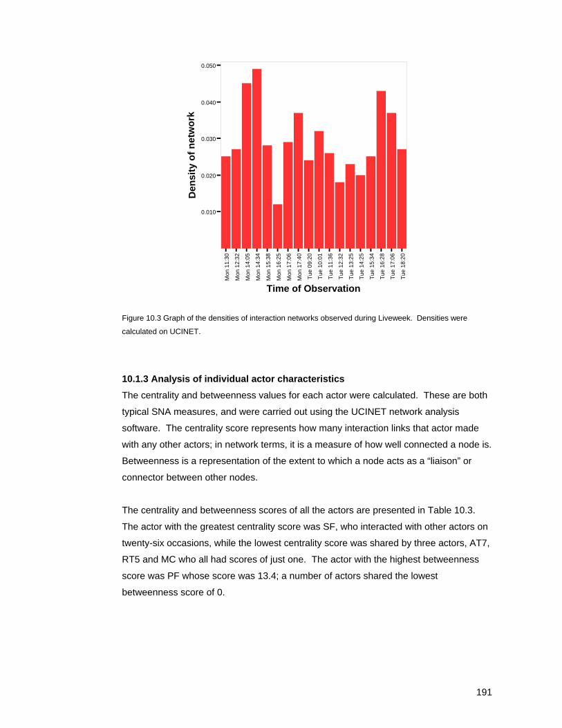
Density is an SNA measure of the ratio of the number of actual links to the number of
possible links in a network. A density value of 0 would indicate a network with no links
between actors, while a value of 1 would indicate that all possible links had been made.
During Liveweek, the densities of all the observed interaction networks were fairly low. They
ranged from a very sparse 0.012 (recorded late on Monday afternoon) to a maximum of
0.049, which was recorded earlier on Monday afternoon. The mean density of the networks
Table 10.2 Summary data for all eighteen sets of observation data, showing the number of actors and the
network densities (an SNA measure of the ratio of the number of actual links to the number of possible links in a
network). For a complete collection of the results for all eighteen data sets (observational maps, interaction
matrices, social network maps and summary SNA data, see Appendix 2).
190
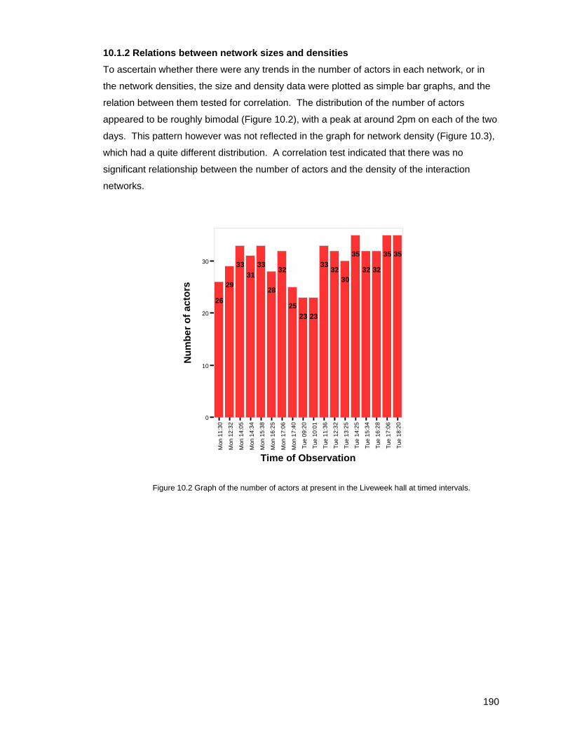
10.1.2 Relations between network sizes and densities To ascertain whether there were any trends in the number of actors in each network, or in
the network densities, the size and density data were plotted as simple bar graphs, and the
relation between them tested for correlation. The distribution of the number of actors
appeared to be roughly bimodal (Figure 10.2), with a peak at around 2pm on each of the two
days. This pattern however was not reflected in the graph for network density (Figure 10.3),
which had a quite different distribution. A correlation test indicated that there was no
significant relationship between the number of actors and the density of the interaction
networks.
Mon
11:
30
Mon
12:
32
Mon
14:
05
Mon
14:
34
Mon
15:
38
Mon
16:
25
Mon
17:
06
Mon
17:
40
Tue
09:2
0
Tue
10:0
1
Tue
11:3
6
Tue
12:3
2
Tue
13:2
5
Tue
14:2
5
Tue
15:3
4
Tue
16:2
8
Tue
17:0
6
Tue
18:2
0
Time of Observation
0
10
20
30
Num
ber o
f act
ors
26
29
3331
33
28
32
2523 23
3332
30
35
32 32
35 35
Figure 10.2 Graph of the number of actors at present in the Liveweek hall at timed intervals.
191
Mon
11:
30
Mon
12:
32
Mon
14:
05
Mon
14:
34
Mon
15:
38
Mon
16:
25
Mon
17:
06
Mon
17:
40
Tue
09:2
0
Tue
10:0
1
Tue
11:3
6
Tue
12:3
2
Tue
13:2
5
Tue
14:2
5
Tue
15:3
4
Tue
16:2
8
Tue
17:0
6
Tue
18:2
0
Time of Observation
0.010
0.020
0.030
0.040
0.050
Den
sity
of n
etw
ork
Figure 10.3 Graph of the densities of interaction networks observed during Liveweek. Densities were
calculated on UCINET.
10.1.3 Analysis of individual actor characteristics The centrality and betweenness values for each actor were calculated. These are both
typical SNA measures, and were carried out using the UCINET network analysis
software. The centrality score represents how many interaction links that actor made
with any other actors; in network terms, it is a measure of how well connected a node is.
Betweenness is a representation of the extent to which a node acts as a “liaison” or
connector between other nodes.
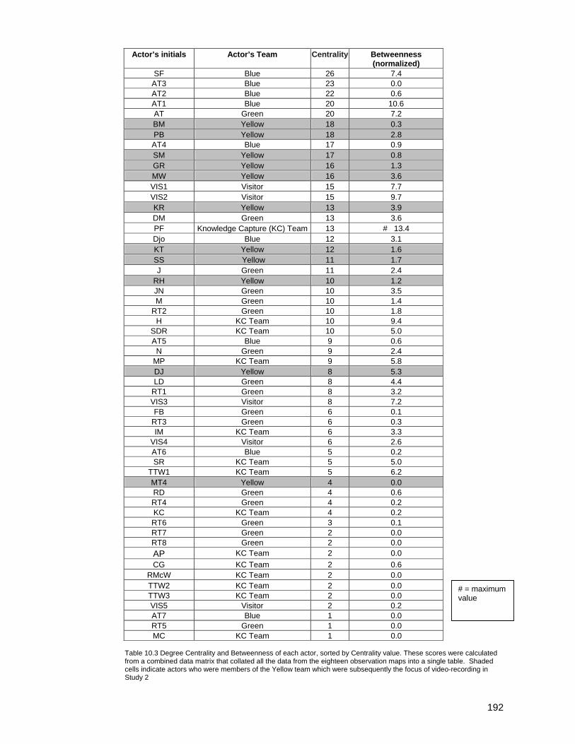
The centrality and betweenness scores of all the actors are presented in Table 10.3.
The actor with the greatest centrality score was SF, who interacted with other actors on
twenty-six occasions, while the lowest centrality score was shared by three actors, AT7,
RT5 and MC who all had scores of just one. The actor with the highest betweenness
score was PF whose score was 13.4; a number of actors shared the lowest
betweenness score of 0.
192
Actor’s initials Actor’s Team Centrality Betweenness (normalized)
SF Blue 26 7.4 AT3 Blue 23 0.0 AT2 Blue 22 0.6 AT1 Blue 20 10.6 AT Green 20 7.2 BM Yellow 18 0.3 PB Yellow 18 2.8 AT4 Blue 17 0.9 SM Yellow 17 0.8 GR Yellow 16 1.3 MW Yellow 16 3.6 VIS1 Visitor 15 7.7 VIS2 Visitor 15 9.7 KR Yellow 13 3.9 DM Green 13 3.6 PF Knowledge Capture (KC) Team 13 # 13.4 Djo Blue 12 3.1 KT Yellow 12 1.6 SS Yellow 11 1.7 J Green 11 2.4
RH Yellow 10 1.2 JN Green 10 3.5 M Green 10 1.4
RT2 Green 10 1.8 H KC Team 10 9.4
SDR KC Team 10 5.0 AT5 Blue 9 0.6
N Green 9 2.4 MP KC Team 9 5.8 DJ Yellow 8 5.3 LD Green 8 4.4
RT1 Green 8 3.2 VIS3 Visitor 8 7.2 FB Green 6 0.1
RT3 Green 6 0.3 IM KC Team 6 3.3
VIS4 Visitor 6 2.6 AT6 Blue 5 0.2 SR KC Team 5 5.0
TTW1 KC Team 5 6.2 MT4 Yellow 4 0.0 RD Green 4 0.6 RT4 Green 4 0.2 KC KC Team 4 0.2 RT6 Green 3 0.1 RT7 Green 2 0.0 RT8 Green 2 0.0 AP KC Team 2 0.0 CG KC Team 2 0.6
RMcW KC Team 2 0.0 TTW2 KC Team 2 0.0 TTW3 KC Team 2 0.0 VIS5 Visitor 2 0.2 AT7 Blue 1 0.0 RT5 Green 1 0.0 MC KC Team 1 0.0
Table 10.3 Degree Centrality and Betweenness of each actor, sorted by Centrality value. These scores were calculated from a combined data matrix that collated all the data from the eighteen observation maps into a single table. Shaded cells indicate actors who were members of the Yellow team which were subsequently the focus of video-recording in Study 2
# = maximum value
193
Team Mean Betweenness of actors
Visitors 5.5 Knowledge Capture 3.5 Blue 2.6 Yellow 2.0 Green 1.8
Table 10.4 Mean betweenness scores of the actors in each Liveweek Team.
10.1.4 Clustering of actors A measure of “clustering” was performed on the combined network data, to see whether
members of the same team tended to interact together as a group, rather than with
members of other teams. The tool used for this was another UCINET statistical function
referred to within the software as “Network Autocorrelation”, essentially it was a
modified ANOVA test. In this case, the Network Autocorrelation function tested the
hypothesis that actors prefer to interact with members of the same team. The result
was significant to a level greater than 0.001, indicating that the clustering of the network
nodes around team membership groups was non-random. In short, the results of this
test showed there was a significant tendency for the team members to interact with
each other, rather than to interact with members of other teams.
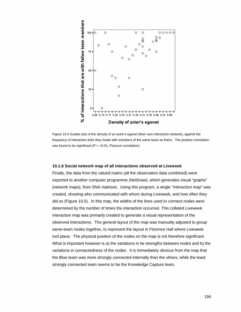
10.1.5 Relationship between density of network and links to non-team members Although the centrality measures in Figure 10.3 show the level of interaction of each of
the teams members, they do not show how many of the interactions occurred within or
out of the teams; they merely indicate the level of interaction between team members
and any other actors. To further investigate whether there was any relationship
between a team member’s activity level and the frequency of interactions they made
within their own team, a scatter plot was made (Figure 10.4). This plot relates the
density of an actor’s personal network (known as an actor’s egonet), which is an
indication of the frequency of their interactions with others, with the frequency of links
made within the team. The result, shown in Figure 10.4, suggests that there is a
positive relationship between an actor’s egonet size and the frequency of their
interactions with fellow team members. A Pearson test for correlation found that the
relationship between these two factors was significant to the 0.01 level. This correlation
suggests that as an actor’s egonet becomes more active (i.e. contains more
interactions), the interactions are more likely to be with fellow team members than with
“outsiders” who are members of a different team.
194
Figure 10.4 Scatter plot of the density of an actor’s egonet (their own interaction network), against the
frequency of interaction links they made with members of the same team as theirs. The positive correlation
was found to be significant (P = <0.01, Pearson correlation)
10.1.6 Social network map of all interactions observed at Liveweek Finally, the data from the valued matrix (all the observation data combined) were
exported to another computer programme (NetDraw), which generates visual “graphs”
(network maps), from SNA matrices. Using this program, a single “interaction map” was
created, showing who communicated with whom during Liveweek, and how often they
did so (Figure 10.5). In this map, the widths of the lines used to connect nodes were
determined by the number of times the interaction occurred. This collated Liveweek
interaction map was primarily created to generate a visual representation of the
observed interactions. The general layout of the map was manually adjusted to group
same-team nodes together, to represent the layout in Florence Hall where Liveweek
tool place. The physical position of the nodes on the map is not therefore significant.
What is important however is a) the variations in tie strengths between nodes and b) the
variations in connectedness of the nodes. It is immediately obvious from the map that
the Blue team was more strongly connected internally than the others, while the least
strongly connected team seems to be the Knowledge Capture team.
195
Figure 10.5 Map of all Observed Interactions During Liveweek. The data in the combined data matrix were transformed into a graphical output using Netdraw. The resulting sociogram shows all interactions observed during Liveweek. Each of the nodes represents an actor, while each node is coloured according to the team to which the actor belonged. The lines between the nodes represent occurrences of interactions. The thicker the line, the more frequently the interaction occurred. The arrangement of the nodes has been manually altered slightly to represent the general positioning in Florence Hall, with each team member positioned roughly in the place where they spent most time during Liveweek.
Blue Team
Green Team
Yellow Team
Knowledge CaptureTeam
KEY
Visitors
196
10.2 Results of Study 2 - Dialogic communication in the collaborative design process The aim of the video-recording had been to collect as much activity and dialogue on
video from a single team as possible. The team chosen for videoing was the Yellow
team, so the bulk of the video data was focussed on members of this team, resulting
in some 10 hours of video-recorded activity. Not all of the recorded sequences
contained dialogue, recordings were also made of team members working on their
computer workstations, sketching designs and so on, so the video recordings were
initially catalogued so that incidences of dialogue could be identified for transcription.
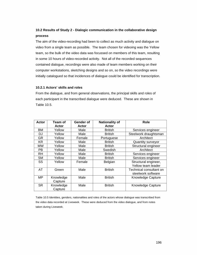
10.2.1 Actors’ skills and roles From the dialogue, and from general observations, the principal skills and roles of
each participant in the transcribed dialogue were deduced. These are shown in
Table 10.5.
Actor Team of Actor
Gender of Actor
Nationality of Actor
Role
BM Yellow Male British Services engineer DJ Yellow Male British Steelwork draughtsman GR Yellow Female Portuguese Architect KR Yellow Male British Quantity surveyor MW Yellow Male British Structural engineer PB Yellow Male Swedish Architect RH Yellow Male British Services engineer SM Yellow Male British Services engineer SS Yellow Female Belgian Structural engineer,
Yellow team leader AT Green Male British Technical consultant on
steelwork software MP Knowledge
Capture Male British Knowledge Capture
SR Knowledge Capture
Male British Knowledge Capture
Table 10.5 Identities, genders, nationalities and roles of the actors whose dialogue was transcribed from
the video data recorded at Liveweek. These were deduced from the video dialogue, and from notes
taken during Liveweek.
197
10.2.2 Overall results of the dialogue coding All of the video-recorded dialogue that involved members of the Yellow team was
transcribed and coded according to the coding scheme presented in Chapter 9. The
data were broken down into 56 “scenes” that ranged between 0.5 and 26 minutes in
length. Eight of these scenes were recorded during Team Meetings. A total of 2211
utterances were transcribed and coded.
The total frequency (in the entire transcribed dialogue) of each kind of statement was
calculated, as were the frequencies of statements in each of the six coding groups in
the entire dialogue. The greatest number of utterances fell into Groups 1 and 2:
Offering Information, or Statements about the Design. The smallest coding group
was Group 3, Feedback and Social Exchange.
A summary of frequencies of the coded utterances appears in Table 10.6.
Coding Group Number of Utterances Subcategories
Code A Code B Code C 1 – Offering information 405 9 307 89
Code D Code E 2 – Organizing 274 179 95
Code G Code H Code N 3 – Feedback and social exchange
75 51 10 14
Code I Code K Code L Code M 4 – Statements about the
design
405 70 122 30 183
Code F Code J 5 – Information-
seeking 306
97 209
Code X 6 - Uncategorized 764 764
Table 10.6 Summary of coding of all of the Yellow team members’ dialogue that was videoed and
transcribed during Liveweek. The table shows the frequencies of each category of statement uttered.
The meaning of each code is as follows:
A - Suggesting an idea (non-skilled, or non skill-specific)
B - Providing skilled advice or suggestion (+ve, agreeing with another, or adding new skilled advice)
C - Providing skilled advice or suggestion (-ve, disagreeing with another, or saying they don’t know
something)
D - Organizing the process
E - Organizing the people
F Stating a problem (identifying a problem)
198
G Giving +ve feedback (“that’s good!”, “nice work” etc.)
H Giving –ve feedback (“you muppet!”, “that’s stupid” etc.)
I Contextualising statement (explaining what’s being discussed etc.)
J Query
K Reporting a past action
L Reporting an intended action (“what we are going to do is”)
M Explaining the design, or explaining what is being shown
N social exchange
X Not categorised
199
10.2.3 Utterance types used by each actor The coded utterances were then considered on an actor-by-actor level, where the
distributions of utterances in each coding group by the individual actors were
examined. The results of this are presented in Table 10.7.
Percentage of Total Utterances In each Code Group
Actor
Group 1 Offering
information (A, B, C)
Group 2 Organizing
(D,E)
Group 3 Feedback
and social
exchange (G,H,N)
Group 4 Statements about the
design (I,K,L,M)
Group 5 Information-
seeking (F,J)
Group 6 Uncategorized
(X)
AT 17 (0,14,3)
24 (17,7)
3 (3,0,0)
10 (0,0,0,10)
7 (3,4)
38 (38)
BM 38 (30,8)
0 (0,0)
0 (0,0,0)
15 (0,8,0,7)
8 (8)
38 (38)
DJ 14 (0,14,0)
7 (0,7)
0 (0,0,0)
24 (0,9,3,10)
17 (7,10)
38 (38)
GR 21 (0,18,3)
5 (3,2)
3 (2,1,0)
25 (2,8,1,14)
7 (2,5)
39 (39)
KR 19 (1,15,3)
7 (5,2)
2 (2,0,0)
25 (3,8,4,10)
16 (6,10)
31 (31)
MP 0 (0,0,0)
0 (0,0)
0 (0,0,0)
15 (0,0,15,0)
23 (0,23)
62 (62)
MW 31 (0,23,8)
10 (6,4)
7 (4,1,2)
13 (3,3,1,6)
12 (3,9)
27 (27)
PB 14 (1,10,3)
7 (5,2)
3 (3,0,0)
19 (4,5,3,7)
17 (7,10)
41 (41)
RH 38 (0,27,11)
2 (0,2)
1 (1,0,0)
18 (3,4,1,10)
13 (10,3)
28 (28)
SM 10 (0,7,3)
0 (0,0)
7 (4,3,0)
17 (0,17,0,0)
30 (3,27)
37 (37)
SR 11 (1,8,2)
4 (2,2)
2 (1,1,0)
10 (5,1,0,4)
30 (3,27)
43 (43)
SS 10 (0,7,3)
24 (16,8)
3 (2,1,0)
19 (4,6,1,8)
11 (5,6)
32 (32)
Table 10.7 Distribution of utterance types for each actor. Figures are percentages, (but may not add up
to 100% due to rounding effects). The figures in brackets show the percentage of utterances in each
respective sub-category within the group (which are identified in the column headers).
The actors whose dialogue primarily concerned offering information were BM and
RH, both of whom were services engineers. The actor who offered the least
information was MP, who was part of the Knowledge Capture team. MP also had a
high score in the information-seeking category, as did SR who was also part of the
Knowledge Capture team.
200
SS, the team leader, as was to be expected from her role, produced a high number
of utterances in the organizing categories. Another actor who had a high score in
this category was AT, who was actually a member of another team who spent some
time working with the Yellow team, and it was not immediately obvious why he
scored highly in this category. The other actor who had a fairly high number of
utterances in the organizing category was MW. This was interesting, as it seemed
that on occasions where there was conflict between MW and SS for who should
perform the role of team leader. Interestingly, MW also had a high score in Group 3
(feedback and social exchanges), which may suggest that in his efforts to secure a
leadership role, he also engaged in more social interaction than the other team
members.
For all the actors a high proportion of their utterances fell into Group 4 (statements
about the design). DJ, GR and KR all had particularly high scores in this group. This
coding group included categories I (contextualising statements), K (reporting a past
action), L (reporting an intended action) and M (explaining what is being shown).
10.2.4 Correlations between utterance types On closer inspection, it became apparent that there could have been a relation
between the scores of each actor in Group 1 (offering Information) and Group 5
(information-seeking). Actors that have a high score in the “offering information”
categories often seemed to have a low score in the “information-seeking” categories,
and vice versa. To test whether there was a relationship between these two
categories, a Spearman rho correlation test (chosen because the data were not
normally distributed) was performed on them. The correlation between the variables
was found to be significant to the 0.05 level. A scatter plot indicated that the relation
between the variables was indeed negative (Figure 10.6), that is to say, as the
number of “information-offering” utterances increased, the number of “information-
seeking” utterances decreased. The level of significance is not high, but it does
suggest that the actors who sought the most information (asked questions, raised
problems etc.) were not the actors who offered most information or answers.
201
Figure 10.6 Scatter plot of the relationship between the total utterances (of all team members whose
dialogue was transcribed) in Coding Groups 1 (offering information) and 5 (information-seeking ). There
is a negative correlation between these variables that is statistically significant to a 0.05 level of
probability.
10.2.5 Uncategorized statements Finally for Study 2, it was noted that the number of statements in the “uncategorized”
group (Group 6), was fairly similar for all the actors at around 30-40%. These
statements mainly represent inaudible utterances, or non-verbal utterances such as
laughter. The exception to the pattern was MP, for whom 62% of his utterances
couldn’t be categorised. In this actor’s case, it’s primarily a reflection of the fact that
he had a very quiet voice that didn’t record clearly and so many of his utterances
simply couldn’t be heard on the video recording.
202
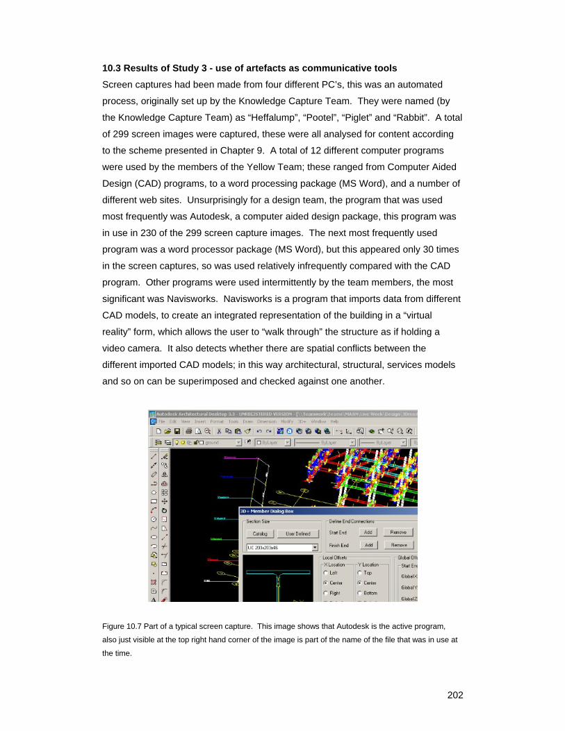
10.3 Results of Study 3 - use of artefacts as communicative tools Screen captures had been made from four different PC’s, this was an automated
process, originally set up by the Knowledge Capture Team. They were named (by
the Knowledge Capture Team) as “Heffalump”, “Pootel”, “Piglet” and “Rabbit”. A total
of 299 screen images were captured, these were all analysed for content according
to the scheme presented in Chapter 9. A total of 12 different computer programs
were used by the members of the Yellow Team; these ranged from Computer Aided
Design (CAD) programs, to a word processing package (MS Word), and a number of
different web sites. Unsurprisingly for a design team, the program that was used
most frequently was Autodesk, a computer aided design package, this program was
in use in 230 of the 299 screen capture images. The next most frequently used
program was a word processor package (MS Word), but this appeared only 30 times
in the screen captures, so was used relatively infrequently compared with the CAD
program. Other programs were used intermittently by the team members, the most
significant was Navisworks. Navisworks is a program that imports data from different
CAD models, to create an integrated representation of the building in a “virtual
reality” form, which allows the user to “walk through” the structure as if holding a
video camera. It also detects whether there are spatial conflicts between the
different imported CAD models; in this way architectural, structural, services models
and so on can be superimposed and checked against one another.
Figure 10.7 Part of a typical screen capture. This image shows that Autodesk is the active program,
also just visible at the top right hand corner of the image is part of the name of the file that was in use at
the time.
203
Program Program Description
Number of times program was active in screen captures
Adobe Acrobat document viewer 1 Autocad CAD program 3 Autodesk CAD program 230 DOS Command Prompt 1 MS Excel spreadsheet
program 1
MS Word word processor 30 Navisworks Three-dimensional
CAD walkthrough program
6
Outlook Web Acess for accessing email on a remote server
5
Pronet document management system
1
Teamwork Web Site 1 Windows Explorer file browser 11 Microstation installation program
1
Table 10.8 Names, descriptions and frequencies of appearance of various computer programs in the
screen capture images taken during Liveweek. A total of 299 screen captures were made. A program
was deemed to be active in the image when it was shown as selected in the image (identified by a blue
bar at the head of the program window).
Outlook web access was used by the users of the workstations called Heffalump and
Rabbit. This program was used for sending and receiving emails from the users’
remotely situated company offices. This is noteworthy because it indicates that they
were maintaining contact with people outside of Teamwork.
The analysis of the data collected for this artefact study is however relatively brief.
This is because most of the detailed analysis of the screen capture images was
conducted through cross-referencing the screen capture data with that from the video
content study (Study 2). Those results therefore will be presented in the next section
of this chapter, which describes the results of the combined analysis data from all
three studies together.
204
10.4 Results of combined analysis of data from all three studies
10.4.1 Relations between the Social Network and Dialogue data (Studies 1 and
2) To assess whether the social network analysis data and the content analysis results
were associated in any way, a number of correlative tests were performed. Factors
such as an actor’s betweenness, centrality and size of egonet were tested for
correlation against each of the coding categories from the content analysis. A
Pearson correlation test was chosen since the data from the content analysis were
categorical and therefore non-normal in distribution. The results of these tests are
Table 10.9. Results of correlation tests between various network measures of Yellow-team actors at
Liveweek (results of Study 1) and the number of statements they uttered in each code category in their
dialogue (results of Study 2). Figures show significance level. N/S = Not significant. A Pearson
correlation test was applied. (N = 12, which represents the total number of team members whose
dialogue was analysed). Three of these relationships were deemed to be significant.1
The meaning of each code is as follows:
A - Suggesting an idea (non-skilled, or non skill-specific)
B - Providing skilled advice or suggestion (+ve, agreeing with another, or adding new skilled advice)
C - Providing skilled advice or suggestion (-ve, disagreeing with another, or saying they don’t know
something)
D - Organizing the process
E - Organizing the people
1 1 Note, the significant results for % total links to members of the same team as the actor with codes B and C were counted as a single positive result, as they both represent the offering of information.
205
F Stating a problem (identifying a problem)
G Giving +ve feedback (“that’s good!”, “nice work” etc.)
H Giving –ve feedback (“you muppet!”, “that’s stupid” etc.)
I Contextualising statement (explaining what’s being discussed etc.)
J Query
K Reporting a past action
L Reporting an intended action (“what we are going to do is”)
M Explaining the design, or explaining what is being shown
N social exchange
Of the 84 correlation tests that were performed on these data, only three revealed
any significant relationships between the Social Network data and the Content data.
Those that were significant were only marginally so, and since the sample size is
small (n=12) it is possible that these correlations are co-incidental.
However, if the results of these correlative tests are treated as revealing true
connections between the data, they suggest that:
• The size of the actor’s network was positively correlated with the number of
utterances they expressed to organize people (Code D).
• The density of the actor’s network was positively correlated with the amount
of positive advice and suggestions they offered to others (Code B).
• The percentage of links that an actor made with fellow team members was
positively correlated with the amount of both negative and positive advice and
suggestions they offered to others (Codes B and C)
10.4.2 Relations between the dialogue and artefact data (Studies 2 and 3) A process of comparison and deduction was used to connect the dialogue captured
in the video recordings with the screen shots captured from the Team member’s
computer workstations. From this, the general layout and positions of workstations
and their users in the Yellow team area were deduced.
Figure 10.8 and Table 10.10 and show the approximate layout of the machines and
the users with which they were most often associated.
206
Heffalump
Piglet
Pootel
Rabbit
BM
GR
MW SS
SM
Key
= computer workstation screen
= computer workstation user
= desk
Figure 10.8 – General Layout and Positions of Workstations and their Users in the Yellow team area.
The initials are those of the team members who were seated in that location most often.
Actor Workstation Name BM GR MW SS SM Piglet 99 1 Pootel 100 Rabbit 30 70
Heffalump 100 Table 10.10 Summary of workstation use by the Yellow Team members during Liveweek. The
workstations were named “Piglet”, “Pootel”, “Rabbit” and “Heffalump”. Figures are percentage use,
measured by occasions that the user was recorded as using that workstation in a screenshot.
207
10.4.3 Percentage use of the different programs The data presented in Table 10.8, which showed the programs used to produce the
files in the screenshots, were reanalysed to represent the actors who used these
programs. Although CAD programs were used by all of the actors, their usage
patterns varied. CAD programs were used for between 58% and 92% of the files
opened by each user. SS and SM used MS Word for word processing quite
frequently, mostly to record knowledge capture data. Table 10.11 shows the
percentage of total files opened in Autocad (the primary CAD program used), and MS
Word.
Percentage of total files opened in these programs BM GR MW SM SS Autocad 90 92 81 58 63MS Word 4 1 15 21 17 Table 10.11 Frequencies of use of Autocad (a CAD program) and Word (a word-processing program) by
the members of the Yellow team during Liveweek. Figures are percentages, representing the
percentage of the total number of files seen in the screen capture images by each actor.
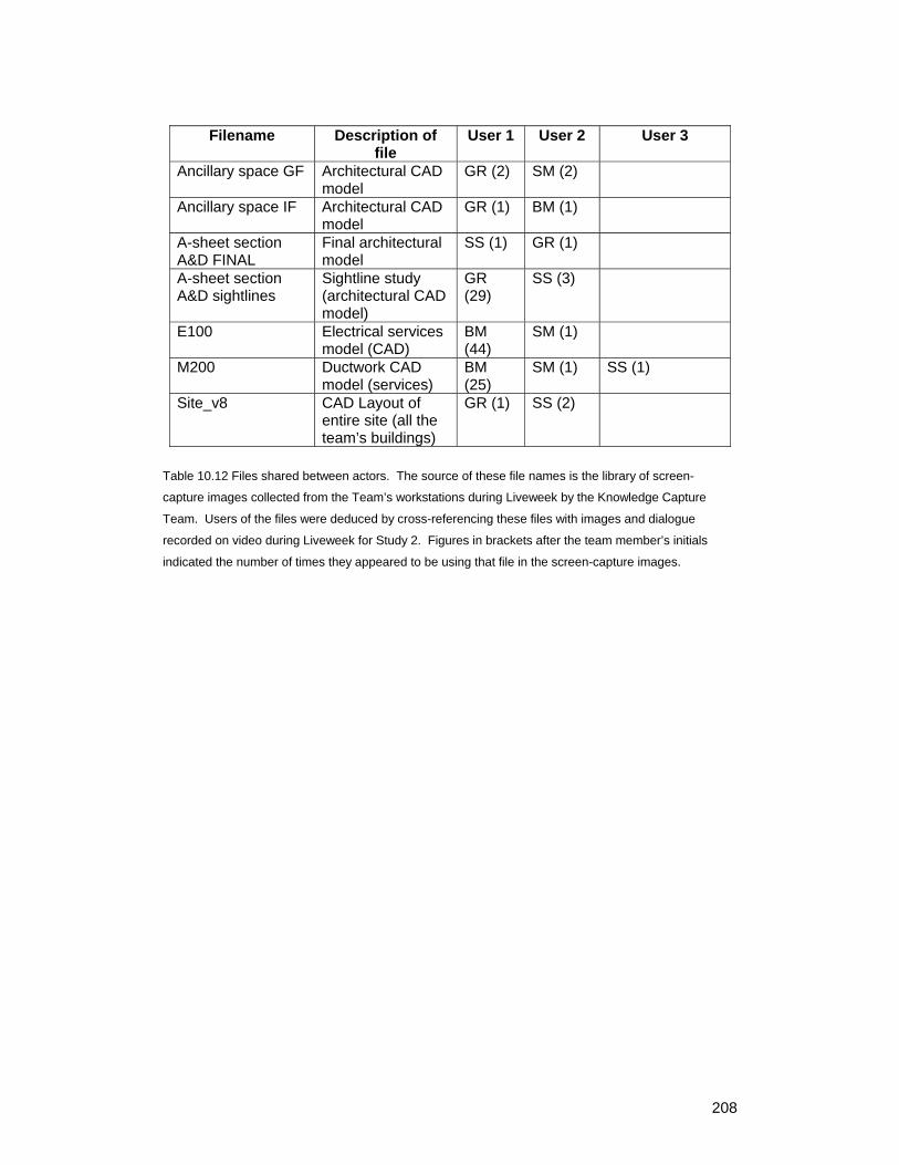
10.4.4 File sharing between users on different workstations A total of 7 files were viewed by more than one actor (on different workstations). One
of these files was viewed by three different actor. All the files that were shared were
CAD models. File use by the various actors is presented in Table 10.12.
208
Filename Description of file
User 1 User 2 User 3
Ancillary space GF Architectural CAD model
GR (2) SM (2)
Ancillary space IF Architectural CAD model
GR (1) BM (1)
A-sheet section A&D FINAL
Final architectural model
SS (1) GR (1)
A-sheet section A&D sightlines
Sightline study (architectural CAD model)
GR (29)
SS (3)
E100 Electrical services model (CAD)
BM (44)
SM (1)
M200 Ductwork CAD model (services)
BM (25)
SM (1) SS (1)
Site_v8 CAD Layout of entire site (all the team’s buildings)
GR (1) SS (2)
Table 10.12 Files shared between actors. The source of these file names is the library of screen-
capture images collected from the Team’s workstations during Liveweek by the Knowledge Capture
Team. Users of the files were deduced by cross-referencing these files with images and dialogue
recorded on video during Liveweek for Study 2. Figures in brackets after the team member’s initials
indicated the number of times they appeared to be using that file in the screen-capture images.