22
ACS-1809-050 Web design and Development Chapter 4

ACS-1809-050 Web design and Development
Chapter 4

ACS-1809-050 – Slides Used In The Course
A note on the use of these slides: These slides has been adopted and/or modified from the original for the use in this course. The author of the text have make these slides available to all (faculty, students, readers) and they obviously represent a lot of work on their part. In return for use, please: • If slides are being used (e.g., in a class) that
the source be mentioned (after all, the author like people to use our book!)
• If any slides are being posted on a www site, note that they are adapted from (or perhaps identical to) the author original slides, and note their copyright of this material.
© McGraw-Hill Osborne Media 2013, HTML. A beginners guide, 5th Edition

Working with Text
• In this chapter we will study – Ensuring Onscreen Readability – Adding Logical Emphasis to Sections of Text – Style Sections of Text Changing Font Characteristics
9/30/2019 3

Ensure Onscreen Readability
• Always try to avoid putting extensive amounts of text on a screen – Difficult on the eyes – Tiresome and inconvenient – Reading from screens is very different from printed materials
• So you better treat them differently – Put no more than 50 percent of the text you would
have used in a hardcopy publication.
9/30/2019 4

Ensure Onscreen Readability
• Keep these points in mind ‐ Keep it short and concise ‐ Web users’ attention to your page likely won’t last over
several screens or several seconds ‐ If you have to put a long article on your website then try to
break it into multiple pages ‐ Separate paragraphs with blank lines
‐ <br> ‐ Limit column widths ‐ To ease and speed reading ‐ It’s suggested a 200-400 pixel width
9/30/2019 5

Ensure Onscreen Readability
• Avoid using underlining – “_” – That means “Link”!
• When centering text, use moderation • Don’t overemphasize • Avoid using all capital letters
– A good example is the street/highway signs • Use lists and group related information
– Easier to scan quickly the contents • The most important information at the top
– Web users might not have the patience to scroll down
9/30/2019 6

Ensure Onscreen Readability
• Use descriptive headlines ‐ Users actually read very little from a mess of text ‐ To help to really catch their attentions
• Make information easy to find ‐ Most studies show users don’t click more than 3 times on a
web site to find information they want ‐ So don’t burry the content deep
• Put a search engine on your website if you have quite some pages
• “5-second” rule ‐ Could the users be able to pick out the main point(s) within
five seconds? If not, you might want to rework the content.
9/30/2019 7

Markup Text
• The ways of formatting text in HTML – Text-level semantics
• How the affected text will be used on the page –Not how it will be displayed – The web browsers decide how to display the affected
text • Examples:
– Abbr, em, dfn, small, strong, sub, sup, ... – Check out Table 4-1 in the textbook, it has a list of the
most commonly used semantics elements
9/30/2019 8

Style Text
• There are so many style properties to affect about any aspect of text – A big portion is about the fonts used to display text on screen
• We will concentrate on this now – However, you as the web designer, don’t have the ultimate
control of the fonts • The web users do!
– Through the configuration of their web browsers
9/30/2019 9

Font Family or Font Faces
There five possible generic font families and they are: • serif (e.g., Times New Roman)
– Serif typefaces have decorative serifs • sans-serif (e.g., Helvetica or Arial)
– San-serif typefaces have straight letter strokes that do not end in serifs
• Monospace (e.g., Courier or New Courier) – all characters take up the same amount of horizontal space on a line
• Cursive (e.g., Zapf-Chancery or Comic Sans) – These fonts emulate a script or handwritten appearance.
• Fantasy (e.g., Western, Impact, or some display-oriented font) – They are purely decorative and would be appropriate for headlines
and other display type. – Fantasy is not commonly used for web sites, as it is difficult to
anticipate which font to use and if it will be legible online.
9/30/2019 10

Font Family or Font Faces
9/30/2019 11
Font Family or Font Faces
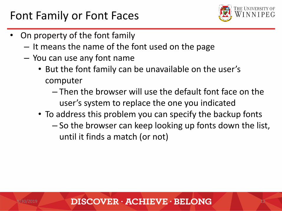
• On property of the font family – It means the name of the font used on the page – You can use any font name
• But the font family can be unavailable on the user’s computer – Then the browser will use the default font face on the
user’s system to replace the one you indicated • To address this problem you can specify the backup fonts
– So the browser can keep looking up fonts down the list, until it finds a match (or not)
9/30/2019 12

Font Family or Font Faces
• Example: <p style=“font-family: ‘gill sans’, verdana, arial, helvetica;”>
• Here I have given the browser four choices, in hopes that it will find one of them on the viewer’s system.</p>
• There are several font faces that have become quite popular – You have a better chance to have them available on the web
users’ computers – Check out Table 4-2 in the textbook
9/30/2019 13

Font Sizes
• You can change the size of the font – You use the font-size property to change the size – There are several ways to do that
• Using Keyword – xx-small, x-small, small, medium, large, x-large, xx-large – Check Table 4-3 in the textbook for the approximate
sizes of the keywords And Figure 4-2 in the textbook for the effect on the
text Even with the same size, the fonts on a Mac look a
tad bit smaller then the same fonts on a PC
9/30/2019 14

Font Sizes
• Relative size – Smaller / larger – To fine tune the font size of the affected text
» Make the text a tad smaller than the default size – It’s flexible to make a change later while still keep this
“smaller/larger” characteristic • Measured size
– Number followed by the unit » 12pt, 9px, 50%, 1.5em
• The last two are relative to the default font of the web browser
9/30/2019 15

Font Sizes
The different units are: • “Ems” (em):
– The “em” is a scalable unit that is used in web document media.
– An em is equal to the current font-size, so if the font-size of the document is 12pt, 1em is equal to 12pt. Ems are scalable in nature, so 2em would equal 24pt, .5em would equal 6pt, etc.
– Ems are becoming increasingly popular in web documents because of the scalability and their mobile-device-friendly nature.
• Pixels (px):
– Pixels are fixed-size units that are used in screen media.
– One pixel equals to one dot on the computer screen.
– Web designers lie to use pixel units in web documents to produce a pixel-perfect representation of their site as it is rendered in the browser.
– The issue with the pixel unit is that it does not scale upward for visually-impaired readers or downward to fit mobile devices.
9/30/2019 16

Font Sizes
The different units are: • Points (pt):
– Points are traditionally used in print media.
– One point is equal to 1/72 of an inch.
– Points are much like pixels, they are fixed-size units and cannot scale in size.
• Percent (%):
– The percent unit is like the “em” unit, with some fundamental differences.
– The current font-size is equal to 100%, i.e. 12pt = 100%.
– When using the percent unit, your text remains fully scalable for mobile devices and for accessibility.
9/30/2019 17

Font Colors
• Very frequently used CSS properties
– The “color” property
• Used to change the color of any item in the foreground
– The “background-color” property
• Used to change the color of any item in the background
– This item can be any HTML element: page, headline, paragraph, etc.
9/30/2019 18

Font Colors
– Example: <p style=“color: purple; background-color: yellow;”>
This is an example of showing how to change the foreground colour and background colour using CSS properties.</p>
When choosing colour, you should follow three basic categories of color theory: • The colour wheel • Colour harmony • Colour context
9/30/2019 19

Colour Wheel

Print Friendly Web Page
• People may want to print your web page, there are two ways to create a print friendly web page – By using PDF file
• Need to create the PDF file and link to the page • Not every one has Adobe reader
– By using CSS file • Need to create two CSS file, one for screen and one for
print <link href="screen_only.css" media="screen" rel="stylesheet" Type="text/css"> <link href="print_only.css" media="print" rel="stylesheet" type="text/css">
• Note the attribute “media” need to be stated so that the browser will use the correct style sheet.

Questions?


