The top window of R Commander will show the R prompt commands that the graphical interface automatically inserts. The bottom window shows the output, unless you ask for a graph, in which case a separate window will open.
Chapter 6
Correlation
6.1 Creating Scatterplots
In this section I work with data from Flege, Yeni-Komshian, and Liu (1999), and our first step in looking for a correlation between age and scores on a foreign accent test will be to examine the data to see whether the relationship between these two continuous variables is linear. Scatterplots are an excellent graphic to publish in papers, because they show all of your data to the reader. I urge you to open up R and follow along with the steps that I will show here. In R, create a scatterplot by first opening the graphical interface R Commander with the command library(Rcmdr). Import the SPSS file called FlegeYeniKomshianLiu.sav and name it flegeetal1999.
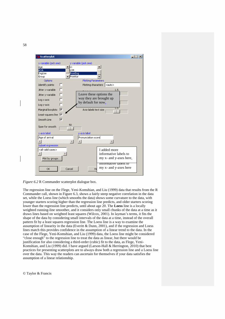
Figure 6.1 Creating a scatterplot in R Commander. In calling for a scatterplot using the GRAPH > SCATTERPLOT drop-down menu (Figure 6.1) you will subsequently see a list of variables for both the x- and the y-variable (Figure 6.2). The only variables that will appear are what R Commander calls ―numeric‖ as opposed to ―character‖ variables. This means that, if you have any variables coded by letters instead of numbers, you will have to change them to numbers in order for them to be visible to the system.
In R Commander, choose GRAPHS and then SCATTERPLOT
Figure 6.2 R Commander scatterplot dialogue box. The regression line on the Flege, Yeni-Komshian, and Liu (1999) data that results from the R Commander call, shown in Figure 6.3, shows a fairly steep negative correlation in the data set, while the Loess line (which smooths the data) shows some curvature to the data, with younger starters scoring higher than the regression line predicts, and older starters scoring lower than the regression line predicts, until about age 20. The Loess line is a locally weighted running-line smoother, and it considers only small chunks of the data at a time as it draws lines based on weighted least squares (Wilcox, 2001). In layman‘s terms, it fits the shape of the data by considering small intervals of the data at a time, instead of the overall pattern fit by a least squares regression line. The Loess line is a way to examine the assumption of linearity in the data (Everitt & Dunn, 2001), and if the regression and Loess lines match this provides confidence in the assumption of a linear trend to the data. In the case of the Flege, Yeni-Komshian, and Liu (1999) data, the Loess line might be considered ―close enough‖ to the regression line to treat the data as linear, but there would be justification for also considering a third-order (cubic) fit to the data, as Flege, Yeni-Komshian, and Liu (1999) did. I have argued (Larson-Hall & Herrington, 2010) that best practices for presenting scatterplots are to always draw both a regression line and a Loess line over the data. This way the readers can ascertain for themselves if your data satisfies the assumption of a linear relationship.
Leave these options the way they are brought up by default for now.
I added more informative labels to my x- and y-axes here
I added more informative labels to my x- and y-axes here.
Figure 6.3 Scatterplot of Flege, Yeni-Komshian, and Liu (1999) pronunciation data, with a regression line (dotted) and a Loess line (solid) imposed on it.
5 10 15 20
24
68
Age of arrival
Pro
nuncia
tion s
core
Creating a Scatterplot in R 1. First make sure your data set is the active one in R Commander by clicking on the ―Data set‖ button in the upper left corner of R Commander‘s interface. From the drop-down menu, choose GRAPHS > SCATTERPLOT. 2. In the ―Scatterplot‖ dialogue box, choose your x- and y-axes variables. You can also customize your graph here by adding axes labels, removing or keeping the regression and Loess lines and marginal boxplots that are called with the standard command, or changing the size of the plotting character. When finished, press OK. 3. The basic scatterplot command in R is: library (car) #this activates the car library, which has the scatterplot command
scatterplot (PronEng~AOA, data=flegeetal1999)
The default scatterplot has boxplots on the margins, a regression line (dotted here), and a Loess (smooth or fit) line that shows
Although R Commander gives you the flexibility to modify variable names or the size of the plotting points, there may be other ways you will want to modify your graph as well. In general, the easiest way that I have found to do this is to copy the R Commander code and paste it to the R Console. This code can then be altered with various arguments to get the desired result. The syntax for making the scatterplot can be found in the upper Script Window of R Commander (see Figure 6.4).
Figure 6.4 Obtaining R commands from the script window of R Commander. The code for the scatterplot in Figure 6.3 is as follows:
scatterplot(PronEng~AOA, reg.line=lm, smooth=TRUE, labels=FALSE, boxplots='xy', span=0.5, xlab="Age of arrival", ylab="Pronunciation score", cex=1.6, data=flegeetal1999) scatterplot (object, . . .) Creates a scatterplot graphic, and needs two
arguments.
PronEng~AOA Specifies the variables to use; the tilde can be read as ―is modeled as a function of,‖ so here pronunciation is modeled as a function of age.
reg.line=lm Tells R to draw a least squares regression line.
smooth=TRUE Calls for a Loess line.
labels=FALSE Suppresses the names of the variables as X and Y labels.
boxplots='xy' Produces boxplots along the margin of the scatterplot.
span=0.5 Refers to how often the data are sampled to create the Loess line.
xlab="Age of arrival" ylab="Pronunciation score"
Put whatever you want to appear on the x- and y-axes in between the quotation marks.
cex=1.6 Magnifies the size of the scatterplot dots relative to the graph; the default is 'cex=1'.
Copy the command from the R Commander script window and then insert it in the R
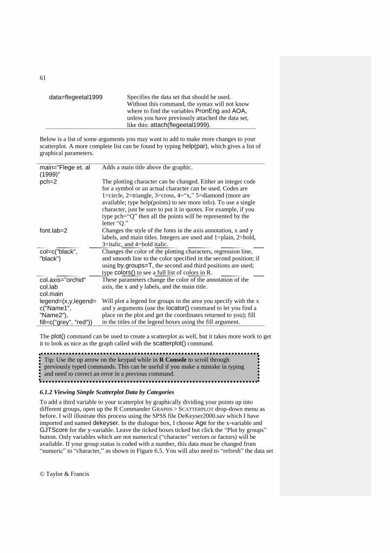
data=flegeetal1999 Specifies the data set that should be used. Without this command, the syntax will not know where to find the variables PronEng and AOA, unless you have previously attached the data set, like this: attach(flegeetal1999).
Below is a list of some arguments you may want to add to make more changes to your scatterplot. A more complete list can be found by typing help(par), which gives a list of graphical parameters.
main="Flege et. al (1999)"
Adds a main title above the graphic.
pch=2 The plotting character can be changed. Either an integer code for a symbol or an actual character can be used. Codes are 1=circle, 2=triangle, 3=cross, 4=―x,‖ 5=diamond (more are available; type help(points) to see more info). To use a single character, just be sure to put it in quotes. For example, if you type pch=―Q‖ then all the points will be represented by the letter ―Q.‖
font.lab=2 Changes the style of the fonts in the axis annotation, x and y labels, and main titles. Integers are used and 1=plain, 2=bold, 3=italic, and 4=bold italic.
col=c("black", "black")
Changes the color of the plotting characters, regression line, and smooth line to the color specified in the second position; if using by.groups=T, the second and third positions are used; type colors() to see a full list of colors in R.
col.axis="orchid" col.lab col.main
These parameters change the color of the annotation of the axis, the x and y labels, and the main title.
Will plot a legend for groups in the area you specify with the x and y arguments (use the locator() command to let you find a place on the plot and get the coordinates returned to you); fill in the titles of the legend boxes using the fill argument.
The plot() command can be used to create a scatterplot as well, but it takes more work to get it to look as nice as the graph called with the scatterplot() command.
6.1.2 Viewing Simple Scatterplot Data by Categories
To add a third variable to your scatterplot by graphically dividing your points up into different groups, open up the R Commander GRAPHS > SCATTERPLOT drop-down menu as before. I will illustrate this process using the SPSS file DeKeyser2000.sav which I have imported and named dekeyser. In the dialogue box, I choose Age for the x-variable and GJTScore for the y-variable. Leave the ticked boxes ticked but click the ―Plot by groups‖ button. Only variables which are not numerical (―character‖ vectors or factors) will be available. If your group status is coded with a number, this data must be changed from ―numeric‖ to ―character,‖ as shown in Figure 6.5. You will also need to ―refresh‖ the data set
Tip: Use the up arrow on the keypad while in R Console to scroll through previously typed commands. This can be useful if you make a mistake in typing
and need to correct an error in a previous command.
by changing to a different active data set and then coming back to your original data set. You can also change the variable to a factor by using the R Console:
dekeyser$Status<-factor(dekeyser$Status)
Figure 6.5 Changing a numeric to a character variable in R Commander. In the DeKeyser data, however, this is already a factor, so you can just click on Status when you open the ―Plot by groups‖ button (see Figure 6.6).
Figure 6.6 Plot by groups button in R scatterplot command. The resulting graph, in Figure 6.7, shows the data split into two groups, one who arrived in the US before age 15 and one who arrived after.
To get a variable to appear in the ―Plot by groups‖ box, click on the ―Edit data set‖ button. The Data Editor spreadsheet appears. Click
on a variable name.
If the variable is numeric, it will not appear in the ―Plot by groups‖ box. Change
Figure 6.7 R scatterplot of DeKeyser (2000) data with division into groups. A legend is automatically added in the upper margin. The syntax of this command changes slightly from that found in the previous section. A simplified version is:
scatterplot(GJTScore~Age | Status, by.groups=TRUE, data=dekeyser) The main difference is that Status is added as a splitting variable, and the command by.groups=TRUE is added. If by.groups is set to FALSE, the regression and Loess lines will be drawn over the entire group.
In some cases you may have a large number of variables to correlate with each other, and in these cases it would be very tedious to graphically examine all of the correlations separately to see whether each pairing were linear. Statistics programs let us examine multiple scatterplots at one time. I will use data from my own research, Larson-Hall (2008), to illustrate this point (to follow along, import the SPSS file LarsonHall2008.sav and call it larsonHall2008). I examine a subset of Japanese learners of English who began studying formally outside of school when they were younger than age 12. To make the graphics manageable, I will show only scatterplots from a 3×3 matrix of the variables of language aptitude test scores, age, and a score for use of English. In R Commander, choose GRAPHS > SCATTERPLOT MATRIX. In the Scatterplot Matrix dialogue box, choose three or more variables in the normal way that you would select multiple items in Windows (hold down the Ctrl key while left-clicking separate variables, or use ―Shift‖ and scroll down with the left mouse key to highlight adjacent variables). I chose the variables age, aptscore, and useeng. In the dialogue box you have your choice of graphics to insert in the diagonal: density plots, histograms, boxplots, one-dimensional scatterplots, normal Q-Q plots, or nothing. You can experiment with which of these extra plots may be the most informative and understandable. The one shown in Figure 6.8 is the default, which is the density plot. This plot gives you a good sense of the distribution of the data, if the variable is not a categorical one (if it is, the distribution will be very discrete, as in the density plot for age). The matrix scatterplot is necessarily information-rich, so take some time to really study it. You are basically looking to see whether you are justified in assuming the linearity of your variables. Note that you will need to look at the graphs only either above or below the diagonal (they are mirror images of one another).
Splitting Data into Groups on a Scatterplot in R 1. First make sure the variable you will use to split groups by is categorical and flagged as a ―character‖ variable by R. If not, use the factor command in R Console:
dekeyser$Status<-factor(dekeyser$Status) 2. From R Commander‘s drop-down menu, choose GRAPHS > SCATTERPLOT and then use the ―Plot by groups‖ button to choose the splitting variable. In R Console, the basic command for a split-group scatterplot is:
Figure 6.8 R multiple scatterplot of Larson-Hall (2008) data. This graphic is implemented with the following syntax:
scatterplot.matrix(~age+aptscore+useeng, reg.line=lm, smooth=TRUE, span=0.5, diagonal = 'density', data=larsonhall2008) The command scatterplot.matrix creates the matrix, and the variables are listed after the tilde. They are combined using a plus sign. The only other command that is different from the simple scatterplot command is diagonal = 'density', which plots a density plot along the diagonal (other choices are 'histogram', 'boxplot', 'oned' (one-dimensional scatterplots), 'qqplot', and 'none'). The scatterplot.matrix command gives both the regression line and the smooth line over all of the plots for the default option. The fact that the smooth line is not very different from the regression line leads us to conclude that these correlations are linear enough to perform further calculations. If you have a data frame that contains only the variables you want to examine, you can call a multiple scatterplot with the simple command plot().
6.2 Application Activities with Creating Scatterplots
1. Use the dekeyser file, if you have followed along with me in the text (otherwise, import the SPSS file called DeKeyser2000.sav and name it dekeyser). Create a scatterplot for the variables of Age and GJTScore. Do there appear to be any outliers in the data? If so, identify them. Comparing the regression line and the Loess line, would you say the data are linear? What trends can you see? 2. DeKeyser noted that the results on the test for participants who had arrived in the US before age 15 and after age 15 seemed to have different kinds of shapes. The data is already split along this dimension by the variable Status. Recreate the scatterplot in Figure 6.7 (from the online document ―Correlation.Creating scatterplots‖), which adds a third dimension (group division) to the scatterplot. What kind of relationship do age and test scores have for each of these groups? 3. Import the SPSS file LarsonHall2008.sav and name it larsonhall2008. This data set was gathered from 200 Japanese college learners of English. The students took the same 200-item grammaticality judgment test that DeKeyser‘s (2000) participants took. Create a simple scatterplot of the variables gjtscore and totalhrs of study to see whether students performed better on this test the more hours of study of English they had. Is there a positive linear relationship among the variables of totalhrs (total hours studied) and gjtscore, so that we could say that, with more hours of study of English, students perform better on the test? Do you note any outliers in the data? If so, identify them. 4. Using the same data set as in activity 3, graphically divide the data into two groups—early learners and later learners—using the variable erlyexp. I wanted to know whether students who had taken private English lessons before age 12 (early learners) would ultimately perform better on morphosyntactic tests than Japanese learners who started study of English only in junior high school at age 12 (later learners). Separate your graph into these two groups. What trends can you see? Comparing the regression line and the Loess line, would you say the data are linear? 5. Import the SPSS file BEQ.Swear.sav and name it beqSwear (this data comes from the Dewaele and Pavlenko Bilingual Emotions Questionnaire). This data was gathered online by Dewaele and Pavlenko from a large number of bilinguals. Explore whether there is a correlation between the age that bilinguals started learning their L2 and their own self-ratings
Creating a Multiple Scatterplot in R
1. On the R Commander drop-down menu, choose GRAPHS > SCATTERPLOT MATRIX. When a dialogue box comes up, select multiple variables by holding down the Ctrl button and clicking on the variables. All of the variables must be numeric, not character (in other words, they cannot be categorical variables). Use the ―Plot by groups‖ button if you would like to split groups. Choose an additional graph to put on the diagonal, such as a density plot or histogram. When finished, press OK. 2. The basic command in R Console for a 3×3 scatterplot matrix is:
of proficiency in speaking their L2 by creating a scatterplot between the variables of agesec and l2speak. What trend can you see? Are the data linear?
6.3 Calculating Correlation Coefficients
In order to perform a correlation using R Commander, choose STATISTICS > SUMMARIES >
CORRELATION MATRIX. Choose at least two variables; then choose the type of correlation test you want (Pearson‘s is the parametric test, Spearman‘s is the non-parametric, and partial is when you want to factor out the influence of another continuous variable). You can also choose to get p-values for the correlations, which I recommend calling for.
Figure 6.9 Obtaining correlations in R.
The results print out in the Output Window of R Commander. Below is the information you would get from either R Commander or running the code in R from the command:
Tip: R will enter variables in alphabetical order no matter in what order you choose
to enter them.
Click here to choose whether to use Pearson‘s r or Spearman‘s rho (partial correlation is explained later in this chapter). Click in the box for
―Pairwise p-values.‖
The variables list includes both categorical and continuous variables. Choose as many variables as you like.
The first table of numbers is the correlation coefficient. This means that, among the variables of language learning aptitude (aptscore), grammatical ability (gjtscore), and total hours spent in study of English (totalhrs), the strongest correlation is between grammatical ability and hours spent in study (r=.18). The ―n=200‖ underneath the table states that there are 200 participants in each comparison. The last two tables are tables of p-values, and they are symmetric about the diagonal line, so you need to look only at three of them. In the first table of raw p-values from pairwise comparisons, the only comparison which is statistical is the one between gjtscore and totalhrs, as we might have suspected from the weak strength of the other correlations (.07 and .08 are very weak correlations). The second table gives p-values adjusted for having multiple comparisons, and uses the Holm adjustment. The Holm adjustment is more liberal than the more commonly known adjustment, the Bonferroni.
The R code for obtaining this correlation asks you to first open the Hmisc library, but at a lower position (#4) on R‘s search list:
rcorr.adjust(larsonhall2008[,c("aptscore","gjtscore","totalhrs")], type="pearson") rcorr.adjust Runs a correlation matrix that also shows
raw and adjusted p-values for pairwise correlations between each two variables. Observations are filtered for missing data and only complete observations are used.
larsonhall2008[ , ] Specifies the variables to use from this data set; the blank before the comma means to use all of the rows, and variables
This is the number of cases tested; if the number differed depending on the pairing, the ―n‖ would also be reported in a matrix, but in this
case all pairings have 200 cases.
Tip: In R Console, to bring up your previous command line and modify it, instead of typing the entire command all over again push the UP arrow.
listed after the comma specify the columns to use.
c("aptscore","gjtscore","totalhrs") Tells R to use these three columns from the data set.
type="pearson" Calls for Pearson correlation coefficients; Pearson is default but you can also choose ―spearman.‖
In order to perform a Kendall‘s tau correlation, only one pairing can be investigated at a time. You can use R Commander, following the STATISTICS > SUMMARIES > CORRELATION test menu, or R Console with the cor.test() command, method specified as ―kendall‖:
Whereas the Pearson correlation did not find a statistical relationship between the aptitude and grammar scores, the Kendall‘s tau correlation did (p=.01), with a stronger correlation coefficient (tau=.12, whereas the Pearson r=.08). The command cor.test can also be used with the method specified as ―spearman‖ (or Pearson will be used as a default if no method is specified). However, as this command can return values for only one pairing at a time, I have not concentrated on it in this discussion.
Tip: To get a list of the variable names in R, type names(larsonhall2008), inserting your own data set name instead of ―larsonhall2008.‖ This will produce a list of the variable names in the data set.
Obtaining Correlation Coefficients with R In R Commander, choose STATISTICS > SUMMARIES > CORRELATION MATRIX. Choose variables, type of correlation test, and tick box for ―Pairwise p-values‖ In R code:
#this can return Pearson and Spearman coefficients
cor.test(larsonhall2008$ aptscore, larsonhall2008$ gjtscore, method="kendall") #this test can give Pearson, Spearman and Kendall‘s tau coefficients, but doesn‘t return #p-
As has been mentioned previously, ―classical‖ correlation is not robust to violations of assumptions, especially the assumption that the data are normally distributed and that there are no outliers. If you understand how to do correlation in R, it is a simple matter to incorporate methods of correlation which are robust to outliers into your analysis. One command that I like for calculating robust correlation is cor.plot in the mvoutlier library. This command also produces a graph which plots an ellipse around the data points that would be included in the ―classical‖ correlation and those that would be included in the robust correlation. The mvoutlier documentation on this command says that ―Robust estimation can be thought of as estimating the mean and covariance of the ―good‖ part of the data.‖ The calculation is based on the fast minimum covariance determinant described in Pison, Van Aelst, and Willems (2002), and more information about robust detection of outliers is found in Rousseeuw and Leroy (1987). Another command that is easy to implement is cov.rob in the MASS library. I will demonstrate the use of both of these calculations, which are quite similar to each other but highly different from ―classical‖ correlation. I will look at the correlation between age and scores on the GJT in the DeKeyser (2000) study. We have previously worked with this data set and seen that DeKeyser would like to divide the group up into participants who arrived in the US before and after age 15. However, if we try to do an overall correlation on the entire data set, the ―classical‖ correlation command of cor will assume a linear relationship and calculate a correlation coefficient for r. To remind you of what these data look like, I give a scatterplot in Figure 6.10.
Figure 6.10 Scatterplot of the dekeyser variables of age and gjtscore. Now we will see what kind of correlation we obtain with the robust correlation commands.
The output reminds us that the classical correlation was strong and negative. This robust correlation says that the correlation is positive but very small, with r=.037. The graph that is plotted in response to this command is very informative.
Figure 6.11 Comparison of data included in classical and robust correlations. The graph from this command (in Figure 6.11) shows an ellipse in a dotted line around the data that would be considered in a classical correlation (which actually has an outlier, so it is slightly different from our previous calculation which did not remove any outliers), and a solid line around the data that is considered to be a ―good‖ representative of the center of the bivariate relationship between the data. In fact, the correlation has basically done what we already knew we should do with the data, which is to consider it as coming from two separate groups and calculate correlations individually. The robust correlation included just the data from the participants who arrived in the US later. The cov.rob() command gives basically the same results:
library(MASS) cov.rob(cbind(Age,GJTScore),cor=T) #notice that the variables get bound together using #cbind() detach(dekeyser) If you‘re following along with me you‘ll notice that the robust correlation for this command is slightly different from the cor.plot() command. The difference in calculations relates to the method of estimating the ―good‖ part of the data, but the differences here are very small in comparison to the differences between the ―classical‖ correlation coefficient and the robust correlations.
Just one more note. Some readers may think that non-parametric approaches are robust as well, but an example of a Spearman‘s correlation on this data will show this is not so (Spearman‘s correlation is non-parametric).
cor(AGE, GJTSCORE, method="spearman") [1] -0.549429 Here we see that the correlation coefficient is still negative, and it is still much higher than that found by the robust correlation.
6.4 Application Activities with Calculating Correlation Coefficients
6.4.1 Pearson Correlation
1. Use the dekeyser file (import the SPSS file called DeKeyser2000.sav and name it dekeyser). What correlation did DeKeyser (2000) find between age of arrival (Age) and scores on the GJT (GJTScore) over the entire data set? What correlation did he find when the participants were divided into two groups based on their age of arrival (use the Status variable to split groups; use the quick and dirty method of dividing into groups by specifying the row numbers for each group and go to the R Console with the code for the previous correlation. The ―Under 15‖ group goes in rows 1–15 and the ―Over 15‖ group goes in rows 16–57)? Before performing a correlation, check to see whether the assumptions for parametric correlations hold (but still perform the correlation even if they do not hold). Say something about effect size. 2. Use the flegeetal1999 file (import the SPSS file called FlegeYeniKomshianLiu.sav and name it flegeetal1999). What correlation did Flege, Yeni-Komshian, and Liu (1999) find between the variables of age of arrival (AOA), pronunciation skill in English (PronEng), and pronunciation skill in Korean (PronKor)? Before performing a correlation, check to see whether the assumptions for parametric correlations hold (but still perform the correlation even if they do not hold). Say something about effect size. 3. Use the file larsonhall2008 file (import the SPSS file LarsonHall2008.sav and name it larsonhall2008). There is a variety of variables in this file; let‘s look for relationships between use of English (useeng), how much participants said they liked learning English (likeeng), and score on the GJT test (gjtscore). In other words, we‘re looking at three different correlations. First, check for assumptions for parametric correlations. Do you note any outliers? Note which combinations do not seem to satisfy parametric assumptions. Then
Performing Robust Correlations in R I introduced two commands from different libraries: From the mvoutlier library: cor.plot(Age,GJTScore) #can only do two variables at a time This returns an informative plot From the MASS library:
cov.rob(cbind(Age,GJTScore),cor=T) #can only do two variables at #a time
go ahead and check the correlations between these variables, checking both Pearson‘s and Spearman‘s boxes if assumptions for Pearson‘s are violated. What are the effect sizes of the correlations? 4. Import the SPSS file BEQ.Swear.sav and name it beqSwear (this data comes from the Dewaele and Pavlenko Bilingual Emotions Questionnaire). What correlation was found between the age that bilinguals started learning their L2 (agesec) and their own self-ratings of proficiency in speaking (l2speak) and comprehending their L2 (l2_comp)? First, check for assumptions for parametric correlations. Do you note any outliers? Note which combinations do not seem to satisfy parametric assumptions. Then go ahead and check the correlations between these variables, checking both Pearson‘s and Spearman‘s boxes if assumptions for Pearson‘s are violated. What are the effect sizes of the correlations?
6.4.2 Robust Correlation
1. Perform a robust correlation on the Flege, Yeni-Komshian, and Liu (1999) data (seen in activity 2 under ―Pearson Correlation‖ above, the file is called flegeetal1999) with the variables of age of arrival (AOA), pronunciation skill in English (PronEng), and pronunciation skill in Korean (PronKor). Do you find any differences from the classical correlations? 2. Perform a robust correlation on the Larson-Hall (2008) data (imported from the SPSS file LarsonHall2008.sav and named larsonhall2008) with the variables of use of English (useeng), how much participants said they liked learning English (likeeng), and score on the GJT test (gjtscore). Do you find any differences from the classical correlations? Note that our robust tests will not work on data sets with missing data (you will need to impute the missing data!). 3. Perform a robust correlation on the Dewaele and Pavlenko (2001–2003) data (imported from the SPSS file BEQ.Swear.sav and named beqSwear) with the variables of age that bilinguals started learning their L2 (agesec) and their own self-ratings of proficiency in speaking (l2speak). Do you find any differences from the classical correlations? Again, note that you will have to impute data to get this to work.
6.5 Partial Correlation
In R Commander a partial correlation is done by including only the pair of variables that you want to examine and the variable you want to control for. In other words, in order to get the correlation between LOR and aptitude while controlling for age, I will include only these three variables in the correlation. The partial.cor() command in R will return a matrix of partial correlations for each pair of variables, always controlling for any other variables that are included. If you want to follow what I am doing, import the SPSS file LarsonHallPartial.sav and name it partial. The steps to performing a partial correlation are exactly the same as for performing any other correlation in R Commander: STATISTICS > SUMMARIES > CORRELATION MATRIX. Choose the two variables you are interested in seeing the correlation between (I want aptitude and LOR), and then the variable(s) you want to control for (age), and click the Partial button (it doesn‘t matter if you check the box for pairwise p-values; you will not get p-values with the partial correlation command). The syntax for this command, in the case of the partial correlation between LOR and aptitude while controlling for age, is:
This syntax should look familiar, as it is almost exactly the same as the rcorr.adjust() command; just the command partial.cor() is new. The argument use="complete.obs" is inserted in order to specify that missing values should be removed before R performs its calculations.
The output shows the Pearson r-value for the pairwise correlation. The results show that the correlation between LOR and aptitude are not statistical when age is removed from the equation (compare that to the non-partial correlation coefficient, which was r=−.55!). Note that I don‘t have a p-value but I don‘t actually need it because I can see that the effect size is now negligible. What the fact that the correlation is non-statistical with age partialled out means is that declines in scores on the aptitude test are almost all actually due to age. In order to test the other correlation we are interested in, that between LOR and accuracy when age is controlled, we would need to perform another partial correlation with only those three variables included. Doing so shows that there is still a strong correlation between LOR and accuracy (r=−.75).
6.6 Point-Biserial Correlations and Inter-rater Reliability
6.6.1 Point-Biserial Correlations and Test Analysis
Import the SPSS file LarsonHallGJT.sav as LHtest. To conduct the reliability assessment in R Commander choose STATISTICS > DIMENSIONAL ANALYSIS > SCALE RELIABILITY. Pick the total test score (TotalScore) and the dichotomous scores for each item (for demonstration purposes I will show you the output just for the last three items of the test, Q43, Q44 and Q45).
We are interested in only one of these numbers—the correlation between LOR and
aptitude.
Partial Correlation in R In R Commander, choose STATISTICS > SUMMARIES > CORRELATION MATRIX. Choose the radio button for ―Partial.‖ Choose three variables—the two you want to see correlated with the third variable the one you want to partial out. (Actually, you can partial out more than one at a time; just add another to the mix.) R code (looking at correlation between two of the variables with the third partialled out):
The output first shows the overall reliability for these three items (it is low here but would be higher with more items). The point-biserial correlation for each item is the third column of data titled ―r(item, total),‖ and the line above the columns informs us that, appropriately, this has been calculated by deleting that particular item (say, Question43) from the total and then conducting a correlation between Q43 and the total of the test (also called the Corrected Item-Total Correlation). Oller (1979) states that, for item discrimination, correlations of less than .35 or .25 are often discarded by professional test makers as not being useful for discriminating between participants.
6.6.2 Inter-rater Reliability
To calculate the intraclass correlation for a group of raters, in R Commander choose STATISTICS > DIMENSIONAL ANALYSIS > SCALE RELIABILITY, as was seen above for test item analysis. Choose all of the variables except for ―Speaker.‖ The columns you choose should consist of the rating for each participant on a different row, with the column containing the ratings of each judge. Therefore, in the MDM data set, variable M001 contains the ratings of Mandarin Judge 1 on the accent of 48 speakers, M002 contains the ratings of Mandarin Judge 2 on the accent of the 48 speakers, and so on. The reliability() command will calculate Cronbach‘s alpha for a composite scale.
Conducting a Point-Biserial Correlation with R In R Commander choose STATISTICS > DIMENSIONAL ANALYSIS > SCALE RELIABILITY. If doing test item analysis, pick the total test score and the dichotomous scores for each item. The R code is:
Whereas for test analysis we were most interested in the third column, the corrected item-total correlation, here we will be interested in the second column, which contains the standardized Cronbach‘s alpha. For the Mandarin judges overall, Cronbach‘s alpha is 0.89. This is a high correlation considering that there are ten items (judges). In general, we might like a rule of thumb for determining what an acceptable level of overall Cronbach‘s alpha is, and some authors do put forth a level of 0.70–0.80. Cortina (1994) says determining a general rule is impossible unless we consider the factors that affect the size of Cronbach‘s alpha, which include the number of items (judges in our case) and the number of dimensions in the data. In general, the higher the number of items, the higher alpha can be even if the average correlations between items are not very large and there is more than one dimension in the data. Cortina says that, ―if a scale has enough items (i.e. more than 20), then it can have an alpha of greater than .70 even when the correlation among items is very small‖ (p. 102). It is therefore important to look at the correlations between pairs of variables, and this means we should look at a correlation matrix between all of the variables. Call for this in R code with the familiar rcorr.adjust() command:
Because the matrix is repeated above and below the diagonal line, you need to look at only one side or the other. By and large the paired correlations between judges are in the range of 0.30–0.60, which are medium to large effect sizes, and this Cronbach‘s alpha can be said to be fairly reliable. However, if the number of judges were quite small, say three, then
Cronbach‘s alpha would be quite a bit lower than what is obtained with 10 or 20 items even if the average inter-item correlation is the same. Try it yourself with the data— randomly pick three judges and see what your Cronbach‘s alpha is (I got .65 with the three I picked). Why don‘t we just use the average inter-item correlation as a measure of reliability between judges? Howell (2002) says that the problem with this approach is that it cannot tell you whether the judges rated the same people the same way, or just if the trend of higher and lower scores for the same participant was followed. Another piece of output I want to look at is the reliability if each item (judge) individually were removed. If judges are consistent then there shouldn‘t be too much variation in these numbers. This information is found in the first column of data next to each of the judges (m001, m002, etc.) in the output for the reliability() command above. Looking at this column I see that there is not much difference in overall Cronbach‘s alpha if any of the judges is dropped for the Munro, Derwing, and Morton (2006) data (nothing drops lower than 86%), and that is a good result. However, if there were a certain judge whose data changed Cronbach‘s drastically you might consider throwing out that judge‘s scores. Overall test reliability is often also reported using this same method. For example, DeKeyser (2000) reports, for his 200-item grammaticality judgment test, that ―The reliability coefficient (KR-20) obtained was .91 for grammatical items [100 items] and .97 for ungrammatical items‖ (p. 509) (note that, for dichotomous test items, the Kuder–Richardson (KR-20) measure of test reliability is equal to Cronbach‘s alpha). DeKeyser gives raw data in his article, but this raw data does not include individual dichotomous results on each of the 200 items of the test. These would be necessary to calculate the overall test reliability. Using the file LarsonHallGJT.sav file (imported as LHtest) I will show how to obtain an overall test reliability score if you have the raw scores (coded as 1s for correct answers and 0s for incorrect answers). I could use the previous reliability() command, but I‘m going to introduce another possibility here. That is the alpha() command from the psych library. I like it because I don‘t have to list individual items, but can instead put the whole data frame into the command. For the LHtest data, though, I just have to make sure I delete any variables (like ID or TotalScore) that are not individual items I want analyzed.
library(psych) alpha(LHtest)
The beginning of the output shows me that with all 40 items I have a Cronbach‘s alpha (under the ―raw_alpha‖ column) of 0.67, which can also be reported as a KR-20 score of .67. This is not very high considering how many items I have, so it would be hard to call this a highly reliable test. (I made it up myself and it clearly needs more work! I actually presented a conference paper at AAAL 2008 where I used R to analyze the data with IRT methods, and I would be happy to send you this presentation if you are interested.)
Calculating Inter-rater Reliability In R Commander, get a measure of the intraclass correlation (measured as Cronbach‘s alpha) and the reliability of the ratings if each item (judge) were removed by choosing STATISTICS > DIMENSIONAL ANALYSIS > SCALE RELIABILITY and choosing all of the items in your test (often the rows are different judges who judged the data). The R code for this is:
reliability(cov(MDM[,c("m001","m002","m003","totalScore")], use="complete.obs")) Alternatively, you don‘t have to type in individual names of variables if you use:
library(psych) alpha(MDM) Just make sure to delete any variables first that aren‘t test items! One more piece of information you should examine is a correlation matrix among all your items, and make sure none of them have extremely low correlations. Call for the correlation matrix with the R code: