Page 1
1
CHAPTER FOUR - TREATMENT OF GROUPED SAMPLE DATA
Frequency Distribution
The probability distribution of a random variable is often very useful in studying the
behaviour of the distribution if presented in a suitable form. Considerable information can
be obtained by grouping our data into classes and determining the number of observations
in each of the classes. Such an arrangement is called a frequency distribution.
Frequency distribution is one of the ways in which we can organize a large number of
data. Data that are presented in the form a frequency distribution are called grouped data.
The number of observations falling in a particular class is called the class frequency and is
denoted 𝑓.
The basic way to build frequency distribution is to divide the range of data values into
classes or (class center) and limit the number of data within each class (or class center).
Example 1.
The following data represent the grades of 32 students in physics in the ministerial
exam for the preparatory stage
22, 47, 88, 71, 34, 54, 62, 41, 36, 87, 76, 69, 48, 29, 33, 66, 42, 52, 58, 99, 53, 57, 59, 74,
39, 45, 42, 58, 63, 84, 55, 58.
The following table represents the frequency distribution of these grades.
From the above example, it is shown that the
frequency distribution is a table consisting of classes,
namely the values of observations or measurements, and the frequencies
corresponding to these classes.
When building the frequency distribution, we have to take in view the following points:
frequency classes 2 20-30
4 30-40
6 40-50
9 50-60
4 60-70
3 70-80
3 80-90
1 90-100
32 Total
Page 2
2
1. Classes must be separated.
2. The classes should be of equal length.
3. The classes are sufficient to hold the data. This means that if we look at any value in the
data we can put it in one class. This allows us to enter all the data in the frequency
distribution classes and the sum of these frequencies equal to the number of data, i.e. if the
number of data is n we have ∑ 𝑓i = nk𝑖=1 (where k represents the number of classes).
To construct the above frequency distribution table, we follow these steps:
-Calculate the range that equals the difference between the largest and smallest numerical
values for that class. 99-22 = 77.
-One integer is added to the range to include the smallest and largest decimal (77 + 1 = 78).
-Choose a suitable class length so that we can get a number of classes between 6 and 15
(class length 10).
-The number of classes is calculated by dividing (range +1) by the length of the class and
rounding the result to an integer (78/10 = 8).
-The classes are fixed by setting the minimum value of the class plus the length of the
class.
-Data is entered into the classes and the number of frequencies for each class is recorded in
the frequency column.
-Note that the sum of the frequencies is equal to the total number of the data.
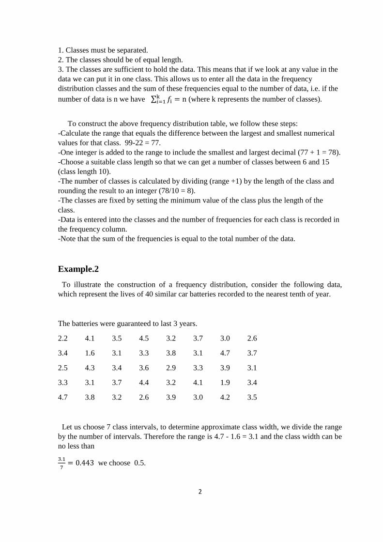
Example.2
To illustrate the construction of a frequency distribution, consider the following data,
which represent the lives of 40 similar car batteries recorded to the nearest tenth of year.
The batteries were guaranteed to last 3 years.
2.2 4.1 3.5 4.5 3.2 3.7 3.0 2.6
3.4 1.6 3.1 3.3 3.8 3.1 4.7 3.7
2.5 4.3 3.4 3.6 2.9 3.3 3.9 3.1
3.3 3.1 3.7 4.4 3.2 4.1 1.9 3.4
4.7 3.8 3.2 2.6 3.9 3.0 4.2 3.5
Let us choose 7 class intervals, to determine approximate class width, we divide the range
by the number of intervals. Therefore the range is 4.7 - 1.6 = 3.1 and the class width can be
no less than
3.1
7= 0.443 we choose 0.5.
Page 3
3
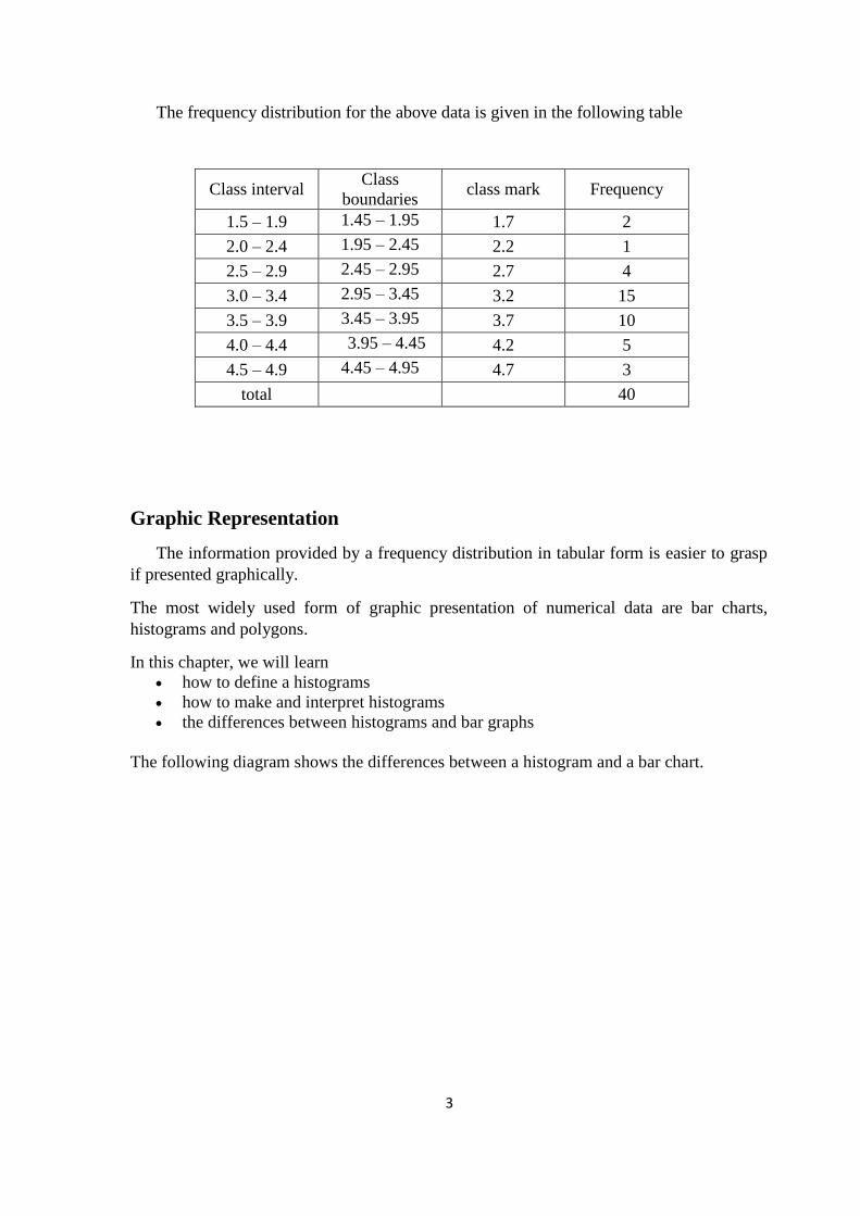
The frequency distribution for the above data is given in the following table
Class interval Class
boundaries class mark Frequency
1.5 – 1.9 1.45 – 1.95 1.7 2
2.0 – 2.4 1.95 – 2.45 2.2 1
2.5 – 2.9 2.45 – 2.95 2.7 4
3.0 – 3.4 2.95 – 3.45 3.2 15
3.5 – 3.9 3.45 – 3.95 3.7 10
4.0 – 4.4 3.95 – 4.45 4.2 5
4.5 – 4.9 4.45 – 4.95 4.7 3
total 40
Graphic Representation
The information provided by a frequency distribution in tabular form is easier to grasp
if presented graphically.
The most widely used form of graphic presentation of numerical data are bar charts,
histograms and polygons.
In this chapter, we will learn
how to define a histograms
how to make and interpret histograms
the differences between histograms and bar graphs
The following diagram shows the differences between a histogram and a bar chart.
Page 4
4
Figure 1: Histogram and Bar Chart
Compare Bar Graphs and Histograms
Histograms are used to show distributions of variables whereas bar charts are used to
compare variables. Histograms plot quantitative data with ranges of the data grouped into
intervals while bar charts plot categorical data.
Note that there are no spaces between the bars of a histogram since there are no gaps
between the intervals. On the other hand, there are spaces between the variables of a bar
chart.
Bar Charts
A bar chart represents the data as horizontal or vertical bars. The length of each bar is
proportional to the amount that it represents.
The Bar Chart of the table for the frequency distribution in example.2 is shown in the
following figure.
Page 5
5
Figure 2: Bar Chart graph of example.2
Histograms
How to define a histogram, interpret a histogram and create a histogram from data?
A histogram is a bar graph that represents a frequency distribution. The width represents
the interval and the height represents the corresponding frequency. There are no spaces
between the bars.
Polygons
The frequency polygon is obtained by fixing the position of each mid class against the
frequency of that class and then connecting these points by straight lines. We reached the
two end points of the polygon by the previous mid class point from the left and the next
mid class from the right. The polygon is joined by these two points, as in the following
figure:
0
2
4
6
8
10
12
14
16
1.5 – 1.9 2.0 – 2.4 2.5 – 2.9 3.0 – 3.4 3.5 – 3.9 4.0 – 4.4 4.5 – 4.9
Bar Chart of example.2
Page 6
6
Figure 3: Polygon graph of example.1
The frequency polygon can also be obtained from the histogram by pointing the upper
sides of the rectangles in the histogram and then connecting these points together with each
other as in the following figure for example.1:
Figure 4: Polygon graph of example.1
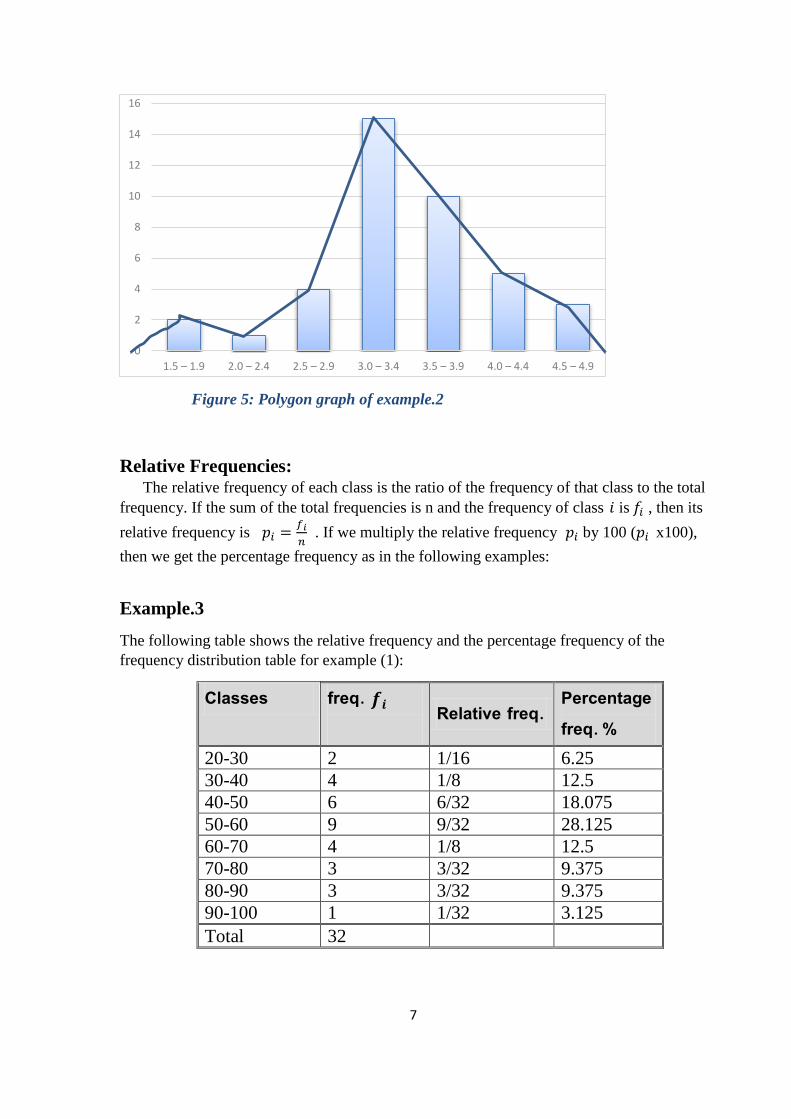
The following graph represent the frequency polygon of Example.2 (Battery Lives).
Page 7
7
Figure 5: Polygon graph of example.2
Relative Frequencies: The relative frequency of each class is the ratio of the frequency of that class to the total
frequency. If the sum of the total frequencies is n and the frequency of class 𝑖 is 𝑓𝑖 , then its
relative frequency is 𝑝𝑖 =𝑓𝑖
𝑛 . If we multiply the relative frequency 𝑝𝑖 by 100 (𝑝𝑖 x100),
then we get the percentage frequency as in the following examples:
Example.3
The following table shows the relative frequency and the percentage frequency of the
frequency distribution table for example (1):
Percentage freq. % Relative freq. freq. 𝒇𝒊
Classes
6.25 1/16 2 20-30
12.5 1/8 4 30-40
18.075 6/32 6 40-50
28.125 9/32 9 50-60
12.5 1/8 4 60-70
9.375 3/32 3 70-80
9.375 3/32 3 80-90
3.125 1/32 1 90-100
32 Total
0
2
4
6
8
10
12
14
16
1.5 – 1.9 2.0 – 2.4 2.5 – 2.9 3.0 – 3.4 3.5 – 3.9 4.0 – 4.4 4.5 – 4.9
Page 8
8
Cumulative frequency distribution: Often our interest is in the number of observation that are equal to or smaller than a
given value.
The sum of the frequencies of all values that are equal to or smaller than a value is the
cumulated frequency of that value.
Example.4
Below is the cumulated frequency distribution table for Example.1:
Cumulated freq. freq. 𝒇𝒊
classes
2 2 20-30
6 4 30-40
12 6 40-50
21 9 50-60
25 4 60-70
28 3 70-80
31 3 80-90
32 1 90-100
32 Total
The number of grades that fall in the class 50-60 or less is 21.
Mean, Median, and Mode
In chapter 3 we defined the mean of a set of observations to be their arithmetic average.
If the data have been grouped we have lost the identity of the observations. To evaluate the
mean we shall assume that all the observations within a given class interval fall at the class
midpoint or class mark.
Definition.1 If 𝑥1, 𝑥2, . . . , 𝑥𝑘 are the class marks (class midpoints) of a set of
grouped data with corresponding class frequencies 𝑓1, 𝑓2, . ., 𝑓𝑘 then the mean of our
sample is
�̅� =∑ 𝑓𝑖𝑥𝑖
𝑘𝑖=1
∑ 𝑓𝑖𝑘𝑖=1
Page 9
9
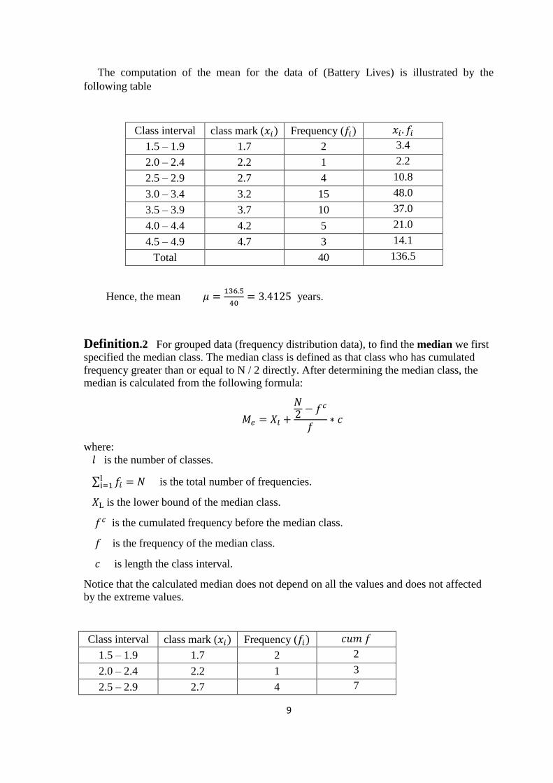
The computation of the mean for the data of (Battery Lives) is illustrated by the
following table
Class interval class mark (𝑥𝑖) Frequency (𝑓𝑖) 𝑥𝑖. 𝑓𝑖
1.5 – 1.9 1.7 2 3.4
2.0 – 2.4 2.2 1 2.2
2.5 – 2.9 2.7 4 10.8
3.0 – 3.4 3.2 15 48.0
3.5 – 3.9 3.7 10 37.0
4.0 – 4.4 4.2 5 21.0
4.5 – 4.9 4.7 3 14.1
Total 40 136.5
Hence, the mean 𝜇 =136.5
40= 3.4125 years.
Definition.2 For grouped data (frequency distribution data), to find the median we first
specified the median class. The median class is defined as that class who has cumulated
frequency greater than or equal to N / 2 directly. After determining the median class, the
median is calculated from the following formula:
𝑀𝑒 = 𝑋𝑙 +
𝑁2 − 𝑓𝑐
𝑓∗ 𝑐
where:
𝑙 is the number of classes.
∑ 𝑓𝑖li=1 = 𝑁 is the total number of frequencies.
𝑋L is the lower bound of the median class.
𝑓𝑐 is the cumulated frequency before the median class.
𝑓 is the frequency of the median class.
𝑐 is length the class interval.
Notice that the calculated median does not depend on all the values and does not affected
by the extreme values.
Class interval class mark (𝑥𝑖) Frequency (𝑓𝑖) 𝑐𝑢𝑚 𝑓
1.5 – 1.9 1.7 2 2
2.0 – 2.4 2.2 1 3
2.5 – 2.9 2.7 4 7
Page 10
11
MedianClass and
ModeClass
For the above data our estimate of the median is 3.3
Where 𝑋L = 3, 𝑓𝑐 = 7, 𝑓 = 15, 𝑐 = 0.4, 𝑁 = 40 ⟹ 𝑀𝑒 = 3 +20−7
15∗ 0.4 = 3.346
Also our estimate of the mode is 3.2.
Definition.3 The mode 𝑿𝒎 for usual data is defined as the value with the highest
frequency. When the data is given in frequency distribution, the corresponding class must
first be fixed. The mode class is defined as the class with the highest frequency. After
finding the mode class we find the mode from the following formula:
𝑀𝑜 = XL +∆1
∆1 + ∆2∗ 𝑐
𝑋L is the lower limit of the mode class .
∆1 is the difference between the frequency of the mode class and the frequency of the
previous class.
∆2 is the difference between the frequency of the mode class and the frequency of the
subsequent class. 𝑐 is the length of the mode class.
(XL = 3, ∆1= 15 − 4 = 11, ∆2= 15 − 10 = 5, 𝑐 = 0.4) 𝑓𝑜𝑟 𝑒𝑥𝑎𝑚𝑝𝑙𝑒. 2
Measurements of dispersion
Range
The range is defined as the difference between the highest value and the smallest value
of data. If the range is small, it means that the data is confined to a close range and if the
range is large, the data is within a long distance.
The range in the frequency distribution is also defined as the difference between the
upper limit of the upper class and the lower limit of the lower class.
Mean Deviation (M.D)
In the case of the frequency distribution with mid classes 𝑋1, X2, … , 𝑋𝑙 and their
corresponding frequencies lfff ,....,, 21 , the mean deviation is:
3.0 – 3.4 3.2 15 22
3.5 – 3.9 3.7 10 32
4.0 – 4.4 4.2 5 37
4.5 – 4.9 4.7 3 40
Total 40
Page 11
11
Variance
In the case of the frequency distribution with mid classes 𝑋1, X2, … , 𝑋𝑙 and their
corresponding frequencies lfff ,....,, 21 , the variance is:
𝑆2 =1
𝑛 − 1∑ 𝑓𝑖
𝑙
𝑖=1
(𝑋𝑖 − �̅�)2 =1
𝑛 − 1[∑ 𝑓𝑖𝑋𝑖
2 − 𝑛�̅�2
𝑙
𝑖=1
]
Where ∑ 𝑓𝑖𝑙𝑖=1 = 𝑛.
Standard Deviation
The standard deviation is defined as the positive square root of the variance i.e.𝑆 = √𝑆2
Example.5
The table below shows the weights(kg) of members in a sport club. Calculate the mean,
median, mode, mean deviation and standard deviation of the distribution.
Masses (kg) 40-49 50-59 60-69 70-79 80-89 90-99
Frequency (𝑓𝑖) 6 8 12 14 7 3
Solution:
1. To find the mean we will use the formula
�̅� =∑ 𝑓𝑖𝑥𝑖
𝑘𝑖=1
∑ 𝑓𝑖𝑘𝑖=1
So we need to find the center of each class (𝑥𝑖), then find ∑ 𝑓𝑖𝑥𝑖𝑘𝑖=1
Mass (kg) Frequency
(𝒇𝒊)
Class mark
(𝑥𝑖) 𝑥𝑖𝑓𝑖 Cum f
40 – 49 6 44.5 267 6
50 – 59 8 54.5 436 14
60 – 69 12 64.5 774 26
70 – 79 14 74.5 1043 40
80 – 89 7 84.5 591.5 47
90 – 99 3 94.5 283.5 50
Total 50 3395
Median class
Mode class
Page 12
12
�̅� =∑ 𝑓𝑖𝑥𝑖
𝑘𝑖=1
∑ 𝑓𝑖𝑘𝑖=1
=3395
50= 67.9
2. To find the median we first specify the median class which is represent the
cumulative frequency greater than or equal to (50/ 2) directly.
𝑀𝑒 = 𝑋𝑙 +𝑁
2−𝑓𝑐
𝑓∗ 𝑐 where c=10 , 𝑋𝑙 =
59+60
2= 59.5 , 𝑓𝑐 = 14 , 𝑓 = 12
𝑀𝑒 = 59.5 +25−14
12∗ 10 = 68.66
3. We can find the mode class which contain highest frequency, then find the mode
from the following formula
𝑀𝑜 = XL +∆1
∆1 + ∆2∗ 𝑐
the lower limit of the mode class is 𝑋𝐿 =69+70
2= 69.5 and
∆1= 14 − 12 = 2, ∆2= 14 − 7 = 7. Then:
𝑀𝑜 = 69.5 +2
2 + 7= 69.722
4. Mean deviation = ∑ 𝑓𝑖|𝑥𝑖−�̅�|𝑙
𝑖=1
∑ 𝑓𝑖𝑙𝑖=1
= 140.4+107.2+40.8+92.4+116.2+79.8
50= 11.536
5. Variance 𝑆2 = 1
𝑛−1[∑ 𝑓𝑖𝑋𝑖
2 − 𝑛�̅�2𝑙𝑖=1 ]
𝑆2= 1
49{[6(44.5)2 + 8(54.5)2 + 12(64.5)2 + 14(74.5)2 + 7(84.5)2 + 3(94.5)2]
−50(67.9)2} = 9522
49
Then the standard deviation =√𝑆2
S = 13.94
∎
Page 13
13
EXERCISES
1. The following scores represent the final examinations grade for an elementary statistics
course:
23 60 79 32 57 74 52 70 82 36
80 77 81 95 41 65 92 85 55 76
52 10 64 75 78 25 80 98 81 67
41 71 83 54 64 72 88 62 74 43
60 78 89 76 84 48 84 90 15 79
34 67 17 82 69 74 63 80 85 61
a. Set up a frequency distribution using 10 intervals.
b. Find the mean, median, and the mod.
c. Construct a frequency histogram.
d. Construct a frequency polygon.
e. Find the relative frequency and the percentage frequency.
2. For the following data
class interval frequency
Page 14
14
a- Find the mean, median, and mode.
b- Find the mean deviation and standard
deviation
c-. Construct a frequency histogram.
d- Construct a frequency polygon.
3. For the following data
class interval frequency
__________________________________
10 – 14 1
15 – 19 3
20 – 24 4
25 – 29 4
30 – 34 5
35 – 39 3
40 – 44 1
1. find the mean, median, and mode.
2. Find the mean deviation and standard deviation
3. construct a frequency histogram.
4. construct a frequency polygon.
4. The following data represent the spending in dollars on extracurricular activities for a
random sample of college students during the first week of the first semester
6 6 9 22 12 7 18 13 11 12 8 2 10 6
7 – 13
14 – 20
21 – 27
28 – 34
35 – 41
42 – 48
49 – 55
56 – 62
5
4
3
2
2
1
2
1
Page 15
15
9 4 9 14 13 8 10 12 20 29 9 5 11 3
5 6 5 24 15 4 11 22 13 19 6 4 10 5
a - Set up a frequency distribution using 10 intervals.
b - Find the mean, median, and mod.
c- Find the relative frequency and the percentage frequency
d - Construct a frequency histogram.
e- Construct a frequency polygon.


![Grouped (002) [Read-Only]](https://static.documents.pub/doc/80x56/623b577c0febdd124b0a8fca/grouped-002-read-only.jpg)


