Photoshop for Design C.Grundy Lesson 1: Starting Out Photoshop is a complex programme and therefore it can be helpful to consider techniques for using the programme in particular categories. We will cover: Basic Tool box and interface Making Changes to whole images Working with Selected areas of an image Combining Images Generating new illustrations Please read lecture notes ‘an Introduction to Photoshop ‘ and watch the video I have created for you or review the Powerpoint slides, before you start, they will help you understand where basic features are and also general principles. Starting Up For a PC you need to go to the Start button to access any programmes Hold the mouse down over the pull down ‘All Programmes’ arrow. Navigate to a folder that says Adobe Master Collection CS (number) and click Click on the icon that says Adobe Photoshop CS(number) its usually blue.
Transcript
Photoshop for Design C.Grundy
Lesson 1: Starting Out Photoshop is a complex programme and therefore it can be helpful
to consider techniques for using the programme in particular
categories.
We will cover:
Basic Tool box and interface
Making Changes to whole images
Working with Selected areas of an image
Combining Images
Generating new illustrations
Please read lecture notes ‘an Introduction to Photoshop ‘ and watch the video I have created for you or review the Powerpoint slides, before you start, they will help you understand where basic features are and also general principles.
Starting Up For a PC you need to go to the Start button to access any programmes
Hold the mouse down over the pull down ‘All Programmes’ arrow.
Navigate to a folder that says Adobe Master Collection CS (number) and click
Click on the icon that says Adobe Photoshop CS(number) its usually blue.
For a Mac you need to navigate to the Applications folder and double click on the correct named folder.
IMPORTANT POINTS: ALWAYS SAVE DOCUMENTS YOU ARE WORKING ON TO YOUR
OWN PERSONAL DRIVE, EITHER THE ON-LINE ONE SUPPLIED BY THE UNIVERSITY OR A USB KEY. IF YOU LEAVE THEM ON THE DESKTOP THEY WILL BE LOST AS THIS IS REGULARLY CLEARED.
KEEP SAVING ALL THE WAY THROUGH THE PROCESS. KEEP ALL THE LAYERS IN YOUR DOCUMENT AND THE
ORIGINAL IMAGE IN CASE OF PROBLEMS THE ILLUSTRATIONS SHOW VERSION CS6 OF PHOTOSHOP
(CURRENT as of 31.8.12 )AND SHOWS A DARK INTERFACE. YOU MAY FIND YOURSELF USING AN EARLIER VERSION (OR A LATER ONE IN FUTURE) WHICH LOOKS DIFFERENT HOWEVER THE PRINCIPLES WILL BE SIMILAR.
Opening a New document:
Photoshop for Design C.Grundy
On the Top Menu go to File and then New (if you don’t know what I am talking about
you need to watch the video or read the notes about the interface as mentioned
earlier!)
Keep all the default settings that appear automatically for the new document
and just press ok.
Within the Tool Box choose the icon that looks like a Paintbrush. If you
don’t see it, someone may have changed the settings, ask your tutor about
this.
N.b : if you hold the mouse over the Tool Box items it should tell you what they are.
Change the colour that you are about to apply by clicking the top left square
almost at the bottom of the Tool Box.
Drag the double arrow on the central slider to change the overall colour.
Then click in the main box on the left to change the tone.
Drag the brush across your new document.
Note that you can change the basic properties of the brush tool (and others)
at the top of the screen. If you click the current brush setting
icon (in this case basic
13 diameter) the
dialogue box to the left
should appear.
Try making changes
and noting the
difference.
Just experiment with
different effects to get
a feel for this tool.
There is also a much
more complex brush
Photoshop for Design C.Grundy
panel that can be accessed via the folder at the top. Try this too. Both are circled in
the diagram.
Downloading ImagesFor the learning exercises you will need a series of images that will be supplied by your tutor.
To Download: Go to the Photoshop folder within the module for this course inside the on-line study
facility you have been asked to use.
Either : For the PC, right click on the link for each picture and choose Save Link as
and navigate to your drive, click OK. (For the Mac, always hold down Control and click instead of right clicking, it has the same results)
Or: Click to open each picture and then right click the image and choose Save As.
Making changes to whole photographic images
Exercise 1: Basic image changes Open ‘Twinkles.jpg’ using the top menu, choose: File-
Open and navigate to where you stored the image.
AAAHH….
Magnification: Have a look in the bottom left hand of the
screen, here you can check the image is being viewed at
full size. If not select the number and enter 100%.
This is then the exact size the image would appear if you had created it for a screen application like a web site.
Photoshop for Design C.Grundy
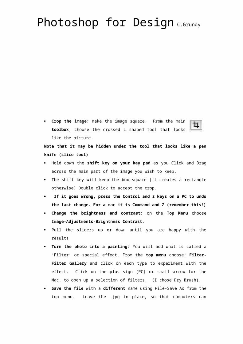
Crop the image: make the image square. From the main toolbox,
choose the crossed L shaped tool that looks like the picture.
Note that it may be hidden under the tool that looks like a pen knife (slice tool) Hold down the shift key on your key pad as you Click and Drag across the main
part of the image you wish to keep.
The shift key will keep the box square (it creates a rectangle otherwise) Double click
to accept the crop.
If it goes wrong, press the Control and Z keys on a PC to undo the last change. For a mac it is Command and Z (remember this!)
Change the brightness and contrast: on the Top Menu choose Image-Adjustments-Brightness Contrast.
Pull the sliders up or down until you are happy with the results
Turn the photo into a painting: You will add what is called a ‘Filter’ or special effect.
From the top menu choose: Filter-Filter Gallery and click on each type to
experiment with the effect. Click on the plus sign (PC) or small arrow for the Mac, to
open up a selection of filters. (I chose Dry Brush).
Save the file with a different name using File-Save As from the top menu. Leave
the .jpg in place, so that computers can recognize the format of the image. A different
name ensures you don’t over write the original, since you may need it again.
Making Mistakes!
We all make mistakes, or change our mind about things. That is fine in Photoshop, you can either:
Undo the last change with the Keyboard
short cuts as described in the last section.
Or use Edit from the Top Menu and Undo
if you can’t remember the short cuts!
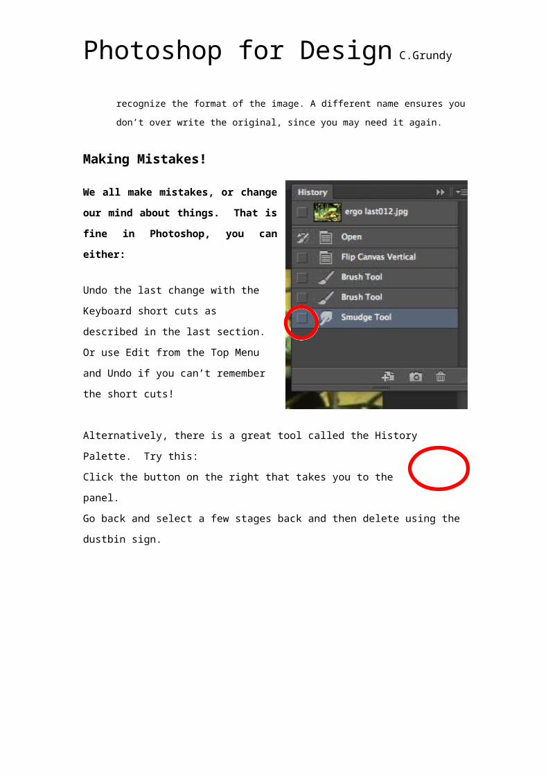
Alternatively, there is a great tool called the
History Palette. Try this:
Click the button on the right that takes you
to the panel.
Go back and select a few stages back and
then delete using the dustbin sign.
Photoshop for Design C.Grundy
Exercise 2: Correcting a Scanned image and working with Image Size..
A common way of getting graphical material to work with is to use a scanner. After this
process, it is likely that there will be unwanted areas around the part of an image you require
and sometimes the picture can be slightly rotated. On occasions there may be a colour cast
either in the original picture or after the scan. We will remedy these problems:
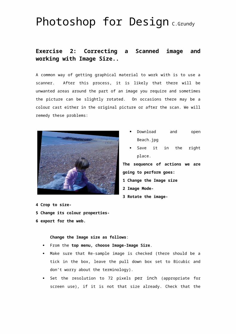
Download and open Beach.jpg
Save it in the right place.
The sequence of actions we are going to perform goes: 1 Change the Image size 2 Image Mode- 3 Rotate the image- 4 Crop to size-5 Change its colour properties-6 export for the web.
Change the Image size as follows:
From the top menu, choose Image-Image Size.
Make sure that Re-sample image is checked (there should be a tick in the box, leave
the pull down box set to Bicubic and don’t worry about the terminology).
Set the resolution to 72 pixels per inch (appropriate for screen use), if it is not that
size already. Check that the width and height in the document size area are the same
as they were previously (roughly 13 cm across).
Note: if you de-selected the resample image tick box in the dialogue, the document
measurements would increase from 13 to retain the same file size as before. (Try and do the
same thing with the resample unchecked and see the difference with the file size and
dimensions) Set it back again and click OK. If you do not know what I am talking about
review the intro lecture powerpoints.
Change the image mode: Choose Image-Mode from the Top Menu and slide the
mouse down to RGB. A tick should be placed next to it to indicate the change. This is
the right choice for screen images.
Note : if you sometimes struggle to work with a document or to add colour, check the image mode. Sometimes you are restricted in your options. Always set to
Rotate the canvas : Choose Image-Rotate Canvas-Arbitrary. Then you can put in
4 or 5 degree rotations to correct the problem, make sure you choose the right
direction, in this case anti clockwise.
Photoshop for Design C.Grundy
Crop the image: Choose the Crop Tool from the toolbox,
Drag it across the part of the picture you want to keep, holding the mouse button
down. Use the handles on the cropping window to fine-tune the selection. After you
have the cropping window placed where you want it, double-click inside it to delete
the area outside the window. If you crop too much of the picture, you can undo using
Edit-Undo from the top menu or key in on the key board Control Z for PC and Apple Z
for the Mac.
Change the colour cast: On the right hand side you should see a menu of icons called Adjustments. Choose
the one that looks like scales for colour balance and in the menu that appears,
change the different levels using the levers until you are happy with the effect. Try
and find brightness and contrast and alter those too. Note that in an open panel
called ‘Layers’ some new layers appear after you have finished. Click on the eye icon
to the left of them to switch that layer on and off and to check the effect you created.
You can double click on the rectangle for each layer to go back and make further
changes too.
Note: There are different ways to change the overall colour cast;. One method is to go on the top menu to Image Adjustments-Colour Balance. Another,is to go to Image- Adjustments-Variations.
Saving and optimizing: To save a low resolution version of this file choose from the
top menu: File-Save for the Web.
Photoshop for Design C.Grundy
In the dialogue box, you need to select Jpeg for the file type (as this is photographic
in nature) Do this from the pull down menu, to the right. It may currently say ‘GIF’.
Jpegs require that you modify the quality setting
to optimize to an appropriate file size.
Where there are tabs at the top of the Save for
the Web window, choose the ‘2-up’ tab to see a
‘before’ and ‘after’ version of the optimized
image.
Click on the arrow next to ‘Quality’ and change
the slider .
Note: If you can’t see the whole image, resize it is using the magnifying glass, located on the
left of the dialogue box. Hold down the Alt key to zoom out. You can also move the image
around using the Hand tool, found in the same area or press the space bar and drag.
Check the quality: Check that there is not too much deterioration of the image in the optimized
version compared with the original.
Review the final file size to see if it is low enough for the web, this is located at the bottom of
the optimized picture window. You can also see an estimated download time for a 28k
Photoshop for Design C.Grundy
modem. You can preset this to different bandwidths, i.e. for broadband by right clicking on
the description and picking from the list.
Note: Ideally a whole page of a web site should be 32 K or less. This is quite a large and colourful image, it is unlikely that it will optimize to less than 18 k. Click Save and
give it a different name, by writing in the title box, thus ensuring that you don’t write over the
original file.
Working with parts of an image
Exercise 3: Selection tools
Here we introduce some of the more commonly used selection tools. You play around with
this image and understand how the ‘marching ants’ indicate what you have selected.
Open bluehead.jpg
Rectangular Marquee: With this tool selected from
the toolbox, you click and drag a box around the area
at the bottom of the image shown in the picture.
Note: If you cant see this rectangle, there is
also an ellipse and column tool to choose from
which may be currently visible. The triangle at
the bottom right of the tool means hidden tools
that you need to hold down the mouse to
choose.
We want to make this area look like
the rest, so we will fill it in by
matching the colour of the dark
outer box. First we need to select
the background colour swatch to
make that the active colour
selection.
Choose the eyedropper tool and
select somewhere in the solid dark
area to match that colour.
Photoshop for Design C.Grundy
Note: the toolbox can appear as a
double column or single, depending
on who worked on it before you, but
it is the same. Clicking the double
arrow at the top switches between
them.
We will add a new layer
Note: Adding layers before you make edits is generally good practice, this allows you to correct or make changes more easily, the more layers the better!
At the bottom of the layers palette, click the
button with a piece of paper on.
In the top menu, choose Edit-Fill and in the dialogue box that
appears ensure that Background Color is selected from the pull
down. (The default is set to
foreground or a colour, you need it
set to Background for the next step)
Also check that you do not have
‘preserve transparency’ selected
(this only allows you to fill areas
where there are already pixels of
colour.)
Photoshop for Design C.Grundy
Note that the new layer has the filled area on it.
Deselect the area by going to the top menu, Select-
Deselect all. Or choose Ctrl D for the PC and Apple D
for the Mac.
To frame the image with the dark
colour entirely:
Increase the canvas size, by going
to the top menu: Image-Canvas
size.
In the dialogue, change 4 cm to 4.5
in the Height box.
Change the Anchor point by clicking
in the central bottom square as
shown.
Choose Background as the Canvas
Extension Colour.
The results should look like the picture,
Save the image with a new name, like headframed.jpg
Exercise: Using the Lasso tool
You are going to change the
colour of the head area in
isolation to look like the
illustration at the end.
Photoshop for Design C.Grundy
Select only the head: choose the magnetic lasso tool.
Begin to click carefully around the edge of the head. This
is a process that requires practice. Tip: keep clicking
often to set points securely before moving on, especially
where angles change abruptly. There are settings at the
top of the Photoshop area, which can be adjusted. Play
around to see if you can get more and less sensitivity.
Work right around to the beginning of your selection.
Change the head colour: In the
top menu choose Image-Adjustments-Hue / Saturation.
Fiddle around with all three
sliders to see the effect and
choose ok when you are happy
with the result.
Deselect as before and save the image.
Note 1: Have a play around with the other Lasso tools at this point so that you are aware of
their function.
Note 2: You could also have corrected the image using what is called a Selection Mask, but
these are quite advanced, and we don’t have time. Be aware of their existence however, for
when you get better.
Exercise: Selecting a face
Note : The photograph for this exercise was supplied by
Martin Mims, photographer.
Besides some new selecting tips you will be copying and
pasting things you have selected.
You will also be introduced to Layers (an important
Photoshop principle)
Photoshop for Design C.Grundy
Open “face.jpg” this is the suffix for a jpeg, from the folder
1. Make sure that the image is RGB, make it 300 pixels/inch (for PRINT) and deselect
the box that says ‘Resample Image’ so that Photoshop maintains the overall file size.
The physical dimensions of the image should reduce .
Note : remember the File Size = Document dimensions x Resolution. If you didn’t check the box, the image would appear quite pixilated when printed.2. Look at the layers palette. If it is not open, choose from the Top Menu: Windows-
Layers or press F7. 3. Unlock the existing layer to edit it: Currently the boy is on a layer called
‘Background’, which has a locked symbol next to it. This makes it difficult to edit. To
remedy this, copy the layer by placing the
mouse over the small arrow in the right hand corner of the layers palette, holding it
down and selecting duplicate layer.
v
Note that you can select either layer in the layers palette, by clicking on their label. You will then only be making changes to the selected layer. Note: You cant just unlock the background layer. Now you can delete it if you prefer.
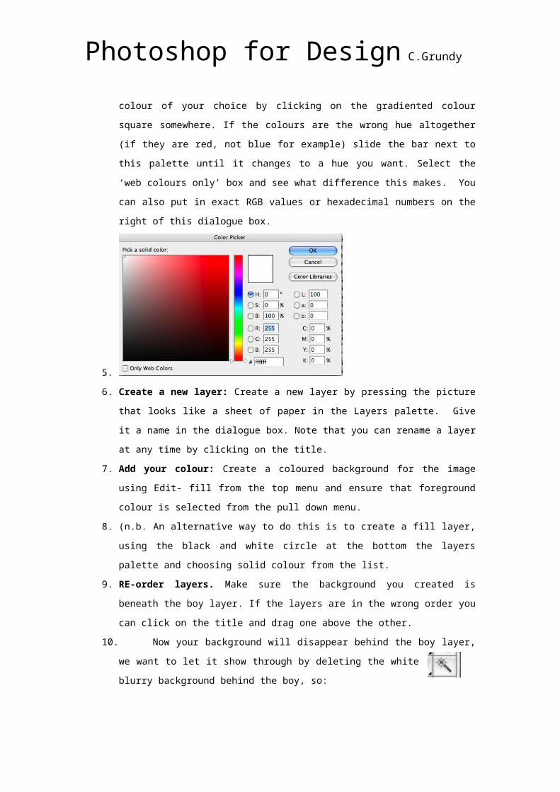
First we need to make a background:4. Choose a Colour for the background: Click on the coloured square at the bottom of
the toolbox that is uppermost (the foreground colour). In the dialogue box that
appears, pick a colour of your choice by clicking on the gradiented colour square
somewhere. If the colours are the wrong hue altogether (if they are red, not blue for
example) slide the bar next to this palette until it changes to a hue you want. Select
the ‘web colours only’ box and see what difference this makes. You can also put in
exact RGB values or hexadecimal numbers on the right of this dialogue box.
Photoshop for Design C.Grundy
5.
6. Create a new layer: Create a new layer by pressing the picture that looks like a
sheet of paper in the Layers palette. Give it a name in the dialogue box. Note that
you can rename a layer at any time by clicking on the title.
7. Add your colour: Create a coloured background for the image using Edit- fill from
the top menu and ensure that foreground colour is selected from the pull down menu.
8. (n.b. An alternative way to do this is to create a fill layer, using the black and white
circle at the bottom the layers palette and choosing solid colour from the list.
9. RE-order layers. Make sure the background you created is beneath the boy layer. If
the layers are in the wrong order you can click on the title and drag one above the
other.
10. Now your background will disappear behind the boy layer, we want to let it show
through by deleting the white blurry background behind the boy, so:
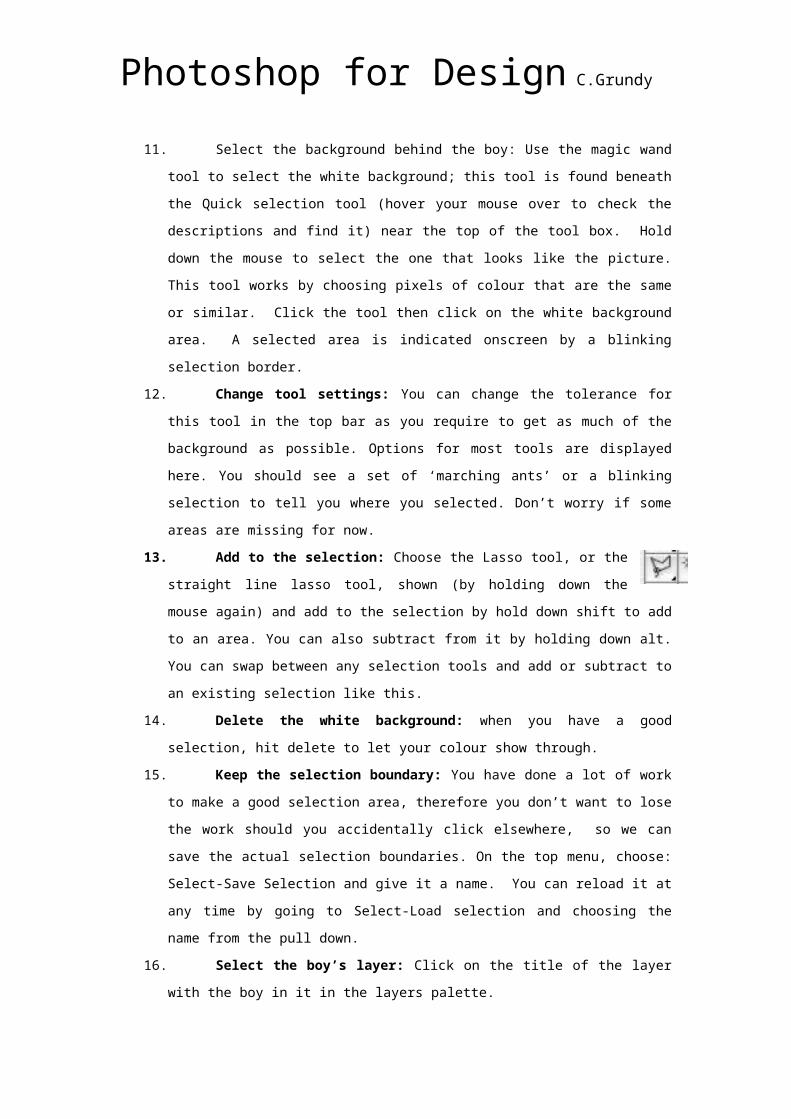
11. Select the background behind the boy: Use the magic wand tool to
select the white background; this tool is found beneath the Quick selection tool (hover
your mouse over to check the descriptions and find it) near the top of the tool box.
Hold down the mouse to select the one that looks like the picture. This tool works by
choosing pixels of colour that are the same or similar. Click the tool then click on the
white background area. A selected area is indicated onscreen by a blinking selection
border.
12. Change tool settings: You can change the tolerance for this tool in the top bar as
you require to get as much of the background as possible. Options for most tools are
displayed here. You should see a set of ‘marching ants’ or a blinking selection to tell
you where you selected. Don’t worry if some areas are missing for now.
13. Add to the selection: Choose the Lasso tool, or the straight line lasso tool,
shown (by holding down the mouse again) and add to the selection by hold
down shift to add to an area. You can also subtract from it by holding down alt. You
can swap between any selection tools and add or subtract to an existing selection like
this.
14. Delete the white background: when you have a good selection, hit delete to let your
colour show through.
Photoshop for Design C.Grundy
15. Keep the selection boundary: You have done a lot of work to make a good
selection area, therefore you don’t want to lose the work should you accidentally click
elsewhere, so we can save the actual selection boundaries. On the top menu,
choose: Select-Save Selection and give it a name. You can reload it at any time by
going to Select-Load selection and choosing the name from the pull down.
16. Select the boy’s layer: Click on the title of the layer with the boy in it in the layers
palette.
17. A good trick!! To select the boy, load the background selection using Select-load
selection from the top menu and then choose Select-Inverse. Photoshop selects
everything that wasn’t previously selected instead.
18. Copy and Repeat the boy’s image Edit-Copy, Edit-Paste the boy (Photoshop
automatically creates a new layer) to make two boys alongside each other.
19. Move it: Select the move tool and then drag the second boy to where required.
You should end up with two twin boys on a coloured background.
Note Important Practice: By default the programme makes an image with layers into a Photoshop or .psd file. This is usually not suitable for transferring to other programmes. We save the file with all its layers, to keep all the data safe (in case we need to make changes later) and also save it as a pict or jpeg to get a non layered version.
Testing Understanding
See if you can save your file as 72 dpi and also go through the Save for the Web process, like
you did for the previous image.
Photoshop for Design C.Grundy
Lesson 3: Using the Pen Tool and working towards Product Rendering. Ex: Using the pen tool …
The Pen tools create paths or vector shapes that can be used for a variety of functions. For
us they help to create more complex but accurate shapes for selections or to create drawings
using paint tools, as we will see later.
Photoshop provides two different Pen tools. The standard Pen tool draws with the greatest
precision; the Freeform Pen tool draws paths as if you were drawing with pencil on paper You
can use the pen tools in conjunction with the shape tools to create complex shapes, but that
comes later..
when held down reveals:
1. Pen tool : Click on the canvas to create paths with straight segments, click and drag to
create paths with curves.
2. Freehand Pen tool : Click on the canvas and drag to draw paths freely, as though using a
brush.
Photoshop for Design C.Grundy
3. Add Anchor Point tool : Click on a path segment to add anchor point.
4. Delete Anchor Point tool : Click on anchor point to remove from path.
5. Convert Point tool : Click on an anchor point and drag to create bezier handles where there
were none, click on an anchor point with handles to a remove them.
Photoshop for Design C.Grundy
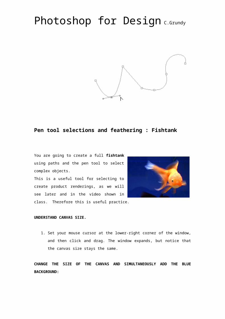
Pen tool selections and feathering : Fishtank
You are going to create a full fishtank using paths
and the pen tool to select complex objects.
This is a useful tool for selecting to create product
renderings, as we will see later and in the video
shown in class. Therefore this is useful practice.
UNDERSTAND CANVAS SIZE.
1. Set your mouse cursor at the lower-right corner of the window, and then click and
drag. The window expands, but notice that the canvas size stays the same.
CHANGE THE SIZE OF THE CANVAS AND SIMULTANEOUSLY ADD THE BLUE BACKGROUND:
1. pick the dropper tool from the tool box. and click on a typical area of the blue
background. The colour in the top left square of the tool box should change to your selection.
2. At the moment that makes the blue the foreground colour. To switch the swatches around,
click the arrow that appears to connect the two. This makes it the background colour.
3. Then select Image-Canvas Size. In the dialogue box, you need to increase the numbers
that specify the increased size and the Anchor section lets you specify the base area from
which the canvas expands, by clicking any of the eight white squares.
4 Using these settings the canvas auto fills with the blue.
SELECTING COMPLEX SHAPES WITH THE PEN TOOLThis time we will use the pen tool to select the fish more carefully as it is a more complex
shape. .
IMPORTANT ! change the pen setting at the top of the page to the one shown in the image.
2. You need to click to create points all around the fish shape. You do not have to be
too exact or add too many points.
3. The points can be finely adjusted afterwards to fit,
Photoshop for Design C.Grundy
4. Use the tool that looks like a V shape and click drag the points to change their
properties. You can make the lines that emerge from a point more curved to fit.
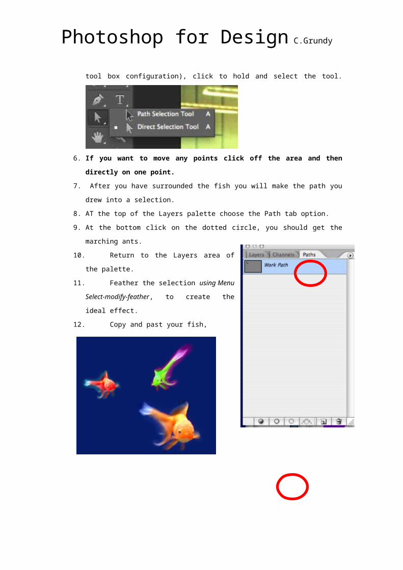
5. Use the ‘direct selection’ tool to move a point. This is a white arrow (may be hidden
by a black arrow) three quarters of the way down (below the pen or the text tool
depending on your tool box configuration), click to hold and select the tool.
6. If you want to move any points click off the area and then directly on one point. 7. After you have surrounded the fish you will make the path you drew into a selection.
8. AT the top of the Layers palette choose the Path tab option.
9. At the bottom click on the dotted circle, you should get the marching ants.
10. Return to the Layers area of the palette.
11. Feather the selection using Menu Select-modify-
feather, to create the ideal effect.
12. Copy and past your fish,
After you have copied them , change them using Menu-
Edit-Transform or rotate/skew /flip the results. You
can also transorm their hue with the Adjustments tools
If you want to make the background more uniform,
make a fill layer beneath the fish with the blue colour.
Save as a jpeg.
Photoshop for Design C.Grundy
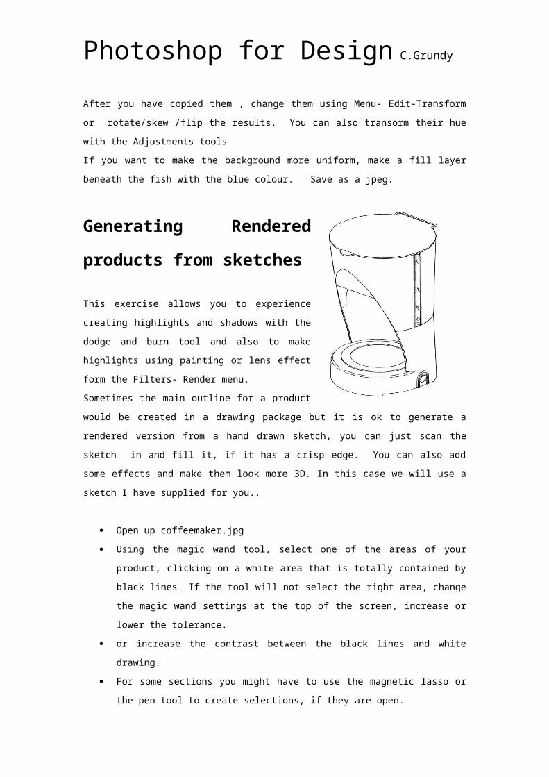
Generating Rendered products from sketches
This exercise allows you to experience creating highlights and shadows with the dodge and
burn tool and also to make highlights using painting or lens effect form the Filters- Render
menu.
Sometimes the main outline for a product would be created in a drawing package but it is ok
to generate a rendered version from a hand drawn sketch, you can just scan the sketch in
and fill it, if it has a crisp edge. You can also add some effects and make them look more 3D.
In this case we will use a sketch I have supplied for you..
Open up coffeemaker.jpg
Using the magic wand tool, select one of the areas of your product, clicking on a
white area that is totally contained by black lines. If the tool will not select the right
area, change the magic wand settings at the top of the screen, increase or lower the
tolerance.
or increase the contrast between the black lines and white drawing.
For some sections you might have to use the magnetic lasso or the pen tool to create
selections, if they are open.
Add a new layer, so that you are not obliterating the original, then use the fill
technique you used before to create flat areas of colour. (either from the edit menu or
creating a new fill layer in the first place.
Use the burn tool from the tool box to make shadows at the edge of the form.
Choose an appropriate brush size and shape.
I used a 100 px diameter brush set on airbrush ; settings as below:
Photoshop for Design C.Grundy
Note: This is better than having to choose a darker version of the same colour, and definitely better than using black; its quicker and it also works if you have added textures or multiple colours. Whatever shade it sees it makes darker.
Use the burn tool again and note how it works across all the tones of the texture.
Also use the dodge tool to make it more 3 dimensional still by lightening areas that
would be more prominent.
You use the airbrush, to highlight extreme areas. You find the paint tool first and then
toggle the air brush effect on in the top menu. Choose white as the foreground
colour.
You can play around with the opacity and flow to get the right effect and also the
brush size and shape. I started with a largish brush to create an overall glare and
then a very small one to create a solid ching of light.
Try the same process on a texture now. With an area of product selected. Open
up any texture, you created earlier.
From the Select menu, choose Select All, alternatively press Ctrl A on PC or Apple A
to select all of the texture.
Photoshop for Design C.Grundy
From the edit menu choose Copy, or press Ctrl C (pc) Apple C (mac)
Click on the Product picture to make it the active window and from the Edit menu,
choose paste or Ctrl V, Apple V into the selected area.
Now try a lens effect from the Filters menu to also create highlights in areas that might be
seen to protrude outwards from the picture to see the difference..
Summary Exercise: Wheel.Using the pen tool and any of the rendering techniques you used above, make a rendering of a car wheel. A blank drawing is supplied.
Photoshop for Design C.Grundy
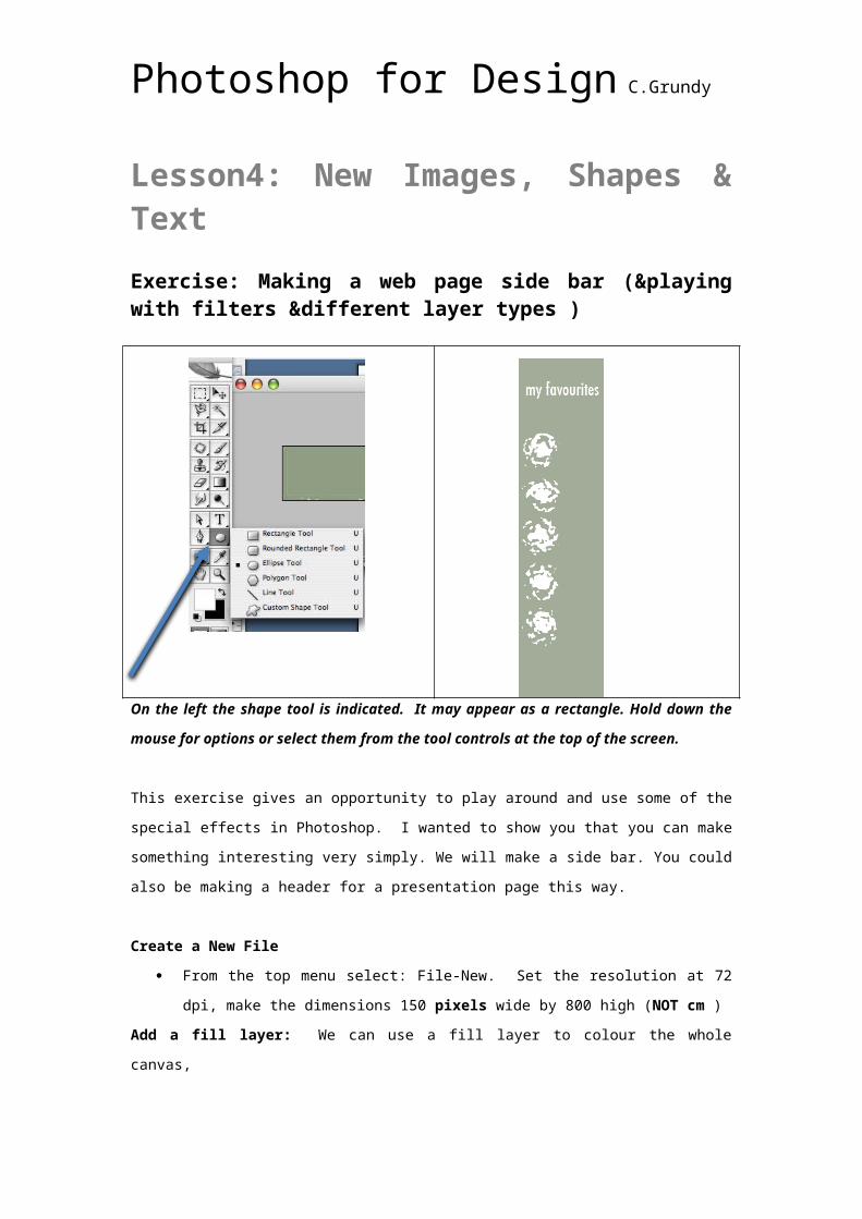
Lesson4: New Images, Shapes & Text Exercise: Making a web page side bar (&playing with filters &different layer types )
On the left the shape tool is indicated. It may appear as a rectangle. Hold down the mouse for options or select them from the tool controls at the top of the screen.
This exercise gives an opportunity to play around and use some of the special effects in
Photoshop. I wanted to show you that you can make something interesting very simply. We
will make a side bar. You could also be making a header for a presentation page this way.
Create a New File
From the top menu select: File-New. Set the resolution at 72 dpi, make the
dimensions 150 pixels wide by 800 high (NOT cm )
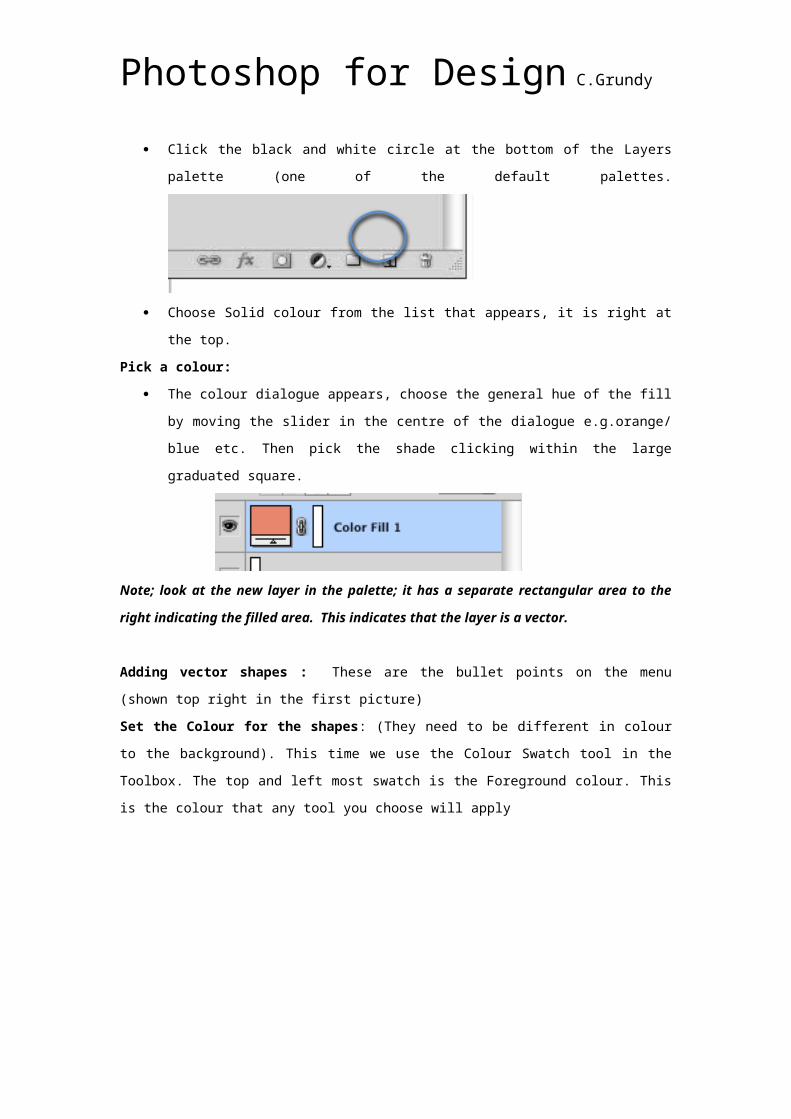
Add a fill layer: We can use a fill layer to colour the whole canvas,
Click the black and white circle at the bottom of the Layers palette (one of the default
palettes.
Choose Solid colour from the list that appears, it is right at the top.
Pick a colour:
Photoshop for Design C.Grundy
The colour dialogue appears, choose the general hue of the fill by moving the slider in
the centre of the dialogue e.g.orange/ blue etc. Then pick the shade clicking within
the large graduated square.
Note; look at the new layer in the palette; it has a separate rectangular area to the right indicating the filled area. This indicates that the layer is a vector.
Adding vector shapes : These are the bullet points on the menu (shown top right in the first
picture)
Set the Colour for the shapes: (They need to be different in colour to the background). This
time we use the Colour Swatch tool in the Toolbox. The top and left most swatch is the
Foreground colour. This is the colour that any tool you choose will apply
Create a new layer, click the piece of paper icon at the bottom of the layers palette.
Hint: The dustbin allows you to delete a layer.
Click on the foreground swatch to change it, dialogue box is the same as before.
Choose a shape: From the tool box click on the vector tool as shown in the illustration
(and hold down the mouse to choose your shape (Actually you can choose any shape
you like). The tool may look like a rectangle to begin with.
Photoshop for Design C.Grundy
Change tool settings: On the tool settings bar at the top there are three choices on
the left hand side for the mode, pick the one that looks like a simple square as shown
in the illustration. This creates a simple pixel version of the shape.
Click and drag to make a shape the size and location you wish.
Hold down shift to maintain the shape proportions, for example to create a square or
a perfect circle.
Note: Holding down shift helps to maintain proportions for all tools, like ‘crop’ or for making a square selection with the rectangular marquee tool.
If you choose custom shapes, there are a surprising number of options.
Clicking the Shape arrow will bring up a large selection of objects, some may be useful though many look like clip art ! Clicking the small arrow can load up even more options.
Repeat the shape: Clever use of the keyboard allows you to repeat shapes or any layered
item quickly and easily.
With the shape layer selected, switch to the ‘Move tool’ in the tool-box.
Hold down the Shift and Alt keys and drag (Check PC)
(Alt is the ‘copy’ key but in this case shift ensures that the copy lines up with the
original in the direction you drag. )
Make as many copies as you wish, leave a space to the right for your title.
Add a filter to customize the shapes: Flattening the Image: To make the filters work on the whole image you will have to
‘flatten’ the image which means merging the layers together in to one. It is good to save a
layered copy first, in case you want to make changes.
Photoshop for Design C.Grundy
Save the file as menu.psd keeping the layers.
Now you can experiment. From the
top menu, choose Filter-Filter Gallery.
This dialogue box appears with a
range of filter choices and feedback
on the left about the effects on your
image. Any special settings appear
on the right. I chose Ocean Ripple.
Hint: Another interesting effect is hidden among the Adjust features in the menu bar: Liquify. Using this creates an interesting crinkled shiny effect.Add text: Choose the Text tool from the tool box and click where you want it to be,
make sure that the foreground colour swatch is set to something suitable.
Set the font, font size and other attributes using the tool settings bar at the
top. Experiment with the different features to see their effect.
Save for the Web & Devices. This time we need to create a gif image,
because there are more areas of solid colour (depending on the filters you
chose actually, but usually this is the case)
We need to select the ‘two up’ tab along the top of the box as before. For gifs
we need to set the number of colours. This usually defaults to 256, in fact we
need much fewer to make our image still look ok. Try 14 or fewer. Check the
file size each time.
Note: If the optimization dialogue doesn’t appear, make
sure that you have selected the optmized image side of
the view. Don’t worry about any of the other settings at
this time.
Photoshop for Design C.Grundy
Creating a Logo: Methods that may be helpful. Ref: http://help.adobe.com/en_US/photoshop/cs
The Text Tool:1. Click on the Text tool in the tool box.
2. Experiment with the different settings for the font, size and
colour etc along the top
3. Click on the ‘warp’ text tool and experiment with the settings in the dialogue
box:
Creating Shapes and Paths:In some cases you might wish your logo text to
follow a certain outline or path. The shape tools
provide an easy way to create vector based whole
objects, like squares, circles or more random
shapes. They can also provide a useful path to run
text along for more interesting ‘logo’ like effects.
The central setting creates a work path, which is most useful for text and logo
creation. .
Create a shape 1. Select a shape tool.
2. Make sure that the Path tool button is selected in the options bar.
Photoshop for Design C.Grundy
3. (Optional) Set tool options in the options bar. Click the inverted arrow next to the
shape buttons to view additional options for each tool. (See Shape tool options.)
4. Drag in your document to draw a shape:
4. To draw from the center out, position the pointer where you want the center of
the shape to be, press Alt (Windows) or Option (Mac OS), and then drag
diagonally to any corner or edge until the shape is the desired size.
Shape tool optionsIt is probably best just to experiment with the different shape tools and their settings. However, the following options may be useful to read through.
Each shape tool provides a unique subset of the options below. To access these
options, click the arrow to the right of the row of shape buttons in the options bar.
Arrowheads Start And End
Adds arrowheads to a line. Select the Line tool and then select Start to add an
arrow to the beginning of the line; select End to add an arrow to the end of the line.
Select both options to add arrows to both ends. The shape options appear in the
pop-up dialog box. Enter values for Width and Length to specify the proportions of
the arrowhead as a percentage of the line width (10% to 1000% for Width, and 10%
to 5000% for Length). Enter a value for the concavity of the arrowhead (from –50% to
Photoshop for Design C.Grundy
+50%). The concavity value defines the amount of curvature on the widest part of the
arrowhead, where the arrowhead meets the line.
Defined Proportions: Renders a custom shape based on the proportions with
which it was created.
Defined Size: Renders a custom shape based on the size at which it was
created.
Fixed Size: Renders a rectangle, rounded rectangle, ellipse, or custom shape as
a fixed shape based on the values you enter in the Width and Height text boxes.
From Centre: Renders a rectangle, rounded rectangle, ellipse, or custom shape
from the centre.
Indent Sides By: Renders a polygon as a star. Enter a percentage in the text box
to specify the portion of the star’s radius taken up by the points. A 50% setting
creates points that are half the total radius of the star; a larger value creates
sharper, thinner points; a smaller value creates fuller points.
Sides: Specifies the number of sides in a polygon.
Smooth Corners or Smooth Indents: Renders a polygon with smooth corners or
indents.
Snap To Pixels: Snaps edges of a rectangle or rounded rectangle to the pixel
boundaries.
Square: Constrains a rectangle or rounded rectangle to a square.
Weight: Determines width, in pixels, for the Line tool.
Edit paths and shapes To change the shape of a path, use the Direct Selection tools. The points can be
moved and their parameters changed. You can add points using the pen tool,
hold it over the existing shape and click.
* To move a shape without changing its size or proportions, use the Move tool.
A shape layer is a fill layer linked to a vector mask. You can easily change the fill to a
different color, a gradient, or a pattern by editing the shape’s fill layer. You can also
edit the shape’s vector mask to modify the shape outline, and apply a style to the
layer.
* To change the color of a shape, double-click the shape layer’s thumbnail in the
Layers panel, and choose a different color using the Color Picker.
* To fill a shape with a pattern or gradient, select the shape layer in the Layers
panel and choose Layer > Layer Style > Gradient Overlay.
Photoshop for Design C.Grundy
* To change stroke width, select the shape layer in the Layers panel, and choose
Layer >Layer Style > Stroke.
* To modify the outline of a vector shape, click the shape layer’s vector mask
thumbnail in the Layers panel or Paths panel. Then use direct selection as before.
To Enter type along a path
1. Select the Horizontal Type tool or the Vertical Type tool depending on the effect
you want.
2. Position the pointer so that the baseline indicator of the type tool is on the path
and click. After you click, an insertion point appears on the path.
The baseline indicator of the Type tool (left) and the Type tool with its baseline
indicator on a path (right)
3. Enter the type. Horizontal type appears along the path, perpendicular to the
baseline. Vertical type appears along the path, parallel to the baseline.
Move or flip type along a path
Select the Direct Selection tool
or Path Selection tool and position it over the type. The pointer changes to an
I-beam with an arrow .
Photoshop for Design C.Grundy
*To move text, click and drag the type along the path. Be careful not to drag
across the path.
* To flip text to the other side of the path, click and drag the type across the path.
Summary Exercise: Your own Logo
Using these methods to create interesting Text, and any shapes you wish to include
you can begin to create your own logo
You could also choose an appropriate photographic image as a background or even
to combine as part of the logo.
You need first to copy it across into your document.
With the photographic image window open, choose Select All and with the move tool
selected in the tool box drag it across to your logo document.