12
Codes and Conventions of Magazines
| Date post: | 29-Jul-2015 |
| Category: |
Art & Photos |
| Upload: | sophiaarosee |
| View: | 108 times |
| Download: | 0 times |

Codes and Conventions ofMagazines
Codes and Conventions of a Front Cover

House style:. Black, white and yellow. Artists clothes, hair and makeup link in with the house style.
Coverlines: . Goes against conventions as on this magazine they are on the left instead of the right.. Yellow and white font sticks to the colour scheme. . Numerous bands show there is a wide range of information inside.. Varied font size and colour draws the audiences attention.
Masthead: . Goes against normal conventions as it doesn’t stand out. . Conventionally to this magazine bold colours are used to fill in letters – allows flexibility depending on the main image that is chosen. . The yellow used links with the rest of the colour scheme.
Main coverline: . Conventionally the artists with the biggest featured story.. Conventionally the largest and boldest font on the cover.
Main Image:. Conventionally a medium close up . Direct address between the image and audience – creates a personal connection.. The artists blond hair links to the colour scheme.
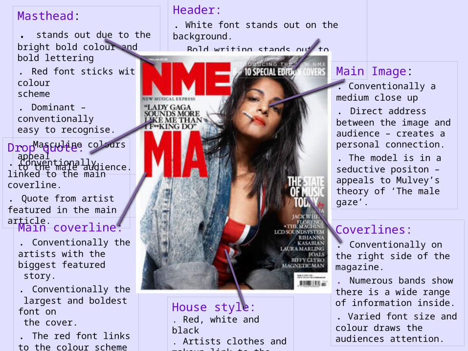
House style: . Red, white and black. Artists clothes and makeup link to the house style.
Header: . White font stands out on the background.
. Bold writing stands out to audience.
Drop quote:. Conventionally linked to the main coverline.. Quote from artist featured in the main article.
Coverlines:. Conventionally on the right side of the magazine.. Numerous bands show there is a wide range of information inside.. Varied font size and colour draws the audiences attention.
Main coverline: . Conventionally the artists with the biggest featured story.. Conventionally the largest and boldest font on the cover. . The red font links to the colour scheme of the masthead.
Masthead:
. stands out due to the bright bold colour and bold lettering. Red font sticks with colour scheme . Dominant – conventionally easy to recognise.
. Masculine colours appeal to the male audience.
Main Image:. Conventionally a medium close up. Direct address between the image and audience – creates a personal connection.. The model is in a seductive positon – appeals to Mulvey’s theory of ‘The male gaze’.
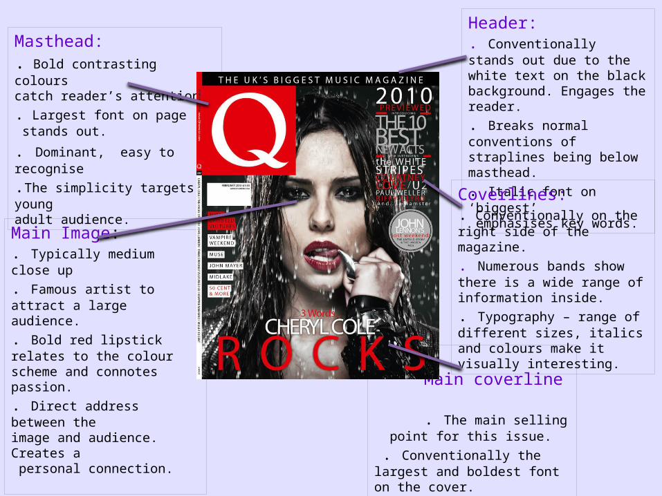
Header:. Conventionally stands out due to the white text on the black background. Engages the reader. . Breaks normal conventions of straplines being below masthead.. Italic font on ‘biggest’ emphasises key words.
Coverlines:. Conventionally on the right side of the magazine.. Numerous bands show there is a wide range of information inside.. Typography – range of different sizes, italics and colours make it visually interesting.
Main coverline . The main selling point for this issue. . Conventionally the largest and boldest font on the cover. . Situated at bottom of page goes against normal conventions.
Main Image:. Typically medium close up
. Famous artist to attract a largeaudience. . Bold red lipstick relates to the colour scheme and connotes passion. . Direct address between the image and audience. Creates a personal connection.
Masthead: . Bold contrasting colours catch reader’s attention.. Largest font on page stands out.
. Dominant, easy to recognise
.The simplicity targets a young adult audience.
Codes and Conventions of a contents page
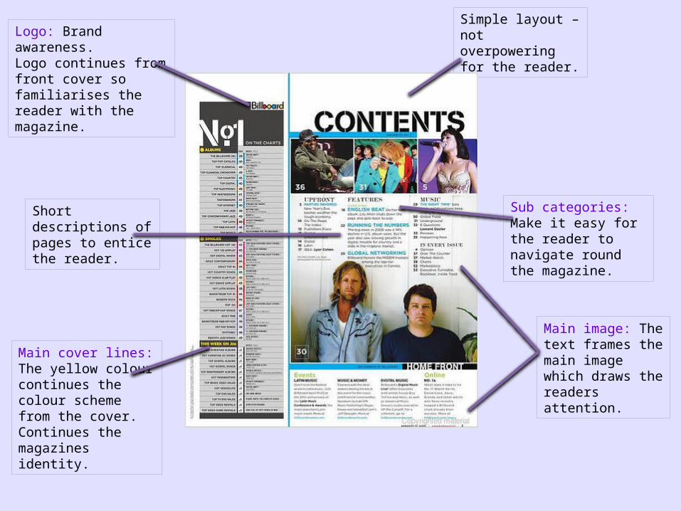
Short descriptions of pages to entice the reader.
Simple layout – not overpowering for the reader.
Main image: The text frames the main image which draws the readers attention.
Sub categories: Make it easy for the reader to navigate round the magazine.
Main cover lines: The yellow colour continues the colour scheme from the cover. Continues the magazines identity.
Logo: Brand awareness.Logo continues from front cover so familiarises the reader with the magazine.
Advertising: The colours used in the advert clash with the colour scheme therefore making it stand out to the reader persuading them to subscribe to the magazine.
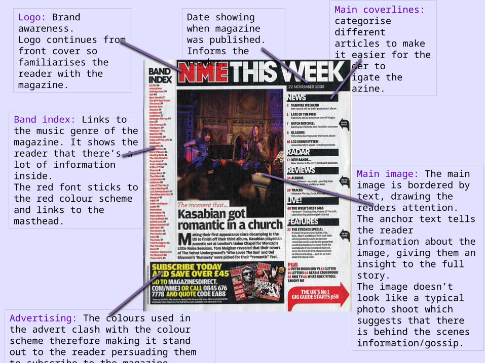
Main image: The main image is bordered by text, drawing the readers attention. The anchor text tells the reader information about the image, giving them an insight to the full story. The image doesn’t look like a typical photo shoot which suggests that there is behind the scenes information/gossip.
Main coverlines: categorise different articles to make it easier for the reader to navigate the magazine.
Band index: Links to the music genre of the magazine. It shows the reader that there’s a lot of information inside.The red font sticks to the red colour scheme and links to the masthead.
Logo: Brand awareness.Logo continues from front cover so familiarises the reader with the magazine.
Date showing when magazine was published. Informs the reader.
Text next to main image ‘James Blunt’ lets the reader know who the main image is of, also what the main article is about. Main Coverlines:
Larger font is used so that the coverines stand out to the audience. Page numbers are red which links to the colour scheme and also makes it easy for the reader to navigate the magazine.
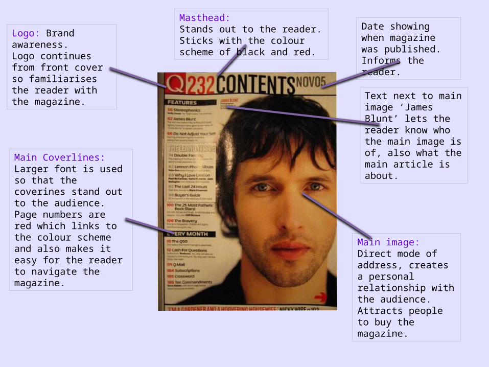
Main image: Direct mode of address, creates a personal relationship with the audience. Attracts people to buy the magazine.
Logo: Brand awareness.Logo continues from front cover so familiarises the reader with the magazine.
Masthead: Stands out to the reader. Sticks with the colour scheme of black and red.
Date showing when magazine was published. Informs the reader.

Codes and Conventions of adouble page spread
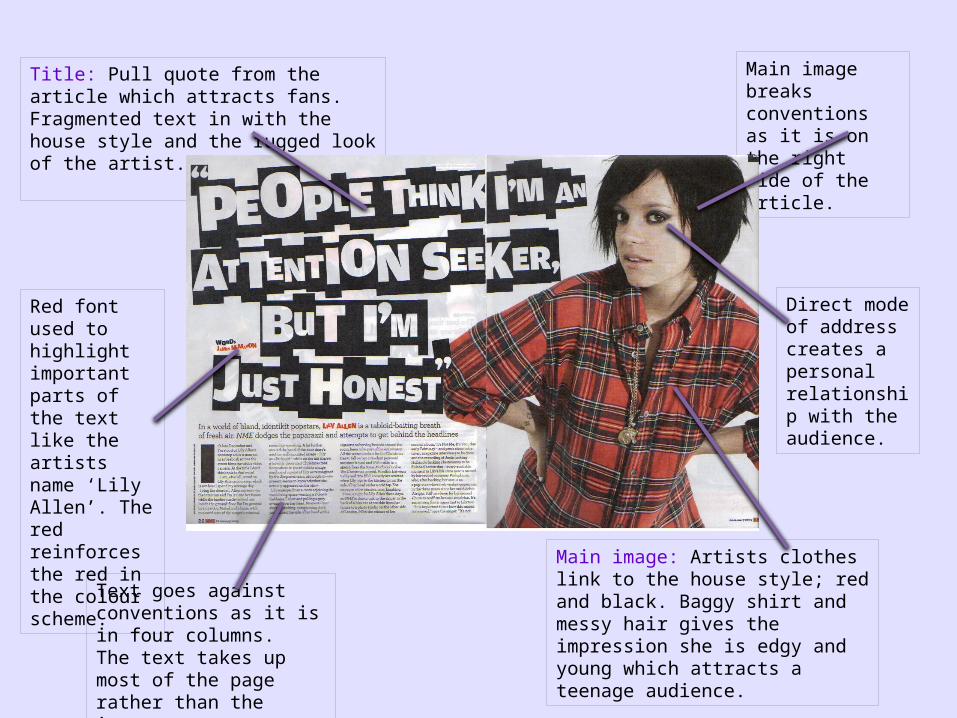
Red font used to highlight important parts of the text like the artists name ‘Lily Allen’. The red reinforces the red in the colour scheme.
Direct mode of address creates a personal relationship with the audience.
Main image breaks conventions as it is on the right side of the article.
Title: Pull quote from the article which attracts fans. Fragmented text in with the house style and the rugged look of the artist.
Text goes against conventions as it is in four columns. The text takes up most of the page rather than the image.
Main image: Artists clothes link to the house style; red and black. Baggy shirt and messy hair gives the impression she is edgy and young which attracts a teenage audience.

Image is conventionally to the left of the article.
Medium close-up and eye contact with the audience creates direct mode of address.
Artists name reinforces and links to the main image.
Brand awareness:Logo continues from front cover so familiarises the reader with the magazine.
Black and White image shows her as being wealthy. Also the black, white and red colours anchor the genre of Q magazine.
The bright red ‘L’ links to Lady Gaga’s name, also it fits the red colour scheme.
How the artist has been positioned and what she is wearing conforms to Mulvey’s theory ‘The male gaze.’
The text is in three columns which is a convention for a music magazine.


