75
Color
| Date post: | 31-Dec-2015 |
| Category: |
Documents |
| Upload: | macey-saunders |
| View: | 29 times |
| Download: | 0 times |

Color
Color-
the visual response of the eye to reflected rays of light
element of design3 dimensions
huevaluechroma

•Hue-
the descriptive name of color
(i.e. red, yellow, & green)pure color w/o black, white, or gray added defines a specific spot on the color wheel
12 hues on the color wheel
•Value-
the lightness or darkness of a hue relative to the gray scale achieved by the addition of black, white,
or grayShadeTintTone

•Gray Scale-
a visual aid which represents the transitional graduations of value from white to black, encompassing all the varying degrees of gray

Gray Scale
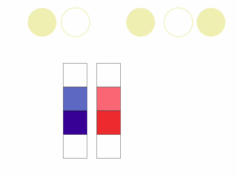
Shade-
a hue which has been darkened by the addition of black
deeper in appearancei.e. navy is a shade of bluei.e. burgundy is a shade of red


Tint-
a hue which has been lightened by the addition of white
pastel in appearancei.e. baby blue is a tint of bluei.e. pink is a tint of red


Tone-
a hue which has been muted by the addition of gray
dusty in appearancei.e. wedge wood blue is a tone of bluei.e. mauve is a tone of red

Chroma-
the degree of strength, intensity, saturation or purity of a color
More pigment would make a color brighter; less would make the color more dull

Pigment
substance used to provide color to paints, dyes, plastics, and other materials

Intensity
reflects the maximum amount of light back to the viewer’s eye
is not mixed with black, white, or gray

Saturation
the measure of the intensity or brightness of a color, describing the amount of light reflecting from it
The greater the saturation of color, the higher the chroma

Color wheel
Twelve hour color system which was developed by Louis Prang, an American Printer in 1876.
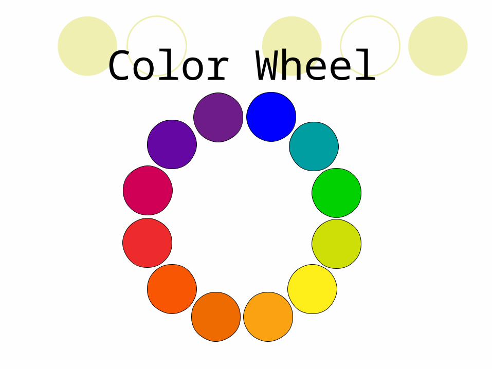
Color Wheel

Primary colors-
red, yellow, & bluespaced equidistantly apart on the color
wheelcannot be created by mixing any other
colors together

Primary Colors
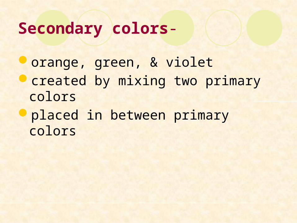
Secondary colors-
orange, green, & violetcreated by mixing two primary colorsplaced in between primary colors
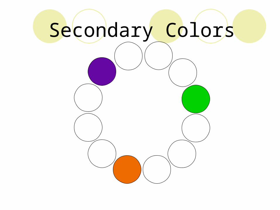
Secondary Colors
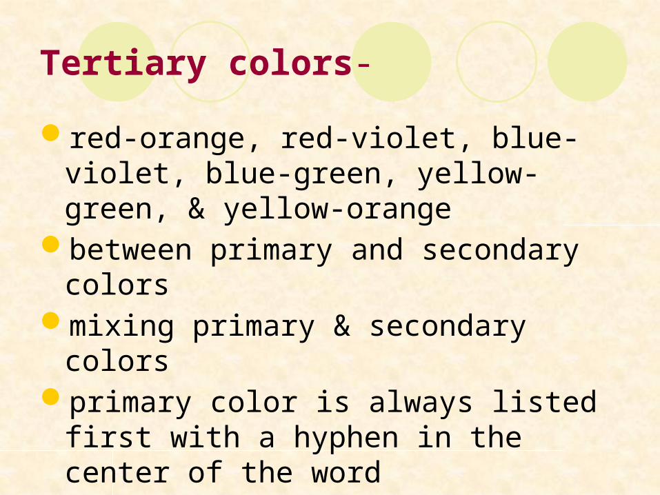
Tertiary colors-
red-orange, red-violet, blue-violet, blue-green, yellow-green, & yellow-orange
between primary and secondary colorsmixing primary & secondary colors primary color is always listed first with a
hyphen in the center of the word

Tertiary Colors

Chromatic colors-
Colors derived from the visible spectrum characterized by the presence of both hue
and chromaall colors other than black, white or gray

Achromatic colors-
white, black, & any values of gray do not appear on the color wheel
Neutral colors-
achromatic color to which a small amount of hue has been added
Advancing (warm) colors-
aggressive or warmpredominantly composed of red or yellowvisually move forward toward the viewer

Warm colors
red, orange, yellowassociation with warm and hot thingsactive, cheery, evoking warm and happy
feelingsdominate, look larger and advanceinformal and blendirritating if too much

Warm Colors

Receding (cool) colors-
passive or coolpredominantly composed of blues or
greensvisually pull back from the viewer

Cool Colors
blue, green, violetassociation with cool thingsrestful, peaceful, soothing, quiet,
melancholy, “less friendly”recede, look smallermay appear formal and lack unitycannot be seen from a distanceusing both increases depth in an
arrangement

Cool Colors

Color harmonies—
Groupings of specific hues and/or different values of a hue
resulting in a pleasing or useful combinationColor harmonies may display different values of
the given hue and still be (i.e. pink and mint green) considered complementary color harmony.
Achromatic colors can be included in any color harmony

Achromatic color harmony-
A grouping of colors without hue; white, black, and any values of gray.

Monochromatic color harmony-
A grouping of different values of one huemay include achromatic colorsAn example would be red and tints, tones,
shades of red—i.e. pink, mauve, red, & burgundy


Analogous color harmony-
A color harmony featuring adjacent hues on the color wheel
no more than one primary colorcolors form an angle of up to 90 degrees on the
color wheelone color usually dominatesone of the most harmonious and pleasing of alli.e. green, blue-green, and yellow-green, with
green dominating


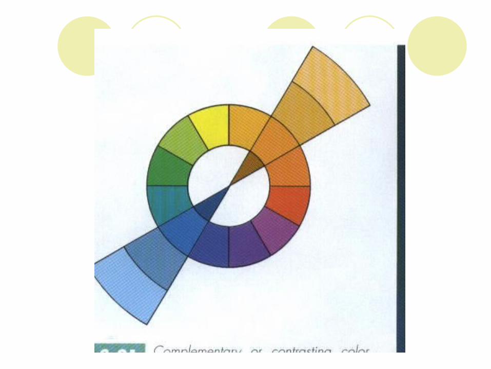
Complementary color harmony-
a pair of hues directly opposite each other on the color wheel
i.e. red & green, violet & yellow, or blue & orange
Many schools select their colors from a complementary color harmony.


Split complementary color harmony
-a trio of hues, consisting of a hue and the two hues on either side of its direct complement
i.e. violet, yellow-orange, & yellow-greenMany restaurants use a split-
complementary color scheme

Triadic color harmony
a grouping of three hues which are equidistant on the color wheel
i.e. primary colors--red, blue & yellowTints of primaries-pink, baby blue, & soft yellow
Changing the value does not change the color harmony.


Tetradic color harmony-
A grouping of four hues which are equidistant on the color wheel
Polychromatic color harmony
a multicolored grouping of many hues which may otherwise be unrelated
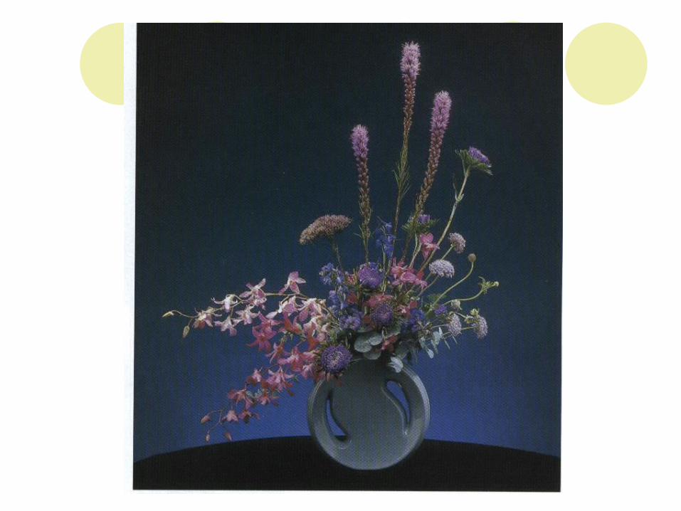
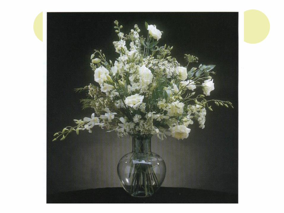
Colors in Floral Designs

White
Blend easilyCleaner, livelierUseful neutralAdds brightness and contrastAchromatic-without colorSimple, elegance and sophistication

Red
Lively, stimulatingStrength and dominanceUse with careDemands attentionCould overpowerGreen foliage complement red

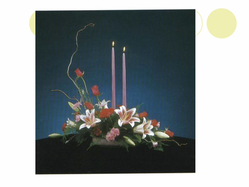
Pink
Combines with many colorsRomance, femininityOften enhanced by use of stronger
contrasting colorsBrighter pink—more attention


Orange
StimulatingCompels attentionAdds brightnessAutumnTints and shades


Yellow
Reflects a lot of lightVibrant and highly visibleFriendlySpirit and perkToo much as monochromatic


Green
Natural backgroundSoothing and restfulContainers


Blue
Peaceful, quiet, and coolDifferent lighting—actually purpledepressing


Purple
Rich and dramaticOpposites in extremes (red and blue)Cool or warm


Examples of Color Activities

Coloring White Carnations


Mandala


