21
Portfolio Clint Goodman
| Date post: | 19-Dec-2015 |
| Category: |
Documents |
| Upload: | clint-goodman |
| View: | 14 times |
| Download: | 2 times |

PortfolioClint Goodman

ContactClint [email protected]

Table ofContents
Photodesign BrochureMontageWebpageEvent AdFlierLogosBusiness CardsLetterhead

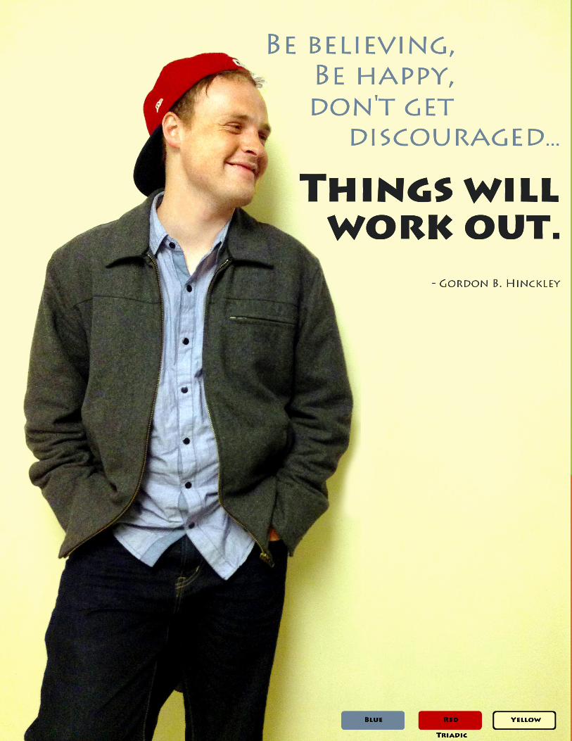
Description:Take a photo, apply basic photo edits, use a color scheme
and add text to complete a photo graphic.
Course/Instructor:Comm 130 - Visual MediaCory Kerr
Tools Used: Adobe Photoshop and professional camera
Objectives: Learn basic photography skills; choose a color scheme,
take a photo to match those colors, then incorporate the colors into the layout; adjust image levels, saturation, color balance, sharpen tool on separate layers for NDE (non-destructive editing); print with full-bleed margins.
Process: I took this photo of my roommate. The reason why I chose
to work with this photo was because of the obvious color scheme, and the good lead which left room for a good quote. I applied 5 edits to the photo using Adobe Photoshop, which included level balancing, color balancing, using the sharpen tool, adjusting the saturation, and using the paintbrush and stamp tools. After bringing out the colors, I also took care of some skin blemishes in the picture by removing a shaving burn. I also edited the background to make it more yellow, uniform and consistent by using a mixture of the paintbrush tool and the stamp tool. My alignment was done using the ruler, and that took a little while to perfect.
PhotoDesignFebruary 7, 2015

Description:This is a bifold offset brochure, with original logo and text created by myself.
Course/Instructor:Comm 130 - Visual MediaCory Kerr
Tools Used: Adobe Photoshop, Adobe InDesign and Adobe Photoshop
Objectives:Set up and align a two-sided, folded document; create an original, new logo
and use it in a brochure; incorporate quality images; incorporate at least four quality images, not including the logo; trim for a full bleed and print in duplex (two-sided) color.
Process: In order to make the logo on the front, I used the pen tool to make the “Y”. I
found a picture of a cougar online, and using the magnetic selection tool, I saved a selection that outlined the cougar. I then used that selection to make a mask over the “Y” linked image, which made the cougar outline transparent on the “Y”.
There are three football players, and I used three images online, and using a mixture of selection tools (and refining edges) I deleted the background of all three of the football players, and saved these as Photoshop documents.
The back photo had large text above in the clouds, as well as text beneath.Using the stamp tool, I took out the text from both top and bottom, extended the clouds and the bottom, and positioned it to where the main line focal point was on a third line.
I made the “BYU football” top logo by using Adobe Illustrator, typed in the text, and converted the text to outlines. I was then able to make the text thicker, and adjust the inner gaps between characters to provide a wider canyon.
The football field was also done using an image from online, and using the stamp tool taking out ticker marks and extending the field using Photoshop. Using the layer adjustments, I converted the field from green to blue.
The rest was done in Indesign. There is a repeated element of a elongated square. To do this, I made a big square and filled it with blue. I copied that square, shrunk it, and made it white to surround the header. I then copied the original blue square twice more, filled it with no color, and made those new shapes very skinny. I clicked on both of the new squares, and adjusted the text wrapping for them to be “Wrap around bounding box”. This created the angle text wrapping effect that followed the diagonal lines of the surrounding shape.
BrochureMarch 26, 2015

footbal l
CO
UG
AR
S
Honor
Spirit
Tradition
What is BYU Football?
BYU football holds traditions important. Whether it be starting
each game with the Haka, or the pre-game fi reside the night before,
our traditions give us identity and meaning.
We strive to bring honor to our team, family and our university. When we
live right on and off the fi eld, we are worthy of bearing the name of our university, which stands for honor,
truth and right living.
We play with spirit, passion and great courage. We have purpose in our team, direction in our publicity, and a motivation that makes us strive for our best.
It is more than a game, it is what the game teaches us.
It is more than a touchdown pass, it is discipline, execution, teamwork, vision and hard work.
It is more than a win for the record, it is a sense of accomplishment, purpose, and unifi ed success.
It is more than a sideline spectator that we are trying to impress.
It is more than a TV contract, our name in the paper, or just another extra-curricular activity.
Our purpose is nobler, our aim is higher, and our rhythm is unstoppable.
BYU football represents a template for how to achieve goals and stretch yourself.
It is about legacy, not about statistics.
It is about honor to the university, not just publicity.
It is about doing the best we can, not just winning.
This is BYU football!
footbal l
Front Back
Inner

Description:This project is a montage design, using photos from the
internet in a creative blend to produce a spiritual message.
Course/Instructor:Comm 130 - Visual MediaCory Kerr
Tools Used: Adobe Photoshop
Objectives: Use the FOCUS design process with strong focal point
and flow; unify a layout with a consistent theme and dominant spiritual message; learn to blend two or more images together gradually, using masks; demonstrate more advanced Photoshop skills for layout with multiple elements; use a mask to apply a filter to one part of the image; apply typography principles.
Process: Using the magnetic lasso tool, I went carefully along
the edge of the depressed man on the top left, as well as the pushup man on the bottom right, to select just the outline of their bodies. Then, I clicked on “Refine Edge”, and made the selection more smooth, slightly feathered, and moved the center a little outward. I made a few more adjustments to get my selection just what I wanted for both images.
I brought in the background cloud/water image, and made it grayscale by using image filters. I then duplicated that layer, and made it blue using image filters. Then, on the blue layer, I made a mask that opened up the clouds to the layer below, and made the layer semi-transparent.
I dragged the two men onto the background image. I then applied masks to both images, using radial gradients from black to white, to allow a smooth fade of transparency.
I applied a similar mask to the pushup man as I did with the blue ocean, so that I could turn his gray space into blue space.
I copied all of the words into a new merged layer. I then painted all the letters white. I applied a Gaussian blur to that layer, which created this white glow mist the approximate shape of the words. I doubled that layer to increase the glow slightly.
MontageFebruary 14, 2015


Description:For this project, we were required to use HTML and CSS
to write and style a webpage describing a previous project (concerning logos).
Course/Instructor:Comm 130 - Visual MediaCory Kerr
Tools Used: HTML/CSS
Objectives: Acquire a working knowledge of HTML; acquire a working
knowledge of CSS; identify hex colors to match logo, using Photoshop color picker.
Process: First, I designed a basic HTML structure and flow of nested
<div>’s. Within those <div>’s, I added minor markup, such as <strong>, <ul>’s, etc.
I then began the work of implementing the CSS parallax effect. This involved many, many hours of debugging, searching online for answers, re-arranging code, adding classes to the <div>’s, changing z-index’s, etc.
I then created the alternate effect (every other slide alternate’s alignment) by using the CSS rule of nth’s.
I then made the webpage more responsive by changing fixed values to percentages.
I developed everything using Sublime Text as the editor and Google Chrome and Firefox as the browsers.
Special thanks to a tutorial that answered many of my questions: http://keithclark.co.uk/articles/pure-css-parallax-websites/.
WebpageMarch 14, 2015


Description:For this project, we were to design an event flyer using an
image that we had scanned. The event was to be a fundraiser for an organization that I made up.
Course/Instructor:Comm 130 - Visual MediaCory Kerr
Tools Used: Microsoft Word
Objectives:Comprehend image sizing (how pixels and inches work
together); find, scan and import a high-quality image; create a full-bleed design; choose a color scheme and typeface(s) that work for your message and audience; learn to use only Word design features without using any Adobe programs, including Photoshop.
Process: The requirements for this project included a scanned image
and Microsoft Word. We were not allowed to use any other software, so resorting to using this Microsoft product presented it’s challenges. I wanted the most captivating phrase, “Run For Your Life”, to stand out as clever and important. I used strategic sizes of fonts and grouped them according to the information that they presented (date/time/place at bottom left, fundraiser details on bottom right, purpose is dead center).
Event AdFebruary 1, 2015

`
June 27 2015 2:00 pm Porter Park
Entrance fee 15$ donated to Overrun by Obesity
Hosted by Delicious Doughnuts

Description:A grayscale flier advertising for a leadership conference for
graduates.
Course/Instructor:Comm 130 - Visual MediaCory Kerr
Tools Used: Adobe InDesign
Objectives: Apply the design principles and use appropriate typography,
incorporate basic InDesign skills to improve basic flier layout, retrieve image and logo from links on this page, create a project folder with image, logo and InDesign document to keep links in InDesign intact.
Process: The images, logo, and body text were all given to me to
work with, as well as the requirement that the project be a grayscale project. After making sketches and receiving feedback on the sketches, I designed flier using Adobe InDesign. Because it was grayscale, I wanted to make my central message (leadership learning opportunity) have lots of contrast, and create a hierarchy of visual importance based on small tints of grayscale, and not color. I then wanted to add more asymmetry to my flier, and so I played around with the layout of textboxs until I had a pleasing design. I have received input on this flier from my peers, and made adjustments accordingly.
FlierJanuary 24, 2015

Do you want to have the competitive edge in business?
Come learn how to at Vouant Communication’s annual Graduate Leadership Conference.
Vouant Communications is devoted to helping tomorrow’s leaders gain essential leadership skills in the workplace. During this dynamic three-day seminar, attendees will meet with top executives of Vouant Communications to discuss breakthrough leadership techniques, while cultivating attributes of leadership that will market to any employer.
Conference is available to graduating seniors. Space is limited.
October 218 a.m. - 5 p.m.Lincoln Convention Center
Leadersh ipGraduate
Conference
Registration and more information available at http://www.vouantcomm.com/leaders

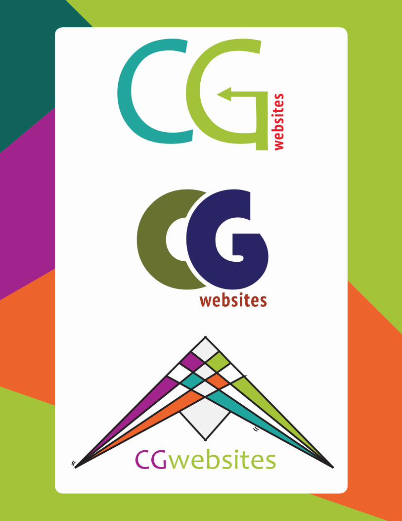
Description:This project was to design 3 different types and styles of
logos for a company (in this case, the company is my own).
Course/Instructor:Comm 130 - Visual MediaCory Kerr
Tools Used: Adobe Illustrator
Objectives: Create three completely different, original logos to fit a
company or personal image that will appeal to the audience; use only the Illustrator tools to create and draw your logos.
Process: To make the top logo, I used created my text using the
type tool, and then I created outlines from the text. With the direction selection tool, I was able to manipulate the “G” to transform it into an arrow tip. I was able to straighten things using rulers and guides. I rotated the text “websites” 90 degrees.
To make the middle logo, I likewise started with the type tool, and then created outlines from the text. The “C” filled up too much space, and I wanted crop and make it fill less space. So I created a circle shape, placed it in front of the “C”, make it slightly bigger than what my “G” was, and used the “minus front” shape mode from the pathfinder tool to cut the “C” to the size I wanted it. That was the trickiest part for this logo. I aligned the “websites” to the far right.
To make the bottom logo I used the line segment tool, and using the background grid to get spacing correct I create the background “checker” pattern. The thing that was the most difficult was to get alignment with equal spacing. I then used the “live paint bucket” tool to fill in the colors. The color scheme was easy to fill in because I created my own color pallet with the colors I wanted in it.
LogosFebruary 22, 2015
webs
ites
websites
CGwebsites

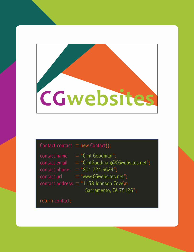
Description:Design an stationary set letterhead, in connection with
business cards design.
Course/Instructor:Comm 130 - Visual MediaCory Kerr
Tools Used: Adobe InDesign and Adobe Illustrator
Objectives: Create a new logo to fit a company or personal image; use
the new logo to design consistent layouts for a business card and letterhead; apply typography rules, keeping small copy; keep designs simple with light watermarks and drop shadows and plenty of white space.
Process: First I sketched out my design using paper and pencil. I
also gathered images of a popular coding program (Sublime Text) to help me get a recognizable color scheme.
Using Adobe Illustrator, I made two triangles, and using the direct select tool I manipulated them to overlap one another and change proportions. After making my text, I converted the text into outlines, and altered the “i” and the “t” in the word “websites” so that there were no tangents with the orange triangle behind it. This took the most time, finding a balance of spacing to prevent tangents. The front side of the logo uses tabs to get the “=” to align all the way down evenly. I used the images of Sublime Text to copy the color scheme over.
Business Cards February 27, 2015
Contact contact = new Contact();
contact.name = “Clint Goodman”;contact.email = “[email protected]”;contact.phone = “801.224.6624”;contact.url = “www.CGwebsites.net”;contact.address = “1158 Johnson Cove\n Sacramento, CA 75126”;
return contact;

Description:Design an stationary set, including a letterhead that is
consistent with business cards.
Course/Instructor:Comm 130 - Visual MediaCory Kerr
Tools Used: Adobe InDesign
Objectives: Create a new logo to fit a company or personal image; use
the new logo to design consistent layouts for a business card and letterhead; apply typography rules, keeping small copy; keep designs simple with light watermarks and drop shadows and plenty of white space.
Process: To create the letterhead, I used Adobe InDesign. Using
links, I referenced the logo and an alternate form of the logo (without text). I altered the opacity of the watermark to 5%.
LetterheadFebruary 27, 2015

Clint GoodmanCl intGoodman@CGwebsi tes.net801.251.6624www.CGwebsi tes.net1158 Johnson Cove | Sacramento, CA 75126


