CONSTRUCTION - DRAFT 1 (DPS) To make my double page spread, I made the page on Fireworks 1000 x 700. I added a line using the line tool down the centre of the page to separate the two pages. I again copied and pasted the background from the contents/front cover page onto the double page spread.
Transcript
CONSTRUCTION - DRAFT 1 (DPS)
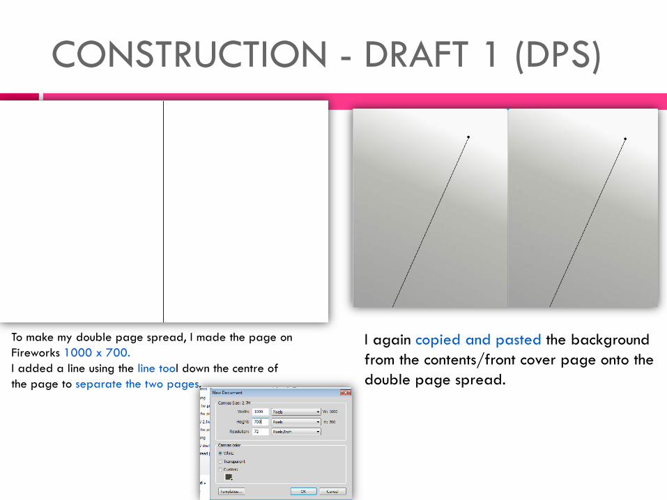
To make my double page spread, I made the page on Fireworks 1000 x 700. I added a line using the line tool down the centre of the page to separate the two pages.
I again copied and pasted the background from the contents/front cover page onto the double page spread.
CONSTRUCTION – DRAFT 1 (DPS)
I used the text tool and the font Baskerville Old Face to create the dateline for the double page spread. I again imported the masthead/logo onto both pages to create brand identity. I used the font Gils..... for the title. I made this the same colour as the contents page title. I also added subtext under that to tell the reader what the article is about. I added page numbers too.
I began writing my article; I used the Baskerville Old Face font for this, and made it a dark purple so it could be easily read against the background. Looking back at my planning, I also found a capital Y and imported this onto the page. This was done so the audience knew again who the article was about and who the main feature of this edition was. My preferred reading was that the main focus was continually on the artist.
CONSTRUCTION - DRAFT 1 (DPS)
I opened the image that I wanted and used the polygon lasso tool to cut around the artist. I then imported the image into the double page spread onto the right page; I made the text flow around the image using the pointer tool and repositioning it.
I now had to make the 'Y' a colour that was part of my colour theme. I selected the letter and used the colour select tool on the page numbers to make sure it was the right colour; I made it gold and changed the opacity to 50 so it wasn't too dark. I made this central on the right page.
CONSTRUCTION - DRAFT 1 (DPS
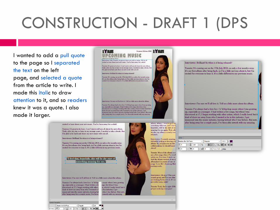
I wanted to add a pull quote to the page so I separated the text on the left page, and selected a quote from the article to write. I made this italic to draw attention to it, and so readers knew it was a quote. I also made it larger.
CONSTRUCTION - DRAFT 2 (DPS)
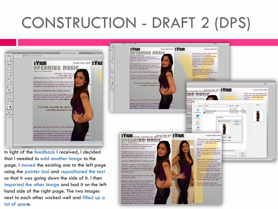
In light of the feedback I received, I decided that I needed to add another image to the page. I moved the existing one to the left page using the pointer tool and repositioned the text so that it was going down the side of it. I then imported the other image and had it on the left hand side of the right page. The two images next to each other worked well and filled up a lot of space.
CONSTRUCTION – DRAFT 2 (DPS)
I then realised that the letter Y no longer was visible and wasn't prominent as it was; I moved this using the pointer tool to the left page, this looked better. I also repositioned the pull quote so it overlapped between the pages, and using the colour tool made this gold as purple wasn't legible against black.
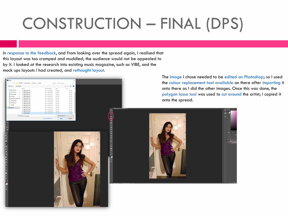
CONSTRUCTION – FINAL (DPS) In response to the feedback, and from looking over the spread again, I realised that this layout was too cramped and muddled; the audience would not be appealed to by it. I looked at the research into existing music magazine, such as VIBE, and the mock ups layouts I had created, and rethought layout.
The image I chose needed to be edited on Photoshop; so I used the colour replacement tool available on there after importing it onto there as I did the other images. Once this was done, the polygon lasso tool was used to cut around the artist; I copied it onto the spread.
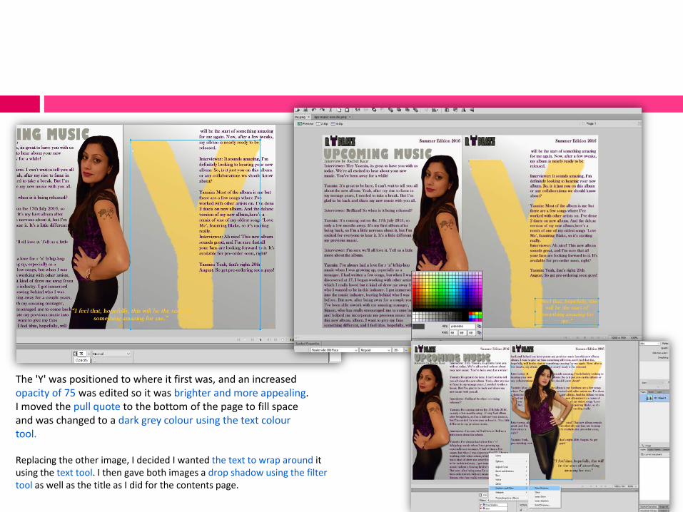
Replacing the other image, I decided I wanted the text to wrap around it using the text tool. I then gave both images a drop shadow using the filter tool as well as the title as I did for the contents page.
The 'Y' was positioned to where it first was, and an increased opacity of 75 was edited so it was brighter and more appealing. I moved the pull quote to the bottom of the page to fill space and was changed to a dark grey colour using the text colour tool.