16
| Date post: | 23-Mar-2016 |
| Category: |
Documents |
| Upload: | tyler-reed |
| View: | 212 times |
| Download: | 0 times |


DIRTY DIRTY DIRTY DIRTY DIRTY DIRTY DIRTY DIRTY SEXY SEXY SEXY SEXY SEXY SEXY SEXY SEXY RETRORETRORETRORETRORETRORETRORETRORETRO

This magazine attracted me as its young, its feminine and its modern.
I feel that the large image connotes a livelier attitude for its audience.
The stylised, edgy attitude is the style I want my magazine to achieve.
I feel this kind of theme would be appropriate for my target audience,
as it meets the criteria for 16-20 year old girls who love music. I love
the use of the large image as it makes a bold statement. With a
recognised artist on the front wich also attracts readers.

TONETONE
TONE
TONE
TONETONE
TONE
TONE
THE FIXTHE FIXTHE FIXTHE FIXTHE FIXTHE FIXTHE FIXTHE FIX
PULSE
PULSE
PULSE
PULSE
PULSE
PULSE
PULSE
PULSE FEUDFEUDFEUDFEUDFEUDFEUDFEUDFEUD
CULT
CULT
CULT
CULT
CULT
CULT
CULT
CULT
DIVEDIVEDIVEDIVEDIVEDIVEDIVEDIVE
BEAT
BEAT
BEAT
BEAT
BEAT
BEAT
BEAT
BEAT
DMT
DMT
DMT
DMT
DMT
DMT
DMT
DMT
PURE
PURE
PURE
PURE
PURE
PURE
PURE
PURE
BASS
BASS
BASS
BASS
BASS
BASS
BASS
BASS
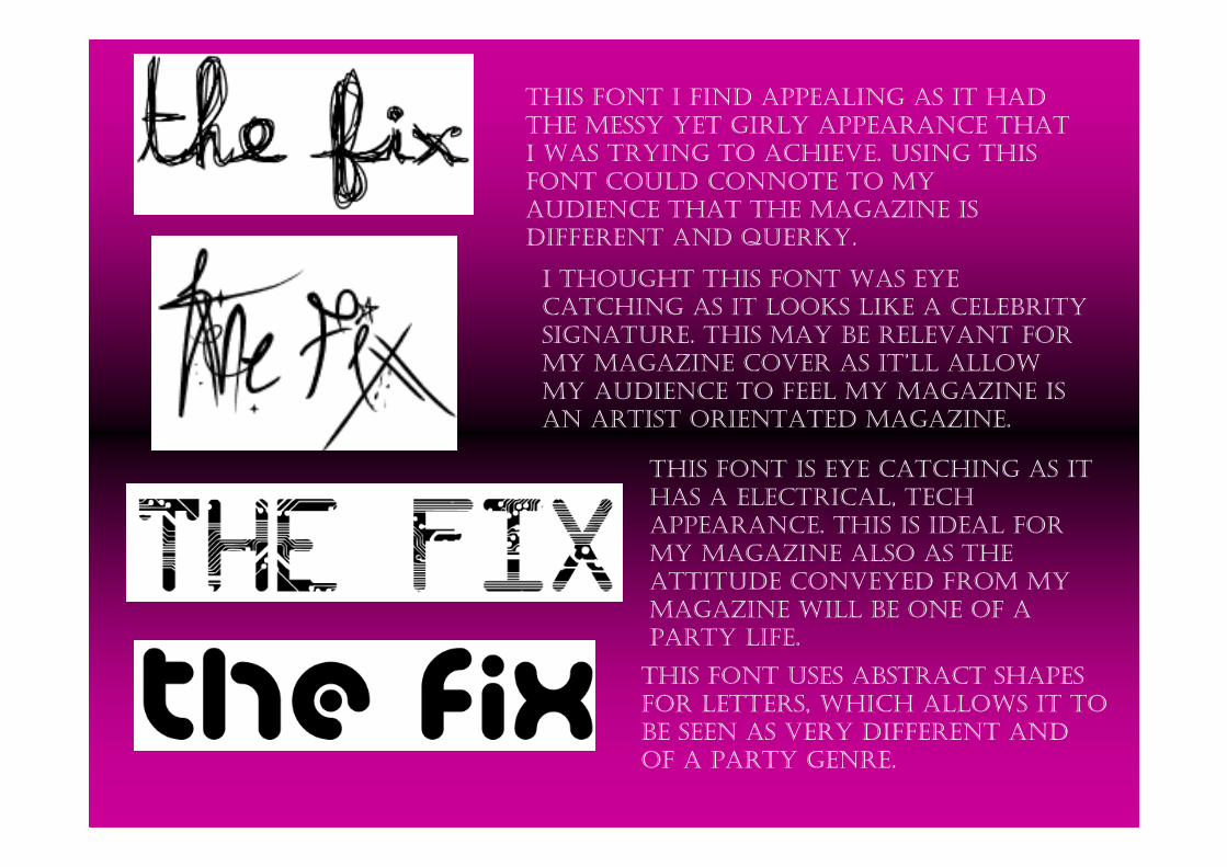
THIS FONT I FIND APPEALING AS IT HAD
THE MESSY YET GIRLY APPEARANCE THAT
I WAS TRYING TO ACHIEVE. USING THIS
FONT COULD CONNOTE TO MY
AUDIENCE THAT THE MAGAZINE IS
DIFFERENT AND QUERKY.
I THOUGHT THIS FONT WAS EYE
CATCHING AS IT LOOKS LIKE A CELEBRITY
SIGNATURE. THIS MAY BE RELEVANT FOR
MY MAGAZINE COVER AS IT’LL ALLOW
MY AUDIENCE TO FEEL MY MAGAZINE IS
AN ARTIST ORIENTATED MAGAZINE.
THIS FONT IS EYE CATCHING AS IT
HAS A ELECTRICAL, TECH
APPEARANCE. THIS IS IDEAL FOR
MY MAGAZINE ALSO AS THE
ATTITUDE CONVEYED FROM MY
MAGAZINE WILL BE ONE OF A
PARTY LIFE.
THIS FONT USES ABSTRACT SHAPES
FOR LETTERS, WHICH ALLOWS IT TO
BE SEEN AS VERY DIFFERENT AND
OF A PARTY GENRE.

I chose this font as its very modern and has a very party life
appearance towards it. I chose the name the fix as it will relate my
magazine as a drug to the readers. I want my magazine to become
addictive so that it fresh new and my audience always wants to
read it.
SLOGAN: SLOGAN: SLOGAN: SLOGAN: SLOGAN: SLOGAN: SLOGAN: SLOGAN:
DDDDDDDDIIIIIIIIRRRRRRRRTTTTTTTTYYYYYYYYY Y Y Y Y Y Y Y SSSSSSSSEEEEEEEEXXXXXXXXYYYYYYYYYYYYYYYY RRRRRRRREEEEEEEETTTTTTTTRRRRRRRROOOOOOOOOOOOOOOOThis slogan is everything I ant my magazine to represent and portray.

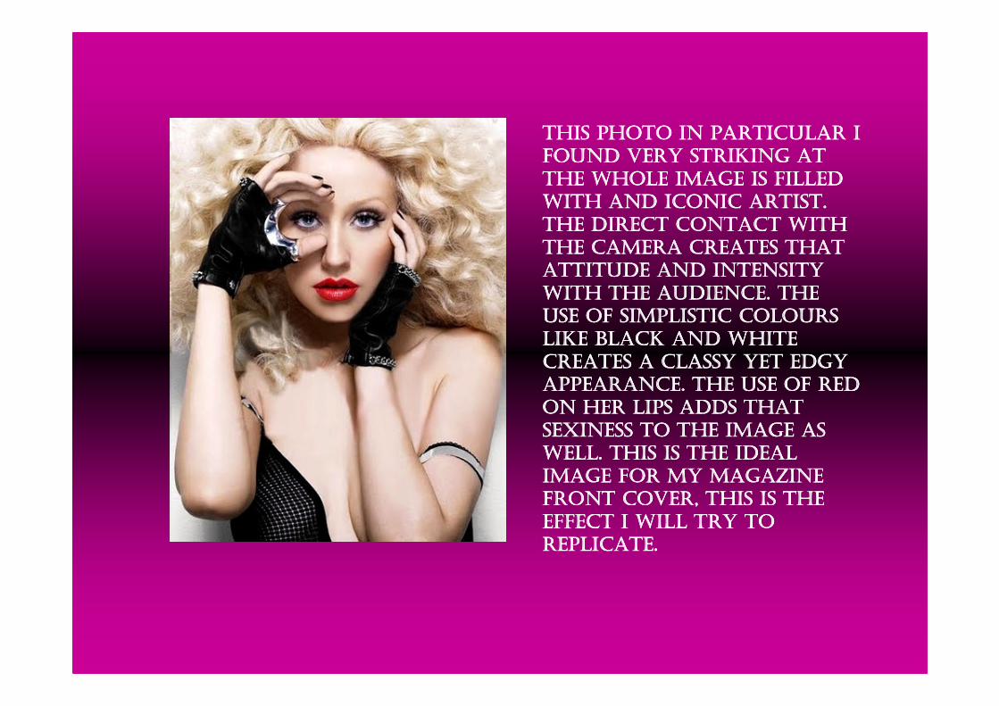
THIS PHOTO IN PARTICULAR I THIS PHOTO IN PARTICULAR I THIS PHOTO IN PARTICULAR I THIS PHOTO IN PARTICULAR I
FOUND VERY STRIKING AT FOUND VERY STRIKING AT FOUND VERY STRIKING AT FOUND VERY STRIKING AT
THE WHOLE IMAGE IS FILLED THE WHOLE IMAGE IS FILLED THE WHOLE IMAGE IS FILLED THE WHOLE IMAGE IS FILLED
WITH AND ICONIC ARTIST. WITH AND ICONIC ARTIST. WITH AND ICONIC ARTIST. WITH AND ICONIC ARTIST.
THE DIRECT CONTACT WITH THE DIRECT CONTACT WITH THE DIRECT CONTACT WITH THE DIRECT CONTACT WITH
THE CAMERA CREATES THAT THE CAMERA CREATES THAT THE CAMERA CREATES THAT THE CAMERA CREATES THAT
ATTITUDE AND INTENSITY ATTITUDE AND INTENSITY ATTITUDE AND INTENSITY ATTITUDE AND INTENSITY
WITH THE AUDIENCE. THE WITH THE AUDIENCE. THE WITH THE AUDIENCE. THE WITH THE AUDIENCE. THE
USE OF SIMPLISTIC COLOURS USE OF SIMPLISTIC COLOURS USE OF SIMPLISTIC COLOURS USE OF SIMPLISTIC COLOURS
LIKE BLACK AND WHITE LIKE BLACK AND WHITE LIKE BLACK AND WHITE LIKE BLACK AND WHITE
CREATES A CLASSY YET EDGY CREATES A CLASSY YET EDGY CREATES A CLASSY YET EDGY CREATES A CLASSY YET EDGY
APPEARANCE. THE USE OF RED APPEARANCE. THE USE OF RED APPEARANCE. THE USE OF RED APPEARANCE. THE USE OF RED
ON HER LIPS ADDS THAT ON HER LIPS ADDS THAT ON HER LIPS ADDS THAT ON HER LIPS ADDS THAT
SEXINESS TO THE IMAGE AS SEXINESS TO THE IMAGE AS SEXINESS TO THE IMAGE AS SEXINESS TO THE IMAGE AS
WELL. THIS IS THE IDEAL WELL. THIS IS THE IDEAL WELL. THIS IS THE IDEAL WELL. THIS IS THE IDEAL
IMAGE FOR MY MAGAZINE IMAGE FOR MY MAGAZINE IMAGE FOR MY MAGAZINE IMAGE FOR MY MAGAZINE
FRONT COVER, THIS IS THE FRONT COVER, THIS IS THE FRONT COVER, THIS IS THE FRONT COVER, THIS IS THE
EFFECT I WILL TRY TO EFFECT I WILL TRY TO EFFECT I WILL TRY TO EFFECT I WILL TRY TO
REPLICATE.REPLICATE.REPLICATE.REPLICATE.
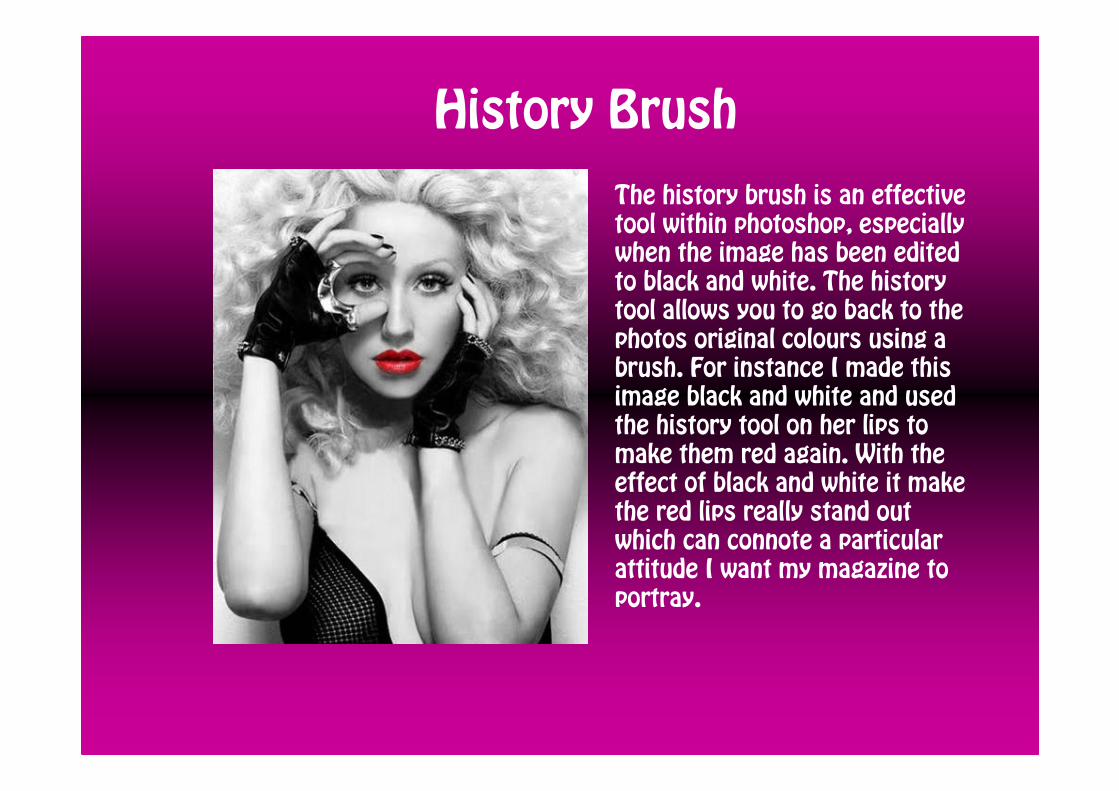
History Brush
The history brush is an effective
tool within photoshop, especially
when the image has been edited
to black and white. The history
tool allows you to go back to the
photos original colours using a
brush. For instance I made this
image black and white and used
the history tool on her lips to
make them red again. With the
effect of black and white it make
the red lips really stand out
which can connote a particular
attitude I want my magazine to
portray.
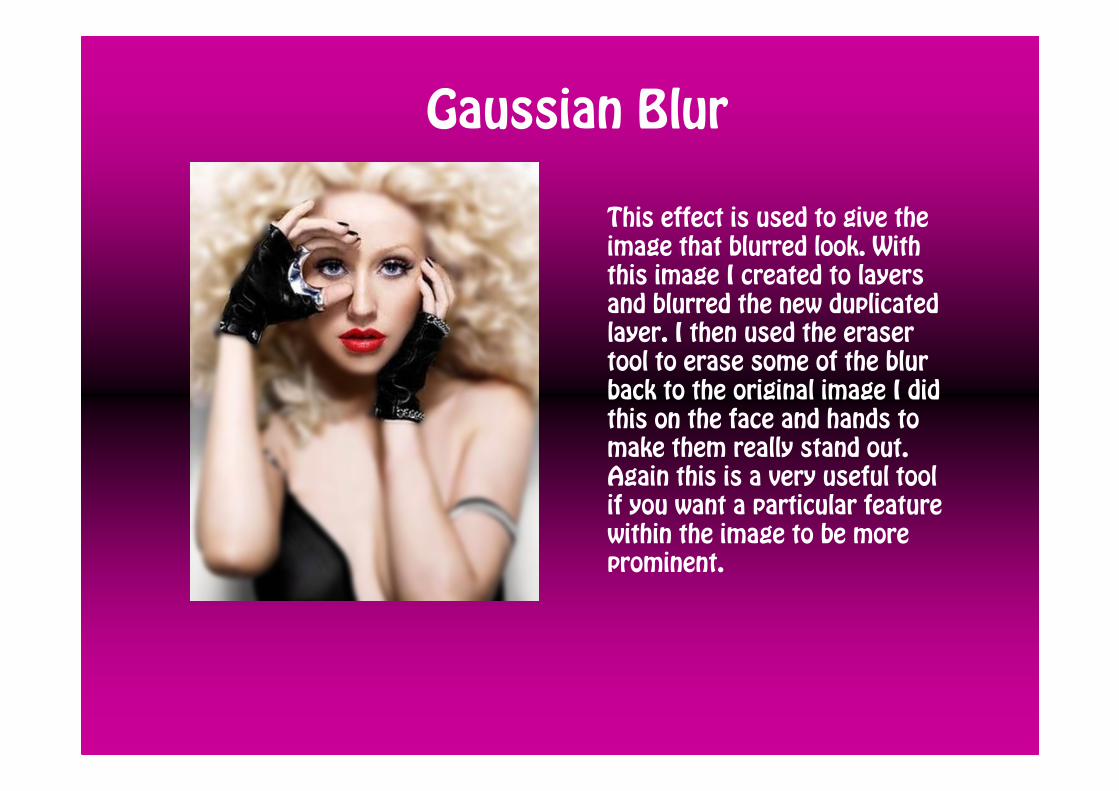
Gaussian Blur
This effect is used to give the
image that blurred look. With
this image I created to layers
and blurred the new duplicated
layer. I then used the eraser
tool to erase some of the blur
back to the original image I did
this on the face and hands to
make them really stand out.
Again this is a very useful tool
if you want a particular feature
within the image to be more
prominent.

Flat Plans

My magazine
Like my flat plans my magazine will be modern and fresh with colours
that are relevant to my central image. I will use large central images
to create a bold statement for my audience and they will either be
role-model woman or idolised men, as my audience is mainly for 16
20 years old females. I will have; mainly a pink and black theme, as
my masthead consists of these colours. My magazine will be cost
£2.50 and will consist of music news as well as celeb gossip,
including competitions and the chance to win freebies. These
incentives will make my magazine more interesting for its audience.


