5
64135 Joe Dolan 2043 Music Magazine – Contents Page and DPS Textual Analysis
| Date post: | 08-Aug-2015 |
| Category: |
Education |
| Upload: | joedolan2014 |
| View: | 73 times |
| Download: | 0 times |
64135
Joe Dolan2043
Music Magazine –
Contents Page and DPS Textual Analysis
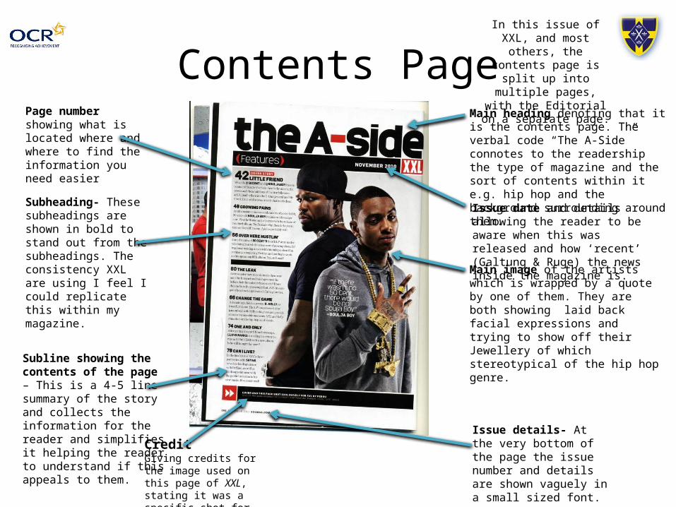
Contents PageMain heading denoting that it is the contents page. The verbal code “The A-Side” connotes to the readership the type of magazine and the sort of contents within it e.g. hip hop and the background surrounding around them.
Issue date and details allowing the reader to be aware when this was released and how ‘recent’ (Galtung & Ruge) the news inside the magazine is.
Main image of the artists which is wrapped by a quote by one of them. They are both showing laid back facial expressions and trying to show off their Jewellery of which stereotypical of the hip hop genre.
Page number showing what is located where and where to find the information you need easier
Subline showing the contents of the page – This is a 4-5 line summary of the story and collects the information for the reader and simplifies it helping the reader to understand if this appeals to them.
In this issue of XXL, and most others, the contents page is split
up into multiple pages, with the Editorial on a
separate page.
CreditGiving credits for the image used on this page of XXL, stating it was a specific shot for this issue.
Subheading- These subheadings are shown in bold to stand out from the subheadings. The consistency XXL are using I feel I could replicate this within my magazine.
Issue details- At the very bottom of the page the issue number and details are shown vaguely in a small sized font.
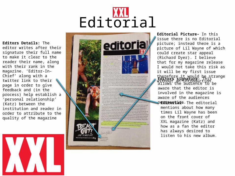
EditorialEditorial Picture- In this issue there is no Editorial picture; instead there is a picture of Lil Wayne of which could create star appeal (Richard Dyer). I believe that for my magazine release I would not take this risk as it will be my first issue therefore it would be strange without an introduction.
Editors signature- This allows the audience to be aware that the editor is involved in the magazine is aware of the audiences perspective.
Editors Details: The editor writes after their signature their full name to make it clear to the reader their name, along with their rank in the magazine. ‘Editor-In-Chief’ along with a twitter link to their page in order to give feedback and (in the process) help establish a ‘personal relationship’ (Katz) between the institution and reader in order to attribute to the quality of the magazine
Editorial- The editorial mentions about how many times Lil Wayne has been on the front cover of XXL magazine (Katz) and how as a fan the editor has always desired to listen to his new album.
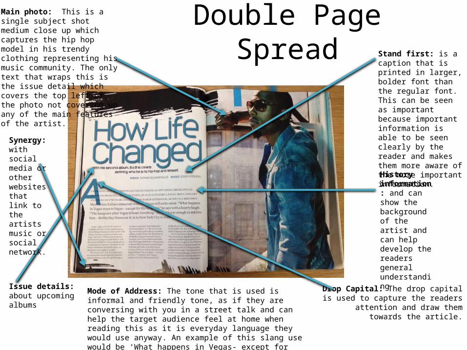
Double Page SpreadMain photo: This is a single subject shot medium close up which captures the hip hop model in his trendy clothing representing his music community. The only text that wraps this is the issue detail which covers the top left of the photo not covering up any of the main features of the artist.
Issue details: about upcoming albums
Stand first: is a caption that is printed in larger, bolder font than the regular font.This can be seen as important because important information is able to be seen clearly by the reader and makes them more aware of the more important information.
History information: and can show the background of the artist and can help develop the readers general understanding
Synergy:with social media or other websites that link to the artists music or social network.
Drop Capital: The drop capital is used to capture the readers attention and draw
them towards the article.
Mode of Address: The tone that is used is informal and friendly tone, as if they are conversing with you in a street talk and can help the target audience feel at home when reading this as it is everyday language they would use anyway. An example of this slang use would be ‘What happens in Vegas- except for the hangover’ using comical humour to connect the magazine with the readers.
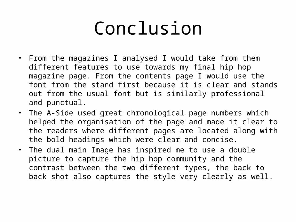
Conclusion• From the magazines I analysed I would take from them different features to use
towards my final hip hop magazine page. From the contents page I would use the font from the stand first because it is clear and stands out from the usual font but is similarly professional and punctual.
• The A-Side used great chronological page numbers which helped the organisation of the page and made it clear to the readers where different pages are located along with the bold headings which were clear and concise.
• The dual main Image has inspired me to use a double picture to capture the hip hop community and the contrast between the two different types, the back to back shot also captures the style very clearly as well.


