16
Conventions of media question
| Date post: | 08-Aug-2015 |
| Category: |
Business |
| Upload: | jaiydeen-deeble |
| View: | 61 times |
| Download: | 0 times |
Conventions of media question

My findings Masthead
Barcode
Pull quote
Cover star
Lead article
cover line
3 colour scheme
stage 1 In the previous slide we see that I have captivated the key elements of
a typical music magazine .in this I have used the magazine Mixmag as a case study to project how I have replicated this into my own product . This example of magazine is just one of the many music magazines in which I was able to reciprocate , in this previously I had conducted research in to the key features of music magazine covers . Thus I identified two rock magazines in which I studied through annotation . Furthermore with the association of lessons on the features of magazine covers , I was able to successfully apply my research into making my own magazine cover . In which would be professional looking . Music magazine covers seizes to be the most important part of any magazine , as they connote what will appear inside as content .

stage 2
• Imagery , language , text , font colours , layout and content are the key features of this ; through working with these elements I had to consider my genre immensely as a first step as it is important magazines will sell to the targeted audience . My genre being dance/club music I noticed the way in which these magazines used the elements and made them suitable for their audience , the biggest aspect I took from magazine covers such as mixmag were that they had a fun aspect to them through the colours they used , in which had summery tones such as yellows , reds and with a combination of neon colours such as lime green and neon blue . Particularly according to my targeted audience I felt their was a real gap in the market for a more girly magazine hence forth I felt pink was a good representative colour for females .
Stage 3 There on I considered the 3 colour scheme in which were one of the
main features of magazine covers the colours I chose to assist pink were white and yellow , this is because yellow is also a bright colour which has a summery tone in which is what the club and dance scene is all about . And the colour white is a good colour as it appears on a dark background in which I also chose to use . One I had selected my colour scheme I considered my photography and how this would be an alliance to colour and the them of the magazine . My cover star had to firstly look the part , I chose to use an attractive cover who was female , with this her costume included provocative items as in these are the type of clothing people would wear out clubbing thus it would be suitable .

Stage 4
In the process of making my cover I had to consider the following ; Shots used , shot size , angle ,composition With this I used a medium shot in which the cover star angled her
body slightly but made direct eye contact with the audience , but with her face also slightly tilted , the angled in which I positioned the camera to be facing the cover star. Therefore the effect of this causing the cover star to be a lined with the eye level of a reader this ensures the reader will be captivated to the image .
Development
My development stage came about with the fact that in my research stage I had initially sought information from rock music magazines , with this I enjoyed the essence of rock magazines due to the fact they were fun and unconventional , they were colourful and free spirited . But I felt that this genre of magazine would be hard to create as I could not find a cover star who would create a look for rock magazine in this I looked aside for a genre in which shared this fun approach to media , so I chose dance/club music as this was a new type of music magazine which did not have much competition in the magazine market thus there was a gap in the market .
Further development
• Therefore due to my previous experience with music magazines I used all my combined knowledge with making my magazine and considered how visually all music magazines looked and so I tired to use a bit of each genre in my to create something new to the music magazine industry . Mainly I found that most magazines seemed to have no gender biased , but if they did especially for rock magazines , therefore I felt that having a music magazine that would mostly entice a female audience would a good idea . Plus women seem to be a more sociable audience therefore they could create a large media buzz for a magazine , and secondly it would allow new features such as fashion and agony aunts to be adapted into a music magazine .

Categories Contents title
Page numbers Editors comment Club
photography
Magazine articles

Stage 1
In the previous slide is my made contents page along side mixmags contents page with this I chose to present an a-3 contents page I felt spreading it out would look better , with this is used the programme to deign it using columns and text boxes to separate the text , my colour scheme for this was white black and pink , similarly we can see how mixmag also use a similar contents colour scheme of black and white . I chose to use six different images where as mix mag have one main image this is due to the fact I wanted to entice my audience through the colours and action of the photography . Also by the use of an image of the cover star link the front cover to the article in which would be relevant .
Stage 2
• I also chose to use photos of one of my featured articles this would draw the audiences attention to this article also . With this I further tried to stick to my theme by still making it girly , that way it would attract my target audience who I mainly aimed at to be female . I tried to keep it young a vibrant with the back ground being a clubbing scene. my main focus was definitely the pictures as I feel they will encourage the readers to go on the most , having images of models smiling and enjoying themselves help tone the page so it all looks like a great big party .

Development
• My development stage came about as I found that in my research stages through looking through case studies of mixmag , Mojo and classic rock , the contents pages we usually very simple , in which they either had one main image or many images but ultimately the pages were more about the writing than the images . Therefore in my magazine I felt that it was important to use imagery to enhance my magazine I wanted every page to be like a party and fun like a real clubbing experience I wanted my audience to read my magazine and feel happy.
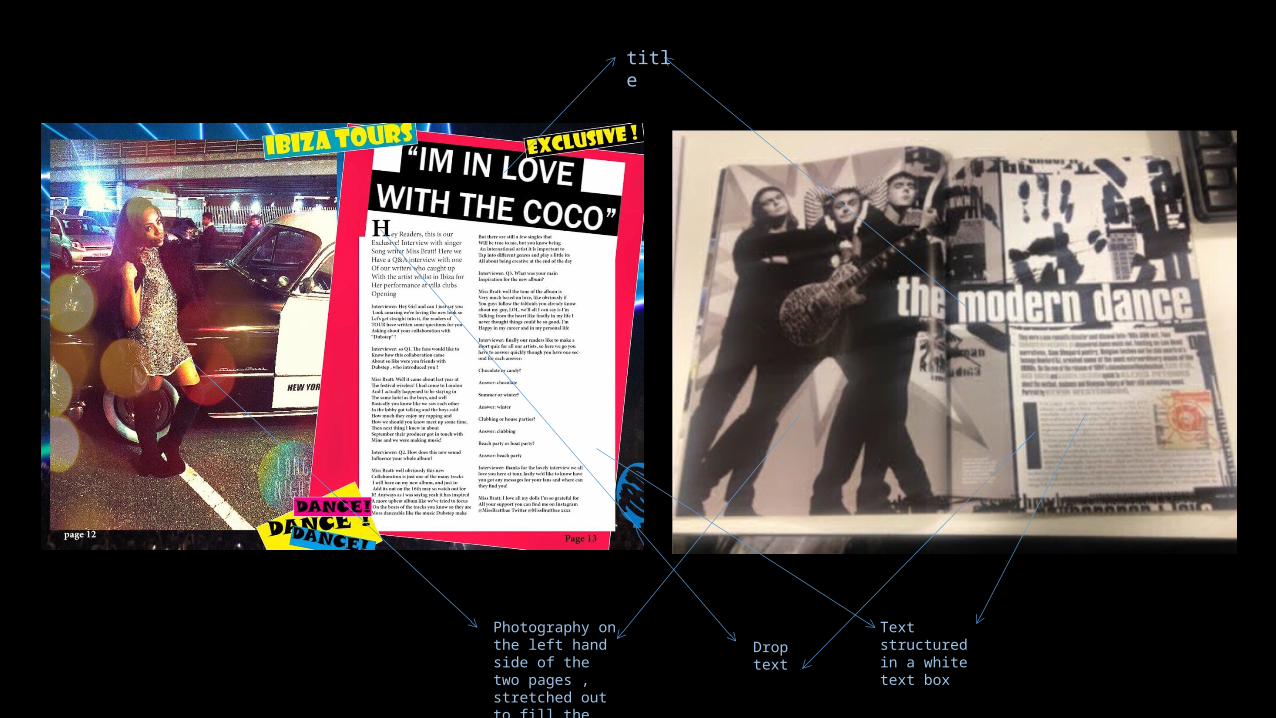
Stage 3 title
Photography on the left hand side of the two pages , stretched out to fill the page
Drop text
Text structured in a white text box
Stage 1
• The previous slide presents my very own double page spread for my magazine Tour , in this beside it is a double page spread of classic rock magazines , with this I used this double page spread as an example for my own , I liked the layout of this page as the image on left was large and filled the page and the text on the right hand side in a white text box . This layout allowed the image to be large and dominant on the page therefore you got a feel of the article before reading it , thus this technique would encourage the audience to read the article . Also via the use of drop text , and quotes in which I used are all efforts to captivate the audience before even reading it .
Stage 2
• In this I chose a Q&A format for my questions , this is due to the fact its an easy way to interview a celebrity clearly . As the structure is formed with the question then response . After planning my questions I needed photography to match I chose to make my image very glamorous to present the model to be a celebrity . Also the model looks fashionable with makeup and via her costume and body language . The background of the image is in a car park with a vintage car , I thought this would look more professional to have a background scene rather than a studio image the car made it seem more glamorous like as if it was set in the 1920’s .

Stage 3
• I decided to keep my colour scheme consistent to my magazine cover as I felt it brings everything together when the colour scheme is consistent . In keeping the girly colour scheme it allowed it to emphasis my target audience further as the use of pink indicated it for females . The language in which I used for the interview was very casual as if we were watching the interview I wanted it to be entertaining and fun keeping the audience entertained and keeping with my theme . I used extra advances of fun by using text boxes in which had the words dance and Ibiza , this adding colour to the page and also indicating some of the key words associated with my magazine genre .


