31
Corporate Identity Guidelines

Corporate Identity Guidelines
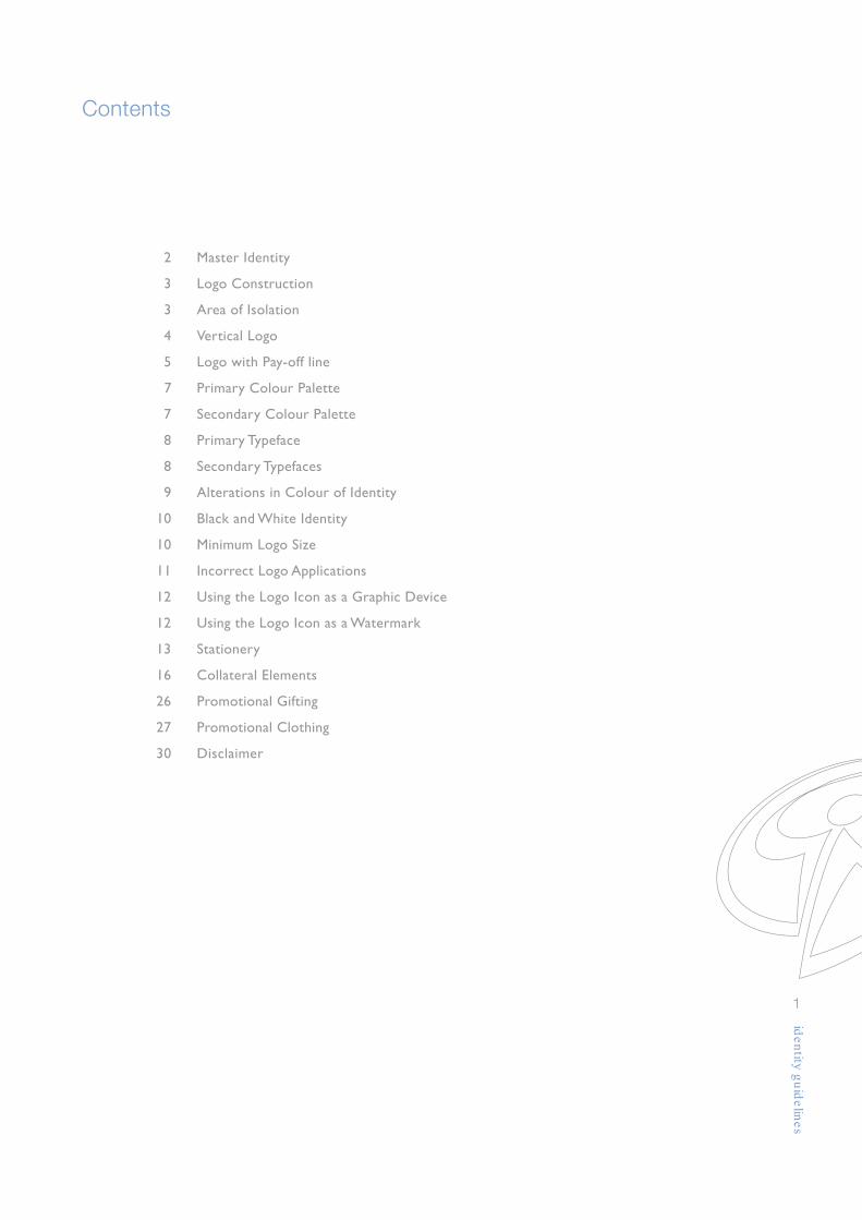
2 Master Identity
3 Logo Construction
3 Area of Isolation
4 Vertical Logo
5 Logo with Pay-off line
7 Primary Colour Palette
7 Secondary Colour Palette
8 Primary Typeface
8 Secondary Typefaces
9 Alterations in Colour of Identity
10 Black and White Identity
10 Minimum Logo Size
11 Incorrect Logo Applications
12 Using the Logo Icon as a Graphic Device
12 Using the Logo Icon as a Watermark
13 Stationery
16 Collateral Elements
26 Promotional Gifting
27 Promotional Clothing
30 Disclaimer
1
Contents

Master Identity
2
logotype with logo descriptorlogo (figure) icon
Our corporate brand is a visual expression of our combined skills, intelligence and businessacumen. The objective of this identity system is to provide the guidelines necessary for the consistentuse of our brand identity, in order that our audiences recognise our corporate ambition throughits expression.
We wish to enhance our position as central to the positive South African Story and continue togenerate goodwill as a public servant.
These guidelines will assist with the implementation and maintenance of our new identity. By followingthe guidelines carefully, you will be able to maintain and control the application of the InsuranceSector Education and Training Authority brand, thus contributing to its well being.
Please call the Insurance Sector Education and Training Authority (INSETA) for any information orqueries. Tel. (011) 544 2000.

3
Area of Isolation
A clear space or area of isolation has been devised to ensure prominence and protection ofthe identity. This area should always be clear of any information.
3X
Area of Isolation 3X
3X
X height =
The INSETA identity has been specifically designed and should not be copied or altered in anyway. A construction grid has been designed to cross-check the accuracy and the positioning ofthe identity. Do not attempt to reproduce or re-construct the logo. This only serves as a guidelineto ensure that the logo is correct. Only official artwork, supplied by INSETA may be used.This is available on www.inseta.org.za.
Logo Construction
11X
= X height
41/2X 21/2X
1X
2/3X
1X
11/2X
31/4X
21/2X 21/2X 21/2X 21/2X

4
The vertical logo has been created specifically for those applications where there is too littlespace to present the preferred horizontal logo. In this option the logotype appear below theicon and centered 2X beneath. This identity should not be used for everyday applications.
Vertical Logo
2X
5
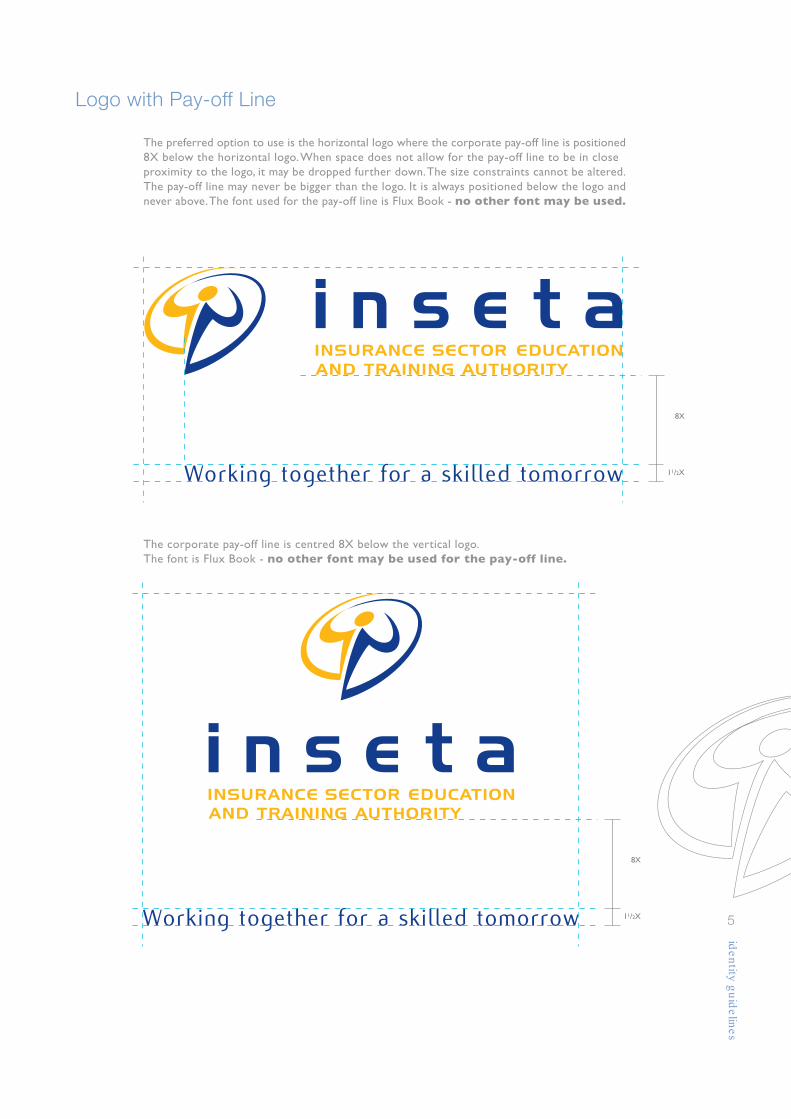
The preferred option to use is the horizontal logo where the corporate pay-off line is positioned8X below the horizontal logo. When space does not allow for the pay-off line to be in closeproximity to the logo, it may be dropped further down. The size constraints cannot be altered.The pay-off line may never be bigger than the logo. It is always positioned below the logo andnever above. The font used for the pay-off line is Flux Book - no other font may be used.
Logo with Pay-off Line
Working together for a skilled tomorrow
8X
11/2X
8X
11/2X
The corporate pay-off line is centred 8X below the vertical logo.The font is Flux Book - no other font may be used for the pay-off line.
6
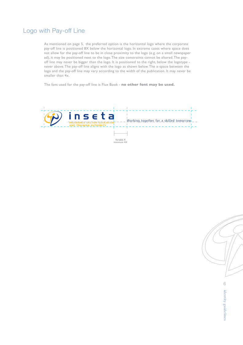
As mentioned on page 5, the preferred option is the horizontal logo where the corporatepay-off line is positioned 8X below the horizontal logo. In extreme cases where space doesnot allow for the pay-off line to be in close proximity to the logo (e.g. on a small newspaperad), it may be positioned next to the logo. The size constraints cannot be altered. The pay-off line may never be bigger than the logo. It is positioned to the right, below the logotype -never above. The pay-off line aligns with the logo as shown below. The x-space between thelogo and the pay-off line may vary according to the width of the publication. It may never besmaller than 4x.
The font used for the pay-off line is Flux Book - no other font may be used.
Logo with Pay-off Line
Working together for a skilled tomorrow
Variable Xminimum 4X

Primary Colour Palette
7
Colour plays an important role in identifying our organisation, its products and services.The consistent and accurate use of these colours is a major factor in keeping our brandrecognizable and memorable.The primary colour palette is to be used for corporate gifts and clothing.Please ensure that these colours are never altered.
yellow
Pantone 130 CCMYK 0c 35m 100y 0kRGB r230 g176 b18
dark blue
Pantone 2747 CCMYK 100c 85m 0y 10kRGB r20 g31 b120
The secondary colour palette is available to compliment the primary palette.Use only as an accent, for example, in line work in printed or electronic material, and as colourpanels as per samples provided.These colours are never to replace the Primary Colour Palette.Please ensure that these colours are never altered.
Secondary Colour Palette
orange
Pantone166 CCMYK 0c 65m 100y 0kRGB r217 g89 b0
burgundy
Pantone 222 CCMYK 0c 100m 10y 60kRGB r107 g23 b59
grey blue
Pantone 7454 CCMYK 50c 25m 0y 10kRGB r107 g143 b181
light blue
Pantone 306 CCMYK 75c 0m 10y 0kRGB r0 g184 b224
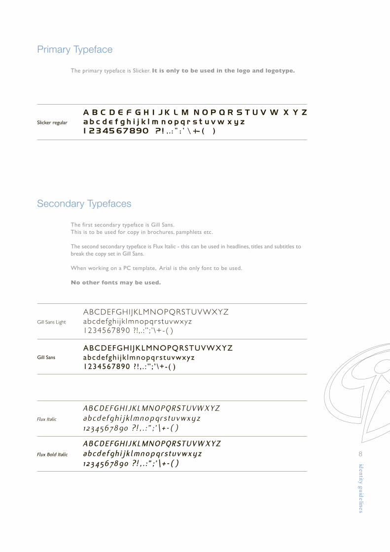
Primary Typeface
8
The primary typeface is Slicker. It is only to be used in the logo and logotype.
The first secondary typeface is Gill Sans.This is to be used for copy in brochures, pamphlets etc.
The second secondary typeface is Flux Italic - this can be used in headlines, titles and subtitles tobreak the copy set in Gill Sans.
When working on a PC template, Arial is the only font to be used.
No other fonts may be used.
Secondary Typefaces
Slicker regular
Gill Sans Light
Gill Sans
Flux Italic
Flux Bold Italic
ABCDEFGHI JKLMNOPQRSTUVWXYZabcdefgh i jk lmnopqr stuvwxyz1234567890 ? ! , . : ” ; ’ \+-( )
ABCDEFGHIJKLMNOPQRSTUVWXYZabcdefghi jk lmnopqrstuvwxyz1234567890 ? ! , . : ” ; ’ \+-( )
ABCDEFGHIJKLMNOPQRSTUVWXYZabcdefghi jk lmnopqrstuvwxyz1234567890 ? ! , . : ” ; ’ \+-( )
ABCDEFGHIJKLMNOPQRSTUVWXYZabcdefghi jk lmnopqrstuvwxyz1234567890 ? ! , . : ” ; ’ \+-( )

Alterations in Colour of Identity
9
100% dark blue 50% dark blue
Full colour
When used on a primary coloured background, the following treatment is recommended.
One colour
When used as a single colour, the yellow should be replaced with a 50% tint of the dark blue.The logo can never be used in yellow only - it does not show on photocopied material.

Black and White Identity
10
In all other designs where the two colour identity can not be reproduced to a satisfactorylevel, and colours are limited in print or the screen used is a coarse one, use the black andwhite logo, e.g. faxes, newspaper supplements, photocopied material.
With descriptor:To ensure maximum legibility and high reproduction standards the logo and logotype maynot be reduced smaller than 30mm in width in any of its applications.
Minimum Logo Size
30mm 30mm
25mm
Without descriptor:To ensure maximum legibility and high reproduction standards the logo and logotype withoutdescriptor may not be reduced smaller than 25mm in width in any of its applications.
25mm

Incorrect Logo Applications
11
Do not give the logo a drop shadow of any colour
Do not change the way the logo type is stacked
Do not elongate or alter the icon in any wayDo not change the angle or rotate the icon
Do not change the colour of the logo type
Do not use the logotype without the icon
Do not move the logo type or swap the colours around

Using the Logo Icon as a Graphic Device
12
The logo icon can be used as a graphic device in line art with no fill. Colours remain in itsoriginal format. The secondary palette can also be used at 100% but preference is given to the primarycolour palette. Alternatively white or a UV varnish can also be used on darker applications.Line thickness is relevant to the size of the application.Used on an A4 or smaller it may not exceed 1pt.Used on a larger format it should be between 2pt and 4pt.
Using the Logo Icon as a Watermark
The logo icon can be used as a watermark- it appears preferably in its original colours tinted at 20% or as a single colour 20% tint fromthe secondary colour palette (not the preferred option).

Stationery
13
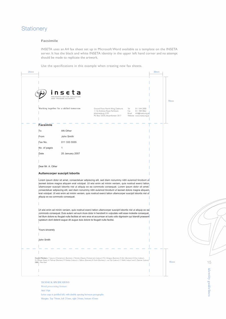
TECHNICAL SPECIFICATIONS
Word processing format:
Arial 10pt for letter copy, Arial 12pt for headlines
Letter copy is justified left, with double spacing between paragraphs
Margins: Top 70mm, left 25mm, right 20mm, bottom 45mm
Working together for a skilled tomorrow
Council Members : T. Jawuna (Chairperson) (Business), I. Mzimela (Deputy-Chairperson) (Labour), M.A. Hlengwa (Business), R. Kerr (Business), B. Khan (Labour),
N. Molope (State), A. Mothupi (Business), M. Naidoo (Labour), L. Ndlovu (Business), B. Scott (Business), L. van Dyk (Labour), C. Wells( Labour) and E. Zeeman (Labour).
CEO : Mike Abel
Ground Floor, North Wing, Oakhurst,
11 St. Andrews Road, Parktown,Johannesburg 2193PO Box 32035, Braamfontein 2017
Tel 011 544 2000
Fax 011 484 0862Email [email protected] www.inseta.org.za
20 January 2007
Dear Mr. A. Other
Aullamcorper suscipit lobortis
Lorem ipsum dolor sit amet, consectetuer adipiscing elit, sed diam nonummy nibh euismod tincidunt ut
laoreet dolore magna aliquam erat volutpat. Ut wisi enim ad minim veniam, quis nostrud exerci tation
ullamcorper suscipit lobortis nisl ut aliquip ex ea commodo consequat. Lorem ipsum dolor sit amet,
consectetuer adipiscing elit, sed diam nonummy nibh euismod tincidunt ut laoreet dolore magna aliquam
erat volutpat. Ut wisi enim ad minim veniam, quis nostrud exerci tation ullamcorper suscipit lobortis nisl ut
aliquip ex ea commodo consequat.
Duis autem vel eum iriure dolor in hendrerit in vulputate velit esse molestie consequat, vel illum dolore eu
feugiat nulla facilisis at vero eros et accumsan et iusto odio dignissim qui blandit praesent luptatum doril
delenit augue duis dolore te feugait nulla facilisi. Lorem ipsum dolor sit amet, consectetuer adipiscing elit,
sed diam nonummy nibh euismod tincidunt ut laoreet dolore magna aliquam erat volutpat. Ut wisi enim ad
minim veniam, quis nostrud exerci tation ullamcorper suscipit lobortis nisl ut aliquip ex ea commodo
consequat. Duis autem vel eum iriure dolor in hendrerit in vulputate velit esse molestie consequat.
Ut wisi enim ad minim veniam, quis nostrud exerci tation ullamcorper suscipit lobortis nisl ut aliquip ex ea
commodo consequat. Duis autem vel eum iriure dolor in hendrerit in vulputate velit esse molestie consequat,
vel illum dolore eu feugiat nulla facilisis at vero eros et accumsan et iusto odio dignissim qui blandit praesent
luptatum doril delenit augue dit augue duis dolore te feugait nulla facilisi.
Yours sincerely
John Smith
20mm25mm
70mm
45mm

Stationery
14
Business cards
Business cards are often the first contact a customer will have with our organisation.Thus, the INSETA identity, typography and colours are all intended to support our brand,while presenting essential information to our customers.The business card size is 90 x 50mm.A template is provided on the INSETA server and no attempt should be made toreplicate the artwork.(Artwork below is shown at 100%)
Laurel de BruynPublic Relations Officer
Ground Floor, North Wing, Oakhurst,
11 St. Andrews Road, Parktown
PO Box 32035, Braamfontein 2017
Telephone 011 544 2000
Direct Fax 011 351 6405
Email [email protected]
Website www.inseta.org.za
Working together for a skilled tomorrow
The compliment slip
The compliment slip used by INSETA corporate stationery uses a slightly shorter than standardcompliment slip size (74 x 210mm).A template is provided on the INSETA server and no attempt should be made toreplicate the artwork.(Artwork below is scaled down)
Working together for a skilled tomorrow
Ground Floor, North Wing, Oakhurst,11 St. Andrews Road, Parktown,Johannesburg 2193PO Box 32035, Braamfontein 2017
Tel 011 544 2000Fax 011 484 0862Email [email protected] www.inseta.org.za
Stationery
15
Facsimile
INSETA uses an A4 fax sheet set up in Microsoft Word available as a template on the INSETAserver. It has the black and white INSETA identity in the upper left hand corner and no attemptshould be made to replicate the artwork.
Use the specifications in this example when creating new fax sheets.
TECHNICAL SPECIFICATIONS
Word processing format:
Arial 10pt
Letter copy is justified left, with double spacing between paragraphs
Margins: Top 70mm, left 25mm, right 20mm, bottom 45mm
20mm25mm
70mm
45mm
Working together for a skilled tomorrow
Council Members : T. Jawuna (Chairperson) (Business), I. Mzimela (Deputy-Chairperson) (Labour), M.A. Hlengwa (Business), R. Kerr (Business), B. Khan (Labour),
N. Molope (State), A. Mothupi (Business), M. Naidoo (Labour), L. Ndlovu (Business), B. Scott (Business), L. van Dyk (Labour), C. Wells( Labour) and E. Zeeman (Labour).
CEO : Mike Abel
Ground Floor, North Wing, Oakhurst,
11 St. Andrews Road, Parktown,
Johannesburg 2193
PO Box 32035, Braamfontein 2017
Tel 011 544 2000
Fax 011 484 0862
Email [email protected]
Website www.inseta.org.za
Dear Mr. A. Other
Aullamcorper suscipit lobortis
Lorem ipsum dolor sit amet, consectetuer adipiscing elit, sed diam nonummy nibh euismod tincidunt ut
laoreet dolore magna aliquam erat volutpat. Ut wisi enim ad minim veniam, quis nostrud exerci tation
ullamcorper suscipit lobortis nisl ut aliquip ex ea commodo consequat. Lorem ipsum dolor sit amet,
consectetuer adipiscing elit, sed diam nonummy nibh euismod tincidunt ut laoreet dolore magna aliquam
erat volutpat. Ut wisi enim ad minim veniam, quis nostrud exerci tation ullamcorper suscipit lobortis nisl ut
aliquip ex ea commodo consequat.
Ut wisi enim ad minim veniam, quis nostrud exerci tation ullamcorper suscipit lobortis nisl ut aliquip ex ea
commodo consequat. Duis autem vel eum iriure dolor in hendrerit in vulputate velit esse molestie consequat,
vel illum dolore eu feugiat nulla facilisis at vero eros et accumsan et iusto odio dignissim qui blandit praesent
luptatum doril delenit augue dit augue duis dolore te feugait nulla facilisi.
Yours sincerely
John Smith
Facsimile
To
From
Fax No.
No. of pages
Date
AN Other
John Smith
011 333 5555
1
20 January 2007

Collateral Elements
16
A5 Note pad
An A5 note pad is available for employees to use for making notes.These note pads are pre-printed. No attempt should be made to copy the artwork.(Artwork below is scaled down)
CD label
INSETA corporate stationery has two templates available for labeling CD’s. The blue templateshould be used for more formal presentations and communications, and the yellow templatefor less formal presentations and communications.A template is provided on the INSETA server and no attempt should be made to copy the artwork.(Artwork below is scaled down)
CD titlesubtitle
Working together for a skilled tomorrow
CD titlelonger subtitleslonger subtitleslonger subtitles
Working together for a skilled tomorrow
Working together for a skilled tomorrow
Ground Floor, North Wing, Oakhurst,11 St. Andrews Road, Parktown,Johannesburg 2193PO Box 32035, Braamfontein 2017
Tel 011 544 2000Fax 011 484 0862Email [email protected] www.inseta.org.za

Collateral Elements
17
A4 folder
The INSETA corporate presentation folder is designed to package all INSETA presentationsand communications supplied to stakeholders, partners and suppliers.These folders are pre-printed and spot varnished.No attempt should be made to replicate the artwork.(Artwork below is scaled down)
Working together for a skilled tomorrow
REQUEST FOR PROPOSALSTo train and mentor designated black brokerages to
grow viable black-owned brokerage firms.
Lorem ipsum dolor sit amet, consectetur aedipscing elit, set diam nonnumy eiusmod tempor
incidunt ut laboarae et dolore magna aliquam erat volupat. Ut enim ad minimim veniami quis
nostrud exercitation ullacorpor suscipit laboris nisi ut aliquip ex commodo consequat. Duis
autem vel eum irere dolor in reprehenderit in volupate velit esse molestaie son consequat, vel
illum dolore eu fugiat nulla pariatur :
At vero eos et accusam et justo odio dignissim qui blandit praesent lupatum
Udelenit aigue duos dolor et molestais exceptur sint occaecat cupidat
Anon provident, simil tempor sunt in culpa qui placeat facer possim omnis
Wes voluptas assumenda est, omnis dolor repellend.
Temporem autem quinsud et aur office debit attrum rerum
Gnecessit atib saepe eveniet ut er repudiand sint et molestia non este recusand
Itaque earund rerum hic tentury sapiente delectus au aut prefer endis dolorib asperiore repellat
Hanc ego cum tene sentia,qide crverear e dem osgacmodaentqos upl nt u emorite i tem ta.
Nsaic t eevl lstia acs ots fradagna uconin fco tm toelgm ne bidin e plr religadop cupiditat, quod
nulla praid im umdnat. Improb pary minuiti potius infaa thunderbird et dodeds.
Lorem ipsum dolor sit amet, consectetur aedipscing elit, set diam nonnumy eiusmod tempor
incidunt ut laboarae et dolore magna aliquam erat volupat. Ut enim ad minimim veniami quis
nostrud exercitation ullacorpor suscipit laboris nisi ut aliquip ex commodo consequat. Duis
autem vel eum irere dolor in reprehenderit in volupatson consequat, vel illum dolore.
Interested parties can download the proposal template from INSETA’s website at www.inseta.org.zaThe completed template must be submitted to the INSETA Programme Office by 11h00on Monday 4 December 2006. Proposals must be sent to Mrs Nozuko Motswiane, INSETA
Programme Office, 2 Eglin Rd, Pricewaterhouse Coopers, Sunninghill, 2157
www.inseta.org.za
Working together for a skilled tomorrow
Collateral Elements
18
One colour print ad
The template is a guideline for any communication produced in newspapers or magazines.The INSETA identity should always be positioned centered at the top. Although it may notalways be possible to reproduce communication that is identical, certain guidelines should beadhered to like colours, fonts and placement of the identity.Lines are 30% black and 3 pt thick.
size 117 x 150mm
if a larger format is used, font sizes etc willgo up proportionately
this is the area for headings
main heading Gill Sans 14 pt up to 16ptkerning noneleading 1.5
sub-heading Gill Sans 11 ptkerning noneleading 1.5
this is the area for body copy
Gill Sans Light 7.5 ptkerning 1leading 2
this is the area for onlythe web addressGill Sans 8.5 ptkerning noneleading 1
this is the area for importantinformation
Gill Sans Italic 8 ptkerning noneleading 1
this is the area for the corporate identity
Collateral Elements
19
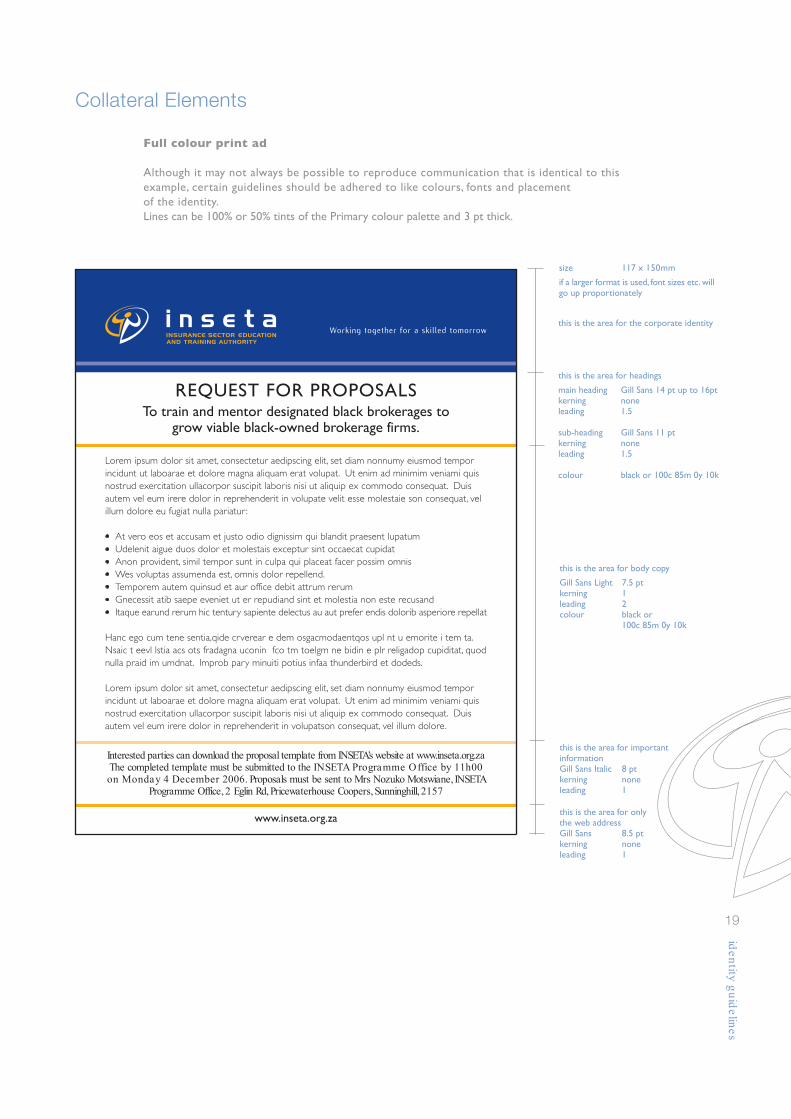
Full colour print ad
Although it may not always be possible to reproduce communication that is identical to thisexample, certain guidelines should be adhered to like colours, fonts and placementof the identity.Lines can be 100% or 50% tints of the Primary colour palette and 3 pt thick.
size 117 x 150mm
if a larger format is used, font sizes etc. willgo up proportionately
this is the area for headings
main heading Gill Sans 14 pt up to 16ptkerning noneleading 1.5
sub-heading Gill Sans 11 ptkerning noneleading 1.5
colour black or 100c 85m 0y 10k
this is the area for body copy
Gill Sans Light 7.5 ptkerning 1leading 2colour black or
100c 85m 0y 10k
this is the area for onlythe web addressGill Sans 8.5 ptkerning noneleading 1
this is the area for importantinformationGill Sans Italic 8 ptkerning noneleading 1
this is the area for the corporate identity
REQUEST FOR PROPOSALSTo train and mentor designated black brokerages to
grow viable black-owned brokerage firms.
Lorem ipsum dolor sit amet, consectetur aedipscing elit, set diam nonnumy eiusmod tempor
incidunt ut laboarae et dolore magna aliquam erat volupat. Ut enim ad minimim veniami quis
nostrud exercitation ullacorpor suscipit laboris nisi ut aliquip ex commodo consequat. Duis
autem vel eum irere dolor in reprehenderit in volupate velit esse molestaie son consequat, vel
illum dolore eu fugiat nulla pariatur :
At vero eos et accusam et justo odio dignissim qui blandit praesent lupatum
Udelenit aigue duos dolor et molestais exceptur sint occaecat cupidat
Anon provident, simil tempor sunt in culpa qui placeat facer possim omnis
Wes voluptas assumenda est, omnis dolor repellend.
Temporem autem quinsud et aur office debit attrum rerum
Gnecessit atib saepe eveniet ut er repudiand sint et molestia non este recusand
Itaque earund rerum hic tentury sapiente delectus au aut prefer endis dolorib asperiore repellat
Hanc ego cum tene sentia,qide crverear e dem osgacmodaentqos upl nt u emorite i tem ta.
Nsaic t eevl lstia acs ots fradagna uconin fco tm toelgm ne bidin e plr religadop cupiditat, quod
nulla praid im umdnat. Improb pary minuiti potius infaa thunderbird et dodeds.
Lorem ipsum dolor sit amet, consectetur aedipscing elit, set diam nonnumy eiusmod tempor
incidunt ut laboarae et dolore magna aliquam erat volupat. Ut enim ad minimim veniami quis
nostrud exercitation ullacorpor suscipit laboris nisi ut aliquip ex commodo consequat. Duis
autem vel eum irere dolor in reprehenderit in volupatson consequat, vel illum dolore.
Interested parties can download the proposal template from INSETA’s website at www.inseta.org.zaThe completed template must be submitted to the INSETA Programme Office by 11h00on Monday 4 December 2006. Proposals must be sent to Mrs Nozuko Motswiane, INSETA
Programme Office, 2 Eglin Rd, Pricewaterhouse Coopers, Sunninghill, 2157
www.inseta.org.za
Working together for a skilled tomorrow
coloured lines
accent colours
Collateral Elements
20
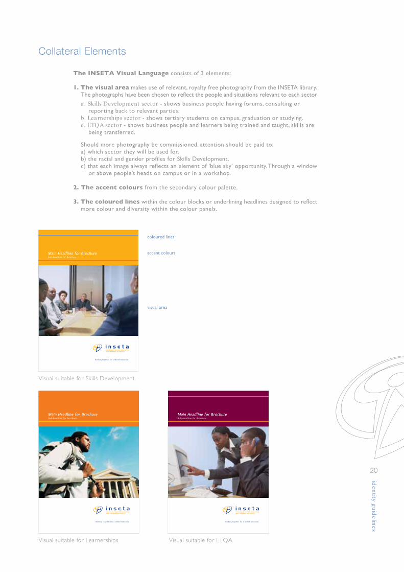
The INSETA Visual Language consists of 3 elements:
1. The visual area makes use of relevant, royalty free photography from the INSETA library.The photographs have been chosen to reflect the people and situations relevant to each sector
a . Skills Development sector - shows business people having forums, consulting or reporting back to relevant parties.
b. Lea rnerships sector - shows tertiary students on campus, graduation or studying.c. ETQA sector - shows business people and learners being trained and taught, skills are
being transferred.
Should more photography be commissioned, attention should be paid to:a) which sector they will be used for,b) the racial and gender profiles for Skills Development,c) that each image always reflects an element of ‘blue sky’ opportunity. Through a window
or above people’s heads on campus or in a workshop.
2. The accent colours from the secondary colour palette.
3. The coloured lines within the colour blocks or underlining headlines designed to reflect more colour and diversity within the colour panels.
visual area
Main Headline for BrochureSub-headline for Brochure
Main Headline for BrochureSub-headline for Brochure
Main Headline for BrochureSub-headline for Brochure
Visual suitable for Skills Development.
Visual suitable for Learnerships Visual suitable for ETQA

Collateral Elements
21
The brochure front cover
This template is a guideline for any communication produced in print.On the front cover, the INSETA identity should always be positioned on the right side at thebottom. Although it may not always be possible to reproduce communication that is identical,guidelines should be adhered as close as possible with regard to colours, fonts, visual languageand placement of the identity.
this is the area for headingsthe area is a quarter height of the page height
main heading Flux 18 pt upkerning 2
sub-heading Gill Sans 11 ptkerning 2colour white
secondary colour palette choices may vary
Main Headline for BrochureSub-headline for Brochure
size A5if a larger format is used, font sizes etc. will go upproportionately
this is the area for visualsthe area is half the height of the page height
this is area for the corporate identitythe area is a quarter height of the pageheight

Collateral Elements
22
The brochure inside spread
This template is a guideline for any communication produced in print.On the inside spreads, the secondary colour palette plays an important role in breaking up thewhite space. Although it may not always be possible to reproduced communication that isidentical, certain guidelines should be adhered to as close as possible with regard to colours,fonts and visual language.Text is always in 2 columns, unless the brochure is smaller than A5.Page numbers are always at the bottom and centered, with lines on each side.Headlines are always in the corporate blue and underlined.Graphs and charts must always use primary and secondary corporate colours and tints.
main heading Flux 14 pt to 18 ptkerning 3colour 100c 85 m oy 10k
line 1 pt
line 0.5 pt
body copy Gill Sans 8 pt to 9 ptkerning 2leading 4colour black
Lorem ipsum dolor sit amet, consectetur aedipscing
elit, set diam nonnumy eiusmod tempor incidunt ut
laboarae et dolore magna aliquam erat volupat. Ut
enim ad minimim veniami quis nostrud exercitation
ullacorpor suscipit laboris nisi ut aliquip ex commodo
consequat. Duis autem vel eum irere dolor in
reprehenderit in volupate velit esse molestaie son
consequat, vel illum dolore eu fugiat nulla pariatur.
At vero eos et accusam et justo odio dignissim qui
blandit praesent lupatum delenit aigue duos dolor et
molestais exceptur sint occaecat cupidat non provident,
simil tempor sunt in culpa qui placeat facer possim
omnis es voluptas assumenda est, omnis dolor
repellend. Temporem autem quinsud et aur office
debit attrum rerum, necessit atib saepe eveniet ut er
repudiand sint et molestia non este recusand. Itaque
earund rerum hic tentury sapiente delectus au aut
prefer endis dolorib asperiore repellat.
Hanc ego cum tene sentia,qide crverear e dem
osgacmodaentqos upl nt u emorite i tem ta. Nsaic t
eevl lstia acs ots fradagna uconin fco tm toelgm ne
bidin e plr religadop cupiditat, quod nulla praid im
umdnat. Improb pary minuiti potius infaa thunderbird
et dodeds.
-4-
Duis autem vel eum irere
-5-
Duis autem vel eum irere
Duis autem vel eum irere
Lorem ipsum dolor sit amet, consectetur
aedipscing elit, set diam nonnumy eiusmod
tempor incidunt ut laboarae et dolore magna
aliquam erat volupat.
1.1 Ut enim ad minimim veniami quis nostrud
exercitation ullacorpor suscipit laboris nisi ut
aliquip ex commodo consequat. Duis autem vel
eum irere dolor in reprehenderit in volupate velit
esse molestaie son consequat, vel illum dolore eu
Headline Headline
Aullacorpor suscipit laboris nisi ut aliquip
ex commodo consequat. Duis autem vel
eum irere dolor in reprehenderit in volupate
velit esse molestaie son consequat, vel illum
dolore eu fugiat nulla pariatur.
1.2 Duis autem vel eum irere dolor in reprehenderit
in volupate velit esse molestaie son consequat,
vel illum dolore eu fugiat nulla pariatur. At vero
eos et accusam et justo odio dignissim qui blandit
praesent lupatum delenit aigue duos dolor et
molestais exceptur sint occaecat cupidat non
provident, simil tempor sunt in culpa qui placeat
facer possim omnis es voluptas assumenda est,
omnis dolor repellend.
Duis autem vel eum irere dolor in
reprehenderit in volupate velit esse molestaie
son consequat, vel illum dolore eu fugiat
nulla pariatur. Duis autem vel eum irere
dolor in reprehenderit in volupate velit esse
molestaie son consequat, vel illum dolore
eu fugiat nulla pariatur.
1.3 At vero eos et accusam et justo odio dignissim
qui blandit praesent lupatum delenit aigue duos
dolor et molestais exceptur sint occaecat cupidat
non provident, simil tempor sunt in culpa qui
placeat facer possim omnis es voluptas assumenda
est, omnis dolor repellend. Temporem autem
quinsud et aur office debit attrum rerum, necessit
atib saepe eveniet ut er repudiand sint et molestia
non este recusand. Itaque earund rerum hic
tentury sapiente delectus au aut prefer endis.
Consectetur aedipscing elit, set diam nonnumy
eiusmod tempor incidunt ut laboarae et dolore
magna aliquam erat volupat. Ut enim ad minimim
veniami quis nostrud exercitation ullacorpor
suscipit laboris nisi ut aliquip ex commodo
consequat. Duis autem vel eum irere dolor in
reprehenderit in volupate velit esse molestaie
son consequat, vel illum dolore eu fugiat nulla
pariatur. At vero eos et accusam et justo odio
dignissim qui blandit praesent lupatum delenit
aigue duos dolor et molestais exceptur sint
occaecat cupidat non provident, simil tempor
sunt in culpa qui placeat facer possim omnis es
voluptas assumenda est, omnis dolor repellend.
Temporem autem quinsud et aur office debit
attrum rerum, necessit atib saepe eveniet ut.
Lorem ipsum dolor sit amet
-6-
Lorem ipsum dolor sit amet, consectetur
aedipscing elit, set diam nonnumy eiusmod tempor
incidunt ut laboarae et dolore magna aliquam
erat volupat. Ut enim ad minimim veniami quis
nostrud exercitation ullacorpor suscipit laboris
nisi ut aliquip ex commodo consequat. Duis
autem vel eum irere dolor in reprehenderit in
volupate velit esse molestaie son consequat, vel
illum dolore eu fugiat nulla pariatur. At vero eos
et accusam et justo odio dignissim qui blandit
praesent lupatum delenit aigue duos dolor et
molestais exceptur sint occaecat cupidat non
provident, simil tempor sunt in culpa qui placeat
facer possim omnis es voluptas assumenda est,
omnis dolor repellend. Temporem autem quinsud
et aur office debit attrum rerum, necessit atib
saepe eveniet ut er repudiand sint et molestia
non este recusand. Itaque earund rerum hic
tentury sapiente delectus au aut prefer endis
dolorib asperiore repellat.
Hanc ego cum tene sentia,qide crverear e dem
osgacmodaentqos upl nt u emorite i tem ta. Nsaic
t eevl lstia acs ots fradagna uconin fco tm toelgm
ne bidin e plr religadop cupiditat, quod nulla praid
im umdnat. Improb pary minuiti potius infaa
thunderbird et dodeds.
Consectetur aedipscing elit, set diam nonnumy
eiusmod tempor incidunt ut laboarae et dolore
magna aliquam erat volupat. Ut enim ad minimim
veniami quis nostrud exercitation ullacorpor
suscipit laboris nisi ut aliquip ex commodo
consequat.
Duis autem vel eum irere dolor in repre henderit
in volupate velit esse molestaie son consequat,
vel illum dolore eu fugiat nulla pariatur. At vero
eos et accusam et justo odio dignissim qui blandit
praesent lupatum delenit aigue duos dolor et
molestais exceptur sint occaecat cupidat non
provident, simil tempor sunt in culpa qui placeat
facer possimomnis es voluptas assumenda est,
omnis dolor. repellend. Temporem autem quinsud
et aur office debit attrum rerum.
-7-
Duis autem vel eum irere
Duis autem vel eum irere
Duis autem vel eum irere
Consectetur aedipscing elit, set diam nonnumy eiusmod tempor incidunt ut laboarae et dolore
magna aliquam erat volupat. Ut enim ad minimim veniamn ullacorpor suscipit laboris nisi ut aliqodo
consequat. Duis autem vel eum irere dolor in reprehenderit in.
page number Flux Italic 8 pt to 9 ptkerning 3colour 100c 85 m oy 10k

Collateral Elements
23
The brochure back cover
This template is a guideline for any communication produced in print.On the back cover, the INSETA identity should always be positioned on the right side at thebottom. Although it may not always be possible to reproduce communication that is identical,guidelines should be adhered as close as possible with regard to colours, fonts, visual languageand placement of the identity.
this area uses the visual languagesecondary colour palette choices may vary
size A5if a larger format is used, font sizes etc. willgo up proportionately
this is the area for the address detailsthe area is half the height of the page height
sub-heading Gill Sans 6 ptkerning 2colour black
secondary colour palette choices may vary
this is area for the corporate identitythe area is a quarter height of the pageheight
Collateral Elements
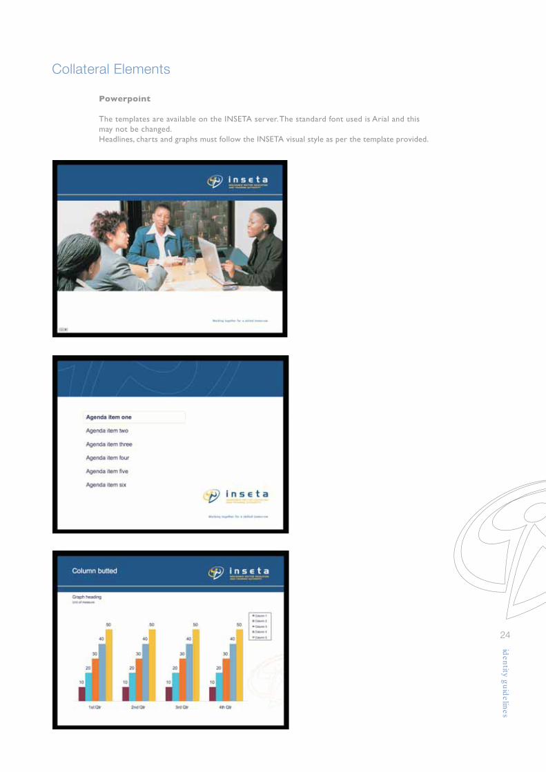
24
Powerpoint
The templates are available on the INSETA server. The standard font used is Arial and thismay not be changed.Headlines, charts and graphs must follow the INSETA visual style as per the template provided.
Collateral Elements
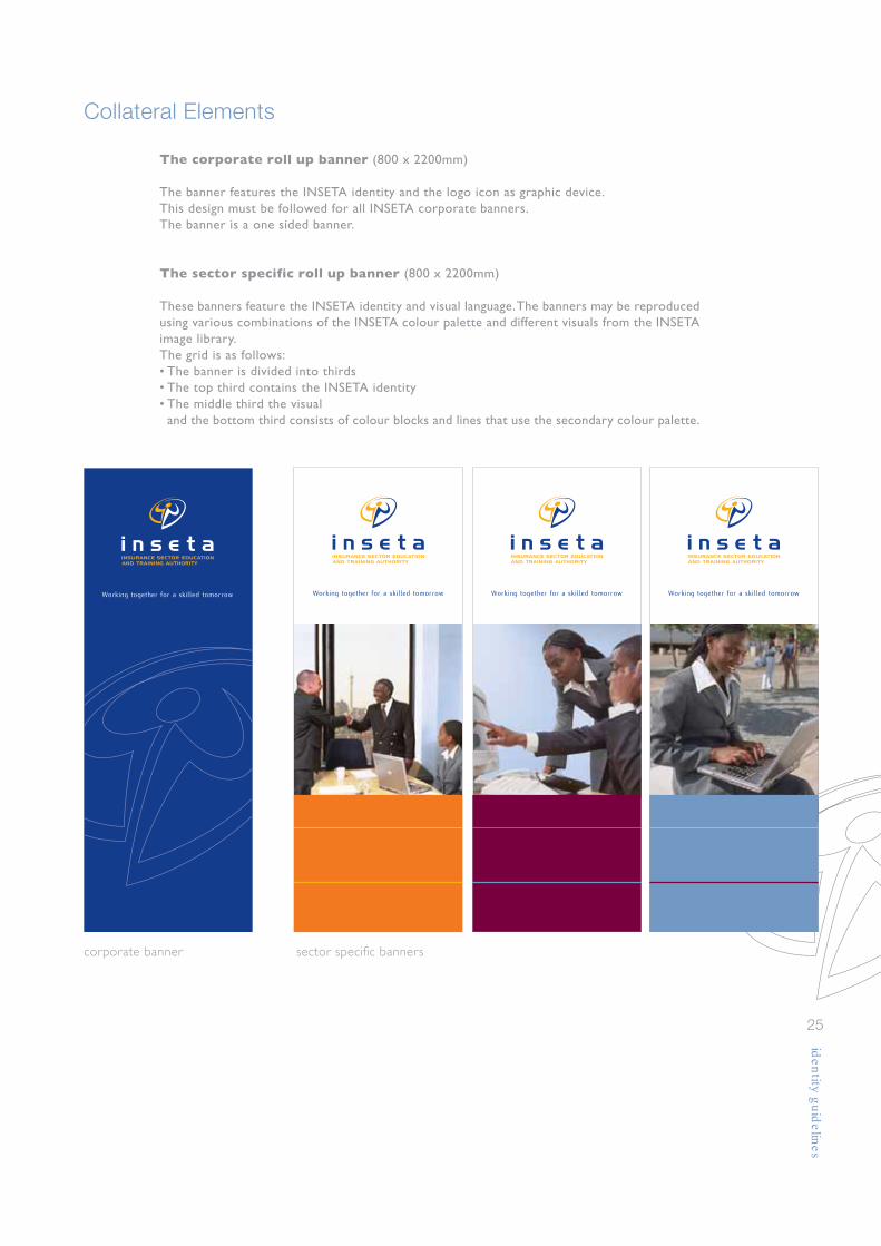
25
The corporate roll up banner (800 x 2200mm)
The banner features the INSETA identity and the logo icon as graphic device.This design must be followed for all INSETA corporate banners.The banner is a one sided banner.
The sector specific roll up banner (800 x 2200mm)
These banners feature the INSETA identity and visual language. The banners may be reproducedusing various combinations of the INSETA colour palette and different visuals from the INSETAimage library.The grid is as follows:• The banner is divided into thirds• The top third contains the INSETA identity• The middle third the visual and the bottom third consists of colour blocks and lines that use the secondary colour palette.
Working together for a skilled tomorrow
corporate banner sector specific banners

Promotional Gifting
26
The INSESTA identity is used without the pay-off line on items such as pens where theprintable area is too small to incorporate it. As discussed on page 10, the logo and logotypemay not be reduced smaller than 25mm in width to ensure maximum legibility and highreproduction standards. Make sure that the logo is used correctly when applied on corporatecolours i.e. the white reversed logo is used on corporate blue (option 3) and the one colourcorporate blue logo is used on corporate yellow (option 4).The colours have to match the corporate colours as best possible.
On items like golf balls where the printable area is too small to incorporate the pay-off line,only the INSESTA logotype and icon is used. As mentioned above the logo and logotype maynot be reduced smaller than 25 mm in width to ensure maximum legibility and high reproductionstandards.Ensure that the logo is used correctly when applied on corporate colours, i.e. the whitereversed logo is used on corporate blue (option 2) and the one colour corporate blue logois used on corporate yellow (option 3).The colours have to match the corporate colours as best possible.
option 1 option 2 option 3
option 1
option 2
option 3
option 4

Promotional Clothing
27
The corporate clothing has been specially designed to promote the strength and consistencyof the INSETA brand. The fabrics and colours have to match the corporate colours asbest possible.
The white T-shirt
On the front of the INSETA T-shirt, the horizontal identity is placed on the left breast.The identity should not be smaller than 75mm in width for the sake of legibility, especiallywhen embroidered.On the back of the shirt, the pay-off line appears centred and at the top. Only on promotionalclothing should the pay-off line be doubled in size (150mm minimum) in relation to the logoand icon. The watermark is a 50% tint of the corporate blue and runs predominantly acrossthe front left to the back right.
The yellow T-shirt
On the front of the INSETA T-shirt, the horizontal identity is placed in a reverse applicationonto yellow fabric, positioned on the left breast. The identity should not be smaller than75 mm in width for the sake of legibility, especially when embroidered. The colour of the shirtmust be matched as closely as possible to the INSETA yellow.The pay-off line appears centred and at the top on the back of the shirt. Only on promotionalclothing should the pay-off line be doubled in size (150mm minimum) in relation to the logoand icon. The watermark is a 50% tint of the corporate yellow and runs predominantly acrossthe front left to the back right.

Promotional Clothing
28
The white golf shirt
On the front of the INSETA golf shirt, the horizontal identity is placed on the left breast.The identity should not be smaller than 75mm in width for the sake of legibility, especiallywhen embroidered.On the back of the shirt, the pay-off line and the logo icon appear centred and towards thetop in the INSETA blue. Only on promotional clothing should the pay-off line be doubled insize (150mm minimum) in relation to the logo and icon on the front.The logo icon should be enlarged to 400% of the identity used on the front.
The blue golf shirt
On the front of the INSETA golf shirt, the horizontal identity is placed in a reverse applicationonto blue fabric, positioned on the left breast. The identity should not be smaller than 75mmin width for the sake of legibility, especially when embroidered.The colour of the shirt must be matched as closely as possible to the INSETA blue.On the back of the shirt, the pay-off line and logo icon appear centred and at the top reversedin white. Only on promotional clothing should the pay-off line be doubled in size (150mmminimum) in relation to the logo and icon on the front.The logo icon should be enlarged to 400% of the identity used on the front.

Promotional Clothing
29
The peak capThis INSETA peak cap features the horizontal identity without the pay-off line embroideredacross the centre of the front 2 panels. The logo is reversed out respectively according to theguidelines set out on page 9.The pay-off line is positioned at the back and runs along the arch of the cap. The yellow andblue fabrics must be matched as closely as possible to the INSETA colour swatches.
or or
Working together for a skilled tomorrow
110mm
101mm
The size of the INSETA logo to be positioned on the front of the peak cap should not besmaller than 110mm. This ensures optimum legibility of the logo descriptor. The pay-off linein relation to the logo, will be 101mm and is embroidered on the back of the cap. The fontused for the pay-off line is Flux Book - no other font may be used.

Disclaimer
30
INSETA’s logo and any associated identities as laid out in these guidelines are the legal propertyof INSETA (Insurance Sector Education and Training Authority).
Usage of any aspect of this corporate identity system, including logo, logotype, primary andsecondary colours combined with any graphic elements may only be under authorization byINSETA, and any artwork generated must be approved and signed off in writing by INSETA.INSETA reserves the right to institute legal action against any person found in possessionof/and usage of any unapproved or incorrect artwork.
Tel 011 544 2000
Fax 011 484 0862
Email [email protected]
Website www.inseta.org.za
Address Ground Floor, North Wing, Oakhurst, 11 St. Andrews Road, Parktown,
Johannesburg 2193
PO Box 32035, Braamfontein 2017


