10
Corporate Identity Manual

Corporate Identity Manual

PANACEA | Corporate Identity Manual
1. The Logo
2. Corporate colors
3. Typographies
4. Logo versions
5. Banned uses
6. Readability and Protection
Index
PANACEA | Corporate Identity Manual
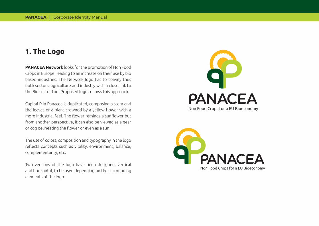
PANACEA Network looks for the promotion of Non Food
Crops in Europe, leading to an increase on their use by bio
based industries. The Network logo has to convey thus
both sectors, agriculture and industry with a close link to
the Bio sector too. Proposed logo follows this approach.
Capital P in Panacea is duplicated, composing a stem and
the leaves of a plant crowned by a yellow flower with a
more industrial feel. The flower reminds a sunflower but
from another perspective, it can also be viewed as a gear
or cog delineating the flower or even as a sun.
The use of colors, composition and typography in the logo
reflects concepts such as vitality, environment, balance,
complementarity, etc.
Two versions of the logo have been designed, vertical
and horizontal, to be used depending on the surrounding
elements of the logo.
1. The Logo
Non Food Crops for a EU Bioeconomy

PANACEA | Corporate Identity Manual
2.1. CMYK
2.2. RGB
Dark greenC= 100 M=15 Y=100 K=60
BlackC= 0 M=0 Y=0 K=100
Dark greenR= 25 G=69 B=40
BlackR= 0 G=0 B=0
Yellow yolkC= 0 M=30 Y=100 K=0
Yellow yolkR= 225 G=177 B=57
Light greenC= 35 M=0 Y=100 K=0
Light greenR= 179 G=203 B=73
PANACEA color palette: dark green, light green and yellow yolk are colors very present in Nature and can be related to Agriculture, main focus of the Network.
It is a combination of warm colors providing dynamism and vitality to the corporate image. Black color is only used on the text of the logo, contrasting with the warmth of the image and adding more personality to the overall image.
2. Corporate colors

PANACEA | Corporate Identity Manual
Ubuntu Light
ABCDEFGHIJKLMNOPQRSTUWXYZabcdefghijklmnopqrstuwxyz1234567890
Ubuntu Regular
ABCDEFGHIJKLMNOPQRSTUWXYZabcdefghijklmnopqrstuwxyz1234567890
Ubuntu Bold
ABCDEFGHIJKLMNOPQRSTUWXYZabcdefghijklmnopqrstuwxyz1234567890
The logo´s and claim´s typography has been specifically created for PANACEA. The source for the logo text is the “GOTHAM” font, whose profiles have been modified making them rounder. For the claim, the “UBUNTU Regular” font has been modified, making softer and rounder contours. Partners who have this font installed can use it on titles and subtitles.
Own and Editable Documents
To elaborate own and editable documents (PPTs, Word reports, etc.), we will follow the next criteria:
- Use of universal operative systems´ common and shared typographies, avoiding those barely used that can be modified when entering in other computers and can generate problems in the text box and in the composition.
- Preferably, use “Sans serif*” and rounded typographies such as “Century gothic. Calibri, Corbel…”
*Sans Serif = Without fancy elements.
3. Typography
Non Food Crops for a EU Bioeconomy
PANACEA | Corporate Identity Manual
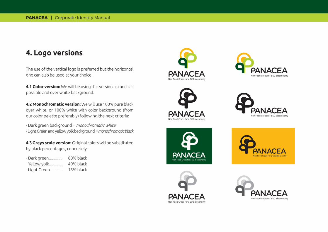
The use of the vertical logo is preferred but the horizontal one can also be used at your choice.
4.1 Color version: We will be using this version as much as possible and over white background.
4.2 Monochromatic version: We will use 100% pure black over white, or 100% white with color background (from our color palette preferably) following the next criteria:
- Dark green background = monochromatic white- Light Green and yellow yolk background = monochromatic black
4.3 Greys scale version: Original colors will be substituted by black percentages, concretely:
- Dark green ............. 80% black- Yellow yolk ............. 40% black- Light Green ............ 15% black
4. Logo versions
Non Food Crops for a EU Bioeconomy
Non Food Crops for a EU Bioeconomy
Non Food Crops for a EU Bioeconomy

PANACEA | Corporate Identity Manual
4.4 Logo over an image or photography: We will follow the criteria:
- Use color version only if background makes it possible.
- Monochromatic white or black if when applying over the background the final result is clearly readable.
- Monochromatic white with a black box that marks the brand´s protection zone (according to the point 6 of the Manual) if the readability without it results unreadable
PANACEA | Corporate Identity Manual
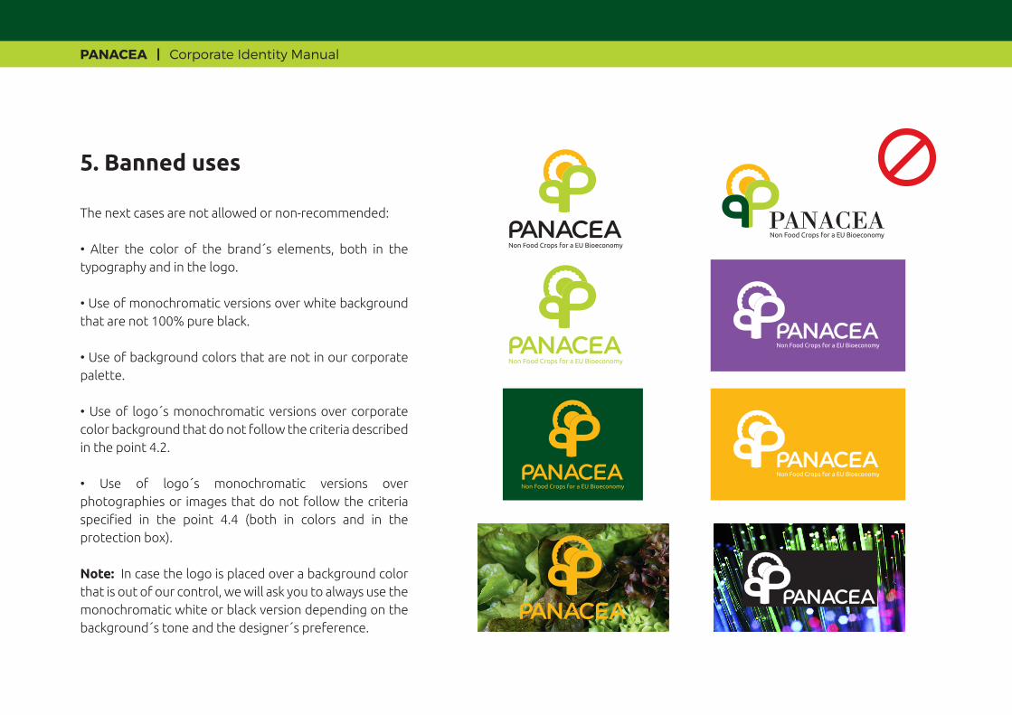
The next cases are not allowed or non-recommended:
• Alter the color of the brand´s elements, both in the typography and in the logo.
• Use of monochromatic versions over white background that are not 100% pure black.
• Use of background colors that are not in our corporate palette.
• Use of logo´s monochromatic versions over corporate color background that do not follow the criteria described in the point 4.2.
• Use of logo´s monochromatic versions over photographies or images that do not follow the criteria specified in the point 4.4 (both in colors and in the protection box).
Note: In case the logo is placed over a background color that is out of our control, we will ask you to always use the monochromatic white or black version depending on the background´s tone and the designer´s preference.
5. Banned uses
PANACEA | Corporate Identity Manual
Non Food Crops for a EU Bioeconomy
Non Food Crops for a EU Bioeconomy
Non Food Crops for a EU Bioeconomy
PANACEA

PANACEA | Corporate Identity Manual
3,5 cm 5 cm
Minimal size recommended.
6.1 Readability
With the aim at making the logo totally readable, it is recommended that we never reduce the dimensions that we show in here.
6.2 Protection Zone
The logo´s perimeter must be protected by creating a “clean zone” that prevents “invasive” elements from getting close.
• We will take PANACEA’s word height as a reference.
• Once our brand´s “Stain Zone” (white box) is delimited with an imaginary box, we will apply the same reference distance above, below, to the left and to the right of it in order to mark the limits of the logo´s protection zone (grey box).
6. Readability and protection
PANACEA | Corporate Identity Manual
Non Food Crops for a EU Bioeconomy
Reference
Reference
Non Food Crops for a EU Bioeconomy
PANACEA PARTNERS


