Explore Using Dot Plots to Display Data A dot plot is a data representation that uses a number line and Xs, dots, or other symbols to show frequency. Dot plots are sometimes called line plots.
Finance Twelve employees at a small company make the following annual salaries (in thousands of dollars): 25, 30, 35, 35, 35, 40, 40, 40, 45, 45, 50, and 60.
A Choose the number line with the most appropriate scale for this problem. Explain your reasoning.
B Create and label a dot plot of the data. Put an X above the number line for each time that value appears in the data set.
Reflect
1. Discussion Recall that quantitative data can be expressed as a numerical measurement. Categorical, qualitative data is expressed in categories, such as attributes or preferences. Is it appropriate to use a dot plot for displaying quantitative data, qualitative data, or both? Explain.
50 1000
50 6030 40 7020
65 8035 50 9520
Salary (thousands of dollars)
Module 9 389 Lesson 2
9.2 Data Distributions and OutliersEssential Question: What statistics are most affected by outliers, and what shapes can data
distributions have?
DO NOT EDIT--Changes must be made through "File info" CorrectionKey=NL-C;CA-C
Explain 1 The Effects of an Outlier in a Data SetAn outlier is a value in a data set that is much greater or much less than most of the other values in the data set. Outliers are determined by using the first or third quartiles and the IQR.
How to Identify an Outlier
A data value x is an outlier if x < Q 1 - 1.5(IQR) or if x > Q 3 + 1.5(IQR).
Example 1 Create a dot plot for the data set using an appropriate scale for the number line. Determine whether the extreme value is an outlier.
A Suppose that the list of salaries from the Explore is expanded to include the owner’s salary of $150,000. Now the list of salaries is 25, 30, 35, 35, 35, 40, 40, 40, 45, 45, 50, 60, and 150.
To choose an appropriate scale, consider the minimum and maximum values, 25 and 150.
A number line from 20 to 160 will contain all the values. A scale of 5 will be convenient for the data. Label tick marks by 20s.
Plot each data value to see the distribution.
Find the quartiles and the IQR to determine whether 150 is an outlier.
B Suppose that the salaries from Part A were adjusted so that the owner’s salary is $65,000.
Now the list of salaries is 25, 30, 35, 35, 35, 40, 40, 40, 45, 45, 50, 60, and 65.
To choose an appropriate scale, consider the minimum and
maximum data values, and .
A number line from to will
contain all the data values.
A scale of will be convenient for the data.
Label tick marks by .
Plot each data value to see the distribution.
150 ? > Q3 + 1.5 (IQR)
150 ? > 47.5 + 1.5 (47.5 - 35)
150 > 66.25 True
150 is an outlier.
x xxx
x xxxxxx x x
20 40 60 80 100 160140120
Salary(thousands of dollars)
Salary (thousands of dollars)
20 70
Module 9 390 Lesson 2
DO NOT EDIT--Changes must be made through "File info"CorrectionKey=NL-C;CA-C
Find the quartiles and the IQR to determine whether 65 is an outlier.
Reflect
2. Explain why the median was NOT affected by changing the max data value from 150 to 65.
Your Turn
3. Sports Baseball pitchers on a major league team throw at the following speeds (in miles per hour): 72, 84, 89, 81, 93, 100, 90, 88, 80, 84, and 87. Create a dot plot using an appropriate scale for the number line. Determine whether the extreme value is an outlier.
Explain 2 Comparing Data SetsNumbers that characterize a data set, such as measures of center and spread, are called statistics. They are useful when comparing large sets of data.
Example 2 Calculate the mean, median, interquartile range (IQR), and standard deviation for each data set, and then compare the data.
A Sports The tables list the average ages of players on 15 teams randomly selected from the 2010 teams in the National Football League (NFL) and Major League Baseball (MLB). Describe how the average ages of NFL players compare to those of MLB players.
On a graphing calculator, enter the two sets of data into L 1 and L 2 .
Use the “1-Var Stats” feature to find statistics for the data in lists L 1 and L 2 . Your calculator may use the following notations: mean _ x , standard deviation σx.
Scroll down to see the median (Med), Q 1 , and Q 3 . Complete the table.
Mean Median IQR ( Q 3 - Q 1 )Standard deviation
NFL 25.98 26.00 0.60 0.46
MLB 28.62 28.70 1.10 0.91
Compare the corresponding statistics.
The mean age and median age are lower for the NFL than for the MLB, which means that NFL players tend to be younger than MLB players. In addition, the IQR and standard deviation are smaller for the NFL than for the MLB, which means that the ages of NFL players are closer together than those of MLB players.
B The tables list the ages of 10 contestants on 2 game shows.
Game Show 1
18, 20, 25, 48, 35, 39, 46, 41, 30, 27
Game Show 2
24, 29, 36, 32, 34, 41, 21, 38, 39, 26
On a graphing calculator, enter the two sets of data into L 1 and L 2 .
Complete the table. Then circle the correct items to compare the statistics.
Mean Median IQR ( Q 3 – Q 1 )Standard deviation
Show 1
Show 2
The mean is lower for the 1st / 2nd game show, which means that contestants in the 1st / 2nd game show are on average younger than contestants in the 1st / 2nd game show. However, the median is lower for the 1st / 2nd game show, which means that although contestants are on average younger on the 1st / 2nd game show, there are more young contestants on the 1st / 2nd game show. Finally, the IQR and standard deviation are higher for the 1st / 2nd game show, which means that the ages of contestants on the 1st / 2nd game show are further apart than the age of contestants on the 1st/ 2nd game show.
Module 9 392 Lesson 2
DO NOT EDIT--Changes must be made through "File info"CorrectionKey=NL-C;CA-C
Explain 3 Comparing Data DistributionsA data distribution can be described as symmetric, skewed to the left, or skewed to the right, depending on the general shape of the distribution in a dot plot or other data display.
Example 3 For each data set, make a dot plot and determine the type of distribution. Then explain what the distribution means for each data set.
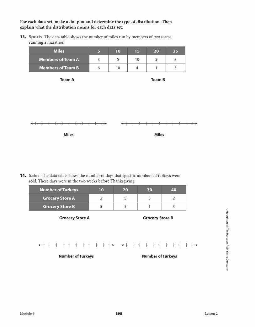
A Sports The data table shows the number of miles run by members of two track teams during one day.
Miles 3 3.5 4 4.5 5 5.5 6
Members of Team A 2 3 4 4 3 2 0
Members of Team B 1 2 2 3 3 4 3
xx xx
xx
xxx
xx
xxx
xx
Symmetric
xx xxx
x xx
xxx
xx
Skewed to the Left
xx xx
xx
x xxx
xx x
Skewed to the Right
Module 9 393 Lesson 2
DO NOT EDIT--Changes must be made through "File info"CorrectionKey=NL-C;CA-C
The data for team A show a symmetric distribution. This means that the distances run are evenly distributed about the mean.
Team B
The data for team B show a distribution skewed to the left. This means that more than half the team members ran a distance greater than the mean.
B The table shows the number of days, over the course of a month, that specific numbers of apples were sold by competing grocers.
Number of Apples Sold 0 50 100 150 200 250 300
Grocery Store A 1 4 8 8 4 1 0
Grocery Store B 3 6 8 8 2 2 1
Grocery Store A Grocery Store B
The distribution for grocery store A is: left-skewed/right-skewed / symmetric. This means that the number of apples sold each day is evenly / unevenly distributed about the mean.
The distribution for grocery store B is: left-skewed/ right-skewed /symmetric. This means that the number of apples sold each day is evenly/ unevenly distributed about the mean.
Reflect
7. Will the mean and median in a symmetric distribution always be approximately equal? Explain.
8. Will the mean and median in a skewed distribution always be approximately equal? Explain.
xx
xx
xx
xxx
xx
xxxx
xxx
3 4 5 6
Miles
xx
xx
xx
xxx
xxx
xxx
xxx
3 4 5 6
Miles
Module 9 394 Lesson 2
DO NOT EDIT--Changes must be made through "File info" CorrectionKey=NL-C;CA-C
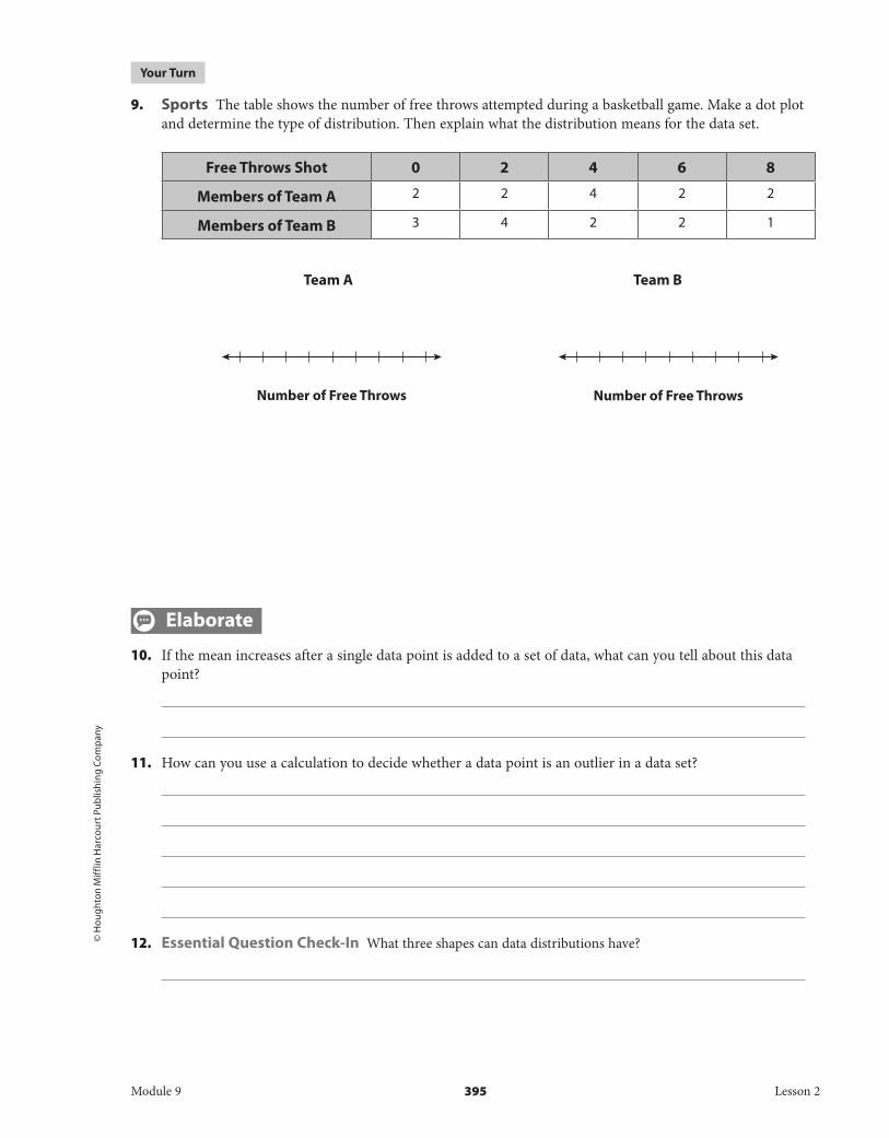
9. Sports The table shows the number of free throws attempted during a basketball game. Make a dot plot and determine the type of distribution. Then explain what the distribution means for the data set.
Free Throws Shot 0 2 4 6 8
Members of Team A 2 2 4 2 2
Members of Team B 3 4 2 2 1
Team A Team B
Elaborate
10. If the mean increases after a single data point is added to a set of data, what can you tell about this data point?
11. How can you use a calculation to decide whether a data point is an outlier in a data set?
12. Essential Question Check-In What three shapes can data distributions have?
Number of Free ThrowsNumber of Free Throws
Module 9 395 Lesson 2
DO NOT EDIT--Changes must be made through "File info" CorrectionKey=NL-C;CA-C
Fitness The numbers of members in 8 workout clubs are 100, 95, 90, 85, 85, 95, 100, and 90. Use this information for Exercises 1–2.
1. Create a dot plot for the data set using an appropriate scale for the number line.
2. Suppose that a new workout club opens and immediately has 150 members. Is the number of members at this new club an outlier?
Sports The number of feet to the left outfield wall for 10 randomly chosen baseball stadiums is 315, 325, 335, 330, 330, 330, 320, 310, 325, and 335. Use this information for Exercises 3–4.
3. Create a dot plot for the data set using an appropriate scale for the number line.
4. The longest distance to the left outfield wall in a baseball stadium is 355 feet. Is this stadium an outlier if it is added to the data set?
Education The numbers of students in 10 randomly chosen classes in a high school are 18, 22, 26, 31, 25, 20, 23, 26, 29, and 30. Use this information for Exercises 5–6.
5. Create a dot plot for the data set using an appropriate scale for the number line.
6. Suppose that a new class is opened for enrollment and currently has 7 students. Is this class an outlier if it is added to the data set?
Number of Members
Number of Feet
Number of Students
Module 9 396 Lesson 2
DO NOT EDIT--Changes must be made through "File info"CorrectionKey=NL-C;CA-C
16. What If? Given the data set 8, 15, 12, 10, and 5, what happens to the mean if you add a data value of 40? Is 40 an outlier of the new data set?
17. Critical Thinking Can an outlier be a data value between Q 1 and Q 3 ? Justify your answer.
18. Justify Reasoning If the distribution has outliers, why will they always have an effect on the range?
19. Education The data table describes the average testing scores in 20 randomly selected classes in two randomly selected high schools, rounded to the nearest ten. For each data set, make a dot plot, determine the type of distribution, and explain what the distribution means in context.
Average Scores 0 10 20 30 40 50 60 70 80 90 100
School A 0 1 2 2 3 4 3 2 2 1 0
School B 0 1 1 1 2 4 5 4 2 0 0
School A School B
Test Scores Test Scores
Module 9 399 Lesson 2
DO NOT EDIT--Changes must be made through "File info" CorrectionKey=NL-C;CA-C
Lesson Performance TaskThe tables list the daily car sales of two competing dealerships.
Dealer A Dealer B
14 13 15 12 16 17 15 20
15 16 15 17 18 19 18 17
17 12 16 14 19 10 19 18
15 16 14 16 15 17 20 19
13 14 18 15 18 18 16 17
A. Calculate the mean, median, interquartile range (IQR), and standard deviation for each data set. Compare the measures of center for the two dealers.
Mean Median IQR ( Q 3 – Q 1 )Standard deviation
Dealer A
Dealer B
B. Create a dot plot for each data set. Compare the distributions of the data sets.
C. Determine if there are any outliers in the data sets. If there are, remove the outlier and find the statistics for that data set(s). What was affected by the outlier?
Dealer A Dealer B
Module 9 400 Lesson 2
DO NOT EDIT--Changes must be made through "File info" CorrectionKey=NL-C;CA-C