36
Colour Quotient ColourNext Special Edition 10 Years of ColourNext Feb 2013
| Date post: | 14-Mar-2016 |
| Category: |
Documents |
| Upload: | asian-paints-limited |
| View: | 221 times |
| Download: | 1 times |

Colour Q
uotient C
olourNext Special Edition
10 Years of ColourNext
Feb 2013

32-33
‘Colour Quotient’ is Asian Paints’ initiative that reflects significance of colours in varied cultures & traditions, and contemporary trends in paints. The objective of Colour Quotient is to share customers’ penchant for colours with architects, interior designers and other creative people and not to solicit business. Views expressed by the authors are personal and photographs used in Colour Quotient are illustrative. For more information, visit: www.asianpaints.com/cq
‘No part of this material may be repro-duced or copied in any form or by any means (graphic, electronic or mechanical, including photocopying, recording, taping or information storage retrieval system) or reproduced in any disc, tape, perforated media or other information storage device etc. without the written permission of Asian Paints Ltd. All rights reserved. Copyright Asian Paints Ltd. All disputes are subject to Mumbai Jurisdiction only.’
Asian Paints offers best-in-class products* which are truly green and conform to the guidelines laid out as per the international GS–11 Standard.
*For more information, log on to www.asianpaints.com
Contemporary Calm
Jan 2013Issue 11
10OCTOBER 2012
ISSUE
REACH US
Let us know what you felt about this issue of Colour Quotient. What would you like to see featured? Have something interesting to share?
Write to us at » [email protected]
Asian Paints Helpline » Contact us at 1800 209 5678 for queries on products, colour tools, services
Asian Paints painting service » Available in Delhi, Chandigarh, Jaipur, Bangalore, Hyderabad, Coimbatore, Chennai, Cochin, Kolkata, Ahmedabad, Baroda, Mumbai, and Pune
IMAGE CREDITS
COLOURSCAPES OF A DECADE• Sy Lunaaisa » flickr.com/photos/flickrsy/2558983405/• Steve Jurvetson » flickr.com/photos/jurvetson/5399911026/• Vinoth Chandars » flickr.com/photos/
vinothchandar/8178276684/• Hamon jp » en.wikipedia.org/wiki/File:Zanskarie_people_
perak_02.jpg
Colour Quotient 11January 2013
Colour Quarterly 10October 2012
View current issue and archive at www.asianpaints.com/cq
To know more about ColourNext 2013 or to
participate in the ColourNext 2014 workshops, write in to us at
ISSUEISSUECQ
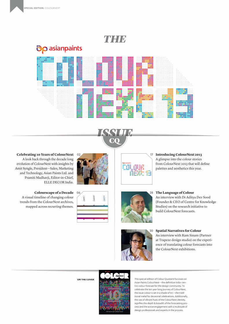
Introducing ColourNext 2013A glimpse into the colour stories from ColourNext 2013 that will define palettes and aesthetics this year.
The Language of ColourAn interview with Dr Aditya Dev Sood (Founder & CEO of Centre for Knowledge Studies) on the research initiative to build ColourNext forecasts.
Spatial Narratives for ColourAn interview with Ram Sinam (Partner at Trapeze design studio) on the experi-ence of translating colour forecasts into the ColourNext exhibitions.
17
28
30
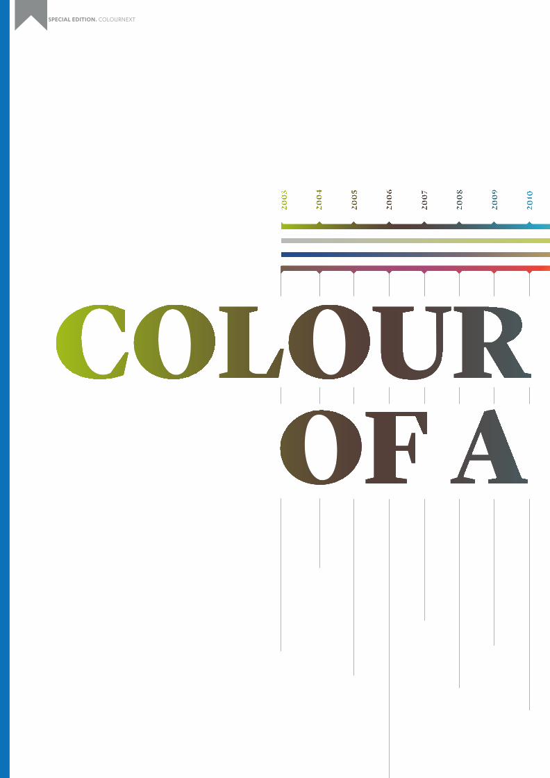
Colourscape of a DecadeA visual timeline of changing colour
trends from the ColourNext archives, mapped across recurring themes.
Celebrating 10 Years of ColourNextA look back through the decade long
evolution of ColourNext with insights by Amit Syngle, President—Sales, Marketing
and Technology, Asian Paints Ltd. and Pramiti Madhavji, Editor-in-Chief,
ELLE DECOR India.
06
02
10 Years of ColourNext
Feb 2013
ON THE COVER
Feb 2013Feb 2013
ON THE COVER This special edition of Colour Quotient focusses on Asian Paints ColourNext—the definitive India-cen-tric colour forecast for the design community. To celebrate the ten year long journey of ColourNext, the issue colour is set in a shade of tin—the tradi-tional metal for decennial celebrations. Additionally, the use of vibrant hues of the ColourNext identity, signifies the depth & breadth of the forecasting pro-cess and the active engagement with a multitude of design professionals and experts in the process.
SPECIAL EDITION. COLOURNEXT
THE

Celebrating
ColourNextYear sof
In the last two decades alone, India has seen unprecedented economic growth. Through the liberalization that occurred in the 1990s, India witnessed the start of globalisation. Soon, this trickled down to the elite of society who became increasingly globalized, mediatized, and urbanized, leading to a sophisticated world-view including design, experiences and even colour.
SPECIAL EDITION. COLOURNEXT

Celebrating
ColourNextYear sof
2–3
ColourNext by Asian Paints is the outcome of a journey across India to gauge changing dynamics of consumer behaviour that define contemporary colour directions. ColourNext aims to provide concrete and resonating design directions, which can then be adapted and moulded by designers. This is what makes ColourNext uniquely exciting, dependable and sustainable. In its tenth edition in 2013, we at Asian Paints look back at this col-ourful journey through a decade, and share the story of its evolution.
With senses being bombarded with rich, vivid and immersive experiences, people’s expecta-tion of and negotiation with aesthetic experi-ences has increased. This has also resulted in a class of people who are instinctively attuned to better aesthetic sensibilities.
While the cause of such change is clear, documented and understood, the effects are myriad, constantly changing and fluidly shift-ing. Unfortunately, such changes, although extremely critical, were overshadowed by more commercial priorities for many indus-tries. Research around people’s behaviour was being conducted in small pockets in India and mostly for academic purposes. The concept of future casting was perceived to be for fairs and the naive. There was a vital need to document, understand and predict consumer and lifestyle trends in a systematic and scientific manner, which could be executable and scalable.
ColourNext was born to meet this need for the design industry in India. It is a unique effort to understand these causal changes in a creative and pragmatic way that is reflective of India’s shifting preferences around aesthetics. Through its research-based approach, it cap-tures the pulse of the nation for the next year. Adding to this is the imaginative way of using themes to present findings, which is holistic, creative and directly usable for India’s design community at large.
“The genesis of ColourNext goes way back to 2002 when as a company dealing with colours, we realised that there was no India-centric colour forecast. Most stake-holders like architects and designers looked to global trends for inspirations which were not in sync with our diverse country and culture. It was this quest of looking at Indian trends and colours to give direction to the design community in India, which led us to create the first India-specific colour forecast—ColourNext 2003. We are now in the 10th year of ColourNext and growing stronger every year.” —Amit Syngle President—Sales, Marketing & Technology, Asian Paints Ltd.

1
THE COLOURNEXT PROCESS— EVOLUTION & DEVELOPMENT Over the last 10 years, the ColourNext endeav-our has been refined, tweaked, polished, and nurtured to create processes that are more sophisticated and result in themes that go hand-in-hand with India’s changing visage.
ColourNext always begins with a data mining activity where hundreds of global and local magazines from different sectors such as fashion, architecture, interior design, product design, graphics, typography, and news, amongst others, are looked at.
Expert insights are gathered from sociol-ogists, lifestyle and consumer behaviour experts across India. Several spaces in news and popular imagination are also visited to understand aesthetics and design sensibilities amongst early adopters.
A visual vocabulary is built using the insights from these different phases illustrating a rich, immersive and vivid picture of what matters to India currently and in the coming year. Lead-ing designers and design thinkers from across India are invited to assess these findings in a series of workshops held in different cities. These high-octane meetings provide a canvas for the designers and thinkers to systematical-ly translate insights into powerful narratives and themes.
These themes are then shortlisted and refined using a variety of design and analytical processes and finally brought to visual artic-ulation in the form of installations and other experiential design methods.
“Colour is specific to a place, to a country, to a city. What works in the West won’t necessarily work for us or for those in any other part of the world. The climate and culture of each country is what subconsciously defines the palette that would be easily accepted in everyday living. For example, cooler shades are preferred in a tropical climate and vibrant ones for a city that has grey skies most months. In India, where culture and tradition play an important role in many households, haldi yellow and kumkum red are applied for auspicious reasons. However, much has changed with global influences now guiding consumers to choose a palette to suit their way of living. The design and decoration market has seen a sea of change in the last 10 years and has evolved from nascent to an emerging one. With the advent of new media and exposure to international trends, more information is now available to the user even in smaller towns. The acceptance of good design and experimentation with colour has changed the way consumers perceive interiors, where today they don’t hesitate to try new colours, combinations and textures.” —Pramiti Madhavji Editor-in-Chief, ELLE DECOR India

4–5
BY THE DESIGN COMMUNITY, FOR THE INDUSTRY The onus of the entire ColourNext effort rests on the shoulders of the designers and design thinkers who have been a critical part of the process. The credit for influential and resonat-ing themes goes to them and the ColourNext team at Asian Paints.
In the last few years, there emerged a need to include future designers or current design students into the fold, since they are the future after all. The workshops were categorized by the experience of the experts, which consisted of students, young and edgy designers as well as the masters. This format was highly suc-cessful and led to extremely rich insights.
FUTURE FORWARD WITH COLOURNEXT The pace of life in all its glory is only has-tening, mutating everything in its path very rapidly. The visual culture of the country has changed drastically in the last few years. One can already see the emergence of the authentic modern Indian, which is Indian in all senses of the word, but influenced greatly by the commoditized economy, extensive international travel as well as an increased exposure to media.
ColourNext in its future editions will aim to track this modern Indian, his beliefs, value systems, preferences and aesthetic sensibili-ties to make sense of contemporary India and where it is heading.
An enviable range of designers have been part of these workshops and panels. Of course there were experts from fashion, architecture, interior design, but recently, also from print, experiential, product, systems and design research fields of design. Furthermore, work-shops have often been often graced by the presence of professors and industry mentors.
With an activity such as ColourNext that is made by the industry and for the industry the possibilities of uptake are immense. The décor ecosystem benefits greatly. Being privy to colour intelligence for the future is immea-surable. Unfortunately, aesthetic experience is not removed from emotion, but ColourNext takes that into account and makes colours that much more comprehensible.
More so, findings from ColourNext are not restricted to the décor industry. The entire design community can use it as inspiration, tweak and tune it, till it is their personal representation.
Building a visual vocabulary through research and analysis.
Developing the ColourNext themes into interactive exhibitions.
2
1
2
SPECIAL EDITION. COLOURNEXT

6–7
NATURE
TECHNOLOGY
MIND STATE
LIFESTYLE
A visual timeline showing the change in use of colour across four key categories over the past decade, as consolidated by Asian Paints ColourNext.
key

Nature is a recurring premise in almost all the themes from the past decade and speaks many languages. The themes from 2003 – 2007 (Earth Palette, Natural Weaves) were about bringing nature into the home. The themes were inspired by living with natural elements and living closely with nature. In 2008 with Synergy, the premise of Nature evolved into a realization of the harm that new lifestyles are causing nature. It was now about learning to live in harmony with nature, with efforts to clean up the environment and balance our lifestyles. The next year saw the premise being taken forward through a more personal agenda. People felt inspired to save the planet, in their own small ways and felt that using technology to do this was appropriate. The technology-nature trend snowballed heavily to give rise to the Nature Networks theme in 2010, which talked about a cleaner, greener side to technology. There are smarter, cleaner and greener ways of doing things and this was the year where technology became responsible. 2013 sees Taste of Earth which is a move into the personal realm, with a growing appreciation of materials and resources that are natural and indigenous.
Though its presence is universal, the interpretation of Nature holds many personal connotations.
FUTURE SCOPE Nature is now moving towards a more shared personal realm. It is evolving into a sensibility that is anti-corporate and a look back to how our forefathers lived. We will enjoy sharing, bartering, improvising, recycling, rethink-ing and repurposing. We will enjoy making products ourselves and sharing it with the community.
Colour inspirations range from different shades of green graduating to blue, often combined with beige or grey. Green is another colour that has been falling in and out of the consumer’s favour. The forest shades have long been associated with nature and the con-sumer’s need to reconnect to all things natural and real. However, in the seasons preceding spring/summer 2013 we saw signs of decline in consumers’ interest in green. For the upcom-ing spring season we are once again gravitat-ing towards green but this time, in more fun youthful shades or duller, barely-there dusty colours. Yellow continues to bring a sense of excitement and playfulness, this time the attention is on cooler and brighter shades.

8–9
2006 saw a slight muddiness being incorporated into the greens along with a tinge of olive. This was reminiscent of the internal conflict that was occurring because of the movement towards synergy.
The greens in the early years were quite straightforward. Extremely natural greens inspired from Eucalyptus and Bamboos were seen.
Browns have been present predominantly across all the themes. The early years saw very natural browns inspired by barks and brown leaves.
2008 saw browns take on a different shade with a neutral brown signifying wellness, organic elements and purity, in an effort to reconcile as an antidote to the concrete culture we live in.
2009 saw this neutral brown get more saturated representing resolve and determination. The grey tones depict a more mature perspective towards the Earth and a personal commitment to save it.
2010 saw this brown turn darker, deeper and greyer.
In 2013, the browns became extremely muted, grey and tan. This represented a connoisseur like approach to natural materials like wood.
The next years saw brighter, organic greens, still with a tinge of olive, that were more active and energetic, referring to the hands-on approach to conservation.
2009 saw the green take on a metallic touch, to indicate the potential that technology has in making a greener planet.
This was taken ahead in 2010 with a more neon green to indicate responsible technology.
BROWNS
BLUES
YELLOWS
GREENS
2003
— 20
0420
03 –2
006 20
08
2009
2010
2006
2009
2010
2007
– 200
8
2013
Candle Wick–7907 R 249 G 243 B 211
Roasted Beans–8765 R 95 G 74 B 57
The blues in Nature are not as varied as the greens, but the shades have evolved very minutely. 2007 saw bright blues with a lot of white, to indicate water and living with natural elements.
2007
Swan Song–7440R 106 G 197 B 213
The yellows in the early years were quite muted, almost tan and representative of dry earth and living closely with nature.
2003
Ripe Olive–7877 R 188 G 155 B 50
Pine Cone–7887 R 197 G 168 B 99
In 2008 this took on a bright tone, energetic and active, to signify the realization and consciousness around conserving nature.
2008 Radiance–7893
R 242 G 186 B 43
In 2009, this evolved into a pale yellow to create a fresh and alive aura. It was also non-imposing to represent that the theme was about personal responsibility and not collective action.
2009
Peeping Sun–7905 R 251 G 237 B 179
2008 saw a darker more saturated and intense blue to depict the power of the Synergy theme.
2008
2009 saw softer and saturated blues, in an attempt to view the planet in a more wholesome manner.
200
9
Soft Blue–9210 R 160 G 206 B 226
Caspian Sea–7294 R 71 G 106 B 143
This took on a more mature tint in 2010, with grey tones to depict technology.
2010
Deep Water–9223 R 83 G 123 B 141
Fresh Sprout–7777 R 223 G 231 B 160
Gold Standard–8517 R 155 G 115 B 60
Organic Green–7766 R 174 G 188 B 88
Cappuccino–8655R 138 G 114 B 104
Sandstone–3211 R 164 G 140 B 117
Timber Land– 8759R 136 G 121 B 107
Weathered Oak–8741 R 85 G 63 B 57
Under Ground–9528 R 157 G 135 B 119
Wild West–8768 R 162 G 146 B 133
Inner Bark–8638 R 147 G 90 B 75
Cilantro–7581 R 35 G 104 B 67
Sporting Green–7741 R 161 G 190 B 26
Emerald Satin–7502 R 0 G 162 B 160
Summer Fern–7829 R 205 G 188 B 9
Blade of Grass–7566 R 0 G 176 B 128
Spinach Soul–7718 R 141 G 154 B 91
Dry Sage–7624 R 159 G 195 B 169
Organic Green–7766 R 174 G 188 B 88
Prairie Green–7471R 99 G 156 B 163
Dropping Leaves–9366 R 172 G 180 B 113
All shades and textures are printed representations and may vary slightly from actual colours and textures. Please refer to the Asian Paints Colour Spectra or the product manuals for exact shade reference.
Royal Glitter CollectionOcean Glitter–M109
Royale Glitter CollectionSilver Flourish–M206

The Tech Theme in 2006 saw a techno-organic style of living, which referred to a lifestyle that was led by technology but balanced by organic elements. It then took on a more personal meaning in the Techno and Homepage themes in the following years, where technology was about reflection and private expression. Inspired by the iPod generation, the theme was driven by rhythm and harmony with the world. Three years later, technology ventured into a sharing space —it created a connected world that was open for all. This was the peak of the open-source movement for technology enthusiasts and it truly became an enabler.
Technology is changing at such a rapid pace that it has found presence in almost all the themes of the past decade.
FUTURE SCOPE
Technology will become more and more experience led, with an increasingly human touch. Multi-sensorial experiences, virtual reality, 3D spaces will become the default interfaces with technology. It will remain a shared-personal experience with increasing collaboration and co-existence. Function will merge with fun to create kinetic and interactive experiences that will engage and delight us.
Colour inspirations will range from a shimmer of traditional tech colours to a wider range of ‘real’, everyday colours. Greys and silver will continue to show their presence with minute variations. There will be iridescent colours that will adapt to the environment and an increasing presence of skin tones to represent the blurring line between man and machine. We will embrace the minimalist, with the strange yet affable charm of futuristic technology. Clean, simple lines, which are fluid and organic, as well as steel finishes and dual-tone colours will represent the different faces of technology.
“The entire process of ColourNext is based on researching the socio-economic trends around us , which index on the living patterns and lead us to décor trends which finally shape the colour forecast. Over the years we have been able to tighten the entire process very strongly and add more credibility in the research process. We have looked at strengthening the initial backbone of looking at the socio-economic changes and subsequently the alignment of these to the décor & colour trends. Considerable effort and energ y has gone in our ability to integrate a cross section of experts and opinion leaders which range from young designers to accomplished personalities. Another area which has gone through big refinement is the science and art of aligning spe-cific palettes and lead colours to the emerging trends and today we are quite confident of the colour stories that we are able to weave into the trends.” —Amit Syngle President—Sales, Marketing & Technology, Asian Paints Ltd.
The next year, changed the image of technology to a more responsible one. It went from being an enabler to a mighty weapon. People were looking for a greener side to technology and a cleaner, more eco-friendly way to everything in 2010. This evolved to a more balanced view of technology over the next year with the Analytica theme of 2011, where technology reflected precise and planned lifestyle choices. We could quantify everything from carbon footprints to skin colour, where choices and access to information had never been easier. People started making very measured decisions and adopting lifestyles that were extremely strategized with the help of technology. 2013 sees technology not only get smaller and more mobile, but seamlessly integrated into our lives. The near future will assimilate it so deeply into human lifestyle, that we will not be consciously aware of it. Intelligent technology will become ubiquitous and part of our natural habitat. The line between technology and human life will start blurring rapidly.

10–11
2008 saw the grey take on a silver tinge to represent the hardcore technology path being taken.
The 2009 greys were colours of the digital era, with the silver tinge continuing but with the addition of a deeper, darker grey.
2013 sees the greys get less stark and turn gentler referring to the seamless interactions between humans and machines.
2010 saw the silver tinge become more powerful, almost a steel colour to represent the high-tech materials being used to conserve nature.
Taking off from steel, the grey of 2011 remained silver but slightly dull representing analytical thoughts and not showiness.
The grey of 2006 represented a more masculine influence; some needed mystery and action in the palette. It was a futuristic and bold colour.
The greens of 2007 saw a very plastic-like, bright green being introduced given the new age materials peaking in that year. It was also reminiscent of the one-dimensionality of how people viewed technology.
This was continued in 2008, with the shade becoming brighter and more vivid.
2011 saw the green turn unnatural and lend a surreal, dramatic and almost ominous feel to the palette.
2013 saw greens with tinges of olive and tan, as well as textured greenish-greys that represent the human as well as the gadget—the traces of which will liven up homes drastically.
2010 saw a similar green, toned down in brightness, but with a more mature quality representing a new consciousness of smarter technology. The coming of age of this colour was representative of the evolving mindset of people around the swiftly damaging ecology.
GREYS
GREENS AND BLUES
2006
2007
2008
2009
2011
2013
2010
2009
2013
2010
201120
08
Bentonite–8230 R 93 G 88 B 91
Lemon Soufflé–7773R 200 G 214 B 45
Festivity–7774 R 212 G 221 B 76
Valley Green–7511 R 0 G 188 B 181
Fairytale Green–9281 R 143 G 204 B 192
Still Aqua–7480 R 130 G 169 B 170
Dropping Leaves–9366 R 172 G 180 B 113
Washed Steps–9480 R 108 G 115 B 114
Carbon Flint–8269 R 49 G 59 B 69
Garden Bench–8432R 139 G 137 B 126
All shades and textures are printed representations and may vary slightly from actual colours and textures. Please refer to the Asian Paints Colour Spectra or the product manuals for exact shade reference.
PU Palette–MetallicSilver Silhouette
Royale Play–Brushing Iridescent Base Coat: Burnt Malt–8229 Top Coat: Arctic Fire–M231
Royale Play DuneDrizzle–M8337
Royale Play–Dune Silver Streak– M609
Royale Glitter CollectionSilver ThunderCloud–M607
Royale Glitter CollectionSilver Flourish–M206

The concept of the internal mind state and sense of being is ubiquitous in all the themes of the past decade. In the early years, the mind state was wholly about serenity and living close to nature. 2006 saw this evolve into a comforting theme with a desire for constant change in chaotic living. Comfort, although necessary, became boring for the mind’s ever shifting eye. This made a turnaround over the next year and changed to quiet moments of contemplation and silent introspection, with Relaxed Weaves, a theme that helped us connect with our inner thoughts. The tryst with our inner thoughts continued and added a multi-dimensional perspective to the mind state with the Multiplicity theme, one where following the heart became more important and life was never slave to the mundane. Exploring new horizons every day became a priority.
A theme that helps us connnect with our inner thoughts.
FUTURE SCOPE
In the future, we will see a world that is changing and shifting in tidal proportions; this constant being in-flux will cause a more proactive realization within people. We will seem to be less tolerant of transgressions committed against us and we will reaffirm the power of the collective. There will be a powerful simplicity at work.
The prominent features of this direction are going to deal with space and light. Stark atmospheres that are more functional than aesthetic, with the use of natural materials will be the trend moving ahead. The essential, simple and pure would be combined with muted luxury, dull metallic shine, and also silver and gold, mother of pearl and cellophane. Transparency and lightness will become important to set off the warmth of wood, along with a range of harmonious neutral colours that fit perfectly together. White would continue to play a balancing role, but an increasing interest in biscuit beige, soft yellow, dusty rose, soft grey blue, and taupe will combine to create interesting spaces. Dark brown, grey and black could be used in small touches as an accent on these lighter natural colours.
The Aura theme of 2010 saw this evolve into a more private, calm experience; one that was positive, pure and conscious, with peace meaning what one wants it to be. The privacy aspect developed on a different trajectory the following year—it was about the darker side of people becoming more acceptable, where there were no whites and blacks, no absolutes. The Charcoal theme recognised the growing openness to the complex, the alternate and the different. Over the next year, it evolved into Headrush, a theme that was about pushing the limits and choosing the unexplored way, in an attempt to stumble upon something incredible. 2012 also saw an awakening where something was astir inside of us, where we felt the freedom to plunge into the depth of our minds and seek the truth from within. It was the opening of our mind’s eye.

12–13
Different shades of blues were used to present the varied sense of being in people. 2006 saw deep inky blues as well as sky blues that represented serenity and bringing nature into the home.
The purple greys of the past decade are omnipresent in the Sense of Being category. Starting with 2007, a pale, almost pastel grey representative of tranquility and a contemplative environ.
The yellows of 2003 – 04 were pale and pastel like representing serenity, peace, relaxation and spaciousness.
2007 saw the light blue continue with a more relaxed connotation to it.
The later years saw this take on a slight peach tint to represent tranquility and a Zen like décor.
2009 saw more adventurous blues bordering towards green and purple signifying the need to explore the horizons and follow the heart in an unconfined manner.
2010 saw dark, edgy greys representing the darker side of the human consciousness. Crosshatched light greys and whites that represented the ability to absorb complexity set this off.
2010 saw the return to a pale yellow, which was a little bright referring to a positive, pure consciousness. It also signifed hope and optimism.
2013 saw the blues lose their purple tinge and become purer, more mature and sensible, reminiscent of deep contemplation and cleaner minds.
2013 saw this turn around to more relaxing, mature colours of purple-greys that represented solitude, placidness, stillness, silence and contemplation.
2010 saw the pale blue trend continue to create private, pure islands of consciousness for people.
This continued in 2011, with brighter blues being added to define the unexpected. Darker stormy blues were also seen to signify the darker side of people becoming more acceptable.
In 2011, this colour darkness continued, with dark greys being used to create an edgy, energetic and intense environment. More mature brownish – grey shades were used to provide a brushed metal feel.
BLUES
PURPLE GREYS
YELLOWS
2006
2007
2003
–200
4
2010
2009
2010
2013
2013
2010
2011
2011
2007
2007
2008
2009
Mineral Blue–X147 R 0 G 108 B 146
Pearly Gates–7219 R 228 G 230 B 238
Silent Night–8254 R 87 G 93 B 101
Whispering Smoke–8303 R 216 G 216 B 212
Golden Apple–7832 R 242 G 234 B 156 Summer Yellow–7863
R 255 G 235 B 122
Inner Peace–7443R 198 G 233 B 236
Summer Harvest–7921 R 255 G 231 B 167
Yellow Metal–7920 R 255 G 219 B 140
Maize Stalk–7903 R 249 G 216 B 119
Blue Revive–9222R 63 G 99 B 116
Plum Island–8214R 123 G 110 B 115
Ink Grey–8270 R 73 G 93 B 107
Lavender Rose–8215 R 147 G 135 B 139
Corsican Sky–7305 R 145 G 172 B 196
Sensibility–8267 R 194 G 205 B 210
Icy Cool–9251R 191 G 221 B 220
Stormy Sky–9181R 53 G 60 B 68
Purple Verve–9101R 87 G 63 B 77
Lilac Dash–8210R 214 G 199 B 204
The darker blues trend continued in 2012 with iridescent, intense and dynamic green-blues being used. This was set off by purple-blues that symbolized freshness of thought, driving change and inspiration.
2012
Teal Dream–X150R 36 G 73 B 84
2009 saw a multiplicity of roles and exploring new horizons that was repre-sented by a layered grey and silver.
2009
Purple Plains–9577R 159 G 143 B 148
Winter Morning–9464R 138 G 141 B 151
All shades are printed representations and may vary slightly from actual colours. Please refer to the Asian Paints Colour Spectra for exact shade reference.
This became much darker and starker in contrast in 2012, which referred to unrest, a deep awakening, energetic deep and heady experiences.
2012
Passion Flower–X107 R 218 G 158 B 25
Burnished Sun–7919 R 255 G 204 B 97
Cheeky Yellow–7902 R 246 G 202 B 81

Lifestyle has been an important part of consumer behaviour and thus important to study. Starting with the early years, the themes of Indian Origin and Luxury first spoke of a time when homes became a new indulgence, a reflection of our style and status in society. Each detail was planned to perfection to create an ambience of luxury. This trend continued for the next year, but in a more sophisticated manner, as Comfort—an aspirational theme of elegance, chic, affluence, and grace was magnified with age. This was offset by Retro, a stylized theme that celebrated the glorious days of the 1920s. This evolved to an urban, authoritative and masculine theme for 2009—Metropolis, meant for the man who had arrived, someone who was judged only by himself and had nothing left to prove. This theme then transformed from a person centric theme to a space centric one for 2010.
Charting evolving lifestyles in colour through influcence and exposure to cultural phenomena.
FUTURE SCOPE
Going ahead, this theme will see an exploration of the dynamics between the future and the past that will create an alternative present. There will be a look back to the age of industry, where people will seek the philosophical and visual styles of an age where function trumped aesthetics.
The future of this category sees a mix of retro influences, especially vintage products from sixties and seventies with the patina of wood and slightly faded colours, affected by time. Traces of the past, imperfections and irregularities will give the products their identity. The colours for this direction are warm and slightly faded. They are primary colours on wood or metal, which are affected by time. Often they are combined with a warm brown to evoke this vintage effect. We see such colours as faded pink, faded orange, old yellow, warm red, mid-blue, mid-green, and faded peacock.
The theme Gallerie was about creating a home that is as sensitive to fine aesthetics as you are. It was sensitive to highlighting the art in one’s home and creating a meta-canvas for it. 2011 with Paris at 40 saw the urban Indian woman coming of age. It was a tribute to the woman of maturity, that celebrated the confidence she had to follow her fancies. It was sophisticated, indulgent and uber-femme. The next year saw Small Joys, a very personal theme about pure moments of joy catching us unawares. It was not about a moment that one seeks, but one that finds us and becomes a part of the individual. The current year is also seeing a celebration of a liberal world that makes room for every kind of gender identity. Individuals are confident about their personalities and choices and they do not need these identities to be flaunted in order to be recognised.
“Having been associated with Asian Paints on the ColourNext research, the intensity of the study is quite amazing. It’s not just about pulling out the next new palette, but actually understanding the user—their way of being, their habits, likes, dislikes—and then arrive at what colours they connect with. Intense panel discussions, workshops and initiatives across var-ied levels of creatives, finally lead to identifying the person who will associate with the palette and vice-versa. With ColourNext, Asian Paints is not selling you paint but a lifestyle that you can relate to.” —Pramiti Madhavji Editor-in-Chief, ELLE DECOR India

14–15
The browns of 2007 are elegant and uber luxurious. These refer to the importance of style and status in the theme.
There are lots of purples used in the themes for lifestyle, for it is a versatile and flexible colour. The purple of 2006 was a jewel-tone, rich shade that symbolized the desire for luxury. It was a celebration of disposable incomes and indulgent spending.
2008 saw these turn darker with pastel browns added in to represent elegance, sophistication and a high degree of exclusivity.
2007 saw this trend continue with a slightly darker purple. It represented glamour and richness, uber luxury, and exclusivity.
The purples of 2012 was bright and inspired by flowers; it represented happiness, joy and positivity.
2013 saw this continue but adding an iridescent dual tone of grey-blue to represent the cognitive dissonance within the idea.
In 2010 the grey-browns and pastel browns continued to represent an artistic canvas and something meant to be treasured. It was also essentialist, handpicked and referred to personal luxury.
In 2009, the purples got murkier, representing the urban, highflying lifestyle of the metropolitan man.
In 2012, the browns went dark to add contrast and create unusual combinations, which symbolized spontaneity, as well as evolved and eclectic experiences.
2011 saw darker, grey and pastel purples being used to create a mood of celebration for the mature woman.
2011 saw the pastel brown get a tinge darker and more mature. This symbolized a more balanced attitude and an analytical approach to life.
2010 saw a return to electrifying purple, to represent the constant excitement of nightlife. The colours were young and vibrant.
2009 saw the browns taking on a greyish tinge, to portray a more masculine, authoritative and urban feel.
BROWNS
PURPLES
2007
2006
2007
2012
2013
2008
2010
2009
2012
2011
2011
2010
2009
Cappuccino–8655R 138 G 114 B 104
Antique Brass–8581R 124 G 85 B 57
Kayak–8757 R 94 G 78 B 63
Mid Buff–3176R 191 G 141 B 56
Very Fuschia–X137R 142 G 52 B 99
Purple Prose–X136 R 117 G 54 B 86
Grape–7199 R 132 G 129 B 174
Edge of Dawn–7216 R 162 G 169 B 217
Blue Glory–7247R 118 G 148 B 206
Splendour–9126R 123 G 104 B 154
Arctic Shadow–9454R 87 G 82 B 81
Lineage–7189 R 68 G 62 B 80
Café Latte–8549 R 119 G 91 B 65
Purple Verve–9101R 87 G 63 B 77
Burnt Metal–8437R 92 G 82 B 66
Under Ground–9528R 157 G 135 B 119
Lilac Dash–8210 R 214 G 199 B 204
Camel Skin–9530 R 197 G 176 B 156
Iris Impact–7109 R 104 G 60 B 104
On The Rocks–9453 R 69 G 64 B 62
Mud House–8656R 172 G 153 B 146
Honeycomb–8533R 144 G 107 B 66
Burnt Yellowstone–4120R 176 G 163 B 140
Butter Rum–8456R 177 G 166 B 148
English Castle–8760R 151 G 139 B 128
Vintage Walnut–8773R 96 G 74 B 56
All shades and textures are printed representations and may vary slightly from actual colours and textures. Please refer to the Asian Paints Colour Spectra or the product manuals for exact shade reference.
Royale Play–SafariBase Coat: Chocolate Cherry–8686Top Coat: Grape Wine–M515
Royale Play–Iridescent Colourwash Base Coat: Orchid Plum–8198 Top Coat: Pacific Lagoon–M708
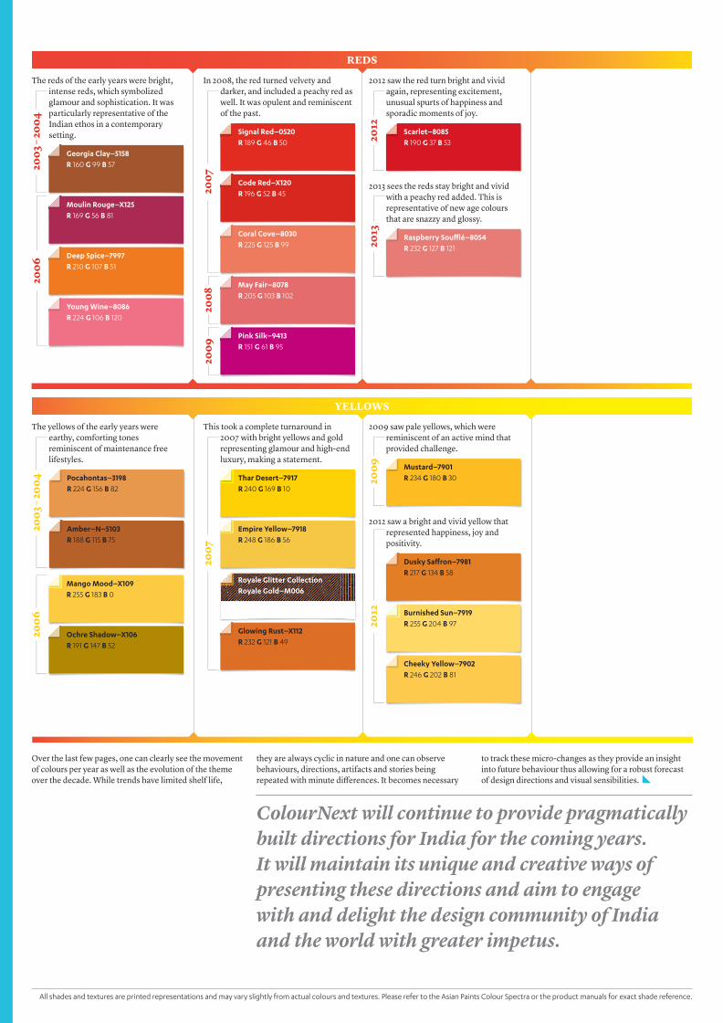
Over the last few pages, one can clearly see the movement of colours per year as well as the evolution of the theme over the decade. While trends have limited shelf life,
The reds of the early years were bright, intense reds, which symbolized glamour and sophistication. It was particularly representative of the Indian ethos in a contemporary setting.
The yellows of the early years were earthy, comforting tones reminiscent of maintenance free lifestyles.
In 2008, the red turned velvety and darker, and included a peachy red as well. It was opulent and reminiscent of the past.
This took a complete turnaround in 2007 with bright yellows and gold representing glamour and high-end luxury, making a statement.
2012 saw a bright and vivid yellow that represented happiness, joy and positivity.
2012 saw the red turn bright and vivid again, representing excitement, unusual spurts of happiness and sporadic moments of joy.
2013 sees the reds stay bright and vivid with a peachy red added. This is representative of new age colours that are snazzy and glossy.
2009 saw pale yellows, which were reminiscent of an active mind that provided challenge.
REDS
YELLOWS
2003
– 20
0420
0620
03 –
2004
2007
2007
2012
2012
2013
2009
Georgia Clay–5158R 160 G 99 B 57
Moulin Rouge–X125R 169 G 56 B 81
Deep Spice–7997R 210 G 107 B 51
Young Wine–8086R 224 G 106 B 120
Mango Mood–X109R 255 G 183 B 0
Ochre Shadow–X106R 191 G 147 B 52
Signal Red–0520R 189 G 46 B 50
May Fair–8078R 205 G 103 B 102
Thar Desert–7917R 240 G 169 B 10
Pocahontas–3198R 224 G 156 B 82
Dusky Saffron–7981R 217 G 134 B 58
Burnished Sun–7919R 255 G 204 B 97
Cheeky Yellow–7902R 246 G 202 B 81
Scarlet–8085R 190 G 37 B 53
Raspberry Soufflé–8054R 232 G 127 B 121
Mustard–7901R 234 G 180 B 30
Code Red–X120R 196 G 52 B 45
Coral Cove–8030R 225 G 125 B 99
Pink Silk–9413R 151 G 61 B 95
Empire Yellow–7918R 248 G 186 B 56
Amber–N–5103R 188 G 115 B 75
Glowing Rust–X112R 232 G 121 B 49
ColourNext will continue to provide pragmatically built directions for India for the coming years. It will maintain its unique and creative ways of presenting these directions and aim to engage with and delight the design community of India and the world with greater impetus.
to track these micro-changes as they provide an insight into future behaviour thus allowing for a robust forecast of design directions and visual sensibilities.
they are always cyclic in nature and one can observe behaviours, directions, artifacts and stories being repeated with minute differences. It becomes necessary
2006
2008
2009
All shades and textures are printed representations and may vary slightly from actual colours and textures. Please refer to the Asian Paints Colour Spectra or the product manuals for exact shade reference.
Royale Glitter CollectionRoyale Gold–M006

16–17
Introducing
ColourNext 2013 is the 10th edition of India’s pioneering colour forecast. Curated by design experts
across India, it is based on an in-depth study of societal, lifestyle and design trends in the last year, and how
these affect colour choices. Our select panel’s intuitive insight and aesthetic flair synthesize these directions for
us to come up with the key colour trends for the year.
SPECIAL EDITION. COLOURNEXT 2013
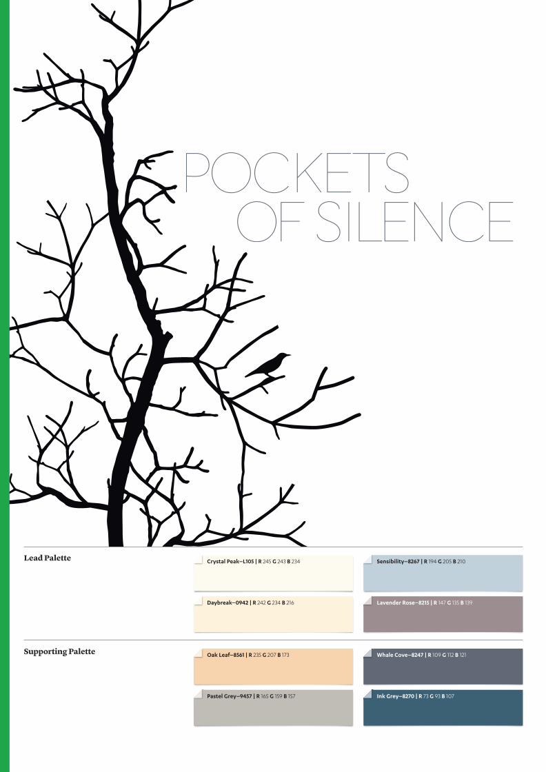
Crystal Peak–L105 | R 245 G 243 B 234
Lavender Rose–8215 | R 147 G 135 B 139Daybreak–0942 | R 242 G 234 B 216
Oak Leaf–8561 | R 235 G 207 B 173
Sensibility–8267 | R 194 G 205 B 210
Pastel Grey–9457 | R 165 G 159 B 157
Whale Cove–8247 | R 109 G 112 B 121
Ink Grey–8270 | R 73 G 93 B 107
Lead Palette
Supporting Palette

18–19
Fabrics that are soft and natural and become one with your form.
Candles lit in small brass containers that glow and reflect light.
Uncluttered and simple lifestyle choices lead one to
a peaceful mind.
The state of silence leads us inwards. A pause stimulates an individual’s need for a quiet so-journ with the self. In a tranquil space that reverberates with meaning and touches the spirit, one can immerse oneself in contem-plation and introspection. The momentary stillness restores ones’ emotional and internal rhythm. What follows is a sense of harmony, restoration and rejuvenation.
Layers of colour tones symbolize the emotion-al transition that the mind goes through. While soft whites and beiges create a placid, light and clean mood, deep contemplative blue greys evoke a sense of stillness.
Combinations of lead and accent colours in various proportions can be used to style each Pockets of Silence space differently.
1
2
3
1
2
3
Pockets of Silence COLOUR PLAY
Mix and match to create your own colour play across walls, furnishings and accessoriesto complete the look.
All shades and textures are printed representations and may vary slightly from actual colours and textures. Please refer to the Asian Paints Colour Spectra or the product manuals for exact shade reference.
To know more about ColourNext 2013 themes or to order the ColourNext 2013 lookbook, visit www.asianpaints.com/colournext/
Moccasin–8763 | R 219 G 209 B 197Raven Song–8253 | R 40 G 39 B 40
Royale Play–Iridescent Colourwash Base Coat: Orchid Plum–8198 Top Coat: Pacific Lagoon–M708
Raspberry Soufflé–8054 | R 232 G 127 B 121
Orange Silk–7999 | R 245 G 167 B 121
Dream Scapes–7430 | R 0 G 137 B 166
Tons of Sun–7895 | R 251 G 220 B 117
Lead Palette
Supporting Palette
Royale Play–Non Metallic Colourwash Base Coat: Orchid Plum–8198 Top Coat: Herbal Green–9271

20–21
Red glass is a ‘must have’—it can be a chandelier or a fruit bowl.
Animal print is found in every form and material—from bags in
zebra to bed throws in leopard print.
Glass birds and animal heads—the wild things appear in
all forms within these stylish spaces.
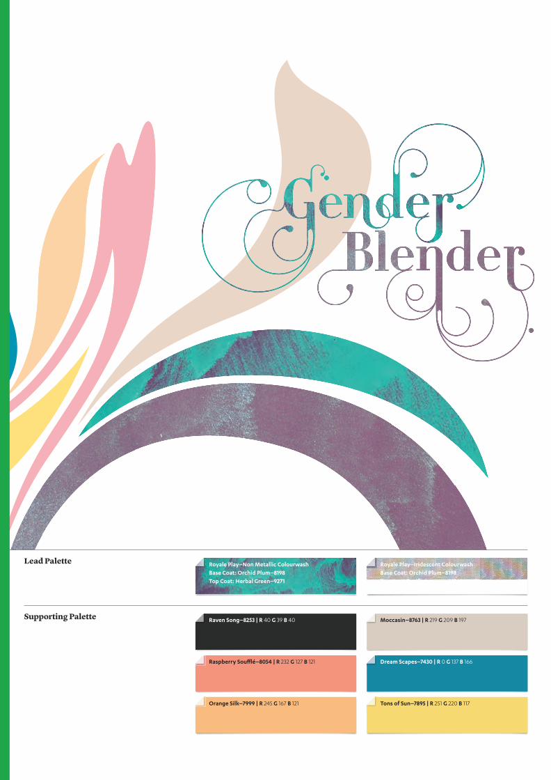
Express yourself! Gender Blender celebrates a liberal world that makes room for every kind of gender identity. Boring stereotypes are giving way to thriving self expression no longer bogged down by a strict gender based colour or style code. Androgyny seems to be the new name of the game. In this freer world, individuals are wearing their personalities on their very stylish sleeves with panache and confidence. Striking experiments with colour, form, materials are the order of the day.A harmony of contrasts characterizes this sophisticated colour arrangement.
Iridescent hues segue seamlessly into more muted tones reflecting the creation of balance between two distinct ideologies. Layering unusual colours and dual toned shades carries the theme forward while the flowing colour-wash finish has a freeing, relaxing effect on the palette. In this exploration of the line between societal stereotypes and individual identities, a sense of mystery is evoked.
Combinations of lead and accent colours in various proportions can be used to style each Gender Blender space differently.
1
3
2
1
2
3
Gender Blender COLOUR PLAY
Mix and match to create your own colour play across walls, furnishings and accessories to complete the look.
All shades and textures are printed representations and may vary slightly from actual colours and textures. Please refer to the Asian Paints Colour Spectra or the product manuals for exact shade reference.
To know more about ColourNext 2013 themes or to order the ColourNext 2013 lookbook, visit www.asianpaints.com/colournext/

Royale Play–Brushing Iridescent Base Coat: Burnt Malt–8229 Top Coat: Arctic Fire–M231
Washed Steps–9480 | R 108 G 115 B 114
Tar Road–8245 | R 54 G 55 B 60
Blushing Rose–5117 | R 230 G 187 B 168
Royale Play Textile Crushed Silk Base Coat: Indian Spice–8568 Top Coat 1: Lazy Brown–8591 Top Coat 2: Memories–8580
Fresh Fuel–9516 | R 221 G 214 B 203
Italian Olive–7823 | R 210 G 204 B 122
PU PalettePure Linen–466
Lead Palette
Supporting Palette
PU Palette–MetallicSilver Silhouette

22–23
It is a brave new world. With every technolog-ical breakthrough our human capabilities and potential get more enhanced. Technology has not just become physically smaller and mo-bile, but it is also more intuitively integrated with our lives. We no longer conduct a one sid-ed operational relationship with cumbersome tools but enjoy a two way interaction. The idea that technology is becoming an extension of us is becoming more and more a reality.
Technology with its human face is what inspires this chromatic expression. Thus dy-namic neons and gadgety greys are softened by gentle and nurturing pinks and flesh tones. Vivid, organic greens complete the palette, symbolizing as they do the throb of life.
Combinations of lead and accent colours in various proportions can be used to style each Human space differently.
1 3
2
1
2
3
Human COLOUR PLAY
Mix and match to create your own colour play across walls, furnishings and accessories to complete the look.
All shades and textures are printed representations and may vary slightly from actual colours and textures. Please refer to the Asian Paints Colour Spectra or the product manuals for exact shade reference.
To know more about ColourNext 2013 themes or to order the ColourNext 2013 lookbook, visit www.asianpaints.com/colournext/
Futuristic grids of light channeled through touch.
Creating nets of light from reflective metal surfaces.
Voids within form create negative spaces.

Apex Duracast–Cross Tex Vertical Scratch Raw Cotton–8459
Arctic Shadow–9454 | R 87 G 82 B 81
Royale Play–Stucco Marble Inner Bark–8638
Under Ground–9528 | R 157 G 135 B 119
Royale Play–Stucco Cobbled Wild Mushroom–8472
Royale Play–Stucco Marble Reef Green–7469
Moody Maroon–4181 | R 105 G 56 B 52
Wild West–8768 | R 162 G 146 B 133
Lead Palette
Supporting Palette
24–25
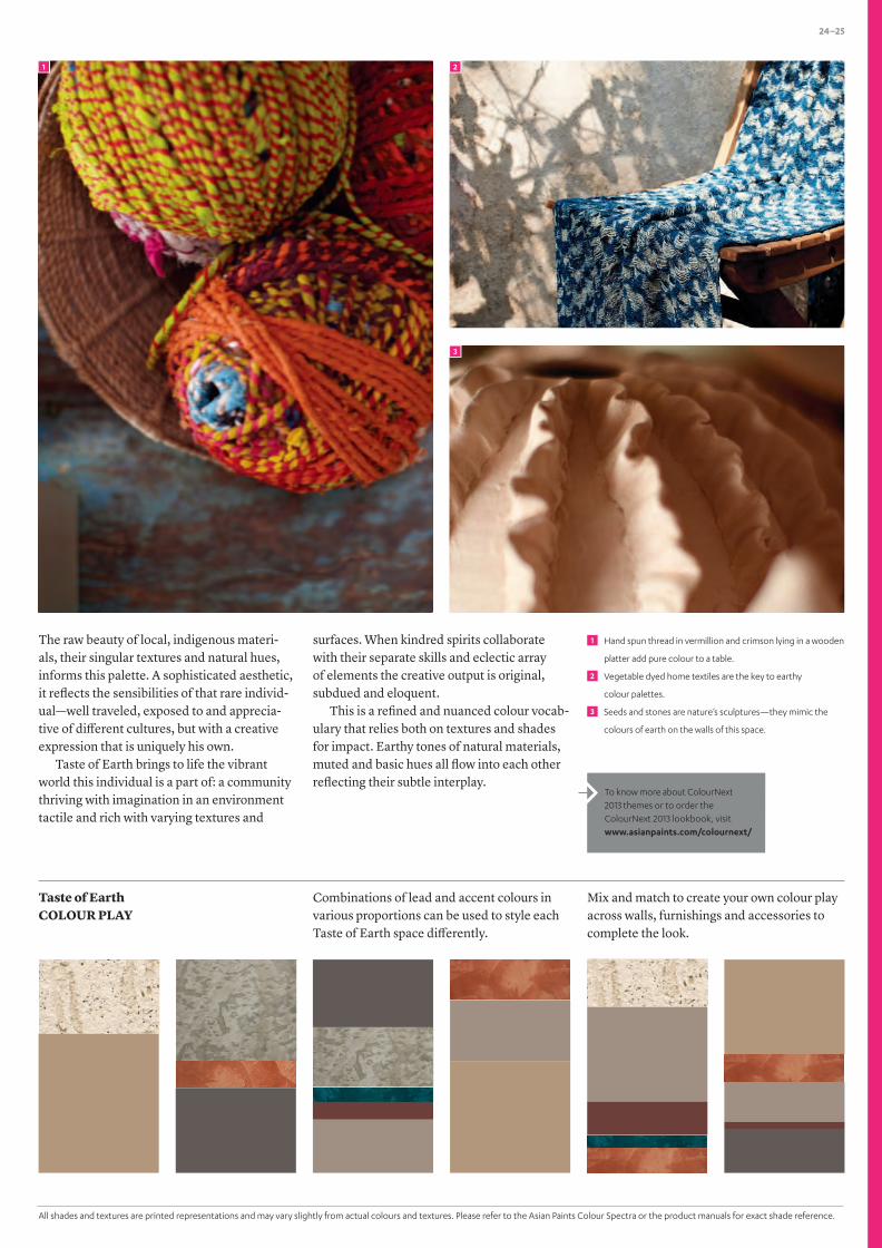
Hand spun thread in vermillion and crimson lying in a wooden
platter add pure colour to a table.
Vegetable dyed home textiles are the key to earthy
colour palettes.
Seeds and stones are nature’s sculptures—they mimic the
colours of earth on the walls of this space.
The raw beauty of local, indigenous materi-als, their singular textures and natural hues, informs this palette. A sophisticated aesthetic, it reflects the sensibilities of that rare individ-ual—well traveled, exposed to and apprecia-tive of different cultures, but with a creative expression that is uniquely his own.
Taste of Earth brings to life the vibrant world this individual is a part of: a community thriving with imagination in an environment tactile and rich with varying textures and
surfaces. When kindred spirits collaborate with their separate skills and eclectic array of elements the creative output is original, subdued and eloquent.
This is a refined and nuanced colour vocab-ulary that relies both on textures and shades for impact. Earthy tones of natural materials, muted and basic hues all flow into each other reflecting their subtle interplay.
Combinations of lead and accent colours in various proportions can be used to style each Taste of Earth space differently.
1
3
2
1
2
3
Taste of Earth COLOUR PLAY
Mix and match to create your own colour play across walls, furnishings and accessories to complete the look.
All shades and textures are printed representations and may vary slightly from actual colours and textures. Please refer to the Asian Paints Colour Spectra or the product manuals for exact shade reference.
To know more about ColourNext 2013 themes or to order the ColourNext 2013 lookbook, visit www.asianpaints.com/colournext/

Royale Play–Dune Drizzle–M8337
Natural Tinge–7879 | R 219 G 188 B 97
Quarry Stone–8658 | R 205 G 187 B 177
Caffeine–8653 | R 82 G 60 B 50
Clay–9521 | R 171 G 161 B 142
PU PaletteFruity Orange–324
Windsor Blue–9198 | R 72 G 106 B 130
PU Palette Carrot Red–319
Lead Palette
Supporting Palette Farm Wash–9287 | R 112 G 152 B 136

26–27
Grow plants in your old gum boots. Remember to put a hole in
the side to drain water!
Old watch movements studded with rhinestones can make
precious jewelry.
Old keys attached with metal rings to a wire mesh lamp shade.
Recycle. Repurpose. Reuse. Give something old new life. Upcycle cele-brates this lively culture that not only animates design with new and humorous twists but is also an important facet in an earth friendly, progressive outlook. The antithesis of the use and dispose mindset, upcycling sees objects reappearing like old friends in new, exciting forms. The fact that they retain traces of their old lives makes these products all the more quirky and enjoyable as both past and present reside in them.
Sepia tones, old metal and wood finishes symbolize objects that have come down from older times. These are accented with brighter, glossier shades to complete the idea of a snazzy makeover. The result is a contemporary, off-beat colour palette.
Combinations of lead and accent colours in various proportions can be used to style each Upcycle space differently.
1
3
2
1
2
3
Upcycle COLOUR PLAY
Mix and match to create your own colour play across walls, furnishings and accessories to complete the look.
All shades are printed representations and may vary slightly from actual colours. Please refer to the Asian Paints Colour Spectra for exact shade reference.
To know more about ColourNext 2013 themes or to order the ColourNext 2013 lookbook, visit www.asianpaints.com/colournext/

In conversation with Dr. Aditya Dev Sood, Center for Knowledge Societies
The Languageof Colour
The Center for Knowledge Societies (CKS) has collaborated with Asian Paints over different areas of research, with primary focus on their ColourNext initiative. CKS has led this research, on behalf of Asian Paints, for the past 6 years now. The objective of this research is to understand the changing consumer behaviour and its impact on design and décor choices. ColourNext studies shifts and movements in the society, analyzes and interprets it to form India’s future décor directions. The outcome of this research is some of the most impactful colour stories for the next year.
CKS is India’s leading innovation consulting firm. CKS partners with different kinds of companies to conduct research and design activities aimed at improving existing products and services and conceptualising new ones focusing on the end user. The company has wide experience in India, but has also worked in different emerging economies worldwide including South Africa, China, Nigeria, Philippines, and Bangladesh.
Dr. Aditya Dev Sood is Founder and CEO of Center for Knowledge Societies. He is a Fulbright scholar with two doctorates from The University of Chicago and a wide range of disciplinary competencies, gained through a long and diverse education, including Architecture, Art History, Critical Theory, Comparative Literature, Sanskrit Philology, Philosophy of Language, Cultural Anthropo-logy, Social Theory, and Political Economy.
How have you seen the application of the ColourNext trends materialise over the year?
Really, this question goes to the heart of all creative action, which at heart is an expression of the will, of human intentionality. All of us have intentionality, the question is only how it is informed and what knowledge the self has access to. This determines the quality and direction of one’s creative output.
I don’t believe ColourNext palettes and concepts should ever be applied directly or used without further creative mediation. Nor is this the pattern that we see among India’s elite designers and architects, the ones we are in touch with time and time again through the ColourNext process. Rather, we see that such creative personalities find inspiration in the ColourNext output, in ways that inform their imagination.
SPECIAL EDITION. COLOURNEXT

28–29
“My own sense, for having been part of the ColourNext process for many years, is that where colour discussions were marginal at the beginning of the last decade, the sophistication and appreciation for the role of colour in determining overall quality perceptions is much much higher now.” —Dr. Aditya Dev Sood
As I see it, as this process matures further, we will see more and more of a dynamic feedback loop between designers talking to one another and talking back to a process like ColourNext, which will in turn set up the conditions for further creative work. ColourNext is a massive but silent public dialogue, conducted in the language of colour.
Over the past 5 years, how have you seen the research process at ColourNext evolve to create better trend outputs?
For all of us who have worked with ColourNext over the years, we recognize that there has been increasing sophistication in the ways in which the process has been imagined and then executed. In the early days there was a strong emphasis on ‘colour trend detection,’ using the idiom of market research, as if these
phenomena were already ‘out there’ and only needed to be discovered. Now I believe we have a more balanced approach where we try to detect societal changes and rumble points but work collaboratively and creatively with a range of designers to generate visual and colour responses to those points of vibration and change. This means that we are working analytically as well as intuitively, using convergent as well as divergent approaches as and where most appropriate.
What is the current state of research on design and colour in India, in comparison with the situation a decade ago? What value do designers, corporates, and consumers see in it?
The first thing to note is that consumer sensibilities around colour have elevated to
an all-time high. This is because of malls and multi-brand outlets, because of media consumption and shopping online, and because of more and more high-concept hospitality and entertainment spaces. For the Indian elite this is where much of their ‘third space’ time is spent (outside work and home), and this is where colour sensibilities are being shaped and formed.
While we can already see the informal application of ColourNext findings by architects, interior and lifestyle designers, we will soon see more formal applications, citing and crediting ColourNext for the themes employed. We will also see more collaborative and co-creative approaches where industry looks for ways in which they can work with ColourNext on speciality themed buildings and installation spaces.
1
2
Workshops centered around colour forecasting.
The research process and tools used for ColourNext.
1 2
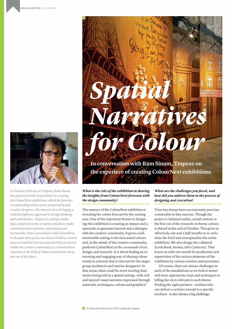
As Creative Director at Trapeze, Ram Sinam has partnered with Asian Paints in creating the ColourNext exhibitions, which his firm has executed along with a team of motivated and creative designers. His interests lie in bringing a multidisciplinary approach to design thinking and articulation. Trapeze is a design studio that seamlessly works in various media to make communication relevant, experiential and memorable. Ram’s association with ColourNext, in the past three years, has been to build a creative aura around the forecast and also help position it within the creative community as a brand whose expertise in the field of colour and interior decor are one of the finest.
What is the role of the exhibition in sharing the insights from ColourNext forecasts with the design community?
The essence of the ColourNext exhibition is revealing the colour forecast for the coming year. One of the important factors in design-ing this exhibition is creating an impact and a spectacle, to generate interest and a dialogue with the creative community. It gives a rich memorable setting to the forecasted colours and, in the minds of the creative community, positions ColourNext at the crossroads of art, design, and research. It is about finding an in-teresting and engaging way of sharing colour trends in a format that is relevant for the target group (architects and interior designers). In that sense, what could be more exciting than stories being told in a spatial setting—with rich and layered visual narrative expressed through materials, techniques, colours and graphics?
What are the challenges you faced, and how did you address them in the process of designing and execution?
Time has always been an extremely precious commodity in this exercise. Though the project is initiated earlier, actual content or the first cut of the research on theme colours is shared at the end of October. This gives us effectively one and a half months to re-artic-ulate the brief and conceptualize the entire exhibition. We also design the collateral (Look Book, Invites, Info Cards etc). That leaves us with one month for production and supervision of the various elements of the exhibition by various vendors and associates.
Of course, there are always challenges in each of the installations as we look to newer and more appropriate ways and techniques in telling the story relevant to each theme. Finding the right partners—vendors who can deliver a certain concept in a specific medium—is also always a big challenge.
In conversation with Ram Sinam, Trapeze on the experiece of creating ColourNext exhibitions.
Spatial Narratives for Colour
1
A ColourNext theme from 2011 created by Trapeze.1
SPECIAL EDITION. COLOURNEXT
30–31
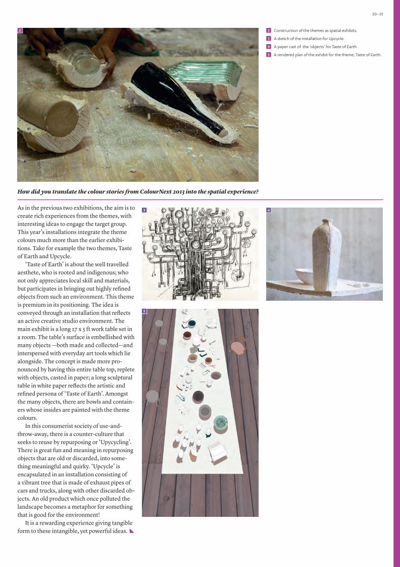
Construction of the themes as spatial exhibits.
A sketch of the installation for Upcycle.
A paper cast of the ‘objects’ for Taste of Earth.
A rendered plan of the exhibit for the theme, Taste of Earth.
How did you translate the colour stories from ColourNext 2013 into the spatial experience?
As in the previous two exhibitions, the aim is to create rich experiences from the themes, with interesting ideas to engage the target group. This year’s installations integrate the theme colours much more than the earlier exhibi-tions. Take for example the two themes, Taste of Earth and Upcycle.
‘Taste of Earth’ is about the well travelled aesthete, who is rooted and indigenous; who not only appreciates local skill and materials, but participates in bringing out highly refined objects from such an environment. This theme is premium in its positioning. The idea is conveyed through an installation that reflects an active creative studio environment. The main exhibit is a long 17 x 5 ft work table set in a room. The table’s surface is embellished with many objects —both made and collected—and interspersed with everyday art tools which lie alongside. The concept is made more pro-nounced by having this entire table top, replete with objects, casted in paper; a long sculptural table in white paper reflects the artistic and refined persona of ‘Taste of Earth’. Amongst the many objects, there are bowls and contain-ers whose insides are painted with the theme colours.
In this consumerist society of use-and-throw-away, there is a counter-culture that seeks to reuse by repurposing or ‘Upycycling’. There is great fun and meaning in repurposing objects that are old or discarded, into some-thing meaningful and quirky. ‘Upcycle’ is encapsulated in an installation consisting of a vibrant tree that is made of exhaust pipes of cars and trucks, along with other discarded ob-jects. An old product which once polluted the landscape becomes a metaphor for something that is good for the environment!
It is a rewarding experience giving tangible form to these intangible, yet powerful ideas.
3
5
2 2
4
3
5
4

Experts and panelists who have contributed their insights and time towards the making of India’s premier colour forecast, Asian Paints ColourNext 2013
SPECIAL EDITION. COLOURNEXT

32-33
‘Colour Quotient’ is Asian Paints’ initiative that reflects significance of colours in varied cultures & traditions, and contemporary trends in paints. The objective of Colour Quotient is to share customers’ penchant for colours with architects, interior designers and other creative people and not to solicit business. Views expressed by the authors are personal and photographs used in Colour Quotient are illustrative. For more information, visit: www.asianpaints.com/cq
‘No part of this material may be repro-duced or copied in any form or by any means (graphic, electronic or mechanical, including photocopying, recording, taping or information storage retrieval system) or reproduced in any disc, tape, perforated media or other information storage device etc. without the written permission of Asian Paints Ltd. All rights reserved. Copyright Asian Paints Ltd. All disputes are subject to Mumbai Jurisdiction only.’
Asian Paints offers best-in-class products* which are truly green and conform to the guidelines laid out as per the international GS–11 Standard.
*For more information, log on to www.asianpaints.com
Contemporary Calm
Jan 2013Issue 11
10OCTOBER 2012
ISSUE
REACH US
Let us know what you felt about this issue of Colour Quotient. What would you like to see featured? Have something interesting to share?
Write to us at » [email protected]
Asian Paints Helpline » Contact us at 1800 209 5678 for queries on products, colour tools, services
Asian Paints painting service » Available in Delhi, Chandigarh, Jaipur, Bangalore, Hyderabad, Coimbatore, Chennai, Cochin, Kolkata, Ahmedabad, Baroda, Mumbai, and Pune
IMAGE CREDITS
COLOURSCAPES OF A DECADE• Sy Lunaaisa » flickr.com/photos/flickrsy/2558983405/• Steve Jurvetson » flickr.com/photos/jurvetson/5399911026/• Vinoth Chandars » flickr.com/photos/
vinothchandar/8178276684/• Hamon jp » en.wikipedia.org/wiki/File:Zanskarie_people_
perak_02.jpg
Colour Quotient 11January 2013
Colour Quarterly 10October 2012
View current issue and archive at www.asianpaints.com/cq

10 Years of ColourNext
Feb 2013
At Asian Paints, colour is our lifeline.
A lot of the work that we are doing and intend to do, is around
colour and in that sense we are like the ‘Colour Guardians’ of
the country. Colour for us is like a moving target where we
need to chalk out the colour and décor trends as we go through
the journey of ‘adding colour to people’s lives’. As we venture
into the future, there is a need to involve more people in this e�ort
and increase their con�dence in using the outputs.
Amit Syngle President–Sales, Marketing & Technology
Asian Paints Ltd


