Tutorial9 | The Best Tutorials and Resources. Free. Home About Get Paid to Write Contact Us Subscribe to Tutorial9 19048 Subscribers Subscribe by RSS | Subscribe by Email Photoshop Tutorials Photography Tutorials Web & Blogging Tutorials Freebies, Resources and Downloads Recent Drawing & Design Interface Design Photo Editing Photoshop Basics Photoshop Effects Text Effects Create a 3D Glossy Box Logo in Photoshop By Tyler Bramer | 116 Comments Search
Transcript
Tutorial9 | The Best Tutorials and Resources. Free. Home About Get Paid to Write Contact Us
Subscribe to Tutorial919048 Subscribers Subscribe by RSS | Subscribe by Email
Photoshop Tutorials Photography Tutorials Web & Blogging Tutorials Freebies, Resources and Downloads
Stumble This! Float This! Mark as Delicious! Tweet This!
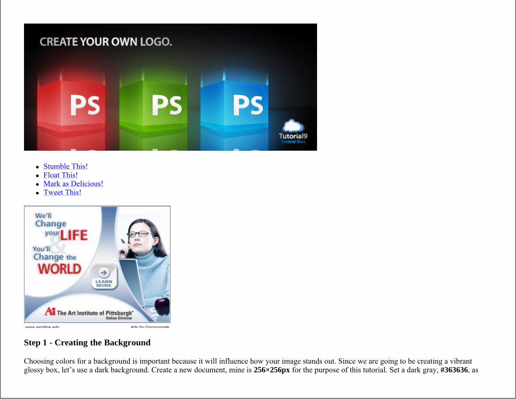
Step 1 - Creating the Background
Choosing colors for a background is important because it will influence how your image stands out. Since we are going to be creating a vibrantglossy box, let’s use a dark background. Create a new document, mine is 256×256px for the purpose of this tutorial. Set a dark gray, #363636, as
www.aionline.edu Ads by Goooooogle
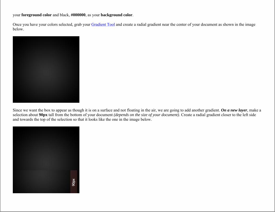
your foreground color and black, #000000, as your background color.
Once you have your colors selected, grab your Gradient Tool and create a radial gradient near the center of your document as shown in the imagebelow.
Since we want the box to appear as though it is on a surface and not floating in the air, we are going to add another gradient. On a new layer, make a selection about 90px tall from the bottom of your document (depends on the size of your document). Create a radial gradient closer to the left sideand towards the top of the selection so that it looks like the one in the image below.
Step 2 - Creating the Box
Now that we have our background, we need to create our actual box. To begin, simply create a selection about 100×100px and fill it with a nice blue color, such as #0062b3.
Since we want our box to have some perspective, we are going to need to transform it by going to Edit > Transform > Perspective. Bring the topright and bottom right corners of the box towards the center of the side a small amount and complete your transformation.
Then go to Edit > Free Transform and drag the right side to the left a small amount, to compensate for the perspective that you applied. You want your box to look like a square, keeping in mind how perspective affects the way your eyes see an object.
Now that we have the right shape, let’s change the color. Grab your linear gradient tool and create a light blue (#0080c3) to dark blue (#004893) gradient from the bottom left to the top right of the box.
With the right side of the box complete, lets move on to the left side. Create a duplicate (Right click layer > Duplicate) of the right side of your box and flip it horizontally (Edit > Transform > Flip Horizontal).
Then simply apply another perspective transformation (Edit > Transform > Perspective) of greater value, and drag the left side in even more. This will give the illusion that the left side of the box is viewable, but it is not the main side of the box. Depending on your tastes, you may want to create a new linear gradient for the left side to make it look a little more unique.
Notice that my box is near the center of the gradient for the surface we created. It also is low enough so that it appears that the entire bottom of the box is touching the surface. It is coming along great!
Step 3 - Creating the Gloss Effect
We have a great looking box already, but the style we are going for is glossy. We are going to accomplish this using a few different steps which can be difficult sometimes, so take your time here.
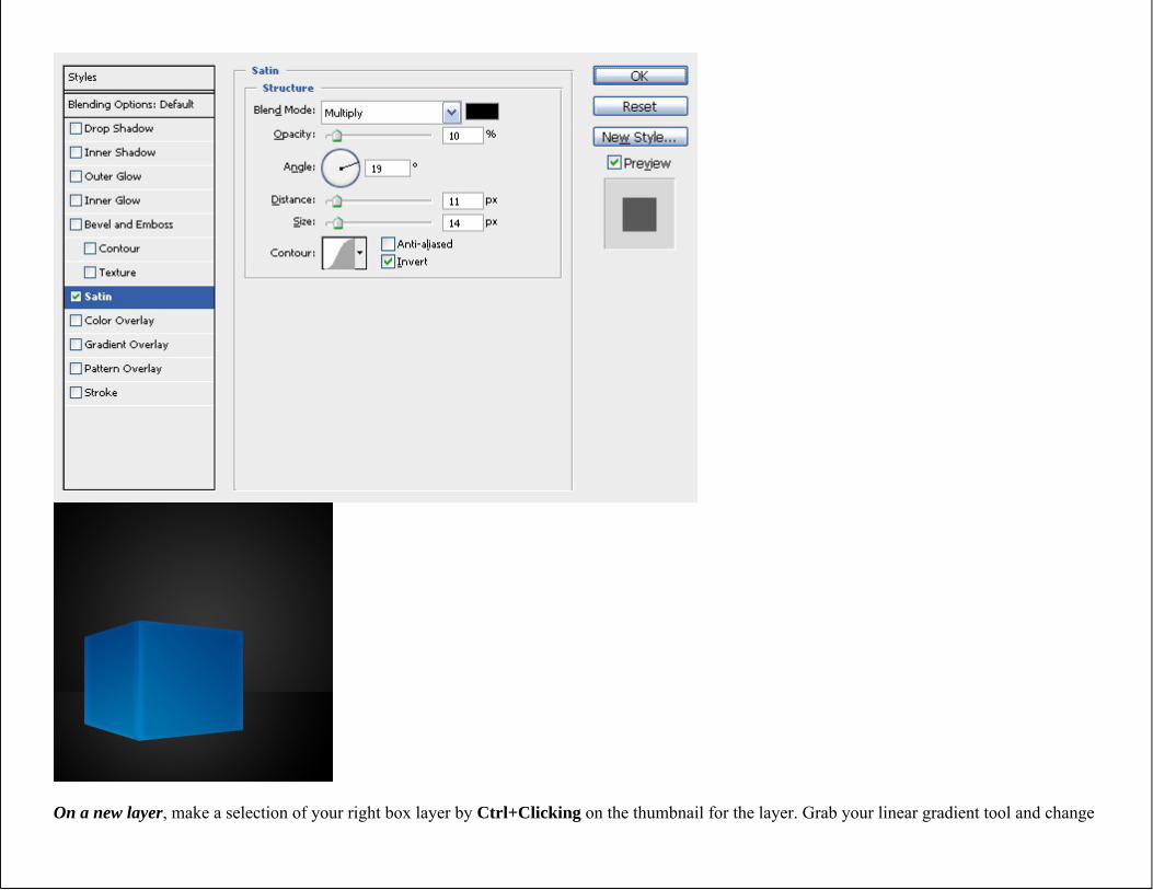
Lets start by applying a layer style effect called Satin to both of our box layers. this is going to give the box a neat effect that looks great underneath the gloss. It will also make the edges a little brighter than the center of the box, which matches the effect that I wanted.
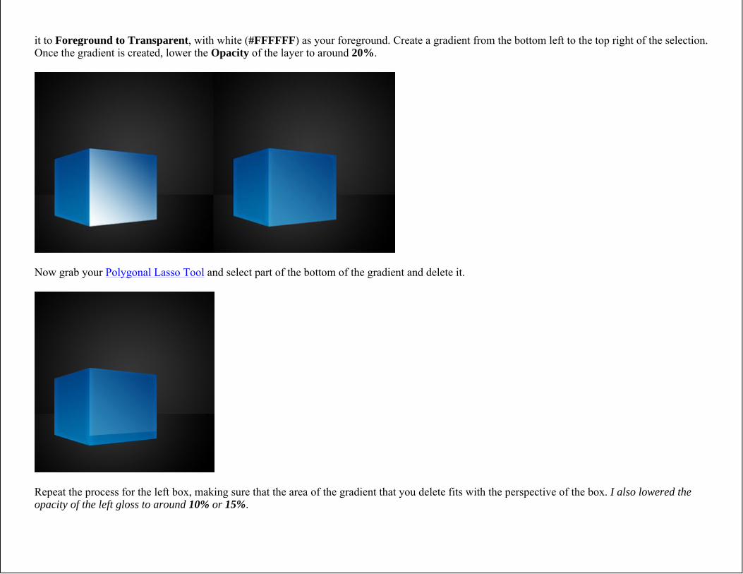
On a new layer, make a selection of your right box layer by Ctrl+Clicking on the thumbnail for the layer. Grab your linear gradient tool and change
it to Foreground to Transparent, with white (#FFFFFF) as your foreground. Create a gradient from the bottom left to the top right of the selection. Once the gradient is created, lower the Opacity of the layer to around 20%.
Now grab your Polygonal Lasso Tool and select part of the bottom of the gradient and delete it.
Repeat the process for the left box, making sure that the area of the gradient that you delete fits with the perspective of the box. I also lowered the opacity of the left gloss to around 10% or 15%.
Step 4 - Placing the Type
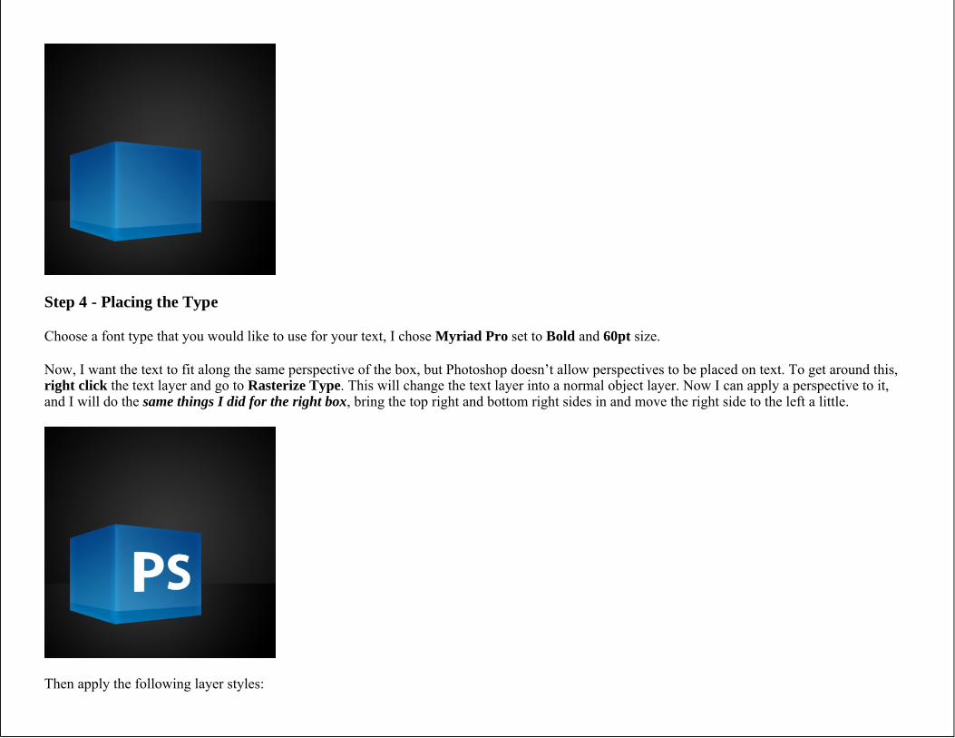
Choose a font type that you would like to use for your text, I chose Myriad Pro set to Bold and 60pt size.
Now, I want the text to fit along the same perspective of the box, but Photoshop doesn’t allow perspectives to be placed on text. To get around this, right click the text layer and go to Rasterize Type. This will change the text layer into a normal object layer. Now I can apply a perspective to it, and I will do the same things I did for the right box, bring the top right and bottom right sides in and move the right side to the left a little.
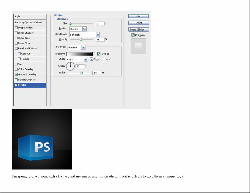
Then apply the following layer styles:
Gradient Overlay
#CCCCCC to #FFFFFF
Stroke
I’m going to place some extra text around my image and use Gradient Overlay effects to give them a unique look.
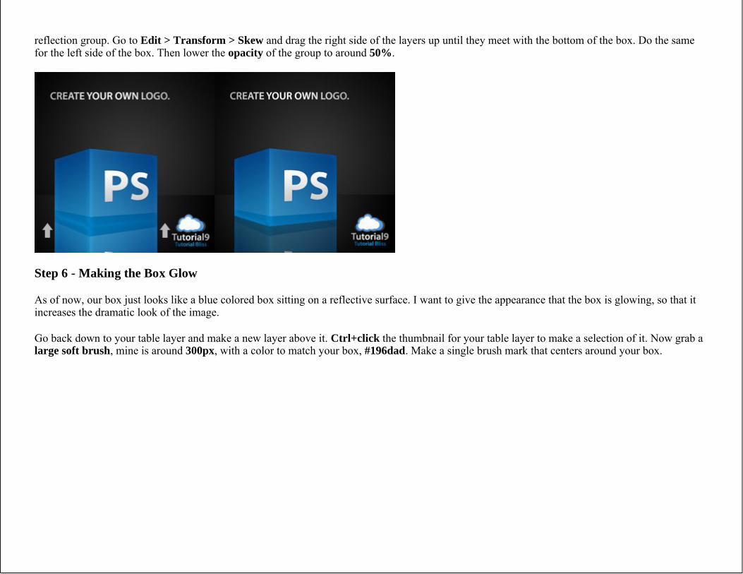
Step 5 - Creating the Reflection
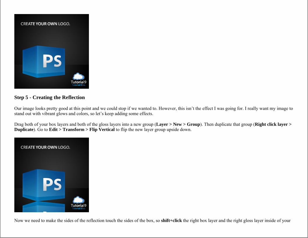
Our image looks pretty good at this point and we could stop if we wanted to. However, this isn’t the effect I was going for. I really want my image to stand out with vibrant glows and colors, so let’s keep adding some effects.
Drag both of your box layers and both of the gloss layers into a new group (Layer > New > Group). Then duplicate that group (Right click layer >Duplicate). Go to Edit > Transform > Flip Vertical to flip the new layer group upside down.
Now we need to make the sides of the reflection touch the sides of the box, so shift+click the right box layer and the right gloss layer inside of your
reflection group. Go to Edit > Transform > Skew and drag the right side of the layers up until they meet with the bottom of the box. Do the same for the left side of the box. Then lower the opacity of the group to around 50%.
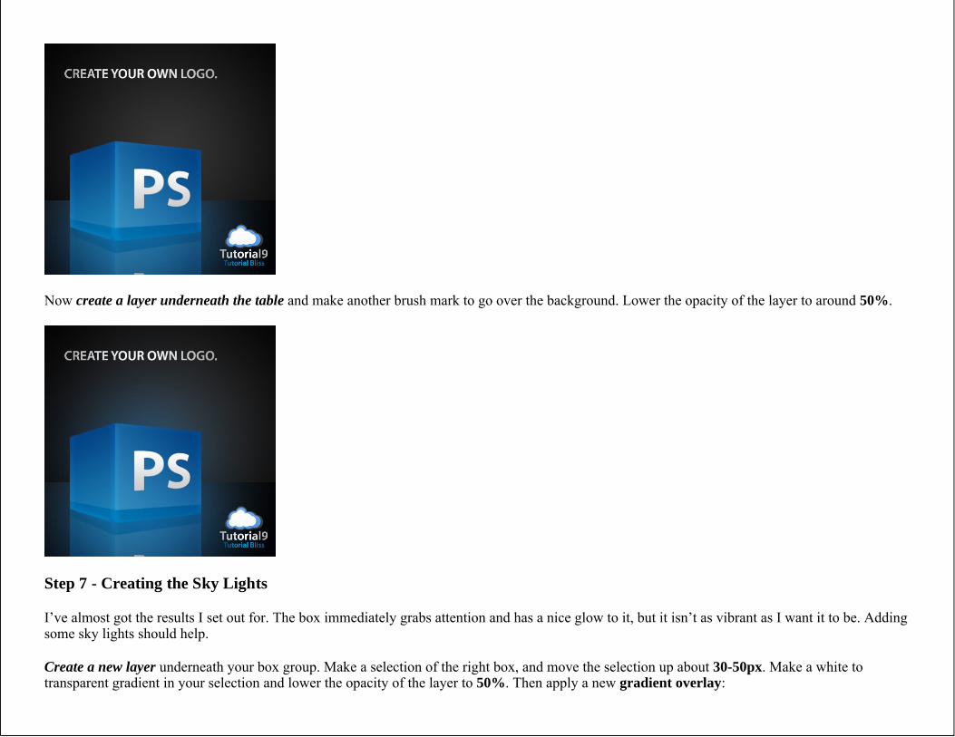
Step 6 - Making the Box Glow
As of now, our box just looks like a blue colored box sitting on a reflective surface. I want to give the appearance that the box is glowing, so that it increases the dramatic look of the image.
Go back down to your table layer and make a new layer above it. Ctrl+click the thumbnail for your table layer to make a selection of it. Now grab a large soft brush, mine is around 300px, with a color to match your box, #196dad. Make a single brush mark that centers around your box.
Now create a layer underneath the table and make another brush mark to go over the background. Lower the opacity of the layer to around 50%.
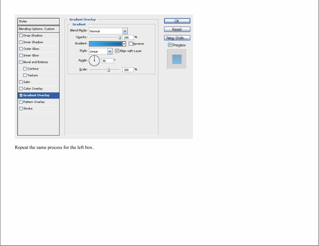
Step 7 - Creating the Sky Lights
I’ve almost got the results I set out for. The box immediately grabs attention and has a nice glow to it, but it isn’t as vibrant as I want it to be. Adding some sky lights should help.
Create a new layer underneath your box group. Make a selection of the right box, and move the selection up about 30-50px. Make a white to transparent gradient in your selection and lower the opacity of the layer to 50%. Then apply a new gradient overlay:
Repeat the same process for the left box.
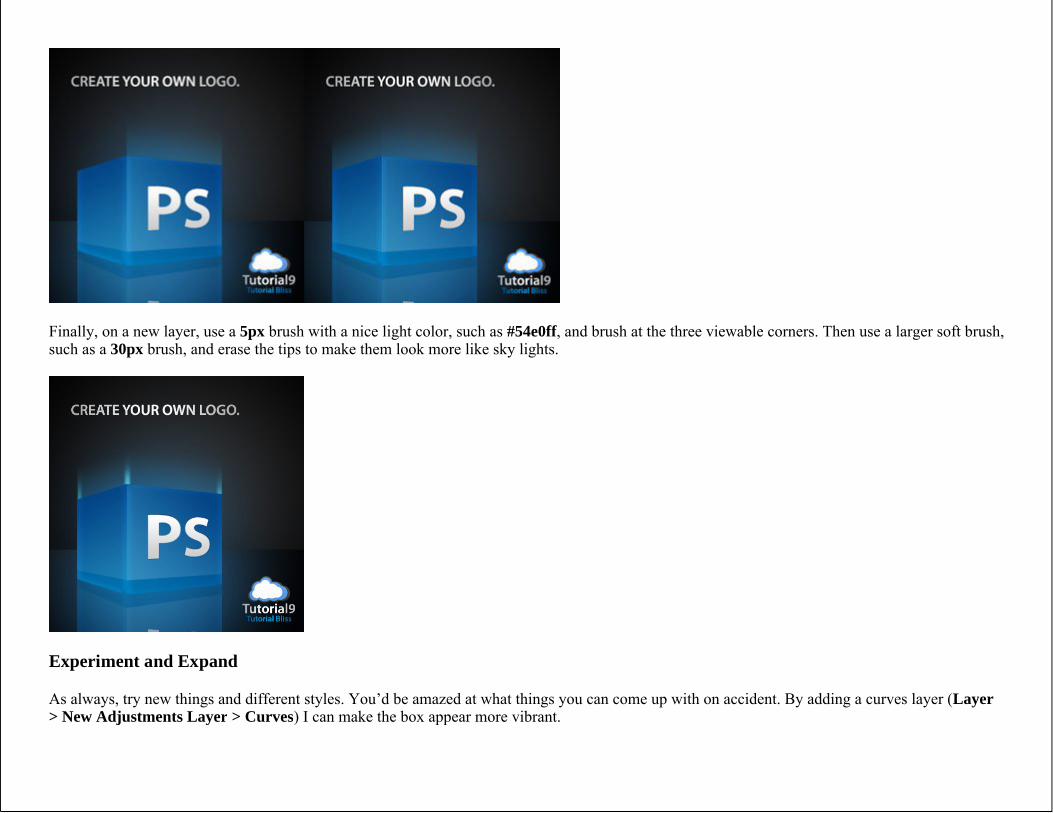
Finally, on a new layer, use a 5px brush with a nice light color, such as #54e0ff, and brush at the three viewable corners. Then use a larger soft brush, such as a 30px brush, and erase the tips to make them look more like sky lights.
Experiment and Expand
As always, try new things and different styles. You’d be amazed at what things you can come up with on accident. By adding a curves layer (Layer > New Adjustments Layer > Curves) I can make the box appear more vibrant.
Now What?
You’ve reached the end of this post. Seeing you made it this far means you might be interested in these related articles and resources:
Designing a 3D Software Box
Create a Vibrant Blueprint in Photoshop
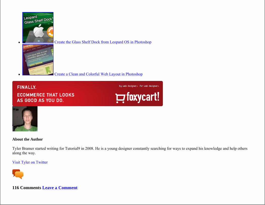
Create the Glass Shelf Dock from Leopard OS in Photoshop
Create a Clean and Colorful Web Layout in Photoshop
About the Author
Tyler Bramer started writing for Tutorial9 in 2008. He is a young designer constantly searching for ways to expand his knowledge and help others along the way.
Visit Tyler on Twitter
116 Comments Leave a Comment
1.Replysubhashis April 20, 2009
Good job……… thanks.
2.Replygrazie April 24, 2009
tnx bro,
really cool stuff, helping out lots of us younger designers..
keep up the good work, kudos to you!
3.ReplyAssa May 1, 2009
really nice
4.Replychetan Madaan May 1, 2009
Thanks a Bunch guys! this is a really good comment.
5.Replyhuwaw69 May 2, 2009
great tutorial man! by the way what is the meaning of “PS”
Dean May 4, 2009
It might be PhotoShop
6.Replybobobo May 4, 2009
step 7 is really confusing mecan someone clarify??and im doing this on photoshop 7 so im not sure i have the layer group optionthanks
Rene May 7, 2009
what I did was create new layer > Polygonal lasso the shape of the the which ever side of the cube you’re working on > with the move tool I pushed up the selection almost to the top of the box so as to give you room so when applying the gradient. Leaving room allows you that soft faded look, similar to light fading into the night sky. Hopefully this post makes sense cause I’m tired as heck from working on this tut.
7.ReplySander May 6, 2009
this is very cool it looks like the original Photoshop logo and now i designed it myself, Im only 14 and from the the netherlands and I could still understand everything
8.
ReplyEDWINERRF May 6, 2009
NICE JOB
9.ReplyKishan Bagaria May 12, 2009
Can you give me the PSD file of it?
10.ReplyWiiKokAiN May 14, 2009
I’d also like a psd of it! It’s easier to train with it =)
11.Replybilly the bob May 14, 2009
hi
12.Replybarbie not the doll May 21, 2009
wow…I like this tutorial it was easy to follow and the results are awsome! keep up the good work!
13.ReplySergio Fraiman May 22, 2009
It was good if you leave the .psd copy to download….
14.Replytempltae June 4, 2009
Excellent, thanks!
15.Replykreatos June 5, 2009
in the second step where you made a new layer of 90px can someone please explain pls, i been using the transform tool but it doesnt give the same result
16.ReplyAlexandre Broggio ( Brasil ) June 5, 2009
Nice work ^_^
17.Replylean June 9, 2009
thank you, simple and cool!!!
18.Replyمنتدیات ماى بكتشرز June 11, 2009
wow WonderFul effect
19.ReplyNetdancer June 11, 2009
Try adding a motion blur to your skylight layers and to your reflection layers, Adjust to your preference Looks really cool.
20.ReplyFcHunter June 11, 2009
This very nice tutorial. İ love photoshop.Thank you.
21.ReplyBala June 12, 2009
Thanks man great tutorial with simple instructionskeep up the good work
22.Replyhari June 17, 2009
its realy awsome
Page 3 of 3 « 1 2 3
Leave a Reply
Name (Required) Mail (Required, but not published) Website
Comment
Want a Personal Avatar? Visit www.gravatar.com to get your own gravatar, a globally-recognized avatar.
Submit Comment
Advertise Here
RSS & Email Subscriptions
Free Goodies. Delivered to You.
Subscribe to Tutorial9, and we'll deliver you the newest freebies and tutorials for free.
Subscribe By Email
Subscribe By RSS
Tutorial9 Feed Advanced Options
School of Photoshop
With the help of these structured lessons, you'll be a master of Photoshop in no time!
Visit the School of Photoshop
Popular Posts on Tutorial9
Most Popular Posts
Graphic River Review Colorful Glowing Text Effect in Photoshop Windows Vista Aurora Effect Photoshop Tutorial Design a Coldplay/Apple Inspired Portrait in Photoshop Add a Fresh Splash to your Design
Subscribe
Write for Us
Write for Tutorial9
Do you want to get paid $150 for writing at Tutorial9? Are you a talented Photoshopper, Blogger, or Photographer? Want to help thousands of others by sharing your knowledge?
If so, we're interested in you, and we'll pay you. Find out how to write for Tutorial9.