36
Create Custom Dashboards

Create Custom Dashboards

This document supports Pentaho Business Analytics Suite 5.0 GA and Pentaho Data Integration 5.0 GA,documentation revision August 28, 2013, copyright © 2013 Pentaho Corporation. No part may be reprinted withoutwritten permission from Pentaho Corporation. All trademarks are the property of their respective owners.
Help and Support ResourcesIf you do not find answers to your quesions here, please contact your Pentaho technical support representative.
Support-related questions should be submitted through the Pentaho Customer Support Portal athttp://support.pentaho.com.
For information about how to purchase support or enable an additional named support contact, please contact yoursales representative, or send an email to [email protected].
For information about instructor-led training, visithttp://www.pentaho.com/training.
Liability Limits and Warranty DisclaimerThe author(s) of this document have used their best efforts in preparing the content and the programs containedin it. These efforts include the development, research, and testing of the theories and programs to determine theireffectiveness. The author and publisher make no warranty of any kind, express or implied, with regard to theseprograms or the documentation contained in this book.
The author(s) and Pentaho shall not be liable in the event of incidental or consequential damages in connectionwith, or arising out of, the furnishing, performance, or use of the programs, associated instructions, and/or claims.
TrademarksPentaho (TM) and the Pentaho logo are registered trademarks of Pentaho Corporation. All other trademarks are theproperty of their respective owners. Trademarked names may appear throughout this document. Rather than listthe names and entities that own the trademarks or insert a trademark symbol with each mention of the trademarkedname, Pentaho states that it is using the names for editorial purposes only and to the benefit of the trademarkowner, with no intention of infringing upon that trademark.
Third-Party Open Source SoftwareFor a listing of open source software used by each Pentaho component, navigate to the folder that contains thePentaho component. Within that folder, locate a folder named licenses. The licenses folder contains HTML.files thatlist the names of open source software, their licenses, and required attributions.
Contact UsGlobal Headquarters Pentaho CorporationCitadel International, Suite 3405950 Hazeltine National DriveOrlando, FL 32822Phone: +1 407 812-OPEN (6736)Fax: +1 407 517-4575http://www.pentaho.com
Sales Inquiries: [email protected]

| TOC | 3
Contents
Introduction................................................................................................................................4Dashboard Theory.....................................................................................................................5Dashboard Designer..................................................................................................................6
Use Dashboard Designer............................................................................................................................. 6Create a New Dashboard.................................................................................................................. 6Use Prompts on Dashboards...........................................................................................................15Dashboard Parameters....................................................................................................................23Use Content Linking to Create Interactive Dashboards...................................................................25Saving Dashboards..........................................................................................................................33Add Content to a Dashboard Using Drag-and-Drop........................................................................ 33Adjust White space in Dashboard Panels........................................................................................33Set the Refresh Interval................................................................................................................... 34
Create a Dashboard Designer Template.................................................................................................... 34Community Dashboard Framework (CDF).............................................................................. 36
Exploring the CDF Sample Content............................................................................................................36
| Introduction | 4
Introduction
This document explains dashboard theory and content and template design with Pentaho software. There are threeways to create a dashboard from Pentaho content:
Method Purpose
Pentaho Dashboard Designer Quick and easy dashboards based on existing Pentahocontent produced by Report Designer, InteractiveReporting or Analyzer; or charts and data tables createdthrough Dashboard Designer or the Data Source Wizard.Basically, Dashboard Designer enables you to displaycontent in a predefined layout; there is a low degreeof customization, but greater ease of use than otherdashboard methodologies.
Community Dashboard Framework (CDF) CDF is an open, community-supported framework forcreating dashboards from XML configuration files andHTML templates. CDF dashboards must be created byhand from a text editor and are thus not nearly as quickand easy to create as Dashboard Designer dashboards,but there is much more flexibility with how content isdisplayed and refreshed.
Custom JSPs If you are a Java Web developer (or have one on staff),you can create your own JSPs that display Pentahocontent in whatever ways are possible through the BIPlatform's content and service APIs. Of course this is themost difficult way to create a dashboard, but it allows youcomplete freedom in terms of the type of content that canbe displayed, and how that content is laid out. Dependingon the complexity of the design and the technical detailsof the implementation, a JSP dashboard could performbetter than CDF or Dashboard Designer, but will takeconsiderably longer to develop.

| Dashboard Theory | 5
Dashboard Theory
Pentaho dashboards provide immediate insight into individual, departmental, or enterprise-wide performance byincorporating key metrics, reports, Analyzer reports, and/or custom content in a cohesive, visually rich interface.Dashboards are useful for providing quick, at-a-glance key performance indicators (KPIs). Stoplight indicatorsare a staple of traditional dashboards; they indicate the status of a major KPI in terms of colors, or a dial on an analoggauge. Simple and colorful charts are just as useful for quick KPI analysis in dashboards. Typically you wouldn't providea high level of detail in a dashboard -- that's what reports are for -- and even if some of your dashboard content isdrillable, you probably wouldn't replace a good, detailed, drillable Analyzer report with a dashboard.

| Dashboard Designer | 6
Dashboard Designer
This section contains information on Pentaho Dashboard Designer. If you don't know where to start with dashboards,read this section first.
Use Dashboard DesignerCreating a dashboard in Dashboard Designer is as simple as choosing a layout template, theme, and the content youwant to display. In addition to displaying content generated from Interactive Reports and Analyzer, Dashboard Designercan also include these content types.
• Charts: simple bar, line, area, pie, and dial charts created with Chart Designer• Data Tables: tabular data• URLs: Web sites that you want to display in a dashboard panel
Dashboard Designer has dynamic filter controls, which enable dashboard viewers to change a dashboard's details bychoosing different values from a drop-down list, and to control the content in one dashboard panel by changing theoptions in another. This is known as content linking.
Note: All graphics displayed in this section show the Onyx theme.
Create a New Dashboard
You must be logged into the User Console. Use these steps to create a new dashboard.
1. From the User Console Home page, click Create New, then select Dashboard.
2. On the bottom of the page, click the Properties tab, and enter a title for your dashboard page in the Page Title textbox.The name you entered appears on the top left corner of the dashboard. This name helps you identify the page if youwant to edit, copy, or delete it later.
3. Click Templates to choose a dashboard layout.A blank dashboard with the layout you selected appears.
4. Click Theme to choose a theme for your dashboard.The theme you selected is applied to your dashboard.
You now have the basic framework for a Pentaho dashboard.
Work with the Chart Designer
The Chart Designer allows you to create bar, pie, line, dial, and area charts that can be added to a dashboard. Beloware the general steps associated with creating a chart:
1. Select a data source.2. Build a query.3. Set the data definitions: values, series, category.4. Select a chart type and theme.5. Enter labels for the chart title, and x,y axes.6. If applicable, adjust scaling and label rotation.7. Place your chart in the dashboard.8. Save your dashboard.
If you are new to charting, here are guidelines that may help you determine what type of chart is best suited for the datayou want to present in your dashboard:
Bar Charts
If you want to compare items during a specific time period, consider using a bar chart. Key words to think about whencreating a bar chart are compare or rank. For example if you want to compare items sold to show which one madethe most profit, you might create a bar chart that ranks the products from the lowest to highest profit. The bar's length
| Dashboard Designer | 7
determines its ranking; the label identifies the item. Bar chart data can be presented horizontally or vertically dependingon your requirements.
Pie Charts
If you are comparing parts of a whole, consider using a pie chart. Key words associated with charts include, portion,share, and percentage. If for example, you want to demonstrate the proportion of the company's budget spent on healthinsurance, use a pie chart. To make the chart easier to read, limit the number of slices to five. Pie charts can also beexploded, which means certain slices are pulled away from the remainder of the chart for emphasis.
Line Charts
Line charts are useful for showing changes over time. Key words associated with data that is best suited for a line chartare trend, growth, and decline. If, for example, you want to show how product sales have changed over five years, usea line chart. The slope of the line helps users quickly identify the direction of the trend.
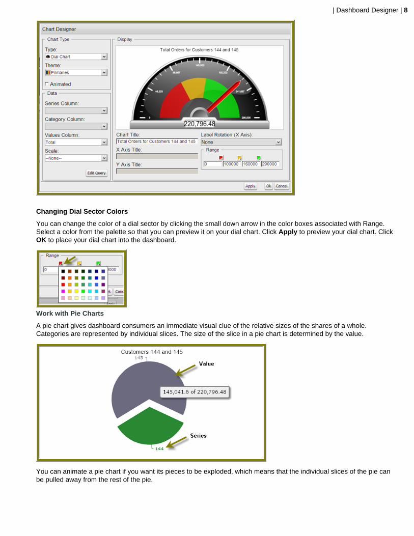
Dial Charts
Dial charts are often associated with Key Performance Indicators (KPIs). Dial charts are circular and contain a scale,a needle, and one or more a dial sectors. The dial sector is used to identify a specified area on a dial chart usinga particular color. For example, you could have a dial plotting inventory with a minimum dial value of 10000 and amaximum dial value of 50000. There could be a red dial sector for the region between 2000 and 4000 indicating that ifthe needle is in this area, there is a danger of a supply inventory shortage.
Area Charts
Area charts can be used to show a comparison of the same thing during different points in time. Area charts arenot designed to provide exact data but they do give users visual clues of the relative sizes of the items they arerepresenting.
Rotate Chart Axis Labels
If your chart axis labels become unreadable because they are too long, Label Rotation may correct the problem.
1. In the Chart Designer, display your chart.
2. Under Label Rotation, choose Diagonal or Vertical and click Apply.The labels display with the rotation you set.
3. Click OK to display the chart in the dashboard panel.
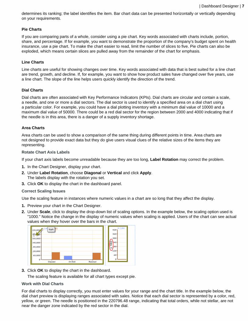
Correct Scaling Issues
Use the scaling feature in instances where numeric values in a chart are so long that they affect the display.
1. Preview your chart in the Chart Designer.
2. Under Scale, click to display the drop-down list of scaling options. In the example below, the scaling option used is"1000." Notice the change in the display of numeric values when scaling is applied. Users of the chart can see actualvalues when they hover over the bars in the chart.
3. Click OK to display the chart in the dashboard.
The scaling feature is available for all chart types except pie.
Work with Dial Charts
For dial charts to display correctly, you must enter values for your range and the chart title. In the example below, thedial chart preview is displaying ranges associated with sales. Notice that each dial sector is represented by a color, red,yellow, or green. The needle is positioned in the 220796.48 range, indicating that total orders, while not stellar, are notnear the danger zone indicated by the red sector in the dial.
| Dashboard Designer | 8
Changing Dial Sector Colors
You can change the color of a dial sector by clicking the small down arrow in the color boxes associated with Range.Select a color from the palette so that you can preview it on your dial chart. Click Apply to preview your dial chart. ClickOK to place your dial chart into the dashboard.
Work with Pie Charts
A pie chart gives dashboard consumers an immediate visual clue of the relative sizes of the shares of a whole.Categories are represented by individual slices. The size of the slice in a pie chart is determined by the value.
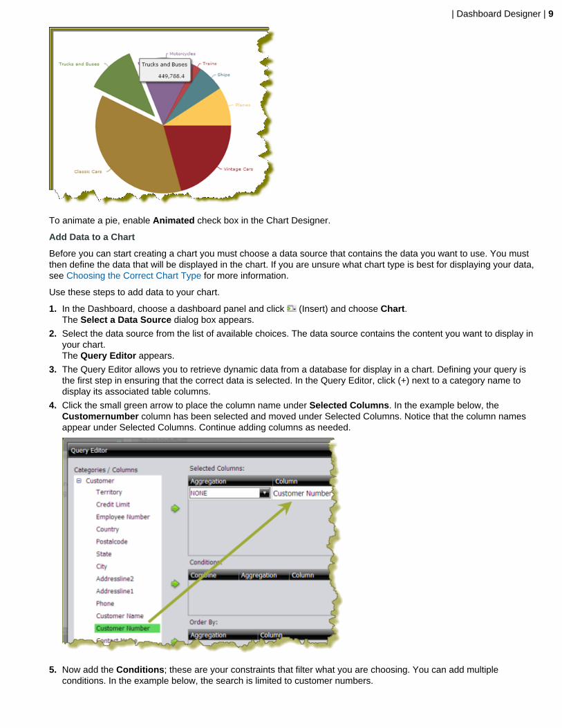
You can animate a pie chart if you want its pieces to be exploded, which means that the individual slices of the pie canbe pulled away from the rest of the pie.
| Dashboard Designer | 9
To animate a pie, enable Animated check box in the Chart Designer.
Add Data to a Chart
Before you can start creating a chart you must choose a data source that contains the data you want to use. You mustthen define the data that will be displayed in the chart. If you are unsure what chart type is best for displaying your data,see Choosing the Correct Chart Type for more information.
Use these steps to add data to your chart.
1. In the Dashboard, choose a dashboard panel and click (Insert) and choose Chart.The Select a Data Source dialog box appears.
2. Select the data source from the list of available choices. The data source contains the content you want to display inyour chart.The Query Editor appears.
3. The Query Editor allows you to retrieve dynamic data from a database for display in a chart. Defining your query isthe first step in ensuring that the correct data is selected. In the Query Editor, click (+) next to a category name todisplay its associated table columns.
4. Click the small green arrow to place the column name under Selected Columns. In the example below, theCustomernumber column has been selected and moved under Selected Columns. Notice that the column namesappear under Selected Columns. Continue adding columns as needed.
5. Now add the Conditions; these are your constraints that filter what you are choosing. You can add multipleconditions. In the example below, the search is limited to customer numbers.

| Dashboard Designer | 10
Under Combine, you can choose your constraint (and, or, and not, or not) from the drop-down list. UnderComparisons you can click the drop-down list to display options for comparisons, =, <, >, and so on; (for example,where the customer number is equal to 144 or 145). You can also choose an aggregation type from the drop-downlist for table columns that contain numeric data. The table below contains a definition for each aggregate type:
Aggregate Type Description
SUM Sums a column's values
COUNT Counts a column's values
AVG Averages a column's values
MIN Selects the minimum column value
MAX Selects the maximum column value
Click Preview at any time to view the data associated with your query.
6. Add the columns that you want to Order By. The ordering of the selected data is accomplished by one or morecolumns in a table. For example, you can sort the data by customer name and address.
7. Click OK in the Query Editor when you are done.The Chart Designer appears.
8. Under Data, click the drop-down arrow to display and choose the table columns.
Data Definition Description
Series Column Series show up as the individual columns on a bar chartand as individual lines in a line chart. Area charts displayeach series as a point.
Category Column Categories are displayed as bars or groups of bars onthe x-axis (horizontal axis). In line charts, categories areusually associated with time periods. In area charts, thex-axis displays the category labels.
If you don't want to display categories, choose None.
Values Column The value is always numeric. The value determines theheight of columns in a bar chart and the height of lines ina line chart. In area charts, the y-axis values determinethe heights of the points.

| Dashboard Designer | 11
A preview of the chart appears in a box in the upper-right corner of the Chart Designer as you choose your options.
9. Under Chart Type, click a chart type to choose it.
By default, pie and dial charts display in "animated" Flash mode. You can turn animation off by disabling theAnimated check box in the Chart Designer. Animated charts bring focus to important aspects of your data. Forexample, animation allows you to bring out a data point if it reaches a critical value, such as high or low salesnumbers.
If you selected a pie or dial chart, see Working with Pie Charts or Working with Dial Charts, respectively.
10.Under Theme, choose a theme from the list.The theme is applied to your chart.
11.Enter the labels for the Chart Title, X Axis Title (horizontal axis), and Y Axis Title (vertical axis).Entries are displayed in the chart preview.
12.Click Apply to see the chart preview.
13.Click OK display your chart in the dashboard panel.

| Dashboard Designer | 12
Add a Data Table to a Dashboard
The Data Table feature allows you to display a tabular representation of a database query in a dashboard. It also allowsyou and consumers of the dashboard to manipulate the display of the data in the data table, while in the dashboard. Forexample, users can resize, sort, and change the order of columns. Follow the instructions below to add a data table toyour dashboard.
1. Select a panel in the Dashboard Designer.
2. Click (Insert) and choose Data Table.The Select a Data Source dialog box appears.
3. Select a data source from the list of available data sources and click OK.The Query Editor opens.
4. Begin building your query. Click (+) next to the category name to display its associated table columns. When thecolumn names appear, click to choose the column that contains the data you want displayed in your data table.
5. Click the small yellow arrow to place the column name under Selected Columns.
6. Now add the Conditions; these are your constraints that filter what you are choosing. You can add multipleconditions.
Under Combine, you can choose your constraint (and, or, and not, or not) from the drop-down list. UnderComparisons you can click the drop-down list to display options for comparisons, =, <, >, and so on; (for example,where the customer number is equal to 144 or 145). You can also choose an aggregation type from the drop-downlist for table columns that contain numeric data. The table below contains a definition for each aggregate type:
Aggregate Type Description
SUM Sums a column's values
COUNT Counts a column's values
AVG Averages a column's values
MIN Selects the minimum column value
MAX Selects the maximum column value
Click Preview at any time to view the data associated with your query.
7. Add the columns that you want to Order By. The ordering of the selected data is accomplished by one or morecolumns in a table. For example, you can sort the data by customer name and address.
8. Click OK in the Query Editor when you are done.The Data Table appears in the dashboard panel.
Update the Data Table Display
You can edit the data table display directly in the dashboard panel.
Sorting Column Data
To change the sort order data under a column, click the drop-down arrow in the header and choose Sort Ascending orSort Descending. You can also hide one or more columns by disabling the appropriate check boxes next to the columnnames.

| Dashboard Designer | 13
Adjusting Column Width
You can adjust the width of a column by clicking the right border of the column header and dragging it to the right or left.Release the mouse button when you are done.
Moving Columns
To move the placement of a column, click and drag the column it to the appropriate location in the Data Table as shownin the example below:
Paginating
The pagination feature allows you to page through a large number of records.

| Dashboard Designer | 14
Add a Report Designer Report to a Dashboard
Use these steps to add a report created with Report Designer.
1. Select a panel in the Dashboard Designer.
2. Click (Insert) and choose File.A browser window opens.
3. Locate the appropriate report file.
4. Click Select to place the report inside the dashboard panel.
Pagination control arrows at the top of a report allows you to scroll through long reports. Notice that the report filename, Inventory.prpt, appears under Content: in the dashboard edit pane in the sample below. This sample reportcontains parameters. You can enter values manually and link them to a dashboard filter in the text boxes underSource. When the report renders again, the parameter value(s) you entered are included in the report.

| Dashboard Designer | 15
Important: If you choose a Report Designer file to place in a dashboard, but do not supply values for requiredparameters, the report will show up blank.
Add an Analyzer Report to a Dashboard
Use these steps to display an Analyzer report in a dashboard.
1. Select a panel in the Dashboard Designer.
2. Click Insert and choose File.
3. Locate the appropriate Analyzer report and click Select.The Analyzer Report appears inside the dashboard panel.
Add a Web Site to a Dashboard
Use these steps to display contents of a Web site in a dashboard panel.
1. Select a panel in the Dashboard Designer.
2. Click (Insert) and choose URL.The Enter Web site dialog box appears.
3. Enter the Web site URL in the text box and click OK.
4.If applicable, click (Edit) to make changes.
5. Save your dashboard when you are done.
Use Prompts on Dashboards
Prompts display a subset of data based on the dashboard user's point of view. For example, a European user may onlywant to see EMEA region sales data, whereas the dashboard's default region is the NA region. To ensure that a prompt
| Dashboard Designer | 16
links to the correct content in a dashboard, the content to which you are linking (data table or chart) must contain atleast one parameter.
Below are general instructions below for adding prompts to your dashboard:
1. In the dashboard page, choose Edit (the pencil icon), which will make the Objects pane appear.
2. Under General Settings, choose Prompts.The Prompts pane appears on the right. No prompts are listed if this is the first time you are assigning prompts.
3. To display a prompt toolbar to users of the dashboard, enable Show Prompt Toolbar.The prompt toolbar appears at the top of the dashboard.
4. Click the Add button to start adding prompts.The Prompts dialog box appears.
5. In the Prompts dialog box, enter a display name for the control label. For example, "Region."
6. Enable Display Name as Control Label if you want users to see the display name in the prompts toolbar.
7. Select your control type. Control types define how your prompt values are selected; for example, in a drop down list,radio button, check box, and so on.
The table below contains a description of each control type.
Control Type Description
Drop Down Users choose a prompt value from a drop-down list.
List Users choose a prompt value from a scrolling list. Thisprompt control supports multiple selections.
Radio button Users click a radio button to choose a prompt value.
Check box Users enable a check box to choose a prompt value.This prompt control supports multiple selections.
Button User click a button to choose a prompt value. Thisprompt control supports multiple selections.
Text Field Users enter a text string or number into a text fieldmanually.
Date Picker Users examine prompt values based on calendar date.
Your dashboard now has a prompt.
If you plan to provide hard-coded names and values for your dashboard users, or produce a dynamic prompt list,continue on to the next few sections.
Add a Prompt to a Dashboard
You can create a prompt tool bar that enables users to refine report results in a dashboard. First create the PromptToolbar. Then customize the toolbar so that the appropriate options appear.
Creating a Prompt Toolbar for Dashboards
1. Open a dashboard that contains at least one parameterized report.
2. Click the Edit Content icon to open the editing options in the dashboard.
3. In the bottom section, inside the Objects pane, choose Prompts to access the Prompt pane.
4. Click Show Prompt Toolbar to display the prompt toolbar to dashboard users.
5. Click Add to add a prompt.The Prompt dialog box appears.
6. In the Name field, enter the title for the prompt toolbar.
7. In the Control box, click the format for the prompt options. For example, you can choose the Drop Down control ifyou want a list that appears when users click the first option.
8. Ensure that Static List is selected under Type.
Customizing a Prompt Toolbar for Dashboards
1. In the Data box, click Add.The List Value dialog box appears.

| Dashboard Designer | 17
2. In the Label field, enter the option name as you want it to appear to dashboard users.
3. In the Value field, enter the parameter source name. For example, using the Steel Wheels sample, enter ClassicCars.
4. Add labels and values for each parameter you want to filter. Click Close to exit the List Value dialog box.
If you are filtering an Analyzer report and using a static list, you can add the option All. This option drops the filterfrom the report and shows all values.
5. In the Control Properties box, under Initially Selected:, choose which item you want to appear first in the promptlist. Choose Use First Value to set the default to the first value in the list, or you can choose Specify if you want aspecific value to appear first.
6. Click OK.
7. In the Objects pane, choose the title of the report you want to filter. Click the Parameters tab and choose thecorrect Source for the parameter from the list. The source should be the name of your prompt.
8. Click Save.
Create a Metadata List
You must have a data table or chart that contains at least one parameter for your prompt control to function correctly.
When you create a Metadata List, you are defining a query to retrieve a list of display names and corresponding valuesfrom a metadata data source provided by your administrator.
1. In the dashboard page, under General Settings, choose Prompts.The Prompt Editor appears on the right. No prompts are listed if this is the first time you are assigning prompts.
2. To display a prompt toolbar to users of the dashboard, enable Show Prompt Toolbar.A placeholder for the prompt toolbar appears at the top of the dashboard.
3.Click (Add) to add a prompt.The Prompts dialog box appears.
4. In the Prompts dialog box, enter a Name for your prompt.
5. Under Data Type, choose Metadata List.
6. Click Select to choose the data source that contains the content you need to set options from the drop-down list andclick OK.The Query Editor opens.

| Dashboard Designer | 18
7. In the Query Editor, build a query to choose either a single column (that represents both a name and a value), ortwo columns representing the display names and corresponding values.
If a single column query is defined, the values of that column will be used for both the display names and the values.
8. Click OK to exit the Query Editor.Your options appear under Selected Items in the Prompts dialog box.
9. Under Control Properties, enter a Default Label/Value for the initially selected option in your prompt control.
10.Select a Label to display in the prompt control; this is the user-friendly name that users will see in the dashboard.
11.Select the Value; this is the value in the database that is associated with the Label you selected in the previous step.
12.If applicable, choose your Display type from the list.
Some prompt controls allow you to choose the position of your prompt options. If you have a long list of options, forexample, a list of cities, options may not appear correctly in the user console unless you change the Display type toHorizontal.
13.Click OK.
The list of values appear in the prompts toolbar in the dashboard.
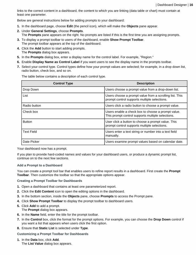
Create a Cascading Prompt
A cascading prompt changes based on a value a user selects. When the value in the drop down list, (Country),changes, the prompt is automatically applied to the second prompt, (City) thus changing its values.
The example above was created using a Metadata List for the drop-down prompt (Country).
| Dashboard Designer | 19
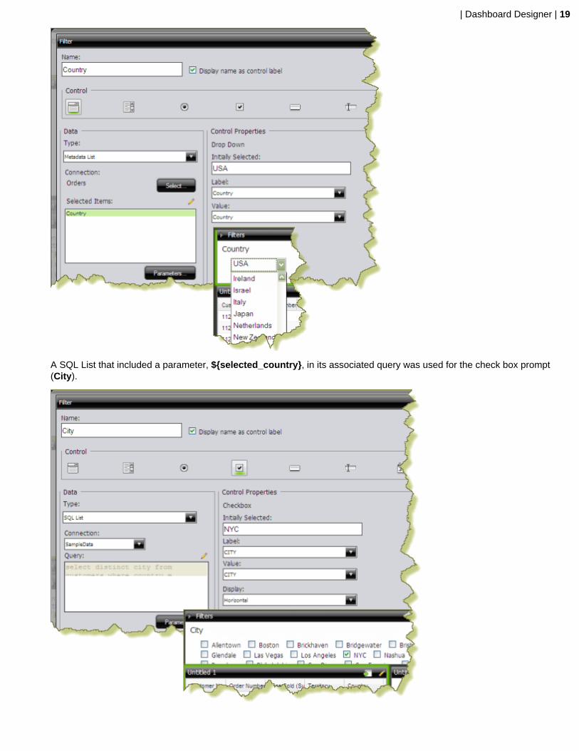
A SQL List that included a parameter, ${selected_country}, in its associated query was used for the check box prompt(City).

| Dashboard Designer | 20
The Default Value for the selected_country parameter was set to USA with New York City (NYC) as the initiallyselected value for the check box prompt.
To link the City prompt to the Country prompt, another Source for the selected_country parameter was chosen. Thealternate source is the Country prompt.
When the prompts are linked, users can choose a country and then choose a city (or cities) in the country of theirchoice.
Using this example, the report designer can now add a data table, chart, or other content in the dashboard that can bedriven by the prompt he or she just created. Suppose the designer decides to add a pie chart to the dashboard. The piechart will display the percentage of sales per city.
In the Query Editor, the report designer creates a parameter, {City}, with an extended default value: NYC|Las Vegas.The resulting pie chart displays values for New York City and Las Vegas. Under the Parameters tab associated with thepie chart, the Source value for the City parameter is changed to the City prompt.

| Dashboard Designer | 21
When the report is saved, users of the dashboard can see results for a country and multiple cities in that country.
Link Dashboard Prompts to Analyzer Parameters
This process only applies to dashboards that include parameterized Analyzer reports. You must have an Analyzerreport with a query parameter in it in order to proceed.
The instructions below explain how to parameterize an Analyzer report.
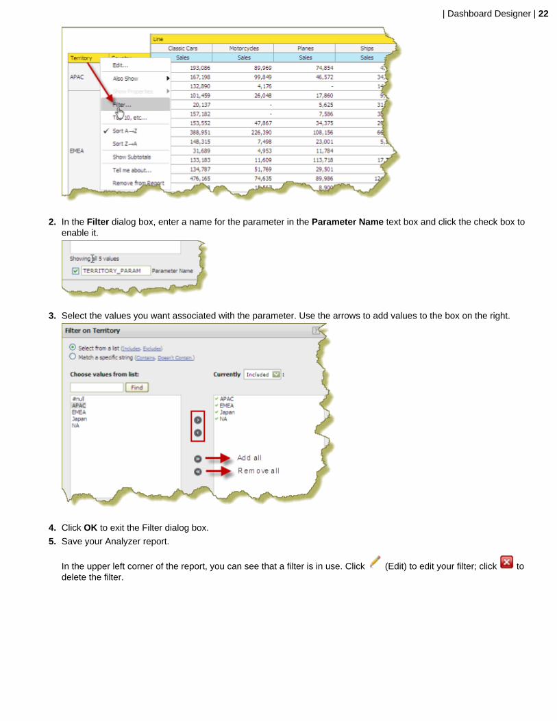
1. In Analyzer, choose a field in your report to which you want to link; then, right-click and choose Filter.
In the example below, data will be filtered by Territory.
| Dashboard Designer | 22
2. In the Filter dialog box, enter a name for the parameter in the Parameter Name text box and click the check box toenable it.
3. Select the values you want associated with the parameter. Use the arrows to add values to the box on the right.
4. Click OK to exit the Filter dialog box.
5. Save your Analyzer report.
In the upper left corner of the report, you can see that a filter is in use. Click (Edit) to edit your filter; click todelete the filter.

| Dashboard Designer | 23
6. Create a dashboard and drag the Analyzer report into a panel.
The name of the parameter appears in the lower portion of the dashboard under Parameters.
7. Add a filter to the dashboard based on the parameter you created in your Analyzer report.The filter appears in the dashboard.
Edit Prompts
You can edit prompts as needed. Use these steps to edit prompts.
1. Locate the prompts pane at the top of the panes in the dashboard.
2. Located the different prompts and the drop-down menus next to them.
3. Select the prompt you want to edit and choose an alternative prompt from the drop down menu.The prompt changes, causing the graphs and charts in the dashboard to change appropriately.
Dashboard Parameters
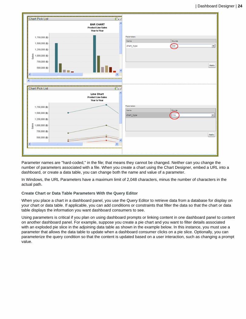
If you are placing a file, such as an .xaction or .prpt, inside a dashboard panel, it is possible that the author of thefile defined meaningful parameters for the content. If previously defined, the parameters and their associated defaultvalues, appear under Parameters in the edit pane of the dashboard. In the example below, when the chart initiallyrendered, it displayed a parameter called, "chart_type" with a default value called, "bar." A user can change the value ofthe parameter to see the content rendered as a pie, line, or area chart.
| Dashboard Designer | 24
Parameter names are "hard-coded," in the file; that means they cannot be changed. Neither can you change thenumber of parameters associated with a file. When you create a chart using the Chart Designer, embed a URL into adashboard, or create a data table, you can change both the name and value of a parameter.
In Windows, the URL Parameters have a maximum limit of 2,048 characters, minus the number of characters in theactual path.
Create Chart or Data Table Parameters With the Query Editor
When you place a chart in a dashboard panel, you use the Query Editor to retrieve data from a database for display onyour chart or data table. If applicable, you can add conditions or constraints that filter the data so that the chart or datatable displays the information you want dashboard consumers to see.
Using parameters is critical if you plan on using dashboard prompts or linking content in one dashboard panel to contenton another dashboard panel. For example, suppose you create a pie chart and you want to filter details associatedwith an exploded pie slice in the adjoining data table as shown in the example below. In this instance, you must use aparameter that allows the data table to update when a dashboard consumer clicks on a pie slice. Optionally, you canparameterize the query condition so that the content is updated based on a user interaction, such as changing a promptvalue.

| Dashboard Designer | 25
To create a parameter, in the Value field, enter the name of the parameter inside curly braces, as in {ParameterName}. In the example below, the designer created a parameter called, {TERRITORY}; the default value, or source,for the parameter is, "NA" (North America). When a chart or data table renders, it displays data associated with NorthAmerica. Remember that this a default value. When you enclose a parameter name with curly braces, you are creatinga parameter query. That means, that users can change the query dynamically by replacing the default, "NA," with adifferent territory acronym, (for example, EMEA), when the query runs.
You can define multiple default parameter values by adding a pipe (|) between the values, as in NA|EMEA|APAC.
Suppose a dashboard designer chooses to limit the data to North America (NA) exclusively? In this instance, he or shewould not include the curly braces around "NA," (as shown in the example below), and Default (value) is disabled. Thisis an example of a static query.
Use Content Linking to Create Interactive Dashboards
Depending on your needs, you can create a "static" dashboard, which contains content in each panel that is separatebut related. For example, you may provide users with a bar chart that contains total sales figures by region. Additionally,you may provide a data table that displays sales details for each state in a specific region. You may also want to providesales data associated with each salesperson in a specific region. The content in your dashboard is useful to dashboardconsumers, but to make it more "interactive," you may want to consider using content linking.
The content linking features in dashboards allow you to associate (link) content in one dashboard panel to content onanother dashboard panel as long as query parameters have been defined. These features are particularly helpful fordrilling down or for dynamic filtering; for example, when dashboard consumers explode a single slice in a pie chart tolaunch content in a data table associated with that pie slice. In this instance, dashboard consumers are moving from asummary view to a detailed view interactively.
You can use content linking if your dashboard panel contains a data table, chart, .xaction, .prpt, and Analyzer report.
Content Linking and Query Parameters
Query parameters are required for content inside a dashboard panel to receive values used to filter data from a filtercontrol. They are also required when receiving values from content in other dashboard panels that are broadcastingvalues associated with Content Linking. The way in which query parameters are defined is different depending on thetype of content you are placing inside your dashboard panels:

| Dashboard Designer | 26
If Then
You are defining parameters in the Analyzer... See Adding Query Parameters to Analyzer Reports
You are defining parameters for a chart or data table... Use the Query Editor to define your parameterized query.See Linking Charts and Data Tables and Linking Columnsin a Data Table to Content in other Dashboard Panels
Link Charts and Data Tables
Below are general instructions for linking charts and data tables in a dashboard. This is just an example. You mustadjust the instructions when working with your own data.
1. Create a simple dashboard that contains a chart and a data table. At this point, none of the content has been linkedand you have a "static" dashboard.
Notice the pie chart in the example above. You want dashboard consumers to click a slice (NA, APAC, Japan,EMEA) and have the data table on the right update with the values associated with that slice exclusively. Forexample, if a report consumer clicks the EMEA slice, the data table will display values associated with EMEA andnothing else. To get the correct filter display, you must first create a parameterized query that drives the content inthe data table.
2. Click the Edit Button to open up the Edit Pane at the bottom of the screen. Within the Objects pane, choose thereport you want to parameterize.
Parameterizing a query, as described here, allows you to pass values dynamically and update the chart basedon events triggered by other elements of the dashboard such as a user choosing an item from a filter control orfollowing links defined in content associated with another panel in the dashboard.
3. Click the {p} button next to the Title box.The parameters will populate after the title in the Title box.
4. Click the Parameters tab and ensure that the parameters name is linking to the correct Source.
5. Click Apply.
The new source for the parameter corresponds to the title of the dashboard panel that contains the chart as shownin the example above. This new source will now drive the display in the data table.
6. Click the Edit button (pencil icon) to exit the edit mode.The filters will appear after the panel titles.
7. Save your dashboard. See Saving Your Dashboard.
When users click a pie slice or bar in a chart, the data table displays content associated with that specific pie slice orbar. The currently applied filters appear after the title.
Link Columns in a Data Table to Content in other Dashboard Panels
The instructions that follow show you how to link a chart to a column in a data table. You must adjust the instructionswhen working with your own data.
1. Create a simple dashboard that contains a data table and a bar chart. At this point, none of the content has beenlinked and you have a "static" dashboard.

| Dashboard Designer | 27
Notice the data table in the example above. You want dashboard consumers to click a product in the Product Linecolumn and have the bar chart update with information about sales by territory for that specific product line.
2. Add a parameterized condition to the query for the bar chart by specifying a parameter name in curly braces in theValue text box; then, provide a default value for that parameter in the Default text box. In the example below, aparameter called Productline with a default value of Classic Cars has been created.
3. In the Chart Designer, set the data definitions for the series, category and values columns associated with your barchart and click OK.
4. Under General Settings, choose the data table and click the Content Linking tab. Enable content linking onthe column in your data table that will filter content in your chart. Each of the columns in a data table are able tobroadcast values to other dashboard components.

| Dashboard Designer | 28
5. Under General Settings, choose the chart and click the Parameters tab. Click the down arrow, in the Source textbox to display another source for the parameter you created. In the example below, notice that Order Details -Product Line , (this is the name of the dashboard panel that contains the data table), can now be selected as asource for the Productline parameter.
6. Save your dashboard.
7. In the data table, choose an item in the column that has content linking enabled.The content in the chart updates in response to the item that was clicked in the data table.
In the example below, the Product Line column was enabled for content linking.
Create Content to Content Links in an Analyzer Report
Below are general instructions for creating content links in an Analyzer report, (inside a dashboard), that can be usedto drive the parameter values of content in other dashboard panels. You must adjust the instructions when working withyour own data.
1. Create a simple dashboard that contains an Analyzer Report and a data table. At this point, none of the content hasbeen linked and you have a "static" dashboard.

| Dashboard Designer | 29
In the example above, when content linking is achieved, the list of territories (APAC, EMEA, Japan, and NA) willbecome hyperlinks that, when clicked, will update customer details data table. To get the correct filter display, aparameterized query that drives the content in the data table must be created.
2. Add a parameterized condition to the query for the data table by specifying a parameter name in curly braces inthe Valuetext box; then, provide a default value for that parameter in the Default text box. In the example below, aparameter called TERRITORY with a default value of NA has been created.
Parameterizing a query, as described here, allows you to pass values dynamically and update the chart basedon events triggered by other elements of the dashboard such as a user choosing an item from a filter control orfollowing links defined in content associated with another panel in the dashboard.
Under General Settings, click the data table and examine its available parameters. In the example below, there isan available parameter called TERRITORY with a default source value of NA (North America). A drop-down arrowin the Source text box indicates that there are additional values to control the available parameter. In this example,there are no additional source values that control the TERRITORY parameter.
| Dashboard Designer | 30
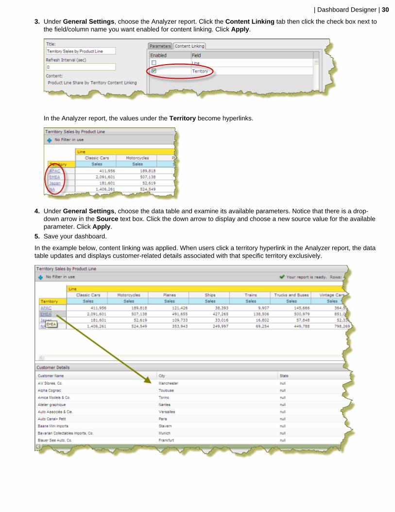
3. Under General Settings, choose the Analyzer report. Click the Content Linking tab then click the check box next tothe field/column name you want enabled for content linking. Click Apply.
In the Analyzer report, the values under the Territory become hyperlinks.
4. Under General Settings, choose the data table and examine its available parameters. Notice that there is a drop-down arrow in the Source text box. Click the down arrow to display and choose a new source value for the availableparameter. Click Apply.
5. Save your dashboard.
In the example below, content linking was applied. When users click a territory hyperlink in the Analyzer report, the datatable updates and displays customer-related details associated with that specific territory exclusively.

| Dashboard Designer | 31
Control a Dashboard Parameter From a PRPT Hyperlink
You must have a report (.prpt) that contains a hyperlink before you can complete this task. See the Design Print-QualityReports section for instructions about adding hyperlinks to a report.
The instructions that follow show you how a link inside a Report Designer report (.prpt) can drive a parameter in contenton another dashboard panel. You must adjust the instructions when working with your own data.
1. Create a simple dashboard that contains a .prpt report and a data table. At this point, none of the content has beenlinked and you have a "static" dashboard.
Notice the report (.prpt) in the example above. You want dashboard consumers to click a territory (APAC, EMEA,etc.), hyperlink and have the data table update with information about that territory specifically.
2. Under General Settings, choose the report (.prpt) and click the Content Linking tab. Click the checkbox next to thefield you want used for content linking.
3. Add a parameterized condition to the query for the data table by specifying a parameter name in curly braces inthe Valuetext box; then, provide a default value for that parameter in the Default text box. In the example below, aparameter called TERRITORY with a default value of NA has been created.
Parameterizing a query, as described here, allows you to pass values dynamically and update the data table basedon events triggered by other elements of the dashboard such as a user choosing an item from a filter control orfollowing links defined in content associated with another panel in the dashboard.
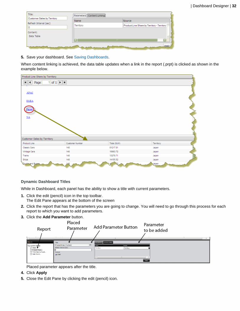
4. Under General Settings, choose the data table and click the Content Linking tab. Click the drop-down arrow, inthe Source text box to display another source for the parameter you created. In the example below, notice thatProduct Line Share by Territory - Territory , (this is the name of the dashboard panel that contains the .prpt), isnow selected as a source for the Territory parameter.
| Dashboard Designer | 32
5. Save your dashboard. See Saving Dashboards.
When content linking is achieved, the data table updates when a link in the report (.prpt) is clicked as shown in theexample below.
Dynamic Dashboard Titles
While in Dashboard, each panel has the ability to show a title with current parameters.
1. Click the edit (pencil) icon in the top toolbar.The Edit Pane appears at the bottom of the screen
2. Click the report that has the parameters you are going to change. You will need to go through this process for eachreport to which you want to add parameters.
3. Click the Add Parameter button.
Placed parameter appears after the title.
4. Click Apply
5. Close the Edit Pane by clicking the edit (pencil) icon.

| Dashboard Designer | 33
The title will now show the parameters applied to it.
Saving Dashboards
You must be in Edit mode to save a dashboard.
1. Click the Save As button, which is a floppy disk and pencil button, to open the Save As dialog box.
2. In the File Name text box, type a file name for your dashboard.
3. Enter the path to the location where you want to save the dashboard. Alternatively, use the up/down arrows or clickBrowse to locate the solution (content files) directory in which you will save your dashboard.
4. Click Save.The report saves with the name specified.
Add Content to a Dashboard Using Drag-and-Drop
Use these steps to add an existing chart, table, or file to your dashboard panels using the drag-and-drop feature.
1. Create a new dashboard. See Creating a New Dashboard for specific instructions.
2. In the left pane of the Pentaho User Console, under Files, locate to the content (chart, table, or file) you want addedto your dashboard.
3. Click and drag the content into a blank panel on your dashboard. You will see the "title" of the content as you move itaround the dashboard. Notice that the title background is red; it turns green when you find a panel where the contentcan be dropped.
Repeat steps 2 and 3 until your dashboard contains all the content you want to display. To swap content from onepanel to another, click the title bar of the panel that contains the content you want moved and drag it over the panelyou want swapped. You will see the swap icon as you are moving the content.
If you are working with an existing dashboard, you can perform steps 2 and 3 steps; however, a warning messageappears when you try to place content in a panel that already contains content. The new content will override theexisting content.
4. Save your dashboard.
Adjust White space in Dashboard Panels
Sometimes you must adjust the white space in dashboard panels, (or the filter panel), so that content appears correctly.Use these steps to adjust white space.
1. Open an existing dashboard.
2. In the lower pane, click General Settings and then click the Properties tab.
3. Click Resize Panels.The white space between the dashboard panels turns blue.

| Dashboard Designer | 34
4. Adjust the panel size by clicking and holding the left mouse button down as you move the blue lines (white space)around. Release the mouse button when you are satisfied with the positioning of the panel.
5. Click Close in the lower-right corner of the dashboard to exit resize layout mode.
6. Examine the dashboard contents to make sure they are placed correctly. You can return to the resize layout mode ifyou need to make additional changes.
7. Save your dashboard.
Set the Refresh Interval
The content in your dashboard may need to be refreshed periodically if users are examining real-time data. You can setrefresh intervals for individual panels on your dashboard or for the entire dashboard.
To set the refresh interval for individual panels in the dashboard, click the edit button and the choose the panel thatcontains the content you want refreshed in the Objects panel . Under Refresh Interval (sec) enter the interval time inseconds and click Apply.
If you want the entire dashboard to refresh, click the Prompts tab in the dashboard and set your refresh interval.
Create a Dashboard Designer TemplateFollow the directions below to create a new Pentaho Dashboard Designer template.
Note: You will have to migrate this template by hand if/when you upgrade Dashboard Designer, since thetemplate files will be stored in the Dashboard Designer plugin directory. The upgrade procedure that Pentahoprovides does not typically cover customizations like this one, except to mention that they must be migrated byhand.
1. Stop the BA Server.
2. Navigate to the /pentaho/server/biserver-ee/pentaho-solutions/system/dashboards/templates/xul/ directory.
3. If you want to remove all templates that you know will never be used, you can safely delete their corresponding XULfiles now. When you are done, also remove the corresponding files from the html sibling directory.
4. Copy the existing XUL file that most closely resembles the template layout you want to create, giving the new XULfile a name that starts with a two-digit number that represents the template's order in the hierarchy, followed by ashort description of its dimensions.
All Dashboard Designer templates follow this naming convention.
5. Create a .properties file that corresponds to the one you just copied in the previous step, and put one item in it:name=Description here, where "Description here" represents the display name of this template.
6. Create a thumbnail graphic that fits the same dimensions as the other PNG thumbnails in this directory, and give itthe same name as the previous two files, with a PNG extension.
You should now have three new files, all with the same name, with three different extensions: .xul, .properties,and .png.

| Dashboard Designer | 35
7. Edit the new .xul file and change the box attributes to match your template specifications.
A vbox node creates a column; an hbox node creates a row; a box element defines an individual panel in each row.
height and width define static widths in pixels; the flex size attribute defines a percentage of the total width of thedashboard. If you'd like more extensive definitions of XUL elements, refer to the official XUL documentation: http://developer.mozilla.org/en/XUL_Reference.
Note: Ensure that each box, vbox, and hbox node has its own unique id.
8. Save and close all open files, then start the BA Server.
9. Test your new template and adjust its configuration accordingly.
You now have a custom Dashboard Designer template deployed to your BA Server.
You must copy the template files by hand if you upgrade the BA Server or Dashboard Designer in the future. You maywant to back up your custom templates to a safe location right now just in case you forget to copy them over during afuture upgrade.

| Community Dashboard Framework (CDF) | 36
Community Dashboard Framework (CDF)
CDF dashboards are extremely flexible and work well with Pentaho content, but it takes a good understanding of HTML,CSS, and JavaScript to develop them. This section explains how to view some Pentaho-supplied CDF examples andhow to create a simple dashboard.
This document represents the only official, maintained, and up-to-date documentation that Pentaho provides on theCommunity Dashboard Framework. If you need to purchase further CDF development support, contact your Pentahoaccount representative. You can also purchase more in-depth documentation and examples directly from WebDetails.
Exploring the CDF Sample ContentPentaho ships sample CDF dashboards with the archive package and graphical installer for the BA Server. By default,the samples are not exposed in the solution repository.
To make them visible, edit the /pentaho-solutions/plugin-samples/ file and set the value of the <visible>element to true, then refresh your solution repository.
Once you have exposed the samples, you can find the CDF content in the cdf-samples directory within bi-developers. Each example is minimally self-documented; you should examine each sample to read the comments inthe code and in the rendered dashboard to find out more about how CDF works.


![[ Getting Acquainted with Pentaho Components ]reportes.fuxionbiotech.com/pentaho/docs/components.pdf · [ Getting Acquainted with Pentaho Components ]] ... Pentaho BA Suite helps](https://static.documents.pub/doc/80x56/5ad7ac027f8b9a991b8c5bad/-getting-acquainted-with-pentaho-components-getting-acquainted-with-pentaho-components.jpg)


