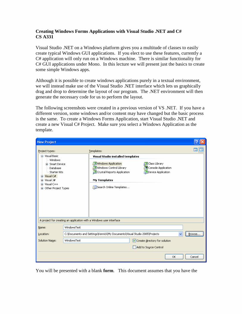
Creating Windows Forms Applications with Visual Studio .NET and C# CS A331 Visual Studio .NET on a Windows platform gives you a multitude of classes to easily create typical Windows GUI applications. If you elect to use these features, currently a C# application will only run on a Windows machine. There is similar functionality for C# GUI applications under Mono. In this lecture we will present just the basics to create some simple Windows apps. Although it is possible to create windows applications purely in a textual environment, we will instead make use of the Visual Studio .NET interface which lets us graphically drag and drop to determine the layout of our program. The .NET environment will then generate the necessary code for us to perform the layout. The following screenshots were created in a previous version of VS .NET. If you have a different version, some windows and/or content may have changed but the basic process is the same. To create a Windows Forms Application, start Visual Studio .NET and create a new Visual C# Project. Make sure you select a Windows Application as the template. You will be presented with a blank form. This document assumes that you have the
Transcript
Creating Windows Forms Applications with Visual Studio .NET and C#
CS A331
Visual Studio .NET on a Windows platform gives you a multitude of classes to easily
create typical Windows GUI applications. If you elect to use these features, currently a
C# application will only run on a Windows machine. There is similar functionality for
C# GUI applications under Mono. In this lecture we will present just the basics to create
some simple Windows apps.
Although it is possible to create windows applications purely in a textual environment,
we will instead make use of the Visual Studio .NET interface which lets us graphically
drag and drop to determine the layout of our program. The .NET environment will then
generate the necessary code for us to perform the layout.
The following screenshots were created in a previous version of VS .NET. If you have a
different version, some windows and/or content may have changed but the basic process
is the same. To create a Windows Forms Application, start Visual Studio .NET and
create a new Visual C# Project. Make sure you select a Windows Application as the
template.
You will be presented with a blank form. This document assumes that you have the
Toolbox pane visible on the left of the screen and it is set to Windows Forms. This pane
contains common controls which make up the elements on the form. The layout is
shown below:
A control is a component with a visual representation. The Control class in the
System.Windows.Forms namespace is the base class for the graphical objects on the
screen. All controls are derived from the base control. Examples of controls include:
A Form is a type of ContainerControl. It can contain other controls and we can
add controls to it.
In this document we will only discuss a few controls: Buttons, Labels, TextBox,
ProgressBar, and PictureBox. A Button is just like it sounds, a button we can press and
when it is pressed some code is invoked. A Label is a way to output some text on the
form. A TextBox can be used to output data and provide a way for the user to enter text
to the program (although a label is better for data that is purely output only). A
ProgressBar displays a graphical bar of progress for some slow event. Finally, a
PictureBox is used to load and display an image. Please refer to the .NET documentation
for details about the other controls.
Let’s make a simple Windows application that will allow the user to enter a number into
a TextBox and press a button. Upon pressing the button we will output if the number is
even or odd into a label.
First, select the form by clicking on it. In the Properties Window, you can click and
modify various properties of the form. By default, it is called Form1. Scroll through
the properties; there are many available to change, such as the size, icon, width, locked,
etc. One we can change is the title bar shown with the form. Here we change the title bar
of the form to “Even Odd Tester” by changing the Text property.
This changes the title of the form itself:
At this point you may wish to grab the “size” handles around the form, and resize it to the
dimensions that you like.
To add controls to the form, select the control you want from the Toolbox on the left.
Then click and drag in the form window in the location you want the control to go. If
you select the Pointer tool, you can select existing items on the form and move them
elsewhere. You can also click and resize the control on the form. Try dragging a button
onto the form:
Click the button on the form and change its Name property to “buttonEvenOdd”. This is
setting the name of the variable used to reference the button object from its default of
“Button1”. Also change the button’s text property to “Even or Odd”. You should see the
change to the text field take place on the form:
In the same fashion as the button, add a label to the form and name it “labelResult” and
set its Text field to “Enter data”.
Also add a TextBox to the form, name it “textBoxData” and delete the contents of the
Text field. As you add the controls to the form, you will see vertical lines that help you
align controls to each other.
The result should look something like this:
At this point you should be able to execute the program you have created so far by
clicking on the run button, shown as an arrow:
Your app should execute and look like the following:
You can enter data in the textbox and press the button. However, nothing will happen
because no code is associated with these objects. We will add code to them shortly. A
Windows application is based upon event-based processing. The application is waiting
for some event to happen and reacts to those events rather than firing off sequential
statements and exiting when they are done. At this point it may be useful to see the
actual code that has been generated so far. By dragging our controls on the Form, Visual
Studio has generated the code that would correspond to what is visually shown on the
screen. You can look at the code at any time by right-clicking on the “Form1.cs” name
and select “View Code” to see the C# code:
You can see that Visual Studio has generated some code for you. There is more, but it’s
not generally made visible to the programmer.
To go back to the graphical form designer, click on the “Form1.cs [Design]” tab .
To add code behind an event, click the control you are interested in and then click on the
events button (indicated by a lightning bolt) of the properties window. In this case, we
would like to add an event to the button, so select the button on the form and then events:
The window shows all of the events supported by Windows. For example, the Click
event is invoked when the button is clicked. The DragDrop event is invoked if an item is
dragged and dropped on the button. You can scroll through the list to see the myriad of
events.
Select the Click box and enter “buttonClicked”. This is defining a method named
“buttonClicked” that will be invoked when the button is clicked. Immediately Visual
Studio will bring you to an empty code skeleton that it generates for the method: