21
PRODUCING VIDEO INSTALLATION WORK EVALUATION ISAAC SHARP CRYING
| Date post: | 28-Jul-2015 |
| Category: |
Art & Photos |
| Upload: | isaacsharpmedia |
| View: | 24 times |
| Download: | 1 times |

PRODUCING VIDEO INSTALLATION WORKEVALUATION
ISAAC SHARP
CRYING
STAGE 1 – INDIVIDUAL EVALUATION

FITNESS FOR PURPOSEI feel that ‘Crying’ fits the Creative Brief reasonably well. One option in the brief required the art to be ‘an exploration of time, space, and motion’. My video art matches this, because the sun is located in space, and it changes over time by going through lots of different motions.
The other option in the brief required the art to represent technology in the modern day. I adhered to this too, as I felt that the way people worship the sun in the art represents a modern interpretation of the way people worship big technology companies such as Apple for even the most unimportant new piece of technology. However, this was not as obvious as the way ‘Crying’ represented space, time and motion, and required me to explain it. I intended to create a small plaque to explain this for me at the exhibition, but this did not come into fruition.
STAGE 1 Q1
‘Crying’ can be compared to the work of Grant Steven, particularly his piece of video art, ‘The Drift’. ‘The Drift’ took a tropic and showed it in an abstract way, by having the words float around in space. This is not unlike ‘Crying’, which sends messages about technology by showing a large sun in space. ‘The Drift’ by Grant Steven

COMPARED TO ORIGINAL INTENTIONS
While ‘Crying’ followed the intentions of the original plan, visually, it changed a lot. In the original plan, the sun was going to be constantly animated, and it would look like a cartoon character, with bright colours, an exaggerated design, and a big happy face, on an orange background. I had assigned Amy Jones to draw this sun, but it had not been drawn before the editing process had begun, so I had to proceed with a real photo of the sun. I used a black, more space-like background, to match the background of the image of the sun, and to fit the theme better.
‘Crying’ was also supposed to play beside extremely happy music, but after the tone of the video became more serious, I used more majestic music, and begun to sync the sun’s motions with the music.
The theme of the art, and what it represented, stayed the same throughout production.
STAGE 1 Q2
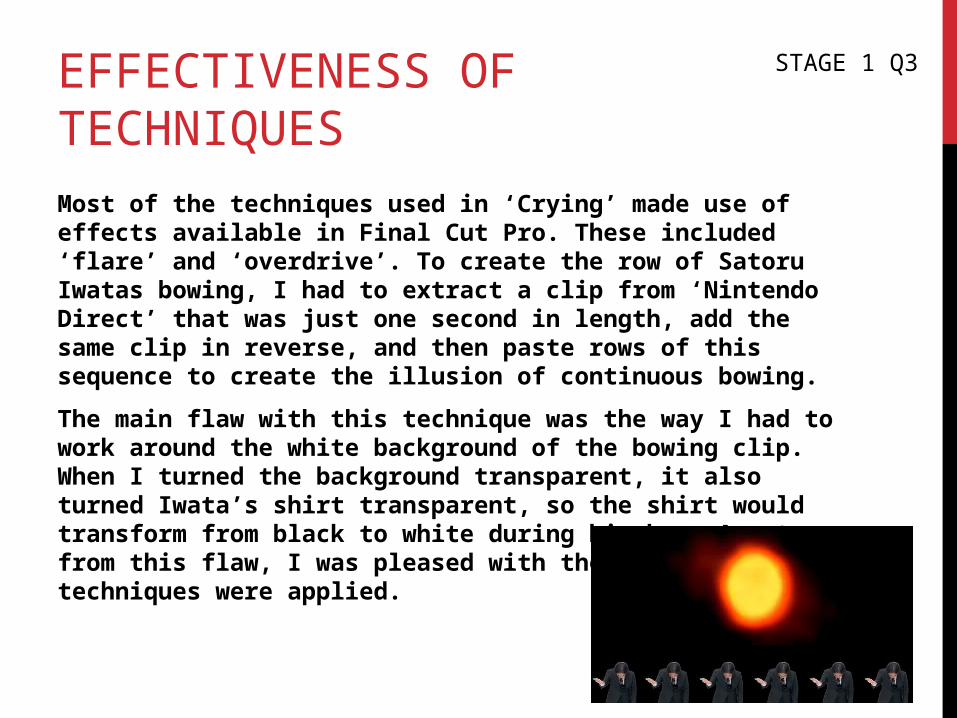
EFFECTIVENESS OF TECHNIQUESMost of the techniques used in ‘Crying’ made use of effects available in Final Cut Pro. These included ‘flare’ and ‘overdrive’. To create the row of Satoru Iwatas bowing, I had to extract a clip from ‘Nintendo Direct’ that was just one second in length, add the same clip in reverse, and then paste rows of this sequence to create the illusion of continuous bowing.
The main flaw with this technique was the way I had to work around the white background of the bowing clip. When I turned the background transparent, it also turned Iwata’s shirt transparent, so the shirt would transform from black to white during his bow. Apart from this flaw, I was pleased with the way that the techniques were applied.
STAGE 1 Q3

TECHNICAL QUALITIESAs ‘Crying’ contained no camerawork of my own, the technical qualities that I can assess are mostly part of the editing process.
Despite me only adding music towards the end of production, synching the motions of the sun with the music was turned out to be one of the most important parts of the process. When I first added the music, the motions felt too spontaneous, and the lack of motion when the music reached its climaxes was disappointing.
Once I synched up the music and the motions, I was pleased with the result, although it meant that sound would be more important to hear at the exhibition, which could have been a problem. At the exhibition, the sound was slightly quieter than I hoped, but still sufficient, and it was not interrupted by other artworks.
STAGE 1 Q4

TECHNICAL QUALITIESThe editing process was quite simple, as when I wasn’t editing alongside the sound, it was a simple case of copying and pasting clips, and applying effects to the sun. My favourite effect was when the sun briefly faded away before reappearing a second later, as it worked particularly well with the music. The effect that pleased me the least was when the sun flashed between a bigger and smaller size rapidly, and I would not use this effect again.
However, due to the sheer amount of clips, I would have to render a clip every time I altered it. Even if I only moved a clip down the timeline by a short distance, I would still have to render it. If I needed to render several clips, it would often take a few minutes to do this. I feared that this meant the video would spend a very long time exporting, so I exported the art in just 720p. Surprisingly, ‘Crying’ took just six minutes to export.
The exported video had been slightly squashed at the sides, so the sun was no longer a perfect circle. I was unable to fix this before exhibiting ‘Crying’.
CREATIVE/ARTISTIC QUALITIESAssess the creative and artistic qualities of your advert. What worked, what didn’t work, how could you improve this? Could it be freely interpreted or did it require explanation?
When I was first introduced to video art, my first thoughts were how abstract or silly it can be at times, so when trying to be artistic in my own work, I tried to make ‘Crying’ abstract, and also a little silly. While the original plan met these guidelines better, I still feel I made an artistic piece that was abstract and didn’t have to be taken seriously.
The art was also able to convey the theme of time, space and motion, although it was only able to convey the theme of technology with an explanation.
Although I can compare ‘Crying’ to the works of artists such as Grant Steven, I still believe that it is unique and creative, as I have not seen the act of worship represented in this way before.
The film was named ‘Crying’ in an attempt to contrast with the content of the art. It would also be intended to pleasantly surprise an audience who expected depressing art, and maybe even lead people to associate crying with this art. The name certainly contrasted with the content, although it was unable to surprise anybody, as the audience would see the the art before the name.
STAGE 1 Q5

SUMMARYOverall, I think the strengths of ‘Crying’ were:
*The effects that were applied to the sun
*The humour of the bowing Satoru Iwatas
*The way the motions were synched with the music
*The vibe of the music
*How well it appealed to my online audience
The main weaknesses were:
*The lack of footage may be off-putting to some viewers.
*How hard it was to understand the way ‘Crying’ represented technology
*The effect that caused the sun to grow and shrink
*The background of the moon overlaps the background of the sun.
*Satoru Iwata’s shirt changes colour.
STAGE 1 Q6
STAGE 2 – AUDIENCE FEEDBACKI HAVE RECEIVED AUDIENCE FEEDBACK ON THE TECHNICAL AND CREATIVE QUALITIES OF MY ART AND ITS SUITABILITY AS AN ART PIECE
THIS SECTION WILL SUMMARISE AND REFLECT UPON MY FEEDBACK

TECHNICAL FEEDBACK POSITIVE‘Crying’ received positive feedback on the technical aspects. Several audience members praised the way that the clips of Satoru Iwata bowing loops. They were able to see that it was a single clip being looped, but did not see this as a negative thing.
One piece of feedback even praised an aspect of the art that I considered a flaw. Reading “I like how his shirt changed colour”, this was the only piece of feedback that mentioned the way Iwata’s shirt changes colour. I did not intend for the shirt to change colour, it was simply a compromise so I could have a black background.
STAGE 2 Q1

TECHNICAL FEEDBACK NEGATIVEThe negative feedback I received mostly regarded the message of the art, though two pieces told me that I should use more additional footage. If I were to try and add more additional footage, I would add flashing stars in space that are in sync with the music. I feel that too much additional footage would take away from the emptiness of space. I was also told that the art would benefit from having even more bowing Satoru Iwatas, which I can agree with.
I was also told that the art was too long. However, as a constantly looping piece, I feel that my art would benefit from being longer, rather than shorter, as the music track I used is longer than the art itself. If I made the art shorter, I would not be able to use as many visual effects, and I would not be able to include the climax of the music track.
STAGE 2 Q2
CREATIVE FEEDBACK POSITIVEI received feedback on the messages of the art more than any other aspect, and I was given a variety of interpretations. These are some examples:
“The same person represents the same opinions of many people, bowing to the sun in the same way”
“This video can mean anything you want it to. Open to interpretation. I think it’s about people worshipping the sun because it is God technically. It created everyone and everything and therefore people worship it”
“It’s like the sun represents everything from the big bang and the Nintendo guy is representing the future going forward”
“The power of worship between the sun and also technology of how in the past people worshiped the sun as if it was a jewel to life, while the reality or the juxtaposition now technology is to be worshiped and how much more we rely on it today. But that is the power of this video of how the sun is the vessel of today it warms graces and us us. A great piece of art installation that continues to show the ever changing colour of the sun, like the transmission of the suns change of time as it grows in size and in scientific terms turns into a Red Giant.”
STAGE 2 Q3

CREATIVE FEEDBACK POSITIVE
This was the most interesting part of the feedback for me, as I agree that the messages of ‘Crying’ are open for interpretation. Although the message I originally had in mind was the way people worship modern technology, I feel that everybody’s interpretations are also appropriate messages for the art.
I was particularly interested when one person said that the sun turned into a Red Giant. I assume that he is referring to the overdrive effect towards the end of the film. I only applied this effect because it seemed like a dramatic effect to use towards the end, and I had not considered that it could be interpreted this way.
STAGE 2 Q3
CREATIVE FEEDBACK NEGATIVESummarise the negative feedback you received about the Creative qualities of your installation, you should also consider use of space
Most of my negative feedback told me that the audience did not understand the message, or that the message should have been more clear. If I were to try and make the message more clear, I would have a faint overlay of the Apple logo on top of the sun for a few seconds toward the end of the art.
One piece of feedback told me that while ‘Crying’ is memorable, it would not grab his attention straight away. This was actually my intention, as I felt that projecting ‘Crying’ onto a radiator would make it more of an “art piece on the side”. I may not have made this obvious enough, although I cannot think of a way to get that across without bringing more attention to it.
STAGE 2 Q4
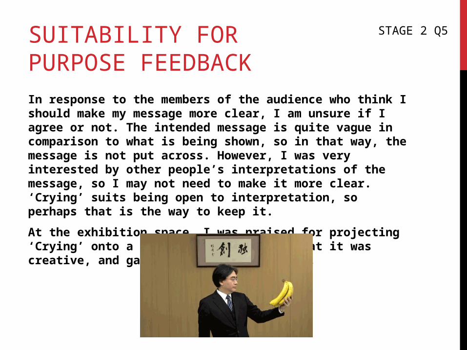
SUITABILITY FOR PURPOSE FEEDBACKIn response to the members of the audience who think I should make my message more clear, I am unsure if I agree or not. The intended message is quite vague in comparison to what is being shown, so in that way, the message is not put across. However, I was very interested by other people’s interpretations of the message, so I may not need to make it more clear. ‘Crying’ suits being open to interpretation, so perhaps that is the way to keep it.
At the exhibition space, I was praised for projecting ‘Crying’ onto a radiator. People felt that it was creative, and gave the message of warmth.
STAGE 2 Q5

FEEDBACK SUMMARYSummarise the feedback you received, was the general response positive or negative? What specific points did people make? Do you agree or disagree? Why?
In general, I am pleased with the feedback I received, as I was interested by everyone’s interpretations of the message. The negative feedback mostly focussed on the same thing, and it gave me an idea of how to fix these problems if I decided to do so. I was happy to see that people enjoyed the art, and did not claim to be bored by the lack of footage.
STAGE 2 Q6
STAGE 3 – FINAL CONCLUSION
BASED ON MY INDIVIDUAL EVALUATION AND THE INSTALLATION/SCREENING FEEDBACK, I ASSESS THE OVERALL SUCCESS OF YOUR PROJECT.
I ALSO SUGGEST ACTIONS FOR YOUR NEXT PROJECTS
CONCLUSIONOn the whole, I believe that ‘Crying’ was a success. I enjoyed editing it, and I was pleased with the final product as soon as I had finished it. My negative feedback mostly focussed on a single aspect, and my audiences both offline and online enjoyed the art, despite online viewers providing little direct feedback. Hearing other people’s interpretations of the art’s message was a pleasure, especially the visual interpretation of a random effect being ‘the sun’s transformation into a Red Giant’.
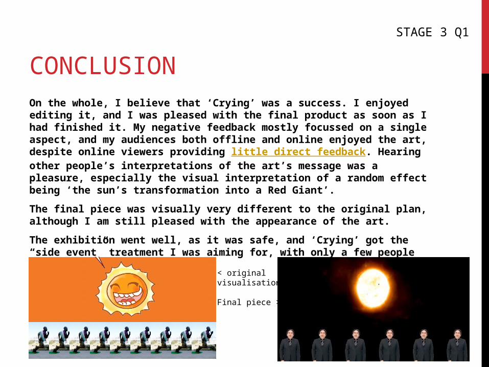
The final piece was visually very different to the original plan, although I am still pleased with the appearance of the art.
The exhibition went well, as it was safe, and ‘Crying’ got the “side event” treatment I was aiming for, with only a few people watching it at one time.
STAGE 3 Q1
< originalvisualisation
Final piece >

IMPROVEMENTSI feel that the main way to improve ‘Crying’ would be to increase its length. The music I used (Holy Ground – Inazuma Eleven) is 2:33 in length, and features a dramatic climax at the end. ‘Crying’ is only 1:39 in length, so does not take advantage of the entire track.
If I decide that the message of the art needs to be made clearer, I could add a faint overlay of the Apple logo towards the end of the art.
A minor improvement that I could make would be to fix the aspect ratio of ‘Crying’; the exported version is slightly stretched, which it was not in editing.
If I paid more attention to the other works of Grant Steven beside ‘The Drift’, I may have been able to implement parts of them into ‘Crying’, if I were to pay homage to him.
STAGE 3 Q2
FUTURE ACTION1. Pay more attention to other artists in the same field. Doing this may positively influence my productions, and give me ideas, and knowledge of the genre.
2. Continue synching effects with music, as I have learned how effective and satisfying it is by synching ‘Crying’ with ‘Holy Ground’.
3. Ask for feedback on the ‘message’ of productions, as it is interesting to see how people respond. This can also tell me if I need to make the message clearer.
4. Think about music choices in advance. When I make productions, I generally do not plan music tracks before the editing process, so I spend that time searching for music, and may not use the music to its full potential.
5. Ask online viewers to provide feedback. More feedback is always better, and as ‘Crying’ has already passed 80 views on YouTube, asking some of those viewers to leave feedback should not be a big ask.
STAGE 3 Q3


