47
CS160 Midterm Review February 21, 2006
| Date post: | 28-Dec-2015 |
| Category: |
Documents |
| Upload: | gwen-bailey |
| View: | 214 times |
| Download: | 0 times |

CS160 Midterm Review
February 21, 2006

Midterm Review Selected slides from lecture – but not
guaranteed to contain everything you need to know!
Ask questions about the things that you don’t understand.

Human-Centered Design
Design
Prototype
Evaluate
task analysiscontextual inquiryscenariossketchinglow-fi:
paper, DENIM
low-fi testing,Heuristic evaluation

The Human-Centered Design Process
Who is going to use the system? What are their characteristics, goals and desires? Choose representative tasks and analyze them Rough out a design (plagiarize as needed) Rethink the design – does it best address a need? Create a prototype Test it with users Iterate Build a production version (and ship it!) Track use Evolve the design

Design

Brainstorming Rules
1. Sharpen the Focus
2. Playful Rules
3. Number your Ideas
4. Build and Jump
5. The Space Remembers
6. Stretch Your Mental Muscles
7. Get PhysicalAlso, remember conformity vs. creativity and groupthink vs. dissent

Personas are concrete* representations of the user group as individuals.
Things to strive for in a good persona:
Attributes (age, gender, occupation)
Likes, dislikes
Values and desires (or life’s goals)
A good persona is generative (of ideas) – a good fictional character.
* Concrete representation is the opposite of abstract representation – it widens the designer’s perspective while abstraction narrows it.
Personas

Users: Personae A portrait of a character (with a name)
Name: Jack Occupation: ProfessorValues: liberal politicsLikes: water (swimming, sailing, lying on a beach),Asian food, French food, Italian food, seafood,…Dislikes: traffic, bad comedians, bureaucracy, Goals: start family, get good education for kids (probably private), build a leading research group in area,…

Task Analysis and Contextual Inquiry Selecting tasks
Real tasks with reasonable functionality coverage
Do your best to anticipate new tasks
Contextual inquiry
Helps answer the task analysis questions
Hybrid between interview and observation
Use the master-apprentice model to get them to teach you

What is Task Analysis ? Two flavors:
The formal version breaks tasks down step by step and builds a kind of flow-chart for them. We wont be using this now…
The informal version poses a set of questions to help the designer’s understanding of the task. We use this one.

The Task Analysis Questions1. Who is going to use system?
2. What tasks do they now perform?
3. What tasks are desired?
4. How are the tasks learned?
5. Where are the tasks performed?
6. What’s the relationship between user & data?
7. What other tools does the customer have?
8. How do customers communicate with each other?
9. How often are the tasks performed?
10. What are the time constraints on the tasks?
11. What happens when things go wrong?

Contextual Inquiry Way of understanding users’ needs and
work practices
Goal is to “get inside the user’s head” and see their tasks the way they do.
Neither pure observation nor pure interview, but a little of both.

Master-Apprentice model Master – Apprentice model allows user to
teach us what they doMaster (user) does the work & talks about it while working
We interrupt to ask questions as they go
Each step reminds the user of the next (betterthan just asking user)

Principles: Context Go to workplace & see the work as it unfolds
People summarize, but we want details
Keep it concrete when people start to abstract
“We usually get reports by email”, ask “Can I see one?”
Look for skipped steps, ask user to fill them in.

Principles: Partnership
Stick with master-apprentice relationship; avoid lapsing into other models, i.e.
Avoid interviewer/interviewee (stops work)Above all, don’t “teach”! Partnership allows more apprentice interaction: its OK to be a designer and interrupt!… but go back “in role”:Alternate between watching& probing (withdrawal & return)

Principles: Interpretation Good facts are only the starting point
Design is based on interpretations
Validate & rephraseRun interpretations by user to see if you are right
People will be uncomfortable until the phrasing is right – theirs is right by definition
You need to be committed to hearingwhat the user is really saying

Principles: Focus You need data about specific tasks
Steer conversation to stay on useful topics
Respect triggers (flags to change focus – changing understanding)
Shift attention (some one walks in)Treat every utterance by thecustomer as a potential clue tosomething important

Prototype

Why Do We Prototype? Get feedback on our design faster
Experiment with alternative designs
Fix problems before code is written
Keep the design centered on the user

Fidelity in Prototyping Fidelity refers to the level of detail
High fidelity
Prototypes look like the final product
Low fidelity
Look like a sketch with many details missing

Wizard of Oz Technique Faking the interaction.
Comes from the film “The Wizard of OZ”
The wizard was actually a “man behind the curtain”
Long tradition in computer industry
Prototype of a PC w/ a VAX behind the curtain!
Much more important for hard to implement features
Speech, vision & handwriting recognition

Tasks, Scenarios and Storyboards
What Should Tasks Look Like? Say what the user wants to do, but not how the
user would do itallows comparing different design alternatives
They should be very specificforces us to fill out description w/ relevant detailssay who the users are (use personas or profiles)
design can really differ depending on whoname names (allows getting more info as
necessary)characteristics of the users (job, expertise, etc.)
Some should describe a complete jobforces us to consider how features work together
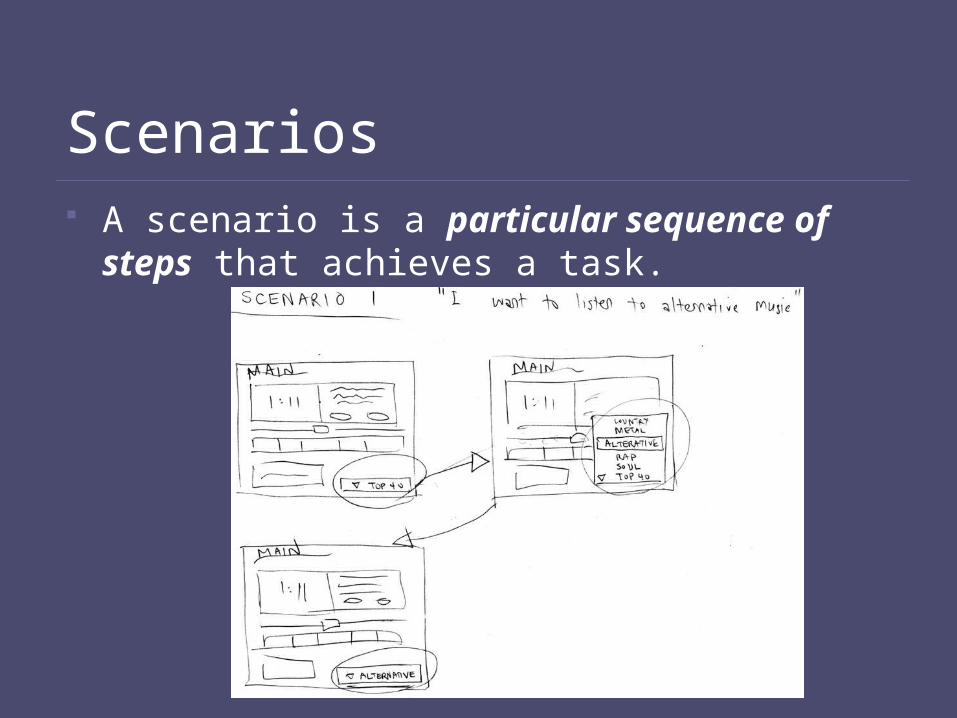
Scenarios A scenario is a particular sequence of steps
that achieves a task.

Scenarios Produce scenarios for each task
what user has to do & what they would seestep-by-step performance of task
Scenarios are design specific, tasks aren’t
Scenarios force us to show how various features will work togethersettle design arguments by seeing examples
only examples sometimes need to look beyond
Show users storyboardssequences of sketches showing screensactions users can take

Task ≠ Scenario
Task e.g.:“It’s 1 PM, you just had lunch, and you are now at your Political Science 2 lecture. The professor is explaining about the cult of personality, and because you were phasing out for a few seconds, you missed his main points, and you are now confused. Hoping he will clarify what he means by cult of personality, you decide to send feedback that this part of lecture is hard to understand.”
Scenario e.g.:“It’s 1 PM, Mark has just had lunch, and is now at Political Science 2 lecture. ... Hoping that the professor will clarify what he means by cult of personality, Mark decides to inform the professor that this part of lecture is hard to understand. He looks for the drop-down box for lecture feedback on the upper right-hand corner of his Tablet PC screen, and taps on it to reveal a list of options. He scans them visually until he finds “confused,” and taps on it to send his feedback.”

Low-fi Storyboards Where do storyboards come from?
Film & animation
Give you a “script” of important events
Scene changes and important story events
In UI design, the storyboard is non-linear to support user action choices.
Warning: You can also “storyboard” a linear scenario, and this term is used somewhat inconsistently.

Storyboards
Black: page content
Red: page titles
Green: annotations
Blue: links
Color Coding

Hi-fi Prototype Dis-Advantages: Distort perceptions of the tester
Formal representation indicates “finished” nature
People comment on color, fonts, and alignment
Discourages major changes
Testers don’t want to change a “finished” design
Time is lost on details
Discussion tends to be swallowed up on details, not the big-picture issues that matter most.

Hi-fi Prototype Dis-Advantages: Using hi-fi tools, you need to specify a string, the font,
the style, the size, etc.
Black found designers will push one design too far -- tunnel vision
Testers focus on unimportant low-level details
Testers give more “useful” comments on sketches than on finished-looking interfaces
70 seconds for ONE screen in a design of many screens

Evaluate

The User Test “10 Steps to Better Evaluation” (lecture 8)
The actual user test will look something like this:
Greet the user
Explain the test
Get user’s signed consent
Demo the system
Run the test (maybe ½ hour)
Debrief

Conducting a Test Four testers (minimum)
Greeter - puts users at ease & gets data
Facilitator - only team member who speaksgives instructions & encourages thoughts, opinions
Computer - knows application logic & controls italways simulates the response, w/o explanation
Observers - take notes & recommendations
Typical session is 1 hour
Preparation, the test, debriefing

Discount Usability Engineering Based on:
ScenariosSimplified thinking aloudHeuristic EvaluationSome other methods…

Scenarios Eliminate parts of the
system
Compromise between horizontal and vertical prototypes
Horizontal: partial implementation of many featuresVertical: full implementation of one feature

Other budget methods Walkthroughs
Put yourself in the shoes of a user
Like a code walkthrough
Action analysis
GOMS (later…)
On-line, remote usability tests
Heuristic evaluation

Heuristic Evaluation Developed by Jakob Nielsen
Helps find usability problems in a UI design
Small set (3-5) of evaluators examine UI
Independently check for compliance with usability principles (“heuristics”)
Different evaluators will find different problems
Findings are aggregated afterwards
Can be done on a working UI or on sketches

Heuristics (original) H1-1: Simple & natural
dialog
H1-2: Speak the users’ language
H1-3: Minimize users’ memory load
H1-4: Consistency
H1-5: Feedback
H1-6: Clearly marked exits
H1-7: Shortcuts
H1-8: Precise & constructive error messages
H1-9: Prevent errors
H1-10: Help and documentation

Revised Heuristics H2-1: visibility of system
status
H2-2: Match system and real world
H2-3: User control and freedom
H2-4: Consistency and standards
H2-5: Error prevention
H2-6: Recognition rather than recall
H2-7: Flexibility and efficiency of use
H2-8: Aesthetic and minimalist design
H2-9: Help users recognize, diagnose and recover from errors
H2-10: Help and documentation

How to Perform Evaluation At least two passes for each evaluator
First to get feel for flow and scope of systemSecond to focus on specific elements
If system is walk-up-and-use or evaluators are domain experts, no assistance needed
Otherwise might supply evaluators with scenarios
Each evaluator produces list of problemsExplain why with reference to heuristic or other informationBe specific and list each problem separately
Rank severity and cost for each problem

HE vs. User Testing HE is much faster
1-2 hours each evaluator vs. days-weeks
HE doesn’t require interpreting user’s actions
User testing is far more accurate (by def.)
Takes into account actual users and tasks
HE may miss problems & find “false positives”
Good to alternate between HE & user testing
Find different problems
Don’t waste participants

Teams “A team is a small number of people with
complementary skills who are committed to a common purpose, set of performance goals, and approach for which they hold themselves mutually accountable.” – Katzenbach & Smith

Teams Teams are small groups, which are more than the sum
of their parts
They are characterized by shared goals, leadership and mutual accountability
Design benefits from uninhibited discussion and creative conflict
Conflicts are an opportunity to improve team-building skills – use them
Conflict resolution is a whole-team task

Mark Weiser (1952 – 1999)
Introduced the idea of “ubiquitous computing”
“The most profound technologies are those that disappear. They weave themselves into the fabric of everyday life until they are indistinguishable from it”

Key Challenges in Making Mobile Applications Limited Physical Resources
CPU, Memory, Screen Size, Input Devices, Battery Life etc
Diversified Context of Use
Different Activities
Limited Attention

Theories Behind Quantitative Keyboard Layout Optimization Fitt’s Law
Digraph Distribution Model in a Language

Good Luck!


