INTUIT INTERACTIVE TOOLSET FOR UNDERSTANDING TRADE-OFFS IN ATM PERFORMANCE
This document is part of a project that has received funding from the SESAR Joint Undertaking under grant agreement No 6993030 under European Union’s Horizon 2020 research and innovation programme.
Abstract
This document reports the results of INTUIT WP5. The purpose of WP5 is to design and develop a performance monitoring and management toolset organised around the concept of an interactive dashboard equipped with a set of visual analytics tools. The document describes the three visualisation tools developed in the context of INTUIT WP5: (i) optimisation of unit rates to optimise a series of KPIs; (ii) performance assessment dashboard for the identification of flight efficiency influence factors; and (iii) decision support tool for data clustering.
This document reports the results of INTUIT WP5. The purpose of WP5 is to design and develop a performance monitoring and management toolset organised around the concept of an interactive dashboard equipped with a set of visual analytics tools. The document describes the three visualisation tools developed in the context of INTUIT WP5:
• A multi-objective optimisation engine to find the Pareto-optimal solution for a set of KPIs.
The route choice predictor developed in INTUIT WP4 was integrated into an optimisation tool
to predict the effects on performance of a particular setting of unit rates and help in the
selection of the best setting of unit rates. The route choice predictor is used to calculate
aggregated efficiency metrics for a given origin destination as a function of the unit rates
setting, which determine the charges that have to be paid to fly each route. The dashboard
allows the evaluation of the trade-off between flight efficiency, cost efficiency and capacity by
means of different interactive visualisations, supporting the assessment of the effect of unit
rates and route choices on ATM performance.
• A performance monitoring dashboard. This dashboard provides a tool to identify and evaluate
the causes of flight inefficiencies in a particular Area Control Centre (ACC). Flight efficiency
indicators are presented with different types of visualisations versus other flight properties
derived from both the flight plan and the ideal route, such as heading, altitude and airspace
crossed. The model allows the evaluation of the influence of these factors on flight efficiency.
The extracted interrelationships may serve as a basis to perform an assessment of the causes
and effects of low performing flights.
• A decision support framework for optimising the process of data clustering. Clustering is
often used in performance analysis for grouping objects with similar characteristics and
building models for these groups, e.g., groups of ACCs that behave similarly along a set of Key
Performance Indicators (KPIs). Clustering results may vary depending on the selected method,
its parameters, and initial settings. Respectively, it is necessary to ensure that the results of the
clustering process represent meaningful groups of objects with similar characteristics, are
stable in respect to the clustering settings and are easy to reproduce. The tool provides a suite
of visual analytics tools that combines different types of clustering, distance measures, data
and clustering projections for representing multidimensional visual summaries of clusters and
The INTUIT project aims to explore the potential of visual analytics, machine learning and systems modelling techniques to improve the understanding of the trade-offs between Air Traffic Management (ATM) Key Performance Areas (KPAs), identify cause-effect relationships between KPIs at different scales, and develop new decision support tools for ATM performance monitoring and management.
The present deliverable describes the results of INTUIT WP5. The goal of WP5 is to design and develop a performance monitoring and management toolset organised around the idea of an interactive dashboard equipped with a set of visual analytics tools. More precisely, the specific objectives of the work package are:
• to develop performance monitoring tools including tools for early detection of performance
deviations;
• to develop a multi-objective optimisation engine to find Pareto-optimal solution for a set of
KPIs;
• to develop an interactive dashboard for multi-criteria and sensitivity analysis;
• to develop a prototype integrating the developed tools; and,
• to demonstrate and evaluate the prototype (this objective is described in D5.2 Performance
Monitoring and Management Toolset Evaluation Report).
The visualisation work presented in this document is based on the results achieved by WP3 and WP4, where a set of research questions have been extensively investigated through different data science techniques. WP5 extends the capabilities developed in WP3 and WP4 by providing tools that allow analysts to interactively explore different ATM performance problems results through ad-hoc environments and suitable visual representations. To showcase the abilities of the visualisation approach, this deliverable describes how it has been applied to the three case studies (CSs) described in D4.1 Performance Metrics and Predictive Models, namely:
• CS-1. Study of the effect of unit rates on en-route performance, and more generally the
modelling of airline route choice decisions and their impact on ATM performance.
• CS-2. Identification of sources of en-route flight inefficiency.
• CS-3. Development of new multi-scale representations of ATM performance indicators.
The present deliverable has been written in accordance with the following INTUIT documentation:
• Grant Agreement N. 699303 INTUIT – Annex 1 Description of the Action;
• INTUIT D1.1 Project Plan, v00.02.00, June 2016:
• INTUIT D1.2 Data Management Plan, v01.00.00, December 2016;
• INTUIT D2.1 Performance Data Inventory and Quality Assessment, v01.00.00, December 2016;
• INTUIT D2.2 Qualitative Analysis of Performance Drivers and Trade-offs, v01.00.00, November
2016;
• INTUIT D3.1 Visual Analytics Exploration of Performance Data, v01.00.00, October 2017;
• INTUIT D4.1 Performance Metrics and Predictive Models, v00.03.00, February 2018.
Furthermore, the following resources have been used as references:
[1] Cook, K.A. & Thomas, J.J. (2005) “Illuminating the path: the research and development agenda for visual analytics”, National Visualization and Analytics Ctr.
[2] Keim. D., Kohlhammer, J., Ellis, G., & Mansmann, F. (2010) “Mastering the information age: solving problems with visual analytics”, Eurographics Association.
[3] Marcos, R., Toribio, D., Garrigó, L., Alsina, N., Adrienko, N., Andrienko, G., Piovano, L., Blondiau, T. & Herranz, R. (2016). “Visual Analytics and Machine Learning for Air Traffic Management Performance Modelling”, in D. Schaefer (Ed.) Proceedings of the SESAR Innovation Days 2016, EUROCONTROL.
[4] Andrienko, G., & Andrienko, N. (2001) “Constructing parallel coordinates plot for problem solving”, in 1st International Symposium on Smart Graphics (pp. 9-14).
[5] Yang, J., Peng, W., Ward, M.O. & Rundensteiner, E.A. (2003) “Interactive hierarchical dimension ordering, spacing and filtering for exploration of high dimensional datasets”, in Information Visualization, 2003. INFOVIS 2003. IEEE Symposium on (pp. 105-112). IEEE.
[6] Endres, M., Roocks, P., & Kießling, W. (2015) “Scalagon: an efficient skyline algorithm for all seasons”, in International Conference on Database Systems for Advanced Applications (pp. 292-308), Springer, Cham.
[7] Roocks, P. (2016) “Computing Pareto frontiers and database preferences with the rPref Package”, RJ, 8(2), 393-404.
2 Application of Visual Analytics to ATM performance modelling: INTUIT approach
2.1 Overview of Visual Analytics
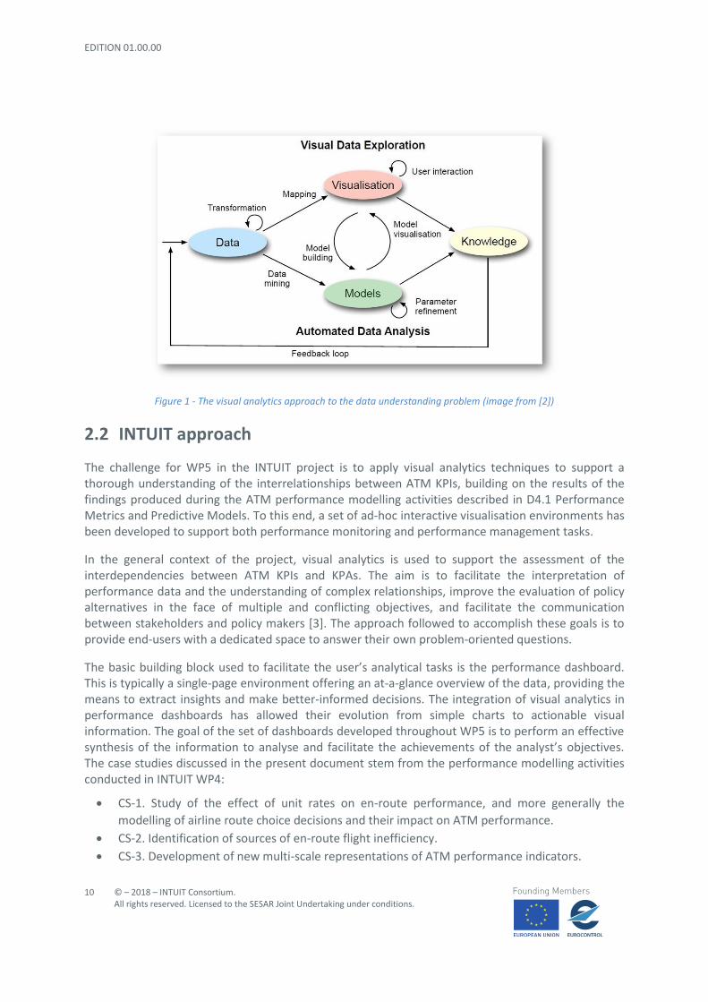
Visual analytics is the science of analytical reasoning facilitated by interactive visual interfaces [1, 2]. This approach is based on coupling interactive visual representations of data and analytical functionalities to enable human-information discourse and, consequently, to foster high-level user’s thinking activities such as reasoning, drawing conclusions, planning, and decision-making. The novelty and the emphasis of the approach lie in the visual part. At the very heart of its foundations, it relies on the perception mechanisms used by humans and aims at amplifying their cognitive capabilities in order to allow them to see, explore and understand large amounts of information at once. The capability to extract insights from data is enabled by suitable visual representations which convert abstract items and properties (typically in numeric format) into visible forms that highlight salient features and patterns. Augmenting the cognitive reasoning process with perceptual reasoning as described has several benefits such as allowing user’s analytical reasoning process to become faster and more focused.
Figure 1 shows how the visualisation approach is usually employed in the context of data analysis. It is clear from the picture the supporting role played by the visual data representation in both exploring (raw) data and in understanding the modelling activities. User interaction means allow users to be active during the visual data exploration step. Last but not least, the insights revealed by both the perceptual and analytical sides converge to form the domain knowledge which is in turn used to feed back the overall knowledge generation process.
VA’s mix of information visualisation practices and computational data analysis techniques is particularly appropriate to address several tasks, such as:
• to detect the expected and discover the unexpected;
• to summarise information and simplify the complex;
• to obtain insights from massive, dynamic, ambiguous, and often conflicting data;
• to provide timely, evidence-based, and understandable analysis; and
• to communicate actionable assessments effectively.
Figure 1 - The visual analytics approach to the data understanding problem (image from [2])
2.2 INTUIT approach
The challenge for WP5 in the INTUIT project is to apply visual analytics techniques to support a thorough understanding of the interrelationships between ATM KPIs, building on the results of the findings produced during the ATM performance modelling activities described in D4.1 Performance Metrics and Predictive Models. To this end, a set of ad-hoc interactive visualisation environments has been developed to support both performance monitoring and performance management tasks.
In the general context of the project, visual analytics is used to support the assessment of the interdependencies between ATM KPIs and KPAs. The aim is to facilitate the interpretation of performance data and the understanding of complex relationships, improve the evaluation of policy alternatives in the face of multiple and conflicting objectives, and facilitate the communication between stakeholders and policy makers [3]. The approach followed to accomplish these goals is to provide end-users with a dedicated space to answer their own problem-oriented questions.
The basic building block used to facilitate the user’s analytical tasks is the performance dashboard. This is typically a single-page environment offering an at-a-glance overview of the data, providing the means to extract insights and make better-informed decisions. The integration of visual analytics in performance dashboards has allowed their evolution from simple charts to actionable visual information. The goal of the set of dashboards developed throughout WP5 is to perform an effective synthesis of the information to analyse and facilitate the achievements of the analyst’s objectives. The case studies discussed in the present document stem from the performance modelling activities conducted in INTUIT WP4:
• CS-1. Study of the effect of unit rates on en-route performance, and more generally the
modelling of airline route choice decisions and their impact on ATM performance.
• CS-2. Identification of sources of en-route flight inefficiency.
• CS-3. Development of new multi-scale representations of ATM performance indicators.
INTUIT visualisation platform is currently hosted by CeDInt – UPM servers and can be accessed through the following link: https://viz2know.cedint.upm.es
Due to the sensitive nature of the data used throughout the project and in compliance with EUROCONTROL Demand Data Repository (DDR2) data policy, the access is restricted to authorised personnel only. Currently, the users allowed to enter the platform are researchers belonging to the INTUIT consortium.
To access the platform, the authorised users must introduce their credentials in the form of a username (or e-mail) and password. The access is secured by Lock, an embeddable, flexible and configurable login form, developed by Auth01. The authentication process is performed through a secured http connection, such that all sensitive information is encrypted. Figure 2 shows the personalised login widget used to access the platform.
Figure 2 - The login widget to access the INTUIT visualisation platform
The main features characterising the INTUIT visualisation platform are the following:
• Unified environment with different dashboards. Having several working places within a single
container provides several benefits such as:
o single access point;
o unified layout;
o switching between dashboards is simpler and faster.
• Ad-hoc solution. The INTUIT platform hosts different dashboards that have been conceived to
support the analysis of specific problems. Rather than providing a general-purpose solution,
each dashboard focuses on the main characteristics of the problem under consideration and
addresses the needs and requirements of the analyst. On the one hand, this strategy does not
allow the reuse of the dashboard for different tasks. On the other hand, the implementation
has followed the main principles of modularity, so that the single charts could be extracted and
substituted with others with a small effort in terms of coding;
• Web-based. The implementation of the platform uses web technologies to take advantage of
their intrinsic benefits, such as:
o worldwide reachability through a single URL;
o no installation of external programs is required;
o cross-platform and operative system independent.
• The platform is built according to a server-client paradigm so that the computation and the
chart rendering steps are processed on the server side. This way the client can run faster since
its only task is to show what the server has already prepared. On the other hand, possible
drawbacks could arise from the adoption of the web technologies, such as:
o loss of connection means loss of platform operability;
o working sessions could be slowed down if heavy interactions are required;
o bandwidth bottlenecks depending on the type of connection used and the amount of
data to be exchanged by the two end-points
• Fully interactive: the user must have an active role when playing with the data. The charts and
widgets used in the different visualisation environments give the user the freedom to
approach the problem under analysis by reflecting the analyst’s wishes.
The core of the platform has been developed by using the R2 statistical language program. A set of customised scripts in JavaScript has also been developed to amend some look-and-feel features and improve functionalities related to interactivity and presentation / layout.
The idea of using R as the fundamental language to build the dashboard has come in order to unify the data manipulation and the visualisation front-end. R is an integrated suite of software facilities for data manipulation and calculation which has been extended with a variety of packages dealing with graphical display: indeed, one of R’s strengths is the ease with which well-designed (static) plots can be produced. Given the raising interest in producing visualisations for web-oriented environments, R’s developers have introduced more resources to include also dynamic and interactive charting facilities. One of these is Shiny3, an open source R package that provides an elegant and powerful web framework for building web applications via R. Among the advantages of such package, it is worth mentioning that R enables the deployment of interactive web applications without prior knowledge of any of the languages used in web programming (such as JavaScript) and/or structuring and styling web content (i.e. HTML5 and CSS3).
The main drawback of using R is that it is somehow limited to the academic world and/or to develop relatively small data science projects. It is thought that the maturity level achievable nowadays by R
is close but still not enough as to fulfil all the standards and requirements used in the industry fields. Among the criticisms in this sense, speed is considered a bottleneck that should be addressed before reaching the next level of adoption.
Table 2 provides the list of packages used to develop the current INTUIT visualisation platform.
Library Version Description shiny shinydashboard shinyjs shinyjqui
1.0.5 0.7.0 1.0 0.2.0
Suite of libraries to develop interactive, web-based applications from the R statistical programming language environment.
ggplot2 ggthemes plotly parcoords
2.2.1 3.4.0 4.7.1 0.5.0
Set of graphical libraries used to create the charts contained in the visualisation platform.
leaflet leflet.minicharts
1.1.0 0.5.2
Libraries to include and manage interactive maps, map-related charts and all the geographical information.
rPref 1.2 Library used to show the Pareto frontier and its level sets extrafont scales viridis
0.17 0.5.0 0.5.1
Helpful resources to complement the standard graphical components in terms of layout, content presentation (e.g. fonts, labels format) and colour scales.
dplyr lazyeval lubridate reshape2 rlang tidyr
0.7.4 0.2.1 1.7.3 1.4.3 0.2.0 0.8.0
Libraries used to manipulate the data
DT 0.4 Library to insert data tables in the dashboards
jsonlite readr
1.5 1.1.1
Libraries used to read / save and import / export the files containing the original data stored in the most common formats such as JSON and CSV
digest 0.6.15 Library to handle the user management (e.g. user credential generation, storing and encryption)
Table 2 - List of the most relevant R libraries used to develop the INTUIT visualisation platform.
2.3.1 Intended use
The INTUIT visualisation platform has been conceived as a desktop application, whose main goal is to provide an effective and visually pleasing environment for the analysis of the data coming from the INTUIT case studies. For these reasons, the following recommendations of use are provided in order to achieve the best possible user experience:
• screen: it is better to use the extended ones (e.g., with a resolution of 1920 x 1080) since the
graphical elements have been aligned horizontally to facilitate the comparison steps;
• browser: the platform has been tested against the latest versions of Chrome and Firefox. In
general, any modern browser should be able to properly visualise the platform provided that it
can support the most recent web technologies (e.g., HTML5, CSS3);
• full screen: the use of the full screen option allows the optimisation of the screen space;
• it is important to note that the tool is not designed to be used with mobile devices such as
smart phones or tablets due to their low screen width.
The current version of the INTUIT platform is a prototype used for research purposes and therefore is not suitable for an industrial environment yet. The following issues are known to the developers and should be improved in the next releases:
• Server disconnection: the user may experience a sudden disconnection from the server while
working with the visualisation environment. It generally happens when trying to recover a
session after a long period. Even if the server time-out has been properly set to handle this
case, it could occur that the connection would be reset anyway.
• The lateral bar is not properly loading the first time the user enters a visual environment: this
issue happens from time to time and it is currently under investigation to discover the causes
behind it.
• Some labels may overlap: this could happen when using the dashboard on a screen with a
more compact aspect ratio.
• The Parallel Coordinates Plot is not auto-scaling when a dimension is removed from the chart
and/or the browser window is resized (CS-1 environment). This issue is automatically solved
when a chart redrawing is performed (e.g., by usually interacting with some other elements of
the chart). This bug will be removed by improving the JavaScript code behind the chart
3.1 CS-1: Effect of Unit Rate Variance on en-Route Performance
3.1.1 Objectives
The main objective of this dashboard is to assess the performance impact of modifying the unit rates on the flights between an origin-destination (OD) pair based on the results of the case study CS-1 developed in WP4 (for further details on the modelling activity, see D4.1 Performance Metrics and Predictive Models, Section 4.1). In this case study, airline route choices were modelled as a function of route characteristics (route extension, air navigation charges and amount of regulations). The variety of routes is simplified into a smaller group of averaged route clusters. The origin-destination pair chosen for the prototype dashboard is Canary Islands-London.
The dashboard provides a tool to assess the performance effect of a setting of unit rates on three KPAs, averaged over the flights in that OD: cost-efficiency (measured by average en-route charges per flight), capacity (measured by the number of regulations) and efficiency (measured by the horizontal route extension). The user can select an optimal setting of unit rates by giving a weight to each of the performance indicators (en-route charges, number of regulations and horizontal route extension). The dashboard allows the evaluation of the trade-offs of a given setting of unit rates in terms of flight efficiency, cost efficiency and capacity by means of different interactive visualisations, supporting the assessment of the effect of unit rates and route choices on ATM performance.
The dashboard has been built to provide a double point of view on the possible setting of unit rates (i.e., optimal solutions): (i) first, the analyst can study the whole space of optimal solutions (each solution being linked to a set of weights and a corresponding setting of unit rates) based on their impact on the selected performance indicators; and (ii) a specific solution can be compared with the baseline scenario (i.e., the original situation as computed from DDR2 historical data) to understand the pros and the cons of a specific solution and analyse local effects on particular stakeholders, namely Air Navigation Service Providers (ANSPs) or airlines. In the first case, the average value of each indicator is used to make the comparisons; in the latter case, the indicator results are broken down into the components corresponding to the main stakeholders (airlines and ANSPs) and routes involved in the scenario.
3.1.2 Datasets
The main data sources used within this visualisation exercise concern the results obtained during the modelling phase in WP4 and computed by Nommon, which was in charge of developing the related case study. The results come in two different datasets, both stored as .csv (Comma Separated Values) files. The first one contains the solution space for the optimisation of en-route charges for
the origin-destination pair under study (see Table 3). Each row of the CSV file contains the definition of one solution (ID and combination of weights) and the predicted solution results (unit rates, demand, performance indicators, etc.). The second dataset (Table 4) contains the characteristics of the clusters of routes for the baseline scenario.
For the sake of geographical visualisation, two shapefiles4 have been used to represent the shape of route clusters and the ANSP airspaces respectively. In the first case, the clusters have been computed by Nommon (based on historical data of the DDR2 restricted-access flight database maintained by EUROCONTROL); in the latter case, the data are directly retrieved from DDR2 repository.
Column name Data type Description Unit Solution ID integer The unique ID of the solution - route_extension_weight, revenue_weight, congestion_weight
Integer ∊ [-1,3]:
-1, same as in the baseline;
0: no importance;
3: highest importance
Weights assigned to the route extension / revenue / congestion dimensions respectively to state their importance in the multi-criteria optimisation process.
-
ANSPk_ur Decimal Optimal setting of unit rates’ for a given ANSP obtained from the optimisation process for the given combination of weights.
€ cent / 100km
ANSPk_NM Decimal Nautical Miles (NM) flown in a given ANSP. NM routei_ANSPk Decimal Average NM flown by flights flying route I in a given
ANSP. NM
incomei_ANSPk Decimal Average income generated by flights flying route I in a given ANSP.
Decimal Average quantities for route i. These columns describe the following indicators respectively:
• charges paid to fly the route; • percentage of route extension w.r.t. the
Great Circle Distance (GCD); • number of regulated flights; • deviation of the flight level; • flight time; • number of flights; and • income generated.
Decimal Average quantities for airline j. These columns describe the following indicators respectively:
• flights for each route I; • charges paid by the airline; • percentage of route extension w.r.t. GCD; • number of regulated flights; • deviation of the flight level; • time taken to fly; and • number of flights
Column name Data type Description Unit avg_route_extension, avg_regulations, avg_charges, avg_stdfl, avg_time
Decimal Average quantities for the given solution. These columns describe the following indicators respectively:
• percentage of route extension w.r.t. GCD; • number of regulated flights; • charges paid by the airline; • deviation of the flight level; and • time taken to fly
%, flights,
€, h. ft., min
Table 3 – Metadata for the optimisation solutions file. The table summarises the main features of the data used for the CS-1 visualisation dashboard and provides a short description of each variable involved into the case study under analysis. The
resulting file contains 125 rows (i.e. the whole set of optimisation solutions provided that there are 5 different weights which apply to the three criteria considered) and 185 columns. The dataset for the Canary Islands – London routes takes into
account 10 airlines, 8 ANSPs and 4 main clusters. The solution with the weight triplet (-1 / -1 / -1) is the baseline.
Column name Data type
Description Unit
cluster Character The unique ID for the route cluster. -
n_flights Integer Number of flights assigned to the cluster in the baseline scenario.
Decimal Average quantities for each route cluster. These columns describe the following indicators respectively:
• percentage of route extension w.r.t. GCD;
• charges paid by the airline;
• number of regulated flights;
• deviation of the flight level (FL);
• extension of the route due to wind; and,
• flight time.
%, €, flights, h. ft., NM, min
ANSPk_NM Decimal Average nautical miles flown in the route over a given ANSP NM
Table 4 – Metadata for the route clusters file. This table summarises the main features of the data used for the CS-1 visualisation dashboard and provides a short description of each variable involved into the case study under analysis. The
resulting file contains 9 rows (i.e. clusters) and 16 columns. Given the low number of flights in the last 5 clusters (namely 42, as in cluster 3), it was agreed to group them to form a fourth, bigger cluster: as a consequence, also the overall statistics for
the new cluster have been updated as the average of the statistics of the individual smaller clusters. The total number of ANSPs is 8.
3.1.3 Dataset preparation
Before introducing the aforementioned datasets in the visualisation platform, some preliminary transformation was required to clean data issues. In order to perform this cleansing task, an R5 script was devised to shape the data according to the desired structure. The first step was to homogenise column names to ease the task of data manipulation and for clarity of results interpretation (columns where given self-explanatory names). The second step was to round the original decimal values of the indicators up to a suitable number of decimal digits.
Following the divide-et-impera approach, the original table was divided into several tables to ease the task of scripting and debugging and increase the execution speed. Finally, and in order to speed up the computations in the analysis window, the comparisons between the performance results of each solution and the baseline were pre-calculated and saved in three separates files. These files contain the comparative assessments in terms of both raw numbers (i.e., differences between the indicator values of a solution and the corresponding values in the baseline) and percentages (i.e., representing the improvement / worsening of a given indicator dimension with respect to the initial scenario).
The whole process described above has been implemented in R (version 3.4.3, released on 30th November 2017, and also known as Kite-Eating Tree) and by using RStudio6, an IDE for R statistical programming language (version 1.1.383). More specifically, the dataset manipulation has been performed by using Hadley Wickham’s dplyr7 (version 0.7.4) package.
3.1.4 Main functionalities
THE FIGURES HERE PRESENTED ARE JUST ILLUSTRATIVE AND SHOW REPRESENTATIONS OF A MOCK DATASET
CREATED TO SHOW THE OVERALL LOOK AND FEEL OF THE DASHBOARD AND DO NOT REPRESENT ANY PREDICTION
OF PERFORMANCE. THE ACTUAL VERSION OF THE DASHBOARD (HTTPS://VIZ2KNOW.CEDINT.UPM.ES/)
PRESENTS THE ACTUAL PREDICTIONS COMPUTED.
SOME OF THE FUNCTIONALITIES OR THE APPEARANCE OF SOME CHARTS PRESENTED IN THIS DOCUMENT MAY
SLIGHTLY DIFFER FROM THE LATEST VERSION OF THE DASHBOARD.
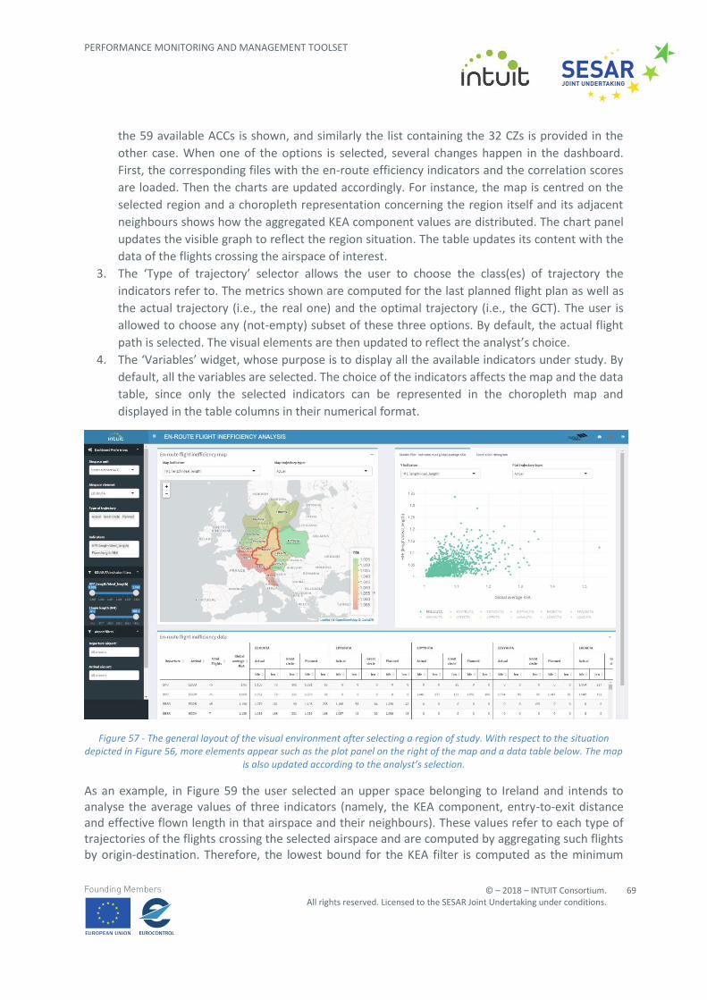
The dashboard is organised into three parts, reflected in the tripartite layout shown in Figure 3: a lateral bar on the leftmost side of the screen helps the analyst to set-up the dashboard environment; two floating windows (called ‘Optimisation window’ and ‘Analysis window’ respectively and shown in their minimised form) represent the spaces where the user is invited to visually explore the data. There is also a horizontal bar – with a blue background – dedicated to some general purpose action buttons. From left to right in Figure 3, it is possible to see:
• The INTUIT project logo: by clicking on it, the user is redirected to the project website.
• The lateral bar show/hide button: by clicking on it, the vertical bar either disappears
(increasing the space for the visualisation windows) or it is brought to the user’s attention.
• The dashboard title.
• UPM-CeDInt logo: it redirects to the CeDInt web-page.
• The dashboard selector: it redirects the user to the page where it is possible to choose which
visual analytics space to open;
• A disclaimer icon, where a text is popped-up describing the objectives of the dashboard as well
as its limitations and possible uses.
• The exit button: the user is disconnected, and the server resets each open connection. The
Figure 3 – The general layout of the visualisation dashboard for CS-1 case study
3.1.4.1 Setting-up the analysis environment
The lateral bar is used to set-up the visualisation environment according to the user’s preferences and the tasks to be performed. As shown in Figure 4, the bar is composed by three main parts:
1. The ‘Go to’ section allows the user to quickly switch between the Optimisation and Analysis
Windows. This is particularly useful when both windows are maximised: in this case, the first
open window is likely to fill the whole vertical space of the screen, such that the user would
have to scroll down to meet the other one. The ‘Go to’ buttons are thought to simplify this
process and speed up the switch step.
2. The ‘Route Selection’ selector allows the user to choose which route to consider for the
analysis task. Once selected the desired OD pair, the platform loads the corresponding files
and updates the environment accordingly. In the current prototype, only the Canary Islands-
London pair is available.
3. The ‘Criteria Prioritisation’ slider set is the core of the lateral bar. It allows the user to
interactively set the relative importance of the three KPAs under analysis (i.e. route extension,
navigation costs and delay), such that it will be possible to evaluate the impacts of the
resulting unit rate setting. Each KPA has five distinct weights to choose among and the
combination of the three weights altogether provides a reference to a unique solution in the
space of the solution set. Labels 1, 2, and 3 correspond to low, medium, and high importance,
respectively. Label 0 is named None and should be intended as ‘the analyst is not considering
relevant to work with / consider the corresponding KPA’. Just below the last slider, a legend
reminds to the user the correspondences between the aforementioned labels and their
meanings (see Figure 4). Label -1 implies that the corresponding indicator has to remain
unchanged from the baseline scenario. Being so different from the other labels, the design
solution to tackle this tag is to introduce a couple of buttons called ‘Priority’ and ‘Baseline’
respectively and let the user choose between them when setting the weights. By selecting the
‘Baseline’ button, the weight(s) of the corresponding KPA(s) is/are forced to be -1. To stress
this concept, the corresponding slider is hidden so that any further interaction with it will be
forbidden (see Figure 5). To reverse this situation and make the slider visible again, the button
Priority should be pressed. By default, all the sliders are set to Low priority and therefore, with
Figure 5 - The lateral bar with the route extension weight set to -1. In this scenario, the Baseline button is highlighted and the corresponding slider is hidden. The remaining KPAs are set to Low (label 1) and the sliders are visible and ready for
further interactions. With respect to the set of optimisation solutions, this one is identifiable through the triplet -1 / 1 / 1.
3.1.4.2 The optimisation window
The optimisation window is the visual environment where the whole set of solutions is presented in order to allow the user to assess the pros and cons of each proposed optimisation solution and understand the possible trade-offs arising. The user is provided with four different tools aiming at providing a comprehensive point of view about the problem under analysis. Figure 6 shows the optimization window at a glance.
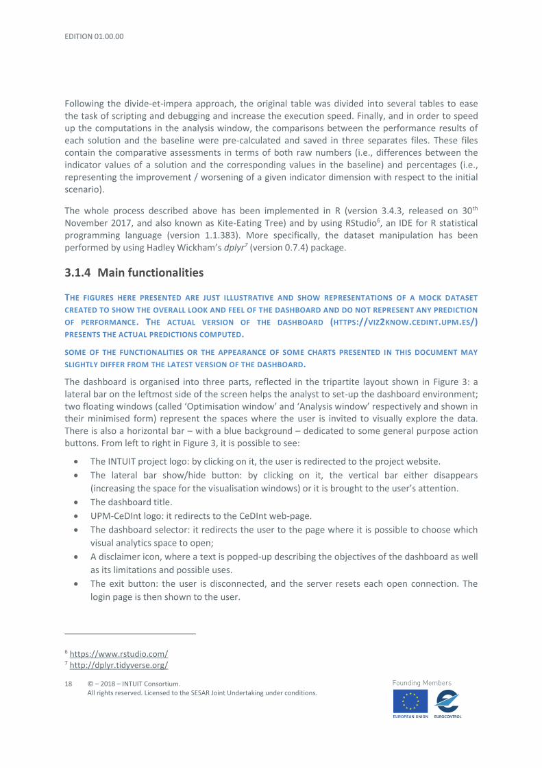
Although tables cannot be considered as graphical elements, their usefulness is straightforward, especially when an analyst needs to have quantitative information about any aspect of the problem under analysis. For this reason, a data table is present in the optimisation module: for each optimisation solution (rows), it shows a set of measurements for every dimension (i.e., for each performance metric) considered. Figure 7 depicts the table of solutions within the optimisation window.
Figure 7 - The table element in the optimisation window. Each solution spreads across a single row. By default, the solutions are sorted by the Solution column (i.e. the ordered triplet containing the KPAs priority weights), with the selected (orange)
and baseline (green) scenarios always on the top.
The table layout is a standard one, but it has some additional features that could ease the analyst’s task of comparing solutions. The selected solution and the baseline scenario are always displayed as the two first rows of the table, respectively in orange and green. Being always in foreground and strongly differentiated from the remaining options, this design solution enables easier comparisons between the indicator values. The fixed position ensures that the two solutions under analysis are always present in the table. This is particularly useful when performing filtering activities (see Figure 8) and ordering operations (see Figure 9). In the former case, it prevents the accidental drop of relevant solutions; in the latter case, it precludes the user to spend time and effort in searching these solutions across the different tabs making up the table.
The data table is dynamically linked with all the widgets and charts within the optimisation window. All the changes happening in the table are automatically reflected to the charts; conversely, the filtering on both criteria and indicators impacts on the number of rows shown in the table itself. This way, it is possible to link the quantitative information stored in the table with its visual representation. One possible scenario to apply this technique would be a comparison of several solutions across the Parallel Coordinates Plot (PCP, see Section 3.1.4.2.3) and the trade-off scatterplot (see Section 3.1.4.2.4). To perform this task, the analyst could select a series of interesting solutions, such as in Figure 10. The highlighted rows in the table make them easily distinguishable with respect to the unselected ones. The corresponding lines and points in the charts change their appearance to reflect the user’s actions (see Figure 11 and Figure 12).
Figure 8 - The data table and the filtering utility: only the rows fulfilling the search criterion are dynamically shown. The search is performed across each cell of the table. The selected solution and the baseline scenario are excluded from being
filtered and therefore they are always shown to the user.
Figure 9 - The data table ordered (in ascending order) by the route extension metric. The first two rows are always free from being ordered.
Figure 10 - Selecting some rows (i.e. solutions) in the data table: rows change their background colour to be distinguishable. The graphical elements corresponding to these rows are also highlighted in the charts belonging to the optimisation
window. To unselect a specific row, the user has to click on it again. The ‘Unselect All’ button is the fastest way to unselect all of them at once.
Figure 11 - The PCP after selecting the three rows in the data table, as per Figure 10. The corresponding lines are thicker and without transparency, so tat they can stand out with respect to the pool of the other solutions. The baseline and the solution
under analysis are highlighted with different colors, respectively in green and orange. The green line is not fully visible because it overlaps with one of the blue lines: this means that a concrete solution does not provide any tangible effects upon
the original situation, at least with respect to the dimensions (vertical lines) considered.
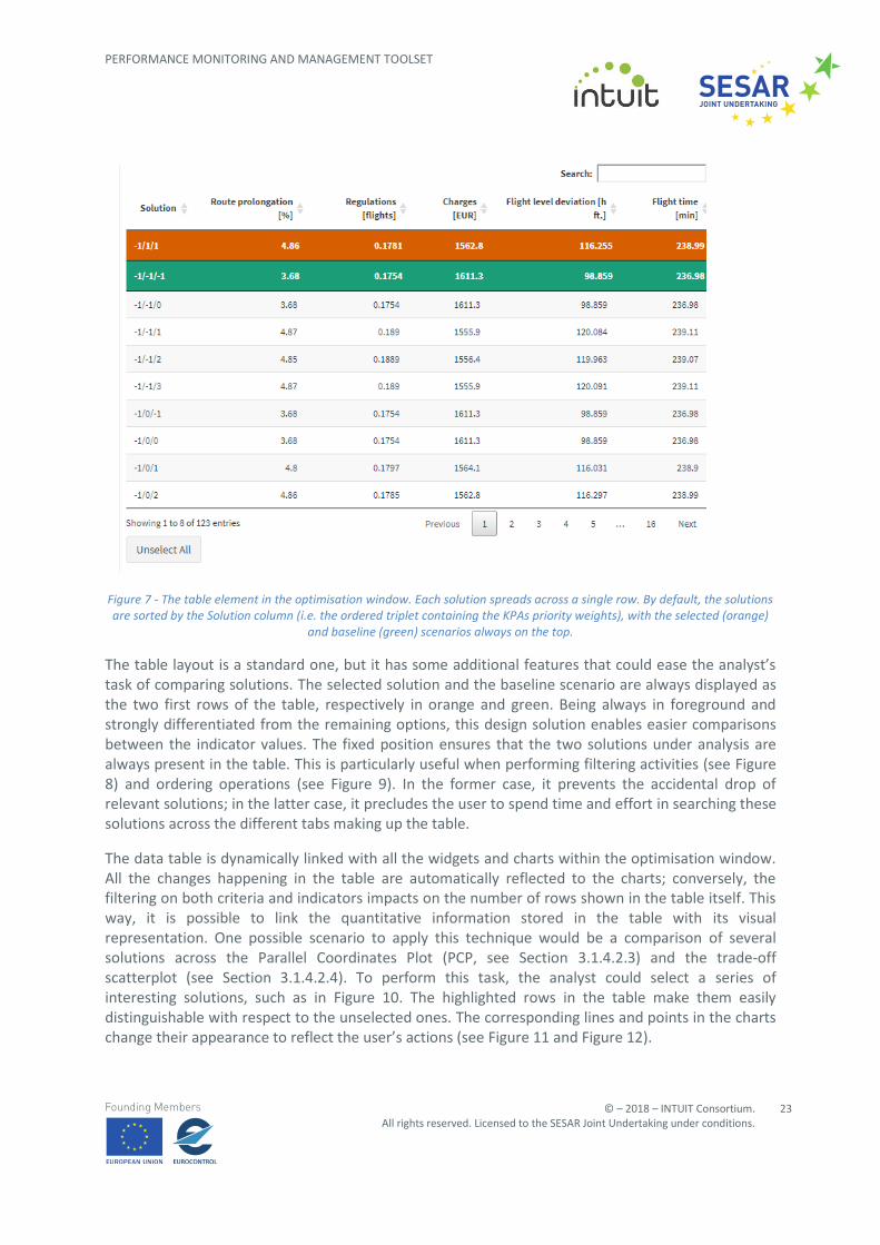
Figure 12 - Trade-off scatterplot reflecting the selection of three different rows in the data table, as per Figure 10. In this case, the circles with an inner point correspond to the selected rows. The baseline scenario is represented with an external
green square).
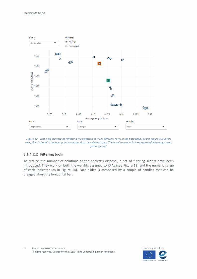
3.1.4.2.2 Filtering tools
To reduce the number of solutions at the analyst’s disposal, a set of filtering sliders have been introduced. They work on both the weights assigned to KPAs (see Figure 13) and the numeric range of each indicator (as in Figure 14). Each slider is composed by a couple of handles that can be dragged along the horizontal bar.
Figure 13 - Sliders to set filters on the KPA weights: only those solutions meeting the three weight conditions are kept and shown in the charts and table of the optimisation window.
The space of solutions is represented by means of a Parallel Coordinates Plots (PCP). The PCP implementation used throughout this visualisation is an adaptation of the parcoords solution8 for Shiny and R environments and comes with many of the improvements proposed and discussed in [4].
The default appearance of the PCP chart is shown in Figure 15. Generally speaking, a PCP is composed by a set of vertical, parallel and equally spaced lines representing the variables / dimensions of interest and a set of polylines depicting the solutions (i.e., rows in the data table) to be analysed. Each polyline is formed by a series of segments intersecting the vertical lines, such that each vertex position matches the coordinate (i.e., the cell value in terms of the data table) for the given dimension.
At the beginning, the PCP represents the whole set of optimisation solutions. In order to reduce the overhead due to visual cues, the lines are drawn by using transparencies: this way, the user is still able to detect patterns and relationships without being overwhelmed by too much (visual) information. The use of transparency is particularly useful to spot group of similar solutions, since they will have overlapping segment representations. The baseline scenario and the solution selected according to the KPA weights are drawn in green and orange respectively. Their outstanding representation is used as a reference for the exploration and the assessment of the other solutions. In addition, the transparency is omitted from other solutions (in blue) selected in the table or with the mouse directly on the plot.
Figure 15 - The Parallel Coordinate Plot interface
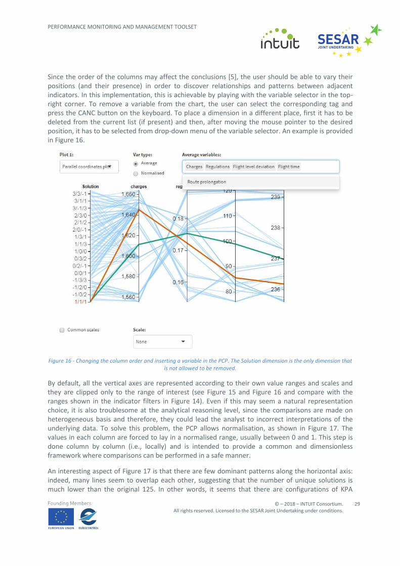
Since the order of the columns may affect the conclusions [5], the user should be able to vary their positions (and their presence) in order to discover relationships and patterns between adjacent indicators. In this implementation, this is achievable by playing with the variable selector in the top-right corner. To remove a variable from the chart, the user can select the corresponding tag and press the CANC button on the keyboard. To place a dimension in a different place, first it has to be deleted from the current list (if present) and then, after moving the mouse pointer to the desired position, it has to be selected from drop-down menu of the variable selector. An example is provided in Figure 16.
Figure 16 - Changing the column order and inserting a variable in the PCP. The Solution dimension is the only dimension that is not allowed to be removed.
By default, all the vertical axes are represented according to their own value ranges and scales and they are clipped only to the range of interest (see Figure 15 and Figure 16 and compare with the ranges shown in the indicator filters in Figure 14). Even if this may seem a natural representation choice, it is also troublesome at the analytical reasoning level, since the comparisons are made on heterogeneous basis and therefore, they could lead the analyst to incorrect interpretations of the underlying data. To solve this problem, the PCP allows normalisation, as shown in Figure 17. The values in each column are forced to lay in a normalised range, usually between 0 and 1. This step is done column by column (i.e., locally) and is intended to provide a common and dimensionless framework where comparisons can be performed in a safe manner.
An interesting aspect of Figure 17 is that there are few dominant patterns along the horizontal axis: indeed, many lines seem to overlap each other, suggesting that the number of unique solutions is much lower than the original 125. In other words, it seems that there are configurations of KPA
weights leading to similar results on average. A large proportion of them are combinations of 0 and/or -1 weight values, which result in the same solution as the baseline scenario.
Figure 17- Normalising PCP columns: each dimension is scaled so that they share the same value range, typically from 0 to 1. Since the scale is unique now, it is not necessary to replicate it across all the vertical lines. With respect to the situation
depicted in Figure 15, few changes can be spotted in the polylines representation; but it is safer to draw conclusions and make assessments since the representation domain is uniform and dimensionless.
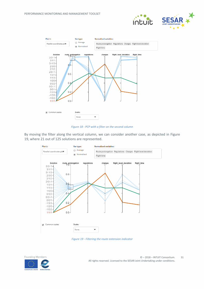
To further proceed with the filtering of possible solutions, we apply some filtering directly on the route extension column. To this end, we draw a rectangle on the chosen vertical line: this way, only the lines falling inside this area are rendered (and only the corresponding rows are retained in the data table). The result on the PCP is shown in Figure 18. Only 18 out of 125 solutions have been kept in the chart, plus the two highlighted by default.
So far, the solutions have been visually represented according to the coordinates present in the original data (in both raw and normalised forms). However, if the goal of the visual inspection is to spot relationships among attributes, this representation could not be the best choice in the presence of outliers. To overcome this issue, the PCP is equipped with different methods to scale the axes. Two classes of such methods have been implemented for this visualisation exercise, corresponding to two different analysis tasks, namely:
• Investigation of the solution features (e.g., statistical variation of the results for each
dimension drawn in the plot, analysis of relationships between pairs of attributes):
o Normalisation by mean and standard deviation (see Figure 20): the mean 𝑥 and the
𝑥 ± 𝜎 points are computed for each dimension shown and the axis are scaled such
that the three points above are horizontally aligned. The positions of all the other
values are computed by linear interpolation.
Figure 20 - PCP with axes normalised by mean and standard deviation. With this representation, it is possible to assess the distribution of the indicators among the solutions. At the same time, some correlations can be spotted, for example, the
charge indicator has a negative correlation with respect to both the regulation and flight level deviation dimensions.
o Normalisation by median and quartiles (see Figure 21): similar as the one above but
considering the median and the first and third quartile values.
Figure 21 - PCP with axes normalised by median and quartiles. Similar insights could be derived as for Figure 20. Conversely, this graph allows us to spot easily outlier solutions in each performance indicator. In this case, the route extension
dimension shows a compact distribution around the centre of the corresponding axis, which is something different from the picture portrayed in the previous image.
• Comparison by solution similarity (e.g., understanding the distribution of characteristics over
a set of objects, finding the closest solutions with respect to a given reference):
o Axes shifting and centred on the baseline (see Figure 22): the reference solution is
drawn as a (green) straight line and horizontally aligned to the vertical axes mid-
points. All the remaining solutions are then mapped according to the linear distances
(e.g., differences of corresponding attributes) they have at each dimension with
Figure 22- PCP centred on the baseline. The reference solution is drawn as a (green) straight line and horizontally aligned to the vertical axes mid-points. In this image, the axes are scaled in order to have a common scale.
o Axes shifting and centred on the selected solution (see Figure 23): same as above but
with the reference line painted in orange.
Figure 23 - PCP centred on the solution under analysis. The reference solution is drawn as a (orange) straight line and horizontally aligned to the vertical axes mid-points.
In the case study under analysis, it is possible to use the techniques described above to discover possible constraints in the optimisation. Some examples could be:
• Is there any solution improving all the indicator results simultaneously (see Figure 24)? We
can see that this is not the case: the charge variable is always greater than the corresponding
baseline indicator value, for all the solutions performing better in terms of route extension
and number of regulations.
Figure 24- There is not any solution simultaneously improving all the indicators with respect to the baseline scenario.
• Provided that a possible scenario will imply small changes on the average charge indicator,
which set of solutions are closer to the reference and what are their strengths and
weaknesses (see Figure 25)? To answer this question, the analyst could draw a more or less
symmetric filter on the charge axis, centred on its mid-point until meeting the first solution.
In this way, all the options that are not distancing themselves too much – in both directions -
from the baseline reference value can be found. It can be seen that there are two classes of
solutions for the regulations dimension: indeed, a bunch of them drastically decrease the
average number of regulations, while the remaining solutions leave that value almost
unchanged (actually, with a small increase). This bi-partition is reflected in the charge
indicator as well, since the lines with the smallest values on the regulation axis correspond to
the lines worsening the charge results. However, it is also clear from the chart that, despite
having more charges to pay, the effects on the flight level deviation may be much better than
the situation of reference and the average flight time would improve, too.
Figure 25 - Reasoning about local optima having small difference in the charge indicator w.r.t the baseline scenario
3.1.4.2.4 Exploring trade-offs between two dimensions
So far, the focus of the optimisation window was to explore the big picture of the optimisation solution set, trying to infer properties and patterns across the whole set of dimensions. The last chart of this window, namely a scatterplot, helps the analyst to find relationships between pairs of dimensions and get detailed insights about the trade-offs to consider when dealing with conflicting objectives.
The default scatterplot interface is depicted in Figure 26. Different selectors allow the user to setup the analysis environment and adapt it to the objectives of the analytical tasks: some of them play the same role as the corresponding ones in the PCP interface, some others have been inserted expressly for the scatterplot charts. Each solution is represented as a point into a Cartesian coordinate system, where the axes are chosen among the dimensions belonging to the indicator pool. By default, regulations and charges are shown on the horizontal and vertical axes respectively. Points are coloured in light blue, but it is possible to use this dimension to convey a third piece of information in the chart. The selector ‘Var colour’ can be used for this purpose. An example of coloured scatterplot can be found in Figure 27, where the indicator about flight level deviation is used to provide additional context to the analysis.
Figure 26 - The general scatterplot interface. The graphic apart, it is possible to see selectors and other widgets that could be used to setup the chart environment and thus adjust it to the analyst's requirements
Figure 27 - Scatterplot whose points are coloured according to a third indicator chosen by the user. This way it is possible to extend the 2D analysis to include one more dimension.
Points representing the baseline scenario and the selected solution are highlighted with a green and an orange square, respectively, in accordance with the norm used throughout this visualisation exercise.
Points are placed in the bi-dimensional space by considering their indicator values. These coordinates can be either the original values (i.e., the average values coming from the optimisation model) or a normalised version of them. In the latter case, different scaling methods can be used to transform the data. Among the possibilities offered by the scatterplot interface, the following methods are highlighted:
• Min-max (see Figure 26): the values of each dimension are scaled to bring their values in the
range [0,1], where 0 is assigned to the lowest value in the corresponding dimension and,
conversely, 1 is given to the highest one.
• Standard score (see Figure 28): as in the PCP case, this technique normalises according to the
mean and the standard deviation.
Figure 28 - Scatterplot representation of the optimisation solutions scaled according to the standard score technique
• Quartile range (see Figure 29): the same as above but combining the median and first and
third quartile values.
Figure 29 - Scatterplot whose solutions have been rescaled by using the median, the first and third quartile values. The same transformation is used for the PCP chart too.
• Scaling by taking as reference either the baseline or the selected solution (see Figure 30 and
Figure 31 respectively):as in the PCP case, relevant solutions are taken as a reference and the
remaining data objects are compared against them. In the case of scatterplots, the reference
is also the origin of the two axes. The four regions in the plot can be used to classify the
solutions based on the potential relative improvements and/or deteriorations on the given
indicators. For instance, those points falling in the first quarter (i.e., North-East quarter with
respect to the origin) represent those solutions with positive effects on both dimensions (i.e.
improvements with respect to the point of reference); the opposite quarter, that is the
South-West corner, collects those points with worsening effects. By analogy, the remaining
corners gather those points which only improve one indicator. In Figure 32, an example is
shown by comparing the use of such technique in both the PCP and scatterplot charts.
Figure 30 - Scatterplot centred on the baseline scenario. This way it is possible to visually assess the how good are the optimisation solutions to improve the baseline situation.
Figure 31 - Scatterplot centred on the selected solution (that is the one resulting according to the preference criteria set in the lateral bar of the dashboard). This way it is possible to visually assess the performance of the selected solution with
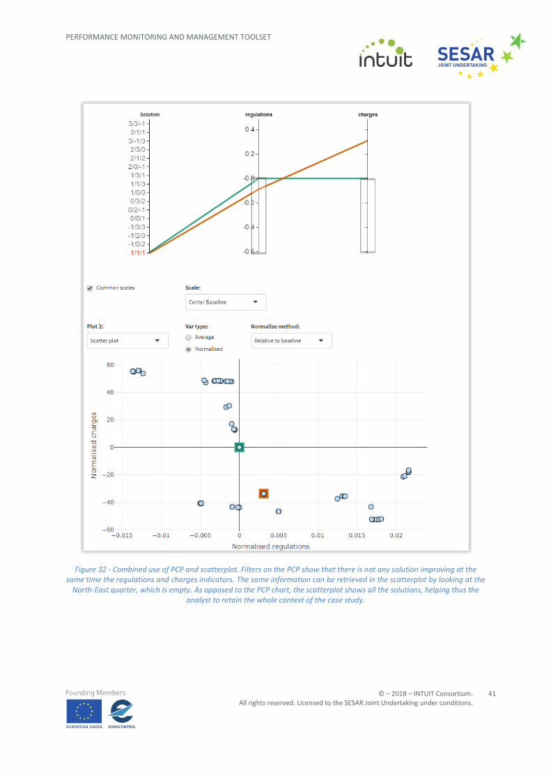
Figure 32 - Combined use of PCP and scatterplot. Filters on the PCP show that there is not any solution improving at the same time the regulations and charges indicators. The same information can be retrieved in the scatterplot by looking at the
North-East quarter, which is empty. As opposed to the PCP chart, the scatterplot shows all the solutions, helping thus the analyst to retain the whole context of the case study.
In order to provide more information to the analyst, suitable tooltips are shown as the mouse pointer hovers a solution point, as shown in Figure 33. The information contained therein encompasses: the total amount of optimisation policies represented by that graphical object; the ordered triplets of KPA weights leading to these results; and the values of the indicators used to depict the chart. The same colour filling the data point is used to fill the background of the tooltip. This is valid also when hovering the green and orange squares highlighting the special solutions.
Figure 33 - Tooltip for a given solution point.
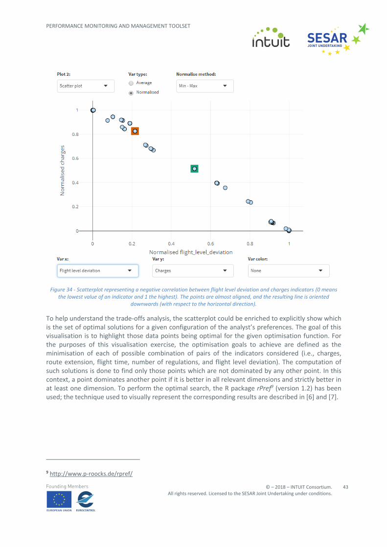
A possible working scenario where an analyst could use the scatterplot chart is to find correlations between pairs of indicators. Even if some inferences could be performed through the PCP (see details in Section 3.1.4.2.3), scatterplots are more reliable representations for such tasks. Some examples are shown in the figures below. For instance, Figure 34 tells the analyst that the flight level deviation and the charge indicators have a negative correlation: the highest the deviation, the lowest the charge to be paid. From another point of view, this result highlights that these indicators represent conflicting objectives: it is impossible to improve both at the same time and therefore some trade-offs must be considered when setting up an optimisation policy. Concerning the situation depicted in Figure 34, the baseline scenario impacts less on the route charges with respect to the solution under consideration, but at the cost of increasing flights level deviations.
Figure 34 - Scatterplot representing a negative correlation between flight level deviation and charges indicators (0 means the lowest value of an indicator and 1 the highest). The points are almost aligned, and the resulting line is oriented
downwards (with respect to the horizontal direction).
To help understand the trade-offs analysis, the scatterplot could be enriched to explicitly show which is the set of optimal solutions for a given configuration of the analyst’s preferences. The goal of this visualisation is to highlight those data points being optimal for the given optimisation function. For the purposes of this visualisation exercise, the optimisation goals to achieve are defined as the minimisation of each of possible combination of pairs of the indicators considered (i.e., charges, route extension, flight time, number of regulations, and flight level deviation). The computation of such solutions is done to find only those points which are not dominated by any other point. In this context, a point dominates another point if it is better in all relevant dimensions and strictly better in at least one dimension. To perform the optimal search, the R package rPref9 (version 1.2) has been used; the technique used to visually represent the corresponding results are described in [6] and [7].
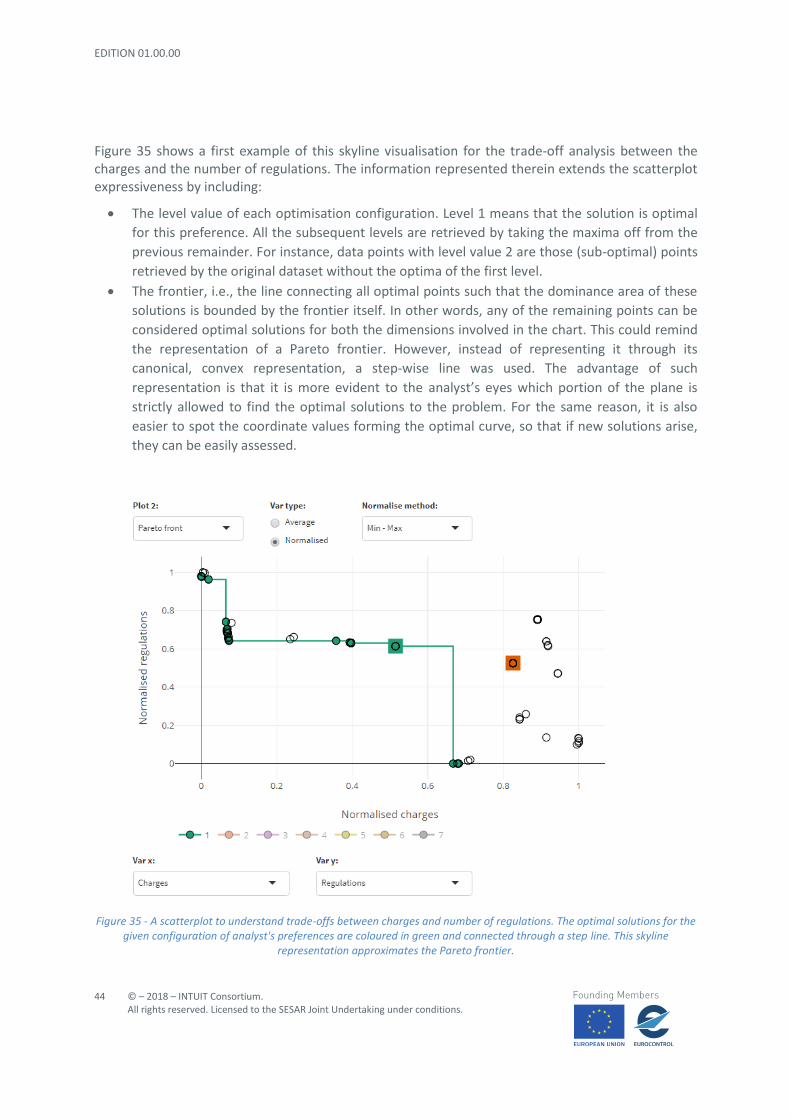
Figure 35 shows a first example of this skyline visualisation for the trade-off analysis between the charges and the number of regulations. The information represented therein extends the scatterplot expressiveness by including:
• The level value of each optimisation configuration. Level 1 means that the solution is optimal
for this preference. All the subsequent levels are retrieved by taking the maxima off from the
previous remainder. For instance, data points with level value 2 are those (sub-optimal) points
retrieved by the original dataset without the optima of the first level.
• The frontier, i.e., the line connecting all optimal points such that the dominance area of these
solutions is bounded by the frontier itself. In other words, any of the remaining points can be
considered optimal solutions for both the dimensions involved in the chart. This could remind
the representation of a Pareto frontier. However, instead of representing it through its
canonical, convex representation, a step-wise line was used. The advantage of such
representation is that it is more evident to the analyst’s eyes which portion of the plane is
strictly allowed to find the optimal solutions to the problem. For the same reason, it is also
easier to spot the coordinate values forming the optimal curve, so that if new solutions arise,
they can be easily assessed.
Figure 35 - A scatterplot to understand trade-offs between charges and number of regulations. The optimal solutions for the given configuration of analyst's preferences are coloured in green and connected through a step line. This skyline
The line drawn in Figure 35 illustrates which data points are optimal for an optimisation scenario concerning charges and number of regulations. It is evident from this illustration that the baseline is already an optimal configuration, while the solution selected by prioritising the KPAs is far from this status. Moreover, the baseline is in the region where there is an equilibrium between the two indicators. Some improvements to the initial situation could be achieved by choosing one of the possible solutions to the left side of the baseline point: indeed, the solutions there suggest to the analyst that the charge indicator would benefit from one of the solutions at about (0.1, 0.6), i.e., lower than current charges, at the cost of a small growth of the number of regulated flights. To reduce the visual cue in presenting this kind of information, only the first level of solutions (i.e., the optimal ones) is shown. The remaining levels are simply filtered out but could be shown at any moment by the user. An example of such a situation is depicted in Figure 36 where three levels are shown simultaneously. The three lines never intersect, by definition of dominant set. The zone around the point (0.1, 0.6) is populated with several data points and consequently, the trends are more complicated to be spotted. In general, lines for level values 2 and 3 are really close to each other, as well as some of the points belonging to levels 1 and 2: this means that there would not be a big difference in the impacts if those solutions were selected. Such insights about non-optimal solutions could be useful in case optimisation were not achievable (for instance, because of priority choices, not satisfactory combination of results for a given set of indicators, and/or technical limitations): this way, it would be possible to trace non-optimal options whose general effects could help to make some progress as well.
Figure 36 - A scatterplot with the representation of up to three level sets of optimal solutions. The green line corresponds to the optimal set while the orange and light purple lines represent two different levels of sub-optimal configurations.
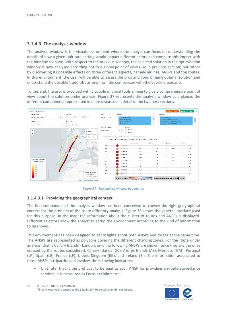
The analysis window is the visual environment where the analyst can focus on understanding the details of how a given unit rate setting would impact different actors and compare this impact with the baseline scenario. With respect to the previous window, the selected solution in the optimisation window is now analysed according not to a global point of view (like in previous section) but rather by discovering its possible effects on three different aspects, namely airlines, ANSPs and the routes. In this environment, the user will be able to assess the pros and cons of each optimal solution and understand the possible trade-offs arising from the comparison with the baseline scenario.
To this end, the user is provided with a couple of visual tools aiming to give a comprehensive point of view about the solution under analysis. Figure 37 represents the analysis window at a glance: the different components represented in it are discussed in detail in the two next sections.
Figure 37 - The analysis window at a glance.
3.1.4.3.1 Providing the geographical context
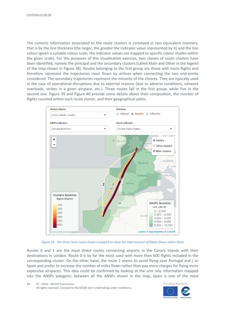
The first component of the analysis window has been conceived to convey the right geographical context for the problem of the route efficiency analysis. Figure 38 shows the general interface used for this purpose. In the map, the information about the cluster of routes and ANSPs is displayed. Different selectors allow the analyst to setup the environment according to the kind of information to be shown.
This environment has been designed to get insights about both ANSPs and routes at the same time. The ANSPs are represented as polygons covering the different charging zones. For the route under analysis, that is Canary Islands - London, only the following ANSPs are shown, since they are the ones crossed by the routes considered: Canary Islands (GC), Azores Islands (AZ), Morocco (GM), Portugal (LP), Spain (LE), France (LF), United Kingdom (EG), and Ireland (EI). The information associated to those ANSPs is tripartite and involves the following indicators:
• Unit rate, that is the unit cost to be paid to each ANSP for providing en-route surveillance
• Controlled Nautical Miles, that is the total distance flown in a given ANSP by the flights
between that origin-destination pair.
• Income, that is the total revenue collected by the ANSP from the flights between that origin-
destination pair. It is given in Euros and it is computed by multiplying the two quantities
above.
Figure 38 - The visualisation interface used to provide some geographical context to the analysis of the route efficiency problem.
The map shows also the information about the route clusters. A route cluster can be defined as the average trajectory followed by a set of flights showing similar features / properties. More details about how such clusters have been computed can be found in D4.1 Performance Metrics and Predictive Models. A route cluster is represented as a line crossing different ANSPs. The information represented for these flight aggregations includes:
• Number of flights, that is how many flights belong to each cluster.
• Average charges: the average en-route charges paid by the flights taking that route.
• Total income, that is the revenue generated by the routes to the ANSPs. It is measured in
The numeric information associated to the route clusters is conveyed in two equivalent manners, that is by the line thickness (the larger, the greater the indicator value represented by it) and the line colour (given a suitable colour scale, the indicator values are mapped to specific colour shades within the given scale). For the purposes of this visualisation exercise, two classes of route clusters have been identified, namely the principal and the secondary clusters (called Main and Other in the legend of the map shown in Figure 38). Routes belonging to the first group are those with more flights and therefore represent the trajectories most flown by airlines when connecting the two end-points considered. The secondary trajectories represent the minority of the choices. They are typically used in the case of operational disruptions due to external reasons (due to adverse conditions, network overloads, strikes in a given airspace, etc.). Three routes fall in the first group, while five in the second one. Figure 39 and Figure 40 provide some details about their composition, the number of flights counted within each route cluster, and their geographical paths.
Figure 39 - The three main route clusters mapped to show the total amount of flights flown within them
Routes 0 and 1 are the most direct routes connecting airports in the Canary Islands with their destinations in London. Route 0 is by far the most used with more than 600 flights included in the corresponding cluster. On the other hand, the route 2 seems to avoid flying over Portugal and / or Spain and prefer to increase the number of miles flown rather than pay more charges for flying more expensive airspaces. This idea could be confirmed by looking at the unit rate information mapped into the ANSPs polygons: between all the ANSPs shown in the map, Spain is one of the most
expensive airspaces (as France but a little bit cheaper than the United Kingdom) and it could be a logical choice trying to skip it. Moreover, the overall shape for route 2 deviation gives the impression of avoiding as much as possible the crossing of French and English airspaces too, even if it would imply a longer distance to cover.
Figure 40 - The five secondary route clusters mapped. Less than 100 flights can be counted within each cluster.
Figure 40 above shows the details of the less flown routes to connect Canary Islands and London. It is interesting to note that four of them, namely routes 3, 5, 6, and 7, follow similar paths that resemble the aggregated trajectory shaped by route 2 in Figure 39. However, and differently to the latter one, these flights cross the Irish airspace before entering the UK airspace. The higher number of miles flown in the UK airspace is partially balanced out by the cheaper Irish unit rate. Of the five clusters shown above, route 5, seems to have the cheapest costs since it succeeds at escaping some of the most expensive ANSPs. On the other hand, route 4 presents much more commonalities with route 0
even if the overall trajectory is far to be as direct as the latter one because of a bigger detour in Moroccan and Spanish airspaces.
The geographical tool allows the analyst to explore and understand up to nine different pairs of indicators in order to have a complete point of view of the details of the performance effects over the ANSPs and route clusters of a selected policy. The interface lets the user choose the scenario of interest. The optimisation effects are either represented against the baseline / the selected solution scenarios or the tool can be setup to show the possible differences between the two.
Figure 41 - Exploration of the benefits / drawbacks of applying an optimisation policy over the baseline scenario. The case study involves the representation of the unit rate indicator for the ANSPs and the number of flights for the route clusters.
The solution used in this example and in the following two figures is characterised by the ordered triplet 1 / 1 / 1.
A typical routine where this visualisation representation could be used by an analyst is presented in Figure 41. Let us suppose that the task is to explore the benefits / drawbacks of a given solution against the reference scenario, in particular the impact on the number of flights for each cluster, as the ANSPs conditions are changing. The mock solution used throughout this example will be the one identified with the three KPA weights set to 1. The changes in the number of flights against the unit rate indicator are displayed in Figure 41.
Another way to explore the possible effects of a certain policy is offered by the interface shown in Figure 42. The charts and the selectors presented there allow the analyst to reason about the comparative details of different data features.
Figure 42 - Revealing details about the comparison of an efficiency optimisation policy against the baseline scenario.
The same information described for the geographical representation is available for this section. Details about the optimisation effects on airlines are provided. The indicators used to measure benefits and drawbacks for airlines regarding the selected unit rate setting are the same used throughout the optimisation analysis, that is charges, route extension, number of regulations, flight level deviation, and flight time. The kind of data to be represented can be chosen by the data selector in the top-left corner of the previous image. According to the preference set, the text areas widgets in the first row update accordingly to reflect the required changes. By default, the charts show the information for the whole set of data items (i.e. airlines, routes or ANSPs) and variables. The analyst can setup the graphical environment by selecting the desired subsets of options for both of them. As for the PCP and scatterplot described in the previous sections, the numerical information can be represented as raw as well as normalised values. Additionally, these values can be shown in absolute or percentage terms.
The visual representation of the optimisation effects is presented in one of the three tabs at the analyst’s disposal. Each of them represents a specific facet of the underlying data.
For instance, to get an overview of the comparison between the baseline and the solution labelled as 1 / 1 / 1, the analyst can select the ‘Comparison overview’ tab to get a picture like in Figure 42. The chart shows a tabular scatterplot where both a pictorial representation of the difference values and their numeric form are represented. Each point in the chart encodes the estimated impact in two ways: the circle area is proportional to the absolute value of such estimation, while the colour represents the real difference value. Unfortunately, the above representation is not conveying a clear message for all the indicator columns presented in the chart, since the charge dimension is clearly dominant with respect to the other ones. To overcome this issue, the visualisation tool allows a normalised representation that can improve the effectiveness of the comparison. Such a representation is presented in Figure 43.
Figure 43 - Comparison overview of the estimated effects of an optimisation policy (the one obtained by setting the all the KPA values to 1) with respect to the baseline. The study is conducted for all the airlines flying the routes between Canary
Islands and London. The values are normalised to allow a fair comparison.
The above figure presents interesting insights to explore further. In particular, it is evident that the policy under analysis, will considerably reduce the charges for all the companies. This could be a direct consequence of the effects described in the previous section: the reduction of the ANSPs unit rate and more direct trajectories to reach the destination produce lower charges to pay. According to Figure 43, this positive trend can almost be spotted throughout all the indicators and the airlines, even if to different extents. For instance, the route extension indicator in the second column has small improvements but a couple of relevant peaks for AWC, BAW and TCK. On average, also the regulation dimension shows the same effects but with a smoother distribution across all the companies. Among the five indicators, the one that could experience less benefits from choosing this
optimisation policy seems to be the deviation of the flight level. From the airline point of view, the most prominent benefits will apply to BAW. On the other side of the spectrum, both BLX and EZY airlines do not seem to take so much advantage of applying such optimisation solution, since the only noticeable effects are expected for the charge variable.
The normalised values allow a better comparison across different dimensions, but the analyst loses the overall context since the quantities represented are a-dimensional. A clearer understanding of the policy details can be achieved by representing the changes as percentages, as shown in Figure 44. The overall picture does not change too much, but the variation magnitudes are more evident and comparable.
Figure 44 - Comparison overview of the estimated effects of an optimisation policy (the one obtained by setting the all the KPA values to 1) with respect to the baseline. The study is conducted above all the airlines flying the routes between Canary
Islands and London. The values are presented as percentages.
The ‘Detailed comparison’ tab provides the same information, but it allows an explicit comparison of the values of the two policies under analysis. Some examples are presented in Figure 45, Figure 46, Figure 47, and Figure 48.
Figure 45 - Detailed comparison involving 3 out of 10 airlines. As usual, the green bar encodes the results for the baseline scenario, being the orange bar dedicated to the selected solution.
Figure 46 - Detailed comparison involving 4 out of 10 airlines. By splitting the original set of airlines into smaller subsets, it is easier to spot differences.
Figure 47 - Detailed comparison involving 3 out of 10 airlines as in the case of Figure 45. Only four indicators are shown here, since the charge variable would be too much dominant with respect to the selected ones, preventing this way to spot
small details.
Figure 48 - Detailed comparison involving 4 out of 10 airlines. The same considerations made in Figure 47 apply here.
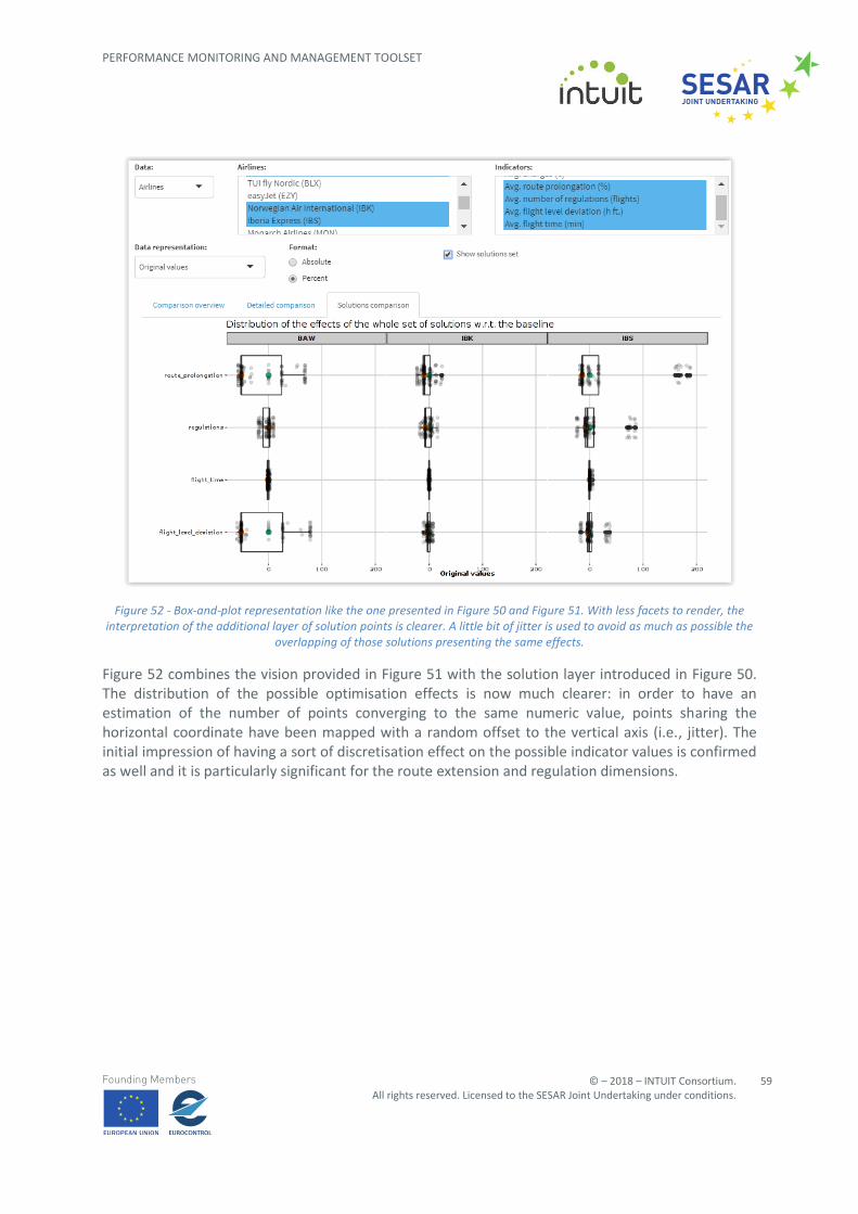
The last chart inserted in this section allows the user to see the statistical distribution of the optimisation results for the whole solution set, split per indicator and object of study. The idea is to
provide a visual ranking of the possible manners to improve the overall route efficiency and provide suggestions to explore new solutions if they would make definitely better the current choice. Some examples of such approach are presented in the four figures below, from Figure 49 to Figure 52.
Small exten
Figure 49 – Exploring the statistical distribution of all the 125 possible, optimisation solutions. The box-plot allows the analyst to see an approximation of the ranges of all the values expected for the optimisation problem. The green and orange
points help to rank the current, proposed solution and the reference scenario for the indicators and actors selected.
The situation for the airlines and their corresponding indicators is depicted in Figure 49. At first glance, it is worth noting that the whole set of mock optimal solutions act in a similar way for most airlines presented in the figure: this can be inferred by looking at how compact is the box representing the distribution of the values. In other words, it seems that there could be a small margin to perform improvements with respect to the reference situation. From the chart above it is not clear if there are optimal solutions improving the effects upon some dimensions, such as number of regulations. Last but not least, the solution 1 / 1 / 1 performs as good as the baseline scenario since the green and orange points tend to overlap to each other.
Figure 50 – The same as in the example shown in Figure 49 with an additional layer of points for each solution present in the dataset. The compact representation of the small multiples does not allow a clear interpretation of their meaning, even if
they can be used as a guidance to spot some insights into the data.
By adding a layer containing a data point for each optimisation solution in the set to analyse, it is possible to have a more complete picture of the problem to solve. Such an example is provided in Figure 50. Points are given a transparency value such that the clusters of similar solutions can be highlighted better. The simultaneous presence of small multiples such as in the figure above provides a too compact representation that could prevent the user from clearly interpreting the underlying patterns. However, the point clouds can be used as a guidance to spot some insights into the data. For instance, it appears that the optimisation modelling returned its results at very discrete positions rather than providing a smoother solutions distribution. This is particularly evident at route extension and flight level deviation indicators for BAW and TCX companies: there are solution aggregations at specific places such as in correspondence with the first and third quartile values and very few elsewhere.
To give a more readable view of the charts, the same representations on a smaller subset of companies are shown in Figure 51 and Figure 52.
Figure 51 – Box-and-plot representation like the one presented in Figure 49. Filtering some airlines and indicators allows a larger representation of the different facets, such that the interpretation of the chart (and consequently the comparison task
too) would be more feasible and effective.
Figure 51 confirms many of the insights detected in the previous figures and adds some more details to the overall picture. For instance, it is possible right now to get the information of the median of the distribution (i.e., the thicker, black line within the quartile box) that could be used to enrich the interpretation of the optimisation problem trends. The possible improvements for specific companies are also more evident to the analyst’s eyes. As an example, the regulation indicator is improvable by all the airlines shown in the chart and the greatest benefit would affect BAW. In general, the baseline scenario is a good starting point since it is well positioned with respect to the overall distribution of possible optimal solutions. Provided that finding a good optimisation is an equilibrium game among conflicting constraints and interests, this also means that some of the actors involved in it could experience some worsening effects at some points. For instance, there could be an optimal solution that could cause IBS to double the number regulations and increase by four the flight level deviation of its flights.
Figure 52 - Box-and-plot representation like the one presented in Figure 50 and Figure 51. With less facets to render, the interpretation of the additional layer of solution points is clearer. A little bit of jitter is used to avoid as much as possible the
overlapping of those solutions presenting the same effects.
Figure 52 combines the vision provided in Figure 51 with the solution layer introduced in Figure 50. The distribution of the possible optimisation effects is now much clearer: in order to have an estimation of the number of points converging to the same numeric value, points sharing the horizontal coordinate have been mapped with a random offset to the vertical axis (i.e., jitter). The initial impression of having a sort of discretisation effect on the possible indicator values is confirmed as well and it is particularly significant for the route extension and regulation dimensions.
3.2 CS-2: Identification of sources of en-route flight inefficiency
3.2.1 Objectives
This dashboard consolidates the data exploration activity and the modelling results achieved by the case study CS-2 developed within WP4 (for further details, see D4.2 Performance Metrics and Predictive Models, Section 4.2).
The dashboard aims to provide a tool to identify the factors that affect and their influence on flight efficiency for a particular airspace, either an ACC or a Charging Zone (CZ). Different types of visualisations are used to represent flight efficiency indicators against different flight properties, such as average heading, average altitude and airspace crossed, derived from both the flight plan and the ideal route (here understood as the Great Circle Trajectory, GCT). The model allows the evaluation of the influence of these factors on flight efficiency. This case study provides a first approach to make using of data analytics in order to assess performance for a certain airspace area, in particular at ACC and CZ level, by enabling the identification and analysis of meaningful correlations between flight properties and performance. The extracted interrelationships may serve as a basis to perform an assessment of the causes and effects of low performing flights.
The dashboard provides a single analysis environment where multiple charts offer different perspectives of the correlations between flight characteristics and flight efficiency at an aggregated level. The idea is to provide a tool to analyse influence factors of Horizontal en-route Flight Efficiency (HFE) in a particular airspace.
3.2.2 Datasets
The main data sources used concern the results obtained during the modelling phase in WP4 and computed by Nommon, which was in charge of developing the related case study.
The results come in two different datasets, both stored as .csv (Comma Separated Values) files. The first one is a list of all the flights crossing the European skies on the day chosen to perform the efficiency analysis (20th February 2017) and the related flight properties computed at different spatial granularities (e.g., at each area – being ACC or CZ – crossed during its trajectory or for the whole flight) and for different types of trajectories (i.e., the planned vs. the actual vs. the optimal trajectory, represented by the Great Circle Route).
The second dataset includes a series of files collecting the correlation scores between the horizontal en-route flight efficiency key performance indicator (KEA) and all the other variables provided in the previous file, aggregated by area of interest. For each area, all flights flying over it have been considered to calculate the correlation. The correlation scores have been computed for: (i) Pearson correlation coefficient [8], (ii) Spearman rank correlation coefficient [9], (iii) maximal information coefficient [10], and (iv) distance correlation [11]. These coefficients aim to reveal relations of different nature between KEA and the rest of variables in the dataset. While Pearson correlation coefficient specifically aims to measure linear relations between variables, Spearman coefficient quantifies the strength of a broader set of monotonic relations. Specifically, the Spearman method allows the identification of relations between variables which increase (or decrease) in the same direction at not necessarily equal rate (e.g. y=x2).
Pearson [8] and Spearman [9] coefficients are widely used and shall be the first option to explore correlations within a dataset. However, both methods are quite sensitive to the presence of outliers in the data, so coefficient values obtained could vary dramatically when this kind of data is present in the sample. Hence, other more robust methods have been included. The first one is the maximal information coefficient [10] which is founded over the mutual information notion of information theory. Mutual information measures the amount of information shared by two variables, typically in bits. However, it can be inconvenient to directly apply this method for correlation estimation, since the obtained values are not metric nor normalised. Moreover, it can be problematic to compute it for continuous variables since the variables need to be discretised by binning and the mutual information score can be quite sensitive to bin selection. Maximal information coefficient [11] is a technique developed to address these shortcomings. In this method a previous optimization for optimal binning is made and the procedure turns mutual information score into a metric value that lies in a normalized range between 0 and 1, enabling the comparison between variables. Distance correlation is another robust method of correlation estimation which was explicitly designed to address the limitations of Pearson coefficient. While a correlation score of 0 for the Pearson method does not imply independence, distance correlation of 0 does imply that there is no dependence between variables, which makes this method a powerful tool to discard possible correlations.
Table 5 and Table 6 describe the most relevant features of the datasets available for this case study.
The current dashboard includes the results of each ACC and CZ for the 44 countries belonging to European Civil Aviation Conference (ECAC10). In this sense, it extends the results provided in D4.1 – Chapter 4.2 by dealing with a greater number of areas to analyse.
Variable Type Description Unit Application areas
Trajectory type
fid String Flight ID - - -
dep String Origin airport (ICAO code) - - -
arr String Destination airport (ICAO code) - - -
tot Date Departure date and time - - -
arrt Date Arrival date and time - - -
reg String Regulation code - - -
reg_delay Integer Average delay due to regulations minutes General -
wind Decimal Additional wind distance NM General, ACC, CZ
Actual, planned, Great Circle
head,
head_cos,
head_sin
Decimal Average heading
(0 → North/South;
π/2 → East/West). The three variants refer to the overall heading and their horizontal and vertical projection, respectively.
rad General, ACC, CZ
Actual, planned, Great Circle
eff Decimal Effective length flown in a given airspace
NM ACC, CZ Actual, planned, Great Circle
i-o Decimal Entry to exit distance in a given airspace
NM ACC, CZ Actual, planned, Great Circle
fl Decimal Average flight level in a given airspace
h ft. ACC, CZ Actual, planned, Great Circle
distin Decimal Distance between entry points
(planned vs. great circle; actual vs. great circle; and, actual vs. planned)
NM ACC, CZ Actual, planned, Great Circle
distout Decimal Distance between exit points
(planned vs. great circle; actual vs. great circle; and, actual vs. planned)
NM ACC, CZ Actual, planned, Great Circle
fltatco Decimal Flights per ATCO in the ACC during flight
Flights ACC -
od String Origin-destination string ID - - -
Table 5 - Metadata for the horizontal en-route efficiency file. The table summarises the main features of the data used for the CS-2 visualisation dashboard and provides a short description of each variable involved into the case study under
analysis. The original file contains 22,862 rows (i.e. all the flights passing over the European skies on the day chosen for the case study, that is, 20th February 2017) and 3,213 columns.
Variable Type Correlation variable Application areas
Trajectory type
distout Decimal Distance between exit points
(planned vs. great circle;
actual vs. great circle; and,
actual vs. planned)
ACC, CZ Actual, planned, Great Circle
fltatco Decimal Flights per ATCO in the ACC during flight
ACC -
Table 6 - Metadata for the correlation scores between the overall horizontal en-route efficiency (KEA in Table 5) and the other variables. The table summarises the main features of the data used for the CS-2 visualisation dashboard and provides a short description of each variable involved into the case study under analysis. The original file contains 96 rows (i.e., all the
European ACCs – 59 – and CZs – 36 – plus an overall score) and 3,205 columns. The number of columns is slightly less than the corresponding in the flights dataset since some textual / date-time variables have not been taken into account to
compute the correlation scores.
Concerning the geographical representation, two shapefiles have been used, representing the ACCs and CZs respectively. These files come from DDR2 system operated by EUROCONTROL.
These areas are represented in Figure 53 and Figure 54, for ACC and CZ respectively. Figure 55 is intended to show the spatial relationship of inclusion between these two classes of areas.
Figure 53 - The ACCs used for the CS-2 visualisation exercise. 59 regions are depicted in the image. Some countries are split in different ACCs (e.g., Spain, Italy and Turkey), while some others are composed by just a ACC area (such as Portugal,
Figure 54 - The CZs used for the CS2 visualisation exercise. 32 regions are represented in the image above. In most cases, a CZ corresponds to a national airspace controlled by an ANSP. Few cases break this rule, such as Germany and Hungary. In
the first case, German airspace is split into two parts: one part is under the control of the Belgian-Dutch CZ, while the other encompasses the German airspace in the strictest sense of the word and a portion of the Austrian ANSP. Hungary controls
the Kosovo CZ too.
Figure 55 - ACCs (delimited by a tiny red line) and CZs drawn together to show their perfect overlap.
As in the case described in Section 3.1, some preliminary data transformation steps have been required to properly use the datasets within our platform. This task has been performed by implementing a script to clean and shape the data coming from the model. This section gives the main details of this pre-processing phase.
The first issue to solve was to reduce the size of the original dataset to something more manageable. The dataset contains about 23,000 flights and 2,800 columns. In terms of storage, the file size is more than 330 MB. Directly using such a file would cause several performance issues, such as higher processing times (especially in terms of loading and online computing) and latency when interacting with the charts and the widgets of the visualisation space. The key to solve such issue is to understand how the information contained in the file itself is organised, since the data appear to be stored in a sparse matrix. This means that, despite the huge dimensionality of each data item, very few variables contain useful information. This could be explained by recalling the structure of the file as illustrated in Table 5: each row describes a flight and its indicators computed in general terms and for each of the areas of the study, that is for each ACC and CZ. But a trajectory crosses a very limited number of airspaces. Only the trajectories crossing that particular airspace are taken into account. The columns without any valid trajectory are filled with neutral values such as zeros or NaN11. Therefore, to tackle the curse of dimensionality for this specific case, the original file has been split into smaller chunks, one per area of interest. This way, each file stores only the information related to the subset of flights crossing either a concrete ACC or CZ. The discriminating factor to perform such a split is the variable containing the actual number of Nautical Miles flown in a specific area: a flight is assigned to an airspace if and only if the value of such indicator is greater than zero. For the purpose of the geographic visualisation, each file contains, apart from the relevant indicators for a specific ACC or CZ, also the information related to the ACC / CZ neighbouring areas. So, for instance, the file concerning the Spanish airspace (LE) contains the indicators for Spain itself and Portugal and France (LP and LF, respectively), being the CZs adjacent to Spain.
In a second step of the cleansing phase, all fights whose origin and destination do not belong to the ECAC area where filtered out. This is coherent with CS-2 in WP4 and aims to analyse those flights whose flight efficiency is more affected by the airspace structure. For instance, a flight crossing the Atlantic may have low flight efficiency in French airspace as it heads to Ireland to take the standard oceanic routes.
A further condition to consider valid flights is a minimum average flight level in the airspace under study, which was set to FL 245. This condition ensures that the departure and approach flight phases are not considered in this study.
The numeric values of the indicators have been modified too, by rounding the decimal expansion of their measures to a small number of significant figures. Since this number is variable within each indicator, Table 7 lists the convention used in this case study.
11 NaN means Not A Number and it is a widely accepted marker expressing an invalid / missing value.
Table 7 - The number of digital digits used for each indicator contained in the dataset. The variable names listed here reflect the original names within the data table and described in Table 5.
Finally, the average values of each indicator are computed by aggregating the flights by origin-destination pairs.
At the end of this process, the original dataset has been split into 95 smaller files, one for each area of interest (i.e., 59 ACCs and 36 CZs). All together these files weight less than 10 MB, i.e., the overall data size has been reduced by a factor around 40. The biggest file currently available corresponds to the EDUUUTA ACC (an airspace spanning a great percentage of the German territory and part of the Austrian one), which weights a little bit more than 420 KB. This data file contains around 1,450 observations and only 371 variables. In other words, the number of data items is approximately 16 times less than the original file and its dimensionality has shrunk by a factor of about 7.
In a similar fashion, the correlation files have been cleansed and prepared to be visualised through our platform. Originally, there was one file for each correlation technique used for this purpose: Pearson’s correlation coefficient, Spearman's rank correlation coefficient, maximal information coefficient, and distance correlation. These files were merged into a single one and an additional column was added to label the scores with the corresponding name of the technique used to compute them. The situation here is the opposite to the one described for the flights dataset. The files are much lighter (more or less 2 MB), especially because the observations contained there refer to the correlations aggregated by ACC or CZ. On the other hand, the number of variables is pretty equivalent to those contained in the flights dataset, since the correlation scores have been computed between the KEA components at ACC or CZ level and each individual measure. Then, the correlation scores of each KEA component (associated to an airspace) is extracted and saved into a separate file.
To perform this pre-processing task, the same programming tools described in Section 3.1 have been used, that is, R (version 3.4.3) through the RStudio IDE (actually the version 1.1.383), and more specifically, the dataset manipulation has been performed by using Hadley Wickham’s dplyr (version 0.7.4) package.
SOME OF THE FUNCTIONALITIES OR THE APPEARANCE OF SOME CHARTS PRESENTED IN THIS DOCUMENT MAY
SLIGHTLY DIFFER FROM THE LATEST VERSION OF THE CS-2 DASHBOARD.
The dashboard developed for CS-2 has many commonalities with the one described in Section 3.1 in terms of layout and functionalities. Therefore, only the most relevant differences are discussed here.
The dashboard is logically organised into two distinct parts as shown in Figure 56 and Figure 57. A lateral bar on the leftmost side of the screen helps the analyst to set-up the dashboard environment; most of the space is left to the analysis space which is organised around three main elements: a map, a chart panel and a data table. Each of these elements are embedded into a floating window that can be minimised / maximised according to the analyst’s needs.
Figure 56 - The general layout of the visualisation dashboard for the CS-2. The screenshot depicts the look of the environment when any specific region (ACC or CZ) has been selected yet.
3.2.4.1 Setting-up the analysis environment
The lateral bar is used by the user to choose the elements to be visualised in the environment. The bar is composed by two main parts. The first part is about choosing the elements to be shown in the charts in terms of areas of interest, indicators and type of trajectory the indicators refer to. To this end, four different selectors are provided, namely:
1. The ‘Airspace Unit’ section allows the user to choose the type of airspace to analyse between
ACCs and CZs. By default, the dashboard only shows the ACCs’ upper airspace.
2. The ‘Airspace element’ selector provides a list of available regions in accordance with the
choice performed with the previous widget. In other words, by choosing the ACCs, a list with
the 59 available ACCs is shown, and similarly the list containing the 32 CZs is provided in the
other case. When one of the options is selected, several changes happen in the dashboard.
First, the corresponding files with the en-route efficiency indicators and the correlation scores
are loaded. Then the charts are updated accordingly. For instance, the map is centred on the
selected region and a choropleth representation concerning the region itself and its adjacent
neighbours shows how the aggregated KEA component values are distributed. The chart panel
updates the visible graph to reflect the region situation. The table updates its content with the
data of the flights crossing the airspace of interest.
3. The ‘Type of trajectory’ selector allows the user to choose the class(es) of trajectory the
indicators refer to. The metrics shown are computed for the last planned flight plan as well as
the actual trajectory (i.e., the real one) and the optimal trajectory (i.e., the GCT). The user is
allowed to choose any (not-empty) subset of these three options. By default, the actual flight
path is selected. The visual elements are then updated to reflect the analyst’s choice.
4. The ‘Variables’ widget, whose purpose is to display all the available indicators under study. By
default, all the variables are selected. The choice of the indicators affects the map and the data
table, since only the selected indicators can be represented in the choropleth map and
displayed in the table columns in their numerical format.
Figure 57 - The general layout of the visual environment after selecting a region of study. With respect to the situation depicted in Figure 56, more elements appear such as the plot panel on the right of the map and a data table below. The map
is also updated according to the analyst’s selection.
As an example, in Figure 59 the user selected an upper space belonging to Ireland and intends to analyse the average values of three indicators (namely, the KEA component, entry-to-exit distance and effective flown length in that airspace and their neighbours). These values refer to each type of trajectories of the flights crossing the selected airspace and are computed by aggregating such flights by origin-destination. Therefore, the lowest bound for the KEA filter is computed as the minimum
KEA value for those grouped flights and with respect to their actual and planned trajectories. Symmetrically, this computation holds for the maximum values too. By using the filters, the number of rows shown in the data table may vary. In turn, the map representation is also affected, since it reflects the average values of a specific indicator for the OD pairs retained in the table itself.
Figure 58 - Example of dashboard configuration
3.2.4.2 Presenting the raw data in tabular form
The tables used in this case study show many similarities to the ones introduced throughout Section 3.1. Their function is to provide an explicit reference of the metrics in the flight dataset. Each row describes the average of the metrics for all the flights flying between an origin-destination. There are measures referring to the whole flight as well as values measured at segments inside a particular airspace. This geographical granularity allows the comparison of the efficiency across areas and the identification of possible issues concerning specific airspaces. All the data cover just one day of
observations, so the possible conclusions drawn from there not necessarily reflect typical daily situations. An example of table used in this visualisation exercise is shown in Figure 59.
Figure 59 - Data table for the measures of indicators affecting the horizontal en-route efficiency. The data refer to the EISNCTA airspace as selected in Figure 58. The data is also related to adjacent ACCs, which are shown together with data of
the selected ACC.
The information arranged in the table always follows a specific design. The first four columns describe general information about the set of flights for each origin-destination, the number of flights between them, and the general average KEA measure computed for the whole trajectory. The second group of columns describes the metrics calculated for the portion of the trajectories crossing the selected airspace. In this case, there is a column for each indicator and trajectory type selected. In the remaining columns, the same information is provided but calculated with the portion of trajectories in those airspaces indicated in the first row, namely those adjacent to the selected area. With reference to the figure above, it is possible to see how the table layout has been designed to reflect such sub-divisions. In particular, it is worth noting the three-level heading guiding the user to understand the data organisation: this hierarchy encapsulates the geographical information (i.e., the airspace code) in the most external level, followed by the type of trajectory and then the indicator names. The thicker lines delimiting blocks of cells further reinforce the perception of strongly related information. Since not all the columns / rows fit in the screen at once, a horizontal / vertical scroll can be used to explore the hidden columns / rows of the table. At the bottom of the table, a sentence indicates how many rows the table is composed by. Finally, the table can be re-arranged by ordering the values of a specific column (in either ascending or descending order). By default, the rows are ordered by the departure code (i.e., by the first column).
In the example contained in Figure 59 above, all the columns dealing with the selected airspace contain values different from zero. On the other side, there are several rows that show zeroes in one or more blocks of the following columns. For instance, the first three rows show zero values for the EGPXCTA airspace, meaning that none of the trajectories followed by the flights in that origin-destination cross EGPXCTA ACC.
The first graphical element has been introduced to represent the geographical distribution of a particular metric (KEA by default). Figure 60 shows the general interface used for this. As in the previous case study, the main focus is represented by a choropleth map where the indicator values are depicted through a suitable colour scale. The geographical representation is centred on the area chosen by the analyst and draws the polygons related to it as well as to its adjacent regions. This way, it is possible to study the contributions of the neighbouring areas to the indicator. The rationale behind this choice is that each area should be studied in conjunction with its closer neighbours since the dynamics leading to determine possible factors of flight inefficiencies could easily propagate through different airspaces (cascading effect). In particular, the choropleth map is prepared such that:
• The selected region shows the average of the indicator values for all the flights crossing the
selected airspace.
• The adjacent regions show an average of the indicator values for all the flights crossing the
relevant airspace and the selected area.
Figure 60 - The general interface for the choropleth map used to map the indicator values. The current implementation allows the user to choose one of the indicators provided in the Map variable selector and the type of trajectory this indicator refers to. The map is centred on the selected area whose borders are highlighted in red. The adjacent regions are shown too
to see their contributions on the selected indicator.
Two selectors allow the configuration of the map environment in order to choose the indicator to represent as well as the type of trajectory used to compute it. The elements listed in both selectors are updated with the choices performed in the corresponding selectors of the lateral bar. By default, the KEA metric is shown. The data represented in the choropleth map represent the average of the indicator values for all the OD pairs shown in the data table. With reference to the figure above, the situation derived by considering all the trajectories crossing the EDUUUTA space is depicted. The value shown on each ACC is calculated with the average of the KEA values of the flights crossing it and the area of reference. Performing a filtering on the data table implies an update of the map.
The choropleth map can be used to extract insights about the geographical distribution of efficiency metrics and correlations between airspaces as well as to compare different type of situations. For instance, let us consider the situations presented in Figure 60 and Figure 61. These pictures show, respectively, the KEA values (HFE from actual trajectories) and the HFE of the last filled flight plan. Some differences are evident: for instance, the flight plan values are generally lower for the actual trajectories, that is, the overall HFE has decreased during operation. An analyst would come to the conclusion that, while the central ACCs (in particular, those covering the Netherlands, the Western part of Germany, Denmark, Poland, Czech Republic, and Austria) show similar tendencies in both images, the same does not apply to South Sweden area: indeed, the planned KEA value is higher than its neighbours. It is curious the case of the southern ACCs, since EDYYBUTA (corresponding more or less to Belgium) and the group formed by LFEECTA, LSAZUTA and LIPPCTA (more or less, the North-East of France, Switzerland, and the North East of Italy, respectively) are swapping their roles in the two images. In particular, Belgium is improving its horizontal efficiency while passing from planned to actual paths while the opposite holds for the other regions. There is not any KEA map for the Great Circle Path because its value is 1 by definition. A similar analysis can be performed for a subset of the crossing flights, e.g., for the most flown origin-destinations in the table by filtering them out directly from the table like in Figure 62.
Figure 61 - Representation of the KEA values for the EDUUUTA ACC and its neighbors. In this case, the KEA for the planned routes is shown. It is noticeable to note the differences in the representation
Figure 62 - Part of the table considered for the examples shown in Figure 61.
The tool also allows the user to filter airports with the lateral bar to limit the areas where flights take off or land. In particular, we consider the case where the departure airport is located in the United Kingdom and the arrival in Germany. As in the previous case, we consider the ACC as the geographical unit of reference for the analysis, and in particular the EDUUUTA airspace. The corresponding KEA choropleth map is shown in Figure 63. In Figure 63, only the ACCs crossed by flights from UK to Germany are coloured. Here, the analyst could spot that the region performing best in this case is EDYYDUTA: the flights landing in the North of Germany have a minor route deviation on average and the overall. On the other hand, a possible effect of inefficiency propagation across areas can be spotted as the selected region (recognisable because of a thicker, red border) presents some of the worst KEA values among all the other areas considered. This effect could be explained by considering that, before entering the area under analysis, the flights must cross other regions, and depending on the trajectories followed, this could add an important contribution to the final efficiency score. In this sense, any further guess about the possible causes of this propagation would not be possible without considering the choropleth maps of other relevant variables (such as the average global heading and the mileage flown), omitted here for a sake of brevity. Moreover, a univariate choropleth map would maybe not suffice to directly answer the previous question. It is possible that a bi-variate representation12 could help to improve such aspects because it directly shows the relationships about two variables at the same time.
Figure 63 - KEA indicator for flights from UK to Germany
3.2.4.4 Analysing the relationships between the global KEA and the other indicators
The main topic of investigation in this case study is to analyse which are the factors influencing the most the formation of the general KEA measure. In other words, an analyst could be interested in discovering which relationships exist between the several variables involved into the study and highlight their most important contributions. A possible objective of this type of research could be finding the main factors influencing the efficiency metric.
This visualisation environment provides two charts helping the analyst with this task, namely:
• A scatterplot to compare the global average KEA against another variable of interest.
• A bar chart plotting the correlation values between the global average KEA and another variable of interest.
3.2.4.4.1 Representing the spatial contributions over the global average KEA
As shown in Figure 59 and Figure 62, each origin-destination in the table has a global average KEA value representing the overall efficiency measured over the trajectory. The overall trajectory can be further split into a set of segments, each of them crossing a different airspace (either ACC or CZ for the purposes of this exercise). For those segments, a set of metrics have been computed to find correlations with the HFE (see Table 5 for details). The research question is then how each metric could affect the KEA of the whole trajectory.
In this sense, a scatterplot could help to identify such relationships. The horizontal axis is always dedicated to the KEA indicator of the whole trajectory. The variable to compare against can be chosen by the analyst through the selector on the top of the chart. Another selector can be used to consider the type of trajectory to analyse. There are as many points in the figures as rows in the data table.
Figure 64 represents an example of such scatterplot, where the KEA is charted against the equivalent local measure of Horizontal Flight Efficiency (HFE, i.e. the ratio between flown distance and achieved distance as defined in [12]). Each point represents an average value of the HFE component in an ACC or CZ of the flights in an origin-destination. Points that share the same x value describe the values of the different segments (in different ACC or CZ) of the flights in an origin-destination. By default, only the values of the area under analysis are shown. To enable the representation of the neighboring zones, the analyst can click on the entries in the legend below the chart itself. With reference to the aforementioned figures, each point inserted there corresponds to one of the about 1,400 flight groups flying over the EDUUUTA airspace.
Figure 64 - A scatterplot representing the global average KEA vs. the relative HFE indicators. Each point represents a segment of the routes listed in the data table, so that the geographical component of each group of flights is represented.
The situation plotted in the figure deal with the actual situation.
The overall presentation is cluttered since many points are laying in a relative small portion of the chart. The denser region is located in the sub-plane around the intervals [1, 1.1] and [1, 1.05] on the horizontal and vertical axes respectively. To add the information of more areas, the analyst may select the corresponding name of the region, as shown for instance in Figure 65. This way it is possible to analyse the contributions deriving from this additional source of information. In order to make this task easier, the analyst can enable the option to show concurrent tooltips when hovering a specific global KEA value, so that it is possible to retrieve the information of a specific set of flights scoring such as efficiency score and see the separate contributions of the indicator represented on the vertical axis. This allows the analyst to spot which area has performed the best and make speculations about possible bottlenecks and underperforming regions.
Figure 65 - The scatterplot is showing the global average KEA of each flight against the HFE values of each of the segments flown in a different ACC. The double tooltip highlights the HFE components of a specific group of flights.
With reference to Figure 65, it is possible to filter the data points (for instance) of a highly recurring origin-destination (EDDF to EDDT) and analyse its efficiency with respect to the rest of trajectories. This is possible by clicking on the corresponding rows in the table.
3.2.4.4.2 Representing the correlation values over the global average KEA
The second plot used in this dashboard to find which factors could have a greater influence on the HFE is a bar chart. Its purpose is to show how the different variables considered in this study are correlated with the HFE. In particular, the correlation computation aims at considering the HFE component of the areas under analysis (either ACCs or CZs) against both the global variables and the indicators under analysis. For each area, only the flights over that area are considered to calculate such correlations. The methods used to compute such correlations provide different coefficients whose interpretation can shed light on the influence factors of the HFE indicator. In particular, the dashboard displays the correlation coefficients derived by Pearson, Spearman’s rank, maximal information, and distance correlation algorithms. The general interface of this chart is represented in Figure 66. The chart is configurable through three different selectors, providing the analyst with a wide range of possibilities. The selectors provided allow the user to select the correlation method to represent, the number of the top-k indicator contributions to show and the classes and the amount of areas to display in the chart.
From the figure, one can observe the correlation of different indicators vs the HFE component in EDUUUTA airspace. The HFE actual indicator has a perfect correlation as it refers to the same indicator. The HFE calculated from the flight plan (planned HFE) has a very high correlation but does not explain all the variance. For instance, the planned and actual flight level flown have some correlation with the achieved HFE.
Figure 66 - The general interface for the correlation bar charts. The main controllers are above the graphical space.
The second selector has been designed so that only the most important correlations for the area under analysis are shown. The number of correlation values is determined by the analyst by interacting with the selector. For graphical space constraints, we limit the choice to a maximum of 5 indicators. In the figure above, only the main four contributors for the EDUUUTA zone are depicted.
The third selector configures how many subplots of the general bar chart are shown. There are three options to choose among, namely: only the selected area, the selected area and some of its neighbouring regions, and the general results. By selecting the second choice, a fourth selector is enabled: this is the interface where the analyst can choose the number of neighbours to include into the chart. Each area will be represented in a separate facet. The indicators shown in such facets are exactly the same as the top-k performers for the selected airspace. An example of such situation is depicted in Figure 67. From this figure, it can be observed the influence of the indicators in neighbouring airspaces on the HFE component in EDUUTA. For instance, the highest correlation is found for the HFE of the actual trajectory in EDYYHUTA.
In this case, the plots are indifferent to the filtering set on the table. In other words, the data shown through the bar chart have been precomputed by considering all the flights crossing the selected airspace (or the selected airspace and the corresponding neighbour).
Figure 67 - The Pearson correlation analysis for the EDUUUTA zone and three of its neighbouring regions. The indicators shown in the chart correspond to the most prominent contributors for the selected zone.
One of the possible uses for this chart is to understand the influence that each factor may have on the value of the HFE component in some airspace. Figure 66, Figure 68, Figure 69, and Figure 70 show the situation for the EDUUUTA ACC and the results obtained by changing the correlation metric to represent. All the other parameters are kept unchanged throughout the images. An analyst would first notice that there is not consensus about which are the top influence factors across the correlation metrics. The actual HFE indicator is always present (and always set to 1), since this is the reference metric. On the other side, it seems that the set of metrics measuring distances between entry / exit points to the airspace (see Table 5 for further details) are among the best explainers of the HFE indicator.
3.3 CS-3: Multi-scale representation of ATM performance indicators
3.3.1 Objectives
The objective of this visual analysis exercise is to provide a decision support framework for optimising the process of data clustering. Clustering is often used for grouping objects with similar characteristics and building models for these groups. Clustering results may vary depending on the selected method, its parameters, and initial settings such as randomisation seeds. Respectively, it is necessary to ensure that results of the process represent meaningful groups of objects with similar characteristics, are stable with respect to the clustering settings and are easy to reproduce.
This exercise deals with the corresponding third case study developed in WP4 (see D4.1 for more details) by TML. In this case study, the clustering is used to find similarities between ANSPs and select a subset of the most representative ANSPs to be analysed.
The description of this visual analysis will differ from the presentation of the first two, because the tool used to perform this task is not a part of the INTUIT platform discussed so far. The partner in charge of such task was Fraunhofer IAIS, which relied on its own visual analysis tool, V-Analytics. Mainly due to the software incompatibility between the two toolsets, the corresponding graphical interfaces could not be properly implemented and added to the INTUIT platform.
3.3.2 Datasets
In this experiment, we explored different clustering approaches to analyse the characteristics of ANSPs. The data set consists of a table expressing the features of 36 ANSPs through 4 attributes. Although the dataset is very small, it is still suitable for the demonstration of the approach.
3.3.3 Main results
For clustering the data, we propose a suite of visual analytics tools that combines:
• two clustering methods: k-Means [13] and Expectation-Maximisation [14];
• three variants of similarity measures: Manhattan [15], Euclidean [16] and Minkowski distances
[17];
• Sammon’s projection [18] of data records and/or cluster centroids;
• a table lens display for representing data values, cluster assignment, and distances to cluster
centroids; and,
• a parallel coordinates plot for representing multidimensional visual summaries of clusters and
comparing cluster profiles.
All visualisation techniques provide immediate feedback after changing clustering parameters. They are coordinated through dynamic linking with common highlighting of selected data items and broadcasting of colours for data items between displays. A demo video can be found in the following link: https://drive.google.com/file/d/0ByvPezzMX-09RWJXM1FpSTF4Rm9nLXMwMkFaR25xNUt1T3d3/view?usp=sharing
Typically, partition-based clustering algorithms require the user to specify the number of clusters in which the data must be divided. The suitable number of clusters is often not known in advance. We propose to perform clustering iteratively, starting with a small number of clusters and gradually increasing it. This process is supported by the projection display of the cluster centres. When the distances between the cluster centres in the projection space are large, it is reasonable to try a larger number of clusters. If the next clustering step results in two or more cluster centres located very closely, it makes sense to return to the previous step with a smaller number of clusters.
Additionally, the quality of the clusters is assessed based on the distances of the cluster members from the cluster centres. Cluster quality can also be judged from the distance statistics. A large difference between the mean and median distances indicates that the cluster includes outliers and should be refined. However, it is not guaranteed that re-running of the clustering method after increasing the desired number of clusters will refine this particular cluster. We suggest progressive clustering, i.e., application of the clustering algorithm only to the clusters needing refinement.
Please note that it is not the ultimate goal of the analysis to obtain perfect clusters. The goal is to uncover the patterns and trends existing in the data. This is achieved through repeated re-clustering of data with different clustering parameters and observing the colour patterns emerging on a map and table display. When increasing the number of clusters does not uncover additional patterns in comparison to previous results but only highlights outliers, the process may be finished. Even when the analyst is interested in finding outliers, there is no need to strive at separating them into individual clusters (singletons). When outliers are included into larger clusters, their distances to the cluster centres are large.
To facilitate comparisons of results of different clustering runs, it would be good to preserve the consistency of cluster colours between the runs. We apply the following approach. For each cluster resulting from the latest run, the interactive clustering tool finds the closest cluster from the previous run, i.e., such that the distance between the vectors of the cluster centres is minimal. More formally, let {Ci
N, 1≤i ≤k(N)} be the set of clusters obtained in the N-th run of the clustering algorithm; k(N) denotes the number of the clusters obtained. Let cvi
N be a vector of flow values representing the centre of cluster Ci
N. Let projection(cviN) = (xi
N, yiN) be the projection point of the cluster centre onto
the colour plane.
When N>1, for each CiN, the tool finds a matching cluster from the previous run Mi
N-1=CmN-1,
1≤m≤k(N-1), such that data_distance(cviN, cvm
N-1) < data_distance(cviN, cvj
N-1) for any 1≤j≤k(N-1), j≠m. Here data_distance is the distance between two vectors of flow values computed by the same distance function as has been used for the clustering, i.e., Manhattan distance, Euclidean distance, or fractional Minkowski distance.
Then the tool runs the projection method multiple times for the set of cluster centres {cviN, 1≤i≤k(N)}
to obtain different projection variants. Each run of the projection method may arrange the vectors in a different way. Only the relative distances between the vectors are preserved but not their absolute positions. From the different projection variants, the tool selects the one with the smallest sum of weighted distances between the positions of the new cluster centres and the positions of their matching cluster centres in the projection used for the previous clustering results. The distances are weighted by the cluster sizes.
N-1)) is the spatial distance between the projection points of the cluster centres cvi
N and mviN-1 in the projection space.
In this way, new clusters receive colours similar to the colours of the corresponding old clusters, giving higher priority to larger clusters. This precludes radical changes of the assigned colours and corresponding resulting patterns on other displays.
3.3.3.2 Application of progressive clustering to ANSP data
Figure 71 demonstrates a user interface, which enables the selection of the clustering method and similarity measure and the definition of parameters such as desired the number of resulting clusters and a seed for initial assignment. Non-zero seed values enable reproducibility of results, while 0 results in a completely random initial assignment.
Figure 71 - User interface for setting parameters of clustering.
Centroids (or medoids) of the resulting clusters are projected to two-dimensional colour scale (see Figure 72). This projection enables the understanding of the distribution of the cluster centroids in a multidimensional space and the assignment of colours to clusters. The positioning of such centroids show that the clustering produces well-spaced results. Therefore, it is possible to infer that the algorithm used for it has well captured the peculiarities of the data under analysis. The assigned colours can be projected to a table lens display (Figure 73) and map (Figure 74).
Figure 72 - Projection of cluster centroids to 2d plane with a possibility to select an appropriate 2D colour scale (rectangular, polar, CIEL*a*b) and adjust its orientation.
The analysis of Figure 73 provides interesting information about the internal structure of each cluster. For instance, the first cluster (in a shade of purple) is characterised by data with higher values in the first dimension while the remaining three dimensions present on average small values. Something similar happens with the second cluster, but in this case the leading attribute is represented by the third column. The third and fourth clusters show a different behaviour. In the first case, the data included in it tend to show high contribution from the last three variables; in the latter, no dimension seems to be so dominant. On the contrary, this cluster is characterised by showing data with small values across all the variables under study.
Figure 73 - Table lens display represents normalized attribute values by bar charts. Table rows are grouped by cluster assignment and coloured by colours that correspond to clusters. Each group can be ordered according to a user-selected
attribute.
The following step is to project the resulting clusters onto a map to see how they are formed from a geographical point of view. The resulting map can be seen in Figure 74. The subdivision of the European zones is interesting as it highlights, in general, compact and well-defined macro-regions. The yellow cluster, for instance, groups together many of the countries of the West-Central zone plus Turkey; the green cluster is dominated by the Northern Europe block and Switzerland and Austria. The most of East Europe is packed in the purple cluster, but some exception like Poland (yellow) and the Czech Republic (blue). Finally, the blue cluster is the sparser one and mainly comprises the peripheral countries. Most interestingly, these results correspond with the findings of the modelling activity of CS-3 described in D4.1.
Figure 74 - Cluster members are shaded on the map according to the cluster colours.
To sum up, a progressive clustering procedure that enables interactive exploration of cluster analysis results has been described in this section. This procedure supports an analyst in iterative refinement of clusters, interpretation of them and, eventually, informed model building and decision making.
In this document, we have described the visualisation toolset developed in INTUIT WP5, which aims to support ATM performance data exploration and decision-making. The goal was to design and implement interactive dashboards that could support the workflow of an analyst during a typical decision-making process, focusing on the very specific problems addressed by the different INTUIT case studies:
• CS-1. Study of the effect of unit rates on en-route performance, and more generally the modelling of airline route choice decisions and their impact on ATM performance. A decision support dashboard was developed to help in the decision of selecting an optimal setting of unit rates to optimise performance. The main objective of this dashboard is to assess the performance impact of tuning unit rates on the flights between an origin-destination. A multi-objective optimisation was performed to find the optimal settings of unit rates to optimise a set of KPIs according to different sets of weights for each KPI. The dashboard enables the evaluation of the trade-offs of a given optimal setting of unit rates in terms of flight efficiency, cost efficiency and capacity by means of different interactive visualisations and assess the effect of unit rates and route choices on ATM performance. The dashboard provides additional functionalities to analyse a unit rate setting in detail to assess equity between the different actors (ANSPs, airlines) affected by the unit rate tuning. Further developments would integrate the predictions of several origin-destinations to provide a comprehensive analysis of the effects of unit rate tuning on all the routes affected at European level.
• CS-2. Identification of sources of en-route flight inefficiency. A performance monitoring dashboard is developed to help in this task. This dashboard provides a tool to identify and evaluate the causes of flight efficiency in a particular airspace (ACC or CZ). Flight efficiency indicators are presented with different types of visualisations versus other flight properties derived from both the flight plan and the ideal route, such as average heading, altitude and airspace crossed. The model allows the exploration of the influence of these factors on flight efficiency by computing different correlation metrics between them. The extracted interrelationships may serve as a basis to perform an assessment of the causes and effects of low performing flights. Future developments of the tool would aim to allow a more detailed analysis of low performing flows and the influence factors determining such low efficiency. Moreover, the study could be extended to other KPAs such as cost-efficiency or capacity. Finally, the tool could be enhanced not only to study correlations but also to measure the influence of such factors in quantity and direction and to provide prediction capabilities for the early detection of low performance episodes.
• CS-3: Multi-scale representation of ATM performance indicators. A decision support framework was developed for optimising the process of data clustering of objects with similar characteristics (e.g., ANSPs) and helping in building models for these groups. The tool allows
the user to compare different clustering methods, parameters, and initial settings such as randomisation seeds. Additionally, the tool provides visualisations to evaluate if the resulting clustering groups represent meaningful groups of objects with similar characteristics, are stable in respect to the clustering settings and are easy to reproduce. The tool provides a suite of visual analytics tools that combines different types of clustering, distance measures, and projections for representing multidimensional visual summaries of clusters and comparing cluster profiles. Further developments of the tool would include automation of the clustering process and generalisation to different types of datasets, including high-dimensionality datasets such as trajectories.
From a software point of view, the most distinctive feature of the work presented here concerns the use of the R language as the main backbone for the whole implementation. The web-based nature of the whole platform and the data-driven character of the case studies were particularly appropriate to this research experiment. In addition, the language provides a good balance between speed, flexibility and ease of use.
The newly developed tools have enabled the exploration of both historical and computed data with interactive capabilities, including the exploration of unconventional visualisations such as the skyline representation proposed to compare the different optimality levels of each solution. In addition, other typical visualisations combined with interactivity proved to be useful for the decision-making support and pattern discovery such as the possibility to filter indicators in a PCP or store selections in tables. The toolset is being evaluated through a set of experiments in which a variety of ATM experts will use the tool to answer a questionnaire related to the analysis of different ATM performance datasets. The results of these experiments will be documented in INTUIT D5.2 Performance Monitoring and Management Toolset Evaluation Report.
Possible future research lines towards the exploitation of the current work would comprise: building an industrial version of the current platform; providing stability and computationally demanding tasks such as choosing the input data period; trans-domain application of the developed tools, which are highly reusable in research and data analysis fields; and exploration and development of novel high-dimensionality representations, fostering the capabilities shown in the developed tools to extract information of such data.