19
Data Visualizatio n Joseph Ryan ITS Research Computing November 8, 2012
| Date post: | 13-Dec-2015 |
| Category: |
Documents |
| Upload: | abraham-lane |
| View: | 219 times |
| Download: | 0 times |

Data Visualization
Joseph RyanITS Research Computing
November 8, 2012


On the agenda.
1. The “magic” hypothesis.
2. Three common goals.
3. How to get started.
4. Visualization tools for the web.

Goals

Successful visualizations depend on you
• And your audience
• And your goal(s) for your visualization


A Path

Who? What? Should?
• Who is my audience?
• Experts?
• Students?
• General public?
• What do I want to tell them?
• Space or time relationship?
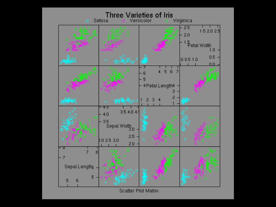
• Multivariate system?
• Does this message belong in a visualization?

Ben Fry: How to Get Started
• Get some data.
• Organize and structure the data.
• Remove unnecessary(!) data.
• Use statistical methods to discover patterns.
• Choose a visualization style.
• http://www.visual-literacy.org/periodic_table/periodic_table.html
• Refine.
• Build interaction, if appropriate and possible.

Tools
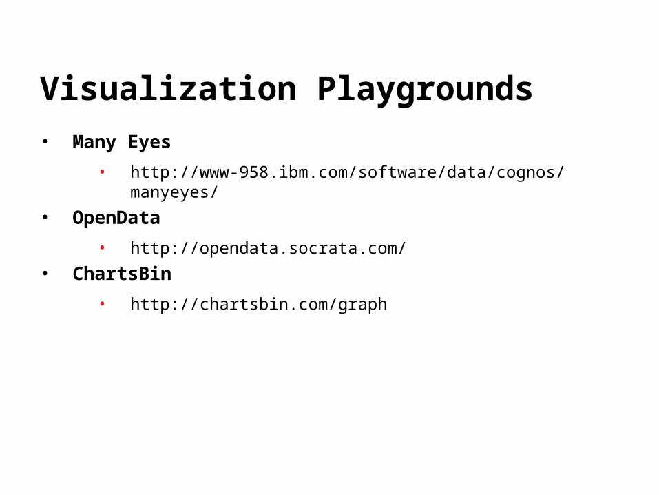
Visualization Playgrounds
• Many Eyes
• http://www-958.ibm.com/software/data/cognos/manyeyes/
• OpenData
• http://opendata.socrata.com/
• ChartsBin
• http://chartsbin.com/graph

http://code.google.com/apis/chart/interactive/docs/gallery.html
Google Chart API
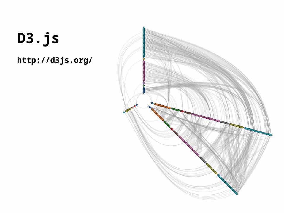
D3.jshttp://d3js.org/
Summing Up
• Make sure data visualization is the right tool for the job
• Define audience, information to communicate first
• Choose a visualization
• Existing examples in knowledge area?
• Data to support this visualization?
• Tools and expertise to create it?
• Have fun
• Try breaking some rules
• Ask someone outside of your area for feedback!

Thank you!
Joseph Ryan
ITS Research Computing
Ben Fry’s excellent Visualizing Data provided
significant intellectual content to this presentation.


