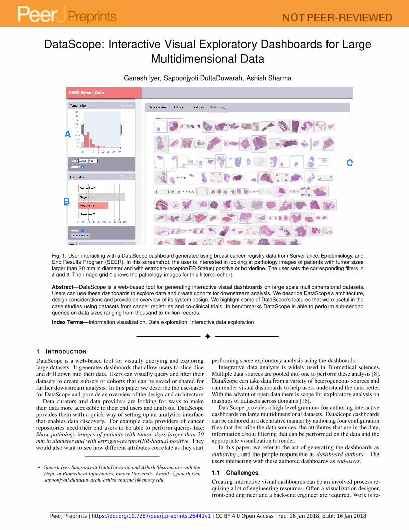
DataScope: Interactive Visual Exploratory Dashboards for Large Multidimensional Data Ganesh Iyer, Sapoonjyoti DuttaDuwarah, Ashish Sharma Fig. 1. User interacting with a DataScope dashboard generated using breast cancer registry data from Surveillance, Epidemiology, and End Results Program (SEER). In this screenshot, the user is interested in looking at pathology images of patients with tumor sizes larger than 20 mm in diameter and with estrogen-receptor(ER-Status) positive or borderline. The user sets the corresponding filters in A and B. The image grid C shows the pathology images for this filtered cohort. Abstract—DataScope is a web-based tool for generating interactive visual dashboards on large scale multidimensional datasets. Users can use these dashboards to explore data and create cohorts for downstream analysis. We describe DataScope’s architecture, design considerations and provide an overview of its system design. We highlight some of DataScope’s features that were useful in the case studies using datasets from cancer registries and co-clinical trials. In benchmarks DataScope is able to perform sub-second queries on data sizes ranging from thousand to million records. Index Terms—Information visualization, Data exploration, Interactive data exploration 1 I NTRODUCTION DataScope is a web-based tool for visually querying and exploring large datasets. It generates dashboards that allow users to slice-dice and drill down into their data. Users can visually query and filter their datasets to create subsets or cohorts that can be saved or shared for further downstream analysis. In this paper we describe the use-cases for DataScope and provide an overview of the design and architecture. Data curators and data providers are looking for ways to make their data more accessible to their end users and analysts. DataScope provides them with a quick way of setting up an analytics interface that enables data discovery. For example data providers of cancer repositories need their end users to be able to perform queries like: Show pathology images of patients with tumor sizes larger than 20 mm in diameter and with estrogen-receptor(ER-Status) positive. They would also want to see how different attributes correlate as they start • Ganesh Iyer, Sapoonjyoti DuttaDuwarah and Ashish Sharma are with the Dept. of Biomedical Informatics, Emory University. Email: {ganesh.iyer, sapoonjyoti.duttaduwarah, ashish.sharma}@emory.edu performing some exploratory analysis using the dashboards. Integrative data analysis is widely used in Biomedical sciences. Multiple data sources are pooled into one to perform these analysis [8]. DataScope can take data from a variety of heterogeneous sources and can render visual dashboards to help users understand the data better. With the advent of open data there is scope for exploratory analysis on mashups of datasets across domains [16]. DataScope provides a high-level grammar for authoring interactive dashboards on large multidimensional datasets. DataScope dashboards can be authored in a declarative manner by authoring four configuration files that describe the data sources, the attributes that are in the data, information about filtering that can be performed on the data and the appropriate visualization to render. In this paper, we refer to the act of generating the dashboards as authoring , and the people responsible as dashboard authors . The users interacting with these authored dashboards as end-users. 1.1 Challenges Creating interactive visual dashboards can be an involved process re- quiring a lot of engineering resources. Often a visualization designer, front-end engineer and a back-end engineer are required. Work is re- PeerJ Preprints | https://doi.org/10.7287/peerj.preprints.26441v1 | CC BY 4.0 Open Access | rec: 16 Jan 2018, publ: 16 Jan 2018
Transcript
DataScope: Interactive Visual Exploratory Dashboards for LargeMultidimensional Data
Fig. 1. User interacting with a DataScope dashboard generated using breast cancer registry data from Surveillance, Epidemiology, andEnd Results Program (SEER). In this screenshot, the user is interested in looking at pathology images of patients with tumor sizeslarger than 20 mm in diameter and with estrogen-receptor(ER-Status) positive or borderline. The user sets the corresponding filters inA and B. The image grid C shows the pathology images for this filtered cohort.
Abstract—DataScope is a web-based tool for generating interactive visual dashboards on large scale multidimensional datasets.Users can use these dashboards to explore data and create cohorts for downstream analysis. We describe DataScope’s architecture,design considerations and provide an overview of its system design. We highlight some of DataScope’s features that were useful in thecase studies using datasets from cancer registries and co-clinical trials. In benchmarks DataScope is able to perform sub-secondqueries on data sizes ranging from thousand to million records.
Index Terms—Information visualization, Data exploration, Interactive data exploration
1 INTRODUCTION
DataScope is a web-based tool for visually querying and exploringlarge datasets. It generates dashboards that allow users to slice-diceand drill down into their data. Users can visually query and filter theirdatasets to create subsets or cohorts that can be saved or shared forfurther downstream analysis. In this paper we describe the use-casesfor DataScope and provide an overview of the design and architecture.
Data curators and data providers are looking for ways to maketheir data more accessible to their end users and analysts. DataScopeprovides them with a quick way of setting up an analytics interfacethat enables data discovery. For example data providers of cancerrepositories need their end users to be able to perform queries like:Show pathology images of patients with tumor sizes larger than 20mm in diameter and with estrogen-receptor(ER-Status) positive. Theywould also want to see how different attributes correlate as they start
• Ganesh Iyer, Sapoonjyoti DuttaDuwarah and Ashish Sharma are with theDept. of Biomedical Informatics, Emory University. Email: {ganesh.iyer,sapoonjyoti.duttaduwarah, ashish.sharma}@emory.edu
performing some exploratory analysis using the dashboards.Integrative data analysis is widely used in Biomedical sciences.
Multiple data sources are pooled into one to perform these analysis [8].DataScope can take data from a variety of heterogeneous sources andcan render visual dashboards to help users understand the data better.With the advent of open data there is scope for exploratory analysis onmashups of datasets across domains [16].
DataScope provides a high-level grammar for authoring interactivedashboards on large multidimensional datasets. DataScope dashboardscan be authored in a declarative manner by authoring four configurationfiles that describe the data sources, the attributes that are in the data,information about filtering that can be performed on the data and theappropriate visualization to render.
In this paper, we refer to the act of generating the dashboards asauthoring , and the people responsible as dashboard authors . Theusers interacting with these authored dashboards as end-users.
1.1 ChallengesCreating interactive visual dashboards can be an involved process re-quiring a lot of engineering resources. Often a visualization designer,front-end engineer and a back-end engineer are required. Work is re-
PeerJ Preprints | https://doi.org/10.7287/peerj.preprints.26441v1 | CC BY 4.0 Open Access | rec: 16 Jan 2018, publ: 16 Jan 2018
quired to fetch and integrate datasets of different formats from differentsources. A back-end must be developed to create APIs to power thedashboards. Front end engineers are required to set up the user inter-face and client-side code. Visualization designers are required to writecustom charts and visualizations using libraries like D3 [7].
Data providers often have data coming from various heterogeneoussources namely REST APIs, Databases, flat files etc. The data can bein a variety of different formats like JSON, CSV, XML etc. Specializedlibraries are required to extract and parse the data. DataScope is able toingest data from these variety of sources and provides an interface toquery and visualize the different data modalities. With DataScope dataproviders can specify where to find the data instead of how.
Another challenge was the scale of the data. Web based chartinglibraries like D3 etc. work well when by all the data is loaded inthe browser. Modern web browsers can load data only upto a certainsize, based on the RAM of the client and browser configurations. Forlarger datasets users can very easily exceed these memory limits ofthe browser. Preforming filtering on large datasets is computationallyexpensive. Also some data providers might have restrictions for sharingall of their data. Thus loading and filtering the data at the client sideis not an option. We need to develop a scalable server based query-ing system that is able to handle massive amounts of data. We alsoneed specialized data structures to perform sub-second querying overmillions of data points.
Data providers have their own customized needs and the systemmust be flexible enough to allow them to make these changes swiftly.There might be custom data formats that require specialized librariesto parse them. We needed to make the system extensible enough tohandle new visualization modes, filtering modes and data formats.
2 RELATED WORK
Kienle et al [11] identified seven quality attributes for visualizationtools: a) rendering scalabilty b) information scalability c) interoper-ability d) customizability e) interactivity f) usability g) adaptability.We base our design decisions based on these attributes. In this sectionwe highlight some other tools that are used to generate exploratorydashboards.
There are several graphing libraries that are built using Javascript.D3 [7] is widely used as a building block for many graphing librarieslike DC.js [3]. Google Charts is widely used for quickly setting upa visualization [4]. These libraries can be used to develop customdashboards for different data providers. This requires reproducing a lotof the effort like defining interactions, linking various charts, ingestingdata from different servers and so on. Thus these libraries are low-leveltools that can be used as building blocks for developing dashboards.
Keshif [18] is an open source web-based environment for creatinginteractive visual dashboards. It has an API that can be used to configurenew dashboards. Due to its client-side data loading, there is a practicallimit on the data volume that can be loaded into the browsers memory.Keshif can support datasets upto 220,000 records. The size and scale ofbiomedical datasets normally reach the order of a million tuples witha large number of attributes. This limits the use of such client-siderendering, and therefore led us to develop a system that relies on theserver-side to load the data.
Voyager [15] is a great tool for visual analysis inspired by exploratorysearch which is designed using AngularJS framework with HTML’sflex display. The tool seems to have an edge because of the importanceit gives to data variation instead of design variation. It is great atprocessing wide range of queries. One of the biggest advantages thistool has is the recommendation system which seems to recommenddata variables and transformations which the user might find helpful.Voyager’s novelty is in providing the end users recommendations whileexploring datasets. However it doesn’t address the issues faced by datacurators for providing an environment to explore their data. It currentlydoesn’t support a schema to define a dashboard.
Polaris [17] has a very different way to visualize data as comparedto the approach that was taken by Voyager. The primary concentra-tion of this system is on large multidimensional databases and howto effectively visualize those datasets. It challenges the way the mul-
tidimensional databases are (were) treated using the n-dimensionaldatacubes. The system interprets the state of the interface as a visualspecification of the analysis task and automatically complies it intodata and graphical transformations. The system however, lays out therequirements a visualization tool that must be matched in order forit to process large multidimensional databases which are data densedisplays, multiple display types and exploratory interface. The systemuses tables in order to display these high dimensional datasets. Thesystem tries to compare it’s queries against the SQL queries to seewhich ones give you better results. However, unlike DataScope whichprovides an interface to be used online with any dataset, this tool islimited to using only multi-dimensional relational databases in order tohelp explore the relations in the dataset.
3 TECHNICAL OVERVIEW
In this section we provide a technical overview of DataScope. Wedescribe the purpose and the specification of DataScope’s configurationfiles. We will also describe the architecture of DataScope.
3.1 SpecificationDataScope dashboards can be declared using four configuration files,namely: a) Data source b) Data description c) Interactive filters d)Visualization. These files allow authors to specify the dashboard ina declarative manner. We use a high level grammar for generatingdashboards which lets users specify what instead how.
3.1.1 Data sourceThe data source definition provides information about the different datasources that are pooled into one to perform integrative data exploration.This information is specified in a JSON file called dataSource.json.The data source definition is consumed by the application server and isused by it to load the data. It needs to provide information about thesource of data, and the information required to obtain the data from thesource. Multiple datasources can be provided, DataScope performs aninner-join of the different datasources. Currently DataScope supports:Flat files, REST APIs and Databases as data sources. The data mustbe either JSON or CSV in format. DataScope is extensible enough toadd further types of data sources like XML etc. The following JSONdocument is an example of dataSource.json that is used to fetchdata from a remote REST API:
3.1.2 Data descriptionData description is used by the server to obtain information about eachattribute in the pooled data. Each attribute must have information aboutthe data provider, the data type of the attribute, and whether the attributeis a filtering attribute or a visualization attribute or both. This informa-tion is specified in a JSON file called dataDescription.json Fol-lowing JSON document is an example of dataDescription.json.
In this example, we restrict ourselves to 3 attributes for brevity. It de-scribes the attributes present in Breast Case data provider: Tumor size,Image and ER Status.
[{
PeerJ Preprints | https://doi.org/10.7287/peerj.preprints.26441v1 | CC BY 4.0 Open Access | rec: 16 Jan 2018, publ: 16 Jan 2018
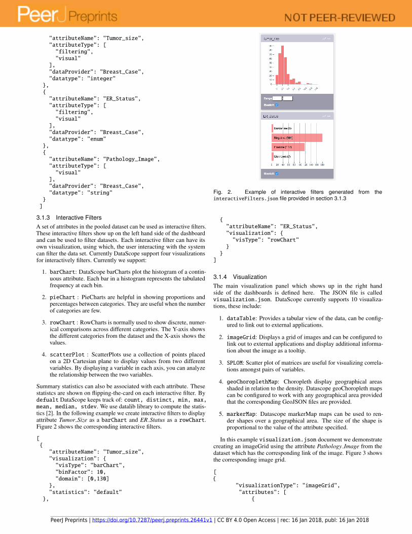
3.1.3 Interactive FiltersA set of attributes in the pooled dataset can be used as interactive filters.These interactive filters show up on the left hand side of the dashboardand can be used to filter datasets. Each interactive filter can have itsown visualization, using which, the user interacting with the systemcan filter the data set. Currently DataScope support four visualizationsfor interactively filters. Currently we support:
1. barChart: DataScope barCharts plot the histogram of a contin-uous attribute. Each bar in a histogram represents the tabulatedfrequency at each bin.
2. pieChart : PieCharts are helpful in showing proportions andpercentages between categories. They are useful when the numberof categories are few.
3. rowChart : RowCharts is normally used to show discrete, numer-ical comparisons across different categories. The Y-axis showsthe different categories from the dataset and the X-axis shows thevalues.
4. scatterPlot : ScatterPlots use a collection of points placedon a 2D Cartesian plane to display values from two differentvariables. By displaying a variable in each axis, you can analyzethe relationship between the two variables.
Summary statistics can also be associated with each attribute. Thesestatistcs are shown on flipping-the-card on each interactive filter. Bydefualt DataScope keeps track of: count, distinct, min, max,mean, median, stdev. We use datalib library to compute the statis-tics [2]. In the following example we create interactive filters to displayattribute Tumor Size as a barChart and ER Status as a rowChart.Figure 2 shows the corresponding interactive filters.
3.1.4 VisualizationThe main visualization panel which shows up in the right handside of the dashboards is defined here. The JSON file is calledvisualization.json. DataScope currently supports 10 visualiza-tions, these include:
1. dataTable: Provides a tabular view of the data, can be config-ured to link out to external applications.
2. imageGrid: Displays a grid of images and can be configured tolink out to external applications and display additional informa-tion about the image as a tooltip.
3. SPLOM: Scatter plot of matrices are useful for visualizing correla-tions amongst pairs of variables.
4. geoChoroplethMap: Choropleth display geographical areasshaded in relation to the density. Datascope geoChoropleth mapscan be configured to work with any geographical area providedthat the corresponding GeoJSON files are provided.
5. markerMap: Datascope markerMap maps can be used to ren-der shapes over a geographical area. The size of the shape isproportional to the value of the attribute specified.
In this example visualization.json document we demonstratecreating an imageGrid using the attribute Pathology Image from thedataset which has the corresponding link of the image. Figure 3 showsthe corresponding image grid.
[{
"visualizationType": "imageGrid","attributes": [
{
PeerJ Preprints | https://doi.org/10.7287/peerj.preprints.26441v1 | CC BY 4.0 Open Access | rec: 16 Jan 2018, publ: 16 Jan 2018
Fig. 3. Image grid generated from the visualization.json provided inSection 3.1.4
3.2 ArchitectureWe used a client-server architecture to distribute the load on the system.With a fat client, applications can quickly run into browser limits, andcan only work with very small datasets. To deal with larger datasetswe load the data on the server and used AJAX calls between the clientand the server to communicate essential information that was requiredby the client to render visualizations. Figure 4 provides a high leveloverview of the architecture.
3.2.1 InitializationDataScope uses configuration files to initialize the server and clientand to load the data into the server. As shown in Figure 4 thedataSource.json and dataDescription.json files are consumedby the server, whereas interactiveFilters.json and visualiza-tion.json are consumed by the client side. The configuration files areused as follows:
1. The application server identifies the various data sources.It can ingest data from REST APIs and flat files. UsingdataSource.json the application server loads data from eachdata source in memory. It performs SQL-like JOIN and UNIONoperations based on the key attribute specified.
2. The application server creates binned aggregated representationsof the data to perform filtering quickly using a javascript librarycalled: crossfilter [1] for all the filtering attributes in the datadescription.
3. On the client side, interactiveFilters.json file is used torender the interactive filters. The client side renders the visualiza-tions based on the visType provided in the interactive filter.
4. The client side also uses visualization.json to render visual-izations based on the visualization type specified.
3.2.2 Filtering
Once the dashboards are initialized the users can interact with the filtersand slice and dice their data. Following is how the interaction takesplace:
1. Filtering information: The user interacts with the system andperforms filtering, the filter information is sent to the server. Thebrowser makes a GET request to /filter. The filtering informationis represented in the form of a JSON object. Some examples arefollowing:{} = No active filters{age: [20,40]} = Attribute age from range 20 to 40{age: [20,40], groups: [a, c]} = Attributes that haveage from range 20 to 40 and have value for attribute groups a or c
This filtering information can be stored to load the dashboardsfrom previous states or to share a filtered cohort.
2. Result of filtering: The application server performs filtering, andsends the current state information of the attributes to the view.The results are transferred as a response to AJAX call in JSONformat. The result is binned and aggregated to make the payloadlightweight.
3.3 Design considerations
In this section we describe some of the design considerations thatguided the development of DataScope.
DataScope visualization components are designed in a generic way thatmakes it possible for these visualizations to handle various datatypes.Queries on these visualizations can be on of: Ranged, Categorical or2-D Ranged. The goal of DataScope is to be able to specify the typeof visualization that users would want to see without having to writeany code for it. We use the JSON specifications provided in 3.1.3 and3.1.4. These JSON documents can be used to specify how each attributeshould be visualized without having to write any code.
3.3.2 Scalable visualizations
All DataScope visualizations must be scalable to handle large datasets.To handle larger datasets without overwhelming the user and the fil-tering engine we only plot summaries of the data. We use binned-aggregation to plot values for attributes [12] [13]. Using this we firstbin and aggregate the date and then visualize the densities of each bin.For numeric values one can define the bin factor for binning these val-ues. For enumerated values each value is considered its own bin. Thisapproach can be scaled to handle large datasets without overcrowdingthe display.
3.3.3 Filtering
One of the major goals of DataScope is enabling the creation of cohorts.Users can filter their data using any of the interactive panels. Filteringwill reduce the size of the dataset and will generate a new cohort ora subset of the original dataset. Users can then view the differentvisualizations to examine trends in these cohorts.
PeerJ Preprints | https://doi.org/10.7287/peerj.preprints.26441v1 | CC BY 4.0 Open Access | rec: 16 Jan 2018, publ: 16 Jan 2018
3.3.4 Coordinated interactive visualizationsIn DataScope, we use the brushing and linking pattern of interaction.Making selections in one view updates data in all other views. All theother views are rendered again based on the current state of filters. Bothinteractive filters and visualizations are linked and coordinated. Userscan make selection using visualizations(if the visualization supportsselections) and the interactive filters get updated and vice-versa.
3.3.5 Saving and launching stateEach interaction in the dashboard creates a new state. The state is aJSON object which stores information about the current active filters.Users can drill down and create cohorts using the filters. They can get asharable link for the dashboard. Any user that uses the link will launchDataScope with the given filters set. External applications can also beused to generate states and launch DataScope from pre-defined states.
3.3.6 RESTful interfaceDataScope exposes a RESTful API that can be used to POST newdatasets or visualizations at runtime. To add a new visualization to anexisting instance of DataScope, the dashboard-authors can POST a newvisualization.json with the new visualizations. Having a RESTAPI also makes it easier to integrate DataScope with other externalanalytics applications.
3.4 Compressing data using data dictionariesThe datasets we encountered are often redundant having the samevalues repeated throughout the data. For example, having categoricalattributes with large strings as values increases the size of the data. Wecan easily encode these large strings into a small, compressed codedvalue. During our work with SEER data we observed that there weredata dictionaries available for the datasets1. We observed that usingdata dictionaries can be used to compress the data by a significantamount. Datascope stores data in a compressed form on the back-endand using a data-dictionary on the front-end to decode the data fromthe coded state while rendering visualizations.
4 CASE STUDIES
In this section we describe some of the case studies where we’ve usedDataScope. We also highlight the features of DataScope that were mostuseful for that particular use-case.
4.1 Scientific Mashup to Explore Data from Co-clinical tri-als
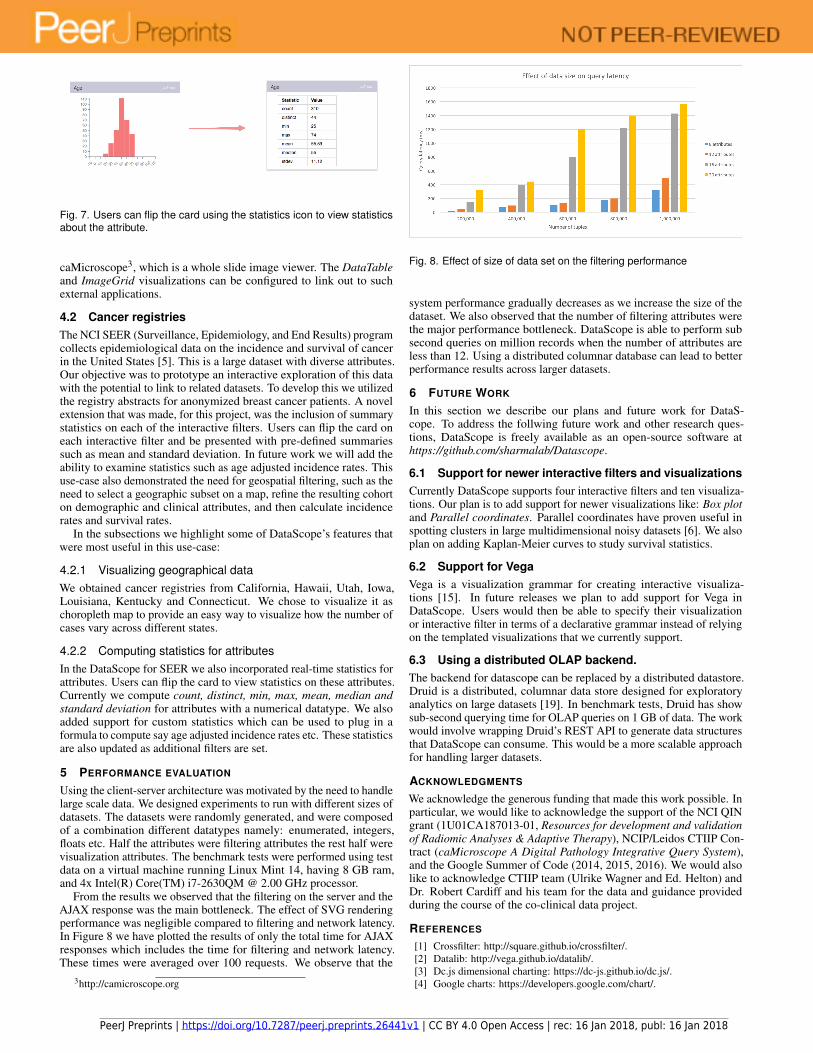
This project was one of the initial drivers of DataScope. The overar-ching objective was to explore data, that is of data typically acquiredduring a Co-Clinical trial [14], and support an exploration of the inte-grated human+mouse data. In a Co-Clinical trial mouse models thatreplicate mutations seen in patients, are constructed, and used in pre-clinical trials that are run, in parallel with ongoing human trials. Froma data integration and exploration perspective, one needs to create adata mashup and give users the ability to examine clinical data, ge-nomic data, and support the exploration of radiology and pathologyimages. For this project we utilized data provided by Robert Cardiff(UC Davis) and Eran R. Andrechek (Dept. of Physiology, MichiganState University), and described here [10]. The objective was to explorea fusion of mouse model data and data from the Cancer Genome Atlas,both in breast cancer. The radiology images were stored in The CancerImaging Archive, while the pathology images were stored at Emory.DataScope allowed Dr. Cardiff and his group to take an integratedview of the data, and hypothesize the human correlates to pathwayclusters that were seen in mouse models. The primary visualizationwas a SPLOM (Scatterplot Matrix), that was constructed on the Ageand the PR, Her2 and ER mutation statuses. Users could create customcohorts using a combination of these, then refine the cohort using clini-cal attributes, and finally visualize the digitized pathology images aswell as radiology images. We highlight the most useful features in thefollowing subsections.
1https://seer.cancer.gov/data/documentation.html
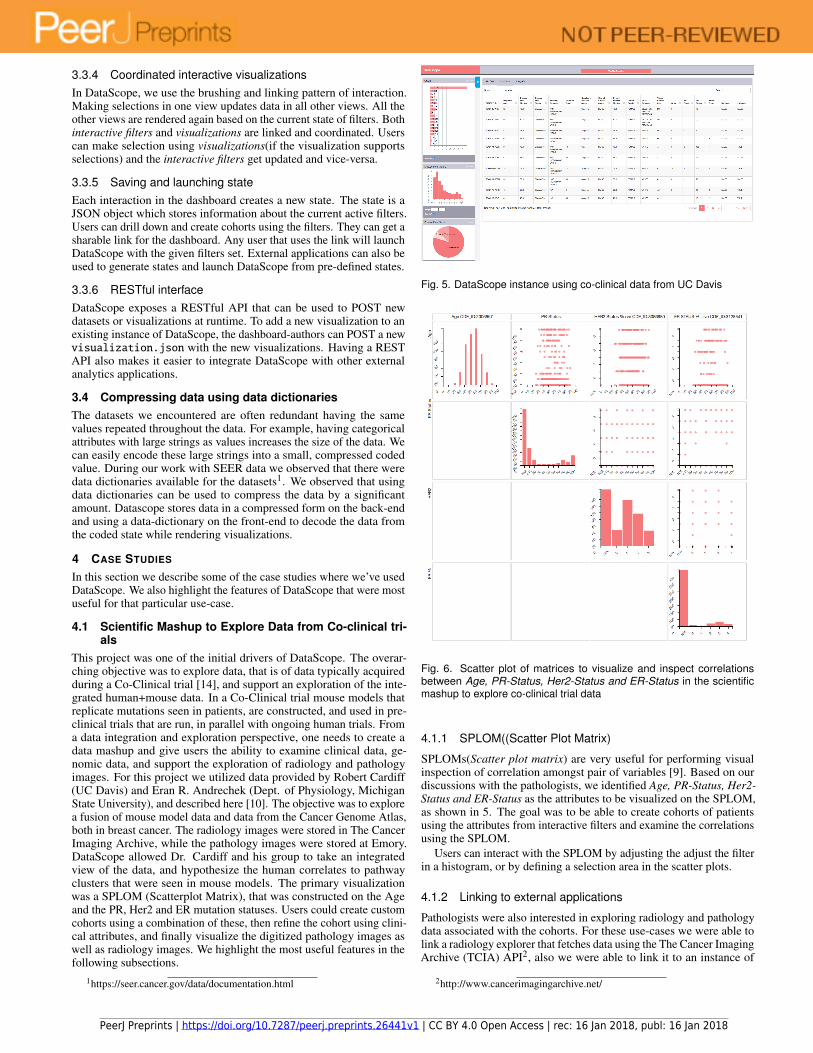
Fig. 5. DataScope instance using co-clinical data from UC Davis
Fig. 6. Scatter plot of matrices to visualize and inspect correlationsbetween Age, PR-Status, Her2-Status and ER-Status in the scientificmashup to explore co-clinical trial data
4.1.1 SPLOM((Scatter Plot Matrix)
SPLOMs(Scatter plot matrix) are very useful for performing visualinspection of correlation amongst pair of variables [9]. Based on ourdiscussions with the pathologists, we identified Age, PR-Status, Her2-Status and ER-Status as the attributes to be visualized on the SPLOM,as shown in 5. The goal was to be able to create cohorts of patientsusing the attributes from interactive filters and examine the correlationsusing the SPLOM.
Users can interact with the SPLOM by adjusting the adjust the filterin a histogram, or by defining a selection area in the scatter plots.
4.1.2 Linking to external applications
Pathologists were also interested in exploring radiology and pathologydata associated with the cohorts. For these use-cases we were able tolink a radiology explorer that fetches data using the The Cancer ImagingArchive (TCIA) API2, also we were able to link it to an instance of
2http://www.cancerimagingarchive.net/
PeerJ Preprints | https://doi.org/10.7287/peerj.preprints.26441v1 | CC BY 4.0 Open Access | rec: 16 Jan 2018, publ: 16 Jan 2018
Fig. 7. Users can flip the card using the statistics icon to view statisticsabout the attribute.
caMicroscope3, which is a whole slide image viewer. The DataTableand ImageGrid visualizations can be configured to link out to suchexternal applications.
4.2 Cancer registriesThe NCI SEER (Surveillance, Epidemiology, and End Results) programcollects epidemiological data on the incidence and survival of cancerin the United States [5]. This is a large dataset with diverse attributes.Our objective was to prototype an interactive exploration of this datawith the potential to link to related datasets. To develop this we utilizedthe registry abstracts for anonymized breast cancer patients. A novelextension that was made, for this project, was the inclusion of summarystatistics on each of the interactive filters. Users can flip the card oneach interactive filter and be presented with pre-defined summariessuch as mean and standard deviation. In future work we will add theability to examine statistics such as age adjusted incidence rates. Thisuse-case also demonstrated the need for geospatial filtering, such as theneed to select a geographic subset on a map, refine the resulting cohorton demographic and clinical attributes, and then calculate incidencerates and survival rates.
In the subsections we highlight some of DataScope’s features thatwere most useful in this use-case:
4.2.1 Visualizing geographical dataWe obtained cancer registries from California, Hawaii, Utah, Iowa,Louisiana, Kentucky and Connecticut. We chose to visualize it aschoropleth map to provide an easy way to visualize how the number ofcases vary across different states.
4.2.2 Computing statistics for attributesIn the DataScope for SEER we also incorporated real-time statistics forattributes. Users can flip the card to view statistics on these attributes.Currently we compute count, distinct, min, max, mean, median andstandard deviation for attributes with a numerical datatype. We alsoadded support for custom statistics which can be used to plug in aformula to compute say age adjusted incidence rates etc. These statisticsare also updated as additional filters are set.
5 PERFORMANCE EVALUATION
Using the client-server architecture was motivated by the need to handlelarge scale data. We designed experiments to run with different sizes ofdatasets. The datasets were randomly generated, and were composedof a combination different datatypes namely: enumerated, integers,floats etc. Half the attributes were filtering attributes the rest half werevisualization attributes. The benchmark tests were performed using testdata on a virtual machine running Linux Mint 14, having 8 GB ram,and 4x Intel(R) Core(TM) i7-2630QM @ 2.00 GHz processor.
From the results we observed that the filtering on the server and theAJAX response was the main bottleneck. The effect of SVG renderingperformance was negligible compared to filtering and network latency.In Figure 8 we have plotted the results of only the total time for AJAXresponses which includes the time for filtering and network latency.These times were averaged over 100 requests. We observe that the
3http://camicroscope.org
Fig. 8. Effect of size of data set on the filtering performance
system performance gradually decreases as we increase the size of thedataset. We also observed that the number of filtering attributes werethe major performance bottleneck. DataScope is able to perform subsecond queries on million records when the number of attributes areless than 12. Using a distributed columnar database can lead to betterperformance results across larger datasets.
6 FUTURE WORK
In this section we describe our plans and future work for DataS-cope. To address the follwing future work and other research ques-tions, DataScope is freely available as an open-source software athttps://github.com/sharmalab/Datascope.
6.1 Support for newer interactive filters and visualizationsCurrently DataScope supports four interactive filters and ten visualiza-tions. Our plan is to add support for newer visualizations like: Box plotand Parallel coordinates. Parallel coordinates have proven useful inspotting clusters in large multidimensional noisy datasets [6]. We alsoplan on adding Kaplan-Meier curves to study survival statistics.
6.2 Support for VegaVega is a visualization grammar for creating interactive visualiza-tions [15]. In future releases we plan to add support for Vega inDataScope. Users would then be able to specify their visualizationor interactive filter in terms of a declarative grammar instead of relyingon the templated visualizations that we currently support.
6.3 Using a distributed OLAP backend.The backend for datascope can be replaced by a distributed datastore.Druid is a distributed, columnar data store designed for exploratoryanalytics on large datasets [19]. In benchmark tests, Druid has showsub-second querying time for OLAP queries on 1 GB of data. The workwould involve wrapping Druid’s REST API to generate data structuresthat DataScope can consume. This would be a more scalable approachfor handling larger datasets.
ACKNOWLEDGMENTS
We acknowledge the generous funding that made this work possible. Inparticular, we would like to acknowledge the support of the NCI QINgrant (1U01CA187013-01, Resources for development and validationof Radiomic Analyses & Adaptive Therapy), NCIP/Leidos CTIIP Con-tract (caMicroscope A Digital Pathology Integrative Query System),and the Google Summer of Code (2014, 2015, 2016). We would alsolike to acknowledge CTIIP team (Ulrike Wagner and Ed. Helton) andDr. Robert Cardiff and his team for the data and guidance providedduring the course of the co-clinical data project.
PeerJ Preprints | https://doi.org/10.7287/peerj.preprints.26441v1 | CC BY 4.0 Open Access | rec: 16 Jan 2018, publ: 16 Jan 2018
[5] Surveillance, epidemiology, and end results (seer) program(www.seer.cancer.gov) research data (1973-2014), national cancerinstitute, dccps, surveillance research program, surveillance systemsbranch, released april 2017, based on the november 2016 submission.
[6] A. O. Artero, M. C. F. de Oliveira, and H. Levkowitz. Uncovering clustersin crowded parallel coordinates visualizations. In Information Visual-ization, 2004. INFOVIS 2004. IEEE Symposium On, pp. 81–88. IEEE,2004.
[7] M. Bostock, V. Ogievetsky, and J. Heer. D3 data-driven documents. IEEEtransactions on visualization and computer graphics, 17(12):2301–2309,2011.
[8] P. J. Curran and A. M. Hussong. Integrative data analysis: the simultaneousanalysis of multiple data sets. Psychological methods, 14(2):81, 2009.
[9] J. Heer, M. Bostock, and V. Ogievetsky. A tour through the visualizationzoo. Commun. Acm, 53(6):59–67, 2010.
[10] D. P. Hollern and E. R. Andrechek. A genomic analysis of mouse models ofbreast cancer reveals molecular features ofmouse models and relationshipsto human breast cancer. Breast Cancer Research, 16(3):R59, 2014.
[11] H. M. Kienle and H. A. Muller. Requirements of software visualizationtools: A literature survey. In Visualizing Software for Understanding andAnalysis, 2007. VISSOFT 2007. 4th IEEE International Workshop on, pp.2–9. IEEE, 2007.
[12] L. Lins, J. T. Klosowski, and C. Scheidegger. Nanocubes for real-timeexploration of spatiotemporal datasets. IEEE Transactions on Visualizationand Computer Graphics, 19(12):2456–2465, 2013.
[13] Z. Liu, B. Jiang, and J. Heer. immens: Real-time visual querying of bigdata. In Computer Graphics Forum, vol. 32, pp. 421–430. Wiley OnlineLibrary, 2013.
[14] C. Nardella, A. Lunardi, A. Patnaik, L. C. Cantley, and P. P. Pandolfi. TheAPL paradigm and the co-clinical trial project, 2011.
[15] A. Satyanarayan, R. Russell, J. Hoffswell, and J. Heer. Reactive vega: Astreaming dataflow architecture for declarative interactive visualization.IEEE transactions on visualization and computer graphics, 22(1):659–668,2016.
[16] N. Shadbolt, K. O’Hara, T. Berners-Lee, N. Gibbins, H. Glaser, W. Hall,et al. Linked open government data: Lessons from data. gov. uk. IEEEIntelligent Systems, 27(3):16–24, 2012.
[17] C. Stolte, D. Tang, and P. Hanrahan. Polaris: A system for query, anal-ysis, and visualization of multidimensional relational databases. IEEETransactions on Visualization and Computer Graphics, 8(1):52–65, 2002.
[18] M. A. Yalcın, N. Elmqvist, and B. B. Bederson. Keshif: Out-of-the-boxvisual and interactive data exploration environment.
[19] F. Yang, E. Tschetter, X. Leaute, N. Ray, G. Merlino, and D. Ganguli.Druid: A real-time analytical data store. In Proceedings of the 2014 ACMSIGMOD international conference on Management of data, pp. 157–168.ACM, 2014.
PeerJ Preprints | https://doi.org/10.7287/peerj.preprints.26441v1 | CC BY 4.0 Open Access | rec: 16 Jan 2018, publ: 16 Jan 2018