The EZ Trade FOREX™ Day Trading System is mainly used with four different currency pairs; the EUR/USD, USD/CHF, GBP/USD and AUD/USD, but some trades are also taken on the USD/JPY. It uses four main indicators; moving average lines, the Detrended Price Oscillator, MACD and Directional Movement Index (DMI). The basis of this system is trend following. It uses trend following indicators and works best in actively trending markets. Even though the system does produce the most profits when markets are active and volatile, the system produces signals early enough into price movements, that you are able to profit in both trending market conditions and when the market is in a range with smaller, choppy price movements. The EZ Trade FOREX™ System very accurately predicts changes in trends, and usually near the beginning of a new price movement, allowing you to capture the maximum amount of profit on a given trend. We predominantly use the 60 minute chart with this system, but also use other time frames, and you will learn when and how. The EZ Trade FOREX™ system is a complete, mechanical system, which will show you exactly how to spot buy signals, and exactly how to spot sell signals. There will be no decision making on your part, or a learning curve in spotting the signals, as they are clear and precise. You will also learn detailed rules of where to place your stop losses, where and when to move them to protect profit, and when to take profit on the trades. I leave nothing out of this system. It is a complete package that will address all aspects of trading this strategy that you need to know in order to have success. The first half I will go over the indicators used in this system and how they are utilized together in an exact manner to give you buy and sell signals. I will also give you exact rules to follow for managing and exiting trades. In the second half I will give you a lot of trade examples so you can see with your own eyes many trades that were taken according to the system and I will also give you some advanced strategies that you can use as you feel comfortable with them that will even improve the results of employing the core mechanics of the system.
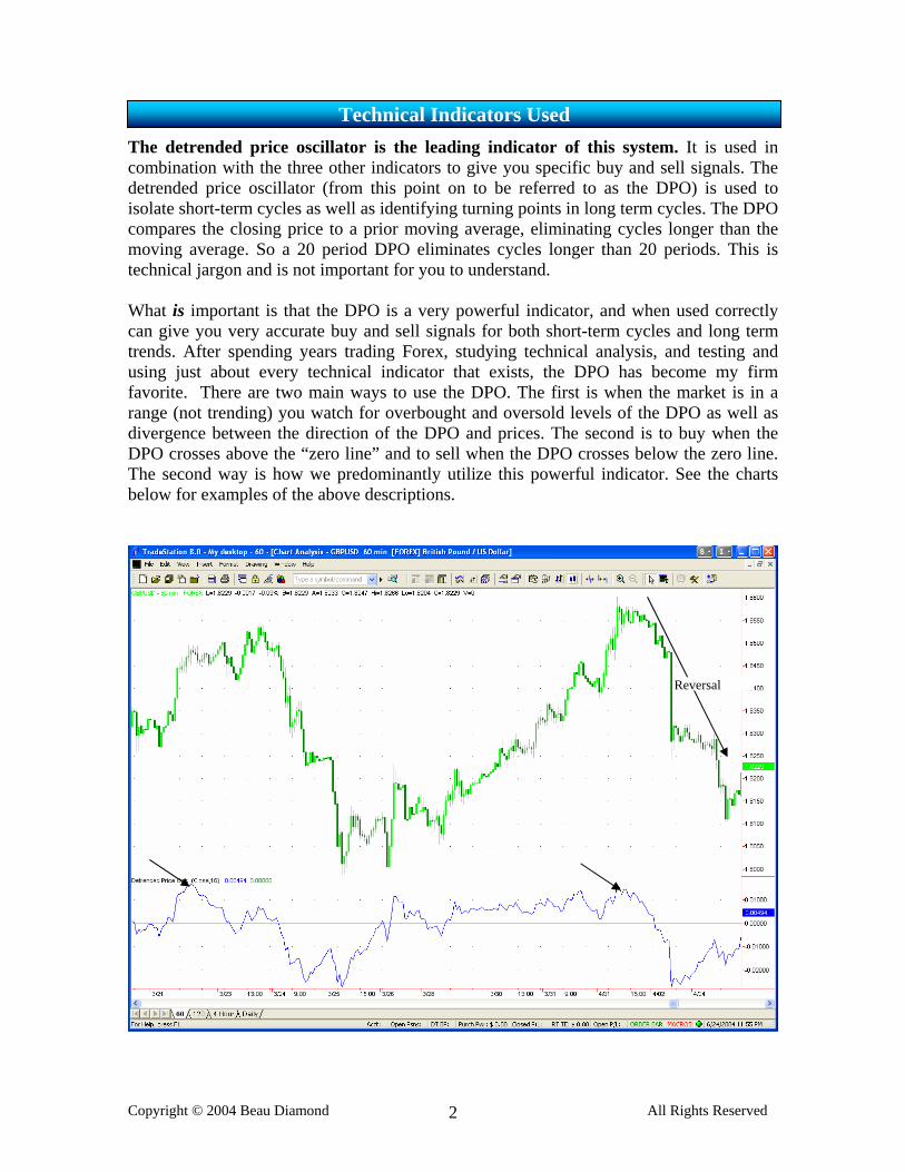
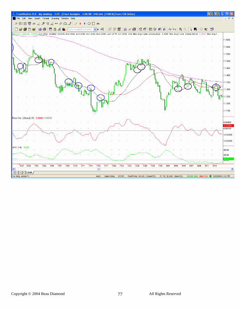
The detrended price oscillator is the leading indicator of this system. It is used in combination with the three other indicators to give you specific buy and sell signals. The detrended price oscillator (from this point on to be referred to as the DPO) is used to isolate short-term cycles as well as identifying turning points in long term cycles. The DPO compares the closing price to a prior moving average, eliminating cycles longer than the moving average. So a 20 period DPO eliminates cycles longer than 20 periods. This is technical jargon and is not important for you to understand. What is important is that the DPO is a very powerful indicator, and when used correctly can give you very accurate buy and sell signals for both short-term cycles and long term trends. After spending years trading Forex, studying technical analysis, and testing and using just about every technical indicator that exists, the DPO has become my firm favorite. There are two main ways to use the DPO. The first is when the market is in a range (not trending) you watch for overbought and oversold levels of the DPO as well as divergence between the direction of the DPO and prices. The second is to buy when the DPO crosses above the “zero line” and to sell when the DPO crosses below the zero line. The second way is how we predominantly utilize this powerful indicator. See the charts below for examples of the above descriptions.
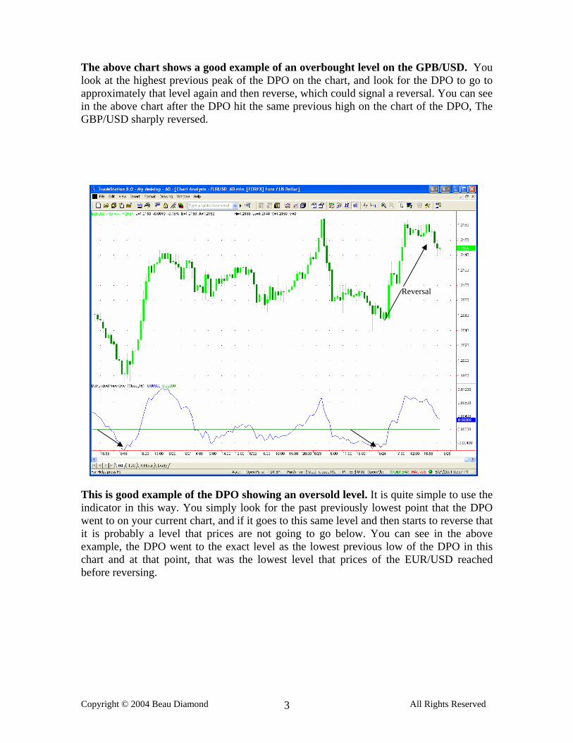
The above chart shows a good example of an overbought level on the GPB/USD. You look at the highest previous peak of the DPO on the chart, and look for the DPO to go to approximately that level again and then reverse, which could signal a reversal. You can see in the above chart after the DPO hit the same previous high on the chart of the DPO, The GBP/USD sharply reversed. This is good example of the DPO showing an oversold level. It is quite simple to use the indicator in this way. You simply look for the past previously lowest point that the DPO went to on your current chart, and if it goes to this same level and then starts to reverse that it is probably a level that prices are not going to go below. You can see in the above example, the DPO went to the exact level as the lowest previous low of the DPO in this chart and at that point, that was the lowest level that prices of the EUR/USD reached before reversing.
This is an example of the DPO showing divergence. As you can see, prices were rising and the DPO was falling, showing divergence, which was followed by a reversal. Normally when the prices are rising, the overall slope of the DPO will be upward as well, so when the direction of the DPO is the opposite of the direction that prices are moving, this shows strong divergence, as above, and is a probable indication of an upcoming reversal. Divergence on the DPO is a very helpful tool in confirming trades, so it’s a good idea to keep an eye out for when this occurs.
This is a text book example of divergence with the DPO and prices on this hourly chart of the EUR/USD. You can see that for several days prices were steadily rising, while the DPO was simultaneously falling, showing a strong divergence. This accurately forecasted a sharp reversal. When you see divergences such as these you should expect to see a reversal before too long. The reversal will most likely occur after the DPO crosses the zero line after divergence is seen on the chart.
This is another example of divergence. It looks a bit different from the other examples but is another kind of divergence you will see. Normally, with each decline of the prices you will also see new low of the DPO, but often when there is an impending reversal prices will make a new low but the DPO will not. You can see the mountains and valleys of the DPO in this chart and with each corresponding decline in prices the new DPO valley would be lower, except where the arrow is pointing, which shows divergence. This was immediately followed by a reversal.
This is an example of how we will be using the DPO for specific buy and sell signals. The DPO always has a horizontal line through the middle called the “zero line”. According to the DPO, when the DPO is above the zero line the currency is in an uptrend and when it is below the zero line the currency is in a downtrend.
• When the DPO crosses up through the zero line this is a buy signal.
• When the DPO crosses down through the zero line it is a sell signal, it’s that simple.
You can see one example each of a buy and a sell signal in the above chart.
The MACD is the second indicator used in the EZ Trade FOREX™ System. It is used as a confirming indicator rather than a leading indicator such as the DPO. There is no such thing as one “magic indicator” out there that will give regular buy and sell signals that result in profit. All indicators, including the DPO must be used with filters, to filter out signals that are not valid. That is the main function of the MACD in the EZ Trade System is to help filter out false signals. It is very easy to use the MACD as a confirmation for signals. The MACD is the difference between a 12 and 26 day exponential moving average, which you see on these charts is the green line (faster moving line). On these charts the black line of the MACD is the signal line (slower moving line), which is a 9 day exponential moving average. When the MACD line is above the signal line it is in an uptrend and when it is below the signal line it is in a down trend. With the EZ Trade system, we only take signals from the DPO in the direction of the trend of the MACD indicator. So when you get a buy signal on the DPO you would take it only if the black MACD line is above the blue signal line, or just intersecting in the upward direction. And on a sell signal you would only take the trade if the MACD line is below the signal line or just intersecting in the downward direction. In some high probability winning trades, the MACD and signal line will sometimes intersect just as you are getting a signal on the DPO.
In this example, anytime during which the MACD line was above the signal line, buy signals with the DPO would have been taken and sell signals would have been ignored. Any time during which the MACD line was below signal line sell signals with the DPO would have been taken and buy signals would have been ignored.
MACD line above signal line MACD line below signal line
The directional movement index (from now on DMI) is the third indicator used in this system. The DMI was developed by Welles Wilder and is explained in his book, New Concepts in Technical Trading Systems. The DMI determines the strength of the current price trend by comparing the positive movement to the negative movement. I will not get into the technical aspects of how it is calculated because it is not necessary that you know this. With the DMI there are two lines, +DI and –DI. In these charts the blue line is the +DI and the black line is the –DI. When +DI crosses above –DI this is a buy signal, and when +DI cross below –DI this is a sell signal. Most good trades will be confirmed by the DMI in one of two ways. 1. The +DI and –DI will be intersecting at approximately the same time or a little before the DPO crossing zero or 2. The +DI may already be above the –DI when you get a buy signal on the DPO, or the +DI may already be below the –DI when you get a sell signal on the DPO. Important note: Sometimes, you may get a good signal on the DPO confirmed by the other indicators, but the DMI may have NOT yet confirmed the trade. It is okay to take trades that are not yet confirmed by the DMI, as long as the +DI and the –DI are relatively close to each other. If they are still very wide and far apart, you shouldn’t take the trade. You will find that most good trades are indeed confirmed by the DMI, but they do not HAVE to be for you to enter the trade. Trades where all indicators show a fresh signal on approximately the same candle however, are the highest probability winning trades.
A two line moving average crossover is the 4th indicator used in the EZ Trade FOREX™ System. A moving average line tells you the average price over a given period of time. A 10-day simple moving average line tells you the average price over the last 10 time periods. 10-day does not actually mean “days”, it means periods. So, on an hourly chart it will tell you the average price over the last 10 time periods of 1 hour, so in other words, it tells you the average price for the last 10 hours. In the EZ Trade system we use the crossover of 3 and 15 period simple moving average lines. I’ll refer to it from this point forward as the 3/15. The 3/15 functions as a very effective filter for the EZ Trade system, to filter out false signals. The system is effective just with the DPO, the MACD, and the DMI, but by also using the 3/15 filter the performance of the system is very much increased because we’re able to avoid more false signals by using this confirmation. A moving average crossover is generally used with a fast moving average (the 3 day) and a slow moving average (the 15 day). It’s also called the leading and lagging indicator, the fast moving average being the leading, and the slow moving average being the lagging indicator. When the two of them cross this generally signals a change in trend, and when this occurs at approximately the same time as we get a signal on the DPO, when confirmed by the other indicators, this is a prime opportunity to enter the market. You will notice when you look at the charts many times where the DPO crosses but the 3/15 does not, and you will also see many times when the 3/15 crosses but the DPO does not. But when the DPO crosses at the same time as the 3/15, this is very powerful, and very often occurs right near the beginning of a new trend, and thus the right time to enter the market to make a profit.
In the above chart, the black MA is the 3 day, and the light blue MA is the 15 day. When using the 3/15 cross, a buy confirmation is when the 3 day crosses above the 15 day, and a sell confirmation is when the 3 day crosses below the 15 day. (Please see above chart) For us to take a signal from the DPO, when the confirmation from the MACD and DMI (optional) is there, the 3/15 must confirm the trade by crossing up to 3 candles before or after the DPO crosses the zero line. Let’s say the DPO crosses above the zero line and that cross is confirmed by the MACD and the DMI, and then on the same candle the 3/15 crosses also, or on the 2nd or 3rd candle after the DPO crosses the 3/15 crosses, this is a valid signal. If on the other hand the 3/15 cross first, (which occurs much more frequently) and we get a signal on the DPO on that candle or the second or third candle after the cross of the 3/15, then that is a valid confirmation. In the above chart, both of these examples of the 3/15 cross is a perfect example of a valid sell signal, and then a valid buy signal, confirmed by all indicators at the same time. The basis of trading the EZTrade4X™ System is with the moving average line and the
For a buy signal… (1) The DPO most cross above the zero line. (2) The MACD line must be above the signal line. (3) The +DI should be above the –DI or just be crossing above the -DI. (As you
learned, this is not 100% necessary, but preferable.) (4) Finally, the 3 day MA must cross above the 15 day MA up to 3 candles either
before or after the upward cross of the DPO. For a sell signal…
(1) The DPO most cross below the zero line. (2) The MACD line must be below the signal line. (3) The +DI should be below the –DI or just be crossing below the -DI. (As you
learned, this is not 100% necessary, but preferable.) (4) Finally, the 3 day MA must cross below the 15 day MA up to 3 candles either
before or after the upward cross of the DPO.
Rules for Buy and Sell Signals
Rules for Managing and Exiting Trades
Once in a trade….
(1) Place your stop loss 10 pips below the 15 MA on a long trade or 15 pips above the 15 MA on a short trade, OR put the stop at 30 pips, whichever is closer. (35 – 40 on the USD/CHF) (2) Continually trail the stop 10 pips below the 15 MA on a long trade or 15 pips above the 15 MA on a short trade, as the currency moves in your favor. (3) Once you are up 50 pips, move your stop loss to your entry point. Leave the stop loss at your entry point for the duration of the trade. (4) Exit the trade when the 3 MA crosses below the 15 MA if you are long, or when the 3 MA crosses above the 15 MA if you’re short.
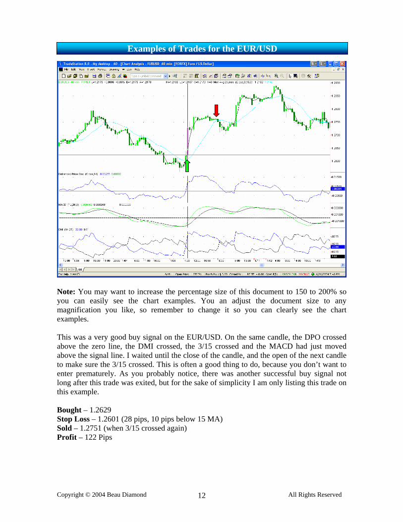
Note: You may want to increase the percentage size of this document to 150 to 200% so you can easily see the chart examples. You an adjust the document size to any magnification you like, so remember to change it so you can clearly see the chart examples. This was a very good buy signal on the EUR/USD. On the same candle, the DPO crossed above the zero line, the DMI crossed, the 3/15 crossed and the MACD had just moved above the signal line. I waited until the close of the candle, and the open of the next candle to make sure the 3/15 crossed. This is often a good thing to do, because you don’t want to enter prematurely. As you probably notice, there was another successful buy signal not long after this trade was exited, but for the sake of simplicity I am only listing this trade on this example. Bought – 1.2629 Stop Loss – 1.2601 (28 pips, 10 pips below 15 MA) Sold – 1.2751 (when 3/15 crossed again) Profit – 122 Pips
This is what I consider to be a “perfect” sell signal with this system. The reason I say this is because every indicator showed a sell signal on the exact same candle, simultaneously. You can see that the DPO crossed below zero, while at the same time the +DI crossed below the –DI and the 3/15 crossed downward to confirm the trade. The MACD was also below the signal line. Trades such as these are the highest probability winning trades. One thing you will notice is that the prices temporarily retraced almost exactly to the 15 MA, and then continued in the right direction. This is something that happens on a relatively frequent basis, which is why one of the rules to the system is to place the stop loss on the other side of the 15 MA. Sold – 1.2338 Stop Loss – 1.2368 (30 pips away, and conveniently, 14 pips above the 15 MA) Bought – 1.2029 Profit – 309 pips (this is an unusually large amount to make on one trade, but it happens from time to time)
This is an example of a losing trade on the EUR/USD. It was a good sell signal,. The DPO crossed one candle after the 3/15 cross, and the DMI and the MACD confirmed the trade. However it just happened to be a loser, as you should expect 30 to 40% of your trades will be. Luckily the system wins more than it loses, and the average winners are larger than the average losses, but I want you to have realistic expectations of the system and accept that losers are a regular part of trading, and this system is definitely no exception. As you may be able to see, this trade was preceded and followed by wining trades, but I want to show you some losers as well as winners. I also want you to notice, that right after this trade was stopped out, there was another signal in the opposite direction which turned out being a winning trade. This is something that is not infrequent. Sometimes the movement which is causing you to lose your current trade will be the beginning of a larger, better movement and the beginning of a new trend, so if there is another signal, take it! Often times, a trader that is not experienced with his/her system will get discouraged after a losing trade and not take the very next trade which may a winner, and often a much bigger winner than the size of the loss. This is all part of the psychology of trading. Trading without emotion and just taking the trades is very important. You have to pretend to be almost like a robot when trading a mechanical system. That is when you will experience the best results. Sold – 1.2047 Stop Loss – 1.2077 (30 pip stop, which was also 15 pips above the 15 MA. Bought – 1.2077 Loss – 30 pips
This is an example of a buy signal on the USD/CHF that was not confirmed by the DMI. If you look closely, at the time of this trade the +DI had not yet crossed above the –DI. It was still below it, however the +DI and –DI were converging very close together, and the DPO had crossed 2 candles after the 3/15 cross, and the MACD confirmed the trade, so it was okay to take this signal. Had the two lines of the DMI still been very far apart and widely separated you would want to pass on the trade. This ended up being a very profitable trade. It is important that when exiting the trade, you wait for the 3 to fully cross the 15 MA, because as you can see by the area that is circled on the chart, they nearly crossed but didn’t quite cross in the middle of the trade, and the currency ended up moving quite a bit further before the 3/15 finally crossed, confirming the exit of the trade. Bought – 1.2447 Stop Loss – 1.2410 (37 pips, 10 pips below the 15 MA) Sold – 1.2656 Profit – 209 Pips
Here is an example of two short trades on the USD/CHF, one right after the other. They were both good trades, confirmed by all indicators simultaneously. First Trade: Sold – 1.4133 Stop Loss – 1.4177, 40 pips (Also 15 pips above the 15 MA) Bought – 1.4067 Profit – 66 pips Second Trade: Sold – 1.4028 Stop Loss – 1.4063, 35 pips (15 pips above the 15 MA) Bought – 1.3876 Profit – 152 pips
Here is an example of a losing trade on the USD/CHF. The buy signal on the DPO was confirmed by the 3/15 and the MACD, but the +DI had not yet crossed above the –DI but it was close enough to take the trade, but it happened to be a false signal and the trade was a loser. It was however quickly followed by a large winning short trade. Bought – 1.3242 Stop Loss – 1.3213, 29 pips (10 pips below 15 MA) Sold – 1.3213 Loss – 29 pips
This is an example of a short trade on the GBP/USD. It was a good signal, confirmed by all indicators at the same time. Sold – 1.7884 Stop Loss – 1.7914, 30 pips Bought - 1.7706 Profit – 178 pips
This is a long trade on the GBP/USD that was confirmed by all indicators. The DPO and the 3/15 crossed on the same candle, however I had to wait for the next candle to initiate the trade, because the MACD had not crossed above the signal line yet. Once the MACD crossed the signal line it was still okay to initiate the trade at this point, since the 3/15 crossed only one bar previously and the DPO crossed only one bar previously as well. Bought – 1.7571 Stop Loss – 1.7541, 30 pips Sold – 1.7654 Profit – 83 pips
This is an example of a losing trade on the GBP/USD. It was a long trade in which all indicators confirmed the trade simultaneously, and it looked like a good signal, but it was a losing trade because the GBP/USD had a false spike upward. It’s hard to see in this small example, but the DPO did cross above the zero line at the top of the green candle, and that’s where the trade was initiated long. There was a winning trade before this, and 2 winning trades after it that you may be able to see on the chart, but this was a loser. You might notice that if the stop was placed 10 pips below the 15 MA, the trade would not have been stopped out. However, the problem with this was that the entry point was at a level that would have required a 53 pip stop for it to be placed 10 pips below the 15 MA, so the maximum stop of 30 pips was used. Another strategy you can use, if you want to allow the market a good amount of breathing room, and always place the stop on the other side of the 15 MA is to take the trade and use the larger stop, but to put a smaller than normal position on the trade. Then you are risking the same dollar amount with a 53 pip stop than you would with your normal sized position with a 30 pip stop. Bought – 1.8886 Stop Loss – 1.8856, 30 pips Sold – 1.8856 Loss – 30 pips
This is a long trade taken on the AUD/USD. The DPO, DMI, and 3/15 indicated a buy signal on the same candle, and the MACD was above the signal line. It was not a big winner, but a winner nonetheless. Bought – .7555 Stop Loss – .7525, 30 pips Sold - .7603 Profit – 48 pips
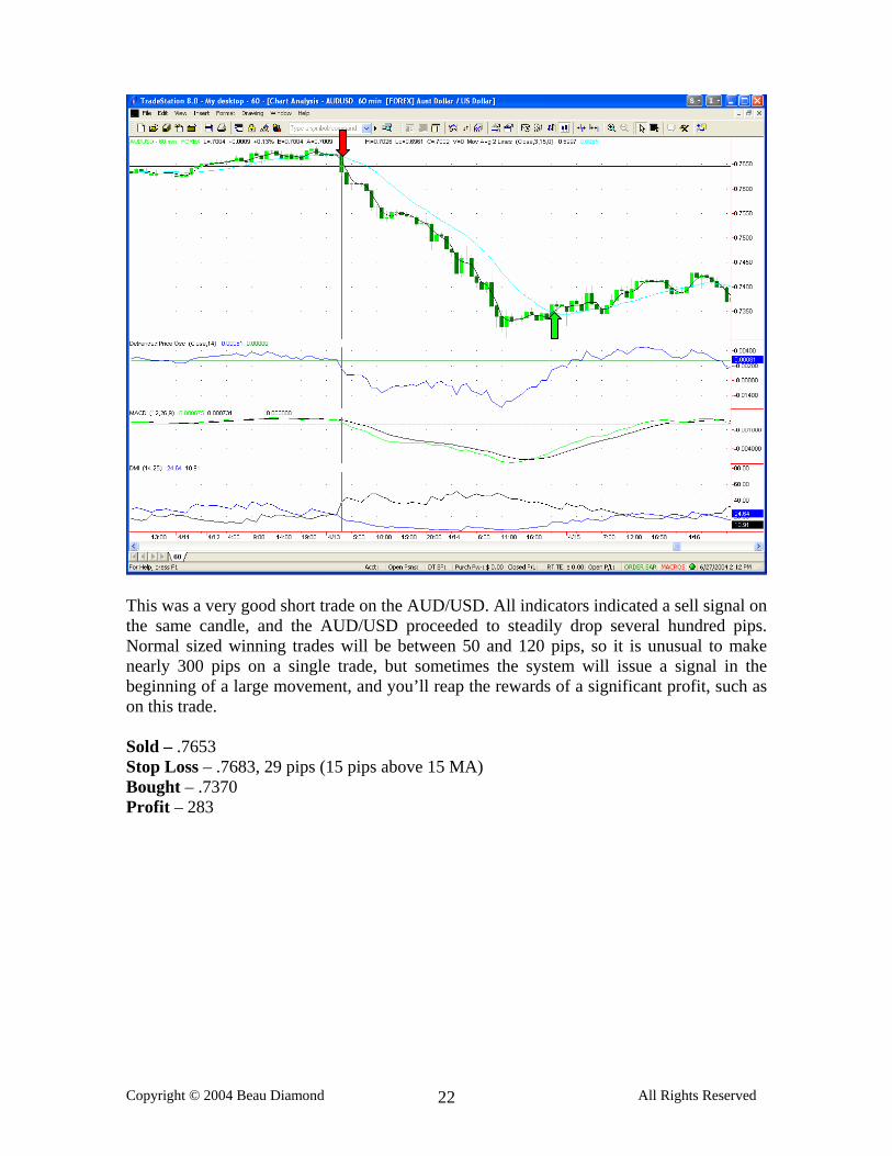
This was a very good short trade on the AUD/USD. All indicators indicated a sell signal on the same candle, and the AUD/USD proceeded to steadily drop several hundred pips. Normal sized winning trades will be between 50 and 120 pips, so it is unusual to make nearly 300 pips on a single trade, but sometimes the system will issue a signal in the beginning of a large movement, and you’ll reap the rewards of a significant profit, such as on this trade. Sold – .7653 Stop Loss – .7683, 29 pips (15 pips above 15 MA) Bought – .7370 Profit – 283
This is an example of a losing trade on the AUD/USD. It was a very good signal, but the market was in a choppy range for a few days. You can see when it finally broke out there was a large short trade that the system caught, but there were a couple losing trades during the choppy periods. You should expect that there will be unfavorable, choppy conditions in the market sometimes, and it’s difficult to avoid. It’s just part of trading and should not disappoint you. The Stop loss was trailed 10 pips below the 15 MA, and there was a brief spike that triggered the stop as you can see. Bought – .7329 Stop loss – .7299, 30 pips Sold – .7305 Loss – 24 pips
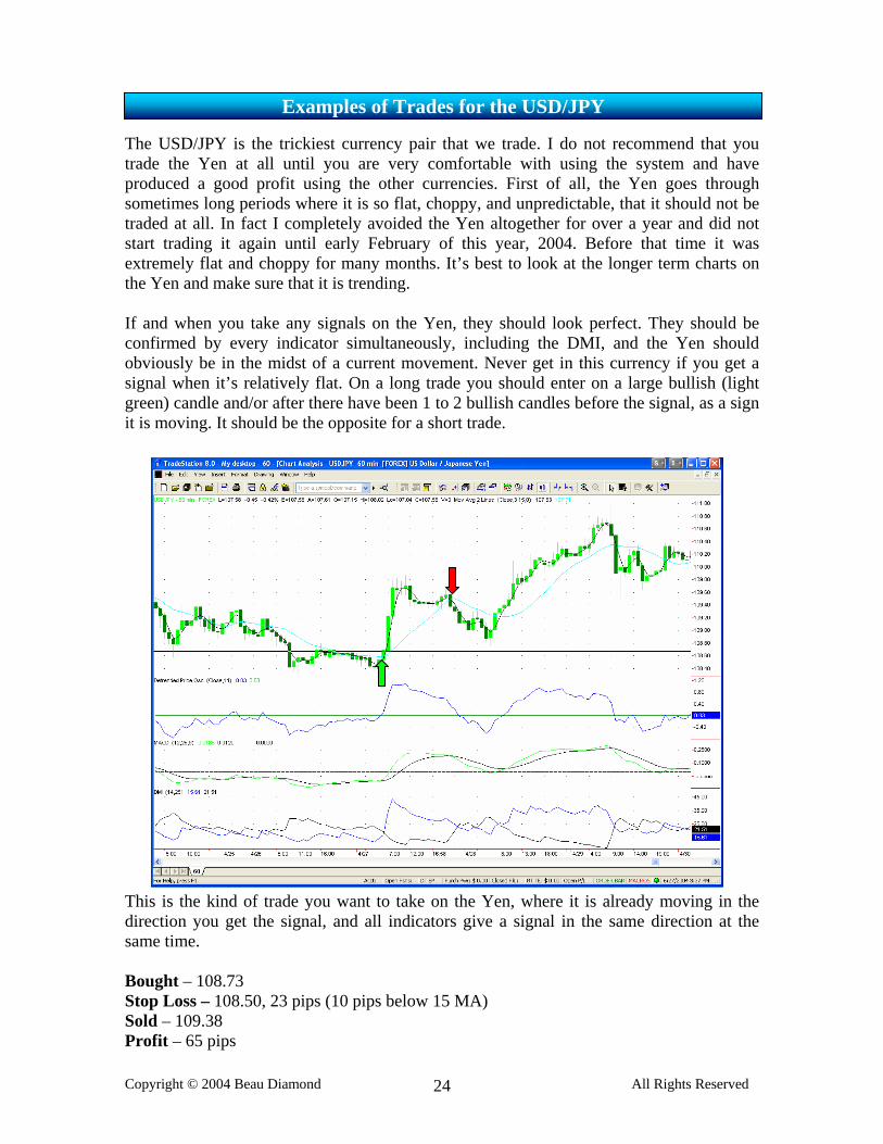
The USD/JPY is the trickiest currency pair that we trade. I do not recommend that you trade the Yen at all until you are very comfortable with using the system and have produced a good profit using the other currencies. First of all, the Yen goes through sometimes long periods where it is so flat, choppy, and unpredictable, that it should not be traded at all. In fact I completely avoided the Yen altogether for over a year and did not start trading it again until early February of this year, 2004. Before that time it was extremely flat and choppy for many months. It’s best to look at the longer term charts on the Yen and make sure that it is trending. If and when you take any signals on the Yen, they should look perfect. They should be confirmed by every indicator simultaneously, including the DMI, and the Yen should obviously be in the midst of a current movement. Never get in this currency if you get a signal when it’s relatively flat. On a long trade you should enter on a large bullish (light green) candle and/or after there have been 1 to 2 bullish candles before the signal, as a sign it is moving. It should be the opposite for a short trade. This is the kind of trade you want to take on the Yen, where it is already moving in the direction you get the signal, and all indicators give a signal in the same direction at the same time. Bought – 108.73 Stop Loss – 108.50, 23 pips (10 pips below 15 MA) Sold – 109.38 Profit – 65 pips
This is an example of a good sell signal on the Yen. You’ll notice that the signal came at the end of a large bearish candle, indicating it was currently in the midst of a move down, and all indicators then provided a sell signal on this candle. This is the kind of trade you want to look for on the Yen. Sold – 105.48 Stop Loss – 1.0578, 30 pips Bought – 104.21 Profit – 127 pips
Here’s an example of how tricky the Yen can be. At the time, this looked like a great signal. It went just 20 pips in the right direction, and then came right back down, triggering the stop. It was a small loss, and losses should be expected on every currency, but the Yen has a tendency to do this more often than the other currencies, and it takes a little more experience to trade it successfully. Bought – 110.37 Stop Loss – 110.07 (10 pips below the 15 MA) Sold – 110.07 Loss – 20 pips
This is an example of a trade you should NOT take. Can you see why? Everything confirmed the trade except the MACD. The MACD was not above the signal line, so this buy signal was NOT valid. As it happened, if one were you to take this trade it would be a loss. You will sometimes see trades where the MACD does not confirm it, but every other indicator looks perfect. It may be tempting to jump the gun even though the MACD is not yet on the correct side of the signal line, but the MACD confirmation is an important part of this system, so make sure you do not take any trades that are not confirmed by it.
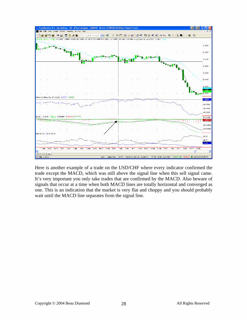
Here is another example of a trade on the USD/CHF where every indicator confirmed the trade except the MACD, which was still above the signal line when this sell signal came. It’s very important you only take trades that are confirmed by the MACD. Also beware of signals that occur at a time when both MACD lines are totally horizontal and converged as one. This is an indication that the market is very flat and choppy and you should probably wait until the MACD line separates from the signal line.
This is an example of a long trade on the GBP/USD that you would not want to take. Every indicator except the MACD confirmed the trade, but it was clearly against the trend of the MACD, and would be a losing trade.
This is an example of a trade where the DMI had not crossed yet, and it was just too far apart. It was not close together enough to justify a trade. It does not look like the DPO ever crossed above the zero line on this trade, but in real time, it did, but since it was just a false spike, and the market turned around quickly, it went back below the zero line and looked like it never crossed. This is something that happens from time to time. When the DMI lines are so far apart and the +DI is this far below the –DI when you are looking for a buy signal it simply shows that the market is not yet ready to move up, and entering the trade would be premature. As you can see the market quickly spiked the other direction and the trade would be a loss. Several bars later the DMI did confirm the trade and it was a large winner.
The most active trading hours in the Forex market correspond to London’s banking hours, and the early part of US business hours. Approximately 2 AM to noon is when the market is most active. However, the result of a lot of testing has shown that the EZ Trade System produces signals for profitable trades as early as 8 PM EST, and as late as 12 noon EST. I do not recommend that you take any trades between the hours of 12 PM to 8 PM each day, as these are the hours when the market experiences the least volatility, and signals will much more likely be false during this no man’s land, so to speak. What you have just learned is more than enough for you to have tremendous success trading, as the system as you have just learned it is consistently profitable. However, as traders, the more tools we have in our toolbox, the more prepared we are for changing market conditions and the better off we will be in the long term. If you are flexible and have a lot of knowledge of how to spot many different trading opportunities using various methods, then you will have the greatest success as a trader. I am going to share with you a variety of different methods that I use to confirm trades, in addition to what you have already learned. I recommend that you acquaint yourself with the core of the system as explained thus far, as it is very effective and you should be very comfortable with it before you try to add other things to the mix.
Trendlines can be one of the easiest indications of support and resitance levels, and are a great tool to help confirm trades. Used with this system it can increase the probability of a trade being a winner if the signal comes right after a trendline is broken, or right after prices bounce of a trendline and then go the other way. Trendlines indicate market momentum, and are sometimes referred to as momentum lines. When prices break a trendline it can often indicate a change in the direction of the market momentum, and is therefore a good tool to add to your repertoire. Please take a look at the examples on the following pages of trades confirmed by trendlines.
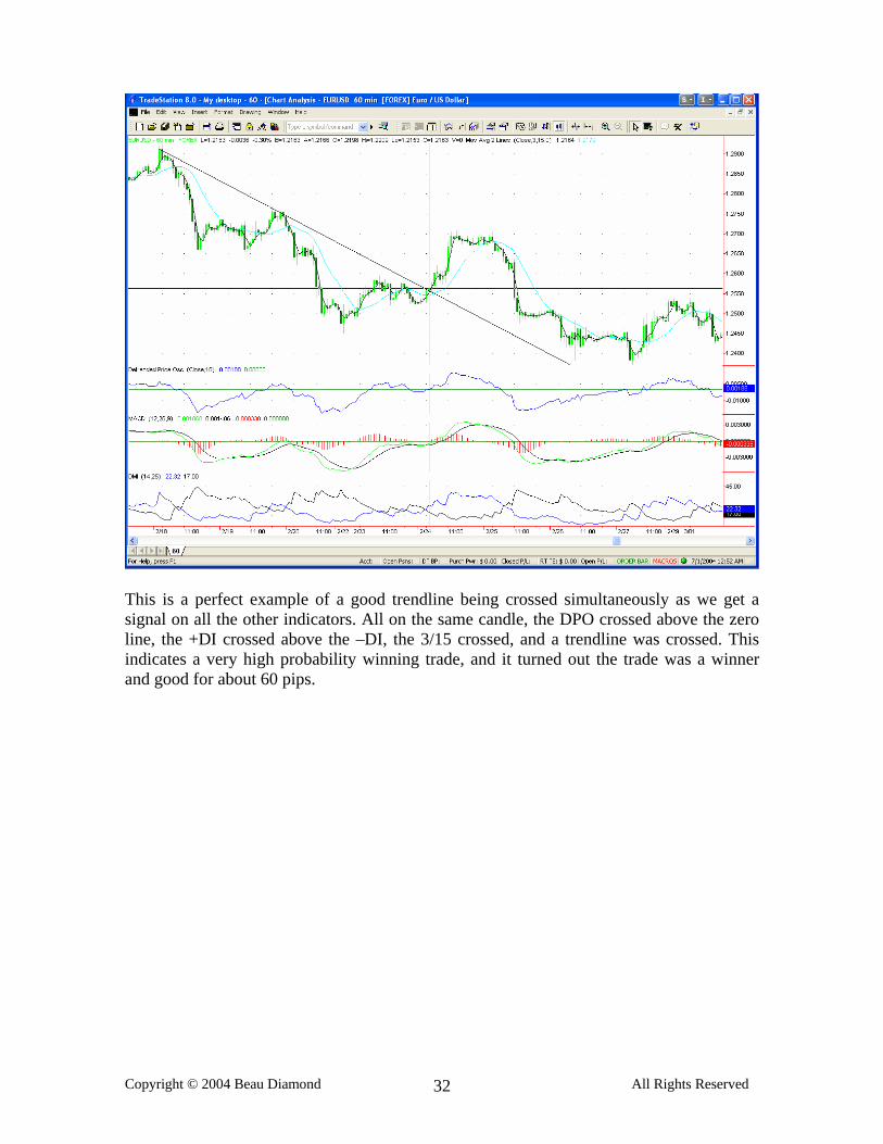
This is a perfect example of a good trendline being crossed simultaneously as we get a signal on all the other indicators. All on the same candle, the DPO crossed above the zero line, the +DI crossed above the –DI, the 3/15 crossed, and a trendline was crossed. This indicates a very high probability winning trade, and it turned out the trade was a winner and good for about 60 pips.
This is a great example of a trendline confirming a sell signal. Again, on the same candle all indicators showed a sell signal, as well as the trendline being crossed. You can see there were two valid trendlines drawn from the previous movement upward. As the first was broken the sell signal came. Prices briefly broke the second trendline and then bounced upward, almost exactly to the 15 MA, as they are known to do pretty frequently, then proceeded to plummet. This turned out to be a 200+ pip winning trade.
In this example a good trendline was broken right as a sell signal came once again. It’s often a good idea to keep trendlines on the chart for a while, even after they are crossed. The market will frequently go almost exactly to the level of a previous trendline, on a new movement. Trendlines that represent support will suddenly represent resistance after they are crossed.
This trendline was crossed and then the market briefly pulled back to the trendline, and resulted in a loss on this trade. Sometimes the market will temporarily fail on the first attempt to break a trendline, then pull back to it, and on the second attempt will keep going. So if you are ever see the market pull back to the trendline after it breaks it then go back in the directly of the break in momentum, you should definitely take a signal that occurs at this point.
Here is another good example of a trendline that was crossed right as a sell came. The trade turned into a good sized winner. You can see that trendlines can be a very simple, yet helpful tool in confirming trades.
When you draw a line connecting the lows in an uptrend, this is a trendline. When you draw a line connecting the highs in an uptrend this is a channel line. On the other hand, when you draw a line connecting the highs in a downtrend, this is a trendline. When you draw a line connecting the lows in a downtrend, this is a channel line. Channel lines can very helpful in helping you to determine future highs in an uptrend, and future lows in a downtrend. A channel line can give you a projection of future price action in the current trend. In addition, when a channel line is broken and the market moves beyond it, that normally indicates acceleration of the current trend. When you are able to draw a parallel, or fairly close to parallel trendline on the opposite side of a channel line, this is a trend channel. The trend channel can be used as a target indicator, as well as providing a general sense of direction and a projected range for new price action. In the case of a trending market, it is sometimes difficult to find support and resistance, especially if the market is at a new high or low. Once the price reaches the upside of a trend channel, in a long trend, it is a fair indication of a potential top, an end to that particular move. You could then expect the market to move towards the other side of the channel. On the following pages are many different examples of channel lines and trend channels This is a good example of a channel line. In an uptrend a trendline would connect the lows, where as this line connects the highs. You can see that the market touched the channel line 3 times after the initial line was drawn from point A to point B. Channel lines can often give you accurate future price projections, as this one does in this example.
As you can see from both of the examples below, when you are able to draw a parallel trendline on the other side of the channel line, you have a trend channel. As you can see, when prices moved outside of both of the following trend channels, the trend changed. In addition, the channel provided accurate projections of the highs and lows within the trends.
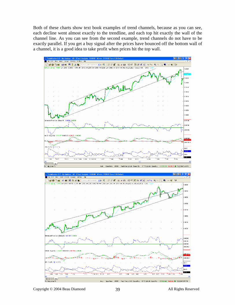
Both of these charts show text book examples of trend channels, because as you can see, each decline went almost exactly to the trendline, and each top hit exactly the wall of the channel line. As you can see from the second example, trend channels do not have to be exactly parallel. If you get a buy signal after the prices have bounced off the bottom wall of a channel, it is a good idea to take profit when prices hit the top wall.
Two more good examples of trend channels below. As you can see from the arrows, there are several buy and sell signals with the EZ Trade system in this trend channel.
The following are two examples of sideways trend channels, or trading ranges. When you spot a trading range, you do NOT want to enter the market until prices break out of the sideways channel.
In the first example you can see that the trend greatly accelerated once this channel line was crossed. This will often occur. In the second example once the channel line was broken, a new trend channel was drawn.
Aside from the 3 and 15 moving average lines, certain other MAs can be very helpful for determining support and resistance, targets, and when the trend is changing. The first is the 200 MA on an hourly chart. The 200 MA offers very strong support and resistance, and it is remarkable how often prices will halt exactly at the 200 MA before bouncing off and going the other way, or breaking through it and changing trends. There are two simple ways to use the 200 MA along with the EZ Trade system.
(1) If you take a signal, and the trade turns into a winner, and prices have moved a significant amount (100 pips or more) and prices are approaching the 200 MA it is a very good place to take profit. If prices have already moved considerably in one day, and then reach the 200 MA they are unlikely to keep going that day. This is especially true if is close to or after 12 noon, EST.
(2) If prices go to the 200 MA, fail at that level, bounce off, and then you get a signal on the EZ Trade system, this is a high probability winning trade. An example of this is in the chart below on this page.
Other ways the 200 MA can be helpful is stop loss placement. If you go long right above the 200 MA, it’s a good idea to place your stop loss at least 10 pips below it, because the market may pull back to the 200 MA before moving further. Take a look at some examples on the following pages of how significant the 200 MA on the 60 minute chart can be.
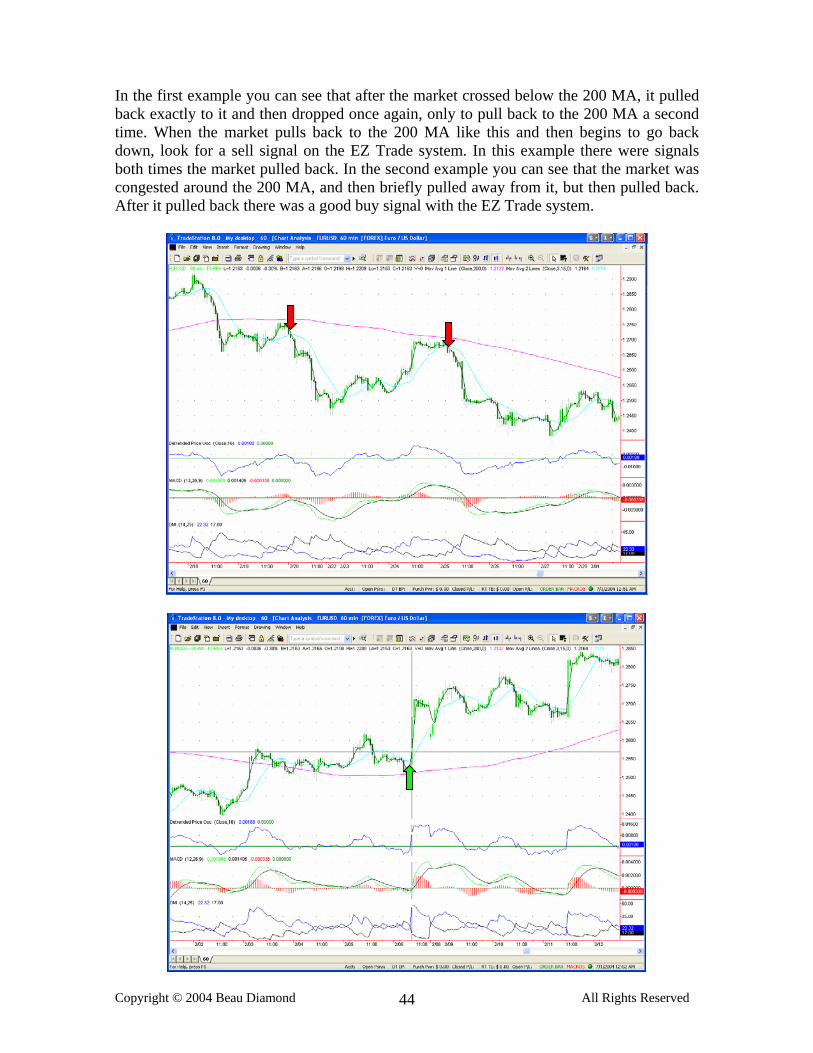
In the first example you can see that after the market crossed below the 200 MA, it pulled back exactly to it and then dropped once again, only to pull back to the 200 MA a second time. When the market pulls back to the 200 MA like this and then begins to go back down, look for a sell signal on the EZ Trade system. In this example there were signals both times the market pulled back. In the second example you can see that the market was congested around the 200 MA, and then briefly pulled away from it, but then pulled back. After it pulled back there was a good buy signal with the EZ Trade system.
In the first chart you can see that the market bounced off the 200 MA twice, both times giving buy signals. In the second chart on three separate cases the market pulled back exactly to the 200 MA on each decline of this uptrend, each time giving a buy signal after it bounced off the 200 MA.
This short trade is a great example a trade that occurred relatively far from the 200 MA, and the market moved over 100 pips from the point of the short signal, and prices halted exactly at the 200 MA. This is a prime example of a circumstance when you should exit the trade when prices reach the 200 MA. Now if it was only 40 pips below where the signal came, and the prices hit the 200 MA early in the day that’s probably an indication the market is going to go straight through it. But if there is a significant 100+ point move before the market hits the MA, and especially if 200 MA isn’t hit until the afternoon, after a long late night and early morning move, it’s a good idea to take profit at the 200 MA.
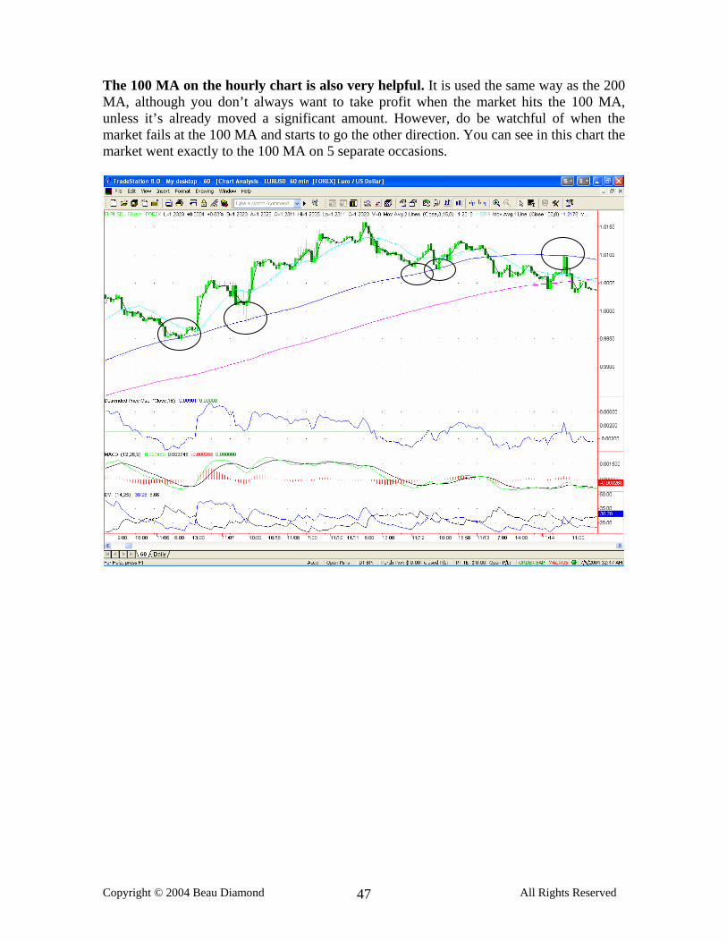
The 100 MA on the hourly chart is also very helpful. It is used the same way as the 200 MA, although you don’t always want to take profit when the market hits the 100 MA, unless it’s already moved a significant amount. However, do be watchful of when the market fails at the 100 MA and starts to go the other direction. You can see in this chart the market went exactly to the 100 MA on 5 separate occasions.
Here are two more good examples of the 100 MA offering support and resistance. In the first example, the market hit the 100 MA twice in the beginning of this uptrend. Towards the right edge of the chart the market briefly hit the 100 MA, bounced up a bit, then crossed it completely. In the second example there’s a perfect long trade after the market bounced off the 100 MA.
The third simple moving average line I use is a 50 period MA on the hourly chart. It is used similarly to the 100 and 200 MAs, and offers support and resistance levels, but not as strong as the 200 MA. When the market is in a strong trend, it will sometimes retrace to the 50 MA before continuing to move in the direction of the trend, as you can see from the following two examples.
When you take a long signal, and the market is below the 50, 100 and 200 MAs, the first one crossed will generally be the 50 MA, if the market is already in an uptrend. You can see each stage of the movement as it crossed each MA. This chart is a good example of a time where you would NOT take profit at the 200 MA, even though it had already moved a significant amount from the signal. The reason why is that it was only 8 in the morning Eastern time when the 200 MA was hit, and if it’s that early in the day the currency will probably keep moving in the same direction. If it’s closer to noon and it’s already moved a considerable amount, then you would want to think about taking profit near the 200 MA.
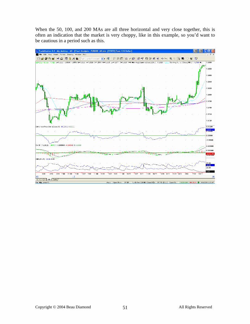
When the 50, 100, and 200 MAs are all three horizontal and very close together, this is often an indication that the market is very choppy, like in this example, so you’d want to be cautious in a period such as this.
There is an interesting phenomenon regarding the 50 and 200 MAs that I call “filling in the gap”. It’s very simple. When there is a large gap between the 50 and 200 MA, and the market crosses through one, it will often fill in the gap between the other. Take a look at the following 4 examples of the market breaking through the 50 MA and filling in the gap between it and the 200 MA. This happens with relative frequency and you should keep an eye out for it.
I suggest you trade for a while just on the one hour chart until you feel very comfortable with the system and you are having good results. When you are ready you may want to learn how to enhance the system by using other time frames in certain cases. I regularly monitor the 30 minute, 1 hour, 2 hour, 4 hour and daily charts when I am trading. Almost all of the signals I take are based on the 1 hour chart, but I use the other charts to give me a better feel for the overall direction of the market and also to pinpoint my entry point on some trades. I also switch to a higher time frame when one time frame looks too choppy. On the 30 minute, 1 hour and 2 hour charts I keep the exact same indicators, with the same settings. The 4 hour chart I have a 25 period simple moving average line instead of the 3/15 cross, and a DPO set to 16 and the DMI with default settings. On the daily chart I just have the 50, 100, and 200 MAs. If I take a signal on the 30 minute chart, I take it with the exact same indicators and same rules you have learned with the 1 hour chart, however I only take signals on the 30 minute time frame when I have a very strong confirmation that the market is switching directions, and I want to get an earlier entry point than the 1 hour system will give. If you take all the signals on the 30 minute chart the same as you do with the 1 hour chart you will have a lot more losses, so this is why I only use the 30 minute chart when there are very strong confirmations for the trade. Examples of this would be if the market has already crossed a significant trendline, and it is clear that the market has changed momentum. If the 60 minute chart is not close to giving a signal yet at this point, I may switch to the 30 minute chart and take the signal on that, which almost always comes earlier. Other examples are basically anytime the market either breaks through, or bounces off a significant support or resistance level as defined by a trendline, trend channel, 100 or 200 MA, strong chart pattern or a Fibonacci retracement level (which we will talk about soon). When the market bounces off or breaks through a significant support or resistance level I sometimes want to get in as soon as possible, so I take the 30 minute signal instead of waiting for the 60. This should only be done when you have a good amount of experience using the system and are clear on the type of confirmations that give strong indications it is a good time to take the 30 minute signal. Let’s take a look at a couple examples of this.
These two charts show the same trade. One was the signal on the 60 minute chart and the second one on the 30 minute chart. When you see a good trendline such as this crossed during active trading hours, the market is very likely changing directions, and I like to get a better entry point, rather than waiting for the 60 minute to cross if it looks like it’s going to have to move a lot further. By taking the signal on the 30 minute chart you get an entry point more than 50 pips lower than by taking the 60 minute signal on this particular trade.
I also sometimes switch from the 1 hour chart to the two hour chart when the market is very choppy and the DPO is nearly flat, right on the zero line for too long. By switching to the 2 hour chart you will not get as many signals and it can often get you positioned for a breakout without getting whipsawed as much during a choppy zone as you would if you were just looking at the 1 hour chart. These two examples show the same period on a 1 hour and a 2 hour chart. When it started to look choppy I switched to the 2 hour chart and there was only 1 false signal on the 2 hour chart in this period instead of 3 or 4 on the 1 hour. The 2 hour still caught the breakout and gave a signal at a good level.
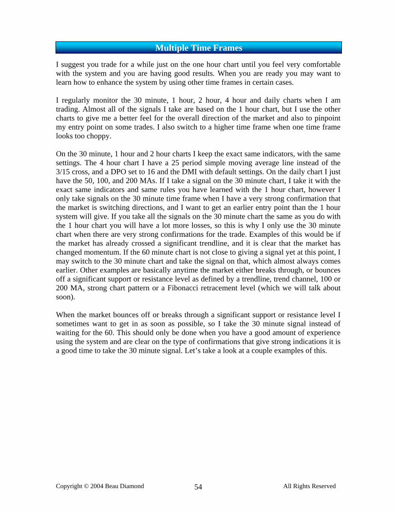
I also use a 4 hour chart, but do not have all the same indicators. I use the DPO, also set to 16, and the DMI, but I don’t use the MACD or the 3/15. I also do not use the 50 or 100 MA, but do use the 200. I instead use a 25 period simple moving average line. If I ever take signals on the 4 hour chart, I look for a cross on the DPO, confirmed by the DMI. I don’t often take these signals however, and more use the 4 hour chart for a larger overall picture of the market, and for drawing trendlines and Fibonacci retracements. The 4 hour chart can give you a good indication of the current trend, and tell you whether a signal you are taking on the 1 hour chart is with or against the trend, or possibly right as the trend is changing, and can thus be helpful in terms of knowing whether to go for less or more profit on that particular trade. Here is the 4 hour chart that I look at:
I consider the market in an uptrend according to the 4 hour chart when the DPO is above the zero line and the prices are above the 25 period MA. If you match this up with the 1 hour chart when you are taking signals you can sometimes tell if you are more or less with or against the trend or if the market is in a trading range. I have recently found signals on the DPO, confirmed by the DMI on the 4 hour chart to be quite reliable on the GBP/USD and the AUD/USD. If you do take signals with the 4 hour however, remember that it’s a larger time frame and you must allow for more market fluctuation, so it normally requires a stop of 50 pips or more, and if you enter the market based on the 4 hour chart you should place the stop on the other side of the 25 MA and trail it behind the 25 MA. You may want to take half profit at 100 pips and stay in the trade until prices cross back over the 25 MA. I suggest trailing the stop 10 to 20 pips on the other side of the 15 MA.
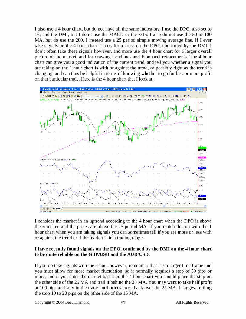
DPO signals on multiple time frames simultaneously can often mean a higher probability winning trade. This is a very easy to use method to confirm trades. Just switch to a 30 minute chart, a 2 hour and a 4 hour and see if any of the DPOs are crossing at the same time. It could be the 30 and the 120 or the 60 and the 4 hour or the 30 and the 60 or the 120 and the 4 hour or all four of them at once or any combination. The more that cross at the same time, the better it is. When you see 3 or more DPOs on different time frames cross at the same time, this most likely means a very high probability winner. By the “same time” I mean 1 to 3 candles within the shorter time frame. So if the 4 hour DPO crosses within 1 to 3 candles of the 1 hour chart, I would consider this simultaneous. Or if the 2 hour crosses within 1 to 3 candles of the 30 minute chart, etc.
This is an example of the DPO crossing simultaneously on the GPB/USD on the 1 hour, 2 hour and 4 hour charts. As you can see it was followed by a 150+ pip move. I also use the daily chart to give me a “big picture” so to speak, and to gage the long term trend. It’s also important to draw trendlines on the daily chart and check them every day to see if the market is close to a significant trendline that could help you with a trade. You need the daily chart to draw trendlines on big, long term movements that you simply cannot see on shorter term charts. Take a look at a few examples of trendlines on the daily chart and how significant they can be. The 50, 100 and 200 day MAs on the daily chart also offer strong support and resistance.
This is a trendline you would only be able to easily see on the daily chart because the time that it spanned. When it was crossed you can see how far the market moved up in just a matter of a couple days. It was also at the same moment that the 50 MA was being crossed. Had you not looked at the daily chart you would not have known this was happening. This coincided with a signal on the EZ Trade system on the hour chart that was then confirmed once in the trade by this cross of the trendline and the 50 MA on this daily chart.
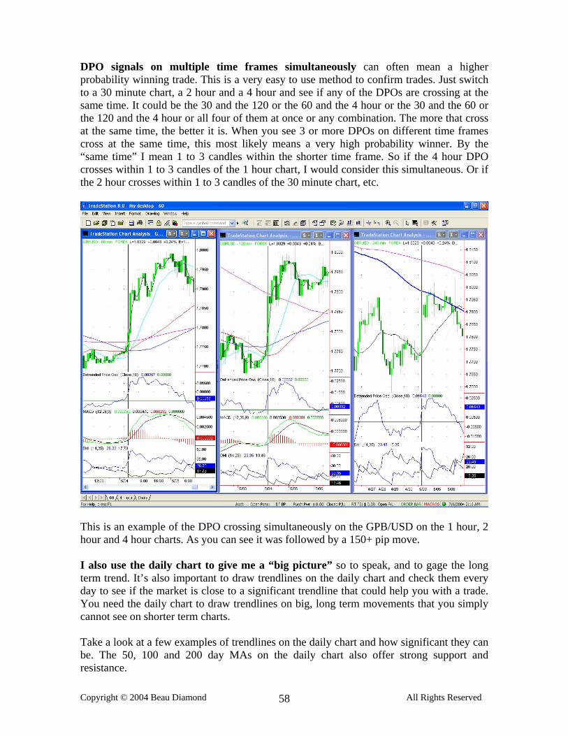
Take a look at the movement followed by the cross of the first trendline on the chart. And the second line is a channel line going across the neckline of this reverse head and shoulders formation. When the neckline was crossed the market proceeded to rise over 800 pips over the next 6 weeks. Notice also that the head on the reverse head and shoulders formation stopped short exactly at the 100 MA. You would have to look at the daily chart to see this head and shoulders formation. I suggest you look at the daily chart for each currency on a daily basis and look for any chart patterns and trendlines that you can spot. It will help you have a better feel for the market, tell you whether you are going with or against the long term trend, and give you good confirmations for trades.
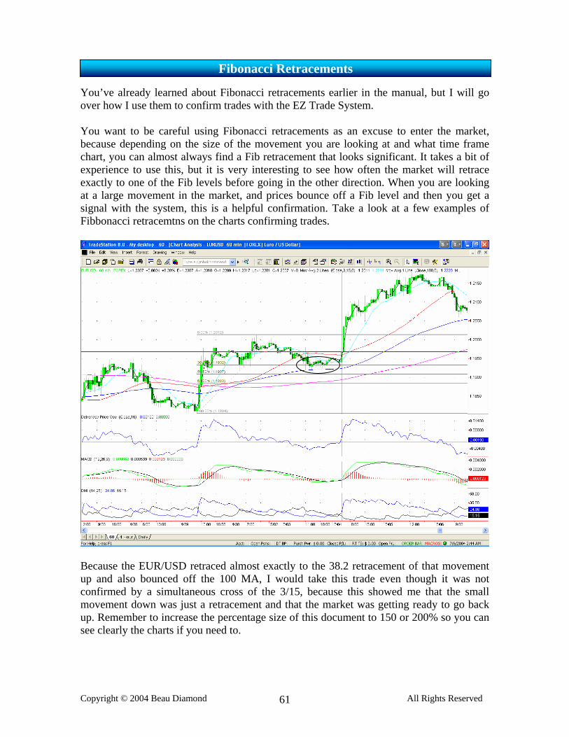
You’ve already learned about Fibonacci retracements earlier in the manual, but I will go over how I use them to confirm trades with the EZ Trade System. You want to be careful using Fibonacci retracements as an excuse to enter the market, because depending on the size of the movement you are looking at and what time frame chart, you can almost always find a Fib retracement that looks significant. It takes a bit of experience to use this, but it is very interesting to see how often the market will retrace exactly to one of the Fib levels before going in the other direction. When you are looking at a large movement in the market, and prices bounce off a Fib level and then you get a signal with the system, this is a helpful confirmation. Take a look at a few examples of Fibbonacci retracemtns on the charts confirming trades.
Because the EUR/USD retraced almost exactly to the 38.2 retracement of that movement up and also bounced off the 100 MA, I would take this trade even though it was not confirmed by a simultaneous cross of the 3/15, because this showed me that the small movement down was just a retracement and that the market was getting ready to go back up. Remember to increase the percentage size of this document to 150 or 200% so you can see clearly the charts if you need to.
Here is another example where the market retraced exactly to the 38.2 retracement of the previous movement down, and then proceeded to go back down. There was a good signal on the EZ Trade system after this occurred, and at almost exactly the level of the 38.2 retracement was the 50 and 200 MA, with the 100 MA right above it. This was a clear signal that the market was headed south.
It is a good idea to drawn fib retracements on longer term charts in addition to the 60 so you can see larger movements. The AUD/USD in this example retraced precisely to the 38.2 fib level and then produced a signal on the 4 hour chart. This was followed by a large move down.
This is another example of the AUD/USD where the market retraced exactly to the 61.8 fib level and once the DPO issued a buy signal on the 4 hour chart, this was followed by 200 pip move. As you can see, the Fibonacci retracements can be a very good tool.
This is the current EUR/USD daily chart. The February to April trend down retraced exactly 50% and then halted. It is again approaching this 50% Fib retracement, and if it keeps going beyond it will likely go to the 61.8 retracement above it. If it again fails at this level it will be a double top, and I would look for a sell signal. After the EUR/USD bounced off the 50% retracement in early June I looked for a short signal and there was a short signal on the EZ Trade system shortly after this 50% retracement was hit. This trade was over a 200 pip winner.
I like to use a blank chart with no moving average lines, and only the DPO so I can just see the candles for drawing trendlines and chart patterns. I find it easier to spot trendlines, trend channels, flags, triangles, head and shoulders formations, DPO divergence, etc just with a blank candlestick chart. I switch up and back between the 1 and 2 hour blank chart and look for any relevant trendlines or chart patterns that can help me. In this example you can see a perfect reverse head and shoulders formation on this EUR/USD 2 hour chart. After the neckline was crossed there was a nice movement up on the Euro. Right before this reverse head and shoulders formation was divergence between the prices and DPO. The EUR/USD made a new low (A), and the DPO barely came down showing strong divergence (B). When this happens you’d simply look for the next upward cross of the DPO, which in this case offered a nice little opportunity for profit.
QUESTION: There was a signal on the DPO, and it was confirmed by all the other indicators. But after the DPO crossed above the zero line, the market completely reversed and I was stopped out. It then looked as if the DPO had never crossed above the zero line in the first place. Is this normal? Is there any way to avoid this?
ANSWER: Like all indicators, the detrended price oscillator can sometimes look
different in the past than it does in real time. If the market reverses quickly, what looked like a perfectly good signal can sometimes disappear. This does not mean that the signal was not valid, and it is just a normal part of trading. It is factored in as part of the losing trades. Luckily, more often then not, when we get a signal on the DPO confirmed by all the indicators we use it filters out as much of these kinds of circumstances as possible. One thing that you can do is wait 5-10 minutes after the DPO crosses the zero line to make sure it isn’t just a false spike.
QUESTION: Should I wait until the close of the candle after the DPO crosses to take the
trade? ANSWER: No, you should not. Although this is one way to help filter out false spikes
on the DPO, if all of the other indicators confirm the trade when the DPO crosses zero, you should wait 5 to 10 minutes and then enter the trade. The problem with waiting for the close of the candle is that we are using an hourly chart, and a LOT can happen in an hour. The signal might come right in the beginning of a large, relatively fast movement and it could move up 50 pips or more in that hour after the signal comes. Imagine if you end up entering 50 pips higher than the signal on a long trade, or 50 pips or more below the signal on a short trade. This can obviously make a huge difference, and could turn what would be a profitable trade into a very small winner, or a loss.
QUESTION: I looked at the charts and saw moves in the market that did not have signals
confirmed by the MACD, or were not confirmed by the 3/15 cross, but they were big moves. Shouldn’t the system catch these movements?
ANSWER: Absolutely not. One thing that you must realize about trading is that no
trading system in existence catches every move in the market, or even close to every movement. If a system did catch every movement you could turn a small amount of money into millions and millions of dollars in just a few short months. Don’t deceive yourself into thinking that anyone is pulling that off. There are absolutely trades that you will miss out on because they were not confirmed by the 3/15 cross, or they were not confirmed by the MACD, or they came at an odd hour, and some of them will be very large movements. You should expect this. What IS important, is that if you look at the trades that take place without using all our indicators as confirmations and see what the statistics are for winning and losing trades you will see
that you will have a much higher percentage of losers. By only taking signals that are confirmed by all the indicators you will catch fewer trades, but the ones you DO take will have a much higher probability of being winners. The only thing that matters when you are using a system is that you are taking more winning trades than losing ones, and/or that your winners are a lot larger than your losers. If you have this combo, and the system is a producing a regular profit, than that is all that matters. This system produces approximately 4 trades per week per currency pair, so I personally would not even want to use a system that produced more trades that that. Remember that every time you trade you expose your capital to risk, so overtrading can really go against you when the market has more losers during a choppy period. The last thing you want is a system that overtrades.
QUESTION: What about economic news and data releases? Should I stay out of the
market during these times? Or should I take under consideration what direction the market may move based on an important economic announcement or data release?
ANSWER: I don’t ever suggest you try to guess the direction the market will move
based on what figures are released, as this has proven very unreliable. You should definitely however find out when significant economic figures and announcements are released, because it does normally cause a fast movement in the market. They are normally released at 8:30 AM EST and very often on Thursdays and Fridays, although it could be any day of the week. Because of the strong, fast movements that economic announcements often cause, there is very frequently an EZ Trade signal right after the figures are released, but the market moves so fast that you sometimes are forced to take a relatively poor entry point, in relation to how far from the 15 MA you are forced to enter, in which case I recommend taking smaller than normal positions so you are able to accept the same level of risk using the larger stop loss. You always should allow for more fluctuation in the market when figures come out, as the market has a tendency to bounce around in a more volatile manner than usual. Because of the large movements that often proceed economic figure releases I do recommend that you take advantage of the signals that occur in these cases. I just urge you to use more caution, and you may want to watch it happen a few times before you take part in these fast market conditions.
QUESTION: If I get a signal and there is a trendline drawn on the chart that has not been
crossed yet, should I wait for the trendline to be crossed before I enter the trade?
ANSWER: No, if there is a good signal, you should not wait, as this could mean
entering 20 or 30 pips worse than the entry point of the actual signal, which could force you to use a march larger than normal stop loss. On the other side of this coin, if a good trendline is crossed before you get a signal, you may want to switch to the 30 minute chart and see if there is a signal there.
For the last few weeks I have been working on replacing the DPO with a very similar indicator, but that moves more smoothly with a little less whipsaws than the DPO. I have come to the point that I am very satisfied with the result. I am now using the exponential price oscillator with very specific parameters across the board as a replacement for the detrended price oscillator. It has less whipsaws, it is less zig-zaggy, it reacts in a more stable manner to price action than the DPO, and actually gives more accurate buy and sell signals. In TradeStation, the price oscillator is not exponential, so I had to go in and change the code to make it exponential. Most other software I have used already has the price oscillator exponential. For the two inputs, I have tested an enormous amount of combinations and right now I am most satisfied with: Fast Length: 4 Slow Length: 14 If you are using TradeStation please e-mail me if you are unable to change the price oscillator's code to be exponential and I will e-mail you the indicator, also set for the price alarms to go off when it crosses zero. If you are NOT using TradeStation, and your software does not list the price oscillator then you will have to stick with the DPO.
This is a screen shot of the XPO and the DPO. The XPO is in blue and DPO in red. They both work, but I personally think the DPO is too reactionary to prices.
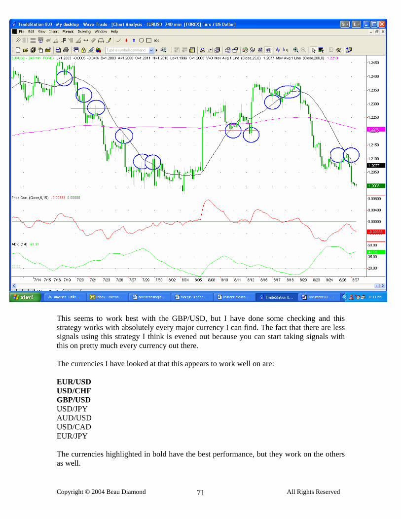
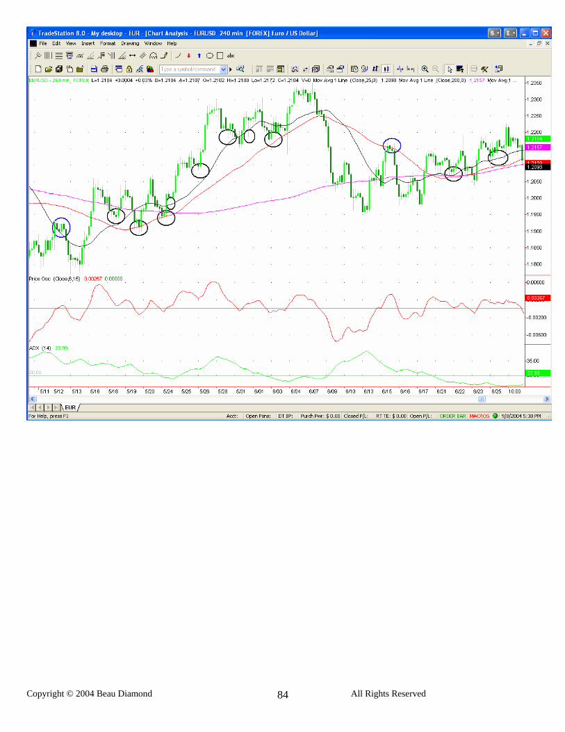
I constantly search for ways to improve my results trading, and tweak the EZ Trade system to have less risk and higher profitability. I have recently modified my way of trading, which I am going to share with you. Some of you may be comfortable with this and like the idea of it, and others may want to stick to the strategy as you have learned it, which is fine. Both work, but I have found a way to very much limit the number of signals taken, to only be with the trend on the 4 hour chart. I have found that this sort of skims the cream off the top so to speak, and only picks signals that have a much, much higher probability of being winning trades, than standard EZ Trade signals as you have learned the system. The other side of this is that the criteria for these signals are met much less frequently, but when they are, the winning percentage is very much increased, and many of the winners are very large. The premise is that in any given trend, the market always retraces before it continues to move back in the direction of the trend, and when the market is in an established trend, if you are trading in the direction of the current trend and find a good entry point within that trend, you will have a high probability of winning the trade. I’m not just taking any trade that is in the direction of the trend of the 4 hour chart. I’m only taking trades where the 25 MA on the 4 hour chart is clearly in an upward or downward angle, and prices retrace close to either the 25 period MA on the 4 hour, or the trend reverse level and then start to go back in the direction of the trend of the 4 hour chart and look for an EZ Trade signal at this point. In looking for an EZ Trade signal after this retracement I am only using the new price oscillator and the 3/15 MAs. No MACD or DMI is required when only taking the trades in the direction of the 4 hour chart, and when the prices bounce off the TRL or the 25 day MA on the 4 hour chart. As I’m sending out my daily trades from now on, it will show the 1 hour on one side of the screen and the 4 hour on the other side and you will start to understand what I’m looking for. In the meantime I will show you the current EUR/USD 4 hour chart and circle every point on the chart that I would look for a signal. I have also put two red lines where the trend reverse level was when it had any relevance to looking for a signal on the EZ Trade system. When looking for signals using this strategy I’m looking for trades between 7 PM and 12 PM EST. I ignore any signals between 12 noon and 7 PM EST.
This seems to work best with the GBP/USD, but I have done some checking and this strategy works with absolutely every major currency I can find. The fact that there are less signals using this strategy I think is evened out because you can start taking signals with this on pretty much every currency out there. The currencies I have looked at that this appears to work well on are: EUR/USD USD/CHF GBP/USD USD/JPY AUD/USD USD/CAD EUR/JPY The currencies highlighted in bold have the best performance, but they work on the others as well.
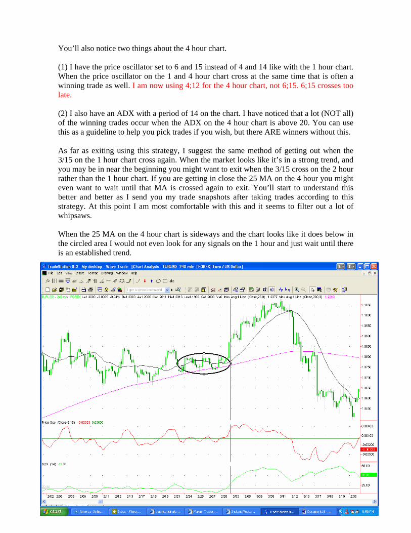
You’ll also notice two things about the 4 hour chart. (1) I have the price oscillator set to 6 and 15 instead of 4 and 14 like with the 1 hour chart. When the price oscillator on the 1 and 4 hour chart cross at the same time that is often a winning trade as well. I am now using 4;12 for the 4 hour chart, not 6;15. 6;15 crosses too late. (2) I also have an ADX with a period of 14 on the chart. I have noticed that a lot (NOT all) of the winning trades occur when the ADX on the 4 hour chart is above 20. You can use this as a guideline to help you pick trades if you wish, but there ARE winners without this. As far as exiting using this strategy, I suggest the same method of getting out when the 3/15 on the 1 hour chart cross again. When the market looks like it’s in a strong trend, and you may be in near the beginning you might want to exit when the 3/15 cross on the 2 hour rather than the 1 hour chart. If you are getting in close the 25 MA on the 4 hour you might even want to wait until that MA is crossed again to exit. You’ll start to understand this better and better as I send you my trade snapshots after taking trades according to this strategy. At this point I am most comfortable with this and it seems to filter out a lot of whipsaws. When the 25 MA on the 4 hour chart is sideways and the chart looks like it does below in the circled area I would not even look for any signals on the 1 hour and just wait until there is an established trend.
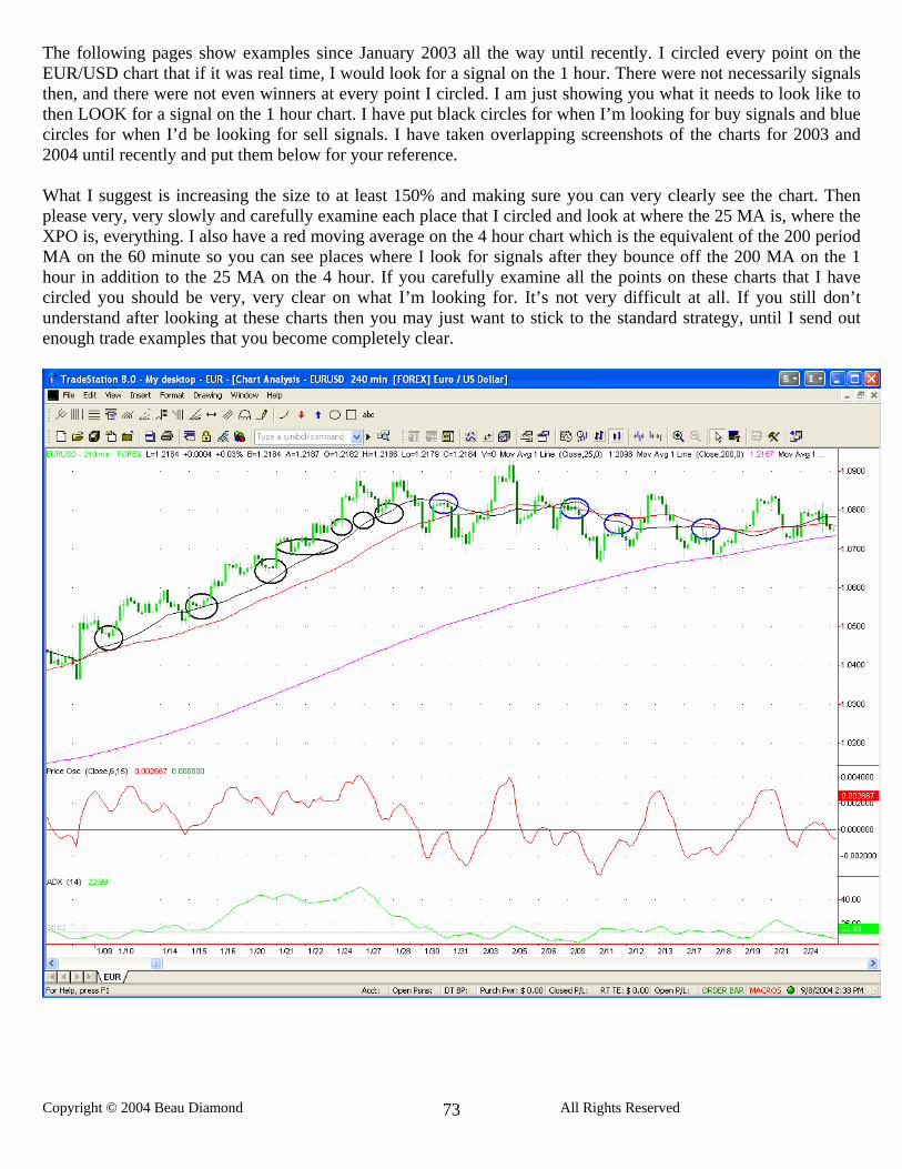
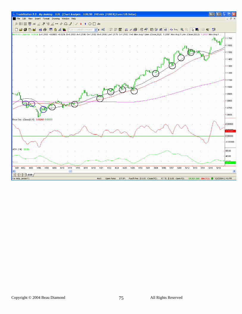
The following pages show examples since January 2003 all the way until recently. I circled every point on the EUR/USD chart that if it was real time, I would look for a signal on the 1 hour. There were not necessarily signals then, and there were not even winners at every point I circled. I am just showing you what it needs to look like to then LOOK for a signal on the 1 hour chart. I have put black circles for when I’m looking for buy signals and blue circles for when I’d be looking for sell signals. I have taken overlapping screenshots of the charts for 2003 and 2004 until recently and put them below for your reference. What I suggest is increasing the size to at least 150% and making sure you can very clearly see the chart. Then please very, very slowly and carefully examine each place that I circled and look at where the 25 MA is, where the XPO is, everything. I also have a red moving average on the 4 hour chart which is the equivalent of the 200 period MA on the 60 minute so you can see places where I look for signals after they bounce off the 200 MA on the 1 hour in addition to the 25 MA on the 4 hour. If you carefully examine all the points on these charts that I have circled you should be very, very clear on what I’m looking for. It’s not very difficult at all. If you still don’t understand after looking at these charts then you may just want to stick to the standard strategy, until I send out enough trade examples that you become completely clear.
I have only back tested this fully for the USD/CHF and have back tested it enough to be satisfied that it at least works for this currency. I am not going to use this strategy on any other currency until I fully back test those currencies as well. From some preliminary back testing it appears that it also may work on the USD/CAD and possibly the GBP/USD as well, but will hold off trading reversals on those currencies until I complete back testing for them. I have decided to use the 90 minute on the USD/CHF for these reversal trades and am also now using the 90 minute chart for normal with-the-trend signals on the USD/CHF as well. I have concluded that it just doesn’t make sense to trade the EUR/USD and USD/CHF with the exact same system on the exact same time frame, because they are too closely correlated. Thus I’ve decided to just use the 90 minute on the USD/CHF. You have already seen a spreadsheet that shows the results of this back testing for the USD/CHF. Not only did I back test the reversal trades on the USD/CHF with the 90 minute (which you’ll find on the right side of the spreadsheet) but I also back tested the with the 4 hour chart trades using the 90 minute chart (which you’ll find on the left side of the page). You can decide from these results or from your own testing whether or not you want to use this strategy. I have started using it on the USD/CHF. By the way, when back testing the reversal trades on the USD/CHF I have logged in the spreadsheet results from taking half profit at 75 pips on the reversal trades, and exiting the rest of the position when the 3/15 crosses. You can do this if you want. It does not increase the overall profit according to the back testing. It actually yields slightly less profit than just exiting every trade with the 3/15 cross, so this is up to you. By taking only trades on the one hour chart that are with the trend of the 4 hour, as explained in the last update, you will tend to catch a lot of the good movements that are with the trend, but what you will miss are some of the very large reversal moves, that come at the very end of an old trend, and at the very beginning of a new one. These are often some of the biggest moves in the market. So with that in mind, I have come up with a way to catch some of these reversal trades. This method does not have a great win to loss ratio, and if you match up the overall profitability of taking these trades against the 4 hour trend, compared with the ones with the 4 hour trend, it is not nearly as profitable, but it does add to your bottom line by about 30 to 40% and enables you to catch some very large reversal moves. All I am doing is putting Bollinger bands on the 4 hour chart and waiting for the market to bounce off the Bollinger bands and then look for a signal on a shorter time frame. By doing this I am able to catch some very large reversal moves at the beginning of new trends, but I also catch plenty of false signals when the market is still trending. When the market is not in a very strong trend, and it continually bounces off highs and lows and it is more in a trading range, the Bollinger bands will accurately signal reversals. The drawback is when the market is in a trend the market will touch or go through the Bollinger bands but then continue on the trend. To guard against too many false signals when trying to catch reversal moves in this way, I am using a 90 minute chart, instead of the 60 minute, and am using the XPO and 3/15, along with the MACD and the DMI. I am only taking signals on the XPO and 3/15 that are confirmed by the MACD and also the DMI. If the DMI hasn’t already crossed in the direction that I’m looking for a signal, then I won’t take the trade unless it is very, very close to crossing, almost touching. If the signal looks good aside from this then I will not wait for it to completely cross, but will get in as long as it is very close to touching. If the DMI confirms the trade by having already crossed this is obviously preferable, but I am taking them if it is close to crossing. I am staying
completely away from any of these reversal signals where the + and –DI are far apart and not close to touching. I am using the default value for the Bollinger bands on TradeStation, which is 20, 2, -2, and 0 displacement. Just use whatever the default value is for the Bollinger bands on your software. It’s going to vary very little. What do I count as the market bouncing off the Bollinger bands? Coming within 15 pips of the Bollinger band, actually touching the bands, or going through them and then coming back in the other direction. I’ll give you a few examples of these reversal trades below. You can see that the prices bounced off the upper 4 hour Bollinger band and then there was a short signal on the 90 minute chart. This trade was good for about 150 pips if you exited when the 3/15 crossed. There was a similar short signal right before this one that was a loser. You will get losing trades that occur while the currency is still in a trend, but if you use this strategy you will catch some good reversal trades that make up for the losers and add to your overall profit.
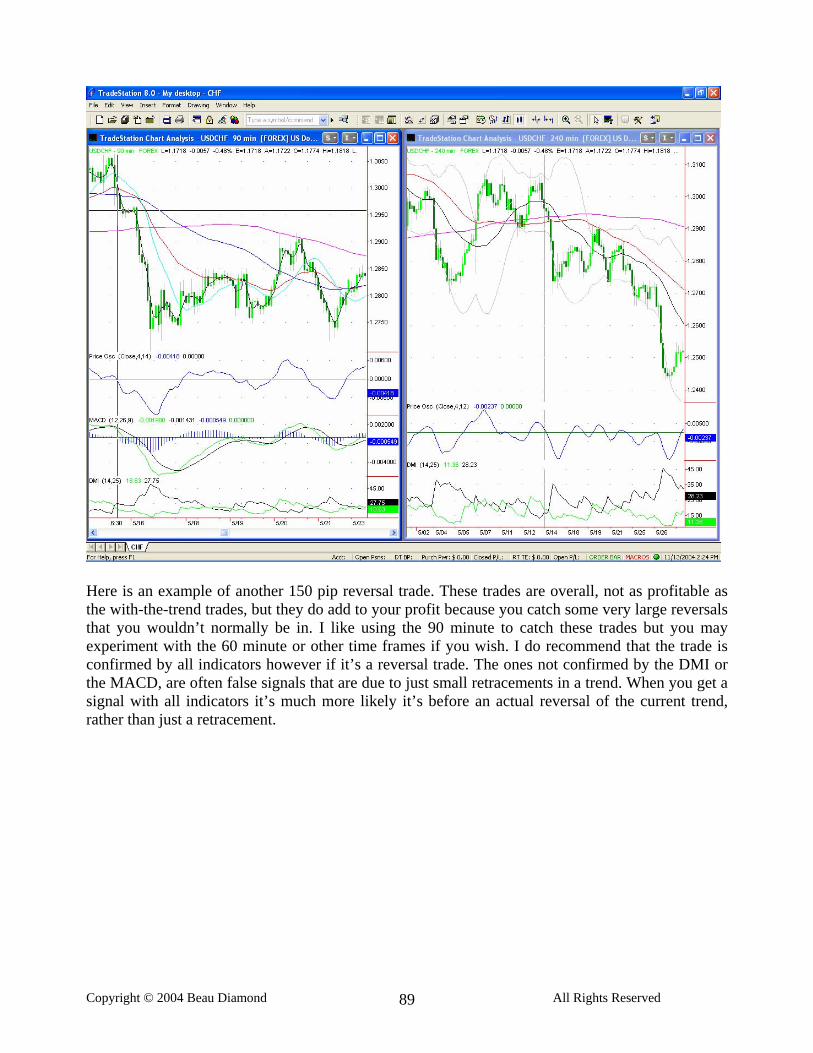
Here is an example of another 150 pip reversal trade. These trades are overall, not as profitable as the with-the-trend trades, but they do add to your profit because you catch some very large reversals that you wouldn’t normally be in. I like using the 90 minute to catch these trades but you may experiment with the 60 minute or other time frames if you wish. I do recommend that the trade is confirmed by all indicators however if it’s a reversal trade. The ones not confirmed by the DMI or the MACD, are often false signals that are due to just small retracements in a trend. When you get a signal with all indicators it’s much more likely it’s before an actual reversal of the current trend, rather than just a retracement.