+ All Categories
Home > Documents > Decoding Urban Inequality: The Applications of Machine ...

Decoding Urban Inequality: The Applications of Machine ...

Date post: 18-Mar-2022
Category:
Upload: others
View: 3 times
Download: 1 times
Share this document with a friend
67
1 Decoding Urban Inequality: The Applications of Machine Learning for Mapping Inequality in Cities of the Global South By Kadeem Khan BA, Government and Politics University of Maryland College Park (2015) Submitted to the Department of Urban Studies and Planning in partial fulfillment of the requirements for the degree of Master in City Planning at the MASSACHUSETTS INSTITUTE OF TECHNOLOGY June 2019 © 2019 Kadeem Khan. All Rights Reserved The author hereby grants to MIT the permission to reproduce and to distribute publicly paper and electronic copies of the thesis document in whole or in part in any medium now known or hereafter created. Author_________________________________________________________________ Department of Urban Studies and Planning May 24 th 2019 Certified by _____________________________________________________________ Associate Professor, Gabriella Carolini Department of Urban Studies and Planning Thesis Supervisor _____________________________________________________________ Associate Professor, Sarah Williams Department of Urban Studies and Planning Thesis Supervisor Accepted by______________________________________________________________ Professor of the Practice, Ceasar McDowell Co-Chair, MCP Committee Department of Urban Studies and Planning
Transcript

1

Decoding Urban Inequality: The Applications of Machine Learning for

Mapping Inequality in Cities of the Global South

By

Kadeem Khan

BA, Government and Politics

University of Maryland College Park (2015)

Submitted to the Department of Urban Studies and Planning

in partial fulfillment of the requirements for the degree of

Master in City Planning

at the

MASSACHUSETTS INSTITUTE OF TECHNOLOGY

June 2019

© 2019 Kadeem Khan. All Rights Reserved

The author hereby grants to MIT the permission to reproduce and

to distribute publicly paper and electronic copies of the thesis

document in whole or in part in any medium now known or

hereafter created.

Author_________________________________________________________________

Department of Urban Studies and Planning

May 24th 2019

Certified by _____________________________________________________________

Associate Professor, Gabriella Carolini

Department of Urban Studies and Planning

Thesis Supervisor

_____________________________________________________________

Associate Professor, Sarah Williams

Department of Urban Studies and Planning

Thesis Supervisor

Accepted by______________________________________________________________

Professor of the Practice, Ceasar McDowell

Co-Chair, MCP Committee

Department of Urban Studies and Planning

2

Decoding Urban Inequality: The Applications of Machine Learning for

Mapping Inequality in Cities of the Global South

By

Kadeem Khan

Submitted to the Department of Urban Studies and Planning On May 24, 2019 in partial fulfillment of the

requirements for the degree of Master in City Planning

Abstract

According to the United Nations, by the year 2050, 68% of the world’s population will

live in cities. However, the UN also estimates that 1 in 8 people in the world currently live in

slums; furthermore, slum populations are growing at a rate of 4.5% per year. Nairobi, the

capital of Kenya, is known for having large slum settlements and a high degree of spatial

inequality. While slums are expanding at a rapid rate, cities in the Global South lack the

crucial data to monitor deepening spatial inequalities. Current urban poverty assessments

rely on census data, poverty maps or slum demarcation maps, however, for city planning,

these are subject to limitations. It is important to note that while the world is undergoing

this immense change in its ecology, we are also experiencing a ‘data revolution’ which is

characterized by a rapid growth in data availability as well as a growing interest in data

science techniques such as machine learning (ML). Acknowledging these significant trends,

this thesis applies ML to generate useful insights on spatial inequality in Nairobi. The

research incorporates data from multiple sources including: census, satellite imagery and

data derived from calculations in GIS.

The research explored two ML methods. The first method attempted to map living

conditions for small areas in the city. Moreover, the second method produced residential

typologies or zones for equitable investment and land management in the city. One of the

overall aims of the research is to contribute to the wider conversation on how ML may be

applied in the realms of policy and city planning in the Global South.

Thesis Supervisors: Gabriella Carolini & Sarah Williams Title: Associate Professors of Urban Studies and Planning

3

TABLE OF CONTENTS

ABSTRACT .................................................................................................................. 2

TABLE OF CONTENTS ................................................................................................ 3

ACKNOWLEDGEMENTS ............................................................................................. 4

CHAPTER 1 ................................................................................................................. 6

1.1 PERSONAL MOTIVATIONS .............................................................................. 6

1.2 INTRODUCTION ................................................................................................ 7

1.3 LITERATURE REVIEW ..................................................................................... 13

1.4 STUDY AREA, DATA AND METHODS ............................................................. 29

CHAPTER 2 ................................................................................................................. 40

2.1 RESULTS ........................................................................................................... 40

2.2 DISCUSSION ...................................................................................................... 55

2.3 LIMITATIONS AND ETHICAL CONSIDERATIONS ............................................ 60

CHAPTER 3 ................................................................................................................. 62

3.1 CONCLUSION .................................................................................................... 62

3.2 FUTURE WORK ................................................................................................ 63

BIBLIOGRAPHY .......................................................................................................... 64

4

Acknowledgements

Firstly, I would like to thank my thesis advisors, Professor Gabriella Carolini and Professor

Sarah Williams. I am so grateful to be supported by the two professors I worked most closely

with during my time at DUSP. You both deserve an award for your patience. It was an

incredible experience drawing from your expertise to produce this innovative research.

Gabriella, thank you for challenging me to strengthen the theoretical foundation of the work

and think critically about its applications. Sarah thank you for providing the crucial

contextual knowledge, datasets, GIS and presentation expertise that were much needed.

Both of you pushed me to do my best on this project.

Secondly, I would like to thank my reader Brandon Rohrer for taking time out of your busy

schedule to support me as a reader. Especially for your guidance at various stages of the data

modelling process. Your advice early on in the process allowed me to submit my work for

MIT’s Machine Learning Across Disciplines Challenge and be selected as one of the winners.

Thank you for encouraging me at each stage when I may have doubted myself.

To my family, I would like to thank both my grandmothers Alustra and Deanne. Your love

and support is the main reason I am able to continue my pursuit of knowledge.

I also thank Kenya National Bureau of Statistics (KNBS) for the crucial data provided for the

research.

Additionally, thank you to the decision committee of the Machine Learning Across

Disciplines Challenge for selecting my project as one of the winners and giving me a chance

to showcase my work at several events, including to incoming students. At each event I

received useful feedback on how to communicate the findings.

5

I would like to say thank you to my dear friends back home in Trinidad, especially Lynn-

Marie and Cecil; in addition to my Cambridge friend Marc. You all provided an outlet for me

to present my work and seek feedback.

To my classmates Jacob Kohn, Adham Kalila thank you for your critiques and comments

throughout the semester and helping me refine my idea. Further, thank you to my TA and

classmates, including: Laura Delgado, Dasjon, Max, Misael, Kavya and others. We made it to

the finish line!

Lastly, thank you to the DigitalGlobe Foundation for the research award granting access to

the vital satellite imagery used for the research.

6

Chapter 1

This chapter contains firstly, the author’s personal motivations for undertaking the

research. Secondly, the introduction which explains the research background, problem,

questions and objectives. Thirdly, the chapter includes the literature review which discusses

important themes related to spatial inequality in cities, machine learning and the theoretical

framework. Lastly, the chapter contains the study area and methodology.

1.1 Personal Motivation

In addition to the theoretical motivations and the importance of the issue that are

outlined in this chapter, I was motivated to pursue this research for several reasons. Firstly,

coming from an underserved urban neighborhood in the Global South, I have always been

interested in uneven economic development and unequal access to public services and

transportation in the Global South context. Secondly, I gained the experience of working on

spatial inequality issues firsthand as a researcher in the World Bank’s Poverty and Equity

Practice. While at the World Bank, I had the opportunity to work on poverty mapping

projects for several countries. However, I realized that though the poverty maps were

incredibly useful for understanding the leading and lagging regions in a given country, the

maps had limited usefulness for city planning. After a few years at the World Bank, I decided

to pursue a Masters in City Planning at MIT. While studying at MIT I gained in depth

knowledge on issues related to southern urbanisms, informality and inequity; while on the

technical side, I gained proficiency in data science methods, particularly machine learning.

With my newly acquired knowledge and technical abilities, combined with my work

experience, I wanted to develop a thesis project which was situated at the intersection of city

planning, international development and data science. The hope was that I could produce

useful research and or methods which promote an understanding of intraurban inequality

in the Global South.

7

1.2 Introduction

This thesis is focused on employing the use of machine learning to gain insights on

spatial inequalities in the city of Nairobi. Spatial Inequalities can be defined as “inequality in

economic and social indicators of wellbeing across geographical units within a country”

(Kanbur & Venables, 2005). Nonetheless, it is important to acknowledge that spatial

disparity issues affect many urban areas in the Global South. Furthermore, in many cities of

the Global South, spatial inequalities are exacerbated by growing slum populations, poor

land management, residential fragmentation, unequal access to goods and services among

others. And while these issues persist, there is also a growing awareness of what some have

termed a “data revolution” which include growing conversations and debates about

leveraging technology, big data and citizen science for improved urban planning (Klopp,

2017). Acknowledging both the pervasive issues related to spatial inequality and the

advancements in data availability and data-driven techniques, this thesis aims to bridge

these two schools by applying machine learning to generate useful insights on spatial

inequality which may supplement or even challenge existing methods of mapping inequality.

This section outlines the focus of the thesis as well as the issues related to spatial disparity

in Nairobi.

1.2.1 Background

The world is undergoing a radical transformation in its ecology. According to the

United Nations, by the year 2050, 68 percent of the world’s population will live in cities (UN-

Habitat, 2018). Demographic trends show that the world is urbanizing at a rapid rate,

however, the UN estimates that almost 1 billion or 1 in 8 people in the world currently live

in slum settlements (UN-Habitat, 2015); furthermore, slum populations are growing at a rate

of 4.5 percent per year (Engstrom, 2017). Currently, absolute numbers of urban residents

living in slums continue to grow partly due to accelerating urbanization, population growth

and the lack of appropriate land and housing policies (Klopp, 2017). While slums are

expanding at a rapid rate, cities in the Global South largely lack the data to monitor the spatial

distribution of these deepening inequalities. This is because most urban poverty

8

assessments rely on census or survey data, poverty maps or slum demarcation maps,

however, for city planning, these are subject to limitations such as: high costs of surveying,

data temporal irregularity, lack of insight on the multidimensionality of poverty (non-

monetary measures) and lack of adequate spatial granularity (Baker et al, 2004).

Furthermore, scholars and policy-makers argue that income and consumption-based

(monetary) poverty measurements fail to capture the multi-dimensional nature of poverty

in urban areas and thus systematically underestimate the level and complexity of poverty

and deprivation in cities (Satterthwaite, 2003). It is important to note that urban poverty in

the Global South is a complex issue which is quite distinct from rural poverty due to several

factors including: commoditization (reliance on the cash economy), overcrowding, crime

and violence, environmental hazards, poor sanitation, traffic accidents and more (Baker et

al, 2004). For all these reasons, greater research into urban-specific welfare mapping is

crucial to improve the planning and allocation of resources in cities of the Global South.

The United Nations has recognized the importance of sustainable urban development

through the inclusion of Sustainable Development Goal (SDG) 11. The goal of SDG 11 is to

“make cities and human settlements inclusive, safe, resilient and sustainable” and includes a

series of 11 targets, each with politically negotiated indicators. As previously mentioned, the

“data revolution”, raises questions on how data-driven processes could be harnessed to

achieve the SDGs. Nevertheless, Klopp (2017), acknowledges the limitations of the SDGs for

establishing concrete goals for policy-makers to work towards at the city-level. Furthermore,

Klopp (2017) outlines the opportunities for localized metrics or goals which complement the

broad indicators of the SDGs- “overall, these indicators should not crowd out other local

measures of change but compliment and strengthen them, especially because each indicator

is extremely limited”. Thus, we need to “continue to refine contextually sensitive approaches

and analysis to address the specific conditions of the urban poor and other vulnerable groups

in varied cities”. Overall, the SDGs provide a framework to guide policies in cities,

nonetheless, cities can benefit from contextually sensitive metrics and goals to ensure

equitable and sustainable development.

According to Athey (2017), the explosion in the availability of GIS data, high-

resolution satellite imagery and advances in machine learning algorithms have opened a new

9

frontier in analysis. Machine Learning (ML) is the process by which computers learn

automatically without human intervention or assistance and adjust actions accordingly. ML,

is widely used in the realms of tech, business analytics, biomedical research among others.

Applications of ML include topics as varied as predictive model for email spam classification

to data mining algorithms which accurately make online shopping recommendations based

on customer purchase history to speech recognition and medical diagnosis. Nonetheless, ML’s

applications in the realm of policy and city planning are relatively nascent in comparison;

this is especially true in the context of the Global South.

1.2.2 Research Problem

The city of Nairobi, popularly known as the "Green City in the Sun", is the capital and

largest city of Kenya. Nairobi contributes more than 50% of Kenya’s GDP, however, within

the city of Nairobi, wealth is not evenly distributed among residents (Otiso, 2012). Nairobi

the capital of Kenya, is known for having large slum settlements and high spatial disparity in

wealth (Jimmy, 2017). The city’s inequalities can be observed through the characteristics of

the various neighborhoods; these characteristics include differences in housing typology and

urban form, access to public goods, infrastructure and service provision (Jimmy, 2017).

Moreover, Nairobi experienced an immense growth in population in the last few decades,

growing from 2 million in 1999 to 3.1 million in 2009 as many rural Kenyans migrated to

informal settlements in the city (Bird et al, 2017). Further, the Global Cities Institute

estimates that Nairobi’s population could swell to 46.6 million by 2100, which would make

it the 12th most populous city in the world (Hoornweg, 2014). Thus, these growing

demographic pressures suggest a level of urgency for urban planning in the city.

In a comparison of slums in Nairobi and Dakar, Gulyani et al (2014) found that slum

residents in Nairobi were relatively well-educated and had higher levels of employment than

slum residents in Dakar. However, the slum residents in Nairobi suffer from poorer living

conditions as measured by access to infrastructure and urban services, housing quality and

the levels of crime. Gulyani et al (2014) also acknowledges the heterogeneity among slum

households, in that, many slum households in Nairobi were above the monetary poverty line,

however, still experienced deplorable living conditions and vice versa. Bird et al (2017), in a

study of Nairobi slums over time and space found that slums in Nairobi had seen notable

10

improvements in socioeconomic outcomes such as school attendance and child health

outcomes; these factors are have caught up or are on pace to catch up in the near future with

formal areas. However, living conditions in slums still considerably lag when compared to

formal areas; this includes: access to services, quality of housing and quality of

infrastructure. These studies demonstrate the limitations of income and consumption

poverty estimates for understanding spatial inequality Nairobi.

While the spatial disparities in Nairobi are evident, it is important to consider the

city’s long history of uneven spatial planning which started during British colonialism.

Nairobi’s first attempt at establishing a land use plan was the Master Plan study of 1948

which “laid the groundwork for legitimizing the city’s growth as a colonial city” (Oyugi &

K'Akumu, 2007). The plan segregated the various races with the Europeans receiving most

of the western and northern parts of the city and high access to services. On the other hand,

many other residential neighborhoods in Nairobi sprung up due to space availability with

minimal effort at providing infrastructure and services such as water, sewerage and roads.

The uneven spatial planning has resulted in residential fragmentation, whereby there is a

distinct pattern of well-planned and unplanned areas known as urban fragments (Jimmy,

2017). The city’s uneven spatial planning is also characterized by uneven investments by

both the public and private sector. Notably, Bird et al (2017) found that services that can be

accessed through private investment such as access to electricity for lighting, have seen a

large increase in provision. For services that require public investment or at least

coordination between numerous households, such as sanitation, the improvements have

been slower. Oyugi & K'Akumu (2007), commenting on the uneven spatial planning have

suggested that “Nairobi needs a new land use management strategy that takes into

cognizance the city’s current form and functions as well as one that makes allowances for

projected future growth patterns in light of infrastructure capacity”.

Acknowledging the aforementioned challenges, this thesis advocates for innovative

machine learning methods to provide insights on spatial inequalities, particularly: 1. the

development of a city-wide spatial inequality metric which emphasizes living conditions and

2. a propositional method for creating zones for equitable growth and investment. Although

the research is focused on Nairobi, the methods employed in this thesis may have

applications in other cities in the Global South which exhibit high levels of spatial inequality.

11

1.2.3 Research Objective

The main objective of this research is to apply machine learning techniques in the city

of Nairobi in order to analyze spatial inequalities and propose methods which may promote

equitable spatial planning in Nairobi.

1.2.3.a Specific Objectives

Informed by the literature, the specific objectives of the research are:

1. Employ the use of ML to develop a metric for mapping living conditions at a highly

granular level in Nairobi

2. Compare the results of the model with existing data on monetary poverty

3. Employ ML to develop a method for establishing neighborhood typologies as zones

for equitable spatial planning

4. Characterize the different residential zones in the city with regards to socioeconomic,

demographic, built environment and accessibility characteristics

1.2.4 Research Questions

How can we employ machine learning to advance our understanding of spatial

inequality and improve spatial planning in Nairobi?

More Specifically:

How can we use machine learning to map spatial inequality in Nairobi?

● How we use predictive algorithms trained on the location of slums to map living

conditions at a highly-granular level in Nairobi?

○ Which variables are the strongest predictors of the location of slums? How do they

advance our understanding of living conditions in Nairobi?

○ Where do living conditions and poverty estimates diverge? Why might this be the

case?

How can we use machine learning to create zones for more equitable spatial planning

in Nairobi?

12

● Can we use machine learning to create neighborhood typologies which reflect the

areas’ socioeconomic and built environment characteristics?

○ When clustering analysis is applied, what are the characteristics of the

neighborhood typologies in Nairobi?

○ How can these typologies or ‘zones’ be used for spatial planning and/or investment?

13

1.3 Literature Review

This chapter first introduces the issue of spatial inequality in the Global South context

and moreover its relevance for cities in Sub-Saharan Africa. It also acknowledges the

limitations of monetary poverty maps for understanding inequality in urban areas.

Additionally, the chapter details how advancements in data availability and machine

learning have addressed some of these limitations. Lastly, this chapters outlines the

conceptual framework of the research.

1.3.1 Inequality Through a Spatial Lens in the Global South

Understanding the spatial dimensions of inequality is important for reducing overall

inequality in countries of the Global South. The 2009 World Development Report “Reshaping

Economic Geography”, states that as countries develop, the most successful nations “institute

policies that make living standards of people more uniform across space” (World

Development Report, 2009). Nevertheless, Kim (2009) argues that rapid economic growth

is often associated with uneven regional and urban development, policy makers are also

concerned that economic development is likely to exacerbate rather than reduce spatial

inequalities. Moreover, according to Kanbur & Venables (2005), though spatial inequality is

a dimension of overall inequality, but it has added significance when spatial and regional

divisions align with political and ethnic tensions which may undermine social and political

stability.

Spatial inequality can be understood through disparities in access to resources such

as education, water, health services etc., one of the main instruments for understanding and

visualizing the spatial dimensions of inequalities is the income or consumption-based

poverty map (Kanbur & Venables 2005; Ravallion, 2007). According to the World Bank

Serbia Poverty Map report (2016), instruments such as poverty maps are useful to build

awareness about poverty, to strengthen accountability, to help identify leading and lagging

areas of the country, to better geographically target resources, and to inform policy more

broadly. Therefore, the geographical dimensions of inequality are important for policy-

14

makers because areas experiencing high poverty may remain poor unless services and

resources are introduced.

Though cities are often viewed as places of opportunity and drivers of economic

growth, intraurban inequalities still exist. Research by Ravallion (2007) demonstrated that

globally the rise of urbanization is associated with a reduction in absolute poverty. However,

Ravallion noted that one-quarter of the world’s consumption poor live in urban areas and

that the proportion has been rising over time. Additionally, he noted that, unlike the global

trend, Africa’s urbanization process has not been associated with falling overall poverty.

Gulyani et al (2014) noted that Sub-Saharan Africa (SSA) is on average, both the fastest

urbanizing and the poorest region in the globe. For this reason, many cities in SSA have

neither been able to plan for, nor keep up with the influx of residents; thus, according to

Gulyani et al (2014), “an increasing number of urban residents live in unplanned, squalid

settlements that lack access even to basic services such as piped water, sanitation, drainage,

and electricity”. And though global absolute poverty has decreased steadily over the last few

decades, UN-Habitat projects that the world’s slum population is likely to climb to 889

million by the year 2020 (UN-Habitat, 2010). These findings highlight an increasing need for

understanding intra-urban inequality, particularly for cities in SSA.

1.3.2 Features of Urban Poverty and Slum Settlements

It’s important to acknowledge the poverty at the urban scale and how it differs from

rural poverty. According to Baker et al (2004), urban poverty requires specific analysis since

certain characteristics are more pronounced in urban areas, these include: commoditization

(reliance on the cash economy); overcrowded living conditions (slums); environmental

hazard (stemming from density and hazardous location of settlements, and exposure to

multiple pollutants); social fragmentation (lack of community and inter-household

mechanisms for social security, relative to those in rural areas); crime and violence; traffic

accidents and natural disasters.

Baker et al, further emphasizes that, for an individual city attempting to tackle the

problems of urban poverty, she argues that an aggregate urban poverty rate “is not sufficient

for answering specific questions such as where the poor are located in the city, whether there

are differences between poor areas, if access to services varies by subgroup, whether specific

15

programs are reaching the poorest, and how to design effective poverty reduction programs

and policies”. According to Satterthwaite (2003), “many specialists use inaccurate statistics

uncritically because they fit with their belief that urban poverty is mild in comparison to

rural poverty. For rural poverty specialists, these statistics legitimate a concentration on

rural poverty. One can even find comments applied to low-income African and Asian nations

about there being virtually no poverty in urban areas. Set an income-based poverty line too

low and poverty will disappear”.

One important characteristic of inequality in urban areas of the Global South are slum

settlements. Lucci (2016) emphasizes that it is hard to discuss urban poverty without

focusing on slums, as they are often where most poor people in cities in the developing world

live. Indeed, much of the literature on urban poverty in the Global South is focused on the

conditions of slum settlements. According to the United Nations Program on Human

Settlements (UN-Habitat), a slum household is defined as a household lacking one or more

of the following five indicators: 1) improved water, 2) improved sanitation, 3) sufficient

living area, 4) durable housing, or 5) security of tenure (Engstrom, 2017). Lucci (2016) states

that, the term ‘slum’ has been used to cover a range of housing deficiencies and lack of access

to basic services, as different organizations – even within a country – often use varying

definitions. This variation makes it difficult to measure the number of people living in such

areas. Though much of the literature on urban poverty is focused on slums, it is important to

note that not all slums are monetarily poor. Gulyani et al (2014), in a comparative study of

slums in Nairobi and Dakar, found that in both cities there were households above the

poverty line, which had high education attainment and employment, but still had poor living

conditions (and vice versa). It is therefore important to acknowledge the complex nature of

urban inequality and the need for nuanced metrics to best tailor interventions.

1.3.3 Limitations in Measuring Urban Poverty

Some researchers and policy-makers argue that poverty estimates have not caught

up with the reality of an increasingly urbanized world. Many monetary poverty maps depict

low poverty in urban areas (Satterthwaite, 2003). Mitlin and Satterthwaite (2013), argue

that monetary poverty estimates may be underestimating the scale and depth of urban

poverty. Furthermore, Lucci and Bhatkal (2014) argue that indicators used to measure basic

16

deprivations in urban contexts are not providing policy-makers with the information they

need. The literature on urban monetary poverty measurement suggests 4 main types of

limitations; these include limitations that are: methodological, conceptual, temporal and

spatial in nature. Metrics which address these limitations are critical, particularly for large,

sprawling cities with highly diverse populations and growing problems of urban poverty

(Baker et al, 2004).

i. Methodological Limitations

One of the most crucial limitations to poverty urban estimation are the

methodological issues; some argue that these issues can lead to an underestimation

of poverty in urban areas. If methodological designs for measuring poverty are more

attuned to rural contexts, then the estimates produced for urban areas could be

underestimating urban poverty (Lucci, 2016). According to Gibson (2015), If not

properly adjusted, monetary measures can underestimate urban poverty because

they do not make allowance for the higher or extra costs of urban living (housing,

transport, and lack of opportunity to grow one’s own food). Gibson (2015) notes that

the methodology for estimating poverty has not changed much in 30-40 years, when

rural poverty was the main focus. Secondly, there are methodological issues related

to the underlying data and data collection. According to Lucci (2016), Data collected

through household surveys or censuses can underrepresent slum dwellers. For

example, in Nairobi, estimates of the population of Nairobi’s Kibera slum based on

independent sources are 18–59% higher than those in Kenya’s most recent national

census (Lucci, 2016). It is important to note that in the urban context there are

practical reasons why household surveys may undercount the number of people in

slums. According to Lucci (2016), “certain areas may be missed or not thoroughly

covered by surveyors because they appear hostile and unsafe, are hard-to-reach or

living conditions are appalling – for example places where water is dirty, defecation

is out in the open, sewers are uncovered or have reached capacity and sanitation and

hygiene are low.” On the other hand, there are also political considerations as to why

slums are undercounted; this includes slum dwellers choosing to be left unreported

for fear or reprisal for occupying land that they do not legally own, or because they

17

have illegally set up the infrastructure for services such as electricity, water, sewerage

as well as other services (Lucci, 2016).

ii. Conceptual Limitations

Related to the methodological limitations are the conceptual limitations of

monetary poverty measurement in urban areas, particularly that monetary measures

do not provide immediate insight into the complex and multidimensional nature of

poverty in urban areas. For instance, income and consumption-based measures do

not provide information on living conditions, accessibility to (public) services,

vulnerability to natural disasters and many other non-monetary forms of

depravations (Satterthwaite, 2003). Satterthwaite (2003) states that “most official

poverty definitions give little or no attention to non-income aspects of poverty such

as very poor quality, insecure housing, lack of access to water, sanitation, health care

and schools, absence of the rule of law, and undemocratic, unrepresentative political

systems that allow poorer groups no voice or influence”. It is surprising that

governments and international agencies talk about the proportion of urban dwellers

“living in poverty”, but do not consider the living conditions of these urban dwellers

when defining and estimating poverty (Satterthwaite, 2003). Baud et al (2008), in a

study of Delhi, India, developed an index of multiple deprivations (IMD) to provide

relevant lens for understanding inequality in the city. The IMD consisted of census

indicators from 4 domain areas including: social (social discrimination), human

(literacy, employment), financial and physical (electricity access, drinking water

source, overcrowding and overcrowding). Baud et al, then examined the spatial

concentration of poverty; the diversity of the various deprivations at the ward level

and whether poverty was concentrated in slums. Overall, Baud et al found that though

high deprivations, monetary poverty and slum populations were all correlated, these

three concepts diverged in several areas. Moreover, Baud et al found that hotspots of

monetary poverty were diverse in their characteristics, but were not always

concentrated in slum areas. Hence, Baud et al’s research challenges the assumptions

about urban poverty and demonstrate the possibility to go beyond indicators that just

18

measure monetary poverty and that acknowledge other deprivations such as access

to education, employment and other services.

iii. Temporal Limitations

Another important limitation of poverty measurements are the temporal

aspects since poverty estimates require both a country census as well as a living

standards survey, thus, a new poverty map is often only generated once every 10

years. Lucci (2016) states that census data are collected only every 10 years; this

means that, in places where urbanization is taking place at a rapid pace and the

population of informal settlements is changing, census data can quickly become

outdated. Furthermore, conducting a household living standards survey is costly,

therefore lower income countries may not update them regularly making spatial

poverty estimates unavailable for long periods of time. Speaking about the availability

of poverty data Xie et al (2016) state that in the Global South, this data is typically

“scarce, sparse in coverage, and labor-intensive to obtain”.

iv. Limited Spatial Granularity

Related to the methodological limitations, poverty maps often lack the spatial

disaggregation necessary to be useful for planning in most cities of the Global South.

The issue of spatial limitation is due to the fact that the household survey sample sizes

are often too small to represent highly granular subnational areas (Lucci and Bhatkal,

2014), and not for cities, let alone slum areas. Thus, poverty maps may be neglecting

pockets of deprivation within the larger administrative areas (Lucci, 2016). Baker et

al (2004) argues that this level of aggregation is often not sufficient for answering

specific questions about where the poor are in cities.

It must be noted that, the argument here is not that monetary poverty maps are

useless for city planning, indeed they may provide some insights on inequality in cities,

however, these maps can be supplemented by other inequality metrics that are not subject

to the same limitations. One example of this is Baud et al’s (2008) application of the index of

multiple deprivations (IMD) to map inequality in Delhi through the lens of ‘the livelihoods

19

assets framework’. Nonetheless, metrics such as the IMD rely primarily on census and/or

survey data which may systematically undercount the extent of these issues in slums and

lack high spatial and temporal resolution. Thus, even though the IMD provides useful insights

for spatial inequality and planning, it succumbs to many of the limitations of the monetary

poverty map. Moreover, cities may employ the use of a slum demarcation map which

identifies particular areas in the city that are zoned as informal settlements, therefore

highlighting areas for spatial targeting of interventions. Nevertheless, a map depicting slum

demarcation lacks information on the heterogeneity across slums and the multidimensional

nature of poverty and access within these slums. According to Lucci (2016), “improvements

in data collection are urgently needed. Only then will governments and others better understand

the consequences of urbanization and tailor policies to improve poor city dwellers’ lives”.

With regards to the available spatial inequality data available for Nairobi (monetary

poverty estimates, slum demarcation etc), all of the above limitations previously outlined

apply to some degree. In terms of methodological limitations, the city’s large slum population

makes the issues of undercounting highly likely. Furthermore, the city’s rapid urbanization

in the past few decades indicate a dynamic and rapidly changing environment thus limiting

the temporal usefulness of a monetary poverty map. In terms of spatial granularity, the

residential fragmentation in the city means that there are pockets of low-income areas

within the larger administrative units for which the poverty estimates are available and the

proliferation of gated communities throughout the city indicate that the opposite is also true

(Jimmy, 2017). Nairobi’s uneven spatial planning and uneven investments by the public and

private sector also vary considerably within and across the city’s sub-locations, suggesting

the usefulness for more granular inequality metrics. Lastly, one of the most important

considerations are the conceptual limitations of the available inequality measures in the city.

Though the city’s monetary poverty estimates and slum demarcations maps provide some

insights into the geographic patterns of inequality, research by Gulyani et al (2014) and Bird

et al (2017) suggest that the concept of urban living conditions is relevant lens through

which to assess inequality in the city and promote more equitable investments in

underinvested areas. Based on the various research papers on slum conditions in Nairobi, it

can be argued that slums exhibit characteristics which can be classed into three interrelated

domains which include: accessibility to infrastructure & services, built environment

20

characteristics and socioeconomics & demographics. The next section explains the relevance

of these three domains and how they may manifest in slum settlements.

1.3.4 Socio-spatial Characteristics of Nairobi

1.3.4.a Residential Fragmentation

Nairobi is known for its high spatial disparity and history of uneven spatial planning.

One of the notable characteristics of the city is the notable residential fragmentation and

large informal settlements in various parts of the city. Residential fragmentation is “the

distinct spatial pattern of well-planned and unplanned areas known as urban fragments”

(Jimmy, 2018). According to Jimmy (2017), “residential fragmentation undermines

interaction and integration in urban areas and is associated with increasing inequality, social

exclusion and proliferation of gated communities”. The city’s current spatial patterns

emerged due to segregation between European, Asian and African residential areas.

Africans, the main ethnic group in Nairobi, mainly populated areas in the city’s east, while

Asians and Europeans inhabited the portions of the city just west of the CBD and had greater

access to services (Mitullah, 2012). Even today, the western portions of Nairobi are more

affluent and more sparsely populated when compared to the eastern portions of the city.

However, the extent of residential fragmentation in Nairobi means that there are pockets of

low-income settlements among the high-income areas and vice versa (Jimmy, 2017). Fig 1.

(right image) below shows an example of a slum located among higher-income settlements

while the second image shows a high-income, planned settlement bordering lower-income

areas. According to Mbogo (2017) on Nairobi, “to make the matter worse, the demand for

gated communities has been increasing in the city since the elite prefers to live in

neighborhoods serviced with good roads, street lighting, children playgrounds, shopping

malls, gymnasium, schools and other amenities”.

21

Figure 1. Example of Residential Fragmentation in Nairobi

Source: Google Earth

1.3.4.b Characteristics of Slum Settlements in Nairobi

I. Socioeconomic and Demographic Features

Gulyani et al (2014), found that the monetary poverty rate in Nairobi slums

were high with 72 percent of slum households falling below the poverty line.

However, in terms of unemployment and school attendance, research conducted by

Gulyani et al (2014) indicated that 68 percent of households had some type of paid

employment and 92 percent of school-aged children in Nairobi were enrolled in

school. In a comparison of slums in Nairobi and Dakar, Senegal, Gulyani et al (2014),

found that slums in Nairobi had much better socioeconomic outcomes than Dakar

with lower poverty rates, higher rates of paid employment and higher school

attendance. Nonetheless, Nairobi slums were noted for having much worse access to

basic infrastructure such as public transport, electricity, telecommunication, water

and sewage disposal. Bird et al (2017), in an examination of changing slum

characteristics over time in Nairobi found that, between 1999 and 2009, slums in

Nairobi had improved in terms of socioeconomic characteristics such as child health

and school attendance, however, found that improvements in service provision and

building quality did not experience significant improvement. Further, Bird et al

(2017) found that in Nairobi, there was considerable heterogeneity across the city

with regards to the conditions within slums, however, slums, particularly, centrally

located slums were not found to have low socioeconomic indicators.

22

One of the main demographic characteristics of slums settlements in Nairobi

is the high population density and this growing density is owed largely in part to rural

to urban migration. According to Bird et al (2017), the average population density of

slums in Nairobi was 28,200 people per km squared in 2009, which is 51 per cent

higher than in 1999 and still considerably higher than the formal residential areas in

the city. In a discussion of population density in Nairobi slums, Bird et al (2017)

suggests “though higher population densities are usually lead to productivity gains,

easier provision of services and greater access to a wide set of potential employers

and firms, in Nairobi we find that that slums are incredibly dense, with those near the

city center approximately ten times as dense as formal residential areas in the same

part of the city”. According to Salon and Gulyani (2010) residents have little access to

urban areas beyond the slum in which they live, leading to low mobility and jobs

access. Dense areas are also subject to large externalities across households including

higher rates of crime and high risk of communicable disease (Bird et al, 2017; Gollin

et al., 2017; Sclar et al., 2005). Bird et al., (2017) argues that “these externalities are

worsened if there is underinvestment in services, with a lack of access to clean water

and sanitation, in particular, having large negative health consequences”. Hence, as

Bird et al (2017) suggests, the incredibly high population density experienced by

some slums in Nairobi, combined with low access to services may be better

understood as overcrowding since residents of these neighborhoods are prone to

several negative externalities.

II. Infrastructure and Accessibility to Services

In terms of transportation infrastructure, Jimmy (2017) notes that slums often

have few or no planned roads, with mainly narrow footpaths providing channels for

movement within the community. Bird et al (2017), in an analysis of 2009 census data

found that 63 percent of slum households had access to piped water, compared to 83

percent of formal settlements. In terms of electricity for lighting, 51 percent of slum

residents had access to electricity compared to 86 of residents in formal areas. In

terms of sewer or septic tank 25 percent to 78 percent of households (Bird et al,

2017). Moreover, Bird et al (2017) noted that “slums, such as Uthuru, that have high

23

levels of access to piped water do not always have good sanitation, and similarly

slums with improvements in sanitation services are not the same slums that have

seen improvements in electricity access”. According to Jimmy (2017), residents of

slums often have to buy water at common water points and residents often use a

shared pit latrine. Lastly, in terms of public facilities, Jimmy (2017) states that some

of the slums’ schools and healthcare centers tend to be overcrowded.

III. Built Environment Features

According to Jimmy (2017), slums appear as developments with no particular

form or planning. Jimmy (2017) notes that slums are often distinguishable by their

iron sheet roofs as well as “mud and makeshift houses”. Slums are noted for having

little open or green space and any available open space is normally used as a waste

dumping site (Jimmy, 2017). Furthermore, many of the slums in the city are located

on land that is unsuitable for development, these spaces are normally near rivers

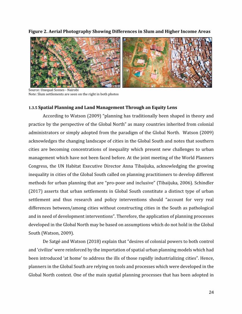
(Mitullah, 2012). Figure 2. below from the Unequal Scenes Project Nairobi

demonstrates and example of residential fragmentation as it shows stark built

environment differences between slums and bordering higher income

neighborhoods. The differences in roofing materials, dwelling size, building density,

presence of paved roads and open/green space are evident. A study by Scott et al

(2017), found that slums are disproportionately affected by heatwaves and heat-

related illness and fatalities as they exhibited higher temperatures than other

residential neighborhoods. Scott et al (2017), attributed the higher temperatures

largely due to lack of trees and vegetation to mitigate extreme temperatures though

they noted that further research is required.

24

Figure 2. Aerial Photography Showing Differences in Slum and Higher Income Areas

Source: Unequal Scenes - Nairobi Note: Slum settlements are seen on the right in both photos

1.3.5 Spatial Planning and Land Management Through an Equity Lens

According to Watson (2009) “planning has traditionally been shaped in theory and

practice by the perspective of the Global North” as many countries inherited from colonial

administrators or simply adopted from the paradigm of the Global North. Watson (2009)

acknowledges the changing landscape of cities in the Global South and notes that southern

cities are becoming concentrations of inequality which present new challenges to urban

management which have not been faced before. At the joint meeting of the World Planners

Congress, the UN Habitat Executive Director Anna Tibaijuka, acknowledging the growing

inequality in cities of the Global South called on planning practitioners to develop different

methods for urban planning that are “pro-poor and inclusive” (Tibaijuka, 2006). Schindler

(2017) asserts that urban settlements in Global South constitute a distinct type of urban

settlement and thus research and policy interventions should “account for very real

differences between/among cities without constructing cities in the South as pathological

and in need of development interventions”. Therefore, the application of planning processes

developed in the Global North may be based on assumptions which do not hold in the Global

South (Watson, 2009).

De Satgé and Watson (2018) explain that “desires of colonial powers to both control

and ‘civilize’ were reinforced by the importation of spatial urban planning models which had

been introduced ‘at home’ to address the ills of those rapidly industrializing cities”. Hence,

planners in the Global South are relying on tools and processes which were developed in the

Global North context. One of the main spatial planning processes that has been adopted in

25

the Global South context is the approach to land management, particularly land use zoning.

Land use zoning is heavily concerned with efficiency, which can be described as “the

functional specialization of areas and movement” (de Satgé and Watson, 2018).

In the case of Nairobi, as previously stated, during colonialism, the British promoted

spatial segregation in the city as the European inhabited areas were carefully planned in

layout with suitable densities, whereas the African were left to settle and develop

spontaneously with little attempt to provide infrastructure (Oyugi & K'Akumu, 2007). Oyugi

& K'Akumu (2007), in congruence to the arguments made by Watson (2009), state that

“Kenya's land use planning framework (manifested through structural plans that are

essentially a colonial legacy) does not adequately respond to evolving changes of sustainable

urban growth”. Research suggests that Nairobi’s history of uneven spatial planning has led

to great heterogeneity in both public and private sector investments and thereby access to

services across the city (Oyugi & K'Akumu, 2007; Bird et al, 2017). Furthermore, Bird et al

(2017) finds that services which rely primarily on public investments, or at least

coordination between numerous households, such as sanitation, have seen slower

improvements over time. Oyugi & K'Akumu (2007), argue for “strategic planning processes

which provide for methodologies of integrating the conflicting political, physical, social,

economic and environmental issues so as to achieve a cohesive equilibrium” and in order to

achieve this, Oyugi & K'Akumu advocate for innovations in technology such as an

information system which enables the complex manipulation of spatial and non-spatial

attributes for the city.

1.3.6 Data Innovations, Improved Availability and Machine Learning for Mapping

Spatial Inequality

Improved data availability, especially the proliferation of high resolution, regularly

collected satellite imagery, makes it possible to identify lagging regions within a country or

city. Duque et al (2017) employed the use of remote sensing indicators to predict the location

of slums is based on the premise that, “physical appearance of a human settlement is a

reflection of the society that created it and is also based on the assumption that individuals

who live in urban areas with similar physical housing conditions have similar social and

demographic characteristics”. Kohli et al (2016) used satellite imagery to construct a simple

26

method for slum identification in Pune, India. The method did not involve the deployment of

ML algorithms but classified slums correctly 60 percent of the time because of the slums’

unique morphology and built environment characteristics. Kohli et al (2016) concluded that

the method produced useful results and had the potential to be successfully applied in cities

with similar morphology.

Nonetheless, some researchers have employed both the use of satellite imagery and

machine learning techniques to predict and map infrastructure quality, slum settlements and

poverty. Engstrom (2017), uses machine learning in order to identify slums in Accra, Ghana

and incorporated census data as well as remotely sensed satellite imagery. The model was

highly accurate in predicting slums and the results demonstrated that, in the case of Accra,

population density and low elevation (flood-prone areas) were significant predictors of slum

settlements. These indicators were found to far-outweigh other indicators such as: the

number of persons per household, and households using a public toilet. Moreover, using the

binary slum classifier developed for Accra, Engstrom (2017) was able to derive a “slum

index”, by mapping the probability, generated by the random forest algorithm, that an

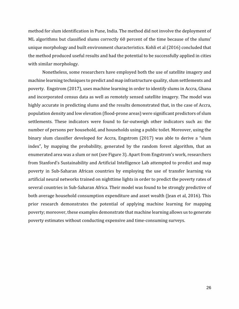
enumerated area was a slum or not (see Figure 3). Apart from Engstrom’s work, researchers

from Stanford’s Sustainability and Artificial Intelligence Lab attempted to predict and map

poverty in Sub-Saharan African countries by employing the use of transfer learning via

artificial neural networks trained on nighttime lights in order to predict the poverty rates of

several countries in Sub-Saharan Africa. Their model was found to be strongly predictive of

both average household consumption expenditure and asset wealth (Jean et al, 2016). This

prior research demonstrates the potential of applying machine learning for mapping

poverty; moreover, these examples demonstrate that machine learning allows us to generate

poverty estimates without conducting expensive and time-consuming surveys.

27

Figure 3. Accra Slum Map (Left) and Slum Probability Map (Right)

Source: Engstrom (2017)

Apart from supervised (predictive) ML methods, unsupervised methods such as

clustering have been employed in the realm of urban science. Wang et al (2017), employed

the use of clustering algorithms on 311 service requests1 to gain insights on local

neighborhood contexts. For the study, the spatialized 311 calls were aggregated to the level

of the census tract and then the clustering algorithm was employed producing 4 clusters. The

various clusters were found to be highly associated with socioeconomic characteristics such

as: educational attainment, income, unemployment and racial composition. The results

indicated that, in the absence of official socioeconomic survey data, 311 calls can provide

useful insights on various neighborhoods in the city.

1.3.7 Theoretical Framework

The conceptual framework of this research upholds the idea that we can gain useful

insights on spatial inequality in Nairobi, by analyzing various types of data and via the

application of machine learning algorithms. Acknowledging the literature, there are several

major themes to consider for this research, firstly, urban inequality is distinct from rural

inequality and merits its own metrics for assessment. Secondly, mapping monetary poverty

and other forms of inequality in cities is subject to limitations including: methodological,

conceptual, temporal and spatial; hence research into a metric which addresses these

limitations is worthwhile. Thirdly, with regards to land management in cities of the Global

1 According to Wang et al (2017), 311 service requests and complaints cover a wide range of concerns, including, but not limited to, noise, building heat outages, rodent sightings, etc.

28

South, reflect methods which were developed in the Global North, largely to maximize

production and efficient use of land, however, given the distinct features of cities in the

Global South; this method can be supplemented by a land management method which

emphasizes equitable growth. Lastly, the research asserts that advancements in data

availability and data science techniques, particularly ML, can provide other metrics which

address the limitations of current inequality mapping and promote more equitable spatial

planning. These larger themes are addressed in this thesis through the development of two

approaches:

1. Method 1, Living Conditions Indicator: Acknowledging, the literature which

suggests that slums in Nairobi exhibit the lowest living conditions in the city

(Gulyani et al 2014; Bird et al 2017). Therefore, by constructing a ML model

which can identify slum settlements, we can use predictive power of the model

to map the gradations in living conditions which are not made clear from a

simple slum demarcation map. Influenced by the work of Engstrom (2017) for

Accra Ghana; this method attempts to generate highly spatially disaggregated

insights on living conditions in the city. The input for this model reflect data

from the 3 domains outlined in the literature review: accessibility to

infrastructure & services, built environment characteristics and

socioeconomics & demographics.

2. Method 2, Residential Typologies: Uses machine learning clustering

algorithms in order to construct residential typologies. By employing this

method we can begin to understand the nuances across various

neighborhoods and identify what areas require what types of investments.

This method is meant to provide an equity lens for land management in the

city. Similarly the input for this model reflect data from the 3 domains.

29

1.4 Study Area, Data and Methods

This section outlines the research design as well as important background

information on the study area- Nairobi.

1.4.1 Nairobi as a Prime Study Area

Nairobi, the capital of Kenya was selected for this research for several key reasons

including:

I. Large Informal Settlements and Spatial Fragmentation: Nairobi is

considered to have high spatial inequalities and large densely populated

informal settlements. Additionally, due to historical settlement patterns and

uneven planning, Nairobi has a high degree of residential fragmentation

(Jimmy, 2018). This fragmentation means that there are pockets of low-

income areas within some of the high-income administrative areas and vice

versa; hence, traditional welfare mapping techniques do not provide sufficient

spatial granularity to identify pockets that are deprived.

II. Rapid Urbanization: Acknowledging that Sub-Saharan Africa is both the

world’s poorest and fastest urbanizing region, Nairobi’s rapid urbanization in

the last few decades highlight some level of urgency to ensure equity (Gulyani

et al, 2010). Between 1999 and 2009, Nairobi’s population grew dramatically

from 2 million to 3.1 million (Bird et al, 2017). Much of this growth can be

attributed to rural to urban migration. Most rural migrants migrate to informal

settlements in Nairobi, causing the population in these communities to

increase and become overcrowded. The average population density of slums

in Nairobi was 28,200 people per km2 in 2009, 51 per cent higher than just 10

years previously and far higher than in formal residential areas (Bird et al,

2017). Further, the Global Cities Institute estimates that Nairobi’s population

could swell to 46.6 million by 2100, which would make it the 12th most populous

city in the world (Hoornweg, 2014).

30

III. Building off Prior Research: In the last two decades, urban poverty in

Nairobi has been studied to a great extent which merit further research. For

instance, research conducted by Gulyani et al (2014) and Bird et al (2017)

demonstrate that residents of slums in Nairobi have comparable

socioeconomic outcomes to formal neighborhoods, however, the living

conditions of slums (housing, infrastructure etc.) were found to be

significantly worse than formal areas. Bird et al (2017), attributed these low

living conditions to lack of public and private investment in slums, however,

with considerable variation across different slums. Additionally, some

scholars such as Marx (2016) have employed the analysis of satellite imagery

in order to assess housing and infrastructure conditions in Nairobi. However,

the analysis was limited to one slum in Nairobi.

1.4.2 Research Strategy

Though the research of the thesis primarily involved quantitative analysis such as

machine learning. The first stage of the research involved reviewing relevant literature on

machine learning, urban poverty and slums, remote sensing, residential fragmentation and

spatial and land use planning. Informed by the literature review, the next stage of the

research involved gathering relevant data and constructing indicators for the model. Once

the indicators were developed, two machine learning models were developed: 1. Supervised

machine learning to map living conditions and 2. Unsupervised machine learning to develop

neighborhood typologies for spatial planning. Once the results of the models are developed

and tested for robustness, they were analyzed in order to answer the research questions.

1.4.3 Data and Software

The development of indicators for this research was informed by the literature (both

Nairobi specific and more broadly) on urban poverty analysis, slums, remote sensing and

machine learning for social science research. The majority of the variables were constructed

specifically for this analysis using data from various sources. Unlike much of the previous

literature on slum identification and poverty mapping, this thesis aimed to use data from

31

various different sources including: country census, OpenStreetMap (OSM), DigitalGlobe

Foundation, Columbia University and The Center for International Earth Science Information

Network (CIESIN). Census data was provided from the Kenya National Bureau of Statistics

(KNBS) from the 2009 census. Satellite imagery was provided by the DigitalGlobe

Foundation via an academic research grant. Infrastructure data such as roads was

downloaded from OpenStreetMap (OSM). The location of businesses was acquired from

Google maps. The land use data was acquired from the Columbia University website. While

population data was acquired from The Center for International Earth Science Information

Network (CIESIN). The following is a list of the variables that were developed for the

analysis:

Table 1. Variable List

Variable Description Source Year

Spatial

Granularity

DistMR Distance from Main Roads OpenStreetMap; Own

calculations 2019 Grid Cell

EconInact Proportion of the Population that is

economically inactive Census 2009 Sub-location

EdgDet_STD Standard Deviation in the amount of spectral

feature edges DigitalGlobe; Own

Calculations 2018 Grid Cell

FirmCount Count of Firms Google 2018 Grid Cell

FirmDns_Mean Firm Density per Area Google; Own Calculations 2018 Grid Cell

Gini Gini of Ward KNBS 2012 Sub-location

NDVI_MEAN NDVI DigitalGlobe: Own

Calculations 2018 Grid Cell

NIR_MEAN Near-infrared Mean DigitalGlobe: Own

Calculations 2018 Grid Cell

NIR_STD Near-infrared Standard Deviation DigitalGlobe: Own

Calculations 2018 Grid Cell

pop_dens1_Pop Population Density CIESIN; Own Calculations 2009 Grid Cell

Pov_headcn Poverty Rate of Ward KNBS 2012 Sub-location

Pov_Sev Poverty Gap KNBS 2012 Sub-location

PropElect Access to Electricity for Lighting (%) Census 2009 Sub-location

PropPipe Access to Piped Water in the Dwelling (%) Census 2009 Sub-location

RdKDns_Mea Road Density OpenStreetMap; Own

calculations 2019 Grid Cell

32

Reflc_MAX Max Reflectance DigitalGlobe: Own

Calculations 2018 Grid Cell

Reflc_MEAN Mean Reflectance DigitalGlobe: Own

Calculations 2018 Grid Cell

Vrity_Mean Mean Homogeneity in Spectral Emittance DigitalGlobe: Own

Calculations 2018 Grid Cell

Note: Though all these variables were developed for the purpose of the research, not all of them were found suitable for both models

To conduct the research in the thesis ArcGIS, Excel, Tableau and R softwares were

employed. Most of the indicators were constructed in ArcGIS through geo-processing. While

Excel was used to clean and store the data. All of the machine learning models were

developed and tuned in R. Tableau was used to conduct exploratory data analysis, analyze

the results of the models and produce some of the final visualizations. Moreover, the

workflow was somewhat circular as ArcGIS was used to produce the final maps.

1.4.4 Geo-Processing and Indicator Development

1.4.4.a Geo-Processing

Using GIS software, the city of Nairobi was gridded into cells or tiles of approximately

200 by 200 meter squared areas (40,000 meters squared), within the city’s 112 sub-

locations (see Figure 4). This grid size was chosen for a few reasons, firstly, the aim of the

research is to provide highly granular insights on poverty, well below the level of city wards,

however, spatial files on the official enumerated areas in the city are not made publicly

available. Additionally, the smallest ward in Nairobi was approximately 163,000 meters

squared. However, making the cells too small may increase the error of the estimates. It is

important to note that the tiles are not perfect squares since they were intersected to fit the

borders of the city’s sublocations, hence tiles at the borders of the sub-locations may be

irregularly shaped and with some varying sizes. In total, there were 18,233 tiles in the city,

these tiles represent the rows in the dataset.

33

Fig 4. Gridded Map of Nairobi

Source: Author Calculations

1.4.4.b Geo-Processing and Indicator Development

For the supervised model, the dependent variable was the location of slums

settlements which was extracted from the land use data for the city. Hence, if a grid cell

contained slum land use it was coded as a binary variable 1 or 0. Since the land use data

represents data from 2005, careful consideration was taken to ensure that the slums from

that period were still present in 2018 (the year for which the satellite imagery is from). In

Google Earth, all of the slum settlements were examined for the year 2004 and compared to

2018. During this process, it was discovered that some of the slums had been cleared.

Additionally, some slums had receded. The spatial file was edited to reflect the changed

landscape. Fig. 5 shows an example of a Nairobi slum in 2004 versus 2017.

34

Figure 5. Example of Slum Clearance in Nairobi

Source: Google Earth Notes: Shows an area near Nairobi’s Southern Bypass where a slum was cleared

The KNBS provided data on economic activity, electricity access, poverty estimates,

water access, GINI, poverty gap and poverty rate. These variables were available at the

sublocation level. Several of the indicators were developed from remotely-sensed

DigitalGLobe data which was available at the 2 meter squared resolution. The DigitalGlobe

data represents various months from January to December 2018, the satellite imagery was

mosaiced in ArcGIS for the development of indicators such as NDVI, Mean reflectance, Max

reflectance, and Mean Infrared emittance. All of these indicators were calculated at the level

of the grid tile.

1.4.5 Exploratory Data Analysis and Variable Selection

Since the units of the different variables were all different, all of the indicators were

standardized by setting the mean value to 0; this is so that the varying units and magnitudes

do not affect the machine learning models. Afterwards, correlation analysis was performed

to explore the relationship between variables and to identify instances of multicollinearity

and also to identify variables which may not be useful for analysis of living conditions.

As a heuristic, a Classification Tree algorithm was run in order to predict binary

classification into slum or non-slum and observe the relative predictive power of the various

indicators and the interaction between variables, for instance, a variable on its own such as

distance from main roads may not be correlated on its own, but the interaction of distance

35

from main roads and NDVI in a predictive model may yield highly predictive results in

identifying slums.

1.4.6 Machine Learning Model Development

As previously stated, the quantitative methods applied in this thesis include both

supervised (predictive) and unsupervised (clustering) methods. Both methods required

different methods of tuning and robustness checks as well as a different list of indicators.

1.4.6.a Supervised Machine Learning

I. Selecting the Best Algorithm

Initial consideration was taken to identify which algorithm was best for a

binary classification model which classes each grid cell in the city into a binary slum

or non-slum class. Furthermore, if the classification performs well, the goal was to use

the probability as a living conditions indicator which can highlight portions of the city

with the lowest living conditions. The two algorithms that were considered were the

random forest and logistic method. The random forest out-performed the logistic

regression considerably, with the logit model significantly underpredicting the

amount of slum settlements in Nairobi. The random forest likely performs well due

to its sensitive to interaction between variables (non-linear relationships). The

random forest algorithm was also selected because of its ability to produce the

variable importance which can give insights into the relative importance of the

variables in the model. The random forest uses the same concept as the decision tree,

however, it runs a randomized subset of indicators on several hundred trees and then

aggregates the results of the trees to give a much stronger prediction than a decision

tree.

II. Tuning the Random Forest Algorithm

Once the random forest was selected the next consideration was to select the

variables which would lead to the most predictive model. Hence, variables were

36

added and removed from the model until the highest accuracy was found.

Additionally, other aspects of the model were tuned, including the number of trees

and the number of randomly selected variables to be considered for each tree. The

best performing model with the following parameters: 500 trees; 7 variables at each

split.

III. Evaluating the Results of the Random Forest Algorithm

Next stage was evaluating the results of the by performing a ten fold cross-

validation (CV). The CV randomly selects 10 different randomly selected subsets of

training and test sets with 80 percent training to 20 percent test for each fold. For

each CV fold the training is used to predict the test set (see Fig. 6) below.

Figure 6. Results of Ten Cross-Validation Folds

Source: Author calculations

The results demonstrate that the model performs quite well when tested on

different subsets of the data. In fact, the results are comparable to prediction on on

the full dataset with a prediction ranging from 0.987 to 0.992. Lastly, the standard

deviation across the 10 folds was 0.0013, indicating only small variation across folds

and that the model is stable.

37

IV. Analyzing the results of the Random Forest Algorithm

Once the results of the random forest were calculated, the next stage of the

research is extracting the probability that a grid tile is a slum. The random forest

algorithm outputs a slum probability, i.e. the probability that the tile contains a slum.

By mapping the slum probability, we may gain insights into the living conditions in

Nairobi at a highly granular spatial level. Additionally, the results of the slum

probability were aggregated to the level of the sublocation by calculating a weighted

mean of the slum probability using each grid cell’s estimated population. The mean

slum probability was compared to the available socioeconomic data, particularly with

the sublocation-level poverty estimates. The slum probability was plotted against the

poverty rate to identify portions of the city in which the two diverge.

1.4.6.b Unsupervised Machine Learning: K-Means Clustering Analysis

The second method employed in the machine learning algorithm was the K-Means

clustering algorithm. Rather than predict the location on slums, this algorithm was employed

to identify underlying patterns in the data via statistical clustering. The objective of applying

the K-Means algorithm was to identify neighborhood typologies, thus, all non-populated tiles

in the city were filtered out using the CIESIN population dataset leaving only areas which

may be inhabited which totaled 11,319 tiles in Nairobi. Once the unpopulated areas were

filtered out, the elbow method was used in order to determine the optimal number of

clusters, determining that 10 clusters were appropriate for this dataset (see Figure 7). The

elbow method involves running the K-Means algorithm with several values for K (the

number of clusters) and where the graph begins to curve and form an elbow is where an

appropriate number of clusters are formed.

38

Figure 7. Results of K-Means Elbow Method

Source: Author calculations

Unlike the supervised model, the variables selected for clustering analysis do not rely

on predictive performance. Instead, analysts may include any variables which are relevant

for characterizing different sub-groups within the data. Therefore, the variables selected for

cluster analysis included data which were informed by the urban poverty and remote

sensing literature with the objective of gaining insights on the socioeconomic, built

environment, and quality of life characteristics of the neighborhoods in Nairobi regardless

of the variables’ relationship to slums specifically. It is important to note that none of the

land use data was used in this model.

II. Evaluating the Results of the K-Means Clustering Algorithm

Unlike the random forest and other supervised ML methods, unsupervised

methods such as the K-Means do not have simple test for accuracy or error, instead

the results may be evaluated in a more qualitative ways and are often meant to give

insights about underlying patterns in the data. One way of validating the results of the

39

K-Means that was applied for this research is running the K-Means test several times

with random initializations and observing whether the clusters look very similar

when visualized for each iteration. Ten different iterations of the K-Means were

produced and the clusters looked very similar for each iteration, hence, the model

was found to be stable.

III. Analyzing the results of the Cluster Analysis

The results of the cluster analysis were then analyzed to understand the

characteristics of the various clusters. Even though the clusters or ‘zones’ created in

this analysis are not meant to reflect the land use plan of the city, the results were

compared with the land use data in order observe relationship between the two and

identify overlaps.

40

Chapter 2

This chapter presents the results based the research questions and objectives of the

study. Secondly, chapter 2 contains a discussion of the results. Lastly, the chapter includes

the limitations and ethical considerations based on the methods employed and the findings.

2.1 Results

This section presents the results based on the research questions and objectives of

the study. The first portion of the results presents the findings of the random forest model,

maps the living conditions indicator (probability that an area is a slum), examines important

predictors of slums and contrasts the results with the monetary poverty map of the city. The

second portion of this section maps the neighborhood typologies according to the results of

the K-means clustering and characterizes the various residential clusters with regards to

built environment characteristics, socioeconomics & demographics, infrastructure & access

to services and land use.

2.1.1 Random Forest for Slum Detection and Mapping Living Conditions

Fig. 8 shows the results of the random forest model for identifying grid cells which

contain slums. The model classified slums correctly with an accuracy of 98.96%. This high

accuracy indicated that the model was adept at identifying slum settlements, however, with

a precision of 0.89 and a recall of 0.55. The relatively high precision (0.89) indicates that

89% of the grid cells that the model identifies as slums are actually slums, while the recall

indicates that 55% of all slum grid cells are being classed by the model as such. This indicates

that the model is ‘picky’ identifying slums; this means a low false positive rate since non-

slum areas are rarely classed as slums. Visual inspection of the classification results map

indicates that much of the larger slums are correctly identified as such, whereas some of the

smaller or bordering slum grid cells are not easily identified. It must be noted that, for a grid

cell to be classed as a slum by the model, it must exceed a probability of 0.5. Though there is

room for improvement, it seems the model is adept at classifying the grid cells as slum vs

non-slum.

41

Figure 8. Location of Slums and Slum Classification Results

Source: Author Calculations

Note: For the model to identify a grid cell as a slum, it has to have a predicted slum probability which is higher than 0.5

Given the model’s high accuracy in classing the slum and non-slum grid cells, we can

map the slum probability generated by the random forest model. Figure 9, below the

probability that a grid cell contains a slum. We can observe pockets of high slum probability

within the larger city wards. We can observe some of the city’s larger slums emerging as

spatial clusters. Additionally, much of the areas in the immediate east of the CBD have high

slum probabilities. Notably, much of the smaller slums (false negatives) that did not meet the

0.5 threshold to be classed as a slum, still exhibit a relatively high slum probability; this

suggests that the characteristics of these settlements may be less pronounced when

compared to the characteristics in the larger slum settlements.

As previously stated, the rationale for mapping the slum probability is to challenge

the binary classification of slum vs non-slum and instead identify the gradations from the

slums settlements which exhibit the lowest living conditions, to the portions of the city that

do not exhibit any similarities to slum settlements with regards to living conditions.

42

Figure 9. Living Conditions Indicator (Slum Probability)

Source: Author calculations

2.1.1.a Examination of Predictive Variables

Another objective of this research is to shed on are what variables are most important

for identifying slums and areas with low living conditions in Nairobi. One of the advantages

of the random forest model is that it provides a variable importance. Fig 10. below shows

that population density and % of people with access to piped water in the dwelling are the

strongest predictors while controlling for other variables. It’s important to acknowledge that

some variables did not improve the overall predictive power of the model and were

removed. These include: poverty rate, % with access to electricity, homogeneity in spectral

emittance, max reflectance and mean reflectance; it does not mean that these variables are

not associated with the presence of slums, it simply means that other variables have better

accounted for the location of slums and allowed for a simpler yet more robust model. For

43

instance, the poverty gap which is a measure of the severity of poverty was found to be

strongly correlated with the poverty rate and was an overall stronger predictor than the

poverty rate, hence, the removal of the poverty rate improved the predictive performance of

the model. Furthermore, before the addition of population density, NDVI and near infrared

emittance were found to be the strongest predictors of slums. Fig 10. below shows that

variables from all three of domains were included in the final model. Six of the variables were

from the socioeconomic and demographic domain, three from the built environment and

three from the infrastructure and accessibility to services domain.

Figure 10. Random Forest Variable Importance

Source: Author calculations

Fig 11. below depicts box plots for all 12 variables for both slum and non-slum grid

cells. Based on the boxplots we can see that population density, access to piped water,

poverty gap, near infrared emittance, economic inactivity rate and edge detection std

deviation as being fairly robust in their ability to separate slums from non-slums. Other

variables such as distance from main roads (Fig 11 row 2 column 1) are not able to effectively

separate slums and non-slums in the same way, still, this variable provides some predictive

power in the model. While both slums and non-slums are just as likely to be located near

main roads, the box plot shows that slum settlements seem to be more or less contained in a

tight distance band from main roads when compared to non-slums which have a wide range

values for this indicator.

44

Figure 11. Boxplots of Model Variables Comparing Slum and Non-Slum Grid Cells

Source: Author Calculations

To further examine how the model is ‘thinking’, a decision tree was produced as a

heuristic. The decision tree provides insight into the interactivity of variables in the model.

For instance, we see that areas with a very high poverty gap, medium to low road density

and low infrared emittance are highly likely to be slums; the model predicts these grid cells

are 96% likely to contain slums. On the other hand, areas with a medium to low poverty gap,

medium to low population density and medium to high NDVI are highly likely to be non-

slums with a 100% likelihood.

45

Figure 12. Decision Tree Diagram

Note: The values represent the standard deviation of the various indicators; Blue nodes indicate high slum-probability;

Pov_Sev (Poverty Gap), pop_dens1_Pop (Population Density), RKDns_Mean (Density of Main Roads), NDVI_MEAN (Mean

NDVI), PropPipe (% with Access to Piped Water), NIR_MEAN (Mean Near-infrared Emittance)

2.1.1.b Comparison of Poverty Estimates and Living Conditions Indicator

The next stage of the analysis involved comparing the constructed living conditions

indicator with that monetary poverty estimates and other indicators from the three domains.

To compare the results of the living conditions indicator (slum probability) the results were

aggregated to the sub-location level, the same level for which the poverty rates are available,

by calculating the population-weighted mean. Correlation analysis shows that the two

indicators have a fairly high correlation coefficient of 0.58, however, when compared to the

poverty estimates, the living conditions indicator showed a stronger relationship with the

built environment variables, economic inactivity rates and population density (Table 2).

Access to piped water and electricity were similarly correlated to both monetary poverty

and the living conditions indicator- though the relationships were slightly stronger for the

46

poverty estimates. On the other hand, poverty rates exhibited a much stronger correlation

with Gini, a measure of monetary inequality.

Table 2. Correlation Matrix

Source: Author calculations

Note: Cells are colored by intensity along their respective columns

Visual inspection of the maps shows similar geographic patterns as there is higher

poverty + lower living conditions in the eastern portion of the city, however, the two metrics

diverge in some notable areas. Fig 13. below shows the map of the poverty rate and living

conditions indicator aggregated to the ward level.

47

Figure 13. Poverty Map (left) and Slum Probability (right) Aggregated to Sub-

Location Level

Source: KNBS; Author calculations

Note: In both maps the scale is classed into 10 quantiles

Using the median ward-level poverty and slum probability values, we are able to class

the city’s 112 sub-locations into four quadrants. In this case, we are interested in the

quadrants which represent where the two metrics diverge (see Fig. 14 below), i.e. areas with

higher poverty but relatively high living conditions and areas with low poverty but poorer

living conditions. Visual inspection of the map shows that areas that have higher poverty yet

higher living conditions, tend to be located in either in the city center or in the outlying

portions of the city. On the other hand, many of the lower poverty but lower living conditions

sub-locations are located in the areas just east of the CBD where many of the city’s slums are

located (seen in red in Figure 14). This suggests that though these slums experience poor

living conditions, they do not have comparably high rates of monetary poverty.

48

Figure 14. Quadrant Analysis of Poverty Rate and Slum Probability Index

Source: Author calculations; KNBS

Figure 15. depicts the performance of these diverging wards across twelve indicators.

The results show that areas with relatively low poverty but low living conditions tend to

have far less green vegetation (NDVI), biomass (NIR emittance) and a much higher edge

detection (std), indicating a dense and/or irregular built environment. With regards to

socioeconomic and demographic factors, these areas have much higher rates of economic

inactivity and population densities. On the other hand, the sub-locations with high monetary

poverty but high living conditions tend to have high inequality (Gini) and a greater poverty

gap. Surprisingly, accessibility to services such as piped water and electricity are fairly

similar in both quadrants, however, sub-locations with low poverty but low living conditions

tend to have less access to piped water.

49

Figure 15. Comparison of Diverging Quadrants

Source: Author Calculations

2.1.2 K-Means Cluster Analysis for Residential Typologies

While the previous ML algorithm employed predictive modelling, the K Means cluster

analysis identifies patterns and similarities within the data, in order to group areas in the

city that are most similar based on the underlying data. Thus, the algorithm was employed

to generate residential typologies in Nairobi. These typologies can inform planning, promote

equity in land management and identify areas for various investments across the city. Fig 16,

below shows the results of the model in which 10 residential typologies or zones were

created. Visual inspection of the mapped results demonstrates distinct spatial patterns as

the CBD (zone 1) emerges as its own cluster, while some of the city’s low density, green areas

in the city’s southwest, emerge as its own distinct typology (zone 5).

50

Figure 16. Residential Typologies Map

Source: Author calculations

2.1.2.a Characterizing Neighborhood Typologies

Though the ten zones generally represent large geographic swaths of the city, they

have vastly different population counts and population densities; this is not surprising since

some areas such as zone 1 (CBD) are primarily commercial areas while other zones are

extremely low density such as zone 5 which comprises most of the city’s green south west

neighborhoods. More than half of the city’s residents live in zone 9 and 10 which are mostly

in the eastern portion of the city not far from the CBD. The population density varies widely

from each cluster with zone 9 emerging as a significant outlier (Figure 18).

51

Figure 17. Estimated Population Count in Each Residential Typology

Source: Author calculations; CIESIN

Figure 18. Estimated Population Density in Each Residential Typology

Source: Author calculations; CIESIN

In Fig. 19 below we observe the performance of the various clusters across several

indicators in the three domains. We can see Zone 1, the CBD Area, emerges as an outlier in

many of the indicators due to its high density of main roads, matatu stops, firm density and

52

extremely low green vegetation. Zone 4 is an interesting case as it represents an area with

the highest access to services such as piped water and electricity. The zone’s high spectral

heterogeneity means that it contains variety of built environment features including a mix of

built-up areas with green spaces, roof types and other infrastructure. Nevertheless, there are

also zones which demonstrate a divergence between positive socioeconomic outcomes and

the availability of services. Notably zone 8, an outlying, sparsely populated residential area

has relatively low poverty and economic inactivity rates, however, it has the lowest access

to electricity and piped water and is largely disconnected from most of the city since it has

the lowest density of Matatus stops and highest distance from main roads. Lastly, zone 10

experiences some of the greatest demographic and infrastructure challenges, since it

exhibits a high population density, low access to piped water and electricity and high poverty

gap, indicating a high severity of poverty. Nonetheless, residents of zone 10 are relatively

well-connected to the city’s transportation arteries which are exhibited by the zone’s fairly

high density of matatu stops and low distance from main roads. Hence, the K Means is able

to group the areas in the city into representative zones, and by describing the various zones

we can observe the advantages and constraints faced by the residents.

Figure 19. Characterizing Residential Typologies

Note: For all indicators the values are standard deviations with a mean of 0; Red indicates a high value (more than 0)

while black indicates a low value (less than 0).

53

The next stage in characterizing the various clusters is comparing the results to the

city’s existing land use map. Though the residential typologies and the city’s land use map

represent two distinct concepts, we expect to see some relationship between the two.

Furthermore, given the city’s goal to decentralize to reduce congestion in the CBD, as

outlined in the Master Plan (2014) we may gain insights on which zones have the lowest

penetration of commercial and institutional areas. The results show that the outlying zones

(5, 6, 7 and 8) have very low commercial land use. We can observe that Zones 9 and 10

contain most of the city’s slums, these are also the most densely populated areas and the

zones which experience some of the lowest access to electricity and piped water. It’s

important to note, that all ten of the residential typologies contained some slum settlements,

albeit not nearly as much as zones 9 and 10, thus indicating pockets of deprivation within

various zones.

Figure 20. Residential Typologies and Land Use

Source: Author Calculations; Columbia University

54

The table below is an attempt to profile the various zones to highlight features which

may be important to policy-makers or private-sector investors (see Table 3). The

descriptions of each zone are complemented by aerial imagery for a grid cell in the zone.

Below are profiles of 5 different zones with varying levels of monetary wealth, population

densities, service provision, access to transport and built environment features. The aerial

imagery provides some qualitative support for application of this model. Inspection of the

aerial imagery shows vast differences in building densities and roof typologies. Notably, we

see that cluster 4 exhibits features of a high-income residential area with paved roads, green

spaces and even swimming pools, on the other hand, we see that one of the main

characteristics of zone 9 and 10 are the presence of iron sheet roofs which occupy much of

the image.

Table 3. Profiling the Residential Typologies

Aerial Imagery and Map Description

4. High Income Residential

● Low Poverty

● Sparsely Populated

● High Connectivity to Commercial Areas

● Very High Access to Public Services

● Significant amount of Greenery

7. Middle-Income Outlying Areas

● Medium Poverty

● Medium to Sparsely Populated

● Low Connectivity to Commercial Areas

● Medium to Low Access to Public Services

● Significant amount of Greenery

8. Low Density, Outlying

● Low Poverty

● Very Sparsely Populated

● Very Low Connectivity to Commercial Areas

● Very Low Access to Public Services

● Very High Greenery

55

9. Low-income Commercial and Slums

● High Poverty

● Densely Populated

● High Connectivity to Commercial Areas

● Low Access to Public Services

● Very Low Greenery

10. Slums, Industrial and Outlying Low-income

● Very High Poverty

● Very Densely Populated

● Medium Connectivity to Commercial Areas

● Low Access to Public Services

● Low Greenery

Source: Google Earth Engine (imagery), Author Calculations

2.2 Discussion

This section presents the interpretation of the study findings based on the outlined

objectives.

2.2.1 Living Conditions Indicator

The literature on urban poverty suggest that urban poverty is distinct from rural

poverty and is associated with overcrowding, low access to services, lack of green space etc.

(Baker et al, 2004; Jimmy 2017). Urban poverty is deserving of its own metric, one which

incorporates the multidimensionality of poverty and living conditions in urban areas. Hence,

one of the goals of the research was to develop a salient metric for mapping intraurban

disparities in living conditions at a highly granular level in Nairobi. As previously outlined,

to construct an indicator for living conditions, a ML algorithm was trained to identify slums

in Nairobi and the probability that an area is a slum was then mapped. This method for slum

detection was heavily influenced by the work of Engstrom et al (2017) who employed a

similar methodology and developed a slum index for Accra, Ghana. However, this research

project takes it a step further by mapping at a higher spatial granularity, examining exactly

what factors the developed living conditions indicator is associated with, as well as how and

56

where it differs from the monetary poverty estimates, as well as why this might be a useful

metric for understanding spatial inequality.

With regards to usefulness of the living conditions indicator, the model has

advantages since it is not subject to many of the limitations of current welfare mapping

methods. One of the key limitations of mapping inequality in cities that the model addresses

is the lack of spatial granularity as discussed by Baker (2004) and Lucci (2016). The model

was able to identify the pockets of deprivation within the administrative areas in the city;

thus identifying some of the residential fragments within the larger administrative units

(Jimmy, 2017). Moreover, if needed the results can be aggregated to the level of the

administrative units in the city. Apart from addressing the issue of spatial granularity, the

model was also developed to address the conceptual limitations of the monetary poverty

map, more specifically, the ML model is meant to reflect neighborhood constraints that are

beyond monetary poverty, but also the build environment, service availability and

demographic features of a given area; this multidimensional lens for understanding urban

inequality is heavily emphasized by urban researchers such as Satterthwaite (2003).

Furthermore, the results of the slum probability were aggregated to the sub-location level

and when compared to the monetary poverty map demonstrated a much stronger

relationship with variables that literature often highlights as being features of poor urban

areas, these include: population density, lower vegetation and higher rates of economic

inactivity (Baker et al, 2004; Satterthwaite 2003). Additionally, when compared to the

monetary poverty estimates, the results of the living conditions indicator exhibited a similar

correlation with access to services such as piped water in the dwelling and electricity for

lighting in the dwelling. Overall, areas with lower living conditions tended to be more

centrally located than monetary poor areas, though they are often not directly served by

main roads.

Though the living conditions indicator addresses some of the limitations of other

welfare mapping techniques, the model also provides insights on which variables are

important predictors. According to Baker et al (2004), overcrowding is one of the features

that distinguishes urban poverty from rural poverty. The results of the random forest

classification model demonstrate that, while including several other variables, slums are

strongly associated with a high population density. This concurs with Bird et al’s (2017)

57

analysis that stated that informal settlements in Nairobi had population densities that were

considerably higher than that of formal areas. Furthermore, a similar machine learning

analysis conducted by Engstrom (2017) in Accra, Ghana, demonstrated that population

density was the strongest predictor in a slum detection model developed for the city, out-

performing some variables that are traditionally associated with slum settlements such as:

roofing materials and the availability of a toilet in the dwelling (Engstrom, 2017).

Research on urban inequalities in Nairobi demonstrate that some of the city’s slums

do not exhibit particularly low socioeconomic outcomes; furthermore slums have seen

considerable improvement in socioeconomic indicators such as school attendance and child

mortality (Gulyani et al 2014; Bird et al, 2017). Hence, the metric developed in this research

was trained on slum locations and was designed to be reflective of inputs from several

domains which relate to living conditions including: infrastructure and accessibility

indicators, built environment features, demographics and socioeconomics. The living

conditions indicator essentially, challenges the binary of slum vs non-slum and is able to

identify the gradations from the areas with the lowest living conditions to the portions of the

city that do not exhibit the characteristics of the city’s slum settlements. The results reveal a

metric which is useful for examining urban inequality in addition to providing much more

granular insight.

With regards to applications in other contexts, the results of the random forest

algorithm provide some insights on which variables may be important for similar analysis in

other contexts. However, it must be noted that the model, with its current parameters, has

limited scalability to other cities since it is heavily tailored to the Nairobi context.

Nonetheless, for cities with similar building materials, demographics and morphologies-

likely other cities in Kenya or SSA - the results of Model 1 suggest that population density,

access to piped water, firm density and poverty gap are some of the most important variables

to include in the model. Even in cities with a very different morphological layout and

demography, we may still see some of these variables being highly predictive. The work of

Engstrom (2017) in Accra for instance, demonstrates that like the findings of this analysis,

population density was found to be the most important independent variable. Apart from

the variable selection, different machine learning algorithms have different advantages and

disadvantages, for instance, rather than the random forest, Jean et al (2016) employed the

58

use of convolutional neural nets to predict poverty levels for areas in SSA. Additionally,

Duque et al (2017), in a comparison of several ML algorithms, found that support vector

machines had the highest predictive accuracy for identifying slums in three cities in South

America. Therefore, alternative machine learning algorithms other than the random forest

may be well suited depending on the context.

2.2.2 Residential Typologies/ Zones for Equitable Development

The residential typologies model was conceptualized as a land management model

which can supplement existing land use zoning maps of cities in the Global South. The

research was motivated partly by the work of Schindler (2017), which suggests that cities in

the Global South are distinct human settlements and therefore, require tools, processes and

research which explicitly acknowledge this differentiation. Furthermore, Schindler (2017)

laments that though there is considerable work in theorizing southern urban areas, this

fervor has not been matched by the development of rigorous empirical methods to study

them. The process of land use zoning, is one which was developed many years ago in the

European context and was adopted by countries in the Global South by European countries.

Land use zoning attempts to structure urban territories to maximize economic efficiency and

production (de Satgé and Watson, 2018; Schindler 2017). Therefore, this methodology,

rather than emphasize economic production and efficiency, instead is a quantitative

approach designed to emphasize equitable spatial planning and investments across the city.

The model was successful in identifying distinct types of neighborhoods (zones) in

the city and highlights the advantages and constraints faced by each zone. Notably, the

Central Business District (zone 1) emerges as a distinct typology because of its uniquely high

access to transportation and high firm density. Further, the findings of the residential

typologies reflect historical divides in the city. For instance, zone 4 represents a portion of

Nairobi where the European settlers lived and had the highest access to services, commercial

areas, transportation and green space (Jimmy, 2017). Indeed, the model demonstrates that

zone 4 has the highest access to piped water and electricity and is served by many main roads

and matatu stops. Inspection of aerial imagery for the various zones, provides some

qualitative support for the generated residential typologies and their observable built

environment and infrastructure features. For instance, aerial imagery for zone 4 depicts

59

considerable green space, paved roads and even swimming pools, while zone 10, a densely

populated zone containing much of the city’s slums, is noted for a lack of green space, small

dwellings and iron sheet roofs as corroborated by aerial imagery; further, zone 10 imagery

supports the description of slums by Jimmy (2017) as having little main roads and distinct

iron sheet roofs.

Notably, the residential typologies also highlighted disparities in investments across

the city as highlighted by the work of Bird et al (2017). Bird et al (2017) notes that for some

neighborhoods in Nairobi, access to piped water and sewer or septic tank is lower for more

outlying areas, however, access to electricity does not exhibit the same spatial decay as one

moves away from the city center. Indeed, zones 5, 7 and 9 are noted for having large

discrepancies in their access to electricity and piped water, with access to piped water

lagging behind electricity access in all 3 of these zones. It should be noted that zones 5 and 7

are outlying high and middle-income areas, indicating that there may be the willingness and

the ability to pay for the service of piped water but the investment in these outlying areas

has not yet materialized.

In a comparison of the city’s land use map (2004 data) and the results of the

residential typologies analysis, we see a relationship between the two land management

concepts where, zone 1 (the CBD) is mostly occupied by institutional and commercial areas.

The Nairobi master plan has outlined much of zone 8 as an area for potential expansion

(Nairobi Master Plan, 2014). Zone 8 is noted for having a low poverty rate and is sparsely

populated, however, the zone has the lowest access to transport, commercial areas and some

of the lowest access to piped water and electricity in the city. Hence, one potential application

of the cluster analysis is to inform decentralization efforts in the city. It must be noted that,

the residential typologies method is not meant to replace existing land use zoning strategy.

Instead, the hope is that the method provides another lens for city governments in the Global

South to manage land and hopefully identify areas where specific investments are needed.

60

2.3 Limitations and Ethical Considerations

2.3.1 Accuracy Limitations (Model 1- Random Forest Algorithm): Model 1 predicts the

location of slums with high accuracy (98.96 %), however, with somewhat lower precision

(0.89) and much lower recall (0.55); this means that, though the model is adept at parsing

out the non-slum areas, a significant number of smaller slums are not being identified. This

could be due to several reasons including: some slum settlements may not exhibit strong

characteristics in the data when compared to other slums in the city, either because they are

quite small (more likely) or because the living conditions in these slums have improved since

the creation of the slum demarcation map (less likely). Another explanation is that there are

other indicators that were not available for this study that would improve the identification

of the smaller slum settlements in the model. Nonetheless, inspection of the slum

classification model (Figure 8.), shows that the city’s larger slums have been largely classified

as such. Moreover, when the probability that an area is a slum is mapped, we see that even

the smaller slums emerge as pockets of higher slum probability.

2.3.2 Temporal Limitations (Model 1- Random Forest Algorithm & Model 2- K Means

Clustering): Though Model 1 is designed to address the limitations (methodological,

conceptual, temporal and spatial) of current welfare mapping metrics, some of the census

data emerge as important predictors for the model. Hence, though the model incorporates

several different types and sources of data and does not rely solely on census data, the census

data are still important predictors, thus the method succumbs to some temporal limitations.

Model 2, the K Means clustering analysis, similarly relies on census data, hence limiting the

temporal resolution of the approach. Nevertheless, it should be noted that for both models,

the indicators which are derived from satellite imagery can be updated more regularly than

the census data, thus providing some insights on the changing city landscape.

2.3.3 Inclusion of other Indicators/More Granular Datasets (Model 1- Random Forest

Algorithm & Model 2- K Means Clustering): Both models are limited by the census data

that was provided by KNBS. Nevertheless, access to more census data indicators (e.g. waste

management, dwelling characteristics etc.) at a more granular spatial level, e.g. for the

61

enumerated areas in the city, would produce more robust clusters for model 2 and likely a

higher accuracy for model 1.

2.3.4 Ethical Considerations (Model 1- Random Forest Algorithm): One important ethical

consideration is whether the highly granular results of the living conditions indicator can be

used to disempower some communities rather than generate insights for planning and

targeting interventions. In some urban contexts in the Global South, governments indeed

engage in slum clearance; thus, a model like this may provide them with information to

displace families. However, it should be noted that in the Global South, most city

governments usually know where the defined slum settlements are located in the city,

therefore, in these cases the living conditions indicator will not likely inform slum clearance

activities. However, if the model is scaled and applied to another city which does not already

have a slum demarcation map, then indeed the tool provides officials with the insights to

engage in displacement activities. Therefore, in the latter context, this may be a tool that is

more suited to inform the activities and objectives of NGOs that operate in poor urban areas

and do not have the ability to displace residents.

62

Chapter 3

This chapter contains the conclusion as well as areas for future work.

3.1 Conclusion

UN Habitat Executive Director Anna Tibaijuka (2006) encouraged “planning

practitioners to develop a different approach that is pro-poor and inclusive, and that places

the creation of livelihoods at the center of planning efforts”. Hence, this thesis research aims

to, capitalize on the “data revolution”, apply machine learning techniques to map inequality

in Nairobi and promote equitable spatial planning with the hope that the models developed

for this research can be improved upon and contextualized in other cities.

Model 1, the Living Conditions Indicator is a predictive algorithm which was trained

to identify the characteristics of slums and using these insights, map living conditions at a

granular level in Nairobi. The results suggest that the indicator is a relevant metric to

understand inequality since it strongly reflects overcrowding, high economic inactivity, low

access to services and built environment characteristics which are associated with informal

areas. Moreover, the model provides key insights on which predictor variables may be

important for conducting similar research in other cities.

Model 2, is a clustering algorithm which was programmed to identify the underlying

data patterns among residential areas in Nairobi and construct ‘residential typologies’. Some

of typologies in many cases reflect areas in the city that are historically underserved and

some areas which historically experienced high access to services. Model 2, is an innovation

in land management which is not meant to replace current land use map, rather, it

acknowledges the complexity of urban settlements in the Global South and it provides a

means of understanding how and where to invest in various types of neighborhoods. The

application of this algorithm demonstrated the uneven investment in different areas across

the city, including areas where access to piped water in the dwelling, electricity for lighting

and transport diverged considerably. Thus, the algorithm was develop to identify uneven

investments and is primarily concerned with the ‘quality of economic growth’ rather than

63

structuring land for the purposes of economic production and efficiency. The analysis of the

results demonstrate that the model is effective and flexible in its ability to profile various

residential areas in the city.

The findings of the research suggest that, indeed, machine learning techniques can

enrich our understanding of spatial inequality in the Global South. However, it should be

noted that the methods are propositional and can undoubtedly be adjusted or improved

upon for Nairobi or for other contexts. The hope is that the findings of this thesis promote

the application of machine learning techniques in the realm of city planning and poverty

alleviation in other contexts.

3.2 Future work

Though, model 1, the random forest algorithm had a high accuracy, there is still room

for improving the predictive accuracy through the inclusion of other remotely sensed

indicators and more granular census data which were not available for this research.

Additionally, both models would benefit from census or administrative data on waste

management, transportation, dwelling characteristics, tenure status, road quality,

educational attainment and health outcomes. The addition of these indicators, especially for

the more granular enumerated areas in the city would ensure that the findings of the cluster

analysis are more robust and reflective of the conditions on the ground.

The residential typologies generated in this analysis demonstrate the feasibility of a

method for understanding the nuances across the various neighborhoods in the city.

Nonetheless, a more fair and equitable application of the method would be to seek the input

from the various communities in Nairobi on what indicators should be included in such a

model to identify investment opportunities. Thus, ensuring that the typologies are co-

generated with the input of Nairobi residents.

64

Bibliography

Athey, S. (2017). Beyond prediction: Using big data for policy problems. Science 355(6324):

483-485.

Baker, J., & Schuler, N. (2004). Analyzing Urban Poverty: A Summary of Methods and

Approaches. Policy Research Working Papers. doi:10.1596/1813-9450-3399

Baud, I., Sridharan, N., & Pfeffer, K. (2008). Mapping Urban Poverty for Local Governance in

an Indian Mega-City: The Case of Delhi. Urban Studies, 45(7), 1385-1412.

doi:10.1177/0042098008090679

Bird, J., Montebruno, P., & Regan, T. (2017). Life in a slum: Understanding living conditions

in Nairobi’s slums across time and space. Oxford Review of Economic Policy, 33(3),

496-520. doi:10.1093/oxrep/grx036

Duflo, E., Galiani, S., and Mobarak, M. (2012), Improving Access to Urban Services for the Poor,

JPAL.

Dupont, V. R., & Houssay-Holzschuch, M. (2005). Fragmentation and access to the city : Cape

Town and Delhi in comparative perspective. In Reconfiguring Identities and Building

Territories in India and South Africa (pp. 275–312). Retrieved from

http://horizon.documentation.ird.fr/exl-doc/pleins_textes/divers17-

07/010046721.pdf

Duque, J., Patino, J., & Betancourt, A. (2017). Exploring the Potential of Machine Learning for

Automatic Slum Identification from VHR Imagery. Remote Sensing, 9(9), 895.

doi:10.3390/rs9090895

Engstrom, R. (2017). Monetary and Non - Monetary Poverty in Urban Slums in Accra:

Combining geospatial data and machine learning to study urban poverty. World Bank.

Gibson, J. (2015) Poverty measurement: We know less than policy makers realize. Working

Paper in Economics 8/15. Hamilton: University of Waikato.

Gollin, D., Kirchberger, M., and Lagakos, D. (2017), ‘In Search of a Spatial Equilibrium in the

Developing World’, Working Paper, available at

https://sites.google.com/site/davidlagakos/home/research/Spatial_Eqm_v5.pdf

65

Gulyani, S., Bassett, E. M., & Talukdar, D. (2014). A tale of two cities: A multi-dimensional

portrait of poverty and living conditions in the slums of Dakar and Nairobi. Habitat

International, 43, 98-107. doi:10.1016/j.habitatint.2014.01.001

Hoornweg, D., & Pope, K. (2016). Population predictions for the world’s largest cities in the

21st century. Environment and Urbanization, 29(1), 195-216. doi:10.1177/0956247816663557

Jimmy, E. (2017). Residential Fragmentation and Quality of Life in Nairobi City.

Kim, S. (2008). Spatial Inequality and Economic Development: Theories, Facts, and Policies.

The Commission on Growth and Development.

Klopp, J. M., & Petretta, D. L. (2017). The urban sustainable development goal: Indicators,

complexity and the politics of measuring cities. Cities, 63, 92-97.

doi:10.1016/j.cities.2016.12.019

Kohli, D., Sliuzas, R., & Stein, A. (2016). Urban slum detection using texture and spatial

metrics derived from satellite imagery. Journal of Spatial Science, 61(2), 405-426.

doi:10.1080/14498596.2016.1138247

Lubaale, G. (2012). The case of Nairobi, Kenya. Understanding the Tipping Point of Urban

Conflict : Violence, Cities, and Poverty Reduction in the Developing World Policy Brief.

Series Number 1/2012.

Lucci, P. (2016). Are we Underestimating Poverty? Overseas Development Institute.

Lucci, P. and Bhatkal, T. (2014) Monitoring progress on urban poverty: Are indicators fit for

purpose? London: ODI.

Marx, B., Stoker, T., and Suri, T. (2016), ‘There Is No Free House: Ethnic Patronage and

Property Rights in a Kenyan Slum’, Working Paper, August, available at

http://http//mitsloan.mit.edu/shared/ods/documents/?DocumentID=2477

Mbogo, S. (2017). Gated homes no longer a preserve of the wealthy - Business Daily.

Retrieved April, 2019, from http://www.businessdailyafrica.com/news/Gated-

homes-no-longer-a-preserve-of-the-wealthy/539546-1108998-

138l7rrz/index.html

66

Mitlin, D. (2015) ‘Building towards a future in which urban sanitation leaves no one

behind’. Environment and Urbanisation Brief 32. London: IIED.

Mitlin, D. and Satterthwaite, D. (2013) Urban poverty in the South. London: Routledge.

Mitullah, W. (2012). The Case of Nairobi, Kenya. Retrieved from

https://www.ucl.ac.uk/dpu-projects/Global_Report/pdfs/Nairobi.pdf.

Nairobi Master Plan. (2014). Nairobi Master Plan.

Olima, H. A. (2001). The Dynamics and Implications of Sustaining Urban Spatial Segregation

in Kenya: Experiences from Nairobi Metropolis. Lincoln Institute of Land Policy.

Otiso, K. (2012). Profile of Nairobi, Kenya. Berkshire.

Oyugi, M. O., & K’Akumu, O. A. (2007). Land use management challenges for the city of

Nairobi. Urban Forum, 18(1), 94–113. https://doi.org/10.1007/BF02681232

Ravallion, M. (2007). The Urbanization of Global Poverty. Development Research Group,

World Bank.

Ravi Kanbur and Anthony J. Venables; Spatial Inequality and Development

Salon, D., and Gulyani, S. (2010), ‘Mobility, Poverty, and Gender: Travel “Choices” of Slum

Residents in Nairobi, Kenya’, Transport Reviews, 30(5), 641–57.

Sclar, E. D., Garau, P., and Carolini, G. (2005), ‘The 21st Century Health Challenge of Slums

and Cities’, The Lancet, 365(9462), 901–3.

Scott, A. A., Misiani, H., Okoth, J., Jordan, A., Gohlke, J., Ouma, G., . . . Waugh, D. W. (2017).

Temperature and heat in informal settlements in Nairobi. Plos One, 12(11).

doi:10.1371/journal.pone.0187300

Serbia Poverty Map. (2016). Serbia Poverty Map- Key Methods and Findings. Retrieved

from

https://www.google.com/url?sa=t&rct=j&q=&esrc=s&source=web&cd=2&cad=rja&

uact=8&ved=2ahUKEwjusKLzsrLiAhVJheAKHaTFDRIQFjABegQIBBAC&url=http://p

67

ubdocs.worldbank.org/en/859541477472336209/Poverty-Map-of-

Serbia.pdf&usg=AOvVaw0pWVRCdd3WUuHS9cJ7A4AG

Talukdar, D. (2018). Cost of being a slum dweller in Nairobi: Living under dismal

conditions but still paying a housing rent premium. World Development, 109, 42-56.

doi:10.1016/j.worlddev.2018.04.002

Wang, L., Qian, C., Kats, P., Kontokosta, C., & Sobolevsky, S. (2017). Structure of 311 service

requests as a signature of urban location. Plos One, 12(10).

doi:10.1371/journal.pone.0186314

Watson, V. (2009). Seeing from the South: Refocusing Urban Planning on the Globe’s

Central Urban Issues. Urban Studies, 46(October), 2259–2275.

https://doi.org/10.1002/9781119084679.ch27

The World Development Report (2009). Reshaping Economic Geography. Development and

Change.

Tibaijuka, A. (2006) The importance of urban planning in urban poverty reduction and

sustainable development. Paper presented at World Planners Congress, Vancouver.

Unequal Scenes Nairobi. (n.d.). Retrieved from https://unequalscenes.com/nairobi

UN-HABITAT. (2010). Cities & Citizens series bridging the urban divide, (March 2010).

Retrieved from https://issuu.com/unhabitat/docs/cities_and_citizen_series-

_bridging_the_urban_divi

UN- HABITAT. (2018). 68% of the world population projyected to live in urban areas b

2050, says UN. Retrieved from

https://www.un.org/development/desa/en/news/population/2018-revision-of-

world-urbanization-prospects.html

Xie, M., & Jean, N. (2016). Transfer Learning from Deep Features for Remote Sensing and

Poverty Mapping. Proceedings of the Thirtieth AAAI Conference on Artificial

Intelligence.


Recommended