35
Depr Shef Alasdair R Department of Town and Region University of Sheffield September 2011 rivation ffield Rae nal Planning n in
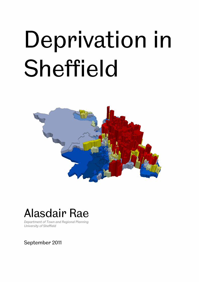
Deprivation in Sheffield
Alasdair RaeDepartment of Town and Regional Planning
University of Sheffield
September 2011
Deprivation in Sheffield
Alasdair Rae Department of Town and Regional Planning
Deprivation in

Deprivation in Sheffield
1
Contents
Introduction 2
Sheffield in Context 4
Deprivation in Sheffield: A General Overview 9
Dimensions of Deprivation in Sheffield 14
Deprivation in Sheffield: Spatial Analysis 21
Trajectories of Change 27
Summary 33

Deprivation in Sheffield
2
1. Introduction This report provides analysis and commentary on the geography, intensity and persistence of deprivation in Sheffield. The intention is to provide a more in-depth and fine-grained picture of deprivation in the city and to contribute to the early work of the Fairness Commission as it works towards its objectives in Sheffield. The report
is based on a significant amount of data analysis and mapping, sophisticated spatial analysis and original typology development. The main sections in the report are described below.
• Sheffield in Context This section of the report provides a contextual overview for understanding deprivation within Sheffield by comparing it to other cities. The English core cities, plus London and four other comparator cities, are used here in order to provide an understanding of Sheffield’s relative position nationally. The analysis shows that whilst Sheffield is a socially and spatially divided city it fares significantly better than many of its comparators. Local authority boundaries are used to define cities here, except in the case of London, which refers to the 32 boroughs plus the City of London (i.e. Greater London).
• Deprivation in Sheffield: A General Overview In this section, the analysis moves down a few of scales to focus on deprivation within Sheffield at the lower super output area (LSOA) level. Reference is also made here to the level of deprivation within Sheffield’s 100 neighbourhood areas. This section demonstrates that regardless of the spatial scale of analysis, areas in Sheffield which fall within the most deprived decile nationally constitute the largest single category.
• Dimensions of Deprivation in Sheffield This section of the report explores the different dimensions of deprivation in Sheffield as they relate to the individual ‘domains’ on the Indices of Deprivation 2010. Like all former industrial cities within England, Sheffield has a disproportionate share of the most deprived areas but this general picture obscures some important local differences. Thus, when we look at individual domains, Sheffield is even more deprived in relation to three in particular: health and disability; education, skills and training; and crime.
• Deprivation in Sheffield: Spatial Analysis In this section of the report some sophisticated spatial analysis tools are deployed in order to more fully ‘spatialise’ the analysis. This is an important extra dimension since existing approaches do not normally take into account the wider locale when ascribing deprivation scores to individual areas. Given the large volume of research on the potential negative impacts of concentrated deprivation and associated ‘neighbourhood effects’, this is a significant gap in deprivation research. The results of this analysis shed further light on, amongst other things, the extent to which some deprived areas are located within much larger concentrations of deprivation, and which are more isolated.

Deprivation in Sheffield
3
• Trajectories of Change In the final analytical section of the report, change through time is considered by means of exploring changes in local deprivation between 2004 and 2010. In addition to this, an original residential mobility typology is described and implemented for Sheffield in order to shed light on the extent to which areas might change as a result of population churn at the local level. The results of the analysis in this section show that persistence is, perhaps, as much a problem as spatial concentration.
Given the range of analytical techniques and approaches used in this report, it is rather difficult to identify a single over-arching message which can encompass the diversity of area types and trajectories in the city. Before proceeding, however, it is useful to consider three important points which might help paint a picture of deprivation in Sheffield in 2011. First, Sheffield is more spatially divided than any of its
comparator cities. This owes much to history and topography but it is a fact that cannot be overlooked. Second, despite this obvious spatial imbalance between rich and poor, Sheffield is actually considerably more balanced socio-economically than most comparable cities; particularly cities such as Manchester, Liverpool and Nottingham. Finally, it is clear that deprived areas differ in several important respects, not least of which are their local spatial context, their trajectory and their role in wider housing and labour market processes.
About the Data The data in this report are primarily drawn from the Indices of Deprivation, 2010. Data from previous versions of the Indices of Deprivation are also referred to. An important point to note here is that there is typically a two to three year time lag between the publication of deprivation indices and the period covered by the data which comprise those indices. Thus, the most recent Indices of Deprivation typically rely on 2008 data. This should be taken into consideration when interpreting the results. A further important point here relates to the fact that not all people living in areas classified as ‘deprived’ necessarily reflect the characteristics of the area they live in. Making an erroneous assumption in this regard is known as an ‘ecological fallacy’ and is more likely when larger spatial units of analysis are used. Therefore, this report mainly uses data at the lower super output area (LSOA) level but reference is also made to Sheffield neighbourhoods and local authority districts. Finally, the Indices of Deprivation provide a good overview of relative patterns of deprivation in England but they do not, on their own, allow us to make absolute statements about the level of deprivation – or poverty – within individual areas. An exception to this relates to the Income and Employment domains of the Indices, since these categories report actual values for individual areas in relation to income benefits and unemployment benefits respectively.

Deprivation in Sheffield
4
2. Sheffield in Context This section of the report looks at Sheffield in relation to twelve other English cities in order to provide a wider context for understanding the spatial and demographic characteristics of deprivation in the city. The intention is not merely to look at which areas are most deprived but to consider the extent to which there are differences
between the proportion of more and less deprived areas in each city. With this in mind, the focus in this section is on locations which are among the 10% and 20% most and least deprived in England according to the Indices of Deprivation 2010. The 12 cities used for comparison and reference are as follows:
• Birmingham
• Bradford
• Bristol
• Coventry
• Hull
• Leeds
• Leicester
• Liverpool
• London
• Manchester
• Newcastle
• Nottingham
In recent years, there has been a renewed focus on the issue of inequalities within society, perhaps most commonly referred to in terms of Wilkinson and Pickett’s (2009) The Spirit Level. In the study of urban and regional inequalities, however, such
ideas are not new and there has in fact been a groundswell of opinion that we need to focus not only on the issue of poverty and deprivation in society but also on the deep divisions which – some say – create and perpetuate this phenomena (e.g. Massey, 1996; Rae, 2011). In an urban environment, there are also very important issues relating to the spatial concentration of deprivation and the potentially damaging impacts these can have on life chances (e.g. Blasius, et al., 2007). Therefore, the first step is to arrive at a basic understanding of the spatial and demographic characteristics of deprivation in Sheffield and its comparator cities. In this first instance, this has been achieved by looking at the percentage of each city’s population which falls within the most and least deprived 20% in England. In order to pick up the most acutely deprived and the very least deprived areas, this analysis was also conducted for the 10% most and least deprived. All things being equal, we might expect each city’s share of the 10% and 20% most deprived locations in England to be very close to those values. However, given the well documented issue of concentrated poverty in cities (Lupton and Fuller, 2009) this is not the case. In fact, 34% of Sheffield’s population live in areas amongst the 20% most deprived in England and 21% live in areas amongst the 10% most deprived. At the other end of the deprivation scale, the situation is more balanced since 16% of Sheffield’s population live in areas among England’s 20% least deprived and 8% live in areas amongst the 10% least deprived. Despite this imbalance, the figures for Sheffield actually compare favourably to other comparator cities, as show in Figure 2.1 and Table 2.1. Manchester, Liverpool, Birmingham, Hull and Nottingham all have more than 50% of their population living in areas amongst England’s 20% most deprived and less than 5% living in the least deprived 20%. Of all the comparator cities, Sheffield has the highest percentage living in England’s least deprived 20%.

Figure 2.1 – Percent of Population
Table 2.1 – Percent of Population in England’s Most/Least Deprived Areas
City
20% Most
Deprived
Birmingham 55.6
Bradford 44.4
Bristol 25.3
Coventry 31.9
Hull 51.6
Leeds 28.6
Leicester 41.0
Liverpool 64.1
London 26.0
Manchester 64.8
Newcastle 38.4
Nottingham 51.5
Sheffield 34.1
Deprivation in Sheffield
Population in England’s Most/Least Deprived 20%
of Population in England’s Most/Least Deprived Areas
% of Population Living in England’s...
20% Most
Deprived
20% Least
Deprived
10% Most
Deprived
3.0 39.7
9.6 31.4
11.3 13.9
5.5 18.4
2.8 42.3
14.0 19.1
1.4 25.1
0.7 49.1
8.7 8.3
0.3 44.8
14.7 25.6
3.7 24.7
15.5 21.6
Deprivation in Sheffield
5
rived 20%
of Population in England’s Most/Least Deprived Areas
10% Least
Deprived
1.6
5.9
4.0
2.7
0.0
5.7
0.0
0.4
2.9
0.0
7.0
0.0
8.0

Deprivation in Sheffield
6
In order to provide some wider contextual information, it is also useful to consider the rank of each city in the English context according to the metrics produced by the Department for Communities and Local Government (CLG, 2011). Six different methods are used to rank the 326 local authority areas in England, as follows.
• Concentration - Population weighted average of the ranks of a local authority district’s most deprived LSOAs that contain exactly 10% of the district’s population.
• Extent - Proportion of a local authority district’s population living in the most deprived LSOAs in the country.
• Income - The number of people who are income deprived.
• Employment - The number of people who are employment deprived.
• Average Score - Population weighted average of the combined scores for the LSOAs in a local authority district.
• Average Rank - Population weighted average of the combined ranks for the LSOAs in a local authority district.
As seen in Table 2.2 below, Manchester, Liverpool and Birmingham are the most deprived cities here, with Birmingham ranked as the most deprived local authority according to income and employment and Liverpool most deprived according to average deprivation score. Both Liverpool and Manchester are among England’s ten most deprived local authorities according to all six ranking methods. The situation in Sheffield is more mixed, since it ranks 84 on average rank and 56 on average score but 6 and 7 on income and employment deprivation respectively. These aspects of deprivation are more fully unpacked in a subsequent section but it is important to highlight these issues given their importance to strategic policy objectives and to emphasise that these figures indicate Sheffield is more income and employment deprived than Hackney, Tower Hamlets and Newham in London. Table 2.2 – Cities Ranked by CLG Indices of Deprivation Ranking Methods*
Rank of Local Authority Within England According to... (1 = most deprived, 326= least deprived)
City Concentration Extent Income Employment Average Score Average Rank
Birmingham 20 10 1 1 9 13
Bradford 11 27 5 6 26 33
Bristol 57 73 14 9 79 93
Coventry 37 52 24 22 50 53
Hull 6 12 18 18 10 15
Leeds 44 59 4 4 68 97
Leicester 21 28 11 14 25 22
Liverpool 2 4 3 2 1 5
Manchester 8 5 2 3 4 4
Newcastle 15 35 29 20 40 66
Nottingham 35 17 17 13 20 17
Sheffield 33 48 6 7 56 84 *London is not included here since it is not a single local authority.
The matter of establishing
only one part of the story. It is also important to consider
manifests itself and the extent to which there are spatial concentrations of both poverty and affluence. The question of
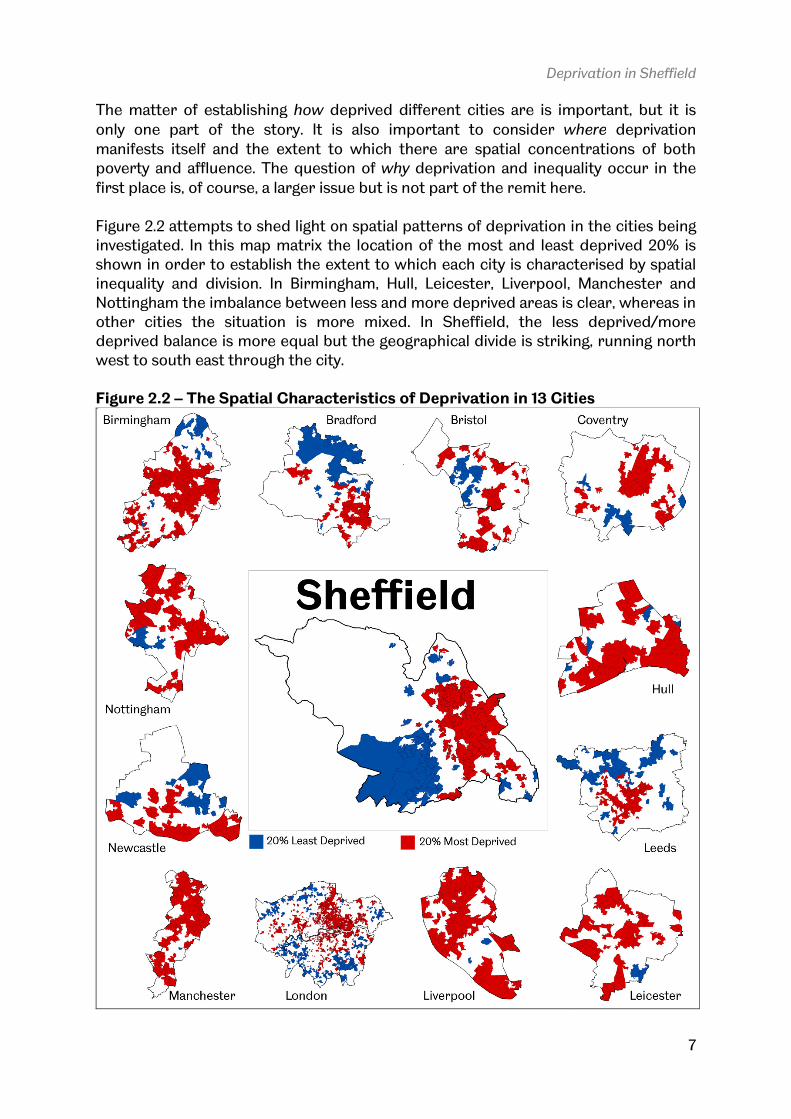
first place is, of course, a larger issue Figure 2.2 attempts to shed light on spatial investigated. In this map matrix the location shown in order to establish the extent to which each city is characterised by spatial inequality and division. In Birmingham, Hull, Leicester, Liverpool, Manchester and Nottingham the imbalance between less and more deother cities the situation is more mixed. In Sheffield, the less deprived/more deprived balance is more equal but the geographical divide is striking, running north west to south east through the city. Figure 2.2 – The Spatial Characteristics of Deprivation
Deprivation in Sheffield
The matter of establishing how deprived different cities are is important, but it is
only one part of the story. It is also important to consider where
manifests itself and the extent to which there are spatial concentrations of both poverty and affluence. The question of why deprivation and inequality occur in the
first place is, of course, a larger issue but is not part of the remit here
to shed light on spatial patterns of deprivation in the cities being investigated. In this map matrix the location of the most and least deprived 20% is shown in order to establish the extent to which each city is characterised by spatial
In Birmingham, Hull, Leicester, Liverpool, Manchester and Nottingham the imbalance between less and more deprived areas is clear, whereas in other cities the situation is more mixed. In Sheffield, the less deprived/more deprived balance is more equal but the geographical divide is striking, running north west to south east through the city.
atial Characteristics of Deprivation in 13 Cities
Deprivation in Sheffield
7
deprived different cities are is important, but it is
where deprivation
manifests itself and the extent to which there are spatial concentrations of both deprivation and inequality occur in the
but is not part of the remit here.
of deprivation in the cities being of the most and least deprived 20% is
shown in order to establish the extent to which each city is characterised by spatial In Birmingham, Hull, Leicester, Liverpool, Manchester and
prived areas is clear, whereas in other cities the situation is more mixed. In Sheffield, the less deprived/more deprived balance is more equal but the geographical divide is striking, running north
in 13 Cities

Deprivation in Sheffield
8
Given the city of Sheffield’s industrial heritage, historical development and topography, the spatial and demographic characteristics described above are perhaps not surprising. They do, however, raise important questions relating to the nature and extent of inequality and how it might be tackled, particularly when we reflect upon previous waves of national urban policy and the embeddedness and persistence of deprivation in English cities. So, whilst Sheffield’s deprivation and inequality profile might look similar in many ways to Leeds, Newcastle or Nottingham, the spatial manifestation of deprivation differs significantly. Therefore, the following key issues (see JRF, 2005) ought to be considered not at a national level but with reference to the individual demographic and spatial characteristics of Sheffield.
• ‘Neighbourhood effects’ – a significant volume of academic and policy literature argues that spatial concentrations of deprivation can have a compounding effect upon residents of poor areas, above and beyond those experienced at an individual level.
• Service provision in areas of concentrated deprivation – in these areas, a reduction in local private sector activity can raise prices for residents, and create a ‘spatial mismatch’ between the local workforce and centres of employment.
• Access to networks – high levels of economic inactivity can limit the networks on which jobseekers depend, and create a ‘culture of worklessness’ that affects residents’ employment opportunities and dissuades businesses from employing them.
• Educational disadvantage – local schools may struggle to attract high-quality staff, secure the resources needed to instruct lower ability pupils, and overcome the downward pressures that social problems exert on school processes and quality.
• Crime and anti-social behaviour – high levels of crime and disorder are often a feature of highly deprived neighbourhoods. This can be a result of peer-group effects among younger people, and reduced social penalties and opportunity costs associated with criminal activity.
• Health and well-being – residents’ health may suffer due to the stress of living in a highly deprived neighbourhood and the environmental effects of abandoned and/or low-quality housing.
Having explored some of the general deprivation characteristics of Sheffield at a general level in relation to a number of other English cities, the intention now is to take a general overview of Sheffield at the local level. The next section therefore examines patterns of deprivation at the lower super output (LSOA) and neighbourhood level.
Deprivation in Sheffield
9
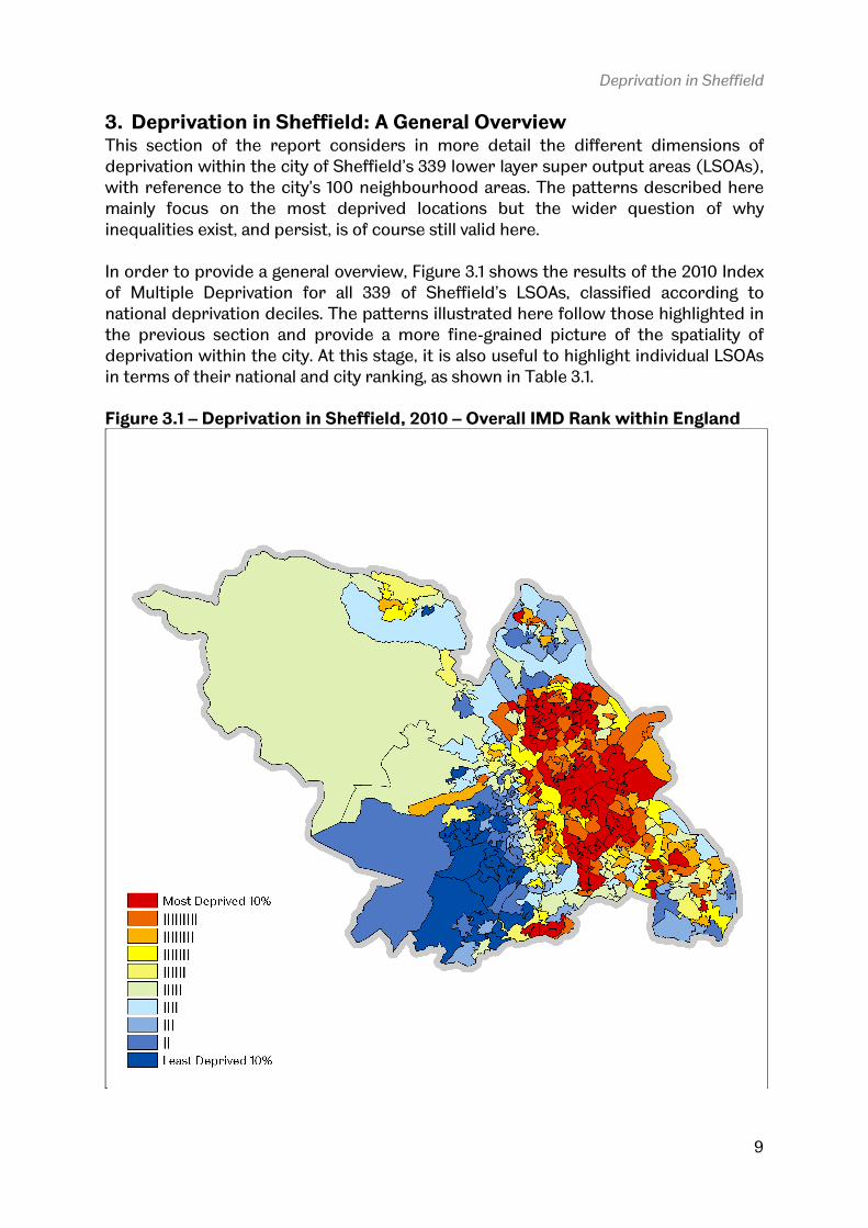
3. Deprivation in Sheffield: A General Overview This section of the report considers in more detail the different dimensions of deprivation within the city of Sheffield’s 339 lower layer super output areas (LSOAs), with reference to the city’s 100 neighbourhood areas. The patterns described here mainly focus on the most deprived locations but the wider question of why
inequalities exist, and persist, is of course still valid here. In order to provide a general overview, Figure 3.1 shows the results of the 2010 Index of Multiple Deprivation for all 339 of Sheffield’s LSOAs, classified according to national deprivation deciles. The patterns illustrated here follow those highlighted in the previous section and provide a more fine-grained picture of the spatiality of deprivation within the city. At this stage, it is also useful to highlight individual LSOAs in terms of their national and city ranking, as shown in Table 3.1. Figure 3.1 – Deprivation in Sheffield, 2010 – Overall IMD Rank within England
Deprivation in Sheffield
10
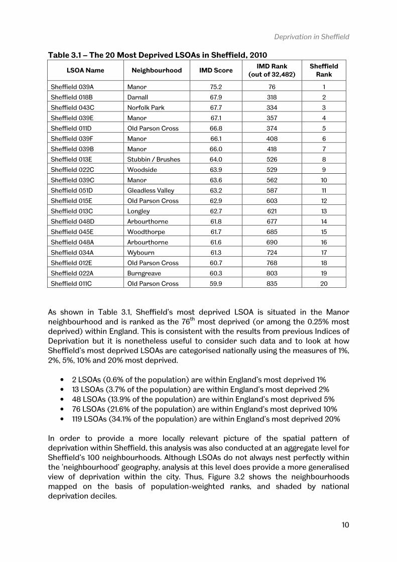
Table 3.1 – The 20 Most Deprived LSOAs in Sheffield, 2010
LSOA Name Neighbourhood IMD Score IMD Rank
(out of 32,482) Sheffield Rank
Sheffield 039A Manor 75.2 76 1
Sheffield 018B Darnall 67.9 318 2
Sheffield 043C Norfolk Park 67.7 334 3
Sheffield 039E Manor 67.1 357 4
Sheffield 011D Old Parson Cross 66.8 374 5
Sheffield 039F Manor 66.1 408 6
Sheffield 039B Manor 66.0 418 7
Sheffield 013E Stubbin / Brushes 64.0 526 8
Sheffield 022C Woodside 63.9 529 9
Sheffield 039C Manor 63.6 562 10
Sheffield 051D Gleadless Valley 63.2 587 11
Sheffield 015E Old Parson Cross 62.9 603 12
Sheffield 013C Longley 62.7 621 13
Sheffield 048D Arbourthorne 61.8 677 14
Sheffield 045E Woodthorpe 61.7 685 15
Sheffield 048A Arbourthorne 61.6 690 16
Sheffield 034A Wybourn 61.3 724 17
Sheffield 012E Old Parson Cross 60.7 768 18
Sheffield 022A Burngreave 60.3 803 19
Sheffield 011C Old Parson Cross 59.9 835 20
As shown in Table 3.1, Sheffield’s most deprived LSOA is situated in the Manor neighbourhood and is ranked as the 76th most deprived (or among the 0.25% most deprived) within England. This is consistent with the results from previous Indices of Deprivation but it is nonetheless useful to consider such data and to look at how Sheffield’s most deprived LSOAs are categorised nationally using the measures of 1%,
2%, 5%, 10% and 20% most deprived.
• 2 LSOAs (0.6% of the population) are within England’s most deprived 1%
• 13 LSOAs (3.7% of the population) are within England’s most deprived 2%
• 48 LSOAs (13.9% of the population) are within England’s most deprived 5%
• 76 LSOAs (21.6% of the population) are within England’s most deprived 10%
• 119 LSOAs (34.1% of the population) are within England’s most deprived 20% In order to provide a more locally relevant picture of the spatial pattern of deprivation within Sheffield, this analysis was also conducted at an aggregate level for Sheffield’s 100 neighbourhoods. Although LSOAs do not always nest perfectly within the ‘neighbourhood’ geography, analysis at this level does provide a more generalised view of deprivation within the city. Thus, Figure 3.2 shows the neighbourhoods mapped on the basis of population-weighted ranks, and shaded by national deprivation deciles.

Deprivation in Sheffield
11
Figure 3.2 – Deprivation in Sheffield, 2010 – Neighbourhoods
The ranking of neighbourhoods here is provided on an indicative basis, since the neighbourhood geography within Sheffield differs in size and population much more than individual LSOAs do. For example, Manor is comprised of a grouping of 6 LSOAs and a total population of around 9,000, whereas Burngreave is comprised of a single LSOA and around 1,700 people. Nonetheless, the classification of neighbourhoods into deprivation deciles does shed light on the relative deprivation levels within areas of Sheffield. In Table 3.2, the 29 neighbourhoods of Sheffield which equate to the 20% most deprived within England are shown in relation to their deprivation score and rank, in addition to their population at the time of the composition of the deprivation indices. In total, these neighbourhoods account for 28% of the city’s population and are geographically clustered to the northern and eastern portions of the city, with the exception of Low Edges and Batemoor/Jordanthorpe on the southern fringes.

Deprivation in Sheffield
12
Table 3.2 – Sheffield’s Most Deprived Neighbourhoods
Rank Neighbourhood Population (2008)
Population-Weighted IMD Score
Population-Weighted IMD Rank
1 Manor 8,919 65.99 496
2 Woodside 4,022 61.81 698
3 Burngreave 1,727 60.28 803
4 Arbourthorne 5,870 60.24 816
5 Gleadless Valley 6,247 57.48 1,162
6 Darnall 8,451 56.52 1,378
7 Shirecliffe 2,770 53.81 1,584
8 Wybourn 5,897 55.51 1,610
9 Old Parson Cross 11,153 54.66 1,815
10 Southey Green 4,682 52.92 1,885
11 Lowedges 4,687 51.56 1,951
12 Stubbin / Brushes 5,135 52.60 2,020
13 Norfolk Park 6,085 53.65 2,049
14 Flower 3,126 52.33 2,055
15 Longley 6,611 52.27 2,192
16 Shiregreen 10,278 49.82 2,313
17 Batemoor / Jordanthorpe 4,667 49.68 2,560
18 Woodthorpe 4,670 50.39 2,631
19 Netherthorpe 3,744 47.61 2,876
20 New Parson Cross 5,465 48.35 2,973
21 Park Hill 1,802 45.55 3,115
22 Hemsworth 2,939 43.69 3,590
23 Fir Vale 6,711 42.90 3,975
24 Firshill 1,809 41.22 4,199
25 Abbeyfield 7,022 42.61 4,378
26 Acres Hill 2,989 38.00 5,241
27 Broomhall 7,769 39.35 6,065
28 Westfield 3,270 38.47 6,201
29 Tinsley 8,919 34.80 6,431
At the other end of the deprivation scale, Ecclesall is the least deprived neighbourhood in Sheffield, followed by Fulwood, Bents Green, Crosspool, Wirlow/Abbeydale and Millhouses – all of which are within the 10% least deprived locations in England. Finally, in relation to the overall IMD, it is useful to consider the distribution of LSOAs and neighbourhoods across deprivation deciles, in order to provide a general overview. This is provided in Figures 3.3 and 3.4, which show the number of LSOAs and neighbourhoods in Sheffield in relation to each national deprivation decile. At both scales of analysis, the most deprived decile contains the most areas, with much less variation in evidence between the other deprivation deciles.

Figure 3.3 – Sheffield LSOAs by Deprivation Decile, 2010
Figure 3.4 – Sheffield Neighbourhoods by Deprivation Decile, 2010
Deprivation in Sheffield
Sheffield LSOAs by Deprivation Decile, 2010
Sheffield Neighbourhoods by Deprivation Decile, 2010
Deprivation in Sheffield
13

Deprivation in Sheffield
14
4. Dimensions of Deprivation in Sheffield In addition to being able to report the overall scores and ranks for the combined Index of Multiple Deprivation 2010, it is also possible to explore different dimensions of deprivation by means of looking at individual domains of the IMD. This is particularly useful since the combined index reflects a somewhat arbitrary weighting
scheme for each domain, as shown below. This weighting methodology is applied consistently across England, though it is interesting to note that the Scottish Indices of Multiple Deprivation, for example, use a different weighting scheme.
• Income Deprivation 22.5%
• Employment Deprivation 22.5%
• Health Deprivation and Disability 13.5%
• Education, Skills and Training Deprivation 13.5%
• Barriers to Housing and Services 9.3%
• Crime 9.3%
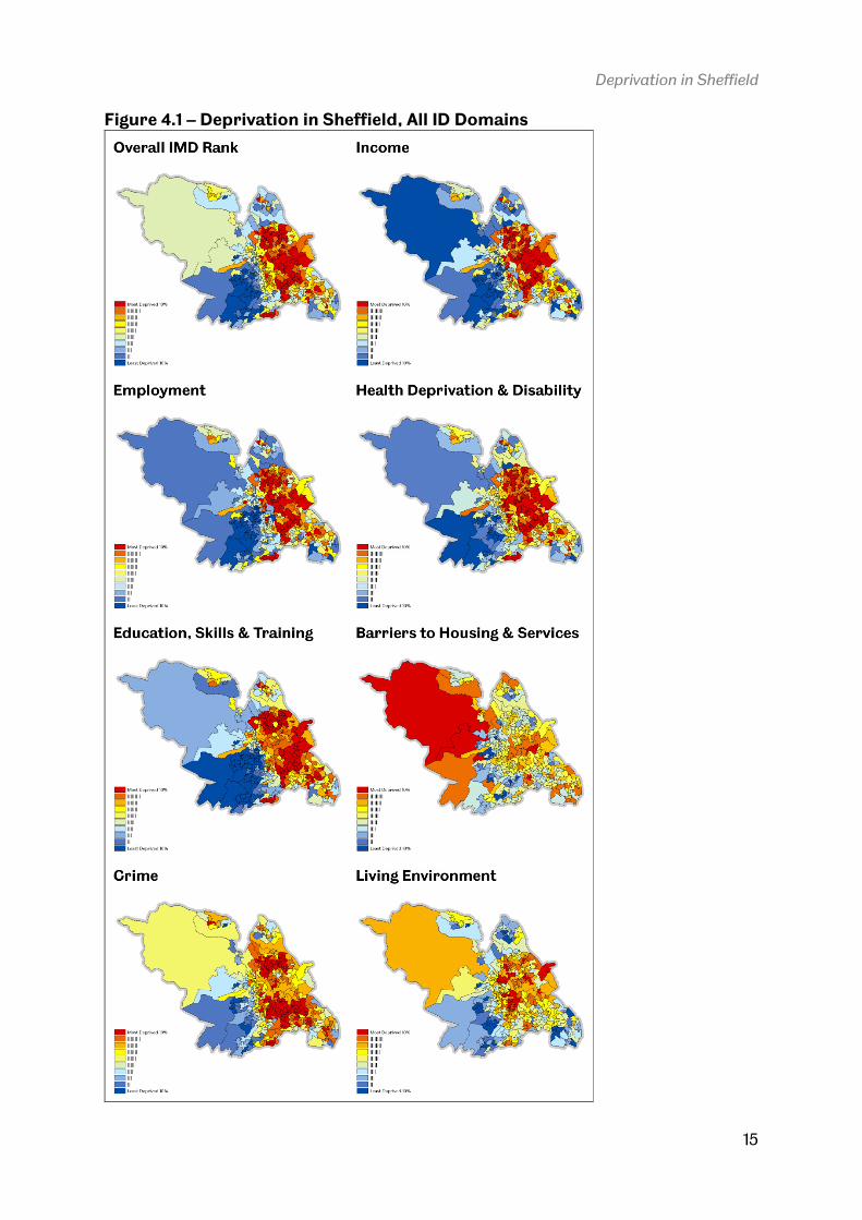
• Living Environment Deprivation 9.3% As shown in Table 2.2 in the second part of this report, Sheffield as a whole ranks nationally as more deprived in relation to income and employment than it is in relation to the overall IMD so it is worth taking a closer look at each dimension in order to understand more about the characteristics and spatiality of these domains in Sheffield. By doing so, we should arrive at a better understanding of how to prioritise each aspect of deprivation in terms of policy priorities. In order to provide a basic visual comparison of the different dimensions of deprivation in Sheffield, Figure 4.1 displays the overall deprivation rank for Sheffield LSOAs and all seven individual deprivation domains. The spatial patterns for Income,
Employment, Health and Disability, Education and Crime are broadly similar to the overall pattern of deprivation in the city. The spatial patterns for Living Environment and Barriers to Housing and Services do differ significantly from other domains, though this is not surprising given Sheffield’s urban location and environment. When we look more closely at the different domains, important differences begin to emerge. Some areas of Sheffield are more deprived in a relative sense on individual domains than they are on the combined IMD, though some are also less deprived. The most deprived LSOAs on each domain are as follows (neighbourhood in brackets).
• Income Deprivation 44 (in Woodside)
• Employment Deprivation 257 (in Longley)
• Health Deprivation and Disability 221 (in Flower)
• Education, Skills and Training Deprivation 15 (in Manor)
• Barriers to Housing and Services 131 (in Rural Area)
• Crime 30 (in Manor)
• Living Environment Deprivation 211 (in Fir Vale)
Deprivation in Sheffield
15
Figure 4.1 – Deprivation in Sheffield, All ID Domains

In order to provide a more finedeprivation as they exist in Sheffield, the number of LSOAs in the deprived decile was calculated, and expressed as a percentage figure Sheffield has fewer LSOAs in the most deprived national deciles for income and employment deprivation than it does on the overall IMD but more LSOAs in the most deprived deciles for Health and Disability, Education, Skills and Training The domain with the highest percentage of LSOAs in the 10% most deprived nationally is Education, Skills and Trainingpercentage within the 20% most deBarriers to Housing and Servicescontain a much lower percentage within the two most deprived deciles. Figure 4.2 – Most Deprived Domains by Decile
Despite the fact that, in general, LSOAs in Sheffield are not equally impacted upon by the different dimensions of deprivation identified in the IMD, there are actually three areas in Sheffield which rank among the 20% most deprived nationally on domains, as indicated below.
• Sheffield 035D in the Park Hill neighbourhood
• Sheffield 060A in the Gleadless Valley neighbourhood
• Sheffield 060B in the Gleadless Valley neighbourhood
Deprivation in Sheffield
In order to provide a more fine-grained analysis of the different domains of deprivation as they exist in Sheffield, the number of LSOAs in the 10% and 20% most
was calculated, and expressed as a percentage figure Sheffield has fewer LSOAs in the most deprived national deciles for income and employment deprivation than it does on the overall IMD but more LSOAs in the most
h and Disability, Education, Skills and Training
The domain with the highest percentage of LSOAs in the 10% most deprived nationally is Education, Skills and Training, at 27%. The Crime domain has the highest percentage within the 20% most deprived nationally, at 66%. By contrast, the Barriers to Housing and Services (12%) and Living Environmentcontain a much lower percentage within the two most deprived deciles.
Most Deprived Domains by Decile
Despite the fact that, in general, LSOAs in Sheffield are not equally impacted upon by the different dimensions of deprivation identified in the IMD, there are actually three areas in Sheffield which rank among the 20% most deprived nationally on
, as indicated below.
in the Park Hill neighbourhood
in the Gleadless Valley neighbourhood
in the Gleadless Valley neighbourhood
Deprivation in Sheffield
16
grained analysis of the different domains of 10% and 20% most
was calculated, and expressed as a percentage figure in Figure 4.2. Sheffield has fewer LSOAs in the most deprived national deciles for income and employment deprivation than it does on the overall IMD but more LSOAs in the most
h and Disability, Education, Skills and Training, and Crime.
The domain with the highest percentage of LSOAs in the 10% most deprived at 27%. The Crime domain has the highest
prived nationally, at 66%. By contrast, the and Living Environment (27%) domains
contain a much lower percentage within the two most deprived deciles.
Despite the fact that, in general, LSOAs in Sheffield are not equally impacted upon by the different dimensions of deprivation identified in the IMD, there are actually three areas in Sheffield which rank among the 20% most deprived nationally on all seven

Deprivation in Sheffield
17
When we remove the Living Environment and Barriers to Housing and Service domains from the analysis, the number of LSOAs which are among the 10% and 20% most deprived on all other domains increases significantly. In total, 26 Sheffield LSOAs are within the 10% most deprived in England on five key deprivation domains and a further 44 fall within the 20% most deprived. The geographical distribution of these areas is shown in Figure 4.3. 1. New Parson Cross (1 LSOA) 2. Old Parson Cross (3 LSOAs) 3. Stubbin/Brushes (1 LSOA) 4. Flower (1 LSOA) 5. Southey Green (1 LSOA) 6. Longley (1 LSOA) 7. Wybourn (1 LSOA) 8. Manor (5 LSOAs)
9. Norfolk Park (2 LSOAs) 10. Woodthorpe (1 LSOA) 11. Arbourthorne (4 LSOAs) 12. Gleadless Valley (2 LSOAs) 13. Westfield (1 LSOA) 14. Batemoor/Jordanthorpe (1 LSOA) 15. Low Edges (1 LSOA)
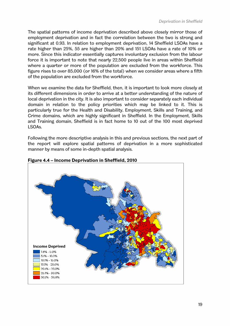
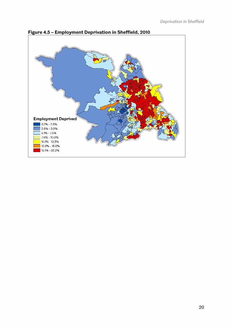
The data described so far are indicative of long-standing spatial patterns of deprivation within the city of Sheffield, but they add a more nuanced view of local area disadvantage in relation to the different dimensions of deprivation included in the Indices of Deprivation. The interpretation of these individual domains is often difficult but for two domains in particular it is more straightforward so this section will conclude by examining income and employment deprivation in more detail. These two domains both report a ‘score’ which is actually an income deprivation rate and an employment deprivation rate for each LSOA across England. Income deprivation measures the percentage of persons in each LSOA living in low income households whereas employment deprivation measures the percentage of the working age population who want to work but are unable to do so due to unemployment, sickness or disability. The precise composition of these indicators is specified in official government documents (CLG, 2010) but it can be said that the income and employment deprivation domains are the only two where the score for each area ‘makes sense’ from a statistical point of view. Therefore, this section concludes with a brief look at these two dimensions, as shown in Figure 4.4 and 4.5. One Sheffield LSOA (022C) in the neighbourhood of Burngreave, has an income deprivation rate of 57%, the only area in the city with a figure above 50%. The highest
income deprivation rate for a LSOA nationally is 77%, in Rochdale. In total, 18 LSOAs have an income deprivation rate of more than 40%, 70 LSOAs have a rate higher than 30% and 132 LSOAs have a rate higher than 20%. More than half the city’s LSOAs (195 out of 339) have an income deprivation rate of 10% or more

Deprivation in Sheffield
18
Figure 4.3 – LSOAs in Most Deprived Deciles on 5 Key Domains, 2010
Deprivation in Sheffield
19
The spatial patterns of income deprivation described above closely mirror those of employment deprivation and in fact the correlation between the two is strong and significant at 0.93. In relation to employment deprivation, 14 Sheffield LSOAs have a rate higher than 25%, 55 are higher than 20% and 151 LSOAs have a rate of 10% or more. Since this indicator essentially captures involuntary exclusion from the labour force it is important to note that nearly 22,500 people live in areas within Sheffield where a quarter or more of the population are excluded from the workforce. This figure rises to over 85,000 (or 16% of the total) when we consider areas where a fifth of the population are excluded from the workforce. When we examine the data for Sheffield, then, it is important to look more closely at its different dimensions in order to arrive at a better understanding of the nature of local deprivation in the city. It is also important to consider separately each individual domain in relation to the policy priorities which may be linked to it. This is particularly true for the Health and Disability, Employment, Skills and Training, and Crime domains, which are highly significant in Sheffield. In the Employment, Skills and Training domain, Sheffield is in fact home to 10 out of the 100 most deprived LSOAs. Following the more descriptive analysis in this and previous sections, the next part of the report will explore spatial patterns of deprivation in a more sophisticated manner by means of some in-depth spatial analysis. Figure 4.4 – Income Deprivation in Sheffield, 2010
Deprivation in Sheffield
20
Figure 4.5 – Employment Deprivation in Sheffield, 2010
Deprivation in Sheffield
21
5. Deprivation in Sheffield: Spatial Analysis Given the policy and academic focus on concentrated deprivation in cities and its presumed pernicious effects (e.g. Lupton and Fuller, 2009), it is useful to have some understanding of exactly how concentrated deprived and non-deprived areas are and where exactly such areas are within Sheffield. This section therefore takes a
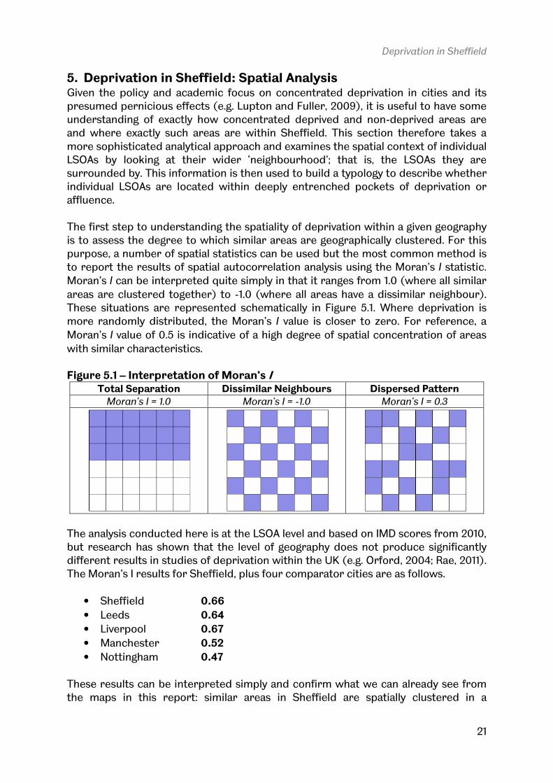
more sophisticated analytical approach and examines the spatial context of individual LSOAs by looking at their wider ‘neighbourhood’; that is, the LSOAs they are surrounded by. This information is then used to build a typology to describe whether individual LSOAs are located within deeply entrenched pockets of deprivation or affluence. The first step to understanding the spatiality of deprivation within a given geography is to assess the degree to which similar areas are geographically clustered. For this purpose, a number of spatial statistics can be used but the most common method is to report the results of spatial autocorrelation analysis using the Moran’s I statistic.
Moran’s I can be interpreted quite simply in that it ranges from 1.0 (where all similar
areas are clustered together) to -1.0 (where all areas have a dissimilar neighbour). These situations are represented schematically in Figure 5.1. Where deprivation is more randomly distributed, the Moran’s I value is closer to zero. For reference, a
Moran’s I value of 0.5 is indicative of a high degree of spatial concentration of areas
with similar characteristics. Figure 5.1 – Interpretation of Moran’s I
Total Separation Dissimilar Neighbours Dispersed Pattern Moran’s I = 1.0 Moran’s I = -1.0 Moran’s I = 0.3
The analysis conducted here is at the LSOA level and based on IMD scores from 2010, but research has shown that the level of geography does not produce significantly different results in studies of deprivation within the UK (e.g. Orford, 2004; Rae, 2011). The Moran’s I results for Sheffield, plus four comparator cities are as follows.
• Sheffield 0.66
• Leeds 0.64
• Liverpool 0.67
• Manchester 0.52
• Nottingham 0.47 These results can be interpreted simply and confirm what we can already see from the maps in this report: similar areas in Sheffield are spatially clustered in a

Deprivation in Sheffield
22
statistically significant way. The Moran’s I value is amongst the highest of all English
cities and it is also considerably higher than the corresponding values for Manchester and Nottingham. Whilst this new knowledge adds statistical robustness to the study of spatially concentrated deprivation within Sheffield, it does not say much about which individual areas sit within larger concentrations of deprivation or affluence. For this, we need to take a more local approach and this is done in two ways. First, a ‘nearest neighbour’ Index of Multiple Deprivation (NN-IMD) was calculated for Sheffield in order to establish which LSOAs were located within the most deprived wider neighbourhoods (i.e. all contiguous LSOAs). This analysis is based on the IMD rank of the neighbours of each LSOA and paints a picture of the extent to which a less favourable local environment may impact upon an area. The results of this ‘nearest neighbour’ analysis are depicted visually in Figure 5.2 where areas are shaded according to the average rank of their immediate neighbours. Figure 5.2 – A ‘Nearest Neighbour’ Index of Multiple Deprivation for Sheffield
The LSOAs with the most deprived local spatial context are located in the Manor, Darnall and Firth Park neighbourhoods of Sheffield. Within England as a whole, there
are 1123 LSOAs which are surrounded by LSOAs with an average deprivation rank of 3,248 or less (i.e. equivalent to the 10% most deprived). This equates to 3.5% of the total. In Sheffield, 35 out of 339 (10.3%) LSOAs are in such a position. What this

Deprivation in Sheffield
23
demonstrates is that a significant percentage of the most deprived areas in Sheffield are located within larger concentrations of disadvantage. An additional method of nearest neighbour analysis is to assign some weight to the surrounding neighbourhood and some weight to the LSOA itself so that individual LSOAs and their wider neighbourhood are considered together. The results of this
analysis, where the LSOA and contiguous LSOAs have been assigned a 50% weight, are displayed in Figure 5.3. Once again, the most deprived locations on this measure are also in the Manor, Darnall and Firth Park neighbourhoods of Sheffield. Within England, 4.7% of LSOAs have an average NN-IMD rank of 3,248 on this measure compared to 14.2% (48 out of 339) of LSOAs in Sheffield. These methods provide an additional level of spatiality to the understanding of deprivation at the local level in that they allow one to consider not only an individual LSOA but its local spatial context; often important in the determination of neighbourhood outcomes. Figure 5.3 – Nearest Neighbour and LSOA 50% Weighted IMD Rank
The second step in a more local spatial analytical approach is to derive a typology from the foregoing NN-IMD indicators, and this is done using a ‘local indicators of
spatial association’ (LISA) method (Anselin, 1995). Based on the statistical nearest neighbour analysis, LSOAs are categorised according to five different types, using a robust spatial statistical approach, as follows (and see Figure 5.4).
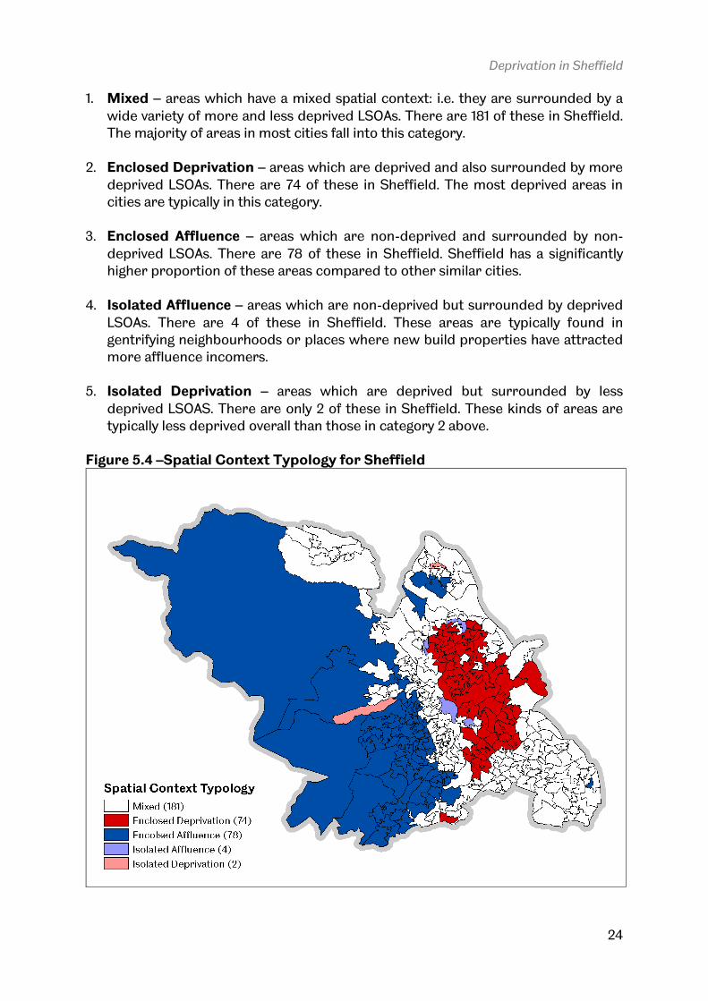
Deprivation in Sheffield
24
1. Mixed – areas which have a mixed spatial context: i.e. they are surrounded by a wide variety of more and less deprived LSOAs. There are 181 of these in Sheffield. The majority of areas in most cities fall into this category.
2. Enclosed Deprivation – areas which are deprived and also surrounded by more deprived LSOAs. There are 74 of these in Sheffield. The most deprived areas in cities are typically in this category.
3. Enclosed Affluence – areas which are non-deprived and surrounded by non-deprived LSOAs. There are 78 of these in Sheffield. Sheffield has a significantly higher proportion of these areas compared to other similar cities.
4. Isolated Affluence – areas which are non-deprived but surrounded by deprived LSOAs. There are 4 of these in Sheffield. These areas are typically found in gentrifying neighbourhoods or places where new build properties have attracted more affluence incomers.
5. Isolated Deprivation – areas which are deprived but surrounded by less deprived LSOAS. There are only 2 of these in Sheffield. These kinds of areas are typically less deprived overall than those in category 2 above.
Figure 5.4 –Spatial Context Typology for Sheffield
Deprivation in Sheffield
25
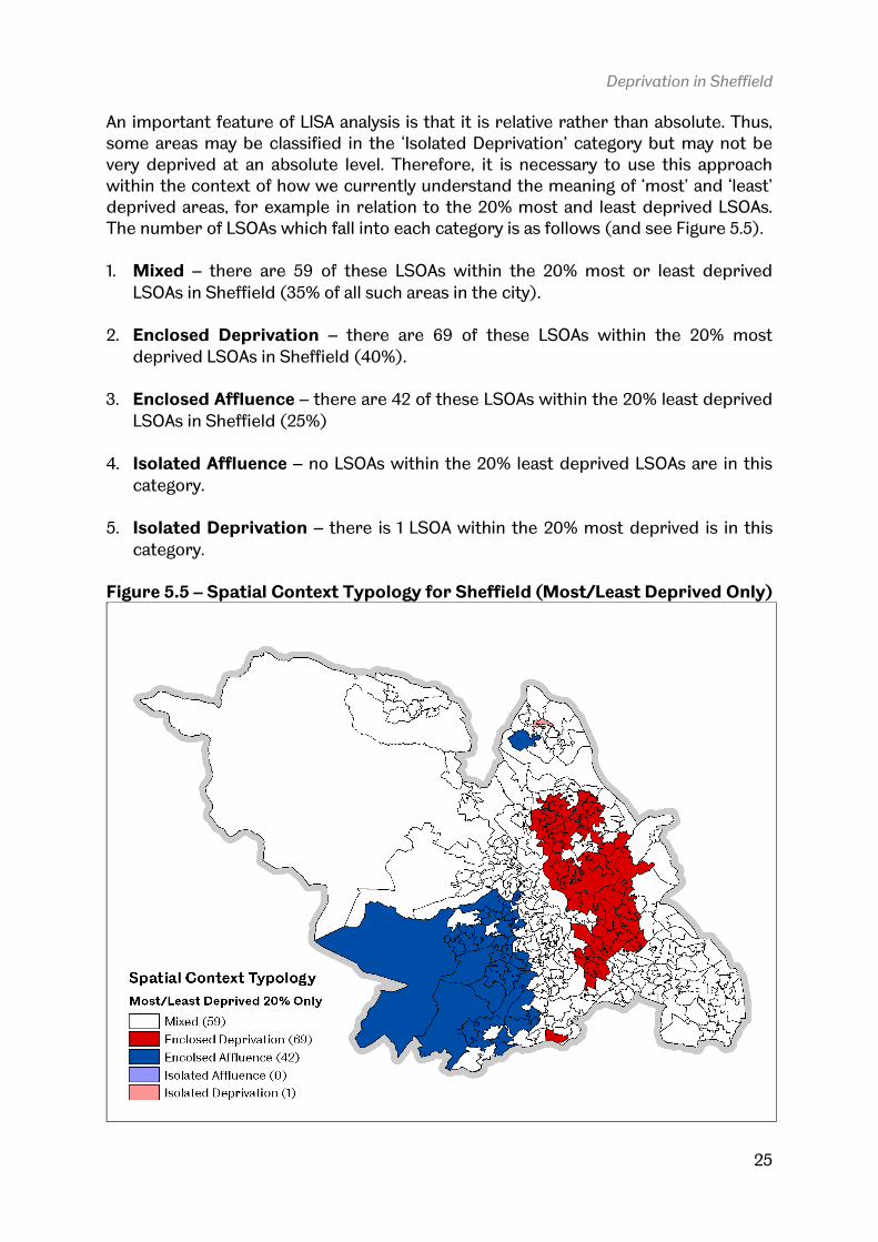
An important feature of LISA analysis is that it is relative rather than absolute. Thus, some areas may be classified in the ‘Isolated Deprivation’ category but may not be very deprived at an absolute level. Therefore, it is necessary to use this approach within the context of how we currently understand the meaning of ‘most’ and ‘least’ deprived areas, for example in relation to the 20% most and least deprived LSOAs. The number of LSOAs which fall into each category is as follows (and see Figure 5.5). 1. Mixed – there are 59 of these LSOAs within the 20% most or least deprived
LSOAs in Sheffield (35% of all such areas in the city). 2. Enclosed Deprivation – there are 69 of these LSOAs within the 20% most
deprived LSOAs in Sheffield (40%). 3. Enclosed Affluence – there are 42 of these LSOAs within the 20% least deprived
LSOAs in Sheffield (25%) 4. Isolated Affluence – no LSOAs within the 20% least deprived LSOAs are in this
category. 5. Isolated Deprivation – there is 1 LSOA within the 20% most deprived is in this
category.
Figure 5.5 – Spatial Context Typology for Sheffield (Most/Least Deprived Only)

Deprivation in Sheffield
26
Despite the level of sophistication involved in the foregoing analysis, the policy messages and key points emerging from it can be quite simply articulated, as follows:
1. Not all deprived areas are the same and so policy responses possibly need to reflect this. For example, the use of simple ‘10% most deprived’ or ‘20% most deprived’ indicators can be helpful at one level but they do not on their own say anything about the local setting of individual areas or whether they are located within larger concentrations of disadvantage; something that could have a serious impact on any policy intervention in such areas. The fact that all deprived areas are not the same is of course not news. What is new here is the development of a method to say exactly how deprived areas differ
in terms of their spatial context and their spatial type.
2. Deprived areas in Sheffield are nearly all surrounded by similar areas.
This is not the case in many other English or British cities and it is important since arguments relating to the negative impacts of ‘neighbourhood effects’ (frequently used as a rationale for policy intervention) may have greater significance in Sheffield.
3. Sheffield is very obviously a ‘split city’ in a geographical sense. This owes much to historical legacy and topography, as stated earlier in the report, but the spatial divisions in the city are more striking than in any other comparable city. This therefore raises more difficult questions related to social and spatial justice more broadly and service provision in particular.
The analysis up to this point has focused very much the state of things as they were at a point in time, based on the 2010 Indices of Deprivation. But this is only part of the story. We also need to consider how places change through time and what the driving forces of such change might be. Consequently, the next section of the report examines this issue from two perspectives. First, the changes in levels of deprivation are explored with reference to the 2004, and 2010 versions of the Indices of Deprivation. This is a relatively short time frame but it offers an important insight into where positive and negative change is occurring and what local trajectories of change might be. Second, the extent to which different kinds of deprived areas can be identified according to patterns of residential mobility is explained and explored in Sheffield. This is based on previous work by the author and others for CLG (e.g. CLG, 2009).

Deprivation in Sheffield
27
6. Trajectories of Change This section of the report considers briefly how different deprived areas within Sheffield have changed in recent years, by means of looking more closely at changes in the Indices of Deprivation between 2004 and 2010, and an original residential mobility typology developed by the author and colleagues at the University of
Manchester for CLG (Robson et al., 2008). The purpose of doing this is to provide further analysis which can enable us to understand more about the trajectories, roles and functions of Sheffield’s most deprived locations. One feature of longitudinal studies of urban deprivation is the fact that there is typically little significant change through time in the characteristics and location of the most deprived areas (e.g. Orford, 2004). Whilst this is true at an aggregate level, there are, however, important local differences to be identified so this work is conducted at the LSOA level in order to provide the most fine-grained analysis of trajectories of change as they relate to deprivation in Sheffield. Figure 6.1 shows the results of the longitudinal change analysis in the relative level of deprivation of those Sheffield LSOAs which were among the 20% most deprived nationally in 2004. At that time, there were 124 such LSOAs (compared to 119 today). From 2004 to 2010, exactly 62 of these LSOAs became less deprived in terms of their national deprivation rank and exactly 62 became more deprived. However, marginal changes in rank do not really mean much so it is important to consider the total rank change if we are to make more sense of it and also to consider how the most and least deprived within the 20% group changed. In Figure 6.1, the most deprived 5% of areas on the 2004 IMD are shown in red, with successive 5% bandings shown in blue, green and orange respectively. Areas which improved between 2004 and 2010 extend upwards, with the reverse being true for areas which became more deprived. Taking a more detailed look at rank changes in the 5%, 10%, 15% and 20% most deprived areas, we can observe the following.
• 5% Most Deprived – 18 LSOAs declined, 25 improved
• 6-10% Most Deprived – 20 LSOAs declined, 15 improved
• 11-15% Most Deprived – 17 LSOAs declined, 9 improved
• 16-20% Most Deprived – 7 LSOAs declined, 13 improved Following this, Figure 6.2 maps the change in deprivation rank for Sheffield’s most deprived LSOAs between 2004 and 2010 using a colour scheme based on 1,624 places on the IMD scale, since this would represent a change of 5 percentage points on the national scale. Thus, if an area was ranked 1,625 in 2004 it would be ranked just outside England’s most deprived 5% but if in 2010 it ranked 3,249 (a change of 1,624 places) it would no longer be ranked among the 10% most deprived in England. On this change measure, 7 out of 124 areas which were amongst England’s most deprived 20% became more than 5 percentage places more deprived between 2004 and 2010. These LSOAs can be found in the neighbourhoods of High Green, Southey Green, Gleadless, Gleadless Valley, Low Edges and Batemoor/Jordanthorpe.

Figure 6.1 – Rank Change in Most Deprived LSOAs from 2004 to 2010
Most areas in Sheffield fall into the +/number improved significantly, with a positive rank change of 3,248 or greater (equivalent at 10% improvement on the IMD). These LSOAs can be found in Firth Park, Norfolk Park, Broomhall, Sharrow, and City Centre. Ineighbourhood, two LSOAs improved by more than 6,496 places on the IMD between 2004 and 2010; a fact which reflects the significant influx of new, more affluent residents during this period. Overall, the majority of the most deprived LSOmodest change in their national IMD rank but a small number did experience significant change. The final aspect of the analysis in this report, therefore, will consider one possible reason for this change mobility between different types of areas
Deprivation in Sheffield
Rank Change in Most Deprived LSOAs from 2004 to 2010
Most areas in Sheffield fall into the +/- 1,624 rank change category, but a small number improved significantly, with a positive rank change of 3,248 or greater (equivalent at 10% improvement on the IMD). These LSOAs can be found in Firth Park, Norfolk Park, Broomhall, Sharrow, and City Centre. In the City Centre neighbourhood, two LSOAs improved by more than 6,496 places on the IMD between
; a fact which reflects the significant influx of new, more affluent residents during this period.
Overall, the majority of the most deprived LSOAs in Sheffield experienced a fairly modest change in their national IMD rank but a small number did experience significant change. The final aspect of the analysis in this report, therefore, will consider one possible reason for this change – that of asymmetrical residential mobility between different types of areas.
Deprivation in Sheffield
28
Rank Change in Most Deprived LSOAs from 2004 to 2010
1,624 rank change category, but a small number improved significantly, with a positive rank change of 3,248 or greater (equivalent at 10% improvement on the IMD). These LSOAs can be found in Firth
n the City Centre neighbourhood, two LSOAs improved by more than 6,496 places on the IMD between
; a fact which reflects the significant influx of new, more affluent
As in Sheffield experienced a fairly modest change in their national IMD rank but a small number did experience significant change. The final aspect of the analysis in this report, therefore, will
metrical residential

Deprivation in Sheffield
29
Figure 6.2 – Map of Change in Deprivation Rank from 2004 to 2010

Deprivation in Sheffield
30
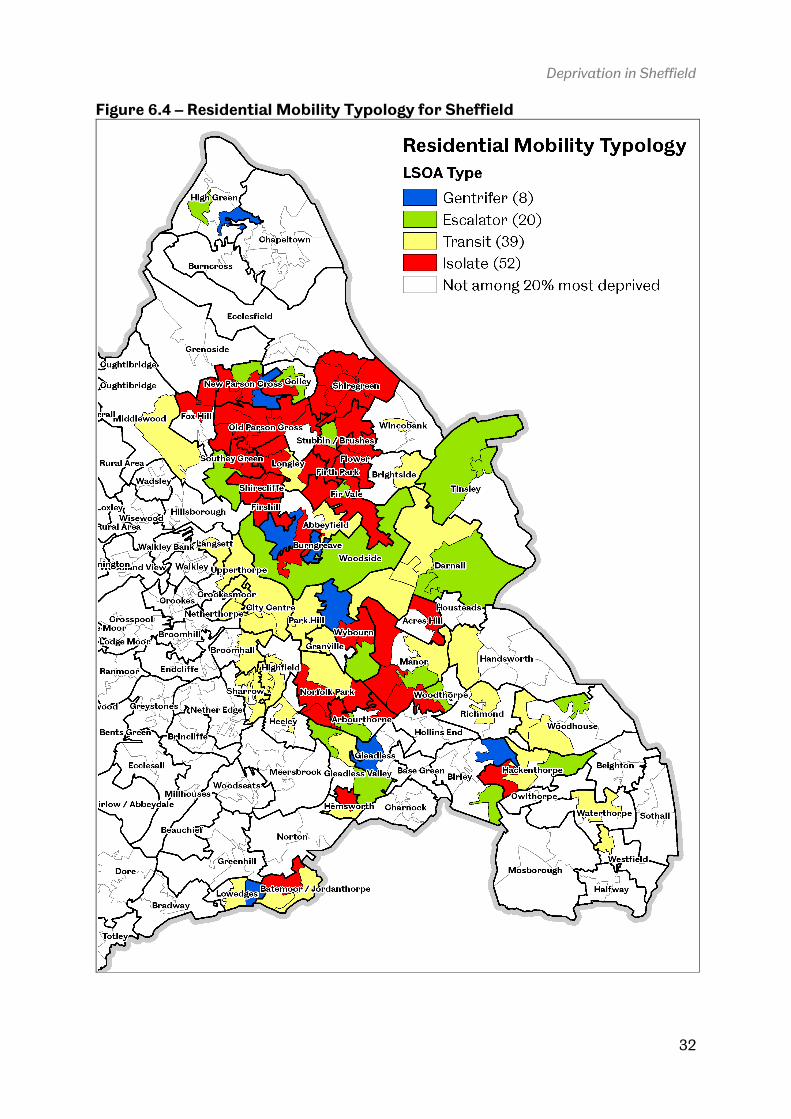
During the official evaluation of the National Strategy for Neighbourhood Renewal (NSNR) in England, a research team at the University of Manchester were commissioned to explore changes in neighbourhood composition related to population churn, or mobility. The purpose of this analysis was to develop an understanding of the dynamics and the functional roles that neighbourhoods play within their wider areas, and this was done for the 20% most deprived LSOAs in England by looking at all population inflows and outflows relating to those areas. Further details of the methodology and technical process behind this work is detailed in full elsewhere (CLG, 2010); in this report the focus is on the types of areas which exist within Sheffield. An important note here is that the typology is based on 2001 Census migration data and 2004 deprivation data so the intention is not to say conclusively which areas in Sheffield fall into which types today but to demonstrate the discriminatory power of such analyses. Nonetheless, subsequent work by the original research team, the New Deal for Communities evaluation team, and other researchers, has provided further evidence that such a typology is valid. The four different types of area identified described below (cf. Robson et al., 2008), illustrated schematically in Figure 6.3 and mapped for Sheffield in Figure 6.4.
• Gentrifier areas are ones in which there is a degree of social improvement since most in-movers come from less deprived areas and most out-movers go to similarly or more deprived areas. This can be seen as a form of gentrification. However, it may not entail the kind of conscious process of richer households displacing poorer households envisaged by much of the gentrification literature. There are 8 of these in Sheffield.
• Escalator areas are deprived neighbourhoods in which most in-movers come from similar or more deprived areas and most out-movers go to less deprived areas. In this type of movement, the neighbourhood becomes part of a continuous onward-and-upward progression through the housing and labour market. The moving households may be older than for the Transit areas since they would not necessarily be at the start of their housing career. There are 20 of these in Sheffield.
• Transit areas are deprived neighbourhoods in which most in-movers come from less deprived areas and most out-movers go to less deprived areas. This often implies young or newly-established households coming from less deprived areas and starting out on the housing ladder. Their early choice of housing - and hence location - reflects their initially limited resources. There are 39 of these in Sheffield.
• Isolate areas represent neighbourhoods in which households come from and move to areas that are equally or more deprived. Hence, they can be seen as neighbourhoods that are associated with a degree of entrapment of poorer households who are unable to break out of living in deprived areas. There are 52 of these in Sheffield.

Deprivation in Sheffield
31
Figure 6.3 – A typology of deprived neighbourhoods*
*Arrows show the direction of the predominant residential flows.
In a climate of restricted public spending, the necessity of improving the efficiency of
urban policy interventions is paramount and this typology was developed for precisely that purpose. The rationale here is that deprived areas differ considerably in terms of the roles they play within wider local housing and labour markets and that some benefit from residential mobility processes whilst some are negatively impacted by them. Given such a typology, we might then look more closely at the types of interventions employed in such areas and, more importantly, consider best how to prioritise such areas in terms of policy intervention. Isolate areas, with their rather restricted residential mobility patterns, are the least likely to experience positive change as a result of migration patterns. They are also the most deprived type of area within Sheffield, having an average rank of 2,382. In summary, then, this alternative approach to understanding deprived neighbourhoods and how they might change can add an important new dimension to our understanding of neighbourhoods, the roles they might play and their level of connectedness to wider housing and labour market processes. The key message here is that connectivity matters because it can result in significant local change.
Deprivation in Sheffield
32
Figure 6.4 – Residential Mobility Typology for Sheffield

Deprivation in Sheffield
33
7. Summary This report has attempted to provide a more in-depth and fine-grained picture of deprivation in Sheffield. In doing so, it has necessarily entailed some contextual analysis so that we can understand that Sheffield, despite its high levels of deprivation, actually compares quite favourably to many similar cities. Nonetheless,
spatial divisions and concentrations of deprivation in the city are testament to the fact that significant policy challenges remain. It is also clear from the analytical content above that deprivation manifests itself in different places in different ways and that there is considerable variation within Sheffield. Given the findings presented in the report, I would like to suggest three future avenues for research – each of which could provide us with a more sophisticated understanding of deprivation in Sheffield and the potential impacts it may have. A significant additional benefit to such work would be in relation to more efficiently targeting limited resources towards the deprived areas most in need. 1. Examine local outcomes with reference to local spatial context. A large
volume of policy and academic work suggests that the location of places – and not just the characteristics – plays an important role in local outcomes. The extent to which this is true in Sheffield could plausibly be explored by expanding upon some of the local spatial context work in this report.
2. Pay more attention to the different dimensions of deprivation. This may be
an obvious point, but it is clear from the foregoing analysis that Sheffield suffers disproportionately from particular kinds of deprivation. Therefore, taking an overview of deprivation by reporting IMD ranks and scores may obscure important local problems.
3. Implement more sophisticated analysis tools. It is commonplace for local
authorities to rigorously interrogate Indices of Deprivation data upon each new release but this is seldom done in a more sophisticated spatial analytical manner. The view here is that by taking adopting more complex (but theoretically simple) analysis tools we can arrive at better understanding of key issues not only in relation to area demographics but also in relation to spatial characteristics.

Deprivation in Sheffield
34
8. References Anselin, L. (1995) ‘Local Indicators of Spatial Association – LISA’, Geographical
Analysis, 27, 93–115.
Blasius, J., Friedrichs, J. and Galster, G., (2007) ‘Frontiers of quantifying neighbourhood effects‘, Housing Studies, 22, 627-636.
CLG (2009) A typology of the functional roles of deprived neighbourhoods,
Communities and Local Government, London. CLG (2011) Indices of Deprivation 2010, Communities and Local Government, London.
JRF (2005) Transatlantic perspectives on mixed communities, Joseph Rowntree
Foundation, York. Lupton, R. and Fuller, C. (2009) ‘Mixed communities: a new approach to spatially concentrated poverty in England’ International Journal of Urban and Regional
Research, 33, 1014–1028.
Massey, D. (1996) ‘The age of extremes: concentrated affluence and poverty in the twenty-first century’, Demography 33, 395–412.
Orford, S. (2004) ‘Identifying and comparing changes in the spatial concentrations of urban poverty and affluence: a case study of inner London’, Computers, Environment
and Urban Systems, 28, 701–717.
Rae, A. (2011) ‘Spatially concentrated disadvantage in England: an empirical assessment’, Regional Studies, forthcoming.
Robson, B., Lymperopoulou, K. and Rae, A. (2008) ‘People on the move: exploring the functional roles of deprived neighbourhoods’, Environment and Planning A, 40, 2693-
2714. Wilkinson, R. and Pickett, K. (2009) The Spirit Level: Why More Equal Societies Almost
Always Do Better, Penguin, London.


