AP Statistics – Ch. 3 Notes Describing Relationships: Scatterplots and Linear Regression In many statistical studies, looking at the distribution of one variable is not enough. The relationships between two or more variables can give a more complete picture. A response variable is the variable of interest in a study. Often, we are interested in predicting its value. An explanatory variable helps explain or influence changes in a response variable. There are some situations where there isn’t a clear distinction between the variables. If we are simply observing both variables, there may or may not be explanatory and response variables. It depends on how you intend to use the data. In other fields of mathematics, response variables are called dependent variables and explanatory variables are called independent variables. In statistics, “dependent” and “independent” have other very specific meanings, so we prefer “explanatory” and “response”. Examples: For each situation, determine which of the two variables is the response variable and which is the explanatory variable. a) Weed growth and amount of rain. b) Winning percentage of a basketball team and attendance at basketball games. c) Amount of daily exercise and resting pulse rate. Example: Julie wants to know if she can predict a student’s weight from his or her height. Jim wants to know if there is a relationship between height and weight. In each case, identify the explanatory variable and response variable, if possible. The best way to display the relationship between two quantitative variables is on a scatterplot. The values of one variable appear on the horizontal axis and the values of the other variable appear on the vertical axis. Each individual in the data appears as a point in the graph. How to Make a Scatterplot: 1. Decide which variable should go on each axis. (The eXplanatory variable goes on the x-axis). 2. Label and scale your axes. 3. Plot individual data values. Pick “nice” values to mark on each axis, making sure you cover the range of each variable. In a scatterplot, the axes usually do not start at 0, and the axes are often not on the same scale, but you need to make sure that the scale on each axis is consistent. Remember to clearly LABEL the variable name and units on each axis!
Transcript
AP Statistics – Ch. 3 Notes
Describing Relationships: Scatterplots and Linear Regression
In many statistical studies, looking at the distribution of one variable is not enough. The relationships between two or more variables can give a more complete picture. A response variable is the variable of interest in a study. Often, we are interested in predicting its value. An explanatory variable helps explain or influence changes in a response variable. � There are some situations where there isn’t a clear distinction between the variables. If we are
simply observing both variables, there may or may not be explanatory and response variables. It depends on how you intend to use the data.
� In other fields of mathematics, response variables are called dependent variables and explanatory
variables are called independent variables. In statistics, “dependent” and “independent” have other very specific meanings, so we prefer “explanatory” and “response”.
Examples: For each situation, determine which of the two variables is the response variable and which is the explanatory variable.
a) Weed growth and amount of rain.
b) Winning percentage of a basketball team and attendance at basketball games.
c) Amount of daily exercise and resting pulse rate. Example: Julie wants to know if she can predict a student’s weight from his or her height. Jim wants to know if there is a relationship between height and weight. In each case, identify the explanatory variable and response variable, if possible. The best way to display the relationship between two quantitative variables is on a scatterplot. The values of one variable appear on the horizontal axis and the values of the other variable appear on the vertical axis. Each individual in the data appears as a point in the graph. How to Make a Scatterplot:
1. Decide which variable should go on each axis. (The eXplanatory variable goes on the x-axis). 2. Label and scale your axes. 3. Plot individual data values.
� Pick “nice” values to mark on each axis, making sure you cover the range of each variable. � In a scatterplot, the axes usually do not start at 0, and the axes are often not on the same scale, but
you need to make sure that the scale on each axis is consistent. � Remember to clearly LABEL the variable name and units on each axis!
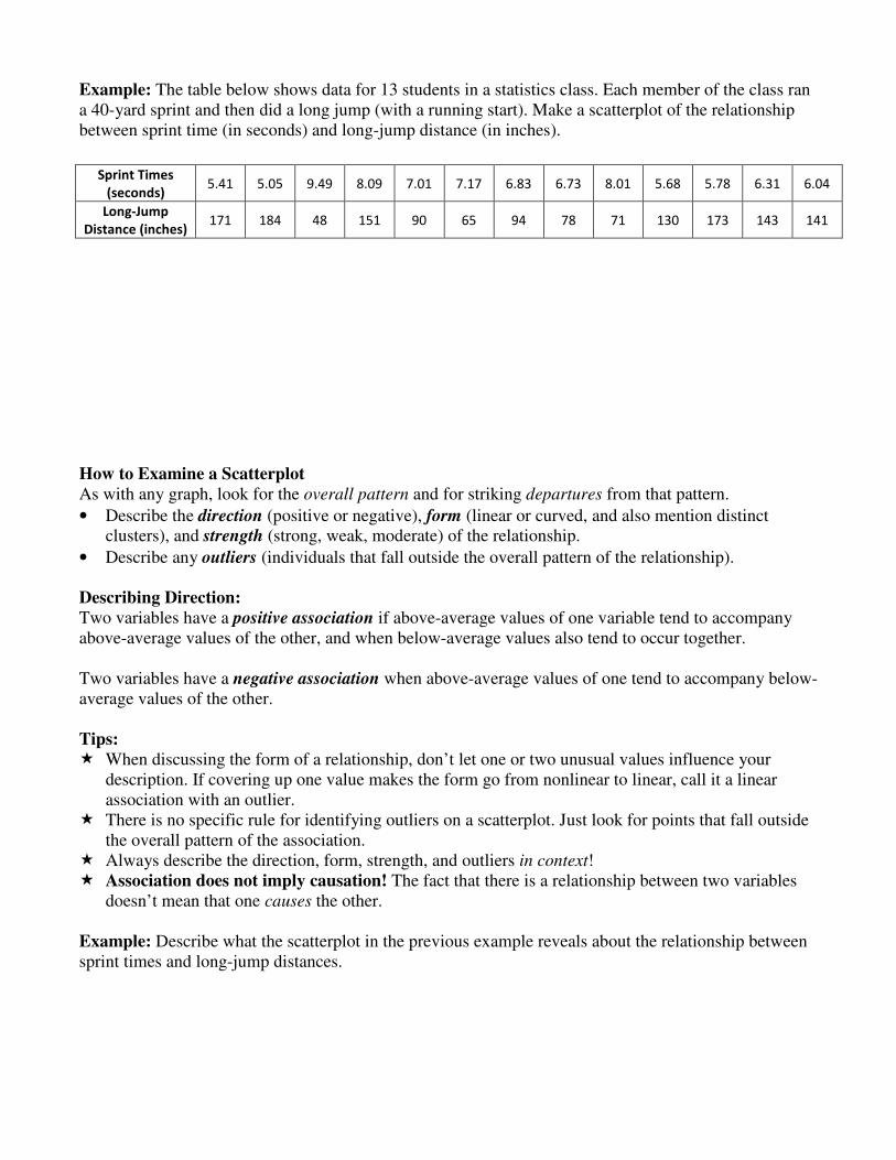
Example: The table below shows data for 13 students in a statistics class. Each member of the class ran a 40-yard sprint and then did a long jump (with a running start). Make a scatterplot of the relationship between sprint time (in seconds) and long-jump distance (in inches). How to Examine a Scatterplot As with any graph, look for the overall pattern and for striking departures from that pattern.
• Describe the direction (positive or negative), form (linear or curved, and also mention distinct clusters), and strength (strong, weak, moderate) of the relationship.
• Describe any outliers (individuals that fall outside the overall pattern of the relationship).
Describing Direction:
Two variables have a positive association if above-average values of one variable tend to accompany above-average values of the other, and when below-average values also tend to occur together. Two variables have a negative association when above-average values of one tend to accompany below-average values of the other. Tips: � When discussing the form of a relationship, don’t let one or two unusual values influence your
description. If covering up one value makes the form go from nonlinear to linear, call it a linear association with an outlier.
� There is no specific rule for identifying outliers on a scatterplot. Just look for points that fall outside the overall pattern of the association.
� Always describe the direction, form, strength, and outliers in context! � Association does not imply causation! The fact that there is a relationship between two variables
doesn’t mean that one causes the other. Example: Describe what the scatterplot in the previous example reveals about the relationship between sprint times and long-jump distances.
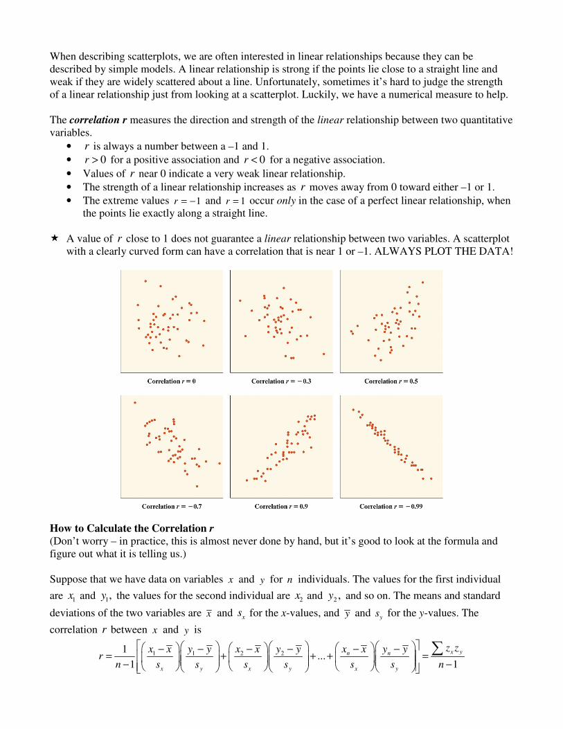
When describing scatterplots, we are often interested in linear relationships because they can be described by simple models. A linear relationship is strong if the points lie close to a straight line and weak if they are widely scattered about a line. Unfortunately, sometimes it’s hard to judge the strength of a linear relationship just from looking at a scatterplot. Luckily, we have a numerical measure to help. The correlation r measures the direction and strength of the linear relationship between two quantitative variables.
• r is always a number between a –1 and 1.
• 0r > for a positive association and 0r < for a negative association.
• Values of r near 0 indicate a very weak linear relationship.
• The strength of a linear relationship increases as r moves away from 0 toward either –1 or 1.
• The extreme values 1r = − and 1r = occur only in the case of a perfect linear relationship, when the points lie exactly along a straight line.
� A value of r close to 1 does not guarantee a linear relationship between two variables. A scatterplot
with a clearly curved form can have a correlation that is near 1 or –1. ALWAYS PLOT THE DATA!
How to Calculate the Correlation r (Don’t worry – in practice, this is almost never done by hand, but it’s good to look at the formula and figure out what it is telling us.) Suppose that we have data on variables x and y for n individuals. The values for the first individual
are 1x and 1,y the values for the second individual are 2x and 2 ,y and so on. The means and standard
deviations of the two variables are x and xs for the x-values, and y and
ys for the y-values. The
correlation r between x and y is
1 1 2 21...
1 1
x yn n
x y x y x y
z zx x y yx x y y x x y yr
n s s s s s s n
− −− − − −= + + + = − −
∑
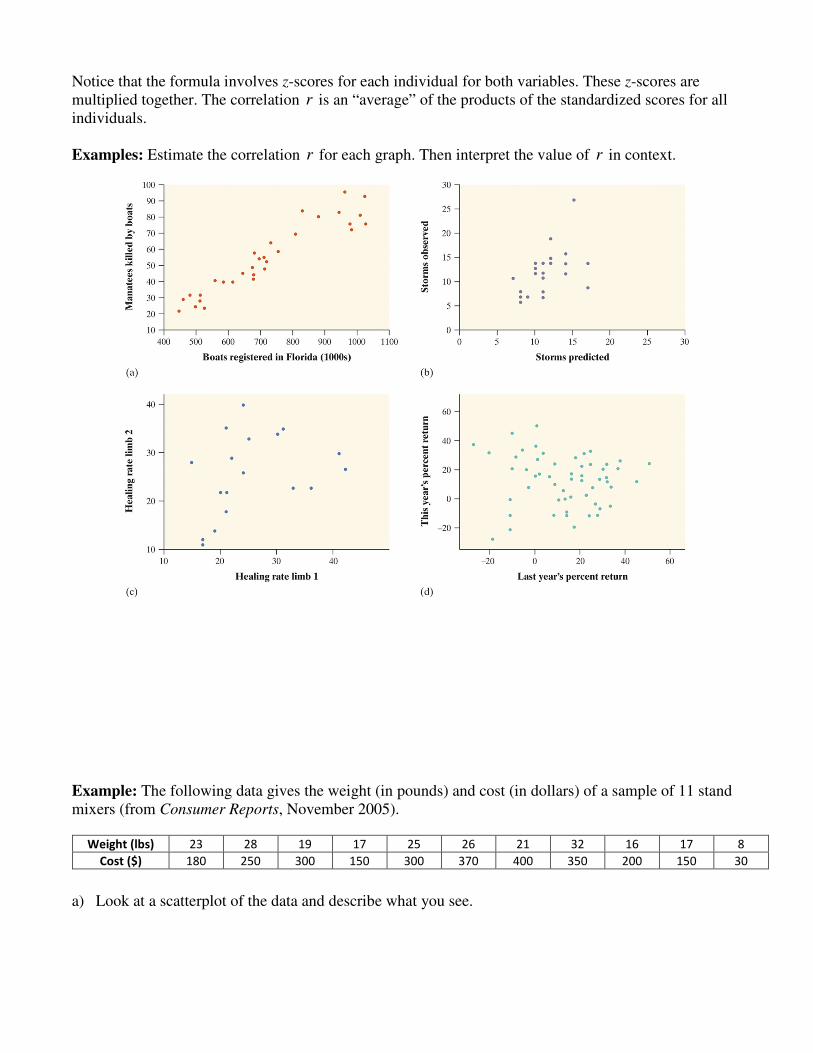
Notice that the formula involves z-scores for each individual for both variables. These z-scores are multiplied together. The correlation r is an “average” of the products of the standardized scores for all individuals. Examples: Estimate the correlation r for each graph. Then interpret the value of r in context.
Example: The following data gives the weight (in pounds) and cost (in dollars) of a sample of 11 stand mixers (from Consumer Reports, November 2005). a) Look at a scatterplot of the data and describe what you see.
b) Calculate the correlation. c) The last mixer in the table is from Walmart. What happens to the correlation when you remove this
point?
d) What happens to the correlation if the Walmart mixer weighs 25 pounds instead of 8 pounds? Add
the point (25, 30) and recalculate the correlation. e) Suppose that a new titanium mixer was introduced that weighed 8 pounds, but the cost was $500.
Remove the point (25, 30), add the point (8,500), and recalculate the correlation. f) Summarize what you have learned about the effect of a single point on the correlation. Facts about Correlation 1. Correlation makes no distinction between explanatory and response variables. If you swap the
explanatory and response variables, the correlation remains the same. 2. Since it is based on z-scores, r does not change when we change the units of measurement of , ,x y
or both. 3. The correlation r has no unit of measurement. It is just a number. Warnings
� Correlation requires that both variables be quantitative.
� Correlation measures the strength of only the linear relationship between two variables. Correlation does not describe curved relationships between variables, no matter how strong the relationship is! A correlation of 0 doesn’t guarantee that there’s no relationship between two variables, just that there’s no linear relationship.
� A value of r close to 1 does not guarantee a linear relationship between two variables. A scatterplot with a clearly curved form can have a correlation that is near 1 or –1. ALWAYS PLOT THE DATA!
� The correlation is not resistant. r is strongly affected by a few outlying observations.
� Correlation is not a complete summary of two-variable data. You should give the means and
standard deviations of both x and y along with the correlation.
Least-Squares Regression A regression line is a line that describes how a response variable y changes as an explanatory variable
x changes. We often use a regression line to predict the value of y for a given value of .x
Suppose that y is a response variable and x is an explanatory variable. A regression line relating y to
x has an equation of the form ˆ .y a bx= +
• y (“y hat”) is the predicted value of y for a given value of the explanatory variable .x In
statistics, “putting a hat on it” is standard notation to indicate that something has been predicted by a model.
• b is the slope, the amount by which y is predicted to change when x increases by one unit.
• a is the y-intercept, the predicted value of y when 0.x =
� You may have noticed the emphasis on the word “predicted.” The AP people are huge on this. When
interpreting a slope or intercept, always use language like, “The model predicts that for every one mph increase in average speed, the gas mileage will decrease by y miles per gallon.” Also, always
write your equation with a hat over the predicted quantity, like � ( )gas mileage average speed .a b= +
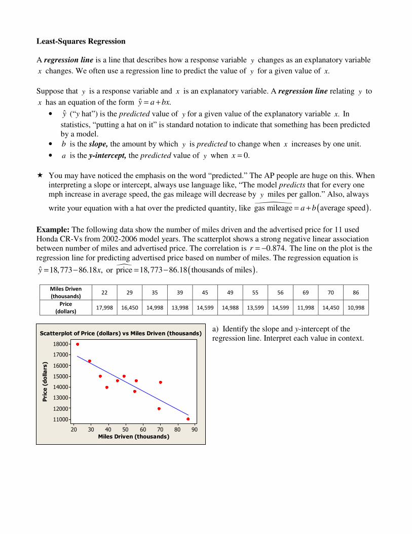
Example: The following data show the number of miles driven and the advertised price for 11 used Honda CR-Vs from 2002-2006 model years. The scatterplot shows a strong negative linear association between number of miles and advertised price. The correlation is 0.874.r = − The line on the plot is the regression line for predicting advertised price based on number of miles. The regression equation is
ˆ 18,773 86.18 ,y x= − or � ( )price 18,773 86.18 thousands of miles .= −
a) Identify the slope and y-intercept of the regression line. Interpret each value in context.
Scatterplot of Price (dollars) vs Miles Driven (thousands)
b) Predict the price for a used Honda CR-V with 50,000 miles. c) Would it be appropriate to predict the asking price for a used 2002-2006 Honda CR-V with 250,000
miles? Why or why not? Extrapolation is the use of a regression line for prediction far outside the interval of values of the explanatory variable x used to obtain the line. Few relationships are linear for all values of the explanatory variable. Don’t make predictions using values of x that are much larger of much
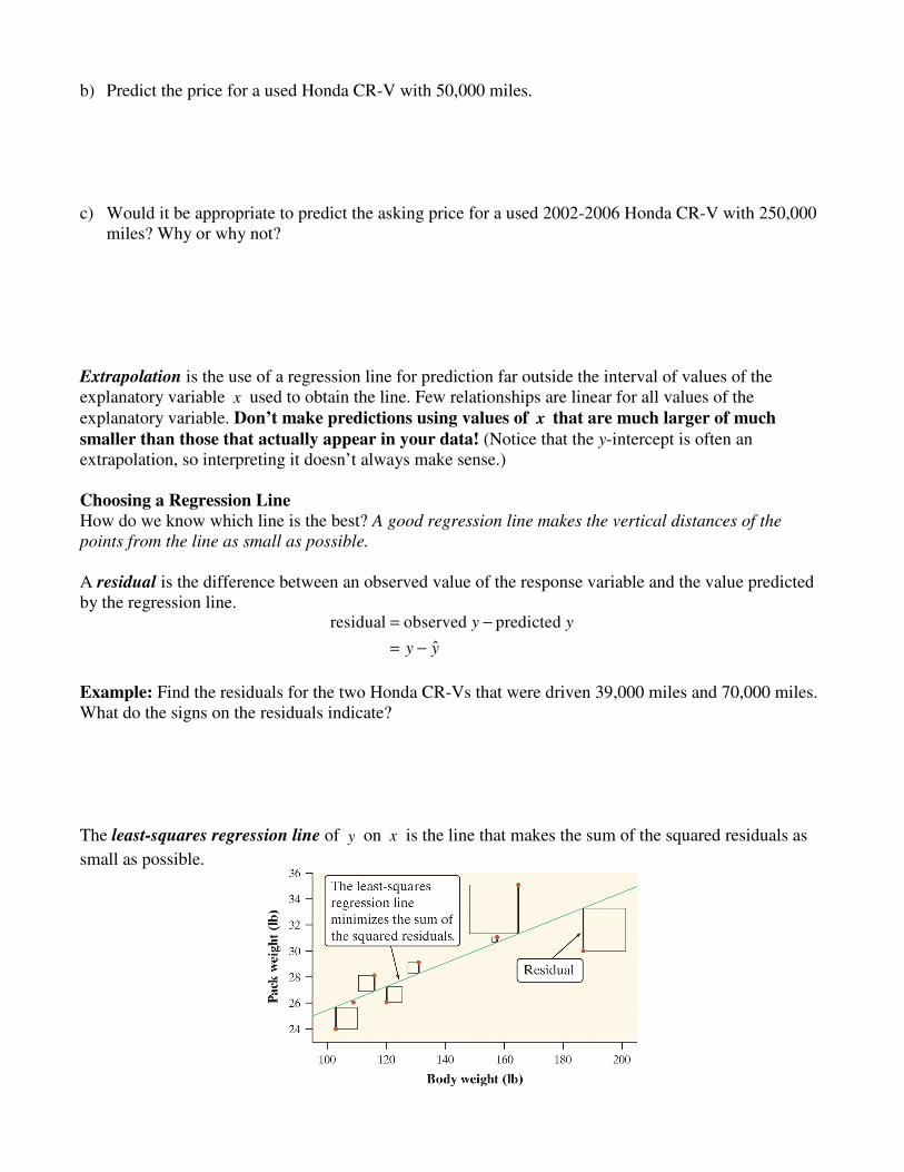
smaller than those that actually appear in your data! (Notice that the y-intercept is often an extrapolation, so interpreting it doesn’t always make sense.) Choosing a Regression Line How do we know which line is the best? A good regression line makes the vertical distances of the
points from the line as small as possible. A residual is the difference between an observed value of the response variable and the value predicted by the regression line.
residual observed predicted
ˆ
y y
y y
= −
= −
Example: Find the residuals for the two Honda CR-Vs that were driven 39,000 miles and 70,000 miles. What do the signs on the residuals indicate? The least-squares regression line of y on x is the line that makes the sum of the squared residuals as
small as possible.
Equation of the Least-Squares Regression Line The least-squares regression line is the line ˆ ,y a bx= + where:
y
x
sb r
s= and .a y bx= −
� The equation for slope tells us that along the regression line, a change of one standard deviation
in x corresponds to a change of r standard deviations in y.
� The equation for the y-intercept makes use of the fact that the least squares line always passes
through the point (((( )))), .x y
Example: The number of miles (in thousands) for the 11 used Hondas have a mean of 50.5 and a standard deviation of 19.3. The advertised prices have a mean of $14,425 and a standard deviation of $1899. The correlation for these variables is 0.874.r = − Find the equation of the least-squares regression line and explain what change in price we would expect for each additional 19.3 thousand miles. Residual Plots A residual plot is a scatterplot with the x values along the x axis and the residuals along the y axis.
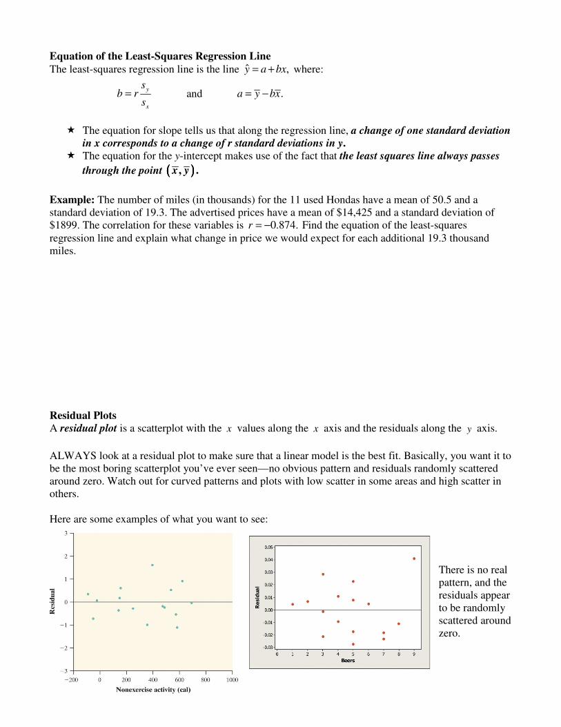
ALWAYS look at a residual plot to make sure that a linear model is the best fit. Basically, you want it to be the most boring scatterplot you’ve ever seen—no obvious pattern and residuals randomly scattered around zero. Watch out for curved patterns and plots with low scatter in some areas and high scatter in others. Here are some examples of what you want to see:
There is no real pattern, and the residuals appear to be randomly scattered around zero.
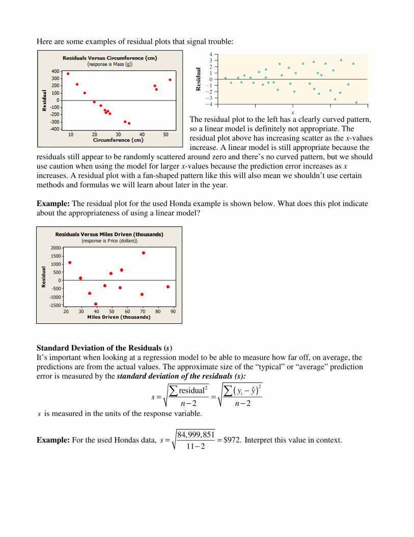
Here are some examples of residual plots that signal trouble:
The residual plot to the left has a clearly curved pattern, so a linear model is definitely not appropriate. The residual plot above has increasing scatter as the x-values increase. A linear model is still appropriate because the
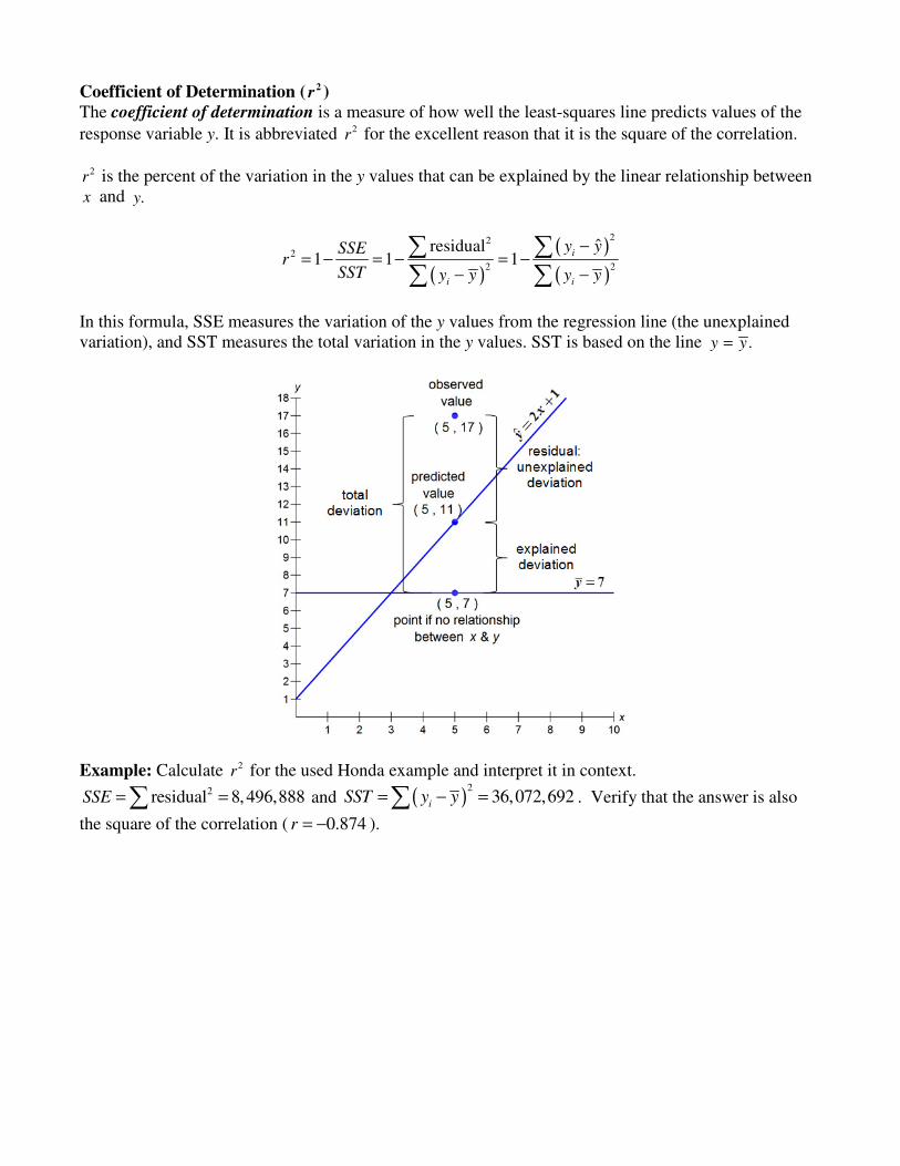
residuals still appear to be randomly scattered around zero and there’s no curved pattern, but we should use caution when using the model for larger x-values because the prediction error increases as x increases. A residual plot with a fan-shaped pattern like this will also mean we shouldn’t use certain methods and formulas we will learn about later in the year. Example: The residual plot for the used Honda example is shown below. What does this plot indicate about the appropriateness of using a linear model?
9080706050403020
2000
1500
1000
500
0
-500
-1000
-1500
Miles Driven (thousands)
Re
sid
ua
l
Residuals Versus Miles Driven (thousands)
(response is P rice (dollars))
Standard Deviation of the Residuals (s)
It’s important when looking at a regression model to be able to measure how far off, on average, the predictions are from the actual values. The approximate size of the “typical” or “average” prediction error is measured by the standard deviation of the residuals (s):
( )22 ˆresidual
2 2
iy y
sn n
−= =
− −
∑ ∑
s is measured in the units of the response variable.
Example: For the used Hondas data, 84,999,851
$972.11 2
s = =−
Interpret this value in context.
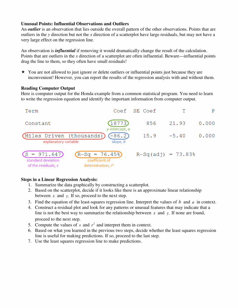
Coefficient of Determination ( 2r )
The coefficient of determination is a measure of how well the least-squares line predicts values of the
response variable y. It is abbreviated 2r for the excellent reason that it is the square of the correlation.
2r is the percent of the variation in the y values that can be explained by the linear relationship between x and .y
( )
( )
( )
22
2
2 2
ˆresidual1 1 1
i
i i
y ySSEr
SST y y y y
−= − = − = −
− −
∑ ∑∑ ∑
In this formula, SSE measures the variation of the y values from the regression line (the unexplained variation), and SST measures the total variation in the y values. SST is based on the line .y y=
Example: Calculate 2r for the used Honda example and interpret it in context. 2residual 8, 496,888SSE = =∑ and ( )
236,072,692
iSST y y= − =∑ . Verify that the answer is also
the square of the correlation ( 0.874r = − ).
Unusual Points: Influential Observations and Outliers
An outlier is an observation that lies outside the overall pattern of the other observations. Points that are outliers in the y direction but not the x direction of a scatterplot have large residuals, but may not have a very large effect on the regression line. An observation is influential if removing it would dramatically change the result of the calculation. Points that are outliers in the x direction of a scatterplot are often influential. Beware—influential points drag the line to them, so they often have small residuals! � You are not allowed to just ignore or delete outliers or influential points just because they are
inconvenient! However, you can report the results of the regression analysis with and without them. Reading Computer Output
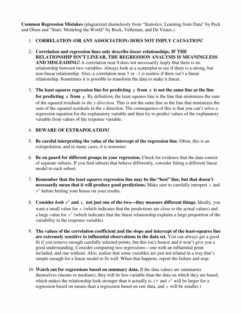
Here is computer output for the Honda example from a common statistical program. You need to learn to write the regression equation and identify the important information from computer output.
Steps in a Linear Regression Analysis:
1. Summarize the data graphically by constructing a scatterplot. 2. Based on the scatterplot, decide if it looks like there is an approximate linear relationship
between x and .y If so, proceed to the next step.
3. Find the equation of the least-squares regression line. Interpret the values of b and a in context. 4. Construct a residual plot and look for any patterns or unusual features that may indicate that a
line is not the best way to summarize the relationship between x and .y If none are found,
proceed to the next step.
5. Compute the values of s and 2r and interpret them in context. 6. Based on what you learned in the previous two steps, decide whether the least squares regression
line is useful for making predictions. If so, proceed to the last step. 7. Use the least squares regression line to make predictions.
Common Regression Mistakes (plagiarized shamelessly from “Statistics: Learning from Data” by Peck and Olsen and “Stats: Modeling the World” by Bock, Velleman, and De Veaux.)
1. CORRELATION (OR ANY ASSOCIATION) DOES NOT IMPLY CAUSATION!
2. Correlation and regression lines only describe linear relationships. IF THE
RELATIONSHIP ISN’T LINEAR, THE REGRESSION ANALYSIS IS MEANINGLESS
AND MISLEADING! A correlation near 0 does not necessarily imply that there is no relationship between two variables. Always look at a scatterplot to see if there is a strong, but non-linear relationship. Also, a correlation near 1 or –1 is useless if there isn’t a linear relationship. Sometimes it is possible to transform the data to make it linear.
3. The least squares regression line for predicting y from x is not the same line as the line
for predicting x from .y By definition, the least squares line is the line that minimizes the sum
of the squared residuals in the y direction. This is not the same line as the line that minimizes the sum of the squared residuals in the x direction. The consequence of this is that you can’t solve a regression equation for the explanatory variable and then try to predict values of the explanatory variable from values of the response variable.
4. BEWARE OF EXTRAPOLATION!
5. Be careful interpreting the value of the intercept of the regression line. Often, this is an extrapolation, and in many cases, it is nonsense.
6. Be on guard for different groups in your regression. Check for evidence that the data consist of separate subsets. If you find subsets that behave differently, consider fitting a different linear model to each subset.
7. Remember that the least squares regression line may be the “best” line, but that doesn’t
necessarily mean that it will produce good predictions. Make sure to carefully interpret s and 2r before betting your house on your results.
8. Consider both 2r and ,s not just one of the two—they measure different things. Ideally, you
want a small value for s (which indicates that the predictions are close to the actual values) and
a large value for 2r (which indicates that the linear relationship explains a large proportion of the variability in the response variable).
9. The values of the correlation coefficient and the slope and intercept of the least-squares line
are extremely sensitive to influential observations in the data set. You can always get a good fit if you remove enough carefully selected points, but this isn’t honest and it won’t give you a good understanding. Consider comparing two regressions—one with an influential point included, and one without. Also, realize that some variables are just not related in a way that’s simple enough for a linear model to fit well. When that happens, report the failure and stop.
10. Watch out for regressions based on summary data. If the data values are summaries themselves (means or medians), they will be less variable than the data on which they are based,
which makes the relationship look stronger than it actually is. ( r and 2r will be larger for a regression based on means than a regression based on raw data, and s will be smaller.)
Transforming to Achieve Linearity If the scatterplot or residual plot of bivariate data shows a curved relationship, it is sometimes possible to transform the data in some way to straighten a non-linear relationship. Once we’ve straightened the data, we can use linear regression techniques to estimate the values of the response variable. Here are some of the most common transformations:
Square Root: y a b x= +
Reciprocal: 1
y a bx
= +
Logarithmic: ˆ lny a b x= + - or - ˆ logy a b x= +
Exponential: �ln y a bx= + - or - �log y a bx= + (can also be written in the form ˆ a bxy e
+= )
Power: �ln lny a b x= + - or - �log logy a b x= + (can also be written in the form ˆ by ax= )
Other possibilities: squaring one or both sides, cubing one or both sides, using 2
1 1 or , etc.
xy−
� You need to be able to evaluate the effectiveness of a model (using a residual plot and the values of
2R and s ) and use the regression equation from the transformed data to make predictions.
� For a non-linear model, the coefficient of determination is denoted with a capital 2.R 2R is the proportion of the variation in the original response variable that can be explained by the approximate
quadratic/exponential/logarithmic/power model. This means 2R can be compared directly for different models even if the transformed y variables have different units.
� Be very careful comparing the values of s for different transformed models. Remember that it is the
prediction error for predicting the transformed y variable, not the original y variable. You shouldn’t compare s directly for two models if the transformed y variables are different (e.g. if one model is
predicting ln y and another is predicting .y )
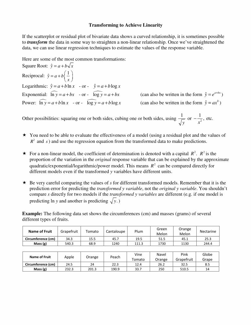
Example: The following data set shows the circumferences (cm) and masses (grams) of several different types of fruits.
Name of Fruit Grapefruit Tomato Cantaloupe Plum Green
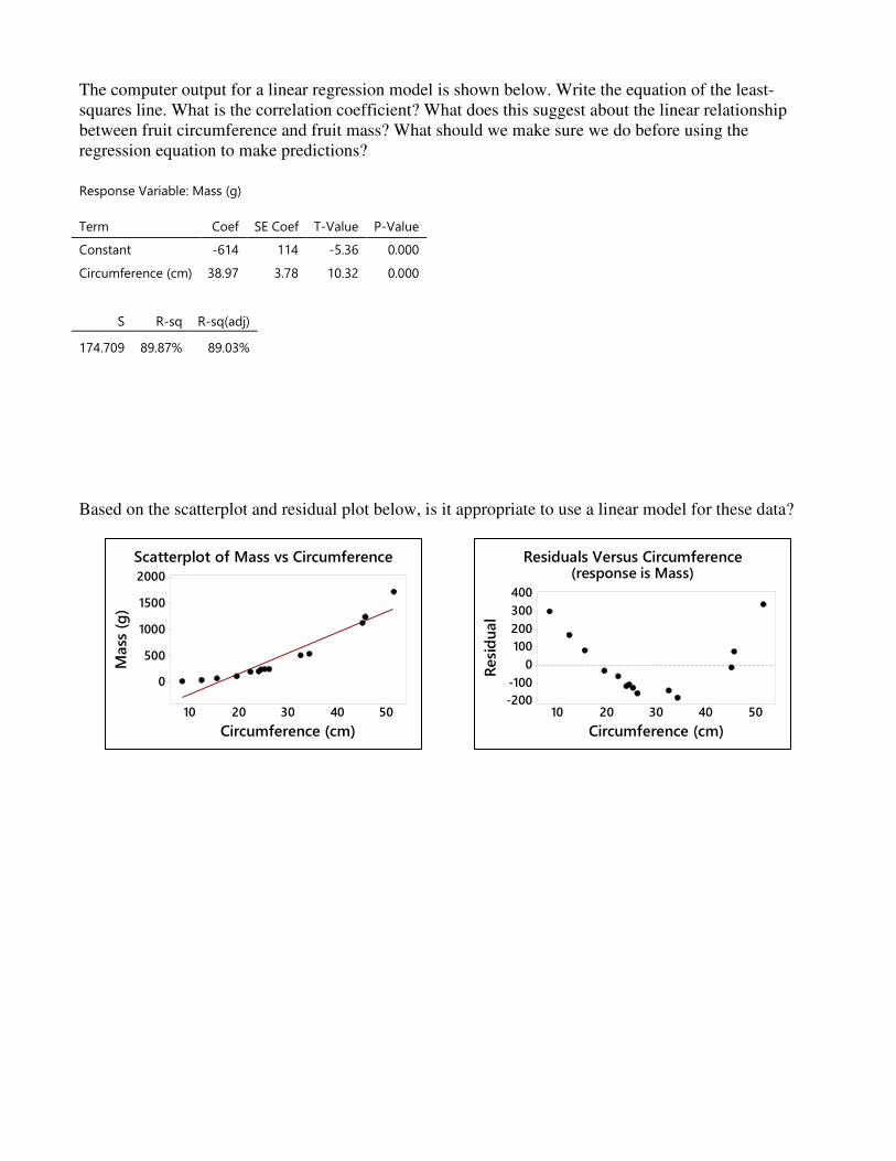
The computer output for a linear regression model is shown below. Write the equation of the least-squares line. What is the correlation coefficient? What does this suggest about the linear relationship between fruit circumference and fruit mass? What should we make sure we do before using the regression equation to make predictions? Response Variable: Mass (g)
Term Coef SE Coef T-Value P-Value
Constant -614 114 -5.36 0.000
Circumference (cm) 38.97 3.78 10.32 0.000
S R-sq R-sq(adj)
174.709 89.87% 89.03%
Based on the scatterplot and residual plot below, is it appropriate to use a linear model for these data?
5040302010
2000
1500
1000
500
0
Circumference (cm)
Mass
(g
)
Scatterplot of Mass vs Circumference
5040302010
400
300
200
100
0
-100
-200
Circumference (cm)
Resi
du
al
Residuals Versus Circumference(response is Mass)
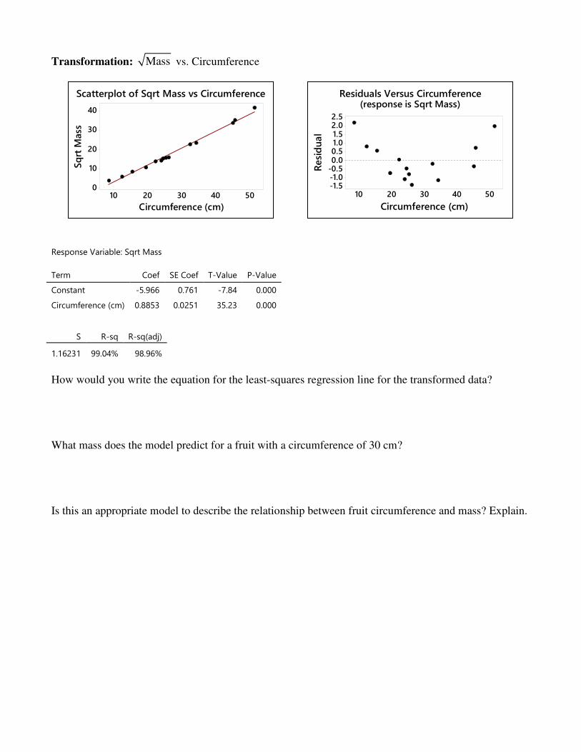
Transformation: Mass vs. Circumference
Response Variable: Sqrt Mass
Term Coef SE Coef T-Value P-Value
Constant -5.966 0.761 -7.84 0.000
Circumference (cm) 0.8853 0.0251 35.23 0.000
S R-sq R-sq(adj)
1.16231 99.04% 98.96%
How would you write the equation for the least-squares regression line for the transformed data? What mass does the model predict for a fruit with a circumference of 30 cm? Is this an appropriate model to describe the relationship between fruit circumference and mass? Explain.
5040302010
40
30
20
10
0
Circumference (cm)
Sq
rt M
ass
Scatterplot of Sqrt Mass vs Circumference
5040302010
2.52.01.51.00.50.0
-0.5-1.0-1.5
Circumference (cm)
Resi
du
al
Residuals Versus Circumference(response is Sqrt Mass)
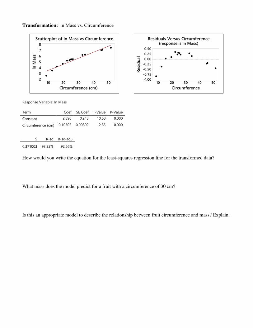
Transformation: ln Mass vs. Circumference
Response Variable: ln Mass
Term Coef SE Coef T-Value P-Value
Constant 2.596 0.243 10.68 0.000
Circumference (cm) 0.10305 0.00802 12.85 0.000
S R-sq R-sq(adj)
0.371003 93.22% 92.66%
How would you write the equation for the least-squares regression line for the transformed data? What mass does the model predict for a fruit with a circumference of 30 cm? Is this an appropriate model to describe the relationship between fruit circumference and mass? Explain.
5040302010
8
7
6
5
4
3
2
Circumference (cm)
ln M
ass
Scatterplot of ln Mass vs Circumference
5040302010
0.50
0.25
0.00
-0.25
-0.50
-0.75
-1.00
Circumference
Resi
du
al
Residuals Versus Circumference(response is ln Mass)
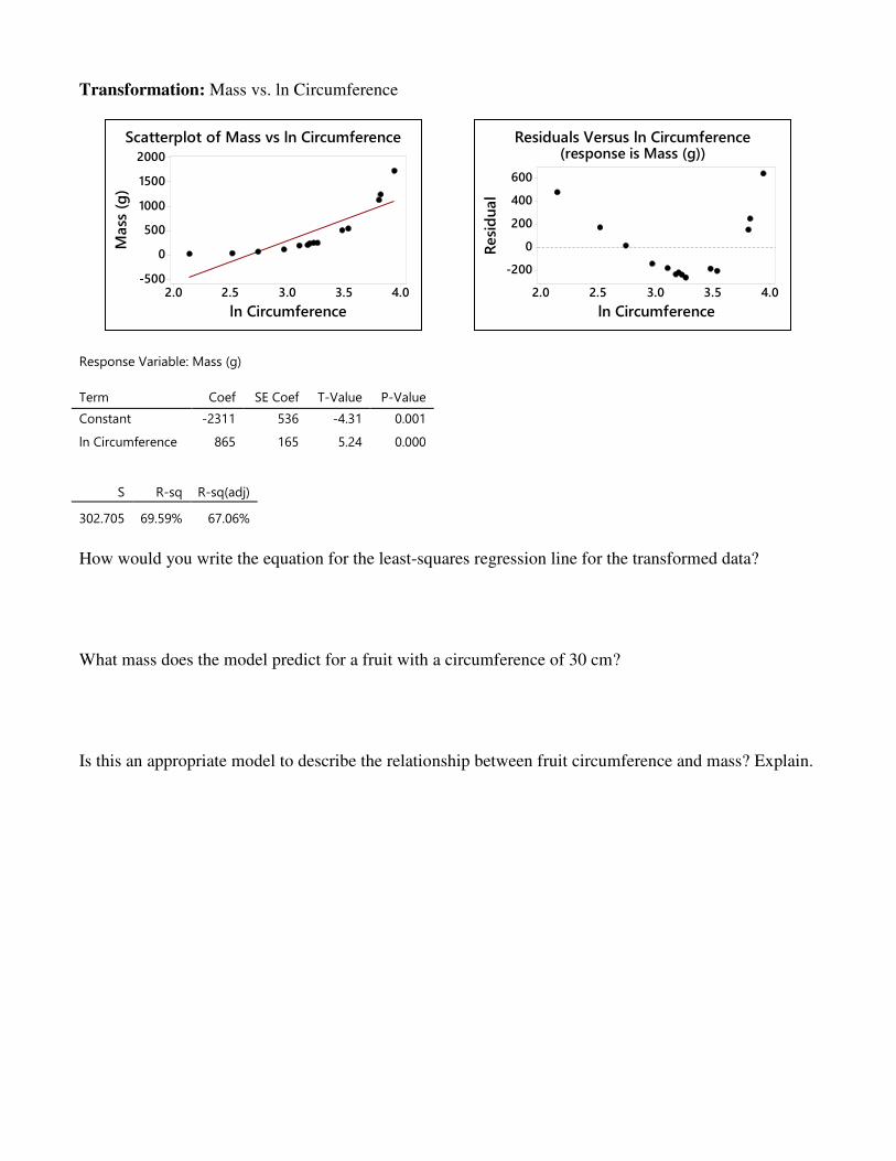
Transformation: Mass vs. ln Circumference
Response Variable: Mass (g)
Term Coef SE Coef T-Value P-Value
Constant -2311 536 -4.31 0.001
ln Circumference 865 165 5.24 0.000
S R-sq R-sq(adj)
302.705 69.59% 67.06%
How would you write the equation for the least-squares regression line for the transformed data? What mass does the model predict for a fruit with a circumference of 30 cm? Is this an appropriate model to describe the relationship between fruit circumference and mass? Explain.
4.03.53.02.52.0
2000
1500
1000
500
0
-500
ln Circumference
Mass
(g
)Scatterplot of Mass vs ln Circumference
4.03.53.02.52.0
600
400
200
0
-200
ln Circumference
Resi
du
al
Residuals Versus ln Circumference(response is Mass (g))
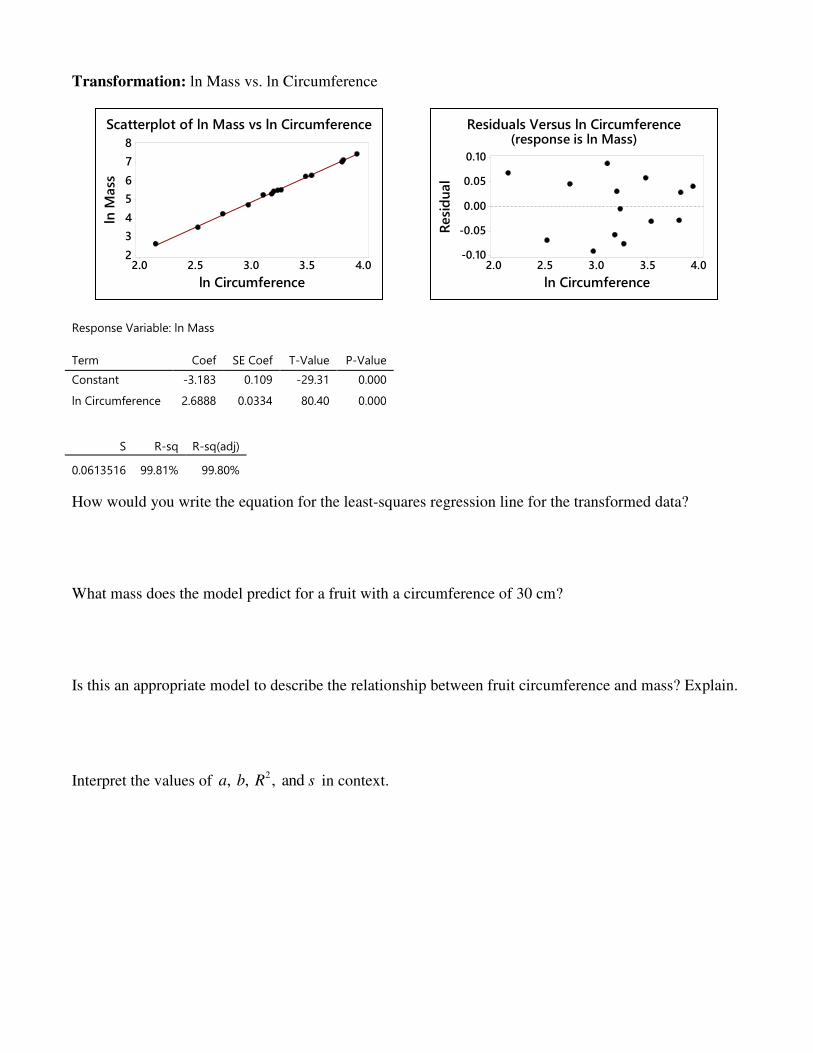
Transformation: ln Mass vs. ln Circumference
Response Variable: ln Mass
Term Coef SE Coef T-Value P-Value
Constant -3.183 0.109 -29.31 0.000
ln Circumference 2.6888 0.0334 80.40 0.000
S R-sq R-sq(adj)
0.0613516 99.81% 99.80%
How would you write the equation for the least-squares regression line for the transformed data? What mass does the model predict for a fruit with a circumference of 30 cm? Is this an appropriate model to describe the relationship between fruit circumference and mass? Explain.
Interpret the values of 2, , , and a b R s in context.
4.03.53.02.52.0
8
7
6
5
4
3
2
ln Circumference
ln M
ass
Scatterplot of ln Mass vs ln Circumference
4.03.53.02.52.0
0.10
0.05
0.00
-0.05
-0.10
ln Circumference
Resi
du
al
Residuals Versus ln Circumference(response is ln Mass)
Example: The lengths (inches) and weights (pounds) of 25 crocodiles are shown below. In your calculator, create the following lists: L1: Length L2: Weight
L3: Square root of weight (use the formula L3 L2= )
L4: Common log of length (use the formula L4 log (L1)= )
L5: Common log of weight (use the formula L5 log (L2)= )
Describe the scatterplot for weight vs. length in context. Which of the relationships appears the most linear? Check the residual plots to verify the linear relationship. (To make a residual plot, first run the LinReg (a + bx) command on the two lists. This will create a residuals list. Then make a scatterplot with the x variable as the XList and YList: RESID.) Write the equation for the least-squares line for the transformation that seems best at eliminating the curvatures in the alligator data.
Interpret 2, , , and a b R s in context.
Using your model, predict the weight of an alligator whose length is 140 cm.