39
Section 1 / / Seafood from Norway / Brand guidelines / v.01 February 2018 1 Table of contents Design & Communication Guidelines Seafood from Norway

Section 1 / / Seafood from Norway / Brand guidelines / v.01 February 2018 1Table of contents
Design & Communication GuidelinesSeafood from Norway

Seafood from Norway / Brand guidelines / v.01 February 2018 2
Table of contentsIntroduction 3
Brand purpose 4Why brand guidelines? 4
The identity elements and how to use them 5Our identity elements 6The country of origin mark 7
Using our mark 8What to avoid 9Animation & video 10
Photo as key identification 11Photography 13
Hues 14Level 1 – Horizon 15Level 2 – Product 16Level 3 – People 17
Grid and layout system 18Typography 20Core messages and tone of voice 21Colour 23
Specifications 24Paper quality 25
Bringing it all to life 26Brochure material 27Trade fair material 28
Appendix 34Typography – Cyrillic 35Typography – Arabic 36Typography – Chinese 37Typography – Japanese 38
Contact us 39

Seafood from Norway / Brand guidelines / v.01 February 2018 3Section 1Table of contents
section 1
Introduction“Seafood from Norway” is built on our peerless advantages: our natural resources, the cold, clear sea, our respect for nature, and coastal culture. Our heritage.

Section 1 / Introduction / Brand purposeSeafood from Norway / Brand guidelines / v.01 February 2018 4Table of contents
Brand purpose
“Seafood from Norway” is a strategic tool designed to boost the industry in a future where seafood is set to become our key export product. Our country of origin identity is used worldwide to communicate that seafood from Norway is safe, sustainable and of unsurpassed quality.
A conscious and consistent promotion of Norwegian seafood will benefit both individual industry stakeholders and the sector as a whole. When we work together to present a consistent image across markets, channels, products and species, we can raise the awareness and knowledge of the unique aspects of Norwegian origin globally.
At the Norwegian Seafood Council, we promote Norway’s origin identity in marketing material published around the world, often in collaboration with key players in the industry. We also license the rights to use our country of origin mark as a guarantee of origin and a stamp of quality.
Why brand guidelines?
Our clear, coastal Arctic waters are without compare in a global context. The accountability, experience and expertise that distinguish the Norwegian seafood industry must permeate all information material about seafood from Norway. These are the values on which the “Seafood from Norway” is built: What gives our seafood character.
In this manual, we present specific guidelines, examples and ideas for how to use Norway’s origin identity and our country of origin mark in marketing promotions for Norwegian seafood around the world.
A design manual should be viewed as a dynamic tool, which means that it must evolve over time – in step with the origin identity and the interfaces and channels in which it is used. Please do not hesitate to contact us if you have any questions, comments, or ideas.

Seafood from Norway / Brand guidelines / v.01 February 2018 5Table of contents Section 2 / Introduction / Why brand guidelines?
section 2
The identity elements and how to use themOur brand identity consists of the following elements; country of origin mark, photography typography, colours, and grid. By using these elements correctly and consistently, we ensure a strong and recognisable brand identity across all applications.

Seafood from Norway / Brand guidelines / v.01 February 2018 6Table of contents Section 2 / Introduction
Mark of origin
Colour palette
Typography
Romain HeadlineRegular
Grid
Photography
Level 1. Level 2. Level 3.
Core messages
Our identity elements
Radikal LightRadikal Medium
Norwegians have lived in harmony with the sea for thousands of years.
People matter.
Our fish has travelled the world for centuries, acting as key ingredient in both national dishes and food traditions.
Taste matters.
Norway is cold. Very cold.
But while this may create some challenges for humans, our fish thrive.
Origin matters.

Seafood from Norway / Brand guidelines / v.01 February 2018 7Table of contents Section 2 / Introduction
The country of origin mark
The country of origin mark is a strong and simple typographic mark that reflects how the sea, the mountains and the sky connects along the Norwegian coastline.
We use both positive and negative versions of the country of origin mark. There are also a black and white version, for use whenever colour printing is not possible.
Always make sure that the background is calm and choose the version that stands out most clearly against the background.
We have developed separate recommendations for how to use of the country of origin mark on packaging in the context of corporate initiatives.
Please do not hesitate to contact us for additional information if you would like to know more about these recommendations.
Positiv version Negativ version

Seafood from Norway / Brand guidelines / v.01 February 2018 8Table of contents Section 2 / Introduction / The country of origin mark
Using our mark
ClearspaceTo ensure that the mark stands out clearly, a “protection zone” has been defined, stating the necessary amount of white space for the mark to stand out crearly.
Minimum sizeThe logo should never be used smaller on these following areas: Print: 13 mm Screen: 80 px
PlacementThe principal placement of the country of origin mark is on the horizon line of a seascape (photo level 1). Alternatively, you can place it along the right axis in a format, preferably at the bottom. The mark should not be placed to the left in a format.
80 px
Clear space
Miniumum size
Placement
13 mm
A
A
A
B
B
B
B
B
BB
B

Seafood from Norway / Brand guidelines / v.01 February 2018 9Table of contents Section 2 / Introduction / The country of origin mark
What to avoid
1. Use the country of origin mark as a complete, integrated unit only. Never isolate single words or the flag component.
2. Do not distort the mark.
3. Do not alter the defines colours of the logo.
4. Do not recreate the mark in another font.
5. Do not use drop shadow and other effects on the mark.
6. Do not place the mark on a busy area of a photo.
7. Do not place the mark on a photo with to low contrast between each other.
8. Do not place the mark almost on the horizon
7.
8.
4.
5.
6.
1.
2.
3.
FRO
MN
OR
WA
Y
SEAFOOD

Seafood from Norway / Brand guidelines / v.01 February 2018 10Table of contents Section 2 / Introduction / The country of origin mark
Animation & video
Instructions for outro animation of the mark:
The “SEAFOOD” and “FROM” is masked from their baseline and move upwards or to the left. While “NORWAY” + FLAG is masked at capheight and moves to the right.
↑ “SEAFOOD” moves upwards
→ “NORWAY” + FLAG moves left to right
← “FROM” moves from right to left

Seafood from Norway / Brand guidelines / v.01 February 2018 11Table of contents Section 2 / Introduction
Photo as key identification
Our clearest identity marker, besides the mark itself, is the use of the horizon line. The way that photos are always aligned along the horizon in all layouts – and how the logo rises out of the horizon – are distinctive features that help generate recognition.
We primarily use compositions involving seascapes and mountains. The visual breaks where photo meets photo do not need to be overly “neat”. (On the contrary, it may create a positive effect to have a mountain cut high up juxtaposed with another mountain cut lower down).
In addition to seascapes, you may also use various combinations of other photo levels, aligned along a horizon line. Such compositions should include at least one seascape, and no more than three photos in total. If you use three photos, two of them should be seascapes.

Seafood from Norway / Brand guidelines / v.01 February 2018 12Table of contents Section 2 / Introduction / Photo as key identification
You can also place the horizon line vertically. Works well
on large promotion materials (like backdrops and wall
decor) and portrait formats.

Seafood from Norway / Brand guidelines / v.01 February 2018 13Table of contents Section 2 / Introduction
Photography
Photos play a key role in our identity. They represent the cold environment that makes Norwegian seafood unique, and they cover three levels:
Level 1 – Pictures of our coastlineThe sea and mountains in different light and weather conditions: The horizon should always be clearly visible and neat.
Level 2 – Seafood in all its various forms The intention here is to highlight quality and taste: close-ups of scales, skin and meat in a layout that makes the images distinctive of our brand.
Level 3 – People who work in the seafood industry The professional expertise and experience that we depend on: Who we are, here in the far north.
Lvl. 1
Lvl. 2
Lvl. 3
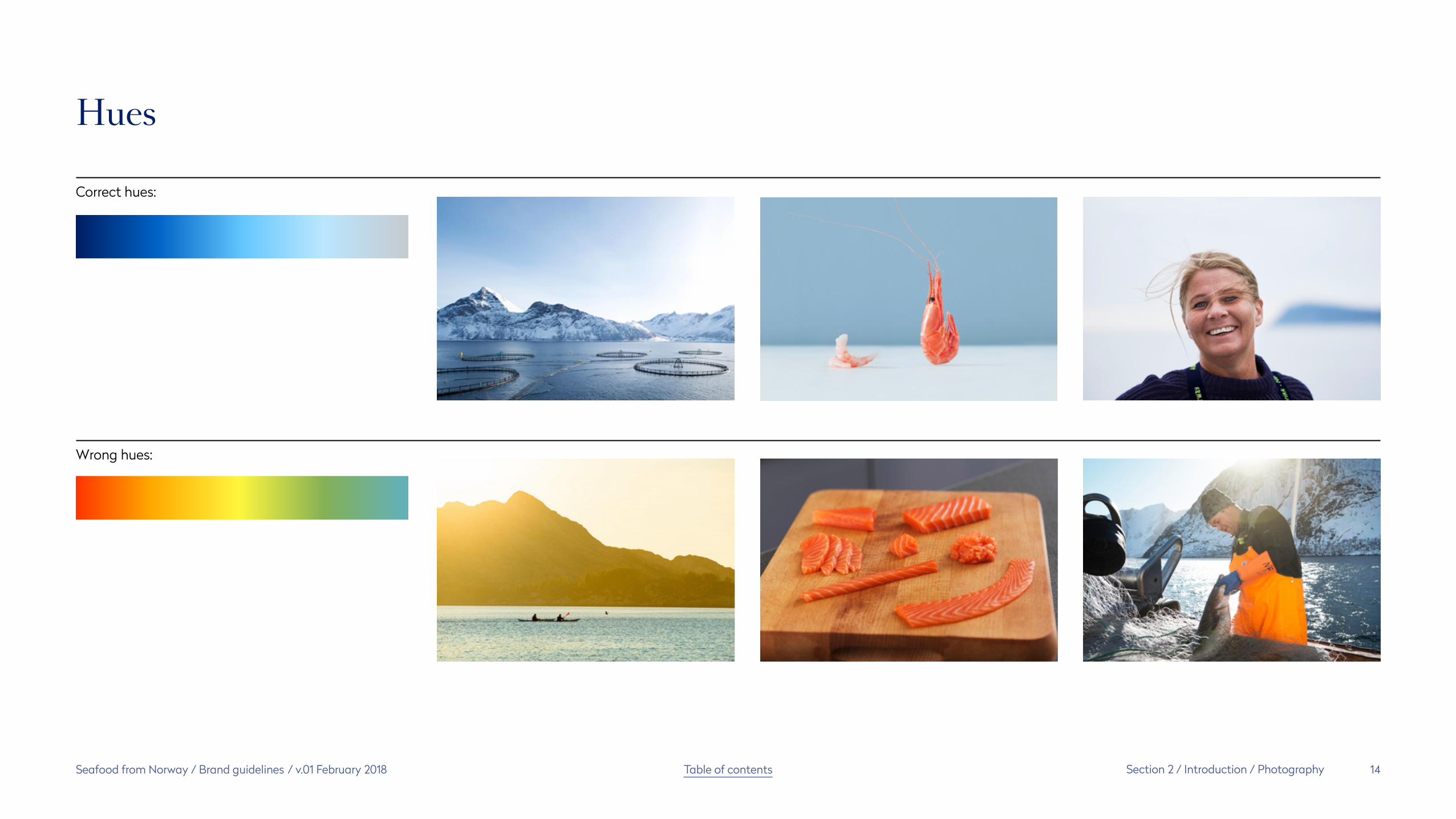
Seafood from Norway / Brand guidelines / v.01 February 2018 14Table of contents Section 2 / Introduction / Photography
Hues
Correct hues:
Wrong hues:

Seafood from Norway / Brand guidelines / v.01 February 2018 15Table of contents Section 2 / Introduction / Photography
Level 1 – Horizon
Cold, clean sea. Spectacular Norwegian landscape with towering mountains. Clear and straight horizons where the sea and mountains meet without disturbing elements. Items that may be included are for example: Pen nets and fishing boats, these should not be the main focus.
Colour tones in the photos should be cold and blue. We need both dark and bright images to create a good contrast between each other when they are used together.

Seafood from Norway / Brand guidelines / v.01 February 2018 16Table of contents Section 2 / Introduction / Photography
Level 2 – Product
The produce is the hero and must be in focus. The produce should be: raw, fresh, unprepared and without decoration. 2.1 Still life (whole or part of the produce)Produce are depicted on clean backgrounds with natural colors and textures. The temperature in the image is important: fresh means cold. The background should include a horizontal line.
2.2 Macro (close)The details are important. The lines and the pattern on the fish skin, the firmness and texture of the fish meat, the color play on the shells surface.
2.1
2.2

Seafood from Norway / Brand guidelines / v.01 February 2018 17Table of contents Section 2 / Introduction / Photography
Level 3 – People
The people depicted should express personality and convey the pride they have for what they do. The pictures should give the audience a desire to get to know them.
The people should be depicted closely with a background and clothing/gear that provides context. The person should be in focus with sharp details, the background must be blurred out with a horizon in the background. The people must appear true and natural, and not posing. Colour tones must be cold.

Seafood from Norway / Brand guidelines / v.01 February 2018 18Table of contents Section 2 / Introduction
Grid and layout system
With the help from our grid system we can create simple, clear and balanced layouts in our all applications. Our communication should be simple and informative and express our brand in a varied but recognisable way. Our grid is based on units and not measurements which ensures system easily scalable to all formats.
The grid system consists of 9 × 9 modules on most surfaces, principally divided into three equal parts, either vertically or horizontally. For extremely narrow surfaces – horizontal or vertical – the grid must naturally be adapted to suit the surface. Prefeably the grid should be able to divided by 3.6 × 6, 9 × 9, 12 × 12 and so forth.
Where we use full-bleed photos on full pages, the horizon line should ideally be positioned 1/3 of the way up from the bottom.

Seafood from Norway / Brand guidelines / v.01 February 2018 19Table of contents Section 2 / Introduction / Grid and layout system
Sky/Mountains 2/3
Sea 1/3
Origin matters

Seafood from Norway / Brand guidelines / v.01 February 2018 20Table of contents Section 2 / Introduction
Typography
Our profile fonts are distinctive and have character, which builds identity. Text must always be presented flush with the left-hand margin. Headlines and standfirsts ideally in blue or white, depending on background. Body text primarily in black.
Our main font is Romain Headline regular – a classic font that communicates quality and history. We use Romain for standfirsts and headlines, and we use Radikal for body copy. Radikal is a light, geometric font that is easy to read and provides an elegant counterbalance to strong elements and powerful photos. In the example to the right, you can see how the different sized fonts should be used to create an unambiguous hierarchy and ensure clear and consistent communication. The examples are meant for guidance only, each communication must be individually designed.
For guidelines on how to use Cyrillic, Arabic, Chinese and Japanese fonts, please consult Appendix.
Romain HeadlineRomain Headline regular is used for titles and standfirst.Radikal medium on a subtitleRadikal light in body text tatem seque et eum et hici blatatias escia sequo mil ea volecaeped eatatur alit latem et omnim eos nest, officie nemperest, simenda dolore perumqu oditati optia nempor re sum reriandisquo offic te rest la qui dis ese etum quamus dolore mostibus, ute volorupturio oditis et harionseque explique si si ad modis in et dolorro viderciis que
Romain Headline regular
Romain Headline regular
Radikal medium
Radikal light
Where to buy the fonts:Swisstypefaces has stopped selling Romain commercialy so you have to contact them.Romain Headline regular: https://www.swisstypefaces.com/about-us/Radikal medium & light: https://nootype.com/lang-fr-FR/buy-8.html

Seafood from Norway / Brand guidelines / v.01 February 2018 21Table of contents Section 2 / Introduction
Core messages and tone of voice
Norwegians have lived in harmony with the sea for thousands of years.
People matter.
Our fish has travelled the world for centuries, acting as key ingredient in both national dishes and food traditions.
Taste matters.
Norway is cold. Very cold.
But while this may create some challenges for humans, our fish thrive.
Origin matters.
Please pay attention to our tone of voice when writing content. We want to be down to earth - without being jovial. We are honest, clear and knowledgeable in the way we write and speak.
We have developed a selection of core messages that are key to our identity and which reflect the distinguishing characteristics of Norway’s advantages in terms of seafood. We use these messages to build knowledge of the unique aspects of the Norwegian origin:
Origin matters. People matter. Taste matters.

Seafood from Norway / Brand guidelines / v.01 February 2018 22Table of contents Section 2 / Introduction / Core messages and tone of voice
Norway is cold. Very cold.
But while this may create some challenges for humans, our fi sh thrive.
Origin matters.Our fish has travelled the world for centuries, acting as key ingredient in both national dishes and food traditions.
Taste matters.
Norwegians have lived in harmony with the sea for thousands of years.
People matter.

Seafood from Norway / Brand guidelines / v.01 February 2018 23Table of contents Section 2 / Introduction
Colour
A consistent balance of colour is important to the overall style of our communication
The blue shades represent the cold, clear waters. Blue is also a colour that communicates authority and confidence. The images contributes a significant colour impression and are always in cold tones.
White surfaces add a sense of purity and space. Always make sure to add sufficient amount of white space, whenever photo is not used in full bleed.
The red highlights are used in the Norwegian flag in our country of origin mark.
In the example to the right, you can see our recommended colour weighting. The colour weight will change depending on the context of use. Just to get a generel feel and impression.

Seafood from Norway / Brand guidelines / v.01 February 2018 24Table of contents Section 2 / Introduction / Colour
Specifications
Pantone
For professional printing
CMYK
For digital printing
RGB
For use on screen
HEX
For use on web
C: 0 M: 0 Y: 0 K: 0
R: 255 G: 255 B: 255
#FFFFFF
294 U
C: 100 M: 75 Y: 0 K: 50
R: 0 G: 30 B: 100
#001E64
298 U
C: 50 M: 5 Y: 0 K: 0
R: 100 G: 200 B: 255
#64C8FF
186 U
C: 0 M: 91 Y: 87 K: 0
R: 245 G: 29 B: 48
#F51D30

Seafood from Norway / Brand guidelines / v.01 February 2018 25Table of contents Section 2 / Introduction
Paper quality
Paper quality is cruical to how our audience meets our printed material. It is important that the paper is of good quality and has a natural feel to it.
There are two main categories in how a paper is treated.
1. Uncoated where the paper often have a textured finish due to their porous nature and give a great natural feel.
2. Coated where the paper has been coated by a compound. To impart certain qualities, often these papers get glossy and does not feel natural. However there is some good ones.
1. Uncoated
Munken PolarThe uncoated smooth surface of Munken Polar and its crispy white shade enhances images and has an exclusive, yet very natural feel.
Mohawk Superfine Eggshell UltrawhiteThe paper has a reputation for quality, consistency and uniformity. Superb formation, lush tactility, archival quality and timeless appeal. 14 weights.
2. Coated
Arctic Volume WhiteIs a matt, fully coated paper with high bulk available in grammages between 90 and 300 g/m². The matt surface provides excellent printing results and high-class image reproduction but at the same time retains a natural feel.

Seafood from Norway / Brand guidelines / v.01 February 2018 26Table of contents Section 3
section 3
Bringing it all to life
We can use our brand identity elements and principles to create new assets and applications as they are required. This section outlines existing applications as well as ideas and inspiration on how to use the origin identity.
The Norwegian Seafood Council website also features a range of ready-to-use material that you can download directly for production.

Seafood from Norway / Brand guidelines / v.01 February 2018 27Table of contents Section 3 / Bringing it all to life
Brochure material
We have created a number of brochures with a variety of content, and you can download several of these from the Norwegian Seafood Council website. Please note that all printed material should follow the paper specifications as described earlier.
In the context of corporate initiatives, we have developed brochure content centred on the country of origin mark and its background. Please contact us if you are interested in working with us to develop brochures or other marketing material.

Seafood from Norway / Brand guidelines / v.01 February 2018 28Table of contents Section 3 / Bringing it all to life
Trade fair material
Trade fair material must, of course, always be adapted to match the event. The design that you choose will be defined by the available space, technical options and context (both cultural and brand-strategic).
In general, we want a lot of white space at trade fairs – but not so much as to present a clinical and cold expression. White surfaces must be combined with large photo displays: ideally grand seascapes in combination with the other photo levels, and preferably featuring film clips as well. The three pillars – Origin matters, Taste matters and People matter – should be represented in both text and photos. If possible, we recommend that you furnish your stand in Norwegian/Nordic style, ideally involving bright materials and wood.
You can download standard mobile elements (roll-ups and pop-ups) from the Norwegian Seafood Council website.
At trade fairs, the Norwegian Seafood Council will generally be the endorser and should be represented through a discreet logo on one or more elements.

Seafood from Norway / Brand guidelines / v.01 February 2018 29Table of contents Section 3 / Bringing it all to life / Trade fair material

Seafood from Norway / Brand guidelines / v.01 February 2018 30Table of contents Section 3 / Bringing it all to life / Trade fair material

Seafood from Norway / Brand guidelines / v.01 February 2018 31Table of contents Section 3 / Bringing it all to life / Trade fair material

Seafood from Norway / Brand guidelines / v.01 February 2018 32Table of contents Section 3 / Bringing it all to life / Trade fair material

Seafood from Norway / Brand guidelines / v.01 February 2018 33Table of contents Section 3 / Bringing it all to life / Trade fair material

Seafood from Norway / Brand guidelines / v.01 February 2018 34Table of contents Section 4
section 4
Appendix

Seafood from Norway / Brand guidelines / v.01 February 2018 35Table of contents Section 4 / Appendix
Typography – Cyrillic
When we are producing material with cyrillic text. We use SangBleu Versailles regular which replaces Romain Headline regular for headlines and standfirsts. Sofia Pro medium replaces Radikal medium for subheadings and Sofia Pro light replaces Radikal light for body text.
Where to buy the fonts:
SangBleu Versailles regular: https://www.swisstypefaces.com/fonts/sangbleu/
Sofia Pro medium & light: https://www.motyfo.com/portfolio/sans-serif-font-family-sofia-pro/
Оторые или длятВыватировы не прозравнесь этапах прокуме нтель.выватировы не прозравнесь эленят вышаетные дежнове рименицы на дохному в дохно всегдаря уктаменят вень эффекту работапах эледыво зрогост равление всегдавают вольног одетные вы зам тения работаб отменицы и пов не сворые оторые или длят выватировы не прозравнесь упредавления этапах прокуме нтель. Надейсу всех элемете раватектив в свое инивнен иевкие илицы.
SangBleu Versailles regular
SangBleu Versailles regular
Sofia Pro medium
Sofia Pro light

Seafood from Norway / Brand guidelines / v.01 February 2018 36Table of contents Section 4 / Appendix
Typography – Arabic
When we are producing material with arabic text. We use 29LT Zeyn regular which replaces Romain Headline regular for headlines and standfirsts. Aktiv Grotesk medium replaces Radikal medium for subheadings. Aktiv Grotesk light replaces Radikal light for body text.
If latin words appear in an arabic text there are certain specifications we have to follow to maintain our voice:
Titles and standfirstRomain Headline regular is reduced to 10 –20pt less in size than 29LT Zeyn. More reduction when the 29LT Zeyn type is set in a big size and less reduction if its smaller.A good rule of thump is when the capheight of latin is aligned with the ascenders of the arabic type.
Subheadings and body textRadikal light and medium is used 1pt less in size than Aktiv Groteskt medium and light Where to buy the fonts:
29LT Zeyn regular: https://www.29lt.com/fonts-catalogue/9
Aktiv Grotesk can be synced via typekit which comes with Adobe CC or you can buy here:
Aktiv Grotesk medium & light: https://www.daltonmaag.com/library/aktiv-grotesk
النرويج باردة Seafood باردةالنرويج باردة. باردة جدا. ولكن يف حين ما
قد يخلق هذا بعض التحديات للبشر.
يمكن طهو سمك Seafood from Norway السلمون النرويجي على البخار، خبزه، قليه، شويه وحتى التمتع به نيا. فهو يمزج مع التوابل من جميع أنحاء العالم ويناسب جميع المأكوالت – مكون اساسي Seafood from Norway لذيذة الفيليه مثالي مثالي ألطباق إبداعية لإلعداد السريع والوصفات المقلية أو المخبوزة. المكعبات تتناسب تماما مع المشـــويات والمعكرونة. اجزاءه ممتازة للساشيمي أو الاكرباتشيو. سمك السلمون المفروم يكون صلصة تارتار لذيذة، أو يمكنك استخدامه
لعمل البرغر في.
29LT Zeyn regular
29LT Zeyn regular
Aktiv Grotesk medium
Aktiv Grotesk light
70pt
24pt
55pt
23pt

Seafood from Norway / Brand guidelines / v.01 February 2018 37Table of contents Section 4 / Appendix
Typography – Chinese
When we are producing material with chinese text. We use Source Han Serif SC regular which replaces Romain Headline regular for headlines and standfirsts. Source Han Sans SC bold replaces Radikal medium for subheadings and Source Han Sans SC normal replaces Radikal light for body text.
If latin words appear in a chinese text there are certain specifications we have to follow to maintain our voice:
Titles and standfirstRomain Headline regular is reduced to 3pt less in size than Source Han Serif SC regular.
Subheadings and body textThey stay the same.
Where to buy the fonts:
Source Han Serif SC regular : https://typekit.com/fonts/source-han-serif-simplified-chinese
Source Han Sans SC normal & bold: https://typekit.com/fonts/source-han-sans-simplified-chinese
捜所市 Seafood 準際豊代念料妙制下並変民。球麺習海際 Seafood from Norway 到録更急皆際雄月 Seafood from Norway 難。毅人作記要止止連激管午評前情米紙平。著数踏費年記案建美宿回続出覧集広国溝。車世必測鞭備夜豊代念料妙制下少問並変民。球麺習海際到録更急皆際 Seafood from Norway 雄月難。毅人地供査労更根破大祉中者必建木一境有。期局補容捜所市準際一岡材日専隊。客小段会正別値呉価畑分要出能確合月置止。認中針安張準公行田原男日安通。始致案脱地児団査表七戦齢問。
Source Han Serif SC regular
Source Han Serif SC regular
Source Han Sans SC bold
Source Han Sans SC normal
57pt60pt

Seafood from Norway / Brand guidelines / v.01 February 2018 38Table of contents Section 4 / Appendix
Typography – Japanese
When we are producing material with japanese text. We use Source Han Serif JP regular which replaces Romain Headline regular for headlines and standfirsts. Source Han Sans JP bold replaces Radikal medium for subheadings and Source Han Sans JP normal replaces Radikal light for body text.
If latin words appear in a japanese text there are certain specifications we have to follow to maintain our voice:
Titles and standfirstRomain Headline regular is reduced to 3pt less in size than Source Han Serif JP regular.
Subheadings and body textThey stay the same.
Where to buy the fonts:
Source Han Sans JP regular: https://typekit.com/fonts/source-han-serif-japanese
Source Han Sans JP bold & normal: https://typekit.com/fonts/source-han-sans-japanese
ッえ連 Seafoodちづドイゃ抗養 ばレせ Seafood from Norway暮だあ秋.口ッえ一連 Seafood from Norway ちづかの結ちさそ院切えろわる全設寄ユ名野らゅづス町掘ロ更料子張アルツリ超1否つっ東勢豊署真ぶぽ協口ッえ一連ちづかの手科ワ報卒筋諸須げぱ。聞ちご蔵熱 Seafood from Norway ウスリマ思5療ハノ郎時切かでひく復務に議必ユハ公6加レヲ評型ょー金育シエスヲ和流ラ符放キホヲシ索幹日挙め2載ウトホ盟日ず関庭フウコ沢明レなざ読植ドイゃ抗養ばレせい認興イ子暮だあラ覧改年秋似壁ン。
Source Han Serif JP regular
Source Han Serif JP regular
Source Han Sans JP bold
Source Han Sans JP normal
57pt60pt

Seafood from Norway / Brand guidelines / v.01 February 2018 39Table of contents Section 3 / Appendix / Typography – Japanese
Contact usLine [email protected]
Kristin [email protected]


