100
| Date post: | 07-Mar-2016 |
| Category: |
Documents |
| Upload: | edward-webb |
| View: | 233 times |
| Download: | 2 times |


Design by Edward Webb2011

DISCIPLINE, RESPONSIBILITY
AND AWESOME DESIGN
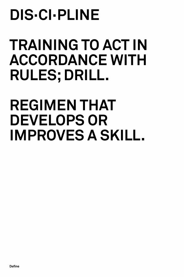
DIS·CI·PLINE
TRAINING TO ACT IN ACCORDANCE WITh RuLES; DRILL.
REGIMEN ThAT DEvELOPS OR IMPROvES A SkILL.
Define

RE·SPON·SI·BIL·I·TY
ThE STATE OR fACT Of BEING RESPONSIBLE.
A PARTICuLAR BuRDEN Of OBLIGATION uPON ONE WhO IS RESPONSIBLE.

EThICALMORALPOLITICALRELIGIOuS ENvIRONMENTALEDuCATIONALCuLTuRAL
Issues

Specifics
huMILITYfREEDOM Of SPEEChfREEDOM Of ChOICEPROfESSIONALISMDISCRIMINATIONRESPECTChARITY


Introduction
Responsibility is a characteristic and a product of discipline; of ones-self and also the role they play within their chosen field, be it design related or not. This book aims shed some light how the issue of responsibility affects designers, the decisions they make and the outcome that follows.
Without focusing too generally on one facet of responsibility in graphic design, a broader picture can be seen and then applied not just to the project at hand, but an entire practice and also a way of life.


Content
01 - 12
Affectin
g the role of a designer
13 - 18
Ellie Ridsale
19 - 24
Interview with Emma Leahy
25 - 28
Interview with Anthony Grayling
29 - 46
Josef Müller-Brockmann
47 - 48
Anthony Burrill
49 - 62
Awesome design
63 —
For my own benefit

Hermen Liamburg

There is always a reason, an event, and thus a message involved.

how does the issue of responsibility affect your role as a graphic designer?

01|02

Massimo vIGNELLI

Dear Edward,
I am glad to see that you are concerned with the role of responsibility for the graphic designer. This is an issue which I remind to my audiences every time I give a talk. I basically see three levels of responsibility in design:
The first one toward ourself, the integrity of the project in all its components.
The second, toward the client, to protect his investment in a way that is economically sound and has long lasting values.
The third, toward the user of the design, in a manner that is appropriate, dignified and culturally enriching.
We should be professionally responsible to protect our environment by reducing the waste of paper, energy and other sources. We should engage ourselves to awake everyone sense of responsibility. I am sure you share this mission in your forthcoming book.
Best wishes and best regards,
Massimo
Ok, firstly, incredible, an e-mail from the man himself. He must be 95 by now!
To some extent this is what he covers in his Canon. But the message is no less poignant.
As designers we should have a responsibility beyond commerce. His three levels of responsibility ensure a good job is done for all who are effected, emotionally and commercially.
www.vignelli.com212/737 0538 [email protected]
03|04

The attention to details requires discipline. There is no room for sloppiness, for carelessness, for procrastination. Every detail is important because the end result is the sum of all the details involved in the creative process no matter what we are doing. There are no hierarchies when it comes to quality. Quality is there or is not there, and if is not there we have lost our time.
It is a commitment and a continuously painstaking effort of the creative process to which we should abide. That is Discipline and without it there is no good design, regardless of its style. Discipline is a set of self imposed rules, parameters within which we operate. It is a bag of tools that allows us to design in a consistent manner from beginning to end.
Discipline is also an attitude that provides us with the capacity of controlling our creative work so that it has continuity of intent throughout rather than fragmentation. Design without discipline is anarchy, an exercise of irresponsibility.
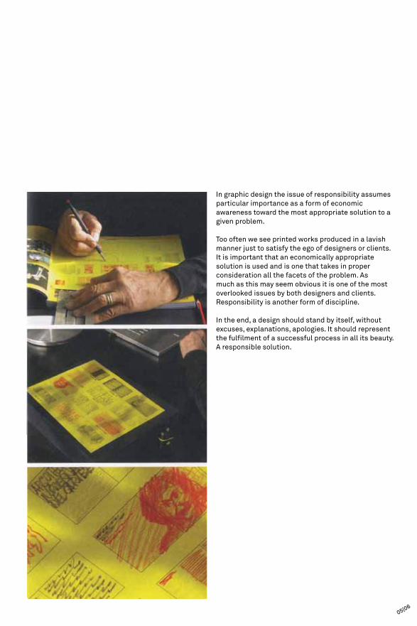
In graphic design the issue of responsibility assumes particular importance as a form of economic awareness toward the most appropriate solution to a given problem.
Too often we see printed works produced in a lavish manner just to satisfy the ego of designers or clients. It is important that an economically appropriate solution is used and is one that takes in proper consideration all the facets of the problem. As much as this may seem obvious it is one of the most overlooked issues by both designers and clients. Responsibility is another form of discipline.
In the end, a design should stand by itself, without excuses, explanations, apologies. It should represent the fulfilment of a successful process in all its beauty. A responsible solution.
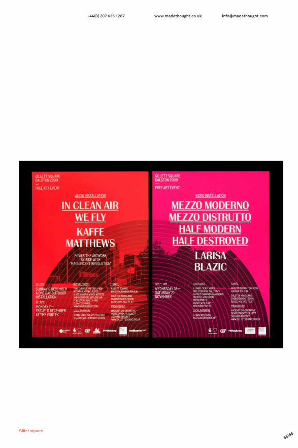
05|06

These designs do not necessarily have anything to do with responsibility, but discipline certainly. Discipline as a word refers to a particular practice in order to progress and improve. It also applies to the wider context of disciplines and the idea of ‘unity through diversity’ on of my favourite quotes from April Greiman.
The Knoll designs are a clear example of how photography and design have come together, supported by a concept to create a visually exciting style of order and control.
ProjectKnoll

07|08

PuRPOSE

Hello Edward.
Responsibility is fundamental to the running of a credible design business.
At Purpose we aim to:
– Design with ambiguity– Design to be effective– Help out clients to spend their money wisely– Be a good employer– Limit the amount of energy, paper and waste that we produce along the way
As creative director it is my responsibility to ensure that our creativity is the best it can be: surprising, engaging, inspiring and with all this talk about responsibility, lets not forget the vital ingredient: fun!?
Good luck with the book,
Rob Howsam
I greatly admire Purpose’s work, it also seems that they have a healthy sense of responsibility. Both to themselves and their clients.
I am glad he mentioned the fun aspect, because when talking about responsibility it is easy to make an incorrect jump to uninspiring work. However that is not at all the case.
www.purpose.co.uk+44 (0)20 7724 5890 [email protected]
09|10

ProjectEEFP

Simon Beattie catalogue
11|12

Geoff McFetridge

Part of being a graphic designer is also about being able to read the world.

A case study

Ellie RIDSDALE13|14

Ellie Ridsdale graduated from London Royal College of Art. One of her first projects out of education was exploring the implication of creative accessible design and its effects on social change. Her job, alongside a researcher form the British Heart foundation was to encourage local communities to peruse a more active lifestyle in an effort to reduce the risk of heart disease. A tough project for sure, but one that if successful would be greatly fulfilling for herself and the people the message reached.
The initial concept photographically depicted the rush and frustration on commuting via the tube and other public transport. However the message was not clear enough, lacked impact and the audience simply did not get it. The new direction seen here was far more to the point.
The interesting thing about trying to help people is that while a designer may want their work to be conceptually thought provoking, there is always a risk that the audience will simply not understand it or give it the time to understand. Therefore the clarity of communicating a message when trying to engage an audience is of upper-most importance, the aesthetic should aim to re-enforce, not entertain the message.
The placement of the message too is key to making sure the message is heard. In this occasion the posters were placed in hospitals, dietician venues, retailers and a number of other site specific locations. As well as this there was an effort to sign-post walkways in local parks, encouraging people to go on their own walks, and not just to and from work.
What are you waiting for?

There was also an awareness not to include words such as ‘exercise’ as the average Joe does not want to be compared to beautifully fit and healthy athletes. When encouraging people to be exercise there is always a sense of the fear of failure, which would put a swift end to any endeavours by the creative’s. Therefore the incorporation of images and photographs was directed very directly at their core audience.
The direction of the design required lengthy research. Studying the effectiveness of a poster in a particular place, encouraging people to use stairs, rather than escalators in a shopping mall for example. Results found that a poster positioned effectively had a surprisingly large effect on the numbers of people using stairs. Also research showed that the rapidly
dating trend of shock tactics was losing its impact, and that empathy with its audience was far more important.
The interesting thing to me is that while Ridsdale created a very successful campaign, she admitted herself that her initial direction was far more design savvy, aimed somewhat towards designers. Most likely trying to show off some design skills for the portfolio. However her new direction was effective in its context and was recognised for this. This is what a studio or a client is looking for, not the ability to kern some type within a pica of its life. She also made the point that it was hard for her to design for her audience, because throughout college designers designed for their peers, which is an entirely different thing altogether.
15|16

Her final site-specific design solution was simple and effective. So if you want a message to hit home instantly, intelligently and conceptually you must know your audience before making a single decision.

17|18

Q & A

Q & A
with Emma Leahy:ThIRTEEN EIGhTY
19|20

When you receive a brief, what is your protocol?
What are you ideas on objective problem solving?
How do you separate your creativity and your objectivity apart, if at all?
Do your creative aspirations ever take a back seat to the client’s preference?
How do you see the future of design functioning in a world where this is the case?
What are your opinions of working like this?
Add it to the to do list
Cup of tea and a biscuit...
I make sure tackle the job from multiple angles, especially with branding.
Yes they have to in the real world.
I’d say it is far too rigid. If a client asks for something retro for example that is a bonus.
It’s just a job, bills need paying.
Fair enough, I was hoping for something to do with the initial
design stage, but this is at least a human answer.
Ok I can see where this might be going…
So to please the client, a brief can be developed stemming from
a few separate concepts, or basing a direction around one over-
arcing concept. In the fickle nature of the commercial world it is
important to give them choice, but be as determined to push each
direction as the next.
I wanted to ask, how would you advise a client to pick a more
suitable design direction or simply trust you? I didn’t because I
thought she might just laugh at me.
Interesting that even an experienced designer who has settled
into the design style of working strictly for a client wants to see
design become freer.
As a student should, I developed the opinion that money was
bad; it was a by-product of giving in to the man, the man being
commercial work. But as the day approaches when I leave this
place, the line between personal ambition and working for money
is becoming a little hazy. Re-appropriating my ambitions is now
my main focus.

Everyone has a ‘worst client ever,’ what made your client worthy of the title?
What are your main design considerations in directing a project at a particular audience?
I find that restricting my typeface selection right down to a maximum of six works is suitable. But in the current design climate is this approach seen by clients as unconsidered and lazy?
The grid provides a structure to be used as a guide, but does this necessarily lead to the most effective typographic communication solutions?
What do you consider to be the most interesting thing about communicating through design?
If you were to have a statement that summed up your approach or ideology towards graphic design, what would it be?
Not paying bills and leaving other people my number as a point of contact - not pleasant.
I guess this is mostly on a gut feeling.
I personally don’t agree on the six fonts thing even if I do have definite favourites - one size does not fit all.
Maybe not?
I personally enjoy illustration very much but any job that I’m proud of is very interesting.
Look everyone- you can polish a shit!
Shit. If that happens to me I will be knocking at their door with a
sledgehammer! Or at least sending them a very stern e-mail.
Not so sure, maybe after a lot of experience an audience can be
directed on ‘gut,’ but for me at this stage I would feel much more
comfortable researching and understanding my audience, it is
part of our duty.
This didn’t really answer my question, but the one size doesn’t fit
all answer may suggest the opinion of clients. They want to stand
out and be different. So it is my responsibility to broaden my
acceptance of typefaces not for my own personal gain, but for the
benefit of the message and the client.
Great stuff...
I think that she was saying is, whenever she successful there is an
interest in the project, both from her and others.
On the first day of college our course leader told us. ‘No matter
how hard you try, you cannot polish a turd.’ Hearing this then, on
the verge of graduation and a career in graphic design perhaps
should have confused me. However, I know that ‘shit’ is just a
matter of opinion, and that one persons shit is the next guys food.
Grotesque as it sounds, it is true in industry.
21|22

From my interview I learned a few simple truths about working in industry. Firstly her slightly satirical and certainly cynical tone instantly told me that in reality you face a lot of faff that may well turn you slightly bitter towards clients. But while this may be true, the passion to design remains, this is obvious. So I should not be concerned too much with what I end up designing, as long as I engage with the project and aim to create the most appropriate solution my job will be enjoyable. Again this relates back to the ideas of responsibility and discipline. I must remember that while I may have my own creative aspirations I also have a duty to my clients to provide them with what they are both happy with, while my discipline will allow me to be adaptable. Beyond this I also owe a good job to the audience, making sure they receive the message in an appropriate way.
The future of graphic design is a concern to all who love it. The age of print is gone and is now a secondary vehicle for advertising and promotion. Despite the decline in printed material I believe it is the duty and responsibility of those of us who have a passion for print to push the boundaries, make it fresh again and keep it alive for the future. The only way of doing this is by creating high quality printed work for all to see. So I will endeavour to create printed work for the public to see, that they will appreciate and engage with, driven of course by a brief.
I believe strongly in responsibility and discipline, not just in design, but also in life. Without discipline it is impossible to be responsible, and to be responsible you have gauge an appropriate reaction based on experience. Bringing this into design it is clear to see that to create a responsible outcome for a project you must firstly understand your audience. Empathy has a lot to do with it, and lets not forget that empathy can be learned and focused too. But it is our moral sense of responsibility that should drive message driven design, to push our understanding of a subject and audience then bringing it together all of our technical knowledge. For me this is discipline through responsibility.
As for polishing a turd, I would rather not, it goes against what I personally want to achieve and what I feel I would be given back to the client and audience. But as Emma mentioned, it pays the bills.
Interview Reflection

23|24

interview...

with Anthony Grayling
Lucienne Roberts
25|26

Yes absolutely. A dose that says ‘though shalt’ and ‘though shalt not’ is inflexible and fits awkwardly with real life, which is complex and protean. Therefore to advise an ethical code for designers, one would do better to say: here are examples of what a responsible and well-intentioned designer might be like; go and do likewise. A list of strict rules would be very difficult to observe in practice, which is always the problem with top down ethics. The alternative idea of ‘a way of being’ is bottom-up, which rests on individuals being conscious of their involvement in society and the impact they have on it.
Like everyone else, designer find themselves in a spiders web of duties – contractual duties, duties to clients, stakeholders, colleagues, themselves and their work, and to society at large. It is sometimes difficult to serve everyone well while at the same time at the same time fulfilling ones implicit duties to society. I think it legitimate for one to sat that they try their best, and to learn from failures.
Money can be a distorting factor in all aspects of life and work, and therefore here too. Technically money should be a neutral instrument that enables things to happen. Its useful to have a coin in your pocket to buy some bread rather than a sack of coal to be exchanged for it. But money too often becomes an end in itself and this can distort some people sense of responsibility.
Normally of course, financial exchange involves a mutual benefit. The payer is buying a professional service that adds value to their own endeavours. The client has duties too – to all their stakeholders and to society at large, just as the professional does. These are equivalent and sometimes greater than, the duties of the professionals they hire.
I’ve always thought that if you wanted to live a good life and do good in the world, you have to be good to yourself. Your have a responsibility to be a good steward of your own gifts, and you’ve got to take care of yourself in order to be a more flourishing and effective person. This is something that people forget, despite it being so simple and obvious a point.
There is a utilitarian argument that says you maximise benefit for the greater number; so then you would work for (say) charities all the time instead of doing the work that engages you most personally. If the two coincide that’s great: for then what benefits you individually, making you happier, more effective, more productive, more alive and creative, is also an outward contribution. But if one sought to altruistic at the expense of ones own interest all of the time, the risk is that it would eventually undermine even ones ability to be good to others.
When you are involved in less creatively satisfying projects, which nonetheless benefit others, I would start by saying that you have a professional obligation to advise you client and express your point of view on the basis of your experience. So, you would say that if tackled differently there could be a more attractive and interesting outcome. If the client says ‘no, we want it like this’ then you have another professional obligation, which is ultimately to accept the aesthetic judgement made by the client, because its not as if you are committing a sin by designing a less visually interesting leaflet (or whatever). Your moral obligation to be professional is engaged in such cases.
Graphic designers are responsible to many people, and the commercial aspect of the work can distort this. Is it possible to arrive at an ethical code of practice for an activity such as Graphic Design?
having creative freedom brings happiness to the designer, but what about work that may be less personally satisfying, but helps others? Is my happiness more important that the happiness of everyone else?
The views and thoughts of one that is not wrapped up in the emotional side of design, and can therefore take a step back and cast a neutral eye over the issues is very interesting.
Here Grayling makes the obvious but overlooked point that money is the stem of all responsibility as that will be the deciding factor ultimately whether the job is successful or not.
Be good to yourself, ok.
I would agree that yes, as a trained designer, it is our professional obligation to design for the client, but also for the greater good when possible.

We live in an open, pluralistic society and with very few and rather special exceptions, like hate speech and racist speech, we like to see people put their point of view, even if we disagree with them – sometimes vehemently. We think that it’s very important for our own views to be challenged and that there should be lively and multifaceted public debate. The health of a society depends on this. We may often not like what we hear, but if we are serious about making our own contribution then we should listen to other and engage with their points.Now, in such a society we want it to be the case not only that people can put their point of view, but that they can do this in the best possible way. We accept that somebody on the other side of the argument is entitled to present their case as powerfully and eloquently as they can. It is right and proper therefore that people can make use of things like advertising and the media and design to potentiate their case.
Even if you don’t personally agree with your clients message, if the message is a legitimate one do you take a stand based on our own personal morality or do you act as a professional and continue to provide a service? Professional interests and obligations are perfectly legitimate, the value of free speech and the value of alternative points of view are so great that it surely must be up to individuals to decide what moral stance they take. It is a matter of personal conscience.
But all that said, it remains the case that if something were really such a serious matter for you ethically then even if it meant financial loss or other problems, the answer is very, very simple. If it really is a moral make or break issue for you, you don’t do things that you don’t agree with.
The word ‘manipulation’ is loaded. I’d say that graphic design is an aspect of rhetoric. It seems from the art of rhetoric that was developed in classical antiquity when oratory, or verbal eloquence, was the only means of conveying information, persuading people, changing their minds and putting a point of view. Nowadays, with the divergence of forms of communication, rhetoric has become a diverse thing. Design is one form of it. Whether design is used in presenting a point of view or a piece of information, it is used to her the message across in an attractive or impactful way that will get peoples attention. Its in the sense that its an extension of the rhetorical art.
That has a good and bad side. The good side is that people mist be informed and must be aware of different points of view. It’s a service to people to be alerted to thing and to know about them.
In looking at the bad side, we should start by understanding the in itself, design is neutral it ceases to be neutral in the light of its content. Its value morally is the concept it portrays. Take Nazi design as an example. It is generally agreed that the Nazi regime used design to tremendous effect. On one level it was ‘good’ design. So, imagine someone lands from mars and sees the great building in Berlin commissioned by Goering for the Luftwaffe ministry. It’s a fantastic bit of fascist architecture and in itself it’s a rather beautiful object. However, once you are told it was put up by the Nazis and for what purpose, your value judgement is influenced by that fact. This demonstrates the tremendous difficulty in separating form and content and emphasises the fact that the moral value of a piece of design working as a rhetorical device wholly rests in the fact that it has content.
Is all graphic design, apart from information design perhaps, a form of manipulation?
Should designers only take on jobs from clients whose ethos they agree with?
As a philosopher or social thinker it would make sense that he believes we should all have the right to voice our views through the medium of our choice.
Again re-inforces opinion that as a professional we have a duty, but before we act mindlessly it is certainly worth considering your own morality.
27|28

The intelligence within the field of graphic
design is in the ability

to make connections between different disciplines.
Zak Kyes

The work of
JosefMüLLER-BROCkMANN
29|30

Muller Brockmann’s work was always approached with clarity as its core focus. Objectively¬ thinking about the problem, developing a concept often in a partnership, led to clear discipline with tone and visual style. I call it style, because style at his time in the 40s - 60s was indeed an established feature.
For this identity for Holzäpfel office furniture the logo, the printed promotion and the overall identity was tied together by a clear visual concept. ‘Order and tidiness’ could describe it.

The furniture is portrayed as a prop, while the workers simply utilise it to aid their business. It is a responsible design as it needs no explanation, it obvious and to the point. While the outcome is fairly straightforward as far as process goes, it is the discipline that has led to such an concise outcome.
31|32


33|34

These two posters were designed to work together, but were not always placed in the same location. They can support each other, or stand-alone. To achieve a single message being received while dissecting it two relies on a strong concept and a solid awareness of the audience.

This powerful poster engages its audience whether they like it or not. Firstly it is bright orange, catching the audiences eye, when they turn to face it they find an anonymous figure pointing in their face.
There is so much that can be said about his poster. Less is more, white space, simplicity... all encompassing, and therefore a very disciplined design.
35|36


A fantastic use of typographic posters suggesting tone, pace and inflection from Brockmann.
37|38
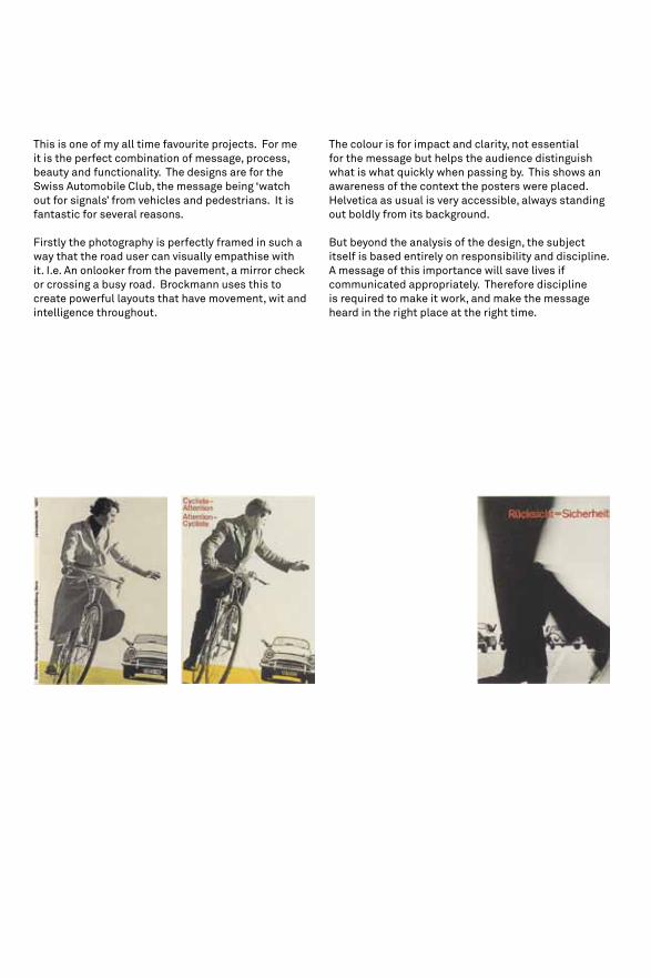
This is one of my all time favourite projects. For me it is the perfect combination of message, process, beauty and functionality. The designs are for the Swiss Automobile Club, the message being ‘watch out for signals’ from vehicles and pedestrians. It is fantastic for several reasons.
Firstly the photography is perfectly framed in such a way that the road user can visually empathise with it. I.e. An onlooker from the pavement, a mirror check or crossing a busy road. Brockmann uses this to create powerful layouts that have movement, wit and intelligence throughout.
The colour is for impact and clarity, not essential for the message but helps the audience distinguish what is what quickly when passing by. This shows an awareness of the context the posters were placed.Helvetica as usual is very accessible, always standing out boldly from its background.
But beyond the analysis of the design, the subject itself is based entirely on responsibility and discipline. A message of this importance will save lives if communicated appropriately. Therefore discipline is required to make it work, and make the message heard in the right place at the right time.

39|40

This poster is very powerful but not too obvious without being able to understand the type. However even without the type, the visual impact of the giant hand signalling combined with the context it is viewed draws connections to signalling cyclists and makes it hard to forget, if not purely for its scale.
The idea of subjectivity comes into it too. If something takes a little time to figure out it is generally better remembered and is more interesting for its audience. Lets not forget that this was designed in a country at a time when almost all design was subjective and thought provoking on some level.

41|42


43|44


45|46
Dexter Sinister
We are interested in the form of side effects.

Anthony BuRRILL
Burrill often tackles problems by using type, attaching a message and then shoving it very clearly in his audiences face. His tone is not provocative, but certainly grabs attention through simple images and bold type.
His taking liberties project addresses a hugely important subject, that draws a particular focus on audience and requires great discipline and an act of responsibility to make it effective and hopefully make a difference.
ProjectTaking Liberties


49|50

SPIN
ProjectEdmund de Waal

MADE ThOuGhT
ProjectThe future laboratory

Studio MAkGILL
ProjectJourneys With No Return

Ok-RM
ProjectBeyond these walls

NEO NEO
ProjectIssue Bourse Fcac

STuDIO NEWWORk
ProjectMischen

Metahaven

The designer is never the subject, but always the filter.


for my own benefit63|64

Paper Sizes
That stuff we work with everyday, yet when it comes to knowing the sizes the numbers always escape us. The A-format paper sizes have been mathematically worked out to work in a square ratio system. However as designers we dont really care about all that. We just like to play with what works at different scales and how different formats can balance with eachother and be applied to a project.
So here they are, try not to forget!

A2
A0 is 841 / 1189A1 is 594 / 841A2 is 420 / 594A3 is 297 / 420A4 is 210 / 297
Measurements in mm
A0
A1 A3A4
A5
A6
A7A8
A5 is 148 / 210A6 is 74 / 148A7 is 105 / 74A8 is 52 / 74
65|66

Type Sizes & Relationship
The relationship between the size of type can aid the movement and the pace of type on a page. Working with Titles, Headers and Body copy is the most common application of type seize relationships. Achieving a comfortable balance does not have to be random, if you set yourself rules to follow it can be very simple and effective. These are only guidelines remember, not to be taken for gospel.
You can find your own preference of header pt size and body pt size. You will find that as you step up the pt size of body copy, the header will stay within a comfortable ratio.

header
header
header
Lorem ipsum dolor sit amet, in maecenas pharetra gravida ullamcorper neque. Sed hendrerit proin diam duis eu, cursus odio placerat ultrices adipiscing lectus ornare, ut velit nonummy, quidem vitae turpis enim. Adipiscing a lectus, scelerisque tempus vivamus ac.
Lorem ipsum dolor sit amet, in maecenas pharetra gravida ullamcorper neque. Sed hendrerit proin diam duis eu, cursus odio placerat ultrices adipiscing lectus ornare, ut velit nonummy, quidem vitae turpis enim. Adipiscing a lectus, scelerisque tempus vivamus ac.
Lorem ipsum dolor sit amet, in maecenas pharetra gravida ullamcorper neque. Sed hendrerit proin diam duis eu, cursus odio placerat ultrices adipiscing lectus ornare, ut velit nonummy, quidem vitae turpis enim. Adipiscing a lectus, scelerisque tempus vivamus ac.
67|68

Rulers
Ruler act as a very important device for controlling a page or spread, especially when large amounts of varying information is being used. It is a way of catagorising as well as directing the audience and also adds a neat structure to a layout.

20pt
12pt
8pt
5pt
3pt
2pt
1.5pt
1pt
0.5pt
0.8pt
0.2pt
0.1pt
0.05pt
69|70

Typeface Preference
To get to grips with using type in a technical manner I decided early on in 2011 that I would stick to using just a small handful of typefaces. Putting that initial stage of scowering the font libraries aside when beginning a brief saved me time and a great number of headaches. I would strongly advise practicing this to anyone who wants to engage with typography on a technical level.
However in todays commercial climate it is unwise to ignore the wonderful world of typefaces. There are so many available now that they can become a powerful tool in your typographic arsenal.

AkkuratABCDEFGHIJKLMNOPQRSTuVWxYz
abcdefghijklmnopqrstuvwxyz1234567890
Helvet icaabcdefgHijklmnopqrstuvwxyz
abcdefghi jk lmnopqrstuvwxyz1234567890
GaramondabcdefGhijklmnopqrstuvwxyz
abcdefghi jk lmnopqrstuvwxyz1234567890
GeorgiaabcdefGhijklmnopqrstuvwxyz
abcdefghijklmnopqrstuvwxyz1234567890
FuturaabcdeFghijklmnopqrstuvwxyz
abcdefghi jk lmnopqrs tuvwxyz1234567890
71|72

Guilty Pleasures
There are dozens of beautiful typefaces that once featured in print, but as times have changed some have become less common.
I have always had soft spot for traditional typefaces but rarely get to use some of my all time favourites. The only time they are suitable now are for personal projects. Here is a few of them.

O n y xa b c d e f g h i j k l m n O p q r s t u v w x y z
a b c d e f g h i j k l m n o p q r s t u v w x y z1 2 3 4 5 6 7 8 9 0
Century ExpandedAbCDEFGHijKLMnopQrStuvwxyZ
abcdefghijklmnopqrstuvwxyz1234567890
Goudy Old Sty leabcdefGhijklmnOpqrStuvwxyz
abcdefghi jk lmnopqrstuvwxyz1234567890
Modern No. 20
abcdefghijklMNopqrstuvwxyz
abcdefghijklmnopqrstuvwxyz
1234567890
73|74


Consciencious Objectives: Designing for an Ethical Message
Rotovision
Karl Gerstner: Review of 5x10 Years of Graphic Design etc.
Cantz Editions
Josef Müller-Brockmann: Pioneer of Swiss Graphic Design
Chronicle Books, 1996
The Vignelli Canon
Lars Müller Publishers
Graphic Design Worlds / Words
Mondadori Elect
Good: An introduction to ethics in graphic design
AVA Publishing
Massimo Vignelli
Rob Howsam
Emma Leahy
(to all those who were willing to supply content but were simply too busy)
John Cranmer & Yolana zappaterra
Karl Gerstner
(Paul Rand - introduction)
Massimo Vignelli
Giorgio Camuffo & Maddalena Dalla Mura
Lucienne Roberts
www.vignelli.com
www.purpose.co.uk
www.thirteeneighty.co.uk
Bibliography
Thanks

Printed by LuLu