Copyright reserved Please turn over MARKS: 150 TIME: 3 hours This question paper consists of 20 pages. This question paper must be printed in full colour. DESIGN P1 (THEORY) NOVEMBER 2013 NATIONAL SENIOR CERTIFICATE GRADE 12
Transcript
Copyright reserved Please turn over
MARKS: 150 TIME: 3 hours
This question paper consists of 20 pages. This question paper must be printed in full colour.
DESIGN P1
(THEORY)
NOVEMBER 2013
NATIONAL SENIOR CERTIFICATE
GRADE 12
Design/P1 2 DBE/November 2013 NSC
Copyright reserved Please turn over
BLANK PAGE
Design/P1 3 DBE/November 2013 NSC
Copyright reserved Please turn over
INSTRUCTIONS AND INFORMATION 1. 2. 3.
This question paper consists of SEVEN questions. There are choices within some questions in this question paper. Read the options carefully. This question paper consists of THREE sections:
SECTION A:
SECTION B: SECTION C:
Design literacy (80 marks) QUESTIONS 1 to 4 Design in a social/environmental context (40 marks) QUESTIONS 5 and 6 Design in a business context (30 marks) QUESTION 7
4. 5. 6. 7. 8.
Read the requirements of the questions carefully. Answer in full sentences and avoid the listing of facts. Use the mark allocation to determine the time to be spent on each question. Do NOT repeat the same facts and examples in different questions. Write neatly and legibly.
Study the designs below and answer the questions that follow. 1.1
FIGURE A: Bambani ('to hold') by the Zizamele Ceramic Group (Kommetjie, Noordhoek, Cape Town), 2011.
Discuss the use of the following elements and principles of design in relation to FIGURE A: • Colour • Contrast • Pattern • Movement • Focal point
(10)
Design/P1 5 DBE/November 2013 NSC
Copyright reserved Please turn over
1.2
FIGURE B: M2 Building designed by Kengo Kuma (Tokyo, Japan), 1991.
1.2.1 1.2.2
Define the following concepts with reference to the building in FIGURE B: • Form follows function • Deconstruction • Less is a bore
Discuss the use of the following principles with reference to FIGURE B: • Contrast • Focal point
(6) (4) [20]
Design/P1 6 DBE/November 2013 NSC
Copyright reserved Please turn over
QUESTION 2 The images in the visual sources below, FIGURE A and FIGURE B, challenge and/or reinforce stereotypes. Study the two visual sources carefully and answer the questions that follow.
2.1 2.2
FIGURE A FIGURE B
His (FIGURE A) and Hers (FIGURE B) chair designs
by Kare Designs (Munich, Germany), 2010. Explain how the designs in FIGURES A and B can be regarded as reinforcing stereotypes by referring to the following: • Title • Materials • Colour • Form Discuss how you would avoid stereotyping in your design projects.
(8) (2) [10]
Design/P1 7 DBE/November 2013 NSC
Copyright reserved Please turn over
QUESTION 3 3.1 Refer to FIGURE A and FIGURE B below and answer the questions that
follow.
FIGURE A: Chandelier by Michael Chandler (Cape Town), 2012.
FIGURE B: Bafana Bafana by Bheki Dlamini (Esikhawini, KZN), 1998.
3.2
Compare the designs in FIGURE A and FIGURE B according to: • Local and international influences • Use of materials • Colour • Pattern Design is useless if it is not functional. Discuss this statement by referring to a South African designer/agency/studio. Do the following:
• Name the designer/agency/studio. • Discuss influences on the designer/agency/studio with reference to one
or more design products. • Discuss the characteristic style of the design(s) or designer(s) by
referring to the statement.
(10) (10) [20]
Design/P1 8 DBE/November 2013 NSC
Copyright reserved Please turn over
QUESTION 4: DESIGN HISTORY 4.1
FIGURE A: St. John's College,
Herbert Baker (Johannesburg), 1912.
FIGURE B: The Colosseum
Building, WH Grant (Cape Town), 1936–1938.
FIGURE C: The Meat Board, Helmut Stauch and partners
(Pretoria), 1957.
FIGURE D: McDonald's
(Bloemfontein), 2010.
FIGURE E: Palace Hotel, Sun City, South Africa, 1979.
South African designs, past and present, often show influences from Western design history as seen in the designs above.
Design/P1 9 DBE/November 2013 NSC
Copyright reserved Please turn over
Choose any TWO of the designs (FIGURE A to FIGURE E) on the previous
page and answer the following: • Identify the name of the design history movement that could have
influenced EACH design of your choice, and list THREE characteristics of BOTH designs.
• Discuss TWO other typical characteristics and/or influences of EACH movement/style that you did not mention above.
• Name ONE work and designer from EACH movement/style and give a brief analysis of the work.
(20)
4.2
FIGURE F: Display cabinet by Gustav Serrurier-Bovy,
Art Nouveau, circa 1880–1905.
FIGURE G: Display cabinet by Gio Ponti, Modernism, 1950s.
4.2.1
4.2.2
Which display cabinet (FIGURE F or FIGURE G) do you prefer? Substantiate your answer. Compare FIGURE F and FIGURE G by referring to: • Form • Function • Space • Symmetry
TOTAL SECTION A:
(2) (8) [30] 80
Design/P1 10 DBE/November 2013 NSC
Copyright reserved Please turn over
SECTION B: DESIGN IN A SOCIAL/ENVIRONMENTAL CONTEXT QUESTION 5 5.1
FIGURE A: Good Parent Campaign (DDB, Poland), 2009. 5.1.1
5.1.2
Discuss how the designer has highlighted the idea of child abuse in the poster (FIGURE A). Discuss ONE INTERNATIONAL designer you have studied who has addressed a social issue(s). Name the designer, discuss a design(s) and explain how the social issue(s) has/have been addressed. You may NOT refer to any designer(s) that you have used previously or other designers used in this question paper.
(2) (8)
Design/P1 11 DBE/November 2013 NSC
Copyright reserved Please turn over
5.2
FIGURE A: The Shova Kalula Bicycle Project (South Africa), 2001 to present.
The Department of Transport has developed a bicycle implementation strategy to enable citizens to actively participate in the social and economic life of South Africa.
FIGURE B: Examples of the project's uses.
5.2.1
5.2.2
Refer to the images in FIGURE B and discuss how the Shova Kalula Bicycle Project encouraged different design solutions to meet community needs. Write a short paragraph on any ONE SOUTH AFRICAN designer/ design group/design studio you have studied, who addressed a social issue(s). You may not refer to examples that you have used previously.
(4) (6) [20]
Design/P1 12 DBE/November 2013 NSC
Copyright reserved Please turn over
QUESTION 6 Answer TWO of the three questions below.
6.1
FIGURE A: Campaign Poster for NORA-SA [National Oil Recycling Association of South Africa] (South Africa), 2012.
6.1.1
6.1.2 6.1.3
How do the images used in FIGURE A contribute to encouraging an environmentally safe society? State TWO advantages of using recycled material to create design products. Discuss ONE work of a SOUTH AFRICAN designer who makes the environment sustainable by creating products with recycled materials or green methods. Use the following structure in answering the question: • Name of designer • Title of design • Description of design • Explanation of how it addresses green issues You may NOT refer to any designer(s) that you have used previously or other designers used in this question paper.
(2) (2) (6)
AND/OR
Design/P1 13 DBE/November 2013 NSC
Copyright reserved Please turn over
6.2
FIGURE B: Solaleya Home by David Fanchon (Fort Lauderdale, USA), 1994. The above house is built on a concrete pedestal which enables it to rotate 360 degrees.
6.2.1
The house above rotates through the day and continually changes position. How does the change in position of the house contribute to a healthy environment?
(3)
6.2.2
Discuss the work of ONE INTERNATIONAL designer who uses environmentally friendly methods to contribute to a better environment. Use the following structure in answering the question:
• Name of designer • Title of design • Description of design • Explanation of how it contributes to the environment You may NOT refer to any designer(s) that you have used previously or other designers used in this question paper.
(7)
AND/OR
Design/P1 14 DBE/November 2013 NSC
Copyright reserved Please turn over
6.3
FIGURE C: Volivik
Lampshade by EnPieza Studios
(Madrid, Spain), 2007.
FIGURE D: Kitchen Collection Lampshade by Francois Legault
(Canada), 2008.
6.3.1
6.3.2
How do the materials used in FIGURE C and FIGURE D contribute to an environmentally safe society? Discuss the work of ONE SOUTH AFRICAN OR ONE INTERNATIONAL designer who uses waste material to improve the environment. Use the following structure in answering the question: • Name of designer • Aims of designer • General characteristics of designer's work • Title and analysis of ONE work explaining how it addresses
environmental issues You may NOT refer to any designer(s) that you have used previously or other designers used in this question paper.
TOTAL SECTION B:
(2) (8) [20] 40
Design/P1 15 DBE/November 2013 NSC
Copyright reserved Please turn over
SECTION C: DESIGN IN A BUSINESS CONTEXT QUESTION 7 Answer only ONE question in this section. Answer either QUESTION 7.1 OR QUESTION 7.2.
7.1
FIGURE A: Tent sofa by Phillippe Malouin
for the Italian brand manufacturer Campeggi (UK), 2009.
7.1.1
7.1.2 7.1.3
A variety of stores are interested in selling the tent sofa in FIGURE A. Write down a possible SWOT analysis that is required by one of these stores. Write a short business plan for the tent sofa, focusing on the following: • Funding possibilities • Possible fixed and variable costs Briefly list FOUR human resource management considerations needed by businesses.
(8) (2) (2) (4)
Design/P1 16 DBE/November 2013 NSC
Copyright reserved Please turn over
FIGURE B: Muvbox is a Popup Restaurant by Daniel Noiseux
(Montreal, Canada), 2009. Peet Pienaar, cofounder of Popup Restaurants, says that Popup Restaurants have become a huge trend in
contemporary society.
7.1.4 7.1.5 7.1.6 7.1.7
Identify a possible target market for the design in FIGURE B and motivate your answer. Give FOUR possible reasons why this business model is affordable and risk free. Name FIVE ways of marketing this product. Name TWO design careers that could have been involved during the designing of the Popup Restaurant in FIGURE B.
(3)
(4)
(5) (2) [30]
OR
Design/P1 17 DBE/November 2013 NSC
Copyright reserved Please turn over
7.2
FIGURE A
FIGURE B
7.2.1 Write down the following for FIGURE A and FIGURE B:
• A business name for each product range • A slogan that highlights the strength(s) of each product range • A target market for each product range and give a reason • An appropriate typography style for a business card for each
product range and give reasons for this (You may also illustrate the typography style.)
• Name TWO ways of marketing each product range, other than using a business card.
(2) (2) (4) (4) (4)
Design/P1 18 DBE/November 2013 NSC
Copyright reserved Please turn over
7.2.2
FIGURE C: Front
FIGURE C: Back
Both sides of a business card are important in the marketing of a business. The business card in FIGURE C has proved to be highly successful for the company. Discuss the success of this business card by referring to: • Shape • Colour • Typography • Layout
(8)
Design/P1 19 DBE/November 2013 NSC
Copyright reserved Please turn over
7.2.3
You are about to start your own textile business using the examples shown above. Refer to FIGURES D, E and F on the next page and answer the questions that follow.
Design/P1 20 DBE/November 2013 NSC
Copyright reserved
FIGURE D: Street market
FIGURE E: Flea market (community organised)
FIGURE F: Shopping mall
• Which ONE of the places of business shown in FIGURES D to F is the
most suitable for selling your textile products? Give reasons for your answer.
• Give reasons why you feel the other two places of business are less suitable for selling your textile products.
TOTAL SECTION C: GRAND TOTAL:
(2) (4) [30] 30 150
Copyright reserved Please turn over
MARKS: 150
This memorandum consists of 26 pages.
DESIGN P1
(THEORY)
NOVEMBER 2013
MEMORANDUM
NATIONAL SENIOR CERTIFICATE
GRADE 12
Design/P1 2 DBE/November 2013 NSC – Memorandum
Copyright reserved Please turn over
SECTION A: DESIGN LITERACY QUESTION 1 [20 marks] AS1: Make value judgments informed by a clear understanding of design. AS2: Understand design theory and use design terminology correctly.
1.1 [10 marks]
• Colour: The colour use in the bowl can be described as limited. The
predominant colour is a pale blue. The repetitive use of the colour range creates a rhythm and unified composition. Blue also adds elements of coolness and could also refer to the domestic worker’s uniform.
• Contrast: The main or obvious contrast is between the female images that creates the decorative edge to the round and curved bowl. The Zizamele Ceramic bowl created a 'playful rhythm' by alternating patterns on the blue female images. Another contrast is between the solid bowl and the positive and negative play between the spaces of the female figures creating the edge of the bowl. The white decorative dot pattern contrasts with the solid blue colour of the dress.
• Pattern: Decorative geometric patterns are playfully used on the images. Patterns can be seen as both decorative and typical of African art or design. The repetitive pattern of the female form on the edge of the bowl creates harmony. The female dress is also repeated to create a pattern.
• Movement: The female figures on the edge of the bowl create the strongest form of rhythmic movement with their arms connected. The use of alternating blue female images also strengthens the movement. The use of geometric patterns on the surface as a decorative element creates a further movement. The repetitive surface patterns also create movement.
• Focal point: Some learners might see the edge of the bowl, created by the silhouettes of the females, as the focal point. The way that the female images lean forwards or inwards, also leads your eye to the central or focal point within the bottom area of the bowl. The skirts of the women are all pointing to the centre of the bowl. The circular patterns and the edges of each dress in the middle of the bowl, draws the eye towards the centre.
Credit must be given to any valid and reasonable answer.
Design/P1 3 DBE/November 2013 NSC – Memorandum
Copyright reserved Please turn over
1.2 [10 marks]
1.2.1
FIGURE B
M2 Building and showroom for Mazda motors, designed by Kengo Kuma, (Tokyo Japan), 1991.
(Allocate 6 marks) • Form follows function: The concept was coined by Bauhaus architects. Emphasis is placed on the function of the design, a case of ‘what you see, you get’! If a designer decides to build a school or church the building should be interpreted as such. Decoration is basically an afterthought. In the M2 building the designer clearly did not follow in the steps of Bauhaus architects. In the true spirit of Postmodernism, he places emphasis on an overload of elements and Eclectic styles. The architect has made a radical shift from the term Form Follows Function and creates a building that is dominated by a grotesque postmodern Ionic column that consists of a chaotic collage of superimposed awkward shapes. The function of the building is not clear as the eclectic style confuses and camouflages the meaning or function.
• Deconstruction: The term refers to the use of forms and space bombarded by fragmented, sharp, clashing angles, skewed shapes and incomplete forms. The Deconstruction (movement/style) is strongly influenced by art movements such as Cubism, Futurism and Constructivism. The M2 building has clearly been shaped by the Deconstruction movement/style in its use of fragmentation. Popular styles deconstructed for reinvention.
Q1.1 LEVEL
COGNITIVE SKILLS
WEIGHTING
QUESTIONS MARKS (10)
Lower order Recall 30% 1.1 3 Middle order Application of elements
and principles
40%
1.1
4 Higher order
Analysis; Synthesis; Evaluation;
30%
1.1
3
Design/P1 4 DBE/November 2013 NSC – Memorandum
Copyright reserved Please turn over
1.2.2
• Less is a bore: Robert Venturi coined the term during Postmodernism. The term refers to a design that makes use of various styles. The term also refers to a reaction to the emphasis on Minimalism, uniformity and rigid adherence to styles of movements such as De Stijl, Bauhaus and the International Style. Many describe the M2 building as Postmodernist, Neo-Historical, and Neo-Eclectic architecture which strengthens the idea of ‘Less is a Bore’. The M2 building can also be described as Pluralistic and Hybrid. The above should refer to the building. (Allocate 4 marks) • Contrast The most obvious contrast in the M2 Building is created by the use of a huge variety of traditional and modern materials. Another contrast is introduced by the use of classical styles with modern styles, as well as the glass versus the concrete. In the same line of thought, contrast is created by the use of Minimalism versus Ornamental design.
• Focal point The architect of the M2 building made use of a monumental classic Ionic pillar as the central focal point. The pillar is placed in the centre and rises above the rest of the building. The size of the column dominates the proportion of the building. Credit must be given to any valid and reasonable answer.
QUESTION 2 [10 marks]
AS3: Discuss, explain and demonstrate the context and purpose of the products, images, signs and symbols used in design to convey overt and hidden messages that reinforce or challenge stereotypes, biases and prejudices, past and present. AS2: Understand design theory and use design terminology correctly.
2.1
(Allocate 8 marks) Learners will offer different viewpoints to the question. Opinions must be based on appropriate design language. Learners must be able to identify the existence of stereotypes and discuss how this design reinforces prejudices that are embedded in the design. (The application of critical thinking skills and how the learner is able to answer appropriately is to be considered in the overall assessment of this question.)
Q1.2 LEVEL
COGNITIVE SKILLS
WEIGHTING
QUESTIONS MARKS (10)
Lower order Recall 30% 1.2.1 + 1.2.2 3 Middle order Application of elements &
principles
40%
1.2.1
4 Higher order
Analysis; Synthesis; Evaluation;
30%
1.2.1 + 1.2.2
3
Design/P1 5 DBE/November 2013 NSC – Memorandum
Copyright reserved Please turn over
2.2
FIGURES A and B reinforce stereotypes in the following way: • Title: The fact that the designer consciously named the chairs 'His and
Hers' reinforces a stereotypical attitude that there are specific forms for each gender. The title clearly gender differentiates between the two chairs.
• Materials: The fact that the designer chooses materials that are 'generally' associated with a male or female is another indication that the designer is reinforcing stereotypes. The 'His' chair makes use of materials that are traditionally seen as ‘male’, i.e. masculine tough, resistant leather and rubber whereas the 'Hers' chair is upholstered in soft velvety material which is traditionally seen as feminine.
• Colour: The 'His' chair is upholstered in pitch black which is considered a strong, hard colour which strengthens the stereotype that men are always strong and hard and the 'Hers' chair is completely in red/pink also strengthening the stereotype of women being soft, sweet and feminine but also passionate.
• Form: Both chairs look very similar in form or shape. The main differences are that the 'His' chair has a little carved crown motive on the roof which strengthens the stereotypical idea that the man is ‘king’ or the leader and in comparison to the 'Hers' chair, slightly bigger or bulkier also emphasising that he is bigger and stronger. The other chair is far curvier.
Credit must also be awarded to any other valid statements. (Allocate 2 marks) The learner can state that it would be necessary to: • avoid controversial images that create bias and discrimination • avoid images or statements that place males in expected roles (the leader,
strong, the provider) and females in expected roles (e.g. weak, the sex object, the cook)
• work towards presenting people as unique individuals • promote responsible design practice that does not discriminate against
groups or individuals
Credit must also be awarded to any other reasonable observations.
Q2 LEVEL
COGNITIVE SKILLS
WEIGHTING
QUESTIONS MARKS (10)
Lower order Observation; Recall Comprehension
30%
2.1 3
Middle order Application 40% 2.1 4 Higher order
Analysis; Synthesis; Evaluation; Deduction
30%
2.1 + 2.2 3
Design/P1 6 DBE/November 2013 NSC – Memorandum
Copyright reserved Please turn over
QUESTION 3 [20 marks] AS4: Investigate, reflect on and interpret information from a variety of sources that show global influences shaping the development of design.
A learner may choose to use any example as provided in the LPG, PAT or any other documented source. NOTE: Chief markers must validate the authenticity of the learners' response if a learner provides a designer that is not on the approved National LTSM list. No marks will be awarded for the name of the designer and the title of the design product/s. Only statements that are relevant to the question will receive credit.
3.1
(Allocate 10 marks)
DIFFERENCES SIMILARITIES Local and International Influences FIGURE A reflects a modern approach to traditional craft. FIGURE B is influenced by local culture, viz. Bafana Bafana, popular culture whereas FIGURE A uses traditional African design techniques in reinventing a European style.
Both make use of traditional three-dimensional craft, i.e. wirework, wool.
Use of materials FIGURE A combines wire/wool with beads. Although traditional, the use of white beads creates a more trendy/contemporary look. FIGURE B makes use of telephone wire only, retaining a traditional ethnic feel.
Both designs utilise wire/wool, giving them a traditional or crafted/handmade feel.
Colour FIGURE A is monochromatic, reflecting a calm, clean, sophisticated and modern feel, whereas FIGURE B was done in bright, bold colours, creating a naive and happy effect.
None.
Pattern The forms in FIGURE A form a pattern through the repetition of the chandelier’s curvy arms and the beads but in FIGURE B the colours and shapes form a pattern through the repetition of the stripes and simplified soccer players.
Both designs make use of the element pattern.
Credit must also be given to any other reasonable observations.
Credit must also be given to any other reasonable observations.
Design/P1 7 DBE/November 2013 NSC – Memorandum
Copyright reserved Please turn over
Q3.1
LEVEL COGNITIVE
SKILLS WEIGHTING QUESTIONS MARKS
(10) Lower order Observation 30% 3.1 3 Middle order Application 40% 3.1 4 Higher order Evaluation; Critique 30% 3.1 3
3.2 (Allocate 10 marks) NOTE: A learner may choose to use any example as provided in the LPG, PAT or any other documented source. ONE POSSIBLE EXAMPLE: Michael Chandler INFLUENCES AND CHARACTERISTICS: His work is as diverse as the country that inspires him and covers from ceramics and soft-furnishings to jewellery and furniture. As a student, Michael began working at Stephan Welz and Sotheby’s, where his overwhelming curiosity for antiques began to influence his personal creative projects. Since high school Michael says that the doodles in some of his notebooks were inspired by Cape Dutch. The Cape’s domestic interior aesthetic is a strong theme in his work. Michael says his style is a Cape Dutch angle on the 1940s Hollywood Regency look, and his African heritage gives it an extra edge. His style could be defined as ‘Cape Regency’ but that’s been used before, so he called it ‘Cape Splendour’ instead. Splendour is glamour without opulence, good-quality pieces put together in a discreet way. Recurring themes of blue-and-white oriental porcelain, Cape Dutch gable motifs and subtle African elements find their way into many of Michael’s designs, but each of these is always reinterpreted in a new and contemporary way.
Design/P1 8 DBE/November 2013 NSC – Memorandum
Copyright reserved Please turn over
Michael is a self-professed ideas man and after he conceptualises he shapes his designs in one of his notebooks. He then hands over his quirky sketches to a careful selection of talented craftspeople from around the Cape Peninsula. Michael says that the process from idea to item is not only influenced by his creativity but also by that of the craftsperson. The crafter who creates one of his designs is one of the filters that will affect the final product, just as the material itself is a filter. In effect, it’s an informal collaboration. This chain of individual influence is what ultimately defines the personality of the final product. Michael’s designs, although decorative, are functional objects in the sense that they can be utilised as mirrors, chandeliers and wearable pendants.
QUESTION 4 [30 marks] AS4: Investigate, reflect on and interpret information from a variety of sources that show global influences shaping the development of design. AS5: Analyse, interpret and critically reflect on examples and relate them to their cultural, historical and contemporary contexts.
4.1 (Allocate 10 marks for each movement for a total of 20) Learners must choose TWO designs. TWO POSSIBLE OPTIONS ARE: FIGURE A AND FIGURE C
Q3.2 LEVEL
COGNITIVE SKILLS
WEIGHTING QUESTIONS MARKS (10)
Lower order Recall; Name 30% 3.2 3 Middle order Application 40% 3.2 4 Higher order Evaluation/Deduction 30% 3.2 3
Design/P1 9 DBE/November 2013 NSC – Memorandum
Copyright reserved Please turn over
FIGURE A: Inspired by the Arts and Crafts movement. THREE CHARACTERISTICS OF THIS BUILDING THAT REFLECT THE INFLUENCE OF THE ARTS AND CRAFTS ERA: • The building reflects the Arts and Craft movement’s love for the rustic
English Cottage style in its use of mainly natural materials, i.e. stone walls, wooden windows and clay roof tiles.
• The hand-made quality of the building reflects the emphasis of the Arts and Crafts movement on craftsmanship and their rejection of the machine.
• The simple, austere, bulky quality of the building as well as the arched entrance and arched windows on the left are reminiscent of medieval Gothic buildings which strongly influenced the Arts and Crafts movement.
TWO OTHER TYPICAL CHARACTERISTICS OF THE ARTS AND CRAFTS MOVEMENT: • Themes of the ''countryside'', e.g. milking cows; country flowers were
often visible. • Typical subject matter included plants, animals, birds and medieval
design motifs like the trefoil and quatrefoil. • Products included textiles, furniture, ceramics; leather bound books,
metal work and architecture. • Decoration was used to enhance the basic design. Ornamentation was
kept to a minimum. • Textiles and Ceramic designs were more organic due to the influence of
plant and animals. • They made use of flat areas of bold colour in different shades of blue,
yellow and red. They also made use of earth tones. • The balance was generally symmetrical due to the medieval Gothic
influence of stability and order. • Human figures taken from medieval sources can often be seen e.g. in
stained glass and furniture panel. • Due to the reaction against industrialisation and the emphasis on the
craftsman, handmade techniques were celebrated. • Construction details were often made visible e.g. the rivets in metalwork
and the dowelling in furniture would have a decorative function. • Natural materials that were 'untouched' by industry were used, e.g.
indigenous (English) woods such as oak and beech. William Morris's idea of 'truth to materials', where materials were left unadorned so that the beauty of the material from which the object was made, became obvious.
• Products had a rustic, cottage, ''unfinished'' look. • A revival of traditional crafts such as weaving, embroidery, lace-making
and tapestry is visible. William Morris was the main inspiration for this renewed interest.
Any TWO of these characteristics or any other relevant characteristics can be given credit. Characteristics that were pointed out as evident in the South African example may not be repeated in this section.
Design/P1 10 DBE/November 2013 NSC – Memorandum
Copyright reserved Please turn over
ONE DESIGNER AND WORK AND A BRIEF ANALYSIS OF THE WORK: Designer: Phillip Webb Design: The Red House, England, 1859
• The design is functional and simple with plain surfaces throughout. • Interior walls were painted with murals using floral and bird designs. • Many fittings and furnishings were designed by Webb. • The house shows the plain brick surfaces of the English cottage style. • The roof consists of many pointed roofs and chimneys, typical of Gothic
architecture. • The front entrance and windows display the arched forms of Gothic
architecture.
Credit any other correctly named and analysed work. FIGURE C: Inspired by the Bauhaus movement. THREE CHARACTERISTICS OF THIS BUILDING THAT REFLECT THE INFLUENCE OF THE BAUHAUS MOVEMENT: • Typical of the Bauhaus is this building’s use of block-like, geometric
forms. • The building is raised from the ground on simple columns which is similar
to the Bauhaus as its workshop wing is also raised on concrete blocks. • The dominant use of unadorned concrete in this building is typical of
Bauhaus architecture. Credit any valid statements. TWO OTHER TYPICAL CHARACTERISTICS OF THE BAUHAUS MOVEMENT: • Bauhaus designs are based on pure, geometric forms such as the cone,
the circle, the cylinder and the cube. • In buildings, straight, horizontal and vertical lines dominate. • Organic lines and forms are rejected. • Surfaces are smooth and undecorated to reflect the machine age. • Primary colours and neutrals dominate. • The emphasis is on functionality and forms are dictated by the function of
the product (‘form follows function’). • The beauty of products lie in the formal arrangement of the elements of
design to create very balanced and ordered compositions. • Simplicity is emphasised.
Design/P1 11 DBE/November 2013 NSC – Memorandum
Copyright reserved Please turn over
Any TWO of these characteristics or any other relevant characteristics can be mentioned. Characteristics that were pointed out as evident in the South African example may not be repeated in this section. ONE DESIGNER AND WORK AND A BRIEF ANALYSIS OF THE WORK:
Designer: Marcel Breuer Design: Wassily Chair, 1925 - 1926 • The chair is made up of tubular steel and leather strips. • Straight horizontal and vertical lines dominate. • It creates an ordered composition of geometric, rectangular and block-like
positive shapes and negative spaces. • Surfaces are smooth and undecorated.
Credit any other correctly named and analysed work.
4.2.1
(Allocate 2 marks) Learners need to state which cabinet they prefer and must support their choice with two well-substantiated reasons. If the choice was FIGURE F the following possible reasons could be given: The curvilinear lines and shapes of the cabinet very beautifully reflect nature and bring nature into the home. The repetition of the curvilinear lines creates a rhythmic design. If the choice was FIGURE G the following possible reasons could be given: The simple shapes and clean lines have a contemporary feel. The large top section and unusual placing of shelves give the cabinet a quirky, off-beat character. Credit must also be given to any other relevant statements.
Q4.1 LEVEL
COGNITIVE SKILLS
WEIGHTING QUESTIONS MARKS (20)
Lower order Recall of facts 30% 4.1 6 Middle order Application 40% 4.1 8 Higher order Critical analysis 30% 4.1 6
4.2 [10 marks]
Design/P1 12 DBE/November 2013 NSC – Memorandum
Copyright reserved Please turn over
4.2.2
(Allocate 8 marks) A table has been supplied to allow for ease of marking but learners are expected to compare answering in paragraph form. COMPARISON BETWEEN FIGURE A AND FIGURE C: ART NOUVEAU DISPLAY CABINET (FIGURE F)
MODERNIST DISPLAY CABINET (FIGURE G)
FORM: The underlying forms of the cupboards and drawers are geometric but these are framed and joined to each other with organic, curving strips of wood that remind one of the stems of plants and creepers creating a dominantly organic, earthy look.
The forms are mainly geometric and block-like creating quite a formal, machine-like effect, but the slightly rounded corners of the top shelves and of the sliding doors below soften the mechanical feel and add a slight link with nature. The sharply pointed feet and diagonal legs repeat the slightly diagonal sides and sharp corners of the rectangular forms and add sharp, dynamic accents.
FUNCTION: The function of the cabinet is dominated by the curvilinear rhythms of these interlinking strips of wood. The strips move around the form taking the eye away from the essential function of the cabinet. The cabinet is useful as it has different types of storage space, e.g. drawers, little cupboards as well as sections with glass inserted for the display of objects.
The function of the cabinet is clear and not dominated by surface decoration or decorative elements. The cabinet has shelving and cupboard space but does not offer display space behind glass. The cabinet does not offer as much storage space as the Art Nouveau one as space dominates the large top section.
SPACE: The designer of this cabinet has integrated negative spaces carefully into this design so that solid areas and negative spaces interact in a dynamic, visually exciting way. FIGURE F has a solid appearance that would dominate the space, unlike FIGURE G.
Negative space also plays an important role in this design as the asymmetrical placement of the shelves activates the white background in an interesting way. The space between the top and bottom section forms a narrow rectangular band repeating other rectangular forms acting as a unifying element.
Design/P1 13 DBE/November 2013 NSC – Memorandum
Copyright reserved Please turn over
SYMMETRY: The forms and lines are symmetrically arranged around a central axis helping to stabilise the movement created by the organic lines. The design is vertically symmetrical but horizontally asymmetrical. Intersecting verticals and horizontals formed by the core form of the cabinet give the design stability, whereas the curving stem-like ‘arms’ connecting sections and extruding curving frames around these make the whole busy and full of movement. Although the central back strip is the largest shape it does not overpower or dominate the design. Main forms are quite similar in size, although contrasts are visible creating some visual interest.
The large, top shape is strongly asymmetrical adding to the unusual tension created by its size. This tension is stabilised by the symmetry of the bottom section. Horizontal and vertical lines are also visible in this cabinet but here they dominate the design creating a whole that is more formal and ordered. Very little organic elements are visible ensuring a quieter, stable effect. The top, rectangular form is large and dominates the design creating an unusual top-heavy composition. The fact that the bottom, solid, cupboard section is much smaller than the top section and space dominates solids in the top section creates a composition with exciting contrasts and tension.
Credit any valid statements.
Q4.2
LEVEL COGNITIVE
SKILLS WEIGHTING QUESTIONS MARKS
(10) Lower order Observation;
Comprehension 30% 4.2.1 + 4.2.2 3
Middle order Application 40% 4.2.2 4 Higher order Analysis 30% 4.2.2 3
TOTAL SECTION A: 80
Design/P1 14 DBE/November 2013 NSC – Memorandum
Copyright reserved Please turn over
SECTION B: DESIGN IN SOCIAL/ENVIRONMENTAL CONTEXT QUESTION 5 [20 marks] AS7: Demonstrate an understanding of the ways in which design can be used to reinforce or challenge social, cultural, environmental and ethical issues.
5.1 SOCIAL ISSUES (INTERNATIONAL) 5.1.1
5.1.2
(Allocate 2 marks) The disturbing ‘shattered’ limbs imagery makes for an uncomfortable feeling. The juxtaposition of this ‘shattered’ child with the unsettlingly sterile household surroundings, as well as the graphic photoshopped compositions, delivers the emotionally shocking message. The small, simple font in a light tone, against the empty wall emphasises the fact that this child is alone in an ‘empty’ unsupportive world. The broken doll has many implications. When parents become senseless and angry with their kids, they are hurting them both emotionally and physically. The image is a metaphor for child abuse. They get hurt internally and a shattered childhood is the result. Credit any other valid statements. (Allocate 8 marks) Name of designer: (1 mark) Kerina West. Title of design: (1 mark) ‘My mother wore fur’ poster campaign
Anti-fur campaign poster entitled 'My Mother Wore Fur' designed by Kerina West, (Palm Beach, Florida, America), 2011. (6 marks) The social issue poster campaign 'My mother wore fur' is an anti-fur campaign prompting people not to buy fur and not to support the fur trade. The graphic designer cleverly used line to form the text, which then continued into the image of a half or incomplete drawn rabbit. By doing this, your eye flows from text to image that enhances the social message of the poster. The use of line also imitates stitching and thereby gives some texture to the design.
Design/P1 15 DBE/November 2013 NSC – Memorandum
Copyright reserved Please turn over
Stitched type connects the message strongly to the fashion industry. The distressed nature of the thread and the frayed fabric conveys the suffering of the fur trade's victims. The designer used line to 'draw' a little furry rabbit and because they are cute you feel sorry for them. In so doing, she made her point even stronger and more emotional. The focal point is trying to inform the viewer where fur comes from in a short but powerful message. Credit should be given for any other relevant information.
5.2 SOCIAL ISSUES (SOUTH AFRICAN)
NOTE: A learner may choose to use any example as provided in the LPG, PAT or any other documented source.
5.2.1
5.2.2
(Allocate 4 marks) The bicycles have been adapted creatively to suit their own needs. Some changed their bicycles to be able to deliver goods and run their businesses while others use it for transporting children to school or commuting other people. Transport was made possible especially in rural areas where there is no other means of transport. The bicycles also enabled people to be independent in areas where there is a lack of transport from point A to point B. Credit must be given to any valid and reasonable answer. (Allocate 6 marks) ONE POSSIBLE EXAMPLE: Siyazama Project The project founder, Kate Wells, explained the project’s aims by saying that Siyazama (Zulu for 'we are trying') craftswomen have -produced hundreds of small, beautifully beaded child-figure dolls that collectively make a strong statement about the statistics with regard to the AIDS orphans in South Africa. The project has also resulted in the publication of the book, Siyazama: Art, AIDS and Education. Siyazama’s work aims to make a statement about the huge numbers of Aids orphans in South Africa, and the impact those numbers have on the communities where the children live.
Q5.1 LEVEL
COGNITIVE SKILLS
WEIGHTING QUESTIONS MARKS (10)
Lower order Observation/Recall; Comprehension
30% 5.1.2 3
Middle order Application 40% 5.1.2 4 Higher order Analysis;
Synthesis; Evaluation
30%
5.1.1 + 5.1.2
3
Design/P1 16 DBE/November 2013 NSC – Memorandum
Copyright reserved Please turn over
The small beaded angel dolls are made to represent AIDS orphans and those affected by AIDS. They are intended to be a gesture of hope, a prayer of awareness and compassion.
The doll makers came together in 2002 for an income-generating project, but so much more happened. A powerful synergy of sitting together to make dolls, sharing information about HIV/AIDS was a transformational process for them. For the majority of these craftswomen, participation in the Siyazama Project was their first opportunity to hear of AIDS and its complexities other than via gossip and rumour. The doll makers shared the information with the other women, often under opposition and duress from the men. They began to stitch beaded tableaux depicting the struggles of women and their growing rage against the AIDS pandemic. Slowly, as the women held fast, the attitudes slowly changed and AIDS awareness came to their rural community. As the bead makers’ fame and income grew from their doll making, so did the men’s resistance decrease. The Siyazama Project promotes the role of art and design to affirm indigenous knowledge and skills and as a vehicle to disseminate vital information about HIV/AIDS amongst the most marginalized and vulnerable of people in South Africa – rural women. The Beaded tableaux and dolls (some of them life sized) of Siyazama have been exhibited at the Michigan State University Museum, in England, Sweden and at the Canadian Museum of Civilization. Doll Collections have been commissioned by major collections in the United States and UK.
Q5.2 LEVEL
COGNITIVE SKILLS
WEIGHTING QUESTIONS MARKS (10)
Lower order Observation/Recall; Comprehension
30% 5.2.2 3
Middle order Application 40% 5.2.1 + 5.2.2 4 Higher order Analysis;
Synthesis; Evaluation
30%
5.2.1
3
Design/P1 17 DBE/November 2013 NSC – Memorandum
Copyright reserved Please turn over
6.1 SOUTH AFRICAN environmental designer
(Allocate 10 marks)
6.1.1
6.1.2 6.1.3
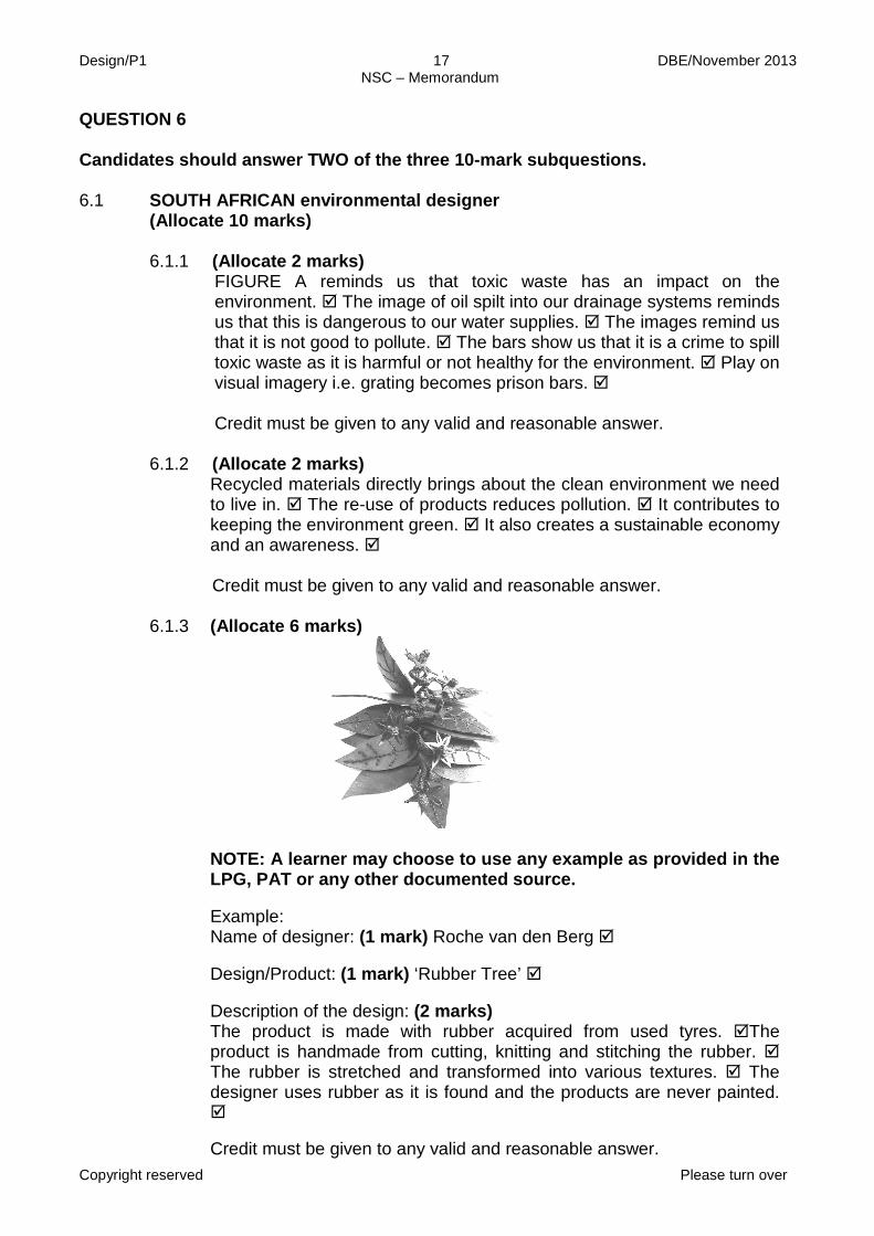
(Allocate 2 marks) FIGURE A reminds us that toxic waste has an impact on the environment. The image of oil spilt into our drainage systems reminds us that this is dangerous to our water supplies. The images remind us that it is not good to pollute. The bars show us that it is a crime to spill toxic waste as it is harmful or not healthy for the environment. Play on visual imagery i.e. grating becomes prison bars. Credit must be given to any valid and reasonable answer. (Allocate 2 marks) Recycled materials directly brings about the clean environment we need to live in. The re-use of products reduces pollution. It contributes to keeping the environment green. It also creates a sustainable economy and an awareness. Credit must be given to any valid and reasonable answer. (Allocate 6 marks)
NOTE: A learner may choose to use any example as provided in the LPG, PAT or any other documented source. Example: Name of designer: (1 mark) Roche van den Berg Design/Product: (1 mark) ‘Rubber Tree’ Description of the design: (2 marks) The product is made with rubber acquired from used tyres. The product is handmade from cutting, knitting and stitching the rubber. The rubber is stretched and transformed into various textures. The designer uses rubber as it is found and the products are never painted. Credit must be given to any valid and reasonable answer.
QUESTION 6 Candidates should answer TWO of the three 10-mark subquestions.
Design/P1 18 DBE/November 2013 NSC – Memorandum
Copyright reserved Please turn over
How does the product address green issues? (2 marks) Since rubber is not biodegradable, making the products help by reducing waste and promoting the eco-system. The transformation of waste into beautiful functional objects helps plants and trees to grow on cleaner soil or earth. The re-use of existing material is needed in order to limit the use of raw material for all related industries. Credit must be given to any valid and reasonable answer.
AND/OR
6.2 International environmental designer
(Allocate 10 marks)
6.2.1 6.2.2
(Allocate 3 marks) The house would rotate away from the sun in summer to keep it cool without using electric powered gadgets, e.g. an air conditioner. The house rotates towards the sun during winter to warm it up and minimise the use of heaters. The rotation of the house ensures maximal natural lighting inside the house. Credit must be given to any valid and reasonable answer. (Allocate 7 marks)
NOTE: A learner may choose to use any example as provided in the LPG, PAT or any other documented source. Name of the designer: (1 mark) Michael Young Title of the design: (1 mark) Bird Nest
Q6.1 LEVEL
COGNITIVE SKILLS
WEIGHTING
QUESTION
MARKS (10)
Lower order
Recall/Knowledge; Comprehension 30% 6.1.3 3
Middle order Application 40% 6.1.1 + 6.1.3 4 Higher order
Analysis; Synthesis; Evaluation
30% 6.1.1 + 6.1.2 3
Design/P1 19 DBE/November 2013 NSC – Memorandum
Copyright reserved Please turn over
Description of the design: (3 marks) ‘Bird Nest’ refers to different designs by Michael Young done to create dwellings for birds, bats and bees. The nests are built with waste material (rubbish) which includes newspaper, plastic, latex, wood and wire. The material is interwoven and glued to strengthen it and thus giving it a rich texture. How the design contributes towards the environment: (2 marks) By using waste material (rubbish), the project helps in cleaning environment. The recycling of material helps in reducing pollution. Credit must be given to any valid and reasonable answer.
Q6.2
LEVEL COGNITIVE
SKILLS WEIGHTING
QUESTION
MARKS
(10) Lower order
Recall/Knowledge; Comprehension 30% 6.2.2 3
Middle order Application 40% 6.2.1 + 6.2.2 4 Higher order
Analysis; Synthesis; Evaluation
30% 6.2.1 3
AND/OR
6.3 [Allocate 10 marks] 6.3.1
6.3.2
(Allocate 2 marks) This is a way of reducing non recyclable waste and using it in a different useful manner. It reduces using newly manufactured material that would either deplete the earth’s resources or make use of production processes that are harmful to the earth. The use of the recycled material minimises landfill issues. If the waste products are not recycled, they may contribute to littering that impact on the environment. (Allocate 8 marks) NOTE: A learner may choose to use any example as provided in the LPG, PAT or any other documented source. Marks should only be awarded for a designer and design that has not been previously discussed.
Design/P1 20 DBE/November 2013 NSC – Memorandum
Copyright reserved Please turn over
INTERNATIONAL ENVIRONMENTAL DESIGNER
Name of the designer: (1 mark) Francois Legault
Aims of the designer: (2 marks) The designer aims to create eco friendly products. The designer aims to make use of the already existing products available in our surroundings to create something new and attractive. Francois is sensitive to environmental concerns and uses mostly kitchen equipment for his designs. General characteristics of the designer’s work: (2 marks) The products are made from cutlery, glasses, small plates, nails, screws and mostly spoons. The lights mostly use kitchen utensils arranged differently to give each a special unique design. Occasionally, a heavy glass bottom is used to stabilize the lamp so that the top can be tilted at any angle without affecting the stand’s position. The colour on the product is optional. Title and how the work addresses environmental issues: Title of the work: (1 mark) ‘Triple Espresso’ How the work addresses environmental issues: (2 marks) The lamp is made from unused or found kitchen objects, (cup and saucer) which are not biodegradable. The way of reducing non-recyclable waste by using it in a different and useful manner, helps environment by minimising pollution. Credit must be given to any valid and reasonable answer.
OR
Design/P1 21 DBE/November 2013 NSC – Memorandum
Copyright reserved Please turn over
(Allocate 8 marks) SOUTH AFRICAN ENVIRONMENTAL DESIGNER
NOTE: A learner may choose to use any example as provided in the LPG, PAT or any other documented source. Name of the designer: (1 mark) Ronél Jordaan Aims of the designer: (2 marks) Ronél chooses her material carefully because of wanting to reuse the bi-products. The products are in harmony with nature as processes implemented in the workshop are all eco friendly. General characteristics of the designer’s work: (2 marks) Ronél is predominantly inspired by nature. She creates ‘rock’ cushions, pebble ‘riverbed’ carpets, ‘falling leaves’ wall hangings, and floral-patterned throws. The nature inspired goods have the textures and shapes of leaves and flowers, webs, thorns, hides and bark. Her designs are expressively and playfully mixing contemporary interiors with the beauty, simplicity and quietness of nature. The products are hand-made natural fibres, mostly 100% merino wool. Title and how the work addresses environmental issues: Title of the work: (1 mark) ‘Disa Weave’ How the work addresses environmental issues: (2 marks) The processes implemented in the workshop are all eco friendly. Waste grey water left in the process is recycled into organic food gardens. As soap is important to the felting process, she uses a product which is fully bio-degradable and that is essential for the environment. The dyes are imported because they are lead free and meet with Eco-Standards. She does not carbonise the wool she uses because traditionally a bath of hydrochloric acid and other chemicals are used in this process. Credit must be given to any valid and reasonable answer.
Q6.3 LEVEL
COGNITIVE SKILLS
WEIGHTING QUESTIONS MARKS (10)
Lower order Observation/Recall; Comprehension 30% 6.3.2 3
Middle order Application 40% 6.3.1 + 6.3.2 4 Higher order
Analysis; Synthesis; Evaluation
30%
6.3.2 3
TOTAL SECTION B: 40
Design/P1 22 DBE/November 2013 NSC – Memorandum
Copyright reserved Please turn over
SECTION C: DESIGN IN A BUSINESS CONTEXT QUESTION 7 [30 marks] AS9: Demonstrate a basic understanding of marketing design products in terms of target market, packaging and advertising.
AS10: Demonstrate an understanding of responsible design by taking into consideration human rights and environmental issues throughout the process.
7.1 [Allocate 30 marks in total] 7.1.1
7.1.2
FIGURE A: (Allocate 8 marks) STRENGTHS: • The design is multi-functional and can be used as a bed, a chair and
a tent. • It is simple and all construction possibilities are easy to set up. • It is a flat-pack design that would not require much storage space.
WEAKNESSES: • It appears to be made of cloth which would mean that it will wear out
quite quickly. • Its plain colour will show stains easily and will not be that easy to
clean. • It might not be weather- or water-resistant. • It will need additional materials to make it sustainable. OPPORTUNITIES: • It could be marketed at crèches, day-care centres and at schools for
field trips. • It could be offered to the government as a solution for the homeless.
• Temporary housing for disaster victims. THREATS: • Other businesses who offer a similar product. • It may not be affordable to those who really can benefit from it or to
a wide enough market to make it profitable. • Storage and maintenance could be a deterrent. • Expensive material when compared to common cardboard. Credit must be given to any valid and reasonable answer. FUNDING POSSIBILITIES (Allocate 2 marks) • The project could be offered to the government as a product to help
support the homeless. • A large company/NGO in the private sector could be asked to fund
this project as part of their outreach programme to support the needy.
• A bank loan. • Outdoor companies, such as Outdoor Living or Cape Union Mart,
could be approached to invest in this product.
Design/P1 23 DBE/November 2013 NSC – Memorandum
Copyright reserved Please turn over
7.1.3 7.1.4 7.1.5
POSSIBLE FIXED AND VARIABLE COSTS (Allocate 2 marks) • Fixed costs: Rental of the factory space. Salaries. • Variable costs: Materials. Transportation. Telephone, electricity
and internet. Marketing.
(Allocate 4 marks) HUMAN RESOURCE MANAGEMENT: • Staff needs to be employed according to labour laws, ensuring fair
salaries, working hours, holidays and pension options. • The workspace needs to be organised according to health and
safety specifications, e.g. well-ventilated with extractor fans if procedures cause the release of toxic fumes.
• Incentives could be offered to encourage productivity. • Skills training and general staff development programmes could be
offered for employer empowerment.
Credit must be given to any valid and reasonable answer. FIGURE B: (Allocate 3 marks) Possible target markets and reasons for each: • Emerging small businesses because these businesses do not
need too much capital to set it up and would probably not need to pay rent.
• A building company can use it as their temporary canteen because they move around a lot this would work well for them as it can set up quickly and is on wheels.
• It could also be used for big functions on unusual sites that do not have permanent structures, e.g. outdoor musical festivals.
• Outdoor companies, such as Outdoor Living or Cape Union Mart. • Special functions like concerts.
Credit any other valid statements. (Allocate 4 marks) • It reuses a container • It is mobile • Its rent will be little or free • It can be closed securely eliminating vandalism and burglary • It does not take much time to ‘close shop’ • Overhead costs will be little • Minimum staff is required Credit any other valid answers.
Design/P1 24 DBE/November 2013 NSC – Memorandum
Copyright reserved Please turn over
7.1.6 7.1.7
(Allocate 5 marks) • Advertisements in newspapers and magazines • Flyers • Brochures • Television • Radio • Promotions • Posters Credit any other valid answers. (Allocate 2 marks) • Industrial designer • Surface designer • Interior designer • Sign writer Credit any other valid answers.
Q7.1
LEVEL COGNITIVE
SKILLS WEIGHTING
QUESTIONS
MARKS
(30) Lower order Recall/Knowledge 30% 7.1.4 + 7.1.6 + 7.1.7 9 Middle order Application 40% 7.1.4 + 7.1.5 + 7.1.6 12 Higher order Analysis;
Synthesis; Evaluation
30% 7.1.1 + 7.1.2 + 7.1.3 9
OR
[Allocate 30 marks in total] 7.2.1
(Allocate 16 marks) • Possible business name for each: Any appropriate business names must be credited. The name for the baskets in FIGURE A must convey the organic, hand-made quality of the products, as well as their irregular, free forms , e.g. ‘Warped Weaves’. The name for FIGURE B must convey in some way that these baskets display traditional African basketry techniques, forms and patterns, e.g. ‘Geometric gems’. • Possible slogan or tagline: Any appropriate slogan or tagline for each must be credited. They could link in some way with the business name. A possible slogan for FIGURE A could be: ’Let nature into your home!’ A possible slogan for FIGURE B should be: ‘Dazzle your home with African geometry!’
Design/P1 25 DBE/November 2013 NSC – Memorandum
Copyright reserved Please turn over
7.2.2
• Possible target market for each with reason: FIGURE A: These baskets would probably appeal to alternative, creative, environmentally aware people because their forms are quirky and reflect nature in both their forms and their use of natural materials. FIGURE B: These baskets would appeal to tourists because they reflect the original forms and patterns of traditional African basketry.
• An appropriate font for a business card and reasons for this choice:
FIGURE A: The font to advertise these products could make use of curvilinear, informal lines and shapes to reflect the organic quality of the forms. FIGURE B: The font for these baskets could be quite geometric and block-like incorporating triangular or diamond shapes to reflect the geometry of the pots. Allocate marks if learners have illustrated appropriate font styles.
• TWO other ways of marketing each product: FIGURE A: Website, displaying in a gallery, museum or upmarket gift/curio shop, catalogues or brochures. FIGURE B: Street markets, flea market, road side displays and craft markets. Credit must be given to any valid and reasonable answers. (Allocate 8 marks in total) The following reasons can be supplied: • Shape: The business card has a bite-like shape in the one corner which is unusual but links well with the fact that chocolate is delicious and appetising and hard to refuse. • Colour: Dark brown dominates the front of the card and golden brown the back, aptly reflecting the colours of chocolate. The baby blue insertions in the font are fresh and light and contrast well with the brown. • Typography: The use of a sans serif lowercase font for the word ‘taste’ expresses an informal, light and direct feeling. The large size of the letters also makes them eye-catching. The cursive font used for the word ‘chocolate’ adds to the light, free, informal feel of the design. • Lay-out: The lay-out of the front is simple and striking because the name of the business is large and stands on its own against a plain background.
Credit must be given to any valid and reasonable answers.
Design/P1 26 DBE/November 2013 NSC – Memorandum
Copyright reserved
7.2.3
(Allocate 6 marks in total) In this question it will depend on what the candidate chooses. One EXAMPLE would be: • FIGURE E because the flea market would be ideal to promote textiles
and textile products as it can be sold for cheaper and will have a lot of exposure to pedestrians who can easily access the venue.
• FIGURE D would not be suitable as the venue is not safe and there is no space to exhibit the product. FIGURE F would be too expensive for venue/shop hire as textiles cannot be overpriced to cover these costs. Furthermore one would only be able to attract very affluent or up-market people.
Credit must be given to any valid and reasonable answer.
Q7.2
LEVEL COGNITIVE
SKILLS WEIGHTING
QUESTIONS
MARKS
(30) Lower order Recall 30% 7.2.1 + 7.2.2 9 Middle order Application 40% 7.2.2 + 7.2.3 12 Higher order Analysis;