18
Designers e ultimate guide for profesional designers, design templates, and art proyects. Magazine
| Date post: | 06-Mar-2016 |
| Category: |
Documents |
| Upload: | alejandro-madera |
| View: | 218 times |
| Download: | 1 times |

1 Designers Mag.
DesignersThe ultimate guide for profesional designers, design templates, and art proyects.
Magazine

Designers magazine 1

3 Designers Mag.
DesignProfilesPeopleArt
DesignTutorials
...editor:Superman
president:Batman
photos:Ironman
Designers magazine 1 2 Designers magazine

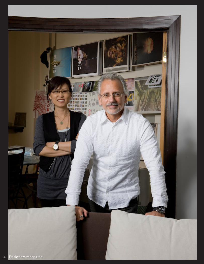
Carlos SeguraSegura Inc.
Carlos segura, founder of the Chi-Cago-based design firm segura inC.,
Came to the united states from Cuba at the age of nine. he began
his Career in graphiC design as a pro-duCtion artist but soon gained more
interesting Challenges. he moved to ChiCago in 1980 and worked for many prestigious ad agenCies, inClud-ing bbdo, marsteller, foote Cone & belding, young & rubiCam, ket-Chum, and ddb needham. in 1991 he founded segura inC. to pursue
design more Creatively with the goal of blending as muCh “fine art” into
“CommerCial art” as he Could.
segura inC was the beginning of a series of CommerCial ventures that expanded Carlos segura’s Creative efforts. in 1994, the t26 digital type foundry was born to explore
the typographiCal side of the busi-ness. t26 fonts are now distrib-
uted throughout the world.segura inC. and t26 have reCeived
numerous awards from organizations around the world, inCluding the tokyo type direCtors Club, the
soCiety of typographiC arts, both the new york art direCtors Club and the new york type direCtors
Club, and the ameriCan Center for design. segura’s work has been
shown in many journals inCluding graphis, print magazine, how, and publiCations by pie books,
north light books, dunCan baird publishing, f&w publiCations,
roCkport publishers, die gestalten verlag publishing and others. his
work has been shown in exhibits from the denver art museum to
tokyo japan.
“In 2004, Segura was named 1 of the 21st Century’s 100 best designers”
Designers magazine 3
5 Designers Mag. Designers magazine 3 4 Designers magazine

Designers magazine 2

7 Designers Mag.
I’m a graphIc desIgner and occa-sIonal author who specIalIses In desIgnIng brand IdentItIes. peo-ple hIre me because I help make
theIr busInesses more profItable.companIes I’ve worked wIth
Include Yellow pages (canada), gIacom (england), asIan devel-
opment bank (phIlIppInes), and berthIer assocIates (Japan).
self-emploYed sInce 2005, mY busIness Is successful because It’s
less about me, and more about mY clIents; about the dIrectIon
theIr companIes are headIng and about the success theY wIll
achIeve. the Ideas I create don’t Just ensure mY clIents stand-out, theY also provIde tImeless vIsual
expressIons that enable clIents to engage and connect wIth
theIr own customers more effec-tIvelY than ever before.
the people I work wIth are of-ten kInd enough to offer testI
monIals.I’ve gaIned experIence In both the unIted kIngdom and the
unIted states and You’ll now fInd me In mY home studIo In
northern Ireland where I work wIth great people all over the
world.
a selectIon of prevIous IdentItY proJects are In mY desIgn portfo-lIo.
“We have been very much impressed by David’s ability to literally read our minds
and deliver a corporate identity which perfectly
symbolizes our vision and conveys the stylish, elegant and modern image we need-
ed to sustain the interna-tional development of our
company.”
— DAVID SADIGH,
FOUNDER & CEO, DLG
on another note, mY twItter account Is followed bY thought leaders In desIgn that Include chermaYeff & geIsmar, pen-tagram, debbIe mIllman, John maeda, sIegel+gale, mark boulton, John boardleY, mov-Ing brands, landor assocIates, the partners, antonIo caru-sone, tIna roth eIsenberg, vIt-alY frIedman, Interbrand, sImon manchIpp, cameron moll, and khoI vInh.
If You’re In need of a new brand IdentItY It’d be great to talk. - davId areY
Designers magazine 2 6 Designers magazine

“Anyone involved in creating visual identities, or wanting to learn how to go about it, will find this book invaluable.”
— AIGA MEDALIST TOM GEISMAR
My graphic design blogs Logo Design Love, davidairey.com and brand identity showcase Identity Designed are visited by more than 600,000 de-signers each month.
-DAVID AIREY
“I recommend David unequivocally and would hire him again in a heartbeat.”
— DR TAMMY LENSKI
Designers magazine 7

9 Designers Mag. Designers magazine 7 8 Designers magazine

Review: Bamboo Create
“INSPIRE, CREATE, IMAGINE.”
Keegan Phillips: ‘I was very satisfied with the accompany-ing programs considering the considerably low price of the complete package.’
Designers magazine 9

11 Designers Mag.
Create your world. Here’s a Bamboo that is just right for those with artistic interests! With its larger digital canvas, Bamboo Create is great for all types of digital art proj-ects, including sketching, illus-trating and digital painting.
Inspire. Create. Imagine. Bamboo Create opens up a new world for digital art and photo projects. With twice the workspace of other Bamboo tablets, Bamboo Create gives you plenty of space to express yourself, enabling broad brush-strokes or arm movements.Let your imagination soar as you freely and naturally draw, paint, doodle and sketch in your favorite software. Use software applications like Adobe® Pho-toshop® Elements, Corel® Painter™ Essentials and Autodesk® SketchBook® Express, all included in the box, to explore a variety of digital media, including pencils, pens, markers, chalks, watercolors, oil paints and more.
Your pen gives you the feel of working in natural media.Bamboo Create is perfect for art projects that require a larger digital canvas. Turn digital images into special mementos. Use the pen to add hand-drawn embellishments or journaling to your projects and photos. Create unique, per-sonal invitations, greeting cards and photo books to print and share digitally with friends and family.
Designers magazine 9 10 Designers magazine

The first step is to source images from your local sur-roundings. Hunt out textures and interesting visuals –
in this particular design I’ve included natural elements. These will form the key focal point in the final collage. Look out for unusual and abstract shapes that you think
will work well in your design.
Take your images and cut them out in Photoshop us-ing the Pen tool, with feather settings at 0. My cut-
outs can be found in the support files if you prefer to use them.
Add a coloured circle (mine is yellow): this will act as a guide for the core shape of your artwork. You
can now begin adding in elements to your collage by selecting the clouds and dancers from your disc and placing them on your art board. Use the Transform
tool to play about with the size of your images.
Start selecting interesting shapes and contours to use in your collage. Look for contrasting textures – I’ve used sharp edges as well as the soft curve highlight-
ed in sections 2 and 4 of my bin bag image.
Tutorials: How to Create an Abstract Collage
Designers magazine 11

13 Designers Mag.
Cut out your chosen sections and position them on your art board. I’ve also added sections of purple cloth,
which can be found on your disc, to build up my de-sign. At this stage, experiment with the shapes in your collage and try out different arrangements to create the
effect you want within your image.
Now sharpen the colour contrasts of the dancer figures. Firstly adjust the saturation to -83 and then
change the levels to 25 black, 0.48 grey and 223 white. The white output levels need to be set at 213.
Select the tree stump from the support files and place it onto your art board. Use the Warp Transform
function on this image and adjust its levels to help the object blend into the collage effectively. You can
duplicate as many of these as you want.
Place the purple vectors from the support files onto your design, and use the Transform tool to decide how big you want them to be. Keep in mind that
you want the focus to be on the natural elements, so don’t overuse these vector shapes.
Designers magazine 11 12 Designers magazine

Next, begin to cut the tree stump out. Adjust the levels of this to 40 black, 0.50 grey and 225 white. The white output level needs to be at 124. Once this is done, place
the stump onto the back layer of your image.
When you’ve added in these various elements, you can begin to bring the piece to life. You want to cre-ate the impression of movement and organic life by
wrapping the warped tree stumps around the arms and faces of the dancers. To do this, select any stump with the Free Transform tool, and adjust and rotate to the
desired size.
Continue to build up your design with different items – I’ve included doves, a large warped log, gold fabric and spots on your disc. At this stage, you also want to consider your background. I changed the background colour to a light grey and darkened it in areas by ap-plying a deeper shade of grey with a soft brush tool.
Now to add a sense of dimension to the piece by adding a shadow effect. Begin by mapping out the areas where you think a shadow would naturally fall. I tend to look out for curves and sharp edges
as indications of where the shadows should go. You can insert red circles to act as a guide to where you will be placing your shadows. I set the opacity to
78% so that I could still see through to the artwork
Tutorials: How to Create an Abstract (Continued)
Designers magazine 13

15 Designers Mag.
Once you’ve mapped out where they should go, you can begin to cast your shadows. To create the shadows, select the soft brush tool and set the master diameter to 90px, the hardness to 0%, the blend mode to Multiply
and the opacity to 69%.
Add the finishing touches to your artwork by bring-ing in more natural imagery – I’ve chosen some
leaves. Use the Duplicate command to place these throughout the design. Feel free to adjust the sizes
and colours to help blend these into your image. I’ve also put in some white highlights behind the doves to create a soft glow and really accentuate the sense
of movement.
Finally, add a vector from Illustrator. I’ve created my own typeface – the lettering reads ‘BE’ to fit the title of the artwork ‘Be Free’. Copy and paste your vector into your image in Photoshop, and position it or layer
it as you wish.
- And this, guys, was the tutorial for this issue. Not easy for beggin-ners, but gives you an idea of how to create any abstract artwork with the use of a picture previously taken. Lots of practice will get your abilities into perfection...what every designer wants. Practice makes perfect, so START NOW!
Designers magazine 13 14 Designers magazine

2
Tutorials: How to create a futuristic composition (ADVANCED)
You can now add a light source to make it look like the lines are shining from the core of the image. I’ve chosen white and then painted onto a new layer before adding a lot of Gaussian blur to it. Next, transform
the layer with the Perspective tool to keep it in line with the perspective we already have
in the photograph.
Now it’s time to change the colours. The easiest way to do this is to create several colour layers (multiple shades of blue and purple, in this case) and play around with them to get the look you
want. Experiment with the Exclusion and light source tools on dark- and lightco-
To create the futuristic effect seen here, start off with a simple photograph – in this case, an office ceiling, which we’ll add speed and action to through the advanced use of some Photo-
shop techniques. First duplicate your photo and expand the canvas vertically, then transform and mirror it to create a kaleidoscope effect.
Now add more depth to the image by enhanc-ing the feeling of perspective. Create a single
line with the Pen tool on a new layer and then add some motion blur to it by selecting Filter>Blur>Motion Blur. Do this vertically only and the edges will become much more fluent.
Designers magazine 15

17 Designers Mag.
2
Now add some motion to the image. Draw a cir-cular object, go to Filter>Distort>Twirl, and then add blur by going to Filter>Blur>Radial. Repeat and duplicate layers until you get the feeling you
want.
Now to add an element of 3D perspective to the focal point. Select the Marquee tool and, vertically through the centre of the image, mark an area 1 pixel wide and the height of your canvas. Go to
Edit>Define Pattern, then create a new layer and select it with the Rectangular Marquee tool.
With this layer selected, go to Filter> Polar Coordinates to create a circular pattern. This filter can be used in other ways too, and your whole image doesn’t need to be filled. Play around and see what kind of effects you
can create
You can turn it into a symmetrical circle by selecting the Mar-quee tool, Ctrl/right-clicking and choosing Scale, depending on the dimensions of the image you’re working with. You can also use the Marquee tool with Ctrl/Cmd pressed down and
View>Snap on, to mark a circle out of the centre of the image.
To integrate this element more fully into the pic-ture, I’ve added thin, white-lined circles around the focal point. If you have Snap on and drag guidelines onto the work area, you can snap them as a cross in the centre of your image.
Finally, add some particle details by making dots with the Pen tool. Now add blur to the layer, duplicate it, move it,
and scale it to a smaller size. This process can be repeated as many time as you like for more particles, but when
you’ve finished, merge all the particle layers.
Designers magazine 15 16 Designers magazine


