Page 1
Designing better graphs
1
Designing Better Graphs by Including Distributional Information
and Integrating Words, Numbers, and Images
David M. Lane and Anikó Sándor
Rice University
Keywords: graphics, statistics, display of data
Running Head: Designing better graphs
Lane, D. M. & Sandor, A. (2009) Designing better graphs by including distributional information and integrating words, numbers, and images, Psychological Methods, 14, 239-257.
Page 2
Designing better graphs
2
Abstract
Statistical graphs are commonly used in scientific publications.
Unfortunately, graphs in psychology journals rarely portray distributional
information beyond central tendency and few graphs portray inferential
statistics. Moreover, those that do portray inferential information generally
do not portray it in a way that is useful for interpreting the data. We present
several recommendations for improving graphs including: (1) bar charts of
means with or without standard errors should be supplanted by graphs
containing distributional information, (2) use good design to allow more
information to be included in a graph without obscuring trends in the data,
and (3) figures should include both (a) graphic images and (b) inferential
statistics presented in words and numbers.
Page 3
Designing better graphs
3
Designing Better Graphs by Including Distributional Information
and Integrating Words, Numbers, and Images
Statistical graphs are useful both for the discovery of knowledge
(Larkin & Simon, 1987; Tukey, 1974, 1977) and communication of
knowledge (Few, 2004; Kosslyn, 1985; Tversky, 1995; Wilkinson and the
Task Force on Statistical Inference, APA Board of Scientific Affairs, 1999).
Although graphs have been used since prehistoric times, statistical graphs
are a relatively new phenomenon. Before the late 18th century, tabular data
representations were popular and graphs were regarded as useless for
analysis. This view changed when Playfair invented what are still the most
commonly used graphs: the bar graph and line graph in 1786 and the pie
chart in 1801 (Wainer, 2005). Herschel’s invention of the scatterplot in 1832
further demonstrated the value of graphs (Friendly & Denis, 2005).
Numerous studies have assessed the relative value of graphical versus
tabular presentation of data. Based on an extensive review of research
available at the time, Jarvenpaa and Dickson (1988) concluded that graphs
are better at summarizing data, showing trends, and showing points and
patterns whereas tables are better for point/value reading. More recent
studies and literature reviews are consistent with these conclusions (Gelman
& Stern, 2006; Gillan, Wickens, Hollands, & Carswell, 1988; Meyer, Shamo,
& Gopher, 1999). A further benefit of graphs cited in the APA publication
manual is that graphs can make it easy to perceive the “overall pattern of
results” (APA, 2001).
Page 4
Designing better graphs
4
Not surprisingly, graphs are used frequently in the reporting of results
in psychology as well as in other fields, although the degree of use varies
greatly across fields (Cleveland, 1984; Smith, Best, Stubbs, Archibald, &
Robertson-Nay, 2002). For example, Cleveland (1984) found that the
proportion of journal space devoted to graphs was higher in the natural
sciences than in the social sciences. Best, Smith, and Stubbs (2001) found a
positive relationship between perceived scientific hardness of psychology
journals and the proportion of area devoted to graphs. Interestingly, Smith
et al. (2002) found an inverse relationship between area devoted to tables
and perceived scientific hardness.
Despite advances in graphics and the availability of graphics software,
graphs are often poorly constructed in practice. In a study of the graphs in
the journal Science, Cleveland (1984) evaluated the frequencies of four types
of errors: construction errors, degraded image errors, errors in the
explanation, and discrimination errors (elements of a graph were difficult to
distinguish). He found that 30% of the graphs contained at least one error.
This proportion is surprisingly high considering that only major errors were
included and smaller flaws ignored.
Tufte (2001) sampled graphics from scientific and news publications
between 1979 and 1980 and evaluated their data density. He found that the
average published graphic had a low data density, although nearly every
publication contained a few data-rich graphs.
We consider how to portray three types of information in graphs:
shapes of distributions (Wilkinson et al., 1999), trends (Gelman, Pasarica, &
Page 5
Designing better graphs
5
Dodhia, 2002), and inferential statistics (Cumming & Finch, 2005; Masson &
Loftus, 2003; Wilkinson et al., 1999). We focus on how to include and
juxtapose these types of information so as to support correct interpretations
of the data. We do not discuss perceptual considerations for creating graphs
such as label placement, scaling of axes, aspect ratio, and contrast in detail
since these topics have been covered very well in previous works (Cleveland,
1994; Gillan et al, 1998; Kosslyn, 1985, 1993). However, we do refer to
these and related works in our section on general principles for graph
construction.
Distributional Information
Graph use in psychology has been criticized for focusing on the
depiction of central tendency to the neglect of other distributional
information. For example, Wilkinson et al. (1999) argued strongly that a
common deficiency of graphs in psychology journals is their lack of
information regarding the shape or distribution of the data, and that this lack
of information hinders scientific evaluation.
Sándor and Lane (2007) conducted a survey of graph use in two
leading psychology journals and obtained results consistent with Wilkinson et
al.’s conclusions: The majority of the graphs were bar charts and only about
10% of the graphs showed distributional information beyond central
tendency. Although bar charts are useful for displaying counts or
percentages, we believe that there are few if any situations in which it would
not be better to replace bar charts of means with box plots since box plots
Page 6
Designing better graphs
6
take up no more space and provide summary information about distributions
(See the Appendix for more information about box plots).
Consider how to graph the results from a hypothetical experiment with
a Condition (A, B, and C) x Group (Control and Experimental) between-
subjects design and 12 cases per cell in which Condition is a categorical
variable. As would be typical in a design such as this, assume the
(hypothetical) experimenter was interested in the difference between the
experimental and control groups as well as whether this difference varies
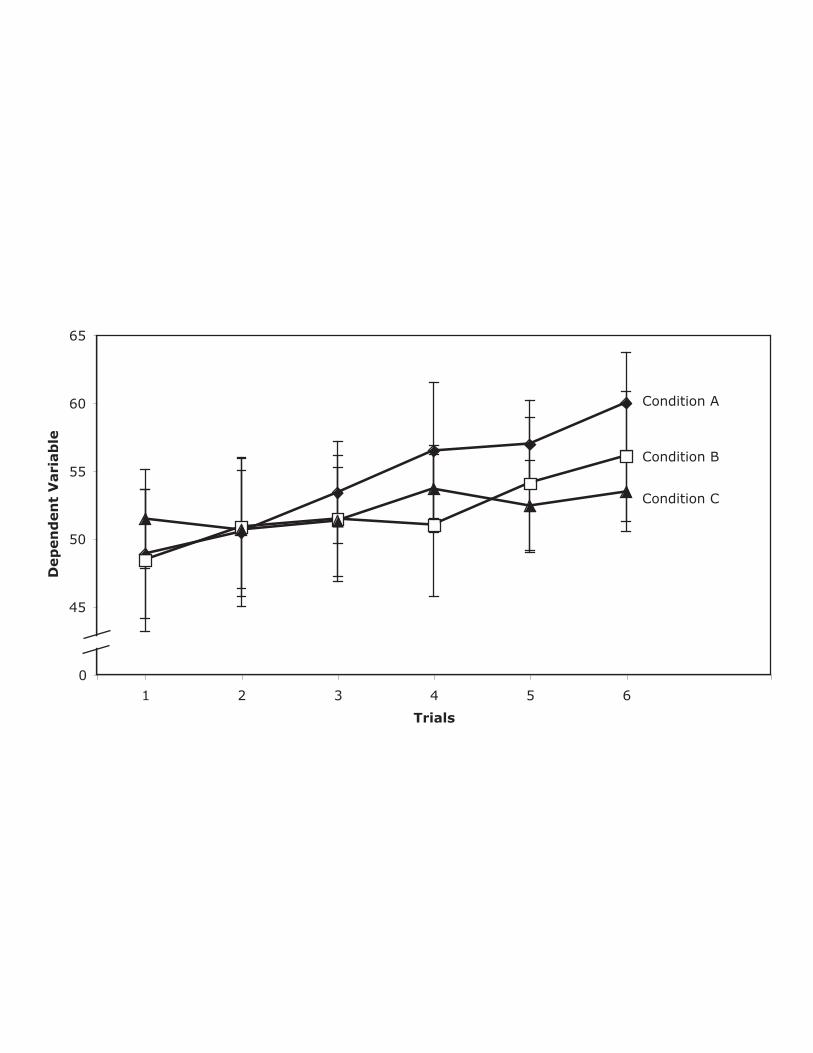
across conditions. Figure 1 shows a graph typical of those appearing in
psychology journals. Although it is clear that the difference between the
control and experimental means was large in Condition A, small in Condition
B, and medium-sized in Condition C, there is no information about the
variability or shape of the distributions. The “data density” of the figure is
very low since it portrays very few values.
--------------------------------------------------- Please insert Figures 1 and 2 about here
----------------------------------------------------
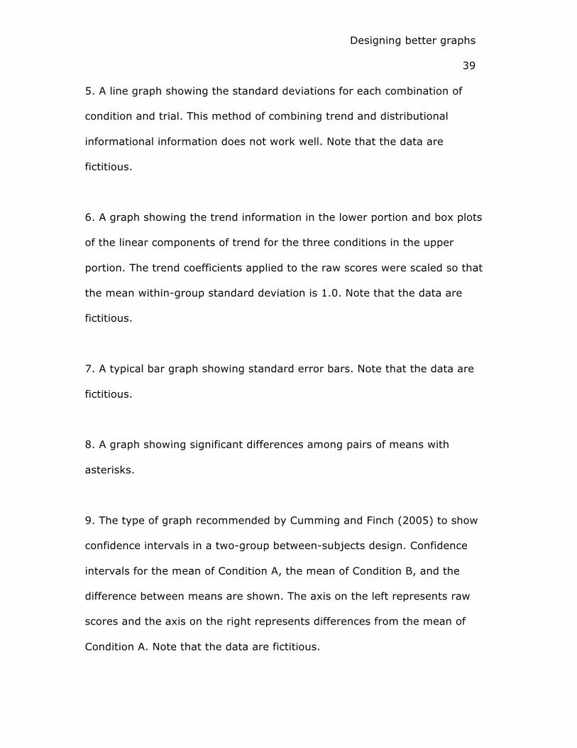
Figure 2 shows the same data portrayed by box plots. In recognition of
the fact that the mean is often of great importance, a variation of box plots
that displays the mean (indicated by a plus sign) was chosen. Figure 2 is
much richer in information than is Figure 1: In addition to the differences in
means shown in Figure 1, Figure 2 shows (1) that the range and interquartile
range in the experimental group are larger than in the control group in all
three conditions; (2) the distributions overlap greatly in Condition B,
Page 7
Designing better graphs
7
somewhat in Condition C, and very little in Condition A; and (3) that there
are no outliers.
If other aspects of the distribution were theoretically relevant, then
three sets of back-to-back stem-and-leaf displays would be a good
alternative. If the sample sizes were much larger, then back-to-back
histograms could be shown (See the Appendix for more information about
back-to-back stem-and-leaf displays and back-to-back histograms).
We stress that there is room for subjective opinions in the choice of
graph type and the details of graph construction. Our point is not that graphs
should be constructed precisely in the manner shown here. Rather, it is that
the kinds of information contained in Figure 2 and subsequent example
graphs should be routinely depicted in graphs appearing in psychology
journals and other scientific publications.
One possible objection to including more distributional information is
that this information may distract readers from what is typically the main
objective of the graph: portraying the pattern of means. The tradeoff
between including more information and obscuring important patterns is a
general one, and can often be dealt with effectively by emphasizing graphic
elements that show the important pattern. A good example is provided by
Tufte (2006, p. 116-121) in his discussion of a graph showing the
relationship between the body weight and brain weight of animals. In the
original version of the graph presented by Sagan (1977), the animal names
were printed next to the points in the scatterplot. Cleveland (1994) argued
that these labels cluttered the graph and should have been omitted.
Page 8
Designing better graphs
8
However, Tufte disagreed noting that with the proper design, clutter can be
reduced without a content reduction. Accordingly, Tufte presented two
excellent redesigns of the graph, each containing the information about the
identities of the individual points while clearly showing the pattern of the
relationship. In the first, the points in the scatterplot were dark whereas the
labels for the points were light grey. In the second, drawings of the animals
replaced the points themselves.
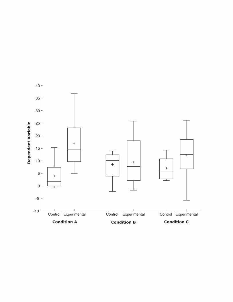
The idea that a design solution is preferable to a content reduction can
be applied to the statistical graphs discussed here. For example, if one
wished to emphasize differences among means in parallel box plots, one
could, as shown in Figure 3, make the representation of the means more
prominent and the other elements of the box plot less prominent.
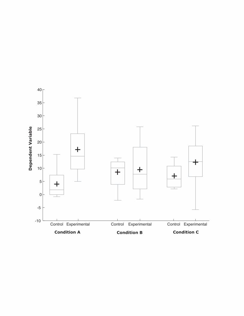
Alternatively, if one wished to emphasize differences in variability among
conditions, one could make the range and the interquartile range of each
distribution more prominent as in Figure 4.
--------------------------------------------------- Please insert Figures 3 and 4 about here
----------------------------------------------------
There is an understandable desire on the part of researchers to show
their data in a positive light. As a result, some may resist showing
distributional data that reveal the variability and possible irregularities not
apparent in a plot of means. However, this is clearly not a justifiable basis on
which to omit distributional information (Wilkinson et al., 1999).
Page 9
Designing better graphs
9
Trends and Distributional Information
------------------------------------------- Please insert Figure 5 about here
-------------------------------------------
Portraying distributional information and trends in the same figure can
be difficult. For example, consider a hypothetical experiment in which the
researcher is interested in differences in the rate of learning as a function of
condition. Figure 5 displays the means in order to show the trends and the
standard deviations to show the most basic kind of distributional information,
variability. There are several problems with this graph. First, the lines
showing the standard deviations are distracting and make it more difficult to
view the trends. Moreover, it is difficult to tell which bar goes with which
condition. Second, the standard deviations are misleading since they are
based on between-subjects error whereas the tests of the trends and
Condition x Trend interactions are based on the within-subjects error term
(See Loftus & Masson, 1994 for a discussion of this issue). Third, and
probably most important, the distribution of scores at specific combinations
of condition and trial are not likely to be the distributions most relevant to
the research question. For example, if the researcher were interested in
whether performance increased across trials and whether there were
differences among conditions in the rate of increase, the distributions of the
linear components of trend (computed by applying linear trend coefficients to
the raw scores for each subject) for the various conditions would be more
relevant.
Page 10
Designing better graphs
10
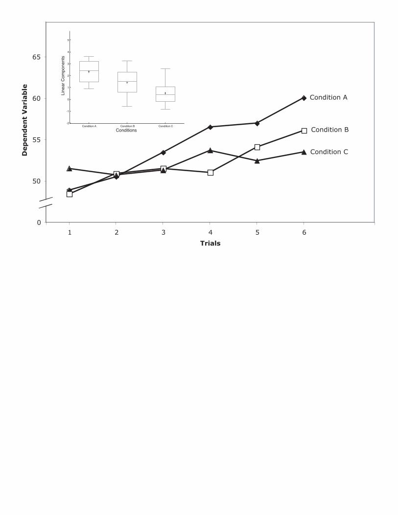
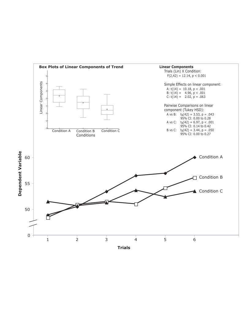
Figure 6 shows the trend information in the lower portion and box
plots of the linear components of trend in the upper portion1. Although one
could show the distribution of the linear components of trend in a separate
figure, we believe a single figure showing both graphs communicates the
results more effectively.
------------------------------------------- Please insert Figure 6 about here
-------------------------------------------
The box plots in Figure 6 provide important distributional information
that is not available in either Figure 4 or 5. First, one can see that there are
no outliers and that none of the distributions have substantial skew. Second,
one can see that the within-group variances do not differ greatly. Finally, one
can get a good sense of the size of the effect. For example, it can be seen
that the 25th percentile of Condition A is approximately the same as the
median of Condition B, which is slightly above the 75th percentile of Condition
C. Also evident is the fact that the difference between the means of
Conditions A and B as well as the difference between the means of
Conditions B and C are approximately one standard deviation (d ≈ 1).
We believe that it would be valuable to supplement most graphs
showing trend with a graph showing the distributions of one or more
components of the trend. The construction of the graph would, of course,
depend on the details of the data being portrayed.
Page 11
Designing better graphs
11
Inferential Statistics
The descriptive statistics shown in graphs, no matter how well
presented, do not stand on their own. Wainer (1996) argued convincingly
that an effective display of data must (1) reveal the uncertainty in the data,
(2) characterize the uncertainty as it relates to inferences to be made from
the data, and (3) help prevent the drawing of incorrect conclusions due to
lack of appreciation of the precision of the information conveyed. Consistent
with Wainer, many authors have recommended that graphs contain
information relevant for inferential statistics (Belia, Fidler, Williams, &
Cumming, 2005; Cumming & Finch, 2005; Loftus, 1993; Wilkinson et al.,
1999). Cumming et al. (2007) found that the percentage of graphs
containing inferential statistics is increasing: The mean percentage of
psychology articles with figures containing inferential information increased
from 11% in 1998 to 25% in 2003-2004, and to 38% in 2005-2006. Even
with this increase, it is clear that many graphs do not include inferential
information. Similarly, Sándor and Lane (2007) found that inferential
statistics are more often omitted than included in graphs.
A frequently-used method to portray inferential information is to
display means with standard error bars. Figure 7, which is based on the
same fictitious data as Figures 1 and 2, is typical of these graphs. The
problem with Figure 7 is that the only inferences directly supported by the
graph involve individual cell means. For example, the graph shows that the
mean for the control group in Condition C is approximately seven with the
Page 12
Designing better graphs
12
error bar stretching somewhat more than one in each direction. Since a 95%
confidence interval is approximately the mean plus and minus two standard
errors, the graph provides meaningful information about the precision of the
estimate of the population mean.
------------------------------------------- Please insert Figure 7 about here
-------------------------------------------
The problem is that estimates of individual means are rarely the critical
issue. More relevant here is, for example, the difference between the
experimental and control groups in Condition C.
Figure 7 shows that the difference between group means in Condition
C is approximately five. The standard error of the difference between means
can be computed using the following formula:
�
sMean Difference
=2MSE
nwhere MSE is the Mean Square Error or average variance
within the groups and n is the sample size. Although considerable mental
gymnastics would be required to obtain a rough approximation of this
standard error of the difference between means, it could be done by using
the average standard error as an estimate of
�
MSE
n and 1.4 as an
approximation of the square root of 2. Since the standard error for the
control group is a little above 1.0 and the standard error of the experimental
group is about 2.5, the average standard error is about 1.8. Multiplying by
1.4, one obtains a value approximately equal to 2.5. Therefore, the 95%
Page 13
Designing better graphs
13
confidence interval on the difference between means ranges from about 0 to
about 10 (i.e. 5 ± 2 x 2.5).
Since the main purpose of published graphs is to communicate, it is
important to consider how well the target audience understands the graphs.
Belia, Fidler, Williams, and Cumming (2005) investigated how well authors in
psychology, behavioral neuroscience, and medical journals understand the
relationship between standard error bars, confidence intervals, and
significance tests. Participants were shown a graph of two means and either
standard error bars or confidence intervals depending on the experiment.
Their task was to adjust the difference between means so that the difference
would be just statistically significant at the .05 level. The results were
dramatic: Fewer than a quarter of the subjects set the means so that the p
value was between half the target value (.025) and twice the target value
(.10).
It is clear that the calculations to make a theoretically-meaningful
inference from a graph containing means with standard error bars are not
easy to do in one’s head and not well understood by most authors (not to
mention readers) of journals. Therefore, including standard error bars is
often not sufficient for communicating inferential information.
Figure 8 shows an alternative method of displaying inferential
information. Although easy to interpret, we believe that graphs specifying the
means that are significantly different from each other have several
drawbacks. First, by marking differences as either significant or not, this type
of graph encourages the “all or none” rejection of a null hypothesis, a
Page 14
Designing better graphs
14
practice that has been widely and severely criticized (Gelman & Stern, 2006;
Loftus, 1993; Tukey, 1991; Wilkinson et al., 1999).
Second, this type of graph emphasizes hypothesis testing and neglects
confidence intervals. Finally, this type of graph may distract visually from the
pattern of means if several means are being compared.
------------------------------------------- Please insert Figure 8 about here
-------------------------------------------
Cumming and Finch (2005) proposed ways to design graphs so that
they would show inferential statistics in a more meaningful way. Specifically,
they gave examples of how graphs could display confidence intervals
relevant to the inference in question. As noted previously, standard error
bars and confidence intervals are typically drawn around condition means
even though the relevant inference pertains to the difference between
means. Cumming and Finch suggested that in a two-condition experiment,
one should include a graph showing the difference between means and a
confidence interval on this difference in addition to the group means and
their respective confidence intervals. Figure 9 shows an example of this type
of graph.
------------------------------------------- Please insert Figure 9 about here
-------------------------------------------
For between-group designs, this type of graph has the advantage of
showing the relevant confidence interval directly. It has an even bigger
advantage for within-subjects designs because the error term for these
designs is often much smaller than the error terms for the groups individually
Page 15
Designing better graphs
15
and cannot be computed from the confidence intervals on individual means.
Although the type of graph suggested by Cumming and Finch (2005) is
valuable and represents a significant improvement over typical methods of
portraying confidence intervals graphically, it does not represent a general
solution to the problem of graphing confidence intervals. As acknowledged by
Cumming and Finch, “However, if more than a few effects are of interest, the
graphical challenge is very great, and no convincing and proven graphical
designs have yet emerged” (p. 178). Moreover, it is often desirable to
present inferential information more precisely than is practical to do with
graphs. For example, the recommendation to report the exact p levels (APA,
2001 p. 25; Wilkinson et al., 1999) implies that at least some kinds of
inferential information should be presented with text rather than graphically.
The failure of graphs to portray inferential information successfully is a
serious problem since inferential statistics are important for interpreting a
graph. A graph showing only means does not provide sufficient information
for the reader to know how seriously to take sample differences or to judge
the likely size of the difference in the population. One solution is to refer the
reader to the text for the inferential statistics. Although this is not entirely
unsatisfactory, it would be preferable for the reader to see the graph and the
inferential statistics without having to jump back and forth between the text
and the graph, which may even be on different pages. As described in the
following section, we believe a much better solution is to create figures that
integrate graphics and text.
Page 16
Designing better graphs
16
The Archaic Separation of Graphics and Text
Wainer (1997) and more recently Tufte (2006) have bemoaned the
separation of graphics and text that is now typical in scientific journals
including those in psychology. Tufte (2006) argued that displays of evidence
should bring together verbal, visual, and quantitative information and that
the process of publishing causes these elements to be segregated
unnecessarily.
Unlike modern scientific journals that separate graphics, text, and
quantitative analyses, Leonardo da Vinci’s notebooks (see Wainer, 1997, p.
145) integrated text and graphics. For example, “Studies of Embryos”
published in the early 16th century contains pages that integrate sketches,
geometric diagrams, and text. Similarly, Galileo’s “The Starry Messenger”
(Galileo, 1610) is 30% images and diagrams all fully integrated in the text
(Tufte, 2006, p. 83).
The modern practice of separating these types of information is
unfortunate since it often requires the reader to skip back and forth between
figures, tables, and text in order to interpret the data. Gillan et al. (1998)
recognized this problem and its importance for graph design. They argued
that graph design should take into account the cognitive demands on the
reader including the task of integrating the meaning of the graph with the
text. Cognitive demands are lower if the various modes of information are
displayed together in an integrated format.
Strong empirical support for integrating graphics and text was
obtained by Sweller, Chandler, Tierney, and Cooper (1990). Based on a
Page 17
Designing better graphs
17
series of six experiments they concluded that the conventional method of
separating graphics and text leads to poorer performance than presenting
material in a way that does not require learners to split their attention.
As is evident from the casual inspection of any psychology journal and
documented more formally by Sándor and Lane (2007), data presentations in
psychology predominantly use a split-source format in which the numerically-
presented details of the statistical analysis such as significance tests,
confidence intervals, and measures of effect size are presented in text
separated spatially from the figure. Design principles (Tufte, 2006; Wainer,
1997), theoretical considerations (Gillan et al., 1998) and empirical evidence
(Sweller et al., 1990) all support the proposition that figures should integrate
both graphical and numerical information2.
In the following section we present examples of how graphics and text
can be integrated in figures. The inferential statistics included in these
examples are in line with the recommendations of Wilkinson et al. (1999).
However, they should be considered only as examples since our purpose is to
demonstrate how graphics and text can be integrated rather than to
advocate any particular approach to inferential statistics. Our argument is
applicable to non-parametric, resampling, Bayesian, and other approaches to
inference.
Examples Integrating Graphics and Text
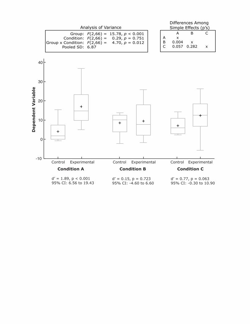
A reader examining the box plots in Figure 2 would likely wonder how
seriously to take the finding of a larger difference between the control and
experimental groups in Condition A than in the other two conditions. Figure
Page 18
Designing better graphs
18
10 adds inferential statistics to this figure including the results of an analysis
of variance that shows that the interaction is significant, p = .012.
------------------------------------------------------- Please insert Figure 10 about here
-------------------------------------------------------
An advantage of integrating graphics and inferential information is that
the graphics display distributional information relevant to the assumptions of
the inferential statistics. Since differences in interquartile ranges between the
control and experimental conditions shown in Figure 10 indicate a violation of
the assumption of homogeneity of variance, it would be incumbent on the
author to justify the use of ANOVA. In this case, a comment about the
robustness of ANOVA to violations of the assumption of homogeneity of
variance when the sample sizes are equal would probably suffice. In other
cases a more extended discussion might be required.
Since an interaction means that the simple effects differ, tests of
differences between simple effects are often informative. The upper right-
hand portion of the figure shows the p values for the three differences
between simple effects. Effect size estimates, confidence intervals, and
significance tests for each simple effect are shown at the bottom of the
figure. Note that a graphical scheme that indicated only whether or not an
effect was significant would not reveal that the simple effect at C approached
significance and would subtly hint that this possible simple effect should be
ignored.
------------------------------------------------------- Please insert Figure 11 about here
-------------------------------------------------------
Page 19
Designing better graphs
19
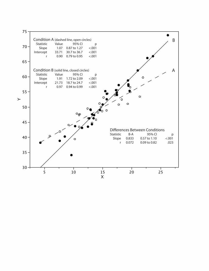
A graph integrating distributional, trend, and inferential information is
shown in Figure 11. This figure adds inferential information to Figure 6, which
shows distributional and trend information. Figure 12 shows how one might
integrate the display of bivariate data and relevant inferential statistics. The
inferential statistics in this figure consist of tests showing that the slopes and
correlations for the two conditions are significantly different as well as being
significantly different from zero in each condition. Confidence intervals for all
statistics reported are included.
------------------------------------------------------- Please insert Figure 12 about here
-------------------------------------------------------
Our next example is a bit more complex. In a hypothetical experiment,
a researcher is interested in the relationship between the independent
variables X1, X2, X3, and the dependent variable (DV). Although the
researcher did not necessarily anticipate an interaction between X1 and X2,
the regression analysis found a significant X1(linear) x X2(linear) interaction with
no test involving a quadratic term or other interaction term approaching
significance. The regression equation after centering X1 and X2 (i.e.,
transforming them to deviation scores) is:
DV’ = 0.533 X1 + 0.370 X2 + 0.427 X3 -0.37 X1 X2 + 92.826
This equation indicates that the slope of the relationship between X1 and DV
decreases by 0.37 for each increase of one in X2. The question is how to
construct a graph to describe the interaction. A method suggested by Aiken
and her colleagues (Aiken & West, 1991; Cohen, Cohen, West, & Aiken,
2003) is to graph the regression line for the prediction of DV by X1
Page 20
Designing better graphs
20
separately for three levels of X2: the mean of X2, one standard deviation
below the mean of X2 and one standard deviation above the mean of X2. For
these (fictitious) data, these three values (after centering) are -10, 0, and
10. The three regression lines are shown in Figure 13.
------------------------------------------------------- Please insert Figure 13 about here
-------------------------------------------------------
This method of graphing the interaction is valuable in that it shows the form
of the interaction clearly. For these data it is easy to see that the slope is
high for the low level of X2 and decreases linearly as X2 increases. However,
we do not believe that this method of graphing should be the only one used
to depict the interaction since it produces a graph of a model of the data
rather than a graph of the actual data. As such, it contains no distributional
data and highlights the regularities in the data without revealing any possible
irregularities.
An additional way of graphing the interaction is to divide the data into
groups based on X2 and to examine the relationship between X1 and DV for
each of these groups. Since X2 and X3 are controlled in the statistical
analysis, they should also be controlled in the graph. Figure 14 shows the
relationship between X1 and DV separately for four levels of X2 with both X2
and X3 controlled. The first steps were to compute the residuals in X2 after
being regressed on X3 (X2.3) and the residuals in X1 after being regressed
on X2 and X3 (X1.23). Next, the data were divided into quartiles based on
the values of X2.3. Finally, DV was regressed on X1.23 within each of these
quartiles. The slopes in these four regressions show how the partial slope of
Page 21
Designing better graphs
21
X1 (in predicting DV) decreases as a function of X2. Unlike Figure 13, Figure
14 shows that the decrease in the slope from Quartile 1 to Quartile 2 is larger
than the decrease from Quartile 2 to Quartile 3 or from Quartile 3 to Quartile
4. Since the X1(linear) x X2(quadratic) interaction did not approach significance,
this change in the difference in slopes should not serve as a basis for
concluding that the interaction is not strictly linear x linear. However, it is
important because it provides a hint that the model may not be correct and
that some caution in interpretation is warranted. The distributional
information in Figure 14 allows the reader to see that the data are generally
well behaved and no points appear to exert undo influence.
------------------------------------------------------- Please insert Figure 14 about here
-------------------------------------------------------
Figure 14 also contains significance tests and confidence intervals for
each quartile. These tests are essentially simple effects tests following the
significant linear x linear interaction and reveal that one can make a strong
conclusion that there is a positive relationship between X1 and DV for low
levels of X2 but leave the relationship for higher levels of X2 in doubt. The
confidence intervals in Quartiles 3 and 4 make clear that a range of values of
the slope other than zero are plausible and, as is always the case, a point
null hypothesis should not be accepted.
In our final example, we consider how to display distributional
information in an analysis of covariance (ANCOVA) design. As noted
previously, a bar chart showing group means lacks distributional information.
The alternative of using graphs such as box plots to portray group differences
Page 22
Designing better graphs
22
has two potential problems when used in an ANCOVA design. One is that
since inferential tests are done on differences among adjusted means
(controlling for the covariate), differences in means portrayed in the graph
would not reflect the differences tested in ANCOVA. Second, the variability of
the distribution shown in the graph would include the variability potentially
controlled by the covariate and would therefore be greater than it should be.
As a result, differences among means relative to this variability would appear
smaller than they really are.
The solution proposed here is to remove the effect of the covariate
from the data before creating the box plots. As an example, consider a
hypothetical experiment designed to assess the difference between an
experimental condition and a control condition. A total of 50 participants was
randomly divided between the two conditions and a covariate thought to be
related to the criterion was measured for each subject. Subsequently, the
experimental procedures were administered.
Before conducting an ANCOVA, the assumptions of linearity and
homogeneity of regression slopes should be assessed. Figure 15 shows
separate regression lines for the two conditions. It is clear from the graph
that the slopes of the lines are very similar and the inferential statistics
shown on the graph indicate that the difference in slopes did not approach
significance. Figure 15 also shows that the covariate is strongly related to the
criterion and that the relationship is at least approximately linear.
------------------------------------------------------- Please insert Figure 15 about here
-------------------------------------------------------
Page 23
Designing better graphs
23
As noted previously, constructing box plots without regard to the
covariate would portray the effects as being smaller (relative to variability)
than they actually are. Therefore, the following procedure was used to
eliminate variance due to the covariate from the graph:
1. A linear model was developed to predict the dependent variable
(DV) from the covariate and from “condition.”
2. The adjusted means for each condition (sometimes called “least
squares means” or “estimated marginal means”) were
computed. The adjusted means are estimates of what the
sample means on the dependent variable would have been if all
group means on the covariate had been the grand mean on the
covariate. Most if not all major statistics packages have an
option to report adjusted means.
3. The residuals from the model were saved. The means for each
condition’s residuals are necessarily 0.
4. The adjusted mean for each condition was added to the residual
score of every subject in the condition thus making the
condition means equal to the adjusted means.
5. Box plots were constructed based on the scores computed in
Step 4.
It is interesting to note that if one were to do an ANCOVA on these derived
scores, the results would be the same as on the raw scores except that the
slope and sums of squares for the covariate would be zero. This reflects the
fact that variation related to the covariate was removed from the data.
Page 24
Designing better graphs
24
The box plots created following these steps are shown in Figure 16 and
reveal a clear treatment effect. Specifically, the box plots show that (1) the
25th percentile of the experimental group is approximately equal to the
median of the control group and (2) the median of the experimental group is
approximately equal to the 75th percentile of the control group. The
variability shown in the box plots is considerably less than it would have been
if the scores had not been adjusted for the covariate. For example, the
difference between the top and bottom of the box plots (the range when
there are no outliers as is the case here) is approximately 26 whereas it is
about 36 for the raw data. Similarly, the height of the box (the H-Spread or
interquartile range) is about 11 whereas it is about 14 for the raw data.
Figure 16 also shows that the effects of the covariate and of condition
are both significant and that the mean difference is 0.81 standard deviations.
Thus, one can draw a confident conclusion that the experimental treatment
leads to higher scores than does the control treatment.
------------------------------------------------------- Please insert Figure 16 about here
-------------------------------------------------------
We believe that the examples shown here that integrate graphs with
inferential information do a better job communicating experimental findings
than the procedure of artificially separating text, tables, and graphs typically
used in journal articles. Since integrating text and graphics is no longer
difficult or expensive for either publishers or authors, we suggest that
authors follow the excellent examples of da Vinci and Galileo and create
figures integrating words, numbers, and images.
Page 25
Designing better graphs
25
Creating figures that integrate text and graphics is not technically
difficult. The first step is to create the statistical graph using one of the many
widely available statistics packages. One should be flexible in the choice of
software rather than rely exclusively on one program. A spreadsheet
program is often sufficient to create simple graphs such as line graphs. For
more complex graphs, one could choose the graphing program or statistical
package best suited for the specific graph to be created.
The integration of text and graphics can be best accomplished by
graphics-editing programs such as Adobe Illustrator or CorelDRAW that
provide considerable control and flexibility. However, even programs with
basic page-layout capabilities such as Microsoft's PowerPoint, Microsoft Word,
Apple's Keynote, and Apple's Pages can produce excellent integrated figures.
Principles for Constructing Good Graphs
Although the focus of this article has been on suggestions for including
distributional and inferential information in graphs, we understand that other
aspects of graphs are also of great importance. Since there is a sizeable
literature relevant to the construction of effective graphs (e.g., Kosslyn,
1989, 1993; Cleveland, 1993, 1994; Few, 2004; Gelman, Pasarica & Dodhia,
2002; Gillan et al., 1988; Tufte, 2001, 2006; Wainer, 1997), space
limitations preclude a comprehensive review of this literature. Therefore we
present only some of the more important themes.
Well-constructed graphs help focus on important aspects of data,
provide visual clarity, and make interpretation easy. Accordingly, one should
normally avoid shaded backgrounds that reduce contrast, eliminate
Page 26
Designing better graphs
26
unnecessary or redundant elements, and use sufficiently dark lines and
points. It is usually not necessary to include horizontal lines to extend tick
values on the Y axis. When it is necessary, these lines should be made lighter
than other graphical elements.
One should be careful to avoid apparent inconsistencies between the
graph and the results of the statistical analysis. For example, in a within-
subjects design, the graph should control for variation due to subjects just as
the statistical analysis does (see Loftus & Masson, 1994 and Figure 11 of this
article for examples of how to do this). Similarly if variance due to a
covariate is controlled in the statistical analyses, it should also be controlled
in the graph (see Figure 16). Special care should be taken in graphing means
from designs containing both between- and within-subjects variables since
the error terms for various comparisons between means are different.
Graphs should be designed to minimize mental load. For example,
consider how to designate the conditions in a line graph such as the one
shown in the lower portion of Figure 11. In graphs such as this, it is better to
place the condition information next to each line as shown rather than to
have a separate caption since having a separate caption would require the
reader to remember which symbol represents which condition. For more
complex designs, the choice of symbols should be consistent. For example,
consider an Age (2) x Condition (2) design in which conditions are designated
by two levels of shape (circle and square) and two levels of “fill color” (white
and black). It is important that the assignment of symbols to conditions be
Page 27
Designing better graphs
27
consistent, as in the left portion of Figure 17 rather than inconsistent as in
the right portion of the figure.
------------------------------------------------------- Please insert Figure 17 about here
-------------------------------------------------------
The design of a graph should be informed by the well-established
Gestalt laws of perceptual grouping including good continuation (objects
following a line or smoothed curve tend to be grouped together), proximity
(objects near each other tend to be grouped together), similarity (similar
objects tend to be grouped together), common fate (lines going in the same
direction tend to be grouped together), and good form (enclosed shapes tend
to be seen as single units). See Kosslyn (1993) for examples of how the
application of these laws can result in more easily apprehended graphs.
Finally, place graphical elements that are likely to be compared near each
other.
It is important to consider the amount of information contained in the
graph: Too much information can make a graph difficult to interpret whereas
two little information can waste space and fail to provide the benefits
typically associated with graphs. As noted earlier, bar graphs provide
relatively little information for the amount of space they take up. Box plots
and stem-and-leaf displays are among the types of graphs that contain more
information in roughly the same amount of space.
Graphs can be used to mislead rather than to inform. Although the
blatant use of misleading graphs in scientific publications is rare due to the
review process and the sophistication of the readership, one should always
Page 28
Designing better graphs
28
be on guard against creating a graph that is unintentionally misleading. It is
well known that group differences can be obscured or exaggerated by the
scaling of the Y-axis. Therefore, both the Y-axis origin and the scaling of the
units should be chosen carefully and in accordance with theoretical notions of
what constitutes small and large effect sizes for a particular domain. Graphs
such as box plots that show the minimum and maximum values put
constraints on the scale of the Y-axis and normally lead to good choices. For
example, the box plots in Figure 10 lead naturally to a sensible Y-axis scale.
The use of double Y-axis graphs can be very misleading as is described
in the following example. Wainer (1997, p. 93-94) shows three ways to
portray the relationship between per-pupil expenditures for education and
SAT using a double Y-axis graph. Year (from 1978-1990) is graphed on the
X-axis. The graph contains two lines: one for per-pupil expenditures and one
for SAT. Since these two variables are measured on vastly different scales
two Y-axes are used: the per-pupil expenditures scale shown on the left Y-
axis and the SAT scale shown on the right Y-axis. In the original graph
published in Forbes magazine, the Y-axes were scaled so that it appeared
that there was a large increase in expenditures over time with little change in
SAT. In one of Wainer’s alternate versions of the graph differing in the
scaling of the Y-axes, it appears that both expenditures and SAT increased
greatly. In a second alternative scaling, it appears that expenditures
increased only slightly while SAT scores increased greatly over time.
The perceptual aspects of graphs can mislead in unexpected ways. As
an example, Kosslyn (1993) presented a bar chart showing the results for
Page 29
Designing better graphs
29
three conditions. The heights of the bars increased from left to right, as did
the darkness of the shading of the bars. This change in the darkness of the
shading made the largest bar the most salient, a change that has been
shown by previous research by Kosslyn to lead the reader to overestimate
the size of the increase.
As noted previously, a comprehensive review of the work on designing
effective graphs is beyond the scope of this article. Readers wishing to
produce effective graphs are strongly encouraged to consult among others
(a) Kosslyn (1993) for concrete recommendations for applying perceptual
principles to the design of graphs, (b) Gillan et al. (1988) for numerous
research-based guidelines and a set of rules for determining which type of
graph to select and whether to use a figure or a table, (c) Wainer (1997) for
an insightful analysis of many aspects of graphs and their design, and (d)
Tufte (2001, 2006) for practical principles of designing good graphs and
elegant examples of how to communicate quantitative information.
Page 30
Designing better graphs
30
References
Aiken, L. S., & West, S. G. (1991) Multiple Regression: Testing and
Interpreting Interactions. Newbury Park, CA: Sage.
American Psychological Association. (2001). Publication manual of the
American Psychological Association (5th ed.). Washington, DC: Author.
Belia, S., Fidler, F., Williams, J., & Cumming, G. (2005). Researchers
misunderstand confidence intervals and standard error bars.
Psychological Methods, 10, 389-396.
Best, L. A., Smith, L. D., & Stubbs, D. A. (2001). Graphs use in psychology
and other sciences. Behavioural Processes, 54, 155-165.
Cleveland, W. S. (1984). Graphs in scientific publications. American
Statistician, 38, 261-269.
Cleveland W. (1993) A Model for Studying Display Methods of Statistical
Graphics. Journal of Computational and Graphical Statistics, 2, 323-
343.
Cleveland, W. S. (1994). The Elements of Graphing Data. Murray Hill, NJ:
AT&T Bell Laboratories.
Cohen, J., Cohen, P., West, S. G., & Aiken, L. S. (2003) Applied Multiple
Regression/Correlation Analysis for the Behavioral Sciences (3rd
Edition). Mahwah, New Jersey: Lawrence Erlbaum Associates.
Cumming, G., Fidler, F., Leonard, M., Kalinowski, P., Christiansen, A., Klenig,
J. L., McMenamin, N., Wilson, S. (2007) Statistical reform in
Page 31
Designing better graphs
31
psychology: Is anything changing? Psychological Science, 18, 230-
232.
Cumming, G., & Finch, S. (2005). Inference by eye: Confidence intervals,
and how to read pictures of data. American Psychologist, 60, 170-180.
Few, S. (2004). Show Me the Numbers: Designing Tables and Graphs to
Enlighten. Oakland: Analytic Press.
Friendly, M., & Denis, D. (2005). The early origins and development of the
scatterplot. Journal of the History of the Behavioral Sciences, 41, 103-
130.
Frigge, M, Hoaglin, D. C., & Iglewicz, B. (1989) The American Statistician,
43, 50-54.
Galileo (1610). The Starry Messenger (Sidereus Nuncius) Venice.
Gelman, A., Pasarica, C., & Dodhia, R. (2002). Let's practice what we preach:
Using graphs instead of tables. American Statistician, 56, 121-130.
Gelman, A., & Stern, H. (2006). The difference between "significant" and
"not significant" is not itself statistically significant. American
Statistician, 60, 328-331.
Gillan, D. J., Wickens, C. D., Hollands, J. G., Carswell, C. M. (1988)
Guidelines for presenting quantitative data in HFES publications,
Human Factors, 40, 28-41.
Jarvenpaa, S., & Dickson, G. W. (1988) Graphics and managerial decision
making: Research based guidelines. Communications of the ACM, 31,
764-774.
Page 32
Designing better graphs
32
Kosslyn, S. M. (1985). Graphics and human information processing. Journal
of the American Statistical Association, 80, 449-512.
Kosslyn, S. M. (1993) Elements of Graphic Design New York: W.H. Freeman
& Company
Larkin, J. H., & Simon, H. A. (1987). Why a diagram is (sometimes) worth
10,000 words. Cognitive Science, 11, 65-100.
Loftus, G. R. (1993). A picture is worth 1000 p-values - On the irrelevance of
hypothesis-testing in the microcomputer age. Behavior Research
Methods, Instruments & Computers, 25, 250-256.
Loftus, G. R., & Masson, M. E. J. (1994). Using Confidence Intervals in
Within-Subject Designs. Psychonomic Bulletin & Review, 476-490.
Masson, M. E. J., & Loftus, G. R. (2003). Using confidence intervals for
graphically based data interpretation. Canadian Journal of
Experimental Psychology, 57, 203-220.
Meyer, J., Shamo, M. K., & Gopher, D. (1999) Information structure and the
relative efficacy of tables and graphs. Human Factors, 41, 570-587.
Sagan, C. (1977). The Dragons of Eden: Speculations on the Evolution of
Human Intelligence. New York: Random House.
Sándor, A. & Lane, D. (2007) Graph use in psychology journals. Poster
Presented at the Annual Conference of the Houston Chapter of the
Human Factors and Ergonomics Society, Houston, Texas, May, 2007.
Smith, L. D., Best, L. A., Stubbs, D. A., Archibald, A. B., & Robertson-Nay, R.
(2002). Constructing knowledge: The role of graphs and tables in hard
and soft psychology. American Psychologist, 57(10), 749-761.
Page 33
Designing better graphs
33
Sweller, J., Chandler, P., Tierney, P., & Cooper, M. (1990) Cognitive load as a
factor in structuring technical material. Journal of Experimental
Psychology: General, 119, 176-192.
Tufte, E. R. (2001). The Visual Display of Quantitative Information (2nd ed.).
Cheshire, CT: Graphics Press.
Tufte, E. R. (2006). Beautiful Evidence. Cheshire, CT: Graphics Press.
Tukey, J. W. (1974). Mathematics and the picturing of data. In: Proceedings
of The International Congress of Mathematics, 523-531.
Tukey, J. W. (1977). Exploratory Data Analysis. Reading, MA: Addison-
Wesley.
Tukey, J. W. (1991). The philosophy of multiple comparisons. Statistical
Science, 6, 100-116.
Tversky, B. (1995). Cognitive origins of graphic conventions. In F. T. Marchese
(Ed.), Understanding Images (pp. 29-53). New York: Springer-Verlag.
Wainer, H. (1996). Depicting error. American Statistician, 50, 101-111.
Wainer, H. (1997). Visual Revelations. New York: Springer-Verlag.
Wainer, H (2005). Graphic Discovery: A Trout in the Milk and Other Visual
Adventures, Princeton University Press, Princeton, NJ.
Wilkinson, L. and the Task Force on Statistical Inference, APA Board of
Scientific Affairs (1999). Statistical Methods in Psychology Journals.
Guidelines and Explanations. American Psychologist, 54, 594-604.
Page 34
Designing better graphs
34
Appendix
Box Plots
The first step in creating a box plot is to determine the 25th percentile,
the median, and the 75th percentile. For the box plot shown in Figure 1
Appendix these values are 15, 20, and 23 respectively. A box is then drawn
from the 25th to the 75th percentile with a line representing the median drawn
inside the box. The mean is then drawn as a “+” sign. Next, the values of the
inner and outer fences are computed. Defining a “step” as 1.5 times
difference between the 75th and 25th percentiles (12 in this example), the
upper inner fence is 1 step above the 75th percentile, the upper outer fence is
2 steps above the 75th percentile, the lower inner fence is 1 step below the
25th percentile and the lower outer fence (not shown) is 2 steps below the
25th percentile. The fences are drawn in Figure 1 Appendix for illustrative
purposes only and do not appear in box plots.
-------------------------------------------------- Please insert Figure 1 Appendix about here
--------------------------------------------------
Lines are then drawn from the 25th percentile to the lowest value
inside the fences and from the 75th percentile to the highest value inside the
fences. Values between the inner and outer fences are each represented by
the letter “o” whereas values outside the outer fences are represented by
asterisks.
There are many variations of box plots (Frigge, Hoaglin, & Iglewicz,
1989). As stated in the text, we prefer versions that include the mean.
Page 35
Designing better graphs
35
Although many statistics programs do not provide this option, the Statistical
Analysis System (SAS) is one that does.
Stem-and-Leaf Displays
Stem-and-leaf displays can be used to display a relatively small
dataset to two decimal places. Figure 2A Appendix contains a stem-and-leaf
plot of the same data shown in Figure 1 Appendix. The “stems” are located
on the left and range from 0 to 5 and represent the 10’s place. The “leaves”
are located on the right and represent the 1’s place. The highest number in
the data (55) is represented by a stem of 5 and a leaf of 5. The second
highest number (37) is represented by a stem of 3 and a leaf of 7. The
lowest number (6) is represented by a stem of 0 and a leaf of 6. Notice that
there are two rows for each value of the stems: the higher is for leaves from
5-9 and the lower is for leaves from 0-4. The place represented by the stems
(10’s, 100’s, etc.), the number of stem repetitions, and the sequence of
stems can differ as a function of the details of the data.
-------------------------------------------------- Please insert Figure 2 Appendix about here
---------------------------------------------------
Figure 2B Appendix compares two distributions. The distribution on the
right is the same as the distribution in Figure 2A Appendix. This type of
graph is called a “back-to-back” stem-and-leaf display.
Back-to-Back Histograms
Creating a back-to-back histogram is a good way to portray
differences between the distributions of two relatively large data sets. As in
Page 36
Designing better graphs
36
the example shown in Figure 3 Appendix, it is usually desirable to display the
histograms vertically rather than horizontally.
--------------------------------------------------- Please insert Figure 3 Appendix about here
---------------------------------------------------
Page 37
Designing better graphs
37
Footnotes
1. The scale of coefficients for a component of trend does not affect its
significance test. To maximize interpretability, we scaled the
coefficients so that the pooled standard deviation across cells is 1.0.
The coefficients to accomplish this are: -0.15, -0.09, -0.03, 0.03, 0.09,
0.15
2. Ironically, an example of an error occurring because of the artificial
separation of text and graphics was made by a reader of a previous
version of this article. This reader apparently failed to relate the graph
in Figure 8 to the text and thought we were presenting this graph as a
positive example rather than as an example of what not to do. In the
present version, we followed or own advice about integrating text and
graphics in constructing Figure 8.
Page 38
Designing better graphs
38
Figure Captions
1. A graph typical of those that appear in psychology journals. Note that the
data are fictitious.
2. The data graphed in Figure 1 portrayed by box plots. Considerably more
distributional information is revealed in approximately the same amount of
space. Specifically, the medians are shown by the horizontal lines inside the
boxes, the 25th and 75th percentiles are shown as the bottoms and tops of
the boxes, and the minimum and maximum values are shown as the small
horizontal lines below and above the boxes (if there were outliers they would
be shown individually). The ranges are therefore the differences between the
lower and upper horizontal lines and the interquartile ranges are the
differences between the lower and upper portions of the boxes.
3. Parallel box plots emphasizing differences among means by making the
representation of the means more prominent and the other elements of the
box plot less prominent. As a result, the pattern of differences among means
is easier to perceive.
4. Parallel box plots that emphasize differences in variability by making the
ranges and interquartile ranges more prominent than the means and
medians.
Page 39
Designing better graphs
39
5. A line graph showing the standard deviations for each combination of
condition and trial. This method of combining trend and distributional
informational information does not work well. Note that the data are
fictitious.
6. A graph showing the trend information in the lower portion and box plots
of the linear components of trend for the three conditions in the upper
portion. The trend coefficients applied to the raw scores were scaled so that
the mean within-group standard deviation is 1.0. Note that the data are
fictitious.
7. A typical bar graph showing standard error bars. Note that the data are
fictitious.
8. A graph showing significant differences among pairs of means with
asterisks.
9. The type of graph recommended by Cumming and Finch (2005) to show
confidence intervals in a two-group between-subjects design. Confidence
intervals for the mean of Condition A, the mean of Condition B, and the
difference between means are shown. The axis on the left represents raw
scores and the axis on the right represents differences from the mean of
Condition A. Note that the data are fictitious.
Page 40
Designing better graphs
40
10. This graph shows box plots of the six combinations of condition and
group. The upper-left hand portion of the figure shows the analysis of
variance results. The box in the upper right shows the p values for the
differences among the three simple effects of Group. Cohen’s d for the
difference between Control and Experimental groups and the 95% confidence
interval on the difference between means are presented below each
condition. Note that the data are fictitious.
11. A graph showing distributional, trend, and inferential information. The
box plots show the distribution of the linear components of trends for the
three conditions; the table shows inferential statistics for the linear
component computed by applying the linear trend coefficients to the scores
for each subject. In the pairwise comparisons, ts stands for the studentized t.
Note that the data are fictitious.
12. A graph showing a scatterplot of variables X and Y separately for
Conditions A and B. Precise information such as the values of correlations
and slopes as well as inferential information is presented in text. The data
themselves and the least-squares regression lines are shown graphically.
13. The regression of DV on X1 for three levels of X2. This graph shows the
shape of the linear x linear interaction clearly but does not contain any
distributional information. Note that the data are fictitious.
Page 41
Designing better graphs
41
14. The regression of DV on the part of X1 independent of both X2 and X3
(X1.23) as a function of the portion of X2 independent of X3 (X2.3). The
upper-left portion of the figure contains a significance test of the linear x
linear interaction. The full regression equation is shown to the right. The
scatterplot for each quartile of X2.3 includes the regression line, the slope of
the line, a 95% confidence interval on the slope of the line and the
probability value. Note that the data are fictitious.
15. The regression of the dependent variable (DV) on the covariate
separately for the experimental and the control conditions. The inferential
statistics in the lower right show the R2 for the model in which the slopes of
the two lines are allowed to differ and the R2 assuming a common slope. The
common slope and a significance test for the difference between the slopes
are also shown. Note that the data are fictitious.
16. Box plots and inferential statistics relevant to the comparison of the
experimental and the control conditions. The box plots were created based
on residual scores computed by removing variability linearly related to the
covariate.
17. Consistent and inconsistent assignment of symbols to conditions. For the
consistent assignment, the level “young” is represented by circles whereas
the level “old” is represented by squares. The level “control” is represented
Page 42
Designing better graphs
42
by a filled symbol whereas the level “experimental” is represented by an
unfilled symbol.
1 Appendix. An example of a box plot. The fences are included for illustrative
purposes only and should not be shown in the final version of a box plot.
2 Appendix. Examples of stem-and-leaf displays. Graph A shows the
distribution of one variable. The data values are equal to 10 times the stem
plus the leaf. Graph B shows back-to-back stem-and-leaf displays.
3 Appendix. An example of back-to-back histograms.
Page 43
0
2
4
6
8
10
12
14
16
18
20
Condition A Condition B Condition C
Dependent Variable
Control group Experimental group
Dep
en
den
t V
ari
ab
le
This type of graph is not recommended because it contains no information about the variability or shape of the distributions.
Page 44
Control Experimental Control Experimental Control Experimental-10
-5
0
5
10
15
20
25
30
35
40
Dep
en
den
t V
ari
ab
le
Condition A Condition B Condition C
Page 45
Control Experimental Control Experimental Control Experimental-10
-5
0
5
10
15
20
25
30
35
40
Dep
en
den
t V
ari
ab
le
Condition A Condition B Condition C
Page 46
Experimental Control Experimental Control Experimental-10
-5
0
5
10
15
20
25
30
35
40
Dep
en
den
t V
ari
ab
le
Condition A Condition B Condition C
Control
Page 47
0
45
50
55
60
65
1 2 3 4 5 6
Trials
Condition A
Condition B
Condition C
Dep
en
den
t V
ari
ab
le
Page 48
0
50
55
60
65
1 2 3 4 5 6
Trials
Condition A
Condition B
Condition C
Condition A Condition B Condition C-2
-1
0
1
2
3
4
5
Conditions
Line
ar C
ompo
nent
s
Dep
en
den
t V
ari
ab
le
Page 49
0
2
4
6
8
10
12
14
16
18
20
Condition A Condition B Condition C
Control group Experimental group
Dep
en
den
t V
ari
ab
le
This use of standard error bars is not generally recommended because it does not provide easily-ascertainable information about standard errors of differences among means.
Page 50
0
5
10
15
20
Condition A Condition B Condition C
Control group Experimental group
*
*
Dep
en
den
t V
ari
ab
le
This type of graph is not recommended because (a) it encourages all-or-none rejection of the null hypothesis, (b) it emphasizes significance testing to the neglect of confidence intervals, and (c) the indicators of significance may distract visually from the pattern of means.
Page 51
A B B - A
0
5
10
15
20
25
Dep
en
den
t V
ari
ab
le
0
5
10
15
20
Page 52
Control Experimental Control Experimental Control Experimental-10
0
10
20
30
40
Dep
en
den
t V
ari
ab
le
Condition A Condition B Condition C
d’ = 1.89, p < 0.00195% CI: 6.56 to 19.43
d’ = 0.15, p = 0.72395% CI: -4.60 to 6.60
d’ = 0.77, p = 0.06395% CI: -0.30 to 10.90
Group: F(2,66) = 15.78, p < 0.001 Condition: F(2,66) = 0.29, p = 0.751 Group x Condition: F(2,66) = 4.70, p = 0.012 Pooled SD: 6.87
Analysis of Variance A B CA x B 0.004 x C 0.057 0.282 x
Differences Among Simple Effects (p’s)
Page 53
0
50
55
60
1 2 3 4 5 6
Trials
Condition A
Condition B
Condition C
Condition A Condition B Condition C-2
-1
0
1
2
3
4
5
Conditions
Line
ar C
ompo
nent
s
Dep
en
den
t V
ari
ab
le
Linear ComponentsBox Plots of Linear Components of TrendTrials (Lin) X Condition: F(2,42) = 12.14, p < 0.001
Simple Effects on linear component: A: t(14) = 10.18, p < .001 B: t(14) = 4.96, p < .001 C: t(14) = 2.02, p = .063
Pairwise Comparisons on linearcomponent (Tukey HSD): A vs B: ts(42) = 3.53, p = .043 95% CI: 0.00 to 0.28 A vs C: ts(42) = 6.97, p < .001 95% CI: 0.14 to 0.42 B vs C: ts(42) = 3.44, p = .050 95% CI: 0.00 to 0.27
Page 54
30
35
40
45
50
55
60
65
70
75
Y
5 10 15 20 25X
A
B
Differences Between ConditionsStatistic B-A 95% CI p Slope 0.833 0.57 to 1.10 <.001 r 0.072 0.09 to 0.82 .023
Condition A (dashed line, open circles) Statistic Value 95% CI p Slope 1.07 0.87 to 1.27 <.001 Intercept 33.71 30.7 to 36.7 <.001 r 0.90 0.79 to 0.95 <.001
Condition B (solid line, closed circles) Statistic Value 95% CI p Slope 1.91 1.72 to 2.09 <.001 Intercept 21.73 18.7 to 24.7 <.001 r 0.97 0.94 to 0.99 <.001
Page 55
75
80
85
90
95
100
For X2low = -10 : DV’ = 0.903 X1 + 89.13
For X2mean = 0 : DV’ = 0.533 X1 + 92.83
For X2high = +10 : DV’ = 0.163 X1 + 96.53
-10 0 10X1
DV’
Page 56
100
120
140
160
180
200
DV
-30 -20 -10 0 10 20 30X1.23
100
120
140
160
180
200
DV
-30 -20 -10 0 10 20 30X1.23
100
120
140
160
180
200
DV
-30 -20 -10 0 10 20 30X1.23
b = 0.58195% CI: 0.00 to 1.16p = 0.049
b = 0.33295% CI: -0.25 to 0.92p = .260
b = 0.29995% CI: -0.45 to 0.74p = .631
100
120
140
160
180
200
DV
-30 -20 -10 0 10 20 30X1.23
b = 1.2495% CI: 0.64 to 1.84p < 0.001
X2.3 Quartile1M = -12.00
X2.3 Quartile 2M = -3.14
X2.3 Quartile 3M = 3.07
X2.3 Quartile 4M = 12.21
X1 (linear) x X2 (linear) Interactionb = -0.03795% CI: -0.562 to -0.018Incremental R2 = .039p < .001
Regression EquationTerm Valueb1 0.533b2 0.370b12 -0.037b3 0.427A 92.826
Note: X1 and X2 were centered before interaction predictor was created.
Page 57
DV
30
35
40
45
50
55
60
65
70
75
30 35 40 45 50 55 60 65 70Covariate
ExperimentalY’ = 0.73X + 18.75
Y’ = 0.68X + 15.57Control
R2 separate slopes: .453R2 common slope: .452Common slope: .702Test of difference between slopes:t(46) = 0.21, p = .84
Page 58
+
+
Covariate: F(1,47) = 31.17, p < .001 Condition: F(1,47) = 8.23, p = .006Pooled SD: 7.24Mean Difference: 5.88, 95% CI: 1.75 to 10.00d: 0.81
30
35
40
45
50
55
60
65
70
75
ControlCondition
DV
Experimental
Page 59
Young, ControlYoung, Experimental
Old, ExperimentalOld, Control
Young, Control
Old, Experimental
Young, ExperimentalOld, Control
Consistent Assignment Inconsistent Assignment
Page 60
o
*
+
Inner Fence
Inner Fence
Outer Fence
60
40
30
20
10
0
50
Page 61
5|55|4|4|3|73|232|8892|0011122231|568888991|224440|69
|5|5 |5| 8|4| 2|4| |3|7 012|3|23 556678|2|88901233344|2|001112223 55789|1|56888899 344|1|22444 5|0|69
A B
Page 62
2030
4050
6070
8090