33
Digital Graphic Narrative Development Coral Welburn
| Date post: | 13-Aug-2015 |
| Category: |
Art & Photos |
| Upload: | coralwelburn |
| View: | 20 times |
| Download: | 0 times |

Digital Graphic Narrative
Development
Coral Welburn
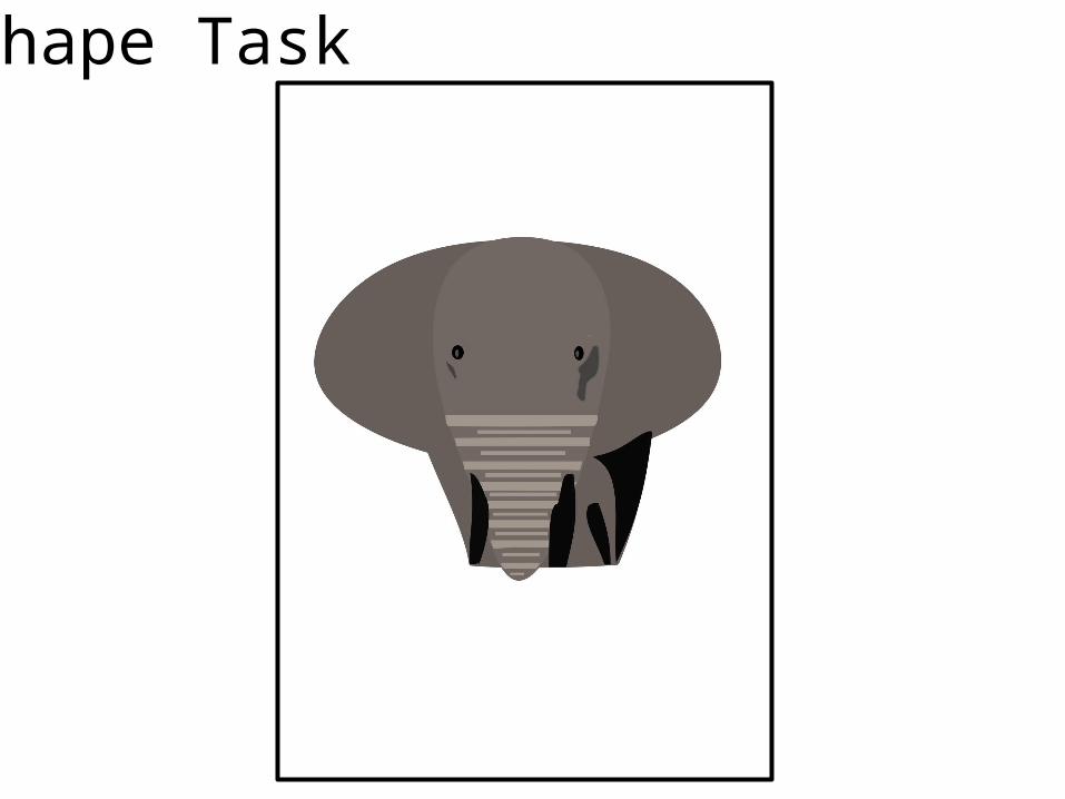
Shape Task

EvaluationWhat did you like about your image?There are a few things that I like with my elephant. The main outline structures a cute, cartoon elephant that fits well with the aim of this task. The outline is simple and isn’t trying to be too specific, just having a round head and ear’s. However the main part of my image that I particularly like is the outline and shaping of the head and trunk. It stands out off the rest of the body and having it made out of just one shaping gives me more space to add smaller details, such as the texture and shaping of the creases of the trunk. The little detail on the trunk is something I find cute and simple, I believe adding the different sizes of the creases etc brings out the shaping of the trunk more.
What would you improve if you did it again?If I was to do this again I would either pick a different animal that is simpler and doesn’t have as much shadowing and detail, such as a dog or a panda. However if I couldn’t choose another animal I would just choose a different position of the elephants head so you could see the full body, been able to work with more space and more shaping, making it easier to try and get across the main structure and details of the animal. This certain position of this elephant gives you a close up of the elephants head, not giving you much eye space to see the back of the body as its been clouded by shadowing and the head and trunk. The detail I would like to add it would be the shaping of the ear’s, with the curving and the general idea of the ‘flappiness’ of the ears. However on mine its showing just a rounded shaping. Another point of detail that I would of added in would be the sharpness of the tusks and the shadowing over the eyes, adding lines in to shape the eyelids.
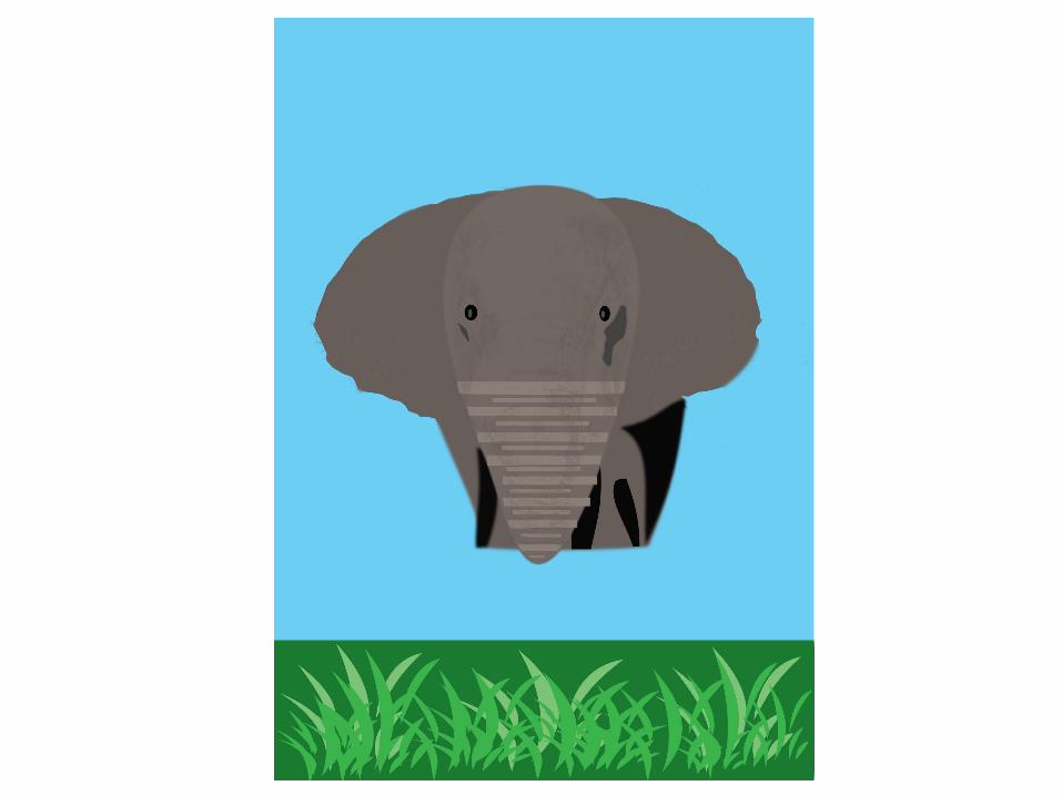
What do you like about your image? This is my improved image from the first version of my elephant. I have tried to add and change certain things that I didn’t like from the earlier version. I really like the elephants ear’s as there is now a different shaping to them. I used a polygonal lasso tool to erase certain parts of the ear’s, changing the fully rounded ear, to them having a flow. Another part of my image that I like would be the texture that has been added to the head and the trunk. What this has done has changed the childlike look of it and improved it. Also it has added shaping around the eye’s, making it look more like an elephant. I blurred the head of the elephant so that the shape edges weren’t as strong and it softened it down. I also blurred the shadowing so it blended into the body, again taking the sharp lines out and bringing a softer texture to it.
What would you improve?I have added the improvements I could to it, however with added knowledge I would like to improve the shadowing around the legs and the shaping of the back legs, as with the position the elephants standing in the back legs wouldn’t be seen and would blend in with the two front legs. However I would want people who would see my image be able to tell that they are legs. Another thing would be the tusks, they would need to be added in however if I were to try and not like them they aren’t really needed as they could be hidden by the trunk.
Evaluation
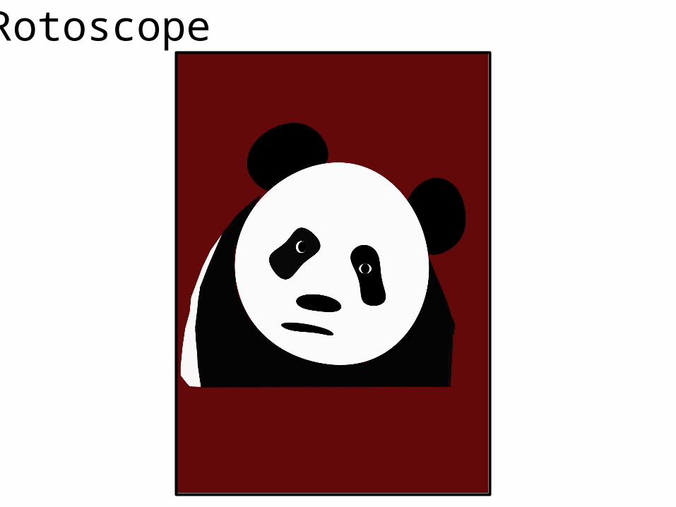
Rotoscope

EvaluationWhat did you like about your image?I really like this image as it was simple, but it still has detail added in and it really reflects the structure and looks of a panda. Using the polygonal lasso tool I created the body as I really wanted to get the right structure and shaping. Using this tool really helps create better shaping, as using shapes doesn’t help when you want something specific that has different shaping and lines to it in different area’s. So using this helps you create the shaping you want as you can ‘draw’ round the shaping you want. As its such a simple animal there are a few things that were simple to do that I’m happy with, such as the patches on the panda’s face. Even though its such a small thing, it really does add to the face and bring attention to the eyes and shaping of the facial features.
What would you improve if you did it again?If I were to do this again I wouldn’t use any other tools other than the polygonal lasso tool so that you could see the different versions of the panda that can be created. So I would change the ear’s shaping as I used the shape tool for that, so using that tool would change the look to be more ‘out of the lines’. I would then do that with the rest of the head as that was done with a different tool also. I really like the smooth texture of it as it looks more cartoon like, so what I would do would be to change the colours of the ear’s, showing more of a gradient overlay, going from black to white.


Text Based
EvaluationWhat did you like about your image?I like the first image as its showing the use of the different settings that can be used by the tracking and leading and also the colour range settings. The colour range example is the yellow and blue text, which is the gradient overlay effect, which includes a backing shadow of green, which was the inner glow, which then makes it stand off the page as its highlighting it but its also reflecting into the background. The tracking and leading setting helps you bring your text together and apart, changing the spacing between each letter and word. This is a useful tool as it would help in a variety of different topics, such as a book, it can help you bring together the text for the older generation but for the younger kids bringing the text apart will help them visually read it better. The clipping mask tool is the last image, which is showing my name been written with the picture of my favourite band been inserted inside the text. Once the image had been hidden behind the text I went onto using colour range where I added the stroke tool which just went round the text with black, just showing that sort of block bubble effect. I also used the drop shadow effect, which just provides that boldness around the text, which then makes the text stand out more. I really like the clipping mask tool because it helps make the text more interesting and you are able to project a two in one situation. Using this tool helps provide you with more space to insert more things in certain situations as sometimes a picture can take up a lot of room, so showing it through text helps more things be added into whatever it is that you are creating. The second image that is provided is showing the different transform settings that are on Photoshop. The 1st version of my name is showing distort, skew and perspective been shown all in one, where as the other two is only showing one setting that is been shown. I like the way all three add the effect of it been brought off the page, its showing a sense of direction and ways that text can catch the viewers attention. However this tool isn’t one that I would choose to use first over other ones that are provided, as it doesn’t provide much to work with.
What would you improve if you did it again?If I were to do it again I would look at adding a few more effects from the colour range setting, which really does add to the text that has been written out. I wouldn’t want to over do it, but just wanting to show what each one can do on different examples. Also I would use the clipping mask again but with more words, which then will show what it would look like when there is more to be read.
Comic Book

Evaluation
What did you like about your image?
What would you improve if you did it again?

Photography
Evaluation
What did you like about your image?
What would you improve if you did it again?
Illustration

Evaluation
What did you like about your image?
What would you improve if you did it again?

Initial Ideas
Mood board of inspiration
Idea Generation

Mood board of chosen idea
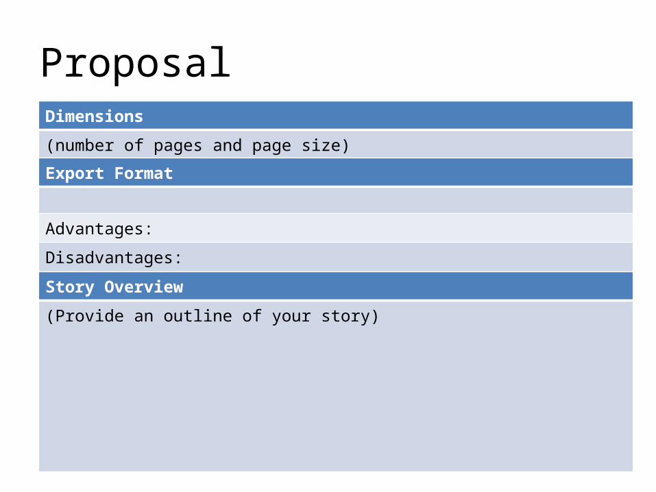
ProposalDimensions
(number of pages and page size)
Story Overview
(Provide an outline of your story)
Export Format
Advantages:
Disadvantages:
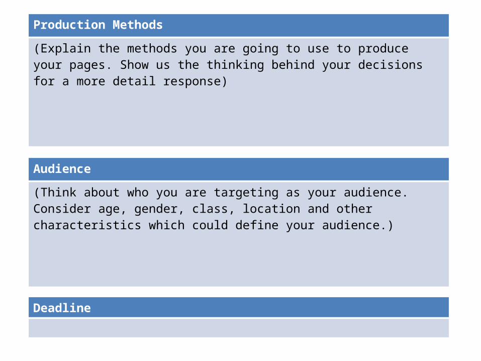
Deadline
Audience
(Think about who you are targeting as your audience. Consider age, gender, class, location and other characteristics which could define your audience.)
Production Methods
(Explain the methods you are going to use to produce your pages. Show us the thinking behind your decisions for a more detail response)

What are the strengths of the proposal? What areas of the proposal need further work?
What are the strengths of the idea generation? What areas of idea generation could have been further developed?

What are the strengths of the proposal? What areas of the proposal need further work?
What are the strengths of the idea generation? What areas of idea generation could have been further developed?
What are the strengths of the proposal? What areas of the proposal need further work?
What are the strengths of the idea generation? What areas of idea generation could have been further developed?

Feedback Summary
Sum up your feedback.
Which parts of your feedback do you agree with and why?
Which parts of your feedback do you disagree with and why?

Storyboards

Storyboards
Storyboards

Original Script
Original Script goes here with link to where it came from

Original Script
Original Script goes here with link to where it came from
Final Script
Final script goes here.
Digital Flat Plans
