This red strip is to represent a red ribbon, connotation of the album title ‘starting from scratch’. The red ribbon is to signify something new, you often see them being cut at an opening of a new building or you may also see the red on a ‘red carpet’ at a premiere. This colour runs throughout the promotional material I have created as one of my house colours, creating a brand identity. Album Title; this title is to represent the start of this artists career. This is his first album and where he has chosen to start his career. This Photo is a close up of the artist’s guitar. I wanted to create the artist’s sound as his selling point. This highlights the artist’s talents rather than his image. I have overlaid a transparent layer. This layer has a ripple effect and represents the ocean. The ocean was the artist inspiration for the song I am using for my video and therefore I have made it the theme of his album. This layer makes the image look as though it is under the sea. I have also added a blue outline to the title. This colour is one of my house colours and signifies the ocean. It helps create a brand Identity if the colours have a meaning behind them and run consistently throughout the promotional material. This is the artist’s name. I have used Troutkings BTN, a serif font on my front cover. This is also used throughout the digipak and advert. The font reminds me of the little mermaid, with the trident shape. This correlates with my theme. Digipak Analysis
Transcript
This red strip is to represent a red ribbon, connotation of the album title ‘starting from scratch’. The red ribbon is to signify something new, you often see them being cut at an opening of a new building or you may also see the red on a ‘red carpet’ at a premiere. This colour runs throughout the promotional material I have created as one of my house colours, creating a brand identity.
Album Title; this title is to represent the start of this artists career. This is his first album and where he has chosen to start his career.
This Photo is a close up of the artist’s guitar. I wanted to create the artist’s sound as his selling point. This highlights the artist’s talents rather than his image.
I have overlaid a transparent layer. This layer has a ripple effect and represents the ocean. The ocean was the artist inspiration for the song I am using for my video and therefore I have made it the theme of his album. This layer makes the image look as though it is under the sea.
I have also added a blue outline to the title. This colour is one of my house colours and signifies the ocean. It helps create a brand Identity if the colours have a meaning behind them and run consistently throughout the promotional material.
This is the artist’s name. I have used Troutkings BTN, a serif font on my front cover. This is also used throughout the digipak and advert. The font reminds me of the little mermaid, with the trident shape. This correlates with my theme.
Digipak Analysis
This is the first double page in the booklet for my digipak. The first page is an introduction and biography section. This section was written by the artist himself. This would often appear in a booklet of the album. It gives a personalised touch and shows them as the creator of the music. This is in Bradley Hand ITC font. I went for a font that looks like handwriting. This adds to the personalised touch.
Quotes from the lyrics
Quotes from the lyrics
This photo presents the artists name in sand. I thought this was a creative way of putting his name in the digipak rather than just font. It runs with his inspirational them of the beach and ocean. The sand also matches the lyrics of this song I am using in my video.
Guitar design; I have taken an image of a guitar, cropped it to shape and coloured it white. This signifies the artist’s music. This has become his motif. It appears throughout his promotional material and several close ups appear in his music video.
The artists name. This acts as a sign of to his biography section. It appears in the same typography throughout his promotional material.
This page has a deep red background. This is one of the house colours. The red is to signify something new, you often see red ribbons being cut at an opening of a new building or you may also see the red on a ‘red carpet’ at a premiere.
This photo highlights the ocean, the inspiration to this artist. It is a close up shot taken on the beach.
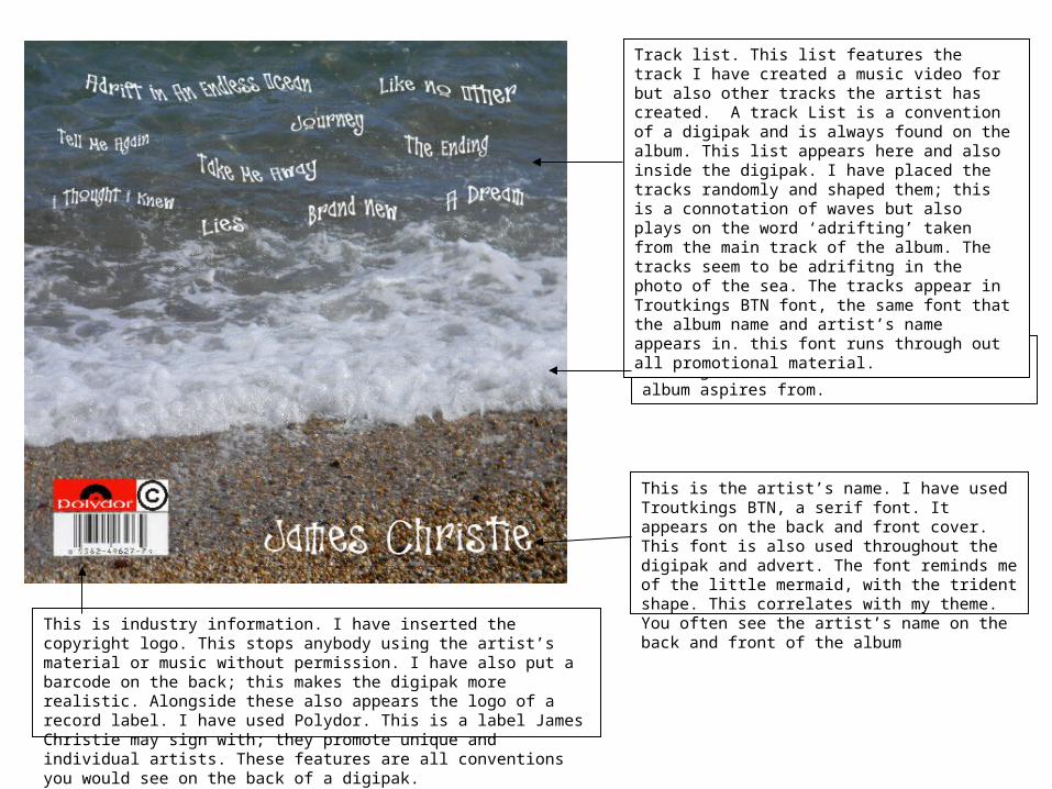
Track list. This list features the track I have created a music video for but also other tracks the artist has created. A track List is a convention of a digipak and is always found on the album. This list appears inside and also on the back on the album.
This is the web address for the artist. This adds industry information to the digipak and allows buyer to look more into the artist. This appears in the same font it does on the magazine advert, Agency.
The back ground of this page is blue, a connotation of the ocean. This is one of my house colours. I have also added a strip of red in the shape of a wave. This red is also a house colour. It adds interest to the page, highlights the website and adds to the connotation of the ocean.
This photo is a clever angle which also appears in the video I have made. This photo was taken on a day of filming. It signifies the artist’s talent and sound. It represents the rawness of his music and sells his album purely on that rather than his own image.
The artists name. This acts as a sign of to his mention of thanks. It appears in the same typography throughout his promotional material.
This page has a deep red background. This is one of the house colours. The red is to signify something new, you often see red ribbons being cut at an opening of a new building or you may also see the red on a ‘red carpet’ at a premiere.
This page is a section of thanks; this is another convention that would appear in a digipak. This section has also been written by the artist. It appears in the same font as the biography section, and therefore gives it the personalised look. The font is in size 10pt. This is a common size for paragraph text on a digipak.
This is a photo I took on a day of filming. It merges the theme of this album and music and also shows the artists selling point and motif, his sound. The guitar is shown in this photo however the artist is not.
This is where the CD would lay inside the digipak. The Background is the house colour blue. But to add interest I have inserted the over lay which also appears on the front cover. This layer represents the waves and movements in the sea.
Pull Quotes. These are a convention that I have used on my advert. They give an opinion from someone that the audience may respect such a music magazine.
This Photo was taken on a day of filming. It shows the sea on which this album aspires from.
Track list. This list features the track I have created a music video for but also other tracks the artist has created. A track List is a convention of a digipak and is always found on the album. This list appears here and also inside the digipak. I have placed the tracks randomly and shaped them; this is a connotation of waves but also plays on the word ‘adrifting’ taken from the main track of the album. The tracks seem to be adrifitng in the photo of the sea. The tracks appear in Troutkings BTN font, the same font that the album name and artist’s name appears in. this font runs through out all promotional material.
This is the artist’s name. I have used Troutkings BTN, a serif font. It appears on the back and front cover. This font is also used throughout the digipak and advert. The font reminds me of the little mermaid, with the trident shape. This correlates with my theme. You often see the artist’s name on the back and front of the album
This is industry information. I have inserted the copyright logo. This stops anybody using the artist’s material or music without permission. I have also put a barcode on the back; this makes the digipak more realistic. Alongside these also appears the logo of a record label. I have used Polydor. This is a label James Christie may sign with; they promote unique and individual artists. These features are all conventions you would see on the back of a digipak.