34
DKAN Documentation Release DKAN Nov 14, 2017

DKAN DocumentationRelease
DKAN
Nov 14, 2017


Contents
1 Table of Contents 3
i

ii

DKAN Documentation, Release
React Dash is a library for quickly building custom data visualization dashboards based on re-usable components.
• Chart Components Using NVD3
• Choropleth Maps in geoJson and topoJson
• HTML Components
• Custom Filtering
• Custom Data Handling
• CSV Integration
• DKAN API Integration
Contents 1

DKAN Documentation, Release
2 Contents

CHAPTER 1
Table of Contents
1.1 Getting Started
1.1.1 Starting a project with the boilerplate module
The react-dash-boilerplate project provides a starter project and a development environment for doing react-dashdevelopment. It’s a good place to start.
• Make sure that you have npm installed on your system
• Install the react-dash-boilerplate project and its dependencies:
git clone https://github.com/NuCivic/react-dash-boilerplate.gitcd react-dash-boilerplatenpm installnpm run initnpm run start
• Visit http://localhost:5000 on your system - if everything was successful, you should see an example dashboard
• Look at our Developer’s Guide for next steps to customize your dash!
1.1.2 Run the example project that ships with the react-dash project
If you can’t get the boilerplate project to install, just install the react-dash library and use the example project as astarting place.
• Make sure that you have npm installed on your system
• Set up an npm project
npm initnpm install react-dashnpm run start
3

DKAN Documentation, Release
• Look in the examples/ folder for the project source
• Take a look at our Developer’s Guide for next steps to customize your dash!
1.1.3 Building a DKAN project
Visit the Drupal Module page for more on Drupal Dkan development
1.2 Features
1.2.1 NVD3 Chart Components
NVD3 is a powerful Javascript library for doing advanced data visualizations. To see examples of what is possiblewith nvd3, visit http://nvd3.org/examples/index.html
1.2.2 Filters
Filters allow end-users to filter and compare data. Commone use cases include:
• Filter data by year
• Filter data by department
• Compare entitities
4 Chapter 1. Table of Contents

DKAN Documentation, Release
Select Filter
Autocomplete Filter
Checkbox Filter
1.2.3 Map Components
1.2.4 Data Table
1.2.5 Metric Component
1.2.6 Text component
1.3 Developer Guide
1.3.1 Overview
Currently, there are two formats avialable for defining dashboards:
JSX
You can define a dashboard using familiar JSX syntax. Following is a complete example of a simple dashboard definedin JSX:
npm run jsx-example will load the following dashboard:
/*** This example shows how to build a basic dashboard using available components
* and basic React JSX syntax.
***/
/*** Import the required elements
**/import 'bootstrap/dist/css/bootstrap.min.css';import React, { Component } from 'react';import ReactDOM from 'react-dom';import { Dashboard, Region, Card, Metric, Chart } from '../../src/ReactDashboard';
/*** Extend the application and provide a render method
**/class App extends Component {
render() {return (
/*** Use the Dashboard component to wrap your
* dashboard elements
**/<Dashboard title="A Simple Dashboard Writ in JSX" doFilterRouting={false}>
1.3. Developer Guide 5

DKAN Documentation, Release
<link rel="stylesheet" type="text/css" href="https://maxcdn.bootstrapcdn.com/→˓bootstrap/3.3.7/css/bootstrap.min.css" />
<div className="row"><Metriccaption='Caption A'data={[1]}background='#687a99'cardClasses={['col-md-4']}iconClass='fa fa-bed'
/><Metriccaption='Caption B'data={[2]}background='#689994'cardClasses={['col-md-4']}iconClass='fa fa-bomb'
/><Metriccaption='Caption C'data={[3]}background='#8f6899'cardClasses={['col-md-4']}iconClass='fa fa-bathtub'
/></div><div className="row">
<Chartheader="Header 1"iconClass="fa fa-cloud"cardClasses={['col-md-6']}key="chart1"data={[{x: 'foo', y: 10}, {x: 'bar', y: 20}, {x: 'bax', y: 30}]}settings={
{type: 'pieChart',height: 300
}}
/><Chartheader="Header 2"iconClass="fa fa-cogs"cardClasses={['col-md-6']}key="chart2"data={[{x: 'Eeny', y: 1122}, {x: 'Meeny', y: 2220}, {x: 'Miney', y: 910}]}settings={
{type: 'pieChart',height: 300,
}}
/></div>
</Dashboard>)
}}
6 Chapter 1. Table of Contents

DKAN Documentation, Release
document.addEventListener('DOMContentLoaded', function(event) {ReactDOM.render(<App/>, document.getElementById('root'));
});
Javascript Settings object
In many cases it is useful to define dashboard configuration in JSON - allowing for database storage, programmaticcreation, etc. Here is the above Dashboard defined as a Javascript object.
npm run js-example will load the following dashboard configuration at localhost:3000:
/*** A very simple Dashboard implementation using
* a settings object
*/import React, { Component } from 'react';import ReactDOM from 'react-dom';import { settings } from './settings';import { Dashboard } from '../../src/ReactDashboard';import 'fixed-data-table/dist/fixed-data-table.min.css';
/*** The settings object is passed as props to the Dashboard component
**/document.addEventListener('DOMContentLoaded', function(event) {
ReactDOM.render(<Dashboard {...settings}/>, document.getElementById('root'));});
Complete Dashboard Application
The app at /examples/app.js runs an example of a more robust application with datahandling, filtering, etc.
npm run start will from the react-dash repository will run the application.
Boilerplate project
The boilerplate module includes the above application in a complete development environment suitable for doingdashbaord development.
git clone https://github.com/NuCivic/react-dash-boilerplate.git cdreact-dash-boilerplate npm install npm run init npm run start
This will spin up the example application, and you can use it as a starting point for developing your own app.
1.3.2 Application Entry Point - app.js
React dash is a libary for building apps, not an app itself. We need to provide a data handling framework, and we dothat in our app.js. Take a look at /examples/app.js and follow along with the explanations below. Also, for a goodstarting place for development, including a working skeleton of an application, along with a development environment,check out the boilerplate project.
1.3. Developer Guide 7

DKAN Documentation, Release
Extend Dashboard
getDashboardData
We extend the dashboard to provide an implementation of the getDashbaordData method.
Data is segmented into dataResources. Each dataResource or dataKey contains a discreet set of data. dataResourcesshould be defined as an array settings.js / props. Each dataKey can contain data required for fetching given data. Weleave the implementation details up to you. For more, see the section on Data Handling.
The dashboard is initialized with state.isFetching = false. getDashboardData should set this state para-mater to false when all data has returned.
Also, getDashboardData() should set state.isFetching = false once all data has been returned.
As per normal REACT, the setState call will trigger a re-render of the dashboard, updating components as needed.
1.3.3 Configuring the dashboard - settings.js
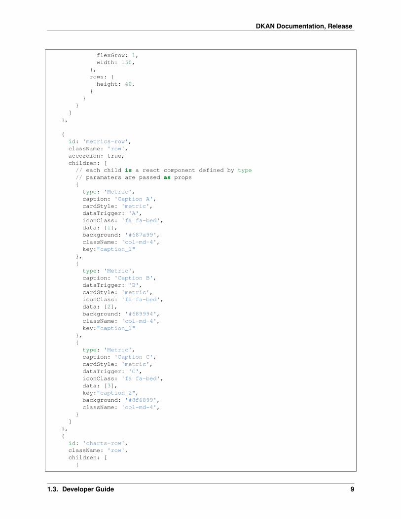
settings.js defines a declarative configuration for our react-dash.
A simple example:
import 'bootstrap/dist/css/bootstrap.min.css';
export var settings = {title: 'React-Dash Javascript Settings Example',doFilterRouting: false,// regions are used by the dashboard to divide// the layout into rows using the bootstrap gridregions: [
{id: 'text-row',className: 'row',children: [
{type: 'DataTable',header: 'Mi titulo',cardClasses: ['col-md-6'],key:"my_table",data:[
[{foo: 1, bar: 2},{foo: 11, bar: 21},{foo: 111, bar: 222},{foo: 1, bar: 2},
]],settings: {
table: {rowHeight: 40,width: 800,maxHeight: 300,headerHeight:40
},columns: {
8 Chapter 1. Table of Contents
DKAN Documentation, Release
flexGrow: 1,width: 150,
},rows: {height: 40,
}}
}]
},
{id: 'metrics-row',className: 'row',accordion: true,children: [
// each child is a react component defined by type// paramaters are passed as props{type: 'Metric',caption: 'Caption A',cardStyle: 'metric',dataTrigger: 'A',iconClass: 'fa fa-bed',data: [1],background: '#687a99',className: 'col-md-4',key:"caption_1"
},{type: 'Metric',caption: 'Caption B',dataTrigger: 'B',cardStyle: 'metric',iconClass: 'fa fa-bed',data: [2],background: '#689994',className: 'col-md-4',key:"caption_1"
},{type: 'Metric',caption: 'Caption C',cardStyle: 'metric',dataTrigger: 'C',iconClass: 'fa fa-bed',data: [3],key:"caption_2",background: '#8f6899',className: 'col-md-4',
}]
},{
id: 'charts-row',className: 'row',children: [
{
1.3. Developer Guide 9

DKAN Documentation, Release
type: 'Chart',cardStyle: 'chart',header: 'Header 1',iconClass: 'fa fa-cloud',className: 'col-md-6',key: 'c1',data: [{x: 'foo', y: 10}, {x: 'bar', y: 20}, {x: 'baz', y: 30}],settings: {
type: 'pieChart',height: 300
}},{type: 'Chart',cardStyle: 'chart',header: 'Header 2',iconClass: 'fa fa-cloud',className: 'col-md-6',key: 'c2',data: [{x: 'eeny', y: 110}, {x: 'meeny', y: 920}, {x: 'mo', y: 430}],settings: {
type: 'pieChart',height: 300
},},
// start DataTable Example{
type: 'DataTable',header: 'Mi titulo',data:[[{foo: 1, bar: 2},{foo: 11, bar: 21},{foo: 111, bar: 222},{foo: 1, bar: 2},
]],settings: {table: {
rowHeight: 40,width: 800,maxHeight: 300,headerHeight:40
},columns: {
flexGrow: 1,width: 150,
},rows: {
height: 40,}
},overrides: {// target table columns with custom attributes// use column header name as keycolumns: {bar: {
10 Chapter 1. Table of Contents

DKAN Documentation, Release
flexGrow: 9,className: 'greenCell'
},},// target table rows with custom attributes// use row index as keyrows: {1: {className: 'yellow'
}},// target individual cells with custom attributes// define key using coordinate: headerName_rowIndexcells: {foo_1: {className: 'red'
},}
},},// end DataTable Example
]}
]}
Regions
Boostrap rows
Regions are rendered into divs, allowing you to add bootstrap row class, and thus to organize the dashboard into rowsusing the responsive grid.
Conditional Rendering
If region.multi = true then you can use conditional rendering to render the region. If this is the case, thenthe region should contain an elements object. The elements object has keys which each contain a different array ofelements. The muli-region should also define a datahandler. The datahandler returns a string which is used as the keyto chose an array from the elements object.
@@TODO add example
1.3.4 Data Handling
Overview
Dashboard Data Settings
Dashboard data is configured using the dataResources prop. The dataResources keys (also called dataKeys) refer to asettings object which is used by getDashboardData() to fetch data and populate the dashboard.
1.3. Developer Guide 11

DKAN Documentation, Release
getDashboardData()
Each dashboard implementation should include a getDashboardData() with the following responsibility:
• fetch data based on props.dataResources
• set data to dashboard using this.setState({data: fetchedData})
• set isFetching to false using this.setState({isFetching: false})
Dashboard Data Format
Dashboard data should be formated as follows:
data: {dataKey1: { //... },dataKey2: { //... }// ...
}
Each dataKey should represent a discreet data set. This division of data into seperate indexes allows us to target theseindexes in our dataHandlers dataHandlers, filters, etc.
Component Data
Data is passed as a prop to components. Data should be formatted as an array, but the specific data format is determinedby the component.
Each component can define data as an object, OR provide dataHandlers which return a data object.
See Components for more information about data format required by each component type.
Data Handlers
Data handlers are similar in principle to Redux reducers. They take as input the global dashboard state, and thedashboard data, and return a data object which is passed as props.data to the component which defined the handler.
datahandler definition
Datahandlers are defined as props at the component level - props.datahandlers is defined as an array of objects,where each object consists of a name property, as well as any number of additional properties, which are passed to thedatahandler function as properties of the handler argument.
Consider the following dataHandler configuration for a chart component:
And following is the implmentation of the dataHandler function. It recieves the indicators array and colors array fromthe handler element, and uses them to generate the barChart data series.
12 Chapter 1. Table of Contents

DKAN Documentation, Release
datahandler arguments
componentData
Data set on the component as this.state.data - this could come from a fetch call, be passed as props, or through somenovel method on a custom component.
dashboardData
Also referred to as globalData - this is the data available to the entire dashboard
handler
The handler as deffined in settings.js. Any properties set on the handler are available as handler.foo, etc
e
DEPRECATED This is an empty object in the current implementation.
appliedFilters
A global property of the dashboard which indicates what filters are applied at the global level. This object is pf theform:
{filterValueOne: ["val1", "val2"],filterValueTwo: ["val3"]
}
pipelineData
If datahandlers are chained, then pipelineData will be the return value of the previous datahandler in the chain. Seechaining
chaining
If the component.props.dataHandlers array has more than one datahandler then the return value from the first handlerwill be passed as pipelineData to subsequent handlers, in this way composition of components is possible, etc.
Existing Data Handler Libraries
common
Includes a library of common data transformations. @@TODO document each handler, but for now you can look in‘/src/datahandlers/common.js’
1.3. Developer Guide 13

DKAN Documentation, Release
nvd3
A library of data handling functions for working with NVD3 chart data. @@TODO document each handler, but fornow you can look in ‘/src/datahandlers/NVD3.js’
State Handlers
State handlers (stateHandlers) work in a similar manner to data handlers, but they are called later in the lifecycle,AFTER the component has been populated with data. At this point the stateHandler
definition
stateHandlers are defined as props at the component level - props.datahandlers is defined as an array of objects,where each object consists of a name property, as well as any number of additional properties, which are passed to thedatahandler function as properties of the handler argument.
Consider the following stateHandler configuration for a chart component:
The stateHandler should return a literal value, which will be applied the state using the handlers attribute property.When looking up props, the component checks the state first, and if that prop is set on the state, will use that instead,allowing the state to override props on a case-by-case basis, using stateHandler.attribute
Attributes
• name the name of the stateHandler function
• attribute the attribute of the component state which will be set with the return value of the stateHandler
• Any additional paramaters defined in the stateHandler’s settings will be available inside the stateHandler func-tion as handler.myParam (for example)
Arguments
stateHandler arguments are the same as dataHandler arguments: See data handler arguments
Backends
1.3.5 Data Backends
Data handling is up to you, but we are working on some backends to address common use cases.
CSV
Coming soon...
14 Chapter 1. Table of Contents

DKAN Documentation, Release
DKAN
Coming soon...
CartoDB
Coming soon...
1.3.6 Dashboard Filtering
The dashboard’s user interface is represented through filters components. Filters trigger actions on the Dashboardwhich update state.appliedFilters. This triggers a re-render, allowing the Dashboard to respond to theupdated application state - by re-fetching data, filtering existing data, reconfiguring the Dashboard etc.
Filter
props
Filters take the following props: type The component type. Filter components should extend BaseFilter component.field This represents a key that will be used on the state.appliedFilters object. Depending on the implemen-tation, it can also represent a field in the data. action: NOT IMPLEMENTED. (This will allow for sort or other filteractions in the future) willFilter An array of strings, each string corresponds with a dataResource or dataKey. Thisproperty indicates which part of the dashboard data the filter will be applied to. disabledBy An array of strings, whereeach string corresponds to a field value of another filter. When that field value is present in appliedFilters, the filter’shtml element will have the attribute disabled=true. data / dataHandlers As with all components, data can bepassed as an object literal, or calculated via dataHandlers. It should be an array of arrays, where each array is a seriesof key value pairs. initVal An initial value for the filter.
Example
Consider this filter definition:
{type: 'Autocomplete',className: 'col-md-6',name: 'specialty-autocomplete',id: 'specialty-autocomplete',className: 'specialty-autocomplete',field: 'YearMonth',action: 'filter', // sort / groupBy / etcwillFilter: ['climateData'], // array of dkanDataResources keys that filters affectdata: [[
{ label: '2010', value: '2010' },{ label: '2011', value: '2011' },{ label: '2012', value: '2012' },{ label: '2013', value: '2013' },{ label: '2014', value: '2014' },{ label: '2015', value: '2015' },
]],
1.3. Developer Guide 15

DKAN Documentation, Release
placeholder: 'Select year to filter dashboard...'}
This will create the following select box:
If the user selects a year, the dashboard’s state.appliedFilters object will be updated as follows:
state : {// ...appliedFilters: {
YearMonth: ['2010']}
}
Out dataHandlers have access to the appliedFilters values and can filter data accordingly:
Object.keys(appliedFilters).forEach(k => {if (k === "year" && appliedFilters[k].length > 0) {
_data = _data.filter(row => {return _inYear(row, appliedFilters[k]);
})}
});
See also Actions.
1.3.7 Components
Autocomplete Component
Autocomplete uses the react select component https://github.com/JedWatson/react-select. As a result all the reactselect configurations can be passed in the element configuration.
{type: 'Autocomplete',name: 'some-name',multi: true,url: 'http://localhost:3004/options?q={{keyword}}',
},
Available settings
16 Chapter 1. Table of Contents

DKAN Documentation, Release
• willFilter: An array of values where each value referes to a dataResource which the filter applies to
• disabledBy: An array of values where each value is the field attribute of another filter. If the referenced filter isenabled, the current filter will be disabled.
• multi: you can enable multi-value selection by setting multi to true.
• field: an arbitrary name, or key, for the filter - this will be the key for state.appliedFilters[field].It is often helpful for the field name to correspond to a column variable in your data.
• data: an array with options (e.g.: [{ value: ‘one’, label: ‘One’ }])
• dataHandlers: Alternately, you can use a data handler to return the component data - this is useful if yourautocomplete options are derived from dashbaord data
Chart Component
Chart component is a wrapper of the react-nvd3 library (@@LINK), which is also a wrapper of the nvd3 chart library.That meanas all the charts and options available in nvd3 are also available in this component.
{header:'Top',type: 'GAChart',iconClass: 'glyphicon glyphicon-tree-conifer',settings: {id:'lineChart2',type: 'discreteBarChart',x: 'label',y: 'value',height: 340,margin: {
left: 38
1.3. Developer Guide 17

DKAN Documentation, Release
},color: ['#EA7E7E']
},dataHandlers: ['getChartDaqta']
}
Notice that all the chart configuration goes inside the settings object.
If the x and y columns on your data already have the names you want, then you don’t need to specify the x and ysettings.
Available settings
• settings Settings are passed the React NVD3 module. See React NVD3 documentation
• data If raw data is being passed, data should be formatted as per the NVD3 data requriments which vary basedon chart type. See the NVD3 documentation and examples which oultine the proper shape for data.
• dataHandlers If you are using the react-dash internal data handling, make sure to pass data to one of the NVD3Data Handlers as the final step of your data handling pipeline
Dashboard Component
Public Methods
method componentWillMount
Calls getDashboard when Dashboard is initally loaded.
method componentDidUpdate
Sets state.isFetching to true. Calls getDashboardData().
method getDashboardData
This is an abstract method. Your Dashboard should implement its own getDashboardData method which sets adata object to the dashboard in the following way:
// fetch datasetState({data: data});
When all data has been returned, getDashboardData() should set state.isFetching = false
method getFilters
Given a key, determine which filters should be applied to state.data[key];
method getChildData
Apply component dataHandlers and return data. Will return props.data if data is set as props on component.
18 Chapter 1. Table of Contents

DKAN Documentation, Release
Data Table
This is a fork of facebook’s fixed-data-table product.
Here’s an example of the configuration:
{type: 'DataTable',header: 'Mi titulo',data:[
[{foo: 1, bar: 2},{foo: 11, bar: 21},{foo: 111, bar: 222},{foo: 1, bar: 2},
]],settings: {
table: {rowHeight: 40,width: 800,maxHeight: 300,headerHeight:40
},columns: {
flexGrow: 1,width: 150,
},rows: {
height: 40,}
},overrides: {
// target table columns with custom attributes// use column header name as keycolumns: {
1.3. Developer Guide 19

DKAN Documentation, Release
bar: {flexGrow: 9,className: 'greenCell'
},},// target table rows with custom attributes// use row index as keyrows: {
1: {className: 'yellow'
}},// target individual cells with custom attributes// define key using coordinate: headerName_rowIndexcells: {
foo_1: {className: 'red'
},}
},},
Available settings
• hideControls Hide the controls
• hideFilterHeader Hide the filter controls
• settings:
– settings.table: allows to configure all the properties for a table
– settings.columns: allows to configure all the properties for columns
– settings.cells: allows to configure all the properties for cells
– overrides: allows to override configurations for the cell in the row number used as key.
– settings.hideControls: Hide row-numbers select in table header..
– settings.hideFilterHeader: Hide filter box in table header.
• overrides
– overrides.columns An object keyed to the header title
– overrides.rows
– overrides.cells
** DATA ** Data should be in the format given in the example above. The first row of data will be used as headers.
Goal Component
React Dash allows you to define goals to accomplish and are measured against the data. Goals be displayed byincrease, decrease, maintain or measure.
20 Chapter 1. Table of Contents

DKAN Documentation, Release
{type: 'GAGoal',title: '',caption: 'number of schools enrollments',link: 'http://tootherplace.com',icon: 'glyphicon-gbp',startDate: '03/24/2016',endDate: '04/24/2016',startNumber: 0,endNumber: 200,action: 'increase',background: 'white',// trackStatus: 'function',tolerance: [{from: 0, to: 2, label: 'On Track', color: 'green'},{from: 2, to: 5, label: 'Needs Improvement', color: 'orange'},{from: 5, to: Infinity, label: 'Off Track', color: 'red'},
],spline: {height: 50,
},fetchData: {type:'function', name: 'getData'},metric: 'getRandomMetric'
}
Available settings
• caption: caption text using in the component. Only plain text is allowed.
• link: a url to redirect users when they click in the goal.
• startDate: date when you start to messure your goal
• endDate: date when you needs to reach the goal.
• startNumber: amount of units you start with.
• endNumber: amout of units you want to reach.
• action: the action you want to accomplish.
There are 6 possible values:
• increase: your goal is to increase the number of units. If the number of units are equal or greater than theendNumber then goal is on track.
• decrease: your goal is to decrease the number of units. If the number of units are equal or lower than theendNumber then goal is on track.
• maintain_above: this action is very similar to the increase action except startNumber and endNumber should beset at the same number.
1.3. Developer Guide 21

DKAN Documentation, Release
• maintain_below: this action is very similar to the decrease action except startNumber and endNumber shouldbe set at the same number.
• measure: in this case you don’t want to reach a goal but just display a mesure.
• tolerance: allow you to define a tolerance to define the status of your goal.
Let’s take a look at the above example. In that case if your deviation is between 0 and 2 then the OnTrack label willbe displayed because the first item of tolerance will be selected.
Deviation is computed by projecting the number of units based on the startDate, endDate and endNumber and usinga linear function. You can override the getTracker and the trackStatus functions if this projection doesn’t fit with yourneeds.
• spline: you can choose to additionally show a spline chart below the goal. If you choose to display the goal thenyou can set an object with the configuration needed to display the spline (e.g.: height).
Loader
Loader allows components to display a loader while they are fetching data.
class MyComponent extends BaseComponent {render(){return (
<Loader isFetching={this.state.isFetching}><MyComponent>
//...</MyComponent>
</Loader>);
}}
As soon as state.isFetching is true then all the components inside and will display.
ifFetching is passed to components as props from the Dashboard state.isFetching
Markup
Markup component allows you to embed arbitrary html markup within your react dashboard layout.
For example - a static html list:
{type: 'Markup',content: '<div>\
<ul>\<li>FOO</li>\<li>BAR</li>\<li>BAZ</li>\
</ul>\</div>'
}
Available settings
• content: the html content to display.
22 Chapter 1. Table of Contents

DKAN Documentation, Release
Metric Component
Metrics are intended to display a single value to the end-user.
{type:'Metric',cardStyle: 'metric',iconClass: 'fa fa-clock',background: '#9F3E69',data: ['Provided Value'],caption: 'New Users',
}
Available settings
• background: the background color to be used for this metric.
• caption: a description to be displayed
• cardStyle: REQUIRED: must be ‘metric’
• iconClass: font-awesome icon class
• data: a value for the metric. It should be a scalar value contained within an array
• dataHandlers: an arry containing dataHandler object(s)
• options: an array with options (e.g.: [{ value: ‘one’, label: ‘One’ }])
1.3. Developer Guide 23

DKAN Documentation, Release
Choropleth Maps
@@TODO UPDATE - !!!this is out of date!!! The Choropleth element provides a choropleth map (also known as a“heat map”) and a legend. The component uses a set of functions (choroplethFunctions) to map domain data to mappolygons. The following elements are required to generate the Choropleth:
Map Data
Map data provides features suitable for rendering a d3 map. Two formats are supported: topojson and geojson.
Domain Data
Domain data provides the statistical data necessary to calculate the levels of the choropleth. As with all components,this can be provided by the globalData parameter, or fetched via a custom function or using any of the availablebackends.
Configuration object
{type: 'Choropleth',format: 'geojson',fetchData: {url: './data/apollo-parsed-1737-325_0.csv',
24 Chapter 1. Table of Contents

DKAN Documentation, Release
type: 'backend',backend: 'csv',// delimiter: '\t'
},id: 'Choropleth',dataKeyField: 'Zone',dataValueField: 'Total Observers',geometryKeyField: 'name',geometry: './data/zones.geojson', // topojson or geojsonprojection: 'equirectangular',scaleDenominator: .7,borderColor: '#000000',noDataColor: '#F3F3F3',dataClassification: 'equidistant',legend: {// startColor: 'red',// endColor: 'yellow',classesCount: 5,palleteKey: 'GnBu',pallete: ['#f0f9e8', '#bae4bc', '#7bccc4', '#43a2ca', '#0868ac'],domainStartValue: '',domainEndValue: '',
}// customMin: '',// customMax: '',// topologyObject: 'counties'
}
Settings
• format: [string] type of geometry file to be used. Actually geojson and topojson geometries are supported.
• geometry:: [string] path to either a geojson or topojson file.
• geometryKeyField (geojson): [string] name of the property in the geometry file that will be used to join thedomain data with the proper polygon.
• dataKeyField: [string] field in the domain data that will be used to join join the domain data with the properpolygon.
• dataValueField: [string] field in the domain data to calculate the levels of the choropleth.
• projection: [string] the projection to draw the geometry. Available projections can be found athttps://github.com/d3/d3/wiki/Geo-Projections.
• scaleDenominator: [number] a number to scale the map according to an arbitrary factor - experiment to findthe best result
• borderColor: [string] border color for each shape in the geometry
• noDataColor: [string] shape color when no data is available in a given polygon.
• startColor(linear scale): [string] color mapped to the lowest value in the domain data.
• endColor(linear scale): [string] color mapped to the highest value in the domain data.
• dataClassification: [string] kind of scale to be used for data classification. Linear and Equidistant scales aresupported.
• legend
– classesCount the number of ranges to divide the domain data into
1.3. Developer Guide 25

DKAN Documentation, Release
– pallete An array of css colors to represent the choro[pleth gradient]
1.3.8 Theming
Bootstrap grid
React Dash uses bootstrap responsive grid. Full docs are here
Layout is defined as an array of regions. Each region represents a bootstrap row, as follows:
regions: [{
className: 'row',children: [
{type: 'Metric',value: 'A',className: 'col-4-md'
},{,type: 'Metric',value: 'B',className: 'col-4-md'
},{type: 'Metric',value: 'B',className: 'col-4-md'
}]
}]
Note that we’re just using the bootstrap classes to define the responsive grid.
cards
Component are rendered inside of the Card component.
The Card component exposes a number of regions which can be targeted as props:
custom css
The index.html file in the examples project loads static/custom.css. Add custom css here.
inline styles
Define a style object in settings.js:
{type: 'yourComponentType',style: {height: '100%', maxWidth: '60%', fontFamily: '"Times New Roman", Georgia,
→˓Serif'}}
26 Chapter 1. Table of Contents

DKAN Documentation, Release
1.3.9 Project Workflows
NOTE that these docs relate to internal react-dash development workflows, not to implementations or library usage
NPM Publication
NOTE that this page relate to internal react-dash development workflows, not to implementations or library usage
Versioning Info
We use semver http://semver.org/ : x.y.z x = major version (not currently implemented), y = minor version, z =patch version minor versions are NOT backward compatible before v1.0.0 (0.7.x is not guaranteed to be backwardscompatible with 0.6.x) patch versions should maintain backwards compatibility (0.7.2 should be compatible with0.7.3)
##Workflow
• Do development
• Test / QA
• update changelog
• git commit -am "Commit message - includes build"
• git push origin my-dev-branch
• Submit PR - include description of work done, include acceptance criteria
• Confirm that PR is merged, then...
• git pull
• npm run build
• git add --force dist/
• git co -b release.x.y.z
• git ci -a
• git br -D release.x.y.z
• npm version patch/minor
• npm publish
• git push --tags
• confirm that publication was successful (eg: npm install [email protected] then confirm that codeupdates are valid)
1.3.10 Roadmap
• move actions to own file and allow users to define customActions.js
• move components from inheritance to HOC
• create project location for custom components
• expose more robust interface to filter behavior
1.3. Developer Guide 27

DKAN Documentation, Release
• implement timeline functionality - where each tick updates filter values and dashboard state
• implement websockets interface
• cartodb backend
• unify backends / better define backend interface (using dkan_dash module interface as model / starting place)
1.4 Implementation Examples
• Hours Worked Performance Dashboard
• Current Library Example
• UCR Arrest Data Dashboard
1.5 Ecosystem
React-dash is an npm library that serves as a toolkit for doing rapid prototyping and development.
In order to further speed development, we also provide a boilerplate module with which to build standalone projects.
For Drupal and DKAN development, we provide a Drupal Module which allows you to easily embed a compileddashboard into a drupal page, provides menu callbacks, and other useful features.
28 Chapter 1. Table of Contents

DKAN Documentation, Release
1.6 Contribute to React Dash
Visit our Github Page to:
• Report a bug
1.6. Contribute to React Dash 29

DKAN Documentation, Release
• Submit a patch or pull request
• Suggest an improvement
• Show us what you have built!
30 Chapter 1. Table of Contents


