______________________________________________________________________________ DO TODs MAKE A DIFFERENCE? FrontRunner Commuter Rail Salt Lake-Weber-Davis Co., Utah Matt Miller, Arthur C. Nelson, Allison Spain, Joanna Ganning, Reid Ewing, & Jenny Liu University of Utah 6/15/2014 Do TOD’s Make a Difference?
Transcript
______________________________________________________________________________ DO TODs MAKE A DIFFERENCE? 1 of 38
FrontRunner Commuter Rail
Salt Lake-Weber-Davis Co., Utah
Matt Miller, Arthur C. Nelson, Allison Spain,
Joanna Ganning, Reid Ewing, & Jenny Liu
University of Utah
6/15/2014
Do TOD’s Make a Difference?
Section 1-INTRODUCTION 2 of 38 ______________________________________________________________________________
______________________________________________________________________________ DO TODs MAKE A DIFFERENCE? FrontRunner Commuter Rail
Table of Contents 1-INTRODUCTION .......................................................................................................................................... 6
2-DATA AND METHODS ................................................................................................................................ 7
Selection of Treatment corridor ............................................................................................................... 7
Data Source and Extent ............................................................................................................................. 7
Data Processing ......................................................................................................................................... 8
Study Area CRT .......................................................................................................................................... 8
Data & Methods ...................................................................................................................................... 10
Section 1-INTRODUCTION 3 of 38 ______________________________________________________________________________
______________________________________________________________________________ DO TODs MAKE A DIFFERENCE? FrontRunner Commuter Rail
Data & Methods ...................................................................................................................................... 27
10-APPENDIX A ........................................................................................................................................... 38
Section 1-INTRODUCTION 4 of 38 ______________________________________________________________________________
______________________________________________________________________________ DO TODs MAKE A DIFFERENCE? FrontRunner Commuter Rail
Table of Figures FIGURE 1: EXAMPLE CORRIDOR, BUFFERS, AND LED CENSUS BLOCK POINTS ................................................................................... 8 FIGURE 2: TRANSIT CORRIDOR STATION LOCATIONS ................................................................................................................... 9 FIGURE 4: REGRESSION TREND LINES AND R-SQUARED VALUES FOR DIFFERENT INDUSTRIES ............................................................. 18 FIGURE 5: HOUSING, TRANSPORTATION, AND H+T COSTS FOR THE TRANSIT CORRIDOR, 2009, BY BUFFER DISTANCE ........................... 23 FIGURE 6: TRANSPORTATION COSTS & HOUSING COSTS BY TENURE, BY BUFFER DISTANCE. .............................................................. 24
Table of Tables TABLE 1: LOCATION QUOTIENTS COMPARISON FOR TRANSIT CORRIDOR ....................................................................................... 11 TABLE 2: SHIFT-SHARE ANALYSIS FOR 0.5 MILE BUFFER OF TRANSIT CORRIDOR .............................................................................. 14 TABLE 3: CORRIDOR EFFECT AND CORRIDOR BENEFIT BY INDUSTRY ............................................................................................ 15 TABLE 4: CHANGES IN EMPLOYMENT TRENDS FOR 0.5 MILE BUFFER OF THE TRANSIT CORRIDOR ....................................................... 19 TABLE 6: JOBS-HOUSING BALANCE FOR ALL INCOME CATEGORIES ............................................................................................... 28 TABLE 7: JOBS-HOUSING BALANCE BY INCOME CATEGORY ......................................................................................................... 30 TABLE 8: JOB ACCESSIBILITY TRENDS OVER TIME BY INDUSTRY SECTOR AND CORRIDOR .................................................................... 32
Acknowledgements
This project was funded by the Oregon Transportation Research and Education Consortium (OTREC) through a grant provided by the National Institute of Transportation and Communities (NITC). Cash match funding was provided by the Utah Transit Authority (UTA), Salt Lake County (SLCo), the Wasatch Front Regional Council (WFRC), and the Mountainlands Association of Governments (MAG). In-kind match was provided by the Department of City & Metropolitan Planning at the University of Utah, and by the Nohan A. Toulon School of Urban Affairs and Planning at Portland State University.
Disclaimer
The contents of this report reflect the views of the authors, who are solely responsible for the facts and the accuracy of the material and information presented herein. This document is disseminated under the sponsorship of the U.S. Department of Transportation University Transportation Centers Program in the interest of information exchange. The U.S. Government assumes no liability for the contents or use thereof. The contents do not necessarily reflect the official views of the U.S. Government. This report does not constitute a standard, specification, or regulation.
Section 1-INTRODUCTION 5 of 38 ______________________________________________________________________________
______________________________________________________________________________ DO TODs MAKE A DIFFERENCE? FrontRunner Commuter Rail
PROJECT TITLE Project Title: DO TODs MAKE A DIFFERENCE?
PRINCIPAL INVESTIGATOR Name: Arthur C. Nelson
Title: Presidential Professor
Address: Metropolitan Research Center 375 S. 1530 E. Room 235AAC Salt Lake City, Utah 84112
Section 1-INTRODUCTION 6 of 38 ______________________________________________________________________________
______________________________________________________________________________ DO TODs MAKE A DIFFERENCE? FrontRunner Commuter Rail
1-INTRODUCTION This analysis was intended to help answer the following policy questions:
Q1: Are TODs attractive to certain NAICS sectors? Q2: Do TODs generate more jobs in certain NAICS sectors? Q3: Are firms in TODs more resilient to economic downturns? Q4: Do TODs create more affordable housing measured as H+T? Q5: Do TODs improve job accessibility for those living in or near them?
The first question investigates which types of industries are actually transit oriented. Best planning practices call for a mix of uses focused around housing and retail, but analysis provides some surprises. The second question tests the economic development effects of transit—do locations provided with transit actually experience employment growth? The third question is intended to determine the ability of employers near transit to resist losing jobs; or having lost jobs, to rapidly regain them.
The fourth research question confronts the issue of affordable housing and transit. Transit is often billed as a way to provide affordable housing by matching low-cost housing with employment. Yet proximity to transit stations is also expected to raise land values. Proximity to transit, however, may increase actual affordability, regardless of increases in housing costs, because of the reduction in transportation costs.
The final research question considers the relationship between workplace and residential locations. To be able to commute by transit, both the workplace and home must be near transit. Effective transit should increase both the number and share of workers who work and live along the transit corridor.
Report Structure The rest of the report is structured as follows. The following section details the study area and corridors used for analysis in all of the research questions with each research question given its own section. Each section contains a short review of relevant research as well as a description of additional data sources and analytical techniques. Each section then provides relevant analysis, discussion of the analysis, and relevant conclusions. The report concludes with a summary of outcomes from each.
______________________________________________________________________________ DO TODs MAKE A DIFFERENCE? 7 of 38
2-DATA AND METHODS Data from before and after the opening of a transit line were analyzed to determine if the advent of transit causes a significant change in area conditions. The remainder of this section describes the selection of existing transit (treatment) corridors and the data used for analysis. It also provides an overview of the transit corridor being analyzed.
Selection of Treatment corridor The process began with Center for Transit Oriented Development (CTOD)’s Transit Oriented Development (TOD) Database (July 2012 vintage). The database’s unit of analysis is the station. For each station there is information about the station’s location, providing both address and lat-long points. Station attributes include the transit agency for that station as well as the names of routes using that station. The database was enriched with the addition of transit modes for all stations since many transit stations serve more than one mode.
While the database contained routes, it did not identify the corridor for each station. Most transit routes make use of multiple corridors. While routes change in response to operational needs, a corridor consists of a common length of right-of-way that is shared by a series of stations on the corridor. Typically, all stations along a corridor begin active service at the same time. Transit systems grow by adding corridors to build a network. Initial systems may consist of only a single corridor. Distinct corridors for each system were identified on the basis of prior transportation reports (Alternative Analysis, Environmental Assessments, Environmental Impact Statements, Full Funding Grant Agreements) as well as reports in the popular media. Whenever possible, a corridor that started operation after 2002 but before 2007 was preferred. All stations for that corridor were then imported into a geodatabase in ArcGIS. The analysis was carried out using the stations locations as points.
Data Source and Extent The data used originated from the Census Local Employment-Housing Dynamics (LEHD) datasets. Both the Local Employment Dynamics (LED) and LEHD Origin-Destination Employment Statistics (LODES) were used. Employment data are classified using the North American Industrial Classification System (NAICS), and data are available for each Census Block at the two-digit summary level. Data were downloaded for all years available (2002-2011). The geographic units of analysis are 2010 Census Blocks Points. The database contains information on employment within each block. The data were downloaded from http://onthemap.ces.census.gov/ for each metro area, using the CBSA (Core Based Statistical Area) definitions of Metropolitan/Micropolitan. In cases where either the transit corridor extended beyond a CBSA metro area, adjacent counties were included to create an expanded metropolitan area.
Section 2-DATA AND METHODS 8 of 38 ______________________________________________________________________________
______________________________________________________________________________ DO TODs MAKE A DIFFERENCE? FrontRunner Commuter Rail
There is a vast difference between TOD, and Transit Adjacent Development (TAD). The latter refers to any development that happens to occur within the Transit Station Area (TSA), or 0.5-mile buffer around a fixed guide-way transit station, while the former refers to land uses and built environment characteristics hospitable to transit. This analysis assumes that while the existing development during the year of initial operations (YOIO) may not be TOD, land uses respond to changes in transportation conditions over time, phasing out TAD and replacing it with TOD. On this basis, the TOD is conflated with TSA for the purpose of this analysis.
Data Processing ArcGIS was used to create a series of buffers around each corridor in 0.25-mile increments. Those buffers were then used to select the centroid point of the LED block groups within those buffers, and summarize the totals. Because the location of census block points varies from year to year (for reasons of non-disclosure), it was necessary to make a spatial selection of points within the buffer for each year rather than using the same points each year. Figure 1 shows an example corridor, the buffers around the corridor, and the location of LED points in reference to both.
Study Area CRT This study examines the Utah Transit Authority’s Front Runner commuter rail system. Entering operation in 2008, it has since been extended to almost double its length. Only the initial segment between Ogden and downtown Salt Lake City was used. The corridor has eight stations along 42 miles of track. The corridor was intended as congestion relief for the parallel I-15 corridor. It added another station in Salt Lake City a year ago. Due to its extensive length and metropolitan context running down the spine of a long, narrow metropolitan area, the analysis was carried out using the points around the stations. Because of the extent of FrontRunner, the study area covers not only the Salt Lake metropolitan area, consistent of Salt Lake, Tooele, and Wasatch counties, but also the Ogden-Clearfield metro area, which includes Davis, Weber and Morgan Counties.
Figure 1: Example corridor, buffers, and LED census block points
Section 2-DATA AND METHODS 9 of 38 ______________________________________________________________________________
______________________________________________________________________________ DO TODs MAKE A DIFFERENCE? FrontRunner Commuter Rail
Figure 2: Transit corridor station locations
______________________________________________________________________________ DO TODs MAKE A DIFFERENCE? 10 of 38
3-EMPLOYMENT CONCENTRATION Introduction This section is intended to determine if TODs are more attractive to certain NACICS industry sectors. Case studies indicate that economic development and land use intensification are associated with heavy rail transit (HRT) development (Cervero et al. 2004; Arrington & Cervero 2008). Case studies associated with light rail transit (LRT) have inconsistent results, suggesting that much of the employment growth associated with transit stations tends to occur before a transit station opens (Kolko 2011). A study by CTOD (2011) examined employment in areas served by fixed guide-way transit systems, and explored how major economic sectors vary in their propensity to locate near stations, finding high capture rates in the Utilities, Information, and Art/Entertainment/Recreation industry sectors.
Data & Methods To analyze the difference in the attractiveness of TODs, location quotient was used to analyze the concentration of different industries over time. Location quotient is a calculation that compares the number of jobs in each industry in the area of interest to a larger reference economy for each corridor. The analysis then compares the location quotients of each industry between each corridor. A 0.5-mile buffer around each corridor was used as the unit of analysis.
Results The location quotients within a 0.5-mile buffer for the transit corridor is shown in Table 1. Location quotients are shown for the first and final years, with a sparkline to show trends between the years. Changes in location quotient between the 2002 and the advent of transit are calculated, as well as the advent of transit and 2011. The final column is the difference between the changes in the two periods.
Both corridors are located in a pre-existing, built-up urban area, so additional growth must occur through redevelopment of existing urban land, while the urban area that forms the denominator of the location quotient continues to grow through both development and redevelopment. With an expanding urban area, the location quotient for a fixed area would be expected to fall over time. Any increase in location quotient for a corridor should indicate locational advantage.
Section 3-EMPLOYMENT CONCENTRATION 11 of 38 ______________________________________________________________________________
______________________________________________________________________________ DO TODs MAKE A DIFFERENCE? FrontRunner Commuter Rail
Table 1: Location quotients comparison for transit corridor
Decreases in the location quotient may indicate that either the amount of employment within the corridor has shrunken, or that employment in that industry has grown outside the transit corridor.
After the advent of transit (2004-2011), industries with the highest location quotients in the transit corridor include Public Administration at 5.52, followed by the Information industry at 1.26.
The difference in changes shows difference in trends between the two time periods (2002-2008 and 2009-2011). The most substantial difference in changes is for the Public Administration industry. Prior to 2008, it had a low location quotient, but experienced a substantial increase after the advent of transit. The Information industry also posted significant gains, however, the difference is largely due to a decease prior to the advent of transit. Arts/Entertainment/Recreation and Finance also increased. Sparklines shows that Administrative and Education spike around the year of the advent of transit, but decline thereafter.
Discussion & Implications Attributing causal effect to transit lines is always problematic, and more so for Commuter Rail systems. Even more than light rail systems, they are typically built along existing freight rail corridors. As they represent the re-establishment of regional passenger rail in places that have lacked it for decades, the land uses associated with proximity to commuter rail are those indifferent to the noise and vibration of freight rail. For FrontRunner, only a limited number of stations, notably the ones around Ogden Union Station and the Salt Lake Intermodal center, have any kind of transit oriented development associated
Section 3-EMPLOYMENT CONCENTRATION 12 of 38 ______________________________________________________________________________
______________________________________________________________________________ DO TODs MAKE A DIFFERENCE? FrontRunner Commuter Rail
with them. For most other stations, the only development associated with the FrontRunner are park and ride lots.
But which industry sectors do well near transit corridors is not simply a function of proximity to a transit corridor. Increases in location quotients near transit may be confounded by the effect of freeway proximity, which is far more important to most industries than transit access. While transit may be an amenity which offers competitive advantage to some industries, that does not mean that transit is the only necessary requisite. Transit may enhance a good location, but may not be able to change a bad location into an acceptable one.
A 0.5-mile buffer around a corridor is an inappropriate analytical geography for transit analysis. The buffer distance has been established less by empirical evidence than by custom and by data limitations. That some people walk distances greater than 0.5 miles to transit has been rigorously established, so any buffer distance is somewhat arbitrary. The 0.5-mile buffer is expected to capture the majority of transit effect. Yet there is a negative binomial relationship between distance and number of walkers, so that the number of people willing to walk a given distance falls off exponentially. This also suggests that the strongest effect will be found nearest to transit, and should be most observable there. Using a smaller buffer would reduce the number of confounders.
______________________________________________________________________________ DO TODs MAKE A DIFFERENCE? 13 of 38
4-EMPLOYMENT GROWTH BY SECTOR Introduction This section is intended to determine if TODs generate more jobs in certain NAICS sectors. To determine if the new jobs are actually created as a result of proximity to transit, it is necessary to determine what portion of changes in employment can be attributed to transit and what portion of changes is determined by other factors.
In theory, employment in different NAICS sectors should be variable depending on the NAICS code, as some industry sectors are better able to take advantage of the improved accessibility offered by transit. For example, industries in which employment is characterized by low-income workers in need of affordable transportation or salaried office workers with long distance commutes are more likely to make use of transit. Likewise, arts and entertainment venues prone to serious congestion (due to their high peaks of visitors) would also benefit. Finally, institutions with large parking demands (universities, colleges, hospitals, and some government offices) could be expected to find proximity to transit valuable.
It is difficult to determine to what degree employment growth is caused by location near transit, and what is a product of self-selection, as rapidly growing industry sectors locate next to transit. Shift-Share analysis helps answer this question.
Data and Methods A shift-share analysis attempts to identify the sources of regional economic changes to determine industries where a local economy has a competitive advantage over its regional context. Shift-share separates the regional economic changes within each industry into different categories and assigns a portion of that the change to each category. For the purpose of this analysis, these categories are Metropolitan Growth Effect, Industry Mix, and the Corridor Share Effect.
1. Metropolitan Growth Effect is the portion of the change attributed to the total growth of the metropolitan economy. It is equal to the percent change in employment within the area of analysis that would have occurred if the local area had changed by the same amount as the metropolitan economy.
2. Industry Mix Effect is the portion of the change attributed to the performance of each industrial sector. It is equal to the expected change in industry sector employment if employment within the area of analysis had grown at the same rate as the industry sector at the metropolitan scale (less the Metropolitan Growth Effect).
3. Corridor Share Effect is the portion of the change attributed to location in the corridor. The remainder of change in employment (after controlling for metropolitan growth and shifts in the industry mix) is apportioned to this variable. Within regions, some areas grow faster than others, typically as a result of local competitive advantage. While the source of competitive advantage cannot be exactly identified, the methods of analysis used suggest that the cause of
Section 4-EMPLOYMENT GROWTH BY SECTOR 14 of 38 ______________________________________________________________________________
______________________________________________________________________________ DO TODs MAKE A DIFFERENCE? FrontRunner Commuter Rail
competitive advantage can be directly attributed to the presence of transit, or factors leveraged by the presence of transit.
Results A shift-share analysis of changes in employment within a 0.5-mile buffer of the transit corridor is presented in Table 2. The first batch of columns shows numeric and percentage changes in the metropolitan area, and the second batch of columns shows the numeric and percentage changes in the buffer around the transit corridor. The third batch of columns is the actual shift-share analysis, and apportions the numeric change in the buffer around the corridor.
Table 2: Shift-share analysis for 0.5 mile buffer of transit corridor
For the time period after the advent of transit in 2004, the Metro area suffers a minor loss of employment of about 1 percent. In sharp contrast, the employment around FrontRunner stations explodes, with a hefty 57 percent change, representing an increase of about 8,000 jobs. In numeric terms, the industry to enjoy the most significant numeric increase is Public Administration. Information, Health Care, and Arts/Entertainment/Recreation also post gains. Serious declines occur in the Manufacturing and Retail industries. After using Shift-Share analysis to disaggregate the cause of change in employment, different patterns emerge. Shift-share indicates that the effect of metropolitan growth was negative, and that the industry mix contributed to growth only in the Public Administration, Health Care, and Professional industries. The corridor effect is dominated by the change in Public Administration, although it also benefits the Information industry. Manufacturing and Retail suffer the worst from the Corridor Effect. Information about the Corridor Effect is presented for both the transit corridor in Table 3. Differences between the corridors are also presented. It is intended to confirm that the corridor effects attributed to transit are specific to the transit corridor, and not the result of another effect. The ‘Corridor Benefit’ relates the change employment in employment totals to the change due to the Corridor Effect. It is calculated as the corridor effect divided by the absolute value of employment change. A value of 1
Metro Transit Corridor Sources of Employment Change
Section 4-EMPLOYMENT GROWTH BY SECTOR 15 of 38 ______________________________________________________________________________
______________________________________________________________________________ DO TODs MAKE A DIFFERENCE? FrontRunner Commuter Rail
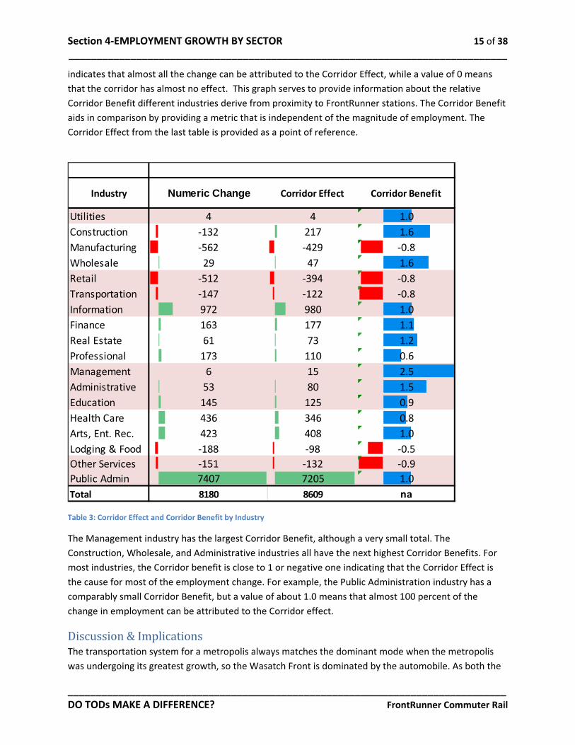
indicates that almost all the change can be attributed to the Corridor Effect, while a value of 0 means that the corridor has almost no effect. This graph serves to provide information about the relative Corridor Benefit different industries derive from proximity to FrontRunner stations. The Corridor Benefit aids in comparison by providing a metric that is independent of the magnitude of employment. The Corridor Effect from the last table is provided as a point of reference.
Table 3: Corridor Effect and Corridor Benefit by Industry
The Management industry has the largest Corridor Benefit, although a very small total. The Construction, Wholesale, and Administrative industries all have the next highest Corridor Benefits. For most industries, the Corridor benefit is close to 1 or negative one indicating that the Corridor Effect is the cause for most of the employment change. For example, the Public Administration industry has a comparably small Corridor Benefit, but a value of about 1.0 means that almost 100 percent of the change in employment can be attributed to the Corridor effect.
Discussion & Implications The transportation system for a metropolis always matches the dominant mode when the metropolis was undergoing its greatest growth, so the Wasatch Front is dominated by the automobile. As both the
Industry Numeric Change Corridor Effect Corridor Benefit
Section 4-EMPLOYMENT GROWTH BY SECTOR 16 of 38 ______________________________________________________________________________
______________________________________________________________________________ DO TODs MAKE A DIFFERENCE? FrontRunner Commuter Rail
density and size of the metropolitan area have grown, so has congestion, and Utah was forced to turn to transit on its most congested corridors. But as a metropolis built for the car, the retrofit has proved difficult. Fortunately, due to geographic constraints, Utah is more compact than most places. The Wasatch Front in Utah has seen an enormous resurgence in rail transit, beginning with the first TRAX light rail line in 1999 and the addition of lines over the next fifteen years. FrontRunner itself has been twice extended, once down the center of Salt Lake County and most recently into Provo City, in the center of Utah County, and adjacent metro area. But FrontRunner has been substantially different in character from TRAX, as a result of use of its freight right of way. While it represents the only access to rail transit around which to form TOD for many cities, actual results have been limited. History as a freight railway means that stations are peripheral to current centers of economic activity. Only Ogden Union Station and Salt Lake Central have seen significant development associated with FrontRunner. Much of which has been driven by a redevelopment agenda, and targeted invested, using subsidies to attract companies to the area, and shifting public offices into proximity of the FrontRunner. For example, Ogden successfully attracted a very large IRS processing center to the area near its FrontRunner station.
______________________________________________________________________________ DO TODs MAKE A DIFFERENCE? 17 of 38
5-EMPLOYMENT RESILIENCE
Introduction Resilience is defined as the ability to absorb and recover from shocks or disruptions. Resilient systems are characterized by diversity and redundancy. The resilience of employment is a critical factor in community economic health. For many communities, the loss of a single primary employer can be catastrophic, resulting in a state of sustained collapse. Employment resilience is the capacity to recover from such disruptions, due to locational characteristics.
Access to transit can help improve employment resilience because proximity to transit is a source of competitive advantage for some industries. Firms located near transit also benefit from reduced employee and visitor parking needs. This translates into an ability to economize on the size of parcels required, both reducing costs and increasing the number of viable sites for business locations.
Transit provides a mechanism to meet transportation needs and unusual or unexpected conditions, such as an automobile breakdown or lower income, and it provides alternate transportation options during conditions that impair other modes, such as weather, construction projects, or accident-induced delay. It also provides accessibility to a population unable to drive such as the young, the elderly, and the poor (VPTI 2014). These factors act to reduce tardiness and absenteeism, thus reducing employment turnover.
Transit also helps create ‘thick’ markets for employment, whereby employees can match themselves to numerous different employment opportunities. This reduces the time necessary to find matches, unemployment duration, and the unemployment rate.
Data and Methods An interrupted time series was used to compare the resilience of employment in both areas to determine if proximity to transit represents a locational advantage. An interrupted time series divides a time series dataset into two time series with the datasets separated by an ‘interruption’ and compares the differences. For the purpose of this analysis, the interruption is the Great Recession, considered to have begun in 2007.
If an interruption has a causal impact, the second half of the time series will display a significantly different regression coefficient than the first half. Failure to be adversely affected by a severe economic shock indicates employment resilience. A low R-squared (R2) represents larger variability in total employment. Industry sectors with a high R2 demonstrate robust trends, indicating that employment failed to change regardless of the effects on the larger economy. The regression coefficient represents the relationships between the change in variables, and the R2 explains how much of the variance in the data is explained by the regression equation—a measure of the ‘goodness’ of the regression.
Section 5-EMPLOYMENT RESILIENCE 18 of 38 ______________________________________________________________________________
______________________________________________________________________________ DO TODs MAKE A DIFFERENCE? FrontRunner Commuter Rail
Results A line graph of the employment by industry time series is presented in Figure 4. The time series (2002-2011) for each is interrupted in 2008. The vertical axis shows total employment in each industry sector along the corridor. Illustrative regression lines with R2 values have been added for some of the industries. The trend lines and associated R2 values for all industry sectors can be found in Table 4.
Figure 3: Regression trend lines and R-squared values for different industries
Section 5-EMPLOYMENT RESILIENCE 19 of 38 ______________________________________________________________________________
______________________________________________________________________________ DO TODs MAKE A DIFFERENCE? FrontRunner Commuter Rail
As the graph shows, industry employment varies by year, with many industries affected by substantial fluctuations in employment, both before and after the recession. While visual inspection is valuable, more rigorous interpretation is necessary.
Resilience by industry is presented in Table 4. It highlights the resilience of different industries between 2002-2008 and 2008-2011. The trend number is the linear regression line on industry employment over time. Trend indicates whether total employment increases or decreases during each time period. A negative trend indicates sustained loss of employment while a positive trend indicates a sustained gain. The trend number is the slope of the regression line. However, industries with larger total employment will have larger slopes. To normalize trend numbers for comparison between industries, the trend percent is presented. It is calculated by dividing the trend number for a time period by the average employment for that period. Finally, the R2 column indicates how strong a trend is. Industry sectors with a high R2 demonstrate robust trends—trends in employment change that are consistent over time with less tendency to fluctuate.
The change in the trend between the two time periods is given in the differences column. A positive value for the trend number represents a change from employment loss to employment gain, or a reduction in the rate of decline in employment for that industry. The change in strength of trend is given by the R2 column. A positive value indicates that a previously erratic trend has become more consistent. A negative value means a previously consistent trend has become more erratic.
Table 4: Changes in employment trends for 0.5 mile buffer of the transit corridor
Prior to the Great Recession, most industries had positive employment trends, with the notable exceptions of Information and Finance, both of which had substantial declines both as numerical and as trends percentages. During the 2008 to 2011 period in the transit corridor, overall employment rose,
Section 5-EMPLOYMENT RESILIENCE 20 of 38 ______________________________________________________________________________
______________________________________________________________________________ DO TODs MAKE A DIFFERENCE? FrontRunner Commuter Rail
and most industries had increasing employment. The Retail and Manufacturing industries saw the worst declines, numerically speaking.
Differences in trends (number and percent) and the strength of trends (R2) indicate which industries in the corridor did better after 2008, as the recession reached its trough and the recovery began. The most substantial positive difference in trends is for the Public Administration industry, followed by the Information industry. Finance and Arts/Entertainment/Recreation also posted substantial increases.
In terms of trend consistency, as measured by the R2 value, the Health Care industry proved the most resilient. In addition to an improved R2 value, indicating greater consistency in trends, it had positive trends before and after the Great Recession. Public Administration shows a similar pattern, although from a weak trend before 2008.
In addition to resilient industries, there are industries that are emergent. They represent a phase shift or transition away from pre-recession industrial ecology and toward a new and different one. Emergent industries are characterized by flat or falling trends prior to the recession, but large positive trends following the recession. Industries that characterize this pattern are the Information and Finance industries.
Discussion & Implications Gauging the resilience of employment around FrontRunner commuter rail stations is difficult, because the opening of FrontRunner itself confounds the analysis. It began operations in 2008, at the same time the Great Recession reached its nadir. FrontRunner itself began construction during the housing boom. Anticipated to serve as an alternate for the crushing loads of traffic predicted for the parallel I-15 highway corridor, the demand never materialized. As a result of the housing crash, the exponential increase in the number of homes predicted throughout Weber and Davis Counties failed to occur, and the combination of the Great Recession and rising gas prices has caused vehicle miles traveled to cease increasing. Thus, predicted highway congestion has never emerged, and FrontRunners’s value as an alternate corridor has not been realized. Without congestion to drive the value of non-automotive transportation, the value of accessibility deriving from proximity to FrontRunner has not substantially increased, so the anticipated private development around FrontRunner stations has failed to occur.
Some caveats are necessary. Employment in any industry sector is variable over time, and the amount of variability increases with smaller geographic units of analysis. Because the geographic unit of analysis is small, the amount of fluctuation is larger. Changes might ‘average out’ over a larger unit of geographic aggregation. In a given year, the relocation of a single firm, or the addition of a new building, would be sufficient to dramatically change employment trends in any industry. Finally, the area within a 0.5-mile buffer is fixed so new development requires the displacement of existing development. The new development may employ workers in different industries, or new residential development may replace existing employment.
______________________________________________________________________________ DO TODs MAKE A DIFFERENCE? 21 of 38
6-HOUSING AFFORDABILITY Introduction It is not always possible to maintain a supply of affordable housing for a growing population by adding housing at the urban periphery. Such locations are the furthest from employment and services, requiring long distance travel to meet basic needs. Total cost of automobile ownership is considerable, given not only the cost of the automobile itself, but also the operations and maintenance costs associated with fuel, insurance, and repairs. Housing in exurban locations may be cheap without actually being affordable.
It is necessary for housing affordability to include both housing and transportation costs (H + T). Housing costs do not exist in isolation but within the context of transportation costs. While housing in an urban location with transit access may cost more than suburban housing, it may still be more affordable once the effect of associated transportation costs has been taken into account. Low-income households tend to spend a high proportion of their income on basic transportation (VPTI 2012). Faced with high transportation costs, close proximity to public transit networks is an effective solution. Populations in poverty remain concentrated in central cities partially because such locations enjoy high quality public transit (Glaeser et al 2008).
While the effects of heavy rail transit on housing affordability has been extensively researched, the effects of non-heavy rail TOD on housing affordability is mixed. Matching low-income employment to high-income housing fails to improve housing affordability, and matching high-income employment to low-income housing may actually decrease affordability through gentrification-induced displacement. Maintaining affordable housing through TODs may require the allocation of affordable housing resources (NAHB 2010). A review of the hedonic literature reporting the price effects of transit stations on housing suggests that TODs may be an anathema to the provision of affordable housing, given their propensity to increase housing values (Bartholomew and Ewing 2011).
Calthorpe (1993) initially proposed a ten-minute walk, or about a 0.5-mile radius, as the ideal size for a TOD. Empirical studies confirm that while the majority of walk trips occur for distances of or equal to 0.5 miles, the effects of proximity to transit can be detected out to 1.5 miles away (Nelson 2011). Access to fixed guide-way transit systems is frequently by non-walk modes such as bicycle, bus, and automobile. The characteristics of the built environment within a mile buffer of a station can still affect transit ridership (Guerra, Cervero, & Tischler 2011).
Data and Methods This section describes the data used for analysis, and the techniques used to process and analyze the data. Unlike all other analysis contained in this report, the housing affordability analysis included data from multiple 0.25-mile buffers, not just a single 0.5-mile buffer. Doing so makes it possible to relate the magnitude of the effect of proximity to transit. Near things are more related than distant things (Tobler 1970). This makes it possible to track the relationship between the magnitude of the effect and proximity to transit. The area within the smallest buffers should show the strongest effect from transit.
Section 6-HOUSING AFFORDABILITY 22 of 38 ______________________________________________________________________________
______________________________________________________________________________ DO TODs MAKE A DIFFERENCE? FrontRunner Commuter Rail
Data Source and Geography This study uses the Location Affordability Index (LAI). The Location Affordability Index was developed by under the aegis of the Sustainable Communities, an inter-agency partnership between the Housing and Urban Development, US Department of Transportation, and the Environmental Protection Agency. The LAI is an effort to use statistical modeling to determine the factors which underlie the causes of housing and transportation costs. It controls for a number of factors known to influence transportation and housing costs, such as income and number of workers. The full methodology for the LAI can be found at: http://lai.locationaffordability.info/methodology.pdf.
The LAI provides an estimate of the total cost of housing plus transportation for different locations. The LAI offers eight different household profiles of different family types. For this analysis, type 1 household (hh_type1) was used. It represents the Regional Typical household, with average household size, median income, and an average number of commuters per household for the region. A full data dictionary can be found at: http://lai.locationaffordability.info/lai_data_dictionary.pdf
The unit of analysis for the dataset is the 2010 Decennial Census Block Group. The data extent is the Census 2010 Core-Based Statistical Area (CBSA). When transit lines crossed the boundary into adjacent statistical areas, both statistical areas were included.
Data Processing The data were downloaded from http://www.locationaffordability.info/lai.aspx?url=download.php as CSV (Comma Separated Values) files. It was then joined to a shapefile of the 2010 Decennial Census Block Groups from https://www.census.gov/geo/maps-data/data/tiger.html
Census Block Groups represent an unacceptably large geography for transit relevant analysis. It was necessary to devise an alternative to determining buffer membership by selecting a centroid. Instead, ArcGIS was used to create a series of buffers around each corridor, in 0.25-mile increments, out to 2 miles. Those buffers were then used to clip the block groups. The characteristics of each block were then weighted by geographic ratio, which is the ratio between the area of the block group, and the area of the portion of the block group that was within a buffer. For instance, if a block group represented 3 percent of the area in the buffer, H+T characteristics for that block group received a weight of 3 percent. The weighted variables were then summed to obtain a geographically weighted value for the buffer.
For the purpose of comparison, a metro index was devised. Because the metropolitan area contains all census blocks, not just urban blocks, weighting the blocks by area was deemed inappropriate. Census block groups are intended to contain similar amounts of population, rather than volumes of area, so the size of Census block groups varies by orders of magnitude. Consequently, the comparison value for the metropolitan area was calculated by weighting the block group characteristics by Census 2012 block group population. This weighted average is intended to provide a referent for what normal values are for the metropolitan area.
This analysis makes use of seven characteristics from the location affordability index: Housing Costs as a Percent of Income and Transportation Costs as a Percent of Income, for owners, renters, and all
Section 6-HOUSING AFFORDABILITY 23 of 38 ______________________________________________________________________________
______________________________________________________________________________ DO TODs MAKE A DIFFERENCE? FrontRunner Commuter Rail
households in the region. Additionally, it makes use of the median income to translate percentages into dollar amounts.
Results The change in housing and transportation (H+T) costs are presented below with three results presented:
1. Housing, Transportation, and H+T dollar costs for the transit corridor 2. Housing costs by tenure, by percent of income 3. Change in H+T costs for transit corridors
For interpreting the Location Affordability Index, housing is considered affordable if total housing and transportation costs do not exceed 46 percent of income.
The 2009 combined housing, transportation, and H+T dollar costs for the transit corridor are shown in Figure 5. The vertical axis shows the dollar cost of housing and transportation. The horizontal axis shows how the total varies by buffer distance from the transit corridor. A stacked graph has been used to display the disaggregated effects of housing and transportation on H+T affordability.
Figure 4: Housing, transportation, and H+T costs for the transit corridor, 2009, by buffer distance
As the above graph shows, H+T costs near the transit line are lower than the metropolitan average. Housing costs vary erratically with distance to FrontRunner stations. Differences in transit costs are not as significant as differences in housing costs, and vary even less.
Section 6-HOUSING AFFORDABILITY 24 of 38 ______________________________________________________________________________
______________________________________________________________________________ DO TODs MAKE A DIFFERENCE? FrontRunner Commuter Rail
Transportation costs, and housing costs by tenure are shown in Figure 6. The vertical axis shows the percent of income needed to meet housing costs. The horizontal axis shows how the total varies by buffer distance from the transit corridor. The response to transit should be more significant nearer to the transit line.
Figure 5: Transportation costs & Housing costs by tenure, by buffer distance.
Transportation costs are lower near to FrontRunner stations. Housing costs for owners near transit are lower than the metropolitan average and show a notable uptick between the 0.25-mile and 0.5-mile buffer. Housing costs for renters show the same pattern, although housing costs are higher out to 1.0 miles from FrontRunner stations.
Discussion & Implications These results are incredibly exciting, as they confirm two theoretical assumptions about transit. Theoretically, the value of the additional accessibility generated by proximity to transit should be capitalized into property value, resulting in rising housing costs. The strongest response to transit should be in the areas closest to the transit station. The pattern of increases in housing costs matches this relationship. The increases in housing costs are greatest near the transit line. The cause of the increase can be attributed to rising housing costs suggesting that the value of the accessibility provided by the FrontRunner commuter rail is being capitalized into housing values. Access to faster, cheaper and more reliable rapid transit is valuable.
The value of reliability is often understated. The primary transit market is typically thought of as low-income transit dependent households. But for rapid transit, there exists a second distinct market, of workers with high enough incomes to both afford cars and access to desirable transit proximate locations, as an alternate if conditions favor its use. Rapid transit is less prone to delay from weather, accidents, or congestion. Travel time along a freeway corridor varies radically by conditions and by time of day. Many of the most congested corridors are barely sub-critical—even minor disruptions in traffic flow can trigger gridlock.
Section 6-HOUSING AFFORDABILITY 25 of 38 ______________________________________________________________________________
______________________________________________________________________________ DO TODs MAKE A DIFFERENCE? FrontRunner Commuter Rail
This suggests that rather than improving housing affordability, transit actually impair its. While this has been empirically demonstrated repeatedly, the extended hypothesis has been that reductions in transportation costs actually offset the increase in housing case. Evidence from FrontRunner suggests that while transportation costs do respond to proximity to the light rail, the effect is insufficient to counter the increase in housing values.
The continued rise in housing prices above the value of transportation costs can be explained by household and housing lifecycles. The effect of increasing H+T costs is compounded by tenure type. Housing affordability issues are most severe in locations where renting is the primary form of tenure. Renters, unlike owners, are not insulated against increases in housing costs. Rental tenure in America is characterized by short leases, so increases in property value can rapidly be capitalized into higher rents. Rising rents increase housing costs, resulting in the displacement of previous tenants, who are no longer able to afford the higher rents. In contrast, mortgage payments are fixed upon purchase, so that current homeowners are largely isolated from the effects of increases in housing costs. The primary cause of declining affordability for existing homeowners is increasing property taxes, of which homeowners pay only a fraction of the increase in value.
The percent of homeowners also acts to confound actual housing affordability conditions. In the past decade, the appreciation in home value has outstripped appreciation in wages so that many current homeowners could no longer afford to buy their own homes. While they are affordable for the current owners, their appreciated value makes them less affordable to prospective owners. Over time, this compounds housing affordability issues. Lower housing affordability means that fewer households are able to become home owners, and must remain renters. They thus remain vulnerable to further increases in housing costs. As rents rise, so does the premium associated with home ownership, so that households are willing to pay more for property. Cities with high monthly rents also have high property prices for a reason.
Policy intervention is necessary to ensure that housing locations near transit stations remain affordable. Without measures to maintain housing affordability, areas around transit stations will see the displacement of low-income renters in favor of medium income owners. There is a strong negative relationship between income and transit ridership, as low income households are more likely to be transit dependent, so this process acts to reduce transit ridership. Changes in the distribution of tenure will also reduce the benefits of self-selection. Households locating near transit self-select for proximity to transit, and are thus the types of households most likely to make use of transit.
Over time, as household characteristics, such as place of work and size of household change, the utility of proximity to transit changes. A single person household is extremely likely to be able to make use of transit, while a two-worker family household is less likely to be able to do so. Unable to make use of transit, such households would then require multiple vehicles, resulting in transportation costs in line with the metropolitan norm. In a worst case scenario, housing units around transit stations are owned by non-transit using households and yet suffer from higher average housing costs. In contrast, households in rental tenure are more likely to relocate in response to changing conditions, so that even if housing costs rise, transit ridership suffers less.
Long term, ensuring a supply of affordable transit oriented housing near stations will require policy intervention. The amount of affordable housing that is constructed is minimal. Most affordable housing
Section 6-HOUSING AFFORDABILITY 26 of 38 ______________________________________________________________________________
______________________________________________________________________________ DO TODs MAKE A DIFFERENCE? FrontRunner Commuter Rail
results from the depreciation of former medium income housing. Constructing new housing as infill development requires higher density housing than the surrounding urban fabric, because the land value has increased in the interval since the initial development of the area. Constructing new affordable housing requires higher densities, due to the lower return per unit. In combination with parking requirements, new affordable housing is required to ‘go vertical’ to achieve sufficient density.
Reducing or eliminating parking minimums near transit stations would be an effective policy. Reduced parking would lower per-unit cost of new affordable housing, and reduce the tendency to convert affordable transit oriented rental units to unaffordable transit indifferent owner-occupied units.
______________________________________________________________________________ DO TODs MAKE A DIFFERENCE? 27 of 38
7-JOB ACCESSIBILITY Introduction Commuters have the ability to travel long distances more rapidly by fixed guide-way transit, making it possible to connect to destinations that are otherwise too distant. TOD is based on the premise that locating housing and employment in close proximity to transit stations will significantly enhance the accessibility of those locations. Because each transit line connects multiple stations, it creates a Transit Oriented Corridor (TOC) where people can live or work near any station and use the rapid transit system to access destinations at any other station along the corridor. Therefore, TOD should significantly enhance employment accessibility along the corridor.
To achieve jobs-housing balance, there should be a rough proportionality between the amount of employment and the amount of housing. However, merely matching the total number of jobs and housing along a corridor is not enough. In recent years, the jobs-housing balance has been refined to include how well jobs (by income) are matched to housing (by income), to ensure that people working in the corridor can afford to live in the corridor. Proximity to light rail stations and bus stops offering rail connections is associated with low-wage job accessibility, but proximity to bus networks alone does not show the same correlation (Fan 2012). To check the degree of match between employment and residence, this analysis controls for both low and high wages. To further check for the degree of match, it compares the occupation balance of how well the number of people employed in the corridor matches the number of people residing in the corridor. If an industry is making heavy use of transit along the corridor, the numbers should be near equivalent.
If transit has a positive effect on jobs-housing balance, there should be a detectable change in the employment resident balance for both wage categories and for all occupation categories.
Data & Methods The data used comes from the Census Local Employment-Housing Dynamics (LEHD) data source, using the Local Employment Dynamics (LED) datasets. Because the LODES data contains both place of employment and place of residence, it is possible to aggregate data to obtain both workplace area characteristics (WAC) and residential area characteristics (RAC). The ratio between the total workers at these different geographies was used as the jobs-housing balance. Corridors with better jobs-housing balance were presumed to have better job accessibility.
Three analyses were performed to determine job accessibility within the corridors: overall jobs-housing balance, jobs-housing balance by earnings category, and jobs-housing balance by industry. In addition to providing total number of employees per Census Block, the LED employment data are classified by earnings category. The LED classifies income by monthly earnings, into the following categories:
• $1250/month or less • $1251/month to $3333/month • Greater than $3333/month
Section 7-JOB ACCESSIBILITY 28 of 38 ______________________________________________________________________________
______________________________________________________________________________ DO TODs MAKE A DIFFERENCE? FrontRunner Commuter Rail
The categories have been treated as low-medium-high income classifications. The actual monthly values are less significant than changes over time in the distribution of each of the categories in proximity to the transit corridor. LED employment data are also classified by industry using the NAICS at the two-digit summary level.
ArcGIS was used to create a series of buffers around each corridor in 0.25-mile increments. Those buffers were then used to select the centroid point of the LED block groups within those buffers, and summarize the totals. Because the location of census block points varies from year to year (for reasons of non-disclosure), it was necessary to make a spatial selection of points within the buffer for each year, rather than using the same points each year. For this analysis, the 0.5-mile buffer was used.
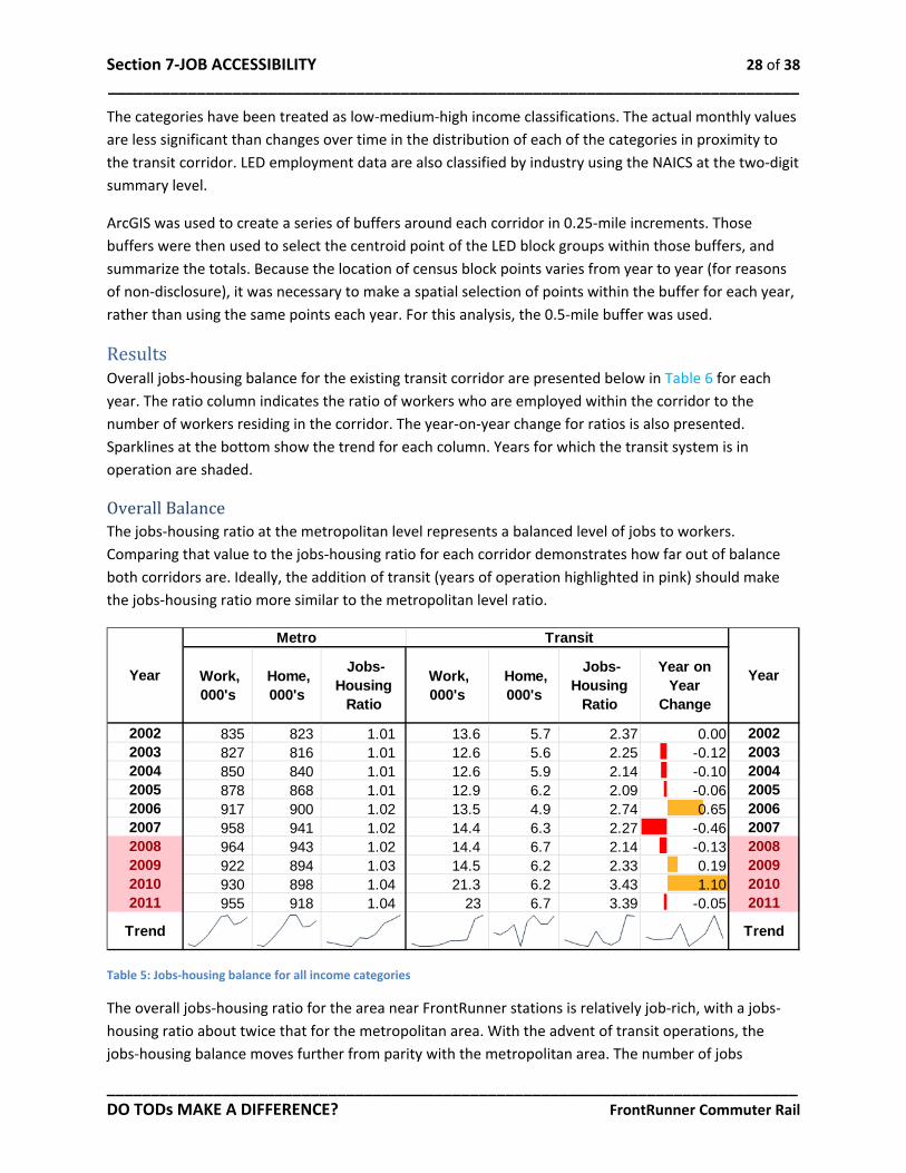
Results Overall jobs-housing balance for the existing transit corridor are presented below in Table 6 for each year. The ratio column indicates the ratio of workers who are employed within the corridor to the number of workers residing in the corridor. The year-on-year change for ratios is also presented. Sparklines at the bottom show the trend for each column. Years for which the transit system is in operation are shaded.
Overall Balance The jobs-housing ratio at the metropolitan level represents a balanced level of jobs to workers. Comparing that value to the jobs-housing ratio for each corridor demonstrates how far out of balance both corridors are. Ideally, the addition of transit (years of operation highlighted in pink) should make the jobs-housing ratio more similar to the metropolitan level ratio.
Table 5: Jobs-housing balance for all income categories
The overall jobs-housing ratio for the area near FrontRunner stations is relatively job-rich, with a jobs-housing ratio about twice that for the metropolitan area. With the advent of transit operations, the jobs-housing balance moves further from parity with the metropolitan area. The number of jobs
Section 7-JOB ACCESSIBILITY 29 of 38 ______________________________________________________________________________
______________________________________________________________________________ DO TODs MAKE A DIFFERENCE? FrontRunner Commuter Rail
increases dramatically in 2010, and the number of homes in 2011, resulting in erratic year on year changes.
Income Balance Jobs-housing balance by earnings category improves as the overall jobs-housing ratio provides only a rough metric of the degree to which residents are matched to places of work within a corridor. Matching low-income residents to high-income workplaces will not increase job accessibility. Comparing the jobs-housing ratio by income category makes it possible to gauge not just the overall improvement in jobs-housing balance, but which earnings categories benefit the most from proximity to transit. To determine the degree to which an earnings-specific match is accomplished, Table 7 compares the jobs-housing balance to the earnings category.
Section 7-JOB ACCESSIBILITY 30 of 38 ______________________________________________________________________________
______________________________________________________________________________ DO TODs MAKE A DIFFERENCE? FrontRunner Commuter Rail
Section 7-JOB ACCESSIBILITY 31 of 38 ______________________________________________________________________________
______________________________________________________________________________ DO TODs MAKE A DIFFERENCE? FrontRunner Commuter Rail
The transit corridor is job-rich for all three income categories, but particularly for high income, where it has 2 to 4 times as many workers as working residents. The jobs-housing ratio is nearest to parity with the metropolitan area for medium income workers. Over time, and especially after the advent of transit, the jobs-housing ratio moves further from parity with the metropolitan area, becoming increasingly job-rich.
The Sparklines show a spike in employment in for all three income categories; in 2011 for low income, 2010 for medium income and both for high-income. High-income workers are the only category to see both workers and workers residing in the corridor increasing.
Industry Balance Industry balance provides a more refined understanding of the match between place of residence and place of work. Comparing the jobs-housing ratio by industry category makes it possible to determine which industries benefit the most from proximity to transit. The industry balance for the transit corridor is presented in Table 8. The jobs-housing ratio has been broken into two data series by the year of the advent of transit.
If any population is making extensive use of transit, they would be expected to be both working and living in the transit corridor. If so, the number of people in any given industry both working and living in the corridor should increase over time, bringing the jobs-housing ratio for the corridor closer to the ratio for the metropolitan area.
Section 7-JOB ACCESSIBILITY 32 of 38 ______________________________________________________________________________
______________________________________________________________________________ DO TODs MAKE A DIFFERENCE? FrontRunner Commuter Rail
Table 7: Job accessibility trends over time by industry sector and corridor
In 2008, when transit operations began, the transit corridor was job-rich for all industries, barring Utilities, Finance, Management, and Education. Following the advent of transit, numerous industries moved toward parity with the metropolitan jobs-housing ratio of 1.02, by becoming less job-rich. Finance deviates from this trend, with a jobs-housing ratio that increases beyond parity with the metropolitan level. Health Care, at parity on the advent of transit, becomes far more job-rich, and Public Administration becomes extremely so.
Discussion & Implications The jobs-housing ratio by incomes does not suggest that transit improves jobs-housing balance, and indeed may aggravate it. In general, most industries move further away from parity, becoming more job-rich. Year on year changes are erratic, with no clear pattern standing out. New transit lines are situated to maximize ridership. Maximizing ridership means focusing on density. The more origins and destinations near a transit station, the more likely it is to generate ridership.
2002 2002 to 2008 2008 2008 to 2011 2011
Utilities 0.00 0.00 0.17
Construction 1.86 2.34 2.94
Manufacturing 2.81 1.91 1.48
Wholesale 1.60 1.70 1.95
Retail 1.61 2.06 1.49
Transportation 3.06 2.29 1.91
Information 7.86 1.90 9.28
Finance 2.11 0.83 1.26
Real Estate 1.58 1.49 1.75
Professional 4.53 4.46 4.70
Management 0.99 0.71 0.71
Administrative 1.87 2.43 2.59
Education 0.31 0.62 0.85
Health Care 1.14 1.03 1.51
Arts, Ent. Rec. 5.17 3.99 6.30
Lodging & Food 3.23 3.21 2.94
Other Services 3.89 3.33 2.92
Public Admin 2.62 2.95 22.24
TransitIndustry
Section 7-JOB ACCESSIBILITY 33 of 38 ______________________________________________________________________________
______________________________________________________________________________ DO TODs MAKE A DIFFERENCE? FrontRunner Commuter Rail
Employment tends to be concentrated, so that employment densities are almost always greater than residential densities. Thus, transit systems tend to be built in job-rich locations. The jobs-housing ratio improves toward parity for some industries, but these are the same industries that earlier analysis characterized as experiencing large job losses. So it seems likely that the increase toward parity along the corridor is not a result of more residents matching their place of residence to their place of work, but rather a result of a lower number of workers in that industry. The larger the metropolitan area, the more places it is possible to both live and work. Thus, the less likely any given worker will be a resident of any given geography. For any growing and expanding metropolitan area, the match between workplace and residence would be expected to worsen over time. However, the addition of transit would be expected to counteract this, providing a mechanism to assort workers in a way that their residential location better matches their employment location. It seems likely that the magnitude of the effect of transit is insufficient to improve jobs-housing balance. Ideally, comparing the jobs-housing ratio for different industries should show which industries are transit compatible, with transit compatible industries showing better matches. At the corridor scale, it seems unable to do so. The jobs-housing ratio is very far from parity for most industries. While improving the job-worker ratio along the corridor towards parity would be a positive result, the failure to do so may not capture the whole story. Effectively gauging the effect on jobs-housing balance would require evaluating the jobs-worker balance over the whole transit network. For a transit system to substantially improve jobs-housing balance by bringing the jobs-housing ratio (by any criteria) into greater conformity with the metropolitan norm, the change in mobility and accessibility provided by that transit system must be sufficient to influence residence location choices for a substantial number of people. Given the limited area within walking distance of transit stations, this implies either very high residential density in proximity to transit stations, or some mechanism that concentrates enough workers to proxy for residential density, such as park and ride lots or transit centers fed by local bus service.
______________________________________________________________________________ DO TODs MAKE A DIFFERENCE? 34 of 38
8-SUMMARY OF FINDINGS Summaries of the results of the analysis for the five policy questions bellow.
Are TODs attractive to certain NAICS sectors? Do TODs generate more jobs in certain NAICS sectors? Are firms in TODs more resilient to economic downturns? Do TODs create more affordable housing measured as H+T? Do TODs improve job accessibility for those living in or near them?
Q1: Attractiveness to NAICS sectors (Location quotient) Transit corridor
• Substantial Increases: Public Administration • Notable Increases: Arts/Entertainment/Recreation and Finance • Substantial Reductions: Other services
Q2: Do TODs generate more jobs in certain NAICS sectors? (Shift-share analysis) Numeric Change in Transit corridor
• Employment in transit corridor grew more than metro area • Substantial numeric increases: Public Administration, Information • Substantial percent increases: Public Administration, Information • Substantial reductions: Construction and Retail
Effect of corridor, as per shift-share • Overall Corridor Effect is positive • Public Administration benefits the most • Negative for: Manufacturing and Retail
Q3: Are firms in TODs more resilient to economic downturns? (Interrupted Time Series) In this example, resilience is defined as the capacity to maintain a positive trend despite the economic shock of the 'Great Recession'. The R2 values measure the amount of variation in trends before and after the recession. More resilient industries will have more similar R2 values. Transit corridor before 2008
• Greatest numerical increase: Construction & Retail • Greatest percent increase: Construction and Administrative • Declining: Information & Finance
Transit corridor after 2008 • Strong positive trends: Public Administration & Information • Lesser positive trends: Arts/Entertainment/Recreation and Health Care
Transit Corridor Differences before and after Great Recession • Biggest positive change: Public Administration • Resilient (Positive trend before and after): Education, Health Care, and Public Administration • Emergent (Negative trend before, positive trend afterward): Information,
Arts/Entertainment/Recreation and Finance
Section 8-SUMMARY OF FINDINGS 35 of 38 ______________________________________________________________________________
______________________________________________________________________________ DO TODs MAKE A DIFFERENCE? FrontRunner Commuter Rail
Q4: Do TODs create more affordable housing measured as H+T? (Housing affordability) Unlike other analyses in this report, this analysis measures changes in more than just the .50 mile buffers. The magnitude of the effect of transit should be proportional to proximity to transit. Transit corridor
• H+T costs for the transit corridor are less than the metropolitan average • H+T costs rise with proximity from 0 to 0.75 miles • Housing costs are higher near to the transit corridor
Transit corridor transportation costs and housing costs by tenure • Transportation costs lower near the transit corridor • For renters, housing costs are higher nearer the transit corridor within 0.5 miles • For owners, housing costs are higher nearer the transit corridor within 0.25 miles
Q5: Do TODs improve job accessibility for those living in or near them? Jobs accessibility was operationalized as the balance between number of workers and number of workers residing in the corridor, using the jobs-housing ratio as a comparison. The jobs-housing ratio for the metro was used as the preferred ratio. The differences were compared for all workers in the corridor, for workers by earnings, and for workers by industry.
• Job rich at start of study period, with jobs-housing ratio greater than that of the metropolitan area
• Erratic trends, big year on year changes • Changes in jobs-housing ratio caused by both declining number of workers, and declining
number of workers resident in the corridor • Jobs-housing ratio generally worsens for all income categories • Improvements in jobs-housing balance typically a result of job-losses
Extreme movements away from parity: Finance, Health Care, and Public Administration
______________________________________________________________________________ DO TODs MAKE A DIFFERENCE? 36 of 38
9-REFERENCES Arrington, G.B. and Robert Cervero. 2008. Effects of TOD on Housing, Parking, and Travel. TCRP Report 128. Washington, DC: Transportation Research Board.
Bartholomew, K. & Ewing, R. 2011. Hedonic price effects of pedestrian- and transit-oriented development. Journal of Planning Literature, 26(1), 18-34.
Cervero, Robert, et al. 2004. TCRP Report 102: Transit-Oriented Development in the United States: Experiences, Challenges, and Prospects. Washington, DC: Transportation Research Board.
US Census Bureau. Table 643, Annual Total Compensation and Wages and Salary Accruals Per Full-Time Equivalent Employee, by Industry: 2000 to 2009. < http://www.census.gov/compendia/statab/cats/labor_force_employment_earnings/compensation_wages_and_earnings.html>
Center for Neighborhood Technology. ‘About the Index’. http://htaindex.cnt.org/about.php
CTOD. 2011. Transit and Regional Economic Development. Chicago, IL: Center for TOD.
CTOD. 2009. Mixed-Income Housing Near Transit. Chicago, IL: Center for TOD.
CTOD. 2012. TOD Database. http://toddata.cnt.org/
Fan, Y., Guthrie, A., and Levinson, D. 2012. Impact of light rail implementation on labor market accessibility: A transportation equity perspective. Journal of Transport and Land Use, 5(3).
Glaeser, Edward L., Matthew E. Kahn, and Jordan Rappaport. 2008. Why do the poor live in cities? The role of public transportation. Journal of Urban Economics 63, no. 1: 1-24.
Kolko, Jed. 2011. Making the Most of Transit: Density, Employment Growth, and Ridership around New Stations. San Francisco, CA: Public Policy Institute of California.
Partnership for Sustainable Communities. 2013. Location Affordability Portal. http://www.locationaffordability.info/About_Data.aspx Accessed January 20, 2014.
NAHB. 2010. The Economic Impact of Low Income Housing Tax Credit Development Along Transit Corridors in Metro Denver. Washington, DC: National Association of Home Builders.
Nelson, Arthur C. 2011. The New California Dream. Washington, DC: The Urban Land Institute.
Schuetz, Jenny and Jed Kolko. 2010. Does Rail Transit Investment Encourage Retail Activity? Project 11-04. Los Angeles, CA: University of Southern California, Metrans Transportation Center.
Tobler W., (1970) "A computer movie simulating urban growth in the Detroit region". Economic Geography, 46(2): 234-240.
Section 9-REFERENCES 37 of 38 ______________________________________________________________________________
______________________________________________________________________________ DO TODs MAKE A DIFFERENCE? FrontRunner Commuter Rail
Victoria Transport Policy Institute (VPTI). Evaluating Transportation Resilience. Online TDM Encyclopedia, 31 March 2014. www.vtpi.org. Accessed 31 March 2014.
Victoria Transport Policy Institute (VPTI). Transportation Affordability. Online TDM Encyclopedia, 10 September 2012. www.vtpi.org. Accessed July 2, 2013.
Vinha, Katja Pauliina. 2005. The impact of the Washington Metro on development patterns. College Park, MD: University of Maryland.
______________________________________________________________________________ DO TODs MAKE A DIFFERENCE? 38 of 38
10-APPENDIX A LEHD
The Longitudinal Employer-Household Dynamics (LEHD) program is part of the Center for Economic Studies at the U.S. Census Bureau. The LEHD program produces new, cost effective, public-use information combining federal, state and Census Bureau data on employers and employees under the Local Employment Dynamics (LED) Partnership. State and local authorities increasingly need detailed local information about their economies to make informed decisions. The LED Partnership works to fill critical data gaps and provide indicators needed by state and local authorities.
Under the LED Partnership, states agree to share Unemployment Insurance earnings data and the Quarterly Census of Employment and Wages (QCEW) data with the Census Bureau. The LEHD program combines these administrative data, additional administrative data and data from censuses and surveys. From these data, the program creates statistics on employment, earnings, and job flows at detailed levels of geography and industry and for different demographic groups. In addition, the LEHD program uses these data to create partially synthetic data on workers' residential patterns.
All 50 states, the District of Columbia, Puerto Rico, and the U.S. Virgin Islands have joined the LED Partnership, although the LEHD program is not yet producing public-use statistics for Massachusetts, Puerto Rico, or the U.S. Virgin Islands. The LEHD program staff includes geographers, programmers, and economists.