Does Building New Housing Cause Displacement?: The Supply and Demand Effects of Construction in San Francisco * Kate Pennington † Latest version available here (Job Market Paper) November 11, 2020 Abstract San Francisco is gentrifying rapidly as an influx of high-income newcomers drives up housing prices and displaces lower-income incumbent residents. In theory, increasing the supply of hous- ing should mitigate increases in rents. However, new construction could also increase demand for nearby housing by improving neighborhood quality. The net impact on nearby rents depends on the relative sizes of these supply and demand effects. This paper identifies the causal impact of new construction on nearby rents, displacement, and gentrification by exploiting random variation in the location of new construction induced by serious building fires. I combine parcel-level data on fires and new construction with an original dataset of historic Craigslist rents and panel data on individual migration histories to test the impact of proximity to new construction. I find that rents fall by 2% for parcels within 100m of new construction. Renters’ risk of being displaced to a lower-income neighborhood falls by 17%. Both effects decay linearly to zero within 1.5km. Next, I show evidence of a hyperlocal demand effect, with building renovations and business turnover spiking and then returning to zero after 100m. Gentrification follows the pattern of this demand effect: parcels within 100m of new construction are 2.5 percentage points (29.5%) more likely to experience a net increase in richer residents. Affordable housing and endogenously located construction do not affect displacement or gentrification. These findings suggest that increasing the supply of market rate housing has beneficial spillover effects for incumbent residents, reducing rents and displacement pressures while improving neighborhood quality. Keywords: Displacement, Gentrification, Housing Supply, Spatial Econometrics * I would like to thank Brian Asquith and the Upjohn Institute for Employment Research for providing me with a fellowship to use the Infutor data, as well as invaluable discussion. Many thanks to Meredith Fowlie, Jeremy Magruder, and Reed Walker for their thoughtful advising. I appreciate the comments from my PhD cohort at Berkeley ARE and participants at UC Berkeley’s Environmental and Resource Economics seminar and the Urban Economics PhD Workshop. Robert Collins of the San Francisco Rent Board provided crucial data and information about evictions in San Francisco and Michael Webster of the City Planning Department provided data and context on San Francisco parcel histories. A warm thank you to Pedro Peterson and Joshua Switzky of the Planning Department for sparking this research agenda and for many conversations. This research has been supported by the San Francisco City Planning Department, Fisher Center for Real Estate and Urban Economics, the Upjohn Institute for Employment Research, and the Institute for Research on Labor and Employment at UC Berkeley. † Department of Agricultural and Resource Economics, University of California, Berkeley. [email protected]1
Transcript
Does Building New Housing Cause Displacement?:
The Supply and Demand Effects of Construction in
San Francisco∗
Kate Pennington†
Latest version available here(Job Market Paper)
November 11, 2020
Abstract
San Francisco is gentrifying rapidly as an influx of high-income newcomers drives up housingprices and displaces lower-income incumbent residents. In theory, increasing the supply of hous-ing should mitigate increases in rents. However, new construction could also increase demand fornearby housing by improving neighborhood quality. The net impact on nearby rents depends onthe relative sizes of these supply and demand effects. This paper identifies the causal impact ofnew construction on nearby rents, displacement, and gentrification by exploiting random variationin the location of new construction induced by serious building fires. I combine parcel-level dataon fires and new construction with an original dataset of historic Craigslist rents and panel dataon individual migration histories to test the impact of proximity to new construction. I find thatrents fall by 2% for parcels within 100m of new construction. Renters’ risk of being displaced to alower-income neighborhood falls by 17%. Both effects decay linearly to zero within 1.5km. Next,I show evidence of a hyperlocal demand effect, with building renovations and business turnoverspiking and then returning to zero after 100m. Gentrification follows the pattern of this demandeffect: parcels within 100m of new construction are 2.5 percentage points (29.5%) more likelyto experience a net increase in richer residents. Affordable housing and endogenously locatedconstruction do not affect displacement or gentrification. These findings suggest that increasingthe supply of market rate housing has beneficial spillover effects for incumbent residents, reducingrents and displacement pressures while improving neighborhood quality.
∗I would like to thank Brian Asquith and the Upjohn Institute for Employment Research for providing me with afellowship to use the Infutor data, as well as invaluable discussion. Many thanks to Meredith Fowlie, Jeremy Magruder,and Reed Walker for their thoughtful advising. I appreciate the comments from my PhD cohort at Berkeley AREand participants at UC Berkeley’s Environmental and Resource Economics seminar and the Urban Economics PhDWorkshop. Robert Collins of the San Francisco Rent Board provided crucial data and information about evictionsin San Francisco and Michael Webster of the City Planning Department provided data and context on San Franciscoparcel histories. A warm thank you to Pedro Peterson and Joshua Switzky of the Planning Department for sparkingthis research agenda and for many conversations. This research has been supported by the San Francisco City PlanningDepartment, Fisher Center for Real Estate and Urban Economics, the Upjohn Institute for Employment Research, andthe Institute for Research on Labor and Employment at UC Berkeley.
†Department of Agricultural and Resource Economics, University of California, [email protected]
1
1 Introduction
Cities across the United States are grappling with what to do about rising housing prices. Since the
1980s, the arrival of high-income newcomers has been driving up housing prices in downtown areas and
causing displacement and gentrification (Couture et al., 2019). Displacement refers to push migration,
where individuals typically move to lower-income neighborhoods with fewer economic opportunities
(Mok and Wang, 2020; Bilal and Rossi-Hansberg, 2018; Ding et al., 2016).1 Gentrification refers to the
replacement of lower-income residents with higher-income residents (Couture et al., 2019; Brummet
and Reed, 2019; Ellen et al., 2019; Ding et al., 2016; Guerrieri et al., 2013).2 Rising housing prices,
displacement, and gentrification often occur together, but they can also happen separately. A lack
of clarity over the causes and consequences of each of these processes, and their relationship to each
other, has complicated policy discussions about how to address them. This paper examines the impact
of one obvious but controversial policy lever: the construction of new housing.
Building new housing is controversial because its impact on rents and rates of displacement and
gentrification nearby is ambiguous. Increasing the housing supply could ground soaring housing
prices and slow demographic change. However, building new, high-quality housing could also increase
demand for nearby housing by improving neighborhood quality. If these demand effects are larger than
the supply effects, new construction could accelerate local displacement. Disagreement over the net
effect and spatial dynamics has led to contentious policy debate (Monkkonen (2016); Zuk and Chapple
(2016), 48 Hills 20203, San Francisco Magazine 20184). Some housing advocates argue that all new
construction should be affordable, that is, low-rent and income-restricted.5 This debate is really an
open empirical question. What is the impact of new housing construction on incumbent residents
and neighborhoods? How large is the supply effect compared to any potential demand effect? Is the
1Qualitatively, displacement refers to involuntary mobility, typically forced by rising rents, eviction, landlords orutilities shutting off heat and water, or natural disasters (Grier and Grier, 1980; Desmond and Shollenberger, 2015).Grier and Grier (1980) write that displacement occurs when a household is forced to move away “by conditions whichaffect the dwelling or immediate surroundings, and which: 1) are beyond the household’s reasonable ability to controlor prevent; 2) occur despite the household’s having met all previously-imposed conditions of occupancy; and 3) makecontinued occupancy by that household impossible, hazardous, or unaffordable.”
2In addition to this demographic definition of gentrification, the term gentrification is sometimes used to refer tochanges in the physical quality of the neighborhood such as building upgrades or the arrival of upscale businesses. Thisdefinition does not specify who lives in the upgrading neighborhood and enjoys its improved quality. Generally, theterm ‘neighborhood revitalization’ refers to quality upgrades when the incumbent residents remain, and ‘gentrification’refers to quality upgrades when the incumbent residents are replaced by richer newcomers.
3The article congratulates activists for successfully changing plans for a market rate development into plans for anaffordable development, claiming that “market-rate housing... would drive up prices (sic) everyone else in the area andlead to massive displacement.”
4The article is titled, “Is This Oakland Developer Building Sorely Needed Housing–or Dropping GentrificationBombs?”
5For a one-person household in San Francisco, the qualifying income range was $45,600 - $91,200 for a rentalapartment and $66,300 - $107,750 for ownership in 20186
2
impact of new market rate housing different from the impact of new affordable housing?
As one of the fastest-gentrifying cities in the country, San Francisco provides an ideal setting
for exploring these questions (Gyourko et al., 2013). Concern about housing affordability is nearly
universal – 84% of Bay Area residents feel there is a housing crisis.7 Over my study period from 2003-
2017, the average price of a one-bedroom apartment listed on Craigslist increased 97%. Systemic
racial inequality means increasing housing prices can also drive changes in racial composition (Depro
et al., 2015). Between 1990 and 2015, the city’s Black population shrank by 45%.8 Yet the majority
of San Franciscans – including renters – oppose new housing in their own neighborhoods, even as
they support an increase in citywide housing supply (Hankinson, 2018). In this paper, I study the
neighborhood impact of new housing construction in San Francisco from 2003-2017.
My analysis overcomes two challenges to research on this topic. The first is an identification
problem: it is well-documented that developers are more likely to build in areas that are already
appreciating (Boustan et al., 2019; Green et al., 2005; DiPasquale, 1999). To overcome this endogeneity
problem, I exploit exogenous variation in the location of new construction caused by serious building
fires. The combination of strict regulation and geography mean that San Francisco cannot grow up or
out. As a result, most new construction requires removing an existing building. Serious fires increase
the probability of construction on a burned parcel relative to its unburned neighbors by lowering
construction costs. I show that severe fires increase the probability of construction on the burned
parcel by a factor of 32 compared to unburned parcels. The incidence of serious fires is unrelated
to trends in rents, displacement, or gentrification. I discuss this identification strategy in detail in
Section 4.1.
The second challenge is to credibly and separately define displacement and gentrification. Sepa-
rating the measures of displacement and gentrification is crucial. Displacement happens to individual
people; gentrification happens to places. Gentrification may happen without displacement (low-income
incumbents willingly move, and are replaced by higher-income newcomers), and displacement may
happen without gentrification (push movers are replaced by newcomers from the same demographic
(Freeman, 2005; Desmond, 2016)). Using spatially aggregated data can mask changes within a smaller
spatial unit (Depro et al., 2015; Kinney and Karr, 2017; Ahlfeldt and Maennig, 2010) and blur the
distinction between displacement and gentrification (Ding et al., 2016; Zuk and Chapple, 2016).
To quantitatively define displacement and gentrification, I combine data on individual migration
7Quinnipiac University poll, 2019.8SF City Planning Department analysis of IPUMS data
3
histories with proxies for income. First, I leverage data on individual address histories from the
consumer data company Infutor. These data allow me to track the addresses of 1.24 million people
who lived in San Francisco between 2003 and 2017. While these data do not include individual
income, I can match each person’s zipcode to the median zipcode income from the Internal Revenue
Service (IRS). This allows me to create measures for displacement and gentrification that capture
both individual mobility and income.
I proxy for displacement using moves to poorer zipcodes. Focusing on moves to lower-income
zipcodes, rather than the universe of moves, helps to zero in on push migration. Surveys from San
Francisco, New York, Seattle, and Milwaukee all find that the need for cheaper housing is a primary
reason for push migration.9 Given the strong correlation between income and housing prices (Couture
et al., 2019), this suggests that households who are displaced by high housing prices will move to lower-
income areas. Indeed, Desmond and Shollenberger (2015) find that renters who report that they did
not want to move are more likely to go to poorer neighborhoods than renters who move voluntarily.
Of course, not all moves to lower-income zipcodes are pushed, and some displaced households may
move to higher-income zipcodes. As a robustness check, I show that the results are qualitatively the
same when I use eviction notices as an alternative measure of displacement.
To define gentrification, I aggregate these individual address histories to the parcel level. Land
parcels are the smallest stable unit of space in San Francisco, typically corresponding to one or
more street addresses in the case of condos and large apartment buildings. Although I do not have
individual income data, I can approximate individual wealth based on the median income of the
sending zipcode. A parcel gentrifies if the net change in richer residents (the number of arrivers from
richer zipcodes minus the number of leavers to richer zipcodes) is larger than the net change in poorer
residents (the number of arrivers from poorer zipcodes minus the number of leavers to poorer zipcodes)
(Guerrieri et al., 2013). This definition of gentrification improves upon the more common approach of
measuring changes in average income within a Census tract or blockgroup (Couture et al., 2019; Zuk
and Chapple, 2016), which cannot be differentiated from neighborhood revitalization (an increase in
incomes for incumbent residents).
Combining this rich microdata and identification strategy allow me to causally identify and com-
pare the spatial impact of housing construction on rents, displacement, and gentrification. The micro-
data allow me to make key distinctions between displacement and gentrification, renters and owners,
92019 Edelman Trust Barometer: Special Report on California, New York City Housing and Vacancy Survey, PugetSound Regional Council Household Travel Survey Program, Milwaukee Area Renters Study.
4
and market rate versus affordable construction10 that are not possible with aggregated data.
I find that monthly rents fall by $22.77 - $43.18, roughly 1.2 - 2.3%, for people living within
500m of a new project. This drop in rents precedes a similar decline in displacement risk. On
average, an additional housing project reduces displacement risk by 17.14% for people living within
500m. Using eviction notices as an alternative measure of displacement, I find that landlords of rent
controlled buildings within 100m are 0.77 percentage points (31.09%) less likely to evict tenants after
new housing is built, consistent with a reduction in the opportunity cost of rent-controlled leases.
Together, these findings suggest that the supply effect outweighs any demand effect at every
distance from the new construction project: there is no tradeoff between a reduction in average rents
and a hyperlocal increase in rents near new construction. However, the demand effect could still be
nonzero. To investigate, I assemble data on building owners’ upgrade decisions, sales, and moves. If
there are positive demand spillovers, building owners will internalize them by upgrading their own
buildings (Hornbeck and Keniston, 2017). I find that building renovations and business turnover all
increase within 100m. However, the probability of owner moves and residential sales do not change.
Given that new construction reduces rents for at least four years, this pattern may reflect a change in
expectations about future housing price appreciation. Owners may see new construction as a signal of
neighborhood upgrading, leading them to renovate their homes today so that they can enjoy a higher
sale price in the future.
I also explore demand effects by studying changes in the probability of endogenous new construc-
tion. If exogenous new construction creates a positive demand shock, then a standard supply and
demand framework predicts that it should lead to an endogenous supply increase. In other words, a
positive demand shock would lead developers to build more endogenous housing nearby. I find that
the probability that developers file for a new construction permit more than doubles within 100m of
new exogenous construction. This finding supports the idea that owners may be anticipating future
neighborhood change when they choose to renovate but not to sell.
The impact on gentrification follows the same pattern as the demand effect. Parcels within 100m
of new market rate construction are 2.5 percentage points (29.5%) more likely to gentrify, that is, to
experience a net increase in new richer inhabitants. The effect decays linearly to zero within 700m.
As with displacement, I find that neither exogenously located affordable housing nor endogenously
10A large proportion of new buildings in San Francisco include both market rate units and affordable units, oftendue to incentives like a density bonus that allows larger developments in exchange for including more affordable units(San Francisco’s density bonus program is called Home-SF). I classify all construction that includes market rate unitsas market rate; only construction that is 100% affordable is designated “affordable housing” here.
5
located construction affects gentrification.
Taken together, these findings suggest a supply effect with a wide radius of at least 1 kilometer
and a demand effect with a narrower radius. Demand responses like residential renovations, business
turnover, and the permitting of new endogenously located construction occur within eyeshot of the
new construction. This suggests that building new market rate housing actually benefits incumbent
tenants by reducing rents, evictions, and the risk of moves to poorer zipcodes. It also attracts wealthier
newcomers and new endogenous construction, slowly gentrifying neighborhoods without displacement.
In contrast, I find that affordable housing does not affect spatial trends in rents or the probability of
displacement and gentrification nearby.
This work contributes to a large and growing urban economics literature on the causes and con-
sequences of gentrification. Quantitatively, we can think of displacement as a high-interest tradeoff
between the present and future. Location is an asset: it determines people’s access to education, job
opportunities, social networks, living amenities, and housing costs (Bilal and Rossi-Hansberg, 2018).
Borrowers can transfer resources to the present by moving to cheaper areas, trading off short-term
reductions in housing cost against long-term opportunity. People who are displaced move to less de-
sirable areas – places with lower earning potential (Bilal and Rossi-Hansberg, 2018; Mok and Wang,
2020), worse schools, higher crime, more job turnover (Qiang et al., 2020), and greater exposure to
environmental bads like air pollution (Depro et al., 2015). Low-wealth households are particularly
likely to use their location asset rather than some other asset, because there are lower borrowing
constraints on moving than on receiving a loan. In this way, displacement intensifies and perpetuates
preexisting inequality.
While a new literature has begun to explore the supply and demand effects of new construction on
local housing prices, this paper introduces a new identification strategy and offers the first estimates
of impacts on rent, displacement, and gentrification in the same setting. Li (2019) finds that a 10%
increase in New York City housing stock causes rents to decrease 1% within 500 feet. She also finds
evidence of a smaller demand effect, with new high-rises attracting new restaurants. Combining
data across metro areas, Asquith et al. (2020) find that new construction decreases rents within 200m
relative to 200-800 meters away by about $200 per month and attracts a more income-diverse group of
newcomers. They also find evidence of an overshadowed demand effect: new construction increases in-
migration from rich areas, but by less than the increase in supply. Both papers rely on the plausibly
exogenous timing of completion conditional upon the timing of approval. My work extends these
6
identification strategies to exploit random variation in location as well as completion time.
Second, I contribute to a growing, diverse spatial economics literature that explicitly considers the
spatial dynamics of place-based policy. Ignoring spatial spillover effects can lead to large overestimates
(Blattman et al., 2017; Ahlfeldt and Maennig, 2010) or even reverse the sign (Englander, 2020; Glaeser
and Gottlieb, 2008) of the total policy impact. In this setting, I explicitly study the spatial spillovers
the neighboring residents from an experiment in a positive housing supply shock.
Finally, this paper contributes to an urban economics literature on the spatial dynamics of the
city. Cities represent large investments in durable goods with a coordination problem. Hornbeck and
Keniston (2017) argue that negative spillover effects on property values from outdated neighboring
buildings depressed renovation in Boston in the late 1800s. The Great Fire in 1872 unlocked a virtuous
cycle of simultaneous reconstruction by removing wide swaths of outdated housing stock. They use a
regression discontinuity design to identify a treatment effect gradient over distance from the burned
area, showing that proximity to a rebuilt plot increases nearby property values and the probability of
renovation. Rossi-Hansberg et al. (2010) and Diamond and McQuade (2016) find evidence of spillover
effects from neighborhood revitalization programs on nearby housing values and Ahlfeldt et al. (2015)
identify positive spillovers from designated landmarks within 600m. Asquith (2016) finds that San
Francisco landlords of rent controlled housing respond to exogenous price increases by increasing
eviction. While these papers investigate the impact of unique or sequential treatments, this paper
identifies the neighborhood effects of concurrent events within the same city.
The next section discusses the conceptual framework. Section 3 describes the data and Section 4
discusses the identification strategy and empirical setup. Section 5 presents results. Sections 6 and 7
use the results to make welfare calculations and compare the effectiveness of market rate and affordable
construction for reducing displacement. Section 8 discusses policy implications and concludes.
2 Conceptual framework
This paper aims to identify the causal impact of a local supply shock in the quantity of market rate
housing on local displacement and gentrification. The thought experiment is for a policymaker to
impose building more market rate housing than would occur endogenously. What are the impacts
on people who live nearby? As in Asquith et al. (2020) and Diamond and McQuade (2016), I treat
neighborhoods as small closed economies, taking as given all other prices and amenities in the city
7
and ignoring potential impacts on city size. These assumptions seem reasonable for this context given
the small quantity of construction over the study period; but this framework and these results would
not apply to a large supply shock which may have significant general equilibrium effects.
In principle, new construction affects displacement through countervailing supply and demand
effects that play out over distance from new construction. Let Θip denote person i’s risk of displacment
from parcel p. The net change in Θip depends on how close parcel p is to the new construction parcel
n; the size of the supply shock; and the size of the demand shock. Briefly, ∆Θip is a function of the
change in the rent Rp at parcel p, which is determined by the distance dp,n between parcel p and
construction parcel n, the change in supply S′
n, and the change in quality Q′
n:
∆Θip = fi(∆Rp(dp,n, S
′
n, Q′
n)))
(2.1)
Figure 1 shows three potential scenarios in the familiar supply and demand framework. The supply
and demand effects could offset each other, so that supply increases but prices stay the same (panel
1a). The demand effect could outstrip the supply effect, causing both supply and price to increase
(panel 1b). Finally, the supply effect could outstrip the demand effect, so that supply increases and
price falls (panel 1c).
Figure 2 displays four general cases for how these traditional supply and demand shifts might play
out over space. For simplicity, I depict linear relationships between price and distance, although the
true functional form may be more complex. I also only show one example of each case, although other
variations are possible for other rates of decay. The goal of these charts is simply to provide a clear
visual for how spatial dynamics might operate.
If the net effect is zero at every distance, then the supply effect and demand effect must have the
same slope and intercept (panel 2a). If the demand effect dominates the supply effect, then the net
gradient will be positive, kink where the supply effect goes to zero, and then decay to zero (panel 2b).
If the supply effect dominates the demand effect, then the net gradient will be negative, kink where
the demand effect goes to zero, and then decay to zero (panel 2c). Finally, it is possible that the net
effect has an inflection point (panel 2d).
8
3 Data
To estimate these gradients, I explore two main panel data sets: one at the individual level to study
displacement, and one at the parcel level to study gentrification. I build both data sets by combining
data at the address level from several different sources for the years 2003-2017.
3.1 Land Parcels and construction
I first build a comprehensive parcel-level data set containing information on housing units and year
built (and consequently rent control status) for all land parcels in San Francisco. I add City data on
zoning at the parcel level. Of the 160,706 parcels in the data, 81.7% are zoned to permit residential
space. I identify owner-occupied units using claims for homeowner’s exemptions in annual property
tax data.
Next, I add internal Planning Department data on new construction. These data include the ad-
dress, permit date, date certified for occupancy, number of market rate units, and number of affordable
units of every new construction project in San Francisco from 2003-2017. Table 1 displays summary
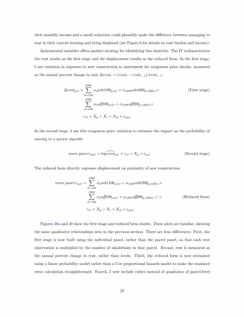
statistics and Figure 3 shows photographs of typical large market rate and affordable projects.
Since 2003, San Francisco has completed an average of 2,060 new units per year, with a stark
drop during the Great Recession. Most of these new units are market rate, although the number of
affordable units has been trending up. In 2017, more than 25% of new units completed were affordable.
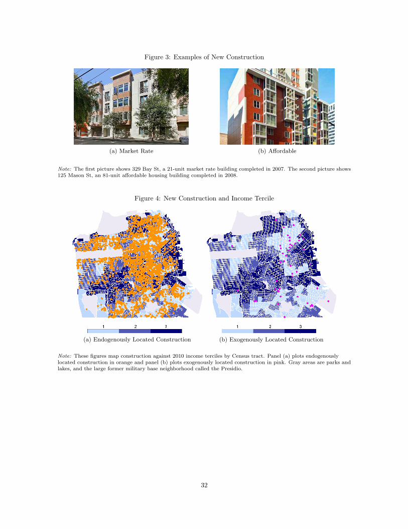
As shown in Figure 4a, most construction happens in the eastern half of the city, which is zoned for
larger residential buildings.
3.2 Building fires
I compile information on serious building fires by subsetting the universe of calls for service to the San
Francisco Fire Department according to several criteria. First, the call for service must also appear in
a separate database of fire incident reports, where it must be classified as an unintentional building fire
that required at least 10 units to be dispatched.11 Second, the incident must appear in Department of
Building Inspection complaints or in the description of new construction. Figure 5 shows an example
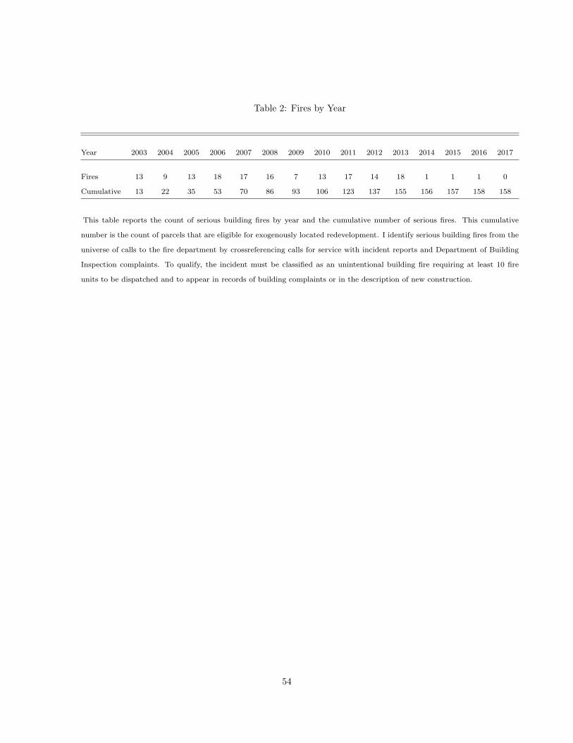
of a serious building fire and its damage record from 2011, and Table 2 counts the number of these
11I remove all incidents that the Fire Department categorized as potentially intentional. I select for at least 10fire units based on a phone conversation on April 19, 2018 with San Francisco Fire Department Chief InformationOfficer Jesus Mora, who explained that a fire serious enough to impact the probability of redevelopment would requirea minimum of 10 fire units.
9
fires occurring in each year. In total, 158 fires serious enough to affect the probability of construction
occurred from 2003-2017.
Combining the data on building fires with the data on new construction yields 47 projects that
took place on a burned parcel during the study period. As shown in Figure 4b, these exogenously
located projects are distributed over most of the city. To deal with potential selection issues, I will
limit my sample to the 135,062 parcels that are within 2km of an exogenous construction project. In
practice, however, the results are qualitatively unchanged if I use the fulll sample.
3.3 Displacement and gentrification
The heart of this paper relies on individual address histories provided by the consumer data company
Infutor. I observe the complete address histories of 1.24 million people who lived in San Francisco at
some point during my study period, including their other addresses anywhere in the United States.
Diamond et al. (2018) show that these data closely match Census tract records, reporting 1.1 adults
per adult counted in the Census and performing well within age groups. Adults may be overcounted
because Infutor data rely on address change data, which captures moves but not deaths. To address
this overreporting issue and to limit my sample to people who are likely to be able to move, I drop
individuals with birthyears earlier than 1930.
To define displacement, I use annual zipcode median income data from the Internal Revenue
Service to identify moves that are more likely to reflect push migration. I set a displacement dummy
equal to one if person i moves to a zipcode with a median income at least 10% lower than their current
median zipcode income.12 I also use this data to proxy for the relative wealth of arrivers and leavers
when I calculate gentrification variables. Figure 9 maps the change in the number of residents from
richer zipcodes from 2003-2017. Over the course of the study period, one in four parcels gentrified.
Both surveys and research suggest that using moves to poorer zipcodes is an appropriate proxy for
displacement. Desmond and Shollenberger (2015) find that renters who report that they did not want
to move are more likely to go to poorer neighborhoods than renters who move voluntarily. Surveys
from San Francisco, New York, Seattle, and Milwaukee all find that the need for cheaper housing is
a primary reason for push migration.13 More than half of low and moderate income households in
12This cutoff is arbitrary. Results are robust to alternative definitions, such as ± 1/2 standard deviation. The goal isto make sure that zipcodes with similar incomes are not mechanically classified as either richer or poorer. This approachgenerates three categories: richer, similar, and poorer.
132019 Edelman Trust Barometer: Special Report on California, New York City Housing and Vacancy Survey, PugetSound Regional Council Household Travel Survey Program, Milwaukee Area Renters Study.
10
San Francisco are rent burdened, that is, spend more than 30% of their monthly income on rent. For
households earning less than 30% of the Area Median Income (about $83,000 in 2014), the problem
is severe: the majority spend more than half of their monthly income on rent. Figure 6 shows rent
burden by income group.14 I find supportive evidence for this approach in my data. People who move
into new affordable housing, which is income restricted, are 23.87 percentage points less likely to come
from rich zipcodes (p = 0.00).
Given the strong correlation between income and housing prices (Couture et al., 2019), this suggests
that households who are displaced by high housing prices will move to lower-income areas. It is also
consistent with Ding et al. (2016)’s call to focus on the ‘quality’ of moves rather than the overall
mobility rate, and Dragan et al. (2019)’s finding that gentrification in New York City predicts moves
to lower-quality buildings but not the overall probability of moving. Of course, not all moves to
lower-income zipcodes reflect push migration, and some displaced households may move to higher-
income zipcodes. I show that the results are qualitatively the same when I use eviction notices as an
alternative measure of displacement.15
3.4 Rental prices
The city of San Francisco does not track rental prices. I construct an original panel data set on
historic rental prices by scraping archived Craigslist ads from 2003-2017. These ads are archived by a
nonprofit called the Wayback Machine, which sporadically archives versions of web pages on random
dates. I access archived Craigslist search results for housing, scraping information on neighborhood,
price, and number of bedrooms. A typical entry reads something like, “$2995 2BR REMODELED
FURNISHED 2BR/1BA Corner of Mission/Potrero/Design Districts.” I first construct rents at the
neighborhood level and then interpolate them using distance weights to the parcel level. I discuss this
procedure in detail in Appendix 11.3. Figure 7 shows the dramatic increase in rental prices over the
study period, from an average of $1,307 for a one bedroom apartment in 2003 to $2,573 in 2017.
Creating this data has two advantages. First, it allows me to observe changes in prices at a fine
14SF City Planning Department analysis of American Community Survey 2011-2014 estimates.15This approach is also consistent with extensive work in sociology and urban planning. Carlson (2020) reviews
the three most common strategies for measuring displacement: a “population approach” that measures changes inneighborhood demographics over time; an “individual approach” that tracks individual moves; and a “motivationalapproach” that observes both individual moves and the reasons for those moves. The choice of a proxy is usuallydetermined by data availability, but it has first-order implications for the results. Carlson uses data from the NewYork City Housing and Vacancy Survey to show that the population approach of measuring demographic change withinan aggregated spatial unit, such as an American Community Survey Public Use Microdata Area (PUMA) or a Cenusblockgroup, has almost zero correlation with a motivational measure (ρ = 0.06). The individual approach performsbetter, with a correlation of ρ = 0.64.
11
geographic scale. Other rental price data are available only at larger spatial scales, such as Census
blockgroup or county, and are sometimes averaged over time, as in the American Community Survey.
Second, different data sources are likely capturing different segments of the housing market. The
renters who are most vulnerable to displacement are more likely to use Craigslist than Zillow, which
caters to higher-income renters. The average 1 bedroom rent in the Craiglist data is $2,759 compared
to $3,422 in the Zillow data over the period 2014-2017.16 Figure 8 in the Appendix shows that the
Craigslist data tracks median rent data released by the United States Department of Housing and
Urban Development, which combine ACS estimates and data from other sources. It also shows that
Zillow rental price data, available beginning in 2011, is consistently higher than the Craigslist rents.
3.5 Other measures of displacement and gentrification
As a robustness check, I also compile address-level data on eviction notices from the San Francisco
Rent Board as an alternative measure of displacement. In Carlson (2020)’s analysis of the New York
City Housing and Vacancy Survey, difficulty paying rent accounted for 59% of push migration and
eviction accounted for 8%. This suggests that between my two proxies for displacement, I capture the
majority of distress moves. However, it is important to note that these data do not perfectly capture
evictions: some landlords evict tenants without going through the formal process (indeed, Carlson
(2020) finds that 5% of unwanted moves were driven by harassment by the landlord), and not all
eviction notices convert into an actual eviction because tenants have the opportunity to redress the
issues cited in the notice.
I will also evaluate changes in the probabilities of other types of moves, including moves to richer
zipcodes, moves away from the Bay Area, and any move.
Next, I assemble data that can help capture neighborhood change via demand effects. I observe
residential renovations using records from the Department of Building Inspection, property sales from
annual Assessors Data, and business turnover using records of business registrations and closures from
the Office of the Treasurer-Tax Collector.
16Calculated using publicly-available Zillow data at the zipcode level.
12
4 Research design
4.1 Identification strategy
The obvious identification challenge is that the timing and location of new construction are endoge-
nous: developers are likely to build in the same areas that are already experiencing increased rents,
displacement, and gentrification (Green et al., 2005; Li, 2019; Asquith et al., 2020).
I exploit exogenous variation in the location of new construction caused by serious building fires.
Regulation and geography combine to make San Francisco one of the most difficult places to build
housing in the United States (Albouy and Ehrlich, 2012; Saiz, 2010). Serious fires, like the one shown
in Figure 5, increase the probability of construction on the burned parcel by making it cheaper to build
there. Removing incumbent tenants eliminates the need for costly buyouts. Under San Francisco just
cause eviction law, landlords who want to sell or redevelop must either wait for tenants to voluntarily
leave, or negotiate a buyout agreement to pay the tenant to leave. In 2015, the median buyout per
tenant was $18,000 and the maximum was $325,000.17 Serious fires also streamline the permitting
and construction process. Controlling for project size, construction on unburned parcels takes nearly
a year longer to complete than projects on burned parcels (p=0.007).
This identification strategy exploits exogenous variation in the location, but not the timing, of
new construction. The limited study window means I cannot predict the timing of redevelopment
based on the timing of a fire. There is wide variation in the time lag between fire and redevelopment:
on average, 4.8 years pass between the fire and the permit application for new construction (sd 3.6);
7.2 years before completion (sd 4.2). Furthermore, not every burned parcel is redeveloped during my
study period. The fire data starts in 2003, so there are undoubtedly post-fire construction projects in
the data that I am not able to identify. Similarly, many – perhaps all – of the burned parcels in my
dataset will ultimately be redeveloped sometime in the future. Figure 12 displays variation in time to
construction.
For this reason, I do not claim that fires predict the timing of construction. Instead, I follow
the literature to argue that project permit and completion dates are quasi-random (within a band
of, say, 1-2 years) due to bureaucracy and construction management (Li, 2019; Asquith et al., 2020).
Similarly, San Francisco’s strict zoning laws mean that project size is determined by project location.
Put differently, developers may want to build a certain quantity of a certain type of housing in
17San Francisco Open Data, accessed 2 October 2019.
13
any given year. The fires make it more likely that they build on parcel A compared to nearby parcel
B.
I use the incidence of serious fires to identify a subset of new construction whose location is plausibly
exogenous within a micro-neighborhood. I will estimate the effect of proximity to new construction
using only these exogenously located projects, although I will also show results for endogenously
located projects for comparison. Using this strategy, I identify 47 parcels that receive exogenously
located market rate projects and 11 parcels that receive exogenously located affordable projects.18
My identifying assumptions are that 1) serious fires increase the chance of construction on that
parcel relative to other parcels within the same 1 km2 micro-neighborhood, and 2) they are unrelated
to displacement trends. The first assumption is easy to demonstrate. During my study period, 27.22%
of burned parcels receive new construction compared to 1.11% of unburned parcels. Controlling for
micro-neighborhood and year, this is a 32-fold increase in the probability of construction (p=0.0000).
To provide evidence for the second assumption, I conduct a series of balance tests. Table 3 shows
baseline characteristics for parcels near burned versus unburned parcels and redeveloped versus not
redeveloped parcels, controlling for micro-neighborhood-year. In the years before the fire, parcels
within the 100m neighborhood of the fire parcel are no more likely to see residents move to poorer
zipcodes than parcels further away. Similarly, before redevelopment, the burned parcels that will
be redeveloped are no more likely to see residents move to poorer zipcodes than burned parcels
that are not redeveloped within the study period. Other characteristics are similar as well: there
is no significant difference in rents, mean zipcode income, the number of residential units, Infutor
population, distance to downtown and train station, building renovations, or eviction notices. The
exception is that serious fires are more likely in neighborhoods with older buildings (mean year built
= 1927 versus 1933, p = 0.043) and where evictions are more likely (mean eviction notice = 0.010
versus 0.006, p = 0.011). These differences do not exist between redeveloped and undeveloped parcels,
which is the time comparison I exploit.
4.2 Building the empirical specification
The empirical approach in this study differs from other recent work on construction and housing prices
in two key ways. First, parcels can be treated more than once as new projects are completed over
time. The treatment intensity of parcel p with respect to construction project n varies with time
18Table 1 reports a total of 60 exogenous projects because one parcel receives multiple projects.
14
since completion, project size S′
n and change in neighborhood quality Q′
n. Parcel p’s total treatment
intensity in year t is a function of its exposure over time and distance to all construction projects
n ∈ N .
Capturing this complexity requires a new approach. Asquith et al. (2020) and Li (2019) use
differences in differences with near and far distance bins, which requires stable near and far areas.
Diamond and McQuade (2016) use a nonparametric difference in differences strategy, constructing an
empirical derivative by smoothing differences in housing prices over space. Hornbeck and Keniston
(2017) nonparametrically estimate a distance gradient and a cutoff point for the spillover effects of
the Great Boston Fire. These approaches require static measures of treatment intensity and clear and
stable divisions between the pre- and post-periods. In fact, Asquith et al. (2020) intentionally limit
their sample to housing units that are only treated by one project during their study period.
Here, I capture treatment exposure using distributed leads and lags in both time and distance.
In each year, I count the number of projects and housing units completed in a set of distance bins.
Figure 10 shows the construction of these binned treatment measures for an example parcel in an
example year. The parcel would have a value of 1 for the number of projects within 0-200m, 0 for
projects within 200-400m, and 1 for projects within 400-600m. Similarly, it would have a value of 6
for units within 200m, 0 within 200-400m, and 200 within 400-600m. Figure 11 maps this approach
over the city of San Francisco for the years 2015 and 2016. To deal with potential selection issues, I
limit my sample to parcels that are within 2km of exogenous construction at some point in the study
period, although the results using the universe of parcels are very similar.
The second difference between this study and other studies is that the main outcome of interest is
a binary event, rather than a continuous surface of housing prices. Moving is rare: most people never
move, or move only once. The average rate of moving is 4.45% per year; the average rate of moves to
poorer zipcodes, my proxy for displacement, is only 1.03%. After moving, individuals exit the sample.
Survival models are designed to study rare events like this, where the dependent variable is usually
zero and occasionally one, after which the individual exits the study. I build a Cox proportional hazards
model with time-varying covariates to study the impact of each explanatory variable on the treatment
(proximity to new construction) on the probability of failure (moving to a poorer zipcode). Coefficients
are reported as risk factors r, with r = 1 indicating no change in risk, and r < 1 indicating a reduction
of 1 − r. By construction, these comparisons are made within the same calendar year (analogous to
including year fixed effects in a linear specification). I allow the baseline hazard of moving to a poorer
15
zipcode to vary by birth decade and sex within each micro-neighborhood (analagous to birth decade
by sex by cell fixed effects in a linear specification). The results from a linear probability model are
similar (Appendix 11.2).
I construct the hazard of moving to a poorer zipcode for person i living in parcel p in micro-
neighborhood c in year t as a function of λ0sbc(t), the baseline hazard for a person of sex s born in
decade b living in micro-neighborhood c; Xipt, how long person i has lived at parcel p; and Xp, parcel-
level controls including latitude and longitude, rent control status, distance to the financial district
and Caltrain station19, landuse zoning, 2010 Census tract median income tercile, and a quadratic in
residential units; and exposure to new construction.
I begin by exploring the relationship between new construction and displacement using distributed
lags and leads in both time and distance. In the next section, I will use these flexible event study-style
plots to refine a condensed specification that uses the data more efficiently – including a large set of
lags and leads forces me to drop observations of early and late years and reduces power.
In the event study-style specifications, I include variables to capture the number of market rate
and affordable construction projects completed each year in a set of distance bins out to 2km. I
include separate counts for new market rate and new affordable construction to allow them to have
different effects. To manage the number of spatial leads and lags, I use smaller bins close to the new
construction, and larger bins as I move further way. This is consistent with the conceptual framework,
which permits a change of sign over very small distances close to the project but predicts a stable
sign beyond any potential inflection point (see Figure 2). Distance bins d within 1km of parcel p are
100m wide (mkt100p,d,t and aff100p,d,t); distance bins from 1-2km are 200m wide (mkt200p,d,t and
aff200p,d,t. The estimating equation is:
move pooreripct =
3∑
t=−2
(
1000∑
d=100
[
αdtmkt100p,d,t + βdtaff100p,d,t]
+
2000∑
d=1000
[
αdtmkt200p,d,t + βdtaff200p,d,t])
+
λsbc0(t) +Xipt +Xp + ǫpct
(4.1)
In addition to this survival model, I use ordinary least squares to study the effect of new construc-
tion on rents and other parcel-level outcomes. These specifications are run on panel data on land
parcels. I include micro-neighborhood by year fixed effects γct and the same set of parcel controls Xp
including latitude and longitude, rent control status, distance to the financial district and Caltrain
19Caltrain is a train running from San Francisco to Silicon Valley, a second hub for high-paying jobs in the Bay Area.
16
station, landuse zoning, 2010 Census tract median income tercile, and a quadratic in residential units:
rentpct =
3∑
t=−2
(
1000∑
d=100
[
αdtmkt100p,d,t + βdtaff100p,d,t]
+
2000∑
d=1000
[
αdtmkt200p,d,t + βdtaff200p,d,t])
+
γct +Xp + υpct
(4.2)
For both of these specifications, I correct standard errors for spatial correlation using randomization
inference.20 Figure 11 shows the spatial correlation of treatment in two consecutive years. Unlike other
studies which consider the effect of a single treatment on each unit of observation (Asquith et al., 2020;
Li, 2019; Diamond and McQuade, 2016), many of the parcels in this study are exposed to repeated
treatments as additional new buildings are completed over the study period. The spatial correlation
of the error terms changes over time. For this reason, it may not be sufficient to cluster standard
errors within a static spatial area. Instead, I solve this problem by using randomization inference to
create a distribution of log-likelihood statistics under the null hypothesis from simulations of spatially
correlated random assignment. I calculate p-values by locating my estimated log-likelihoods in this
simulated distribution.
To mimic the data generating process for randomization inference, I need to preserve the spatial
relationships in the data but randomly vary treatment location. I do this in two steps. First, I use the
real data to create a treatment surface. Second, I create a rule for overlaying this treatment surface on
the map of parcels in a random location. Imagine that the treatment surface is one sheet of paper and
the map of land parcels is another. To create each simulated data set, I randomly slide the treatment
sheet over the parcel sheet. This process preserves the spatial relationship between treatments.
The rule for where to locate the treatment surface is as follows. First, I randomly vary which
parcel receives simulated new construction within a micro-neighborhood-year. A neighborhood-year
that truly had no construction will also have zero simulated construction. A neighborhood-year that
had one project will have one simulated project of that same size, translated to a randomly selected
location.
This new location for simulated construction determines how the entire treatment surface shifts.
I calculate the distance and direction between the real construction parcel A and the simulated
20Computing the standard errors via randomization inference is computationally costly. In this working version ofthe paper, I report standard errors clustered at the micro-neighborhood level. In practice, these clustered standarderrors are very similar to errors calcualted in preliminary RI and do not make a qualitative difference. However, laterdrafts will include standard errors computed via RI.
17
construction parcel B. Then I translate the treatment surface by this distance and direction.
Figure 13 shows how recentering the treatment surface from parcel A to parcel B affects treatment
status across the whole city. Now each parcel is exposed to a simulated treatment intensity that
follows the same pattern of spatial correlation as the true treatment surface.
4.3 Event study results
Since I expect new construction to affect displacement through housing prices, I begin with event-
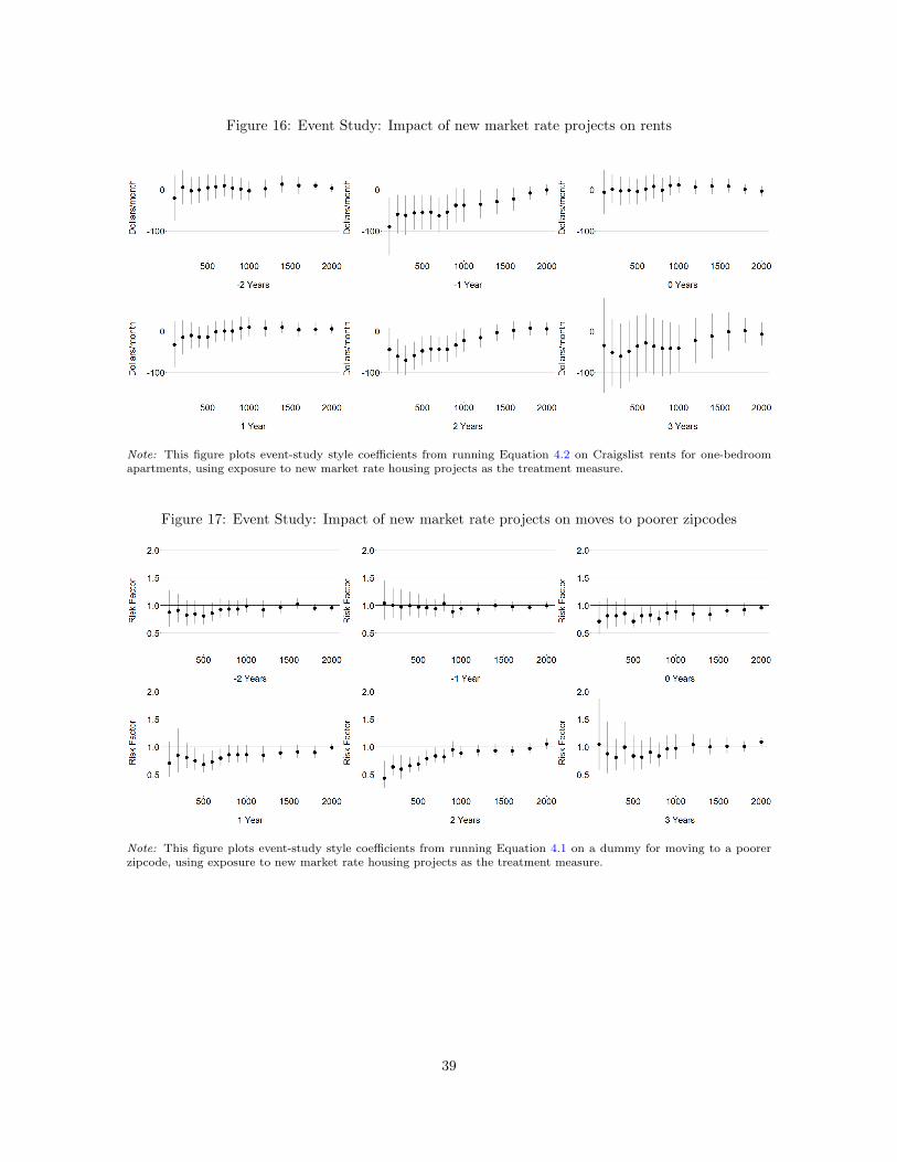
study style plots of results from Equation 4.2. Figure 14 shows that there is no pre-trend in rents
during the two years before construction is completed. A clear distance gradient begins in the year of
completion, with rents within 100m falling by $0.48 per new housing unit and decaying to zero over
distance. The rent reduction persists for at least four years. These findings imply that the risk of
moving may fall as early as t = 0 and remain lower for at least four years.
Alternatively, I can measure treatment exposure using binned counts of the number of completed
projects, rather than completed units. Figure 16 displays a similar pattern: there is no impact on
rents in the pre-period, but a strong distance gradient emerges the year before completion and persists
for at least four years. In t = −1, monthly rents fall by $100 per project for people living within 100m.
This effect decays in distance and time.
Next, I plot the impacts of new construction on displacement from Equation 4.1. Figure 15 shows
that person i’s hazard of moving to a poorer zipcode follows the same pattern: a distance gradient
emerges in year t = −1, the year that rents begin to fall, and persists for several years. Figure 17
displays a similar pattern for the impact of the count of completed projects, with displacement risk
falling beginning in year 0. These estimates are noisier than the estimates for rent because there is
less variation in the moving dummy than in rents.
Plots 20a and 20b show these results as smoothed surfaces. Distance is shown on the x-axis,
time relative to project completion is shown on the y-axis, and the coefficient is shown on the z-axis.
Standard errors are shown as transparent surfaces. Both plots show the same relationship: the effect
is zero for all distances in the pre-period. Starting by year 0, rents and displacement risk fall for
nearby parcels.
The effects identified by Equations 4.1 and 4.2 may continue beyond t = 3. To determine the
longer-term impacts of new construction, I run the specifications again using lags from t ∈ [4, 9]. I run
this longer-term specification separately to preserve statistical power: including lags t ∈ [−2, 9] would
18
limit me to studying projects completed from 2005-2008 because my study window only runs from
2003-2017. These longer-term plots (Figures 18, 19, 21, 22) suggest that impacts on rents persist for
at least 9 years, while impacts on displacement risk decay to zero by t = 5.
4.4 Main specification
These event plots suggest that the main impact on displacement occurs over the period t ∈ [−1, 4].
They also suggest that the distance gradient is approximately linear. Accordingly, I will now condense
the event study specification to estimate the average effect of exposure during the effect window
t ∈ [−1, 4]. This allows me to eliminate the temporal leads and lags, reducing the number of coefficients
of interest from more than 200 to 30. This condensed specification is both better-powered and easier
to interpret.
To study the average effect of exposure to new construction, I construct a measure of cumulative
exposure to new construction during the effect window t ∈ [−1, 4]. These new mkt and aff variables
capture the sum of construction completed within a rolling four-year window. For example, if parcel
p is within 100m of a market rate project completed in 2003 and within 100m of another project
completed in 2005, then mkt100p,100,2003 = 1, mkt100p,100,2004 = 1, and mkt100p,100,2005 = 2. The
streamlined specification is:
move pooreripct = λsbc0(t)+
1000∑
d=100
αdmkt100p,d,t + βdaff100p,d,t+
2000∑
d=1000
αdmkt200p,d,t + βdaff200p,d,t+
γct +Xipt +Xp + upct
(4.3)
The corresponding OLS specification is:
ypct =
1000∑
d=100
αdmkt100p,d,t + βdaff100p,d,t+
2000∑
d=1000
αdmkt200p,d,t + βdaff200p,d,t+
γct +Xp + epct
(4.4)
19
5 Results
5.1 Displacement
The results from Equation 4.3 show a clear distance gradient. Figure 23 shows that both rents and the
risk of adverse moves plunge for people living near new market rate construction. For each additional
housing unit within 100m, rents fall by $0.20 and displacement risk falls by 0.10%. Figure 24 shows
results from measuring exposure to total projects, rather than total units. On average, being within
100m of an additional new project reduces rent by $28.03. The risk of displacement falls by 17.14%.
This effect decays roughly linearly, disappearing completely around 1 kilometer.
Displacement refers to push migration. It is possible that these results reflect a uniform decrease in
moving, perhaps through a demand effect: if neighborhood quality improves, people become less likely
to want to leave to any sort of destination. If these results are truly capturing a decrease in the risk
of displacement, the risk of adverse moves should fall relative to the probability of an advantageous
move. Figure 25 compares impacts on moves to different types of destinations. There is no meaningful
impact on moves outside the Bay Area, moves to richer zipcodes (at least 10% above current zipcode
income), or on the combined probability of any type of move. Proximity to new construction only
affects the probability of adverse moves, consistent with the hypothesis that it decreases displacement
by lowering nearby housing prices. These findings provide evidence for the existence of a supply effect
which decays over distance, and suggest that the supply effect persists for longer than the demand
effect.
Alternatively, I can proxy for displacement as the probability of receiving an eviction notice. It
is important to note that eviction notices are not evictions: tenants can redress the causes stated
in a just-cause eviction notice (overcounting) and landlords can pressure tenants to leave without
going through the formal eviction process (undercounting). Still, eviction notices provide a useful
additional source of information about displacement. I find that the probability of eviction drops
by 0.77 percentage points (31.09%) for tenants living in rent controlled apartments within 100m of
a new project (Figure 26). Consistent with the conceptual framework and with prior research, the
probability of eviction does not change for tenants of uncontrolled apartments. While landlords of
uncontrolled units can simply raise rents, landlords of rent controlled units can only raise rents in
between occupancies. San Francisco’s rent control policy sets a maximum annual rent increase for
units in multifamily buildings built before 1979. When tenants move out, landlords are free to set a
20
new rent in their agreement with their next tenant, which will then also be limited to a modest annual
increase. When prices rise, this creates an incentive to remove tenants through buyouts or eviction.
The finding that evictions decrease only for rent controlled units is consistent with a supply effect that
has reduced the opportunity cost of a low-paying tenant. Asquith (2016) finds that landlords respond
to exogenous housing price increases by increasing evictions in rent controlled units. I identify the
other side of the coin: when prices fall, landlords reduce eviction.
Next, I compare the impact of exogenous market rate construction with three other types of
construction: exogenously located affordable housing, endogenously located market rate housing, and
endogenously located affordable housing. Figure 27 displays the event study of affordable projects
on rents. There is no clear change in this spatial pattern after new construction. Rents near new
construction are roughly $50 higher in year 2, but this matches the pattern in year -2. Similarly,
Figure 28 shows proximity to affordable projects does not affect moves to poorer zipcodes.
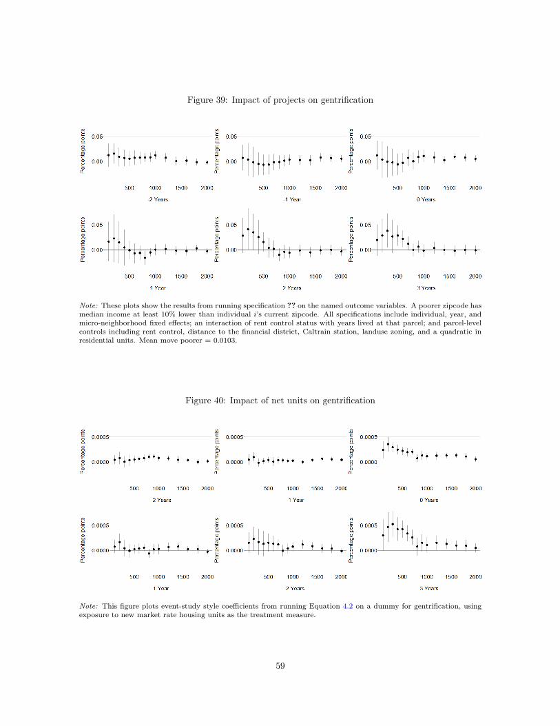
Figure 29 compares the average total impact of exogenously located market rate projects with
the average total impact of exogenously located affordable and endogeneously located projects. The
only type of construction that affects prices and displacement is exogenously located market rate.
This is consistent with the supply effect hypothesis. Theoretically, affordable housing projects may
have a demand effect but no supply effect. They do not increase the market rate housing stock, but
they do randomly change neighborhood quality by transforming a damaged building into affordable
housing. These results show that the net impact of affordable housing is weakly positive, increasing
prices insignificantly and leaving displacement risk unchanged. Endogenously located housing does
not affect prices either. This finding agrees with previous work showing that developers build where
prices are already appreciating. In San Francisco at least, finding a source of exogenous variation in
the location of new construction is necessary for identifying causal effects.
The rent elasticity of displacement
The results shown in Figures 24a and 24b suggest that displacement risk is highly price elastic.
When rents fall by roughly 2% ($40), the risk of moving to a poorer zipcode falls by about 20%, an
elasticity of approximately 10. This high price elasticity is consistent with San Francisco’s very high
levels of rent burden, especially among households earning less than the Area Median Income (AMI).
For the majority of households who earn less than half of the AMI, rent takes up more than 30% of
21
their monthly income and a small reduction could plausibly make the difference between managing to
stay in their current housing and being displaced (see Figure 6 for details on rent burden and income).
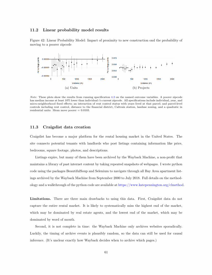
Instrumental variables offers another strategy for identifying this elasticity. The IV recharacterizes
the rent results as the first stage and the displacement results as the reduced form. In the first stage,
I use variation in exposure to new construction to instrument for exogenous price shocks, measured
as the annual percent change in rent ∆rentt = (rentt − rentt−1)/rentt−1:
Figures 30a and 30 show the first stage and reduced form results. These plots are familiar, showing
the same qualitative relationships seen in the previous section. There are four differences. First, the
first stage is now built using the individual panel, rather than the parcel panel, so that each rent
observation is multiplied by the number of inhabitants in that parcel. Second, rent is measured as
the annual percent change in rent, rather than levels. Third, the reduced form is now estimated
using a linear probability model rather than a Cox proportional hazards model to make the standard
error calculation straightforward. Fourth, I now include cubics instead of quadratics of parcel-level
22
controls, like residential units and distance ot the Financial District, to increase the F-statistic of the
instrument.
Table 4 shows results from the second stage and a naive regression of displacement on rents.
In the naive regression, a 1% decrease in the change in price increases displacement by 0.00025
percentage points, or about 2.4%. This negative sign reflects the endogeneity problem: higher prices
are associated with less displacement, because developers are more likely to build in areas that are
already gentrifying, prices are already rising, and residents are already more likely to be richer. The IV
results in the second column reverse the sign. Using only exogenous variation in the annual change in
rents, a 1% decrease in monthly rent would cause a 0.0129 percentage point decrease in displacement
risk, or a 14.44% decrease.21 The IV estimate is modestly larger than the implied elasticity discussed
above, suggesting a rent elasticity of displacement of 14.4.
5.2 Demand effects
We have seen that the net effect of proximity to new construction on rents is negative. This negative
net effect suggests that the supply effect dominates, but the demand effect may still be nonzero. I
assemble a set of alternative dependent variables to pinpoint changes in demand.
If new construction increases neighborhood quality, then the traditional supply and demand frame-
work predicts that supply will increase beyond the initial shock (Figure 1c). To test this, I ask whether
developers become more likely to permit new projects near exogenously located construction by run-
ning equation 4.4 on a dummy variable for new permits. I find that the probability of new endogenous
construction more than doubles within 100m of new projects (Figure 32).
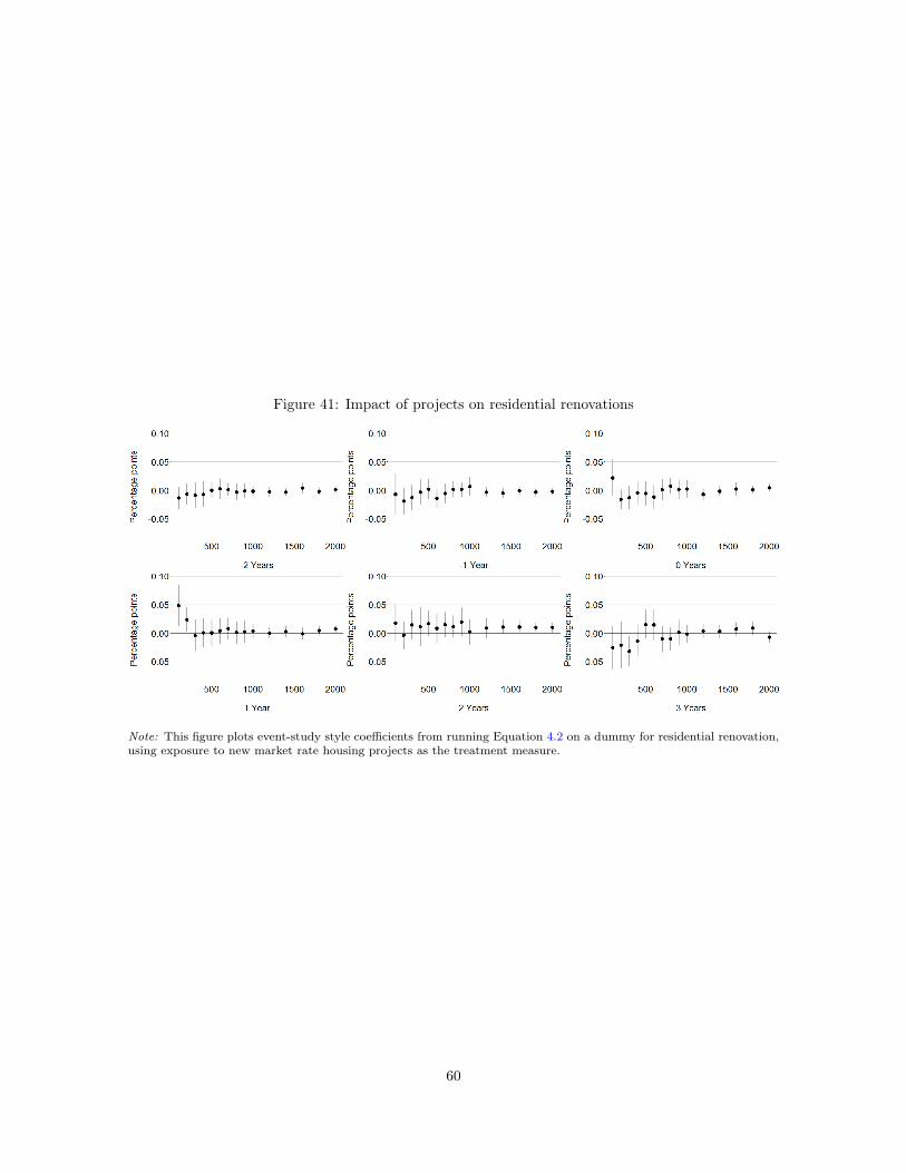
Residential building upgrades offer another way to test for a demand effect. Hornbeck and Kenis-
ton (2017) show that rational building owners internalize positive spillovers by improving their own
building quality. Accordingly, I test whether proximity to new construction affects the probability
of residential renovations and business turnover. Figure 31 provides evidence of large spikes in the
probability of a residential renovation (16%) and business turnover (22%) within 100m. The effect
drops to zero immediately. These results support Li (2019)’s finding that restaurant openings increase
within 500m of new high rises in New York City.
Next, I examine impacts on residential sales and sales prices. I find no evidence of a change in the
likelihood of a sale or in the residential sales price. Accordingly, I do not find evidence of impacts on
21To estimate the percent decrease in displacement risk, I first calculate the predicted probability for a 1% decreasein rents: y = β ·∆P/P. Then I calculate the percent change in risk as (y − y)/y.
23
the likelihood of owner moves (Figure 33).
These findings suggest that new construction may have changing dynamics over time. Shortly
following completion, prices fall and renters are more likely to be able to afford to stay. But the
neighborhood upgrade may also signal to building owners that the area may appreciate over time.
Owners prepare for this appreciation by renovating buildings, and new businesses open to serve a
changing population. The results on gentrification in the next section support this idea.
5.3 Gentrification
Gentrification refers to demographic change within a small spatial unit. New market rate construction
could impact gentrification through a direct effect if the people who move into the new building are
richer and through spillover effects that may attract richer newcomers to the surrounding housing
stock.
I begin by exploring direct effects: who moves into the new buildings? I identify 22,730 people
who move into newly constructed housing units during my study period, of whom 9,696 moved into
exogenously located construction. I construct a dummy variable equal to 1 if person i came from a
richer zipcode. Then I run a descriptive, cross-sectional regression to explore whether people who
move into exogenously located new market rate or new affordable housing are more likely to be from
richer zipcodes:
from richerip = α+ βexogp + γaffp + δexogp × affp + ei (5.1)
Next, I explore impacts in the panel. I limit the sample to all arrivers in their year of arrival,
including those who move into existing housing as well as new construction. I include the familiar set
of micro-neighborhood by year, individual, and parcel controls:
from richeripct = βexogp + γaffp + δexogp × affp +Xi +Xp + γct + ei (5.2)
Table 5 compares the results from the cross-sectional and panel regressions. In the cross-section,
I find that arrivers to exogenous market rate construction are 3.54 percentage points more likely to
come from richer zipcodes, while arrivers to exogenous affordable construction are 23.87 percentage
points less likely to come from richer zipcodes. In the panel, I find that arrivers to exogenously located
market rate housing are 9.6 percentage points more likely to come from a richer zipcode, compared
24
to arrivers to other types of housing. Arrivers to exogenous affordable housing are 12.2 percentage
points less likely to come from richer sending zipcodes. New market rate construction attracts richer
newcomers, while new affordable construction houses lower-income newcomers.
Next, I test for neighborhood spillover effects on gentrification. First, I aggregate individual address
histories to the parcel level. In each parcel-year, I observe the total number of arrivers and movers,
and the number of arrivers and movers from richer or poorer zipcodes. Then I construct a parcel-level
indicator variable equal to 1 if the net increase in wealthy people, captured as the net change in richer
people (arrivers from richer zipcodes minus movers to richer zipcodes) is greater than the net change
in poorer people (arrivers from poorer zipcodes minus movers to poorer zipcodes):
The previous section showed that exogenous market rate construction reduces displacement. How-
ever, gentrification can occur without displacement, if willing movers are replaced by higher income
arrivers. The identification of a demand effect within 100m suggests that, even though the rate of
adverse moves has fallen, newcomers may be different.
This is precisely what I find. Figure 34 shows that parcels within 100m of market rate construction
are 2.5 percentage points (29.5%) more likely to gentrify, with the effect decaying to zero within 700m.
Neither exogenously located affordable construction nor endogenously located construction has any
differential impact on gentrification.
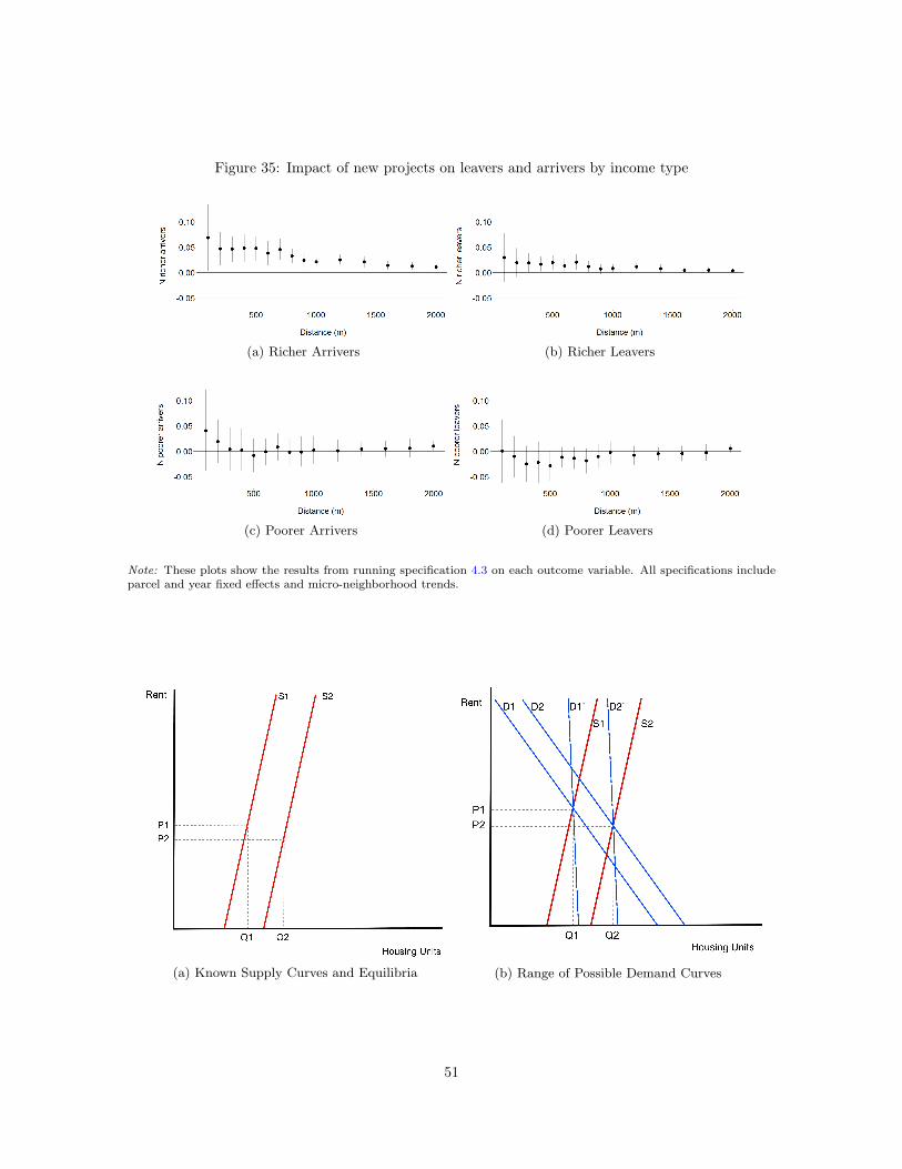
What is driving this increase in gentrification? I decompose the gentrification dummy by studying
each term separately. Figure 35 plots results for richer arrivers, richer leavers, poorer arriver, and
poorer leavers. The gentrification effect is driven by a net increase in arrivers from richer areas.
6 Welfare calculations
This paper has identified the net effect of a joint shock to the supply and demand for housing near
new construction. The net effect is negative, indicating that the supply effect dominates any potential
demand effect, but there is also evidence that the demand effect is nonzero. The natural next step
would be to decompose the net effect into separate supply and demand effects and calculate changes
in welfare.
25
However, decomposing the net effect would require me to find supply and demand shifters that
separately identify each elasticity ηS and ηD and the intercepts of each curve. Since I do not have
either, I turn to the literature.
I use three different estimates for San Francisco’s housing supply elasticity to compute a range
of estimates of changes to landlord surplus. First, Green et al. (2005) estimate that San Francisco’s
housing supply elasticity is 0.14. Second, Saiz (2010) estimates San Francisco’s housing supply elas-
ticity to be 0.66. Third, I use Asquith (2016)’s estimates to calculate a pseudo-supply elasticity of
0.277, discussed below.
The authors use different approaches to arrive at their estimates. Green et al. (2005) apply MSA-
level data to a a simple theoretical model in which housing supply elasticity is a function of the cost of
capital, city population, density, transportation costs, property taxes, and housing prices. Saiz (2010)
uses relative shocks to labor productivity or to amenities as demand shifters, using detailed data from
nearly 100 cities. Asquith (2016) instruments for demand shocks using proximity to potential tech bus
stops in San Francisco, identifying the impact on evictions from rent-controlled units. To estimate the
implied supply elasticity, I treat this eviction response as an expansion of the housing supply available
on the market.22
Notably, all three of these estimates are considerably larger than the estimate of 0.09 used by
the City of San Francisco (Egan, 2014). The City uses an esimate of 0.09, derived by regressing
ln(Q) = α + β ln(p) where Q is the total number of housing units as reported by Census counts
incremented by annual HUD building permits, and p is the average housing price from Zillow. For
comparison, I will also calculate changes in landlord surplus using this elasticity.
For the elasticity of housing demand, I take an upper bound from the literature23 and calculate
a lower bound based on my findings. Albouy et al. (2016) estimate an average demand elasticity of
0.66 across major US metro-areas. Housing demand in San Francisco is likely to be less elastic both
because San Francisco’s unusual job market means that few other cities are good substitutes, and
because geographical constraints mean that there are few substitutes for living in the San Francisco
metro-area for people who have chosen to work in San Francisco. In fact, the City of San Francisco
22Asquith estimates that a 6.4% increase in housing prices drives an additional 6,892 evictions. To calculate thepercent change in the housing stock, I use the 2008 estimate of the number of housing units in the city: 389,787. Theresults are qualitatively unaffected by using the estimate of the average number of units over Asquith’s study period,390,663, or the average over my study period, 391,007.
23If there were no demand shift, then the elasticity of demand implied by the changes in price and quantity is 1.61.I do not use this as an upper bound because it is more than double the highest estimates in the literature.
26
estimates that its elasticity of rental housing demand is 0.6 (Egan, 2014).24
Figure 36a displays known information: assuming that the estimates for ηS from the literature are
accurate, I know the slope and intercept of the supply curves S1 and S2 and the equilibria (P1,Q1)
and (P2,Q2) . Figure 36b shows the bounds that I can put on the slope and intercept of the demand
curves, with D1 and D2 defined by Albouy et al. (2016)’s estimate of ηD and D′
1 and D′
2 defined by
my findings.
Using these estimates allows me to compute a range of changes to landlord and renter surplus
under several key assumptions. First, I assume that the estimates for ηS are accurate. Second, I must
assume that the supply and demand curves are linear and that their slopes are constant over time.
Third, I abstract from neighborhood versus aggregate effects, calculating an average effect rather than
a local one.
Under these assumptions, I can calculate the welfare impact of the rent reduction. From ηS , ηD,
and the original housing supply and price level observed in the data, I can calculate the slopes of the
supply and demand curves and their intercepts:
mS,D = η−1S,D ·
P
Q(6.1)
P = mS,D ·Q+ aS,D (6.2)
Assuming that the slopes of the supply and demand curves do not change, I can calculate the
intercepts at the beginning and end of the study period as shown above, and then calculate the
change in renter surplus and landlord surplus, as depicted in Figure 37:
Estimates for the change in renter and landlord surplus implied by each estimate of ηS and ηD
are shown in Tables 6 and 7. Landlord surplus increases modestly by $3.1-5.8 million. Although
incumbent landlords are made worse off by the reduction in rents, these damages are mitigated by the
gains to the landlords of the new buildings. Renter surplus increases by at least $11.3 million. Taking
24The City calculates the demand elasticity by regressing ln(pQ) = ln() + (1 + 1)ln(p) + 2ln(y), using 2005-2011Public-Use Microdata for household income and a price index p constructed from Zillow’s average housing value for SanFrancisco for the same period. As in their supply estimation, Q is the total number of housing units as reported byCensus counts incremented by annual HUD building permits.
27
the most conservative estimate of renter surplus and the most generous estimate of landlord surplus,
the increase in renter welfare is at least double the decrease in landlord surplus.
7 Comparing the impact of market rate and affordable
housing
This paper has shown that market rate housing has meaningful spillover effects on nearby rents, while
affordable housing does not. However, a full comparison of market rate and affordable housing must
address both spillover and direct effects. In this application, market rate housing does not have a
direct effect on displacement because there were zero residents on each parcel prior to construciton.
In contrast, affordable housing has direct effects on preventing the displacement of the people who
live there.
I make a back-of-the-envelope calculation of prevented moves to compare the spillover effects of
market rate housing with the direct effects of affordable housing. I calculate the number of moves
to poorer zipcodes prevented by the spillover effects of market rate construction by multiplying the
average effect of exposure over the study period times the number of renters:∑2000
0 αd∗mkt100p,d,t×n.
Next, I make a generous estimate of the direct effect of affordable housing as the number of units built
from 2003-2017 times four people per unit. Since many of these units are studios and one-bedrooms,
this should yield an overestimate.
This exercise suggests that roughly 56,000 moves to poorer zipcodes were prevented by the spillover
effects of market rate construction, compared to 36,000 prevented by the direct effect of affordable
construction. Next, I divide each estimate by the number of housing units built. I find that new
market rate construction prevented 14.27 moves to poorer zipcodes per new unit, compared to 4
moves to poorer zipcodes per unit of affordable housing (by construction).
There are three important caveats. First, the people who select into affordable versus market rate
housing are different, so I am necessarily comparing prevented moves among two different groups.
Second, the effectiveness of market rate construction rent spillovers depends on the city’s current
income distribution and rental price level. As the city’s demographics change, so will the magnitude
of these spillover effects. Third, this analysis abstracts from general equilibrium effects which might
become important if the city scaled up construction significantly.
Although market rate construction prevents more moves to poorer zipcodes per unit under current
28
conditions, it is less effective than affordable housing at targeting and preserving long-term income
diversity. Its spillovers accrue to anyone living nearby, regardless of their displacement risk. As
neighborhoods gentrify, the beneficiaries of these lower rents will be less and less in need of support.
In contrast, affordable housing targets people at a high displacement risk by basing eligibility on
income. It can also achieve long-term income diversity by retaining lower-income people permanently,
while market rate housing contributes to gradual gentrification.
8 Conclusion
This paper explores the spillover effects of new housing construction in San Francisco from 2003-2017.
Like many gentrifying cities across the United States, San Francisco is locked in a policy debate over
how to achieve housing affordability. New market rate construction has become politically divisive as
advocates debate whether its aggregate supply effects outweigh its potential local demand effects.
This paper provides evidence that there is no tradeoff between aggregate and local effects: the
supply effect is larger than the demand effect at every distance from the new construction. However,
a hyperlocal demand effect exists within a narrow radius of 100m, i.e., within eyeshot of the new
construction. Within this narrow band, building renovations and business turnover increase. The
upgrade in neighborhood quality25 attracts higher-income newcomers, so that when incumbents move
out, they are more likely to be replaced by wealthier newcomers. In San Francisco, new market rate
housing increases gentrification and reduces displacement.
These findings highlight that market rate and affordable housing construction are complementary.
Building more market rate housing benefits all San Francisco renters through spillover effects on
rents. However, these spillover effects do not reduce gentrification and they may not continue to
reduce displacement in the long term. If the city continues to gentrify over time, these reduced rents
will become less effective at retaining lower-income people because there will be fewer low-income
people to retain. Affordable housing can effectively reduce both displacement and gentrification by
targeting people at higher risk of displacement and preserving housing for low-income people.
In conclusion, policymakers who want to slow displacement and gentrification should accelerate
both market rate and affordable housing construction. The high rent elasticity of displacement also
suggests that policies like rental assistance and a universal basic income (UBI) could be efficient,
25Neighborhood quality here could mean either the upgrade of physical housing stock, or the arrival of higher-incomeresidents to the new building. Guerrieri et al. (2013) find that universal preferences for wealthy neighbors can drivegentrification.
29
cost-effective ways to meaningfully reduce displacement and preserve income diversity.
30
9 Figures
Figure 1: Supply and Demand Scenarios
(a) Net Neutral (b) Net Positive (c) Net Negative
Note: These plots show three theoretically possible scenarios for the supply and demand effects of new construction.The goal of this paper is to identify which of these theoretical scenarios actually occurred.
Figure 2: Spatial Supply and Demand Scenarios
(a) Net Neutral (b) Net Positive
(c) Net Negative (d) Inflection Point
Note: These plots show examples of four theoretically possible cases for combinations of supply and demand effectsover space. The demand effect is shown in blue, the supply effect in red, and the net effect in gray. The goal of thispaper is to identify which of these theoretical scenarios actually occurred.
31
Figure 3: Examples of New Construction
(a) Market Rate (b) Affordable
Note: The first picture shows 329 Bay St, a 21-unit market rate building completed in 2007. The second picture shows125 Mason St, an 81-unit affordable housing building completed in 2008.
Figure 4: New Construction and Income Tercile
(a) Endogenously Located Construction (b) Exogenously Located Construction
Note: These figures map construction against 2010 income terciles by Census tract. Panel (a) plots endogenouslylocated construction in orange and panel (b) plots exogenously located construction in pink. Gray areas are parks andlakes, and the large former military base neighborhood called the Presidio.
32
Figure 5: Example of a Serious Building Fire
(a) Five-Alarm Fire at 1502 Golden Gate Ave, 2011 (b) Record of Fire Damage Complaint
Note: These figures given an example of a serious building fire and its damage record from 2011. Serious buildingfires are identified by crossreferencing the San Francisco Fire Department’s calls for service with incident reports andDepartment of Building Inspection complaints. To qualify, the incident must be classified as an unintentional buildingfire requiring at least 10 units to be dispatched and to appear in records of building complaints or in the description ofnew construction.
Figure 6: Rent Burden and Income
Note: This figure shows the share of households in five income groups who are ‘rent burdened.’ The data come from aSan Francisco City Planning Department analysis of 2011-2014 American Community Survey estimates.
33
Figure 7: Average Monthly 1BR Rent, 2003-2017
Note: This figure plots average Craiglist rents for a 1 bedroom apartment by year.
Figure 8: Comparing Median 1BR Rents from Craigslist with Department of Housing and UrbanDevelopment (HUD) and Zillow
Note: This plot compares the median 1-bedroom Craigslist rent from my data collection process with the median1-bedroom rent from HUD and the mean 1-bedroom rent from Zillow (Zillow does not make median rent available).HUD draws from several data sources, including gross rents data from the U.S. Census Bureau, gross rent informationfrom HUDs American Housing Survey, and yearly telephone surveys. Zillow’s rental price calculation methodology isdiscussed here.
34
Figure 9: Change in Residents from Richer Zipcodes, 2003-2017
Note: This figure maps the difference in the 2003 and 2017 count of residents whose previousaddress was in a richer zipcode. For visibility, the colors display the maximum count per blockrather than the count per parcel, since parcels are difficult to see at this scale.
35
Figure 10: Measuring Treatment Exposure
Note: This figure shows shows the construction oftreatment measures for an example parcel in an exampleyear. This observation would have a value of 1 for thenumber of projects within 0-200m, 0 for projects within200-400m, and 1 for projects within 400-600m. Similarly, itwould have a value of 6 for netunits within 200m, 0 within200-400m, and 200 within 400-600m.
Figure 11: Variation in Treatment Exposure by Distance Bin
Note: These figures visualize treatment exposure measured by counting completed projects within distance bins. Forvisual clarity, the bins pictured here begin at 50m and end at 600m. My specifications include distance bins out to 2km.These figures show that many parcels are exposed to more than one construction project at a time – parcel p mighthave bin50,p,t = 2, bin200,p,t = 1, and bin550,p,t = 1, for example.
36
Figure 12: Project Duration
(a) Years from Fire to Permit (b) Years Under Construction (c) Years from Fire to Completion
Figure 13: Randomly Translating the Treatment Surface
(a) True Exposure to Construction (b) Simulated Exposure to Construction
Note: This figure gives an example of how I define a treatment surface over the city and then randomly translate it toconduct randomization inference. Darker colors are closer to the new construction. This strategy preserves the spatialcorrelation of treatment and ensures that significance is calculated based on small differences in exposure.
37
Figure 14: Event Study: Impact of new market rate units on rents
Note: This figure plots event-study style coefficients from running Equation 4.2 on Craigslist rents for one-bedroomapartments, using exposure to new market rate housing units as the treatment measure.
Figure 15: Event Study: Impact of new market rate units on moves to poorer zipcodes
Note: This figure plots event-study style coefficients from running Equation 4.1 on a dummy for moving to a poorerzipcode, using exposure to new market rate housing units as the treatment measure.
38
Figure 16: Event Study: Impact of new market rate projects on rents
Note: This figure plots event-study style coefficients from running Equation 4.2 on Craigslist rents for one-bedroomapartments, using exposure to new market rate housing projects as the treatment measure.
Figure 17: Event Study: Impact of new market rate projects on moves to poorer zipcodes
Note: This figure plots event-study style coefficients from running Equation 4.1 on a dummy for moving to a poorerzipcode, using exposure to new market rate housing projects as the treatment measure.
39
Figure 18: Long Term Impact of New Units on Rents
Note: This figure plots event-study style coefficients from running Equation 4.2 on Craigslist rents for one-bedroomapartments, using exposure to new market rate housing units as the treatment measure.
Figure 19: Long Term Impact of New Market Rate Projects on Rents
Note: This figure plots event-study style coefficients from running Equation 4.2 on Craigslist rents for one-bedroomapartments, using exposure to new market rate housing units as the treatment measure.
40
Figure 20: Impact of New Units over Time and Distance
(a) 1BR Rents(b) Adverse Moves
Note: This figure plots smooths of the distance bin coefficients from Equation 4.2 and 4.1. Year 0 is the year of projectcompletion. The rent specification includes micro-neighborhood by year fixed effects and parcel controls including rentcontrol, distance to the financial district, Caltrain station, landuse zoning, and a quadratic in residential units. Thedisplacement specification is a Cox proportional hazards model including micro-neighborhood, sex, and birth decadestrata.
41
Figure 21: Event Study: Long term impact of new market rate units on moves to poorer zipcodes
Note: This figure plots event-study style coefficients from running Equation 4.1 on a dummy for moving to a poorerzipcode, using exposure to new market rate housing units as the treatment measure.
Figure 22: Event Study: Long term impact of new market rate projects on moves to poorer zipcodes
Note: This figure plots event-study style coefficients from running Equation 4.1 on a dummy for moving to a poorerzipcode, using exposure to new market rate housing projects as the treatment measure.
42
Figure 23: Impact of proximity to new units on 1BR rents and the probability of moving to a poorerzipcode
(a) 1BR Rents (b) Moves to poorer zipcodes
Note: Panel a shows the results from running specification 4.4 on one bedroom rents, using micro-neighborhood by yearfixed effects and parcel-level controls including rent control, latitude and longitude, distance to the financial district andCaltrain station, landuse zoning, 2010 Census tract median income tercile, and a quadratic in residential units. Panelb shows the results from running 4.3 on a dummy for moving to a poorer zipcode, whose median income is at least 10%lower than individual i’s current zipcode, including sex, birthyear, and micro-neighborhood strata; an interaction ofrent control status with years lived at that parcel; and the same set of parcel-level controls. Mean 1BR rent = $1,891;mean adverse move = 0.0103.
Figure 24: Impact of proximity to new projects on 1BR rents and the probability of an adverse move
(a) 1BR Rents (b) Adverse moves
Note: Panel a shows the results from running specification 4.4 on one bedroom rents, using micro-neighborhood by yearfixed effects and parcel-level controls including rent control, latitude and longitude, distance to the financial district andCaltrain station, landuse zoning, 2010 Census tract median income tercile, and a quadratic in residential units. Panelb shows the results from running 4.3 on a dummy for moving to a poorer zipcode, whose median income is at least 10%lower than individual i’s current zipcode, including sex, birthyear, and micro-neighborhood strata; an interaction ofrent control status with years lived at that parcel; and the same set of parcel-level controls. Mean 1BR rent = $1,891;mean adverse move = 0.0103.
43
Figure 25: Results by Type of Destination
(a) Move to a poorer zipcode (b) Leave the Bay Area
(c) Move to a richer zipcode (d) Any move
Note: These plots show the results from running specification 4.3 on the named outcome variables. All specificationsinclude sex, birthyear, and micro-neighborhood strata; an interaction of rent control status with years lived at thatparcel; and parcel-level controls including rent control, latitude and longitude, distance to the financial district andCaltrain station, landuse zoning, 2010 Census tract median income tercile, and a quadratic in residential units. Meanmove poorer = 0.0103; mean exit Bay Area = 0.0160; mean move richer = 0.00777; and mean any move = 0.0446.Mean 1BR rent = $1,891.
Figure 26: Impacts on Eviction Notices
Note: These plots show the results from running specification 4.3 on an indicator variable for parcel p receiving aneviction notice for rent controlled and uncontrolled parcels respectively. Both specifications use parcel panel data andinclude micro-neighborhood by year fixed effects, rent control, latitude and longitude, distance to the financial districtand Caltrain station, landuse zoning, 2010 Census tract median income tercile, and a quadratic in residential units.Mean eviction for rent controlled parcels = 0.0247 mean eviction for uncontrolled parcels = 0.000263.
44
Figure 27: Event Study: Impact of new affordable projects on rents
Note: This figure plots event-study style coefficients from running Equation 4.2 on Craigslist rents for one-bedroomapartments, using exposure to new affordable housing units as the treatment measure. Mean move to a poorer zipcode= 0.0103.
Figure 28: Event Study: Impact of new affordable projects on moves to poorer zipcodes
Note: This figure plots event-study style coefficients from running Equation 4.1 on a dummy for moving to a poorerzipcode, using exposure to new affordable projects as the treatment measure. Mean 1BR rent =$1,891 per month.
45
Figure 29: Impacts on Rents and Adverse Moves by Type of Construction
Note: These plots show the results from running specification 4.3 on 1 bedroom rents and moves to poorer zipcodes,using cumulative binned exposure to new units of exogenous market rate, exogenous affrodable, endogenous marketrate, and endogenous affordable projects, respectively. All rent specifications use parcel panel data and include micro-neighborhood by year fixed effects, rent control, latitude and longitude, distance to the financial district and Caltrainstation, landuse zoning, 2010 Census tract median income tercile, and a quadratic in residential units. All displacementspecifications use individual panel data and include including sex, birthyear, and micro-neighborhood strata; an inter-action of rent control status with years lived at that parcel; and the same set of parcel-level controls. Mean 1BR rent=$1,891 per month; mean move to a poorer zipcode = 0.0103.
46
Figure 30: IV: First Stage and Reduced Form
(a) First Stage
(b) Reduced Form
Note: These plots show the results from running the First stage and Reduced form specifications, respectively. Bothspecifications use individual panel data and include micro-neighborhood by year fixed effects, sex and birthyear fixedeffects, and interaction of rent control with a cubic in years lived at that address, and parcel-level controls includinglatitude and longitude, cubics in distance to the financial district and Caltrain station, landuse zoning, 2010 Censustract median income tercile, and a cubic in residential units.
Figure 31: Demand Effects?: Impact on Residential Renovations, Sales, and Business Turnover
(a) Probability of a Residential Renovation (b) Business turnover
(c) Probability of a Residential Sale (d) Annual Change in Sales Price
Note: These plots show the results from running specification 4.3 on the named dependent variables. All specificationsuse parcel panel data restricted to parcels zoned for residential or business use, and include micro-neighborhood strataand parcel-level controls including rent control, latitude and longitude, distance to the financial district and Caltrainstation, landuse zoning, 2010 Census tract median income tercile, and a quadratic in residential units. The specificationfor residential sales prices only uses properties that have been sold more than once. Samples are restricted by landusetype, so that only residential properties are included in the residential renovation and sale specifications and onlycommercial properties are included in the business turnover specification. Mean residential renovation = 0.0638; meanresidential sale = 0.0235; mean business turnover = 0.1078.
47
Figure 32: Impacts on New Construction
(a) Units (b) Projects
Note: These plots show the results from running specification 4.3 on an indicator variable for new constructiongetting permitted on parcel p. Both specifications use parcel panel data and include micro-neighborhood strataand parcel-level controls including rent control, latitude and longitude, distance to the financial district andCaltrain station, landuse zoning, 2010 Census tract median income tercile, and a quadratic in residential units.Mean new = 0.000682.
48
Figure 33: Demand effects?: Impact on owners’ moves
(a) Move to a poorer zipcode (b) Leave the Bay Area
(c) Move to a richer zipcode (d) Any move
Note: These plots show the results from running specification 4.3 on the named dependent variables. All speci-fications use individual panel data restricted to owners, and include sex, birth decade, and micro-neighborhoodstrata; years person i has lived at parcel p; and parcel-level controls including rent control, latitude and longi-tude, distance to the financial district and Caltrain station, landuse zoning, 2010 Census tract median incometercile, and a quadratic in residential units. Mean move = 0.0385; mean move poorer = 0.0103; mean exitBay Area = 0.0128; and mean move richer = 0.00545.
49
Figure 34: Impact of new projects on gentrification by construction type
Note: These plots show the results from running specification 4.3 on an indicator variable for gentrification, usingcumulative binned exposure to exogenous market rate, exogenous affrodable, endogenous market rate, and endogenousaffordable construction, respectively. All specifications include parcel and year fixed effects and micro-neighborhoodtrends. The indicator is equal to one if the net change in richer people (arrivers from richer zipcodes minus movers toricher zipcodes) is greater than the net change in poorer people (arrivers from poorer zipcodes minus movers to poorerzipcodes). Mean gent = 0.0712.
50
Figure 35: Impact of new projects on leavers and arrivers by income type
(a) Richer Arrivers (b) Richer Leavers
(c) Poorer Arrivers (d) Poorer Leavers
Note: These plots show the results from running specification 4.3 on each outcome variable. All specifications includeparcel and year fixed effects and micro-neighborhood trends.
(a) Known Supply Curves and Equilibria (b) Range of Possible Demand Curves
51
Figure 37: Calculating Consumer and Producer Surplus
Note: This figure shows the calculation of the change in consumer and producer surplus, assuming linear supply anddemand curves that can shift in intercept but not in slope. It is not drawn to scale: the true supply and demand curvesare so inelastic that it would be difficult to see the changes in an illustration drawn to scale.
52
10 Tables
Table 1: Construction and Serious Building Fires
YearAll construction Exogenous construction
Fires
Completed Net Units Affordable Units Completed Net Units Affordable Units
2003 94 308 7 1 2 0 13
2004 113 1, 047 11 1 1 0 9
2005 129 1, 369 682 2 147 147 13
2006 147 1, 421 450 1 1 1 18
2007 146 2, 567 693 1 8 0 17
2008 171 3, 390 812 7 512 13 16
2009 148 3, 459 921 4 507 76 7
2010 93 1, 303 580 3 5 1 13
2011 72 376 186 4 6 3 17
2012 82 1, 059 565 5 350 201 14
2013 101 2, 169 728 8 557 136 18
2014 119 3, 271 589 5 35 26 1
2015 119 2, 768 459 4 100 9 1
2016 133 5, 752 727 8 670 99 1
2017 164 4, 553 1, 621 6 1, 043 486 0
Total 2, 431 34, 812 9, 031 60 3, 944 1, 198 158
This table reports summary statistics for new construction and fires. New construction includes all new buildings
that added at least one unit to the housing stock. It differs from the annual Housing Inventory: it does not include
demolitions, mergers or splits of existing units within a building, reclassification of illegal units, or corrections of the
record. Exogenous construction refers to the subset of new construction that occurred on a burned parcel. The final
column reports the count of serious building fires each year. To qualify, the fire incident must be classified as an
unintentional building fire requiring at least 10 units to be dispatched and to appear in records of building complaints
Both specifications include micro-neighborhood by year fixedeffects and control for person characteristics (sex, birth decade,and a cubic in years lived at current address) and parcel char-acteristics (cubics in distance to the Financial District and Cal-train station, a cubic in residential units, landuse zoning, 2010Census block income tercile, year built, rent control status, andlatitude and longitude). The sample is restricted to people wholive in parcels that are within 2km of exogenous constructionat some point in the study period, and who have been living attheir address for at least one year. Standard errors are clusteredby micro-neighborhood. ∗∗∗p < 0.001, ∗∗p < 0.01, ∗p < 0.05.
Table 5: Direct gentrification effects: Who moves into new housing?
R2 0.011 0.090Adj. R2 0.011 −0.003Num. obs. 22730 362873The dependent variable is a dummy equal to one if the newcomer comesfrom a richer sending zipcode. The cross-sectional specification includesonly the people who moved into a new building. The panel specificationincludes includes people who live in parcels that are within 2km of exogenousconstruction at some point in the study period, in the year they arrived.It includes micro-neighborhood by year fixed effects and control for personcharacteristics (sex and birth decade) and parcel characteristics (quadraticsin distance to the Financial District and Caltrain station, residential units,landuse zoning, 2010 Census block income tercile, year built, rent controlstatus, and latitude and longitude). Standard errors are clustered by micro-neighborhood. ∗∗∗p < 0.001, ∗∗p < 0.01, ∗p < 0.05.
56
Table 6: Changes in Landlord Surplus
ηS ∆PS Source for ηS
0.14 3,356,669 Green et al. (2005)
0.28 4,013,364 Asquith (2016)
0.66 5,795,822 Saiz (2010)
0.09 3,122,135 Egan (2014)
0.29 4,060,271 Mean
This table shows estimates of the housing
supply elasticity in San Francisco from four
other papers and the implied changes in land-
lord surplus.
Table 7: Changes in Renter Surplus
ηD ∆CS Source for ηD
0.66 11,361,704 Albouy et al. (2016)
0.6 12,497,875 Egan (2014)
This table shows estimates of the housing de-
mand elasticity in San Francisco and the implied
changes in renter surplus.
57
11 Appendix
11.1 Additional event study plots
Figure 38: Impact of projects on probability of new building permit
Note: These plots show the results from running specification ?? on the named outcome variables. A poorer zipcode hasmedian income at least 10% lower than individual i’s current zipcode. All specifications include individual, year, andmicro-neighborhood fixed effects; an interaction of rent control status with years lived at that parcel; and parcel-levelcontrols including rent control, distance to the financial district, Caltrain station, landuse zoning, and a quadratic inresidential units. Mean move poorer = 0.0103.
58
Figure 39: Impact of projects on gentrification
Note: These plots show the results from running specification ?? on the named outcome variables. A poorer zipcode hasmedian income at least 10% lower than individual i’s current zipcode. All specifications include individual, year, andmicro-neighborhood fixed effects; an interaction of rent control status with years lived at that parcel; and parcel-levelcontrols including rent control, distance to the financial district, Caltrain station, landuse zoning, and a quadratic inresidential units. Mean move poorer = 0.0103.
Figure 40: Impact of net units on gentrification
Note: This figure plots event-study style coefficients from running Equation 4.2 on a dummy for gentrification, usingexposure to new market rate housing units as the treatment measure.
59
Figure 41: Impact of projects on residential renovations
Note: This figure plots event-study style coefficients from running Equation 4.2 on a dummy for residential renovation,using exposure to new market rate housing projects as the treatment measure.
60
11.2 Linear probability model results
Figure 42: Linear Probability Model: Impact of proximity to new construction ond the probability ofmoving to a poorer zipcode
(a) Units (b) Projects
Note: These plots show the results from running specification 4.3 on the named outcome variables. A poorer zipcodehas median income at least 10% lower than individual i’s current zipcode. All specifications include individual, year, andmicro-neighborhood fixed effects; an interaction of rent control status with years lived at that parcel; and parcel-levelcontrols including rent control, distance to the financial district, Caltrain station, landuse zoning, and a quadratic inresidential units. Mean move poorer = 0.0103.
11.3 Craigslist data creation
Craigslist has become a major platform for the rental housing market in the United States. The
site connects potential tenants with landlords who post listings containing information like price,
bedrooms, square footage, photos, and descriptions.
Listings expire, but many of them have been archived by the Wayback Machine, a non-profit that
maintains a library of past internet content by taking repeated snapshots of webpages. I wrote python
code using the packages BeautifulSoup and Selenium to navigate through all Bay Area apartment list-
ings archived by the Wayback Machine from September 2000 to July 2018. Full details on the method-
ology and a walkthrough of the python code are available at https://www.katepennington.org/clmethod.
Limitations. There are three main drawbacks to using this data. First, Craigslist data do not
capture the entire rental market. It is likely to systematically miss the highest end of the market,
which may be dominated by real estate agents, and the lowest end of the market, which may be
dominated by word of mouth.
Second, it is not complete in time: the Wayback Machine only archives websites sporadically.
Luckily, the timing of archive events is plausibly random, so the data can still be used for causal
inference. (It’s unclear exactly how Wayback decides when to archive which pages.)
61
In addition, the Wayback Machine does not archive every listing on every date. Usually, it only
archives the first 100-120 results (that is, you cannot click ‘next’ on the archived pages). While this
reduces the numer of recoverable listings, it probably doesn‘t introduce bias: the top 100-120 results
are whichever results were most recently posted when the archive event began.
Third, the data are not continuous (or perfectly reliable) in space, either. Some areas, like the
Mission district, have hundreds of postings over the entire 2000-2018 period. But for other areas,
like the mostly single-family home Sunset neighborhood, postings are sparser. Other times, Craigslist
users failed to enter accurate location data or the location data cannot be confidently matched to a
specific place. For example, if someone entered ‘4th St’ instead of a neighborhood, its not possible to
tell which Bay Area town its in.
Data cleaning and interpolation. The goal of the data cleaning and interpolation exercise is
to move from a listing-date data set to a parcel-year data set. I begin by matching each listing to a
realtor neighborhood shapefile that corresponds with Craigslist neighborhoods. Then I create a set
of distance weights for each Craigslist neighborhood for each parcel by calculating the distance from
the neighborhood centroid to the parcel centroid. The interpolated rent at parcel p in year t is the
distance-weighted average of rents in all Craigslist neighborhoods within 2.5 kilometers in year t.
62
References
Ahlfeldt, G. M. and Maennig, W. (2010). Impact of sports arenas on land values: evidence fromberlin. The Annals of Regional Science, 44(2):205–227.
Ahlfeldt, G. M., Redding, S. J., Sturm, D. M., and Wolf, N. (2015). The Economics of Density:Evidence from the Berlin Wall. Econometrica, 83(6):2127–2189.
Albouy, D. and Ehrlich, G. (2012). Metropolitan land values and housing productivity. NationalBureau of Economic Research.
Albouy, D., Ehrlich, G., and Liu, Y. (2016). Housing demand, cost-of-living inequality, and theaffordability crisis. Technical report, National Bureau of Economic Research.
Asquith, B. (2016). Rent Control and Evictions: Evidence from San Francisco. Working Paper.
Asquith, B., Mast, E., and Reed, D. (2020). Does luxury housing construction increase rents ingentrifying areas? Working paper.
Bilal, A. and Rossi-Hansberg, E. (2018). Location as an asset. Working paper.
Blattman, C., Green, D., Ortega, D., and Tobon, S. (2017). Place-based interventions at scale:The direct and spillover effects of policing and city services on crime. Technical report, NationalBureau of Economic Research.
Boustan, L. P., Margo, R. A., Miller, M. M., Reeves, J. M., and Steil, J. P. (2019). Does con-dominium development lead to gentrification? Technical report, National Bureau of EconomicResearch.
Brummet, Q. and Reed, D. (2019). The effects of gentrification on the well-being and opportunityof original resident adults and children. Working paper.
Carlson, H. J. (2020). Measuring displacement: Assessing proxies for involuntary residential mo-bility. City & Community.
Couture, V., Gaubert, C., Handbury, J., and Hurst, E. (2019). Income growth and the distributionaleffects of urban spatial sorting. Working paper.
Depro, B., Timmins, C., and O’Neil, M. (2015). White Flight and Coming to the Nuisance: CanResidential Mobility Explain Environmental Injustice? Journal of the Association of Environ-mental and Resource Economists.
Desmond, M. (2016). Evicted: Poverty and profit in the American city. Broadway books.
Desmond, M. and Shollenberger, T. (2015). Forced displacement from rental housing: Prevalenceand neighborhood consequences. Demography, 52(5):1751–1772.
Diamond, R. and McQuade, T. (2016). Who Wants Affordable Housing in Their Backyard? AnEquilibrium Analysis of Low Income Property Development. Technical report.
Diamond, R., McQuade, T., and Qian, F. (2018). The Effects of Rent Control Expansion onTenants, Landlords, and Inequality: Evidence from San Francisco. Technical report, NationalBureau of Economic Research.
Ding, L., Hwang, J., and Divringi, E. (2016). Gentrification and residential mobility in Philadelphia.Regional science and urban economics, 61:38–51.
DiPasquale, D. (1999). Why don’t we know more about housing supply? The Journal of RealEstate Finance and Economics, 18(1):9–23.
63
Dragan, K., Ellen, I., and Glied, S. A. (2019). Does gentrification displace poor children? newevidence from new york city medicaid data. Technical report, National Bureau of EconomicResearch.
Egan, T. (2014). The economics of san francisco housing. Office of the Controller - City and Countyof San Francisco.
Ellen, I. G., Horn, K. M., and Reed, D. (2019). Has falling crime invited gentrification? Journalof Housing Economics, 46:101636.
Englander, G. (2020). Information and spillovers from targeting policy in peru’s anchoveta fishery.Working paper.
Freeman, L. (2005). Displacement or succession? residential mobility in gentrifying neighborhoods.Urban Affairs Review, 40(4):463–491.
Glaeser, E. L. and Gottlieb, J. D. (2008). The economics of place-making policies. Technical report,National Bureau of Economic Research.
Green, R. K., Malpezzi, S., and Mayo, S. K. (2005). Metropolitan-specific estimates of the priceelasticity of supply of housing, and their sources. American Economic Review, 95(2):334–339.
Grier, G. and Grier, E. (1980). Urban Displacement: A reconnaissance. Back to the City: Issuesin Neighbourhood Renovation Eds S Laska, D Spain (Pergamon, New York) pp, pages 252–268.
Guerrieri, V., Hartley, D., and Hurst, E. (2013). Endogenous gentrification and housing pricedynamics. Journal of Public Economics, 100:45–60.
Gyourko, J., Mayer, C., and Sinai, T. (2013). Superstar cities. American Economic Journal:Economic Policy, 5(4):167–99.
Hankinson, M. (2018). When do renters behave like homeowners? high rent, price anxiety, andnimbyism. American Political Science Review, 112(3):473–493.
Hornbeck, R. and Keniston, D. (2017). Creative destruction: Barriers to urban growth and theGreat Boston Fire of 1872. American Economic Review, 107(6):1365–98.
Kinney, S. and Karr, A. (2017). Public-Use vs. Restricted-Use: An Analysis Using the AmericanCommunity Survey. US Census Bureau CES Working Paper.
Li, X. (2019). Do new housing units in your backyard raise your rents? Working paper.
Mok, G. and Wang, W. (2020). Do evictions cause income changes? an instrumental variablesapproach. Working paper.
Monkkonen, P. (2016). Understanding and challenging opposition to housing construction in cali-fornia?s urban areas. Available at SSRN 3459823.
Qiang, A. J., Timmins, C., and Wang, W. (2020). Displacement and the consequences of gentrifi-cation. Working paper.
Rossi-Hansberg, E., Sarte, P.-D., and Owens III, R. (2010). Housing Externalities. Journal ofpolitical Economy, 118(3):485–535.
Saiz, A. (2010). The geographic determinants of housing supply. The Quarterly Journal of Eco-nomics, 125(3):1253–1296.
Zuk, M. and Chapple, K. (2016). Housing Production, Filtering and Displacement: Untangling theRelationships. Research Brief.