59
© 2010 NGWeb Solutions, LLC. All Rights Reserved Updated 01/27/2010 Dynamic Forms User Manual Last Updated: 04/04/2016

© 2010 NGWeb Solutions, LLC. All Rights Reserved Updated 01/27/2010
Dynamic Forms User Manual
Last Updated: 04/04/2016

Table of Contents
Table of Contents .................................................................................................................................. 2
Homepage.............................................................................................................................................. 3 The Forms Basics Page
Defining How a Form Acts ..................................................................................................... 4
Form Name / Name tab ............................................................................................................ 4
Admin Notification tab ............................................................................................................ 6
Payment tab .............................................................................................................................. 7
Inactive Text tab ....................................................................................................................... 8
Confirmation tab ...................................................................................................................... 9
Rules tab ................................................................................................................................. 12
Multiple Signature Functionality ..................................................................................................... 20
The Forms Designer Page .................................................................................................................. 24
Optional - Adding a StyleSheet ............................................................................................. 25
Building Forms- Adding Form Items ................................................................................... 26 Long Answer .............................................................................................................. 27 Short Answer.............................................................................................................. 31
Choice List ................................................................................................................. 33 Check Box .................................................................................................................. 35 Text & HTML ............................................................................................................ 36
Image .......................................................................................................................... 38 Master Items ............................................................................................................... 39 Tables ......................................................................................................................... 42
File Upload ................................................................................................................. 48
Copy an existing Item ............................................................................................................ 50 Change the order of items ...................................................................................................... 55
Form Preview Section: ........................................................................................................... 58 Activate a Form .................................................................................................................................. 59

© 2010 NGWeb Solutions, LLC. All Rights Reserved Updated 04/09/2016
3
Homepage After logging in to Dynamic Forms you will be brought to your Homepage. From this
page you can see all of the forms associated with the Organization you are assigned to. You can organize your view of these forms by making and managing form folders. You can access this functionality by selecting the appropriate buttons above the blue line.
If you have Edit Forms permissions, the following icons/functions are displayed next to your forms (some users may not see these options as they do not have permission):
Edit Form Basic Items – Takes Users to the Forms Basics page
Edit Page Items – Takes Users into the Forms Designer page
Activate/Deactivate – Allows users to take forms offline
Form Copy - Users can copy any existing form
URL Button - Users can click this button to view the url for a particular form
Delete Form – Allows users to delete forms
To add a new form, click the button located at the top of the forms list. This action also takes the user to the Forms Basics page.

© 2010 NGWeb Solutions, LLC. All Rights Reserved Updated 04/09/2016
4
The Forms Basics Page
The forms basics page is where the Forms Designer will configure “How the form acts” versus
what the form looks like. The Designer does this by configuring components organized by a tab
structure on the page. The tabs (detailed in the next few pages) will change based on the user
permissions and the type of form. For example, if the form is a multiple signature form, the
“Confirmation Text” tab will not be show, but a “Cosigners” tab will be shown. This is show the
Designer can define confirmation texts for each end user of the form. Here are some other
details about the Forms Basics page…
The Form Name/Type tab is pictured below.
This tab contains the following fields:
Name – This is the name of the form. This field does not contain any character limitations; however, it should describe how the form is used.

© 2010 NGWeb Solutions, LLC. All Rights Reserved Updated 04/09/2016
5
Description – This is a description of the form. This provides an overview of the form’s
purpose and objectives. This field does not have any character limitations and is not a required field.
Esign Requirements – This field lets you choose between no signature, single signature, and multiple signatures depending on the type of form your designing.
Duplicate e-signature check – If you choose single or multiple signatures for your form you can then choose the following options: ignore duplicate submissions, prevent duplicate submissions or warn the user. This allows for blocking or allowing people to
submit a form more than once. If you choose warn the user in that field you will get two more fields to complete.
How long do you want to warn the user and duplicate e-signature message. You can pick a few options for how long do you want to warn the user if they submit a duplicate form and present the user with a message before they actually submit the form.
Custom Opt-Out Information – This enables users to input a custom message that will be displayed to the user when presented with the option to opt out of e-signing the form
and instead choosing to opt out and print. If left blank, default text will be displayed. Show the Form Timer – This option allows the form designer to decide whether or not
the form timer will display when the user is filling out the form. The timer is an indication of when the user’s session will time out. The timer is a security feature that counts down 45 minutes per page. At 2 minutes, Dynamic Forms asks if the user would like to
continue. If no answer is received, the user will be logged out. Show Welcome Screen – This option allows the form designer to decide whether or
not the user will see the Welcome to Dynamic Forms screen, which gives the user the option to visit their pending forms and forms history before beginning to fill out the form.
Use Recaptcha Verification – You can require users to complete a ReCaptcha challenge when submitting the form to ensure forms are not submitted in an automated fashion.
Last Updated By – The last person to update the form (or any elements within it).
Update Page – Takes the User to the Form Designer page.

© 2010 NGWeb Solutions, LLC. All Rights Reserved Updated 04/09/2016
6
The second tab is Admin Notification pictured below.
This tab contains the following fields: Notification Frequency – This field gives you the option to have an email sent either
every 24hrs or with every form submitted. If you choose every 24hrs the email recipients will receive an email once every 24hrs if this form has had a submission. If you choose every form the email recipient will receive an email every time a form is submitted.
Notification email recipient(s) – Use this field to enter the email or email addresses of the users you would like notified when a form has been submitted.
Use custom email – You can have a generic email or custom email sent to the email recipient(s). If you choose custom you will have a few more fields to complete: custom
email subject, custom email body, and dynamic email values. Custom email subject – Enter the subject line for the email notification.
Custom email body – Enter the custom email message to be sent out.
Dynamic email values – You can use this field to display data/text from your form. Users can choose from Common Form values – related fields that are not placed directly onto a form, and User-entered Form Values – fields that users have placed on
the form.

© 2010 NGWeb Solutions, LLC. All Rights Reserved Updated 04/09/2016
7
The third tab is the Payments tab pictured below.
This tab contains the following fields:
Payment Details – If the form is a payment form check the box to the left of “Is this a payment form?”. Then pick which payment system from the following:
Authorize.Net CashNet (Higher One) Nelnet – QuikPay, Crypt Pay and Commerce Manager
Official Payments PayPal TouchNet
Next add your configuration string in the field. Please see the separate User Manual for Payments (Credit Cards) for more detail for each of these options.

© 2010 NGWeb Solutions, LLC. All Rights Reserved Updated 04/09/2016
8
The fourth tab is the Inactive Text tab pictured below.
This tab contains the following field:
Inactive Text – When the form is not active the message entered into this field is what the user will see.
At the Homepage, the Form Designer (if she/he has permissions) can activate or deactivate a form by clicking the red light or green light next to the form. When a form is active (green light) the user will get to the form. When the form is inactive (red light)
the user will see the message shown in the Inactive Text tab.

© 2010 NGWeb Solutions, LLC. All Rights Reserved Updated 04/09/2016
9
The next tab is either the Cosigners or Confirmation Text tab depending on the esign requirements of the form. If you choose no signature required or single signature you
will see the Confirmation Tab pictured below.
This tab contains the following field:
Confirmation Text – When the form is completed the message entered into this field is what the user will see. When the form is a multiple signature form, the Confirmation
Text is shown at the user level. In the picture shown below, the form is a sequential flow with participants Student and Parent. If you want to custom the confirmation text for the parent, edit the Parent profile to find the custom confirmation text area.

© 2010 NGWeb Solutions, LLC. All Rights Reserved Updated 04/09/2016
10
What the User sees on the Confirmation page
The confirmation text messaging was described on the previous three pages. Here is
what your user will see after he/she has submitted the form – this is the Confirmation text that you entered.
All end users will see these options (above). If you complete a form using your
administrative credentials, you will only see the confirmation text and will not be logged out (example below).

© 2010 NGWeb Solutions, LLC. All Rights Reserved Updated 04/09/2016
11
Next is the Workflow tab. This is currently under construction by the Dynamic Forms team but it is utilized within production forms.
In the next release, the Workflow tab will be opened up to selected Forms Designers. Workflow will enable users to build workflows (such as API on Submit, or Verify Parent Signature, etc.) on forms.
Currently, these workflows are configured by the Dynamic Forms team members. After we expand the list of available workflows and add some easier user controls we will
open this up to end users. The Prefill tab (shown below) will no longer be required after our API implementation.

© 2010 NGWeb Solutions, LLC. All Rights Reserved Updated 04/09/2016
12
The final tab is the Rules/Conditions tab. This feature enables you to determine which fields should be displayed to a form user as they navigate through a form. Via this offering, you will be able to provide your form users with a customized form experience
that prompts them for supplemental data based on their answers to certain questions. Below are a couple examples of how you could apply the Rules/Conditions to a form.
IF the user selects “Yes” to a question regarding whether or not they are a US Citizen, THEN they are shown a field asking for their state of residence.
If you have a table that needs to be completed, based on whether or not a user checks a particular checkbox, you can setup a rule that shows all form users the checkbox. IF a user checks the box, THEN that user is given the table.
Please note, these examples represent only two of the many ways you can use this feature to enhance the flow of a form.
Figure 1: Forms Basics screen showing the Rules/Conditions tab
© 2010 NGWeb Solutions, LLC. All Rights Reserved Updated 04/09/2016
13
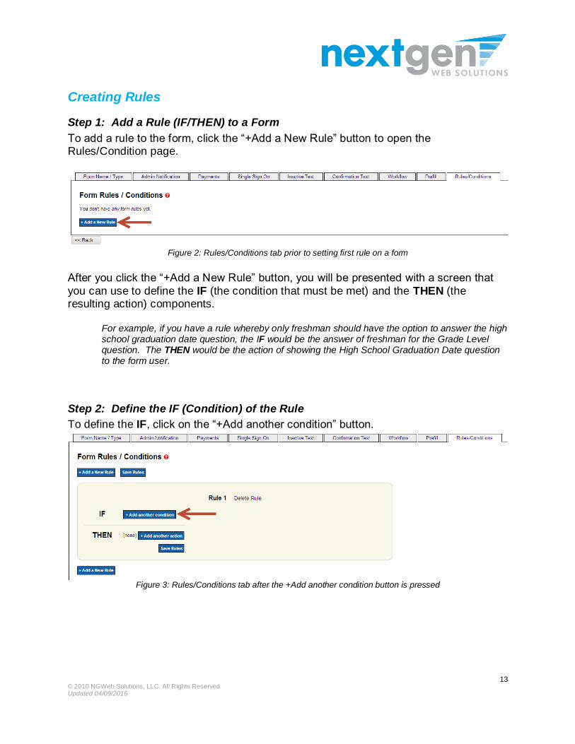
Creating Rules
Step 1: Add a Rule (IF/THEN) to a Form
To add a rule to the form, click the “+Add a New Rule” button to open the Rules/Condition page.
Figure 2: Rules/Conditions tab prior to setting first rule on a form
After you click the “+Add a New Rule” button, you will be presented with a screen that
you can use to define the IF (the condition that must be met) and the THEN (the resulting action) components.
For example, if you have a rule whereby only freshman should have the option to answer the high school graduation date question, the IF would be the answer of freshman for the Grade Level question. The THEN would be the action of showing the High School Graduation Date question to the form user.
Step 2: Define the IF (Condition) of the Rule
To define the IF, click on the “+Add another condition” button.
Figure 3: Rules/Conditions tab after the +Add another condition button is pressed

© 2010 NGWeb Solutions, LLC. All Rights Reserved Updated 04/09/2016
14
This will open the IF section where you can create the condition.
Figure 4: Rules/Conditions with an IF condition
The following components can be used to form an IF condition:
Item – Any item created on the form can be setup to participate in an IF condition. The item name is populated in the drop down according to how it was
named during the design phase.
Treat Value As – Any item on the form can be treated as a certain type of value
(i.e. Text, Number, Date/Time). This component determines what comparison options will be available.
Comparison – Determines how the rule will function by using one of the
following options to filter to user’s answer for the item: o Equal To – The field entry for the item is the same as the specified value.
i.e. In the sample above, IF the answer for Grade Level is “Equal to” Freshman, THEN an action will occur
o Not Equal To – The field entry for the item is not the same as the specified value
o Begins With – The field entry for the item begins with the specified value. i.e. If the user’s first name field begins with an “A”, such as “Alice,” then
an action will occur.
o Between – The field entry for the item falls between the specified values. i.e. If the values in the rule are between 6 and 10, it includes values 6, 7,
8, 9, and 10.
o Contains – The field entry for the item contains the specified value. o Does Not Contain – The field entry for the item does not contain the
specified value.
o Ends With – The field entry for the item ends with the specified value. i.e. if the user’s last name field ends with a “T”, such as “Brett”
Value(s) – A value can be entered for comparison with an item.
o Two values can be entered if a rule compares “between” a range of values.

© 2010 NGWeb Solutions, LLC. All Rights Reserved Updated 04/09/2016
15
Step 3: Define the THEN (Action) of the Rule
In the THEN section of the Form Rules/Conditions page, click the “+Add another action” button to apply the resulting action.
Figure 5: Rules/Conditions tab with a THEN action
You can choose from the following components to perform an action:
SHOW/HIDE – With this option, you can choose to show or hide a page item or
even a whole page. This action is based on if the IF condition was satisfied or not via the form user entry.
Item dropdown – You can choose from a list of created page items from the design phase to either show or hide a field or table based on the user’s entry.
Step 4: Save the Rule!
Make sure to click the blue “Save Rules” button once you have established a rule.
Figure 6: Rules/Conditions tab with the Save Rules button ready to be pressed

© 2010 NGWeb Solutions, LLC. All Rights Reserved Updated 04/09/2016
16
Advanced Rules/Conditions
Adding More than One Condition (IF) to a Rule
Additional IF conditions can be created by simply clicking the “+Add another condition” button. This is useful when you want to create an AND/OR scenario.
For example, if you want to hide a table from a user who enters an age that is “Greater Than” OR “Equal To” 21, adding another IF condition would facilitate this scenario.
Figure 7: Rules/Conditions tab an OR condition
Another example would be if you wanted show a table to a user who checked a checkbox AND entered 21 as their age in a short answer field.
Figure 8: Rules/Conditions tab an AND condition

© 2010 NGWeb Solutions, LLC. All Rights Reserved Updated 04/09/2016
17
Adding More than One THEN (Action) to a Rule
Another THEN action can be created by simply clicking the “+Add another action”
button. This can be useful when you want to hide or show multiple pages or page items. For example, if you want to show the “ThenQuestionClassLevel” table but hide the
“StudentIDTB field” from all users who answer Freshman for the Grade Level Item, you can facilitate this by adding two THEN actions.
Figure 9: Rules/Conditions tab with two THEN actions
Show/Hide on PDF
Based on whether or not a user’s entry meets an IF condition, you can opt to show or hide the fields, tables or pages used in the THEN action.
Examples of how the “Show/Hide on PDF?” works are illustrated on the next page.

© 2010 NGWeb Solutions, LLC. All Rights Reserved Updated 04/09/2016
18
Scenario 1: Show the fields from the THEN (action) on the PDF The THEN field that has been selected to be shown to the user can be shown on the PDF when the “Show/Hide on PDF?” box is checked.
Scenario 2: Hide the fields from the THEN (action) on the PDF The THEN field that has been set to hide from the user can also be hidden on the PDF by checking the “Show/Hide on PDF?” box.
Figure 10: Rules/Conditions tab set to show the THEN field on the PDF.
Figure 11: Rules/Conditions tab set to show the THEN field on the PDF.

© 2010 NGWeb Solutions, LLC. All Rights Reserved Updated 04/09/2016
19
Deleting Rules and IFs, and THENs
To delete an IF/THEN rule as a whole, click the Delete Rule link next to the rule
number as shown below.
Figure 12: Rules/Conditions tab with Delete Rule link
To delete an IF or a THEN item, simply click the button to the right of the
item you wish to remove.
Figure 13: Rules/Conditions tab with the delete options for removing
an IF condition or a THEN action

© 2010 NGWeb Solutions, LLC. All Rights Reserved Updated 04/09/2016
20
Multiple Signature Functionality
This section provides a high level overview of the Multiple Signature functionality
currently available in Dynamic Forms. For a more detailed overview, please view the Dynamic Forms “Multisignature User Guide” available in the Help section of the product.
To help build some of these forms, we have built a Wizard to walk you through the process.
Workflows Supported:
Currently, Dynamic Forms supports three types of multiple signature document workflows, each is detailed below:
1. Broadcast 2. Sequential
3. Conditional

© 2010 NGWeb Solutions, LLC. All Rights Reserved Updated 04/09/2016
21
Workflow 1: Broadcast
This process enables users to build a form where after the initial user (or form owner) completes their part of the form, all subsequent co-signers are e-mailed a request to co-
sign the form simultaneously.
Form Owner
Co-Signer 1
Co-Signer 2
Co-Signer 3
Workflow 2: Sequential
Sequential routing moves the form through pre-determined process one step at a time. All form participants are determined by the designer or identified by the form owner at the start of the form.
Form Owner Co-Signer 1 Co-Signer 2 Co-Signer 3
Workflow 3: Conditional
The conditional routing functionality provides for more flexibility in determining the co-signer flow. Under this process, the next step in the form routing is determined after the form is completed rather than upfront at the form owner
stage.
Form Owner Co-Signer 1
Co-Signer 2 Co-Signer
2 Co-Signer 2
STOP
Next?
Designer provided drop down list
Designer provided
User
Co-Signer 2
Co-Signer 1Provided
User Co-Signer 2

© 2010 NGWeb Solutions, LLC. All Rights Reserved Updated 04/09/2016
22
If you have built a multiple signature form either through the Workflow Wizard or if you have not used the Wizard, you will see the Cosigners tab on the Forms Basics page. Here is where you will modify existing or add cosigner information/functionality.
This tab contains the following fields: Email behavior – The email behavior determines how emails are sent as each form
participant completes their section of the form. You can choose broadcast to all form participants or send emails sequentially as each section is completed.
Sections – This field allows you to enter the different users of the form. For example student, parent, school, etc. When you add a new section you will see the fields pictured below.
© 2010 NGWeb Solutions, LLC. All Rights Reserved Updated 04/09/2016
23
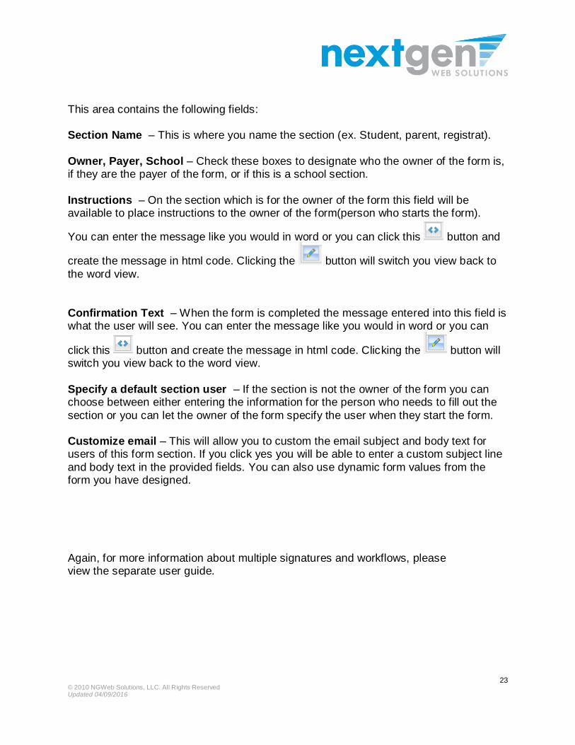
This area contains the following fields: Section Name – This is where you name the section (ex. Student, parent, registrat).
Owner, Payer, School – Check these boxes to designate who the owner of the form is, if they are the payer of the form, or if this is a school section.
Instructions – On the section which is for the owner of the form this field will be available to place instructions to the owner of the form(person who starts the form).
You can enter the message like you would in word or you can click this button and
create the message in html code. Clicking the button will switch you view back to
the word view.
Confirmation Text – When the form is completed the message entered into this field is what the user will see. You can enter the message like you would in word or you can
click this button and create the message in html code. Clicking the button will switch you view back to the word view.
Specify a default section user – If the section is not the owner of the form you can choose between either entering the information for the person who needs to fill out the
section or you can let the owner of the form specify the user when they start the form. Customize email – This will allow you to custom the email subject and body text for users of this form section. If you click yes you will be able to enter a custom subject line
and body text in the provided fields. You can also use dynamic form values from the form you have designed.
Again, for more information about multiple signatures and workflows, please view the separate user guide.
© 2010 NGWeb Solutions, LLC. All Rights Reserved Updated 04/09/2016
24
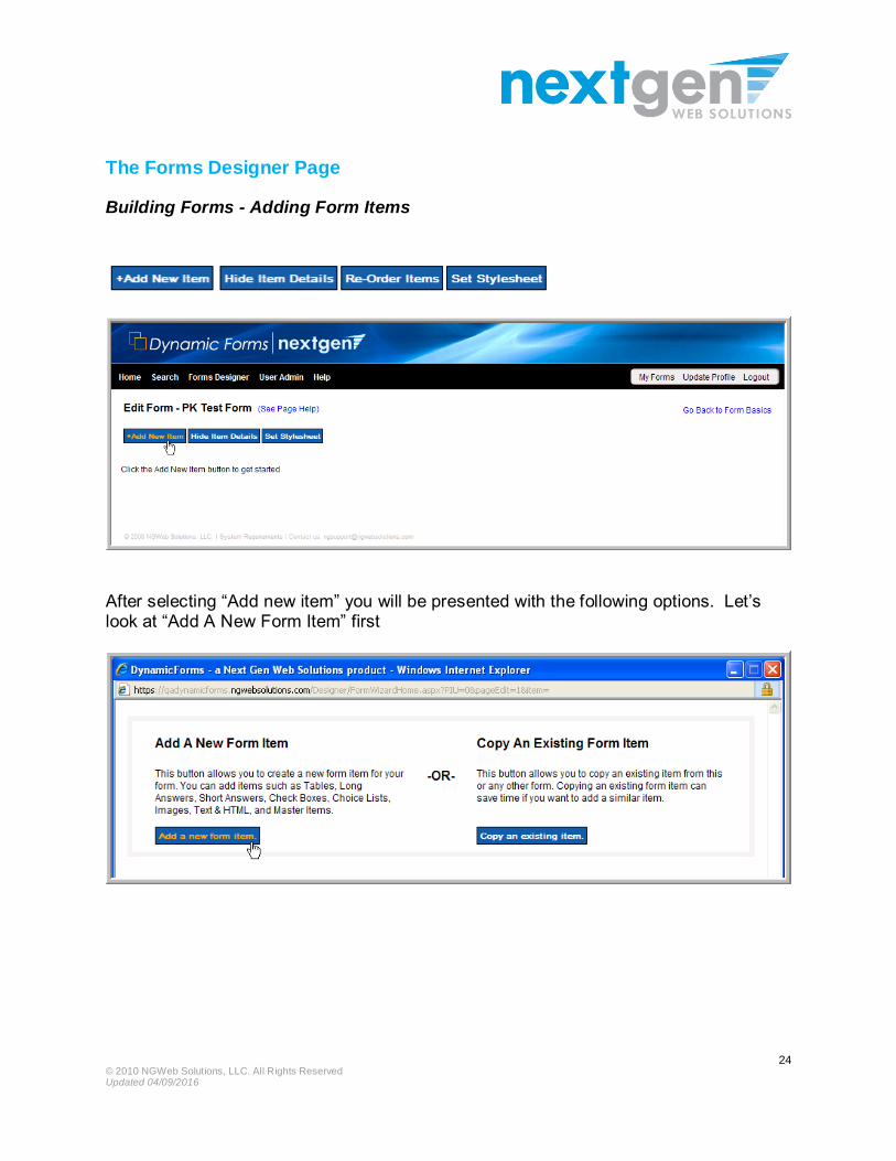
The Forms Designer Page
Building Forms - Adding Form Items
After selecting “Add new item” you will be presented with the following options. Let’s look at “Add A New Form Item” first

© 2010 NGWeb Solutions, LLC. All Rights Reserved Updated 04/09/2016
25
Form Items
After clicking on Add a New Form Item you are presented with the following options:
Table
Tables can be added to the form for greater formatting flexibility. You have full control over the
number of rows and columns in a table.
Long Answer
This provides an area where a user can type in information. A text area field displays as:
The text area allows the
user to input a lot of
textual information
Short Answer
These are used to display text and to accept text entry from users. A text box displays as:
Last Name: Smith
Choice List
These are used to display a list of specific options that a user can select from when completing an
online form. A drop-down list displays as:
© 2010 NGWeb Solutions, LLC. All Rights Reserved Updated 04/09/2016
26
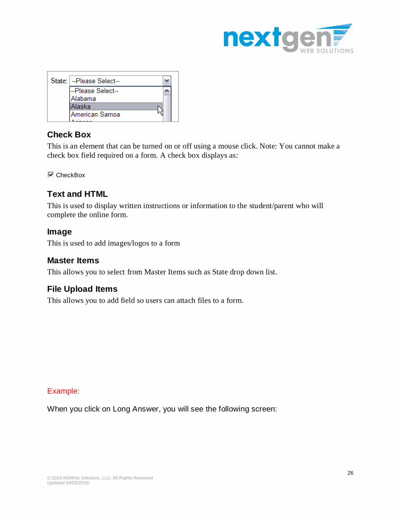
Check Box
This is an element that can be turned on or off using a mouse click. Note: You cannot make a
check box field required on a form. A check box displays as:
CheckBox
Text and HTML
This is used to display written instructions or information to the student/parent who will
complete the online form.
Image
This is used to add images/logos to a form
Master Items
This allows you to select from Master Items such as State drop down list.
File Upload Items
This allows you to add field so users can attach files to a form.
Example: When you click on Long Answer, you will see the following screen:

© 2010 NGWeb Solutions, LLC. All Rights Reserved Updated 04/09/2016
27
You can control the width and height of the long answer field.
The handy Pixel Ruler helps you estimate the size of the field
If you wish to add a label, you now have the ability to simply control how the label will appear.
You can easily change the appearance by using the simple interface to change things such as the font size and color. Simply enter the text, highlight it with your mouse and

© 2010 NGWeb Solutions, LLC. All Rights Reserved Updated 04/09/2016
28
then make your changes. You can then click on “Preview Field” to see how the long
answer field will appear on the form.
Clicking next takes you to the next screen.
© 2010 NGWeb Solutions, LLC. All Rights Reserved Updated 04/09/2016
29
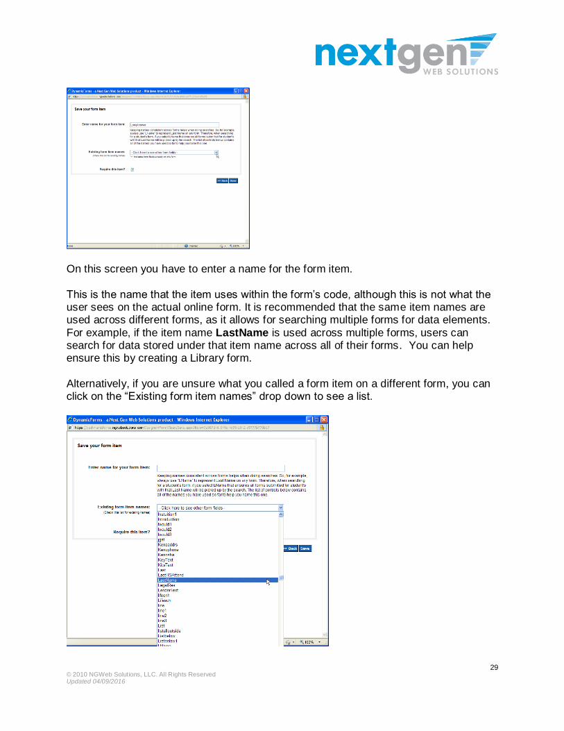
On this screen you have to enter a name for the form item.
This is the name that the item uses within the form’s code, although this is not what the user sees on the actual online form. It is recommended that the same item names are used across different forms, as it allows for searching multiple forms for data elements.
For example, if the item name LastName is used across multiple forms, users can search for data stored under that item name across all of their forms. You can help ensure this by creating a Library form.
Alternatively, if you are unsure what you called a form item on a different form, you can click on the “Existing form item names” drop down to see a list.
© 2010 NGWeb Solutions, LLC. All Rights Reserved Updated 04/09/2016
30
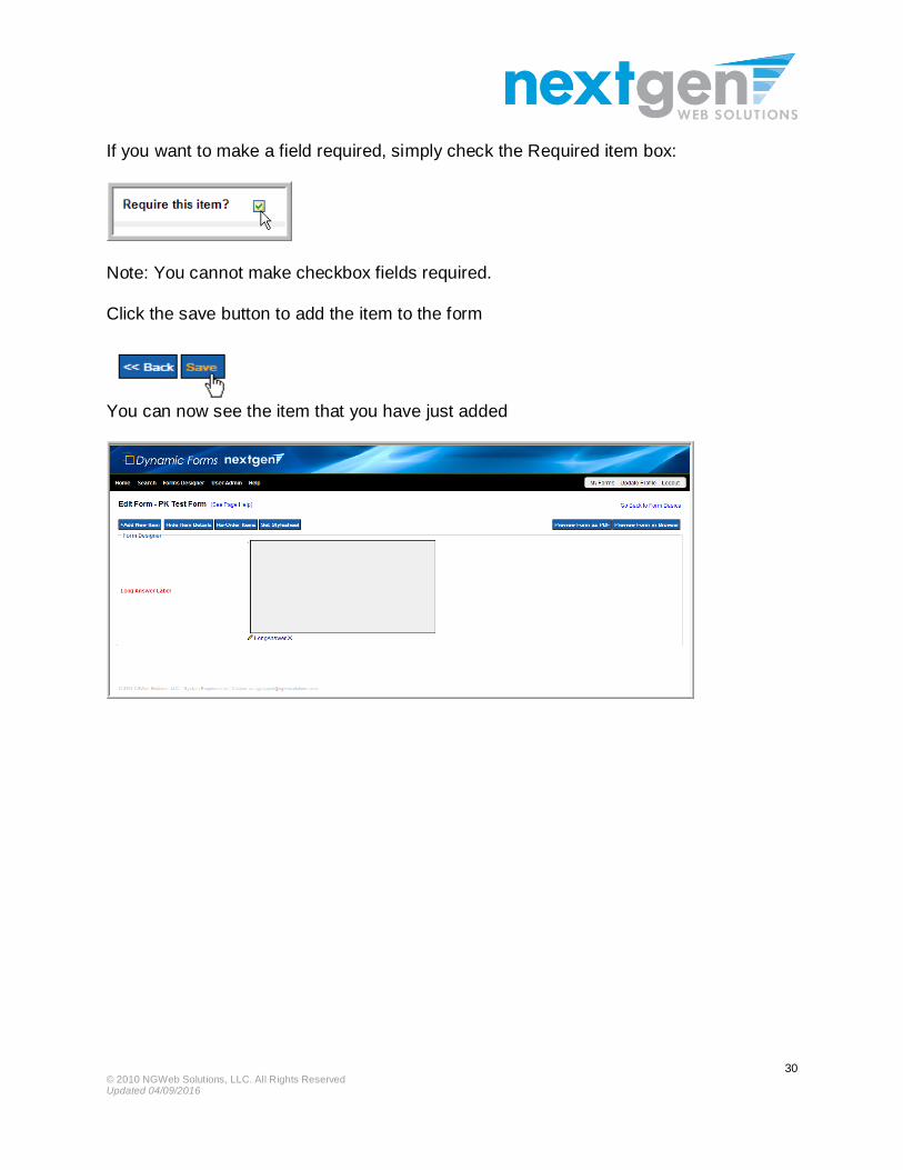
If you want to make a field required, simply check the Required item box:
Note: You cannot make checkbox fields required.
Click the save button to add the item to the form
You can now see the item that you have just added

© 2010 NGWeb Solutions, LLC. All Rights Reserved Updated 04/09/2016
31
Short Answer fields
The short answer field functions the same as the long answer field. The only difference
is that you can stipulate the kind of data that you are looking to capture. This will add a field edit to the form. To select the field edit, simply click on the drop down and choose the option that best fits your needs.
One special field edit is the Prefill option. If a user has logged into the
form, Dynamic Forms knows at least three basic elements about
that user: 1. First Name 2. Last Name
3. E-mail Address Form designers can
now build forms that will prefill those form values into the form.
When the prefill option is chosen, a third wizard page will appear to provide some
additional Prefill options. Depending on how your institution has elected to integrate with Dynamic Forms you may have one or both of these options – User Profile or API.

© 2010 NGWeb Solutions, LLC. All Rights Reserved Updated 04/09/2016
32
User Profile Options API Options User Profile values are stored in the user’s Dynamic Forms identity profile. This information is collected either through the SSO transaction or with the manual creation of the account. Typically, user profiles only contain First Name, Last Name, E-mail Address and possibly some other attributes provided in the SSO transaction.
If your institution wishes to integrate with Dynamic Forms API, these prefill options are only limited to the fields that your institution wishes to share with Dynamic Forms. API fields are collected into datasets. For example, Financial Aid users can see all fields in the Financial Aid datasets, but cannot see the Human Resources dataset. If you have access to all organizations, then users will see all datasets.
There are two ways to prefill a field:
1. Prefill fields that are not editable by the user (red arrow below) 2. Prefill fields that are editable by the user (green arrow below)
In picture above, the red arrow shows the prefill option that is not editable, and the green arrow points to the editable prefill option.

© 2010 NGWeb Solutions, LLC. All Rights Reserved Updated 04/09/2016
33
Choice List (custom drop down lists)
To add a list for students/parents to choose from, click on the button as shown above.
You will then see this:
Simply add the items as shown below, clicking on Save each time.
© 2010 NGWeb Solutions, LLC. All Rights Reserved Updated 04/09/2016
34
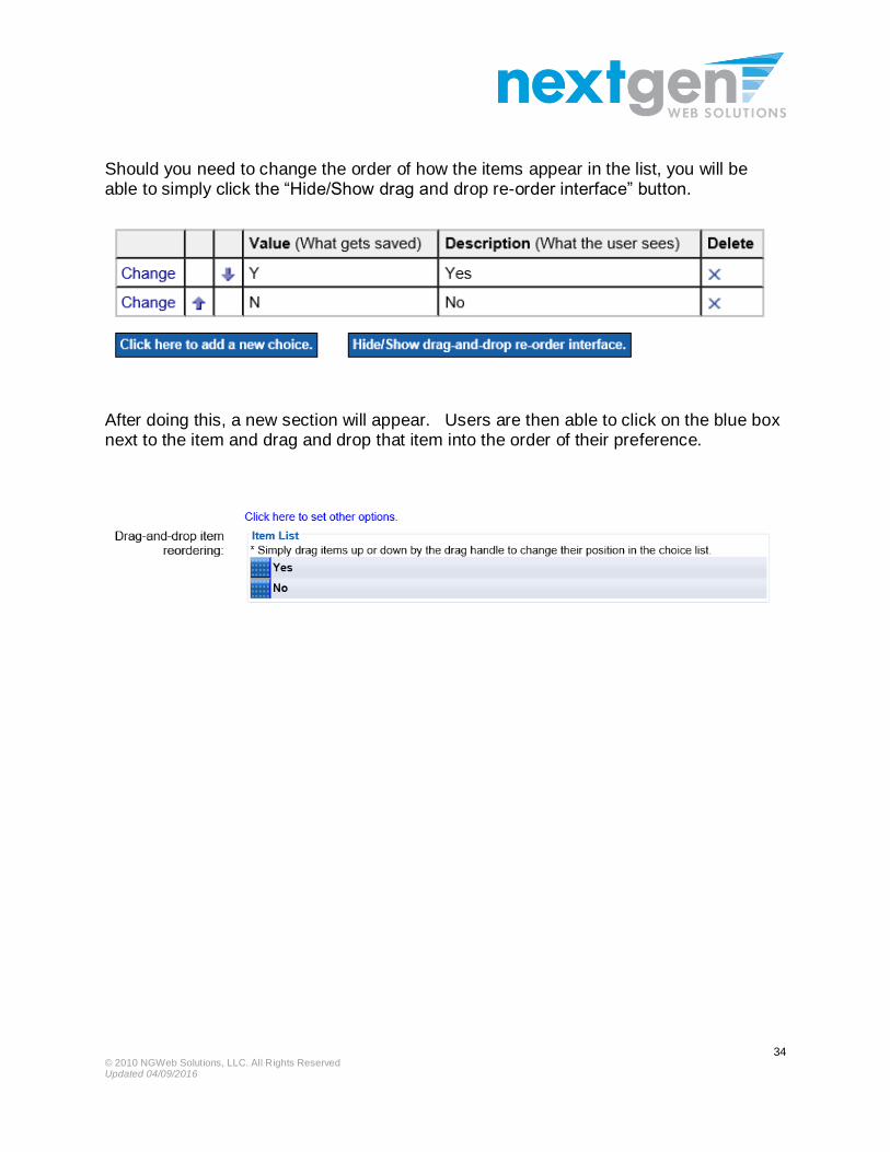
Should you need to change the order of how the items appear in the list, you will be able to simply click the “Hide/Show drag and drop re-order interface” button.
After doing this, a new section will appear. Users are then able to click on the blue box next to the item and drag and drop that item into the order of their preference.

© 2010 NGWeb Solutions, LLC. All Rights Reserved Updated 04/09/2016
35
Check Box
Simply add the label, format it to your liking and then save the form item. Note: You cannot make check box fields required on a form.

© 2010 NGWeb Solutions, LLC. All Rights Reserved Updated 04/09/2016
36
Text & HTML
If you need to add text and/or html to a form, click this option. The text editor will enable you to key in / copy and paste your text into the form. You
can also format your text through the editing button inside the editor.
*Important note about copying text from web or other sources
Many times when users copy text from a different source like a website or a custom word document, the text that is copied is accompanied by several lines of HTML formatting (see example below). Sometimes the items copied include HTML open tags or other bad HTML that can affect the performance of the form. Therefore, if you need to copy a large amount of text from a website or other custom source, we recommended that users first click the <Source> button in the top left hand side of the Editor and bring the text in without formatting. Users can then safely format the text.
Like the short answer and long answer fields, TEXT & HTML fields can use the prefill option of the form. This is terrific is you need to prepopulate the form with static text
from your SIS or other backend system.

© 2010 NGWeb Solutions, LLC. All Rights Reserved Updated 04/09/2016
37
Example of copying things from a website:
In the example below, the user went to the Department of Education’s website and cut
and paste this section of text and pasted it into Dynamic Forms. While this text copied successfully, you can see the HTML below that accompanied that section. However, sometimes users will unknowingly paste text and that paste text will include open HTML
tags that will cause the form to act unexpectedly (not show the intended text).
Laws & Guidance
Overview
Legislation, regulations, guidance, and other policy documents can be found here for the Every
Student Succeeds Act (ESSA), and other topics.
Please note that in the U.S., the federal role in education is limited. Because of the Tenth Amendment,
most education policy is decided at the state and local levels. So, if you have a question about a policy
or issue, you may want to check with the relevant organization in your state or school district.
<h1 style="box-sizing: border-box; margin: 20px 0px 10px; font-size: 30px; font-family: Georgia, 'Times New Roman', Times,
serif; font-weight: 500; line-height: 1.1; color: rgb(0, 66, 133); background-color: rgb(255, 255, 255);">Laws &
Guidance</h1>
<h2 style="box-sizing: border-box; font-family: Georgia, 'Times New Roman', Times, serif; font-weight: 500; line-height: 1.1; color: rgb(0, 66, 133); margin-top: 20px; margin-bottom: 10px; font-size: 24px; background-color: rgb(255, 255,
255);">Overview</h2>
<p style="box-sizing: border-box; margin: 0px 0px 10px; color: rgb(3, 10, 19); font-family: 'Helvetica Neue', Helvetica, Arial, sans-serif; font-size: 14px; line-height: 20px; background-color: rgb(255, 255, 255);">Legislation, regulations, guidance, and
other policy documents can be found here for the <span style="box-sizing: border-box; font-weight: 700;"><a href="http://www.ed.gov/essa?src=policy" style="box-sizing: border-box; color: rgb(126, 93, 142); background-color:
transparent;">Every Student Succeeds Act (ESSA)</a></span>, and other topics.</p>
<p style="box-sizing: border-box; margin: 0px 0px 10px; color: rgb(3, 10, 19); font-family: 'Helvetica Neue', Helvetica, Arial, sans-serif; font-size: 14px; line-height: 20px; background-color: rgb(255, 255, 255);">Please note that in the U.S., the federal
role in education is limited. Because of the Tenth Amendment, most education policy is decided at the state and local levels.
So, if you have a question about a policy or issue, you may want to check with the <a ref="http://www2.ed.gov/about/contacts/state/index.html?src=ov" style="box-sizing: border-box; color: rgb(126, 93, 142);
background-color: transparent;">relevant organization in your state or school district</a>.</p>

© 2010 NGWeb Solutions, LLC. All Rights Reserved Updated 04/09/2016
38
Image
Dynamic Forms enables you to add images to your forms with the Image Page Item. The best option is for users to upload images into their library of images in Dynamic
Forms, but we also give user the ability to host their own forms. ( Note: All images on Dynamic Forms must be hosted in a secure environment to ensure that users do not see a pop up message saying that there are unsecure items on the page.)
To see your library of forms or have the option to upload a new image, click on the “Choose from Library” button.

© 2010 NGWeb Solutions, LLC. All Rights Reserved Updated 04/09/2016
39
Master Items
Dynamic Forms allows you to select from previously built lists – Master Items. This can make building forms easier. For example, you can select the MasterStateList which means you do not have to build it yourself

© 2010 NGWeb Solutions, LLC. All Rights Reserved Updated 04/09/2016
40
Simply select the control you want to use from the drop down and click next.
You will then have the opportunity to make any changes to the options in the choice list.
© 2010 NGWeb Solutions, LLC. All Rights Reserved Updated 04/09/2016
41
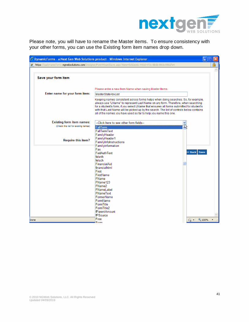
Please note, you will have to rename the Master items. To ensure consistency with
your other forms, you can use the Existing form item names drop down.
© 2010 NGWeb Solutions, LLC. All Rights Reserved Updated 04/09/2016
42
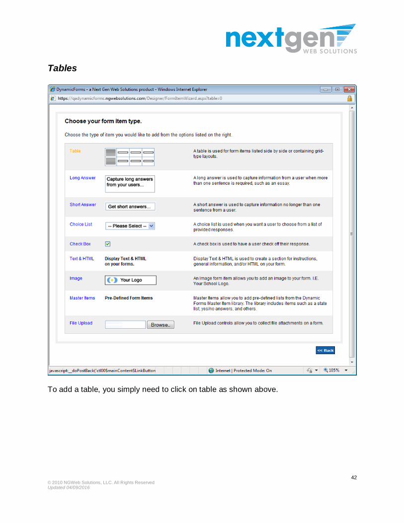
Tables
To add a table, you simply need to click on table as shown above.
© 2010 NGWeb Solutions, LLC. All Rights Reserved Updated 04/09/2016
43
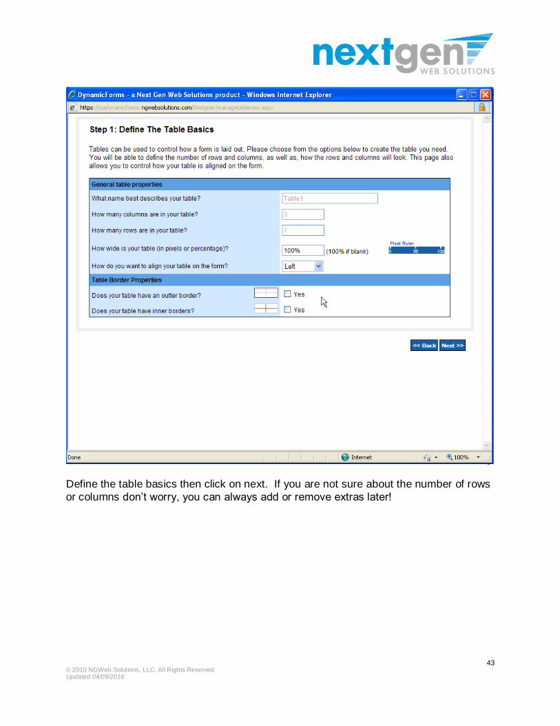
Define the table basics then click on next. If you are not sure about the number of rows
or columns don’t worry, you can always add or remove extras later!

© 2010 NGWeb Solutions, LLC. All Rights Reserved Updated 04/09/2016
44
To add a form control to the table, simply click on the cell where you wish to place the form item. You will then see the same options previously outlined when we looked at adding individual form items.

© 2010 NGWeb Solutions, LLC. All Rights Reserved Updated 04/09/2016
45
If you wish to edit an item from a table or delete it, you can simply click on the pencil icon (to edit) or on Delete. Please note, you can also edit these items directly from the main forms designer window without having to go all the way into the table.

© 2010 NGWeb Solutions, LLC. All Rights Reserved Updated 04/09/2016
46
The options at the top of the table now give you far greater capabilities with tables. You no longer have to build in additional rows or columns when you initially define your table. You can now add new ones or even delete extras at any time.
Simply click on the appropriate option at the top and you will be shown some simple prompts that will ask you where you wish to insert a row/column, or which row/column
you wish to delete
How cool is that!

© 2010 NGWeb Solutions, LLC. All Rights Reserved Updated 04/09/2016
47
Other table improvements
In the screenshot below, there is a table called StudentInfo. You can edit the table by clicking on the table name (as shown).
Alternatively, if you only wish to make an edit to a specific form item, you can now edit
that form item directly by clicking on its name! You no longer have to go all the way into the table to make the change.
Also note in the screenshot below that we now color code items so that you can see if they are designated as student or parent items (for example). This is a global change and not just restricted to tables.

© 2010 NGWeb Solutions, LLC. All Rights Reserved Updated 04/09/2016
48
File Upload

© 2010 NGWeb Solutions, LLC. All Rights Reserved Updated 04/09/2016
49
Simply add the label, format it to your liking and then save the form item.
As with other items, you will need to name the form item and then click on save to add
the form item to your form. If you wish to make the field required (so preventing the student from submitting the
form without completing that field) then simply check the required box as shown below.
© 2010 NGWeb Solutions, LLC. All Rights Reserved Updated 04/09/2016
50
Copy an existing Item
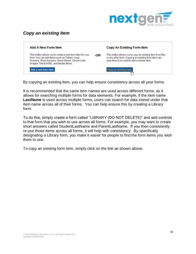
By copying an existing item, you can help ensure consistency across all your forms.
It is recommended that the same item names are used across different forms, as it allows for searching multiple forms for data elements. For example, if the item name LastName is used across multiple forms, users can search for data stored under that
item name across all of their forms. You can help ensure this by creating a Library form.
To do this, simply create a form called “LIBRARY (DO NOT DELETE)” and add controls to that form that you wish to use across all forms. For example, you may want to create short answers called StudentLastName and ParentLastName. If you then consistently
re-use those items across all forms, it will help with consistency. By specifically designating a Library form, you make it easier for people to find the form items you wish them to use.
To copy an existing form item, simply click on the link as shown above.
© 2010 NGWeb Solutions, LLC. All Rights Reserved Updated 04/09/2016
51
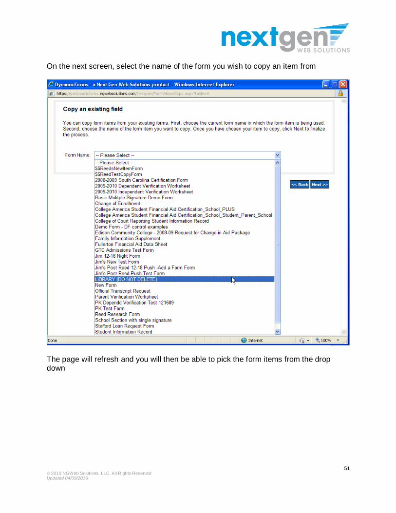
On the next screen, select the name of the form you wish to copy an item from
The page will refresh and you will then be able to pick the form items from the drop down

© 2010 NGWeb Solutions, LLC. All Rights Reserved Updated 04/09/2016
52

© 2010 NGWeb Solutions, LLC. All Rights Reserved Updated 04/09/2016
53
The next screen will show the form elements

© 2010 NGWeb Solutions, LLC. All Rights Reserved Updated 04/09/2016
54
Click on next. Then on the next screen, click save. You do not need to rename the item
(unless you have already used it on the same form). To ensure consistency, you should not rename the item.

© 2010 NGWeb Solutions, LLC. All Rights Reserved Updated 04/09/2016
55
Change the order of items
Click on the Re-Order Items button. You will then see the item list appear on the left hand of your screen as shown below

© 2010 NGWeb Solutions, LLC. All Rights Reserved Updated 04/09/2016
56
Simply drag the item you wish to move up or down the list to the position you want.
When the page refreshes, the items will appear in their new order. To hide the item list,
simply click on Hide Item List

© 2010 NGWeb Solutions, LLC. All Rights Reserved Updated 04/09/2016
57
Form Preview Section:
As you are building your form, you will now be able to preview them as they will appear to students when they are completing the form, and also, how the form will look once
the PDF is generated. Previewing a form regularly as you build will help you determine when you should begin
a new page.
© 2010 NGWeb Solutions, LLC. All Rights Reserved Updated 04/09/2016
58
Optional: Adding a Style sheet
Dynamic Forms work within their own stylesheet, so it is not required to add another
stylesheet. A CSS (Cascading Style Sheet) defines the web page’s font, color, border, size, and background. By using this functionality, a user can utilize a style sheet that has already been defined and saved on a client directory. Your school may have a
standard style sheet that can be used to make your form look similar to your website.
Stylesheet Rules:
1. Users control the stylesheet selection by using the “Set stylesheet” button on the Designer page.
2. A stylesheet rules the page. If you enter a stylesheet for the page,
all page items will reference that stylesheet. If you reference a
stylesheet on Page 1 and want it also on Page 2, you must also enter that stylesheet on Page 2.
3. Dynamic Forms “Add Item” pages are different when a stylesheet is being referenced. See the Stylesheet Screens on the next few pages
4. If users have created forms in the old designer, and used one of the
following Page Item attributes, the Next Gen stylesheet is attributed
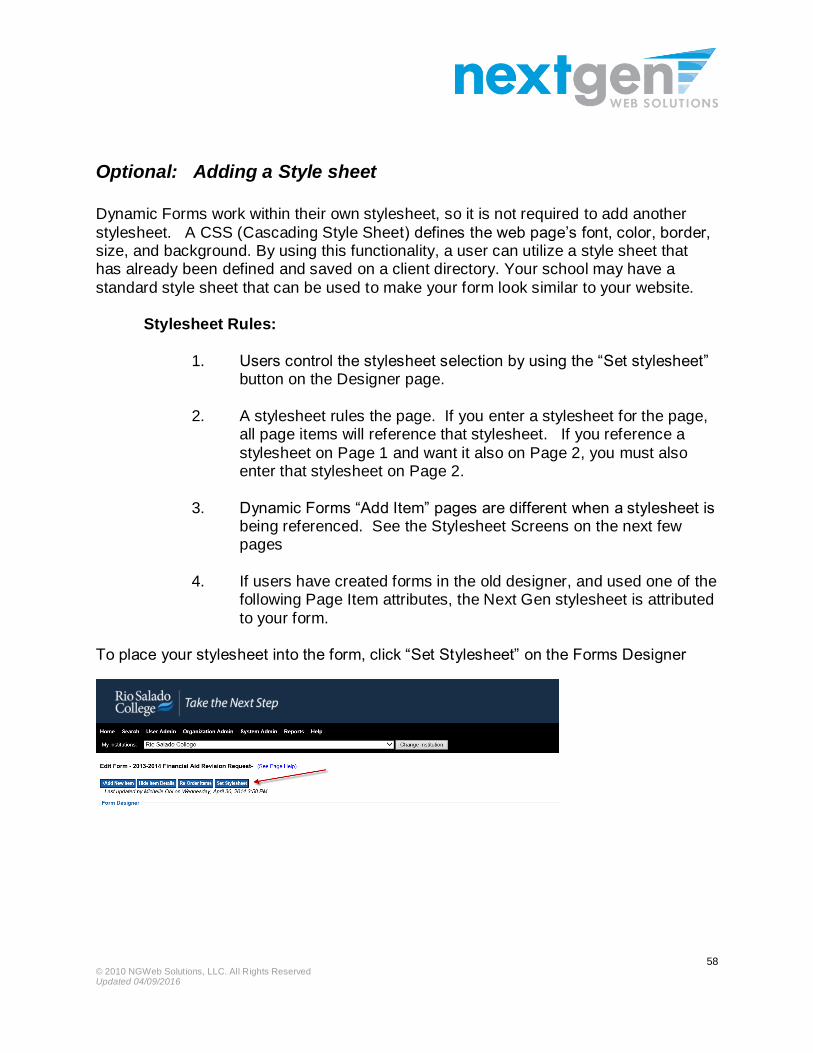
to your form. To place your stylesheet into the form, click “Set Stylesheet” on the Forms Designer

© 2010 NGWeb Solutions, LLC. All Rights Reserved Updated 04/09/2016
59
Step 6: Activate a Form
Active and inactive forms can be identified by clicking the Form Design tab.
Forms with green circles next to them are active.
Forms with red circles next to them are inactive.
Change the status of the form by clicking the circle icon next to the form.
When forms are in an active state, users (if they have access to the proper url) can submit the forms. When the form is in an inactive state and the url is clicked, the user is
presented with the Inactive Text as defined in the Forms Basics page.


