Dynamic visualizations of language changeMotion charts on the basis of bivariate and multivariate data from diachronic corpora*
Martin HilpertFreiburg Institute for Advanced Studies
This paper uses diachronic corpus data to visualize language change in a dynam-ic fashion. Bivariate and multivariate data sets form the input for so-called mo-tion charts, i.e. series of diachronically ordered scatterplots that can be viewed in sequence. Based on data from COHA (Davies 2010), two case studies illustrate recent changes in American English. The first study visualizes change in a diachronic analysis of ambicategorical nouns and verbs such as hope or drink; the second study shows structural change in the behavior of complement-taking predicates such as expect or remember. Whereas motion charts are typically used to represent bivariate data sets, it is argued here that they are also useful for the analysis of multivariate data over time. The present paper submits multivariate diachronic data to a multi-dimensional scaling analysis. Viewing the resulting data points in separate time slices offers a holistic and intuitive representation of complex linguistic change.
This paper presents a way to visualize processes of language change in a dynamic fashion. For this, it uses so-called motion charts (Gesmann & de Castillo 2011), which are series of diachronically ordered scatterplots. Viewing these plots se-quentially on a computer screen creates the impression of continuous motion and allows the viewer to process complex information in an intuitive way. On printed pages, the sequential graphs can be read in the way one would read a comic strip: the frame of reference is held constant, but items within that frame change from one picture to the next. Motion charts were made popular as a visualization tool
436 Martin Hilpert
for change in international socio-economic statistics. Rosling (2006) presents mo-tion charts on the basis of bivariate data sets that capture the socio-economic con-ditions of different nation states. To give an example, plotting a variable such as per-capita income on the x-axis and a second variable such as child mortality on the y-axis allows comparisons between countries: the situation in Finland today regarding these variables is very different from the situation in Burundi. If this kind of information is available for several periods of time, it can visually present how the situation of the respective countries has changed over the years. It can for instance be seen that child mortality has been decreasing in both Burundi and Finland over the past 50 years, and it can be seen that Burundi’s child mortality today is comparable to Finland’s child mortality during the early years of the 20th century.1 In this paper, this technique of representing statistics is used with lin-guistic data from diachronic corpora.
Beyond explaining how bivariate linguistic data can be turned into a motion chart, the present paper also makes the argument that more complex multivari-ate data sets can be fruitfully analyzed through motion charts. In order for this to work, the multivariate data first has to be brought into a format that allows for a two-dimensional, map-like representation. The technique of metric multi-dimen-sional scaling (Kruskal & Wish 1978) will be used here to carry out such a trans-formation. Multi-dimensional scaling will be introduced in more detail below.
The main purpose of producing linguistic motion charts is to give the analyst an intuitive understanding of complex linguistic developments. To this end, the paper presents two case studies from the recent history of American English. The first is a visualization of bivariate data that shows how ambicategorical words such as work, hope, use, and look, which can be used as either nouns or verbs, have changed in their respective proportions of nominal and verbal usages. Over time, elements may become more “verby” or more “nouny”. The second case study uses multivariate data and shows structural change in the behavior of complement-taking predicates. Diachronically, verbs may change their preferred complementa-tion patterns, for instance from that-clauses to ing-clauses. The paper will point to contexts in which the dynamic visualization of linguistic change has advantages over the presentation of line graphs or frequency tables. In such contexts, motion charts can aid and drive the explorative analysis of diachronic corpus data. Seeing how a linguistic phenomenon changes over time can provide the analyst with an immediate experience of the data, and it can address theoretical claims and hy-potheses regarding the phenomena in question.
The exploration of multivariate data in this paper is based on sequentially or-dered two-dimensional maps that have been produced through multi-dimensional scaling (Kruskal & Wish 1978, Wheeler 2005). Multi-dimensional scaling maps, or MDS maps for short, can visualize similarity relations between different linguistic
Dynamic visualizations of language change 437
units on a two-dimensional surface. In a nutshell, units that share many of their characteristics are placed relatively close to one another; units that are very differ-ent are placed at a greater distance. In order to arrive at these placements, similar-ity between the units is measured quantitatively in terms of several features that are specified in advance by the analyst. MDS maps have found many applications in linguistics, for instance in sociolinguistics (Labov 1994), in semantics (Majid et al. 2008), in the comparative study of language varieties (Szmrecsanyi & Kortmann 2009) or in the description of typological generalizations (Croft & Poole 2008).
Most applications of MDS aim to analyze how a complex phenomenon mani-fests itself in the present, i.e. at a fixed, single point in time.2 In this paper, MDS is used to investigate changes over time. Sequences of maps are produced on the basis of time slices of data that are taken from a very large diachronic corpus of American English (Davies 2010). Diachronic corpora represent intervals of time, such as years or decades, through comparable sets of texts that are drawn from the same genres and registers. These resources thus afford the possibility of con-ducting an MDS analysis in which a linguistic unit may be compared not only to a set of other linguistic units, but crucially also to “itself ” at different points in time. As in the initial example involving per-capita income and child mortality, it is possible to make comparisons across two units (Finland vs. Burundi), but it is equally possible to make within-unit comparisons across time (Finland in 1890 vs. Finland in 1990). Within-unit comparisons from one time interval to the next will sometimes be minute, or seemingly erratic. However, across a series of ten or more time slices, minor oscillations and shifts may add up to clearly discernable developments. Motion charts can thus reveal which of the linguistic units under analysis stay constant in their usage and which ones change, how the latter ones change, and whether the overall configuration of units undergoes only a minor adjustment or a major internal restructuring.
In summary, the argument presented here is that a motion chart analysis of diachronic corpus data can substantially support the study of change in a broad range of complex linguistic phenomena. The remainder of this paper is structured as follows: Section 2 discusses the data sources that are used and puts the present efforts towards graphical representations of language change into the context of existing work with the same objective. It will be shown what kinds of visualiza-tions are currently in use, what types of linguistic change they represent, and how the present proposals go beyond what is already available. Section 3 presents the first case study, which addresses ambicategorical nouns and verbs. Section 4 offers a brief description of multi-dimensional scaling, specifically discussing how MDS processes and transforms input data in order to yield map-like representations. Section 5 presents the second case study, which tracks the changing complement-taking behavior of English verbs such as expect, like, or imagine. These verbs occur
438 Martin Hilpert
with a range of different subcategorization frames such as simple noun phrases, to-infinitives, ing-clauses, or that-clauses. The analysis captures how these predicates change diachronically with regard to their preferred subcategorization frames. Section 6 takes a step back from the two case studies and concludes by discussing how motion chart analyses can inform questions of linguistic theory.
2. Diachronic corpus data and visualization of change
2.1 Data
The kinds of visualizations that are proposed here require relatively large amounts of text as input data. Diachronic corpora that are both large enough and suffi-ciently balanced to make such visualizations possible have become available only recently. The present paper makes use of the Corpus of Historical American English (COHA; Davies 2010), which is freely searchable over an on-line interface. The COHA is tagged for parts of speech and contains more than 400 million words, representing 20 sequential decades from the 1810s to the 2000s. From the 1830s onward, each decade is represented by more than ten million words. The corpus contains data from four genres: fiction, popular magazines, newspaper texts, and non-fiction books. A design feature of the corpus is that the percentage of fiction is held constant at around 50% for all decades. Newspaper writing only enters the corpus from the 1860s onward, which is why the case studies in the present paper use only the fifteen decades from the 1860s to the 2000s. Across these periods, popular magazines account for 25% of the data, newspaper texts for 11% and non-fiction books for the remaining 14%. The mean period size is 23.5 million words (sd = 3.2 mw).
2.2 Graphical representations of language change
As yet, there is no established catalogue of analytical techniques that are both adapted towards the special characteristics of diachronic corpus data and that are designed to address the types of theoretical questions that matter to linguists in-terested in diachronic change. As a consequence, the literature contains only few suggestions for the visualization of linguistic change as it can be observed in dia-chronic corpora such as COHA. However, a growing number of studies is working on the problem of how processes of change can be usefully visualized. Most graph-ical representations deal with changes of text frequency, but importantly, these are not the only processes that are of concern in diachronic corpus linguistics. Issues such as corpus periodization or changes in productivity also require quantitative
Dynamic visualizations of language change 439
measurements that can be graphically represented. The figures in the following sections illustrate several types of visualizations.3
2.2.1 Frequency developments and their periodizationThe two graphs in Figure 1 are based on the frequency development of phrases such as many a day or many an American in the COHA. The first graph shows the most common visualization seen in diachronic corpus work: a line chart that represents the frequency development of a linguistic form across a series of corpus periods. A continuous, gradual frequency decline is immediately apparent. Typi-cally, such graphs are accompanied by a discussion of how the form under analysis has changed in frequency over the years, and at which points in the development there were substantial or surprising changes in slope. Useful and intuitively clear as these graphs are, there are a number of extensions that incorporate further in-formation into a visual format that can give the viewer a more precise understand-ing of the change that is happening.
The right panel of Figure 1 shows the same frequency decline as the first graph with some additional elements superimposed on it. First, there is a dendrogram of a cluster analysis that visualizes the respective similarities between neighbor-ing groups of measurements (Gries & Hilpert 2008). For instance, the last two measurements are highly similar and thus merged into a common cluster at a very early stage. Secondly, the gray horizontal lines visualize a tripartite periodization of the overall development. The height of the gray lines indicates the mean fre-quency of the respective measurements. Not surprisingly, the periods show a step-wise frequency decrease. The purpose of the graph is to visualize a data-driven periodization of a diachronic development: historical measurements that display group-internal similarity are usefully combined into a longer period, whereas dis-similarities from one measurement to the next suggest a break between periods,
Figure 1. Frequency developments
440 Martin Hilpert
as for instance between the 1890s and the 1900s. With an analysis of this kind, the data itself can actually guide the researcher in the division of a diachronic develop-ment into sequential periods, which is a desirable alternative to simply partition-ing the data into arbitrarily chosen equidistant time slices.4
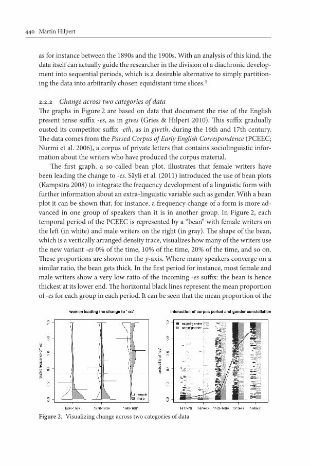
2.2.2 Change across two categories of dataThe graphs in Figure 2 are based on data that document the rise of the English present tense suffix -es, as in gives (Gries & Hilpert 2010). This suffix gradually ousted its competitor suffix -eth, as in giveth, during the 16th and 17th century. The data comes from the Parsed Corpus of Early English Correspondence (PCEEC; Nurmi et al. 2006), a corpus of private letters that contains sociolinguistic infor-mation about the writers who have produced the corpus material.
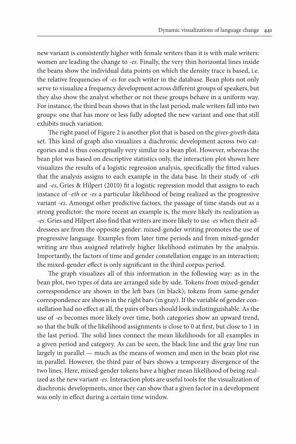
The first graph, a so-called bean plot, illustrates that female writers have been leading the change to -es. Säyli et al. (2011) introduced the use of bean plots (Kampstra 2008) to integrate the frequency development of a linguistic form with further information about an extra-linguistic variable such as gender. With a bean plot it can be shown that, for instance, a frequency change of a form is more ad-vanced in one group of speakers than it is in another group. In Figure 2, each temporal period of the PCEEC is represented by a “bean” with female writers on the left (in white) and male writers on the right (in gray). The shape of the bean, which is a vertically arranged density trace, visualizes how many of the writers use the new variant -es 0% of the time, 10% of the time, 20% of the time, and so on. These proportions are shown on the y-axis. Where many speakers converge on a similar ratio, the bean gets thick. In the first period for instance, most female and male writers show a very low ratio of the incoming -es suffix: the bean is hence thickest at its lower end. The horizontal black lines represent the mean proportion of -es for each group in each period. It can be seen that the mean proportion of the
Figure 2. Visualizing change across two categories of data
Dynamic visualizations of language change 441
new variant is consistently higher with female writers than it is with male writers: women are leading the change to -es. Finally, the very thin horizontal lines inside the beans show the individual data points on which the density trace is based, i.e. the relative frequencies of -es for each writer in the database. Bean plots not only serve to visualize a frequency development across different groups of speakers, but they also show the analyst whether or not these groups behave in a uniform way. For instance, the third bean shows that in the last period, male writers fall into two groups: one that has more or less fully adopted the new variant and one that still exhibits much variation.
The right panel of Figure 2 is another plot that is based on the gives-giveth data set. This kind of graph also visualizes a diachronic development across two cat-egories and is thus conceptually very similar to a bean plot. However, whereas the bean plot was based on descriptive statistics only, the interaction plot shown here visualizes the results of a logistic regression analysis, specifically the fitted values that the analysis assigns to each example in the data base. In their study of -eth and -es, Gries & Hilpert (2010) fit a logistic regression model that assigns to each instance of -eth or -es a particular likelihood of being realized as the progressive variant -es. Amongst other predictive factors, the passage of time stands out as a strong predictor: the more recent an example is, the more likely its realization as -es. Gries and Hilpert also find that writers are more likely to use -es when their ad-dressees are from the opposite gender: mixed-gender writing promotes the use of progressive language. Examples from later time periods and from mixed-gender writing are thus assigned relatively higher likelihood estimates by the analysis. Importantly, the factors of time and gender constellation engage in an interaction; the mixed-gender effect is only significant in the third corpus period.
The graph visualizes all of this information in the following way: as in the bean plot, two types of data are arranged side by side. Tokens from mixed-gender correspondence are shown in the left bars (in black); tokens from same-gender correspondence are shown in the right bars (in gray). If the variable of gender con-stellation had no effect at all, the pairs of bars should look indistinguishable. As the use of -es becomes more likely over time, both categories show an upward trend, so that the bulk of the likelihood assignments is close to 0 at first, but close to 1 in the last period. The solid lines connect the mean likelihoods for all examples in a given period and category. As can be seen, the black line and the gray line run largely in parallel — much as the means of women and men in the bean plot rise in parallel. However, the third pair of bars shows a temporary divergence of the two lines. Here, mixed-gender tokens have a higher mean likelihood of being real-ized as the new variant -es. Interaction plots are useful tools for the visualization of diachronic developments, since they can show that a given factor in a development was only in effect during a certain time window.
442 Martin Hilpert
2.2.3 Change in productivity and collocational profileAs was mentioned above, changes in text frequency represent only one aspect of change that can be studied with diachronic corpora. Equally important measures concern changes in the interdependencies of one linguistic unit with other units in its environment. The two graphs in Figure 3 visualize such changes. The graphs are based on a concordance of the modal auxiliary shall in the The Corpus of Con-temporary American English (COCA; Davies 2008); the concordance covers the eight decades between the 1900s and the 1970s. These decades have been chosen because the measures that are employed require approximately even-sized peri-ods, which is the case here (mean = 23.9 mw, sd = 1 mw).
The first graph shows changes in the productivity of shall. As a modal auxiliary, shall occurs with a wide range of verbs in the infinitive, as in shall do, shall see, shall explain, etc. The extent to which shall combines with lexical verbs can be expressed in different quantitative measurements of productivity. One such measurement is type frequency, which is a simple count of the different infinitive types that occur with shall. Another type of assessment is called potential productivity (Baayen 2009). This measure operationalizes the productivity of a schema as the number of its hapax legomena (i.e. the types that occur only once in a corpus) divided by its overall text frequency (i.e. all of its tokens in a corpus). A high ratio of hapaxes suggests that speakers frequently produce new coinages; hence it is taken as evi-dence for productivity. Both measures can be combined in a two-dimensional plot of global productivity (Baayen & Lieber 1991: 819), which earns its epithet “global” from the fact that it represents two different aspects of productivity.
The graph shows potential productivity on the x-axis and type frequency on the y-axis. Interestingly, type frequency shows an almost completely linear de-crease over time whereas potential productivity shows a perfectly linear increase.
Figure 3. Visualizing changes in productivity and collocational profile
Dynamic visualizations of language change 443
This particular ordering of the decades would not necessarily have been expected, as there seem to be two aspects of productivity developing in opposite directions. Whereas shall has come to be used with fewer verbs overall, it is more freely com-bined with different verb types than it has been in the past. Graphs such as the one in Figure 3 can nicely capture how changes in productivity, which may seem somewhat erratic from one decade to the next, add up to form rather clear trends over longer stretches of time.
Also the second graph of Figure 3 visualizes changes in the combinatorics of shall with lexical verbs. Across different corpus periods, shall occurs with slightly different sets of verbs that differ in their relative frequencies. The graph is the vi-sual output of a so-called correspondence analysis (Nenadić & Greenacre 2007), which is a special case of multi-dimensional scaling. Correspondence analysis has been applied in linguistic studies for instance in the study of lexical synonymy (Glynn 2010). The analysis here is based on the frequencies of 21 selected verb types that differ in their respective distributions across four 20-year periods. The analysis transforms the relative frequencies of different verb types across the four periods into spatial distances on a two-dimensional surface. The basic logic of the graph is the following: corpus periods in which shall occurs with similar sets of verbs are placed close to one another; periods that hold very different sets of verbs are placed further apart. Verbs that are distributed evenly across different periods are placed towards the mutual center of those periods; verbs that are strongly lim-ited to one period are shown close to that period, away from the mutual center of the four periods. The two dimensions of the plot thus reflect distributional differ-ences between the periods and their verbs. They are derived by computing a spa-tial arrangement of periods and verbs that captures their mutual distances with the least possible loss of information. The discussion here leaves some methodologi-cal considerations about correspondence analysis open, but Sections 4 and 5 will come back to these issues and clarify them in connection with the exemplification of MDS, which is based on similar data and similar analytical procedures.
What is of immediate importance here is that in contrast to the preceding graph of global productivity, the progression of time does not map onto the two dimensions in a linear fashion. The graph shows that each of the four periods is associated with a different set of verbs, but the diachronic collocational shift de-scribes a movement of back and forth, rather than a linear trend. Nonetheless, it can be observed that a diachronic shift introduces a change from verbs that encode intentions and obligations (i.e. forbid, advise, govern, avoid, etc.) in the second pe-riod towards verbs that mainly serve as meta-linguistic means to structure upcom-ing discourse (i.e. discuss, argue, grant, explore, etc.) in the third and fourth period. The graph thus allows some conclusions about how shall changed with regard to its collocates over time.
444 Martin Hilpert
3. Case study 1: Change in ambicategorical nouns and verbs
A notoriously productive word formation process in present-day English is the process of conversion, which allows speakers to change the part of speech category of a word and use the word in new structural contexts. Within conversion, two particularly productive patterns are conversion from verb to noun, as in drink — have a drink, and conversion from noun to verb, as in summer — to summer in France. For some elements, it is opaque to present-day speakers whether the ultimate source was nominal or verbal — the element work is a case in point. The analysis here is not concerned with the directionality of the conversion process, but rather focuses on the questions of how different elements are distributed in their respective proportions of verbal and nominal uses, and how these propor-tions may have changed over time. An analysis of ambicategorical words can re-veal which elements are typically used in a verbal or nominal context and which ones are distributed more evenly. An analysis over time can determine whether there were general trends in the use of ambicategorical elements or whether indi-vidual items underwent changes in their respective distributions.
The present study draws on the COHA to gather data for such an analysis. Since conversion between nouns and verbs has given rise to a very high number of types, a selection of types had to be made for the analysis. The 1,000 most fre-quent noun and verb types in the COHA were retrieved together with their overall corpus frequencies. The respective lists were scanned for overlapping elements, which were then checked manually in order to select ambicategorical elements that show a clear semantic relation. Pairs such as desert and to desert, which are semantically distinct, were thus discarded. In order to keep the set managable, 119 of the most frequent items were kept for further analysis. These items include act, cut, love, pause, and view, amongst others.5 For all of these items, their lemma frequencies across the fifteen COHA periods from the 1860s to the 2000s were determined.
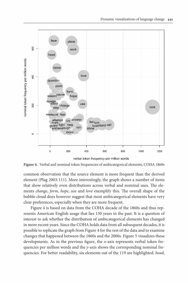
Figure 4 shows how the items are distributed across verbal and nominal uses in the 1860s. Verbal token frequency per million words is shown on the x-axis; nominal frequencies are shown on the y-axis. Each element is represented by a bubble which receives its x- and y-coordinate from the respective verbal and nom-inal frequencies of the element. Bubble size reflects the combined token frequen-cies. Small bubbles hence cluster in the lower left of the graph; larger bubbles owe their size to frequent verbal or nominal usage, or of course both. For better read-ability, some bubbles in Figure 4 are not labeled.
The graph allows the identification of elements such as face, head, and name as predominantly nominal. Conversely, the items call, stand and hold are primar-ily used as verbs. This particular distribution is to be expected, since it reflects the
Dynamic visualizations of language change 445
common observation that the source element is more frequent than the derived element (Plag 2003: 111). More interestingly, the graph shows a number of items that show relatively even distributions across verbal and nominal uses. The ele-ments change, form, hope, use and love exemplify this. The overall shape of the bubble cloud does however suggest that most ambicategorical elements have very clear preferences, especially when they are more frequent.
Figure 4 is based on data from the COHA decade of the 1860s and thus rep-resents American English usage that lies 150 years in the past. It is a question of interest to ask whether the distribution of ambicategorical elements has changed in more recent years. Since the COHA holds data from all subsequent decades, it is possible to replicate the graph from Figure 4 for the rest of the data and to examine changes that happened between the 1860s and the 2000s. Figure 5 visualizes these developments. As in the previous figure, the x-axis represents verbal token fre-quencies per million words and the y-axis shows the corresponding nominal fre-quencies. For better readability, six elements out of the 119 are highlighted: head,
Figure 4. Verbal and nominal token frequencies of ambicategorical elements, COHA 1860s
446 Martin Hilpert
work, love, use, show, and look. The following paragraphs make several observa-tions about the developments that can be seen in Figure 5.
First, it is apparent that the overall configuration of ambicategorical ele-ments has remained rather stable. The crescent-shaped cloud of bubbles that can be seen in Figure 4 continues to characterize later periods of the COHA corpus. For individual elements, however, some changes can be observed. The item work, which is almost exclusively used as a noun in the 1860s, undergoes a decrease in its nominal frequency and steadily increases in verbal frequency from the 1920s onwards. It thereby develops into a truly ambicategorical element. Also the item love decreases in nominal frequency and becomes more evenly distributed across nominal and verbal uses over time. Conversely, the element show starts out with exclusively verbal usage in the 1860s, but gains in nominal frequency, so that by the 2000s love and show exhibit the same ratios of nominal and verbal uses. While some elements change, others stay relatively constant in their distribution. The item head shows moderate gains in nominal frequency over the years, but its low verbal frequency stays very constant. Likewise, look and use increase their respec-tive verbal frequencies but stay the same in terms of nominal frequency.
Figure 5 shows that there clearly is development in the domain of ambicat-egorical nouns and verbs, and it allows the viewer to take in these developments both in a holistic way, focusing on constellations rather than individual items, but also in the detailed way of looking at changes of individual items.
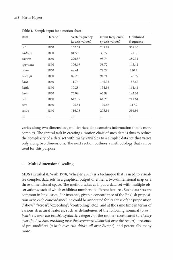
A series of still graphs on a page, as in Figure 5, has the disadvantage that the viewer cannot trace the movements of unlabeled elements. Gesmann & de Castillo (2011) present a software package that can produce animated charts from precisely the same type of data that has gone into the production of Figure 5. In such graphs, the user may interactively select items for closer inspection and im-portantly, the simultaneous movement of all items under analysis can be viewed as a movie. The supporting web materials for this paper illustrate this.6 Table 1 shows the kind of information that is needed: for each element to be shown, the table contains an item label, a time stamp, x- and y-coordinates, which in this case represent the verbal and nominal frequencies per million words, and finally a combined frequency value, which determines the overall size of the bubble for that item. Table 1 shows a snippet of the data for the 1860s; all items reappear in the complete table as further rows for the subsequent decades. In order to create flowing movements, motion chart movies will interpolate between the coordinates of sequential decades. Frequency jumps between decades will thus be shown as relatively fast movements, whereas minor frequency changes translate into slower movements.
The example of ambicategorical nouns and verbs hopefully illustrates the use-fulness of motion charts for linguistic analysis, and it is further meant to show that
Dynamic visualizations of language change 447
not much technical expertise is needed to transform bivariate corpus data into an animated series of scatterplots. The next sections discuss an extension of this approach for multivariate data, which is however completely identical in the way in which information is represented. Data of the kind shown in Table 1 functions as input for a series of map-like charts. What is different there is how the x- and y-coordinates for the maps are derived. Whereas bivariate data by definition just
Figure 5. The development of ambicategorical elements, COHA 1860–2000
448 Martin Hilpert
varies along two dimensions, multivariate data contains information that is more complex. The central task in creating a motion chart of such data is thus to reduce the complexity of a data set with many variables to a simpler data set that varies only along two dimensions. The next section outlines a methodology that can be used for this purpose.
4. Multi-dimensional scaling
MDS (Kruskal & Wish 1978, Wheeler 2005) is a technique that is used to visual-ize complex data sets in a graphical output of either a two-dimensional map or a three-dimensional space. The method takes as input a data set with multiple ob-servations, each of which exhibits a number of different features. Such data sets are common in linguistics. For instance, given a concordance of the English preposi-tion over, each concordance line could be annotated for its sense of the preposition (“above”, “across”, “exceeding”, “controlling”, etc.), and at the same time in terms of various structural features, such as definiteness of the following nominal (over a beach vs. over the beach), syntactic category of the mother constituent (a victory over the Red Sox, presiding over the ceremony, disturbed over the report), presence of pre-modifiers (a little over two thirds, all over Europe), and potentially many more.
Table 1. Sample input for a motion chart
Item Decade Verb frequency(x-axis values)
Noun frequency(y-axis values)
Combined frequency
act 1860 152.58 205.78 358.36
address 1860 81.58 39.77 121.35
answer 1860 290.57 98.74 389.31
approach 1860 106.69 38.72 145.41
attack 1860 48.41 72.29 120.7
attempt 1860 82.28 94.71 176.99
back 1860 11.74 145.93 157.67
battle 1860 10.28 154.16 164.44
blow 1860 75.04 66.98 142.02
call 1860 647.35 64.29 711.64
care 1860 126.54 190.66 317.2
cause 1860 116.03 275.91 391.94
… … … … …
Dynamic visualizations of language change 449
For a researcher aiming to uncover relations between different senses of a word, a data set with this kind of information can be very valuable: for instance, the argument that the “controlling” sense (presiding over the meeting) is a metaphori-cal extension of the “above” sense (hovering over the mountain) could be supported by evidence showing that the two senses in fact show structural similarities, i.e. converging behavior with regard to several of the morpho-syntactic features, and that their mutual similarity is greater than the similarity between them and other senses of over. However, given a large enough set of such features, it soon becomes difficult for a human analyst to assess the relative similarities of two senses of over just by looking at the raw data or at selected cross-tabulations of variables. MDS provides a way to reduce the rich dimensionality of a data set to a smaller number of dimensions, typically two or at most three, which can then be qualitatively in-spected. This process of dimension reduction will disregard some of the data, but only those parts that carry the least informative value. Wheeler (2005: 548) com-pares this process to representing a three-dimensional human hand by its shadow on the wall. Held in the right way, the shadow is clearly discernible as a hand, i.e. the most important information is retained despite the fact that the shadow has one fewer dimension than the object it represents.
Conceptually, an MDS analysis of the kind that is used here involves the fol-lowing steps:7 first, the data needs to be collected and quantified. To stay with the example of over, the structural behavior of each sense of over would have to be expressed in terms of relative frequencies: how many examples of sense X occur with feature Y? Second, MDS uses the full range of quantitative information that is available in a data set in order to determine mutual distances between the different senses. The result of this is a distance matrix not unlike the matrices of geographi-cal distances between major cities that is found in street atlases. The third and final step is the application of an MDS algorithm that transforms the obtained distance matrix into a set of x- and y-coordinates for each sense of over. The algorithm thus generates a map that retains, as far as possible, the mutual distances between the full set of senses. In practice, no MDS map ever succeeds in capturing the exact differences; the result is merely the best approximation that can be achieved with a reduced number of dimensions. The output of an MDS analysis specifies how much more informative a representation becomes with each added dimension. If the first two dimensions capture an amount of information that is only slightly improved upon by adding further dimensions, this suggests that the MDS map is an adequate representation of the phenomenon at hand.
As pointed out in the introduction, MDS analyses have found a variety of ap-plications in linguistics, notably in sociolinguistics, typology, and dialectology. The main point of the present paper is that analyses of this kind lend themselves to the visualization of language change. In combination with diachronic corpus
450 Martin Hilpert
data, MDS maps can function as snapshots of a linguistic phenomenon during a specified time window. Given a sequence of such time windows, an MDS analysis can create a dynamic representation of language change in progress. The following section illustrates this with a case study of English complement-taking predicates.
5. Case study 2: English complement-taking predicates
This case study is concerned with complement-taking predicates such as expect, like, or imagine. Verbs such as these project a syntactic complement structure that may take different shapes. The collocation I expect can be followed by phrase types such as a visitor, to hear from John, or that John will win, amongst others. These dif-ferent options represent some of the subcategorization frames of the verb expect. The present analysis distinguishes between six types of subcategorization frames, which are shown in (1). These types do not exhaust the list of possible patterns, but they do capture a majority of examples for all verbs under investigation. For all verbs, corpus searches have been performed in order to determine how often each verb occurs with these subcategorization frames in the COHA. As a word of caution, the syntactic structures were operationalized in terms of part-of-speech tags, which means that precision and recall are not at ceiling levels.
(1) subcategorization frames full clauses — I suggest we do nothing. that-clauses — I think that John will win. ing-clauses — I enjoy knitting sweaters. to-infinitives — I expect to hear from John. subject-to-object raising — I want John to be our next president. noun phrases — I hate broccoli.
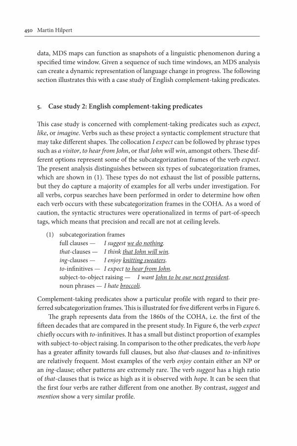
Complement-taking predicates show a particular profile with regard to their pre-ferred subcategorization frames. This is illustrated for five different verbs in Figure 6.
The graph represents data from the 1860s of the COHA, i.e. the first of the fifteen decades that are compared in the present study. In Figure 6, the verb expect chiefly occurs with to-infinitives. It has a small but distinct proportion of examples with subject-to-object raising. In comparison to the other predicates, the verb hope has a greater affinity towards full clauses, but also that-clauses and to-infinitives are relatively frequent. Most examples of the verb enjoy contain either an NP or an ing-clause; other patterns are extremely rare. The verb suggest has a high ratio of that-clauses that is twice as high as it is observed with hope. It can be seen that the first four verbs are rather different from one another. By contrast, suggest and mention show a very similar profile.
Dynamic visualizations of language change 451
With frequency profiles of this kind, an MDS analysis can determine rela-tive similarities within a set of complement-taking predicates. The present analysis compares more than just five verbs: it distinguishes between the 44 verbs that are listed in (2) on the basis of the six subcategorization frames that are listed in (1).
The input for an analysis of the COHA data from the 1860s would hence be a table with 44 by 6 cells where each cell contains a relative frequency value between 0 and 1 and all rows add up to 1. A snippet of that data is shown in Table 2.
With the creation of Table 2, the first step of the analysis is completed. In a second step, that data is transformed into a distance matrix that holds a value of relative similarity for all possible item pairings. This is done by computing euclid-ean distance values for all pairs of rows in the table. It is hence found out that ac-knowledge is very similar to admit, but less so to await. A look at the raw numbers of acknowledge, admit, and await in Table 2 confirms that the latter really stands out. The third step is to run a multidimensional scaling algorithm that produces an arrangement of all predicates on a two-dimensional map. In doing so, the algo-rithm aims to retain all relative distances as accurately as possible.
Figure 7 shows an MDS map that has been produced on the basis of the COHA data from the 1860s. The analysis captures a substantial amount of vari-ance that justifies the choice of a two-dimensional representation (x-axis: 49.6%,
Figure 6. Relative frequency profiles for four complement-taking predicates, 1860s
452 Martin Hilpert
y-axis: 37.1%). The percentages for the two axes indicate how useful each dimen-sion is for distinguishing between the different predicates. Smaller percentages would indicate that a two-dimensional representation can only be achieved at the cost of large deviations from the actual values in the underlying distance matrix. In addition to the spatial coordinates, Figure 7 shows the text frequencies of the predicates by means of different bubble sizes. The verbs know, think, want, and try are clearly visible as the most frequent elements. For reasons of better readability, a few bubbles remain unlabeled.
Figure 7. Metric MDS solution for English complement-taking predicates, 1860s
Dynamic visualizations of language change 453
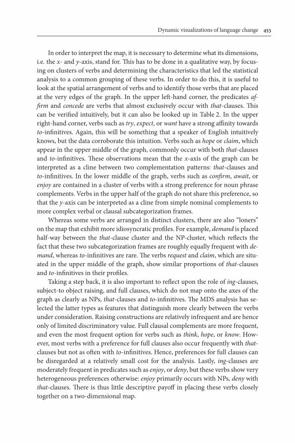
In order to interpret the map, it is necessary to determine what its dimensions, i.e. the x- and y-axis, stand for. This has to be done in a qualitative way, by focus-ing on clusters of verbs and determining the characteristics that led the statistical analysis to a common grouping of these verbs. In order to do this, it is useful to look at the spatial arrangement of verbs and to identify those verbs that are placed at the very edges of the graph. In the upper left-hand corner, the predicates af-firm and concede are verbs that almost exclusively occur with that-clauses. This can be verified intuitively, but it can also be looked up in Table 2. In the upper right-hand corner, verbs such as try, expect, or want have a strong affinity towards to-infinitives. Again, this will be something that a speaker of English intuitively knows, but the data corroborate this intuition. Verbs such as hope or claim, which appear in the upper middle of the graph, commonly occur with both that-clauses and to-infinitives. These observations mean that the x-axis of the graph can be interpreted as a cline between two complementation patterns: that-clauses and to-infinitives. In the lower middle of the graph, verbs such as confirm, await, or enjoy are contained in a cluster of verbs with a strong preference for noun phrase complements. Verbs in the upper half of the graph do not share this preference, so that the y-axis can be interpreted as a cline from simple nominal complements to more complex verbal or clausal subcategorization frames.
Whereas some verbs are arranged in distinct clusters, there are also “loners” on the map that exhibit more idiosyncratic profiles. For example, demand is placed half-way between the that-clause cluster and the NP-cluster, which reflects the fact that these two subcategorization frames are roughly equally frequent with de-mand, whereas to-infinitives are rare. The verbs request and claim, which are situ-ated in the upper middle of the graph, show similar proportions of that-clauses and to-infinitives in their profiles.
Taking a step back, it is also important to reflect upon the role of ing-clauses, subject-to object raising, and full clauses, which do not map onto the axes of the graph as clearly as NPs, that-clauses and to-infinitives. The MDS analysis has se-lected the latter types as features that distinguish more clearly between the verbs under consideration. Raising constructions are relatively infrequent and are hence only of limited discriminatory value. Full clausal complements are more frequent, and even the most frequent option for verbs such as think, hope, or know. How-ever, most verbs with a preference for full clauses also occur frequently with that-clauses but not as often with to-infinitives. Hence, preferences for full clauses can be disregarded at a relatively small cost for the analysis. Lastly, ing-clauses are moderately frequent in predicates such as enjoy, or deny, but these verbs show very heterogeneous preferences otherwise: enjoy primarily occurs with NPs, deny with that-clauses. There is thus little descriptive payoff in placing these verbs closely together on a two-dimensional map.
454 Martin Hilpert
Summarizing these findings, it becomes apparent that a two-dimensional map of complement-taking predicates offers a representation that can be more easily processed than a collection of bar charts, let alone a collection of numeric tables. The analysis brings out the subcategorization frames that best distinguish between different clusters of verbs and thereby sets the scene for a diachronic analysis: given that in the 1860s the complement-taking verbs under investigation can be broadly grouped into that-clause predicates, to-infinitive predicates, and NP-predicates, did any of these verbs move from one category to another during the subsequent decades? Another avenue of diachronic research would be to look for more systemic changes: are the two dimensions that distinguish best between complement-taking verbs in the 1860s still the best ones in the year 2000? If for instance that-clause predicates start taking more to-infinitives and vice versa, the verbs might arrange themselves in different clusters as time goes on.
In order to find answers to these questions, an analysis has to be carried out that is based on data for all decades of the COHA corpus between the 1860s and the 2000s. The input for such an analysis is an expanded version of Table 2: in addition to the information about all 44 verbs in the 1860s, the database now has to contain the same information for all the subsequent decades. Each comple-ment-taking predicate is hence not only compared to its 43 fellow verbs, but it is also compared against “itself ” at different points in time.8 Naturally, it would be expected that diachronic comparisons of the same verb yield rather similar outcomes whereas comparisons of altogether different verbs yield larger differ-ences. Figure 8 shows the results of an expanded MDS analysis that is based on diachronic data. The statistical quality of the analysis is similar to the one of the previous analysis of the 1860s data, the first two dimensions do account for a sub-stantial amount of variation in the data (x-axis: 49.7%, y-axis: 33.8%). Unlike in standard visualizations of MDS results, Figure 8 does not present all data points in the same graph. Instead, only co-temporal data points are shown in each of the 15 panels. For better readability, only 10 of the 44 verbs are labeled in the graphs. These 10 were selected because they illustrate patterns of stability and change that will be discussed in the following.
The graphs capture how the complement-taking verbs change — or do not change — diachronically with regard to their preferred subcategorization frames. First, it can be stated that the systemic configuration of complement-taking predi-cates has remained intact over the past 150 years. In the 2000s, the opposition between that-clauses, to-infinitives, and NPs is still the best way to distinguish between the verbs under analysis. Especially the most frequent and hence most entrenched verbs think, know, hope, want, try, and expect (cf. Figure 7) remain sta-ble in their positions. This result vouches for the fact that the corpus periods that underlie the analysis are indeed diachronically comparable, and it also validates
Dynamic visualizations of language change 455
the general approach that is taken here: if the positions of verbs would change substantially and haphazardly from one period to the next, the sequence of graphs would be of little informative value.
Second, it can be seen that the area in the middle of the graph is becoming increasingly more populated. Whereas in the 1860s only demand and disclose oc-cupy this area, further predicates join them in the subsequent decades. Among them are remember, consider, dislike, and enjoy. Also among them, though not labeled, are appreciate, love, and hate. Manual inspection of the frequency data
Figure 8. Metric MDS solution for English complement-taking predicates, 1860s–2000s
456 Martin Hilpert
reveals that these verbs develop a growing preference for ing-clauses. The fact that these verbs drift towards the middle of the graph indicates that simultaneously to this growing preference, they can be less clearly identified as “a typical that-clause predicate” or “a typical to-infinitive verb”.
Third, the graphs yield insights into patterns of stability and change with re-gard to individual verbs. The verb confirm changes its preferred complementation pattern over time. From taking primarily nominal complements until the 1920s, it develops a strong preference for that-clauses from the 1930s onwards. Closer in-spection of the graphs reveals several such developments. The verb dislike, for in-stance, moves from the upper right-hand corner into the lower middle as it ceases to occur with to-infinitive complements and increasingly occurs with NPs and ing-clauses. The verb demand increasingly occurs with that-clauses as time goes on.
To take stock of the discussion up to now, Figure 8 shows how the sequential presentation of data points from an MDS map based on diachronic corpus data yield a representation of language change in progress. This kind of representation has two advantages over more traditional representations. First, it is dynamic, i.e. the researcher can intuitively assess the temporal contours of a specific develop-ment. For example, it can be easily verified that the change of confirm only begins in the 1930s and proceeds steadily after that. Second, the MDS algorithm pares down some complexity of the phenomenon and thus makes available for inspec-tion the most important dimensions of variability that form a stable frame of refer-ence for a change over time. This allows the analyst to detect and assess changes on the systemic level as well as on the level of individual linguistic units. Again, these developments are more easily detected when they are viewed as an interactive mo-tion chart; a look at the supporting web materials is hence advised. But even a series of still graphs on the printed page serves to convey information that would be hard to communicate in other ways.
6. Conclusions
It has been the main objective of this paper to introduce motion charts as a new tool for the analysis of large diachronic corpora. As was demonstrated in two case studies, the dynamic representation of a linguistic change in the form of a motion chart tracks changes in the relative arrangements of the items under study. The sequence of graphs thus gives the researcher a holistic perspective on an on-going change that allows and promotes further exploratory analysis. The final paragraphs of this paper now discuss how the technique can inform issues of linguistic theory.
An advantage of motion charts over other representations of language change is the ability to bundle large amounts of information in a single bird’s eye view.
Dynamic visualizations of language change 457
As was stated in the introduction, the technique allows the viewer to take in and process a large amount of information in an effective and natural way. This makes it possible for the viewer to arrive at generalizations about what is going on with an entire grammatical domain, rather than just with a single construction. To give an example where an overarching perspective of this kind is important, a change in English verbal complementation patterns from the late 17th century onwards has been discussed in the literature as “the great complement shift” (Vosberg 2006, Rudanko 2006). An analysis like the second case study can address the temporal and structural dynamics of such a shift in fine detail: amongst other things, it can visualize which elements are leading the change, which elements do not partici-pate in the change, and which groups of elements are developing into different di-rections. The fine detail that is available in a motion chart analysis can thus be put into the service of generalizations that are as broad as possible. The nature of the visualization requires the researcher to understand individual patterns of stability and change holistically, i.e. in relation to the broader scenario in which they are embedded. This, in turn, makes it feasible to connect empirical corpus-linguistic observations with questions of linguistic theory. Do individual linguistic units change spontaneously, or as the result of paradigmatic pressure? Is a grammati-cal domain becoming more fragmented or more tightly structured? How are new members integrated into an existing grammatical paradigm? Are certain dimen-sions of variability becoming less important as time goes by, and if so, are other dimensions taking over? Questions such as these can in fact only be meaningfully addressed with an approach that analyzes change across a grammatical domain in a holistic fashion.
A second strength of the approach proposed here is that it is maximally flex-ible with regard to the measurements that are used for the comparison of linguis-tic units. As was discussed in Section 2.2, diachronic change is most commonly analyzed in terms of text frequency. However, many theoretical questions do not straight-forwardly relate to frequency. Whether or not the “controlling” sense of over developed out of its “above” sense is hard to gauge in terms of how often each sense occurs in a corpus, even a diachronic corpus. What needs to be measured is the frequency of each sense’s syntactic contexts, collocates, types of mother con-stituent nodes, and so on. These measurements then yield a behavioral profile for each sense, and a motion chart analysis can use that profile to assess similarities between the two senses as well as diachronic changes of these similarities. Exactly what measurements enter the analysis is up to the analyst, who can choose those characteristics that best inform the theoretical question that is at issue. If a par-ticular hypothesis hinges on a change in frequency, frequency can be chosen. If the presence or absence of some grammatical feature or the range of different context types is of concern, then that very information can be the basis of the analysis.
458 Martin Hilpert
Lastly, motion chart analyses can be applied to the analysis of many different phenomena of linguistic change. The present paper has focused on ambicategori-cal nouns and verbs on the one hand and on complement-taking predicates on the other. Many further objects of study are conceivable. Examples suggesting them-selves are sets of spatial prepositions (Tyler & Evans 2003), lexical near-synonyms (Glynn 2010), different causative constructions (Gilquin 2010), or clausal connec-tives (Kortmann 1997). Corpora that can drive the respective analyses are avail-able at no cost, as are the computational tools that have been used for the present analyses.9 It is thus hoped that the discussion in this paper has been convincing enough to stimulate replications and refinements.
Notes
* I would like to thank the audiences at QITL-4 in Berlin, the conference ‚Exploring the Bound-aries and Applications of Corpus Linguistics‘ in Tuscaloosa, AL, the colloquium of the Leuven FEST research unit, and the FRIAS colloquium series for their comments and suggestions. I fur-ther need to thank three IJCL reviewers for their critical comments that made me re-think some of the points made in an earlier version of this paper. Lastly, special thanks go to Mark Davies for his resources and his interest in the present project. As always, the remaining shortcomings of the paper are my own responsibility.
1. The socioeconomic data was accessed through www.gapminder.org.
2. An exception to this is Szmrecsanyi (2010). In that study, variation between the two English genitives is analyzed across several corpora that differ in language variety and time of produc-tion.
3. Where the graphs in Figure 1 draw on data sets from other publications, this is indicated as such.
4. The approach here does not argue against the compilation of corpora in terms of time slices. Quite the contrary, work with diachronic corpora is much easier if the design strives for the greatest possible balance in successive time slices that are as short as possible. The more reliable the grid of corpus periods, the more revealing can an analysis be which periodizes that corpus in terms of a developing linguistic change.
6. The supporting materials can be accessed at http://omnibus.uni-freiburg.de/~mh608/mo-tion.html.
7. The case study in this paper applies the metric MDS algorithm (cmdscale) that is imple-mented in the stats package in R (R Development Core Team 2010); besides this function there are multiple other applications that are designed to handle similar kinds of data.
8. For such a diachronic analysis, two different approaches are conceivable. One would be to conduct separate MDS analyses for all time slices of the corpus, the second one would be to con-duct one “panchronic” MDS analysis and present the visual output separately for each time slice. For the data discussed in this paper, the two approaches yield highly similar results. However, the first approach has the drawback that the overall frame of reference may in fact change over time, which then renders the direct comparison of successive graphs problematic. Hence, the second, “panchronic” approach is taken in this paper. I am thankful to an anonymous reviewer who pointed out this issue.
9. The COHA and COCA corpora (Davies 2008, 2010) were the most comprehensive resources of this kind at the time of writing; they have since been superseded by the GoogleBooks corpus (Davies 2011). The computations in this paper have been carried out with the open-source soft-ware R (R Development Core Team 2010). Data files and scripts to reproduce the analyses and graphs in this paper are available from the author upon request.
References
Baayen, R. H. 2009. “Corpus linguistics in morphology: Morphological productivity”. In A. Lüdeling & M. Kytö (Eds.), Corpus Linguistics. An International Handbook, Vol 2. Berlin: Walter de Gruyter, 899–919.
Baayen, R. H. & Lieber, R. 1991. “Productivity and English derivation: A corpus-based study”. Linguistics, 29 (4), 801–843.
Croft, W. & K. T. Poole. 2008. “Inferring universals from grammatical variation: Multidimen-sional scaling for typological analysis”. Theoretical Linguistics, 34 (1), 1–37.
Davies, M. 2008: online. The Corpus of Contemporary American English (COCA): 400+ million words, 1990-present. Available at: http://www.americancorpus.org (accessed July 2011).
Davies, M. 2010: online. The Corpus of Historical American English (COHA): 400+ million words, 1810–2009. Available at: http://corpus.byu.edu/coha (accessed July 2011).
Davies, M. 2011: online. Google Books (American English) Corpus: 155 billion words, 1810–2009. Available at: http://googlebooks.byu.edu/ (accessed July 2011).
Gesmann, M. & de Castillo, D. 2011: online. googleVis: Using the Google Visualisation API with R. R package version 0.2.4. Available at: http://CRAN.R-project.org/package=googleVis (accessed July 2011).
Gilquin G. 2010. Corpus, Cognition and Causative Constructions. Amsterdam/Philadelphia: John Benjamins.
Glynn, D. 2010. “Synonymy, lexical fields, and grammatical constructions. Developing usage-based methodology for Cognitive Semantics”. In H. J. Schmid & S. Handl (Eds.), Cognitive Foundations of Linguistic Usage Patterns. Berlin: Mouton de Gruyter, 89–118.
Gries. S. Th. & Hilpert, M. 2008. “The identification of stages in diachronic data: Variability-based neighbor clustering”. Corpora, 3 (1), 59–81.
Gries. S. Th. & Hilpert, M. 2010. “Modeling diachronic change in the third person singular: A multifactorial, verb- and author-specific exploratory approach”. English Language and Linguistics, 14 (3), 293–320.
Kampstra, P. 2008. “Beanplot: A boxplot alternative for visual comparison of distributions”. Jour-nal of Statistical Software, Code Snippets, 28 (1), 1–9.
Kortmann, B. 1997. Adverbial Subordination. A Typology and History of Adverbial Subordinators Based on European Languages. Berlin: Mouton de Gruyter.
Kruskal, J. & Wish, M. 1978. Multidimensional Scaling. London: Sage.Labov, W. 1994. Principles of Linguistic Change. Volume 1: Internal Factors. Oxford: Blackwell.Majid, A., Boster, J. S. & Bowerman, M. 2008. “The cross-linguistic categorization of everyday
events: A study of cutting and breaking”. Cognition, 109 (2), 235–250.Nenadić, O. & Greenacre, M. 2007. “Correspondence Analysis in R, with two- and three-dimen-
sional graphics: The ca package”. Journal of Statistical Software, 20 (3), 1–13.Nurmi, A., Nevalainen, T., Raumolin-Brunberg, H., Keränen, J., Nevala, M. & Palander-Collin,
M. 2006. Parsed Corpus of Early English Correspondence (PCEEC). Annotated by A. Taylor, A. Nurmi, A. Warner, S. Pintzuk & T. Nevalainen. Distributed through ICAME and the Oxford Text Archive.
Plag, I. 2003. Word Formation in English. Cambridge: Cambridge University Press.R Development Core Team. 2010: online. R: A language and environment for statistical comput-
ing. R Foundation for Statistical Computing, Vienna, Austria. Available at: http://www.R-project.org (accessed July 2011).
Rosling, H. 2006: online. TED Talk: Hans Rosling shows the best stats you’ve ever seen. Available at: http://www.ted.com/talks/hans_rosling_shows_the_best_stats_you_ve_ever_seen.html (accessed July 2011).
Rudanko, J. 2006. “Watching english grammar change: A case study on complement selection in British and American English”. English Language and Linguistics, 10 (1), 31–48.
Säily, T., Nevalainen, T. & Siirtola, H. 2011. “Variation in noun and pronoun frequencies in a sociohistorical corpus of English”. Literary and Linguistic Computing, 26 (2), 167–188.
Szmrecsanyi, B. 2010. “The English genitive alternation in a cognitive sociolinguistics perspec-tive”. In D. Geeraerts, G. Kristiansen & Y. Peirsman (Eds.), Advances in Cognitive Sociolin-guistics. Berlin: De Gruyter Mouton, 141–166.
Szmrecsanyi, B. & Kortmann, B. 2009. “The morphosyntax of varieties of English worldwide: A quantitative perspective”. Lingua, 119 (11), 1643–1663.
Tyler, A. & Evans, V. 2003. The Semantics of English Prepositions: Spatial Scenes, Cognition and the Experiential Basis of Meaning. Cambridge: Cambridge University Press.
Vosberg, U. 2006. Die Große Komplementverschiebung. Außersemantische Einflüsse auf die Ent-wicklung satzwertiger Ergänzungen im Neuenglischen. Tübingen: Gunter Narr.
Wheeler, E. S. 2005. “Multidimensional scaling for linguistics”. In R. Koehler, G. Altmann & R. G. Piotrowski (Eds.), Quantitative Linguistics. An International Handbook. Berlin: Walter de Gruyter, 548–553.