129
Economic Impacts of Climate Change on Cape Cod TECHNICAL REPORT Submitted by: Eastern Research Group, Inc., and Synapse Energy Economics, Inc., to the Cape Cod Commission June 30, 2021

Economic Impacts of Climate Change on Cape CodTECHNICAL REPORT
Submitted by: Eastern Research Group, Inc., and
Synapse Energy Economics, Inc., to the Cape Cod Commission
June 30, 2021

ii
Contents
Introduction ............................................................................................................ 1
Part 1. Cost of Doing Nothing Analysis .................................................................... 1
Coastal Hazards and Sea Level Rise ....................................................................... 3
Sea level rise and storm surge impacts to properties ............................................................... 4
Sea level rise impacts to tax revenue....................................................................................... 11
Sea level rise impacts to jobs.................................................................................................. 16
Sea level rise impacts to beach tourism ................................................................................. 20
Sea level rise impacts to salt marshes and eelgrass ecosystem services ................................ 23
Sea level rise impacts to roads ............................................................................................... 28
Coastal erosion impacts to properties, tax revenue, and jobs ................................................ 30
Severe Precipitation Events .................................................................................. 30
Cross-Cutting Climate Hazards and Impacts to Industry ...................................... 31
Impacts of climate change to fisheries and aquaculture ........................................................ 31
Impacts of climate change to agriculture ............................................................................... 36
Cross-Cutting Climate Hazards and Public Health Impacts ................................. 39
Impact of criteria pollutants on public health ....................................................................... 39
Impact of extreme heat on public health ............................................................................... 39
Impact of vector-borne diseases on public health .................................................................40
Part 2. Mitigation Scenarios and Scenario Metrics................................................ 41
Methods ................................................................................................................................. 42
Results .................................................................................................................................... 53
Part 3. Economic Analyses of Adaptation and Mitigation Strategies .....................63
GHG Mitigation-Focused Strategies ..................................................................... 63
Reducing greenhouse gas emissions from buildings ............................................................. 63
Increase generation and use of clean energy ......................................................................... 70
Electrification of the transportation system .......................................................................... 74
Opportunities for green economy jobs................................................................................... 85
Protection, Conservation, and Restoration of Natural Ecosystems .......................................88
Adaptation Strategies ........................................................................................... 88
Support and promote protection, conservation, and restoration of natural ecosystems ......88
Adapting shorelines to Rising Seas ........................................................................................ 92
Retrofit buildings located within climate hazard areas ....................................................... 100
Relocate vulnerable buildings and structures ...................................................................... 102
Discussion of When to Implement Certain Types of Adaptation Strategies ........................ 103
iii
Address vulnerabilities in the road network ........................................................................ 104
Conclusion and Next Steps ................................................................................. 106
References ........................................................................................................... 107
List of Appendices
Appendix A. NAICS Codes in Blue Economy
Appendix B. Potential Lost Tax Revenue by Town for Isolated Homes
Appendix C. Metrics for GHG Mitigation Scenarios

iv
List of Figures
Figure 1. Cumulative damages (in billions of US$) for all of Barnstable County between 2021 and 2100. ............................................................................................................................................... 9
Figure 2. (A) Damages over time for all of Barnstable County. (B) New damages per year. .......... 9
Figure 3. Average annual lost tax revenue from SLR, driven by property value loss by town in each period. ......................................................................................................................................... 14
Figure 4. Projected tax revenue loss from SLR in each year from 2021 to 2100 at the top four most impacted CACs. ......................................................................................................................... 16
Figure 5. Locations of all establishments affected by 1 to 6 feet of SLR. ........................................ 19
Figure 6. Residences in the FEMA special flood hazard area (credit: Cape Cod Commission). ... 31
Figure 7. Migration of key fisheries (Source of graph: National Climate Assessment, 2018). ...... 33
Figure 8. Cape Cod cranberry bogs affected by SLR. ...................................................................... 38
Figure 9. Percent of light-duty EVs over time by scenario. .............................................................46
Figure 10. Percent of heavy-duty EVs over time by scenario. .........................................................46
Figure 11. Total light-duty EV stock over time. ................................................................................ 47
Figure 12. Total heavy-duty EV stock over time. .............................................................................. 47
Figure 13. Percent of new light-duty vehicle sales that are EVs. .................................................... 48
Figure 14. Percent of new heavy-duty vehicle sales that are EVs. .................................................. 48
Figure 15. Sustained policy residential space heating stock (year-round households). ................50
Figure 16. SER1 residential space heating stock (year-round households). ................................... 51
Figure 17. CEN residential space heating stock (year-round households). .................................... 51
Figure 18. SER2 residential space heating stock (year-round households). .................................. 52
Figure 19. SER3 residential space heating stock (year-round households). .................................. 52
Figure 20. Total load associated with EV charging over time by decarbonization scenario. ........ 54
Figure 21. Total GHG emissions from vehicle fleet overtime by decarbonization scenario. ......... 54
Figure 22. Total load associated with electric heating over time by decarbonization scenario. ... 55
Figure 23. Total GHG emissions from buildings over time by decarbonization scenario. ............ 56
Figure 24. Total Barnstable County electric load over time by decarbonization scenario. ........... 57
Figure 25. Total electric sector GHG emissions over time by decarbonization scenario. ............. 57
Figure 26. Economy-wide GHG emissions for sustained policy scenario in Barnstable County. ................................................................................................................................................58
Figure 27. Economy-wide GHG emissions for SER1 scenario. ....................................................... 59
Figure 28. Economy-wide GHG emissions for CEN scenario. ........................................................ 59
Figure 29. Economy-wide GHG emissions for SER2 scenario. ...................................................... 60
Figure 30. Economy-wide GHG emissions for SER3 scenario....................................................... 60
Figure 31. Historical market price of CO2 based on RGGI auction price data. .............................. 67
Figure 32. High and low SCC projections from 2020 to 2050 (2020$ per metric ton). ............... 67
Figure 33. Capital cost of light-duty EVs (Source: NREL, 2017). ................................................... 75
v
Figure 34. Number of charging units needed for up to 30,000 EVs in Barnstable County as estimated by EVI-Pro. ........................................................................................................................ 77
Figure 35. Cost of owning a light-duty EV and ICEV purchased in 2030 by the number of years the vehicle is owned. ................................................................................................................ 80
Figure 36. Cost of owning a light-duty EV and ICEV purchased in 2050 by the number of years the vehicle is owned. ................................................................................................................. 81
Figure 37. Median damages accrued from different barrier strategies over time. .........................96
Figure 38. Benefit-cost ratios for shoreline solutions by town and barrier height. .......................99
Figure 39. Benefit-cost ratios for raising buildings by town. ........................................................ 101
Figure 40. Average lost tax revenue per year from isolated homes and properties near flooded roads..................................................................................................................................... 105
List of Tables
Table 1. SLR projections for Cape Cod ................................................................................................ 3
Table 2. SLR projections by year ......................................................................................................... 5
Table 3. Return periods with associated storm surge and probabilities ........................................... 5
Table 4. Depth damage function ......................................................................................................... 6
Table 5. Damages from SLR and storm tide (damages are in millions of 2020$). .......................... 7
Table 6. Cumulative damage by town (average across simulations expressed in millions of 2020$). ................................................................................................................................................ 10
Table 7. Total land value affected by SLR (in millions of 2020$). ................................................... 11
Table 8. Tax rate (2020) by town ...................................................................................................... 13
Table 9. Total lost tax revenue in millions of 2020$ per time period by town. ............................. 14
Table 10. Total lost tax revenue in millions of 2020$ per time period by CAC. ............................ 15
Table 11. Number of businesses, jobs, and estimated wages affected by each additional foot of SLR. ................................................................................................................................................. 18
Table 12. Blue economy businesses, jobs, and wages affected by SLR. .......................................... 18
Table 13. Average beach width (public or semi-public barrier beaches) lost to SLR. .................... 21
Table 14. National Seashore beach use and user-day value (Source: Opaluch and Hwang, 2018). ................................................................................................................................................... 21
Table 15. Current annual value of beach recreation on Cape Cod. .................................................. 22
Table 16. Annual lost economic value from average beach width lost due to SLR. ....................... 22
Table 17. Economic value lost due to SLR impacts on beach width. ............................................... 22
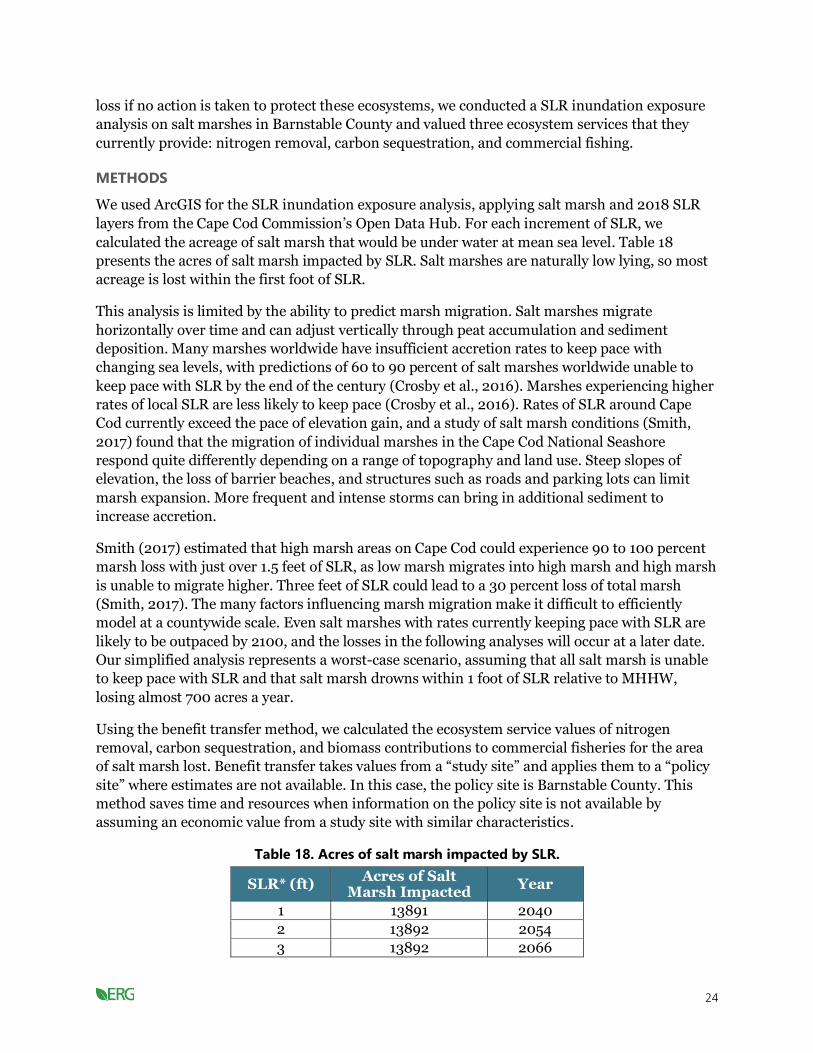
Table 18. Acres of salt marsh impacted by SLR. ............................................................................... 24
Table 19. Social cost of carbon (in 2020$)........................................................................................ 25
Table 20. Annual value lost in salt marsh ecosystem services from SLR for 2040 (in millions of 2020$)............................................................................................................................................. 27
Table 21. Value lost in ecosystem services through 2100 (in millions of 2020$). ......................... 27
vi
Table 22. Current value of ecosystem services provided by eelgrass beds annually (in millions of 2020$). ............................................................................................................................ 28
Table 23. Miles of road impacted by SLR on Cape Cod. ..................................................................29
Table 24. Landings in Barnstable, Dukes, and Nantucket counties. .............................................. 32
Table 25. 2019 Aquaculture landings for oysters in Barnstable County. ........................................ 35
Table 26. Acres of Cape Cod cranberry bogs impacted by SLR. ...................................................... 36
Table 27. Massachusetts cranberry yield per acre and price per barrel (Source: New England Agricultural Statistics Service, 2020)................................................................................................ 37
Table 28. SLR impact on cranberry production on Cape Cod. ........................................................ 37
Table 29. Economic value lost due to SLR impacts on Cape Cod cranberry bogs. ....................... 38
Table 30. Modeling assumptions for transportation sector. ...........................................................44
Table 31. Modeling assumptions for building sector. ......................................................................49
Table 32. Electricity sector clean energy levels (non-emitting sources). ........................................ 53
Table 33. Projected emissions by scenario and year (MMT CO2e). ................................................ 61
Table 34. Approximate emissions reductions from 1990 emissions levels. ...................................62
Table 35. Capital cost of conventional fuel boilers and air-source heat pumps. ............................ 65
Table 36. Fuel consumption per square foot for heating fuels (Source: Mass.gov, 2020). ........... 65
Table 37. Emissions reductions from the residential sector from switching to the aggressive electrification scenario (SER1) from the sustained policy scenario (SP)........................................66
Table 38. Value of each ton of pollutant reduced for electricity generating units (2020$). ........ 68
Table 39. Lifetime cost and annual cost of ownership to the consumer for different heating units. ................................................................................................................................................... 68
Table 40. Monetized benefit of reduced CO2 emissions from residential sector (millions of 2020$). ................................................................................................................................................69
Table 41. Monetized benefit of criteria pollutant reductions from residential sector (millions of 2020$).............................................................................................................................................69
Table 42. Emissions reductions from switching to the aggressive electrification scenario (SER1) from the sustained policy scenario (SP). .............................................................................. 71
Table 43. Selected LCOE for Nonrenewable Energy Sources (2020$). .......................................... 71
Table 44. Selected LCOE for Renewable Energy Sources (2020$). ................................................ 71
Table 45. Selected LCOE for energy storage strategies (2020$). .................................................... 72
Table 46. Monetized benefit of reduced CO2 emissions from the electric sector (millions of 2020$). ................................................................................................................................................ 73
Table 47. Monetized benefit of criteria pollutant reductions from the electric sector (millions of 2020$)............................................................................................................................................. 73
Table 48. Capital and annual costs for a light-duty EV and ICEV in 2030 and 2050. .................. 76
Table 49. Charging stations needed to support light-duty EV projections under SP and SER1 scenarios. ............................................................................................................................................. 78
Table 50. Cost of workplace and public EVSE (Source: EERE, 2015). ........................................... 78
Table 51. Costs of EV charging equipment needed for the SP and SER1 scenarios. ...................... 78
Table 52. Cumulative reduced transportation CO2 emissions by decade by transitioning from sustained policy scenario to SER1 scenario (only considering light-duty vehicle emissions). ..... 79

vii
Table 53. Emissions reductions from the transportation sector from switching to the aggressive electrification scenario (SER1) from the sustained policy scenario (SP) (considering all vehicle emissions).................................................................................................... 79
Table 54. Total cost and cost of public charging equipment needed to support light-duty EVs on the road by decade under the sustained policy scenario. .......................................................... 82
Table 55. Total cost and cost of public charging equipment needed to support light-duty EVs on the road by decade under the aggressive electrification (SER1) scenario. ............................... 82
Table 56. Cost associated with reduced transportation emissions from switching to SER1 scenario from the sustained policy scenario (only considering light-duty vehicle emissions). ... 83
Table 57. Monetized benefit of reduced CO2 emissions from the transportation sector (millions of 2020$). .......................................................................................................................... 83
Table 58. Monetized benefit of criteria pollutant reductions from the transportation sector (millions of 2020$). .......................................................................................................................... 84
Table 59. Labor hours and jobs to expand residential heat pumps. .............................................. 86
Table 60. Breakdown of wetland restoration costs (in thousands of 2020$). .............................. 90
Table 61. Costs and benefits of restoration projects (in thousands of 2020$)............................... 91
Table 62. Benefit-cost ratio for case studies. .................................................................................... 91
Table 63. Annual benefits of restored cranberry bogs (in thousands of 2020$). ..........................92
Table 64. Shoreline solutions in cost per linear foot (2020$). ........................................................94
Table 65. Countywide benefits of shoreline solutions (in millions of 2020$). .............................. 95
Table 66. Construction costs of shoreline solutions (in millions of 2020$). ................................. 97
Table 67. Benefit-cost ratios for each barrier type across time periods......................................... 98
Table 68. Costs of raising a building 8 feet (in 2020 US$). .......................................................... 101
Table 69. Benefits of shoreline strategies. ...................................................................................... 103
Table 70. Land values of homes isolated with each foot of SLR in millions of 2020$ (cumulative). ..................................................................................................................................... 105

1
Introduction
This report summarizes work by Eastern Research Group, Inc. (ERG), and Synapse Energy
Economics, Inc., to inform the Cape Cod Commission as it develops the Cape Cod Climate
Action Plan and potentially proposes amendments to the Regional Policy Plan by putting
climate risks—and options to address those risks—into a monetary context. Climate change and
continued reliance on fossil fuels will affect all sectors of Cape Cod’s economy. Sea level rise
(SLR) will increase instances of flooding and damage to coastal property and infrastructure.
Warming ocean temperatures will alter fisheries and encourage harmful algal blooms. Burning
of fossil fuels will continue to emit pollutants with adverse effects on public health. In response,
we have assessed the impacts climate change may have on the region’s economy, revenues, and
investment decisions, evaluating the costs and benefits of key strategies to address climate
change in the region.
This assessment is presented in three parts, which collectively make the case that without action
on climate change, the impacts to Cape Cod’s economy, communities, and resources will be
severe. Each part is briefly described here and then detailed in subsequent sections of the
report:
• Part 1, Cost of Doing Nothing Analysis, estimates losses that Cape Cod and its
residents could incur without action to prevent or prepare for climate change. The cost of
not adapting to a changing climate is large and will accelerate over time, with SLR and
coastal flooding serving as the largest overall threats.
• Part 2, Mitigation Scenarios and Scenario Metrics, provides an energy use and
emissions baseline based on current state and regional policies, as well as an assessment
of four primary paths forward (or scenarios) for meeting the Cape’s greenhouse gas
(GHG) reduction goals (and key sectors for targeted mitigation) while continuing to meet
energy needs. This analysis identifies key metrics to track the mitigation scenarios.
• Part 3, Economic Analyses of Adaptation and Mitigation Strategies, provides
context for key strategies identified through the Cape Cod Climate Action Plan
stakeholder engagement and planning process. We have provided costs and benefits or
cost-effectiveness values for strategies to the extent possible.
Part 1. Cost of Doing Nothing Analysis
The “cost of doing nothing” refers to the estimated losses that Cape Cod and its residents could
incur if the region does not adapt to climate change and make its own contributions to reducing
GHG emissions. We primarily determined this cost based on damage incurred as a result of
climate-related hazards, but we also included carbon sequestration losses associated with
potential climate hazards.
This cost of doing nothing analysis serves several purposes. First, it helps the Commission set an
economic baseline of the costs that the Cape Cod region could incur if it does not undertake
adaptation or mitigation action. These are costs that can be avoided and can therefore be

2
weighed against the costs of acting (implementing
strategies developed by the Commission and regional
stakeholders). Second, this analysis defines the benefits
of adaptation and mitigation actions to provide
perspective on those actions that have the greatest
chance of reducing damages from climate change (i.e.,
actions with the greatest potential benefit). Thus, these
cost of doing nothing estimates complement Part 3 of
this report, which focuses on the costs and benefits and
cost-effectiveness of various adaptation and mitigation
strategies. Costs and benefit-cost information can
support not only prioritizing, but also refining
strategies—for example, identifying how and when density considerations may make it favorable
to protect versus relocate housing.
Key Terms
Vulnerability: Degree to which climate
change could reduce a value, identified by
the colocation of a hazard and potential
loss.
Loss: The actual reduction in value.
Hazard: The driving force that creates the
reduction.
Exposure: The probability that the
reduction will occur under any climate
scenario.
Costs should not be the sole deciding factor in prioritizing mitigation and adaptation strategies
but can provide an important perspective, along with considerations of equity in how different
groups will share the risks and burdens related to climate change. It is important to keep in
mind the limitations of each cost we evaluated, as this report focuses on those that are readily
quantifiable.
To estimate the cost of doing nothing, we used geospatial analysis to determine the extent to
which an economic layer (e.g., the value of housing, the value of ecosystems, number of jobs) is
exposed to future climate impacts (e.g., SLR, storm surge). Where feasible, we incorporated the
extent of damage (e.g., a depth-damage curve that considers how the depth of flooding is tied to
damage, in addition to the extent of flooding), which
allowed us to move from calculating the exposed value
to a damage or loss. Where possible, we incorporated
the probability of the hazard to move from the damage
associated with an event to an expected annual loss
over time, allowing us to better account for benefits and
costs. To quantify the cost of lost carbon sequestration
under the “do nothing” scenario, we used the social cost
of carbon (SCC) approach (Interagency Working Group
on Social Cost of Carbon, 2010).
Social Cost of Carbon
In juxtaposition to the price of purchasing
carbon credits on the market, the social
cost of carbon is a more accurate depiction
of the cost to society. The social cost
attempts to capture the impacts associated
with releasing an additional metric ton of
CO2 into the atmosphere in terms of
agricultural productivity, changes in energy
costs, human health, and damages from
increased flooding. The analysis that follows is organized by climate
hazard:
• Coastal hazards and SLR
• Severe precipitation events
• Cross-cutting climate hazards and impacts to industry
• Cross-cutting climate hazards and public health impacts
3
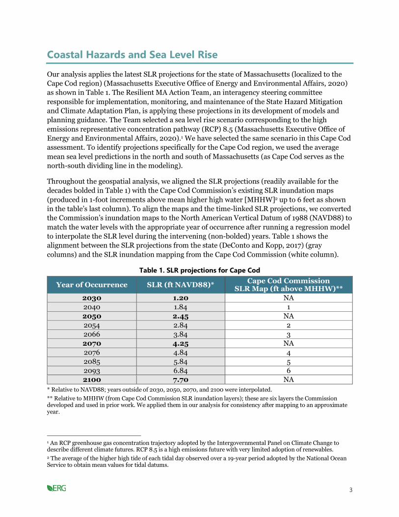
Coastal Hazards and Sea Level Rise
Our analysis applies the latest SLR projections for the state of Massachusetts (localized to the
Cape Cod region) (Massachusetts Executive Office of Energy and Environmental Affairs, 2020)
as shown in Table 1. The Resilient MA Action Team, an interagency steering committee
responsible for implementation, monitoring, and maintenance of the State Hazard Mitigation
and Climate Adaptation Plan, is applying these projections in its development of models and
planning guidance. The Team selected a sea level rise scenario corresponding to the high
emissions representative concentration pathway (RCP) 8.5 (Massachusetts Executive Office of
Energy and Environmental Affairs, 2020).1 We have selected the same scenario in this Cape Cod
assessment. To identify projections specifically for the Cape Cod region, we used the average
mean sea level predictions in the north and south of Massachusetts (as Cape Cod serves as the
north-south dividing line in the modeling).
1 An RCP greenhouse gas concentration trajectory adopted by the Intergovernmental Panel on Climate Change to describe different climate futures. RCP 8.5 is a high emissions future with very limited adoption of renewables.
Throughout the geospatial analysis, we aligned the SLR projections (readily available for the
decades bolded in Table 1) with the Cape Cod Commission’s existing SLR inundation maps
(produced in 1-foot increments above mean higher high water [MHHW]2 up to 6 feet as shown
in the table’s last column). To align the maps and the time-linked SLR projections, we converted
the Commission’s inundation maps to the North American Vertical Datum of 1988 (NAVD88) to
match the water levels with the appropriate year of occurrence after running a regression model
to interpolate the SLR level during the intervening (non-bolded) years. Table 1 shows the
alignment between the SLR projections from the state (DeConto and Kopp, 2017) (gray
columns) and the SLR inundation mapping from the Cape Cod Commission (white column).
2 The average of the higher high tide of each tidal day observed over a 19-year period adopted by the National Ocean Service to obtain mean values for tidal datums.
Table 1. SLR projections for Cape Cod
Year of Occurrence SLR (ft NAVD88)* Cape Cod Commission
SLR Map (ft above MHHW)**
2030 1.20 NA
2040 1.84 1
2050 2.45 NA
2054 2.84 2
2066 3.84 3
2070 4.25 NA
2076 4.84 4
2085 5.84 5
2093 6.84 6
2100 7.70 NA
* Relative to NAVD88; years outside of 2030, 2050, 2070, and 2100 were interpolated.
** Relative to MHHW (from Cape Cod Commission SLR inundation layers); these are six layers the Commission developed and used in prior work. We applied them in our analysis for consistency after mapping to an approximate year.

4
Our analysis and modeling of projected SLR and storm damages consistently uses these state
projections, focusing on impacts in the year 2030, 2050, and 2100 to the extent possible. For
analyses that use the Commission’s SLR inundation layers, we were unable to specifically focus
on 2030, 2050, and 2100 (as the 1-foot increments do not exactly align) and instead focused on
the closest year of occurrence, as shown on Table 1. The only flood-related analysis that did not
use the Commission’s SLR inundation layers was the estimate of damage to buildings from SLR
and storm surge, for which we used the flood model within the Coastal Adaptation to Sea Level
Rise Tool (COAST) to estimate the impacts.
Sea level rise and storm surge impacts to properties
Barnstable County has 560 miles of coastline, much of which contains residential, commercial,
and public properties. Rising sea levels pose a threat to many of these properties in the next 80
years. Without adaptations in place, many properties could be lost to permanent flooding and
many more could be exposed to storm surge damage. We analyzed the impact of SLR and storm
surge on properties to estimate the value of this potential loss.
METHODS
We followed the method for monetizing impacts from coastal flooding and SLR established by
NOAA in “What Will Adaptation Cost” (NOAA, 2013) for damages associated with certain levels
of SLR and storm surge. We then supplemented the approach by creating 10,000 simulations to
estimate the range or distribution in annual damages over time. Our specific process was as
follows:
Single year damages: We used COAST (Blue Marble Geographics, 2020) to measure the
impacts of SLR and storm tides on buildings in Barnstable County at several points between
2020 and 2100. The software uses two layers of data; an elevation map of the study area,
typically from light detection and ranging (LiDAR) data; and an asset layer that includes
building values in the study area. We also used SLR projections from the state (DeConto and
Kopp, 2017) between 2020 and 2100 and storm tides from various return periods (one-year
storm to 200-year storm).3 Finally, we included a depth damage function (DDF) that estimates
the percent damage to buildings based on relative water level from SLR and storm tides
combined.
3 The average number of years between storms of a certain size is the recurrence interval or return period (based on historical records and statistical techniques). The actual number of years between storms of any given size varies significantly because of the naturally changing climate.
The COAST software models SLR and individual storms at different points in time, estimating
the water level and measuring the damage to buildings based on the asset layer and the DDF.
COAST estimates damage by combining SLR and storm tide but calculates damages from each
risk differently—SLR damage is based on the total value of any building that is flooded while
storm tide damage is based off the DDF.
Annual damage model: We used the damage results from the COAST model along with the
SLR and storm tide data that we input into COAST to create a model of total storm damage
between the years 2021 and 2100 based on one annual storm per year. We modeled a single

5
storm per year based on the probabilities of various return periods and their associated storm
tides, then added these values to the SLR to get the combined flood values for that year. To
calculate damages each year, we took the damage from the total water level and subtracted the
SLR damages from the previous year, because once SLR floods reaches a building, the owner is
unlikely to rebuild, such that the area should not have additional damages associated with it.
Conversely, with storm damage, the owner will often repair and have the potential for damage in
the following years. We ran 10,000 simulations between 2021 and 2100 with a static SLR and a
dynamic annual storm model; while we used the exact same SLR scenario, the storms were
random and based only on their associated probabilities.
DATA
Single year damages: The Cape Cod Commission provided parcel-layer data that contained
building values for commercial, residential, and public properties in Barnstable County. Table 2
shows SLR projections for the years 2030, 2050, 2070, and 2100 (latest projections from the
state of Massachusetts). To run COAST, we performed a polynomial regression for these values
and found a projected SLR of 0.717 feet NAVD88 for the year 2020. Table 3 shows return
periods, storm tide values, and their associated probabilities taken from the U.S. Army Corps of
Engineers (USACE) Sea-Level Curve Calculator (Version 2019.21) for the Woods Hole station.
The LiDAR elevation data was taken from the U.S. Geological Survey (Andrews et al., 2018). We
calculated the DDF by taking the average of the depth damage curves for all single-family
residence types originally calculated by USACE (United States Army Corps of Engineers, 2003),
which are shown in Table 4. We measured water levels relative to NAVD88.
Table 2. SLR projections by year
Year SLR* (ft)
2030 1.20
2050 2.45
2070 4.25
2100 7.70
* Relative to NAVD88.
Table 3. Return periods with associated storm surge and probabilities
Return Period Storm Surge* (ft) Probability
1-year storm 2.26 1
5-year storm 3.89 0.2
10-year storm 4.51 0.1
20-year storm 5.22 0.05
50-year storm 6.34 0.02
100-year storm 7.37 0.01
200-year storm 8.50 0.005
* Relative to NAVD88.

6
Table 4. Depth damage function
Depth* (ft) Damage Proportion
-2 0.0573
-1 0.099
0 0.153
1 0.209
2 0.2663
3 0.3243
4 0.3817
5 0.4377
6 0.4917
7 0.5425
8 0.5893
9 0.6318
10 0.6687
11 0.699
12 0.723
13 0.7413
14 0.7548
15 0.7642
16 0.7685
* Relative to NAVD88.
Annual damage model: For this model, we used the same SLR scenario (Table 2) and storm
tide values (Table 3) that we used for the COAST software inputs. We ran a polynomial
regression from the SLR data to obtain a continuous curve of SLR estimates for every year
between 2021 and 2100. The COAST damage estimates were then used to estimate damage for
all of Barnstable County based on water level. We ran a logistic model compared to the total
value of buildings in Barnstable County to get a continuous curve of water level damage.4
4 COAST does not account for buildings that may already have adaptations to SLR. It considers any building that has been flooded due to SLR to be abandoned. For instance, we found a large amount of damage in the first year (2020) compared to the following years in our COAST simulations. For the 2020 scenarios, there was over $23 million in SLR damages, while the 2030 scenarios only had an additional $5 million in damages. We suspect that this is due to a structure getting flooded that would not actually be flooded, such as piers and lighthouses. These structures are made to exist near and on water, so the area might be flooded while the buildings or structures remain undamaged. However, while these damages might not occur in 2020 as we estimated through COAST, they could still be damaged later in the study period.
Using the same sea level and storm tide data as the countywide analysis, we ran individual
logistic models for the 15 towns in Barnstable County to estimate their damage functions based
on the total building value in each town.

7
RESULTS
Single-event damages: ERG ran every combination of SLR and storm tide through COAST
based on the years included in Table 2 (with the addition of 2020) and the return periods in
Table 3. Table 5 shows the SLR and storm scenarios with individual and combined water levels,
as well as estimated building damages from SLR alone and combined SLR and storm tide
damages. Table 5 presents damages for storm tides by year for a given level of SLR. This is not
the expected annual damage by year; rather, the table reflects what the damage would be for a
single event. Further down in this section, we present the expected cumulative loss based on
simulations, which are shown in Figure 2 and Table 6.
Damages from SLR are the cumulative amount from the beginning of our scenarios, while the
combined damages are the damages from a storm tide (a single event) and SLR. For example, in
the year 2030 scenarios in Table 5, just over $28.4 million in cumulative SLR damages are
projected, which represents damage from the start of the scenarios in 2021 through 2030. To
calculate the SLR damages that could occur between 2030 and 2050, we would then subtract
the $28.4 million in damages that might occur through 2030 from the $70.5 million that might
occur by 2050, resulting in around $42.1 million in additional SLR damage between 2030 and
2050. Additionally, the damage from storms alone is the SLR damage subtracted from the
combination of SLR and storm tide for each scenario. The damage from each storm changes
between years as a result of the different starting water levels due to SLR. For example, the 50-
year storm floodplain in 2050 will be 1.25 feet higher than the 50-year storm floodplain in 2030
due to SLR.
Table 5. Damages from SLR and storm tide (damages are in millions of 2020$).
Year Storm SLR (ft)* Storm
Tide (ft)*
SLR and Storm
Tide (ft)*
Cumulative Damage
from SLR
Damage from Storm
Tide and SLR
2020 1-year 0.717 2.26 2.977 $23.4 $37.6
2020 5-year 0.717 3.89 4.607 $23.4 $62.3
2020 10-year 0.717 4.51 5.227 $23.4 $86.0
2020 20-year 0.717 5.22 5.937 $23.4 $120.6
2020 50-year 0.717 6.34 7.057 $23.4 $217.9
2020 100-year 0.717 7.37 8.087 $23.4 $332.5
2020 200-year 0.717 8.5 9.217 $23.4 $586.5
2030 1-year 1.2 2.26 3.46 $28.4 $44.7
2030 5-year 1.2 3.89 5.09 $28.4 $81.0
2030 10-year 1.2 4.51 5.71 $28.4 $107.8
2030 20-year 1.2 5.22 6.42 $28.4 $150.8
2030 50-year 1.2 6.34 7.54 $28.4 $260.1
2030 100-year 1.2 7.37 8.57 $28.4 $405.4
2030 200-year 1.2 8.5 9.7 $28.4 $706.8
2050 1-year 2.45 2.26 4.71 $70.5 $95.3
2050 5-year 2.45 3.89 6.34 $70.5 $170.7
2050 10-year 2.45 4.51 6.96 $70.5 $224.5
2050 20-year 2.45 5.22 7.67 $70.5 $302.6
2050 50-year 2.45 6.34 8.79 $70.5 $454.8

8
Year Storm SLR (ft)* Storm
Tide (ft)*
SLR and Storm
Tide (ft)*
Cumulative Damage
from SLR
Damage from Storm
Tide and SLR
2050 100-year 2.45 7.37 9.82 $70.5 $772.1
2050 200-year 2.45 8.5 10.95 $70.5 $1,097.9
2070 1-year 4.25 2.26 6.51 $150.9 $233.4
2070 5-year 4.25 3.89 8.14 $150.9 $399.5
2070 10-year 4.25 4.51 8.76 $150.9 $493.4
2070 20-year 4.25 5.22 9.47 $150.9 $691.4
2070 50-year 4.25 6.34 10.59 $150.9 $1,023.0
2070 100-year 4.25 7.37 11.62 $150.9 $1,372.2
2070 200-year 4.25 8.5 12.75 $150.9 $1,808.8
2100 1-year 7.7 2.26 9.96 $883.0 $1,280.6
2100 5-year 7.7 3.89 11.59 $883.0 $1,727.9
2100 10-year 7.7 4.51 12.21 $883.0 $1,917.2
2100 20-year 7.7 5.22 12.92 $883.0 $2,224.2
2100 50-year 7.7 6.34 14.04 $883.0 $2,635.6
2100 100-year 7.7 7.37 15.07 $883.0 $3,059.0
2100 200-year 7.7 8.5 16.2 $883.0 $3,540.3
* Relative to NAVD88.
Annual damage model: We ran the projected damages from our COAST model through our
annual storm model (using Table 5 as an input, which shows damage by event). Figure 1 shows
the cumulative damages from 10,000 simulations of the annual storm model, while Figure 2A
and B show the median damage (white line) and 80 percent confidence interval (CI) (shaded
region) for cumulative damages over time (Figure 2A) and for new annual damages (Figure 2B).
Figure 1 and Figure 2A show that the cumulative projected damages to the region between 2021
and 2100 will be $15.3 billion (80 percent CI: $13.4–$17.8 billion).5 From 2021 through 2030,
the median cumulative projected damages to the region totaled $0.64 billion (80 percent CI:
$0.49–$0.94 billion). Figure 2B shows the median annual projected damage was $56.5 million
(80 percent CI: $32.8– 130.1 million) in 2030, $84.6 million (80 percent CI: $50.4–$195.8
million) in 2050, and $429.9 million (80 percent CI: $259.4–$966.0) in 2100.
5 This uses the single event totals from Table 5 and the probability of these events as inputs into the monte carlo simulation. The $15.3 billion is the median value of the output.

9
Figure 1. Cumulative damages (in billions of US$) for all of Barnstable County
between 2021 and 2100.
Figure 2. (A) Damages over time for all of Barnstable County. (B) New damages per year.
Table 6 shows the results from our town analyses, separated over three time periods. These
estimates show damages for each individual time period and do not include damages accrued

10
leading up to that time period. For example, the total damage for the town of Bourne was $54.6
million in 2021–2030 and $140.67 million in 2031–2050. But the combined total damage for
Bourne between 2021 and 2050 was $195.27 million ($54.6 million + $140.67 million). Notably,
the length of the time periods are not equal, so the average total damages should be compared
between towns (horizontally), while the annual damages (in parentheses) can all be compared
(vertically).
Table 6. Cumulative damage by town (average across simulations expressed in millions of
2020$).
Town
Cumulative Damage 2021–2030 (Annual
$ Damage)
Cumulative Damage 2031– 2050 (Annual
$ Damage)
Cumulative Damage 2051– 2100 (Annual
$ Damage)
Cumulative $ Damage by
Town 2021– 2100
Barnstable 120.66 (12.07) 295.99 (14.8) 1,695.71 (33.91) 2,112.36
Bourne 54.6 (5.46) 140.67 (7.03) 971.69 (19.43) 1,166.96
Brewster 0.83 (0.08) 2.27 (0.11) 19.74 (0.39) 22.84
Chatham 46.22 (4.62) 114.35 (5.72) 678.21 (13.56) 838.78
Dennis 47.99 (4.8) 128.06 (6.4) 1,024.05 (20.48) 1,200.1
Eastham 7.05 (0.7) 18.56 (0.93) 141.92 (2.84) 167.53
Falmouth 159.08 (15.91) 416.15 (20.81) 3,054.28 (61.09) 3,629.51
Harwich 13.72 (1.37) 38.25 (1.91) 368.11 (7.36) 420.08
Mashpee 40.08 (4.01) 104.51 (5.23) 762.78 (15.26) 907.37
Orleans 11.52 (1.15) 29.05 (1.45) 186.74 (3.73) 227.31
Provincetown 39.68 (3.97) 114.43 (5.72) 1,245.2 (24.9) 1,399.31
Sandwich 21.26 (2.13) 53.9 (2.69) 353 (7.06) 428.16
Truro 7.67 (0.77) 21.78 (1.09) 225.2 (4.5) 254.65
Wellfleet 30.58 (3.06) 72.92 (3.65) 374.25 (7.49) 477.75
Yarmouth 85.02 (8.5) 224.81 (11.24) 1,720.95 (34.42) 2,030.78
Totals 685.96 (68.6) 1,775.7 (88.78) 12,821.83 (256.44)
15,283.49
Total land value affected: The analysis above calculates damages to buildings. We performed a supplementary analysis to estimate the total value of land affected from permanent inundation at several points in time using the 1- to 6-foot SLR inundation ArcGIS layers from the Cape Cod Commission’s Open Data Hub. Table 7 presents the results. Total land value represents the total value of all parcels either partially or completely flooded. Proportional land value is the value of land flooded, calculated by the fraction of the property flooded multiplied by the property’s land value.

11
Table 7. Total land value affected by SLR (in millions of 2020$).
SLR* (ft) Total Land Value Affected
(Million $) Proportional Land Value
Affected (Million $)
1 $10,039 $1,585
2 $11,002 $2,087
3 $12,007 $2,708
4 $12,942 $3,465
5 $13,783 $4,350
6 $14,538 $5,269
* Relative to MHHW; relative to NAVD88 would be 0.84 feet higher.
LIMITATIONS AND FUTURE ANALYSIS
Single year damages: COAST is a bathtub model, meaning that it only measures damage due
to inundation and not due to water movement and velocity. We used property values from 2020
and made no adjustments over time, so we did not discount the value of buildings, nor did we
escalate the price of buildings over time. We used the value of the home to estimate the cost of
repairing the house, although these values may not always align.
Annual damage model: Our model assumes a single storm in a year, though multiple may
occur. We also assumed that buildings flooded from SLR are abandoned while buildings flooded
from storm tides are repaired.
Property value: COAST uses the building value to estimate damages. It does not account for
the total value of the land that the building is on. We performed a supplementary analysis to
estimate the total value of land affected by flooding at several points of SLR.
Sea level rise impacts to tax revenue
For each time period, we estimated the loss in tax
revenue resulting from SLR-driven flooding of
properties on Cape Cod. Our estimates account for
properties that are projected to be flooded in a given
year, properties that are projected to be isolated in a
given year, properties that are within a quarter mile of
flooded roads, and properties that are projected to
flood in the next time period. We conducted this
analysis at the county, town, and community activity
center (CAC) level using a methodology similar to a
study by McAlpine and Porter (2018).
Community Activity Centers
The 2018 Cape Cod Regional Policy Plan
defines community activity centers as areas
that have a concentration of business
activity, community activity, and a compact
built environment. The vision for these
areas is to accommodate mixed use and
multifamily residential development in a
walkable, vibrant area; to preserve historic
buildings; and to provide diverse services,
shopping, recreation, civic spaces, housing,
and job opportunities at a scale of growth
and development desired by the
community, with adequate infrastructure
and pedestrian amenities to support
development. METHODS
Our methodology grouped property devaluation due to
flooding into four groups:

12
• Properties that are likely to be flooded in the specified year. Properties that
were more than 50 percent flooded were assumed to lose all their value. Before this
point, we assumed that lost acreage was equivalent to lost value, such that property
devaluation would be proportionate to how much of the property was flooded (e.g., at 23
percent inundation, the property will lose 23 percent of its value).6
• Properties that are likely to be isolated in the specified year. Properties that
will be isolated as a result of flooding of all access to the property were assumed to lose
all their value.7
• Properties that are within a quarter mile of flooded roads. Our analysis
excludes properties that were already flooded or isolated in the given year. McAlpine and
Porter (2018) found that property values within a quarter mile of flooded roads in Miami
(or within a quarter mile of roads that will be flooded in about the next 15 years)
increased at a rate of $3.71/square foot/year less than other properties not impacted. We
adjusted that value to be proportionate to the average property value in Barnstable
County and converted it to 2020 dollars. We then applied the resulting property value
penalty of $3.63/square foot/year to affected properties. We intersected SLR layers and
NAVTEQ road layers from the Cape Cod Commission’s Open Data Hub to conduct this
analysis. Because of the limited number of flood layers (six) and complexity of analysis
needed to look at roads that will be flooded in the next 15 years, we only looked at roads
that are currently flooded; these results thus slightly underestimate the impact from this
loss.
• Properties that are likely to be flooded in the next 15 years or so. This analysis
focuses on properties that will be flooded and includes those that were near flooded
roads; any additional penalty was considered additive. McAlpine and Porter (2018)
found that properties that will be flooded in the next 15 years in Miami grew in value at a
rate of $3.08/square foot/year less than properties that will not be impacted. We
adjusted that value to be proportionate to the average property price in Barnstable
County and converted it to 2020 dollars. We then applied a property value penalty of
$3.01/square foot/year in the first year that a property was included in the next zone
likely to be flooded. Next, we multiplied by the number of years between time steps if the
property remained in this zone at the next time step.4
6 We used SLR layers from the Cape Cod Commission’s Open Data Hub and Commission-provided parcel data for Cape Cod to conduct this analysis. 7 We used isolated homes layers provided by the Cape Cod Commission.
If a property was devalued more than it was worth, we set the property value loss to be the value
of the property. Our analysis examined the following years, which relate to the year each SLR
increase is projected to occur:
• 2025: Assumed no flooding or isolated properties but penalized properties that will flood
with 1 foot MHHW of SLR in 2040 (15 years later) plus 1 foot for highest astronomical
tide (HAT) to align with the method in the McAlpine and Porter study.

13
• 2040: Assumed 1 foot MHHW of SLR and associated isolation of properties. Penalized
properties that will flood with 3 feet MHHW of SLR in 2054 plus HAT.
• 2054: Assumed 2 foot MHHW of SLR and associated isolation of properties. Penalized
properties that will flood with 4 feet of SLR in 2076 plus HAT.
• 2076: Assumed 4 feet of SLR and associated isolation of properties. Penalized properties
that will flood with 6 feet MHHW of SLR plus HAT.
We multiplied each property’s total loss in value per year by the 2020 tax rate of the town (Table
8).8 To determine the tax revenue loss for every year from 2021 to 2100, we did a linear
interpolation between years and extrapolated out to 2021 and to 2100.
8 This analysis used the “natural” tax rates for all towns, which do not reflect higher residential tax rates in four towns that have year-round residential tax exemptions (Barnstable, Provincetown, Truro, and Wellfleet). Limited information on properties subject to such exemptions prevented using those higher tax rates in the analysis and results in a more conservative estimate of the potential lost tax revenue.
Table 8. Tax rate (2020) by town
Town Tax Rate per
1,000$ of Value
Barnstable 8.51
Bourne 10.74
Brewster 8.62
Chatham 4.82
Dennis 6.1
Eastham 8.72
Falmouth 8.59
Harwich 8.73
Mashpee 8.96
Orleans 7.56
Provincetown 6.32
Sandwich 14.31
Truro 7.07
Wellfleet 7.48
Yarmouth 10
RESULTS
We determined total tax revenue loss by county, town, and CAC. By 2030, Cape Cod is expected
to lose a total of almost $200 million in tax revenue relative to no SLR occurring. The towns of
Barnstable and Falmouth are expected to experience the highest loss in tax revenue relative to
no SLR occurring (Table 9 and Figure 3).

14
Table 9. Total lost tax revenue in millions of 2020$ per time period by town.
Town 2021 to 2030 2031 to 2050 2051 to 2100 Total
Barnstable 37.94 203.07 1187.48 1428.48
Bourne 20.53 97.34 617.92 735.79
Brewster 4.89 16.82 101.31 123.02
Chatham 9.48 74.89 459.04 543.41
Dennis 11.72 71.62 464.42 547.75
Eastham 7.09 37.30 236.77 281.16
Falmouth 26.75 158.71 1115.16 1,300.63
Harwich 7.30 50.73 368.23 426.26
Mashpee 8.35 57.02 403.61 468.98
Orleans 12.95 58.64 372.48 444.06
Provincetown 2.96 34.45 336.69 374.10
Sandwich 13.34 74.93 359.16 447.43
Truro 9.83 51.89 282.08 343.81
Wellfleet 11.54 59.92 314.85 386.31
Yarmouth 14.82 88.70 636.29 739.81
Totals 199.48 1,136.03 7,255.48 8,590.99
Annual Average
13.30 81.14 329.79 108.75
Figure 3. Average annual lost tax revenue from SLR, driven by property value loss by town in each
period.

15
CACs are expected to lose on average about $0.8, $5, and $24 million per year in tax revenue
from 2021 to 2030, 2031 to 2050, and 2051 to 2100 respectively (Table 10). Buzzards Bay,
Provincetown, Woods Hole, Hyannis, and Wellfleet CACs are expected to suffer the greatest loss
in tax revenue (Figure 4).
Table 10. Total lost tax revenue in millions of 2020$ per time period by CAC.
CAC Name 2021 to 2030 2031 to 2050 2051 to 2100 Total
Barnstable Village 0.70 3.01 13.34 17.05
Buzzards Bay 0.14 0.89 11.72 12.74
Chatham 0.51 5.16 32.86 38.54
Dennis 0.21 1.07 5.48 6.76
Dennis Port 0.15 0.95 4.23 5.33
Falmouth 0.71 2.92 17.72 21.35
Harwich Port 0.30 2.76 19.13 22.20
Hyannis 1.11 5.88 39.13 46.12
Orleans 0.36 1.32 7.41 9.09
Osterville 1.03 4.89 26.17 32.09
Provincetown 1.74 19.33 212.30 233.37
Sandwich 1.06 4.72 25.43 31.21
South Yarmouth 0.38 2.09 16.93 19.39
Wellfleet 2.08 9.47 34.66 46.21
West Dennis 0.81 3.63 16.00 20.44
Woods Hole 0.74 7.03 46.58 54.36
Total 12.02 75.12 529.11 616.24
Annual Average 0.80 5.37 24.05 7.80

16
Community Activity Center
Figure 4. Projected tax revenue loss from SLR in each year from 2021 to 2100 at the top four most
impacted CACs.
LIMITATIONS AND FUTURE ANALYSIS
This study provided a basic estimate of tax revenue loss due to SLR on Cape Cod. However,
further analyses could strengthen our model’s robustness. First, this analysis likely
underestimates tax revenue loss, especially later into the 21st century. We did not penalize
properties that will be near a flooded road or isolated in the next time period (as was done in the
study we based this analysis on) because we had a limited number of flood layers; thus, we
slightly underestimated the losses from this impact. Due to data availability, we also used
property value loss per square foot estimates from a model that was trained on Miami-specific
property transaction data (McAlpine & Porter, 2018). Although we adjusted these values to be
proportionate to the average property value in Barnstable County, more accurate property value
loss estimates would likely result from using property transaction data specific to Cape Cod.
Sea level rise impacts to jobs
Many Cape Cod businesses are located along the shoreline, and as sea levels continue to rise,
jobs will likely be displaced over time. Businesses would therefore need to relocate to less
vulnerable locations before SLR impacts them. The addition of storm surge on top of these
already rising seas could also expose businesses to more frequent flood damage and interruption
in the absence of adaptation strategies.

17
METHODS
To assess when and where SLR could impact businesses, we conducted a GIS-based SLR
exposure analysis of businesses in Barnstable County. Our analysis evaluated flooding at several
points of time using 1–6 feet of SLR layers from the Cape Cod Commission’s Open Data Hub.
Business and accompanying jobs data were obtained from ESRI Business Analyst, which
provides point-based business information according to latitude and longitude.9 We counted
businesses at addresses with coordinates that will be flooded.
9 To perform a reasonableness test on the ESRI Business Analyst data, ERG compared Barnstable County data to the Bureau of Labor Statistics’ (BLS’) Quarterly Census of Employment and Wages (QCEW) data set. ESRI Business Analyst showed 58,040 jobs and QCEW showed 56,720 jobs. The number of establishments was 7,086 in ESRI Business Analyst and 6,374 in QCEW. This is likely due to ESRI Business Analyst catching some smaller firms that the BLS methodology did not catch. Overall, this analysis gave us confidence in the ESRI Business Analyst point-based data.
Businesses were grouped into industries by their North American Industry Classification System
(NAICS) codes, a business classification system. We analyzed all affected businesses as well as
affected businesses that are part of Cape Cod’s maritime economy, known as its blue economy.
The blue economy is a significant economic driver for the Cape Cod Region, representing 12
percent of jobs and 11 percent of gross revenue (Cape Cod Blue Economy Project, 2019).
Appendix A includes a list of industries and their associated NAICS codes that are part of the
Cape’s blue economy.
For each business type, we calculated wages per employee to evaluate the economic impact of
flooded businesses in Barnstable County. Our calculation used annual average employment level
data and total annual wages for the year 2019 from the Bureau of Labor Statistics’ Quarterly
Census of Employment and Wages (QCEW) for all 6-digit NAICS codes of interest. For those 6-
digit NAICS codes that were not present in the QCEW data, we used employment and wage data
for a 5-digit NAICS code and assumed that the 6-digit NAICS code has the same wages-to-
employee ratio. If a 5-digit NAICS code was not present, we used 4-digit and then 3-digit codes;
in a few cases, we used 2-digit NAICS codes for this same approximation. We then adjusted
wage data for inflation using the Bureau of Economic Analysis (BEA) GDP Price Deflator and
divided by the number of employees in each industry employment level to get a final ratio.
RESULTS
Jobs and businesses along the coast and in some inland areas on Cape Cod are at risk from SLR.
Cape Cod’s blue economy is particularly vulnerable because of the density of businesses located
along the coast. About 58 percent of businesses and 78 percent of jobs affected by just 1 foot of
SLR are part of the Cape’s blue economy (Table 11). For example, we found that most of the
establishments located along Commercial Street, Provincetown’s main and most well-known
street, will be flooded with 1 to 2 feet of SLR (Figure 5). Of all industries impacted by SLR on
Cape Cod, the restaurant industry is projected to lose the highest number of total jobs. This is
especially impactful as the hospitality industry is a significant economic driver in the region.
Water passenger transportation is also projected to lose a high number of jobs; however, the
industry is more likely to adapt to SLR than restaurants.

18
Table 11 and Table 12 show how each SLR scenario impacts Cape Cod’s businesses and blue
economy. Clearly, flooding risk may lead to the greatest loss of tourism jobs, which include tour
operators, boat dealers, marinas, RV parks, accommodations, and food services.
Table 11. Number of businesses, jobs, and estimated wages affected by each additional foot of
SLR.
Year SLR (ft)* Businesses
Affected Jobs
Affected Wages Affected
(Millions 2020$)
2040 1 26 293 $11.39
2054 2 45 415 $15.98
2066 3 78 695 $29.80
2076 4 151 1,602 $65.95
2085 5 275 4,592 $175.71
2093 6 371 6,612 $270.70
* Relative to MHHW; relative to NAVD88 would be 0.84 feet higher.
Table 12. Blue economy businesses, jobs, and wages affected by SLR.
Year SLR (ft)* Businesses
Affected Jobs Affected
Wages Affected (Millions 2020$)
2040 1 15 229 $8.04
2054 2 22 299 $10.30
2066 3 38 504 $21.54
2076 4 71 1,030 $39.63
2085 5 118 2,007 $72.57
2093 6 165 2,548 $92.13
* Relative to MHHW; relative to NAVD88 would be 0.84 feet higher.

19
Establishments affected beginning at:
1–2 ft of SLR (2040–2054) 3–4 ft of SLR (2066–2076) 5–6 ft of SLR (2085–2093)
Figure 5. Locations of all establishments affected by 1 to 6 feet of SLR. Darker colors indicate
businesses that will be flooded sooner (with lower levels of SLR) and lighter colors indicate
businesses that will be flooded later (with higher levels of SLR). Some businesses are located very
close to each other, so some overlap in the points may occur.

20
LIMITATIONS AND FUTURE ANALYSIS
This analysis of exposed businesses underestimates the total impact of flooding because it does
not consider changes in access to these establishments due to SLR. Even if the business location
is dry, the business might still experience losses if all access points to the site are flooded.
Additionally, while the business location itself may be dry, the area it operates in could be
flooded. For example, an ecotourism business with headquarters in an unflooded location could
still lose business if the outdoor expedition space it operates in is flooded. Future analyses could
look at access to businesses as well as flooding impacts on a business level to account for
differences at headquarters and the operating region. Additionally, this analysis only considers
impacts to businesses from SLR-induced flooding. Storm surge damage can also impact
company revenue and job stability for months, even if businesses recover from individual
storms.
Sea level rise impacts to beach tourism
Cape Cod is a vacation spot for many people in New England and beyond, with millions of beach
visitors every year. These beaches, however, could be significantly impacted by SLR. As sea
levels rise, the beaches could narrow and become more crowded, leading beachgoers to value
their experience less and potentially resulting in decreased beach visitation. Ultimately, SLR
impacts to beaches could negatively affect Cape Cod’s economy.
METHODS
To analyze the economic impacts of lost tourism, we relied on data that Opaluch and Hwang
(2018) provided to the Cape Cod Commission in a technical memorandum. The memorandum
includes annual estimates of the number of beach visitors, the associated economic value of each
user-day, and the value per meter of beach width for three shoreline categories—National
Seashore, town beaches, and other seashore (Opaluch & Hwang, 2018). Opaluch and Hwang
used readily available studies conducted at sites similar to Cape Cod to estimate these values.
We converted all values to 2020$ using the BEA’s GDP Price Deflator.
Our analysis focused on Cape Cod National Seashore beach visitation because it represents the
most complete and reliable data reported by Opaluch and Hwang (2018). There are 64
kilometers (40 miles) of Cape Cod National Seashore.10 We calculated the current annual value
of beach recreation on Cape Cod using the Opaluch and Hwang (2018) estimates of annual
National Seashore beach use (5.5 million user-days) and the associated user-day value
($44.82/user-day). The economic impact of SLR on beach visitation is based solely on SLR
impact to the Cape Cod National Seashore.
10 https://www.nationalparks.org/explore-parks/cape-cod-national-seashore
Due to geospatial data limitations, we used the best readily available data to estimate beach loss.
The beaches for which geospatial data were available were barrier beaches and public or semi-
public beaches. We estimated the average width of beach lost for each foot of SLR based on
barrier beaches that are also considered public or semi-public beaches. Table 13 provides the
average beach width lost for each foot of SLR (rounded to the nearest meter) and the year that it

21
is projected to occur (as we outlined in Table 1). The annual rate of beach loss was then
estimated and applied to National Seashore data.
Table 13. Average beach width (public or semi-public barrier beaches) lost to SLR.
SLR* (ft) Year of Occurrence Average Beach Width Lost (m)
1 2040 15
2 2054 18
3 2066 21
4 2076 25
5 2085 28
6 2093 30
* Relative to MHHW.
Applying Opaluch and Hwang’s (2018) estimates of beach use and user-day value (Table 14) and
our estimates of the average beach width lost due to SLR (Table 13), we calculated the lost value
associated with each foot of SLR using the following equation:
Lost Value = User-Days per Meter * Average Value per User-Day per Meter of Width * Width of
Beach Lost * Length of Shoreline Impacted
Table 14. National Seashore beach use and user-day value (Source: Opaluch and Hwang,
2018).
Shoreline Category
Annual User-Days per Meter (days/m)
Average Value per User-Day per Meter of Width
(2020$/day/m)
Length of Shoreline
(m)
National Seashore 70.28 $1.39 64,000
To calculate the annual economic value lost as sea levels continue to rise through the foreseeable
future, we estimated the annual beach width lost to be 0.30 meters/year, assuming a linear
beach width loss rate from 2040 to 2093 (Table 13). We estimated the annual lost value due to
SLR impacts on beach width by multiplying the values in Table 14 by the estimated annual
beach width lost (0.30 meters/year).
RESULTS
Cape Cod’s economy currently benefits significantly from beach recreation, but SLR will likely
have a large impact on the available beach area and ultimately decrease the value of Cape Cod
beaches. The annual value of beach recreation on Cape Cod is currently estimated to be over
$246.5 million when considering National Seashore beaches (Table 15).11 This value is
associated with the non-market economic benefit derived from the average value a visitor places
on a beach day—it does not measure the economic impact to (or influx in) revenue as a result of
beach width. However, as beaches are a major driver of tourism to the Cape, the economic
impact of disappearing beach width could be many times larger than the lost economic value.
11 Estimates of annual user-days and user-day values presented in Table 15 are taken from Opaluch and Hwang (2018).

22
Table 15. Current annual value of beach recreation on Cape Cod.
Shoreline Category Annual User-Days User-Day Values
(2020$/Day) Annual Value
(2020$)
National Seashore 5,500,000 $44.82 $246,510,000
As sea levels rise, the beaches will narrow. With less beach area available, the economic value
from beach recreation will decrease. One foot of SLR is projected to have an annual impact of
$93.8 million on the Cape Cod economy.12 As sea levels rise beyond 1 foot, the annual lost value
will continue to increase significantly. Table 16 provides the average beach width lost for each
foot of SLR and the annual lost value that results from this lost beach width.13
12 This estimate, and all other value estimates in this section, only consider National Seashore beaches. The annual lost value associated with each foot of SLR was calculated using the equation outlined in the methods section. For example, the annual lost value from 1 foot of SLR was calculated as 70.28 days/m * $1.39/day/m * 64 km * 15m = $93.8 million. 13 The average beach width lost was multiplied by the values in Table 14 to determine the annual lost value.
Table 16. Annual lost economic value from average beach width lost due to SLR.
SLR* (ft)
Year of Occurrence
Average Beach Width Lost (m)
Annual Lost Value (2020$)14
1 2040 15 $93,800,000
2 2054 18 $112,550,000
3 2066 21 $131,300,000
4 2076 25 $156,300,000
5 2085 28 $175,050,000
6 2093 30 $187,550,000
* Relative to MHHW.
14 Based on average beach width lost (m).
We estimate the annual lost economic value due to SLR to be $1.90 million per year, assuming
that SLR causes a beach width loss 0.30 meters/year.15 This results in a total lost value of $9.65
billion from 2021 to 2100. Table 17 provides the economic value lost due to SLR impacts on
beach width.
15 The rate of beach width loss was estimated assuming a constant rate of loss from the beach width lost presented in Table 13.
Table 17. Economic value lost due to SLR impacts on beach width.
Years Cumulative Lost Value
(2020$) Average Lost Value
(2020$)
2021–2030 $541,980,000 $54,198,000
2031–2050 $1,653,720,000 $82,686,000
2051–2100 $7,457,900,000 $149,158,000
Total (2021–2100)
$9,653,600,000 $120,670,000

23
LIMITATIONS AND FUTURE ANALYSIS
This analysis assumes that the annual user-days per meter and the average value per user-day
per meter of beach width will remain the same through 2100. This means that although beach
width decreases year after year due to SLR, the beach visitors would place the same value on
each meter of beach width, regardless of how large or small the beach actually is. In reality, a
beach that is only 1 meter wide will likely not provide the same economic value as a beach that is
10 meters wide. Our analysis does not consider the increase in economic loss as a beach
becomes too narrow for visitors to enjoy.
Due to data limitations, we used barrier beaches that are also public or semi-public to determine
the average width of beach lost for each foot of SLR.16 We then assumed that the average width
lost on these beaches would be similar to the width lost along the 64 kilometers of National
Seashore. After making this assumption, we only used National Seashore values to estimate the
economic impact of SLR on these beaches. We did not apply National Seashore user-day values
or any other values to barrier beaches.
16 Ideally, the analysis would estimate the average width of beach lost for each foot of SLR based on National Seashore beaches, not barrier beaches that are also public or semi-public.
By only considering barrier beaches that are also public or semi-public beaches, we ensure that
the width of beach loss is only based on barrier beaches that have recreation value. Many public
beaches, however, are not considered barrier beaches. For example, many of the beaches facing
Cape Cod Bay are not classified as barrier beaches. Therefore, our analysis of the average beach
width lost for each foot of SLR is based on significantly fewer beaches than are accessible on
Cape Cod. These estimates are applied over the full 64 kilometers of National Seashore on Cape
Cod and are therefore appropriate for our purposes here. Additional research on beach visitation
is needed for non-National Seashore beaches to estimate economic losses at town beaches.
Another limitation of this analysis is that it assumes that no beach migration will occur as sea
levels rise. This assumption is valid in areas that have developed land or uplands that prevent
beach migration from occurring. Beaches may migrate inland if there is low-lying, undeveloped
land inland of the beach area. The site-specific nature of this analysis requires more resources
than were available for this work, but future analyses should consider whether some beaches
will not narrow due to their ability to migrate inland.
Our estimates only consider the economic impact from lost beach visitation and do not consider
the lost economic value from visitor spending. For example, beach visitors may spend money at
a local ice cream shop, souvenir store, or a nearby hotel. The economic impact of this additional
spending is not considered in our analysis. Future analyses should quantify the total economic
impact of beach visitors to fully understand how beach loss will impact the Cape Cod economy.
Sea level rise impacts to salt marshes and eelgrass ecosystem services
Salt marshes and eelgrass are complex ecosystems that support the wellbeing of communities
and wildlife throughout the Cape. They regulate the environment around them, providing
cleaner water, mitigating GHGs through carbon storage, and supporting local fisheries by
providing important forage and nursey habitat for many species. To understand the potential
24
loss if no action is taken to protect these ecosystems, we conducted a SLR inundation exposure
analysis on salt marshes in Barnstable County and valued three ecosystem services that they
currently provide: nitrogen removal, carbon sequestration, and commercial fishing.
METHODS
We used ArcGIS for the SLR inundation exposure analysis, applying salt marsh and 2018 SLR
layers from the Cape Cod Commission’s Open Data Hub. For each increment of SLR, we
calculated the acreage of salt marsh that would be under water at mean sea level. Table 18
presents the acres of salt marsh impacted by SLR. Salt marshes are naturally low lying, so most
acreage is lost within the first foot of SLR.
This analysis is limited by the ability to predict marsh migration. Salt marshes migrate
horizontally over time and can adjust vertically through peat accumulation and sediment
deposition. Many marshes worldwide have insufficient accretion rates to keep pace with
changing sea levels, with predictions of 60 to 90 percent of salt marshes worldwide unable to
keep pace with SLR by the end of the century (Crosby et al., 2016). Marshes experiencing higher
rates of local SLR are less likely to keep pace (Crosby et al., 2016). Rates of SLR around Cape
Cod currently exceed the pace of elevation gain, and a study of salt marsh conditions (Smith,
2017) found that the migration of individual marshes in the Cape Cod National Seashore
respond quite differently depending on a range of topography and land use. Steep slopes of
elevation, the loss of barrier beaches, and structures such as roads and parking lots can limit
marsh expansion. More frequent and intense storms can bring in additional sediment to
increase accretion.
Smith (2017) estimated that high marsh areas on Cape Cod could experience 90 to 100 percent
marsh loss with just over 1.5 feet of SLR, as low marsh migrates into high marsh and high marsh
is unable to migrate higher. Three feet of SLR could lead to a 30 percent loss of total marsh
(Smith, 2017). The many factors influencing marsh migration make it difficult to efficiently
model at a countywide scale. Even salt marshes with rates currently keeping pace with SLR are
likely to be outpaced by 2100, and the losses in the following analyses will occur at a later date.
Our simplified analysis represents a worst-case scenario, assuming that all salt marsh is unable
to keep pace with SLR and that salt marsh drowns within 1 foot of SLR relative to MHHW,
losing almost 700 acres a year.
Using the benefit transfer method, we calculated the ecosystem service values of nitrogen
removal, carbon sequestration, and biomass contributions to commercial fisheries for the area
of salt marsh lost. Benefit transfer takes values from a “study site” and applies them to a “policy
site” where estimates are not available. In this case, the policy site is Barnstable County. This
method saves time and resources when information on the policy site is not available by
assuming an economic value from a study site with similar characteristics.
Table 18. Acres of salt marsh impacted by SLR.
SLR* (ft) Acres of Salt
Marsh Impacted Year
1 13891 2040
2 13892 2054
3 13892 2066

25
SLR* (ft) Acres of Salt
Marsh Impacted Year
4 13892 2076
5 13892 2085
6 13892 2093
* Relative to MHHW.
Nitrogen removal: Salt marshes remove excess nitrogen from runoff, reducing expenditures
for treating wastewater while helping to maintain water quality. The Cape Cod Commission’s
Technologies Matrix estimates that the annual cost for a conventional wastewater treatment
plant to treat nitrogen is $130 per kilogram (Technologies Matrix | Cape Cod Commission,
n.d.). We used that value to estimate the value of nitrogen removal that the salt marsh provides.
According to Drake et al. (2015), salt marshes in New England remove between 4.7 and 8.5
grams of nitrogen per meter per year. We applied those values to estimate the low and high
range of nitrogen removed, as well as the annual amount of nitrogen removed by the marsh area
that would be inundated by SLR.
Carbon sequestration: Carbon sequestration can be valued using the SCC approach, a
method that many federal agencies use to value the climate impacts of a rulemaking.
While the SCC is a comprehensive estimate of damages, it is limited by a lack of precise
information on the nature of some damages. The SCC increases each year because future
emissions are expected to cause larger incremental damages as greater climatic change leads to
more stressors on natural and economic systems. The EPA discounted the future impacts at 5, 3,
and 2.5 percent, and developed a fourth set of costs at the 95th percentile outcome and 3 percent
discount rate to account for high-risk climate scenarios (Interagency Working Group on Social
Cost of Carbon, 2010). We extrapolated the SCC to 2100, using the 3 percent (to select the
middle value in the range) and 95th percentile SCC to estimate a range of carbon sequestration
values. The extrapolated values assume the economic and climatic trends modeled out to 2050
remain the same until 2100 (Table 19).
Table 19. Social cost of carbon (in 2020$).
Year 3% Discount Rate High Impact (95th Percentile)
2020 $50.31 $149.05
2030 $61.63 $186.11
2050 $84.27 $260.23
2070 $106.91 $334.35
2100 $140.87 $445.53
Carbon sequestration rates vary due to a number of environmental factors that impact accretion
rates. Drake et al. (2015) found that sequestration rates in New England salt marshes range
from 74 to 126 grams of carbon (gC)/m2/year. We used those rates to estimate low and high
burial rates of carbon, then converted gC to carbon dioxide (CO2) equivalents using the ratio of

26
the mass of a CO2 molecule to a carbon molecule (44/12). Next, we multiplied CO2 equivalents
by the SCC and established a baseline of current carbon sequestration to ultimately calculate the
loss of carbon sequestration for every year from 2040 to 2100.
Commercial fisheries: Salt marshes support commercial fisheries by providing a food source
and nursey grounds for fish species. We used the trophic transfer method to calculate the value
of commercial species biomass that an acre of salt marsh provides. Trophic transfer involves
identifying the primary productivity of an ecosystem and determining the amount of
productivity that is lost at each successive trophic level up to the point where the trophic level
reflects a marketable commodity (Kneib, 2003; McCay & Rowe, 2003).
This value was then multiplied by the acres lost to SLR to determine the loss of the ecosystem
service (i.e., total commercial fish species biomass). We started with a primary productivity rate
of New England marsh grasses of 500 grams of dry weight per square meter per year
(g/DW/m2/yr) and a benthic microalgal production rate of 106 g/DW/m2/yr (McCay & Rowe,
2003). At the commercial species trophic level, 0.16 percent of total primary and benthic
microalgal production remains (Kneib, 2003). We assumed dry weight is 22 percent of wet
weight.17 Using these values, salt marshes generate 17.8 kilograms of wet weight per acre per
year of commercial fish.
17 This is the percentage used in the trophic studies we reviewed.
To place a value on commercial fish, we downloaded total landings in Massachusetts from the
National Marine Fisheries Database for 2015–2019 for 11 of the 13 main fisheries on Cape Cod.18
We used the average percentage of landings of each species to calculate a weighted average
price, resulting in a value of $5.95 per pound.
18 Data were not available for two species: Monkfish and Black Sea Bass.
Eelgrass: Our valuation of the ecosystem services that the current extent of eelgrass provides
(i.e., nitrogen removal, carbon sequestration and commercial fisheries) draws on the same
methods described above for salt marshes, but applying values relevant to eelgrass.
RESULTS
Salt marshes: Using the acres of flooded salt marsh from Table 18, we calculated the value of
the ecosystem services lost for nitrogen removal, carbon sequestration, and commercial fish
biomass. In a scenario where marsh accretion cannot keep up with SLR, all of the marsh will
drown with 1 foot of increase, which we estimate will occur in 2040. Table 20 presents the
annual values of the lost services for 2040; carbon sequestration was valued using the SCC with
a discount of 3 percent. Under a high-impact climate scenario, the value of carbon sequestration
increases to $3.4 to $5.8 million in 2040.
Table 21 summarizes the total loss of ecosystem services through 2100, at which point billions in
carbon sequestration, nitrogen filtration, and commercial fishery revenue could be lost. Even if
some salt marsh migrates to keep pace with SLR, small losses in habitat or changes in water
quality could lead to changes in fishery stocks and economic losses.

27
Table 20. Annual value lost in salt marsh ecosystem services from SLR for 2040 (in millions of
2020$).
Acres
Value of Nitrogen Removal
(Low)
Value of Nitrogen Removal
(High)
Value of Carbon
Sequestration (Low Burial)
Value of Carbon
Sequestration (High Burial)
Value to Commercial
Fisheries
13,891 $34.3 $62.0 $0.9 $1.6 $3.3
Table 21. Value lost in ecosystem services through 2100 (in millions of 2020$).
Year
Value of Nitrogen Removal
(Low Burial)
Value of Nitrogen Removal
(High Burial)
Value of Carbon
Sequestration (Low Burial)
Value of Carbon
Sequestration (High Burial)
Value to Commercial
Fisheries
2041–2050 $343 $620.2 $12.1 $20.6 $32.9
2051–2070 $685.9 $1,240.5 $29.3 $49.9 $65.7
2071–2100 $1028.9 $1,860.7 $57 $97 $98.7
Eelgrass: There are 12,562 acres of eelgrass habitat along the coast of Barnstable County
(Eelgrass | Northeast Ocean Data Portal, 2018). Eelgrass beds provide many of the vital
ecosystem services that salt marshes do. These vital habitats are sensitive to changes in the
physical environment, including temperature, light availability, and pollution. Many efforts have
been made to improve water quality and restore eelgrass beds in Massachusetts. While eelgrass
meadows will likely tolerate SLR, they are particularly vulnerable to increasing water
temperature, which is the most important limiting range factor (Carr et al., 2012). Eelgrass
habitats can rapidly decline once temperatures reach a certain threshold. Eelgrass in 27° C water
(typical temperate range is 5° to 25° C) showed a decrease in biomass growth ranging from 40 to
80 percent (Kim et al., 2020). Frequent die-offs are predicted in water above 30° C (Carr et al.,
2012).
A combination of stressors, including poor water quality, are responsible for the current decline
of eelgrass beds. In the future, warming ocean temperatures will increase changes in nutrient
circulation and events of hypoxia, leading to greater eelgrass losses and impacting the vital
ecosystem services they provide.
We estimated the value of current eelgrass ecosystem services (i.e., nitrogen removal, carbon
sequestration, and commercial fisheries) using the same methods we applied in the context of
salt marshes, instead using values relevant to eelgrass.
Cole and Moksnes (2016) estimate that eelgrass removes nitrogen at a rate of 12.3 kilograms per
hectare per year, which is equivalent to 67 pounds per acre per year. Current eelgrass extent
removes 841,740 pounds of nitrogen per year, valued at $500,485,380.
Carbon sequestration rates among eelgrass beds vary spatially and temporally and are
influenced by multiple environmental conditions. A study of New England salt marshes and
eelgrass beds found carbon sequestration rates of eelgrasses ranged from 41 to 170 gC/m2/year

28
(Drake et al., 2015). We used this range to estimate a low and high burial rate, then converted gC
to CO2 equivalents and multiplied by the SCC to estimate the current value of carbon
sequestration by eelgrass beds.
We used the same method of trophic transfer to estimate the contribution of commercial
revenue provided by eelgrass beds. The studies we reviewed found a benthic faunal production
rate (175 g/DW/m2/year) as the starting point, with 4 percent of productivity reaching a
marketable trophic level (Kneib, 2003; McCay & Rowe, 2003). This works out to 128.8
kilograms of wet weight per acre per year. We used the same average price per pound of $5.95.
Eelgrass therefore currently contributes $21,209,640 in revenue to commercial fisheries. Table
22 summarizes the ecosystem services that eelgrass provides. The value of carbon sequestration
is presented using the SCC with a 3 percent discount rate for the year 2020. Under a high-
impact climate scenario, that value increases to $2.4 to $5.9 million for 2020.
Table 22. Current value of ecosystem services provided by eelgrass beds annually
(in millions of 2020$).
Acres Value of Nitrogen Removal
Value of Carbon Sequestration (Low Burial)
Value of Carbon
Sequestration (High Burial)
Value to Commercial
Fisheries
12,562 $49.5 $.38 $1.6 $21.5
A global assessment of over 200 studies found an average loss of 110 km2 per year since 1980
(Waycott et al., 2009). A Massachusetts Division of Marine Fisheries study found that eelgrass
beds are losing density and declining in acreage at increasingly faster rates, with an average loss
of 132 acres a year from 1951 to 2014 across three sites in Duxbury, Kingston, and Plymouth
Bays (Ford & Carr, 2016). More recent rates suggest even faster declines, with an average loss of
467 acres a year from 2012 to 2014 (Ford & Carr, 2016). If the eelgrass around Barnstable
County declined at the average rate of other habitats off the coast of Massachusetts, the region
would lose over $2.67 million in ecosystem services a year.
LIMITATIONS AND FUTURE ANALYSIS
The accuracy of the benefit transfer method is limited by the similarities between the study site
and policy site and will become less accurate as these sites deviate spatially and temporally. Our
analysis used studies from the region, but even sites within New England have a range of
ecosystem functions. Our analysis does not account for marsh migration, which varies for each
site depending on elevation, land use, and sediment sources. Some marsh migration is likely to
occur; more site-specific analysis is needed to determine which areas meet the conditions
necessary. Not all climate change impacts to salt marshes are understood. Our analysis assumes
ecosystem services would continue to function normally if not for SLR. However, habitat
fragmentation and changes in temperature and weather could further reduce the ecosystem
service values even if adaptations for SLR are put in place.
Sea level rise impacts to roads
SLR-induced flooding of roads could impact many assets along the coast. For example, property
values and tax revenue (as captured in the property value section above) could decrease; drive

29
times could increase because drivers have to take longer, alternative routes that have more
congestion; emergency response times might increase; evacuation routes could be impacted;
and roads could be damaged and lost.
This analysis assessed how many miles of road SLR will inundate over time. We quantified the
damage to the road based on the estimated cost of building the road. The cost to keep the road
functioning after SLR would be much higher and would require either 1) raising the road or 2)
re-paving the road and implementing other strategies to keep the water out. Because of a lack of
data and resources, we did not quantify the value of increased drive times, increased emergency
response times, or evacuation route impacts.
METHODS
We primarily used GIS-based SLR data layers from the Cape Cod Commission’s Open Data Hub
to determine the miles of roads that would be exposed to 1 to 6 feet of SLR in Barnstable County.
We also calculated the miles of road isolated using data available from the hub.
RESULTS
While SLR could flood many miles of road, each foot of SLR could isolate two to seven times
more miles of roads from 2040 to 2093 (Table 23). Isolated roads could also impede access to
properties that are not flooded.
Table 23. Miles of road impacted by SLR on Cape Cod.
Year SLR* (ft) Miles of Road
Flooded
Damage to Roads Flooded (Millions
2020$)
Miles of Road Isolated
2040 1 13.7 $95.9 48.9
2054 2 30.9 $216.3 82.9
2066 3 62.3 $436.1 158.0
2076 4 107.7 $753.9 268.9
2085 5 158.4 $1,108.80 338.2
2093 6 211.6 $1,481.20 706.7
* Relative to MHHW (from Cape Cod Commission SLR inundation layers); relative to NAVD88 would be 0.84 ft higher.
LIMITATIONS AND FUTURE ANALYSIS
This analysis only accounts for the miles of road lost and costs associated with rebuilding the
road as is, thus underestimating the damage. It provides a starting point by helping us see the
size of the infrastructure investment that could be lost without action. Rebuilding in a manner
that would prevent the roadway from flooding would require raising the road (many times more
expensive than building at grade) or rebuilding the road in place while also implementing
coastal armoring/natural infrastructure to keep the roadway dry. This does not consider other
costs associated with tax revenue loss, lost time from traffic being forced to take alternative
routes, slower emergency response times, or impacted evacuation routes.

30
Coastal erosion impacts to properties, tax revenue, and jobs
Cape Cod’s beaches are naturally dynamic. In recent years, the rate of shoreline change has
increased due to SLR as well as development and other human activities that interrupt sediment
transport. The 2015 Report of the Massachusetts Coastal Erosion Commission puts the town of
Yarmouth on the list of top 20 communities facing accelerated erosion rates, specifically 8.70
feet per year in Yarmouth between 1970 and 2009 (Report of the Massachusetts Coastal
Erosion Commission Volume 1: Findings and Recommendations, 2015). This increase in
erosion puts Cape Cod communities at an increased risk for habitat loss, property loss, and
infrastructure damage by multiplying the effects from SLR and storm surge (Roberts et al.,
2015).
Anecdotally, some beachside homeowners are combatting beach and dune erosion by investing
in coconut fiber rolls that can be buried in sandy slopes in front of homes to hold the sand in
place (at a cost of $200 to $2,000 per square foot of installation every five years19) (Deconto et
al., 2019). Given the steps landowners are taking to protect their properties from erosion,
including burying fiber rolls, stabilizing dunes, and building seawalls, it is undoubtedly
important to understand the economic impacts of erosion on the Cape.
19 Costs in 2019$.
LIMITATIONS AND FUTURE ANALYSIS
Long- and short-term historic erosion and accretion rates are available for the Cape from the
U.S. Geological Survey, Massachusetts Coastal Zone Management Agency, and Massachusetts
Coastal Erosion Commission. In developing the Cape Cod Coastal Planner, an online decision-
support tool, the Cape Cod Commission projected these erosion rates forward 40 years to
estimate future impacts. While this future projection is helpful for planning purposes, it is
challenging to estimate damages without “double counting” because erosion is closely linked to
SLR and storm surge impacts. In a future analysis, we recommend integrating SLR, storm surge,
and erosion projections to support a combined analysis of economic impacts.
Severe Precipitation Events
In addition to storm surge and coastal flooding, Cape Cod deals with flooding from extreme
precipitation events. These events may or may not accompany high surge and surf.
Precipitation-based flooding is due to an influx of rain at a faster rate and volume than
infiltration and stormwater and drainage systems can accommodate. These flood events may
extend far inland and lead to a range of problems for communities, including but not limited to
flooded roads, properties, and other infrastructure, as well as water quality issues as pollutants
are mobilized.

31
Given the challenges of projecting localized precipitation and calculating how new precipitation
patterns will impact on-the-ground infiltration and flood patterns, one of our best starting
points for looking at rain-induced
flooding is the FEMA floodplain. On
Cape Cod, 15,000 single-family homes
are located within FEMA’s special flood
hazard area (see Figure 6), which is
defined by an area’s susceptibility to
flooding during a 1 percent annual
chance flood event. This flood hazard
can be associated with creek or coastal
flooding or flood-related erosion hazards
and may include additional effects of
storm waves. Homeowners in this flood
hazard area with mortgages from
government-backed lenders are required
to have flood insurance (Flood
Insurance | FEMA.Gov, n.d.).
Figure 6. Residences in the FEMA special flood
hazard area (credit: Cape Cod Commission).
Our earlier discussion of SLR and storm
surge impacts to properties considers
the effects of a 1 percent annual chance
coastal storm surge. Using the data
currently available, we cannot readily
quantify potential damages from a severe rainstorm (causing overland and creek flooding) as
distinct from a flood event driven by storm surge.
FUTURE ANALYSES
Moving forward, we recommend evaluating precipitation-based flooding as distinct from storm
surge-driven flooding to avoid accounting for surge impacts twice.
Cross-Cutting Climate Hazards and Impacts to Industry
Impacts of climate change to fisheries and aquaculture
Fisheries and aquaculture are important parts of Barnstable County’s economy and heritage.
They support local seafood processing businesses, markets, and restaurants. Additionally, fresh
seafood and healthy fisheries support tourism and recreational fishing off the Cape. Rising
ocean temperatures and increasing ocean acidification threaten to change the health,
distribution, and population of these fisheries, making this economic sector particularly
vulnerable. Approximately half of commercial, forage, and protected fish and invertebrate
species in the Northeast are expected to be negatively affected by ocean warming and
acidification by 2050 (USGCRP, 2018). These impacts will ripple through the ecosystem,
affecting valuable and iconic fisheries including Atlantic cod, Atlantic sea scallops, and
American lobster.

32
METHODS
In this section, we present the data available for Barnstable County fisheries and aquaculture
and summarize the predicted climate change impacts on major fisheries for the county to show
the risk to the industry if no action is taken.
RESULTS
In 2017, Barnstable County had 1,175 people working in fishing, aquaculture, seafood
processing, and seafood markets, over 822 of whom were self-employed (ENOW, 2020). The
industry contributed $14.9 million in local wages and $34.2 million in regional gross domestic
product (ENOW, 2020). Climate changes put this multimillion-dollar sector of the economy at
risk, threatening the livelihoods of over a thousand county residents.
The main fisheries of Cape Cod are presented in Table 24, with landing data from 2014 (more
recent data at the county level was not available). We calculated an estimated value for each
species using the state average price per pound paid to fishermen according to the National
Marine Fisheries Service (NMFS). The value used is the price paid to fishermen at the first time
of sale. The regional landing data come from the Cape Cod Commercial Fishermen’s Alliance.
The landings for scallops and mussels include shell weight, and NMFS data are given in pounds
of meat per dollar. Although, we were not able to estimate the value of all species in Table 24,
the Cape Cod Commercial Fishermen’s Alliance finds the sea scallop fishery to generate over $5
million worth of revenue for the region each year.
Table 24. Landings in Barnstable, Dukes, and Nantucket counties.
Species Landings* (Pounds)
Average Price per Pound
Value (2020$)
Skate 9,000,000 $0.38 $3,428,998
Dogfish 6,312,441 $0.23 $1,483,242
Sea scallops** 5,317,258 $13.93 -
Mussels** 5,138,648 $0.85 -
Lobster 3,564,209 $4.88 $17,397,938
Conch** 1,771,671 $4.98 -
Bay scallops** 830,535 $16.17 -
Striped bass 741,231 $4.64 $3,441,043
Monkfish 739,164 NA -
Bluefish 373,446 $1.15 $430,931
Atlantic cod 170,150 $1.91 $324,754
Black sea bass 161,195 $3.57 $575,195
Bluefin tuna 118,200 $6.66 $787,355
* Landings are from Barnstable, Dukes, and Nantucket counties, circa 2014. ** Species landings include shell weight, while price per pound is from weight of meat per pound.
Many of these fisheries are at risk of climate change impacts. Scallops and lobsters are
particularly vulnerable to ocean acidification and warming ocean temperatures. In 2019, Cape

33
Cod fishermen experienced a large lobster die-off because warmer surface water prevented
water from mixing vertically. This stratification led to an accumulation of nutrients and organic
matter that depleted the dissolved oxygen as they decayed. Without the mixing of oxygen-rich
surface water with water at lower levels, many benthic-dwelling organisms, including lobster,
died of hypoxia.
Ocean temperatures are rising at an increasingly faster rate in the Northeast compared to other
regions in the United States. From 2007 to 2016, regional waters increased by 0.25° F a year,
which is four times faster than the long-term trend (NAC, 2018). Sea surface temperatures along
the Northeast continental shelf warmed three times faster in the last 30 years than the global
average. This warming has already impacted marine ecosystems and fisheries by shifting
characteristics of phytoplankton blooms and the timing of fish and invertebrate reproduction
(USGCRP, 2018). Many fish and invertebrates in the region have been moving northward.
Figure 7 displays trends of key New England fisheries and their northward migration based on
their latitudinal centers of biomass. The majority of American lobster are now found in waters
north of Cape Cod (at 41.67° N) and will continue moving farther north as waters warm. These
changes will impact fisheries by increasing the distance fishermen travel and expenses such as
equipment and fuel. But warming waters may also introduce new target species as fish from
farther south migrate north.
Figure 7. Migration of key fisheries (Source of graph: National Climate Assessment,
2018).
34
Ocean acidification also threatens local fisheries, particularly lobster and other shellfish. Since
the preindustrial era, sea surface pH has dropped 0.1 pH units, resulting in a 26 percent
increase in acidity in the last 150 years (Cooley & Doney, 2009). Ocean acidification, a
consequence of rising anthropogenic CO2 emissions, is poised to change marine ecosystems
profoundly by increasing dissolved CO2 and decreasing ocean pH, carbonate ion concentration,
and calcium carbonate mineral saturation worldwide. These conditions hinder many marine
plants and animals from growing calcium carbonate shells and skeletons. The first direct
impacts on humans may be through declining harvests and fishery revenues from shellfish, their
predators, and coral reef habitats. Using a case study of U.S. commercial fishery revenues, we
began to constrain the economic effects of ocean acidification over the next 50 years by applying
atmospheric CO2 trajectories and laboratory studies of their effects, focusing especially on
mollusks.
In 2007, the $3.8 billion U.S. annual domestic ex-vessel commercial harvest ultimately
contributed $34 billion to the U.S. gross national product. Mollusks contributed 19 percent, or
$748 million, of the ex-vessel revenues that year. Substantial revenue declines, job losses, and
indirect economic costs could occur if ocean acidification broadly damages marine habitats,
alters marine resource availability, and disrupts other ecosystem services. We reviewed the
implications for marine resource management and marine-resource-dependent communities,
many of which already possess little economic resilience (Feely et al., 2009). Ocean pH is
predicted to decline another 0.2 to 0.3 pH units by 2100. Higher acidity increases the energy
mollusks need to form shells as they grow, taking away energy from other functions such as
reproduction and immunity. The impacts of acidification alone could cause U.S. commercial
shellfisheries to lose hundreds of billions of dollars in revenue by 2070.
These impacts might hit Barnstable County’s top fisheries hard. Atlantic bay scallops have
already experienced declines in growth, survival, and development due to ocean acidification
(Rheuban et al., 2018). As the ocean continues to acidify, the biomass of sea scallops is predicted
to decline by 50 percent by 2100 (Rheuban et al., 2018). Lobsters living in acidified ocean water
exhibit significantly smaller growth, take longer to reach each molt stage of development, and
have reduced survival rates (Keppel et al., 2012).
The loss of eelgrass and salt marsh habitats might also impact local fisheries, as they are key
places for many species to nurse and forage. Changes to a few species can ripple throughout the
marine ecosystem and impact commercial species that are not directly affected by climate
change. While fisheries may adapt by targeting new species as current fisheries decline, the
economy might still experience negative impacts. Lobster and scallops are some of the highest
value species for fishermen in Barnstable County, and the loss of these fisheries could result in
reliance on lower value catch. Changing to different fisheries could require new investments in
equipment to comply with industry standards, and lower value species could require more time
and effort to replace revenue lost by affected species.
AQUACULTURE
Warming and more acidic waters might also impact the growing aquaculture industry. In 2019,
there were 265 licensed growers and 676.6 acres permitted for aquaculture cultivation in

35
Barnstable County (Kennedy et al., 2020). This represents over half of the aquaculture acreage
in Massachusetts.
Oysters represent more than 95 percent of all aquaculture-raised products in Massachusetts
(Kennedy et al., 2020). Oyster landings for Barnstable, Dukes, and Nantucket counties
increased by 10,000,000 pieces from 2014 to 2018, bringing in an additional $5.5 million in
revenue (Kennedy et al., 2020). Table 25 presents the 2019 landings and value of oysters in
Barnstable County (Kennedy et al., 2020). Over $17 million of oysters were grown in Barnstable,
a value similar to that of American lobster caught in the county.
Table 25. 2019 Aquaculture landings for oysters in Barnstable County.
Town/Region Pieces Reported Value
Barnstable 13,388,942 $7,358,572
Bourne/Falmouth 1,024,211 $563,867
Brewster 586,945 $336,143
Chatham 830,078 $490,699
Dennis 2,328,009 $1,278,132
Eastham 952,324 $505,712
Mashpee 326,051 $187,631
Orleans 1,128,850 $648,828
Provincetown/Truro 146,783 $88,321
Wellfleet 10,089,940 $5,437,374
Yarmouth 907,110 $498,202
Total 31,709,243 $17,393,481
Like sea scallops, oysters and clams are vulnerable to ocean acidification. The increased
frequency and intensity of storms damage equipment and infrastructure necessary for growing
oysters, increasing capital costs for growers. Increasing temperatures also make oysters and
other shellfish more vulnerable to diseases and parasites that kill them in early life stages.
Paralytic shellfish poisoning (PSP), a biotoxin caused by toxic algae that infects oysters during
harmful algal blooms, threatens oysters and public health. Outbreaks of PSP can cause
temporary or permanent closures of aquaculture operations, resulting in revenue losses to
growers. Increasing ocean temperatures are predicted to increase algal bloom events and thus
are likely to increase the occurrence of PSP outbreaks.
LIMITATIONS AND FUTURE ANALYSIS
Our assessment provides an overview of what is at risk; it does not project economic losses in
Barnstable County. The data available included landings from Dukes and Nantucket counties, in
addition to Barnstable County landings. Multiple years of data at this level were not available,
and we were unable to assess and compare current trends in landing data with climate trends.
Species have varying levels of vulnerability and adaptability to climate change. Future analysis
could examine species-level impacts and responses to ocean warming and acidification.

36
Impacts of climate change to agriculture
The most economically valuable crop in Massachusetts is the cranberry, and Cape Cod’s natural
environment has historically provided ideal conditions for cranberries to grow (USDA 2019
State Agriculture Overview for Massachusetts, 2020). They are native to the region and
represent an important part of Cape Cod’s history, culture, and economy. In 2019,
Massachusetts was responsible for over a quarter of the United States’ cranberry production,
and most of this production is concentrated in the Cape Cod region (New England Agricultural
Statistics Service, 2020). Cranberries have about a $1.4 billion economic impact on
Massachusetts, providing over 2,100 full-time equivalent jobs within the state and an additional
4,800 jobs in the support and processing sector of cranberry production (MA Department of
Agricultural Resources, 2016). The vitality of the industry is at risk due to a variety of economic
and environmental pressures (MA Department of Agricultural Resources, 2016).
METHODS
We primarily conducted a SLR flooding vulnerability analysis on cranberry bogs on Cape Cod.
We obtained data on active cranberry bogs as of May 2013 and SLR layers from the Cape Cod
Commission’s Open Data Hub. Table 26 presents the acres of bogs impacted for each foot of
SLR and the year in which the SLR is expected to occur.
Table 26. Acres of Cape Cod cranberry bogs impacted by SLR.
Year SLR* (ft) Number of Cranberry
Bogs Impacted Acres of Bogs
Impacted
2040 1 11 146.3
2054 2 13 161.2
2066 3 19 196.6
2076 4 28 295.5
2085 5 31 316.8
2093 6 34 410.1
* Relative to MHHW.
To determine the annual rate of bog loss due to SLR, we first calculated the annual rate of loss
between 2020 and 2039 to be 5.94 acres/year, assuming the acres of bogs are lost at a constant
rate. We then used a polynomial regression to estimate the annual rate of bog loss from 2040 to
2100.
Cranberry yield per acre (barrels/acre) and the price per barrel were obtained from the U.S.
Department of Agriculture (New England Agricultural Statistics Service, 2020). Based on data
from 2015 to 2019, the average yield for Massachusetts cranberries was 172.3 barrels/acre, and
the average price per barrel was $29.98. We calculated the revenue per acre of cranberry bog by
multiplying the yield per acre by the price per barrel (Table 27).

37
Table 27. Massachusetts cranberry yield per acre and price per barrel (Source: New England
Agricultural Statistics Service, 2020).
Year Yield (Barrels) per
Acre Price per Barrel
(2020$)20 Revenue per Acre
(2020$) 2015 177.3 $32.80 $5,815 2016 174.3 $30.70 $5,351 2017 154.0 $31.50 $4,851 2018 180.4 $27.10 $4,889 2019 175.6 $27.80 $4,882
Average (2015–2019)
172.3 $29.98 $5,166
20 The source does not provide the dollar year. We assume that the values are in 2020$, the same year that the source was published.
RESULTS
Cranberry production is vulnerable to climate change impacts in many ways. Cranberries
require cool temperatures when maturing, cold winters (about 62 days below 45° F), and boggy
habitats. Climate change projections indicate that the Northeast may experience milder and
shorter winters, hotter summers, and increased precipitation. Milder winters may not only
impact the cranberry’s cold winter requirements, but also allow cranberry pests to thrive and
reduce harvest yields. Additionally, hotter summers may increase heat stress on the plants, and
increased precipitation may lead to poor pollination and higher rates of plant infection
(Armstrong, 2016).
As of May 2013, 127 cranberry bogs covered 1,218.3 acres on Cape Cod. These cranberry bogs
collectively produce $6.3 million in revenue per year based on a revenue of $5,166 per acre.
However, 9 to 34 percent of Cape Cod’s cranberry bogs could be impacted by 1 to 6 ft of SLR.
Using the $5,166/acre value, we estimate that 1 foot of SLR will impact roughly 150 acres of
Cape Cod cranberry bogs, resulting in a lost economic value of $755,800. As sea levels continue
to rise beyond 1 foot, more and more cranberry bogs will be impacted, resulting in greater and
greater economic losses (Table 28). Figure 8 shows the bogs that each increasing foot of SLR
will impact. Darker colors indicate the bogs that will be flooded sooner (with lower levels of
SLR) and lighter colors indicate bogs that will be flooded later (with higher levels of SLR). Point
size indicates the bog size in acres. Figure 8 only shows impacted bogs, which represent about
one-third of all bogs in the region.
Table 28. SLR impact on cranberry production on Cape Cod.
Year SLR* (ft)
Number of Cranberry Bogs Impacted
Acres of Bogs Impacted
Lost Revenue ($)
2040 1 11 146.3 $755,800 2054 2 13 161.2 $832,800 2066 3 19 196.6 $1,015,700 2076 4 28 295.5 $1,526,600 2085 5 31 316.8 $1,636,600 2093 6 34 410.1 $2,118,600
* Relative to MHHW.

38
By 2100, Cape Cod may experience a loss of $79.2 million due to SLR impacts on cranberry
bogs. This analysis assumes a linear rate of bog loss between 2021 and 2039 and uses the results
of a polynomial regression to estimate the annual rate of bog loss between 2040 and 2100. Table
29 provides the projected economic value lost due to SLR impacts on Cape Cod cranberry bogs.
Table 29. Economic value lost due to SLR impacts on Cape Cod cranberry bogs.
Years Average Annual Loss
(2020$) Cumulative Lost Value
(2020$)
2021–2030 $168,800 $1,688,000
2031–2050 $556,100 $11,121,000
2051–2100 $1,327,700 $66,385,000
Total (2021–2100) $989,900 $79,194,000
Figure 8. Cape Cod cranberry bogs affected by SLR.
LIMITATIONS AND FUTURE ANALYSIS
This analysis likely underestimates the impact of SLR on Cape Cod’s agricultural sector, focusing
only on the impact to cranberry bog production and not any jobs lost because of the decrease in
cranberry bogs. Future analyses should account for these potential lost jobs—including those
impacted down the supply chain in the manufacturing/processing of cranberry-related goods—
and the ripple effect through the rest of the Massachusetts economy. The cumulative economic
impact from lost cranberry bogs, including from job losses, is likely to significantly impact Cape
Cod and Massachusetts at large.
39
Cranberry bogs have been identified as potentially ideal sites for wetland restoration projects
(MA Division of Ecological Restoration, 2018). Many of the cranberry bogs on Cape Cod were
previously undisturbed wetland bogs (MA Department of Agricultural Resources, 2016).
Restoring the cranberry bogs to their original wetland state can provide many benefits, such as
increasing habitat for wildlife, fish, and shellfish; providing flood and erosion protection;
improving surface water quality by filtering pollutants; and providing recreation areas (OW US
EPA, 2015). Wetland restoration can also help address a variety of the climate change problems
that Cape Cod is facing. In Part 3 of this report, we look at the nitrogen removal benefits of
converting bogs to their original wetland ecosystems. Future analyses should look at the
additional tradeoffs associated with converting cranberry bogs to wetlands.
Cross-Cutting Climate Hazards and Public Health Impacts
Impact of criteria pollutants on public health
Criteria pollutants—including particulate matter (PM2.5), nitrous oxides (NOx), and sulfur
dioxide (SO2)—are emitted from vehicle tailpipes, onsite building energy (e.g., propane, fuel oil,
natural gas), and power plants, among other sources. Barnstable County residents and visitors
are experiencing and will likely continue to experience negative health impacts from tailpipe and
onsite building emissions of these criteria pollutants. Power plants that serve Barnstable County
might also cause health impacts, including asthma, cancer, and sometimes death, to people
throughout the region who are located near the plants.
METHODS
Part 2 of this report includes results that show emissions of criteria pollutants for the sustained
policy case (baseline) and four decarbonization scenarios. Part 3 demonstrates the approximate
economic loss (in terms of health impacts) of the sustained policy case compared to
decarbonization scenarios in the transportation, building energy, and electricity sectors.
Impact of extreme heat on public health
Extreme weather events caused by climate change can cause a host of physical and mental
public health issues. Of growing concern in the Northeast are heat-related illnesses and deaths
caused by increasing temperatures. Populations most vulnerable to heat-related morbidity
include the elderly and people who live alone.
METHODS
We estimated health care costs of current high heat days by connecting statewide costs of
emergency department visits and national costs for heat-related hospital stays with heat illness
tracking data for Barnstable County (Heat Stress Hospitalization | MEPHT, 2020). We
considered these costs in light of projected five- to eight-fold increases in high heat index days
(over 90° F) per year by midcentury (over historic numbers) (Dahl et al., 2019).

40
RESULTS
The Health Care Cost Institute compiled a national data set of emergency department visits
(broken down by state) from 2009 to 2015 to track changing and generally increasing costs of
emergency department visits (Health Care Cost Institute, 2015.). The procedure codes tracked
are key components of an emergency room visit and basic evaluation. As such, these costs
capture the base cost of visiting the emergency department for heat illness (even though heat
illness is not the focus of the data). For Massachusetts, these costs increase each year, with the
average price per claim reaching $565 by 2015 ($612 in 2020$). If we assume that emergency
room visits for the approximately 36 annual heat illness patients in Barnstable County (an
average annual case count from 2010 to 2016; Heat Stress Hospitalization | MEPHT, 2020) cost
at least $612 per visit, the annual cost of these emergency room visits amounts to approximately
$22,032 today.
The average cost per heat-related hospital stay is estimated at $6,717 in 2020$ (converted from
2005$). Applying this cost to the approximately three annual hospitalizations in Barnstable
County (an average annual heat hospitalization count from 2010 to 2016; Heat Stress
Hospitalization | MEPHT, 2020) puts the cost of today’s heat-related hospitalizations at about
$20,152. Hospitalizations and emergency department visits combined cost about $42,200 per
year.
Incidences of illness and treatment costs are both relatively low but will rise with a growing
number of extreme heat days. Historically (1971–2000), Barnstable County has experienced an
average of two high heat index days (over 90° F) per year. By midcentury (2036–2065), the
county is expected to experience an average of 11 to 17 annual high heat days (the range is based
on the extent to which the globe cuts emissions). By late-century (2070–2099), the county is
expected to experience 17 to 45 annual high heat days (Dahl et al., 2019). We expect heat illness
cases to grow under these changing conditions.
LIMITATIONS AND FUTURE ANALYSIS
The hospital and emergency department costs above are a small component of public health
costs related to extreme heat. Future analyses should evaluate impacts to mental health as well
as outdoor worker safety and the related economic consequences of altering work schedules to
avoid high heat times.
Impact of vector-borne diseases on public health
Like much of New England, Cape Cod is expected to experience an increased prevalence of Lyme
disease and West Nile virus (OAR US EPA, 2016). Escalating Lyme infection rates are
particularly concerning, with disease symptoms that can include arthritis, Bell's palsy and other
cranial nerve palsies, meningitis, and carditis. These symptoms lead to costly medical
treatments, income loss, and lower quality of life. While West Nile virus is less common,
increasing cases are also concerning because the virus can be fatal in rare cases.21
21 https://www.cdc.gov/westnile/index.html
While

41
warming winters contribute to increased incidence of these vector-borne diseases, a variety of
landscaping and development practices also contribute to this increase.
METHODS
Given the complex factors impacting Lyme and West Nile virus infection rates, we cannot
project future infections in Barnstable County. Rather, we can draw on existing literature on the
cost to treat patients and number of infections in the region to estimate the current costs of
treating infections in Barnstable County. We will provide qualitative discussions of the latest
literature on how a changing climate is expected to impact disease prevalence.
RESULTS
Lyme disease: In 2019, there were 107 emergency department visits due to tick-borne disease
in Barnstable County (Monthly Tickborne Disease Reports | Mass.Gov, 2020). While these
visits may have resulted in a diagnosis of Lyme disease, babesiosis, or anaplasmosis, Lyme
makes up the majority of diagnoses in the state.
A 2006 study in Maryland estimates that a Lyme disease patient (whether early or late stage)
incurs an annual average of $4,273 in direct medical costs plus $7,485 (2019$) in indirect
medical costs, nonmedical costs, and productivity losses (Zhang et al., 2006). These direct
medical costs are supported by a national-level study in 2015 that estimates Lyme disease is
associated with $3,200 (2019$ adapted from 2015$) in higher total annual health care costs
(Adrion et al., 2015). If we apply costs from the Maryland study, we can assume that Lyme
disease costs are $4,273 for direct medical costs plus $7,485 for indirect costs for a total annual
cost of almost $12,209 (2019$). If we assume that 107 tick-borne disease visits last year were
diagnosed as Lyme disease, the total cost associated with infections from that year is
approximately $1.7 million.
West Nile virus: Barnstable County has recorded no cases of West Nile virus for eight of the
past 10 years. In 2017 and 2018, the county recorded between one and 10 cases each year
(ArboNET Disease Maps, 2020). Additional research is needed to estimate the costs of treating
those patients.
LIMITATION AND FUTURE ANALYSIS
We recommend further investigating the costs of treating and managing these diseases,
especially an expanded literature review on the costs to treat West Nile (as this was beyond the
scope of this study). These cost analyses can be improved as data tracking on current cases of
Lyme in Barnstable County improves, especially as some Lyme cases do not result in an
emergency department visit. They can also be improved as future projections of the prevalence
of these diseases improve.
Part 2. Mitigation Scenarios and Scenario Metrics
We provided energy sector modeling services in support of the Cape Cod Commission’s efforts to
explore the economic impacts of climate change. Energy sector modeling focused on an
exploration of several GHG emissions mitigation scenarios. We performed modeling for three

42
primary energy sectors: transportation, buildings, and electricity because these were the
primary contributors to GHG emissions in the Cape Cod GHG emissions inventory, which each
included a sustained policy scenario (i.e., we continue to operate business as usual according to
any policies in place at the time of this analysis), as well as four decarbonization scenarios to
reduce emissions across these three sectors.
For this analysis, we developed scenarios in an effort to meet Massachusetts’s goal to reduce
GHG emissions by at least 85 percent below 1990 levels by 2050. At the time of this analysis, the
state also adopted a 2030 target of 50 percent below 1990 levels, which we aligned with in this
analysis. It is widely acknowledged in the literature that meeting these aggressive GHG targets
requires deep decarbonization across all sectors.22 The pathway to decarbonization requires
fuel-switching from petroleum-based fuels and natural gas used in the transportation and
buildings sectors to clean renewable electricity. Thus, the focus of our energy sector modeling
was the transition to an electric grid with low and zero carbon emissions generation sources and
beneficial electrification of the transportation and buildings sectors.
22 See, for example, The Brattle Group. September 2019. Achieving 80% GHG Reduction in New England by 2050: Why the region needs to keep its foot on the clean energy accelerator. Available at https://brattlefiles.blob.core.windows.net/files/17233_achieving_80_percent_ghg_reduction_in_new_england_by_20150_september_2019.pdf.
Methods
We used the following modeling tools for the three energy sectors:
EV-REDI for the transportation sector: EV-REDI is a custom-built stock-flow model for
modeling multiple impacts of transportation electrification for individual states. EV-REDI
contains data on vehicle sales, stock, efficiencies, CO2 emissions, and criteria pollutant
emissions. It allows modelers to quickly develop different projections of electrification and
emissions for light- (e.g., passenger vehicles), medium- (e.g., class 6 trucks), and heavy-duty
vehicles (e.g., tractor trailers used for long-haul travel), and other parts of the transportation
sector. EV-REDI can also be used to evaluate the emissions impacts of light-duty vehicle
adoption trajectories, as well as the emissions impacts of non-light-duty vehicles.
The Buildings Decarbonization Calculator (BDC) for the buildings sector: The BDC
is a custom-built calculator for modeling the evolution of building energy consumption for space
and water heating in the residential and commercial sectors. The model calculates the impact of
changes in the market share of heating system technology on both total heating system stock
and energy consumption by fuel type. It accounts for the expected lifetimes of space and water
heating technologies, the efficiencies of systems installed each year, and changes in the total
number of households and commercial buildings over time.
Independent System Operator (ISO) of New England forecasts for the electricity
sector: This modeling uses existing forecasts for the electricity sector produced by ISO New
England, which is responsible for operation of the bulk transmission system across all New
England states, operation of wholesale energy markets, and system planning. As part of the
system planning function, ISO New England produces electricity forecasts for each New
England state. We used the forecast for Massachusetts to calculate an average compound annual
43
growth rate (CAGR) for electric sales. The CAGR was applied to Barnstable County’s 2017
electricity consumption used for the 2017 Cape Cod GHG emissions inventory. GHG emissions
were based on New England-wide average per MWh. The baseline trajectory for electric sector
GHG emissions assumes Massachusetts meets its existing regulatory goal of supplying 80
percent of all electricity in 2050 with zero-carbon renewable sources of generation.
We performed energy sector modeling sequentially, starting first with the transportation and
buildings sectors. These models provide annual fuel use, including electricity consumption for
electric vehicle (EV) charging and heat pumps in buildings. We then added the incremental
annual electricity consumption associated with newly electrified end uses to ISO New England’s
baseline electricity consumption forecasts to calculate total projected electric load in Barnstable
County.
Non-energy emissions in Barnstable County account for 5.3 percent of total emissions. This
category includes GHG emissions from industrial processes, agriculture, and waste emissions.
Unlike the energy emissions, the non-energy emissions were not modeled in-depth. Waste
emissions were assumed to change proportionally with population over time and agriculture
emissions were held constant. Industrial process emissions were assumed to decline over time
due to the expectation that new regulations will limit the use of high global warming potential
gases for industrial processes.
We began the modeling by developing a baseline from which we evaluated alternative
decarbonization scenarios. The baseline modeling in each sector adopted a sustained policy
approach, which assumes that the current policy goals are met, thus representing a snapshot in
time given the current policy context.23
23 For details on all assumptions used in the sustained policy and decarbonization scenarios, please see the interim deliverable Barnstable, MA: Final GHG Mitigation Modeling Scenarios and Priority Metrics slide deck dated November 18, 2020.
In collaboration with the Cape Cod Commission, we developed four decarbonization scenarios
to explore pathways to achieve proportional emissions reductions in the county to align with
Massachusetts’s GHG targets. Transportation sector decarbonization scenarios included varying
degrees of vehicle fleet electrification and reductions in vehicle miles traveled (VMT). The
building sector decarbonization scenarios included varying degrees of heating systems
electrification and building efficiency gains. The four decarbonization scenarios are the
following:
• SER1—The state-level emissions reduction baseline scenario determines the level of
beneficial electrification necessary given baseline energy efficiency gains to meet
Massachusetts's GHG emissions reduction goals.
• CEN—The carbon emissions neutrality reduction scenario determines the level of
beneficial electrification necessary given baseline energy efficiency gains to meet the goal
of carbon neutrality by 2050.While all three “SER” scenarios are strictly based on
emissions reductions from 1990 emissions levels, this scenario is a slightly more
aggressive decarbonization scenario (approximately a 90 percent reduction from 1990
levels) where all remaining emissions are offset by sequestration. This scenario assumes
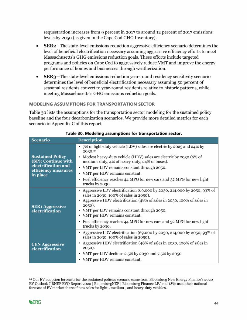
44
sequestration increases from 9 percent in 2017 to around 12 percent of 2017 emissions
levels by 2050 (as given in the Cape Cod GHG Inventory).
• SER2—The state-level emissions reduction aggressive efficiency scenario determines the
level of beneficial electrification necessary assuming aggressive efficiency efforts to meet
Massachusetts's GHG emissions reduction goals. These efforts include targeted
programs and policies on Cape Cod to aggressively reduce VMT and improve the energy
performance of homes and businesses through weatherization.
• SER3—The state-level emissions reduction year-round residency sensitivity scenario
determines the level of beneficial electrification necessary assuming 50 percent of
seasonal residents convert to year-round residents relative to historic patterns, while
meeting Massachusetts's GHG emissions reduction goals.
MODELING ASSUMPTIONS FOR TRANSPORTATION SECTOR
Table 30 lists the assumptions for the transportation sector modeling for the sustained policy
baseline and the four decarbonization scenarios. We provide more detailed metrics for each
scenario in Appendix C of this report.
Table 30. Modeling assumptions for transportation sector.
Scenario Description
Sustained Policy (SP): Continue with electrification and efficiency measures in place
• 7% of light-duty vehicle (LDV) sales are electric by 2025 and 24% by 2030.24
• Modest heavy-duty vehicle (HDV) sales are electric by 2030 (6% of medium-duty, 4% of heavy-duty, 24% of buses).
• VMT per LDV remains constant through 2050.
• VMT per HDV remains constant.
• Fuel efficiency reaches 44 MPG for new cars and 32 MPG for new light trucks by 2030.
SER1 Aggressive electrification
• Aggressive LDV electrification (69,000 by 2030, 214,000 by 2050; 93% of sales in 2030, 100% of sales in 2050).
• Aggressive HDV electrification (48% of sales in 2030, 100% of sales in 2050).
• VMT per LDV remains constant through 2050.
• VMT per HDV remains constant.
• Fuel efficiency reaches 44 MPG for new cars and 32 MPG for new light trucks by 2030.
CEN Aggressive electrification
• Aggressive LDV electrification (69,000 by 2030, 214,000 by 2050; 93% of sales in 2030, 100% of sales in 2050).
• Aggressive HDV electrification (48% of sales in 2030, 100% of sales in 2050).
• VMT per LDV declines 2.5% by 2030 and 7.5% by 2050.
• VMT per HDV remains constant.
24 Our EV adoption forecasts for the sustained policies scenario came from Bloomberg New Energy Finance’s 2020 EV Outlook (“BNEF EVO Report 2020 | BloombergNEF | Bloomberg Finance LP,” n.d.).We used their national forecast of EV market share of new sales for light-, medium-, and heavy-duty vehicles.
45
Scenario Description
• Fuel efficiency reaches 44 MPG for new cars and 32 MPG for new light trucks by 2030.
• Non-motor vehicle emissions (primarily from boats and aircraft) decline 48% by 2050, instead of remaining constant as in the other scenarios.
SER2: Aggressive efficiency with electrification
• Somewhat slower EV adoption relative to SER 1 (39,000 by 2030, 200,000 by 2050; 63% of sales in 2030, 100% of sales in 2050).
• VMT per LDV declines 15% by 2030 and 25% by 2050.
• VMT per HDV remains constant.
• Fuel efficiency reaches 44 MPG for new cars and 32 MPG for new light trucks by 2030.
SER3: Increased year-round population
• Aggressive LDV electrification (70,000 by 2030, 283,000 by 2050; 85% of sales in 2030, 100% of sales in 2050).
• Aggressive HDV electrification (44% of sales in 2030, 100% of sales in 2050).
• VMT per LDV declines 9% by 2030 and 15% by 2050.
• VMT per HDV remains constant.
• Fuel efficiency reaches 44 MPG for new cars and 32 MPG for new light trucks by 2030.
• Number of registered vehicles increases assuming 50% of part-time residents become full-year residents.
The following set of figures graphically depict key inputs into each transportation modeling
scenario. Figure 9 presents the percent of light-duty EVs on the road over time for each scenario,
and Figure 10 presents the percent of heavy-duty EVs on the road over time for each scenario.
Note that in the figures below, a dashed line means two scenarios share the same trajectory.

46
Figure 9. Percent of light-duty EVs over time by scenario.
Figure 10. Percent of heavy-duty EVs over time by scenario.

47
Figure 11 and Figure 12 present the total light-duty EV stock and heavy-duty EV stock in
Barnstable County, respectively, over time and by scenario.
Figure 11. Total light-duty EV stock over time.
Figure 12. Total heavy-duty EV stock over time.

48
Figure 13 and Figure 14 depict the percent of new car sales by year that are light-duty EVs and
heavy-duty EVs in Barnstable County, respectively.
Figure 13. Percent of new light-duty vehicle sales that are EVs.
Figure 14. Percent of new heavy-duty vehicle sales that are EVs.

49
MODELING ASSUMPTIONS FOR BUILDING SECTOR
Table 31 lists the assumptions for the building sector modeling for the sustained policy baseline
and the four decarbonization scenarios. We provide more detailed metrics for each scenario in
Appendix C of this report.
Table 31. Modeling assumptions for building sector.
Scenario Description
Sustained Policy (SP): Continue with electrification and efficiency measures in place
• 19% cumulative residential space heat energy reduction by 2050 through weatherization and new construction.
• 18,000 residential heat pumps installed between 2021 and 2030.
• Commercial heat pump market share reaches 29% among systems replacing oil boilers and 4% of systems replacing natural gas boilers.
SER1: Aggressive electrification
• 19% cumulative reduction in residential space heating energy consumption by 2050 through weatherization and new construction (8%
by 2030).
• Aggressive residential electrification (18,568 year-round homes with heat pump retrofits by 2030 and 45,295 by 2050; 15,100 year-round homes
with whole-home heat pumps by 2030 and 46,223 by 2050).
• Aggressive commercial electrification (2.8 million square feet of commercial space served by heat pumps in 2030 and 29.4 million square feet by 2050).
CEN: Aggressive electrification
• 19% cumulative reduction in residential space heating energy consumption by 2050 through weatherization and new construction (8% by 2030).
• Aggressive residential electrification (18,568 year-round homes with heat pump retrofits by 2030 and 45,295 by 2050; 15,100 year-round homes with whole-home heat pumps by 2030 and 46,223 by 2050).
• Aggressive commercial electrification (3.4 million square feet of commercial space served by heat pumps in 2030 and 30.3 million square feet by 2050).
SER2: Aggressive efficiency with electrification
• 25% cumulative reduction in residential space heating energy consumption by 2050 through weatherization and new construction.
• Slightly less aggressive residential electrification (18,568 year-round homes with heat pump retrofits by 2030 and 48,944 by 2050; 8,501 year-round homes with whole-home heat pumps by 2030 and 40,052 by 2050).
SER3: Increased year-round population
• 19% cumulative reduction in residential space heating energy consumption per home by 2050 through weatherization and new construction (8% by 2030).
• Aggressive residential electrification (18,568 year-round homes with heat pump retrofits by 2030 and 48,944 by 2050; 18,506 year-round homes with whole-home heat pumps by 2030 and 73,824 by 2050).
• Aggressive commercial electrification (2.8 million square feet of commercial space served by heat pumps in 2030 and 29.4 million square feet by 2050).
• 50% of currently seasonal housing units are assumed to become occupied year-round due to an increase in year-round residents.

50
Figure 15 through Figure 19 graphically depict the number of residential households in
Barnstable County that use each type of fuel to heat their home. For all of these figures, “heat
pump/fuel oil” and “heat pump/natural gas” refer to households with both energy sources to
heat their home.25 Note that while we did include seasonal homes in our analysis using the
Commission’s calculated energy use in seasonal homes relative to year-round homes, we
decided not to show the seasonal homes in the stock charts (Figure 15 through Figure 19)
because they use less energy than year-round homes and therefore did not seem to be
equivalent.
25 The dual fuel households install ductless mini split heat pumps to displace oil or gas consumption but use the legacy oil or gas system for supplemental heating on cold winter days. Customers sometimes choose these installations to save money by displacing most consumption of heating fuels while spending less on the heat pump installation.
Figure 15. Sustained policy residential space heating stock (year-round households).

51
Figure 16. SER1 residential space heating stock (year-round households).
Figure 17. CEN residential space heating stock (year-round households).

52
Figure 18. SER2 residential space heating stock (year-round households).
Figure 19. SER3 residential space heating stock (year-round households).

53
MODELING ASSUMPTIONS FOR THE ELECTRICITY SECTOR
Table 32 presents our assumptions for the percent of energy that will come from non-emitting
sources in 2030 and 2050 for all decarbonization scenarios, as well as the sustained policy
scenario.
Table 32. Electricity sector clean energy levels (non-emitting sources).
Scenario 2030 2050
SP 47% 80%
SER 1 75% 89%
CEN 75% 98%
SER 2 75% 91%
SER 3 87% 94%
Results
In this section, we first present results for the transportation, building sector, and electric sector
modeling. We then present the overall emissions, which incorporate results from these three
sectors, as well as all other sectors that generate emissions.
TRANSPORTATION SECTOR RESULTS
Figure 20 presents the total electricity load needed with EV charging over time for all
transportation decarbonization scenarios and the sustained policy case.
Figure 21 presents the total emissions from the vehicle fleet over time for all transportation
decarbonization scenarios and the sustained policy case. While Appendix C presents more
detailed metrics associated with each scenario, key takeaways from the transportation modeling
include:
• All decarbonization scenarios require significant growth in the share of new vehicle sales
that are light-duty EVs. Even the SER2 case, with reduced VMT relative to the other
decarbonization cases, requires 63 percent of new vehicle sales to be EVs by 2030. The
SER3 scenario requires 85 percent by 2030. SER1 and CEN each require 93 percent of
new sales to be EVs by 2030. By 2050, all decarbonization scenarios require 100 percent
of new vehicle sales to be EVs.
• By 2050, SER1, CEN, and SER2 result in approximately 210,000 light-duty EVs on the
road in Barnstable County. The SER3 sees an additional 73,000 light-duty EVs resulting
from an increase in year-round residents by 2050.
• Electrification of transportation significantly increases Cape Cod’s electricity
consumption. On the low end, electricity consumption for EV charging in 2050 equals
0.8 TWh in the SER2 scenario. On the high end, the SER3 scenario sees electricity for EV
charging equal to 1.2 TWh in 2050. The SER3 scenario has more year-round residents
and thus more EVs charging from the grid.
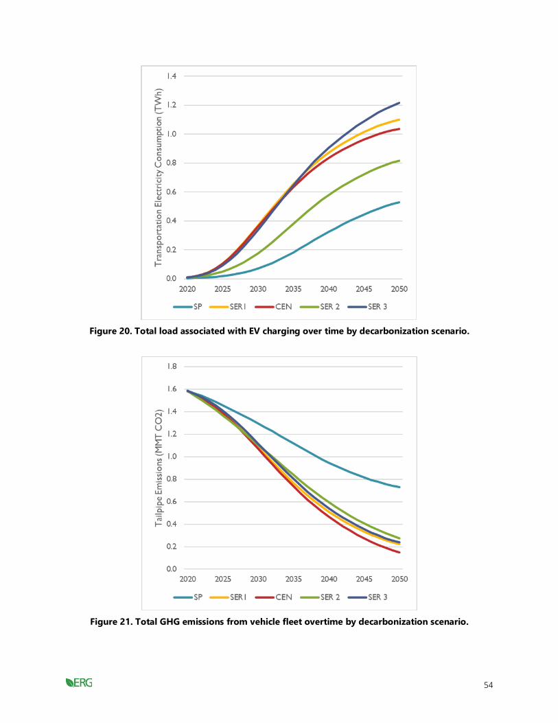
54
Figure 20. Total load associated with EV charging over time by decarbonization scenario.
Figure 21. Total GHG emissions from vehicle fleet overtime by decarbonization scenario.

55
BUILDING SECTOR RESULTS
Figure 22 presents the total electricity consumption in Barnstable County for space and water
heating over time by decarbonization scenarios, including the sustained policy case.
Figure 23 presents the total onsite GHG emissions in Barnstable County associated with
buildings over time for all decarbonization scenarios including the sustained policy case.
One key takeaway is all decarbonization scenarios require significant growth in the use of heat
pump systems, for both retrofits and whole home systems. SER1, CEN, and SER2 all result in
similar electricity use for space heating, with around 0.7 to 0.8 TWh in 2030 and approximately
1.5 to 1.7 TWh in 2050. The SER3 scenario sees electricity use for space heating reach about 0.9
TWh in 2030 and 2.2 TWh in 2050.
Figure 22. Total load associated with electric heating over time by decarbonization scenario.

56
Figure 23. Total GHG emissions from buildings over time by decarbonization scenario.
ELECTRICITY SECTOR RESULTS
Figure 24 presents the electricity needs over time for each decarbonization scenario. This figure
incorporates the electricity needs from the corresponding scenarios from the transportation and
building sector analyses above, as well as other electricity needs.
Figure 25 presents total emissions from electricity over time from all decarbonization scenarios,
as well as the sustained policy scenario.

57
Figure 24. Total Barnstable County electric load over time by decarbonization scenario.
Figure 25. Total electric sector GHG emissions over time by decarbonization scenario.

58
SUSTAINED POLICY (BASELINE) EMISSIONS RESULTS
Figure 26 presents the economy-wide emissions associated with the sustained policy or baseline
scenario in Barnstable County. The figure demonstrates that Barnstable County is unlikely to
meet the state’s GHG emissions reductions targets given current policies and trends.
Figure 26. Economy-wide GHG emissions for sustained policy scenario in Barnstable County.
The sustained policy scenario fails to achieve GHG reduction in Barnstable County consistent
with the overall goals in Massachusetts. Emissions are projected to decline through the study
period. However, total emissions in 2050 are projected to be 1.5 million metric tons, which is a
little less than 1 million metric tons above the 2050 target. The transportation sector continues
to be the largest source of emissions through 2050, representing 48 percent of economy-wide
GHG emissions.
ECONOMY-WIDE EMISSIONS RESULTS (ALL SECTORS)
Figure 27 through Figure 30 present total emissions in Barnstable County over time for each of
the decarbonization scenarios. All of the “SER” scenarios meet the 2030 and 2050 emissions
reduction goals. The CEN scenario exceeds the goal of 85 percent reduction by 2050, as we
developed it to meet net neutrality by 2050.

59
Figure 27. Economy-wide GHG emissions for SER1 scenario.
Figure 28. Economy-wide GHG emissions for CEN scenario.

60
Figure 29. Economy-wide GHG emissions for SER2 scenario.
Figure 30. Economy-wide GHG emissions for SER3 scenario.
Table 33 presents the projected emissions by scenario and sector in 2030, 2040, and 2050.

61
Table 33. Projected emissions by scenario and year (MMT CO2e).
Scenario Sector 2030 2040 2050
SP Residential Buildings 0.480 0.347 0.217
SP Commercial Buildings 0.186 0.167 0.150
SP Transportation 1.296 0.947 0.728
SP Electric Power 0.414 0.348 0.228
SP Industrial Processes 0.013 0.013 0.013
SP Agriculture 0.015 0.015 0.015
SP Waste 0.108 0.108 0.108
SP Total 2.512 1.945 1.459
SER1 Residential Buildings 0.412 0.147 0.039
SER1 Commercial Buildings 0.173 0.087 0.018
SER1 Transportation 1.087 0.512 0.225
SER1 Electric Power 0.246 0.250 0.196
SER1 Industrial Processes 0.013 0.013 0.013
SER1 Agriculture 0.015 0.015 0.015
SER1 Waste 0.108 0.108 0.108
SER1 Total 2.054 1.132 0.613
CEN Residential Buildings 0.410 0.144 0.037
CEN Commercial Buildings 0.170 0.078 0.013
CEN Transportation 1.073 0.467 0.150
CEN Electric Power 0.247 0.107 0.036
CEN Industrial Processes 0.013 0.013 0.013
CEN Agriculture 0.015 0.015 0.015
CEN Waste 0.108 0.108 0.108
CEN Total 2.035 0.932 0.371
SER2 Residential Buildings 0.433 0.176 0.042
SER2 Commercial Buildings 0.173 0.087 0.018
SER2 Transportation 1.102 0.595 0.276
SER2 Electric Power 0.217 0.195 0.143
SER2 Industrial Processes 0.013 0.013 0.013
SER2 Agriculture 0.015 0.015 0.015
SER2 Waste 0.108 0.108 0.108
SER2 Total 2.061 1.189 0.615
SER3 Residential Buildings 0.444 0.164 0.037

62
Scenario Sector 2030 2040 2050
SER3 Commercial Buildings 0.193 0.098 0.016
SER3 Transportation 1.116 0.542 0.238
SER3 Electric Power 0.142 0.167 0.146
SER3 Industrial Processes 0.013 0.013 0.013
SER3 Agriculture 0.015 0.015 0.015
SER3 Waste 0.120 0.131 0.143
SER3 Total 2.042 1.130 0.608
Table 34 presents the approximate emissions reductions compared to 1990 emissions levels.
This assumes Barnstable County accounted for the same fraction of state emissions in 1990 as it
did in 2017.
Table 34. Approximate emissions reductions from 1990 emissions levels.
Scenario 2030 2050
SP 39% 65%
SER 1 50% 85%
CEN 51% 91%
SER 2 50% 85%
SER 3 50% 85%
Key takeaways from the overall emissions analysis include:
• Emissions from the SER1, SER2, and SER3 scenarios all meet the emissions reduction
goals of a 50 percent reduction from 1990 levels by 2030 and 85 percent reduction from
1990 levels by 2050.
• Emissions from the CEN scenario will meet the emissions reduction goals of a 50 percent
reduction from 1990 levels by 2030 and the net neutrality goal by 2050.
• The differences between decarbonization scenarios are small when compared with the
much larger difference between the decarbonization pathways and the sustained policies
case. Rapid transformations are required across all sectors in order to be on pace to meet
decarbonization targets. Even the sustained policies case would require significant action
(e.g., many more EVs and heat pumps, and much more carbon-free electricity) and
results in significant emissions changes relative to 2020, and the decarbonization cases
require more action and show even more change in emissions.
• Transformations at this scale likely require substantial action and assistance from state
and federal governments, but at the same time the homeowners, drivers, and business
owners on the Cape are the fundamental actors who can decide to choose electric options
for their next heating system or vehicle. Organizations such as the Cape Light Compact

63
can be a key enabler for electric sector decarbonization, as well as for engaging
customers about their energy choices.
Part 3. Economic Analyses of Adaptation and Mitigation
Strategies
Our economic analyses of adaptation and mitigation strategies to support the Cape Cod Climate
Action Plan are designed to inform whether an economic case exists to implement the strategies.
In some cases, economic analyses can be used to refine adaptation strategies to ensure an
economic case for implementation (e.g., focus shoreline protection in denser areas). Given the
diversity of strategies selected for economic analyses and the range of data available, the
strategies are evaluated based on a variety of metrics as described in the section that follows.
Strategy prioritization in the Climate Action Plan should not be based on economics alone,
especially as our team was only able to evaluate a subset of the strategies that emerged from the
Cape Cod Climate Action Plan planning process. Other key factors to consider include political
feasibility and equitable distribution of costs and benefits.
We performed several types of economic analyses in this part of the report that vary depending
on the strategy:
• Benefit-cost analysis: This could include both market and non-market (e.g., the value
of recreation even though it is free, and no money may change hands) benefits and costs.
The output is often presented as a ratio of benefits to cost or a net benefit over some
period of time.
• Cost-effectiveness analysis: Particularly for GHG reduction and sequestration
strategies, we present the lifetime cost—which could be a cost increase or cost savings, as
well as a negative cost-effectiveness value—per metric ton of CO2 reduced.
• Economic impact analysis: This could refer to the change in wages, number of jobs,
or revenue as a result of implementing a strategy.
The strategies for economic analysis are organized into two primary groups: 1) mitigation-
focused strategies and 2) adaptation-focused strategies.
We have done our best to present findings at several geographic scales to be flexible to future
regional and town needs.
GHG Mitigation-Focused Strategies
Reducing greenhouse gas emissions from buildings
The energy efficiency of buildings can be greatly increased by reducing the amount of energy
needed for heating and cooling, known as “weatherization” (e.g., improved insulation, energy-
efficient windows) and by replacing outdated and inefficient heating and cooling systems with
heat pumps. At the consumer level, taking these actions can provide cost savings over many

64
years. On a regional level, these actions can help reduce CO2 emissions and lessen the impacts of
climate change. These actions can also lead to a decrease in criteria pollutant emissions,
including PM2.5, NOx, and SO2, which impacts the health of those in the region.
METHODS
ERG conducted a literature review to understand the consumer benefits and costs associated
with weatherization and heat pump installation.
Weatherizing a building incurs an upfront cost, but does not require any operational costs over
time, and in fact reduces the cost of heating or cooling a building over time. Replacing inefficient
heating and cooling systems with a heat pump requires both an upfront cost and an operational
cost over time, but these operational costs are lower than older, more inefficient systems that
most homes in Barnstable County currently rely on.
According to the U.S. Department of Energy (DOE), the average home weatherization cost is
between $4,695 and $6,812 (DOE, 2015; DOE, 2018). This initial cost often consists of a
combination of many different measures to decrease energy consumption and increase energy
efficiency, including installing insulation where needed, performing air sealing, repairing minor
roof and wall leaks, installing programmable thermostats, and insulating water heating pipes.
Once a building has been weatherized, less energy is needed to heat and cool the building
throughout the year. The DOE’s Office of Energy Efficiency and Renewable Energy estimates
that weatherization can provide an annual energy cost savings of $283 per home unit (DOE,
2018).
Heat pumps can decrease a homeowner’s heating and cooling costs, while lowering their GHG
impacts. There are three types of heat pumps—air-to-air, water source, and geothermal—that
collect heat from either the air, water, or ground and redistribute it for use inside a home or
building.
Air-source heat pumps (ASHPs) are the most common type of heat pump (Energy.gov, n.d.).
The Massachusetts Clean Energy Center (MassCEC) publishes state and county level data for the
cost of installing an ASHPs in homes. In 2019, there were 541 ASHPs installed in Barnstable
County, with a median cost was $3,733 per heating ton.26 A 2,100- to 2,700-square-foot home
would require a 4.0-ton ASHP, resulting in a total capital cost of $14,900. This value is in line
with MassCEC’s estimate of $15,000-$20,000 for a whole-home replacement system
(Massachusetts Clean Energy Center, 2020). Conventional fuel boilers have a lower capital cost,
but much higher annual costs. The capital costs associated with conventional fuel boilers and
ASHPs are provided in Table 35. The capital cost reported in Table 35 for the conventional fuel
boilers is based on the national average cost reported by Fixr, a cost comparison website.27
26 Cost per ton is a standard way to compare the prices of heat pumps. One ton is equivalent to 12,000 BTU per hour. 27 https://www.fixr.com/
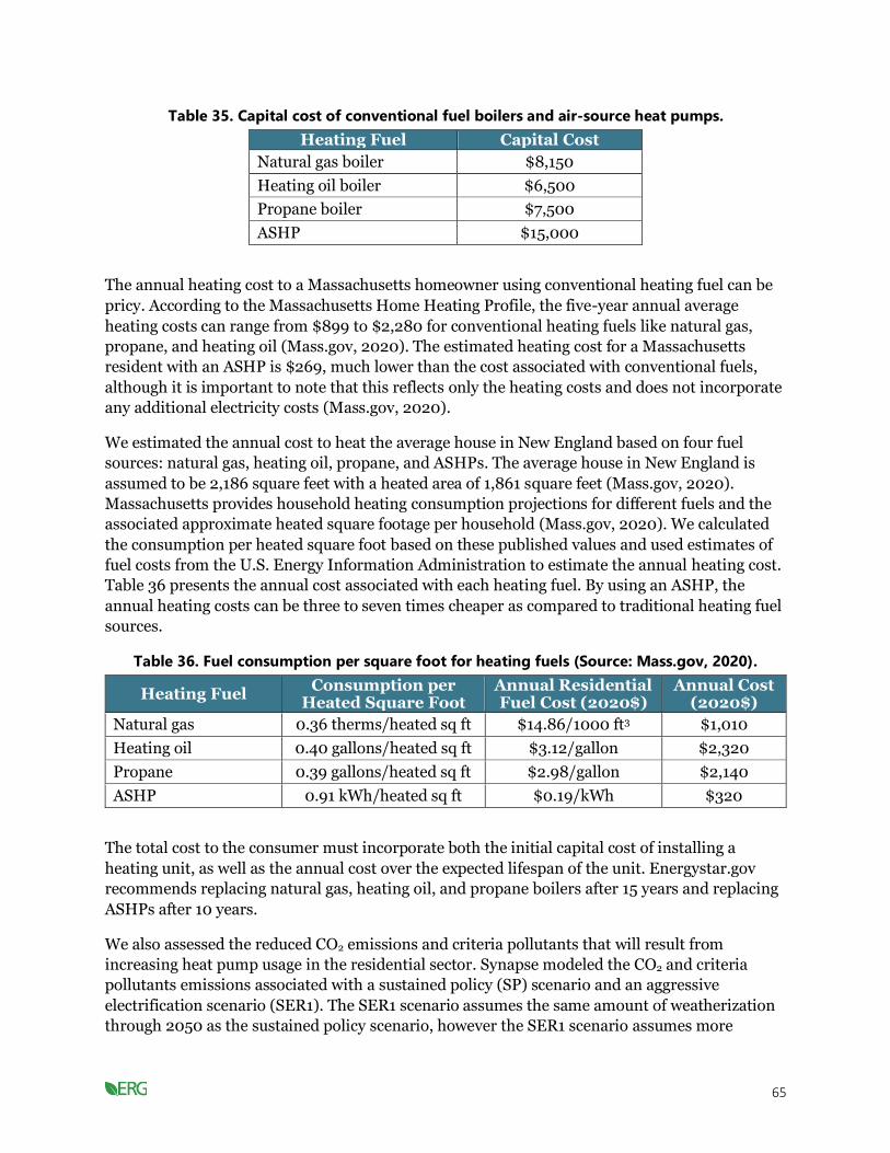
65
Table 35. Capital cost of conventional fuel boilers and air-source heat pumps.
Heating Fuel Capital Cost
Natural gas boiler $8,150
Heating oil boiler $6,500
Propane boiler $7,500
ASHP $15,000
The annual heating cost to a Massachusetts homeowner using conventional heating fuel can be
pricy. According to the Massachusetts Home Heating Profile, the five-year annual average
heating costs can range from $899 to $2,280 for conventional heating fuels like natural gas,
propane, and heating oil (Mass.gov, 2020). The estimated heating cost for a Massachusetts
resident with an ASHP is $269, much lower than the cost associated with conventional fuels,
although it is important to note that this reflects only the heating costs and does not incorporate
any additional electricity costs (Mass.gov, 2020).
We estimated the annual cost to heat the average house in New England based on four fuel
sources: natural gas, heating oil, propane, and ASHPs. The average house in New England is
assumed to be 2,186 square feet with a heated area of 1,861 square feet (Mass.gov, 2020).
Massachusetts provides household heating consumption projections for different fuels and the
associated approximate heated square footage per household (Mass.gov, 2020). We calculated
the consumption per heated square foot based on these published values and used estimates of
fuel costs from the U.S. Energy Information Administration to estimate the annual heating cost.
Table 36 presents the annual cost associated with each heating fuel. By using an ASHP, the
annual heating costs can be three to seven times cheaper as compared to traditional heating fuel
sources.
Table 36. Fuel consumption per square foot for heating fuels (Source: Mass.gov, 2020).
Heating Fuel Consumption per
Heated Square Foot Annual Residential Fuel Cost (2020$)
Annual Cost (2020$)
Natural gas 0.36 therms/heated sq ft $14.86/1000 ft3 $1,010
Heating oil 0.40 gallons/heated sq ft $3.12/gallon $2,320
Propane 0.39 gallons/heated sq ft $2.98/gallon $2,140
ASHP 0.91 kWh/heated sq ft $0.19/kWh $320
The total cost to the consumer must incorporate both the initial capital cost of installing a
heating unit, as well as the annual cost over the expected lifespan of the unit. Energystar.gov
recommends replacing natural gas, heating oil, and propane boilers after 15 years and replacing
ASHPs after 10 years.
We also assessed the reduced CO2 emissions and criteria pollutants that will result from
increasing heat pump usage in the residential sector. Synapse modeled the CO2 and criteria
pollutants emissions associated with a sustained policy (SP) scenario and an aggressive
electrification scenario (SER1). The SER1 scenario assumes the same amount of weatherization
through 2050 as the sustained policy scenario, however the SER1 scenario assumes more

66
residential and commercial use of heat pumps. By comparing the CO2 and criteria pollutant
emissions from the sustained policy scenario to the SER1 scenario, we were able to estimate the
emission reductions associated with significant heat pump adoption in the residential and
commercial sectors. Table 37. Emissions reductions from the residential sector from switching
to the aggressive electrification scenario (SER1) from the sustained policy scenario (SP) shows
the reduced CO2 and criteria pollutant emissions from switching to the SER1 scenario from the
sustained policy scenario by decade.
Table 37. Emissions reductions from the residential sector from switching to the aggressive
electrification scenario (SER1) from the sustained policy scenario (SP).
Years Reduced CO2
Emissions (MMT of CO2)
Reduced PM2.5 Emissions
(Metric Tons)
Reduced SO2 Emissions
(Metric Tons)
Reduced NOx Emissions
(Metric Tons)
2021–2030 0.2 14.2 111.3 150.1
2031–2040 1.5 91.3 393.9 1045.1
2041–2050 2.0 124.5 411.4 1463.0
Total 3.7 229.9 916.6 2,658.2
We then monetized the value of these reduced emissions, using both a market price and SCC to
estimate the benefit of the CO2 reduction. Massachusetts is part of the Regional Greenhouse Gas
Initiative (RGGI), a cooperative effort among ten states in the Northeast to reduce GHG
emissions from the electric power sector. RGGI is a cap-and-trade system where each state
places a cap on CO2 emitted from the electric power sector and CO2 allowances are issued and
can be traded to maintain compliance with the emission caps. RGGI holds quarterly auctions
where these allowances can be bought and sold, and they publish the clearing price per short ton
of CO2 based on these transactions.28 Although the price per short ton of CO2 has ranged from
about $2 to $7.50 since the RGGI program started in 2008. Since December 2018, the price has
been above $5 per short ton of CO2 (Figure 31). The future price of CO2 based on the RGGI
program is difficult to predict because periodic program reviews of the region’s emissions can
lead to adjustments in the CO2 cap, ultimately influencing the market price (RGGI, 2017). We
calculate the benefit of reducing CO2 emissions based on a high ($7.50 per short ton) and low
($5.00 per short ton) estimate of the market price of CO2.29 For each high and low estimate, we
assume the price is constant from 2020 to 2050.
28 Clearing prices for quarterly RGGI auctions are available at https://www.rggi.org/Auctions/Auction-Results/Prices-Volumes. 29 Synapse modeled CO2 emissions in metric tons. One metric ton is equivalent to 1.10231 short tons. Therefore, we converted the high and low market price of carbon to a per metric ton basis for our calculations ($5.51 and $8.27 per metric ton, respectively).
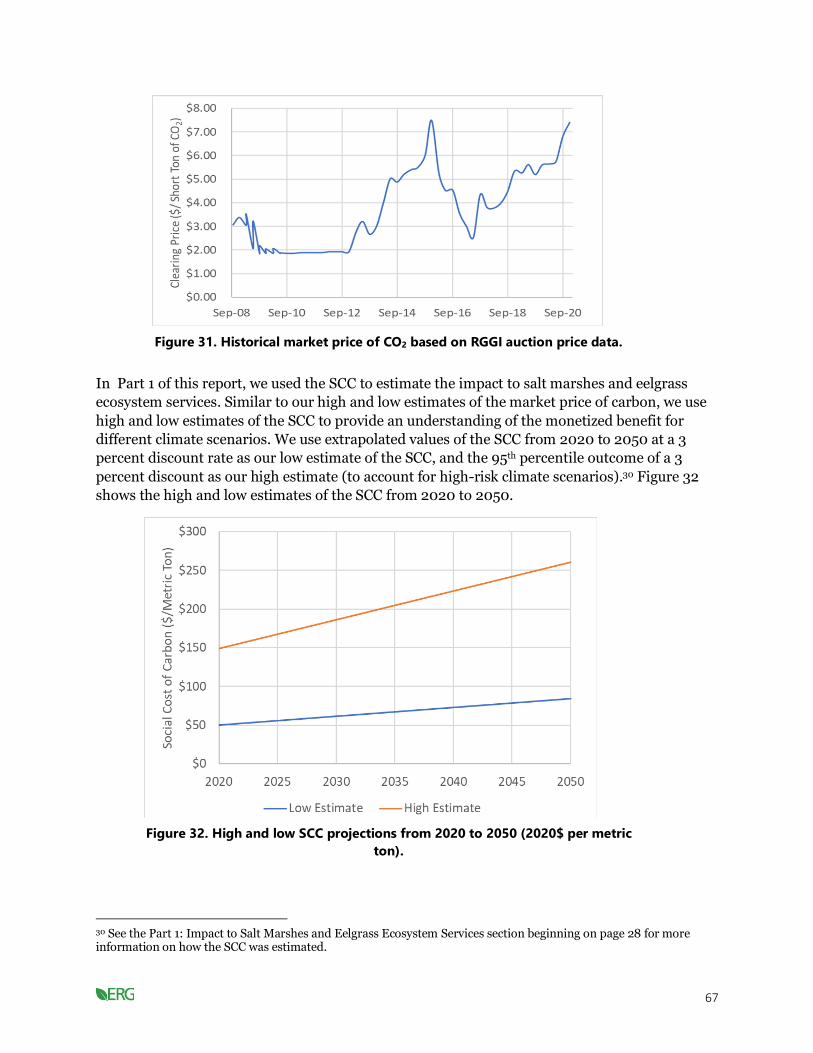
67
Figure 31. Historical market price of CO2 based on RGGI auction price data.
In Part 1 of this report, we used the SCC to estimate the impact to salt marshes and eelgrass
ecosystem services. Similar to our high and low estimates of the market price of carbon, we use
high and low estimates of the SCC to provide an understanding of the monetized benefit for
different climate scenarios. We use extrapolated values of the SCC from 2020 to 2050 at a 3
percent discount rate as our low estimate of the SCC, and the 95th percentile outcome of a 3
percent discount as our high estimate (to account for high-risk climate scenarios).30 Figure 32
shows the high and low estimates of the SCC from 2020 to 2050.
30 See the Part 1: Impact to Salt Marshes and Eelgrass Ecosystem Services section beginning on page 28 for more information on how the SCC was estimated.
Figure 32. High and low SCC projections from 2020 to 2050 (2020$ per metric
ton).

68
We used an EPA study to estimate the benefit of the CO2 reduction by converting the criteria
pollutant reductions into a dollar value based on the anticipated health impacts (i.e., average
estimated reduction in mortality and morbidity) (US EPA, 2013). Table 38 shows the values in
2020 and 2030 for a one-ton reduction of PM2.5, SO2, and NOx. We assumed the value in 2040 is
the same as the value in 2030.
Table 38. Value of each ton of pollutant reduced for electricity generating units (2020$).
Category
Value of 1 Ton
Reduction of PM2.5
Value of 1 Ton Reduction of
SO2
Value of 1 Ton Reduction of
NOx
2020 value per ton reduced for electricity generating units
$365,900 $97,950 $14,150
2030 value per ton reduced for electricity generating units
$424,900 $114,500 $16,550
RESULTS
The lifetime cost to the consumer for ASHPs can be $5,000 to $23,000 cheaper than traditional
heating units. Table 39 presents the lifetime cost and annual cost of ownership for three
traditional heating units (natural gas boiler, heating oil boiler, and propane boiler) as well as for
ASHPs. The annual cost of ownership for an ASHP is $1,820, which is less than both the annual
heating oil and propane fuel costs ($2,320 and $2,140, respectively). Therefore, it is cost-
effective to switch from a heating oil boiler or a propane boiler to an ASHP at any point in time,
including before the boiler reaches the end of its lifespan. In contrast, the annual natural gas
fuel cost ($1,010) is less than the annual cost of ownership for an ASHP. This means that it is
more cost-effective for homeowners who use natural gas to wait until their heating unit reaches
the end of its lifespan before switching to an ASHP.
Although the annual cost of ownership is lowest for ASHPs, the capital cost to install them can
be twice that of conventional heating units (Table 39). This high initial cost can make ASHPs
inaccessible for some homeowners. Smaller, less expensive ASHP units can be installed, but
these may not be able to heat an entire home depending on the size of the home.
Table 39. Lifetime cost and annual cost of ownership to the consumer for different heating
units.
Heating Unit
Capital Cost
(2020$)
Annual Fuel Cost
(2020$/year)
Expected Lifespan
Total Lifetime
Cost
Annual Cost of
Ownership
Natural gas boiler
$8,150 $1,010 15 years $23,250 $1,550
Heating oil boiler
$6,500 $2,320 15 years $41,250 $2,750
Propane boiler
$7,500 $2,140 15 years $39,600 $2,640
ASHP $15,000 $320 10 years $18,200 $1,820

69
Heat pumps emit less CO2 and criteria pollutants than conventional heating systems. When
implemented on a regional scale, the aggregate emissions reduced can help to lessen the impacts
of climate change and can reduce health impacts. We assessed these benefits by monetizing the
emissions reduced from switching to the aggressive electrification scenario (SER1) from the
sustained policy (SP) scenario.
The monetized benefit of the reduction in CO2 emissions is provided in Table 40. Monetized
benefit of reduced CO2 emissions from residential sector (millions of 2020$) using both high and
low estimates of the market and SCC (discussed in the methods section above). The monetized
benefit of the reduction in criteria pollutants is provided in Table 41. By 2050, CO2 emissions
could be valued at over $20 million based on a conservative market price estimate, or as much as
nearly $274 million using a conservative SCC estimate. The monetized benefit of reduced
criteria pollutants is estimated to be around $244 million by 2050.
Table 40. Monetized benefit of reduced CO2 emissions from residential sector (millions of
2020$).
Years Market Value of Reduced CO2
Emissions Social Value of Reduced CO2
Emissions
2021–2030 $1.3–$1.9 $13.8–$41.5
2031–2040 $8.1–$12.2 $101.4–$308.8
2041–2050 $11.1–$16.6 $158.9–$488.6
Total $20.5–$30.7 $274.0–$838.9
Table 41. Monetized benefit of criteria pollutant reductions from residential sector (millions of
2020$).
Years PM2.5 SO2 NOx Total
2021–2030 $5.5 $11.4 $2.2 $19.0
2031–2040 $38.8 $45.1 $17.3 $101.2
2041–2050 $52.9 $47.1 $24.2 $124.2
Total $97.1 $103.6 $43.7 $244.4
LIMITATIONS AND FUTURE ANALYSIS
Although heat pumps provide an efficient and cost-effective way to heat and cool a home or
building, they are less efficient in very cold weather. Fortunately, newer technology has made
cold climate ASHPs practical in New England (EERE, 2017). Our analysis does not specifically
focus on cold climate ASHPs. Future work should consider whether cold climate ASHPs will be
necessary in the future as the climate warms and should look at the costs and benefits of
installing cold climate ASHPs to understand at a more granular level the impact to Cape Cod
consumers.

70
Reducing GHGs from Buildings: Key Takeaways
• It is cost-effective for consumers to switch from a heating oil boiler or a propane boiler to an
ASHP at any point in time, including before the boiler reaches the end of its lifespan.
• From a cost perspective, consumers of natural gas should wait until their heating unit reaches
the end of its lifespan before switching to an ASHP. To switch to an ASHP will be comparable
(less than $100 per year difference).
• In addition to the financial benefits to consumers of switching to ASHPs to help reach 2050
emissions goals, the health benefit of reduced criteria pollutants will be about $244 million,
and the market value of reduced carbon will be about $20 to $30 million from 2021 through
2050 (comparing SER1 scenario to sustained policy scenario).
Increase generation and use of clean energy
Using clean energy can provide a variety of benefits. Clean energy emits less CO2 into the
atmosphere, helping to lessen the contribution to climate change. Clean energy also emits less
criteria pollutants such as PM2.5, NOx, and SO2, which can help to improve the overall health of
the region’s population. Over the past few decades, the cost of clean energy has decreased
dramatically. Today, clean energy is cost-competitive with fossil fuel energy sources.
METHODS
We conducted a literature review of the cost of renewable and nonrenewable energy sources. We
focused on sources that provided the cost in terms of the levelized cost of energy (LCOE). The
LCOE is commonly used to compare the costs of electricity generated from different sources
because it estimates the cost per unit of electricity generated over the entire lifespan of the
generating plant–including capital and operating costs. Therefore, the LCOE provides a
consistent metric that can be used to compare the cost of energy generated from different
sources.
Synapse modeled the CO2, PM2.5, NOx, and SO2 emissions from the electric power sector for the
five scenarios they considered. We used the sustained policy scenario as our baseline and
compared the emissions reductions that will occur if the SER1 scenario is followed. Table 42.
Emissions reductions from switching to the aggressive electrification scenario (SER1) from the
sustained policy scenario (SP) provides the reduced emissions by decade. By 2050, CO2
emissions are projected to be reduced by nearly 3 million metric tons and criteria pollutants
(PM2.5, SO2, and NOx) are projected to be reduced by nearly 2,000 metric tons.
We monetized the reduced CO2 emissions using high and low estimates of the market value and
SCC. The reader is referred to the “Reducing greenhouse gas emissions from buildings” section
of this report for a more detailed review of how these values were estimated. The high and low
market price of carbon was assumed to be $5.51 per metric ton and $8.27 per metric ton,
respectively. Our analysis assumes that these market prices are constant from 2020–2050 and
uses annual estimates of the SCC from 2020–2050. The high SCC estimates range from about
$150 per metric ton in 2020 to $260 per metric ton in 2050. The low SCC estimates range from
about $50 per metric ton in 2020 to $84 per metric ton in 2050.
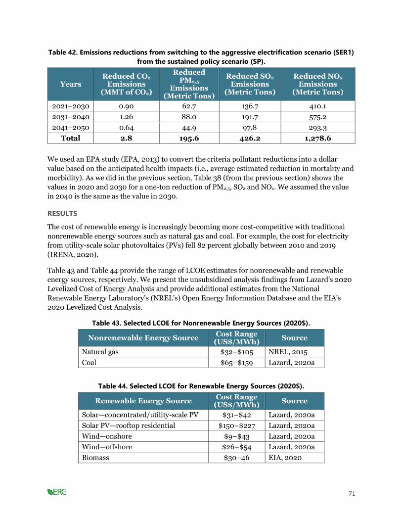
71
Table 42. Emissions reductions from switching to the aggressive electrification scenario (SER1)
from the sustained policy scenario (SP).
Years Reduced CO2
Emissions (MMT of CO2)
Reduced PM2.5
Emissions (Metric Tons)
Reduced SO2 Emissions
(Metric Tons)
Reduced NOx Emissions
(Metric Tons)
2021–2030 0.90 62.7 136.7 410.1
2031–2040 1.26 88.0 191.7 575.2
2041–2050 0.64 44.9 97.8 293.3
Total 2.8 195.6 426.2 1,278.6
We used an EPA study (EPA, 2013) to convert the criteria pollutant reductions into a dollar
value based on the anticipated health impacts (i.e., average estimated reduction in mortality and
morbidity). As we did in the previous section, Table 38 (from the previous section) shows the
values in 2020 and 2030 for a one-ton reduction of PM2.5, SO2 and NOx. We assumed the value
in 2040 is the same as the value in 2030.
RESULTS
The cost of renewable energy is increasingly becoming more cost-competitive with traditional
nonrenewable energy sources such as natural gas and coal. For example, the cost for electricity
from utility-scale solar photovoltaics (PVs) fell 82 percent globally between 2010 and 2019
(IRENA, 2020).
Table 43 and Table 44 provide the range of LCOE estimates for nonrenewable and renewable
energy sources, respectively. We present the unsubsidized analysis findings from Lazard’s 2020
Levelized Cost of Energy Analysis and provide additional estimates from the National
Renewable Energy Laboratory’s (NREL’s) Open Energy Information Database and the EIA’s
2020 Levelized Cost Analysis.
Table 43. Selected LCOE for Nonrenewable Energy Sources (2020$).
Nonrenewable Energy Source Cost Range
(US$/MWh) Source
Natural gas $32–$105 NREL, 2015
Coal $65–$159 Lazard, 2020a
Table 44. Selected LCOE for Renewable Energy Sources (2020$).
Renewable Energy Source Cost Range
(US$/MWh) Source
Solar—concentrated/utility-scale PV $31–$42 Lazard, 2020a
Solar PV—rooftop residential $150–$227 Lazard, 2020a
Wind—onshore $9–$43 Lazard, 2020a
Wind—offshore $26–$54 Lazard, 2020a
Biomass $30–46 EIA, 2020
72
Renewable Energy Source Cost Range
(US$/MWh) Source
Geothermal $59–$101 Lazard, 2020a
As Cape Cod transitions to rely more on electrification, electric power use will increase. To deal
with this likely increase in electricity use, Cape Cod should consider strategies that can help
decrease the electricity demand on the grid at key times during the day.
Combined PV and energy storage projects are becoming increasingly price competitive and can
provide additional electricity to the grid without the costly investments that may otherwise be
needed to meet the projected increase in peak demand. Energy storage can help decrease the
impact of higher electricity usage on the grid by storing energy during low-use times of the day
and then providing electricity to the grid during high use times.
Energy storage systems are a popular “behind the meter” (BTM) strategy that can help
electricity users lower their electricity costs. BTM strategies refer to anything that the user can
do to lower their electricity costs. Until recently, the grid system relied on electricity generated
at power plants and distributed to users. Therefore, the user’s control over their electricity costs
was limited to strategies such as turning off lights and equipment when not in use or using
during off-peak times. With the increasing cost competitiveness of distributed renewable energy
such as PV and decreasing costs of battery storage, the possibility for electricity users to lower
their costs has grown. Residential, commercial, and industrial customers can install solar PV
cells and energy storage to reduce their costs.
Power plants, large-scale distributed energy resources such as solar or wind, and the
transmission and distribution lines that bring electricity to homes and businesses are all
considered “in front of the meter” (IFTM)—that is, they deal with bringing the electricity to the
user. Similar to recent trends in BTM energy storage strategies, IFTM strategies are also
becoming more cost competitive.
Table 45 provides the LCOE for BTM and IFTM energy storage strategies based on Lazard’s
Levelized Cost of Storage Analysis.
Table 45. Selected LCOE for energy storage strategies (2020$).
Energy Storage Strategy (BTM or
IFTM)
Strategy Description and Key Improvements
Cost Range (US$/MWh)
Residential PV and storage (BTM)
Regulates the power supply. $406–$506
Commercial and industrial PV and storage (BTM)
Energy storage system designed to lower peak usage and reduce demand charge; designed to maximize the value of solar PV system.
$247–$319
Standalone commercial and industrial storage (BTM)
Energy storage system designed to lower peak usage and reduce demand charge; can provide grid services to a utility or wholesale market.
$432–$590

73
Energy Storage Strategy (BTM or
IFTM)
Strategy Description and Key Improvements
Cost Range (US$/MWh)
Wholesale PV and storage (IFTM)
Designed to be used with large solar PV facilities; can help align timing of PV generation with demand on the grid.
$81–$140
Wholesale (IFTM) Large-scale energy storage system designed to meet varying system needs.
$132–$250
Source: (Source: Lazard, 2020b)
Demand management strategies are another way to help ease the burden on the grid during
peak electricity usage times. These programs aim to lessen the peak demand for electricity
throughout the day by altering when people use energy. The programs often involve public
education, outreach, and incentives to encourage energy use at off-peak times. A recent study
compared demand management program effectiveness and found that the cost to reduce a MWh
of electricity usage ranges from about $0.00004/MWh to $0.00821/MWh (Pratt & Erickson,
2020).
Table 46 shows the monetized benefit of the reduction in CO2 emissions from the electric sector
using both high and low estimates of the market and social costs of carbon. Table 47 shows the
monetized benefit of the reduction in criteria pollutants. By 2050, CO2 emissions reductions
could be valued at over $15 million based on a conservative market price estimate, or as much as
$187 million using a conservative SCC estimate. The monetized benefit of reduced criteria
pollutants is estimated to be about $147 million by 2050.
Table 46. Monetized benefit of reduced CO2 emissions from the electric sector (millions of
2020$).
Years Market Value of Reduced
CO2 Emissions Social Value of Reduced
CO2 Emissions
2021–2030 $5.0–$7.44 $52.3–$157.2
2031–2040 $7.0–$10.4 $85.0–$258.5
2041–2050 $3.6–$5.3 $50.3–$154.6
Total $15.5–$23.2 $187.6–570.3
Table 47. Monetized benefit of criteria pollutant reductions from the electric sector (millions
of 2020$).
Years PM2.5 SO2 NOx Total
2021–2030 $23.7 $13.8 $6.0 $43.5
2031–2040 $37.4 $22.0 $9.5 $68.9
2041–2050 $19.1 $11.2 $4.9 $35.1
Total $80.1 $47.0 $20.4 $147.4
LIMITATIONS AND FUTURE ANALYSIS
The literature review provides a range of cost estimates associated with different energy sources
and technologies. The performance of these technologies, however, can be highly dependent on
the geographic location that they are implemented in and the specific conditions of the site.

74
Therefore, the specific costs associated with implementing these technologies on Cape Cod will
depend on local factors such as weather, wind speed and consistency, available biomass,
geothermal potential, and others. Future analyses should focus more on the LCOE for
implementing these technologies in the Cape Cod region.
Generation and Use of Clean Energy: Key Takeaways
• The levelized cost of onshore wind (less than $43 per MWh), offshore wind (less than $54 per
MWh), and utility scale photovoltaic (less than $42 per MWh) is becoming cost-competitive
and often cheaper than the levelized cost of coal ($65 to $159 per MWh) or natural gas ($32 to
$105 per MWh) while the cost of rooftop residential is still more expensive (over $150 per
MWh). Moreover, the levelized cost of renewable energy has dropped over 80 percent globally
from 2010 through 2019 so should continue to become more cost-effective in the future. (The
levelized cost of energy includes the capital costs of installation and operating and
maintenance costs over the life of a panel, turbine, or electricity-generating unit).
• Additionally, there are major co-benefits of renewable energy. Increased renewable energy to
reach 2050 emissions goals will generate health benefits from reduced criteria pollutants of
nearly $150 million, and the market value of reduced carbon will be about $15 to $23 million
from 2021 through 2050 (comparing SER1 scenario to sustained policy scenario).
Electrification of the transportation system
This study focused on electrification of EVs with a focus on personal automobiles (light-duty
vehicles) because of data availability, and they account for the largest portion of transportation
emissions. There will be a need to transition the entire transportation system (e.g., personal
automobiles, buses, rail, air, ferry); however, this is not within the scope of this analysis and is
being investigated by others, including the state.
EVs are becoming more accessible to more consumers as their purchasing costs are decreasing.
Purchasing an EV will provide cost benefits to the consumer over the lifetime of the vehicle and
can provide significant health benefits to the region on an aggregate level. The number and
location of charging stations will have an impact on whether consumers feel that they are able to
charge their vehicle over long distances. This reduction in “range anxiety” may encourage
consumers to purchase EVs.
METHODS
As the cost of EVs has decreased, consumers have been steadily purchasing EVs over
conventional internal combustion engine vehicles (ICEVs). We performed a consumer-level
analysis to assess the benefits and costs associated with owning a light-duty EV, as well as a
regional-level analysis to determine the number of charging stations that the growing number of
light-duty EVs would need on the road. We also estimated the cost per metric ton of CO2
reduced from the growing number of light-duty EVs in the region. This analysis assumed that
the baseline is the SP scenario, and the benefit comes from the increased electrification of the
transportation system that occurs under the SER1 scenario.

75
CONSUMER-LEVEL ANALYSIS
We performed a comparison of the lifetime costs of owning a light-duty EV as compared to an
ICEV by incorporating both the initial capital cost and recurring annual costs into the analysis.
The capital cost31 of a light-duty ICEV is projected to remain around $29,000 through 2050. In
contrast, the capital cost of light-duty EVs has decreased dramatically and is projected to
continue to decrease through 2050 to about $32,000 (Figure 33) (NREL et al., 2017). Although
the capital cost of an EV is currently more expensive than an ICEV, there are many state and
federal EV subsidy programs that help make EVs more cost competitive. For example, the
Massachusetts EV rebate program, MOR-EV, offers a $2,500 rebate on qualifying EVs and the
DOE provides a $7,500 federal tax credit incentive for buying an EV.32 In the short term, these
subsidies can help lower the capital needed to purchase an EV and incentivize consumers to
purchase an EV over an ICEV. In the longer term, the cost of EVs without subsidies is expected
to be comparable with ICEVs. Our analysis does not take subsidies into account.
31 The capital cost of a light-duty EV is based on a vehicle with a 200-mile range and under a moderate technology advancement scenario. The capital cost of the light-duty ICEV is based on a similar mid-sized sedan. 32 https://www.mass.gov/service-details/state-and-federal-electric-vehicle-funding-programs
Figure 33. Capital cost of light-duty EVs (Source: NREL, 2017).
Consumers that own an EV must use either a public electric charging station to refuel, or they
can install their own home charging unit. Barnstable County currently has 91 public Level 2
charging stations (DOE, n.d.). Although the number of public charging stations is likely going to
increase as businesses invest in charging stations, we assume that consumers will purchase their
own charging unit.
We also assume33 that the electric vehicle supply equipment (EVSE) that consumers purchase to
install in their homes will be Level 2 equipment.
33 We do not have purchasing data to support this assumption, so if EV purchasers buy a Level 1 EVSE, this would make the purchase of an EV more advantageous. Our analysis includes a range of costs looking at no charger at all to the more expensive Level 2 EVSE. A Level 1 EVSE would fall somewhere in the middle.
Level 2 EVSE charges faster than a Level 1

76
EVSE and can be more convenient, but it is more expensive to install. According to the DOE’s
Office of Energy Efficiency and Renewable Energy, the cost of a Level 2 residential EVSE
typically ranges from $500 to $2,000. We assume the cost of the Level 2 home charging unit is
$1,250 in both 2030 and 2050.
Table 48 shows the capital costs associated with a light-duty EV and ICEV in 2030 and 2050. In
2030, light-duty EVs are $7,850 more expensive than ICEVs, but by 2050 they are projected to
be only $4,340 more expensive than ICEVs.
Our estimated annual costs of owning an EV and an ICEV include both fuel and maintenance
costs. A car travels about 11,500 vehicle miles per year (Federal Highway Administration, 2018).
We used EIA’s 2030 and 2050 projections of the cost of gas and electricity to estimate the
annual fuel cost for a light-duty EV and ICEV. We assumed that the maintenance cost for a light-
duty ICEV is $0.05 per mile driven (Prevedouros & Mitropoulos, 2016), and that the
maintenance cost for an EV is 80% of the maintenance cost for an ICEV (NREL et al., 2017).
Table 48 shows the annual costs for a light-duty EV and ICEV in 2030 and 2050.
Table 48. Capital and annual costs for a light-duty EV and ICEV in 2030 and 2050.
Cost (2020$) 2030 EV 2030 ICEV 2050 EV 2050 ICEV
Purchase Cost $35,330 $28,730 $31,950 $28,860
Home Charging Unit Cost
$1,250 - $1,250 -
Total Capital Cost $36,580 $28,730 $33,200 $28,860
Annual Fuel Cost $380 $910 $320 $940
Annual Maintenance Cost
$460 $570 $460 $570
Total Annual Cost $840 $1,480 $780 $1,510
REGIONAL-LEVEL ANALYSIS
To assess the GHG emissions benefit associated with transitioning to EVs, we used Synapse-
modeled emissions from the transportation sector for a sustained policy scenario (SP) and an
aggressive electrification scenario (SER1). This comparison allows us to isolate the impact of
EVs by keeping other transportation measures constant (like VMT reduction strategies).
Our modeling projected the number of light-duty EVs that will be on the road in each year from
2021–2050. We used EVI-Pro Lite to determine the number of charging stations needed to
support the number of light-duty EVs projected to be on the road in 2030, 2040, and 2050
(California Energy Commission & National Renewable Energy Laboratory, n.d.).34
34 EVI-Pro Lite is a tool developed by the National Renewable Energy Laboratory and the California Energy Commission and can be accessed here: https://afdc.energy.gov/evi-pro-lite
EVI-Pro estimates the number of workplace Level 2 charging plugs, public Level 2 charging
plugs, and public direct current (DC) fast charging plugs needed to support the number of EVs

77
on the road and considers the percent of drivers with access to home charging units.35 The EVI-
Pro tool can only estimate the number of charging stations needed for up to 10 percent of the
light-duty vehicles in the area. According to EVI-Pro, there were 329,500 light-duty vehicles in
the Barnstable region in 2016.36 Our EV projections exceeded this 10 percent threshold, so we
used EVI-Pro to estimate the number of charging units needed by increments of 5,000 EVs up
to the 10 percent threshold (30,000). We then extended these projections to estimate the
number of workplace Level 2, public Level 2, and public DC charging plugs needed to support
the number of EV vehicles in the projections. Figure 34 shows the EVI-Pro projections for
charging plugs needed to support up to 30,000 EVs in Barnstable County.
35 DC is needed to charge car batteries. The Level 2 charging plugs provide alternating current (AC) to the vehicle, which is then converted to DC by the vehicle’s onboard equipment. The DC charging plugs provide DC directly to the battery in the car. The car battery charges faster when DC is provided directly. 36 The EVI-Pro tool does not delineate the Barnstable region exactly as Barnstable urbanized area defines it. RMV data reports that there are about 220,000 light duty vehicles on the road in Barnstable. Despite this discrepancy, our analysis is reasonable due to the large increase of vehicles that can be experienced because of the large visitor population in the region and demand for public charging from those visitors.
Figure 34. Number of charging units needed for up to 30,000 EVs in Barnstable County as
estimated by EVI-Pro.
Table 49 provides the number of each type of charging station needed to support the number of
light-duty EVs projected to be on the road under the sustained policy scenario (SP) and the
SER1 scenario in 2030, 2040, and 2050, assuming that 100 percent of drivers have access to a
home charging unit.37
37 EVI-Pro allows the user to identify the vehicle mix of the EV fleet. We used their default settings, which assumed that 15 percent of vehicles are plug-in hybrids with a 20-mile electric range, 35 percent are plug-in hybrids with 50-mile electric range, 15 percent are all-electric vehicles with 100-mile electric range, and 35 percent are all-electric vehicles with a 250-mile electric range.
78
Table 49. Charging stations needed to support light-duty EV projections under SP and SER1
scenarios.
Year (Scenario)
Number of Light-Duty EVs on the
Road
Workplace Level 2 Charging Plugs
Needed
Public Level 2 Charging
Plugs
Public DC Fast Charging
Plugs
2030 (SP) 13,998 358 230 40
2040 (SP) 67,596 1,698 1,002 126
2050 (SP) 117,766 2,953 1,725 206
2030 (SER1) 69,269 1,740 1,026 128
2040 (SER1) 167,507 4,196 2,441 286
2050 (SER1) 214,025 5,359 3,110 360
The cost to install a non-residential charging station is variable and depends significantly on
site-specific factors. Table 50 provides cost ranges for workplace and public EVSE. In our
analysis we assumed that the workplace Level 2 charging plugs cost $1,700, the public Level 2
charging plugs cost $4,500, and the DC fast charging plugs cost $25,000.
Table 51 presents the total cost of charging equipment needed for the SP and SER1 scenarios at
the end of each decade.
Table 50. Cost of workplace and public EVSE (Source: EERE, 2015).
Type of EVSE Cost Range Appropriate Location
Level 2 basic pedestal $1,200–$1,700 Workplace
Level 2 pedestal with low level data collection
$1,700–$2,700 Workplace or public
Level 2 pedestal with advanced features $3,000–$6,000 Public
DC fast charging $10,000–$40,000 Public
Table 51. Costs of EV charging equipment needed for the SP and SER1 scenarios.
Year (Scenario)
Number of Light-Duty EVs
on the Road
Total Cost of Charging
Equipment Needed
2030 (SP) 13,998 $2,640,000
2040 (SP) 67,596 $10,535,000
2050 (SP) 117,766 $17,925,000
2030 (SER1) 69,269 $10,781,000
2040 (SER1) 167,507 $25,252,000
2050 (SER1) 214,025 $32,104,000
Transitioning from ICEVs to EVs can help reduce GHG emissions and is an essential strategy
because of the substantial emissions from vehicles to Barnstable County’s emissions inventory.
We estimated the reduced emissions from electrification of the transportation sector by

79
comparing the light-duty vehicle emissions that we modeled for the sustained policy scenario
and the SER1 scenario. The projected reduced transportation emissions are presented in Table
52. Using our emissions models, we estimated the cost per MMT of CO2 reduced and the
estimated difference in cost of installing the necessary EVSE.
Table 52. Cumulative reduced transportation CO2 emissions by decade by transitioning from
sustained policy scenario to SER1 scenario (only considering light-duty vehicle emissions).
Years Reduced Transportation CO2
Emissions (MMT of CO2)
2021–2030 0.78
2031–2040 2.65
2041–2050 2.78
Total (2021–2050) 6.21
In addition to looking at the emission reductions specifically from light-duty EVs, we also
monetized the benefits from overall emissions reductions in the transportation sector. This
includes emission reductions from light, medium, and heavy-duty vehicles. Table 53 shows the
reduced CO2 and criteria pollutant emissions from 2020–2050. By 2050, around 9.2 million
metric tons of CO2 could be reduced through increased electrification of the transportation
sector.
We monetized the reduced CO2 emissions using high and low estimates of the market value and
SCC. We monetized the benefit of reduced criteria pollutant emissions using values from a 2013
EPA report. The “Reducing greenhouse gas emissions from buildings” section of this report
contains a more detailed review of how these values were estimated and used.
Table 53. Emissions reductions from the transportation sector from switching to the
aggressive electrification scenario (SER1) from the sustained policy scenario (SP) (considering
all vehicle emissions).
Years Reduced CO2
Emissions (MMT of CO2)
Reduced PM2.5 Emissions
(Metric Tons)
Reduced SO2 Emissions
(Metric Tons)
Reduced NOx Emissions
(Metric Tons)
2021–2030
0.87 6.2 5.0 138.3
2031–2040
3.53 31.5 19.8 817.7
2041–2050
4.80 49.5 25.9 1,497.7
Total 9.20 87.3 50.7 2,453.6
RESULTS
CONSUMER-LEVEL ANALYSIS
The capital cost of EVs is currently higher than ICEVs; however, this cost is offset by the
significantly lower annual costs associated with EVs. The lifetime cost of owning an EV as

80
compared to an ICEV is cheaper for a consumer the longer they drive it. For example, if a
consumer in 2030 chooses to purchase an EV and install a home charging unit, their lifetime
costs will be less after 12 years of ownership than if they had chosen to buy an ICEV at that time.
This breakeven point decreases from 12 to seven years for an EV purchased in 2050. If the
consumer does not purchase a home charging unit, the breakeven point of owning an EV occurs
in the tenth year of ownership if purchased in 2030 and in the fourth year of ownership if
purchased in 2050. Figure 35 and Figure 36 show the cost of owning an EV and ICEV by the
number of years the vehicle is owned based on 2030 and 2050 projections, respectively. The
blue line represents the cost if the consumer purchases a home charging unit, and the grey line
represents the cost without this purchase. The cost of purchasing an ICEV in 2030 and owning it
for 10 years is $1,445 lower compared to purchasing an EV and a home charging unit (in the
absence of an incentive). For vehicles purchased in 2050, it is projected to be more
advantageous to purchase an EV, as 10 years of ownerships results in a $1,873 cost savings after
purchasing an EV and a home charging unit, as compared to owning an ICEV for those 10 years.
Figure 35. Cost of owning a light-duty EV and ICEV purchased in 2030 by the number of years the
vehicle is owned.

81
Figure 36. Cost of owning a light-duty EV and ICEV purchased in 2050 by the number of years the
vehicle is owned.
REGIONAL-LEVEL ANALYSIS
Our regional-level analysis assumes that the sustained policy (SP) scenario is the baseline
scenario from which we calculate the benefits of the aggressive electrification scenario (SER1).
In other words, the SP scenario is the realistic projection of what will happen in the future based
on current trends. The SER1 scenario is used to assess the benefits associated with increased
electrification of the transportation sector.
The Cape Cod region is currently expected to have about 14,000 light-duty EVs on the road by
2030, increasing to nearly 118,000 by 2050. This increase in light-duty EVs is based on a
sustained policy projection and does not consider any actions taken to reach the region’s
emission reduction goals.38
38 The sustained policy scenario assumed that EV market share will grow to 7 percent in 2025 and 24 percent in 2030. This projection is based on the Bloomberg New Energy Finance’s projection of EV sales in the U.S.
To support the projected growth in light-duty EVs under the sustained policy scenario, the
region will need to install 4,883 charging stations by 2050 at an estimated cost of $17.9 million.
This estimated cost assumes that 2,953 charging stations are workplace charging plugs, and
therefore the cost would be paid by businesses and would not be paid by local government or
state funds. The cost of public charging equipment needed to support the number of light-duty
EVs on the road by 2050 is $12.9 million. Table 54 provides the total estimated cost of charging
equipment needed for 2030, 2040, and 2050, as well as the cost of public charging equipment.

82
We assume that government funding will cover the capital cost of the public charging equipment
and the consumer is charged to use the equipment.39 Therefore, we do not account for electricity
costs associated with these charging units because they are passed onto the consumer. Our
consumer-level analysis covers the cost to the consumer, including these electricity costs.
39 It is also possible private industry will cover the capital cost of infrastructure initially and this cost will be passed on to the consumer. Regardless of who pays, there will be a cost incurred for installing the charging infrastructure, which we include in the analysis below.
Table 54. Total cost and cost of public charging equipment needed to support light-duty EVs
on the road by decade under the sustained policy scenario.
Year Number of EVs on the
Road
Number of Charging
Stations Needed
Total Cost of Charging
Equipment Needed
Cost of Public Charging
Equipment Needed
2030 13,998 628 $2,640,000 $2,031,000
2040 67,596 2826 $10,535,000 $7,649,000
2050 117,766 4883 $17,925,000 $12,906,000
The SER1 scenario assumes that the emissions reductions from the transportation sector will
come from high levels of EV adoption. Based on the SER1 scenario projections, the Cape Cod
region is expected to have nearly 70,000 light-duty EVs on the road by 2030, increasing to over
200,000 by 2050. Table 55Table 55. Total cost and cost of public charging equipment needed to
support light-duty EVs on the road by decade under the aggressive electrification (SER1)
scenario provides the total estimated cost of charging equipment needed for 2030, 2040, and
2050, as well as the cost of public charging equipment needed to support the projected light-
duty EV growth for the SER1 scenario. These costs are not incremental; rather, they present the
total spending needed by that year.
Table 55. Total cost and cost of public charging equipment needed to support light-duty EVs
on the road by decade under the aggressive electrification (SER1) scenario.
Year Number of EVs on the
Road
Number of Charging
Stations Needed
Total Cost of Charging
Equipment Needed
Cost of Public Charging
Equipment Needed
2030 69,269 2,894 $10,781,000 $7,824,000
2040 167,507 6,922 $25,251,000 $18,119,000
2050 214,025 8,829 $32,104,000 $22,994,000
If Cape Cod follows the aggressive electrification scenario (SER1), it can reduce CO2 emissions
by over 6.2 MMT in 2050 for a cost of approximately $10 million. This is roughly $1.6 million
per MMT of CO2 reduced. Table 56 shows the cost to achieve these reduced CO2 emissions for
each decade through 2050. The reduction in emissions was calculated as the cumulative
emissions reduced during the specified time period. The cost to achieve the reductions from
2021 to 2030 was calculated as the difference in cost from the public charging equipment
needed to support the number of light-duty EVs on the road for SER1 ($7.8 million from the

83
right column of Table 55) and SP ($2.0 million from the right column of Table 54). The cost to
achieve the reductions from 2031 to 2040 and 2041 to 2050 were calculated as the incremental
cost needed to support the additional EVs projected to be on the road during that time period.
Between 2031 and 2040, the SP scenario projects an additional 53,598 EVs (Table 54) and the
SER1 scenario projects an additional 98,238 (Table 55). The difference in the cost of the public
charging units needed to support these projected increases in EVs is $4.67 million. We
performed a similar calculation for 2041–2050 projections. Between 2041 and 2050, the SP
scenario projects an additional 50,170 EVs and the SER1 scenario projects an additional 46,518
EVs. The year-to-year (incremental) difference in cost between the SP and SER1 scenarios
becomes negative in year 2044 because SP projects a higher rate of increase of EVs on the road
beginning in 2044 as compared to SER1 (although the total number of EVs on the road remains
much greater for the SER1 scenario than the SP scenario). Therefore, the cost to achieve the
emissions reductions from 2041–2050 is less for the SER1 scenario than the SP scenario. The
total cost to achieve the 6.2 MMT of CO2 reductions in 2050 was calculated as the difference
between the estimated cost of public charging equipment needed in 2050 for the SER1 scenario
($23 million) and the SP scenario ($12.9 million). Switching to the SER1 scenario from the SP
scenario results in a savings of over $137,000 per MMT of CO2 reduced by 2050.
Table 56. Cost associated with reduced transportation emissions from switching to SER1
scenario from the sustained policy scenario (only considering light-duty vehicle emissions).
Years Reduced Transportation CO2 Emissions (MMT of
CO2)
Cost to Achieve Emissions
Reductions
$/MMT CO2 reduced
2021–2030 0.78 $5,792,000 $7,441,000
2031–2040 2.65 $4,678,000 $1,763,000
2041–2050 2.78 -$383,000 -$137,562
Total (2021–2050)
6.21 $10,088,000 $1,624,000
We estimated the overall benefits from electrification of the transportation sector by monetizing
the reduced CO2 and criteria pollutant emissions. The reduced emissions consider all types of
vehicles and transportation, not just LDVs. Table 57 shows the monetized benefit of reducing
CO2 emissions from the transportation sector using both high and low estimates of the market
and social costs of carbon. The monetized benefit of the reduction in criteria pollutants is
provided in Table 58. By 2050, CO2 emissions could be valued at over $50 million based on a
conservative market price estimate, or as much as $673 million using a conservative SCC
estimate. The monetized benefit of reduced criteria pollutants is estimated to be nearly $83
million by 2050.
Table 57. Monetized benefit of reduced CO2 emissions from the transportation sector
(millions of 2020$).
Years Market Value of Reduced CO2
Emissions Social Value of Reduced CO2
Emissions
2021–2030 $4.80–$7.20 $51.33–$154.4
2031–2040 $19.4–$29.2 $241.3–$734.8

84
Years Market Value of Reduced CO2
Emissions Social Value of Reduced CO2
Emissions
2041–2050 $26.5–$39.7 $380.9–$1,171.7
Total $50.7–$76.1 $673.5–$2,060.9
Table 58. Monetized benefit of criteria pollutant reductions from the transportation sector
(millions of 2020$).
Years PM2.5 SO2 NOx Total
2021–2030 $2.4 $0.5 $2.0 $4.9
2031–2040 $13.4 $2.3 $13.5 $29.2
2041–2050 $21.0 $3.0 $24.8 $48.8
Total $36.8 $5.8 $40.4 $82.9
LIMITATIONS AND FUTURE ANALYSIS
We used the EVI-Pro tool to determine the number of charging stations needed to support the
projected growth in EVs. This tool focuses on traditional trip patterns, and therefore it does not
necessarily capture the needs for a region with many tourists whose trip patterns may differ
from traditional trip patterns.
The EVI-Pro accounts for the percent of drivers with access to home charging units. We
assumed that 100 percent of the drivers had access to home charging units. If a lower percent of
drivers has access to home charging units, the number of charging stations needed would
increase. Future analyses should look at how the number of charging stations needed changes
based on the assumption of the percent of drivers with a home charging unit.
Electrification of the Transportation System: Key Takeaways
• In 2050, a consumer will save nearly $2,000 on an EV compared to an ICEV after 10 years of
ownership.
• In 2030, a consumer will pay less than $1,500 more for an EV and home charging unit (with no
subsidies) compared to an ICEV after 10 years of ownership.
• The cost-effectiveness of implementing enough public charging infrastructure to support
aggressive vehicle electrification and meet 2050 emissions goals compared to the cost of
implementing enough charging infrastructure in the sustained policy scenario is less than $2
per MTCO2e reduced (over the period of 2021 through 2050).
• The health benefits associated with aggressive electrification (SER1) compared to sustained
policy are over $80 million and the market value of reduced CO2 is approximately $50 to $76
million. This benefit far exceeds the incremental cost of implementing additional charging
infrastructure (approximately $10 million incremental cost from SER1 compared to sustained
policy scenario).

85
Opportunities for green economy jobs
Implementation of many of the adaptation and mitigation actions identified in the Cape Cod
Climate Action Plan planning process will necessitate job creation, with many jobs requiring
skilled labor. Jobs are needed to support wetlands restoration, housing retrofits, and expanded
production of renewable energy, among many other needs. In this section, we will quantify
projected job creation associated with expanded use of renewable energy on Cape Cod.
METHODS
This section focuses on quantifying the benefits (number of jobs created) from renewable energy
and residential electrification. Our team conducted a literature review of jobs created per
megawatt of solar and hours of labor required to install a heat pump, and then scaled jobs and
labor hours for future heat pump adoption and solar development under GHG emissions
scenarios developed in Part 2. Costs related to job creation in these areas were not evaluated as
they may include training programs and/or business loans and will need to be fully evaluated in
the future when necessary to foster these businesses and jobs locally.
Heat pumps: A UCLA Luskin Center for Innovation report looking at workforce needs for
decarbonizing California suggests using residential repair cost estimators (like Homewyse.com)
to estimate labor hours involved in installing several types of residential heat pumps (UCLA
Luskin Center for Innovation, 2019). The latest estimates from Homewyse, which draws on
national labor hour estimates and local rates, found that several types of residential heat pumps
require 14.3 to 14.8 hours of licensed contractor labor (Homewyse Calculator, n.d.). We
multiplied an average value of 14.6 hours to install each heat pump by target heat pump units
under the future GHG emissions scenarios to identify future labor hour needs. Labor hours are
converted into an estimated number of job-years40 by dividing by 2,080 hours in a work year.
40 Job-years refers to the years of full-time equivalent employment (assuming 2,080 hours of work per year).
Solar: The Solar Foundation reports that the solar industry requires about 15.5 job-years per
installed megawatt. These jobs include installation, manufacturing, sales and distribution, and
project development, among other roles in the solar development and maintenance process (The
Solar Foundation, 2015). We drew on solar targets within the “Massachusetts 2050
Decarbonization Roadmap” to estimate future solar capacity on Cape Cod. The Roadmap
projects that in 2050, 32 percent of non-emitting generation will be solar (Massachusetts
Executive Office of Energy and Environmental Affairs & The Cadmus Group, 2020). Applying
this percentage to our forecasted clean energy generation needs under SER 1, we calculated
1,196 GWh of solar generation for the Cape in 2050. By applying capacity factors from the
National Renewable Energy Lab’s Annual Technology Baseline (19 percent for fixed solar), we
see that the county would need approximately 0.6 GW alternating current (AC) of solar,41
including both rooftop and utility scale. We then multiply by 15.5 job-years to estimate future
solar jobs created.
41 Solar panels tend to be rated in terms of the direct current (DC) power they can produce, but this power is converted to AC by an inverter before it is sent out to the grid.
Offshore wind: The “Massachusetts 2050 Decarbonization Roadmap” calls for 15–20 GW of
installed offshore wind capacity by 2050. Specifically, it calls for 65 percent of non-emitting

86
generation to be offshore wind by 2050. We have drawn on analyses of labor needs to construct
and operate wind projects in Massachusetts and applied those findings to estimates of the
Cape’s future offshore wind capacity. This provides estimates of labor needs to meet that
capacity.
RESULTS
Heat pumps and solar: We expect the need for contractors who install heat pumps to grow
from 25 contractor job-years today to between 443 and 862 contractor job-years in 2050, as
presented in Table 59.
Table 59. Labor hours and jobs to expand residential heat pumps.
Scenario
Heat Pump Units: 2020
Labor Hours,
Job-Years (2020)*
Heat Pump Units: 2030
Labor Hours, Job-
Years (2030)
Heat Pump Units: 2050
Labor Hours, Job-
Years (2050)
Sustained Policy
3,543 51,732 hrs, 25 job-years
21,319 311,255 hrs, 150 job-years
63,147 921,944 hrs, 443 job-years
SER 1 3,543 51,732 hrs, 25 job-years
33,669 491,563 hrs, 236 job-years
91,519 1,336,172 hrs, 642 job-years
CEN 3,543 51,732 hrs, 25 job-years
33,669 491,563hrs, 236 job-years
91,519 1,336,172hrs, 642 job-years
SER 2 3,543 51,732 hrs, 25 job-years
27,069 395,211 hrs, 190 job-years
88,996 1,299,340 hrs, 625 job-years
SER 3 3,543 51,732 hrs, 25 job-years
37,074 541,282 hrs, 260 job-years
122,768 1,792,413 hrs, 862 job-years
*Job-years refers to the years of full-time equivalent employment (assuming 2,080 hours of work per year).
Under each greenhouse reduction scenario, there is also an expansion of heat pumps to serve
additional square footage of commercial properties. We expect additional jobs to be created to
meet this need; however, they are not analyzed here.
At about 15.5 job-years per installed megawatt and 0.6 GW of solar capacity in Barnstable
County in 2050, we can expect approximately 9,300 job-years in order for the county’s solar
development to mirror the target 2050 solar capacity.
Offshore wind: Given the “Massachusetts 2050 Decarbonization Roadmap” calls for 65
percent of non-emitting generation to be offshore wind by 2050, we applied this percentage to
our forecasted clean energy generation need under SER 1 and calculated 2,409 GWh of offshore
wind generation in 2050. By applying capacity factors from National Renewable Energy Lab’s
Annual Technology Baseline (44 percent for offshore wind), we see that the county would need
approximately 0.6 GW AC of offshore wind.

87
A 2018 study by the MassCEC evaluated how many jobs and what kind of training would be
required to construct 1,600 MW of offshore wind. The study found that between 2,279 and 3,171
direct job-years is needed to construct 1,600 MW, assuming four 400-MW farms. This includes
direct, indirect (supply chain), and induced impacts. Once the projects are producing power, a
total of 140 to 256 direct jobs will be generated and sustained annually over the life of the wind
farms. Including direct, indirect, and induced impacts, operations and maintenance are
estimated to annually support between 964 to 1,748 job-years (2018 Massachusetts Offshore
Wind Workforce Assessment, 2018). Focusing simply on direct jobs sustained annually over the
life of the farms and based on the proportion of jobs created from the 1,600 MW mentioned
above, we estimate that 0.6 GW of offshore wind capacity requires approximately 75 jobs to
serve the Cape’s consumption of offshore wind, in addition to indirect jobs).
The MassCEC assessment determines that Massachusetts can support labor needs in many
categories, but for operations and maintenance technicians and water transportation workers in
particular, new talent needs to be trained or recruited (Massachusetts Clean Energy Center,
2018). Cape Cod’s workforce can help fill this gap. The assessment identifies Cape Cod
Community College as uniquely positioned to educate candidates coming into the industry,
though the college still requires certification from one of the global credentialing organizations
such Global Wind Organization (GWO) or BZEE (Bildungszentrum für Erneuerbare Energien).
Targeting training on Cape Cod is an important step toward integrating the Cape into the
offshore wind industry. The Commonwealth, wind developers, and philanthropists have started
administering grants to colleges and trade unions to fill these training gaps, including one to
Cape Cod Community College (Vineyard Wind, 2019). As noted in Part 1 of this report, many
blue economy businesses are expected to be impacted by SLR (see Table 12). As the region move
towards its emissions reductions goals, there will be more opportunity for training and
employment in offshore wind and other renewable energy industries.”
LIMITATIONS AND FUTURE ANALYSIS
This analysis does not assess the extent to which existing businesses doing heat pump and solar
installation near, but outside of Barnstable County, are positioned to expand and meet growing
demands on the Cape. This could be evaluated in future work. This analysis assumes that the
County’s local solar development will mirror the quantity of solar power it is targeted to receive
through the grid under statewide decarbonization targets. Further analysis is needed in the
future to determine to what extent the region will develop solar locally, or rely on other parts of
the state to do so.
In considering opportunities in offshore wind for the Cape, more research is needed to
understand opportunities to advocate for additional offshore wind hubs in the state. In addition
to the Wind Technology Testing Center and the New Bedford Marine Commerce Terminal, Cape
Cod could orient a harbor as a center of support for the industry and further expand job
potential.

88
Opportunities for Green Economy Jobs: Key Takeaways
• Installing 60,000 to 120,000 heat pumps by 2050 will generate about 400 to 850 job-years over
that period.
• Installing 0.6 GW of offshore wind capacity (as needed by the region to reach 2050 emissions
goals) will generate approximately 75 jobs in construction and maintenance annually.
• Installing 0.6 GW of solar capacity (as needed by the region to reach 2050 emissions goals) will
generate about 9,300 job-years.
Protection, Conservation, and Restoration of Natural Ecosystems
Protection, conservation, and restoration of natural ecosystems will help sequester carbon and
can help the region reach net neutrality goals. These ecosystems can also provide many other
valuable ecosystem services. For example, marshes can both sequester carbon (referred to as
“blue carbon”), mitigate flood damage, and support fisheries, among many other benefits.
Forests also sequester carbon and can provide valuable recreation opportunities.
We did not perform a quantitative analysis for this strategy. However, based on recent work for
the state of Maine (Eastern Research Group, 2020), ERG estimated the return on investment for
restoring marshes and conserving forests. For forests, ERG estimated a cost of about $4 to $19
per metric ton of CO2 sequestered; however, this was based on being able to conserve land at
about $115 per acre. This may be much less cost-effective in Barnstable County, where land costs
are many times higher.42 ERG also found that restoring marshes and eel grass cost well over
$1,000 per metric ton of CO2 sequestered, so was less cost-effective than other mitigation
options. However, these options become much more cost-effective when they are sited to
maximize their other ecosystem services, such as flood protection.
42 We did not have a comparable data source, but a search on Zillow suggests that land may exceed $100,000 per acre on the Cape; thus, purchasing land strictly for the purpose of sequestration may not be cost-effective.
Adaptation Strategies
Solutions to coastal flooding and sea level generally fall into two categories: shoreline solutions
and building-specific solutions. Shoreline solutions establishing a boundary along the shoreline,
keeping out water to specific water level. Building-specific solutions adapt buildings to better
handle storm tide flooding. We have explored these two categories of strategies below.
Support and promote protection, conservation, and restoration of
natural ecosystems
Wetlands provide storm surge protection, improve water quality, store large amounts of carbon,
and provide critical habitat for local fisheries. However, human development has degraded and
destroyed 38 percent of Cape Cod’s historic43 salt marshes (Puy & Muramoto, 2015).
43 A specific time period was not reported by the authors.
As SLR
threatens these ecosystems, restoring and conserving wetlands requires open space for marsh

89
migration. Protecting these wetlands will provide crucial storm surge protection, as well as a
range of cultural, recreational, and environmental benefits to the surrounding communities on
Cape Cod.
METHODS
Salt marsh restoration costs vary greatly due to marsh conditions. Restoration projects around
the United States have cost $3,300 to $15,550 per acre of salt marsh to restore (Aerts et al.,
2013; Grabowski et al., 2012). Wetland restoration costs in Massachusetts range widely
depending on the complexity of the site. Some project costs, such as construction, materials, and
design, are related to the size of the marsh. Other costs, such as bidding out, monitoring, and
construction oversight, are more fixed. Restoration projects that require extensive excavation
and/or revegetation can be more expensive, while projects that only need to restore natural
hydrology tend to cost less. Some areas may need land to migrate to, while low-lying wetlands
that are in danger of drowning and unable to migrate can be protected with relatively
inexpensive earth-filled levees at $25.13 per foot each year (Aerts et al., 2013). Costs can also
quickly increase if restoring tidal flow puts nearby infrastructure at risk of flooding.
Salt marsh restoration projects infuse money into the economy. For example, Samonte et al.
(2017) found that each acre of restored salt marsh contributes $7,370 to the Massachusetts
economy. Their study included labor-intensive restoration projects, such as building oyster reefs
and removing invasive species.
To estimate the cost of protecting Barnstable County’s nearly 14,000 acres of salt marsh would
require assessing the current conditions and marsh migration potential of each wetland site. The
Association to Preserve Cape Cod (APCC) created an inventory of salt marsh restoration areas,
prioritized according to potential space for migration, number and type of barriers to
restoration, and number of houses and culverts flooded with 2 feet of SLR (Puy & Muramoto,
2015). The APCC identified 16 sites (excluding Herring River Estuary) as priorities for
restoration due to their marsh migration potential (Puy & Muramoto, 2015). We calculated the
cost of restoring the marshes with the most migration potential by multiplying the number of
sites identified by APCC by the average restoration cost per site. We focused on two of those
sites to calculate the value of ecosystem services provided by each site using the methods applied
in Part 1 of this report. We then performed a benefit-cost analysis for each site.
Georgeann Keer, an ecological restoration specialist at the Massachusetts Department of
Environmental Protection, provided the restoration site costs (see Table 60). The upper and
lower bound estimates are driven primarily by project complexity/presence of infrastructure
(rather than acreage). The estimates for construction and materials are for a typical culvert
restoration project. The lower bound estimate for construction and materials is based on
projects on non-major roads. It should be noted that the Herring River Estuary is one of the
sites that the APCC identified; however, due to its size and the complexity of restoration, its
costs fall outside the typical range (G. Keer, personal communication, January 7, 2021).

90
Table 60. Breakdown of wetland restoration costs (in thousands of 2020$).
Project Stage Low End High End
Define project/project reconnaissance $15 $50
Full feasibility/modeling $25 $250
Concept designs $20 $40
Design for permitting $50 $250
Monitoring costs (pre-construction to post-construction) $25 $50
Permitting process $20 $80
Final designs 0 $50
Pre-construction costs $155 $770
Bidding out $20 $40
Construction oversight $50 $100
Construction and materials $250 $1,000
Contingency 10–20% 10–20%
Total $546 $2,197
RESULTS
Cost of restoration: Typical wetland restoration costs range from around $546,000 to $2.2
million per project, averaging at $1.37 million per site (G. Keer, personal communication,
January 7, 2021). It would cost around $20 million to restore all 16 sites (excluding Herring
River Estuary) identified by the APCC as priorities for restoration, but each would provide
numerous ecosystem services, including water quality improvements, biomass for commercial
and recreational fisheries, and carbon sequestration. Some sites may also provide flood
protection. Not all sites listed provided details on the area of restored or impacted marsh. The
two sites for which we identified sufficient information to perform benefit-cost analyses are
Parkers River and Pamet River.
The Parkers River Restoration Project was awarded to the Town of Yarmouth for $3.8 million to
restore the natural hydrology of this 219-acre estuarine system, improving fish and shellfish
habitat and restoring 60 acres in salt marsh, with an average cost of $17,450 per acre (U.S. Fish
and Wildlife Service, 2018).
The Pamet River has 158 acres of open space available for marsh migration. Purchasing this
land and placing it under a conservation easement could preserve the marsh by ensuring the
open space is never developed. The average value of agricultural land in Massachusetts is
around $11,400 per acre (Center for Agriculture, Food and the Environment, 2016), but the cost
of land could be much higher as many lots in Zillow are currently $100,000 per acre or more in
the region. Assuming this natural space is worth the same as agricultural land,44 it would cost
close to $1.8 million to purchase all 158 acres.
44 In the absence of an analysis for the open space, we have used an average value of agricultural land in Massachusetts as a proxy. This analysis can be updated to include actual purchase price of these acres.
Assuming the average cost of a restoration project
is $1.25 million, the total cost of restoration is estimated at around $3 million. The Pamet River

91
restoration project could be complicated by low-lying properties in the area, which might
require additional measures to protect them from flooding once hydrology is restored.
Table 61 summarizes the initial restoration cost compared to the projected annual ecosystem
services and economic contributions of each restoration project. Only the Parkers River has an
estimated economic output, as the restoration described for the Pamet River was less intensive
and would likely require less labor expenditures. The SCC shown in Table 61 is valued for 2030,
assuming these areas are restored in the next 10 years. The value of carbon sequestration will
continue to increase each year.
The restoration of the Pamet and Parkers Rivers could almost recover the initial project cost in
ecosystem services and contributions in under 10 years (see Table 62), assuming ecosystem
services function at a similar level to marshes that have not recently undergone restoration.
These estimates cover only some of the ecosystem services that wetlands provide.
Table 61. Costs and benefits of restoration projects (in thousands of 2020$).
Site Acres Restoration
Cost Nitrogen Removal
Carbon Sequestration (SCC at 2030) Fisheries
Economic Output
Parkers 60 $10,500 $148–267/ year $4.0–7.0/year $14.2/year $422
Pamet 158 $3,170 $390–705/ year $10.7–18.4/ year $37.4/year -
Table 62. Benefit-cost ratio for case studies.
Site Benefit-Cost Ratio
2021–2030 Benefit-Cost Ratio
2021-2050
Parkers 2.0–3.2 5.2–8.3
Pamet 1.4–2.4 4.2–7.2
Cranberry bog restoration: Wetlands in Barnstable County could be restored through
cranberry bog restoration. As noted in Part 1, dozens of cranberry bogs are vulnerable to SLR.
Many of these bogs were originally converted from wetlands. Restoring them back to wetlands
will provide ecosystem services, including improved water quality and carbon sequestration. A
recent project that restored 40 acres of bog back to wetlands in Plymouth, Massachusetts, cost
around $2 million ($50,000 per acre) and required roadwork, dam removal, and the planting of
more than 20,000 trees (Moran, 2019). The cost also included payments of $13,600 per acre to
cranberry farmers (Moran, 2019). If the 410 acres of vulnerable cranberry bogs in Barnstable
County are restored, assuming a cost similar to the Plymouth restoration project, the value in
nitrogen removal alone would equal the cost of restoration in five to nine years, depending on
the rate of removal (see Table 63). The value for carbon sequestration is calculated with the SCC
at 2030. Every year, the value of carbon sequestered will increase.

92
Table 63. Annual benefits of restored cranberry bogs (in thousands of 2020$).
Acres of Bogs
Impacted
Restoration Cost
Value of Nitrogen Removal
Value of Carbon Sequestration
Benefit-Cost Ratio 2021–
2030
410.1 $20,505 $2,230–$4,036 $27.7–47.2 1.10–1.99
LIMITATIONS AND FUTURE ANALYSIS
This analysis presents a high-level overview of the costs and some of the benefits of preserving
and restoring wetlands. It focuses on the initial costs of restoration, so the costs may be higher if
including maintenance (where there was some limited information). Additionally, as climatic
changes occur, the needs of the salt marsh may change, increasing maintenance costs over time.
A detailed assessment of the marsh’s hydrologic flow and migration potential is needed to better
estimate restoration costs. Ecosystem service values are estimated using rates from existing
marshes. It may take some time for restored marshes to provide services at the same rate.
Wetlands can provide storm surge and flooding protection depending on the location and
topography of the site. Future analysis could assess the potential of various sites to reduce wave
attenuation and protect properties from flooding. Future analysis on willingness of
homeowners, cranberry growers, and other landowners to restore land to marsh (through
conservation easements, sales to conversation group or other means) will also be an important
next step.
Support and Promote Protection, Conservation, and Restoration of Natural Ecosystems: Key
Takeaways
• APCC has identified 16 wetlands sites as priorities for restoration. We can expect a large range
in restoration costs per site. However, $1.37 million per site provides as average.
• The restoration of the Pamet and Parkers Rivers could almost recover the initial project cost in
ecosystem services (nitrogen removal, carbon sequestration, and fisheries habitat) and
economic contributions in under 10 years.
• Wave attenuation and flood protection provided by wetlands was not quantified and requires
further study.
• If the 410 acres of vulnerable cranberry bogs in Barnstable County are restored, the value in
nitrogen removal alone would equal the cost of restoration in five to nine years.
Adapting shorelines to Rising Seas
We assessed the benefits (avoided damages from SLR) and costs of raising buildings and
protecting the shoreline to specified design standards. While the main goal of these solutions is
to protect buildings and infrastructure from flood damage, we considered the additional benefits
of avoided loss of wages, cranberry bog revenue, and tax revenue provided by shoreline
solutions in our analysis. That said, this analysis does not comprehensively quantify all costs and
benefits and tradeoffs for each shoreline solution. For example, living shorelines, constructed
wetlands, and beach restoration projects provide additional public green space, erosion
prevention, and water quality improvements—benefits that are not associated with sea walls.

93
Detailed analysis is needed in the future to study these tradeoffs for priority shoreline
adaptation areas.
METHODS
We calculated the benefits and costs of shoreline to SLR and flooding for each town and for all of
Barnstable County. Shoreline solutions provide additional benefits by preventing loss of land to
SLR and protecting roads, businesses, and natural and working lands. This analysis focuses on
shoreline adaptation strategies that would provide a protective barrier for up to 8 feet or 12 feet
MHHW of SLR and/or storm surge. Following the state’s SLR projections, 8 feet MHHW is
approximately equivalent to sea level projected in the year 2100 plus a king tide event, while 12
feet MHHW is approximately equivalent to sea level projected in the year 2100 plus a 50-year
storm surge.
Benefits: Constructing barriers on the shoreline around Barnstable County would prevent
damage from SLR and, in some cases, storm surge. As such, we draw on the avoided damages
(also known as benefits) for SLR flooding impacts on buildings, land (Table 7), job wages
(Table 11), cranberry bog revenue (Table 29), and taxes (Table 9) that we calculated in the cost
of doing nothing analysis. To consider shoreline adaptation benefits, we adjusted our cost of
doing nothing analysis so that buildings that would have been flooded from SLR would no
longer be abandoned and could therefore accrue more damages in the future if water levels
surpass the barrier.
There are a range of cost-effective solutions to flooding and other coastal hazards, particularly in
densely inhabited areas. Depending on the type of infrastructure used, these solutions can
reduce erosion, increase natural habitat, and improve access to the coastline. Solutions are
classified as nature-based (or green), gray, or integrated green-gray infrastructure. Nature-
based solutions rely on natural habitats and materials for protection, such as restoring or
building salt marsh, dunes, and berms. Gray infrastructure refers to man-made infrastructure
such as seawalls, dams, and break walls. Integrated gray-green solutions combine standard
infrastructure interventions such as seawalls with natural elements to enhance the marine or
coastal environment. They can take many forms, such as building terraced wetlands, adding
small structures on seawalls, creating tidepools, and terracing salt marsh along an estuary
(Naylor et al., 2017).
Integrated solution costs vary depending on design complexity. Additions can add as little as
$142 per linear foot to the cost of a traditional seawall ($4,620 per linear foot) to as much as
$7,360 per linear foot to install terraced vegetation (Naylor et al., 2017; US Army Corps of
Engineers, 2019). The level of protection and implementation location of each solution depend
on the type of structure. Many green infrastructure solutions require a good amount of space to
restore or build vegetation. Living shorelines typically cost around $1,500 per linear foot (US
Army Corps of Engineers, 2015). 45
45 Living shorelines can vary in design; the USACE (2015) example begins -2 feet below mean lower low water and a fill width of around 50 feet. It consists of a rock breakwater, sand fill behind the breakwater, and marsh grasses.
While this is less expensive than most gray solutions, such as
seawalls, the level of protection that living shorelines provide and their suitability to conditions
and needs differ. Living shorelines require more space and are not ideal for highly developed
coastlines foot (US Army Corps of Engineers, 2015). Beach restoration can be another cost-

94
effective alternative, but they also require a larger amount of space and rates of erosion may
increase the cost of maintaining beach and dune height. Because of these varying levels of
protection and restrictions on where they can be built, we estimated the benefits and costs for
solutions that had more flexibility in location and level of protection.
Table 64 summarizes the construction costs of three potential shoreline solutions for flood
protection estimated by USACE and case studies from the University of Glasgow. For the
USACE examples, each cost is calculated for a sample project in the North Atlantic; however,
costs can vary depending on the methods used for installation and materials.
Table 64. Shoreline solutions in cost per linear foot (2020$).
Solution Initial Cost
(first vertical ft)
Cost per Additional vertical ft
Cost to Build 8 ft
High
Cost to Build 12 ft
High
Seawall $1,325 $477 $4664 $6,572
Seawall with green infrastructure (artificial seashore habitats)
$1,467 $477 $5,164 $7,276
Berm46 $2,250 $810 $7,920 $11,160
Sources: (Heberger et al., 2009; Naylor et al., 2017; US Army Corps of Engineers, 2019)
46 U.S. Army Corps of Engineers defines a berm as an embankment constructed of compacted soil. It is wide at the base that tapers to toward the top, with grass or other non-woody vegetation planted to stabilize the structure (U.S. Army Corps of Engineers, 2019).
For each town in Barnstable County as well as countywide, we estimated the construction costs
for three shoreline barrier types: berms, seawalls, and seawalls combined with green
infrastructure). We only included construction costs and did not include maintenance costs or
co-benefits that exist for these barrier types. We calculated the amount of shoreline that would
need a barrier by including mileage of shorelines under the proposed design standard of 8 and
12 feet MHHW (this calculation accounted for shoreline elevation). For example, we took the
amount of shoreline in the town of Barnstable and calculated the proportion that would need to
be raised to 8 feet MHHW to match our barrier built to MHHW. Then, we calculated the
proportion that was already at 2 feet MHHW of elevation and would need to be raised 6 feet to
match the height of our barrier. We used the Cape Cod Commission’s digital elevation model to
calculate shoreline elevation along the shoreline “vulnerability ribbon” applied in the Cape Cod
Coastal Planner.
We used cost estimates for sample projects from USACE (2019), Naylor et al. (2017), and
Heberger et al. (2007) that were each designed to a certain height. To determine the initial cost
to build a linear foot and the cost for each additional foot of height, we used data from a Bourne
Consulting Engineering (2013) study. Using cost data on seawalls of varying heights, we used a
linear regression to calculate the base cost and multiplier for each additional foot. We then
calculated the cost of the barriers based on the height and length of the barriers necessary for
both individual towns and the entire county.

95
To calculate the benefit-cost ratio for the three shoreline solutions (berm, seawall, and seawall
with green infrastructure) for each town, we used the following equation:
𝐵𝑒𝑛𝑒𝑓𝑖𝑡 − 𝐶𝑜𝑠𝑡 𝑅𝑎𝑡𝑖𝑜 =𝐷𝑎𝑚𝑎𝑔𝑒𝑠𝑎𝑛𝑛𝑢𝑎𝑙 𝑚𝑜𝑑𝑒𝑙 − 𝐷𝑎𝑚𝑎𝑔𝑒𝑠𝑠𝑡𝑟𝑎𝑡𝑒𝑔𝑦
𝐶𝑜𝑠𝑡𝑠𝑡𝑟𝑎𝑡𝑒𝑔𝑦
Damagesannual model are the damages accrued in the cost of doing nothing analysis. Damagesstrategy
are the damages accrued after implementing the new strategy (i.e., the numerator represents the
avoided loss or benefit). Coststrategy is the total cost of the strategy. We assessed the benefit-cost
ratio at individual time periods beginning in 2021. For all analyses, we assumed the strategies
were constructed in 2021 and were immediately viable.
RESULTS
Benefits: The benefit of a shoreline solution is the avoided damage over time from flooding.
This analysis assumes we would protect each town to a design standard of 8 and 12 feet MHHW.
Table 65 shows the countywide avoided damage (benefit) for each time period and barrier
height and each of the benefit categories.
Table 65. Countywide benefits of shoreline solutions (in millions of 2020$).
Time Period and Barrier Height
Building Damage Avoided
Value of Land Loss
Avoided
Lost Wages
Avoided
Cranberry Damage Avoided
Tax Loss Avoided
Total Damage Avoided
2021–2030 avoided loss (protection to 8 ft MHHW)
$653.49 $5,019.50 $5.70 $1.69 $199.48 $5,879.85
2031–2050 avoided loss (protection to 8 ft MHHW
$1,635.94 $4,648.92 $28.07 $11.15 $1,136.03 $7,460.11
2051–2100 avoided loss (protection to 8 ft MHHW)
$2,300.79 $9,889.08 $535.77 $66.39 $7,255.48 $20,047.50
2021–2100 avoided loss (protection to 8 ft MHHW)
$4,590.22 $14,538.00 $569.53 $79.19 $8,590.99 $28,367.93
2021–2030 avoided loss (protection to 12 ft MHHW)
$685.96 $5,019.50 $5.70 $1.69 $199.48 $5,912.32
2031–2050 avoided loss (protection to 12 ft MHHW)
$1,775.70 $4,648.92 $28.07 $11.15 $1,136.03 $7,599.87
2051–2100 avoided loss (protection to 12 ft MHHW)
$11,816.61 $9,889.08 $535.77 $66.39 $7,255.48 $29,563.32

96
Time Period and Barrier Height
Building Damage Avoided
Value of Land Loss
Avoided
Lost Wages
Avoided
Cranberry Damage Avoided
Tax Loss Avoided
Total Damage Avoided
2021–2100 avoided loss (protection to 12 ft MHHW)
$14,278.27 $14,538.00 $569.53 $79.19 $8,590.99 $38,055.98
Additionally, we estimated building damages over time with no barrier, an 8-foot barrier, and a
12-foot barrier (as part of the cost of doing nothing analysis). Figure 37 shows cumulative
damages over time for each strategy. All three strategies saw increasing damages year over year,
but the strategies with barriers saw damages delayed. With a protective barrier to 8 feet MHHW,
damages by 2060 are $330 million; a protective barrier to 12 feet MHHW accrued no damages
by 2060. With no barrier, damages are over $3.7 billion by 2060. Between 2080 and 2100,
damages under the scenario of a protective barrier to 8 feet MHHW grew significantly because
damages to regular storm surge flooding accrue (even though the barrier provides SLR
protection). These damage values, drawn from our cost of doing nothing analysis, are
conservative, as our cost of doing nothing analysis focused on damages from 1 to 6 feet MHHW
of SLR and storm surge. This shoreline adaptation analysis evaluates higher water levels,
meaning that damages could be greater.
Figure 37. Median damages accrued from different barrier strategies over time.
Costs: Table 66 presents the costs of protecting the entire shoreline up to 8 feet and 12 feet
MHHW for the seawall, seawall with green infrastructure, and the berm. Construction costs
would be substantial for each solution, though berms are the most expensive at over $20 billion
for an 8-foot barrier and over $32 billion for a 12-foot barrier, and this cost would likely need to
be covered by a combination of local taxpayers and the federal government, depending on

97
availability for federal funding resilience measures. The least expensive option is a seawall,
which would cost over $12 billion for a barrier providing protection up to 8 feet MHHW and
nearly $19 billion for a barrier providing protection up to 12 feet MHHW. As noted above, we
did not include the maintenance costs over time or the co-benefits of these barrier types when
calculating the costs.
Table 66. Construction costs of shoreline solutions (in millions of 2020$).
Town
Protection
to 8 ft
MHHW:
Berm
Protection
to 8 ft
MHHW:
Seawall
Protection to 8
ft MHHW:
Seawall with
GI
Protection
to 12 ft
MHHW:
Berm
Protection to
12 ft MHHW:
Seawall
Protection to
12 ft MHHW:
Seawall with
GI
Barnstable $2,962.36 $1,744.50 $1,931.46 $4,533.92 $2,669.97 $2,956.11
Bourne $1,809.10 $1,065.36 $1,179.54 $2,734.34 $1,610.22 $1,782.79
Brewster $351.85 $207.20 $229.41 $571.06 $336.29 $372.33
Chatham $2,473.90 $1,456.85 $1,612.98 $3,802.15 $2,239.04 $2,479.00
Dennis $1,416.98 $834.45 $923.87 $2,163.00 $1,273.77 $1,410.27
Eastham $721.40 $424.83 $470.35 $1,257.16 $740.33 $819.67
Falmouth $3,242.47 $1,909.45 $2,114.09 $4,861.42 $2,862.83 $3,169.64
Harwich $570.74 $336.10 $372.12 $865.87 $509.90 $564.55
Mashpee $1,089.78 $641.76 $710.54 $1,641.39 $966.60 $1,070.18
Orleans $1,302.77 $767.19 $849.41 $2,178.21 $1,282.72 $1,420.19
Provinceto
wn $538.60 $317.17 $351.16 $943.35 $555.53 $615.06
Sandwich $885.35 $521.37 $577.25 $1,420.24 $836.36 $925.99
Truro $629.00 $370.41 $410.11 $1,069.78 $629.98 $697.50
Wellfleet $1,249.43 $735.77 $814.63 $2,130.81 $1,254.81 $1,389.29
Yarmouth $1,319.47 $777.02 $860.30 $2,036.65 $1,199.36 $1,327.90
County-
wide Total $20,563.21 $12,109.45 $13,407.22 $32,209.34 $18,967.72 $21,000.49
GI = green infrastructure
Benefit-cost ratio: Table 67 shows the results from our shoreline strategies analysis. From
2021 to 2100, all three barrier types had a benefit-cost ratio greater than 1, meaning the benefits
outweigh the costs. The berm, seawall, and seawall with green infrastructure had benefit-cost
ratios of 1.2, 2, and 1.8 for protection to 12 feet MHHW, respectively. The ratios were slightly
better for protection to 8 feet MHHW. Benefit-cost ratios were better over time as the barriers
prevented damage, with the largest benefits occurring in the last time period from 2051 to 2100
as SLR compounded the damage from storms (e.g., a 100-year storm in 2100 floods to a higher
water level than in 2030 because of SLR).
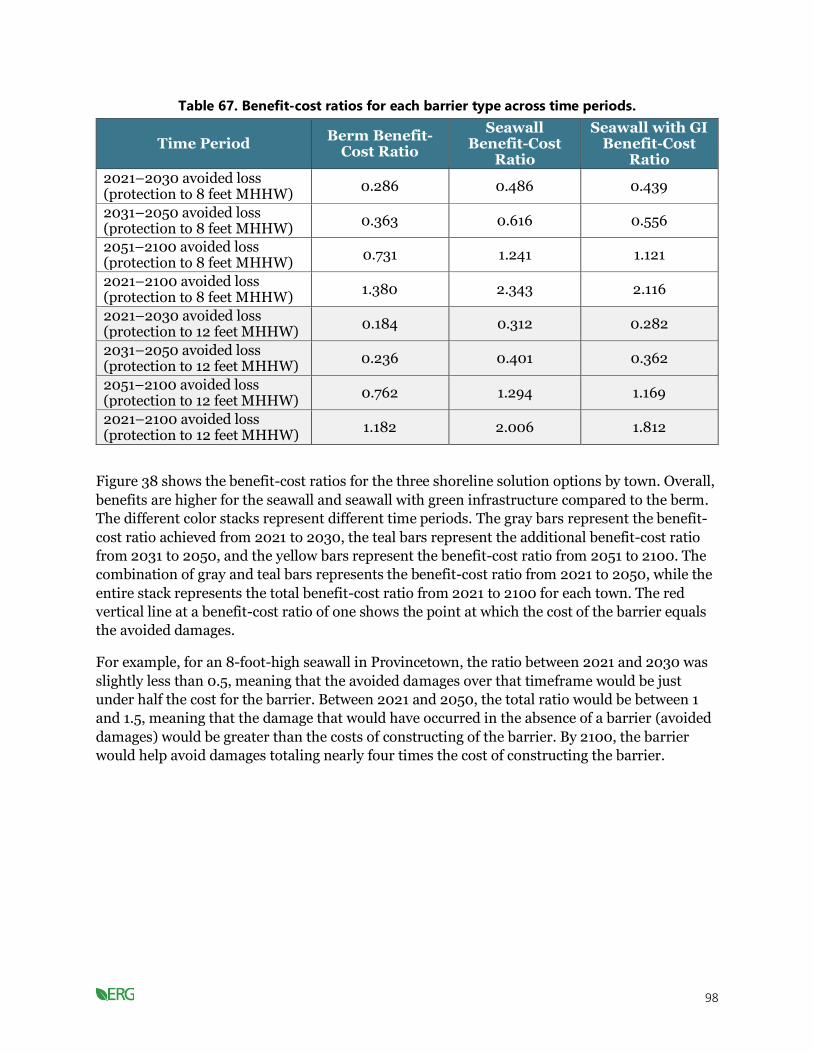
98
Table 67. Benefit-cost ratios for each barrier type across time periods.
Time Period Berm Benefit-
Cost Ratio
Seawall Benefit-Cost
Ratio
Seawall with GI Benefit-Cost
Ratio
2021–2030 avoided loss (protection to 8 feet MHHW)
0.286 0.486 0.439
2031–2050 avoided loss (protection to 8 feet MHHW)
0.363 0.616 0.556
2051–2100 avoided loss (protection to 8 feet MHHW)
0.731 1.241 1.121
2021–2100 avoided loss (protection to 8 feet MHHW)
1.380 2.343 2.116
2021–2030 avoided loss (protection to 12 feet MHHW)
0.184 0.312 0.282
2031–2050 avoided loss (protection to 12 feet MHHW)
0.236 0.401 0.362
2051–2100 avoided loss (protection to 12 feet MHHW)
0.762 1.294 1.169
2021–2100 avoided loss (protection to 12 feet MHHW)
1.182 2.006 1.812
Figure 38 shows the benefit-cost ratios for the three shoreline solution options by town. Overall,
benefits are higher for the seawall and seawall with green infrastructure compared to the berm.
The different color stacks represent different time periods. The gray bars represent the benefit-
cost ratio achieved from 2021 to 2030, the teal bars represent the additional benefit-cost ratio
from 2031 to 2050, and the yellow bars represent the benefit-cost ratio from 2051 to 2100. The
combination of gray and teal bars represents the benefit-cost ratio from 2021 to 2050, while the
entire stack represents the total benefit-cost ratio from 2021 to 2100 for each town. The red
vertical line at a benefit-cost ratio of one shows the point at which the cost of the barrier equals
the avoided damages.
For example, for an 8-foot-high seawall in Provincetown, the ratio between 2021 and 2030 was
slightly less than 0.5, meaning that the avoided damages over that timeframe would be just
under half the cost for the barrier. Between 2021 and 2050, the total ratio would be between 1
and 1.5, meaning that the damage that would have occurred in the absence of a barrier (avoided
damages) would be greater than the costs of constructing of the barrier. By 2100, the barrier
would help avoid damages totaling nearly four times the cost of constructing the barrier.

99
Figure 38. Benefit-cost ratios for shoreline solutions by town and barrier height.
LIMITATIONS AND FUTURE ANALYSIS
We considered initial building costs for each shoreline protection option, but operations and
maintenance costs and co-benefits could alter the benefit-cost ratio. Co-benefits can offset the
additional cost of green infrastructure. We assumed that any shoreline under a specific elevation
would need protection, but it is likely that some areas with little to no infrastructure on the
shoreline would not need this level of protection. In some cases, the entire shoreline may not
need a barrier, depending on the topography and flood pathway. A flood pathway analysis of
town shorelines is needed to determine the feasibility of and potential need for each type of
barrier. Additionally, there could be regulatory challenges and limitations with implementing
certain types of infrastructure such as seawalls. Future analyses could assess the costs and
benefits of using alternative types of protection, green versus gray solutions (when all co-
benefits are accounted for), multiple lines of defense in heavily developed areas, and adaptation
over time (e.g., designing a seawall so additional height can be added in the future). Further
analyses should also evaluate the costs or damages to ecosystems that could occur as a result of
building hard infrastructure, like seawalls (e.g., loss of adjacent salt marsh, erosion of nearby
beaches).

100
Adapting Shorelines to Rising Seas: Key Takeaways
• The approximate benefit-cost ratio for shoreline solutions evaluated here (sea wall, berm, and
seawall with green infrastructure) around the entire Cape is about 2:1 for protecting against up
to 12 feet of water level increase and about 2.2:1 for protecting against up to eight feet for
2021 to 2100.
• This analysis does not comprehensively quantify all costs and benefits and tradeoffs for each
shoreline solution. For example, living shorelines can provide additional public green space
and water quality improvements—benefits that are not associated with sea walls. Detailed
analysis is needed in the future to study these tradeoffs for priority shoreline adaptation areas.
Retrofit buildings located within climate hazard areas
We analyzed several strategies to retrofit buildings to protect against storm surge and SLR. We
compared the strategies against the cost of doing nothing to measure the economic benefit.
METHODS
We conducted a literature search for different methods of addressing potential damages from
SLR and storm surge.
Building-specific solutions: Building-specific solutions include raising buildings above a
floodplain and moving buildings out of a floodplain. Our literature review indicates that moving
buildings out of a floodplain is not currently practical on a large scale and is often used for
historical buildings where the historical benefit of preserving the structure outweighs the
expense of relocating it (see “Relocate Vulnerable Buildings and Structures”). Moving residential
structures would need to be cost-effective on a large scale in order to effectively protect enough
residences, and not enough research exists to form an accurate cost model (Herrmann, 2017;
Spidalieri et al., 2020). As such, we focused our assessment on the costs and benefits of raising
buildings above the floodplain. This solution is effective at protecting buildings from storm
tides, although it will not solve the issue of SLR vulnerability because it would isolate the
building.
Table 68 shows the costs of raising a building (US Army Corps of Engineers, 2015). The costs
when raising a house cover per-area and per-unit costs. For example, a 1,400-square-foot house
would have an estimated elevation cost of $132,837 (1,400 square feet * $94.88/square foot),
while a 2,000-square-foot house would have an elevation cost of $189,765. The temporary
housing cost would be around $10,835 and does not depend on the size of the house (as the
project length is often about two to four months). The contingency cost would typically be
around 25 percent of the combined subtotal for temporary housing and elevation costs ($35,918
for the 1,400-square-foot house, $143,672 * 25 percent), while the construction and
management costs would then be another 10 percent of the new subtotal. Finally, the
engineering and design costs would be around $10,835 per house no matter the area. The right
two columns in Table 68 show the subtotal and costs of each stage of raising a building to an 8-
foot standard. We used our cost of doing nothing analysis to quantify the benefits (i.e., avoided
damages) offered by protection up to 8 feet MHHW. First construction costs are equal to the

101
total construction costs, not including any operations or maintenance and without interest or
depreciation and would be $208,385 for a 1,400 square-foot house.
Table 68. Costs of raising a building 8 feet (in 2020 US$).
Category Costs/
Percentage Units
1,400 sq ft Building
Subtotals
Elevation $94.88 Per square foot $132,837 $132,837
Temporary housing $10,835 Per unit $10,835 $143,672
Contingency 25% Per unit $35,918 $179,590
Construction and management
10% Per unit $17,959 $197,550
Engineering and design $10,835 Per unit $10,835 $208,385
First construction cost $208,385
Source: (US Army Corps of Engineers, 2015)
RESULTS
Figure 39 shows the results from our building-specific analysis. Benefit-cost ratios above 1 are
considered to be economically beneficial, while ratios less than 1 are not cost-effective (and
another strategy like a buyout and retreat, which might cost approximately the value of the
building, would be more cost-effective). Between 2021 and 2030, raising buildings is not an
effective strategy, but it becomes more beneficial over time as the avoided damages increase.
Ultimately, our analysis shows that all towns will benefit from raising buildings by 2100, though
the strategy is particularly successful in Provincetown and Truro. These towns had a large
amount of damage in our cost of doing nothing analysis (Table 6) that raising buildings can
prevent.
Figure 39. Benefit-cost ratios for raising buildings by town.

102
LIMITATIONS AND FUTURE ANALYSIS
We analyzed the cost of raising all buildings within Barnstable County to 8 feet MHHW. This is
an appropriate strategy for houses but not for all buildings. Furthermore, some buildings, such
as lighthouses and piers, are likely already protected against SLR, as discussed in the cost of
doing nothing analysis. The COAST model does not account for water velocity, so storm tides
could still cause damage even when buildings are raised.
Retrofit Buildings Located Within Climate Hazard Areas: Key Takeaways
• Raising buildings has a benefit of about $3 to $5 for every dollar spent.
• Building retrofits are particularly successful in Provincetown and Truro.
• Areas with less density per mile of shoreline may benefit from building-level strategies (e.g.,
flood-proofing and raising buildings) in the near term (to prevent damage from single events).
Relocate vulnerable buildings and structures
METHODS
Our literature review indicates that moving buildings out of a floodplain is not currently
practical on a large scale, preventing us from assessing the costs and benefits of relocating
buildings across the Cape Cod region. However, relocation may be a viable path forward for
historic buildings or individual properties owners, specifically in situations where costs are not a
major object or where costs may still be a major object for historic properties but are deemed
worth it. Therefore, we have summarized cost findings and key considerations from case studies
that may be useful as this issue is inevitably raised in planning discussions.
FINDINGS
Building relocation is a complex process with costs that can vary greatly depending on the
structure size, shape, type, and distance to the new location. Estimates for labor range between
12 to 16 dollars per square foot, but that does not include many of the costs that can occur
(Knorr, 2019). Railroads, underpasses and overpasses, utility wires, and even large trees can
significantly increase the cost of moving a building.
Relocation also requires purchasing new land and building a new foundation, and it could
possibly include renovations to bring the building up to code. In Detroit, Michigan, it costs
$750,000 to move a 3,000-square-foot historic house around the block (Knorr, 2019). Building
relocation requires significant planning and becomes more difficult and time-consuming in
more densely developed areas.
The amount of effort and the large variance in cost is likely why most adaptation plans quickly
rule out relocation as a communitywide strategy. It is much more common for state and local
governments to use buyouts to move residents out of flood zones. These governments then use
the land they acquire to improve community resilience. A project in Queens, New York, is
piloting a land swap project where residents in a hazard mitigation zone can elect to receive a
newly built, elevated home in a safer area or accept a buyout for their property from the city

103
(Spidalieri et al., 2020). In exchange, they transfer their title to the city, which demolishes the
lots and uses them to build flood resilience. Many buyout programs also receive financial
support from the state and federal government. Land acquisition as a form of adaptation
requires support from all homeowners to be effective. Some communities may not find
relocation to be an appealing option and may want to retrofit their houses and armor the
shoreline instead.
Discussion of When to Implement Certain Types of Adaptation
Strategies
This presents discussion of when to implement the adaptation strategies presented above. For
more densely developed areas, it may be more economical for towns to invest in shoreline
solutions rather than raising individual buildings. However, our analysis points to the need to
consider the range of costs and benefits that each shoreline strategy provides, as avoided
property damage and construction costs alone do not provide a complete picture. Living
shorelines, constructed wetlands, and beach restoration projects provide multiple co-benefits,
including additional public green space, erosion prevention, and water quality improvements.
Berms require more space to build but can be integrated into trail systems to provide public
access to recreation. Seawalls and levees have less adaptive capacity than green infrastructure,
but floodwalls and levees may be better at reducing flooding given their height compared to
wetlands and living shorelines. USACE recommends combining measures to improve
redundancies and increase resilience.
Table 69. Benefits of shoreline strategies.
Solution Co-
Benefits Flooding Erosion
Wave
Attenuation
Adaptive
Capacity Recommended Use
Raise properties Low High Low Low Low Less densely populated
areas
Buyouts High High High High High In areas with severe and
frequent flooding
Move structures Low High Low Low Low Preserving historical
buildings
Seawall Low High None Low Low Areas with densely
developed shoreline
Seawall with GI Medium High None Medium Low Areas with densely
developed shoreline
Berm Medium High Medium Low Medium
In densely developed
areas with some space
between the shoreline
and development
Source: (US Army Corps of Engineers, 2015)
Shoreline solutions may only be cost-effective in densely populated areas and for high-value
properties and assets. An analysis of topography and flood pathways is needed to effectively plan
shoreline solutions. Analyzing the difference between densely and sparsely populated areas may
change the outcomes of our benefit-cost analysis. Combining strategies could provide better

104
flood protection in some areas while creating green space with segments of living shorelines in
other areas; therefore, the benefits and costs of combined measures should be evaluated.
While we have focused on solutions that protect to a certain design standard (i.e., a certain level
of flooding), wetland restoration and natural solutions—which do not always protect to a design
standard—have been shown to have a strong return on investment. Most importantly, they come
with strong co-benefits such as recreation, fisheries, and carbon sequestration that often make
these the best solution. Moreover, engineered solutions like seawalls often have negative
environmental impacts, which we did not account for in our study. There could be substantial
regrets (both aesthetically and financially) to invest so heavily in gray infrastructure because of
the uncertainty of SLR over the next 70 years.
Address vulnerabilities in the road network
Flooded roads may isolate properties from the road network and/or decrease the property value
of nearby properties even if they are not explicitly flooded (see SLR impacts to tax revenue).
Clearly, this creates major evacuation concerns. Land buyouts of properties that become isolated
from the road network may be necessary. This analysis also supports adapting critical
transportation infrastructure for climate change impacts.
METHODS
Building on our cost of doing nothing analysis, we calculated the potential loss in tax revenue
from isolated homes and properties within ¼ mile of flooded roads from 1 to 6 feet MHHW of
SLR using the Cape Cod Commission’s data layers of roads exposed to SLR. We then
interpolated and extrapolated this tax loss from 2021 to 2100. To determine the potential costs
associated with land buyouts of isolated homes, we calculated the total land value of isolated
homes for 1 to 6 feet MHHW of SLR. These values represent the benefit from fixing roads,
allowing residents to remain in place rather than relocate through a buyout program. Homes
were only counted as isolated if less than 50 percent of the property is expected to flood (if
greater than 50 percent, the property is considered a loss). We already calculated the costs of
adaptation from fixing roads in Table 23 of our cost of doing nothing analysis.
RESULTS
If no roads on Cape Cod that are projected to flood from SLR are fixed or raised, then the region
could lose on average $0.36 and $0.51 million in tax revenue each year from isolated homes and
properties located near flooded roads, respectively, until 2030 (see tables in Appendix B). This
number could increase with a program that buys out properties that become isolated from
flooding (Figure 40). Most of the expected tax revenue loss will be from devaluation of
properties within ¼ mile of flooded roads (Figure 40).

105
Figure 40. Average lost tax revenue per year from isolated homes and properties near flooded
roads.
Table 70. Land values of homes isolated with each foot of SLR in millions of 2020$
(cumulative).
Town 1 ft
MHHW (2040)
2 ft MHHW (2054)
3 ft MHHW (2066)
4ft MHHW (2076)
5ft MHHW (2085)
6ft MHHW (2093)
Barnstable 10.2 25.06 55.38 49.09 24.6 1.98 Bourne 11.54 30.38 60.88 40.1 26.14 0.53 Brewster NA 0.64 0.97 1.61 1.28 NA Chatham 42.93 33.98 37.01 36.58 14.22 2.38 Dennis 16.57 24.45 18.81 19.88 20.65 2.57 Eastham 0.48 18.45 16.84 16.77 10.72 0.32 Falmouth 12.93 23.88 74.75 52.56 41.16 2.72 Harwich 1.13 1.46 15.22 25.05 11.57 NA Mashpee NA 2.77 16.92 18.9 22.56 0.56 Orleans NA 0.75 17.92 19.77 8.56 0.71 Provincetown 4.36 5.66 24.81 65.34 26.36 2.34 Sandwich 74.25 64.68 53.59 42.34 17.51 1.23 Truro 21.07 16.72 15.5 10.41 4.83 3.16 Wellfleet 15.23 13.56 14.69 12.81 8.88 5.54 Yarmouth 7.77 37.2 42.41 55 31.44 2.18 Total 218.46 299.64 465.7 466.21 270.48 26.22
To better understand the benefits and costs of fixing flooded roads, we outlined some
hypothetical scenarios.
106
1 FOOT MHHW OF SLR IN 2040
With 1 foot MHHW of SLR projected in 204, 13.7 miles of road will flood on Cape Cod. This
equates to $3.2 and $4.6 million of lost tax revenue from isolated homes and properties located
near flooded roads, respectively. Buyout of land from isolated homes would equate to $218.5
million in total land value. So, the total cost of not fixing any of the flooded roads would be
$226.3 million (in $2020).
The cost of rebuilding every mile of flooded road at $7 million per mile would be $95.9 million
(see Table 23). However, the cost of fixing every mile of road would likely be much greater, as
just rebuilding a flooded road may not be a permanent fix, and some roads may need to be
elevated. Elevating roads can often cost many times more than a repair; for example, a recent
project in Florida cost $60 million per elevated mile (Harris, n.d.). If we assume that all flooded
roads in Barnstable County are elevated, this could amount to over $800 million. However,
these costs may be overestimates, as there are likely optimum strategies that combine elevating,
rebuilding, protecting, and abandoning flooded roads. The exact planning combination would
require substantially more study.
LIMITATIONS AND FUTURE ANALYSIS
This analysis only considers hypothetical scenarios of the costs associated with fixing or
elevating flooded roads. A more in-depth cost analysis should identify specific roads that lead to
areas of importance for Barnstable County. Additionally, this analysis does not include costs
associated with seawalls or other coastal protection measures that may preclude some roads
from flooding.
Addressing Vulnerabilities in the Road Network: Key Takeaways
• Flooded roads will lead to the loss of approximately $290 million in tax revenue between 2021
and 2100 and will isolate just over $1 billion in property.
• To rebuild the 212 miles of roads expected to be flooded by 2100 would cost about $1.4
billion. Raising these roads might be eight to 10 times that.
• The cost of raising all roads will far exceed the benefit of the avoided financial losses. Raising
roads will be most cost-effective for segments that serve highly traveled or critical routes.
• Shoreline solutions that can both protect buildings and keep roads dry will provide a dual
benefit and make economic sense in denser areas.
Conclusion and Next Steps
This technical reported has presented results and findings that demonstrate the large and
accelerating costs Barnstable County faces if it does not adapt to climate change. Additionally,
there are paths to meet 2030 and 2050 emissions reductions goals that align with the goals for
the Commonwealth of Massachusetts; however, achieving these goals will require aggressive
electrification and renewable energy implementation. Finally, many strategies with strong
returns on investment can help offset the impacts of climate change or mitigate emissions. The
summary report provides a consolidated version of this report focused on key findings.

107
References
Adrion, E. R., Aucott, J., Lemke, K. W., & Weiner, J. P. (2015). Health Care Costs, Utilization and Patterns of Care following Lyme Disease. PLOS ONE, 10(2), e0116767.
https://doi.org/10.1371/journal.pone.0116767
Aerts, J. C. J. H., Boutzen, W. J. W., de Moel, H., & Bowman, M. (2013). Cost estimates for flood resilience and protection strategies in New York City. Annals of the New York Academy of Sciences, 1294(Cost Estimates for Flood Resilience and Protection Strategies in New York City), 1–104.
Andrews, B., Schwab, W., Sampson, D., & Baldwin, W. (2018). Continuous Bathymetry and Elevation Models of the Massachusetts Coastal Zone and Continental Shelf [Data set]. U.S.
Geological Survey. https://doi.org/10.5066/F72806T7
ArboNET Disease Maps. (2020). Retrieved December 23, 2020, from https://wwwn.cdc.gov/arbonet/Maps/ADB_Diseases_Map/index.html
Armstrong, C. (2016). Cranberries and a Changing Climate.
Blue Marble Geographics. (2020). Coastal Adaptation to Sea Level Rise Tool (Version 1.1) [Computer software]. https://www.bluemarblegeo.com/products/COAST-download.php
BNEF EVO Report 2020 | BloombergNEF | Bloomberg Finance LP. (n.d.). BloombergNEF. Retrieved January 13, 2021, from https://about.bnef.com/electric-vehicle-outlook/
UCLA Luskin Center for Innovation. (2019). California Building Decarbonization Workforce Needs and Recommendations. Retrieved December 21, 2020, from https://innovation.luskin.ucla.edu/california-building-decarbonization/
California Energy Commission, & National Renewable Energy Laboratory. (n.d.). Alternative Fuels Data Center: Electric Vehicle Infrastructure Projection Tool (EVI-Pro) Lite. Retrieved December 23, 2020, from https://afdc.energy.gov/evi-pro-lite
Cape Cod Blue Economy Project. (2019). Cape Cod Blue Economy Project: A Call to Action. Cape Cod Blue Economy Project. https://www.bluecapecod.org/wp-content/uploads/2019/07/Cape-Cod-Blue-Economy-Project-Implementation-Plan-012219.pdf
Carr, J., D’Odorico, P., McGlathery, K., & Wiberg, P. (2012). Modeling the effects of climate change on eelgrass stability and resilience: Future scenarios and leading indicators of collapse. Marine Ecology Progress Series, 448, 289–301. https://doi.org/10.3354/meps09556
Center for Agriculture, Food and the Environment. (2016, October 6). Farm Real Estate Values [Text]. Center for Agriculture, Food and the Environment. https://ag.umass.edu/resources/massachusetts-agricultural-data/farm-real-estate-values
Cole, S. G., & Moksnes, P.-O. (2016). Valuing Multiple Eelgrass Ecosystem Services in Sweden: Fish Production and Uptake of Carbon and Nitrogen. Frontiers in Marine Science, 2. https://doi.org/10.3389/fmars.2015.00121

108
Commons, R. L. / F. / C. (n.d.). In Massachusetts, offshore wind opens up job training, economic opportunities. Energy News Network. Retrieved December 22, 2020, from https://energynews.us/2020/08/17/northeast/as-job-training-emerges-massachusetts-fishing-towns-warm-up-to-offshore-wind/
Cooley, S. R., & Doney, S. C. (2009). Anticipating ocean acidification’s economic consequences for commercial fisheries. Environmental Research Letters, 4(2), 024007. https://doi.org/10.1088/1748-9326/4/2/024007
Crosby, S. C., Sax, D. F., Palmer, M. E., Booth, H. S., Deegan, L. A., Bertness, M. D., & Leslie, H. M. (2016). Salt marsh persistence is threatened by predicted sea-level rise. Estuarine, Coastal and Shelf Science, 181, 93–99. https://doi.org/10.1016/j.ecss.2016.08.018
Dahl, K., Licker, R., Abatzoglou, J. T., & Declet-Barreto, J. (2019). Increased frequency of and population exposure to extreme heat index days in the United States during the 21st century. Environmental Research Communications, 1(7), 075002. https://doi.org/10.1088/2515-7620/ab27cf
Fager, Hayley. (2019). As Dunes Disappear, Fiber Rolls Protect Cape Cod Homes From Coastal Erosion. NPR.Org. https://www.npr.org/2019/04/09/711097302/as-dunes-disappear-fiber-rolls-protect-cape-cod-homes-from-coastal-erosion
Department of Energy. (2015). Weatherization Assistance Program Factsheet.
DOE. (n.d.). Alternative Fuels Data Center: Alternative Fueling Station Locator. Retrieved December 22, 2020, from https://afdc.energy.gov/stations/#/find/nearest?fuel=ELEC
Drake, K., Halifax, H., Adamowicz, S., & Craft, C. (2015). Carbon Sequestration in Tidal Salt Marshes of the Northeast United States. Environmental Management, 56. https://doi.org/10.1007/s00267-015-0568-z
Eastern Research Group. (2020). Assessing the Impacts Climate Change May Have on the State’s Economy, Revenues, and Investment Decisions: Volume 4: Economic Analyses of Adaptation and Mitigation Strategies. Prepared for State of Maine Department of the Governor’s Office of Policy Innovation and the Future (GOPIF). https://www.maine.gov/future/sites/maine.gov.future/files/inline-files/ERG_MCC_Vol4_EconomicAnalysesOfStrategies_11-25-20.pdf
Eelgrass | Northeast Ocean Data Portal. (n.d.). Retrieved December 10, 2020, from https://www.northeastoceandata.org/eelgrass/
EERE. (2017). Cold Climate Air-Source Heat Pumps: An Innovative Technology to Stay Warm in Winter and Cool in Summer. Energy.Gov. https://www.energy.gov/eere/buildings/articles/cold-climate-air-source-heat-pumps-innovative-technology-stay-warm-winter
EIA. (2020). Levelized Cost and Levelized Avoided Cost of New Generation Resources (p. 22).
Energy.gov. (n.d.). Heat Pump Systems. Heat Pump Systems. Retrieved December 21, 2020, from https://www.energy.gov/energysaver/heat-and-cool/heat-pump-systems

109
ENOW. (n.d.). Retrieved December 17, 2020, from https://coast.noaa.gov/enowexplorer/#/employment/livingresources/2017/25001
Health Care Cost Institute. (2015). ER spending increased 85%, driven by price increases for the most severe cases (2009-2015). (n.d.). Retrieved December 23, 2020, from https://healthcostinstitute.org/emergency-room/er-spending-increased-85-driven-by-price-increases-for-the-most-severe-cases-2009-2015
Federal Highway Administration. (2018). Annual Vehicle Distance Traveled in Miles and Related Data. https://www.fhwa.dot.gov/policyinformation/statistics/2018/pdf/vm1.pdf
Feely, R., Doney, S., & Cooley, S. (2009). Ocean Acidification: Present Conditions and Future Changes in a High-CO2 World. Oceanography, 22(4), 36–47. https://doi.org/10.5670/oceanog.2009.95
Flood Insurance | FEMA.gov. (n.d.). Retrieved January 13, 2021, from https://www.fema.gov/flood-insurance
Ford, K., & Carr, J. (2016). Eelgrass loss over time in Duxbury, Kingston, and Plymouth Bays, Massachusetts (pp. 1–44). Massahusetts Division of Marine Fisheries. https://www.mass.gov/doc/eelgrass-loss-over-time-in-duxbury-kingston-and-plymouth-bays-massachusetts/download
Grabowski, J., Brumbaugh, R., Conrad, R., Keeler, A., Opaluch, J., Peterson, C., Piehler, M., Powers, S., & Amyth, A. (2012). Economic Valuation of Ecosystem Services Provided by Oyster Reefs. BioScience, 62, 900–909. https://doi.org/doi:10.1525/bio.2012.62.10.10
Harris, A. (n.d.). At $60 million a mile, the Keys may abandon some roads to sea rise rather than raise them. Miamiherald. Retrieved December 23, 2020, from https://www.miamiherald.com/news/local/environment/article238040499.html
Heat Stress Hospitalization | MEPHT. (2020). https://matracking.ehs.state.ma.us/Health-Data/heat-stress-hospitalization.html
Heberger, M., Cooley, H., Herrera, P., Gleick, P. H., & Moore, E. (2009). THE IMPACTS OF SEA-LEVEL RISE ON THE CALIFORNIA COAST. 115.
Herrmann, V. (2017). The United States’ Climate Change Relocation Plan (p. 14). Atlantic Council. https://www.thearcticinstitute.org/wp-content/uploads/2017/09/The-United-States-Climate-Change-Relocation-Plan_2017.pdf
Homewyse Calculator: Heat Pump System prices, options and installation costs. (n.d.). Homewyse. Retrieved December 23, 2020, from http://www.homewyse.com/costs/cost_of_heat_pump_systems.html
Interagency Working Group on Social Cost of Carbon. (2010). Technical Support Document: Social Cost of Carbon for Regulatory Impact Analysis Under Executive Order 12866. https://obamawhitehouse.archives.gov/sites/default/files/omb/inforeg/for-agencies/Social-Cost-of-Carbon-for-RIA.pdf
IRENA. (2020). Renewable Power Generation Costs in 2019. http://publications/2020/Jun/Renewable-Power-Costs-in-2019
110
Keer, G. (2021, January 7). Cost of wetland restoration in Massachusetts [Video call].
Kennedy, J., McNally, S., Schillaci, C., & Silva, J. (2020). Massachusetts Shellfish Initiative Assessment Report (p. 291). http://www.massshellfishinitiative.org/uploads/1/0/4/9/104987295/assessment_committee_report_2020.pdf
Keppel, E., Scrosati, R., & Courtenay, S. (2012). Ocean Acidification Decreases Growth and Development in American Lobster (Homarus americanus) Larvae. Journal of Northwest Atlantic Fishery Science, 44, 61–66.
Kim, M., Qin, L.-Z., Kim, S. H., Song, H.-J., Kim, Y. K., & Lee, K.-S. (2020). Influence of Water Temperature Anomalies on the Growth of Zostera marina Plants Held Under High and Low Irradiance Levels. Estuaries and Coasts, 43(3), 463–476. https://doi.org/10.1007/s12237-019-00578-2
Kneib, R. T. (2003). Bioenergetic and landscape considerations for scaling expectations of nekton production from intertidal marshes. Marine Ecology Progress Series, 264, 279–296.
Lazard. (2020a). Lazard’s Levelized Cost of Energy Analysis—Version 13.0 (p. 21).
Lazard. (2020b). Lazard’s Levelized Cost of Storage Analysis—Version 6.0 (p. 40).
MA Department of Agricultural Resources. (2016). The Massachusetts Cranberry Revitalization Task Force Final Report (p. 61).
MA Division of Ecological Restoration. (2018). DER’s New Cranberry Bog Program | Mass.gov. https://www.mass.gov/news/ders-new-cranberry-bog-program
Massachusetts Clean Energy Center. (2018, April 26). 2018 Massachusetts Offshore Wind Workforce Assessment. https://files.masscec.com/2018%20MassCEC%20Workforce%20Study.pdf
Massachusetts Clean Energy Center. (2020). Your Guide to Air-Source Heat Pumps. https://goclean.masscec.com/wp-content/uploads/2020/11/MassCEC_ASHP_GUIDE_V2.pdf
Massachusetts Executive Office of Energy and Environmental Affairs. (2020) Draft Climate
Resilience Design Standards Outputs and Relationships for Sea Level Rise/Storm Surge,
Precipitation, and Heat. https://www.mass.gov/info-details/resilient-ma-action-team-rmat
Massachusetts Executive Office of Energy and Environmental Affairs, & The Cadmus Group. (2020). Massachusetts 2050 Decarbonization Roadmap. https://www.mass.gov/info-details/ma-decarbonization-roadmap
Mass.gov. (2020). Household Heating Costs | Mass.gov. Household Heating Costs. https://www.mass.gov/info-details/household-heating-costs
McAlpine, S. A., & Porter, J. R. (2018). Estimating Recent Local Impacts of Sea-Level Rise on Current Real-Estate Losses: A Housing Market Case Study in Miami-Dade, Florida. Population Research and Policy Review, 37(6), 871–895. https://doi.org/10.1007/s11113-018-9473-5

111
McCay, D. P. F., & Rowe, J. J. (2003). Habitat restoration as mitigation for lost production at multiple trophic levels. Marine Ecology Progress Series, 264, 233–248.
Monthly Tickborne Disease Reports | Mass.gov. (2020). Retrieved December 23, 2020, from https://www.mass.gov/lists/monthly-tickborne-disease-reports
Moran. (2019). The State Wants To Turn Cranberry Bogs Into Wetlands. It’s Gritty Work. https://www.wbur.org/earthwhile/2019/11/26/transforming-cranberry-farmers-wetlands-cape-cod
Naylor, L., Kippen, H., Coombes, M., Horton, B., MacArthur, M., & Jackson, N. (2017). Greening the Grey: A framework for integrated green grey infrastructure. University of Glasgow. http://eprints.gla.ac.uk/150672/37/150672Full.pdf
New England Agricultural Statistics Service. (2020). USDA Forecasts Record-High Cranberry Production in Massachusetts in 2020 (p. 1). United States Department of Agriculture.
NOAA. (2013). What Will Adaptation Cost? https://coast.noaa.gov/data/digitalcoast/pdf/adaptation-report.pdf
NREL. (2015). Transparent Cost Database | Transparent Cost Database. https://openei.org/apps/TCDB/
NREL, McMillan, C., Steinberg, D., Muratori, M., Vimmerstedt, L., & Mai, T. (2017). Electrification Futures Study: End-Use Electric Technology Cost and Performance Projections through 2050 (p. 108). NREL. https://www.nrel.gov/docs/fy18osti/70485.pdf
Opaluch, J. J., & Hwang, J. (2018). Benefit Transfer Study Technical Memo.
Pratt, B. W., & Erickson, J. D. (2020). Defeat the Peak: Behavioral insights for electricity demand response program design. Energy Research & Social Science, 61, 101352. https://doi.org/10.1016/j.erss.2019.101352
Prevedouros, P., & Mitropoulos, L. (2016). Life Cycle Emissions and Cost Study of Light Duty Vehicles. Transportation Research Procedia, 15, 749–760. https://doi.org/10.1016/j.trpro.2016.06.062
Puy, C. D., & Muramoto, J. A. (2015). Inventory of Cape Cod Salt Marshes with the Best Migration Potential. 33.
Report of the Massachusetts Coastal Erosion Commission Volume 1: Findings and Recommendations. (2015). 138.
RGGI. (2017). Principles to Accompany Model Rule Amendments.pdf. Regional Greenhouse Gas Initiative. https://www.rggi.org/sites/default/files/Uploads/Program-Review/12-19-2017/Principles_Accompanying_Model_Rule.pdf
Rheuban, J. E., Doney, S. C., Cooley, S. R., & Hart, D. R. (2018). Projected impacts of future climate change, ocean acidification, and management on the US Atlantic sea scallop (Placopecten magellanicus) fishery. PLOS ONE, 13(9), e0203536. https://doi.org/10.1371/journal.pone.0203536
112
Roberts, M. D., Bullard, L., Sleet, K., & Aflague, S. (2015). Coastal Erosion in Cape Cod, Massachusetts: Finding Sustainable Solutions. 20.
Smith, S. (2017). Multidecadal Trends in Atmospheric and Ocean Conditions in Offshore Waters Near Cape Cod, Massachusetts. Northeastern Naturalist, 24, 467–482. https://doi.org/10.1656/045.024.0406
Spidalieri, K., Smith, I., & Grannis, J. (2020). Managing the Retreat from Rising Seas (p. 132). https://www.georgetownclimate.org/files/MRT/GCC_20_FULL-3web.pdf
Technologies Matrix | Cape Cod Commission. (n.d.). Retrieved December 20, 2020, from https://www.capecodcommission.org/our-work/technologies-matrix/
The Solar Foundation. (2015, January 15). National Solar Jobs Census 2014. The Solar Foundation. https://www.thesolarfoundation.org/national-solar-jobs-census-2014/
Vineyard Wind. (2019). Training an offshore wind workforce. Retrieved December 22, 2020, from https://www.vineyardwind.com/in-the-news/2019/5/28/training-an-offshore-wind-workforce
United States Army Corps of Engineers. (2003). Economic Guidance Memorandum (EGM) 04-01, Generic Depth-Damage Relationships for Residential Structures with Basements. https://planning.erdc.dren.mil/toolbox/library/EGMs/egm04-01.pdf
U.S Army Corps of Engineers. (2015). North Atlantic Coast Comprehensive Study: Reslient Adaptation to Increasing Risk Appendix C.
U.S Army Corps of Engineers. (2019). NEW YORK-NEW JERSEY HARBOR AND TRIBUTARIES NEW YORK DISTRICT: Interim Report Cost Appendix (pp. 1–24).
U.S. Department of Energy. (2018). Weatherization Works! Factsheet. https://www.energy.gov/sites/prod/files/2018/03/f49/WAP-fact-sheet_final.pdf
U.S EPA. (2013). Estimating the Benefit per Ton of Reducing PM2.5 Precursors from 17 Sectors [Data and Tools]. US EPA. https://www.epa.gov/sites/production/files/2014-10/documents/sourceapportionmentbpttsd.pdf
U.S EPA, OAR. (2016, July 1). Climate Change Indicators: Lyme Disease [Reports and Assessments]. US EPA. https://www.epa.gov/climate-indicators/climate-change-indicators-lyme-disease
U.S EPA, OW. (2015, April 9). Why are Wetlands Important? [Overviews and Factsheets]. US EPA. https://www.epa.gov/wetlands/why-are-wetlands-important
U.S. Fish and Wildlife Service. (2018). Hurricane Sandy Recovery. https://www.fws.gov/hurricane/sandy/projects/ParkersRiverWatershed.html
USDA 2019 State Agriculture Overview for Massachusetts. (2020). 2019 State Agricultural Overview for Massachusetts. https://www.nass.usda.gov/Quick_Stats/Ag_Overview/stateOverview.php?state=MASSACHUSETTS

113
USGCRP. (2018). Fourth National Climate Assessment. https://nca2018.globalchange.govhttps://nca2018.globalchange.gov/chapter/18
Waycott, M., Duarte, C. M., Carruthers, T. J. B., Orth, R., Dennison, W., Olyarnik, S., Calladine, A., Fourqurean, J., Heck Jr., K., Hughes, R., Kendrick, G., Kenworthy, J., Short, F. T., & Williams, S. L. (2009). Hypsometry of Cape Cod Salt Marshes (Massachusetts, U.S.A.) and Predictions of Marsh Vegetation Responses to Sea-Level Rise—ProQuest. PNAS, 106(30), 12377–12381. https://doi.org/10.1073/pnas.0905620106
Zhang, X., Meltzer, M. I., Peña, C. A., Hopkins, A. B., Wroth, L., & Fix, A. D. (2006). Economic impact of Lyme disease. Emerging Infectious Diseases, 12(4), 653–660. https://doi.org/10.3201/eid1204.050602

A-1
Appendices
Appendix A. NAICS Codes in Blue Economy
Table A-1. NAICS codes used to determine blue economy businesses.
NAICS NAICS Description Blue Level
112511 Finfish Farming And Fish Hatcheries 3
112512 Shellfish Farming 3
112519 Other Aquaculture 3
114111 Finfish Fishing 3
114112 Shellfish Fishing 3
114119 Other Marine Fishing 3
211111 Crude Petroleum and Natural Gas Extraction 2
212321 Construction Sand and Gravel Mining 2
213111 Drilling Oil and Gas Wells 2
213112 Support Activities for Oil and Gas Operations 2
213113 Support Activities for Coal Mining 1
213114 Support Activities for Metal Mining 1
213115 Support Activities for Nonmetallic Minerals (except Fuels) Mining
1
221111 Hydroelectric Power Generation 3
221115 Wind Electric Power Generation 1
221118 Other Electric Power Generation 1
221122 Electric Power Distribution 1
236210 Industrial Building Construction 1
236220 Commercial and Institutional Building Construction 1
237110 Water And Sewer Line And Related Structures Construction
2
237120 Oil and Gas Pipeline and Related Structures Construction 2
237130 Power and Communication Line and Related Structures Construction
1
237990 Other Heavy and Civil Engineering Construction 2
238210 Electrical Contractors and Other Wiring Installation Contractors
1
238220 Plumbing, Heating, and Air-Conditioning Contractors 1
238320 Painting and Wall Covering Contractors 1
238350 Finish Carpentry Contractors 1
238990 All Other Specialty Trade Contractors 1
311712 Fresh and Frozen Seafood Processing 3
314910 Textile and Canvas 3
321114 Wood Preservation 1
324110 Petroleum Refineries 2

A-2
NAICS NAICS Description Blue Level
325510 Paint and Coating Manufacturing 1
331210 Iron and Steel Pipe and Tube Manufacturing from Purchased Steel
2
331221 Rolled Steel Shape Manufacturing 2
331314 Secondary Smelting and Alloying of Aluminum 2
331315 Aluminum Sheet, Plate, and Foil Manufacturing 2
331512 Steel Investment Foundries 2
332312 Fabricated Structural Metal Manufacturing 2
332313 Plate Work Manufacturing 2
332322 Sheet Metal Work Manufacturing 2
332410 Power Boiler and Heat Exchanger Manufacturing 2
332420 Metal Tank (Heavy Gauge) Manufacturing 2
332510 Hardware Manufacturing 2
332710 Machine Shops 2
332999 All Other Miscellaneous Fabricated Metal Product Manufacturing
2
333132 Oil and Gas Field Machinery and Equipment Manufacturing
2
333612 Speed Changer, Industrial High-Speed Drive, and Gear Manufacturing
2
333618 Other Engine Equipment Manufacturing 2
333923 Overhead Traveling Crane, Hoist, and Monorail System Manufacturing
2
333992 Welding and Soldering Equipment Manufacturing 2
334220 Radio and Television Broadcasting and Wireless Communications Equipment Manufacturing
2
334290 Other Communications Equipment Manufacturing 2
334511 Search, Detection, Navigation, Guidance, Aeronautical, and Nautical System and Instrument Manufacturing
3
334519 Other Measuring And Controlling Device Manufacturing 2
335314 Relay and Industrial Control Manufacturing 2
335911 Storage Battery Manufacturing 2
336214 Travel Trailer and Camper Manufacturing 1
336611 Ship Building and Repairing 3
336612 Boat Building 3
336999 All Other Transportation Equipment Manufacturing (ATVs, gocarts, golf carts, snowmobiles)
1
337127 Institutional Furniture Manufacturing 1
339920 Sporting and Athletic Goods Manufacturing 2
423510 Metal Service Centers and Other Metal Merchant Wholesalers
2
423610 Electrical Apparatus and Equipment, Wiring Supplies, and Related Equipment Merchant Wholesalers
2

A-3
NAICS NAICS Description Blue Level
423620 Household Appliances, Electric Housewares, and Consumer Electronics Merchant Wholesalers
1
423690 Other Electronic Parts and Equipment Merchant Wholesalers
2
423710 Hardware Merchant Wholesalers 2
423720 Plumbing and Heating Equipment and Supplies (Hydronics) Merchant Wholesalers
1
423740 Refrigeration Equipment and Supplies Merchant Wholesalers
1
423810 Construction and Mining (except Oil Well) Machinery and Equipment Merchant Wholesalers
2
423830 Industrial Machinery and Equipment Merchant Wholesalers
2
423840 Industrial Supplies Merchant Wholesalers 2
423860 Transportation Equipment and Supplies (except Motor Vehicle) Merchant Wholesalers
2
423910 Sporting and Recreational Goods and Supplies Merchant Wholesalers
2
423930 Recyclable Material Merchant Wholesalers 2
424460 Fish and Seafood Merchant Wholesalers 3
424710 Petroleum Bulk Stations and Terminals 2
424720 Petroleum and Petroleum Products Merchant Wholesalers (except Bulk Stations and Terminals)
2
424990 Other Miscellaneous Nondurable Goods Merchant Wholesalers
2
441210 Recreational Vehicle Dealers 1
441221 Motorcycle, ATV, and Personal Watercraft Dealers 3
441222 Boat Dealers 3
441228 Motorcycle, ATV, and All Other Motor Vehicle Dealers 1
444130 Hardware Stores 1
444190 Other Building Material Dealers 2
444210 Outdoor Power Equipment Stores 1
445220 Fish and Seafood Markets 3
447190 Other Gasoline Stations 1
451110 Sporting Goods Stores 2
481111 Scheduled Passenger Air Transportation 1
481211 Nonscheduled Chartered Passenger Air Transportation 1
483113 Coastal and Great Lakes Freight Transportation 3
483114 Coastal and Great Lakes Passenger Transportation 3
483211 Inland Water Freight Transportation 3
484220 Specialized Freight (except Used Goods) Trucking, Local 1
484230 Specialized Freight (except Used Goods) Trucking, Long-Distance
1
486110 Pipeline Transportation of Crude Oil 2

A-4
NAICS NAICS Description Blue Level
486210 Pipeline Transportation of Natural Gas 2
486910 Pipeline Transportation of Refined Petroleum Products 2
486990 All Other Pipeline Transportation 2
487210 Scenic and Sightseeing Transportation, Water 3
487990 Scenic and Sightseeing Transportation, Other 2
488119 Other Airport Operations 1
488190 Other Support Activities for Air Transportation 1
488310 Port and Harbor Operations 3
488320 Marine Cargo Handling 3
488330 Navigational Services to Shipping 3
488390 Other Support Activities for Water Transportation 3
488510 Freight Transportation Arrangement 1
488999 All Other Support Activities for Transportation 2
493110 General Warehousing and Storage 1
493120 Refrigerated Warehousing and Storage 1
493190 Other Warehousing and Storage 1
517210 Wireless Telecommunications Carriers (except Satellite) 1
522110 Commercial Banking 1
522120 Savings Institutions 1
522130 Credit Unions 1
522190 Other Depository Credit Intermediation 1
522220 Sales Financing 1
522291 Consumer Lending 1
523110 Investment Banking and Securities Dealing 1
524126 Direct Property and Casualty Insurance Carriers 1
524127 Direct Title Insurance Carriers 1
524130 Reinsurance Carriers 1
524210 Insurance Agencies and Brokerages 1
531120 Lessors of Nonresidential Buildings (except Miniwarehouses)
1
532120 Truck, Utility Trailer, and RV (Recreational Vehicle) Rental and Leasing
1
532292 Recreational Goods Rental 1
532411 Commercial Air, Rail, and Water Transportation Equipment Rental and Leasing
3
532412 Construction, Mining, and Forestry Machinery and Equipment Rental and Leasing
2
532490 Other Commercial and Industrial Machinery and Equipment Rental and Leasing
2
541110 Offices of Lawyers 1
541199 All Other Legal Services 1
541330 Engineering Services 2

A-5
NAICS NAICS Description Blue Level
541340 Drafting Services 1
541360 Geophysical Surveying and Mapping Services 3
541370 Surveying and Mapping (except Geophysical) Services 3
541420 Industrial Design Services 1
541614 Process, Physical Distribution, and Logistics Consulting Services
1
541620 Environmental Consulting Services 3
541711 Research and Development In Biotechnology 2
541712 Research and Development in the Physical, Engineering, and Life Sciences (except Biotechnology)
2
541990 All Other Professional, Scientific, and Technical Services 2
555555 Fish and Seafood Wholesaler 3
561311 Employment Placement Agencies 1
561599 All Other Travel Arrangement and Reservation Services 1
561990 All Other Support Services 1
562910 Remediation Services 1
611310 Colleges, Universities, and Professional Schools 1
611430 Professional and Management Development Training 2
611513 Apprenticeship Training 2
611519 Other Technical and Trade Schools 2
611620 Sports and Recreation Instruction 2
611699 All Other Miscellaneous Schools and Instruction 2
611710 Educational Support Services 1
711510 Independent Artists, Writers, and Performers 2
712110 Museums 2
712120 Historical Sites 2
712130 Zoos and Botanical Gardens 2
712190 Nature Parks and Other Similar Institutions 3
713930 Marinas 3
713990 All Other Amusement and Recreation Industries 2
721110 Hotels (except Casino Hotels) and Motels 2
721110 Hotels/Motels/BnBs 2
721110 Hotels/Motels/BnBs 2
721191 Bed-and-Breakfast Inns 2
721191 Hotels/Motels/BnBs 2
721191 Hotels/Motels/BnBs 2
721199 Hotels/Motels/BnBs 2
721199 Hotels/Motels/BnBs 2
721199 Hotels/Motels/BnBs 2
721199.1 Hotels/Motels/BnBs 2

A-6
NAICS NAICS Description Blue Level
721199.1 Hotels/Motels/BnBs 2
721211 RV (Recreational Vehicle) Parks and Campgrounds 1
722511 Full-Service Restaurants 2
722511.2 Full Service Rest 2
722513 Limited-Service Restaurants 1
722514 Cafeterias, Grill Buffets, and Buffets 1
722515 Snack and Nonalcoholic Beverage Bars 1
777777 Retail 3
811213 Communication Equipment Repair and Maintenance 2
811219 Other Electronic and Precision Equipment Repair and Maintenance
2
811490 Other Personal And Household Goods Repair And Maintenance
2
813312 Environment, Conservation And Wildlife Organizations 3
813910 Business Associations 1
924110 Administration of Air and Water Resource and Solid Waste Management Programs
3
924120 Administration Of Conservation Programs 3
926120 Regulation and Administration of Transportation Programs 1
928110 National Security (Navy, Coast Guard) 3

B-1
Appendix B. Potential Lost Tax Revenue by Town for Isolated Homes
Table B-1. Potential Lost Tax Revenue from isolated homes in each time period.
Values shown in millions 2020 US$.
Town 2021 to 2030 2031 to 2050 2051 to 2100 Total
Barnstable 0.12 2.81 20.08 23.01
Bourne 0.16 3.84 23.98 27.98
Brewster NA NA 0.74 0.74
Chatham 0.3 4.84 8.73 13.87
Dennis 0.17 3.26 9.26 12.69
Eastham 0.01 1.11 8.63 9.75
Falmouth 0.15 3.1 26.79 30.04
Harwich NA 0.2 8.82 9.02
Mashpee 0.02 0.44 8.57 9.03
Orleans 0.01 0.12 5.7 5.83
Provincetown 0.1 1.81 24 25.91
Sandwich 1.65 27.32 39.12 68.09
Truro 0.23 3.71 6.15 10.09
Wellfleet 0.21 3.5 8.18 11.89
Yarmouth 0.12 3.85 26.7 30.67
Totals 3.25 59.91 225.45 288.61
Av Each Year 0.36 3.15 4.60 3.65
Table B-2. Potential Lost Tax Revenue from properties within ¼ mile of flooded roads in each
time period. Values shown in millions 2020 US$.
Town 2021 to 2030 2031 to 2050 2051 to 2100 Total
Barnstable 0.45 9.06 87.07 96.58
Bourne 0.45 9.87 97.5 107.82
Brewster 0.02 0.7 15.87 16.59
Chatham 0.24 5.13 40.23 45.6
Dennis 0.44 8.6 72.4 81.44
Eastham 0.06 1.75 37.43 39.24
Falmouth 0.67 15.96 148.74 165.37
Harwich 0.25 6.37 52.41 59.03
Mashpee 0.05 1.76 27.2 29.01
Orleans 0.2 5.14 54.88 60.22
Provincetown 0.25 4.41 12.38 17.04
Sandwich 0.08 1.52 56.52 58.12
Truro 0.48 9.17 43.69 53.34
Wellfleet 0.45 9.08 54.19 63.72
Yarmouth 0.49 11.45 99.19 111.13
Totals 4.58 99.97 899.7 1,004.25
Av Each Year 0.51 5.26 18.36 12.71

C-1
Appendix C. Metrics for GHG Mitigation Scenarios
Table C-1. Sustained Policy Scenario Metrics
Metric 2030 2050
Transportation: Number of light-duty EVs on the road 13,998 117,766
Transportation: EV share of light-duty vehicle sales 24% 64%
Transportation: Reduction in light-duty VMT per vehicle 0% 0%
Transportation: GHG emissions (MMT) 1.3 0.73
Buildings: Number of households with heat pump retrofits 18,688 60,341
Buildings: Number of households with whole-home heat pump systems 2,631 2,806
Buildings: Average Building Shell Improvement Relative to 2020 8% 19%
Buildings: GHG emissions (MMT) 0.67 0.37
Electric Power: GHG emissions (MMT) 0.41 0.22
All Sectors: GHG emissions (MMT)47 2.50 1.43
All Sectors: Emissions reductions from 2017 22% 55%
All Sectors: Emissions reductions from 1990 39% 65%
47 This includes emissions from industrial, agricultural, and waste that are not shown in this table but make up the difference between the totaled and the amount in transportation, buildings (both commercial and residential), and the electric power sector.
Table C-2. SER1 Scenario Metrics
Metric 2030 2050
Transportation: Number of light-duty EVs on the road 69,000 214,000
Transportation: EV share of light-duty vehicle sales 93% 100%
Transportation: Reduction in light-duty VMT per vehicle 0% 0%
Transportation: GHG emissions (MMT) 1.09 0.23
Buildings: Number of households with heat pump retrofits 18,568 45,295
Buildings: Number of households with whole-home heat pump systems
15,100 46,223
Buildings: Average building shell improvement relative to 2020 8% 19%
Buildings: GHG emissions (MMT) 0.58 0.06
Electric Power: GHG emissions (MMT) 0.25 0.20
All Sectors: GHG emissions (MMT) 2.05 0.61
All Sectors: Emissions reductions from 2017 36% 81%
All Sectors: Emissions reductions from 199048 50% 85%
48 For all tables in this Appendix, this reduction from 1990 levels assumes Barnstable County accounted for the same fraction of state emissions in 1990 as it did in 2017.

C-2
Table C-3. CEN Scenario Metrics
Metric 2030 2050
Transportation: Number of light-duty EVs on the road 69,000 214,000
Transportation: EV share of light-duty vehicle sales 93% 100%
Transportation: Reduction in light-duty VMT per vehicle 2.5% 7.5%
Transportation: GHG emissions (MMT) 1.07 0.15
Buildings: Number of households with heat pump retrofits 18,568 45,295
Buildings: Number of households with whole-home heat pump systems 15,100 46,223
Buildings: Average building shell improvement relative to 2020 8% 19%
Buildings: GHG emissions (MMT) 0.58 0.05
Electric Power: GHG emissions (MMT) 0.25 0.04
All Sectors: GHG emissions (MMT) 2.04 0.37
All Sectors: Emissions reductions from 2017 36% 88%
All Sectors: Emissions reductions from 1990 51% 91%
Table C-4. SER2 Scenario Metrics
Metric 2030 2050
Transportation: Number of light-duty EVs on the road 39,000 200,000
Transportation: EV share of light-duty vehicle sales 63% 100%
Transportation: Reduction in light-duty VMT per vehicle 15% 25%
Transportation: GHG emissions (MMT) 1.1 0.28
Buildings: Number of households with heat pump retrofits 18,568 48,944
Buildings: Number of households with whole-home heat pump systems 8,501 40,052
Buildings: Average building shell improvement relative to 2020 12% 31%
Buildings: GHG emissions (MMT) 0.61 0.06
Electric Power: GHG emissions (MMT) 0.22 0.14
All Sectors: GHG emissions (MMT) 2.06 0.61
All Sectors: Emissions reductions from 2017 35% 81%
All Sectors: Emissions reductions from 1990 50% 85%
Table C-5. SER3 Scenario Metrics
Sector: Metric 2030 2050
Transportation: Number of light-duty EVs on the road 70,000 283,000
Transportation: EV share of light-duty vehicle sales 85% 100%
Transportation: Reduction in light-duty VMT per vehicle 9% 15%
Transportation: GHG emissions (MMT) 1.12 0.24
Buildings: Number of households with heat pump retrofits 18,568 48,944
Buildings: Number of households with whole-home heat pump systems 18,506 73,824
Buildings: Average building shell improvement relative to 2020 8% 19%
Buildings: GHG emissions (MMT) 0.64 0.06
Electric Power: GHG emissions (MMT) 0.14 0.15
All Sectors: GHG emissions (MMT) 2.04 0.61
All Sectors: Emissions reductions from 2017 36% 81%
All Sectors: Emissions reductions from 1990 50% 85%


