1 EHR Association June 22, 2017 Electronic Health Record Design Patterns for Patient Safety Pre-Release Version Electronic Health Record Design Patterns for Patient Safety Developed by the Electronic Health Record Association (EHRA) Pre-Release Version Introduction In response to the ongoing discussion of health information technology (IT) and its potential impacts on patient safety -- both in preventing errors and contributing to miscommunications -- the EHRA offers this Electronic Health Record Design Patterns for Patient Safety. This document was created through a collaborative effort of EHRA member companies’ software designers and engineers, human factors experts, clinicians, and other staff who bring decades of experience in the development and deployment of EHRs in healthcare organizations of varying sizes and specialties. While there is important intersection between usability and patient safety, not all usability opportunities involve patient safety and not all patient safety risks arise from usability concerns. This guide focuses specifically on that intersection between the two, establishing and cataloguing design patterns that will help increase consistency in the most safety- critical areas of the EHR. Reflecting our learning health system, the EHRA sees this as an evolving document. We offer it to all stakeholders for their consideration as we continue to work together to ensure that EHRs provide the tools that physicians and other caregivers strive to deliver more effective, efficient healthcare to their patients. Electronic Health Record Design Patterns for Patient Safety is organized into five sections: Medications Alert Fatigue Lab Results Numeric Display Displaying Text Each section presents recommendations for the most effective use of display design techniques and elements, based on our collective experiences. Additional references and resources relevant to each section are presented at the end of the section. The EHRA welcomes feedback from reviewers and suggestions for future editions of this document.
Transcript
1 EHR A ssociation June 22, 2017
Electronic Health Record Design Patterns for Patient Safety
Pre-Release Version
Electronic Health Record Design Patterns for Patient Safety Developed by the Electronic Health Record Association (EHRA)
Pre-Release Version
Introduction
In response to the ongoing discussion of health information technology (IT) and its potential impacts on patient safety --
both in preventing errors and contributing to miscommunications -- the EHRA offers this Electronic Health Record Design
Patterns for Patient Safety. This document was created through a collaborative effort of EHRA member companies’
software designers and engineers, human factors experts, clinicians, and other staff who bring decades of experience in
the development and deployment of EHRs in healthcare organizations of varying sizes and specialties.
While there is important intersection between usability and patient safety, not all usability opportunities involve patient
safety and not all patient safety risks arise from usability concerns. This guide focuses specifically on that intersection
between the two, establishing and cataloguing design patterns that will help increase consistency in the most safety-
critical areas of the EHR.
Reflecting our learning health system, the EHRA sees this as an evolving document. We offer it to all stakeholders for
their consideration as we continue to work together to ensure that EHRs provide the tools that physicians and other
caregivers strive to deliver more effective, efficient healthcare to their patients.
Electronic Health Record Design Patterns for Patient Safety is organized into five sections:
Medications
Alert Fatigue
Lab Results
Numeric Display
Displaying Text
Each section presents recommendations for the most effective use of display design techniques and elements, based on
our collective experiences. Additional references and resources relevant to each section are presented at the end of the
section. The EHRA welcomes feedback from reviewers and suggestions for future editions of this document.
2 EHR A ssociation June 22, 2017
Electronic Health Record Design Patterns for Patient Safety
Pre-Release Version
Medications The proper display of medication information can improve the safety of the medication ordering, administration, and dispensing process. Unclear, incomplete, or confusing presentation of medication information can increase the opportunity for health practitioners to make errors and cause patient harm.
A medication error is an error (of commission or omission) at any step along the pathway that begins when a clinician prescribes a medication and ends when the patient receives the medication.
Medications should be displayed in accordance to the FDA-approved list of “Generic Drug Names with Tall Man Letters" and the Institute for Safe Medication Practices’ (ISMP's) list of "Additional Drug Names with Tall Man Letters" Since 2008, ISMP has maintained a list of drug name pairs, and trios with recommended, bolded tall man (uppercase) letters to help draw attention to the dissimilarities in look-alike drug names. The ISMP, the Food and Drug Administration (FDA), The Joint Commission, and other safety-focused organizations have promoted the use of Tall Man letters as one means of reducing confusion between similar drug names.
Medication names can be provided by a content vendor separate from the EHR developer, meaning that support of this guideline is not always within the EHR developer’s control. However, EHRs should store medication names in a way that is case-sensitive and can support tall man letters.
Example
DON’T
Similar drug names can be confused with each other, increasing the risk of adverse events.
DO
Use of the approved tall man letters for look-alike drug names highlights the
dissimilarities, enhancing differentiation.
When drug name, strength, dosage form, and dosage units appear together, avoid confusion by providing a space between them Standardized and well-thought-out drug labeling practices need to be a part of an overall strategy to improve medication adherence and reduce inadvertent medication errors from label misinterpretation.
3 EHR A ssociation June 22, 2017
Electronic Health Record Design Patterns for Patient Safety
Pre-Release Version
Overly tight word spacing causes words to appear to run into each other, making it more difficult for the reader to distinguish one word from the next. Conversely, word spacing that is too open creates oversized blocks of white space between words, forcing the reader to read individual words rather than phrases or blocks of copy. This dramatically slows down the reading process, reducing reader comprehension and increasing the risk of distraction.
A basic guideline for text is for the word spacing to approximate the character width of the lowercase ‘n’ or ‘o’. The developer should choose a font that meets this criteria and then use it consistently throughout their product displays.
Example
DON’T
The “l” at the end of propranolol may be misread as the number 1. With no space between “10” and “units”, it is difficult to separate the word from the number.
DO
Clear spacing makes it easy to separate drug and dose.
Support Universal Medication Schedule display for patients Universal Medication Schedule (UMS) is a methodology that simplifies medication administration instructions for the patient and/or their caregiver. The goal of UMS is to increase patient understanding and adherence of their medication instructions, thus resulting in improved health outcomes. It also takes into consideration the discussion that will inevitably surround implementation of UMS into daily workflows of prescribers and pharmacists, and attempts to practicably address those associated items.
Example
DON’T
Abbreviated sigs can lead to many different interpretations.
DO
Follow UMS specific timing/exact intervals. Consistency makes communication with patients simpler and more straightforward.
Take one pill in the morning.
4 EHR A ssociation June 22, 2017
Electronic Health Record Design Patterns for Patient Safety
Pre-Release Version
For Further Reading Australian Commission on Safety and Quality in Healthcare. (2016, January). National guidelines for on-screen
display of clinical medicines information. Retrieved April 20, 2017, from https://www.safetyandquality.gov.au/wp-content/uploads/2016/03/National-guidelines-for-onscreen-display-of-clinical-medicines-information.pdf.
AHRQ. (2015, March). Medication Errors. Retrieved April 20, 2017, from https://psnet.ahrq.gov/primers/primer/23/medication-errors.
Institute for Safe Medication Practices. (2016). FDA and ISMP Lists of Look-Alike Drug Names with Recommended Tall Man Letters. Retrieved April 20, 2017, from https://www.ismp.org/tools/tallmanletters.pdf.
Institute for Safe Medication Practices. (2014, December). Principles of Designing a Medication Label for Community and Mail Order Pharmacy Prescription Packages. Retrieved April 20, 2017, from https://www.ismp.org/tools/guidelines/labelFormats/comments/default.asp.
Strizver, I. (n.d.). Word Spacing. Retrieved April 20, 2017, from https://www.fonts.com/content/learning/fontology/level-2/text-typography/word-spacing.
NCPDP. (2013, April). Universal Medication Schedule White Paper. Retrieved April 20, 2017, from http://www.ncpdp.org/members/pdf/201304.UMS.WhitePaper.pdf.
Electronic Health Record Design Patterns for Patient Safety
Pre-Release Version
Alert Fatigue
Alert fatigue describes how healthcare workers become desensitized to safety alerts and, as a result, may ignore or fail
to respond appropriately to such warnings. Providing simple and clear alerts can improve the ability of a clinician to
distinguish important alerts. When many alerts are necessary, an alert hierarchy, in which only the most serious alerts
require a response by the healthcare worker and less serious alerts are presented in a non-interruptive manner, can help
reduce cognitive load.
Differentiate alerts by severity: low, medium, and high The EHR should be used to classify alert priority levels for unsafe events, in which the priority level of the alert is based
on the severity of potential patient harm. This prioritization should separate critical events from non-critical events
through visual, spatial, or other differentiators. Visual differentiators for alert priorities include color, icons, and signal words. In the United States, green checks
typically indicate success, red exclamation marks or the letter “X” indicate errors, yellow triangles indicate warnings, and
blue “i”s (for “information”) indicate informational alerts. Most importantly, differentiators should be used consistently
throughout the product.
An alert’s criticality should determine its intrusiveness
Alerts should be presented according to their alert priority. Critical alerts should be prioritized as interruptive alerts - i.e., an alert that stops the user’s workflow and require the user to respond before continuing their tasks. Non-critical
alerts should generate passive notices. If necessary, a non-critical alert may eventually produce an interruption if action
is required but not addressed.
Example
DON’T
An interruptive alert used for a low-priority notice. The alert covers the user’s current place in the workflow and must be acknowledged to resume the workflow.
6 EHR A ssociation June 22, 2017
Electronic Health Record Design Patterns for Patient Safety
Pre-Release Version
DO
A low-priority notice presented as a passive notification within the task workflow. The user can continue their workflow and does not need to dismiss the alert.
Use a standard, simple structure for all alerts
Simplification of alerts reduces the effort required for users to visually perceive and interpret critical alerts. A key to
simplifying active, interruptive alerts is to provide relevant and structured data within each alert. Four basic
components are recommended by the safety literature: 1. a consistent signal word indicating the seriousness of the alert;
2. information about the hazard (e.g., the drug-drug interaction);
3. instructions or actions to mitigate the hazard;
4. and, specific clinical consequences that may ensue if the hazard is not averted.
Example
DON’T
Drug-Drug Interaction Alert containing insufficient data to perceive and interpret a critical alert.
7 EHR A ssociation June 22, 2017
Electronic Health Record Design Patterns for Patient Safety
Pre-Release Version
DO
Drug-Drug Interaction Alert containing the four components in a structured format to improve perception and interpretation of a critical alert.
Helpful Resources
Leapfrog Survey Tool: http://www.leapfroggroup.org/survey-materials. Leapfrog Hospital Survey; used to
perform a self-evaluation of the effectiveness of CPOE alerting systems. Free to hospitals.
For Further Reading Paterno, M. D., Maviglia, S. M., Gorman, P. N., Seger, D. L., Yoshida, E., Seger, A. C., … Gandhi, T. K. (2009).
Tiering drug-drug interaction alerts by severity increases compliance rates. Journal of the American Medical
Informatics Association: JAMIA, 16(1), 40–6.
Marcilly, R., Ammenwerth, E., Vasseur, F., Roehrer, E., & Beuscart-Zéphir, M.-C. (2015). Usability flaws of medication-related alerting functions: A systematic qualitative review. Journal of Biomedical Informatics, 55,
260–271.
Phansalkar, S., Zachariah, M., Seidling, H. M., Mendes, C., Volk, L., & Bates, D. W. (2014). Evaluation of medication alerts in electronic health records for compliance with human factors principles. J Am Med Inform
Assoc, 21(e2), e332–e340.
Zachariah, M., Phansalkar, S., Seidling, H. M., Neri, P. M., Cresswell, K. M., Duke, J., … Bates, D. W. (2011).
Development and preliminary evidence for the validity of an instrument assessing implementation of human-
factors principles in medication-related decision-support systems--I-MeDeSA. Journal of the American Medical
Electronic Health Record Design Patterns for Patient Safety
Pre-Release Version
Laboratory Results
Clinical laboratory results are the output of some sort of clinical test, frequently (but not always) performed by a
laboratory. They may include numeric values, such as blood glucose level, or text-based results such as the “positive” or
“negative” results of a throat swab culture. Numeric results may be presented in tabular form, particularly when a panel
of multiple types of test is displayed; a longitudinal series of measurements of a single test is often graphed to show
trends over time. Results are typically presented along with a reference range of normal results for the test and type of
patient, with abnormal results flagged.
Display numeric and text results clearly Clinicians must be able to respond correctly to lab results that indicate the presence of a problem. Results that are
outside of the range that would be expected for this patient are particularly important, whether they are outside of a
reference range individually or represent an abnormal change from previous results.
Keep multi-component test results together when displaying them along with other test results.
Display result information in columns wide enough for users to see the full value and abnormality level without having to adjust the display.
Keep the information needed to make a clinical judgment on the same page, and do not require horizontal scrolling to see critical information. If the screen is not displaying a full message such as a long comment, be
sure there is a clear way to see the rest of the message (dragging a scroll bar, clicking an arrow to expand a
panel).
When test results have been changed after the initial report, indicate the change clearly on the display.
Distinguish new results from previous results
Use icons, layout sections, or even notifications to bring a clinician’s attention to new lab results. If multiple instances of
a test over time are displayed in rows, display them in reverse chronological order with the most recent at the top.
Use consistent format for abnormal results, regardless of source Clinicians must be able to respond quickly and correctly to lab results that require attention. Results outside normal
reference ranges or abnormal in some other way must be visually distinguished from normal results.
If the mapping between display characteristics and level of abnormality is different in the same system, it becomes more
difficult for clinicians to quickly scan and interpret results over time. Display should be kept consistent regardless of
where the result originated.
9 EHR A ssociation June 22, 2017
Electronic Health Record Design Patterns for Patient Safety
Pre-Release Version
Example
DON’T
Here is a set of lab results presented to a clinician. The first three results are abnormal, and the second comes from a different system than the first and third. The first and second results are both abnormally high, but the first designates this variance with red text and an exclamation point, while the second uses an asterisk and bold text.
DO
In this example, the clinician can more easily tell that the three values are comparably abnormal - all abnormal values use red bold text with an exclamation point.
Result reports that are predominantly text-based, such as pathology or microbiology reports, should similarly feature a
clear and consistent use of terminology for interpretation - at least, abnormal vs. normal.
Graphical display of results over time Graphs can be easy to misinterpret, particularly if they do not conform to the expectations of the viewer. If the clinician
does not interpret a graph of result data correctly, they may either fail to detect an emerging condition or incorrectly
treat a condition that is not actually present. Graphs of result data should meet the criteria described in Sittig et al
(2015). These include:
General Characteristics
Patient identifying information is clearly associated with the graph, such that it is not possible to view the graph
itself while the patient identifying information is hidden.
The reference range (provided by the laboratory) for each variable should be included.
The precise value of each data point should be available, either always in view or on hover, single click, or key-
Electronic Health Record Design Patterns for Patient Safety
Pre-Release Version
Example
DON’T
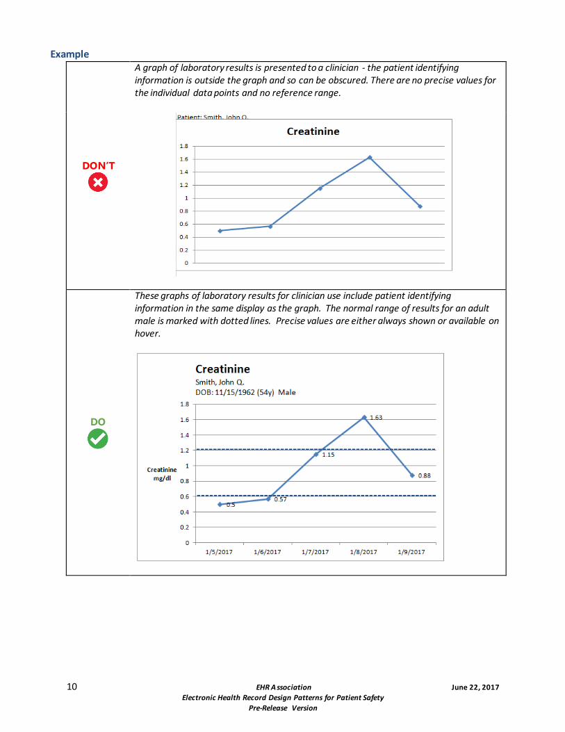
A graph of laboratory results is presented to a clinician - the patient identifying information is outside the graph and so can be obscured. There are no precise values for the individual data points and no reference range.
DO
These graphs of laboratory results for clinician use include patient identifying information in the same display as the graph. The normal range of results for an adult male is marked with dotted lines. Precise values are either always shown or available on hover.
11 EHR A ssociation June 22, 2017
Electronic Health Record Design Patterns for Patient Safety
Pre-Release Version
DO
This example shows historical results from multiple labs with different reference ranges.
X-Axis
The x-axis has multiple, intermediate, evenly-spaced tick marks. If results are collected over unequally-spaced
times, the horizontal space between them must reflect those differences. The time scale of the x-axis should be
consistent across the extent of the graph.
12 EHR A ssociation June 22, 2017
Electronic Health Record Design Patterns for Patient Safety
Pre-Release Version
Example
DON’T
Results are presented to a clinician from an unevenly-spaced set of samples - the samples are evenly spaced on the timeline, which could cause the clinician to misinterpret the rate of changes.
DO
The clinician can better visualize the rate of changes when the horizontal spacing of markers reflects the temporal spacing of the samples.
Y-Axis
Label the y-axis with the name of the variable and its units, for example, “Blood Glucose (mg/dl)”.
Labels should be shown on the individual tick marks. Y-axis values should increase from bottom to top.
13 EHR A ssociation June 22, 2017
Electronic Health Record Design Patterns for Patient Safety
Pre-Release Version
Support display personalization Especially in displays devoted to results review, offering personalization options for sorting and filtering the view will
allow a user to create a display that best matches their mental model. Potential options for such personalization options
include result time, severity, and facility. If a user configures their display, their decisions should be remembered by the
system.
Helpful Resources
SAFER: Safety Assurance Factors for EHR Resilience. Test Results Reporting and Follow-Up.
https://www.healthit.gov/sites/safer/files/guides/safer_testresultsreporting_sg008_form.pdf. The SAFER
Guides are designed to help healthcare organizations conduct self-assessments to optimize the safe use of EHRs.
Free.
For Further Reading
Sittig, D.F., Murphy, D.R., Smith, M.W., Russo, E., Wright, A. & Singh, H. (2015). Graphical Display of Diagnostic
Test Results in Electronic Health Records: A Comparison of 8 Systems. Journal of the American Medical
Electronic Health Record Design Patterns for Patient Safety
Pre-Release Version
Numeric Display
Numbers are commonly used in healthcare -- to represent doses, measurements, prices, and more. EHRs introduce the ability to compute numbers automatically, making it even more important to make sure they are easily read and understood by busy clinicians.
Use a comma to separate groups of three digits
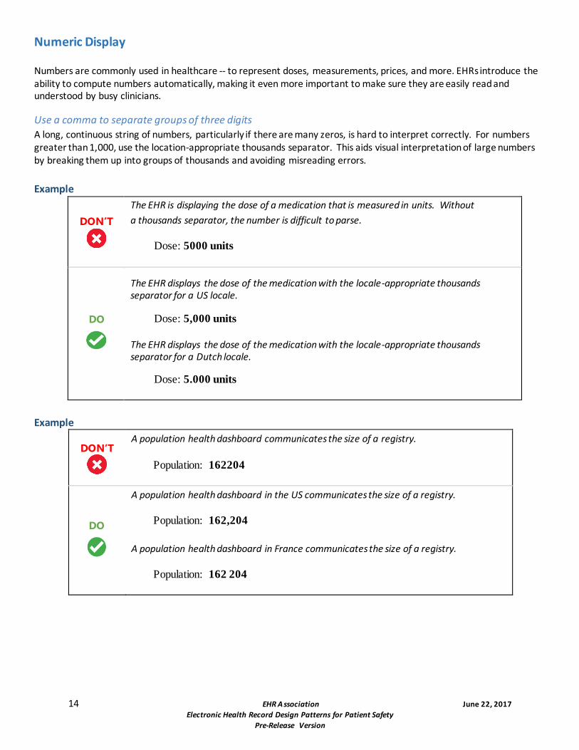
A long, continuous string of numbers, particularly if there are many zeros, is hard to interpret correctly. For numbers greater than 1,000, use the location-appropriate thousands separator. This aids visual interpretation of large numbers by breaking them up into groups of thousands and avoiding misreading errors.
Example
DON’T
The EHR is displaying the dose of a medication that is measured in units. Without
a thousands separator, the number is difficult to parse.
Dose: 5000 units
DO
The EHR displays the dose of the medication with the locale-appropriate thousands separator for a US locale.
Dose: 5,000 units
The EHR displays the dose of the medication with the locale-appropriate thousands separator for a Dutch locale.
Dose: 5.000 units
Example
DON’T
A population health dashboard communicates the size of a registry.
Population: 162204
DO
A population health dashboard in the US communicates the size of a registry.
Population: 162,204
A population health dashboard in France communicates the size of a registry.
Population: 162 204
15 EHR A ssociation June 22, 2017
Electronic Health Record Design Patterns for Patient Safety
Pre-Release Version
Fractional numbers should be displayed with a 0 (zero) before the decimal point
Leading zeros make it less likely that a reader will overlook the decimal point in a fractional number and misinterpret the value.
Example
DON’T
A dose is shown without a leading 0. A distracted user might misread the dose as 5 or 25 mg.
Dose: .5 mg
Dose: .25 mg
DO
The leading 0 makes it clear that these are decimal numbers.
Dose: 0.5 mg
Dose: 0.25 mg
Do not display a trailing zero after the decimal point unless precision is relevant
Including a decimal and trailing zero when displaying a whole number may cause the reader to misinterpret and inflate the value. For example, 1 may be interpreted as 10 if it is expressed with a decimal and trailing zero (1.0).
An exception is when a trailing zero is required to demonstrate a level of precision of the value being reported (labs, imaging studies in regards to size of lesions, catheter/tube sizes, etc.).
Example
DON’T
A dose is shown with an unnecessary 0 after the decimal point. A distracted user might misread the dose as 10 or 200 mg.
Dose: 1.0 mg
Dose: 20.0 mg
DO
Removing the trailing 0 makes the dose clear.
Dose: 1 mg
Dose: 20 mg
Right-justify and decimal-align numbers when displaying them in a column for comparison
When displaying numbers in a column, they should be formatted so the digits with the same significance are stacked vertically. Justify columns with respect to a fixed decimal point. If there is no decimal point, then numbers should be right aligned. By right-aligning or decimal-aligning numerical fields, the values are easier to compare.
This guideline applies specifically to numbers displayed for comparison. When displaying numbers in a table for other purposes -- for example, a table displaying the patient’s last recorded readings for blood pressure, SpO2, respirations, and pulse -- the numbers will not be compared and can be aligned with their labels.
16 EHR A ssociation June 22, 2017
Electronic Health Record Design Patterns for Patient Safety
Pre-Release Version
Example
DON’T
Data is left-aligned, making it difficult to determine which numbers are larger. Numbers with values after the decimal point look larger at first glance.
DO
Numeric data is right-justified and decimal-aligned. Note that this display implies and should only be used when values were measured to thousandths-precision.
For Further Reading
Institute for Safe Medication Practices. (2015). ISMP’s List of Error-Prone Abbreviations, Symbols, and Dose Designations. Retrieved April 20, 2017, from https://www.ismp.org/Tools/errorproneabbreviations.pdf.
Lowry, S. Z., Quinn, M. T., et al. Technical Evaluation, Testing, and Validation of the Usability of Electronic Health Records. Retrieved April 20, 2017, from https://www.nist.gov/sites/default/files/documents/healthcare/usability/EUP_WERB_Version_2_23_12-Final-2.pdf.
Electronic Health Record Design Patterns for Patient Safety
Pre-Release Version
Text Display and Layout
The ability to understand, process, and act upon text in the EHR is a key factor in efficiency and safety. Clinical users
must be able to scan information quickly with high comprehension.
Reduce or eliminate truncated data Truncating medication names and patient names can be confusing. Instead, table cells should be sufficiently large
enough to display complete entries. If truncation is necessary, use a truncation symbol that remains constant
throughout the application. The ellipsis symbol is commonly used to shorten words when text is too long.
Example
DON’T
A list of medications unnecessarily truncates the medication name, making it difficult to determine which medications are being taken.
DO
Since the name of the medication is the most important piece of data, it is given the most space. If absolutely necessary, other fields are made shorter.
18 EHR A ssociation June 22, 2017
Electronic Health Record Design Patterns for Patient Safety
Pre-Release Version
Example
DON’T
A user is viewing or searching a list of patients. If the patient’s name is truncated, there is the potential for the wrong patient to be selected and acted upon.
DO
Avoiding patient name truncation when possible reduces the possibility of a patient identification error.
Use abbreviations sparingly and carefully Whenever possible, do not use abbreviations, symbols or dose designations. Abbreviations often come from Latin and,
with fewer letters, can be more easily mistaken for each other. Using the full text reduces the possibility of
misinterpreting medication orders, which may result in harmful medication errors.
Example
DON’T
“AD” stands for “auris dextra.” The chosen font makes it easy to read the “A” as an “O,” which could stand for “oculus dexter.”
Cortisporin otic suspension 4 drops ad three times a day
DO
Avoiding the use of abbreviations makes the route obvious.
Cortisporin otic suspension 4 drops in right ear three times a day
19 EHR A ssociation June 22, 2017
Electronic Health Record Design Patterns for Patient Safety
Pre-Release Version
Make the difference between "no value recorded" and "actually no value" clear to users Provide an indicator to inform the user when a result value has not been entered, versus when the result is actually a null v alue. A zero should not be used to represent a nil value, since a zero is a value. It is better to use non-numerical identifiers, l ike dashes (--) or
N/A to show that there is no value.
Example
DON’T
A clinician cannot determine if the total cholesterol has not yet been calculated or if it cannot be calculated.
DO
Whenever possible, provide a clear indicator to the user clarifying the value and status.
20 EHR A ssociation June 22, 2017
Electronic Health Record Design Patterns for Patient Safety
Pre-Release Version
Place labels adjacent to values and maintain consistency Place labels adjacent to values and data entry fields and maintain consistency throughout the system. Use right
alignment for screen labels and left alignment for values.
Example
DON’T
When values are not consistently placed by labels, cognitive load is increased.
DO
Whenever possible, maintain a clear and logical display to make viewing and locating data clear and consistent for the clinician.
For Further Reading
Belden, J., MD. et al (2014, August 5). Designing for Clinicians. Retrieved May 03, 2017, from http://inspiredehrs.org/.
Penzo, M. (2006, July 12). Label Placement in Forms. Retrieved May 09, 2017, from http://www.uxmatters.com/mt/archives/2006/07/label-placement-in-forms.php.
Research-based web design & usability guidelines. (2006). Retrieved May 9, 2017, from https://www.usability.gov/sites/default/files/documents/guidelines_book.pdf.
HIMSS EHR Usability Task Force. (2009, June). Defining and Testing EMR Usability: Principles and Proposed Methods of EMR Usability Evaluation and Rating.
Wiklund, M. E., Kendler, J., Hochberg, L., & Weinger, M. B. (2015). Technical Basis for User Interface Design of Health IT. Retrieved May 9, 2017, from http://nvlpubs.nist.gov/nistpubs/gcr/2015/NIST.GCR.15-996.pdf.
The Joint Commission. (2016, June 30). Facts about the Official “Do Not Use” List of Abbreviations. Retrieved May 09, 2017, from https://www.jointcommission.org/facts_about_do_not_use_list/.
Institute for Safe Medication Practices. (2015). ISMP’s List of Error-Prone Abbreviations, Symbols, and Dose Designations. Retrieved April 20, 2017, from https://www.ismp.org/Tools/errorproneabbreviations.pdf.


![USTA TrafficAnalysisBriefing V7 0 20150530 FINAL[1] · PDF file1."Executive"Summary" ... In2014thethreemajorGulfcarriers" –"Emirates,"Qatar"Airways"and"Etihad" Airways"–"carried"some"4.3"million"passengers"intoandout"of"the](https://static.documents.pub/doc/80x56/5aa125967f8b9a46238b5bf2/usta-trafficanalysisbriefing-v7-0-20150530-final1-in2014thethreemajorgulfcarriers.jpg)


