Here is a short introduction to graphic design theory, explaining the different aspects of design which are considered when composing a piece of fine art or producing a graphic layout in commercial art. I call it classic theory because it forms the basis for many decisions in design. Elements of Design Line Shape Texture Value & Color Space Principles of Design Movement Balance Emphasis Unity A line is a form with width and length, but no depth. Artists use lines to create edges, the outlines of objects. A line is created by the movement of the artist's pen. Line Direction The direction of a line can convey mood.
Transcript
Here is a short introduction to graphic design theory, explaining the different aspects of design which are considered when composing a piece of fine art or producing a graphic layout in commercial art. I call it classic theory because it forms the basis for many decisions in design.
Elements of Design
Line Shape Texture Value & Color Space
Principles of Design
Movement Balance Emphasis Unity
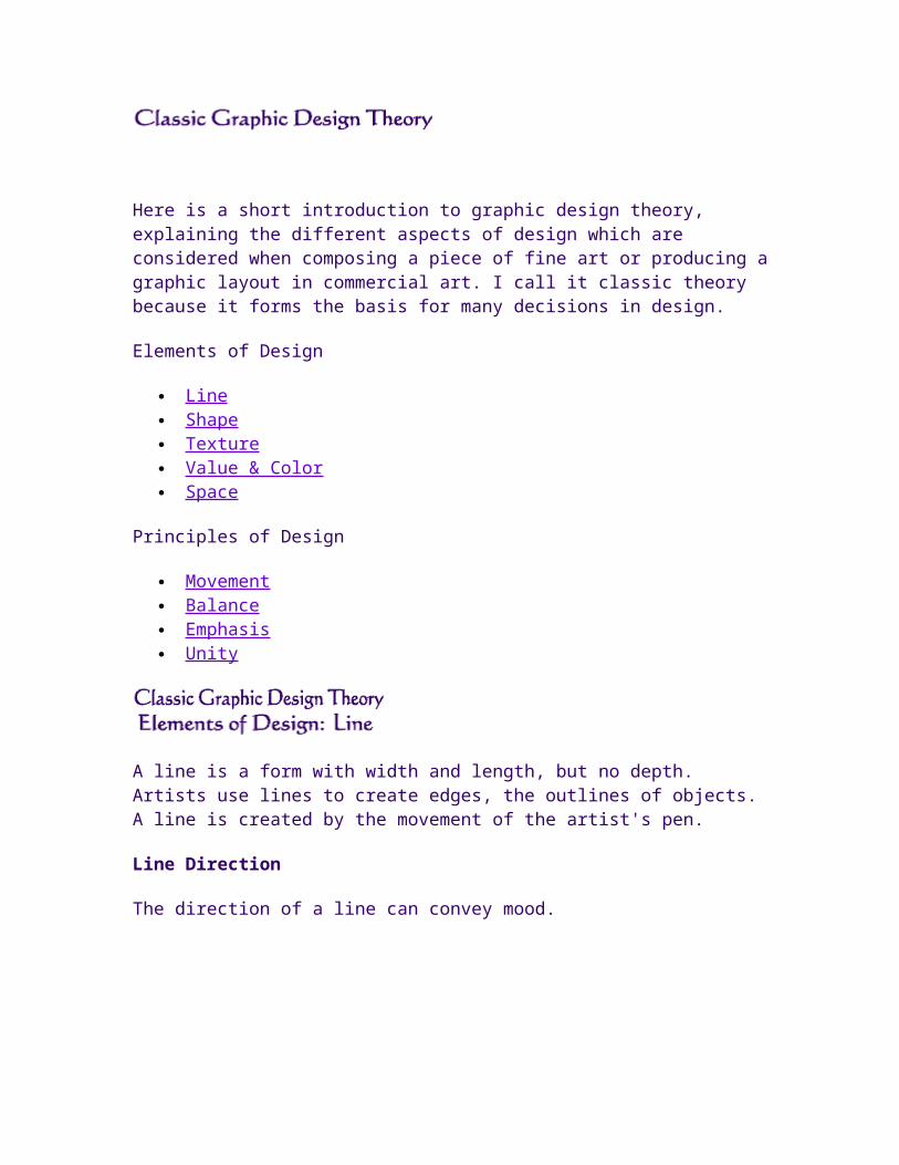
A line is a form with width and length, but no depth. Artists use lines to create edges, the outlines of objects. A line is created by the movement of the artist's pen.
vertical lines suggest more of a potential for movement,
while diagonal lines strongly suggest movement and give more of a feeling of vitality to a picture.
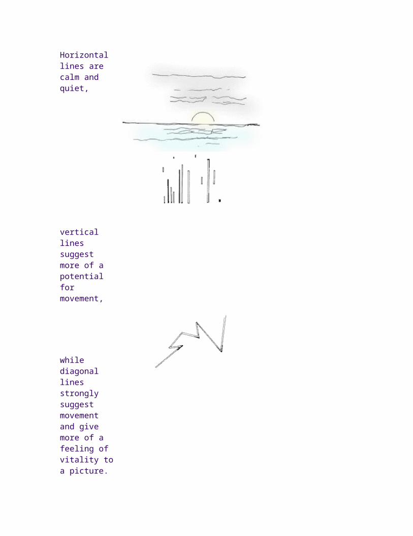
Contour and gesture
Lines used to follow the edges of forms are called contour drawings
Drawings which seem to depict more movement than actual outline are called gesture drawings.
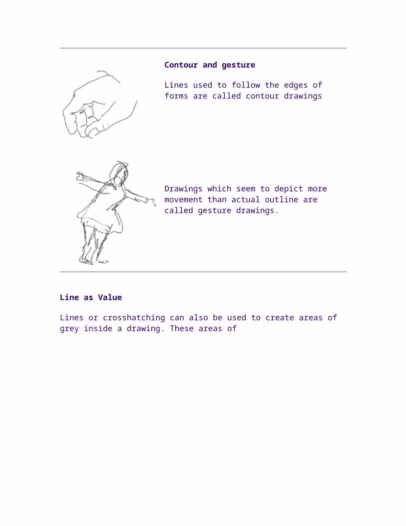
Line as Value
Lines or crosshatching can also be used to create areas of grey inside a
drawing. These areas of darker shading inside a figure, called areas of value, can give a more three-dimensional feeling to an object.
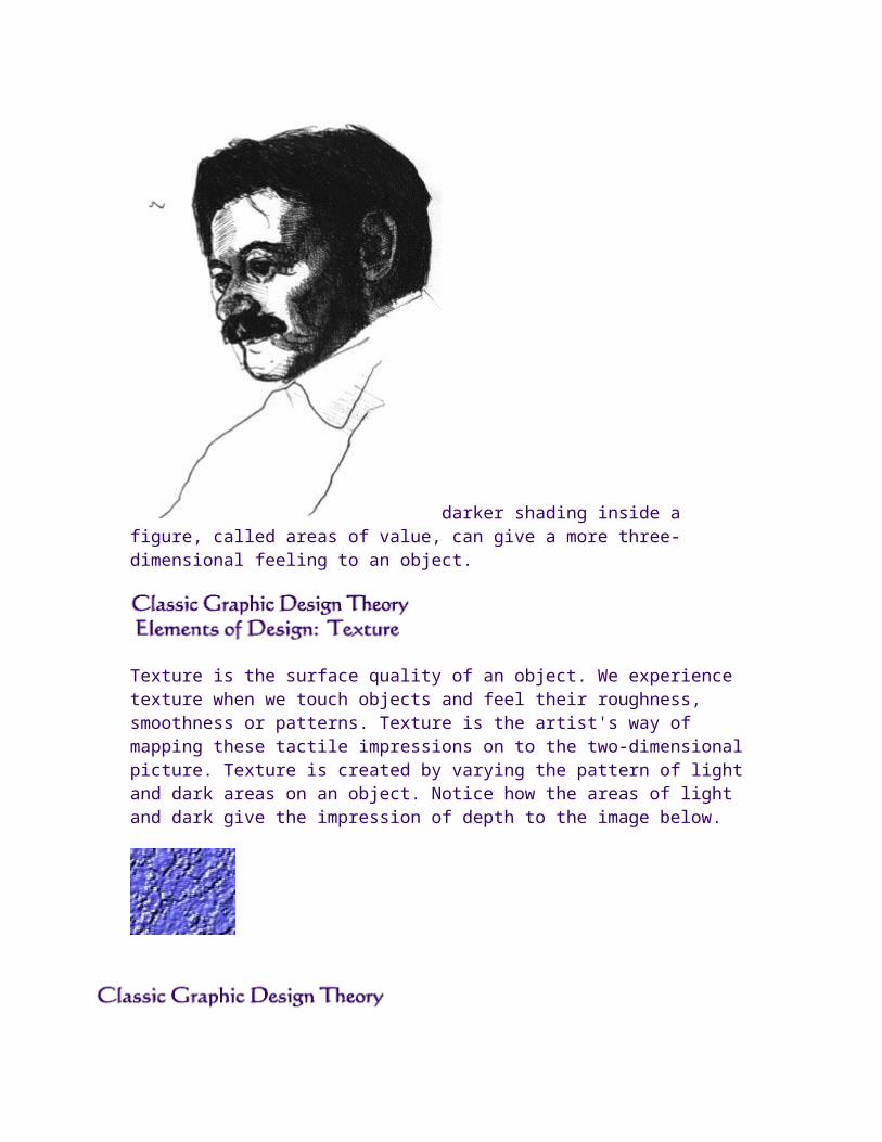
Texture is the surface quality of an object. We experience texture when we touch objects and feel their roughness, smoothness or patterns. Texture is the artist's way of mapping these tactile impressions on to the two-dimensional picture. Texture is created by varying the pattern of light and dark areas on an object. Notice how the areas of light and dark give the impression of depth to the image below.
Value
Color
Properties of Color:
Hue Color Value Intensity
Optical Color Mixing
Color Space
Color Schemes:
Monochromatic Analogous Complementary Triadic
Color Discord
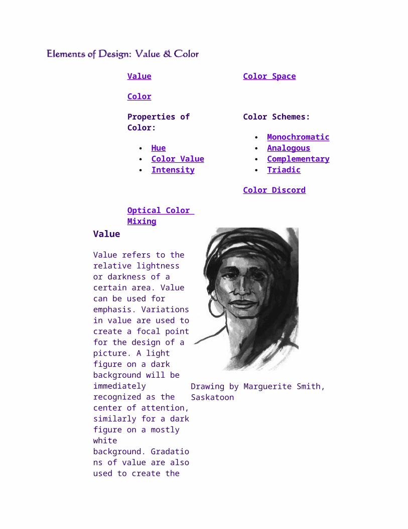
Value
Value refers to the relative lightness or darkness of a certain area. Value can be used for emphasis. Variations in value are used to create a focal point for the design of a picture. A light figure on a dark background will be immediately recognized as the center of attention, similarly for a dark figure on a mostly white background. Gradations of value are also used to create the illusion of depth. Areas of light and dark can give a three-dimensional impression, such as when shading areas of a person's face.
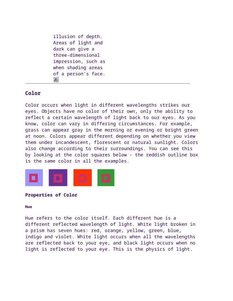
Color occurs when light in different wavelengths strikes our eyes. Objects have no color of their own, only the ability to reflect a certain wavelength of light back to our eyes. As you know, color can vary in differing circumstances. For example, grass can appear gray in the morning or evening or bright green at noon. Colors appear different depending on whether you view them under incandescent, florescent or natural sunlight. Colors also change according to their surroundings. You can see this by looking at the color squares below - the reddish outline box is the same color in all the examples.
Properties of Color
Hue
Hue refers to the color itself. Each different hue is a different reflected wavelength of light. White light broken in a prism has seven hues: red, orange, yellow, green, blue, indigo and violet. White light occurs when all the wavelengths are reflected back to your eye, and black light occurs when no light is reflected to your eye. This is the physics of light.
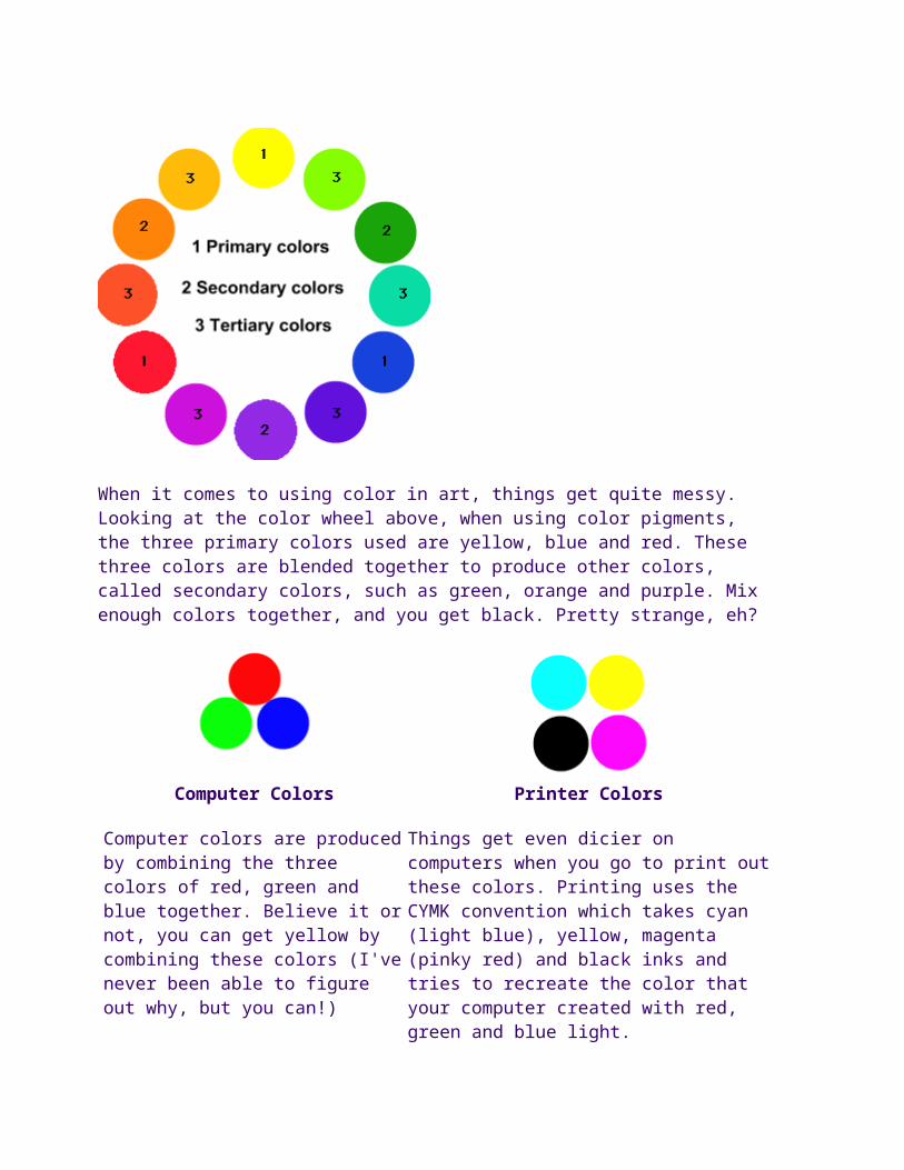
When it comes to using color in art, things get quite messy. Looking at the color wheel above, when using color pigments, the three primary colors used are yellow, blue and red. These three colors are blended together to
produce other colors, called secondary colors, such as green, orange and purple. Mix enough colors together, and you get black. Pretty strange, eh?
Computer Colors
Computer colors are produced by combining the three colors of red, green and blue together. Believe it or not, you can get yellow by combining these colors (I've never been able to figure out why, but you can!)
Printer Colors
Things get even dicier on computers when you go to print out these colors. Printing uses the CYMK convention which takes cyan (light blue), yellow, magenta (pinky red) and black inks and tries to recreate the color that your computer created with red, green and blue light.
Color Value
Color value refers to the lightness or darkness of the hue. Adding white to a hue produces a high-value color, often called a tint. Adding black to a hue produces a low-value color, often called a shade.
Intensity
Intensity, also called chroma or saturation, refers to the brightness of a color. A color is at full intensity when not mixed with black or white - a pure hue. You can change the intensity of a color, making it duller or more neutral by adding gray to the color. You can also change the intensity of a color by adding its complement (this is the color found directly opposite on the traditional color wheel). When changing colors this way, the color produced is called a tone.
When you mix complementary colors together, you produce a dull tone. However, when you put complementary colors side by side, you increase their intensity. This effect is called simultaneous contrast - each color simultaneously intensifies the visual brightness of the other color.
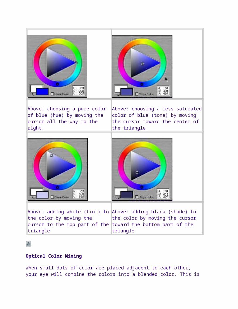
Below are some examples of how this works, using a program called
Metacreations painter. As you can see, you choose a hue from the outer ring. Inside the triangle, you can vary the saturation of the hue (amount of color), the tint or the shade.
Above: choosing a pure color of blue (hue) by moving the cursor all the way to the right.
Above: choosing a less saturated color of blue (tone) by moving the cursor toward the center of the triangle.
Above: adding white (tint) to the color by moving the cursor to the top part of the triangle
Above: adding black (shade) to the color by moving the cursor toward the bottom part of the triangle
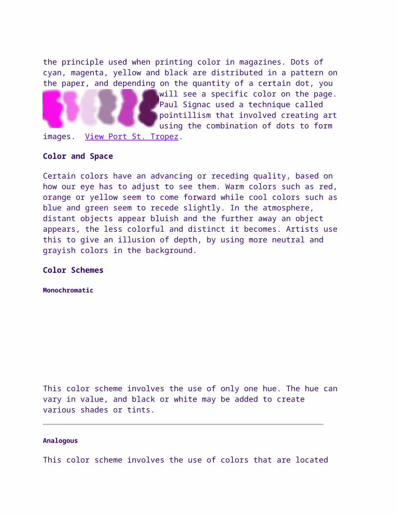
Optical Color Mixing
When small dots of color are placed adjacent to each other, your eye will
combine the colors into a blended color. This is the principle used when printing color in magazines. Dots of cyan, magenta, yellow and black are distributed in a pattern on the
paper, and depending on the quantity of a certain dot, you will see a specific color on the page. Paul Signac used a technique called pointillism that involved creating art using the combination of dots to form images. View Port St. Tropez.
Color and Space
Certain colors have an advancing or receding quality, based on how our eye has to adjust to see them. Warm colors such as red, orange or yellow seem to come forward while cool colors such as blue and green seem to recede slightly. In the atmosphere, distant objects appear bluish and the further away an object appears, the less colorful and distinct it becomes. Artists use this to give an illusion of depth, by using more neutral and grayish colors in the background.
Color Schemes
Monochromatic
This color scheme involves the use of only one hue. The hue can vary in value, and black or white may be added to create various shades or tints.
Analogous
This color scheme involves the use of colors that are located adjacent on the color wheel. The hues may vary in value. The color scheme for this site is analogous, with the colors varying only slightly from each other.
Complementary
This color scheme involves the use of colors that are located opposite on
the color wheel such as red and green, yellow and purple, or orange and blue. Complementary colors produce a very exciting, dynamic pattern.
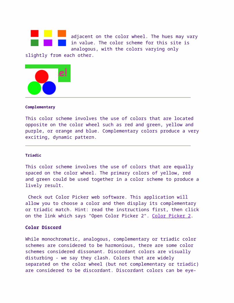
Triadic
This color scheme involves the use of colors that are equally spaced on the color wheel. The primary colors of yellow, red and green could be used together in a color scheme to produce a lively result.
Check out Color Picker web software. This application will allow you to choose a color and then display its complementary or triadic match. Hint: read the instructions first, then click on the link which says "Open Color Picker 2". Color Picker 2.
Color Discord
While monochromatic, analogous, complementary or triadic color schemes are considered to be harmonious, there are some color schemes considered dissonant. Discordant colors are visually disturbing - we say they clash. Colors that are widely separated on the color wheel (but not complementary or triadic) are considered to be discordant. Discordant colors can be eye-catching and are often used for attention-getting devices in advertising.
Some sources for information about color:
Illusion of Space and Depth
We live in a three-dimensional world of depth. When we look around us, some things seem closer, some further away. The artist can also show the illusion of depth by using the following means:
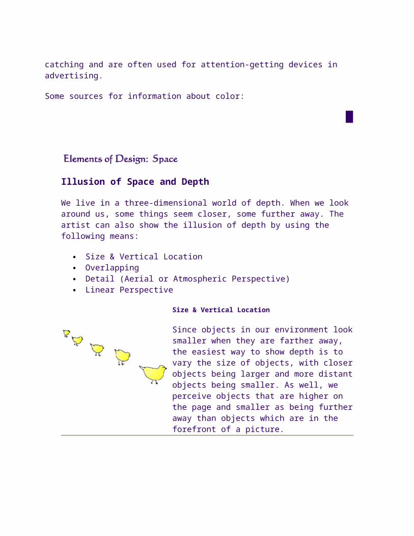
Size & Vertical Location Overlapping Detail (Aerial or Atmospheric Perspective) Linear Perspective
Since objects in our environment look smaller when they are farther away, the easiest way to show depth is to vary the size of objects, with closer objects being larger and more distant objects being smaller. As well, we perceive objects that are higher on the page and smaller as being further away than objects which are in the forefront of a picture.
OVERLAPPING
When objects are partially obscured by other objects in front of them, we perceive them as further back than the covering objects.We do not see them as incomplete forms, just further back.
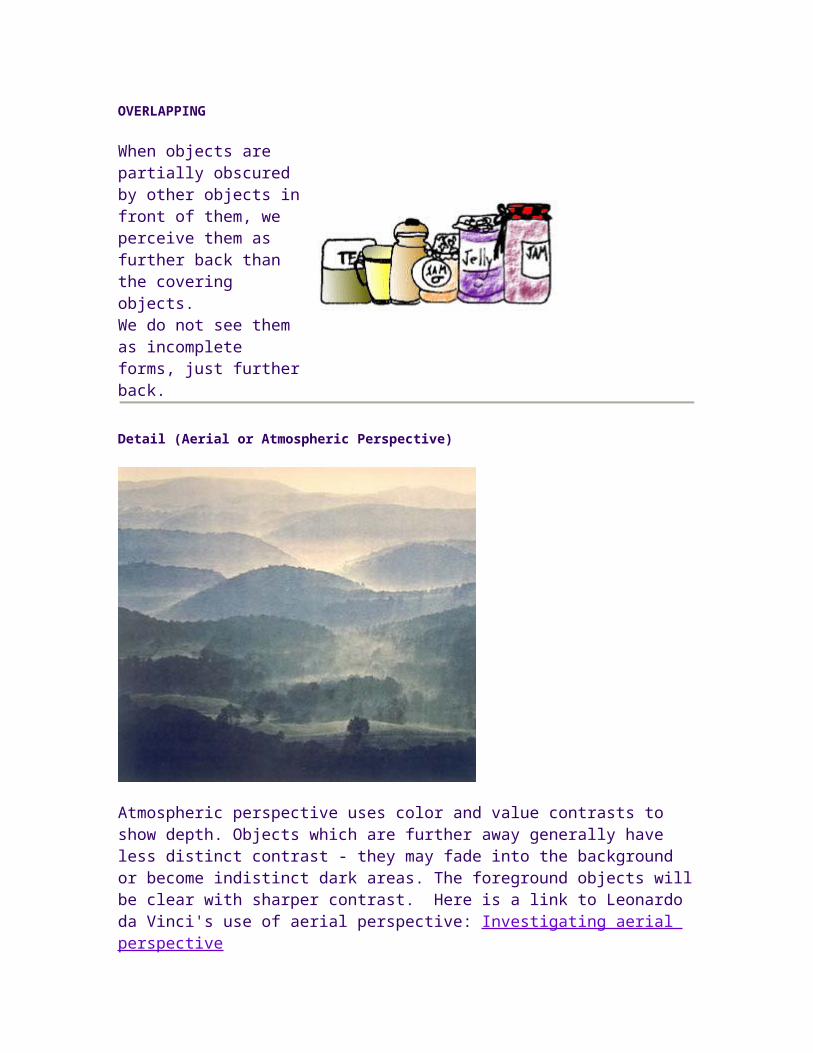
Detail (Aerial or Atmospheric Perspective)
Atmospheric perspective uses color and value contrasts to show depth. Objects which are further away generally have less distinct contrast - they may fade into the background or become indistinct dark areas. The foreground objects will be clear with sharper contrast. Here is a link to Leonardo da Vinci's use of aerial perspective: Investigating aerial perspective
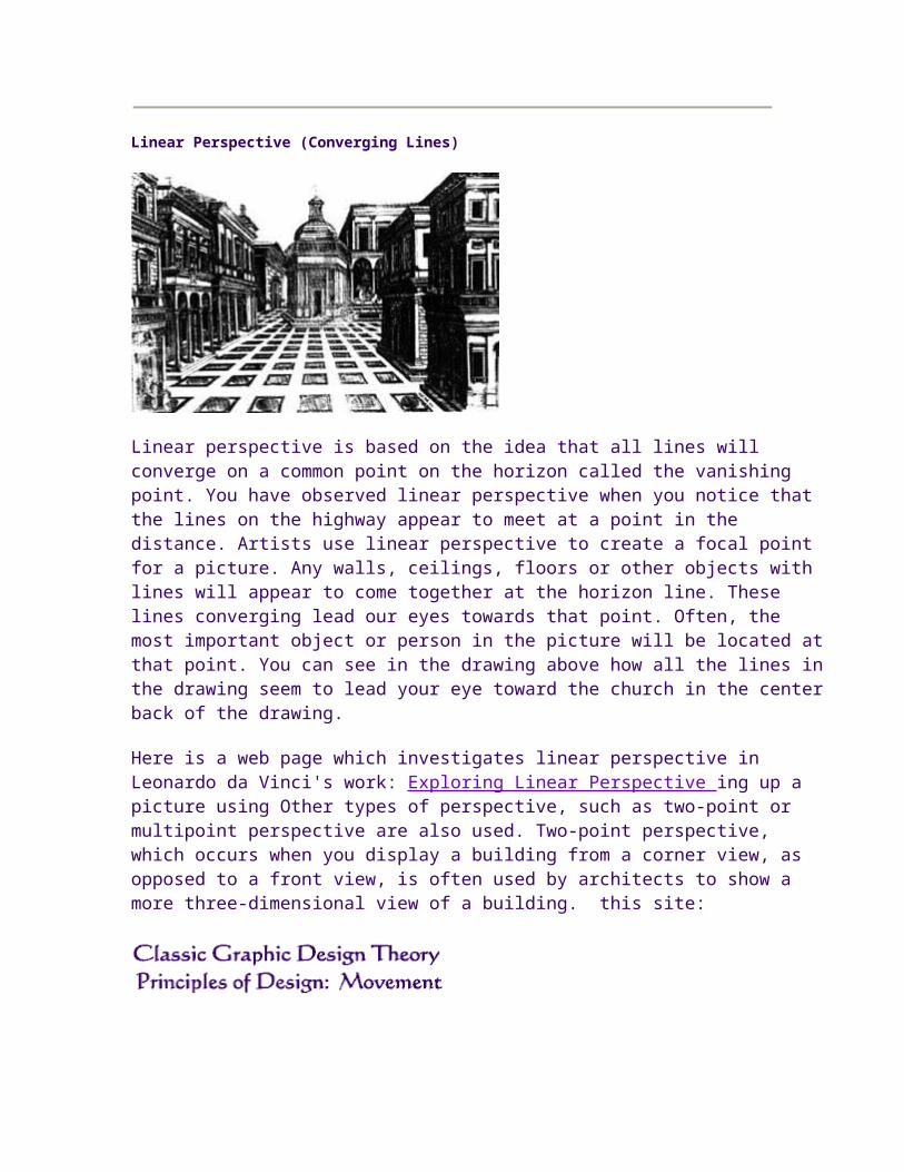
Linear Perspective (Converging Lines)
Linear perspective is based on the idea that all lines will converge on a common point on the horizon called the vanishing point. You have observed linear perspective when you notice that the lines on the highway appear to meet at a point in the distance. Artists use linear perspective to create a focal point for a picture. Any walls, ceilings, floors or other objects with lines will appear to come together at the horizon line. These lines converging lead our eyes towards that point. Often, the most important object or person in the picture will be located at that point. You can see in the drawing above how all the lines in the drawing seem to lead your eye toward the church in the center back of the drawing.
Here is a web page which investigates linear perspective in Leonardo da Vinci's work: Exploring Linear Perspective ing up a picture using Other types of perspective, such as two-point or multipoint perspective are also used. Two-point perspective, which occurs when you display a building from a corner view, as opposed to a front view, is often used by architects to show a more three-dimensional view of a building. this site:
Live figures portrayed in unstable body positions cause us to feel that motion is imminent. We know from past experience with these positions that some kind of movement will occur. This heightens the feeling of motion.
Fuzzy Outlines
When figures move past us at very high speeds, we perceive that figure as somewhat blurry. This experience leads us to interpret blurry or indistinct outlines as conveying motion.
Multiple Image
Similarly, showing multiple overlapping images gives us the impression of motion. We can see that the person or figure has moved through a series of poses.
Optical Movement
In optical movement, the eye is forced to move around the picture dynamically in order to see all the different elements. Optical movement can be enhanced by curved forms that keep your eyes moving in a circular pattern throughout the picture.
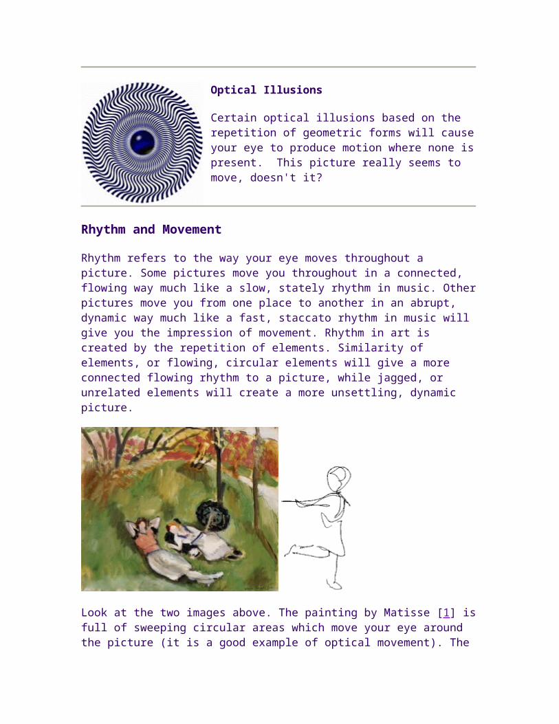
Optical Illusions
Certain optical illusions based on the repetition of geometric forms will cause your eye to produce motion where none is present. This picture really seems to move, doesn't it?
Rhythm and Movement
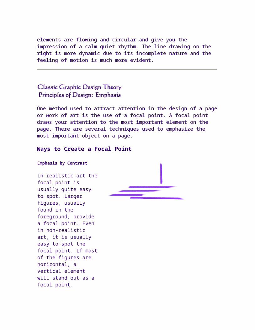
Rhythm refers to the way your eye moves throughout a picture. Some pictures move you throughout in a connected, flowing way much like a slow, stately rhythm in music. Other pictures move you from one place to another in an abrupt, dynamic way much like a fast, staccato rhythm in music will give you the impression of movement. Rhythm in art is created by the repetition of elements. Similarity of elements, or flowing, circular elements will give a more connected flowing rhythm to a picture, while jagged, or unrelated elements will create a more unsettling, dynamic picture.
Look at the two images above. The painting by Matisse [1] is full of sweeping circular areas which move your eye around the picture (it is a good example of optical movement). The elements are flowing and circular and give you the impression of a calm quiet rhythm. The line drawing on the right is more dynamic due to its incomplete nature and the feeling of motion is much more evident.
One method used to attract attention in the design of a page or work of art is the use of a focal point. A focal point draws your attention to the most important element on the page. There are several techniques used to emphasize the most important object on a page.
Ways to Create a Focal Point
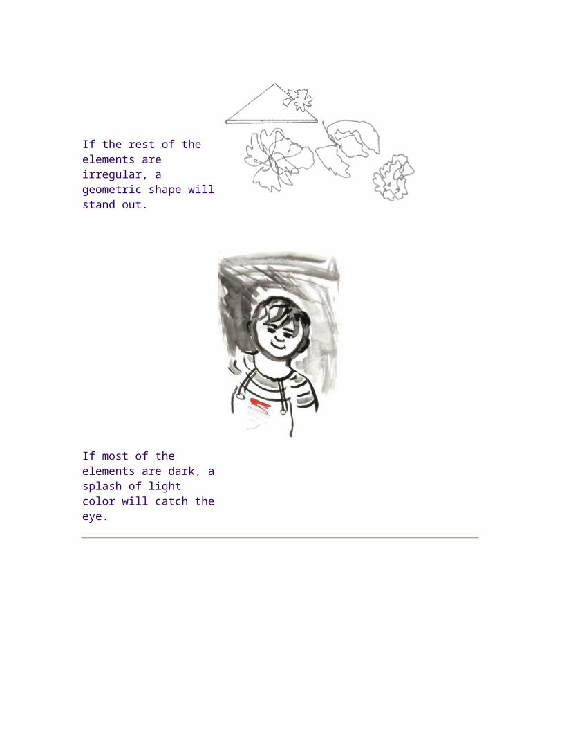
Emphasis by Contrast
In realistic art the focal point is usually quite easy to spot. Larger figures, usually found in the foreground, provide a focal point. Even in non-realistic art, it is usually easy to spot the focal point. If most of the figures are horizontal, a vertical element will stand out as a focal point.
If the rest of the elements are irregular, a geometric shape will stand out.
If most of the elements are dark, a splash of light color will catch the eye.
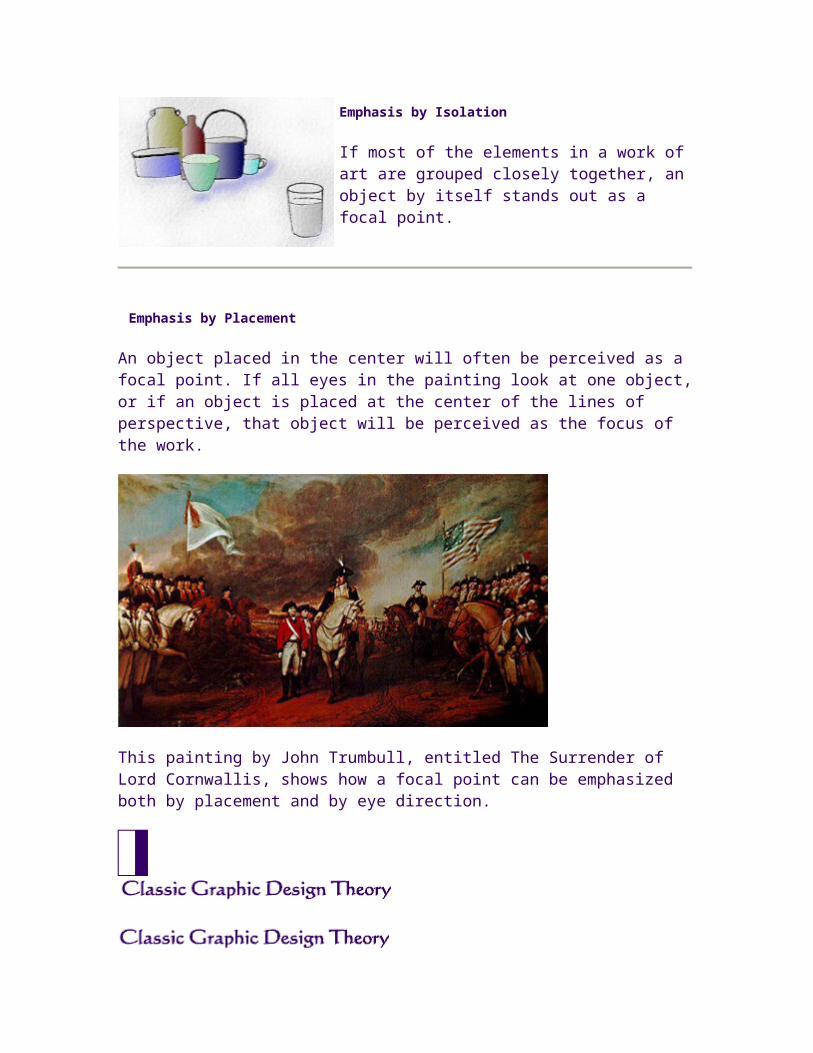
Emphasis by Isolation
If most of the elements in a work of art are grouped closely together, an object by itself stands out as a focal point.
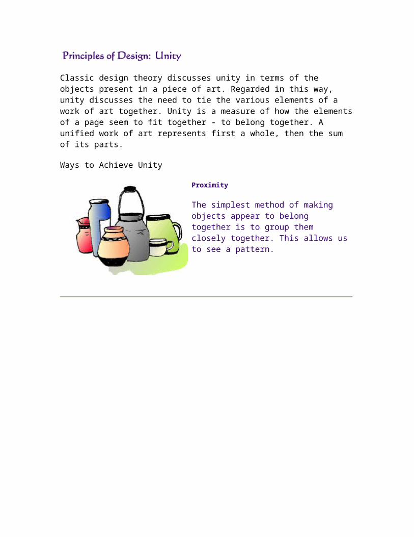
Emphasis by Placement
An object placed in the center will often be perceived as a focal point. If all eyes in the painting look at one object, or if an object is placed at the center of the lines of perspective, that object will be perceived as the focus of the work.
This painting by John Trumbull, entitled The Surrender of Lord Cornwallis, shows how a focal point can be emphasized both by placement and by eye direction.
Classic design theory discusses unity in terms of the objects present in a piece of art. Regarded in this way, unity discusses the need to tie the various elements of a work of art together. Unity is a measure of how the elements of a page seem to fit together - to belong together. A unified work of art represents first a whole, then the sum of its parts.
Ways to Achieve Unity
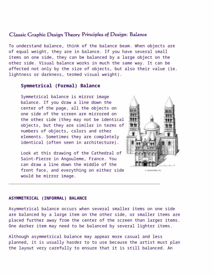
Proximity
The simplest method of making objects appear to belong together is to group them closely together. This allows us to see a pattern.
Repetition
Another method often used to promote unity is the use of repetition. Repetition of color, shape, texture or object can be used to tie a work together.
Continuation
A much more subtle method of unifying a work involves the continuation of line, edge or direction from one area to another. Continuation is often used in books and magazines to tie the elements of a page together with the use of rules, and by lining up edges of copy, headlines and graphics.
This painting by Degas [1] has many elements of continuation. The circle of the girl's back is continued in the circle of the tub on the floor. The overhanging brush guides our eyes towards the objects on the table, which are arranged as a continuation of the circle.
[1] Edgar Degas. The Tub. 1886. Pastel, 60 x 82 cm. Louvre, Paris.
To understand balance, think of the balance beam. When objects are of equal weight, they are in balance. If you have several small items on one side, they can be balanced by a large object on the other side. Visual balance works in much the same way. It can be affected not only by the size of objects, but also their value (ie. lightness or darkness, termed visual weight).
Symmetrical (Formal) Balance
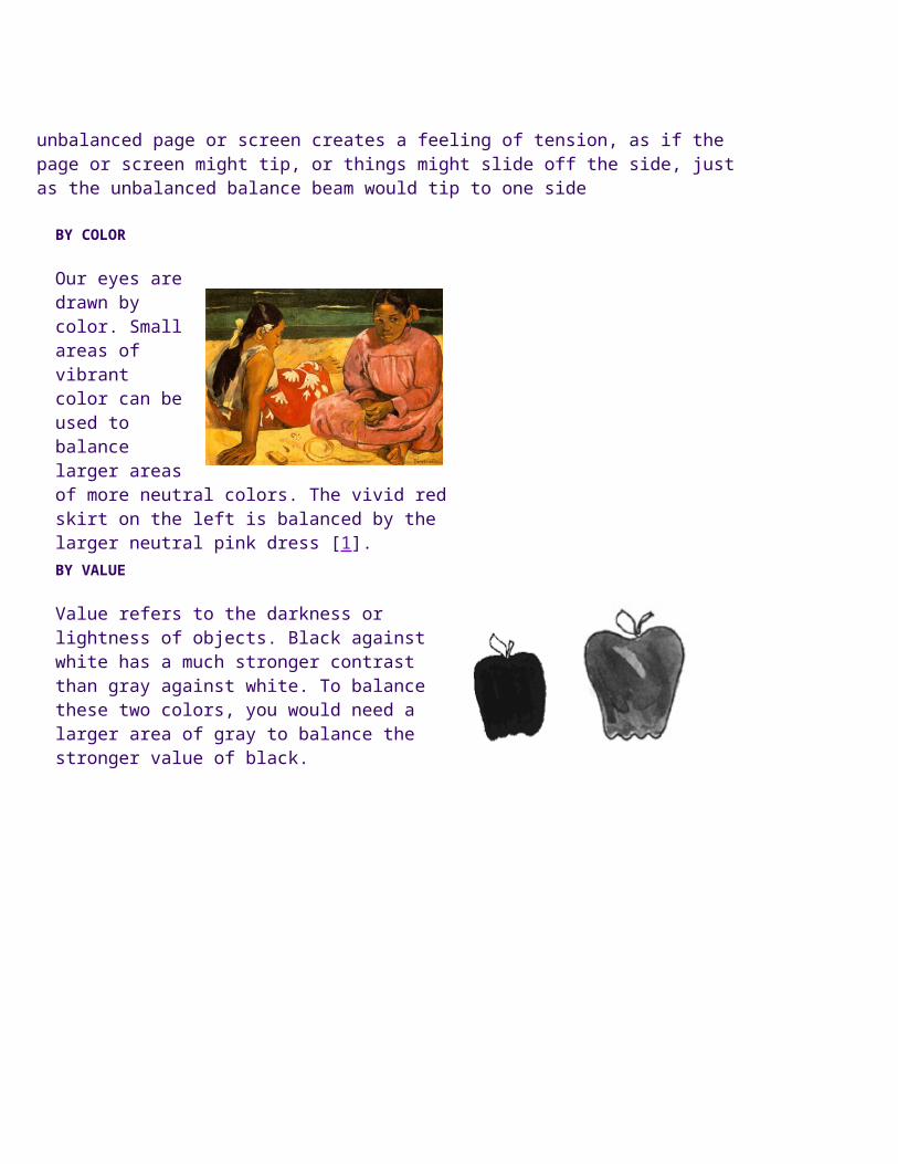
Symmetrical balance is mirror image balance. If you draw a line down the center of the page, all the objects on one side of the screen are mirrored on the other side (they may not be identical objects, but they are similar in terms of numbers of objects, colors and other elements. Sometimes they are completely identical (often seen in architecture).
Look at this drawing of the Cathedral of Saint-Pierre in Angouleme, France. You can draw a line down the middle of the front face, and everything on either side would be mirror image.
ASYMMETRICAL (INFORMAL) BALANCE
Asymmetrical balance occurs when several smaller items on one side are balanced by a large item on the other side, or smaller items are placed further away from the center of the screen than larger items. One darker item may need to be balanced by several lighter items.
Although asymmetrical balance may appear more casual and less planned, it is usually harder to to use because the artist must plan the layout very carefully to
ensure that it is still balanced. An unbalanced page or screen creates a feeling of tension, as if the page or screen might tip, or things might slide off the side, just as the unbalanced balance beam would tip to one side
BY COLOR
Our eyes are drawn by color. Small areas of vibrant color can be used to balance larger areas of more neutral colors. The vivid red skirt on the left is balanced by the larger neutral pink dress [1].BY VALUE
Value refers to the darkness or lightness of objects. Black against white has a much stronger contrast than gray against white. To balance these two colors, you would need a larger area of gray to balance the stronger value of black.
Large flat areas without much detail can be balanced by smaller irregularly shaped objects since the eye is led towards the more intricate shape.
The front dancer in this painting by Degas [2] stands out in intricate detail compared to the large blurry area behind her.
BY POSITION
Using a balance beam, a larger weight closer to the center point can be balanced by a lighter weight further away from the center. This is the basis for balance by position. Sometimes larger elements on one side of the page can be balanced by a smaller element that is positioned by itself at the far end of the other side of the page. This is a very tricky type of asymmetrical balance that often ends up looking out of balance. Look at how the small watering can
on the left is used to balance the larger dancers to the right [3].
Smaller areas with interesting textures (variegated light and dark, or random fluctuations) can balance larger areas with smoother, untextured looks.
by eye direction
Your eye can be led to a certain point in a picture depending on how the elements are arranged. If the people in a picture are looking in a certain direction, your eye will be led there as well. Elements in a picture, such as triangles or arrows, will also lead your eye to look to a certain point and maintain the balance of a picture. Look how the eye direction of the dancers and musicians in this painting by Seurat [4] lead your eye to the small gaslights which provide a focal point in this painting.
Radial Balance
The third type of balance is radial balance, where all elements radiate out from a center point in a circular fashion. It is very easy to maintain a focal point in radial balance, since all the elements lead your eye toward the center.