26
eMetric Presents A reporting application designed to fit the needs of ACCESS for ELLs users.
| Date post: | 27-Dec-2015 |
| Category: |
Documents |
| Upload: | garry-nash |
| View: | 216 times |
| Download: | 1 times |

eMetric Presents
A reporting application designed to fit the needs of ACCESS for ELLs users.
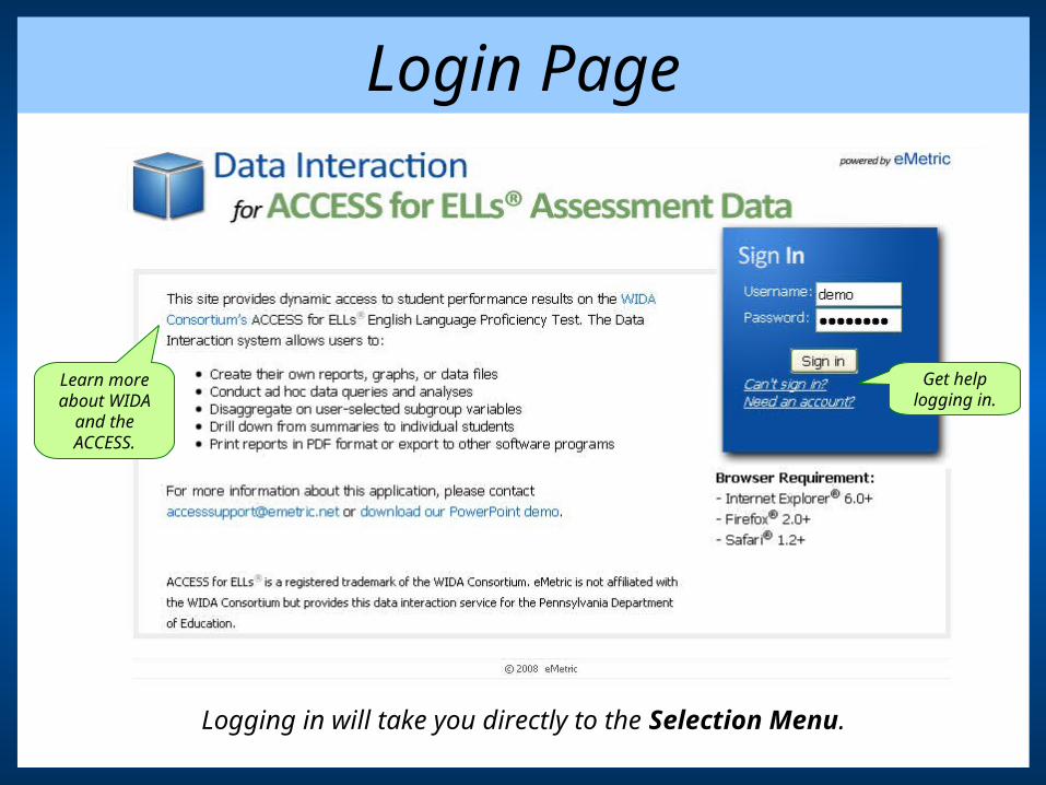
Login Page
Learn more about WIDA
and the ACCESS.
Get help logging in.
Logging in will take you directly to the Selection Menu.
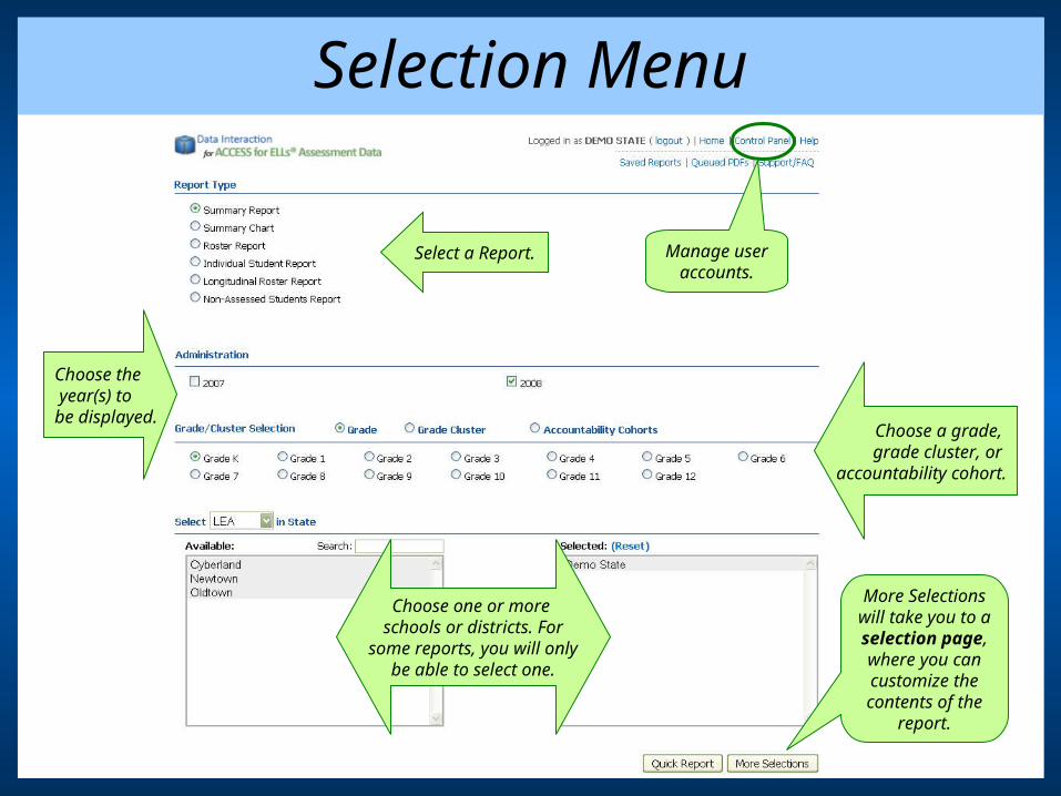
Selection Menu
Select a Report. Manage user accounts.
Choose a grade, grade cluster, or
accountability cohort.
More Selections will take you to a selection page, where you can customize the contents of the
report.
Choose the year(s) to be displayed.
Choose one or more schools or districts. For
some reports, you will onlybe able to select one.
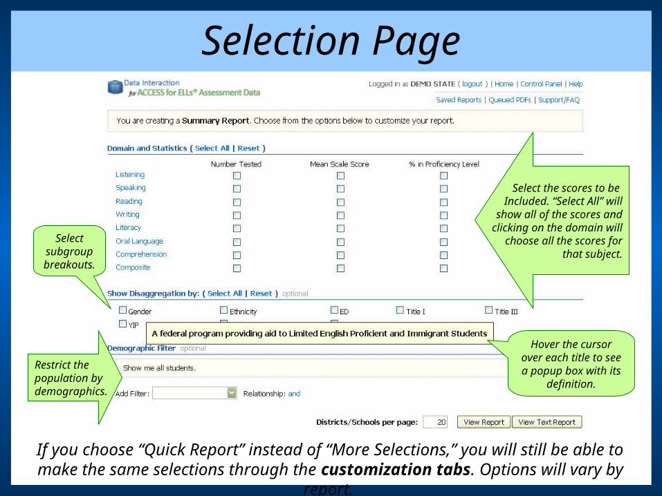
Selection Page
Hover the cursor over each title to see a popup box with its
definition.
Select subgroup breakouts.
Select the scores to be Included. “Select All” will
show all of the scores andclicking on the domain will
choose all the scores forthat subject.
Restrict thepopulation bydemographics.
If you choose “Quick Report” instead of “More Selections,” you will still be able to make the same selections through the customization tabs. Options will vary by report.
The ReportsThe heart of Data Interaction for ACCESS for ELLs is its
collection of customizable reports.

Summary Report
Drill down to subgroups.
Click to see the number of students represented by
the percentages.
Click to hide the content area or show other content areas.
Click on a customization tab
to change the included data.
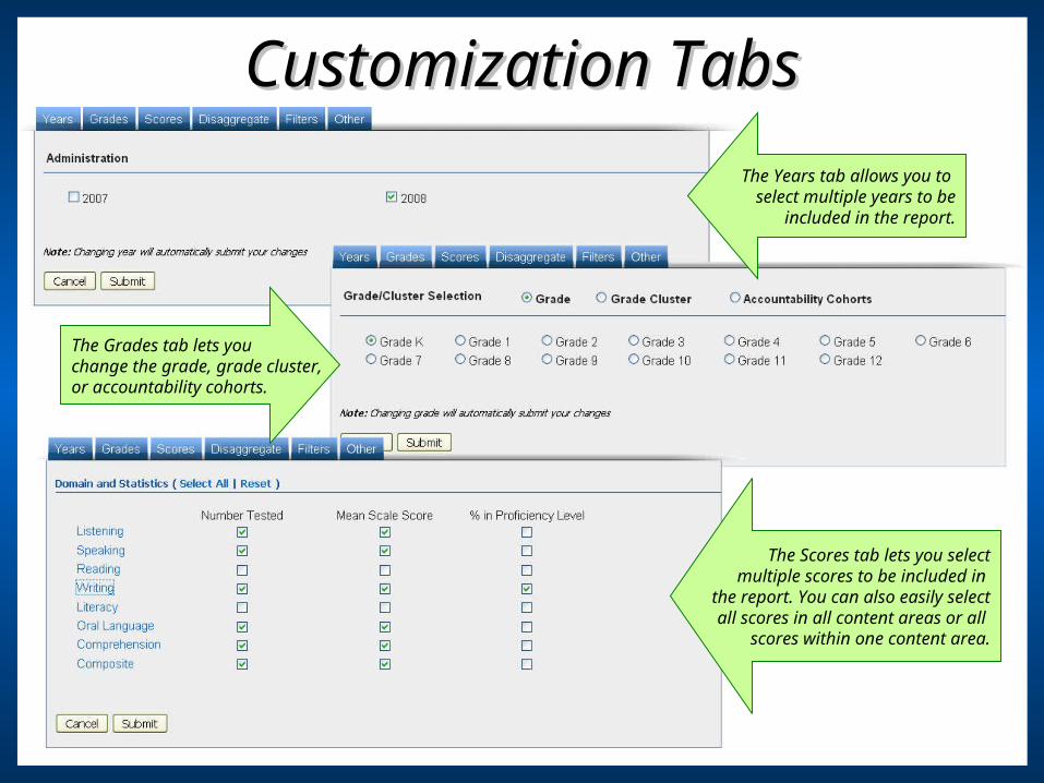
Customization TabsCustomization Tabs
The Grades tab lets youchange the grade, grade cluster, or accountability cohorts.
The Years tab allows you to select multiple years to be
included in the report.
The Scores tab lets you selectmultiple scores to be included in
the report. You can also easily selectall scores in all content areas or all
scores within one content area.
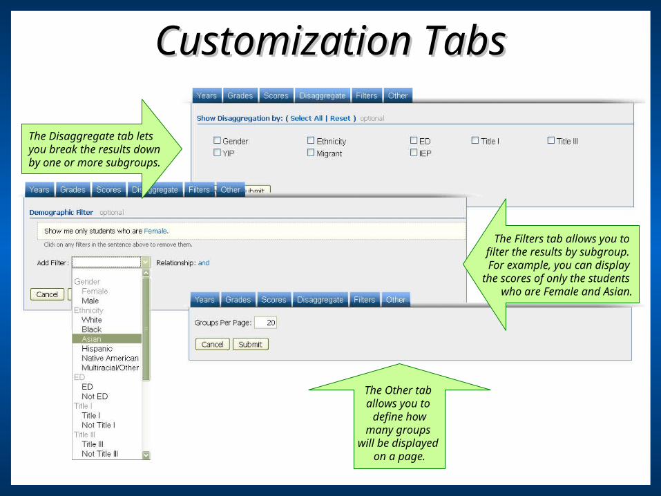
Customization TabsCustomization Tabs
The Disaggregate tab lets you break the results downby one or more subgroups.
The Filters tab allows you to filter the results by subgroup. For example, you can display
the scores of only the students who are Female and Asian.
The Other tab allows you to
define howmany groups
will be displayed on a page.

TransposeTranspose
Click to toggle the
data – information shown in
columns will switch to rows and rows will switch to columns.
Content areaswere previously
displayed in columns.

Summary Chart
Hold your cursor over the bar to see what percent of the total it
represents.
Click on a section of a bar to drill down to a roster
report for that score.
Levels are color-
coded for quick
identification.
The Summary
Chart can be downloaded as a PDF.

Customization TabsCustomization Tabs
The Levels tab allows you to select which proficiency levelsare included in the chart.
The Contents tab lets youchange the domain.
The Report Type tab lets you choose whether to display the data
in a bar chart or a histogram.
You can see a sample of the report
by hovering your cursor over the
name.
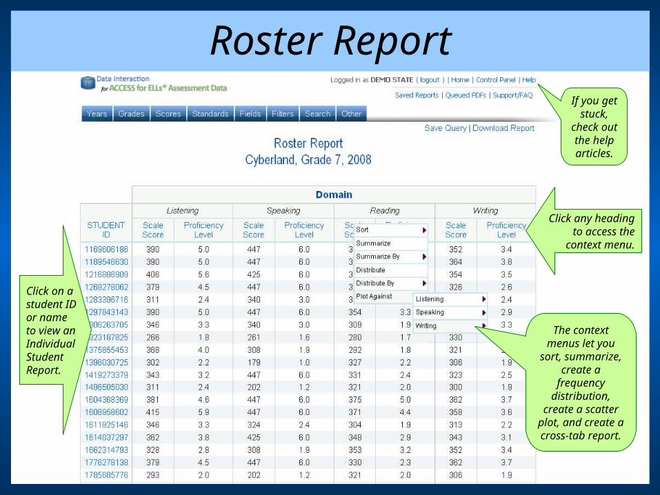
Roster Report
The context menus let you
sort, summarize, create a
frequency distribution,
create a scatter plot, and create a cross-tab report.
Click on astudent ID or nameto view anIndividualStudentReport.
Click any headingto access the
context menu.
If you get stuck,
check out the help articles.

Customization TabsCustomization Tabs
The Scores tab allows youto select which proficiency levels and scale scores are included in the report.
The Fields tab lets youadd many additional fields
to the chart.
The Year tab lets you choose a different year for the chart.
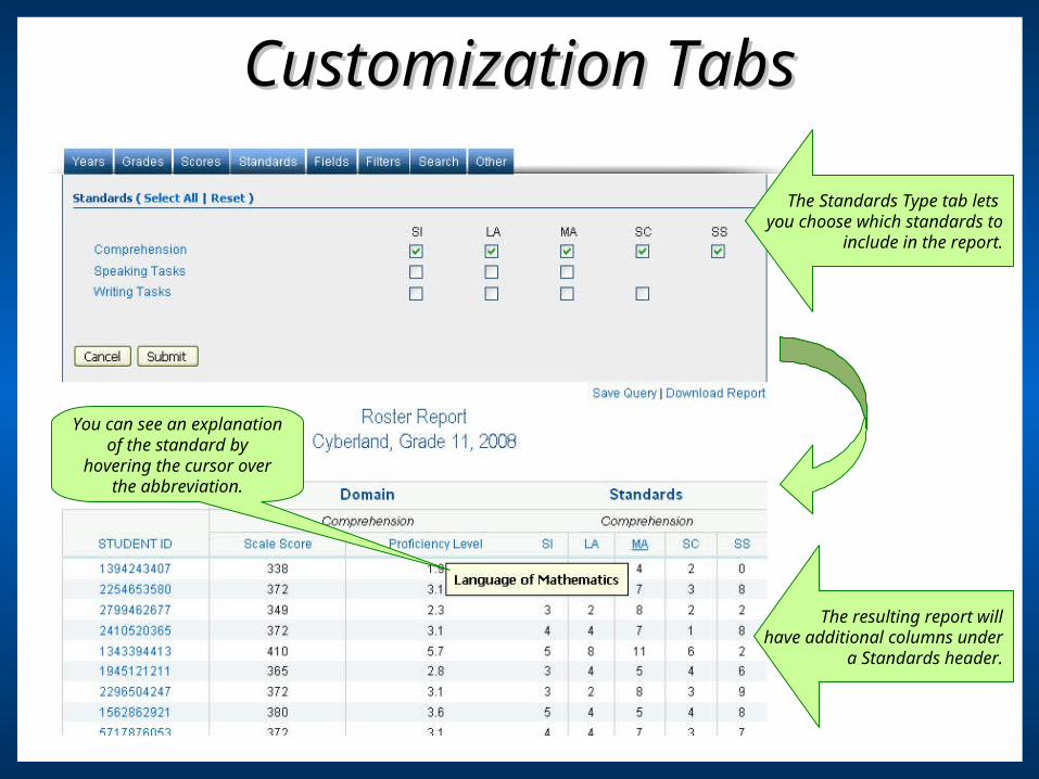
Customization TabsCustomization Tabs
The resulting report willhave additional columns under
a Standards header.
The Standards Type tab lets you choose which standards to
include in the report.
You can see an explanation of the standard by hovering the cursor over
the abbreviation.

Comparing Assessment ResultsComparing Assessment Results
Under the Fields tab, youcan choose to view the state
assessment scores.
The results will include an additional
column for each of the added fields.
A Scatter Plot can be created that
compares the state assessment scale
scores with the ACCESS scale
scores. (A cross-tab report can be created for proficiency levels)

Scatter PlotScatter PlotGo directly to a
Roster Report of all the included scores.
Add prediction bands to your scatter plot. (Prediction bands have been added to
this example.)
Highlight scoreranges to createa limited RosterReport. You can
add as manyranges as you
like.
N count and
correlation coefficient.
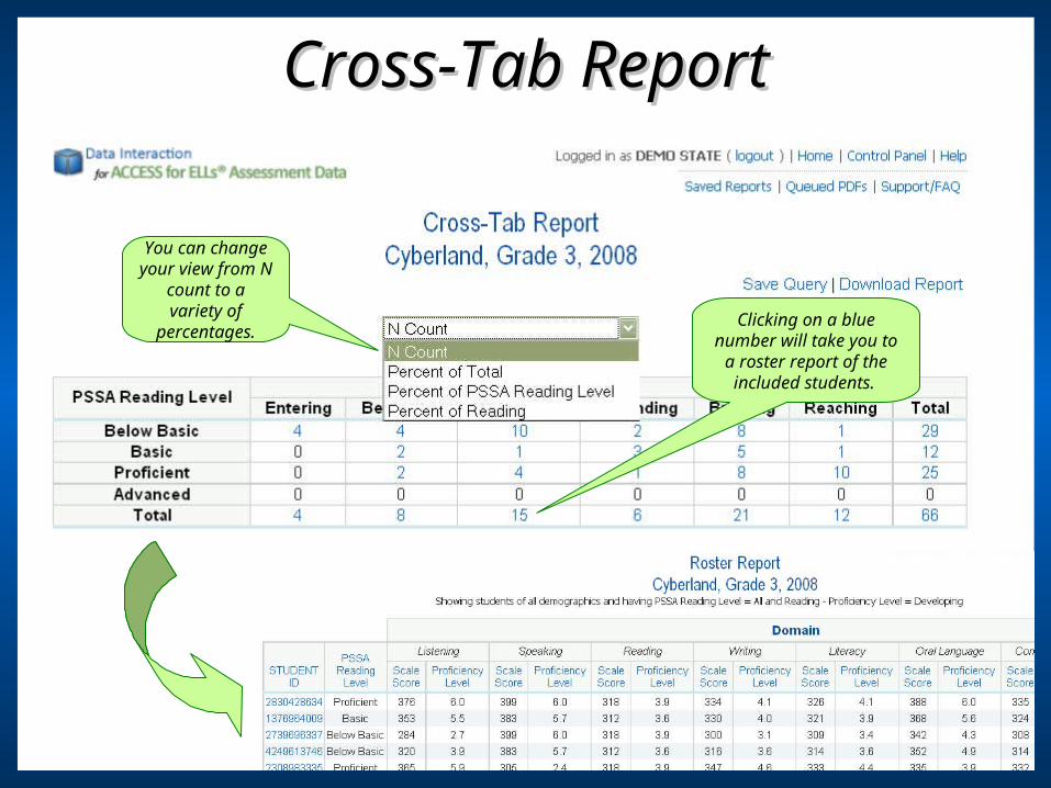
Cross-Tab ReportCross-Tab Report
Clicking on a blue number will take you to
a roster report of the included students.
You can change your view from N
count to a variety of
percentages.
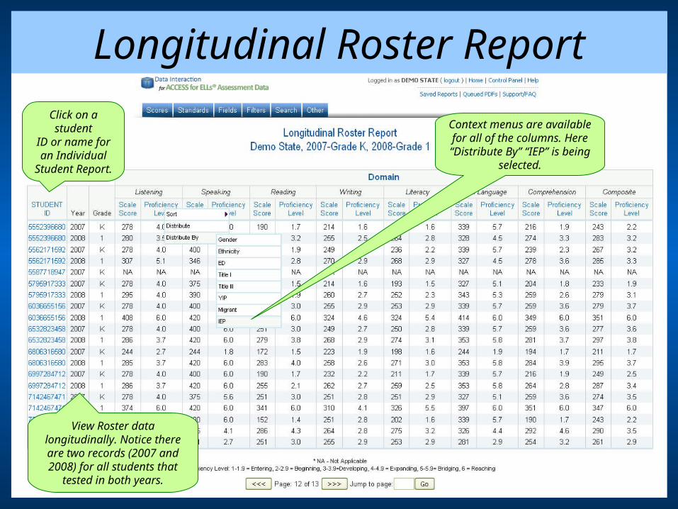
Longitudinal Roster Report
View Roster data longitudinally. Notice there are two records (2007 and 2008) for all students that
tested in both years.
Context menus are available for all of the
columns. Here “Distribute By” “IEP” is being selected.
Click on a student
ID or name for an Individual
Student Report.

Frequency Distribution
This example is a frequency
distribution that is
disaggregated by IEP status.
Data for all ofthe years in
the Longitudinal
Roster Report is included.

Indi
vidu
al S
tude
nt R
epor
t
The Individual Student Reportincludes a bar chart.
You can easily move through the Individual Student Reports and
specify how many reports are displayed per
page.
It also includes tabular data.
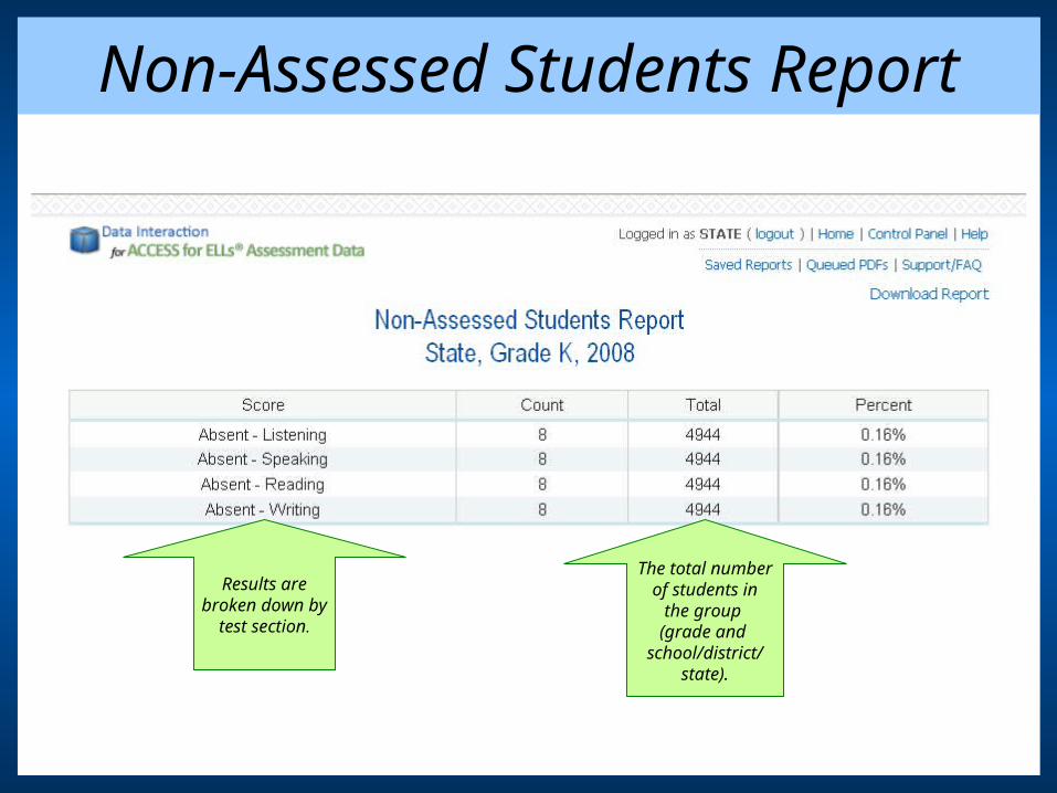
Non-Assessed Students Report
Results arebroken down by
test section.
The total numberof students in
the group (grade and
school/district/state).
Additional Capabilities & Features
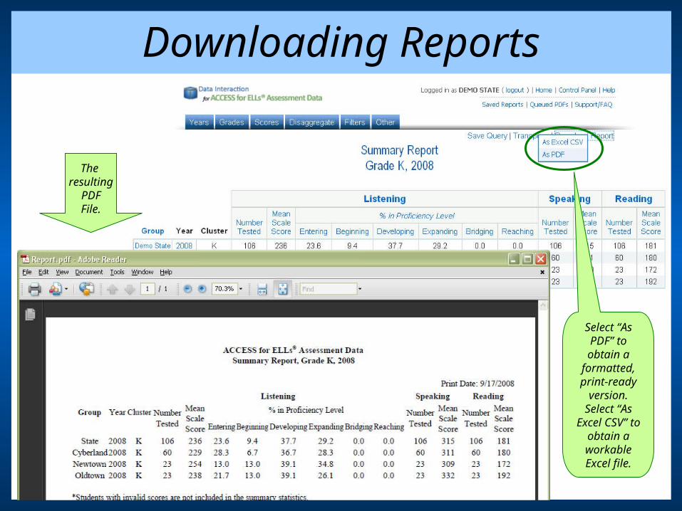
Downloading Reports
Select “As PDF” to obtain a
formatted, print-ready
version. Select “As Excel CSV” to obtain a workable Excel file.
The resulting
PDFFile.

Saving Queries
To save a report, click on “Save Query.”
To retrieve a saved query,
click on “Saved
Reports.”

Control Panel
Visible options vary with access.Administrative users’ options are dependent on their account level: state, district, or school. Normal
users can only view the User Survey Results.
Click on alink to accessthe featuresof the ControlPanel: creatingusers, viewing activity,deactivatingaccounts, and viewingfeedback and survey results.
Thank you for exploring
To discover more, visit us online at www.emetric.net.


