Some Empirical Findings from Effective Visual Communication on Weather Infographics Eunice Hsiao-Hui Wang*, Hung-Yung Tang *Associate Professor, Innovation Center for Big Data and Digital Convergence/Department of Information Communication Yuan Ze University, Taiwan CPRsouth 2015, Taipei August 26-28, 2015
Transcript
Some Empirical Findings from Effective Visual
Communicationon Weather Infographics
Eunice Hsiao-Hui Wang*, Hung-Yung Tang*Associate Professor, Innovation Center for Big Data and Digital
Convergence/Department of Information Communication Yuan Ze University, Taiwan
CPRsouth 2015, TaipeiAugust 26-28, 2015
Introduction
Theory and Literature Review
Conceptual Research Framework
Research Method
Results
Conclusion
Agenda
Emerging infographics
The infographics in various industries
Traffic data
Medical data
Air pollution/weather data
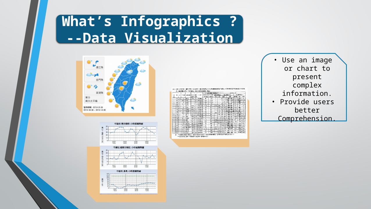
What’s Infographics ? --Data Visualization
• Use an image or chart to present complex
information.• Provide users better
Comprehension.
Theory and Literature
Dual-Coding Theory
Image system is better than the Writing system on memory capacity.And have better learning outcomes.
Source: Paivio,1971
Theory and Literature
Cognitive Load Theory
Amount of information will affect the level of cognitive load.
Excessive amount of information,
Have difficulty in learning and understanding.
Source: Marcus, 1996
Mental effort Mental load
Learning effect
Visual Presentations
Conceptual Research Framework
Number Tables
Number Table/Low Information Number Table/High Information
Digital Graphics
Chart Form/Low Information Chart Form/High Information
Graphic Form/Low Information Graphic Form/High Information
Information Comprehension
Memory Comprehension
Cognitive Load
Mental effort Mental load
Research Method
Field Experiment
Data visualization of Weather information
Central Weather Bureau Information
Research Design Source: Sweller (1998) &Weng (2001)
Questionnaire.
Data Analysis
SPSS 17 & AMOS 20 statistical software
T test one-way ANOVA
How the amounts of information impact on information
comprehension and cognitive load.
How the ways of weather Information presented impact on the information comprehension.
Data Analysis
T test
Low Information High Information
P < .001*** P < .001***
Information Comprehension
Data Analysis
one-way ANOVA
Low Information High Information
Information Comprehension
Number tablesChart Form
Graphic Form
P < .001***P < .027**
Data Analysis
Cognitive load
Low Information High Information
tablesCharts
Graphics
Cognitive loadP < .001***
Conclusion Highlights:One of the most significant factors influencing
memory:Amount of information
One single piece of information presentation works better than the high amount of information
presentation in viewers’ memory.But as of information comprehension, how the
data visualization presented matters more.
Conclusion Highlights:Low amount of information presentation likely leads
to preferable low cognitive load.
The high amount of information will be less easy to understand at a glance, because the content of information
may trigger more cognitive load.Thus, the single piece of information presented will be a
better choice for lower cognitive load for viewers.
Low Information High Information
Cognitive load
Conclusion Highlights:Visual presentations in Information
Learning
Effective visual communication in Information learning
The most effective way of visual communication for weather information learning, in our experiment study, was to
present simple color Charts.
Simple color Charts seem to be the best visual presentation, highlighting substantial information with not too much cognitive