20
Evaluation By Bethany Jones
| Date post: | 27-Jul-2015 |
| Category: |
Design |
| Upload: | bethanyjones1998 |
| View: | 171 times |
| Download: | 0 times |

Evaluation By Bethany Jones
In what why does your media product use, develop or challenge forms and conventions of real media products?
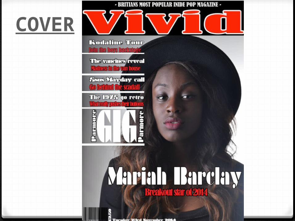
COVER
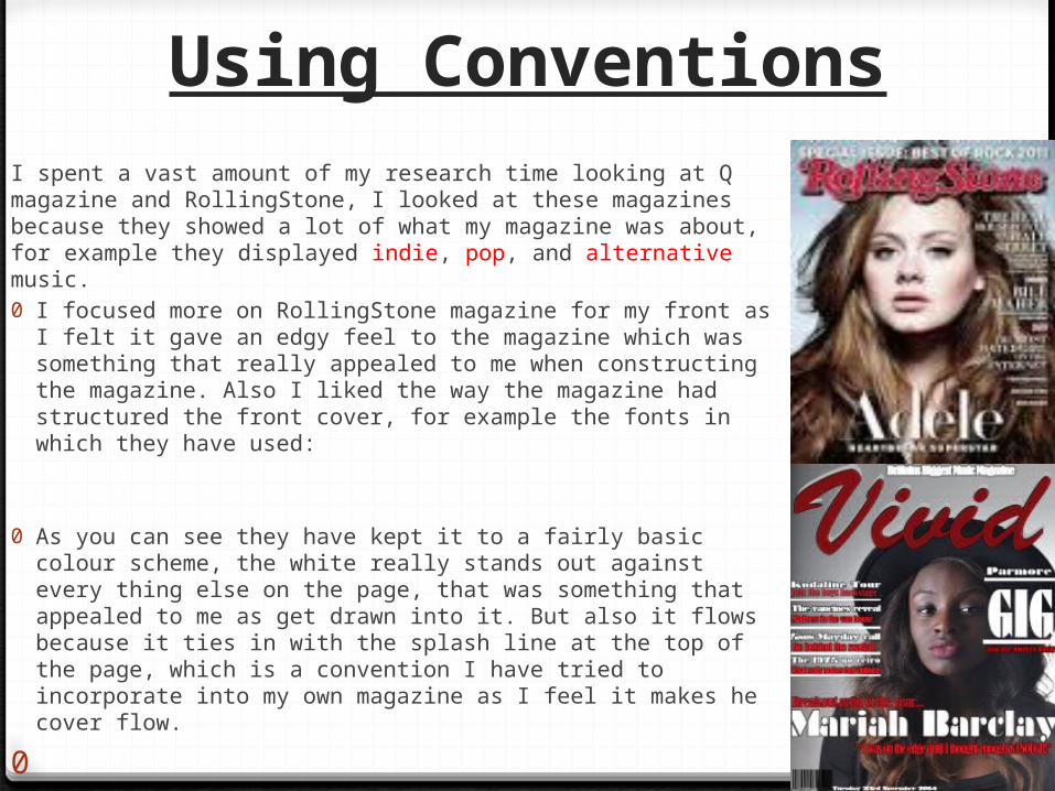
Using ConventionsI spent a vast amount of my research time looking at Q magazine and RollingStone, I looked at these magazines because they showed a lot of what my magazine was about, for example they displayed indie, pop, and alternative music.0 I focused more on RollingStone magazine for my front as I felt it gave an
edgy feel to the magazine which was something that really appealed to me when constructing the magazine. Also I liked the way the magazine had structured the front cover, for example the fonts in which they have used:
0 As you can see they have kept it to a fairly basic colour scheme, the white really stands out against every thing else on the page, that was something that appealed to me as get drawn into it. But also it flows because it ties in with the splash line at the top of the page, which is a convention I have tried to incorporate into my own magazine as I feel it makes he cover flow.
0
Conventions of my magazine
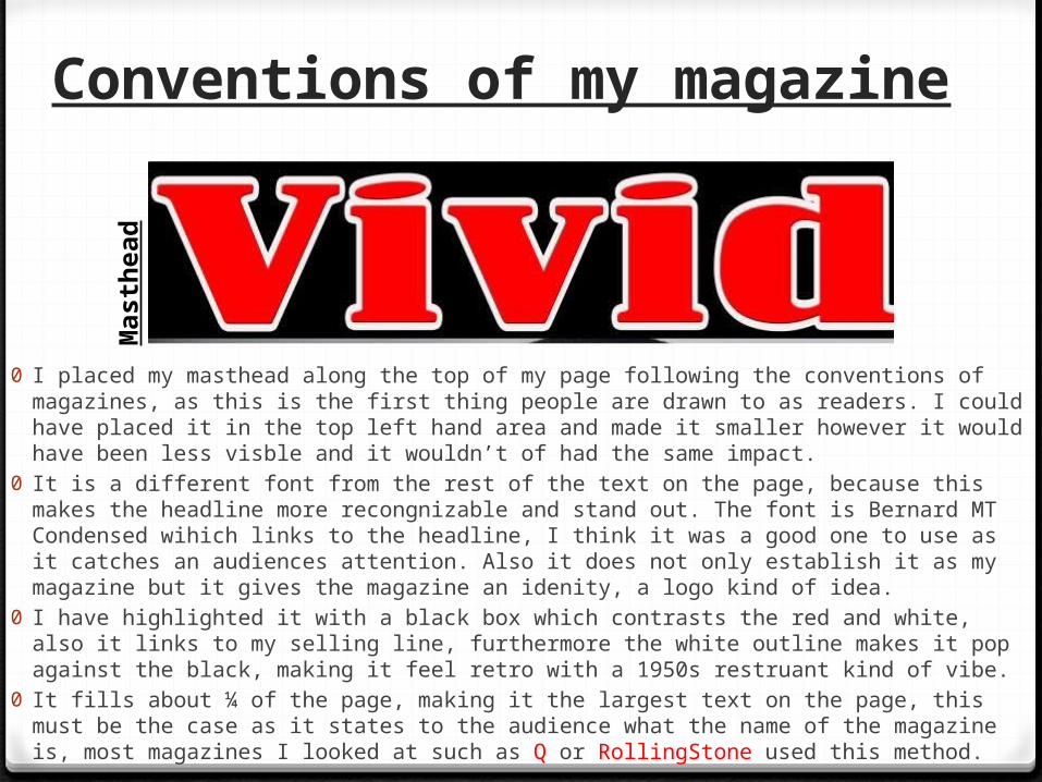
0 I placed my masthead along the top of my page following the conventions of magazines, as this is the first thing people are drawn to as readers. I could have placed it in the top left hand area and made it smaller however it would have been less visble and it wouldn’t of had the same impact.
0 It is a different font from the rest of the text on the page, because this makes the headline more recongnizable and stand out. The font is Bernard MT Condensed wihich links to the headline, I think it was a good one to use as it catches an audiences attention. Also it does not only establish it as my magazine but it gives the magazine an idenity, a logo kind of idea.
0 I have highlighted it with a black box which contrasts the red and white, also it links to my selling line, furthermore the white outline makes it pop against the black, making it feel retro with a 1950s restruant kind of vibe.
0 It fills about ¼ of the page, making it the largest text on the page, this must be the case as it states to the audience what the name of the magazine is, most magazines I looked at such as Q or RollingStone used this method.
Mas
thea
d
Conventions of my music magazine
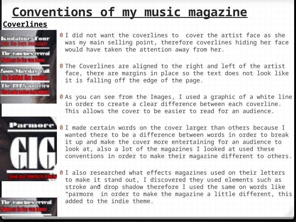
0 I did not want the coverlines to cover the artist face as she was my main selling point, therefore coverlines hiding her face would have taken the attention away from her.
0 The Coverlines are aligned to the right and left of the artist face, there are margins in place so the text does not look like it is falling off the edge of the page.
0 As you can see from the Images, I used a graphic of a white line in order to create a clear difference between each coverline. This allows the cover to be easier to read for an audience.
0 I made certain words on the cover larger than others because I wanted there to be a difference between words in order to break it up and make the cover more entertaining for an audience to look at, also a lot of the magazines I looked at used these conventions in order to make their magazine different to others.
0 I also researched what effects magazines used on their letters to make it stand out, I discovered they used elements such as stroke and drop shadow therefore I used the same on words like “parmore” in order to make the magazine a little different, this added to the indie theme.
Coverlines

Conventions of my magazine
0 The convention of the headline is that: the name of the artist is on the cover photo- in this case “ Mariah Barclay”.
0 It is the second largest text on the page, I chose to make it that way because she is a new, upcoming artist, therefore people may not know who she is a first glance, so with having the name in a Bernard MT condensed font, and in big, bold letters with a black outline it prevents people from ignoring her.
0 Conventionally I have text under the headline, in order to tell people what she is all about, much like ‘RollingStone’ magazine I have chosen “Breakout star of 2014”, this links to the article about her being up and coming.
Hea
dlin
e
Hea
dlin
e
Conventions of my magazine
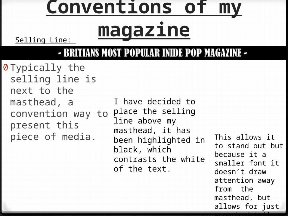
0Typically the selling line is next to the masthead, a convention way to present this piece of media.
Selling Line:
I have decided to place the selling line above my masthead, it has been highlighted in black, which contrasts the white of the text.
This allows it to stand out but because it a smaller font it doesn’t draw attention away from the masthead, but allows for just enough detail for people to see and read it.

CONTENTS
Conventions of my magazineWhat’s inside?
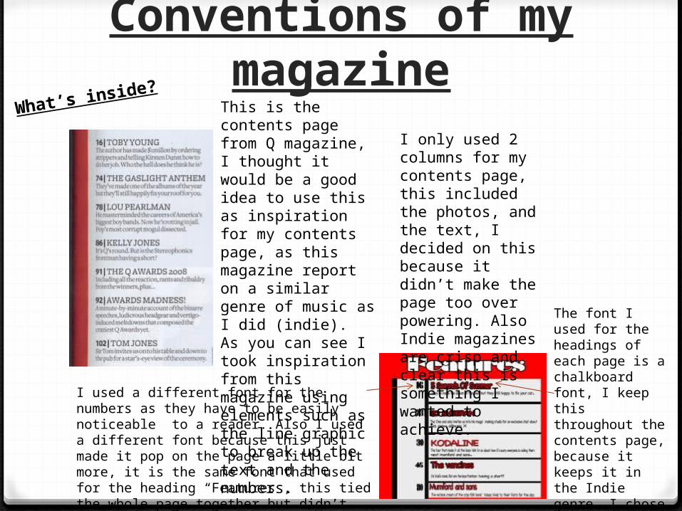
This is the contents page from Q magazine, I thought it would be a good idea to use this as inspiration for my contents page, as this magazine report on a similar genre of music as I did (indie). As you can see I took inspiration from this magazine using elements such as the line graphic to break up the text and the numbers.
The font I used for the headings of each page is a chalkboard font, I keep this throughout the contents page, because it keeps it in the Indie genre. I chose this font because it stands out and gives an edge of oringanity.
I used a different font for the numbers as they have to be easily noticeable to a reader. Also I used a different font because this just made it pop on the page a little bit more, it is the same font that used for the heading “Features”, this tied the whole page together but didn’t make the page too over powering.
I only used 2 columns for my contents page, this included the photos, and the text, I decided on this because it didn’t make the page too over powering. Also Indie magazines are crisp and clear this is something I wanted to achieve.
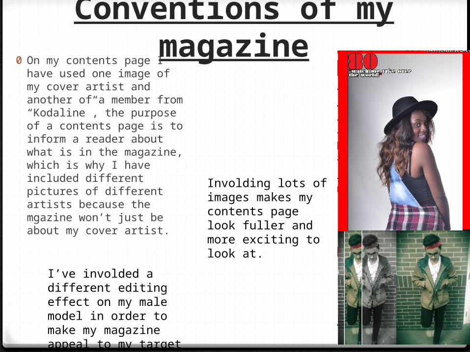
Conventions of my magazine0 On my contents page I have
used one image of my cover artist and another of a member from “Kodaline”, the purpose of a contents page is to inform a reader about what is in the magazine, which is why I have included different pictures of different artists because the mgazine won’t just be about my cover artist.
Involding lots of images makes my contents page look fuller and more exciting to look at.
I’ve involded a different editing effect on my male model in order to make my magazine appeal to my target audience.

Conventions of my magazine
0 I wanted to keep a similar theme running through my magazine with the fonts I used therefore I used one of the same fonts I used on my front cover for my contents headline. The red and white ties in with the theme and keeps a flow through my magazine.
0 I used the same font so my audience will not have to know the name of my magazine but they will recongnize the font therefore start to learn the name of my magazine.
0 The date of the magazine and issue number are smaller compared to the title, however I have used the red on white again because it allows a small font to stand out. But also I made it smaller because it doesn’t take the attention away from the headline.
0 I put the issue number on the contents page so the reader can clearly see what issue it is without having to struggle to see it on the cover.

Article:
Conventions of my magazine
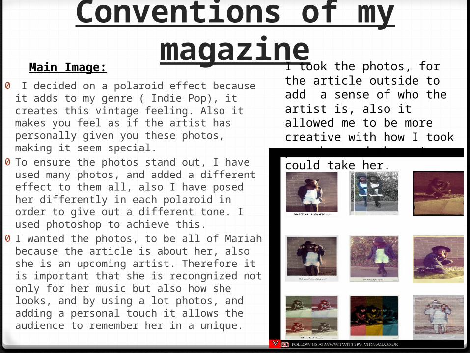
0 I decided on a polaroid effect because it adds to my genre ( Indie Pop), it creates this vintage feeling. Also it makes you feel as if the artist has personally given you these photos, making it seem special.
0 To ensure the photos stand out, I have used many photos, and added a different effect to them all, also I have posed her differently in each polaroid in order to give out a different tone. I used photoshop to achieve this.
0 I wanted the photos, to be all of Mariah because the article is about her, also she is an upcoming artist. Therefore it is important that she is recongnized not only for her music but also how she looks, and by using a lot photos, and adding a personal touch it allows the audience to remember her in a unique.
Main Image: I took the photos, for the article outside to add a sense of who the artist is, also it allowed me to be more creative with how I took pose her and where I could take her.
Conventions Of My Magazine
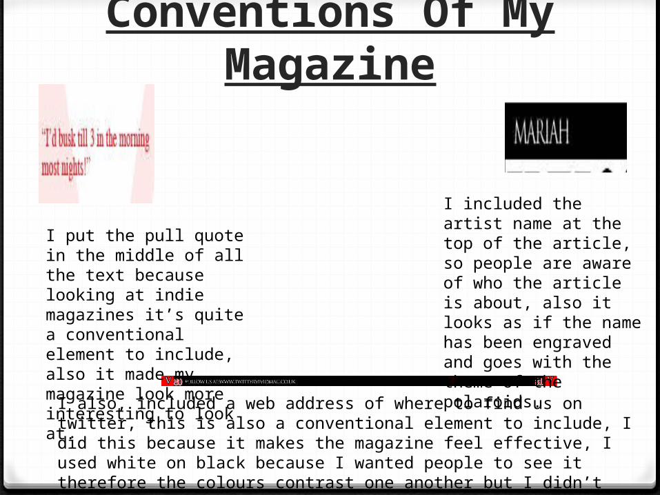
I put the pull quote in the middle of all the text because looking at indie magazines it’s quite a conventional element to include, also it made my magazine look more interesting to look at.
I included the artist name at the top of the article, so people are aware of who the article is about, also it looks as if the name has been engraved and goes with the theme of the polaroids.
I also, included a web address of where to find us on twitter, this is also a conventional element to include, I did this because it makes the magazine feel effective, I used white on black because I wanted people to see it therefore the colours contrast one another but I didn’t want it to take attention away from the article.
Conventions of my magazine
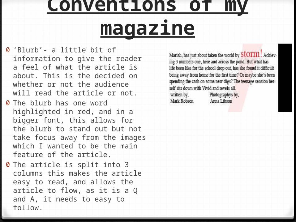
0 ‘Blurb’- a little bit of information to give the reader a feel of what the article is about. This is the decided on whether or not the audience will read the article or not.
0 The blurb has one word highlighted in red, and in a bigger font, this allows for the blurb to stand out but not take focus away from the images which I wanted to be the main feature of the article.
0 The article is split into 3 columns this makes the article easy to read, and allows the article to flow, as it is a Q and A, it needs to easy to follow.
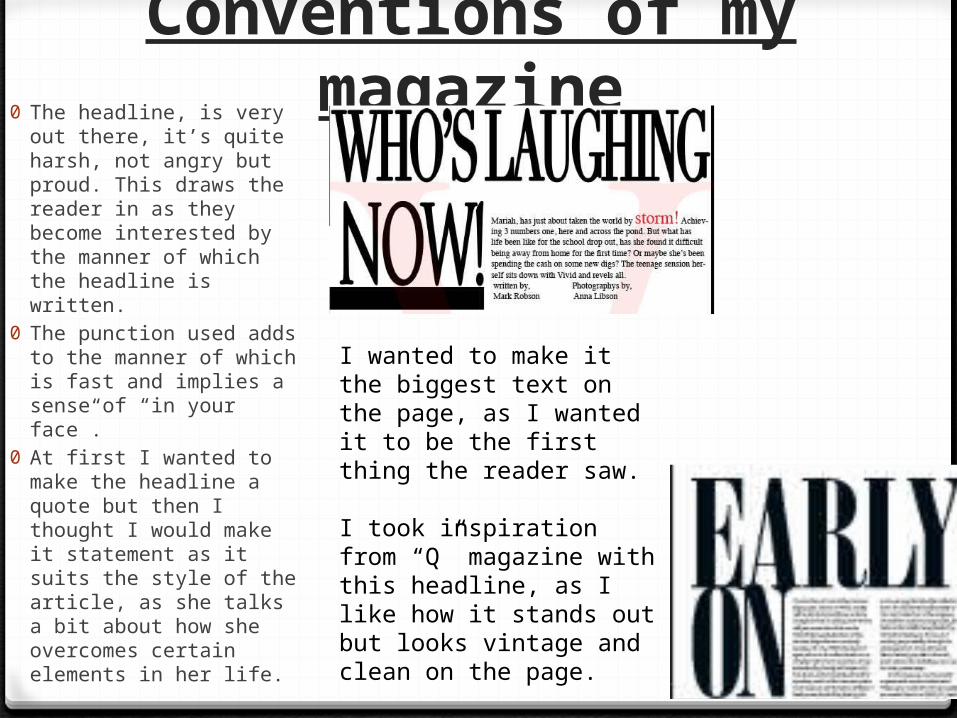
Conventions of my magazine0 The headline, is very out
there, it’s quite harsh, not angry but proud. This draws the reader in as they become interested by the manner of which the headline is written.
0 The punction used adds to the manner of which is fast and implies a sense of “in your face”.
0 At first I wanted to make the headline a quote but then I thought I would make it statement as it suits the style of the article, as she talks a bit about how she overcomes certain elements in her life.
I wanted to make it the biggest text on the page, as I wanted it to be the first thing the reader saw.
I took inspiration from “Q” magazine with this headline, as I like how it stands out but looks vintage and clean on the page.
Forms0 The colour scheme of my magazine is black, white and red, I wanted to
keep it simply as then it doesn’t over power the reader. White and Black are quite sophisticated colours, which I liked because it adds to the whole vintage feeling, but the red adds a bit of edge and adds to the creative aspect, and it adds a bit of brightness.
0 I have used images that were all taken by myself – most magazine would have printed them, I used photoshop, not video clips as this would not have been suitable.
0 I have chosen all different fonts, that flow throughout the magazine, I wanted ones that were clear and easy to read as that make sit easier for the reader. Keeping my genre in mind when choosing, I chose quite indie and vintage fonts.

Challenging Conventions
0The only convention I have not followed it that I haven’t used a reduced version of my cover on my contents page, I didn’t included this as my genre didn’t really ever include this in their magazines. Therefore I wanted to keep my magazine mainstream and true to my genre rather than every other magazine.
0Also, other indie magazine such as “Q” do not use a reduced version of their cover, This may be because the artist on their cover is not always featured on their contents page. For other indie style magazines, I have found that their contents pages are more focused on how creative you can be with the page.


