10
How effective is the combination of your main product and ancillary texts?
| Date post: | 07-Aug-2015 |
| Category: |
Education |
| Upload: | littlealamo |
| View: | 33 times |
| Download: | 0 times |

How effective is the combination
of your main product and
ancillary texts?

Once deciding what genre to focus on we had to choose a suitable song.
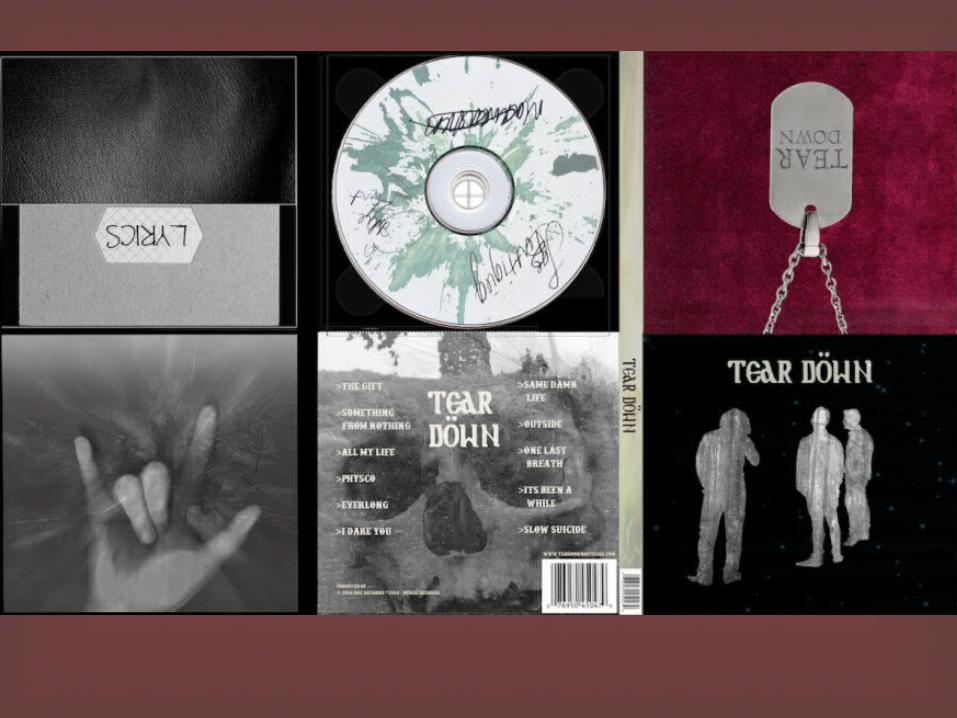
This was easy because me and Aiden both listen to the same genre of music so there wasn’t any problems with it being too much for the other person to listen to continuously. The same liking of music also helped us in the sense that we both knew what roughly was expected in such a genre and had fun trading ideas which we could incorporate into the video. We found out more into depth what is suitable for a post grunge genre music video and started working on digipaks and posters to help promote our band and their music. The amount of research made looking for inspirational ancillary texts a lot easier and very helpful. The colour scheme for my digipaks and poster was quite dark and gloomy, with burgundy and blacks being the most prominent colour. I think this made it look good because it fits in with the expectations of what is expected from a album of this genre. I also added hints of light blue/greens to make sure that it was not too dark, because we wanted to make a twist on general expectations of this genre, so altered it subtly to do so.

The reason we chose this genre was because we both really
enjoy it. We both knew exactly what we wanted the music video to look like, how we wanted the cast to look, and just the whole concept in general. We both had a rough idea in what we wanted to incorporate within the video, and knew good inspiration bands to take ideas from. We decided to try and look at other significant meanings the song may have but made sure we understood the original music videos meaning first; which was the lead singer accidently killing a little girl and throughout the video you see him reminiscing back to her before she died. With this in mind we decided to base it around suicide and the thought of loosing someone you consider to be a gift; taking the idea of death and incorporating it another way into the video to give it some originality.
Why we chose this genre?

My digipak front cover consists of the three band members. I made it so that the forest which the music video is based around is their bodies and souls, symbolising that this memory haunts not only the lead singer, but his fellow band members because of the effect it has had on their friend. The amount of foliage within each member is a representation of how they feel, the lead singer, being the most effected by the death of his girlfriend, has hardly any trees or anything showing that he feels empty and gives the audience a sense of the nothingness he is feeling. His best friend, the drummer is also lacking foliage as he can see his best friend deteriorating from a happy, loving, joker to someone who doesn’t see a reason in waking up anymore. Lastly, Max, the guitarist has the most foliage because he is the only one keeping the band alive and bringing a sense of normality to such a tragic doing. I ensured the space between the trees was bright and light coloured connoting death, and the idea of angels taking their souls. I tried to keep the theme of my digipaks consistent throughout, keeping the colours dark as well as light to both represent the different views of death, it being graceful, as well as daunting and traumatic. I merged images together for the back cover as a representation of the lead singers brain and the fact that he’s thinking over his life; I chose a skull, for the obvious reason that death is a key area for this album, and the forest because it is the key location for the album. I didn’t use an image that would reveal the songs meaning too much because I wanted to give the consumer the ability to think of their own story, and try to think of who died and why, and get the consumer more involved with the album and the band.
Digipak front cover.

I didnt put a facebook or twitter page on my digipak
because i wanted to keep the digipak simple and effective and try and open doors, much like other slides say, for the consumers to do this or create something for the band. Another reason why i didn't want a facebook page on my digipak was because i wanted it to have an old fashioned feel, in the sense that they didn’t have facebook pages on the back of CD’s in the 80’s etc, which led the consumers to go and find people with similar intrests in music and talk to them about the album, and lead them to make up their own stories what they think the album is about and similar activities.

For the poster I kept the image the same as the digipak because I
think it looks better and works better in relation to a different picture. I think the simplicity makes it work and even though its a different image I added other filters to give it a different feel. I think the tree band members really works because it shows a good representation of their inner selves, much like the previous slide where I spoke about it in more depth. I put like a light blue layer over it because i thought it looked like space, which is considered to be quite a lonely place, much like the lead singers soul after his fiancé commits suicide; but the stars show that there are people or things there but you cant always see them because of the approach you take on them, which in this case are his fellow band members. Overall with the time given i think the poster looks quite good and it has conventions of post grunge.
Poster.
With all the ancillary texts, there has been
some sort of relation back to the band members and the story making sure that everything I have done has a meaning and opens up opportunities for the consumer to give their own opinion and reason. I like that my digipak and poster have this essence because it just gets the audience more involved with the band and the band and audience can have a more intimate relationship with each other.

Overall I think that all of my ancillary texts reference each other,
the main image being the point that pulls everything together. All the colours work with each other, showing that the poster and digipak are related. I like the story and meaning behind the front cover and poster and am pleased with the final look. With more time I think that I could of made it look a lot better and learn how to work with photo shop better and give the entire look a cleaner finish and add more to give more story away, but I like that there is a sense of mystery with my digipak because it just opens windows for interaction with the audience and band. I like the colour scheme and the theme of the entire project also, linking in with all the codes and conventions of a post grunge album. So, overall, I am very pleased with my final ancillary texts, especially because I didn’t think that they would turn out as good as they have.
Conclusion.