OCR Media Studies – AS Level Unit G321: Foundation Portfolio in Media Evaluation Name: Von Villanueva Candidate Number: 6515 Center Name: St. Paul’s Catholic College Center Number: 64770 Set Brief - Print Music Magazine – Production Preliminary Task, Log Book and Evaluation
Transcript
OCR Media Studies – AS Level
Unit G321: Foundation Portfolio in Media
Evaluation
Name: Von VillanuevaCandidate Number: 6515Center Name: St. Paul’s Catholic CollegeCenter Number: 64770
Set Brief - Print
Music Magazine – Production
Preliminary Task, Log Book and Evaluation
Photography planning
In order to get a high-quality standard and professional looking magazine, I had to plan where, when and who will represent my magazine.
Through the messaging option on my mobile phone, I asked my friend Francis Galan if he would mind being the main model for my music magazine since he is a major fan of R&B music therefore I felt that he would be interested in my magazine and also he fits into my target audience, so he is a representation of the R&B genre. This is also due to his ‘cool’ and ‘chill’ personality which naturally represents my magazine.
I planned the location and also asked him to style himself in a specific way which involved a combination of smart-casual streetwear. to get the best quality photo I can acquire and also so that his attire will represent my target audience which is 15 to 20 year olds. I had to consider when to take the photos as the lighting from the environment could affect the overall quality of the image.
I asked him to pose which led him to pose in a naturalistic way which made the whole photo-shoot experience more interesting and enjoyable. His natural poses represented how people from my target audience pose and behave.After the images have been taken, I connected my camera with a computer and imported the images where I edited them on Photoshop and inserted them into my magazine.
Q1. In what way does your media product use, develop or challenge forms and conventions of real media products? Front Cover
For this coursework, I was given the task to create a magazine with a front cover, contents page and a double page spread. I aimed to create a magazine which represents the R&B genre but I also wanted to make the magazine personal by making the masthead ‘VasV’ which stands for Von Aerol Soberano Villanueva. The magazine is aimed at 15-20 year old males. I used ‘Q’ magazine as my magazine of inspiration (MOI) as it is a notorious and well-known magazine which features several genres including R&B orientated music. To produce a successful magazine, I mimicked a few codes and conventions from my magazine of inspiration (MOI). For example I have copied the same location of where the masthead is as well as the background behind the masthead to make it more eye-catching. In addition I have also incorporated the same idea of adding a list of artists on the right side of the front cover which is similar to my magazine of inspiration (MOI). The use of repetition (Steve Neale) made sure that the layout matches the standard of a professional magazine such as Q. In addition, I repeated the use of big font size for the models name to emphasise the artist and to promote him more. This can be seen in my magazine of inspiration (MOI) as the text ‘Tine Tempah’ uses a larger font size compared to the other text on the front cover.I also repeated the house style of consistently using the same colours, incorporating masthead and web-address across my 5 pages. This creates brand identity and awareness of the magazine which is more professional. The repetition of the colours used will attract the audience and the addition of the social media links will encourage the reader to gain more information of the magazine on the social media.Furthermore, comparable to my magazine of inspiration (MOI) and my created magazine, both models have some sort of hand gestures and both have items that they are holding. In my magazine, my model (Francis Galan) is making a triangle shape with his eye inside the triangle and he is also holding onto a chain/necklace whereas in my MOI, the model (Tinie Tempah) is holding onto his tie. However I included examples of ‘difference’ such as the way my model is dressed as he is wearing casual ‘street’ clothes which can be described as having ‘swag’ whereas the model on my MOI is wearing a shirt and tie which makes him and the overall front cover more professional and smart.
Front cover of VasV
Front cover of magazine of inspiration
Q1. In what way does your media product use, develop or challenge forms and conventions of real media products? Contents page and 2nd Contents page
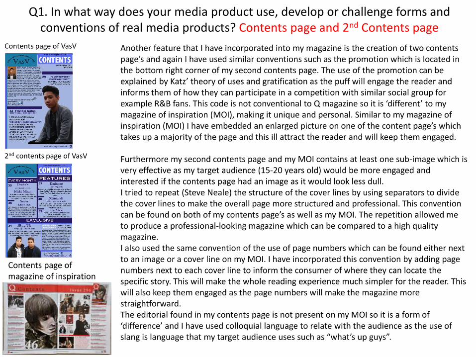
Contents page of VasV
Contents page of magazine of inspiration
2nd contents page of VasV
Another feature that I have incorporated into my magazine is the creation of two contents page’s and again I have used similar conventions such as the promotion which is located in the bottom right corner of my second contents page. The use of the promotion can be explained by Katz’ theory of uses and gratification as the puff will engage the reader and informs them of how they can participate in a competition with similar social group for example R&B fans. This code is not conventional to Q magazine so it is ‘different’ to my magazine of inspiration (MOI), making it unique and personal. Similar to my magazine of inspiration (MOI) I have embedded an enlarged picture on one of the content page’s which takes up a majority of the page and this ill attract the reader and will keep them engaged.
Furthermore my second contents page and my MOI contains at least one sub-image which is very effective as my target audience (15-20 years old) would be more engaged and interested if the contents page had an image as it would look less dull. I tried to repeat (Steve Neale) the structure of the cover lines by using separators to divide the cover lines to make the overall page more structured and professional. This convention can be found on both of my contents page’s as well as my MOI. The repetition allowed me to produce a professional-looking magazine which can be compared to a high quality magazine.I also used the same convention of the use of page numbers which can be found either next to an image or a cover line on my MOI. I have incorporated this convention by adding page numbers next to each cover line to inform the consumer of where they can locate the specific story. This will make the whole reading experience much simpler for the reader. This will also keep them engaged as the page numbers will make the magazine more straightforward.The editorial found in my contents page is not present on my MOI so it is a form of ‘difference’ and I have used colloquial language to relate with the audience as the use of slang is language that my target audience uses such as “what’s up guys”.
Q1. In what way does your media product use, develop or challenge forms and conventions of real media products? Double page spread
Double page spread of VasV
Double page spread of magazine of inspiration
My double page spread (DPS) clearly relied on my magazine of inspiration (NOI) in terms of structure and positioning, for example similar to my MOI, I paced my main image on the right side of the DPS which takes only a quarter of the page. This repetition (Steve Neale) gave me more space for the interview which is what the DPS is ultimately about. Also I have used the same form of embedding the introduction on the top of the left page so that the audience will be informed and educated (Katz) of what the DPS is about and what information it contains. However I have developed my introduction by adding a drop capital which is not conventional to my MOI and makes the introduction more interesting and unique.I challenged the responses from my MOI as they are too standard which is why my magazine contains detailed as well as personal responses from the artist which allows the reader to connect with the artist and so they can try to perfect their self-image (Hartley’s seven subjectivities) and this will appeal to the audience.I have repeated the same structure (Steve Neale) by constructing the interview into columns to make it more organized and professional. This structure will make the experience better for the reader as it will not be condensed too much.In addition I have distinguished the question and response by using different colours which is conventional in my MOI, however I have used purple and black to keep the consistent use of the same colour. This will make it easier for the reader to know which is the question and which is the response. Also the clear contrast of the colours make it more eye-catching and will entice the audience.
Q2. How does your media product represent particular social groups?
My media product represents several social groups such as young, troubled men as well as R&B lovers etc.As seen through the main images on all of the pages, my magazine is a representation of young men, R&B lovers as well as fans of the mainstream artists that I have featured. The well-know artists such as Drake, Nicki Minaj and Coldplay represent social groups who are interested these artists. This creates a sense of community. The denotation of representation is young men for my magazine as my model represents a young man who ‘started from the bottom’ which connotes that he is an average teenager so the audience can relate with the model. On the contents page, I have used colloquial language such as “what’s up guys” which connotes a casual and friendly conversation. This language is widely used in the modern society so this represents young males. In addition I have used similar language on the double page spread as slang as well as a swear word has been incorporated within the questions and responses. This again represents young males as the use of slang makes it much more simpler for the target audience to understand.Moreover R&B artists are typically represented as ‘sexual’ singers in the media as their songs are usually sexual in nature. However the magazine presents a more personal artist as seen in the questions on the double page spread. This connotes that young males can see the model as a role model as his songs denotes his life story and all the hardships he went through. This means the audience may reconsider their self-image (Maslow’s Hierarchy of Needs) and aspire to be like Francis Galan (model). The double page spread represents Francis Galan in a favorable manner as one of his responses connotes “..everything I do is for my parents”. The denotation of this response is that he is very thankful of his parents for providing him with the necessities and this can seem ‘unhip’.
Q3. What kind of media institution might distribute your media product and why?
Based on the research I conducted on existing media institutions/publishers I feel that Bauer Media Group is a more suitable institution than ‘Intermedia partners’ and ‘SpinMedia’ as Bauer is a more well-known and mainstream institution. In addition Bauer Media Group is a more diverse institution as they feature more than one brand of magazine such as Q and Kerrang! Which are two notorious music magazines, and also feature several genre’s such as R&B, Hip Hop and Pop. The fact that they publish different genre’s increases the popularity of the brand and therefore raises awareness of the publisher.
Bauer’s motto is ‘we think popular’ and this suggests that they feature popular and most listened to genre’s such as R&B and so this means they will most likely distribute my magazine.
Similar to Q magazine, VasV magazine features mainstream and notorious artists. In Q magazine the famous artists are usually used as the main image, however I have incorporated the main artists and used them for my cover line. In addition VasV magazine also offers a competition and presents some form of fashion as seen through the main image. This means Bauer might distribute my magazine as I have used similar codes, conventions as well as common features to Q magazine which may seem like my magazine is created to the same standard as a professional magazine.
Q4. Who would be your media audience and why?The target audience for my music magazine would be young males, specifically between the ages of 15 and 20 years old since the genre of my music magazine is R&B which generally appeals to males. This is presented through the young male model on the front cover as well as on the contents and double page spread. This relates to Hartley’s seven subjectivities theory as the different aspects incorporated in my music magazine will appeal to a specific gender, age as well as class. However my music magazine may appeal to an older generation or even females, depending on the content of my magazine and how females are represented in the magazine but stereotypically, young males listen to R&B more than females. R&B music is a popular African-American music which would appeal to that specific culture and background. The majority of R&B artists are male and therefore the young, male consumer can relate as well as build a personal relationship with the artist, including the editor as suggested by Katz’s theory and his idea of the audience can relate to an individual or the situation (personal identification). Alternatively, the audience also builds a close bond with an individual (personal relationship which attracts the consumer even more.
The price of my magazine is £1.75 which can be seen to be very cost-effective for young males. It is ultimately suitable for people in the D and E grade since they are either unskilled or is a full time student, meaning they would be able to afford my magazine. Since the potential buyers of my magazine would be students, I decided to target young males which is why the colours used, the genre as well as the content relate to the up-and-coming and modern stories which are linked to R&B.
‘Social climbers’, as described by Maslow’s Hierarchy of Needs are people who try to identify with several characters and adopt their values and behavior to become popular. By copying celebrities and artists, the audience hopes to be respected by others which is supported by Maslow’s ‘Esteem category’. This also links to the audiences’ ‘self-image’ as they can relate with the artists. Specifically, the story behind my front cover suggests that the model/artist ‘started from the bottom’. This means the audience can find exclusive content on how Francis Galan started as an average student (such as myself and the audience) and rose to become a famous artist. The fact that Francis Galan went through the same things we did as an audience, the consumers can relate to the magazine and will attract them more. This allows the consumer to identify with the artist to perfect their ‘confidence’, ‘self esteem’ as well as ‘self-image’.
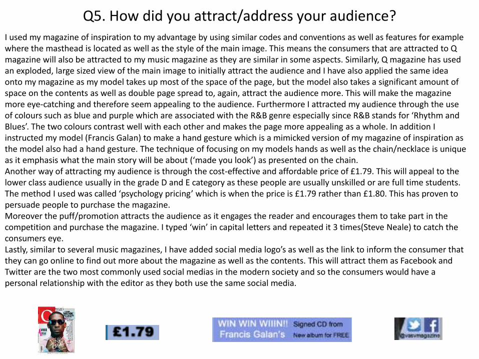
Q5. How did you attract/address your audience?I used my magazine of inspiration to my advantage by using similar codes and conventions as well as features for example where the masthead is located as well as the style of the main image. This means the consumers that are attracted to Q magazine will also be attracted to my music magazine as they are similar in some aspects. Similarly, Q magazine has used an exploded, large sized view of the main image to initially attract the audience and I have also applied the same idea onto my magazine as my model takes up most of the space of the page, but the model also takes a significant amount of space on the contents as well as double page spread to, again, attract the audience more. This will make the magazine more eye-catching and therefore seem appealing to the audience. Furthermore I attracted my audience through the use of colours such as blue and purple which are associated with the R&B genre especially since R&B stands for ‘Rhythm and Blues’. The two colours contrast well with each other and makes the page more appealing as a whole. In addition I instructed my model (Francis Galan) to make a hand gesture which is a mimicked version of my magazine of inspiration as the model also had a hand gesture. The technique of focusing on my models hands as well as the chain/necklace is unique as it emphasis what the main story will be about (‘made you look’) as presented on the chain.Another way of attracting my audience is through the cost-effective and affordable price of £1.79. This will appeal to the lower class audience usually in the grade D and E category as these people are usually unskilled or are full time students. The method I used was called ‘psychology pricing’ which is when the price is £1.79 rather than £1.80. This has proven to persuade people to purchase the magazine.Moreover the puff/promotion attracts the audience as it engages the reader and encourages them to take part in the competition and purchase the magazine. I typed ‘win’ in capital letters and repeated it 3 times(Steve Neale) to catch the consumers eye.Lastly, similar to several music magazines, I have added social media logo’s as well as the link to inform the consumer that they can go online to find out more about the magazine as well as the contents. This will attract them as Facebook and Twitter are the two most commonly used social medias in the modern society and so the consumers would have a personal relationship with the editor as they both use the same social media.
Q6. What have you learnt about technologies from the process of constructing this product?
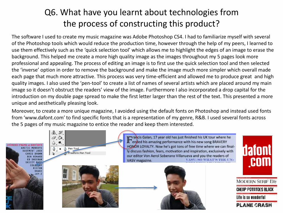
The software I used to create my music magazine was Adobe Photoshop CS4. I had to familiarize myself with several of the Photoshop tools which would reduce the production time, however through the help of my peers, I learned to use them effectively such as the ‘quick selection tool’ which allows me to highlight the edges of an image to erase the background. This helped me create a more high quality image as the images throughout my 5 pages look more professional and appealing. The process of editing an image is to first use the quick selection tool and then selected the ‘inverse’ option in order to remove the background and make the image much more simpler which overall made each page that much more attractive. This process was very time-efficient and allowed me to produce great and high quality images. I also used the ‘pen-tool’ to create a list of names of several artists which are placed around my main image so it doesn’t obstruct the readers’ view of the image. Furthermore I also incorporated a drop capital for the introduction on my double page spread to make the first letter larger than the rest of the text. This presented a more unique and aesthetically pleasing look.
Moreover, to create a more unique magazine, I avoided using the default fonts on Photoshop and instead used fonts from ‘www.dafont.com’ to find specific fonts that is a representation of my genre, R&B. I used several fonts across the 5 pages of my music magazine to entice the reader and keep them interested.
Analysis of codes and conventions: Front cover
Masthead
Strapline
Cover lines: These cover lines feature modern and well-known artists so consumers will be more attracted to the magazine. Red details to emphasise
important content: The red contrast from the purple and black which makes it more eye-catching.
Social media logo/link: This use of convergence informs the consumer of where they can go for more detail about the content. Also these social media are widely used in this society so the consumer can relate with the editor.
Barcode
Puff: This is a promotional convention which is used to attract and encourage consumer’s to take part in a competition which is related to a similar interest so people can relate with other consumers.
Puff: This is an alternative puff since the denotation of this puff is that by purchasing the magazine, the consumer will ‘discover’ never before seen albums.
Main image: The main image of ‘Francis Galan’ is a blown up picture which takes up a majority of the page which makes it even more eye-catching. In addition, The model is doing a hand gesture while emphasizing the chain which is very captivating and enticing.
Star appeal: The use and advertisement of the star appeal will attract a wider audience as the fans of these artists will be interested in purchasing the magazine.
3 borders/ background: The use of 3 backgrounds makes it more sophisticated. It is attractive as the 3 colours contrast well.
Web address: this is similar to the social media links as this will inform the consumer of where they can gain more insight of the magazine.
Price: Affordable, cost-effective price which is suitable for low-class citizens who are usually full time citizens.
Issue
Analysis of codes and conventions: Contents page
Page number: The page number makes the overall page more professional.
Main image: The model is looking directly at the camera so he is engaging with the audience which is more appealing. Also he is wearing casual clothes which gives it an authentic and personal vibe.
Web address: The repetition of the web address (Steve Neale) informs the reader of where they can go for more detail about the content.
Strapline
Masthead
Language: The use of colloquial language such as “What’s up guys” is language that the target audience uses (15-20 yrs) which means the editor is connecting with the audience. Also the editorial includes ways in which the reader can contact the editor.
Social media links: The use of Facebook and Twitter informs the consumer of where they can go for more details about the magazine. Also these are tow well-known and commonly used social media so the reader can identify with the editor as they use similar social media.
Cover line: The cover line title is a purple text and the description is black which contrasts really well and makes it easier to read.
Page numbers: The page numbers informs the consumer where the cover line can be found. This makes the whole experience for the reader much better as it is next to the cover line.
Separators: The purple separators divides the cover lines. This makes it more organized and structured and overall more professional.
Signature and full name: The signature and the editors full name has been added which give it a more personal feel as the editor is engaging with the audience by giving away his full name.
Different coloured texts: The use of purple and black distinguishes the title and the description which makes it clearer for the reader. Also they contrast well so they stand out and they are aesthetically pleasing.
Analysis of codes and conventions: 2nd Contents pageWeb address: The use of web address is consistent throughout the pages and they are used to inform the consumer of where they can be enlightened about the magazine.
Star appeal: The use of current and modern artists is more enticing as these artists are notorious and so each cover line is relevant.
Female star appeal: Females have been presented in the form of a cover line which may appeal to females as they may be fans of this artist. The male gaze (Laura Mulvey) can be applied here as some males find Nicki Minajattractive and will be interested in the story.
Strapline
Masthead
Categories: The cover lines have been put into categories which makes the page look more organized and structured and overall aesthetically pleasing.
Page numbers: The page numbers informs the reader of where the cover line can be found in the magazine. It is a bold text which can be clearly read and makes the whole experience easier for the reader.
Social media links: This is a form of convergence and is used so that the reader can gain more knowledge on the magazine and can even communicate with the editor.
Different font colour: The white text for the puff contrasts with the black text and purple background. This will emphasise the text and make it clearer for the audience to see.
Image: 15 to 20 year olds aren’t interested in too much text as it looks to dull which is why I incorporated an image to attract the readers and to keep them engaged is it make the page more attractive.
Separators: These dividers make the cover lines more organized and much clearer to read for the audience.
Analysis of codes and conventions: Double page spread
Main image: The main image only takes up a quarter of the page to attract attention from the reader. Also the model is biting a piece of gold jewelry which denotes his success.
Web address: The repetition of the web address informs the reader of where they can go for more details about the magazine/.
VasV masthead/logo: The incorporation of ‘VasV’ (masthead) informs the reader and reminds them of the magazine brand/name.
Drop capital: The drop capital feature is used to attract the audience since it is a bigger font size from the rest of the text.
Editor/photography details: These details notifies the reader of the editor and photographer of the magazine and main image.
Social media logo: The social media links are consistent through out the magazine and they inform the audience of where they can go for more details about the magazine.
Initials and name of main image: By adding the initials as well as name of the main image, I have emphasized who the interview is about. Also I used contrasting colours which is unique and makes it more attractive.
Columns: I have structured the interview in columns to make it more organized as well as professional-looking, This will keep the reader interested.
Unique selling point: The USP of my magazine is the personal responses from my main artist/model as they include stories of his past which means the target audience can relate with him and can improve their self-image (Hartley’s 7 subjectivities).
Q7. Looking back at the preliminary task, what do you feel you have learnt in the progression of it from the full product?
Looking back, I feel that I have developed my basic knowledge of Photoshop CS4 which can be seen through my preliminary task and my main task. I have learnt new techniques as well as tools to improve the quality of my pages. Also I have learnt about the expectations of a professional music magazine and how much demands there are from the target audience that relates to it due to my research on existing professional magazines. For example, comparing my school magazine front cover and music magazine front cover, the image is more unique in my music magazine where as the image is more standard in my school magazine. Furthermore, considering that I have further developed my Photoshop skills, I have edited my music magazine’s main image by experimenting with the colour contrast of the image to make it more eye-catching. In addition, looking at my contents pages, the general layout is much more structured and the colour scheme is consistent throughout the pages. However I have repeated (Steve Neale) convention of the separators to divide the cover lines for a more organized and professional look. As I became more experienced with Photoshop, my production time was much more efficient. Especially since I became an expert in editing pictures through the ‘quick selection tool’ which allowed me to highlight the image in a time-efficient manner.
Also I came to understand that my target audience (15-20) find text-orientated pages dull and uninteresting which is why I have incorporated an image on my second contents page to entice the reader and keep them engaged. This development can be seen on my preliminary task contents page and my second contents page.
Overall, I feel I have successfully met the standards of my target audience which is presented on my music magazine due to the high quality images as well as the overall layout and professionalism of the pages. I have identified the fact that I tend to leave blank spaces on my pages such as in my school front cover as well as my music magazine contents page. However I have filled the spaces on my final version, therefore making it a better quality magazine. So as a whole, I am proud of my progress made from the preliminary task to my music magazine.