15
Evaluation
| Date post: | 05-Aug-2015 |
| Category: |
Education |
| Upload: | beckilloyd |
| View: | 20 times |
| Download: | 0 times |

Evaluation

In what ways does your media product use, develop or challenge forms and conventions of real media products?
• Page numbers-I used page numbers in my magazine to help the reader navigate through the magazine and find the specific articles they want.
• Masthead- The mastheads I looked at on music magazines were mainly big, bold in and capitals to stand out to the audience on the shelf. The masthead font normally reflected the genre of the music portrayed in the magazine. I used a font I thought went well with the genre and title of my music magazine (alternative) I also used the house style colours to make it match to the magazine. Also most music magazines mastheads are covered by the main image, so I followed this convention placed my image over part of the title.
• Fonts-Most music magazines use a couple of fonts for the main article writing, the masthead and pull quotes/cover lines. I used 3 different fonts- Copperplate gothic bold, Lucida bright and Bradley Hand ICT.
Copperplate gothic bold(title)
Lucida bright(writing font) Bradley Hand ICT
(editors message)
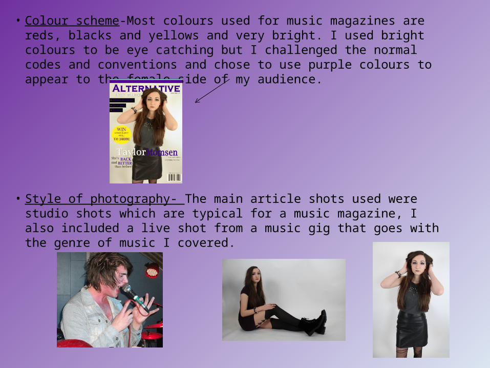
• Colour scheme-Most colours used for music magazines are reds, blacks and yellows and very bright. I used bright colours to be eye catching but I challenged the normal codes and conventions and chose to use purple colours to appear to the female side of my audience.
• Style of photography- The main article shots used were studio shots which are typical for a music magazine, I also included a live shot from a music gig that goes with the genre of music I covered.

• Writing style-My magazine is aimed at students so I used the usual informal, chatty style of writing to appeal to my audience.
• Barcode- This is an essential feature for a magazine so I included it along with the price and date next to it so readers know how much it costs.

How does your media product represent particular social groups?
Age: Most of the artists in my magazine are around or just above the age of my target audience (students) so I used them to appeal and attract the audience and their age. Students mostly like bright, funky colours with and informal style of writing that wont take them ages to read so I applied this.
Class: The main audience my magazine is aimed at is students. So I used an informal, chatty style of writing to engage them and get them interested and not bored of the articles. The price is also affordable for students who are not working. Social groups: My magazine is about alternative/punk rock music (hence the name Alternative) so I represented these social groups through the clothes of my models in the articles and the colours they wore to give off a specific image of the alternative rock scene. The way they are photographed posed in a studio represents the alternative genre too, they are not too scruffily dressed.
Hey readers!So in this issue I got the amazing chance to spend a day with the lovely Taylor Momsen herself (yes despite her moody image, she can tell a good joke or two!) Don’t forget to read the interview with her to find out all about her big comeback, latest album and tour. We’ve even given one of you lucky lot a chance to spend a day with the queen of pop punk herself, TayJardine! Enjoy the issue, will hopefully have lots of new gossip for you in the next issue! Love Becki

Gender: The house colours used throughout my magazine are more feminine colours like purples and yellows so this appeals to my female target audience more but I have also included greys and blacks which could also attract the male audience. I have used mainly female models which could appeal to my female target audience because they could aspire to be like the females in the magazine, this is also known as the male gaze, girls could see themselves as the girl performers in my magazine and aspire to be like them and what men want. The band I used were also quite good looking males which also could appeal to my audience because they could be attracted to them. Also the girl in the photos is represented as a very girly girl with long hair, short skirt, make up and posing quite feminine which represents the genre of my audience.

What kind of media institution might distribute your media product and why?
Bauer Media will publish my magazine because they already publish Kerrang, so they would have experience and knowledge selling my magazine because its of the same genre. It will gain them more money.They also publish in 15 different countries so my magazine could be distributed widely for everyone, also they produce popular music TV channels that play the genre of my music my magazine is about (alternative rock/punk). This channel could advertise my magazine.

Who would be the audience for your media product?
I think that my product would be suitable for the audience intended. In my final product I aimed it more at the female audience who were students rather than both genres. I still focused on the alternative genre as I thought that’s what most of the students aged 17+ at the moment are into. So I used models dressed in alternative rock style clothing so it was appropriate for my target audience. I used both male and female artists so that my female audience could relate to the females portrayed and the male singers would attract the females. I also used more feminine based colours like purples and yellows. I tried to use the information I gathered from the interviews and surveys I conducted and tried to include features that appealed to the students I interviewed like interviews with a certain artists and gig reviews. I didn’t use too complicated lexis as the readers of my magazine are only students and just have a working class education and I didn’t want to put them off the magazine by using complicated words that would make them bored. The audience would be students who enjoy going to gigs and festivals a lot in their spare time and reading about music and album reviews. They would be interested in new up and coming alternative rock bands like We Are The In Crowd and Paramore. The students would dress mainly in things like jeans and converse with a band top of the alternative genre.

How did you attract/address your audience? • Masthead: In the centre of my page to grab attention straight away, I used quite a
bold font that would stand out on the shelf in a bright purple colour that ties in with my magazines house colours so it looks neat.
• Photographs: The location most of my photos were taken was a studio so my photos were very clean cut. They were very bright, high key, posed and clear which looks attractive and neat to the audience. They were also quite simplistic with not much going on so the audience could see the image clearly and focus more on it. In the main article images, the models were directly looking at the camera making eye contact with the audience to engage and directly address them.
The models were posed in a certain way that suits the alternative rock genre (like holding their hands up, grabbing the camera) and would convey that to the audience. I also used a live busy shot from a gig of the band featured as a contrast to the studio ones so the audience could view a wide range of images. I used it to give the audience a chance to feel what it would be like going to one of their gigs so they can kind of experience it for themselves.

• Win a meet&greet: I put a ‘win a meet and greet with ‘ feature in to get the audience to buy the magazine just so they could have a chance to spend time with their favourite band member. Otherwise known as a puff.
• Tagline: I used a slogan with alliteration because it sounds good and also could mean something to the audience.- ‘music matters’ they wouldn’t be reading a music magazine if music didn’t matter to them.
• Cover lines: I used a famous alternative rock artists name to attract readers that could be her fans.
• Font: I edited some of the fonts in Photoshop so it had a colour shadow of purple and black to make it seem more bold and ‘in your face’.

• Layout: horizontal vertical columns main image over masthead• Price: I made the price a reasonable one for what was included in
my magazine, and made it affordable so my audience of students would be able to afford every new issue.

• Colours: The colours used were very bright and eye catching to grab attention and stand out. I tried to use unusual colours for a music magazine (purples) so it would attract readers because it is different and would look intriguing.
• Pull quote: I used a pull quote on the bottom of the page to give the reader an idea of what the interview was about before they read it and entice them.
• Language: Very informal. I used specific field lexis to do with music that my audience would understand. In my main double page spread article I also asked about the album and portrayed it in a good way that would interest the audience. I also talked about the rock and roll genre my magazine is about.

What have you learnt about technologies from the process of constructing this product?
• Survey monkey- I used survey monkey to create a survey for my research and gather answers from people about what my target audience like in a music magazine. I had never used survey monkey before and I found it a very easy, hassle free and quick way to gather a mass amount of information that was highly useful to apply to my product. It wasn’t necessary to use this programme as I could have done a survey on another site but I'm glad I chose to use survey monkey as it saved me a lot of time.
• Camera- I used a special Nikon camera to take professional looking photos in the studio for my magazine production, I didn’t really have much experience using a camera with a tripod, so I took most of my photos freehand, but I learned how to zoom in and out and how to take photos from angles that looked best. I wouldn’t have been able to have taken good enough quality photos if I didn’t use this camera.
• Photoshop- This is the programme I used to create my whole magazine during production. It was the first time I had ever used Photoshop and I found it very difficult and complicated but in the end I found that it produced a very good quality and professional final piece. In design could have been another possible programme I could have used to product a magazine but I didn’t understand that as well as Photoshop.

• Slide share- Used to upload all my PowerPoints onto my blog, I had also never used this before and it surprised me how useful it was. This was a necessary programme.
• PowerPoint- I used Microsoft PowerPoint for my planning- style sheet and photography plan. Also to type up all my evaluations and analysis for my coursework.
• Blogger- This is where I uploaded everything from my coursework. This was also the first blog I had ever created so I learned how to upload different types of files like html codes and pictures, and how to edit a post.
• Google – Without google I couldn’t have completed my research and gathered inspiration for my magazines so I found this search site very useful.
• Word – Used to type my interview up for my double page spread.

Looking back at your preliminary task, what do you feel you have learnt in the progression from
it to the full product? • When I created my college magazine for preliminary task I did no
research for it, unlike my main production task of the music magazine. I did no audience or market research so it didn’t look as good because I had no idea of what existing products looked like or how to set a magazine out or what target audience I would be creating for or how they wanted it to look. I also did no planning I just created one from scratch, so my final pieces looked much better as I had time to look at my research and plan a layout and draw up flat plans to follow. In my preliminary task I didn’t use Photoshop so the quality wasn’t as good as my music magazine.
• Developed skills- in my music magazine, unlike my college magazine, I used both image and text manipulation so I got to develop and practise my skills in this.


